I Learned To Solve All My Interior Design Problems by Playing Music

I Learned to Solve all my Interior Design Problems by Playing Music

Contrast is the Key to Striking Beauty

While in my doumbek class last week, my drum teacher Amir Etemadzadeh, who is a native of Iran was talking about the importance of being able to distinguish clearly all the notes we can make on our drums. The more notes, the better.  The more clearly they are different from each other, the better and more beautiful it sounds to the listener.

Amir describes it as creating a beautiful and delicious meal and all the notes are like the spices and layers that make it delicious to the ears. 

I Learned to Solve all my Interior Design Problems by Playing Music
Mary Ann Benoit of Tavus Dance Company performing on her doumbek for a show in Anchorage Alaska.

As he waxes poetic about the beauty of contrast and how critical it is to distinguish the doum from the slap, and how the Teks and Kas should be as bright and high as possible, my mind wanders to Interior Design and the importance of contrast there as well. 

In music, if the notes are not easily distinguishable, they can all start to sound the same, and some notes will make others sound muddy or dull because each is not living up to its full potential. Your playing becomes boring for the audience.

Interior Design Lessons from Dance

What does it have to do with Interior Design?

Just as a drummer wants their music to sound delicious to the ears, we want our rooms to look delicious to our eyes. Contrast is one of the keys to creating great beauty.

This is Part 1 in my revelations from playing music on how to create your perfect space. 

The older I get, the more I realize the connections between all things artistic. The same principles apply to making the magic happen in Interior Design or any other art form. You just need to open your eyes, listen, and feel it to notice.

It always seems to come back to the alignment between art (creativity), science (color), and energy (connection) that makes the magic happen. I use this alignment to create both beautiful dance pieces and interiors.

You might also enjoy my series on lessons I learned about Interior Design from dancing:

I Learned To Solve All My Interior Design Problems by Dancing : The Magic of Transitions.

I Learned To Solve All My Interior Design Problems by Dancing : Surprise Me.

I Learned To Solve All My Interior Design Problems by Dancing and Learning to Tell a Great Story.

I Learned To Solve All My Interior Design Problems by Dancing- Bring on the Bling.

I Learned to Solve all My Interior Design Problems by Dancing- There Can Only Be One Star.

I Learned to Solve all My Interior Design Problems by Dancing- Be Brave.

I Learned to Solve all My Interior Design Problems by Dancing- Create Drama with Shapes.

I Learned to Solve all My Interior Design Problems by Dancing- Create Drama with a Focal Point.

I Learned to Solve all My Interior Design Problems by Dancing.

I Learned to Solve all my Interior Design Problems by Playing Music
Edesign by Northern Lights Home Staging and Design

How Does Contrast Relate to Interior Design?

Contrast is important in creating interest and making you feel something in the room. You can create contrast with color, texture, shapes, lighting, levels, patterns, sizes and more.

The more contrast between things, the more they each stand out and shine with their own inherent beauty, complimenting each other, rather than one stealing the spotlight and making the other look dull.

There is a lot of complexity to this subject. Today, I will focus on color.


I Learned to Solve all my Interior Design Problems by Playing Music
Edesign by Northern Lights Home Staging and Design

Creating Contrast with Whites and Neutrals

As my teacher spoke about the sounds of the drum, the first thing that came to mind was how important contrast is when using the color white.

White. How seemingly simple but how complex. Many, when confused about color will say, lets just paint it white and be done with it. Haha, well, that just opened a big can of worms.

I Learned to Solve all my Interior Design Problems by Playing Music
The Beauty of white. Photo by Robin Schreiner on Unsplash.

There are so many whites out there, it is amazing. Why? Because white is a color, just like any other, and is ultimately, the least saturated or a low saturation of a hue. Example, take a blue and reduce its chroma until it looks white, It is still that same blue, but with very little chroma. That is why all whites look so different.

P. S., it has nothing to do with so called “undertones”, which is just a word people use that do not understand color science to subjectively describe what they see.

No big deal, until you decide to mix whites in your space. One white can make another look muddy, or dirty, or just “off”.

Why? You need to make sure there is enough difference in chroma to easily distinguish the two whites. And there should still be some color harmony between the hues the whites come from. Whites that are opposites on the color wheel look better together than ones that are so close to each other that they look off.

Neutrals are the same as whites. They just have a little more chroma.

Finding the beauty of a neutral palette using various shades of whites, off whites and neutrals with enough contrast to see all the variations can be gorgeous. Throw in a variety of shapes and textures to add even more interest and variety.

I Learned to Solve all my Interior Design Problems by Playing Music
Edesign by Northern Lights Home Staging and Design

Get the Look

 Here is an example of a beautiful and relaxing Edesign I created using whites and neutrals with contrasting colors and textures.  

I Learned to Solve all my Interior Design Problems by Playing Music
Edesign by Northern Lights Home Staging and Design

Creating Contrast with Opposite Colors

Of course, you can get maximum contrast with saturated hues. The highest degree of contrast comes from either using black and white, or opposite colors on the color wheel, which creates a complimentary color scheme.

Maximum Contrast with Black and White

I Learned to Solve all my Interior Design Problems by Playing Music
Edesign and Fractal Art by Northern Lights Home Staging and Design

Maximum Contrast with a Complimentary Color Scheme

Blue and yellow are opposites or compliments on the color wheel. Each makes the other look even more vibrant.

I Learned to Solve all my Interior Design Problems by Playing Music
Edesign by Northern Lights Home Staging and Design

In the Edesign below, the green in my Spring Fractal Art is the complement of the purple walls. It has the effect of making the art really pop!

I Learned to Solve all my Interior Design Problems by Playing Music
Edesign and Fractal Art by Northern Lights Home Staging and Design

Are You Ready to Create Beauty Through Contrast in Your Home?

Now that you know some of the elements that work together to create your perfect space, are you ready to take action to make it happen in your home? If you knew absolutely for certain that creating a perfect space would create a better life for you, you would do it, wouldn’t you?

Let’s tell your unique story and find the alignment of art, science, and energy that makes you happy.  Let me help you take that trip to your perfect space in a Ferrari instead of a stagecoach. Try my Aligned Design consultation and let’s get started.

Curious about your Interior Design style? Take the quiz and find out.

Why work with Northern Lights Home Staging and Design

Terms of Service  |  Privacy Policy  |  Disclaimer

Prices subject to change without notice.

This page contains affiliate links.

Call 907-362-0065 today

 info@northernlightsstaging.com

By Mary Ann Benoit

President- Northern Lights Home Staging and Design Owner- Arctic Paradise Bed and Breakfast Artist- Stained Glass, Jewelry and Alcohol Ink Art Wildlife Biologist Director- Kaleido World Percussion and Dance Company Director- Tavus Dance Company of Alaska Lover of music, art, dance and animals.

4 comments

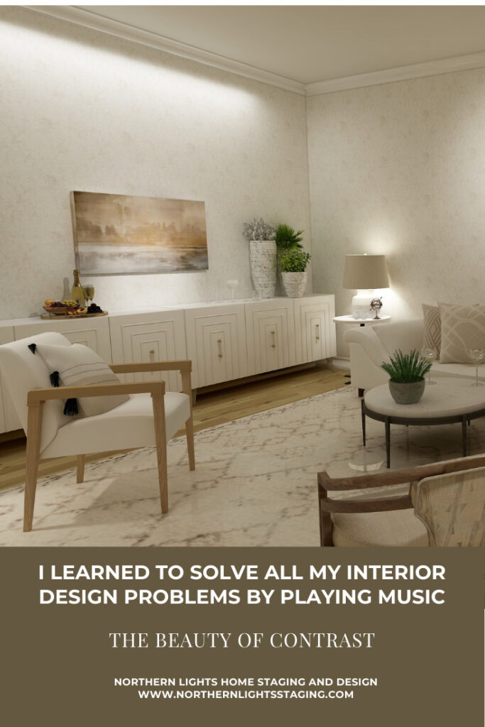
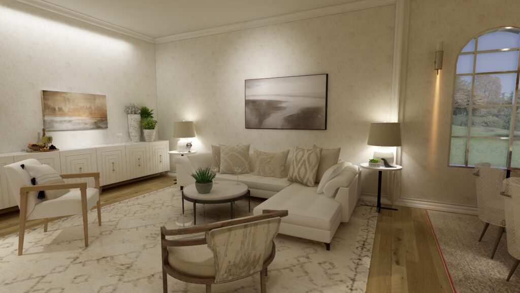
  1. This will be another incredible series! I especially love your characterization of whites – it is so important to understand that white is not a “throw your hands up” solution to not choosing a color, and that there are many many hues of white – that’s probably a whole series in its own right!
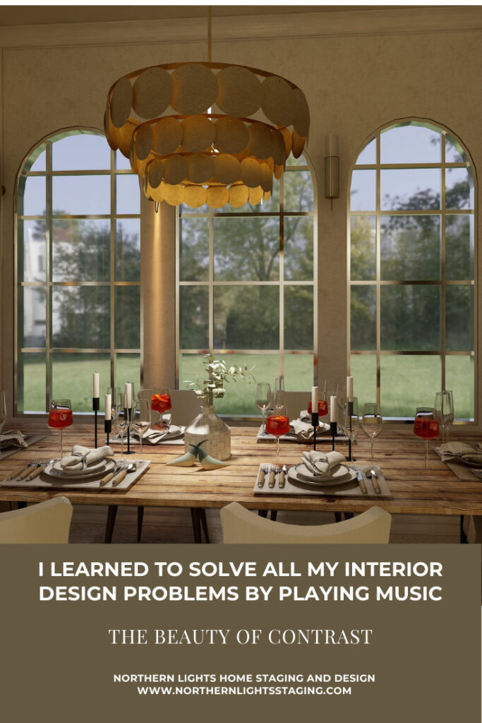
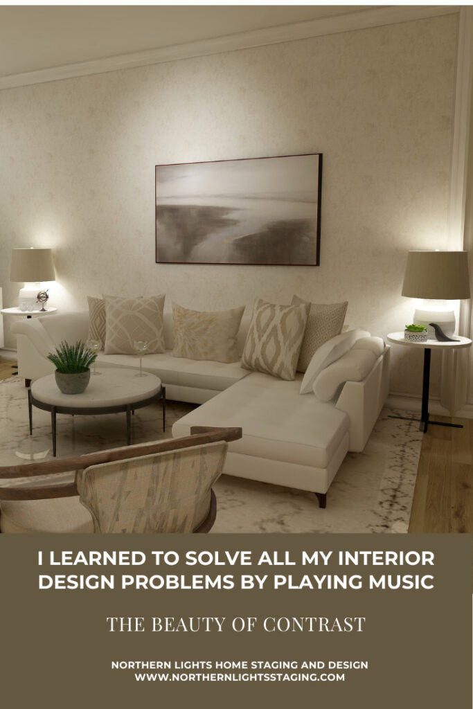
  2. Very interesting! Love to see the connection between music and design. That idea about contrast is so wonderful!

    1. Thank you! It surprises me how many connections there are and now that I am looking for them, they are easy to find!

Comments are closed.

https://zotabox.com/dashboard/embeddedcode/