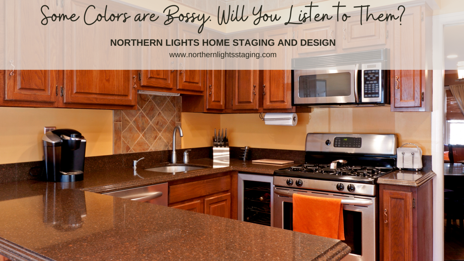
Some colors are just plain bossy. You might want to ignore them, but you can’t. And you shouldn’t.It is not that they are overly bold or colorful. They are just in your face. Every Single Day.They are your fixed finishes. The things you rarely change unless you are doing some significant remodeling. They are your countertops, your floors, and architectural features such as stone or brick walls or fireplaces, or other predominant features. They are the things Read more […]
Tag: color consulting
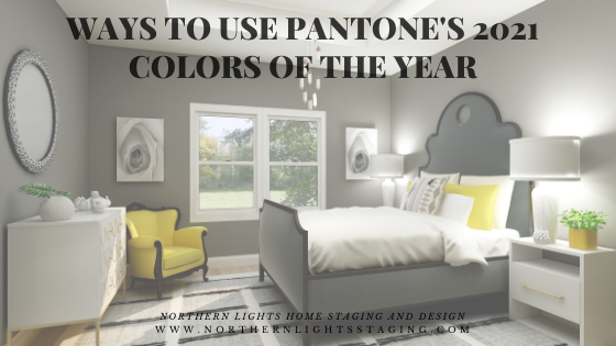
Ways to Use Pantone’s 2021 Colors of the Year
In my last five articles I have been exploring the 2021 colors of the year of different paint companies and comparing them in the same Edesign I created for a master bedroom. I started by exploring Benjamin Moore’s Agean Teal and Sherwin Williams Urbane Bronze. I found that PPG had a color palette of 3 colors of the year instead of one as you can see in my article Ways to Use PPG’s Colors of the Year. I admitted I felt a little let down that they did not just commit to one color. Then Read more […]
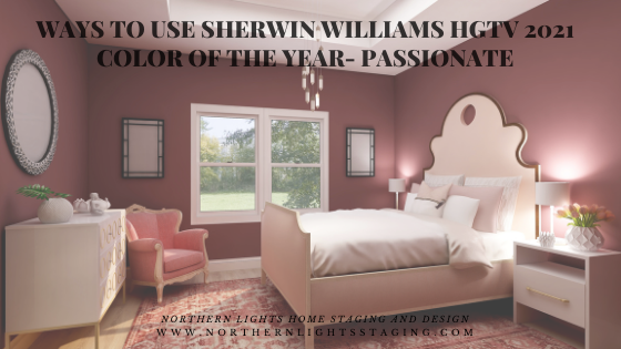
Ways to Use Sherwin Williams HGTV 2021 Color of the Year- Passionate
In my last few articles I have been exploring the 2021 colors of the year of different paint companies and comparing them in the same Edesign I created for a master bedroom. I enjoyed exploring Benjamin Moore’s Agean Teal and Sherwin Williams Urbane Bronze. I found that PPG had a color palette of 3 colors of the year instead of one as you can see in my article Ways to Use PPG’s Colors of the Year. I admitted I felt a little let down that they did not just commit to one color. Then I checked Read more […]
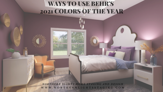
Ways to Use Behr’s 2021 Colors of the Year
In my last few articles I have been exploring the 2021 colors of the year of different paint companies and comparing them in the same Edesign I created for a master bedroom. I enjoyed exploring Benjamin Moore’s Agean Teal and Sherwin Williams Urbane Bronze. I found that PPG had a color palette of 3 colors of the year instead of one as you can see in my article Ways to Use PPG’s Colors of the Year. I admitted I felt a little let down that they did not just commit to one color. This week Read more […]
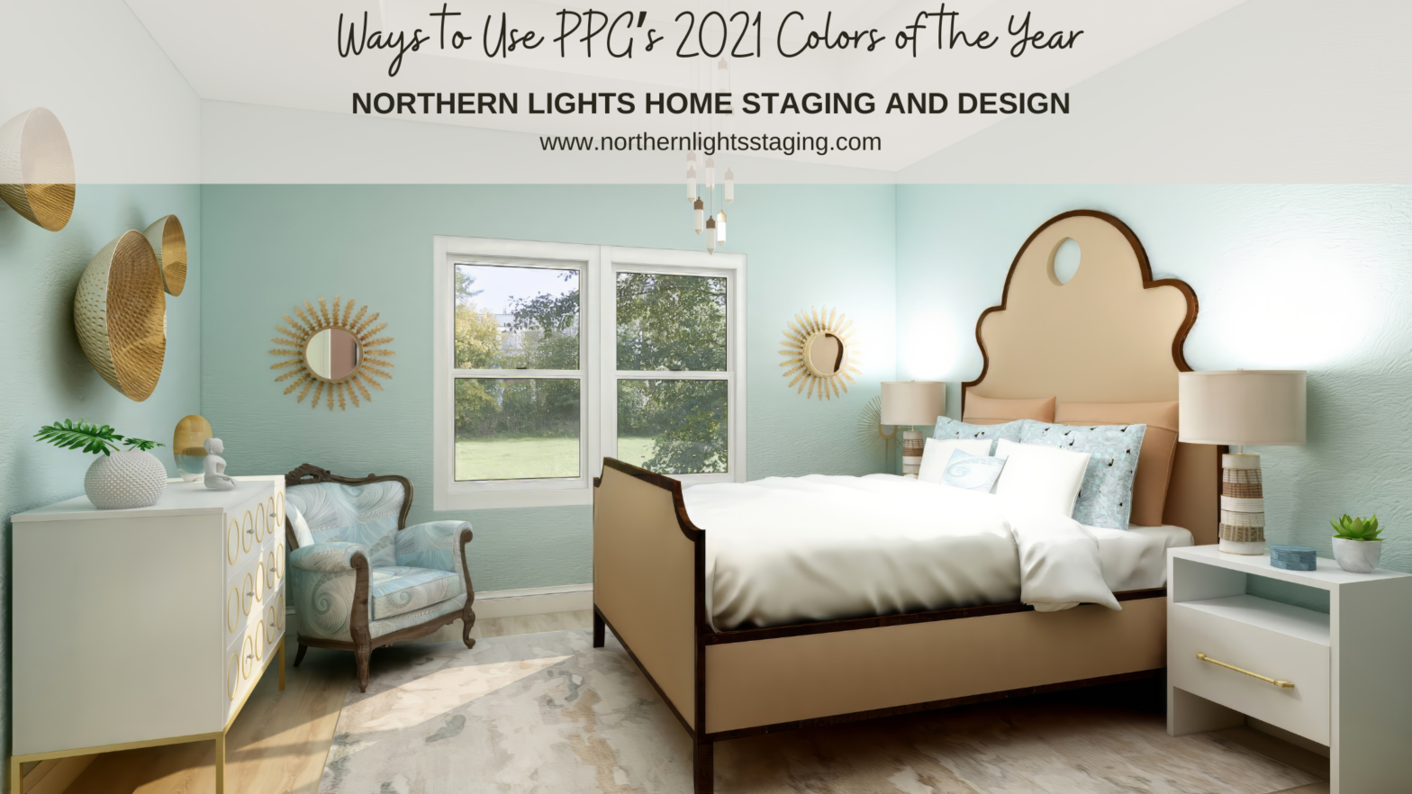
Ways to Use PPG’s 2021 Colors of the Year
In several articles I explored the 2021 colors of the year of different paint companies and compared them in the same Edesign I created for a master bedroom. I enjoyed exploring Benjamin Moore’s Agean Teal and Sherwin Williams Urbane Bronze. I was excited to see what PPG’s color of the year was. But wait….they didn’t have one!! What??? No, they had a color palette for 2021 but not a particular color of the year. Honestly, I felt let down. I guess I don’t like the idea of a color Read more […]
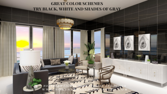
Great Paint Color Schemes- Black, White and Shades of Gray
People often struggle with creating a great color scheme. In my recent series of blog articles we discussed how you could take your favorite color, blue for example, and create different color schemes. We explored monochromatic, analogous, Complimentary, Diad, Triad, Tetrad, Split-Complimentary and Double Complimentary.Today, lets talk about using black, white and shades of gray. To catch up on these other color schemes see my articles Celebrate Your Favorite Color- Go Monochromatic and Create Read more […]
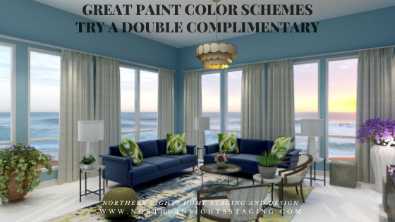
Great Paint Color Schemes- Try a Double-Complimentary
People often struggle with creating a great color scheme. In my last few blog articles we discussed how you could take your favorite color, blue for example, and create different color schemes. We explored monochromatic, analogous, complimentary, diad, triad and tetrad color schemes. Today, lets look at a Split-Complimentary!A tetrad uses four colors which include two complimentary color pairings. It can be difficult to balance if you use all four colors in equal amounts it may feel like Read more […]
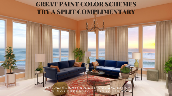
Great Paint Color Schemes- Try a Split-Complimentary
People often struggle with creating a great color scheme. In my last few blog articles we discussed how you could take your favorite color, blue for example, and create different color schemes. We explored monochromatic, analogous, complimentary, diad, triad and tetrad color schemes. Today, lets look at a Split-Complimentary!A double-complimentary scheme uses four colors which include two complimentary color pairings. It can be difficult to balance if you use all four colors in equal amounts Read more […]
Great Paint Color Schemes- Try a Tetrad
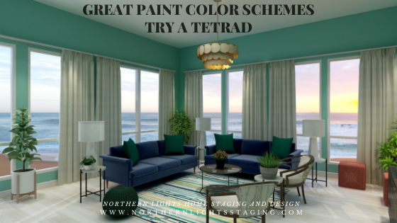
People often struggle with creating a great color scheme. In my last few blog articles we discussed how you could take your favorite color, blue for example, and create different color schemes. We explored monochromatic, analogous, complimentary, diad and triad color schemes. Today, lets look at a Tetrad!A tetrad uses four colors which include two complimentary color pairings. It can be difficult to balance if you use all four colors in equal amounts it may feel like too much. You can use Read more […]
Great Paint Color Schemes- Try a Triad
People often struggle with creating a great color scheme. In my last few blog articles we have discussed how you could take your favorite color, blue for example and create different color schemes. We explored monochromatic, analogous, complimentary and diad color schemes. Today, lets look at a Triad!A triad uses three colors with the equal distance between all colors on the color wheel, causing no clear dominance of one color.So, let’s create a triad color scheme with the blue we have been Read more […]
