Ways to Use PPG’s 2021 Colors of the Year
In several articles I explored the 2021 colors of the year of different paint companies and compared them in the same Edesign I created for a master bedroom. I enjoyed exploring Benjamin Moore’s Agean Teal and Sherwin Williams Urbane Bronze. I was excited to see what PPG’s color of the year was.
But wait….they didn’t have one!! What??? No, they had a color palette for 2021 but not a particular color of the year. Honestly, I felt let down.
I guess I don’t like the idea of a color palette, because I don’t want to be told or encouraged to use a series of colors together. I like to decide that for myself!
The PPG 2021 Color Palette includes Transcend, Mystic Aqua and Big Cypress, which are meant to work together.
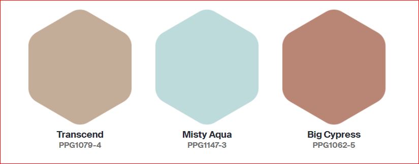
Here is what PPG says about their 2021 color palette:
Transcend: A mid-tone oatmeal-colored hue that draws on earthy influences and nostalgia.
Big Cypress, a shaded ginger with persimmon undertones, is the equivalent of a big, comforting hug for your home.
Misty Aqua, a watercolor cerulean blue, provides an unexpected pairing of freshness against the other warm, earthy tones.
I like the Misty Aqua. Transcend or really any beige makes me yawn. Big Cypress reminds me of the desert, and I am not sure it makes me feel like my home got a hug.
I am trying to have an open mind here and just get over the fact they didn’t just pick one color. I find it a little annoying, as if they are trying to sell me three paints instead of one.
I am not sure why they paired these colors together. Looking at the color data, they do not really fit into any traditional color scheme in relation to hue angle. They are not similar in terms of chroma or lightness to create a harmonious pairing. I don’t really get it, but will see what amazing and beautiful design I can create anyway! Here goes.
Master Bedroom Design
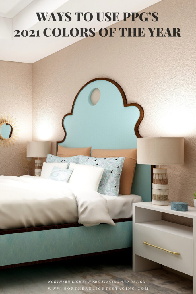
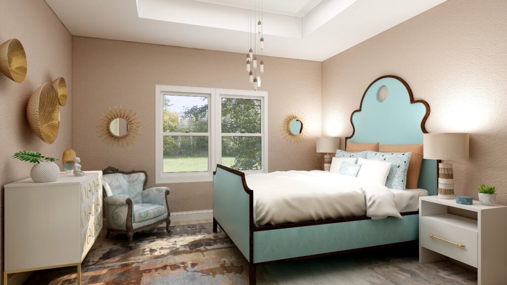
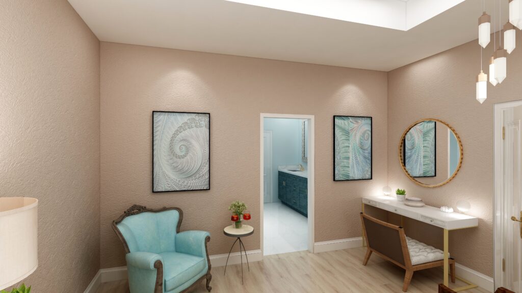
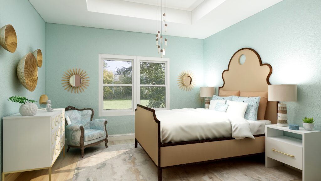
Design 1- Transcend and the PPG 2021 Palette
In this design, I used Transcend as the main color on the walls, and used the two other colors as accents or supporting colors. I used a shade of Mystic Aqua on the bed. The larger pillow shams and the lamps tie in Big Cypress. The area rug has some Transcend and Big Cypress colors in it and also a lighter shade of Mystic Aqua. My design celebrates circles and curves, mixes modern pieces with antiques, and mixes soft fabrics with glass, metal and pottery. I used my fractal art from the “Jenna” collection which has some of the Mystic Aqua color in the pillow shams and accent pillow, the wall art, and on one of the antique chairs. My fractal art celebrates curves and spirals. To learn more about spirals and fractal art, see my blog article What Does Your Art Mean?
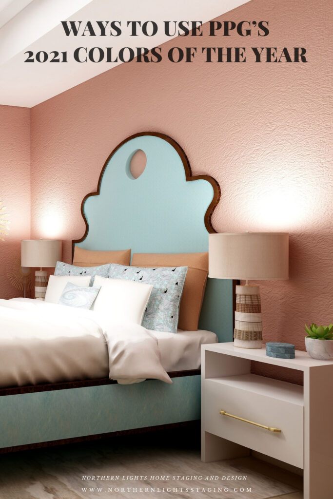
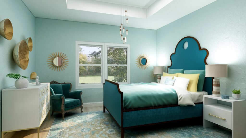
Design 2- Big Cypress and the PPG 2021 Palette
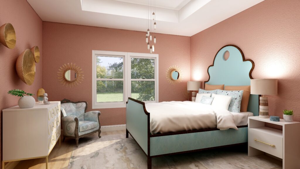
In the design below, I used Big Cypress as the primary color on the walls with the other two colors as supporting colors. I changed the area rug to one that contains colors similar to Transcend.
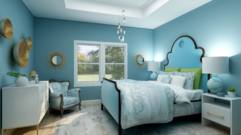
Design 3- Mystic Aqua and the PPG 2021 Palette
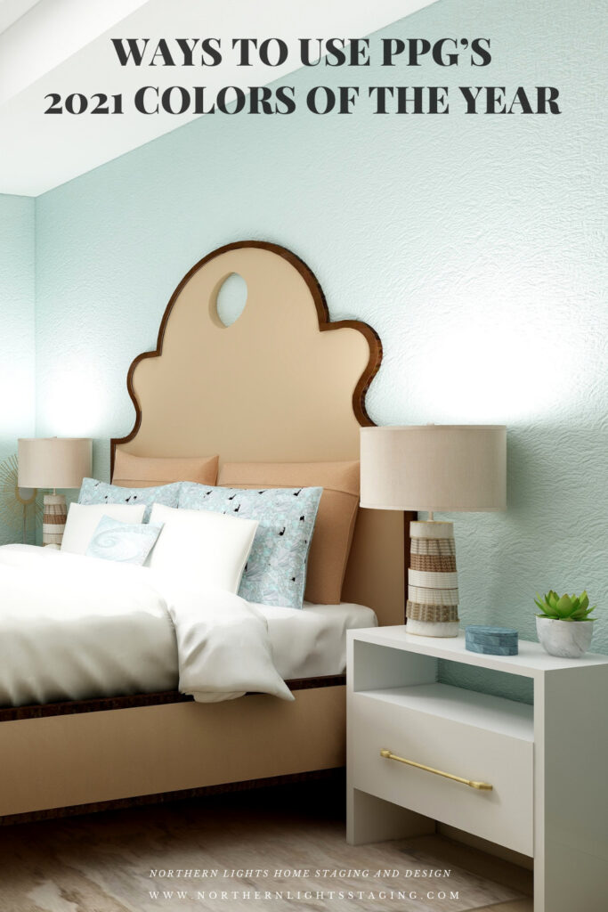
In the design below, I changed the wall color to Mystic Aqua, and changed the bed upholstery to a color similar to Transcend.
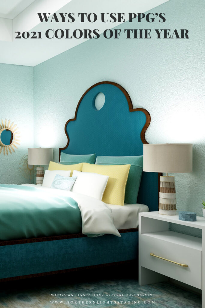
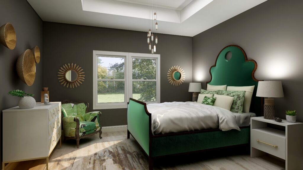
Design 4- Mystic Aqua and my own color palette
In the design below, I did my own thing. I liked Mystic Aqua the best of the three wall colors. I developed my own palette using various shades of blue/greens and yellow, it’s opposite on the color wheel.
Which Color of the Year is Your Favorite?
I enjoyed working with all the colors of 2021, and think they could all work nicely to create a relaxing master bedroom, although Big Cypress feels a little more energizing than relaxing. Of all the colors, I think Aegean Teal is my favorite, how about you?
Are You Inspired?
Get your colors right the first time with a science based color consultation.
Get Your Free Report

Pin These