Great Paint Color Schemes- Try a Tetrad
People often struggle with creating a great color scheme. In my last few blog articles we discussed how you could take your favorite color, blue for example, and create different color schemes. We explored monochromatic, analogous, complimentary, diad and triad color schemes. Today, lets look at a Tetrad!
A tetrad uses four colors which include two complimentary color pairings. It can be difficult to balance if you use all four colors in equal amounts it may feel like too much. You can use one to three colors as dominant colors and and let the rest be more subdued. By subdued, I mean you can use less of the colors proportionally. Or you could use less saturated versions of the colors so they don’t stand out as much, but color schemes tend to look more harmonious if you are using similar saturation or chroma levels. Here are some examples.
Let’s create a tetrad color scheme with the blue we have been working with in the last several articles. You can see this blue in the sofas.
To catch up on these other color schemes see my articles Celebrate Your Favorite Color- Go Monochromatic and Create a Harmonious Color Scheme- Go Analogous, Opposite Colors Attract, Go Complimentary and Great Paint Color Schemes- Do a Diad and Great Paint Color Schemes- Try a Triad. See examples of those color schemes below.
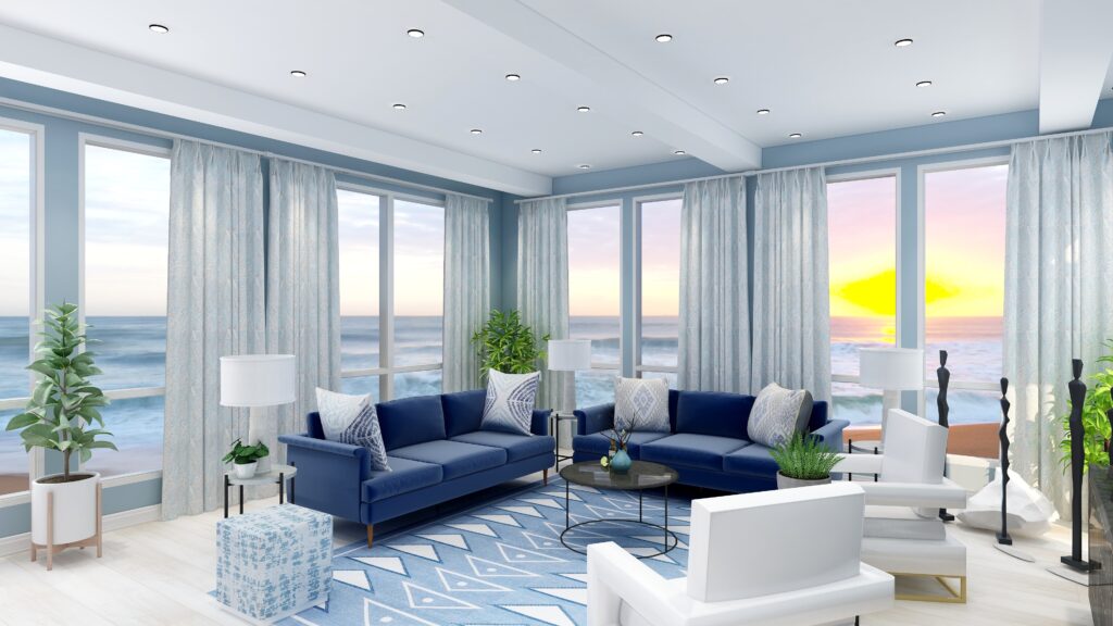
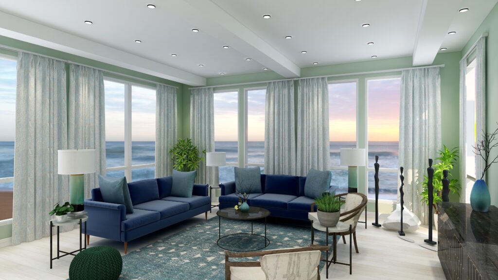
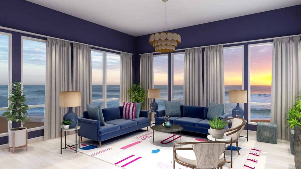
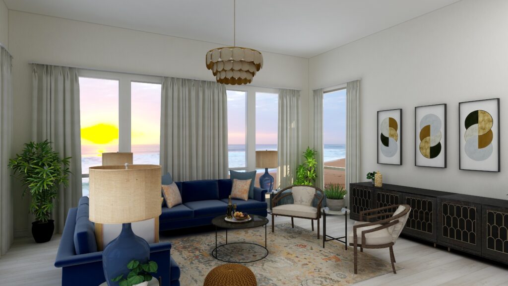
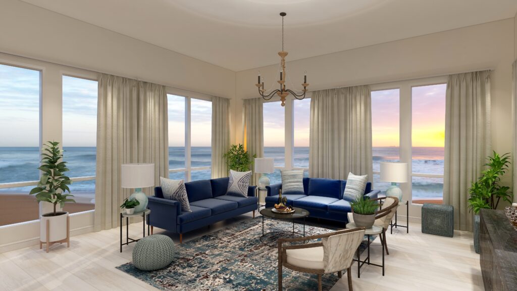
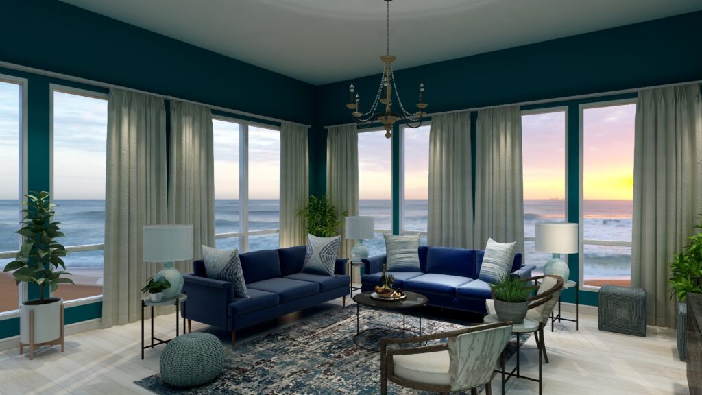
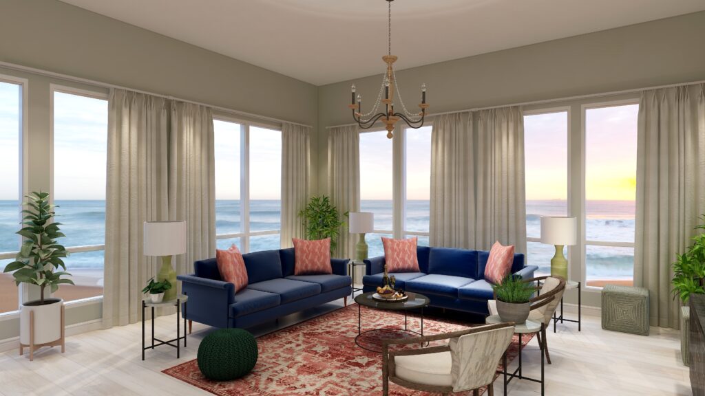
There are three different Tetrads we could choose from that use our blue (which is a blue/purple). For this article, lets work with the first two.
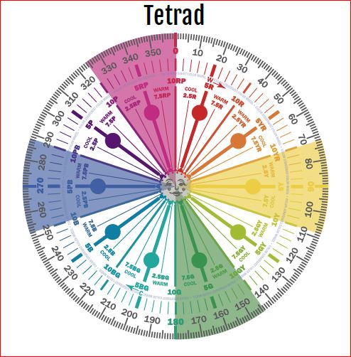
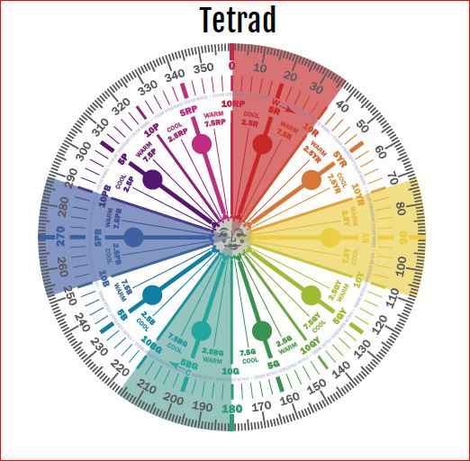
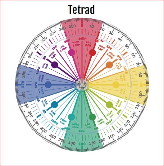
Tetrad Color Scheme Illustrations by Camp Chroma, the Best Color Training Ever!
The Design
With a tetrad you are using 4 colors and have a large variety of tints, tones and shades to play with within those colors. You can get dramatic or keep it mpre neutral based on the colors you choose.
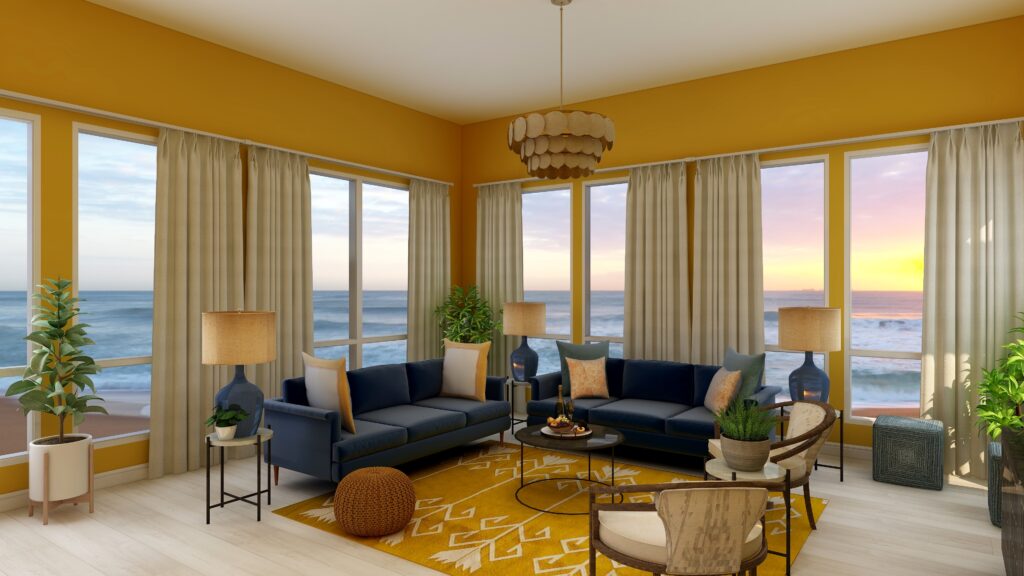
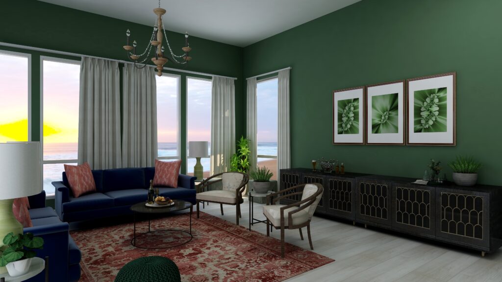
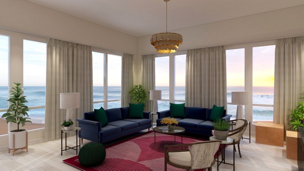
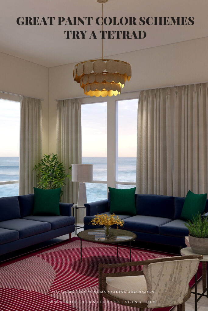
For example, below I created a tetrad with our blue as in the sofas as the base color. It’s compliment is yellow. I chose to use yellow in the wall color, in a a less saturated and lighter yellow than in it’s blue compliment to keep it more neutral. I also used yellow in the buff colored leather ottomans and an accent in the flowers on the coffee table.
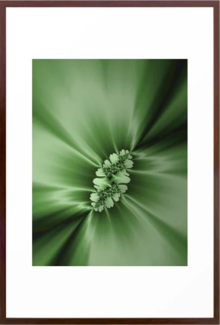
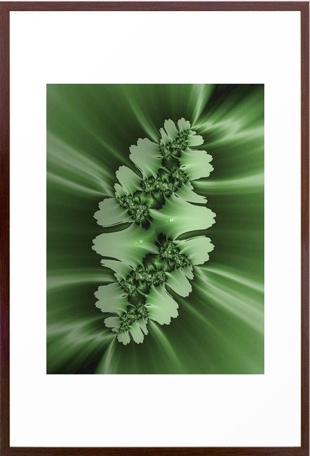
The other pair of compliments are the red/purple and green. I used the red/purple in the area rug, and the green in the pillows, pouf and plants and the art.
The rest of the design I kept neutral with the white chairs, accent tables and lamps and plant stands.
Overall in this design the blue and red-purple are most dominant, followed by the green and with yellow mainly as an accent.
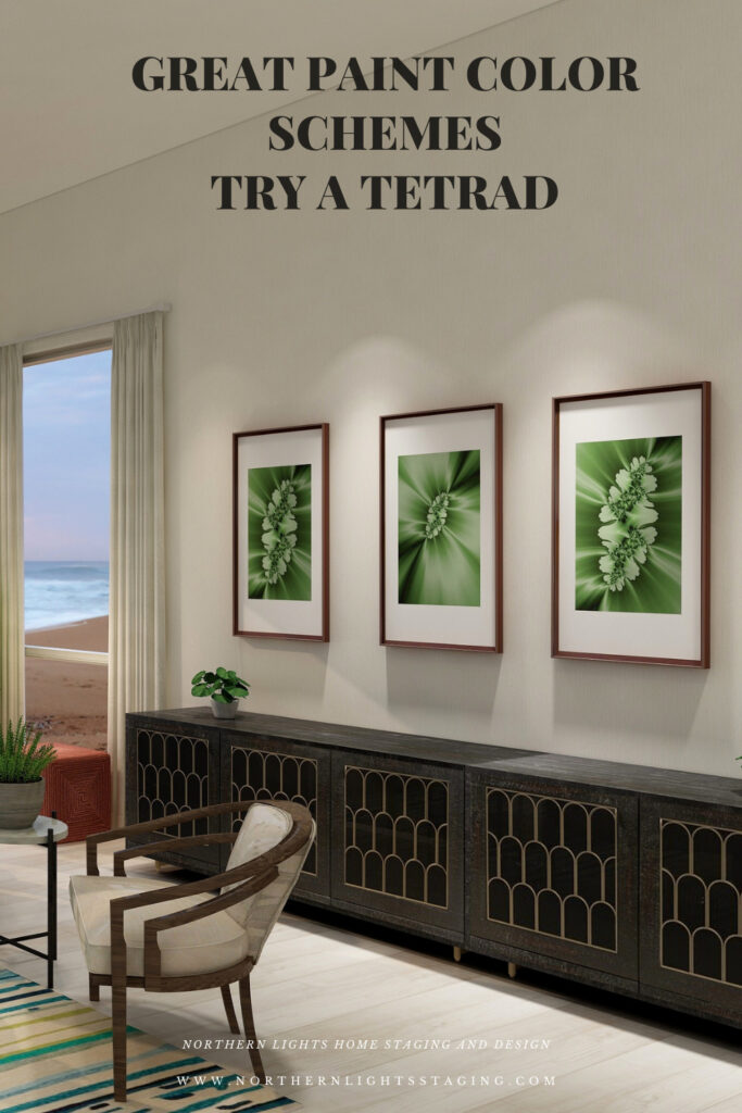
My design also incorporates some of my unique fractal art from my “Spring” Collection.
The design, although using 4 colors still feels fairly neutral and calm with some pops of color for excitement.
Shop the Look
Check out the pieces I selected for this design. Some include affiliate links, meaning I receive a small commission for sharing at no additional cost to you.
I selected pieces of various materials with different textures and patterns within the 3 hue families.
Design 2
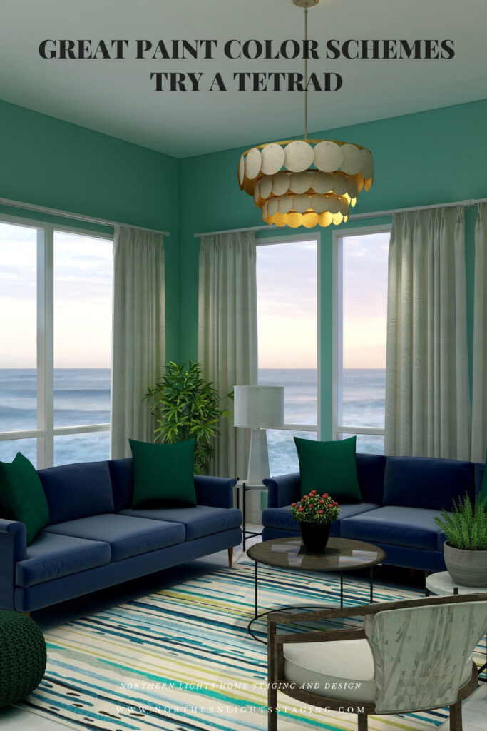
In this second version of a tetrad design, I once again used blue in the sofas and a soft neutral yellow paint color as it’s complement as in the first design.
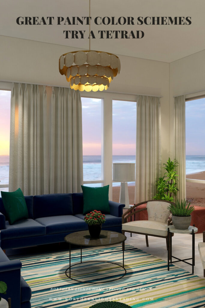
I added the blue green from the second pair of complements into a new area rug (which also ties in the deep blue, yellow and greens). I maintained the green pillows and pouf and added the red in with the two ottomans and the flower centerpiece on the coffee table. As you can see, this time the red is just an accent, where as the blue, blue green and yellow are more dominant.
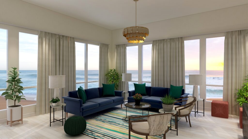
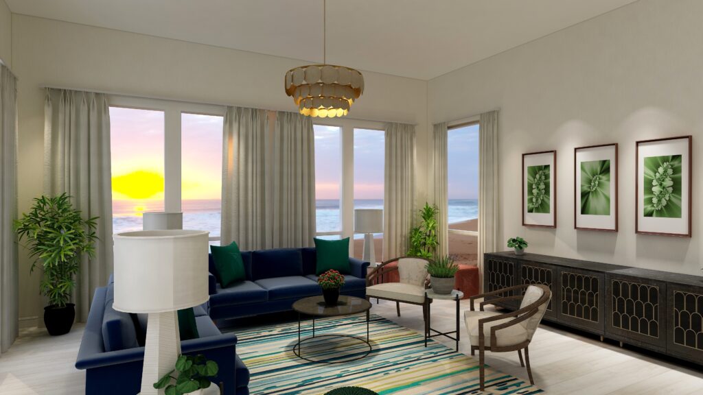
The design, although using 4 colors still also feels fairly neutral and calm with some pops of color for excitement.
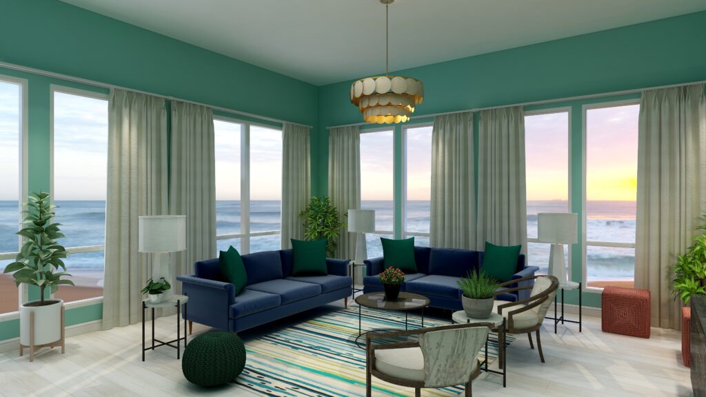
If you wanted to get more dramatic, you could pull in one of the 4 colors with greater saturation or chroma in the wall color as I did below. In this case, I used the blue-green and it changes the whole look and feel, even though everything else is the same.
Shop the Look- Design #2
Benefits of A Tetrad Color Scheme
- A tetrad color scheme is relatively easy to put together using two sets of complimentary colors. The tricky part is determining which colors you want to be more dominant, and balancing the rest so it is not overwhelming.
- Tetrad color schemes can be really dramatic or relaxing based on the saturation and placement of the colors you choose. Very nice for living rooms, dining rooms and areas that you like to entertain. You could try the more relaxing color combinations in a bedroom, especially if you are using blues and greens.
- You can play with this color scheme for different effects by how many colors you allow to be more dominant, and how much weight each carries in the design. Each color brings it’s own feeling to the space so highlight one over the others to get the mood you want.
Create Beauty with Color in Your Space
EACH MOMENT IN LIFE IS YOUR CHOICE.
YOU HAVE THE OPPORTUNITY TO SURROUND YOURSELF WITH BEAUTY RIGHT NOW.
OR NOT, IT’S UP TO YOU.
EVERYTHING IS EASIER WHEN YOU LOVE YOUR SPACE.

What is Your Global Design Style? Take the Quiz
Download my Brochure


Terms of Service | Privacy Policy | Disclaimer
Prices subject to change without notice.
Call 907-362-0065 today
Pin These

Click on the picture to find out more about the best training class on color available, the Four Pillars of Color!.