Color Your Way to a Swift and Profitable Home Sale with These Top Paint Colors

How Much Can Paint Color Increase Your Home’s Sale Price?

The impact of paint color on a home’s sale price has been the topic of numerous studies and analyses, primarily conducted by real estate companies and platforms who have access to vast amounts of sale data. One of the most cited sources on this topic is Zillow, an online real estate marketplace. Zillow released an analysis in their “Zillow Paint Color Analysis” that looked at how certain paint colors in specific home areas impacted the sale price compared to homes with white walls.


Painting walls in fresh light, neutral colors help buyers picture themselves living in the space because they are neutral enough to go with most buyers furnishings and they make the space look larger. Zillow found some colors in specific rooms, particularly light blues, increased the sales price in homes, and a lack of color or certain colors decreased the sales price. Why? Color affects emotion and buyers buy because of emotion!


Neutral colors are generally gray or beige. Picking the right paint is really about making sure the neutral colors and whites work with your fixed finishes. “Greiges” are a mixture of gray and beige that are versatile and will work with a wide variety of floorings, countertops and other finishes. Greiges are great for living and family rooms and exterior colors.


This color data makes sense when you think about the fact that universally, blue is a favorite color worldwide, and that the easiest way for most people to match their existing belongings to a color without having to replaint is if it is a neutral color.


Here are some highlights from Zillow’s findings over the years:

  1. Front Doors:
    • Homes with black or charcoal gray front doors sold for as much as $6,271 more than expected.
  1. Living Rooms:
    • Homes with living rooms painted in light taupe saw an increase of approximately $2,793.
  1. Kitchens:
    • Kitchens painted in light blue to soft gray-blue boosted the sale price by about $1,809.
    • However, homes with straw yellow or marigold kitchens reportedly sold for $820 less than expected.
  1. Bedrooms:
    • Homes with light cerulean to cadet blue bedrooms saw an increase in sale price by about $1,856.
  1. Bathrooms:
    • Bathrooms painted in powder blue to periwinkle had homes selling for $5,440 more than expected.
    • On the other hand, homes with white bathrooms sold for an average of $4,035 less than similar homes.
  1. Dining Rooms:
    • Slate blue to pale gray blue dining rooms boosted the sale price by roughly $1,926.
  1. Exteriors:
    • Homes painted in greige (gray + beige) on the exterior sold for $3,496 more than similar homes painted in a medium brown or with tan stucco.
    •  

These figures are averages and may vary depending on the local market, the overall condition of the house, and other factors. The numbers are also based on Zillow’s data and may not reflect the broader market as a whole.

Which Colors Are Best?

Several studies and real estate analyses have shown that certain paint colors can positively affect a home’s sale price. Here are some colors that have been recognized for their potential to boost home value, along with specific brands and color names where applicable.


Colors that become top sellers are often influenced by the annual “color of the year” selections made by major paint companies, as well as broader design and decor trends. I have added some additional choices similar to those recognized to boost home value based on top selling paint colors, color trends and personal experience. 

Front Doors

Navy Blue or Dark Gray: Houses with doors painted shades of navy blue to dark gray reportedly sold for a higher price. Here are top selling navy blue and dark gray colors that are popular and  could be good choices. Example: “Hale Navy” from Benjamin Moore.

Benjamin Moore “Hale Navy”
Benjamin Moore “Kendall Charcoal”
Sherwin Williams “Naval”
Sherwin Williams “Iron Ore”
Sherwin Williams “Caviar”
Behr “Starless Night”

The color trends for door colors in 2023 featured a lot of black and natural wood tones. Trends for 2024, you will see pops of color as well as traditional black and wood.  Personally, I think the front door is a great place to add a pop of color and make your home more memorable to buyers.  It is something they can easily change if they like.
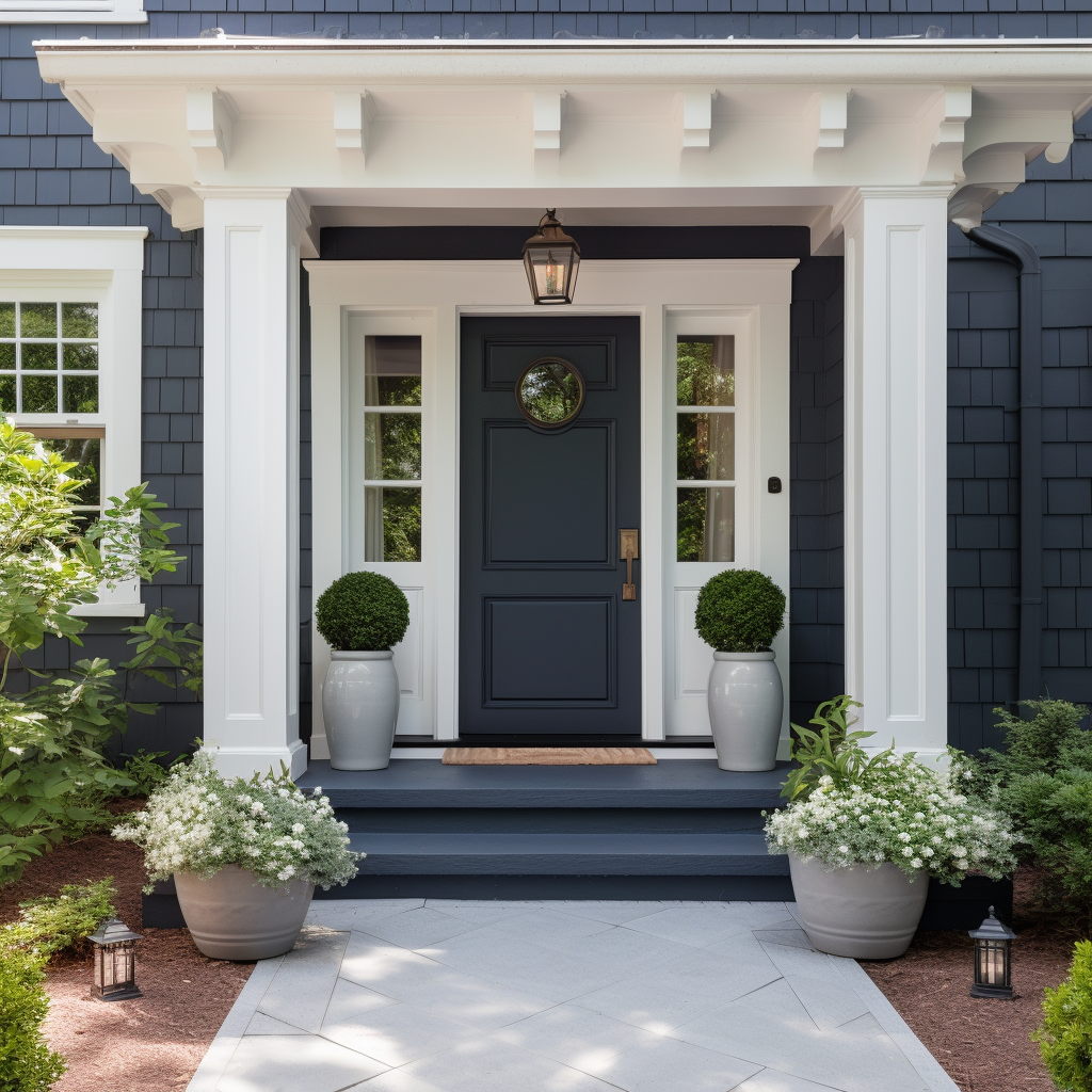
AI generated image of home with front door painted in Benjamin Moore’s “Hale Navy” paint color.

Living Rooms:

Light Beige, Pale Taupe, or Oatmeal: Neutral colors in the living room can be appealing. Example: “Accessible Beige” or “Repose Gray” from Sherwin-Williams.


Sherwin Williams “Accessible Beige”
Sherwin Williams “Repose Gray”
Benjamin Moore “Revere Pewter”
Benjamin Moore “Muslin”
Sherwin Williams “Alpaca”
Behr “Wheat Bread”

I have used Accessible Beige many times for home staging and found it to be a great color that works with a variety of fixed finishes and flooring.
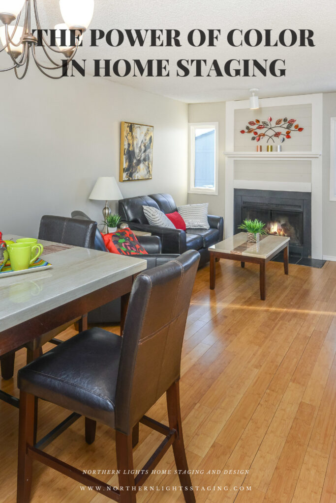
I used Sherwin Williams “Accessible Beige” in the living room as part or a home staging project.

Kitchens

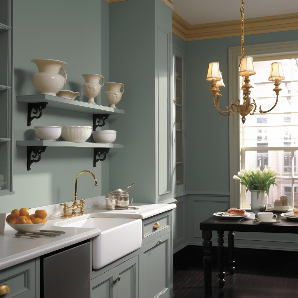
Light Blue to Soft Gray-Blue: These colors in kitchens reportedly increase home value. Example: “Smoke” or “Pale Oak” from Benjamin Moore.

.

Benjamin Moore “Smoke”
Behr Light “French Gray”
Benjamin Moore Icebrrg
Benjamin Moore Woodlawn Blue
Sherwin Williams Rain
Sherwin Williams Sea Salt
AI generated image of a kitchen that uses Benjamin Moore's "Smoke" paint color.
AI generated image of a kitchen that uses Benjamin Moore’s “Smoke” paint color.

Bedrooms

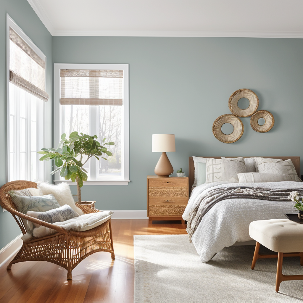
Light Cerulean to Cadet Blue: These are reported to increase selling prices when used in bedrooms. Example: “Breath of Fresh Air” from Benjamin Moore.


Benjamin Moore Breathe of Fresh Air
Benjamin Moore Palladian Blue
Benjamin Moore Wedgewood Gray
Sherwin Williams Rainwashed
Sherwin Williams Sleepy Blue
Sherwin Williams “Meditative”
AI generated bedroom in a bohemian style that uses Benjamin Moore's Wedgewood Gray paint color
AI generated bedroom in Bohemian style that uses Benjamin Moore’s Wedgewood Gray paint color.

Bathrooms

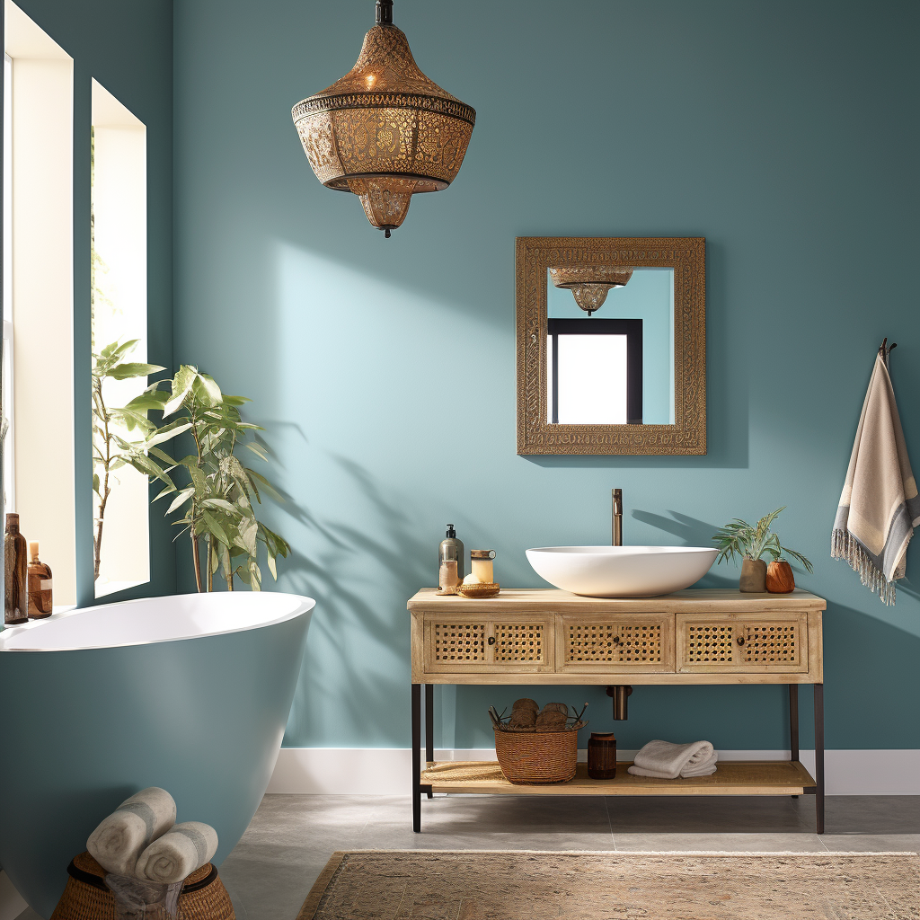
Powder Blue to Periwinkle: Homes with bathrooms this color reportedly fetched a higher selling price. Example: “Bit of Sugar” from Behr or “Atmospheric” from Sherwin-Williams.


Behr “Bit of Sugar”
Sherwin Williams “Atmospheric”
Benjamin Moore “Quiet Moments”
Benjamin Moore “Woodlawn Blue”
Sherwin Williams “Watery”
Sherwin Williams “Silver Mist”

Dining Rooms

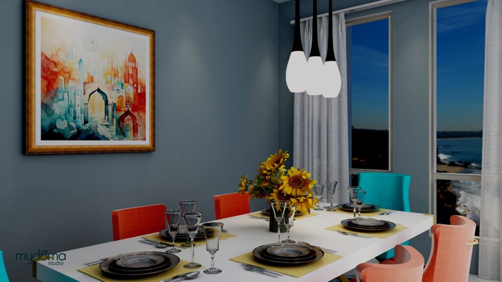
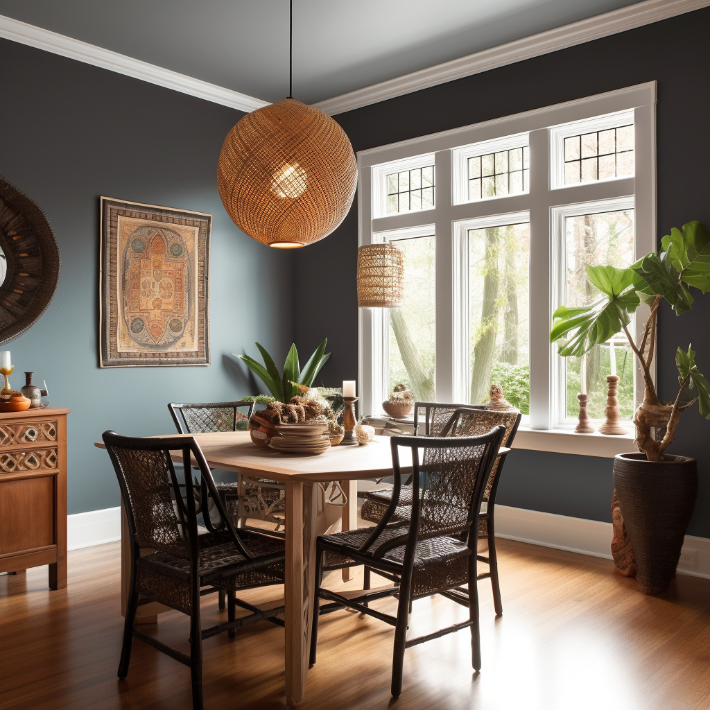
Slate Blue to Pale Gray Blue: They can reportedly increase the sale price. Example: “Palladian Blue” from Benjamin Moore.


Benjamin Moore “Palladian Blue”
Benjamin Moore “Yorktowne Green”
Behr “Seagull Gray”
Benjamin Moore “Smoke”
Sherwin-Williams “Silver Strand”
Sherwin-Williams “Slate Tile”
An AI generated image of a global styel bathroom that uses Sherwin Williams "Atmospheric" paint color.
An AI generated image of a global style bathroom that uses Sherwin Williams “Atmospheric” paint color.
A global style dining room using Sherwin-Williams "Slate Tile paint color. Edesign and Heart of India energy art by Northern Lights home Staging and Design.
A global style dining room using Sherwin-Williams “Slate Tile” paint color. Edesign and Heart of India energy art by Northern Lights home Staging and Design.
AI generated image of a global style dining room using Sherwin-Williams "Slate Tile paint color.
AI generated image of a global style dining room using Sherwin-Williams “Slate Tile paint color.

Exterior Colors

Greige (Mix of Gray and Beige): Homes painted this color often sell for more. Example: “Perfect Greige” from Sherwin-Williams.


Sherwin Willians “Perfect Greige”
Sherwin Willians “Agreeable Gray”
Sherwin Willians “Repose Gray”
Benjamin Moore: “Revere Pewter”
Benjamin Moore: “Edgecomb Gray”
Behr “Greige”
Exterior paint, Sherwin Williams “Repose Gray”.

Home Office

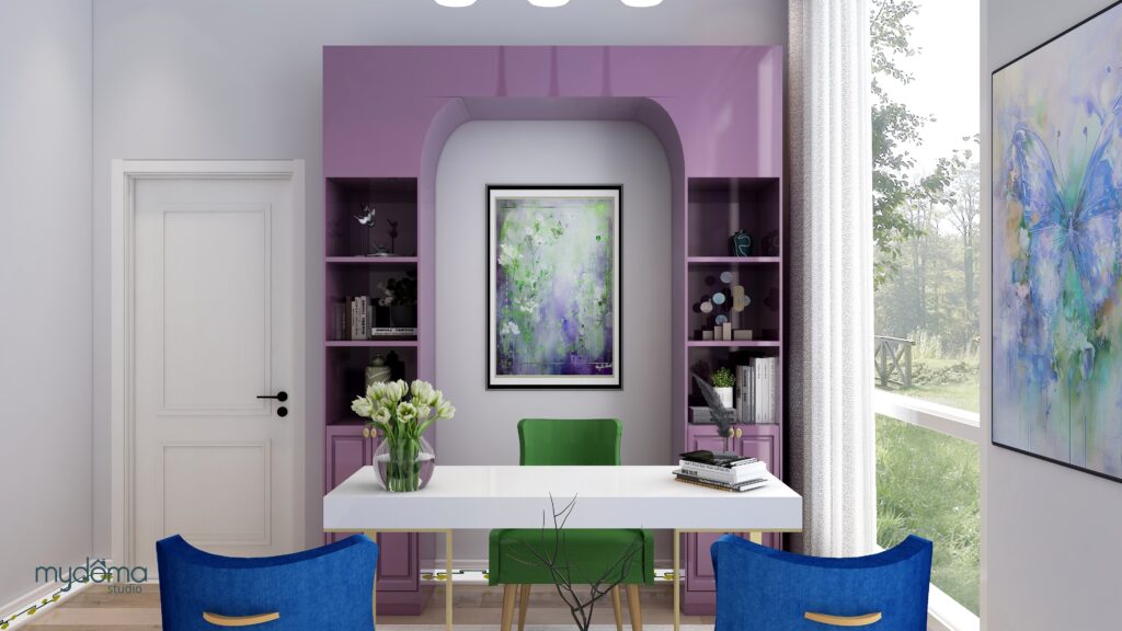
Light Gray: This can boost the selling price. Example: “Gray Screen” from Sherwin-Williams.

Sherwin Williams “Gray Screen”
Benjamin Moore: “Gray Owl”
Benjamin Moore: “Classic Gray”
Sherwin-Williams: “Repose Gray”
Sherwin-Williams: “Agreeable Gray”
Behr: “Seagull Gray”
Office using Sherwin Williams "Gray Screen" paint color.Edesign and Butterfly Medicine energy art by Northern Lights Home Staging and Design.
Office using Sherwin Williams “Gray Screen” paint color.Edesign and Butterfly Medicine energy art by Northern Lights Home Staging and Design.

Putting it All Together

You might be wondering if you can simply choose your favorite colors from the recommended list and expect a higher selling price. The answer is not quite that straightforward. These recommendations serve as guidelines, but your entire color palette must work cohesively, starting from the exterior of your home and flowing seamlessly to the interior. Both exterior and interior colors should align with and complement fixed finishes that you don’t plan to change much, such as your roofing material, stonework, interior countertops, fireplaces, and flooring. It’s like solving a puzzle where each piece must fit together to create the whole picture.

When executed correctly, your color choices can be extraordinary, enhancing the overall appeal of your home. However, if the colors clash or feel disjointed, even if you can’t pinpoint the issue, potential buyers may sense that something isn’t quite right. The most effective strategy is to enlist the expertise of a certified color strategist who can curate a harmonious color palette based on your fixed finishes. By following these guidelines and working with a professional, you can increase your chances of selling your home faster and at a higher price.


Now that you understand more about color, why not let me help you get your colors right with a science based color consultation? Let’s get you the most possible on your home sale.

Not Your Average Color Consultation

Get Your Free Report


Ten Ways To Not Screw Up Picking Your Paint Colors


Why Work with Northern Lights Home Staging and Design

Aligned Design©– All Rights Reserved.

Terms of Service  |  Privacy Policy  |  Disclaimer |  Brochure

Prices are subject to change without notice.

Call 907-362-0065 today


Unlocking the Truth About Choosing Paint Colors

Unlocking the Truth About Choosing Paint Colors

Choosing paint colors can be a daunting task, causing stress and potential costly mistakes. Why is it so challenging? The truth is, much of the advice out there on selecting harmonious paint colors is misleading. Making the wrong choice can either drain your wallet or haunt you daily in your living space. Let’s set the record straight.”

Seeking Answers in All the Wrong Places

Perhaps you’ve scoured blogs by renowned color experts or relied on the advice of your local paint store. Maybe you’ve taken to online forums like Houzz, seeking the perfect color for your space, only to receive a multitude of well-intentioned yet ultimately inconclusive responses. It’s possible you trust your own color intuition implicitly, thinking you’ve got it all figured out. But how’s that working for you?

I embarked on a personal journey to comprehend the intricacies of color, and I’ve come to a profound realization. I now understand more than ever why people grapple with paint color choices and why costly mistakes are nearly inevitable. I’ve been down that road myself!”

Unlocking the Truth About Picking Paint Colors
Ever screw up picking your paint colors?

I’ve always had a deep love for color and a keen sense of what shades complemented each other. My exceptional memory for colors served me well when shopping for items that needed to match a particular hue. I relied on my innate ‘color sense’ for years.


When I started my home staging and design business, I quickly realized the significance of selecting the right paint colors to help homeowners sell their properties.


While I grasped the importance of neutral tones to appeal to a broader spectrum of buyers, the process of picking specific colors often boiled down to following guidelines created by others. These guidelines were often based on personal, subjective opinions and their own ‘color sense.’ Unfortunately, the rationale behind these color choices was rarely explained in detail.


Unlocking the Truth About Picking Paint Colors
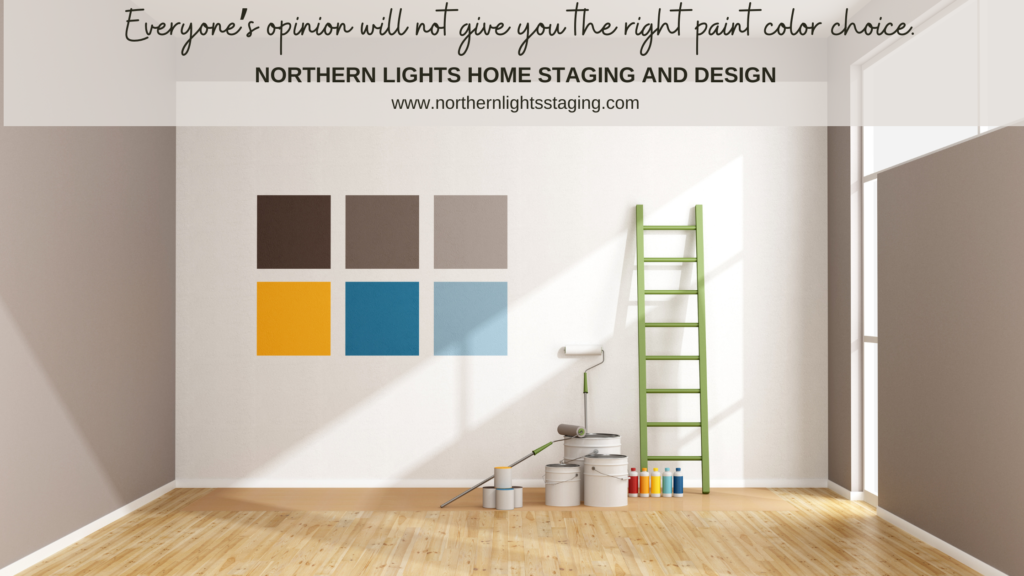
Every space is unique, and relying on others’ opinions for your color choices won’t necessarily yield the right answer. In fact, painting a bunch of swatches on your wall, like this, can invite color mistakes. Discover why by downloading my free report, ‘Ten Ways Not to Make Mistakes When Choosing Your Paint Colors.

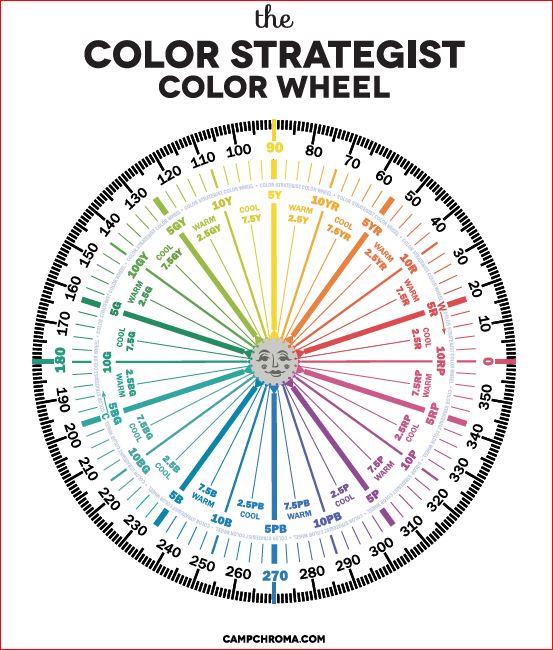
Desiring a deeper understanding and grappling with the challenge of identifying ‘undertones,’ I decided to undergo color training to become a certified color expert. The training provided insights into identifying ‘warm and cool’ color schemes and recognizing ‘undertones.’ However, these insights were based on the trainer’s visual perception, leaving me without clear instructions on how to determine ‘undertones’ independently. Essentially, I was instructed to assess colors against a ‘white’ background and rely on my own visual perception.

My quest for knowledge led me to explore various blogs and podcasts by numerous ‘color experts,’ each of whom had developed their unique methods for explaining color relationships and their perceptions of what worked harmoniously together. The conflicting information left me feeling increasingly bewildered.

At one point, I even considered the possibility that paint companies held the secret to understanding undertones. I reached out to them, seeking answers about whether certain colors would complement one another. I spent hours examining color fan decks, convinced that hidden secrets lay in the arrangement of colors on those sheets. I couldn’t have been more wrong!”


Unlocking the Truth About Picking Paint Colors
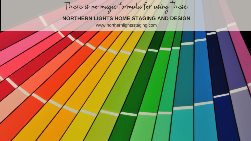
There really is no secret code to how paint fan decks are ordered.

My understanding of how color worked seemed to improve over time. I had accumulated a wealth of ‘rules of thumb,’ advice, and lists of harmonious color combinations from well-intentioned color experts. Yet, a sense of mystery persisted, and I felt like I hadn’t truly grasped the essence of color theory, especially given the divergent approaches of these experts.

The Turning Point: The Science of Color

My quest for answers eventually led me to the world of color science—a turning point in my journey. Here, I discovered how color truly operates, from the principles governing its behavior to the rules of color order, and how to solve intricate color puzzles.

I learned that the term ‘undertone,’ often used by those who lack an understanding of color science, is an inaccurate description. It merely represents a subjective opinion of color based on individual visual perception. Remarkably, we all perceive color in our unique ways.


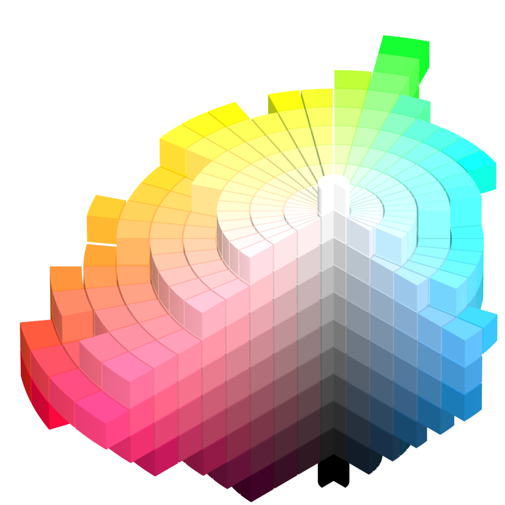
My breakthrough came when I enrolled in ‘The Four Pillars of Color,’ a course taught by Lori Sawaya through Camp Chroma. This course introduced me to the Munsell Color System, a century-old foundation for comprehending color. It provides the framework for how colors are organized, how paint shades are determined, and how color remains consistent in various products. It specifies colors based on three properties of color: hue (basic color), chroma (color intensity), and value (lightness).

Each color can be likened to having its own ‘DNA,’ consisting of four distinct aspects that render it unique. While it may sound intricate, this system offers an orderly and logical approach to understanding color.”


Musell color space
The Munsell Color Space

Saturday Night Live Art Shows and A Passion for Purple
Color science makes understanding , measuring and describing color easy.

I discovered that the fan decks from paint companies lack logical ordering, and the concept of ‘undertones,’ as most color experts use it, doesn’t hold water. Surprisingly, a significant portion of the color information available is simply incorrect.

While some artists and designers may dismiss the use of science as a fun spoiler, I challenge them to consider whether they’ve ever made color mistakes and wished they had a clear understanding of why. Are they aware that each person perceives color slightly differently? How can they be certain that their perception aligns with that of their clients? Relying solely on ‘color sense’ is a highly subjective approach. Even those who believe they’ve found a magic formula through color-measuring tools and apps can benefit immensely from comprehending the underlying data and its practical applications.

The True Magic Lies in Blending Art and Color Science

In truth, selecting appealing color combinations still hinges on your personal preferences and those of your clients. There exists a beautiful synergy between the art and science of color selection. A proficient color strategist possesses the ability to merge these elements seamlessly, offering not only a keen eye for color but also the scientific knowledge to refine selections. With the right expertise, the perfect colors become an achievable reality.

Get Your Colors Right the First Time

Now that you understand more about color, why not let me help you get your colors right with a science based color consultation?


Not Your Average Color Consultation


Ten Ways To Not Screw Up Picking Your Paint Colors


Why Work with Northern Lights Home Staging and Design

Aligned Design©– All Rights Reserved.

Terms of Service  |  Privacy Policy  |  Disclaimer |  Brochure

Prices are subject to change without notice.

Call 907-362-0065 today