Ways to Use Sherwin Williams Urbane Bronze
When I first saw Sherwin William’s “Urbane Bronze”, I was unsure how I felt about it. Browns can be nice to work with, rather serene and a color of nature so nice to “bring the outside in”.
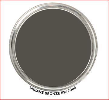
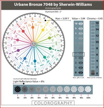
According to the color data Urbane Bronze is actually a yellow hue (really, it’s true) that looks brown because of it’s low chroma and lightness.
Sherwin Williams describes Urbane Bronze as as a color to
“Tap into nature with a hue whose warmth and comfort breathe down-to-earth tranquility”.
“As we’re looking to create the ultimate retreat for reflection and renewal, we’re turning to a hue whose natural simplicity and nature-inspired energy cultivate a sense of calm from the ground up.”
“The trend for biophilia continues to shape our spaces, proving that nature is never far away. Urbane Bronze might be a color rooted in nature, but it also has a unique ability to ground a room through organic appeal.”
OK, so it is supposed to help us feel rooted to nature. I thought about where I may have seen this color in nature. Maybe along mudflats at the beach, possibly in rocks and some types of earth. It does remind me a bit of the color of sea otter fur.

Master Bedroom Design
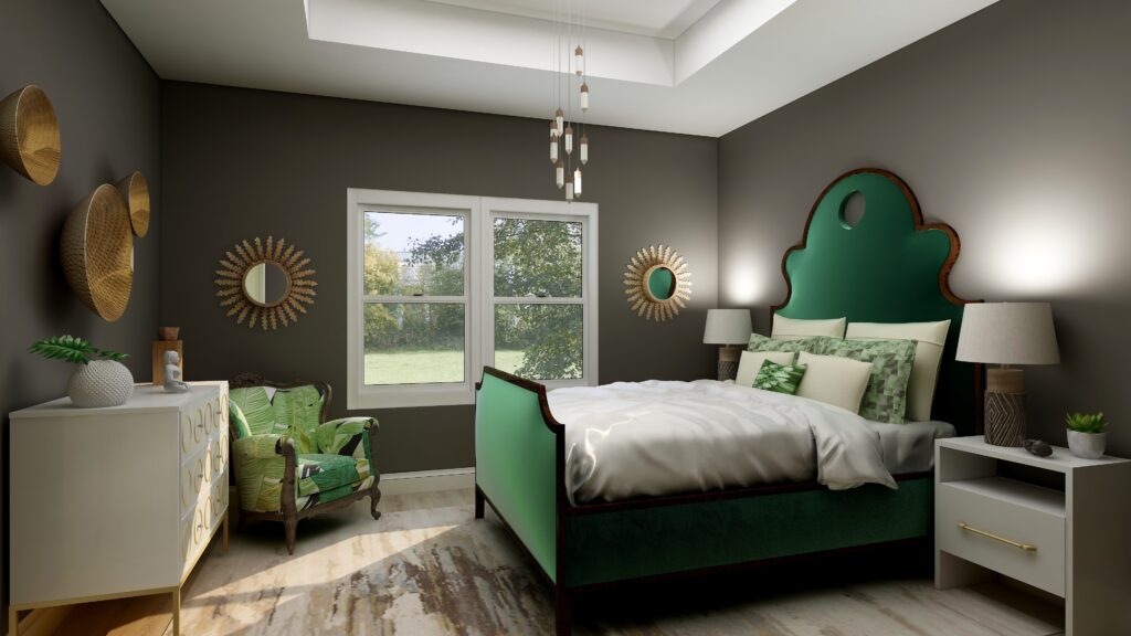
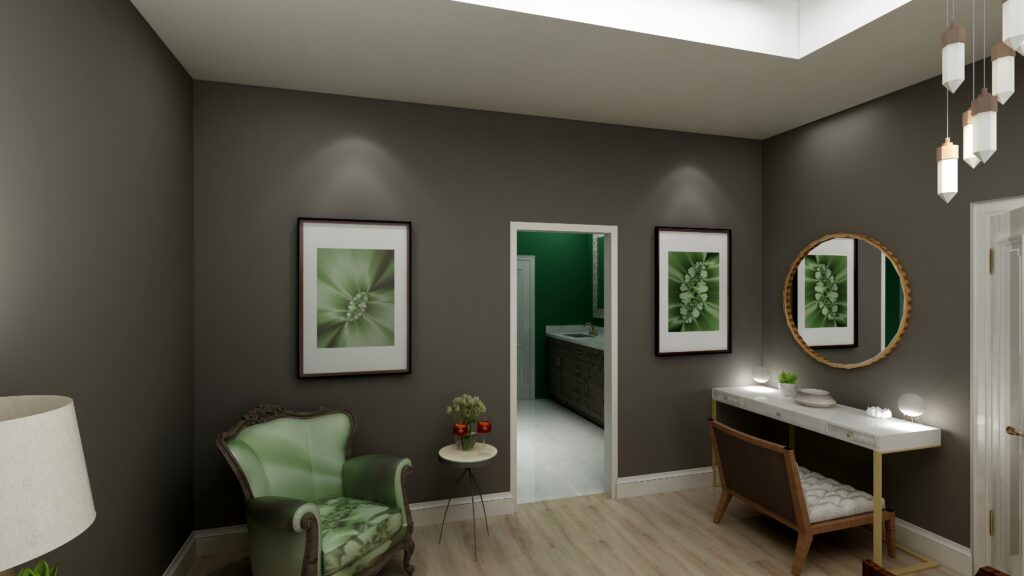
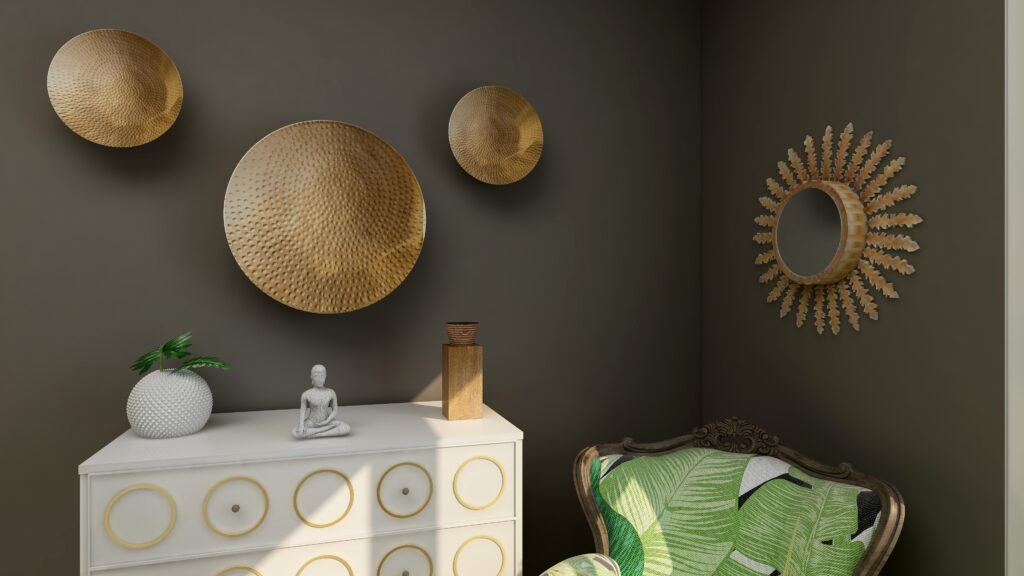
I used Urbane Bronze as the wall color with primarily dark and light greens, browns and white to create a color palette from nature.
Urbane Bronze is actually a Yellow hue, so this works because it is creating an analogous color scheme with yellow, yellow-green and green that are next to each other on the color wheel.
See my blog article on how to use analogous color schemes, Create a Harmonious Color Scheme- Go Analogous.
The mixture of soft fabrics with different metals, wood and pottery add natural elements and a variety of textures.
What are the Pros and Cons of Choosing a Bronze Paint Color?
Pros of Working with a Bronze Colored Paint:
- Warm and Inviting: Bronze paint adds warmth to a room and can create a cozy and welcoming ambiance.
- Versatile: Suits both modern and traditional interiors, complementing a wide range of décor styles.
- Sophisticated: The metallic sheen can lend an air of sophistication and luxury.
- Pairs Well: It complements a variety of other colors, especially earth tones, deep blues, and greens.
- Accentuates Features: Great for highlighting architectural details, moldings, or feature walls.
- Durability: Metallic bronze paints can often be more durable and resistant to damage than flat finishes.
- Light Reflectivity: Its slight sheen can reflect light, making spaces feel more vibrant and sometimes larger.
Cons of Working with a Bronze Colored Paint:
- Application Difficulty: Metallic and bronze paints can show brush strokes or roller marks more easily than flat paints.
- Prep Work: Imperfections on walls, like dents or scratches, can be accentuated, requiring more prep work.
- Trend Sensitivity: While classic, certain shades of bronze may go in and out of trend, potentially dating the décor.
- Overwhelming: In small spaces or spaces without a lot of natural light, bronze can feel a bit overwhelming or dark.
- Cost: Quality metallic paints, including bronze, can sometimes be more expensive than standard paints.
- Maintenance: Fingerprints, smudges, or dirt can be more noticeable, requiring more frequent cleaning.
- Limited Availability: Not all paint brands offer a wide variety of bronze shades, limiting choices.
Remember, the success of using bronze paint largely depends on the specific shade of bronze, the room’s lighting, its size, and the accompanying decor. Always test a sample on the wall before committing to a full paint job.
Are You Inspired?
Get your colors right the first time with an expert science based color consultation.


Aligned Design©– All Rights Reserved.
Terms of Service | Privacy Policy | Disclaimer | Brochure
Prices are subject to change without notice.
Call 907-362-0065 today