

Mary Ann Benoit-Northern Lights Home Staging and Design
"Making Magic Happen—Create a Home & Life in Alignment with Your Highest Self", 907-362-0065
Comments are closed.
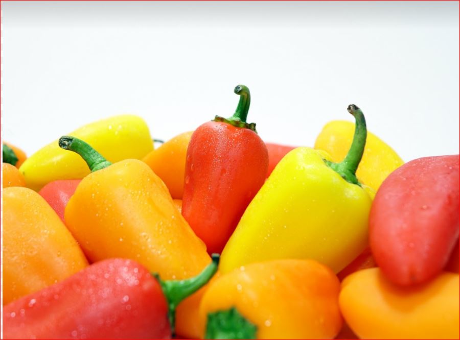
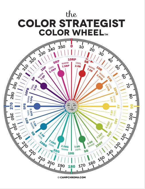
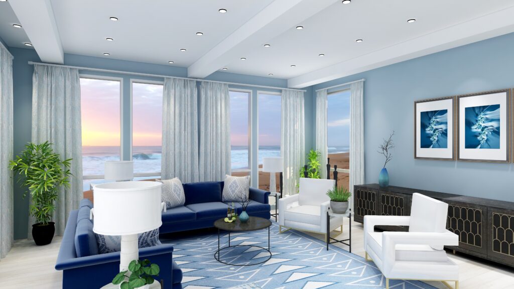
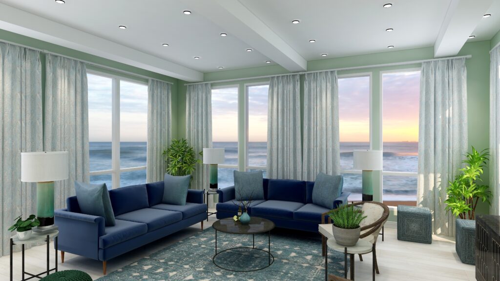
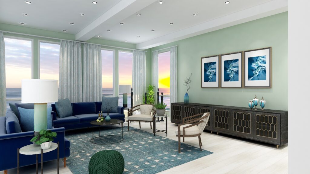
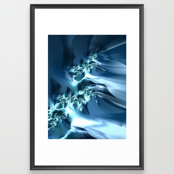
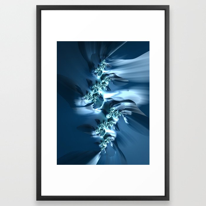
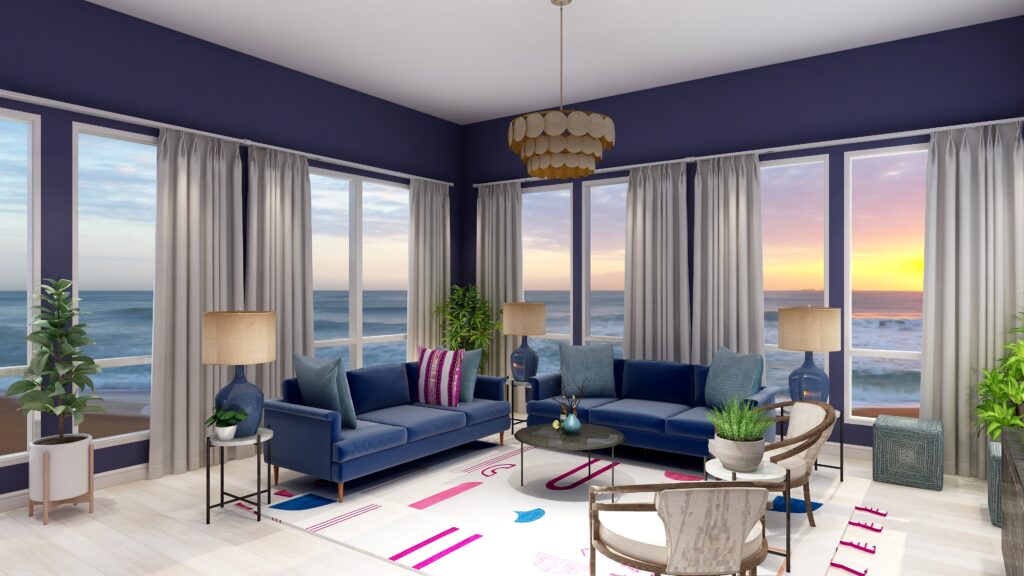
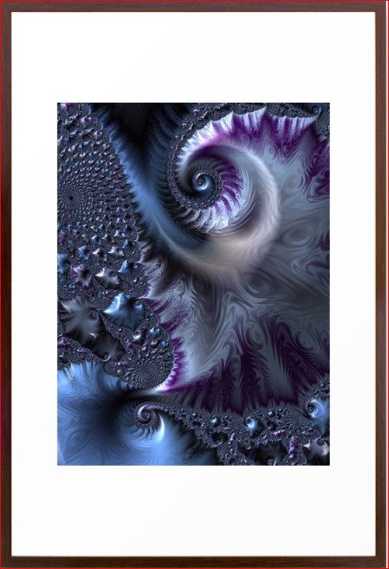
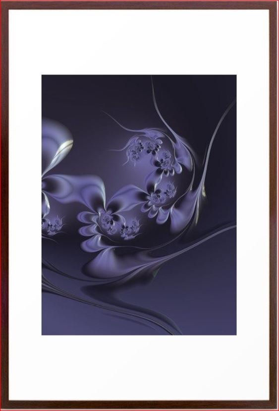
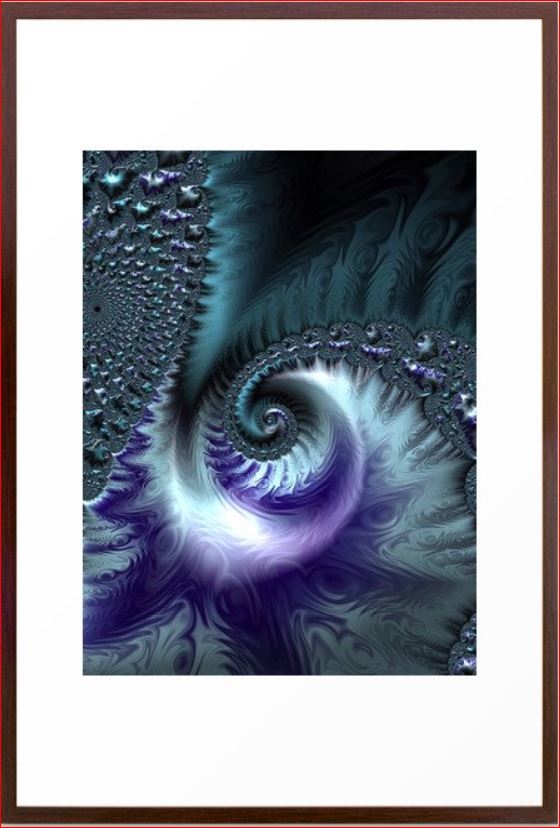
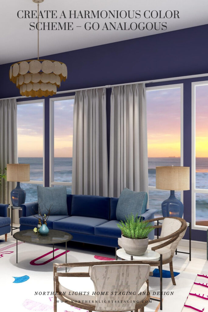
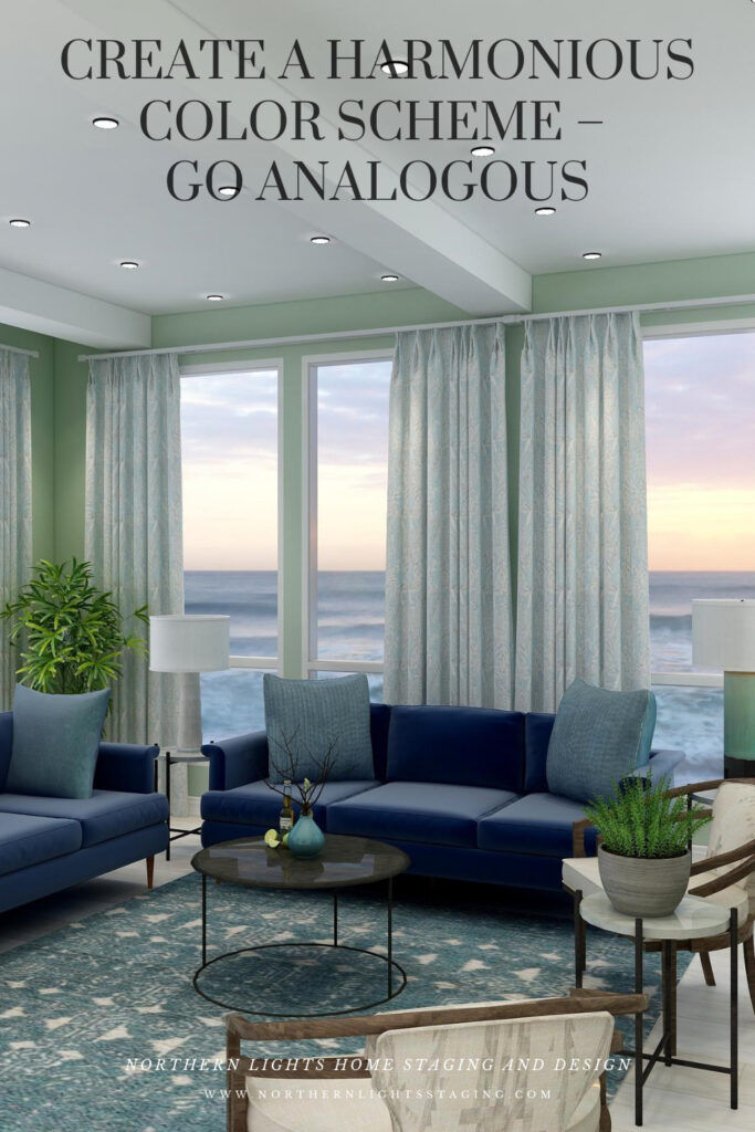
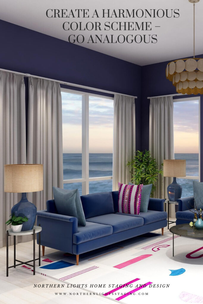
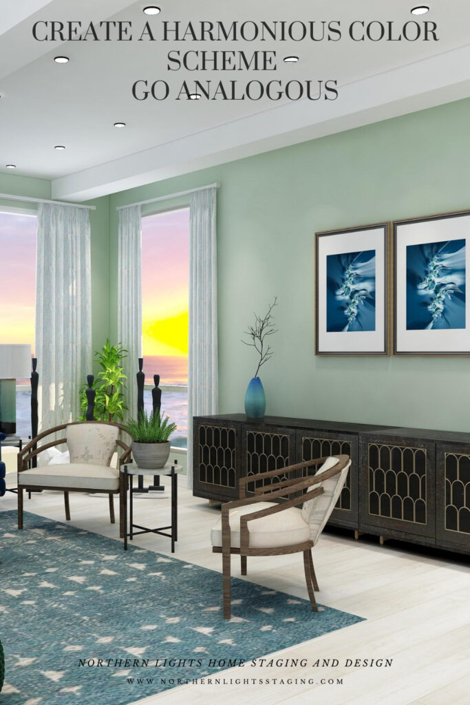
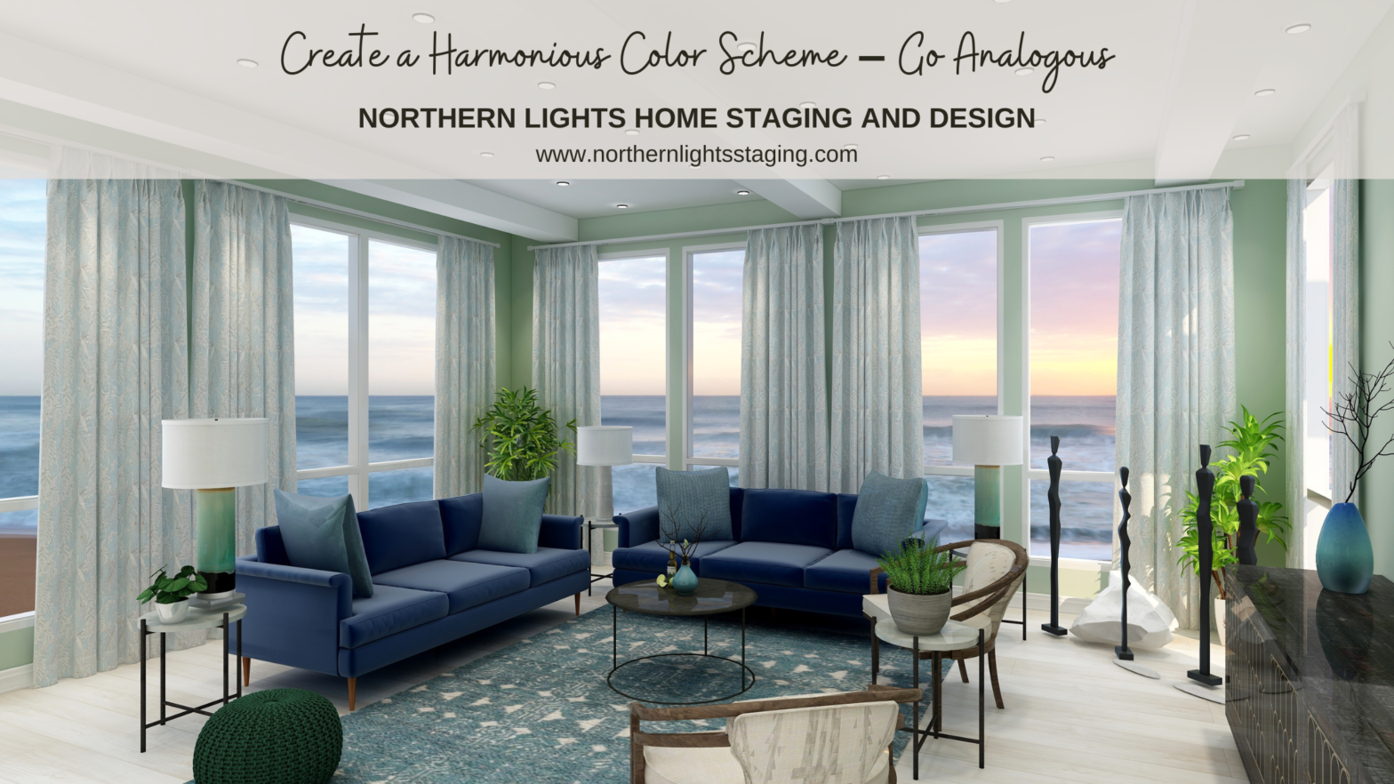
Wonderful color schemes and explanation of analogous color schemes!
Thanks so much Linda!
Love your examples of analogous color schemes – you are on my favorite side of the color wheel :). And I couldn’t agree more – your home should make you happy, re-energized, and refreshed! Living your best life starts at home!
Thank Janet! I agree, I think a beautiful home that reflects you can make a huge difference in how you feel every day.
Mary Ann, what beautiful examples of analogous color schemes and the serene looks you can create.
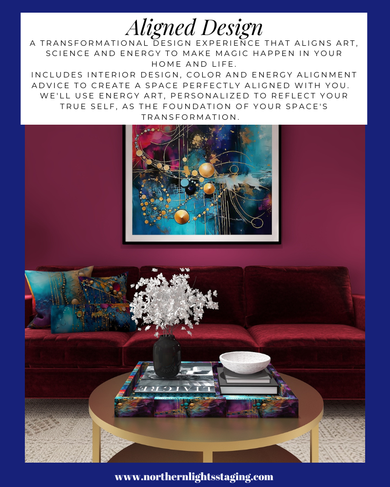
Love your examples- your renderings are just amazing!!
Thank you so much Christie!
Lovely examples! You’re clients will be so happy!
Thank you Suzi!