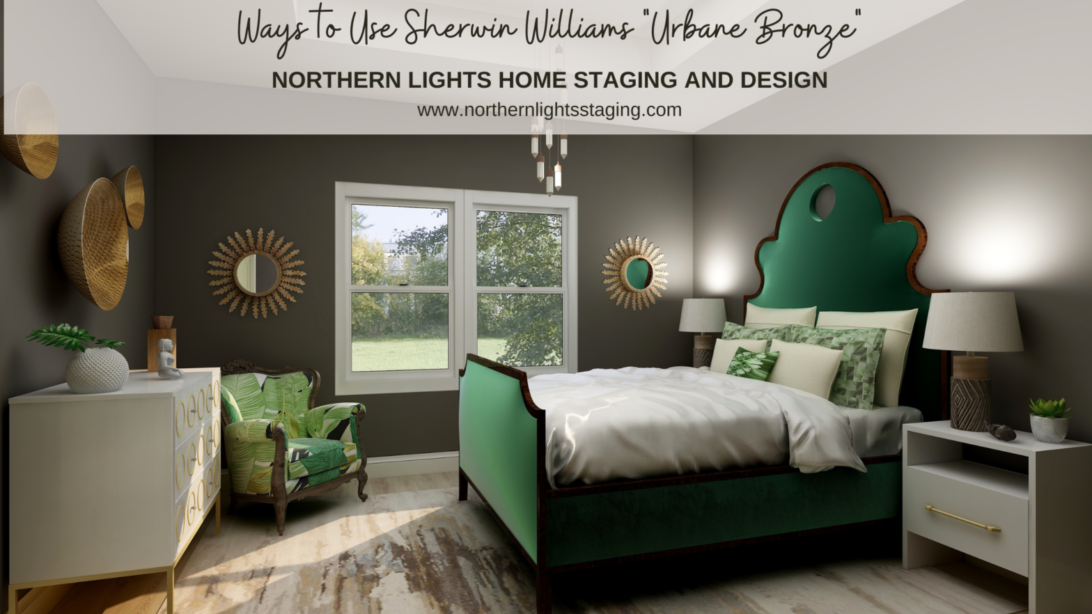
When I first saw Sherwin William’s “Urbane Bronze”, I was unsure how I felt about it. Browns can be nice to work with, rather serene and a color of nature so nice to “bring the outside in”. Sherwin Williams 2021 Color of the Year, Urbane Bronze. Graphic by Camp Chroma. According to the color data… Continue reading Ways to Use Sherwin Williams Urbane Bronze
Tag: color consulting
How to Pick the Perfect Exterior Paint Colors
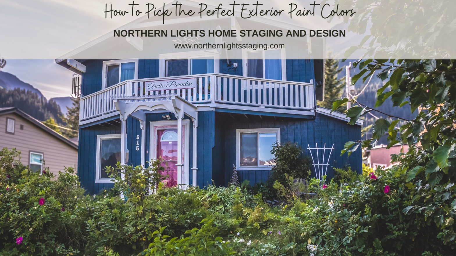
Choosing the right exterior paint color can be daunting; it’s not just about personal preference but about making a choice that the entire neighborhood sees! Plus, a misstep can be pricey to correct. Why is exterior paint selection so challenging? First, determine your purpose: are you painting to sell or are you refreshing your home’s… Continue reading How to Pick the Perfect Exterior Paint Colors
Ways to Use Benjamin Moore’s Aegean Teal
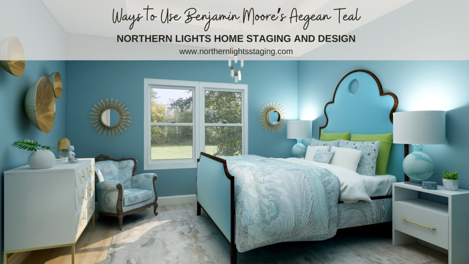
As a certified color strategist, love playing with beautiful color. One of my favorites is Benjamin Moore’s “Aegean Teal”. Benjamin Moore’s 2021 Color of the Year, Aegean Teal. Graphic by Camp Chroma. Benjamin Moore describes Aegean Teal, as “A blend of blue-green and gray, Aegean Teal 2136-40 is an intriguing mid-tone that creates natural harmony.” According… Continue reading Ways to Use Benjamin Moore’s Aegean Teal
Celebrate Your Favorite Color – Go Monochromatic
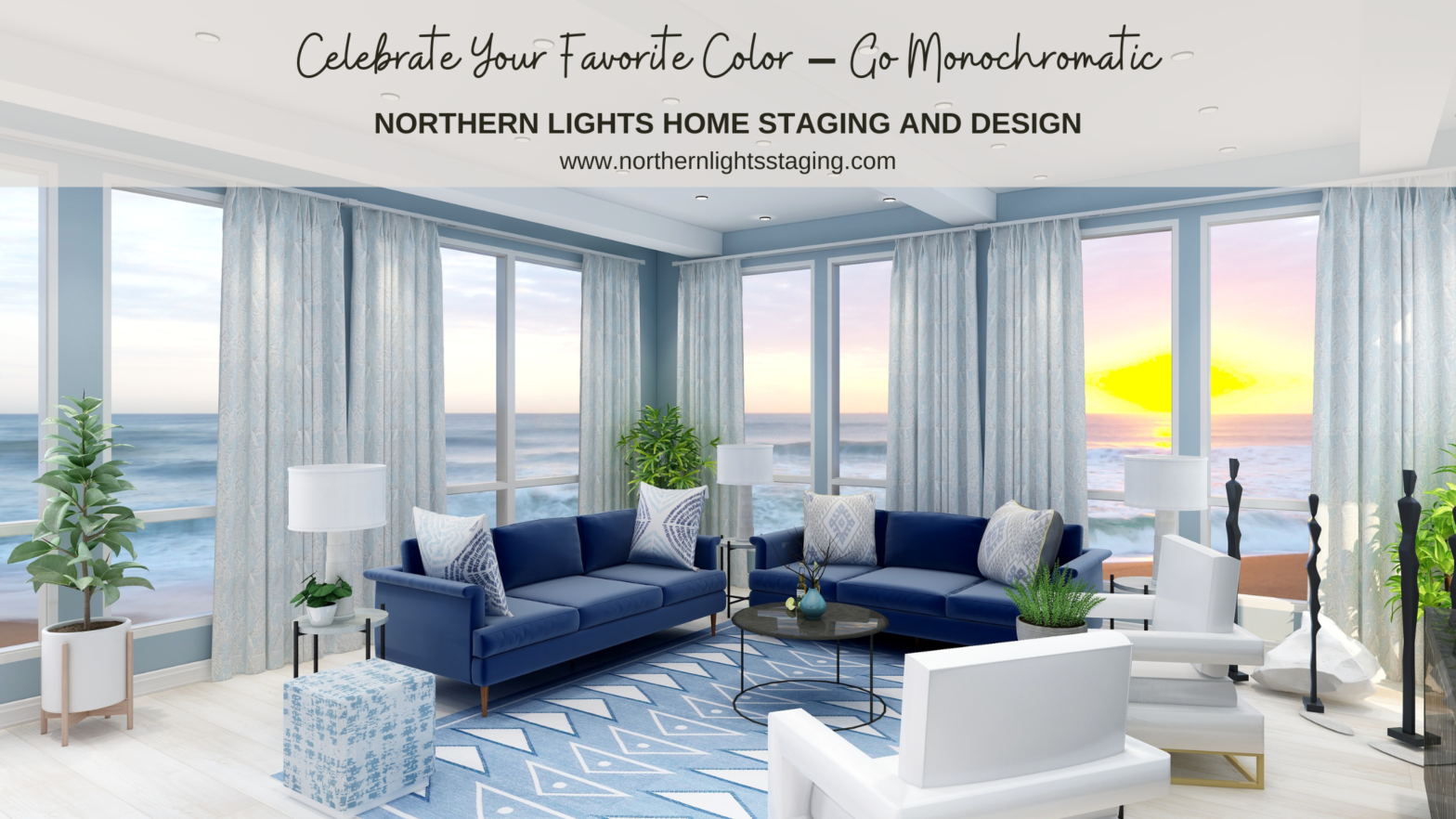
Many people struggle with finding the perfect color scheme, often bound by the constraints of their existing finishes. But what if we make this more fun? Imagine magnifying and embracing your favorite color wholeheartedly. Welcome to the world of Monochromatic design! Monochromatic schemes delve deep into one hue, exploring its diverse shades, tones, and tints.… Continue reading Celebrate Your Favorite Color – Go Monochromatic
Create a Harmonious Color Scheme – Go Analogous
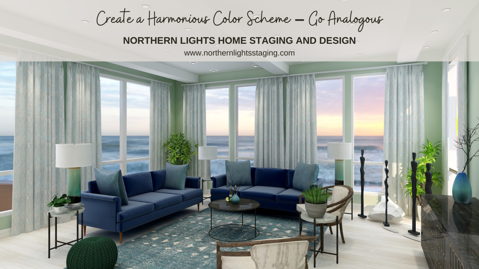
People often struggle with creating a great color scheme. Often, we start the conversation by talking about the limitations, or the box of colors you need to play with based on your fixed finishes. In my last article, Celebrate Your Favorite Color- Go Monochromatic, we talked about how you could take your favorite color and… Continue reading Create a Harmonious Color Scheme – Go Analogous
Opposite Colors Attract – Go Complimentary
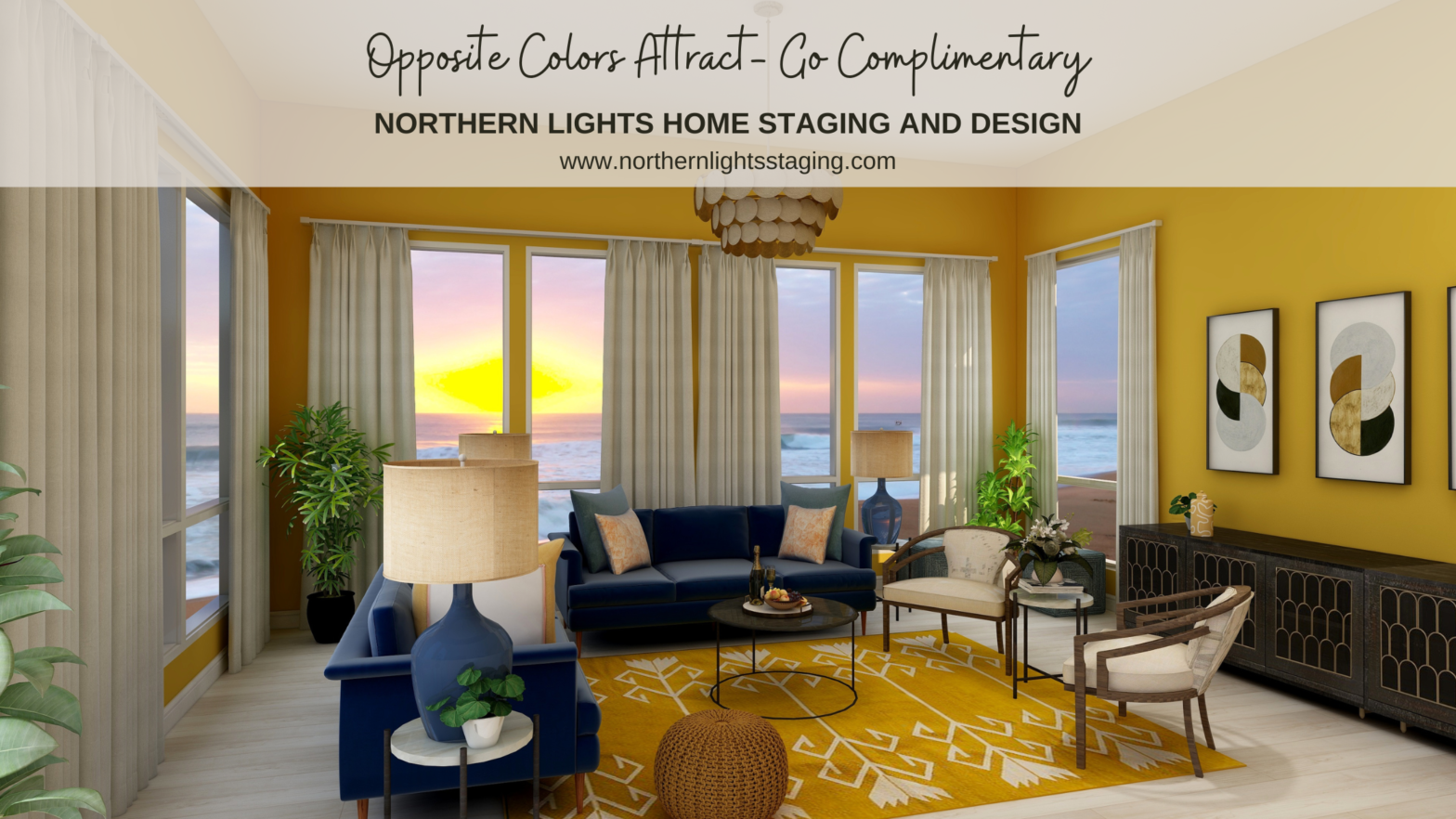
Crafting the perfect color palette can be a daunting task for many. Often, the starting point revolves around fixed finishes and certain constraints. In my recent blog posts, we’ve delved into constructing color schemes from a favorite hue, like blue. We’ve explored monochromatic and analogous palettes, and today, we’re diving into complementary color schemes. … Continue reading Opposite Colors Attract – Go Complimentary
What Does the Color of Your House Say About You?
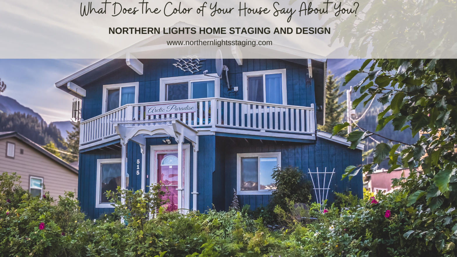
What message does your home’s color broadcast to the world? Every facade tells a story about its inhabitants. Is your home a reflection of your personality? Does it uplift your spirits daily? Does it warmly welcome guests or potential clients for those with home businesses? And if you’re selling, does your home appeal to prospective… Continue reading What Does the Color of Your House Say About You?
How a Silly Facebook Quiz Changed My Life

Here is the crazy story of how I started Northern Lights Home Staging and Design. You never know when inspiration will hit. The question is, will you take action and do something about it? My inspiration came in a surprising way, from one of those silly “Facebook” quizzes. You know, one of those games that… Continue reading How a Silly Facebook Quiz Changed My Life
The Colors of Summer- Bring the Outside In
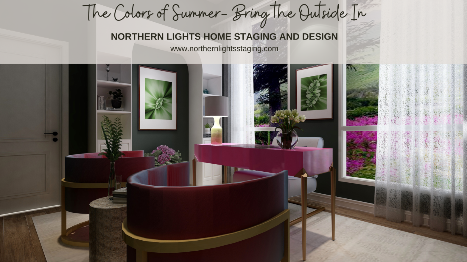
Summer is one of my favorite times of year. It’s warm and the outdoors beckons, the colors explode with flowers, fruit, an explosion of green growth and the showiness of all the male birds. There is a feeling of abundance and adventure. Completion of all the things you have sown. It is bold and beautiful.… Continue reading The Colors of Summer- Bring the Outside In
Want a Beautiful House? Make a Plan!
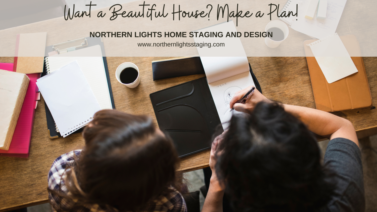
Want a beautiful house? The key to success is to make a plan! Figure out what you need to create the design you want, and if it fits in your budget before you buy a single thing! Make a Plan You are much more likely to get the end result you want if you start… Continue reading Want a Beautiful House? Make a Plan!