
How Much Can Paint Color Increase Your Home’s Sale Price? The impact of paint color on a home’s sale price has been the topic of numerous studies and analyses, primarily conducted by real estate companies and platforms who have access to vast amounts of sale data. One of the most cited sources on this topic is Zillow, an online real estate marketplace. Zillow released an analysis in their “Zillow Paint Color Analysis” that looked at how certain paint colors in specific home areas impacted the Read more […]
Tag: Alaska color consulting
Let’s Solve Your Paint Color Dilemma

Considering a fresh coat of paint for your home’s exterior? It’s amazing how a new shade can give both your home and your spirits a lift. However, this exciting change can sometimes lead to the all-too-common paint color dilemma. It’s something every homeowner encounters. Whether you’re updating the entire exterior, adding a pop to a single room, or just revamping a door, choosing the right shade is crucial. The stakes? Picking a color that doesn’t match your vision, leaving you wondering Read more […]
Unlocking the Truth About Choosing Paint Colors
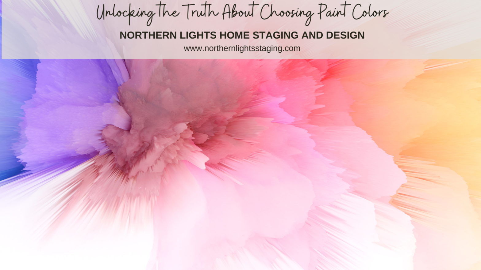
Unlocking the Truth About Choosing Paint Colors Choosing paint colors can be a daunting task, causing stress and potential costly mistakes. Why is it so challenging? The truth is, much of the advice out there on selecting harmonious paint colors is misleading. Making the wrong choice can either drain your wallet or haunt you daily in your living space. Let’s set the record straight.” Seeking Answers in All the Wrong Places Perhaps you’ve scoured blogs by renowned color experts or relied on the Read more […]
Ways to Use Sherwin Williams Urbane Bronze

When I first saw Sherwin William’s “Urbane Bronze”, I was unsure how I felt about it. Browns can be nice to work with, rather serene and a color of nature so nice to “bring the outside in”. Sherwin Williams 2021 Color of the Year, Urbane Bronze. Graphic by Camp Chroma. According to the color data Urbane Bronze is actually a yellow hue (really, it’s true) that looks brown because of it’s low chroma and lightness. Colorography of Urbane Bronze by Lori Sawaya of Camp Chroma. Sherwin Williams Read more […]
I Bet You Made These Three Color Mistakes

I Bet you. Why? Because most people do. Why? Because this bad advice is all over the internet. Why? Because people continue to repeat this bad information on blogs and in forums, so most people think it is true. Mistake #1-Testing paint colors against a white background People often think white is a perfect neutral background to see the true characteristics of the color they are testing. Looking at your color against the old paint color can affect your perception of the new color. White seems Read more […]
Celebrate Your Favorite Color – Go Monochromatic
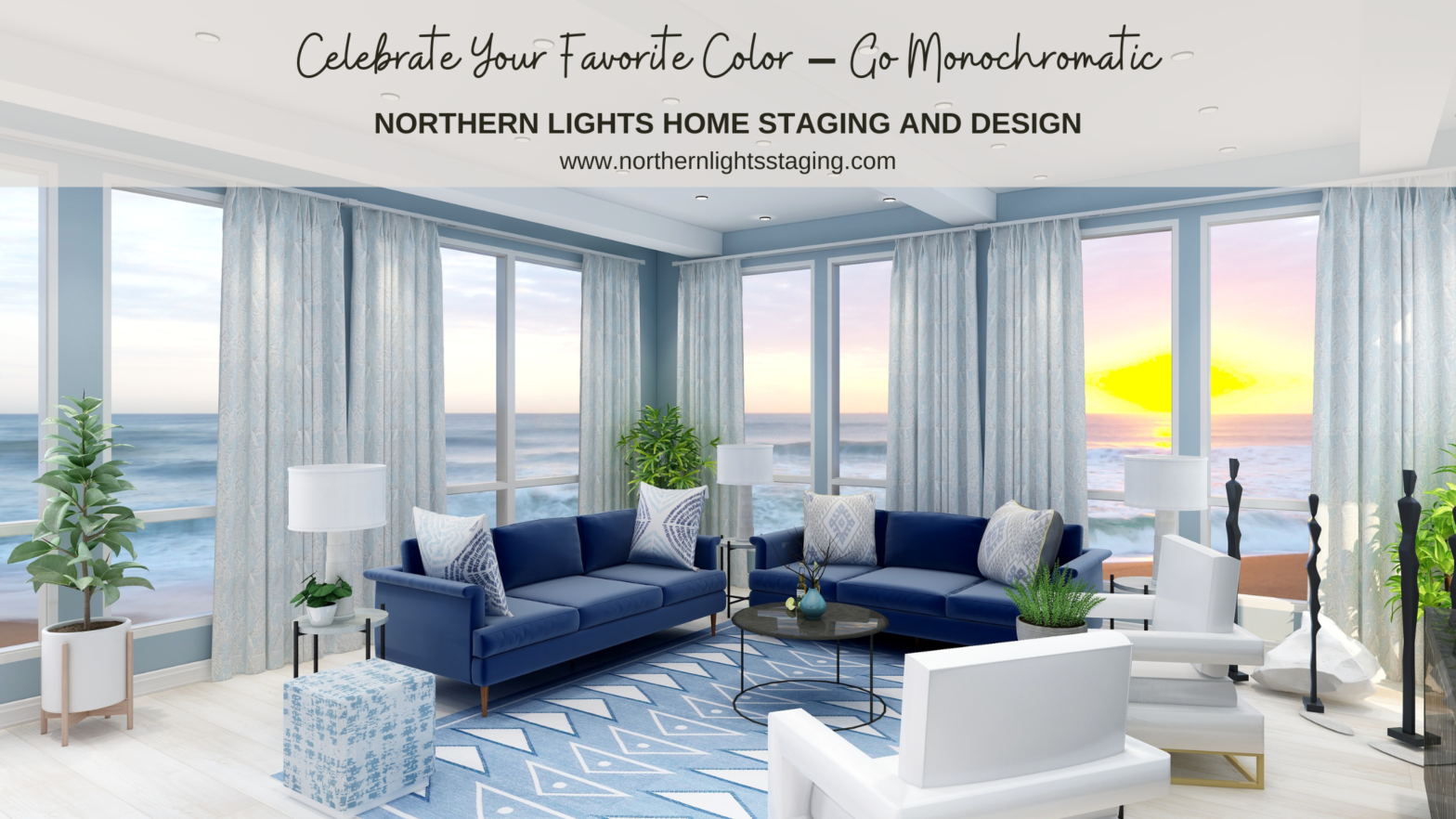
Many people struggle with finding the perfect color scheme, often bound by the constraints of their existing finishes. But what if we make this more fun? Imagine magnifying and embracing your favorite color wholeheartedly. Welcome to the world of Monochromatic design! Monochromatic schemes delve deep into one hue, exploring its diverse shades, tones, and tints. Visualize your cherished color transitioning from its lightest whisper to its richest depth, seamlessly incorporating white and black. Read more […]
Create a Harmonious Color Scheme – Go Analogous
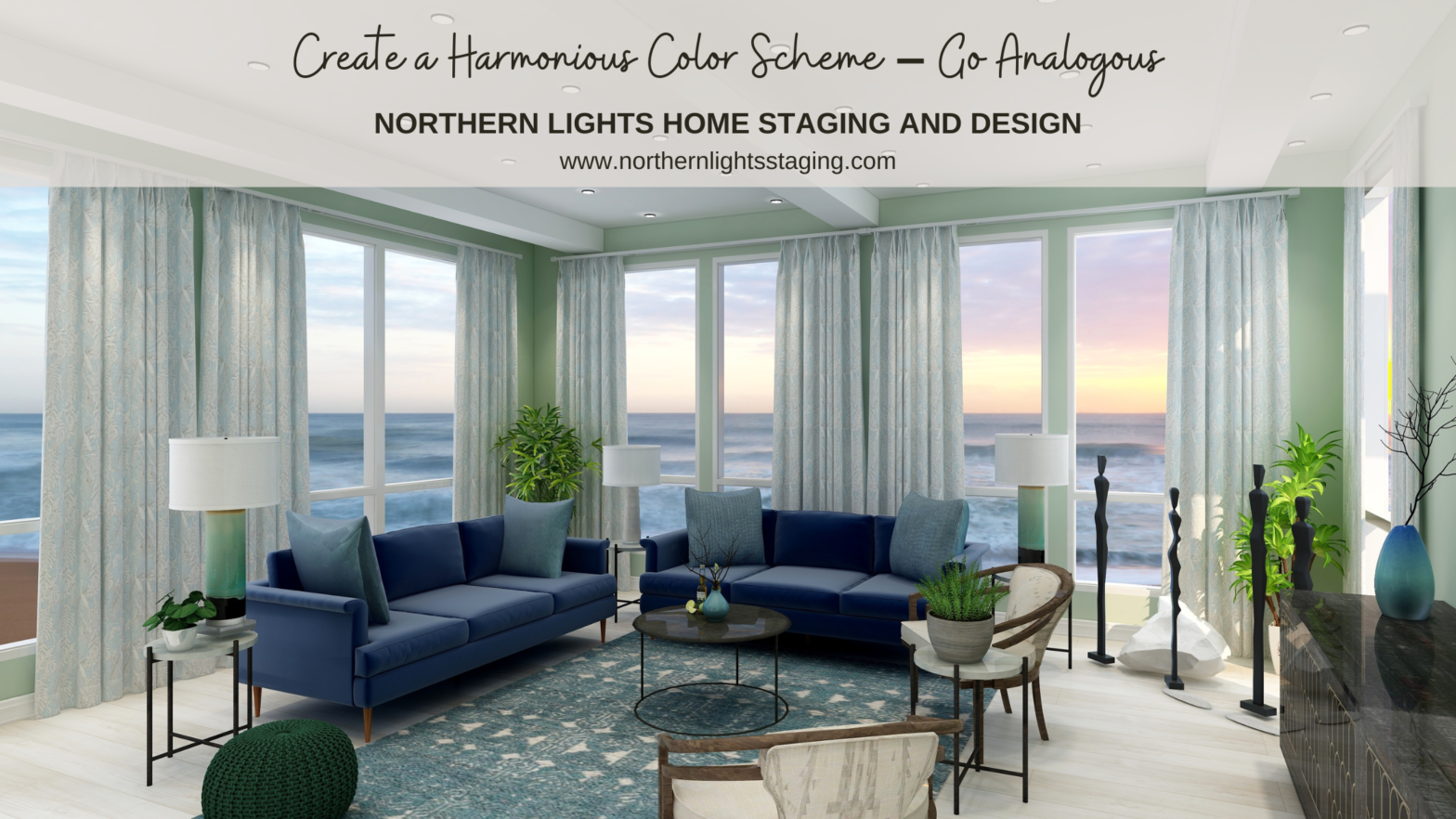
People often struggle with creating a great color scheme. Often, we start the conversation by talking about the limitations, or the box of colors you need to play with based on your fixed finishes.In my last article, Celebrate Your Favorite Color- Go Monochromatic, we talked about how you could take your favorite color and celebrate it in all it’s glory with a monochromatic color scheme. Simple and easy!What if you would like a little more color variety, but still want something that is simple Read more […]
Opposite Colors Attract – Go Complimentary

Crafting the perfect color palette can be a daunting task for many. Often, the starting point revolves around fixed finishes and certain constraints. In my recent blog posts, we’ve delved into constructing color schemes from a favorite hue, like blue. We’ve explored monochromatic and analogous palettes, and today, we’re diving into complementary color schemes. Complementary colors are a pairing of hues that sit opposite each other on the color wheel. When juxtaposed, they amplify each other’s vibrancy Read more […]
The Colors of Summer- Bring the Outside In

Summer is one of my favorite times of year. It’s warm and the outdoors beckons, the colors explode with flowers, fruit, an explosion of green growth and the showiness of all the male birds. There is a feeling of abundance and adventure. Completion of all the things you have sown. It is bold and beautiful. Would you like to have that same look and feeling inside in your home year round? Take some color and other cues from nature and bring the outside in. Here is an example of what I mean. This Read more […]
Want a Beautiful House? Make a Plan!

Want a beautiful house? The key to success is to make a plan! Figure out what you need to create the design you want, and if it fits in your budget before you buy a single thing! Make a Plan You are much more likely to get the end result you want if you start with a plan! Often, people start buying things they like, hoping that it will all work together. This may not work because the styles or colors may not fit well together, or they may end up buying too many colors and patterns because they Read more […]