Celebrate Your Favorite Color – Go Monochromatic

Celebrate your favorite color- go monochromatic!

People often struggle with creating a great color scheme.  Often, we start the conversation by talking about the limitations, or the box of colors you need to stay within based on your fixed finishes. Today, let’s talk about something more fun. If you could take your favorite color and celebrate it in all it’s glory, what could that look like? Monochromatic!

Monochromatic color schemes are based on a single hue and use various shades, tones and tints of that color. Picture your favorite color in a range of light to dark, including white and black.

Celebrate your favorite color- go monochromatic!
Example of a monochromatic blue color palette. Photo by

Why does it work? It creates a sense of harmony because of the visual cohesion created from using one hue. You may have heard the design rule that “All greens go together” or “All blues go together” etc. Because they all have something in common such as the hue, they all work together.

Isn’t monochromatic boring? NO! The absence of contrasting colors can be offset by using a range of “blue” hues for example rather than just one.  You can also create drama and interest with patterns and textures.

For example, I could create a monochromatic color scheme by using the blue at 230 degrees on the color wheel. Then I could use varying saturation levels of that color from white (no saturation) through light blue to darker blue and finally black. For even more variety, I could use hues from hue angles 235-250 (all still blue) at a variety of saturation levels.

When I select my design pieces, I can look for various materials, textures and patterns to add variety, such as mixing soft and hard, matte and shiny, smooth and rough, curves and straight lines etc.

The Design

Here is an example of a living room I created using a blue monochromatic color scheme. The colors range from white to black with varying shades of light and dark blues in between in the paint colors, furnishings, drapes, lighting, accents and accessories. Granted, the green plants add another dimension of color that take it out of being totally monochromatic.

Celebrate your favorite color- go monochromatic! Edesign by NOrthern Lights Home Staging and Design
Monochromatic Blue Living Room Edesign and Spring Fractal Art by Northern Lights Home Staging and Design.
Celebrate your favorite color- go monochromatic! Edesign by NOrthern Lights Home Staging and Design
Monochromatic Blue Living Room Edesign and Spring Fractal Art by Northern Lights Home Staging and Design.

This design incorporates some of my original fractal art in a collection called “The Sea”, which reminded me of white caps on the ocean and also uses variety of blue shades.

The Sea fractal art by Northern Lights Home Staging and Design
The Sea
The Sea #2 fractal art by Northern Lights Home Staging and Design
The Sea #2
The Sea #3 fractal art by Northern Lights Home Staging and Design
The Sea #3

Shop the Look

Here are some of the pieces I used to create this space.  Some contain affiliate links meaning I receive a small commission at no additional charge to you.

To create interest, I mixed soft textures such as the velvet sofas with leather chairs and metal and stone accent tables. A variety of patterns occur in the rug, pouf, art and pillows.

Benefits of A Monochromatic Color Scheme

  • A monochramatic color scheme is relatively easy to put together. Pick your favorite color and play with it in all its glorious variations.
  • Monochromatic color schemes in greens, blues and neutrals can be very calm and relaxing. These are really nice for living rooms, dining rooms and bedrooms.
  • I think monochromatic color schemes allow more freedom to highlight textures and patterns without being overwhelming than in a space with more colors.
  • Read More about using monochromatic color schemes in other art forms such as photography.
Celebrate your favorite color- go monochromatic!
Edesign by Northern Lights Home Staging and Desigo

Celebrate Your Favorite Color

Picture this. You walk into your space and love the colors. Everything is as it should be. You feel happy.  It is a place to relax, recharge, and be inspired. When your home truly reflects you, everything is easier. 

Why not experiment and bring the colors of summer into your home….or whatever your favorite season is.

Purchase an Interior Design and or Color Consultation today.

What is Your Global Design Style? Take the Quiz

Why work with Northern Lights Home Staging and Design

Terms of Service  |  Privacy Policy  |  Disclaimer

Prices subject to change without notice.

Call 907-362-0065 today

 info@northernlightsstaging.com

Pin These

Celebrate your favorite color- go monochromatic! Edesign by NOrthern Lights Home Staging and Design
Celebrate your favorite color- go monochromatic!

By Mary Ann Benoit

President- Northern Lights Home Staging and Design Owner- Arctic Paradise Bed and Breakfast Artist- Stained Glass, Jewelry and Alcohol Ink Art Wildlife Biologist Director- Kaleido World Percussion and Dance Company Director- Tavus Dance Company of Alaska Lover of music, art, dance and animals.

12 comments

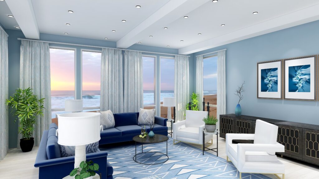
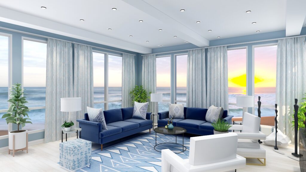
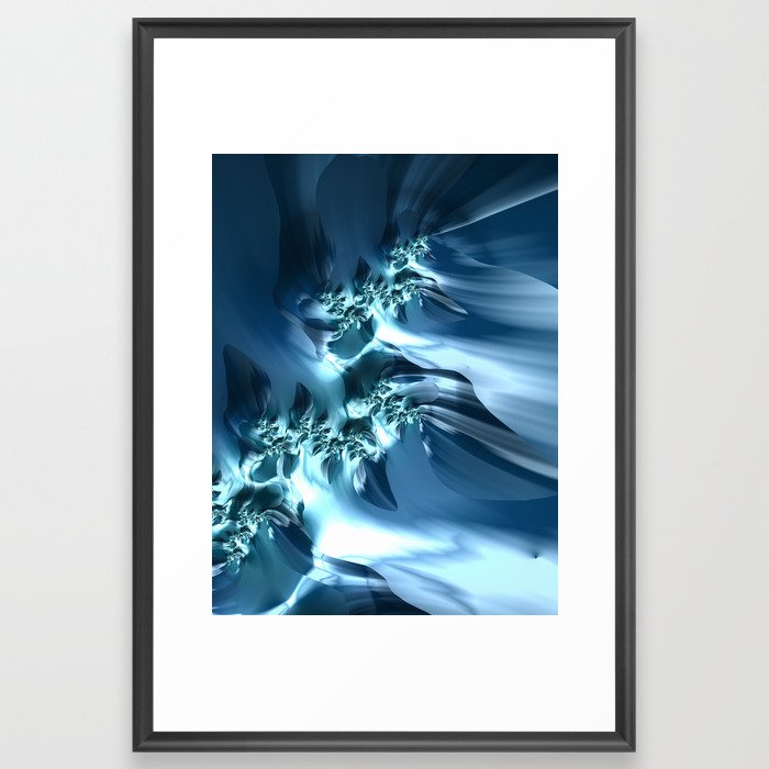
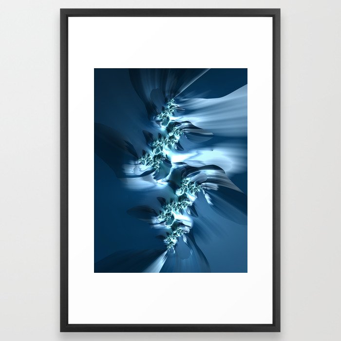
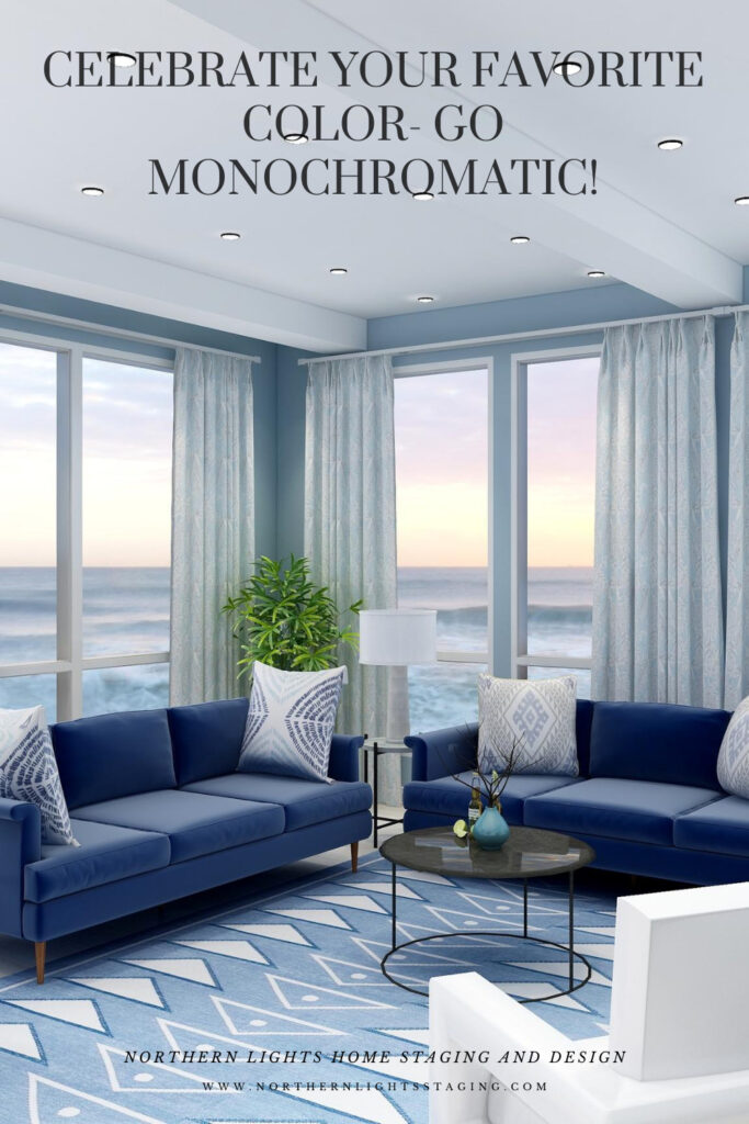
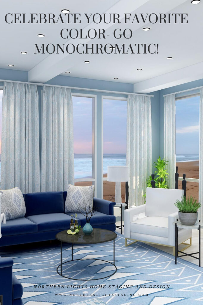
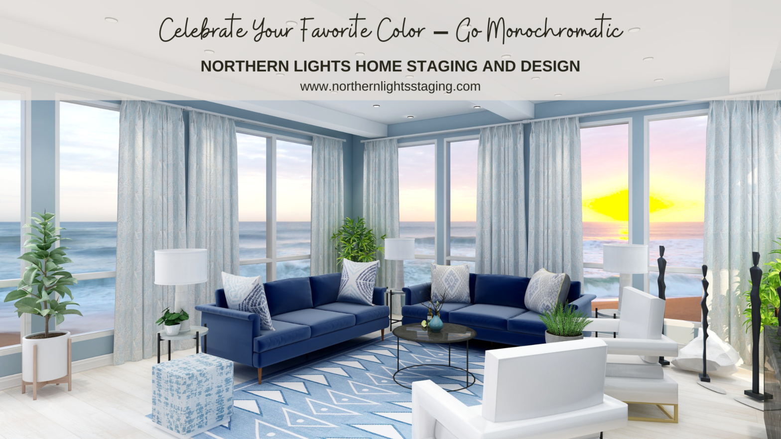
  1. Nice explanation of a monochromatic color scheme and the importance of contrasting shades and textures to keep it interesting! And, as always, your fractal art is awesome 🙂

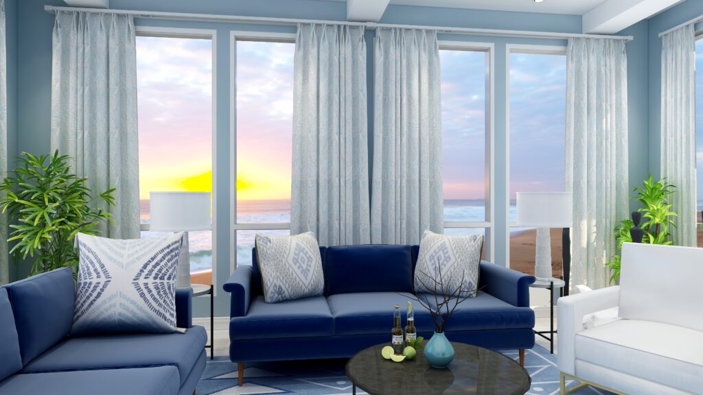
  2. I love a good neutral color palette with a little pop of color. My living room is exactly that, with warm tones and a pop of cobalt blue to give a little pizzazz. Love this post!

  3. Really enjoyed learning about using the monochromatic color scheme in an interior design plan. Your art looks so perfect in this pace, it’s quite lovely.

  4. I’m a fan of the monochromatic look, especially in blues! I love your original artwork too! You are so talented!!!

  5. This is a really great post showcasing how a monochromatic scheme can look so beautiful! The blue room you designed is stunning! While I love blues and greens, I’m tempted to try out yellow!

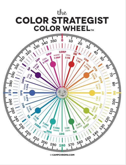
  6. Sometimes it seems like people think monochromatic means neutral. But you showed that it doesn’t. I love the blue theme.

Comments are closed.

https://zotabox.com/dashboard/embeddedcode/