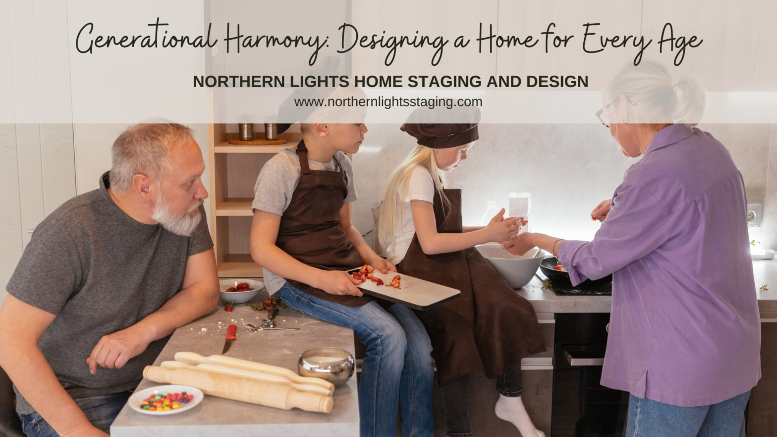
The trend of multi-generational living is gaining momentum, transforming the dynamics of family homes. Navigating this arrangement requires a blend of empathy, strategy, and creativity. This article aims to shed light on effective methods for organizing a home that accommodates grandparents, parents, and children, ensuring a balanced and peaceful coexistence. Photo by Mikhail Nilov on Pexels. Create Designated Living Areas Allocating specific Read more […]
Tag: online Interior Design
Are You Attached to an Ugly House? Six Tips to Set Yourself Free

This week I had a design consultation that gave me a lot of insights into why people have ugly houses. Attachment, attachment, attachment! Let it all go. I have learned that attachment to people, things, outcomes, etc. is the cause of most of our suffering. We stress over outcomes and how people behave. We try to control things because we get “attached” to an end result we want. We expect people to behave a certain way because we are attached to our beliefs of how they should act. We Read more […]
Birds of a Feather- What Birds Can Teach Us About Designing the Perfect Room 3
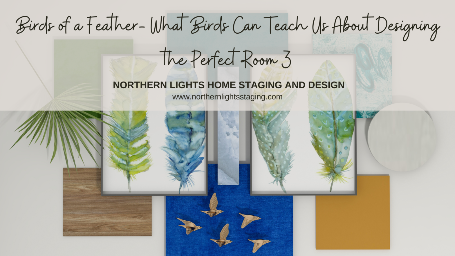
Previously, I showed you how flat lays create endless possibilities for creating a perfect space and three flat lays inspired by bird feathers. Birds provide endless inspiration for creating beautiful designs with the intricate patterns, colors, and textures of their feathers! Flat Lay #1- The Forest In my article Birds of a Feather- What Birds Can Teach Us About Designing the Perfect Room, I shared a design for the first flat lay, inspired by realistic photo art of Pintail duck and eagle Read more […]
I Learned to Solve All My Interior Design Problems by Dancing-Light Transforms Ordinary to Extraordinary
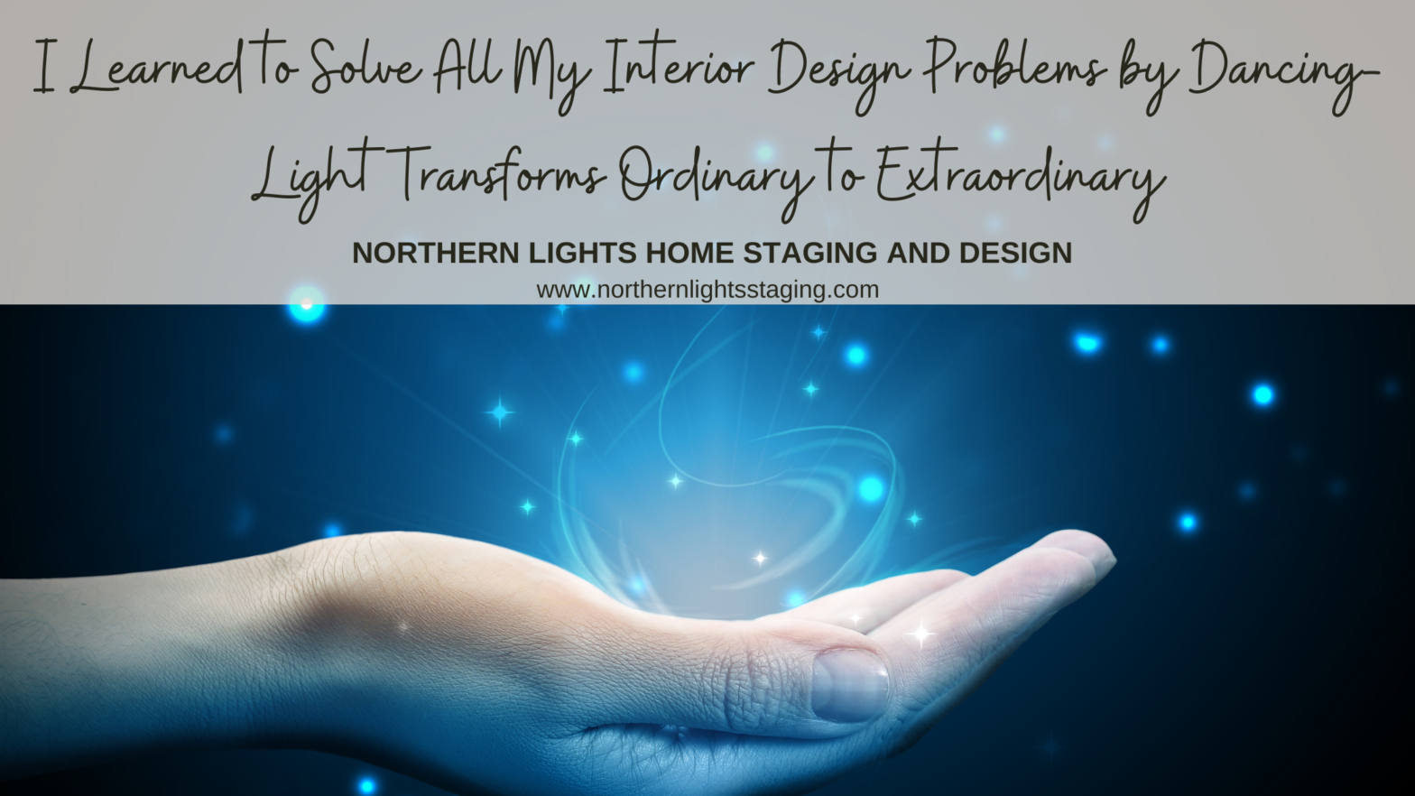
I Learned to Solve All My Interior Design Problems by Dancing-Distractions Ruin Everything. Remove clutter, visual disparity and consider yourself part of the design. Do you enjoy the look, feel, and smell of your space?
Birds of a Feather- What Birds Can Teach Us About Designing the Perfect Room 2
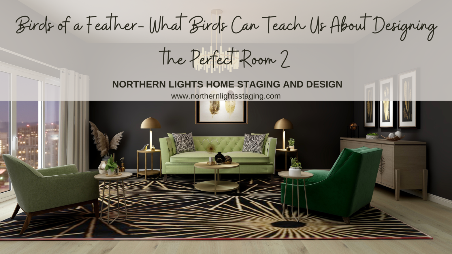
Previously, I showed you how flat lays create endless possibilities for creating a perfect space and three flat lays inspired by bird feathers. Birds provide endless inspiration for creating beautiful designs with the intricate patterns, colors, and textures of their feathers! In my article Birds of a Feather- What Birds Can Teach Us About Designing the Perfect Room, I shared some ideas for one of those flat lays inspired by realistic photo art of Pintail duck and eagle feathers. I designed Read more […]
Ways to Use Sherwin Williams Urbane Bronze
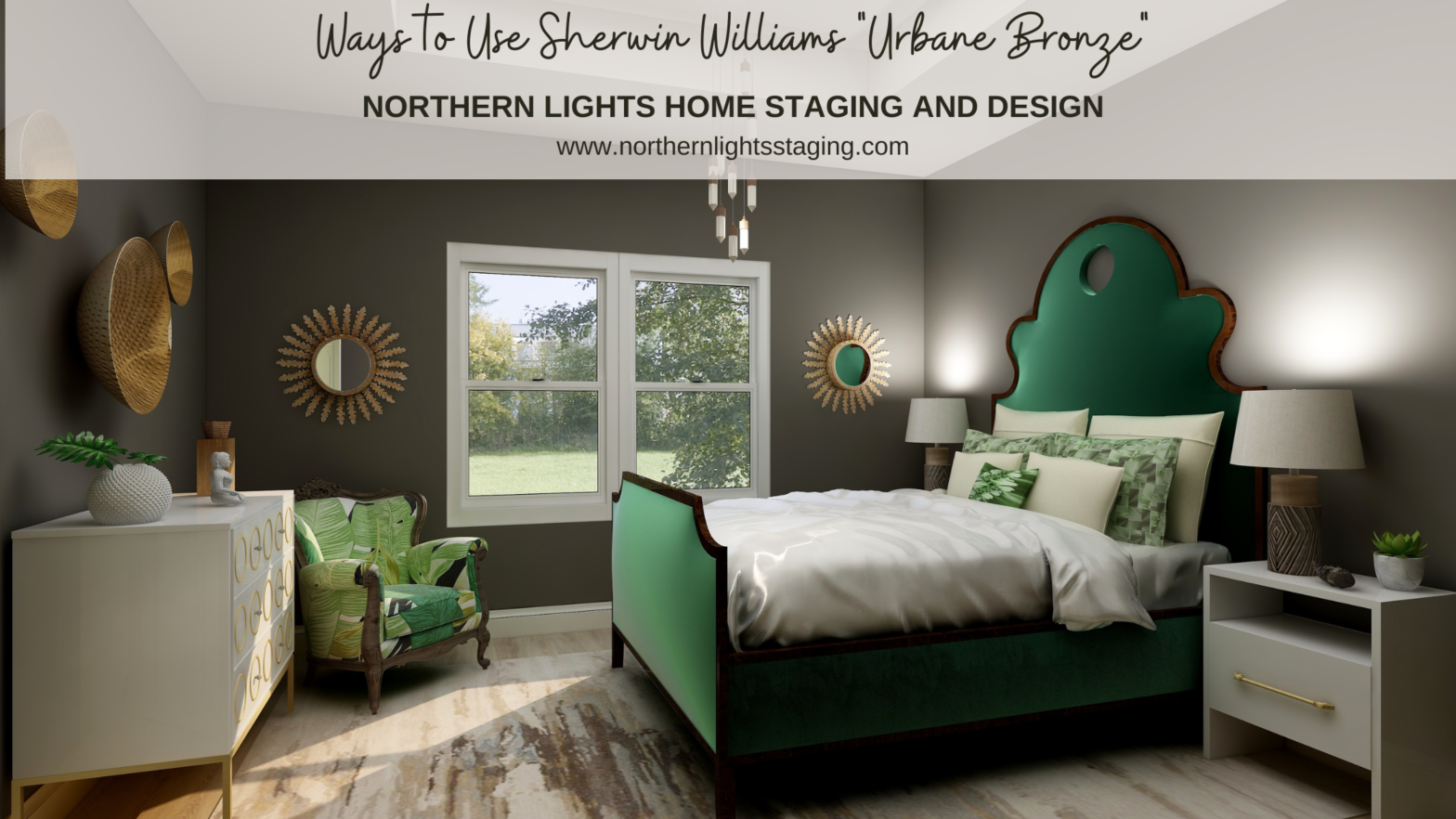
When I first saw Sherwin William’s “Urbane Bronze”, I was unsure how I felt about it. Browns can be nice to work with, rather serene and a color of nature so nice to “bring the outside in”. Sherwin Williams 2021 Color of the Year, Urbane Bronze. Graphic by Camp Chroma. According to the color data Urbane Bronze is actually a yellow hue (really, it’s true) that looks brown because of it’s low chroma and lightness. Colorography of Urbane Bronze by Lori Sawaya of Camp Chroma. Sherwin Williams Read more […]
Unfolding Magic: The Bird’s Eye Brilliance of Flat Lays
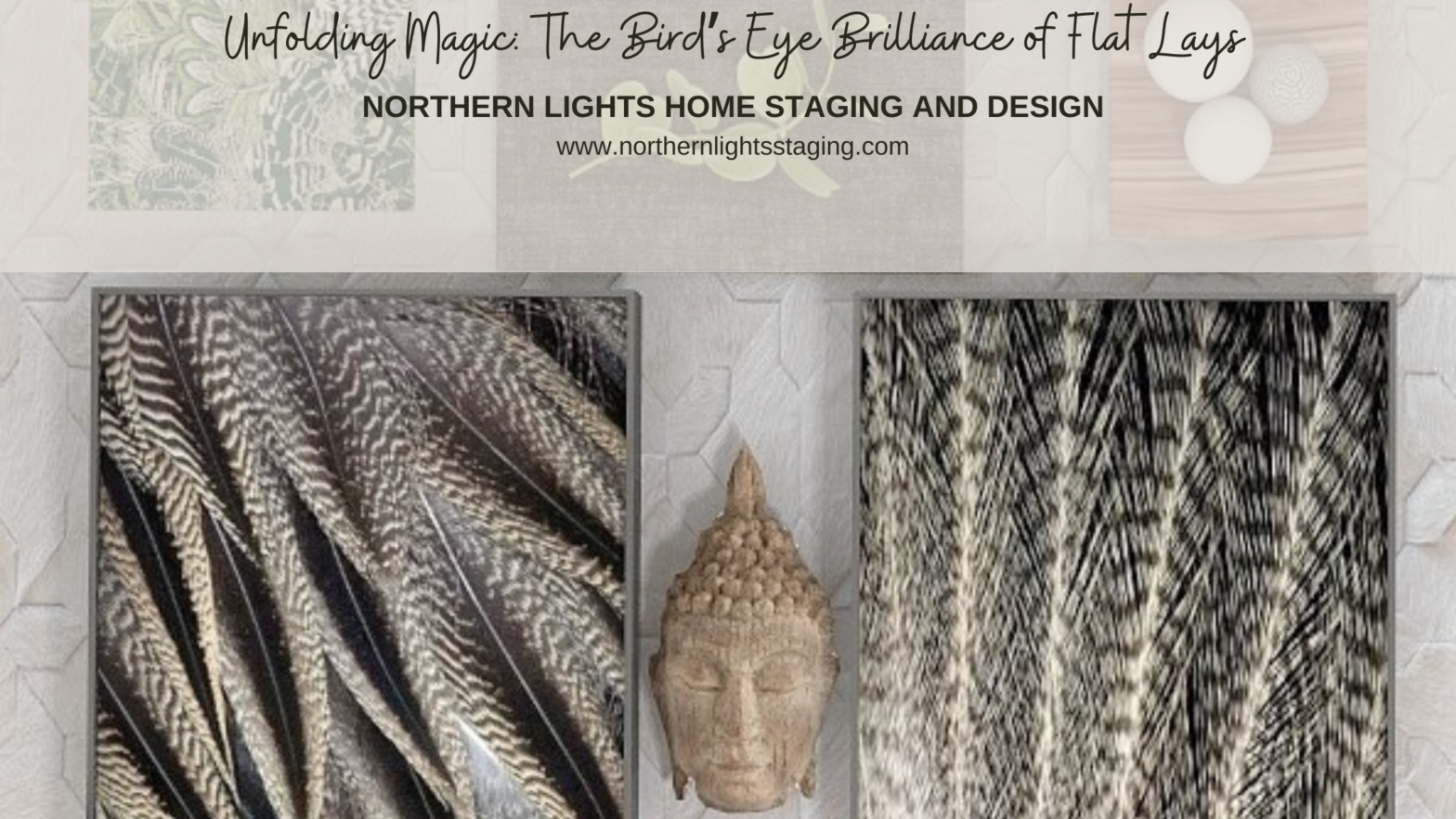
A flat lay is a bird’s eye view of a lot of magic possibilities about to unfold before you. At its simplest, it is a picture of objects arranged on a flat surface being viewed from above. But it is so much more! When used in Interior Design, a flat lay creates endless possibilities for creating a perfect space. A flat lay is an idea filled with possibilities. As an example, here is a flat lay I created that was inspired by the beauty of Pintail duck and eagle feathers. Being a wildlife biologist Read more […]
Celebrate Your Favorite Color – Go Monochromatic
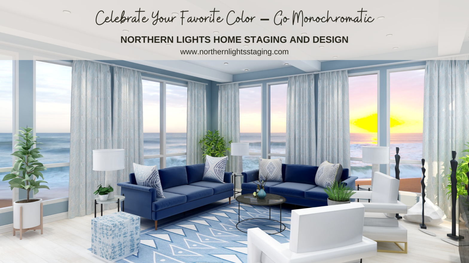
Many people struggle with finding the perfect color scheme, often bound by the constraints of their existing finishes. But what if we make this more fun? Imagine magnifying and embracing your favorite color wholeheartedly. Welcome to the world of Monochromatic design! Monochromatic schemes delve deep into one hue, exploring its diverse shades, tones, and tints. Visualize your cherished color transitioning from its lightest whisper to its richest depth, seamlessly incorporating white and black. Read more […]
Create a Harmonious Color Scheme – Go Analogous
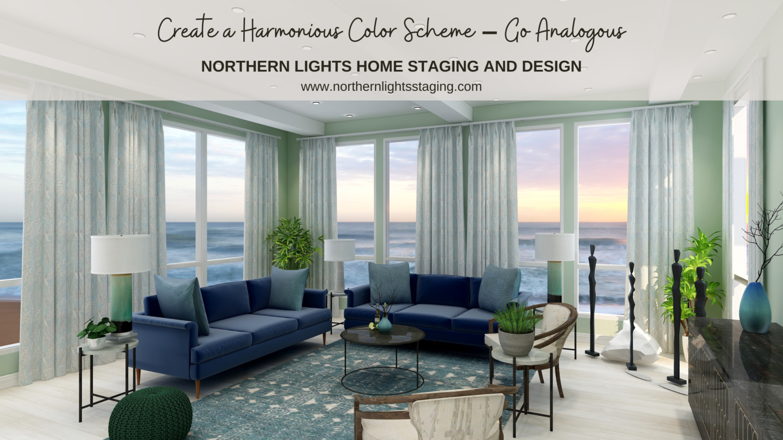
People often struggle with creating a great color scheme. Often, we start the conversation by talking about the limitations, or the box of colors you need to play with based on your fixed finishes.In my last article, Celebrate Your Favorite Color- Go Monochromatic, we talked about how you could take your favorite color and celebrate it in all it’s glory with a monochromatic color scheme. Simple and easy!What if you would like a little more color variety, but still want something that is simple Read more […]
Opposite Colors Attract – Go Complimentary
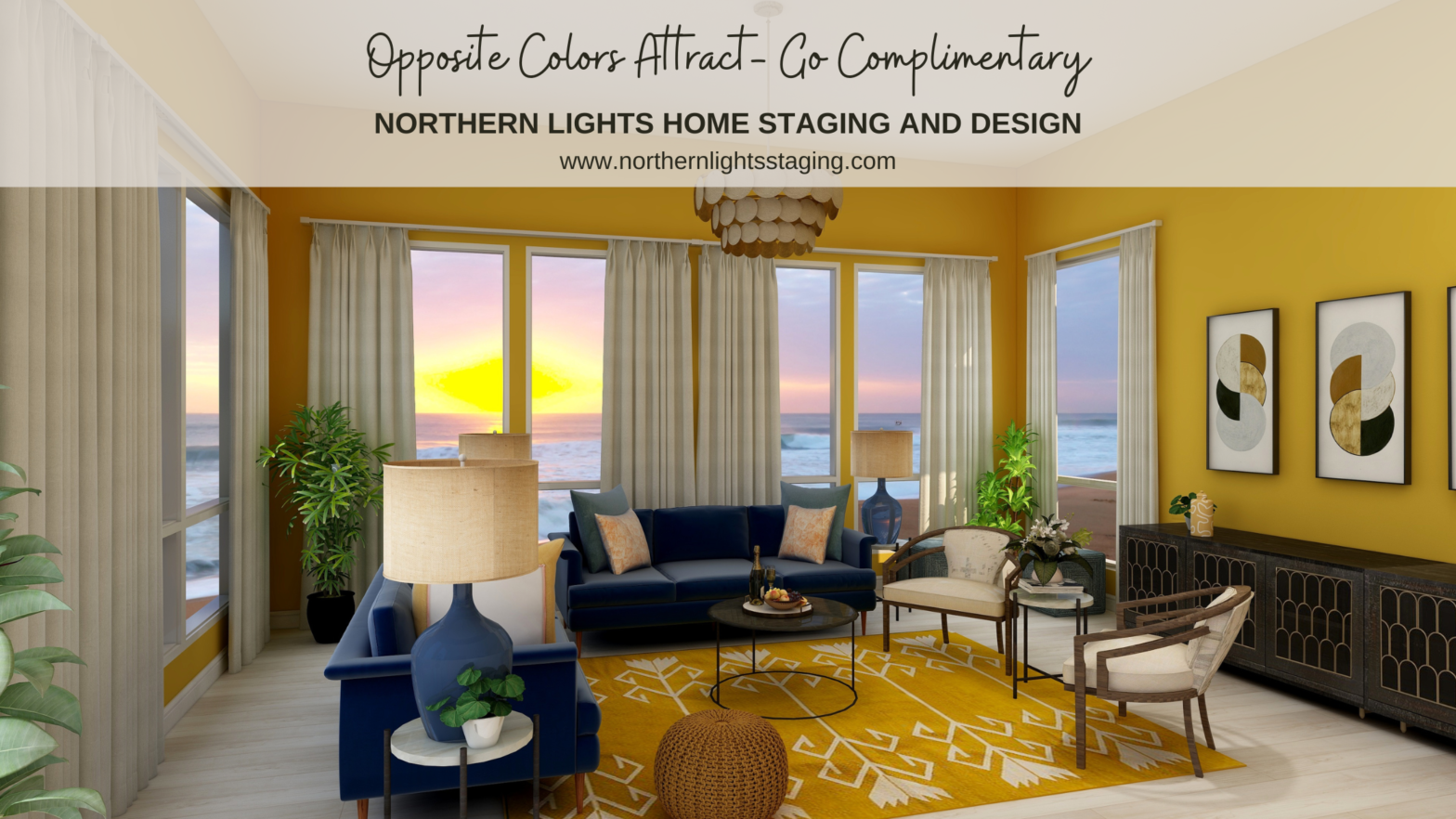
Crafting the perfect color palette can be a daunting task for many. Often, the starting point revolves around fixed finishes and certain constraints. In my recent blog posts, we’ve delved into constructing color schemes from a favorite hue, like blue. We’ve explored monochromatic and analogous palettes, and today, we’re diving into complementary color schemes. Complementary colors are a pairing of hues that sit opposite each other on the color wheel. When juxtaposed, they amplify each other’s vibrancy Read more […]