Considering a fresh coat of paint for your home’s exterior? It’s amazing how a new shade can give both your home and your spirits a lift. However, this exciting change can sometimes lead to the all-too-common paint color dilemma.
It’s something every homeowner encounters. Whether you’re updating the entire exterior, adding a pop to a single room, or just revamping a door, choosing the right shade is crucial. The stakes? Picking a color that doesn’t match your vision, leaving you wondering if the neighbors are silently judging. But fear not, for every paint predicament, there’s a perfect solution waiting to be discovered!
Navigating the maze of paint colors can often feel like an unsolvable puzzle. Most people often resort to:
- Choosing their favorite shade and crossing their fingers.
- Seeking the collective wisdom of friends and family.
- Posting on design forums like Houzz, only to get overwhelmed with diverse suggestions.
- Going down the rabbit hole of color blogs and becoming perplexed by the term “undertones”.
- Painting multiple sample colors on their wall and feeling like they’re in a never-ending loop of indecision.
- Consulting a certified color strategist.
Among these, the last option is truly the game-changer. Here’s why:
- Your favorite color might not necessarily match your home’s permanent fixtures. Whether it’s your exterior finishes or your interior countertops and flooring, you need to ensure harmony.
- Everyone has an opinion, but remember, you’re the one living in your space. What’s aesthetically pleasing to others might not resonate with you.
- Online experts, though well-intentioned, aren’t privy to the specific lighting conditions and nuances of your home. Computer screens rarely capture true colors!
- The term “undertones” often muddies the waters. Colors in different lighting conditions can be deceiving. It’s essential not to get bogged down by the jargon.
- Using multiple swatches is a good start. But remember, colors can influence each other, and it’s essential to view each shade in isolation.
- A certified color strategist is your best ally. They blend the art and science of color, offering a trained eye and understanding the physics of color. This ensures your chosen shade complements the specific fixtures and lighting conditions of your home.
In essence, while color can be subjective, its impact on a space is tangible. With tools like a colorimeter, experts can objectively measure colors, aligning them perfectly with your home’s needs. So, next time you’re caught in the color conundrum, remember, there’s a science to it, and the right expert can make your colorful dreams a reality!
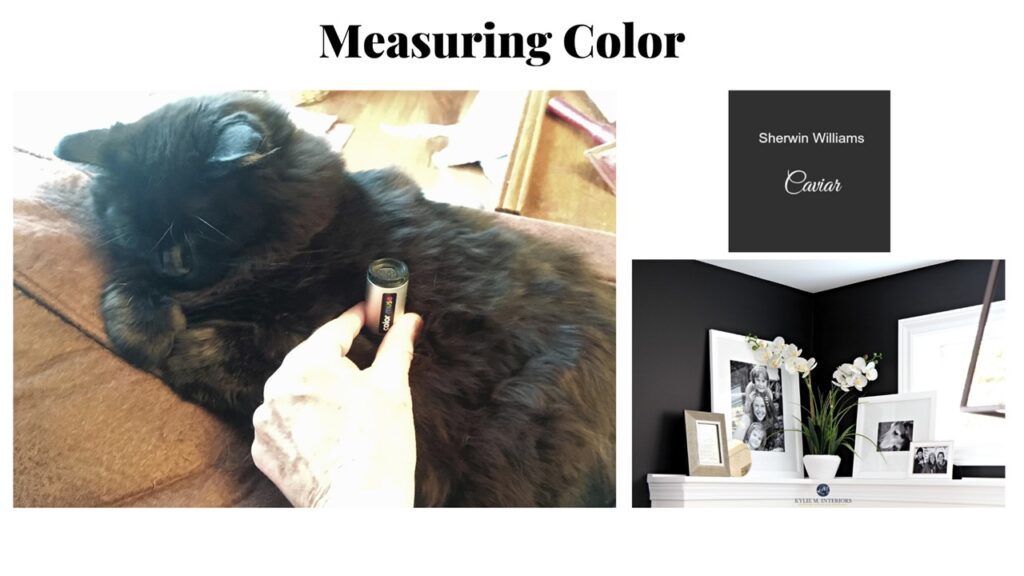
So what is this magical device? A Color Muse! While this device can be used by anyone to find paint colors to match an existing color, the real power comes from understanding what the color data means and how to use it.
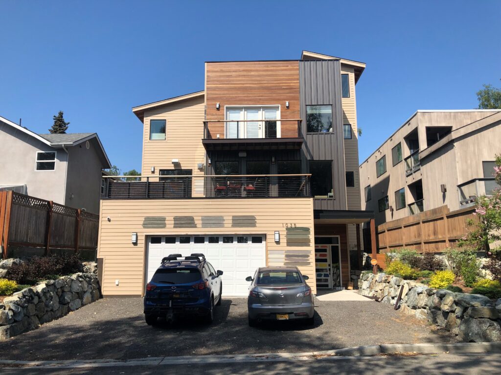
Diving into a color dilemma is akin to playing detective. Let’s unravel one such case I encountered. Upon arriving at the residence, what greeted me was a splash of color swatches on the walls and the door. A classic sign of the homeowner’s quest and confusion in pinpointing that elusive perfect shade. The scene screamed ‘color dilemma’ loud and clear.
At the outset, the intention was evident: the homeowner wanted a fresh look but was overwhelmed by the options. They had tried multiple colors, hoping one would stand out and feel “right”. But instead, what they had was a mosaic of possibilities, with no clear winner.
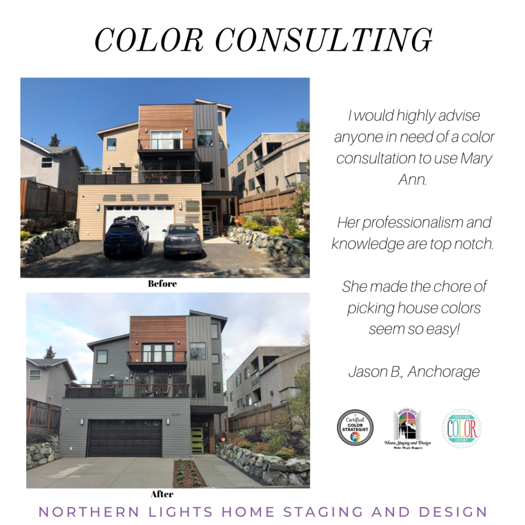
Let me walk you through the art and science of solving this color dilemma. My clients had a vision of their ideal color palette: a hue that struck a balance between gray, green, and brown. They also wanted to preserve the natural wood and metal trim while introducing a vibrant front door. A classic scenario where husband and wife couldn’t quite agree on the perfect color.
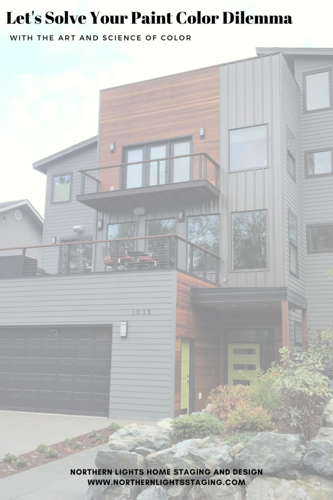
The wood siding and metal trim had now transformed into fixed finishes, dictating the color harmony for the entire exterior. The roof color remained hidden from sight, so it didn’t play a role in the selection. Additionally, there was almost black metal trim on the deck railings and around the front door, which was not up for a paint makeover and thus became another fixed finish. To add to the equation, a stark white garage door stood prominently, making it the most eye-catching feature due to its lighter shade than the rest of the elements.
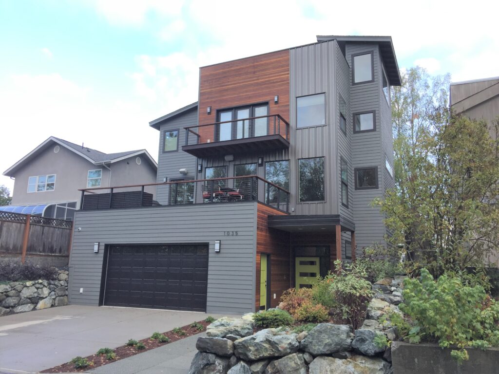
Applying the art of color, I decided to make the garage door recede by painting it a dark color. The trim color on the railings, determined by measurement, also seemed ideal for the window trim and garage to maintain harmony amidst the three other colors designated for the walls, wood, and metal vertical trim. This color turned out to be Sherwin Williams Caviar, aligning perfectly with the measured hue, chroma, and values of the wood and metal vertical wall.
Next, it was time to identify a wall color that would complement these fixed finishes in terms of hue, chroma, or lightness. Several options on the color wheel were considered, such as an analogous scheme (colors close to each other on the wheel), a complimentary scheme (opposite colors), or a triadic scheme (colors evenly spaced on the wheel). By narrowing down the choices, my clients ultimately selected Benjamin Moore Amherst Gray with a hint of “green” that aligned with their preferences.
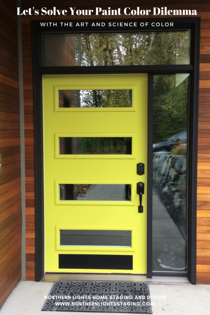
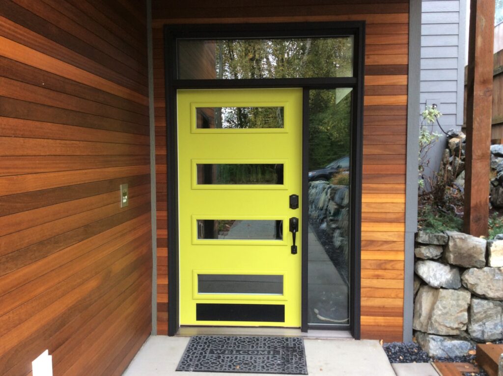
The final piece of the puzzle was the front door. To create a harmonious connection with the landscaping, a color inspired by the vibrant green bushes in the front was proposed. Measuring a leaf with my trusty colorimeter led us to the perfect shade: Sherwin Williams Hep Green.
And voilà! The color dilemma was elegantly resolved, resulting in a stunning transformation.
Did they like the end result? Here is what they said.
Need Help with Your Color Dilemma?
Get Your Free Report

Aligned Design©– All Rights Reserved.
Terms of Service | Privacy Policy | Disclaimer | Brochure
Prices are subject to change without notice.
Call 907-362-0065 today


Congratulations on a beautiful exterior transformation, Mary Ann! And a fabulous testimonial from happy clients!
Thanks Janet! I loved the way it came out and was very happy that the clients loved it too!
That home looks so much better with your expert color selections. Well done!
Thanks so much Lisa!
OMG. Nailed it. Loved your break down of how to choose paint colors, but you really sealed the deal with the exterior color transformation. Superb job!
Thanks so much Jeri! Glad you liked it and thanks for stopping by to read my post.
Mary Ann, what a great post explaining HOW we go about selecting colours.
The colours you chose, including that fantastic front door, is such a wonderful change. I’m sure your clients must be thrilled!
Thanks Sheri! I know color can be complicated and such a mystery on how to choose because most people don’t understand color science or even realize there is such a thing. I know it was an eye opener for me when I learned about it! The clients loved it which made me very happy:)
Beautiful transformation Mary Ann! And that color pop from the front door too!!!! It all looks wonderful.
Thanks Julie, not sure what the bush was in the front I measured but it was a beautiful shade of chartreuse green. Thanks for reading!
I loved this! What a transformation!
Thanks so much Ilse! Color is like magic!