“Clear the Decks #2” -Energy Art and Interior Design

Welcome to Saturday Night Live Art Shows.

The energy of this collection is about transformation, which starts with releasing the old, to create fresh ground to plant new seeds of what we want in life. This art has the energy within it to inspire you take the reins whole-heartedly to make it happen…. not just a little bit, but really go for it.

Each week I show an example in the same room of how you can easily change the look and feel of the room with different art from this collection, and paint and accent colors.

Raise the vibe in your space today. Great design starts with energy. When your space is better, you are better. When you are better, the world is better. The world needs you.

My unique Interior Design philosophy.. “Aligned Deisgn”, combines The ART of beauty The SCIENCE of color The ENERGY of well-being. Art + Science + Energy = Magic.

See all my AI/ fractal art here.

Be sure to check out all the other artists from around the world,   having art shows in their Facebook and social media feeds at 6-9 pm in their time zones. Follow Saturday Night Live Art Shows on Facebook by searching #snlartshows.

“Clear the Decks” Energy Art

When you look at the art, imagine the power of ‘clearing the decks” in your life to transform into something new. Vibrant, swirling blues wash away old patterns, while fresh, warm golds emerge, suggesting the fertile soil where we plant the seeds of our deepest desires. Each translucent layer speaks to spiritual growth, gently washing away the clutter to reveal a pristine surface, ready to nurture new dreams. The fluidity of the forms invites you to surrender and release what no longer serves and embrace the abundant possibilities ahead.

How can you use Energy Art in your space?

Do the lessons from this collection resonate with you? Are you ready to release what no longer serves you and make room for transformation?

I put my energy to attract this into the art. When you see it in your space, your energy in addition to that of the art creates power and helps attract those things to you.

Because this art is digital, it can also be put on a variety of home decor products such as pillows, bedding, rugs, wall murals, and more.  This helps create a variety of ways to use it in your space.


"Clear the Decks #2" Energy Art and Interior Design.


clear-the-decks-12-mary-ann-benoit
“Clear the Decks #12” energy art by Mary Ann Benoit

Here are some other complimentary pieces in the collection that can be used as wall art or in other home decor.


“Clear the Decks #13” energy art by Mary Ann Benoit.

“Clear the Decks #14” energy art by Mary Ann Benoit.

Have some fun and put these designs on your clothing!  See my collection on Le Galeriste.


What is Energy Art?

I infuse my emotions, intentions, and energy into the artwork I create, to convey specific qualities or benefits—such as prosperity—to you. As you engage with the art, you absorb the intended emotions and intentions, and align them with your own energy. This dynamic interaction generates a powerful force that resonates with your intentions, essentially harnessing the energy in the artwork and combining it with your own to attract and manifest what you want.

How? Emotions, which are energy in motion, serve as a catalyst for this connection.

Energy art is the foundation of  Interior Design that not only is beautiful but is transformative and enriches your life by expressing your true essence and supporting your potential.

Are You Ready to Create Your Perfect Space with Art?

Are you ready to create a space with custom art for what you need in your life?  Let’s tell your unique story and find the alignment of art, science, and energy that makes you happy. Try my Aligned Design consultation and let’s get started.
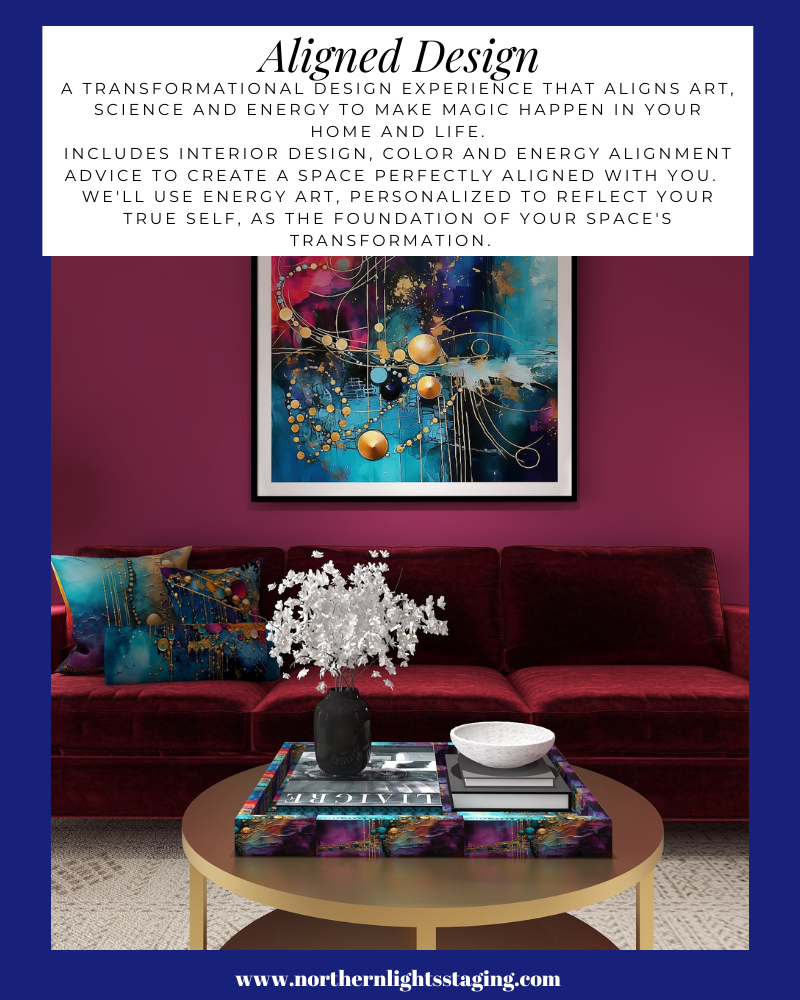

A transformational design experience that aligns Art, Science and Energy to Make Magic Happen in your Home and Life. Includes Interior Design, Color and Energy alignment advice to create a space perfectly aligned with you. We'll use Energy Art, personalized to reflect your true self, as the foundation of your space's transformation.

Aligned Design©– All Rights Reserved.

Terms of Service  |  Privacy Policy  |  Disclaimer |  Brochure

Prices are subject to change without notice.

Call 907-362-0065 today


Why Work with Northern Lights Home Staging and Design


Opposite Colors Attract – Go Complementary

Crafting the perfect color palette can be a daunting task for many. Often, the starting point revolves around fixed finishes and certain constraints. In my recent blog posts, we’ve delved into constructing color schemes from a favorite hue, like blue. We’ve explored monochromatic and analogous palettes, and today, we’re diving into complementary color schemes.

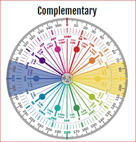
Complementary colors are a pairing of hues that sit opposite each other on the color wheel. When juxtaposed, they amplify each other’s vibrancy and intensity. The beauty of complementary colors lies in their mutual ability to enhance one another’s brilliance.

blue and yellow- complimentary colors
Blue and Yellow glass from Creative Commons CC0.

Complementary color schemes, offer several benefits when used in design:

  1. Visual Contrast: The stark contrast between complementary colors makes each hue stand out distinctly, creating an eye-catching and vibrant look.
  2. Balanced Visual Stimulation: Complementary colors provide a sense of balance; one color might be warm (like red) while its complementary color is cool (like green).
  3. Enhanced Vibrancy: When placed next to each other, complementary colors can make each other appear brighter and more vivid.
  4. Versatility: Complementary color schemes can be adapted to fit various moods and styles. For a bold and energetic look, you can use the colors in their full saturation. For a more subdued and harmonious look, you can use toned-down versions of the colors.
  5. Focus and Attention: Because of their contrast, complementary colors can be used to draw attention to specific elements in a design or space.
  6. Harmony: Even though they’re opposites on the color wheel, complementary colors inherently work well together and create a harmonious design.
  7. Flexibility in Decor: A complementary color scheme allows for flexibility. For instance, if you have a room with predominantly blue decor, introducing some orange accents (like pillows, art, or rugs) can instantly invigorate the space.
  8. Depth and Dimension: In art, especially painting, complementary colors can be used to create depth, with one color serving as a shadow or highlight against its opposite.
  9. Enhancement of Features: Complementary colors can be used to make features stand out. For example, putting orange flowers in a blue vase draws attention to the arrangement and makes both colors pop.

The key to a successful complementary color scheme is balance. Use in moderation and pair with neutral tones to provide a visual rest.

Complementary colors can create interesting optical illusions. For example, if you stare at a square of color for thirty seconds to a minute, and then look at a white paper or wall, you will briefly see an afterimage of the square in its complementary color. Try it with this blue square and see if you see an after image of yellow.

blue square

Why does it work? Leonardo da Vinci observed that the finest color harmonies were those between colors exactly opposed. Maybe that is where the saying opposites attract came from?

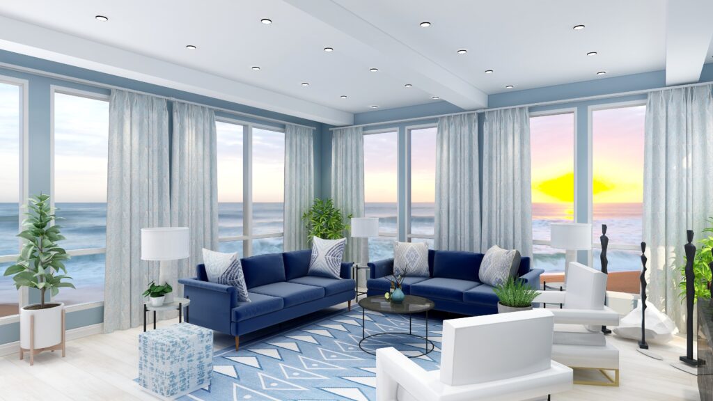
So, let’s create a complementary color scheme with the blue we have been working with in several other articles, as you  see the  sofas. See these other color schemes see my articles Celebrate Your Favorite Color- Go Monochromatic and Create a Harmonious Color Scheme- Go Analogous.


Celebrate your favorite color- go monochromatic! Edesign by NOrthern Lights Home Staging and Design
Monochromatic Color Scheme

Analogous Color Scheme

It’s opposite or compliment on the color wheel is yellow, which ranges from Yellow/red to Green/Yellow and can have varying degrees of saturation or chroma, and lightness. In other words, there are lots of yellows we can work with:)


complimentary colors- Camp Chroma
Complementary Colors- Created by Camp Chroma- The Best Color Training Ever.

The Design

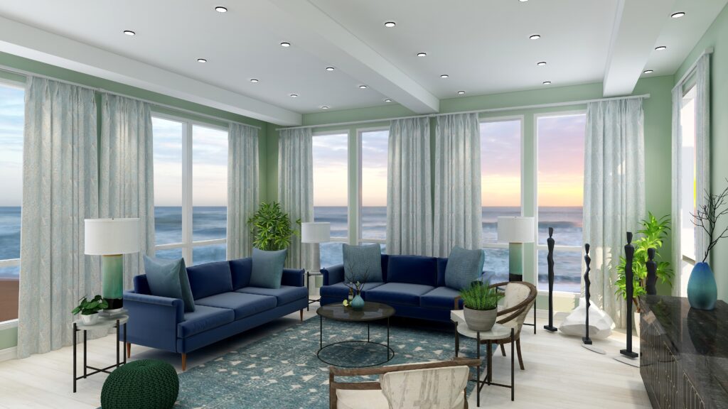
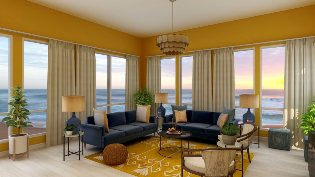
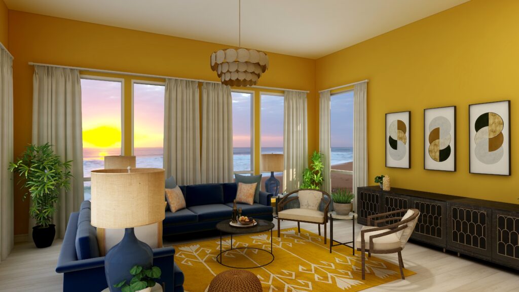
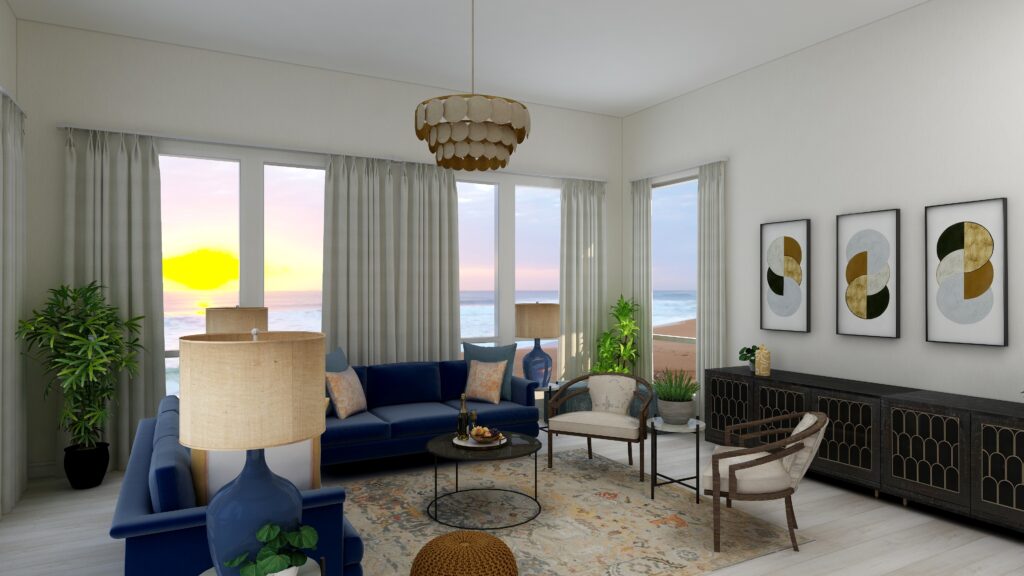
Here are examples of two living rooms I created using a blue and yellow complementary color scheme. The first is bright and dramatic. The second is more relaxed and neutral.

Complimentary Color Scheme Edesign by Northern Lights Home Staging and Design
Complementary blue and yellow Living Room Edesign by Northern Lights Home Staging and Design.
Complimentary Color Scheme Edesign by Northern Lights Home Staging and Design
Complementary blue and yellow Living Room Edesign by Northern Lights Home Staging and Design.

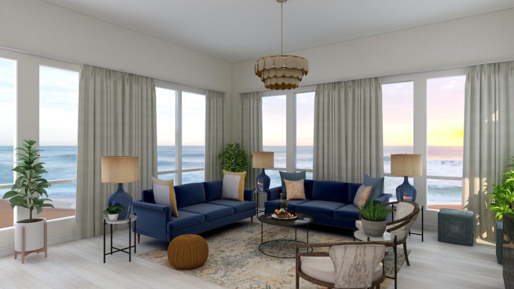
Complementary color schemes don’t have to be bright and colorful. They can use darker, less saturated or more muted tones of opposite colors for a more understated look. The design below uses an area rug with muted yellows and blues, and wallpaper with minimal yellow. Otherwise everything is the same.

Complimentary Color Scheme Edesign by Northern Lights Home Staging and Design
Complementary blue and yellow Living Room Edesign by Northern Lights Home Staging and Design.
Complimentary Color Scheme Edesign by Northern Lights Home Staging and Design
Complementary blue and yellow Living Room Edesign by Northern Lights Home Staging and Design.

Benefits of A Complementary Color Schemes

Navigating the world of complementary color schemes is easy and straightforward. Begin by pinpointing your favorite hue on the color wheel, then locate its direct opposite. This partnership is where the magic happens.

Complementary colors inherently possess a dynamic tension, making them ideal for spaces meant for lively conversations and gatherings, such as living rooms and dining areas.

However, this boldness can be tempered using muted or desaturated versions of these hues. Then you can craft a serene and sophisticated palette, perfect for spaces meant for relaxation and introspection.

Whether you seek vibrancy or tranquility, complementary color schemes offer versatility to match your vision.-

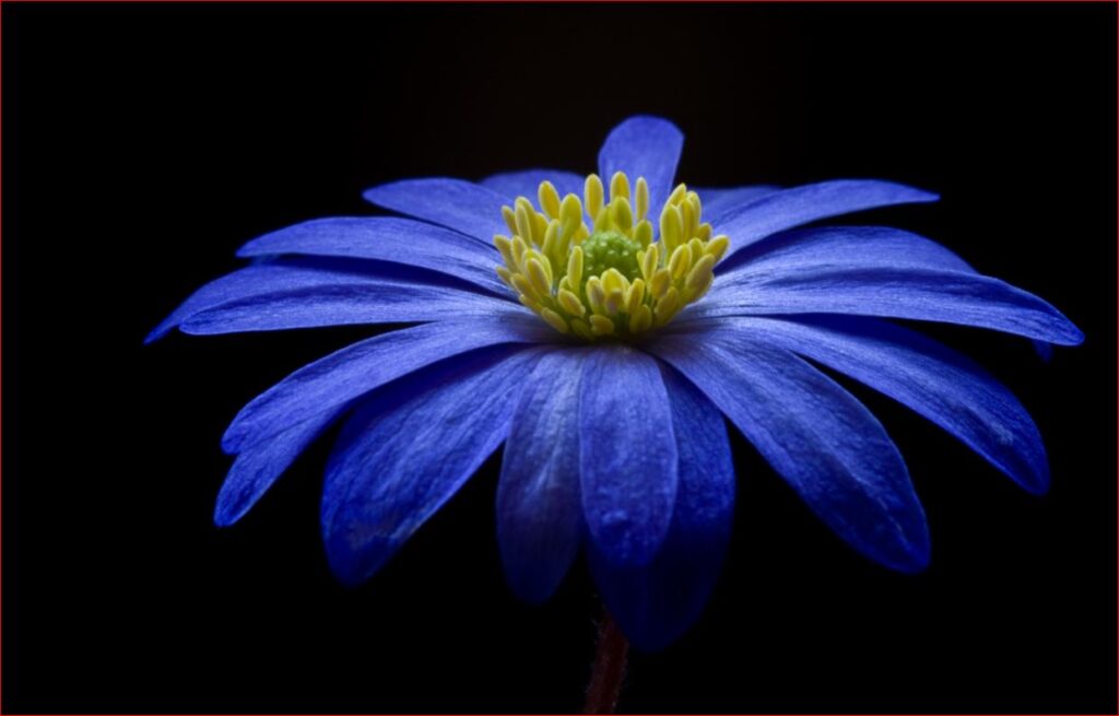
complimentary color scheme
Purple flower from Pexels.com

Create Beauty with Color in Your Space


A transformational design experience that aligns Art, Science and Energy to Make Magic Happen in your Home and Life. Includes Interior Design, Color and Energy alignment advice to create a space perfectly aligned with you. We'll use Energy Art, personalized to reflect your true self, as the foundation of your space's transformation.


Not Your Average Color Consultation

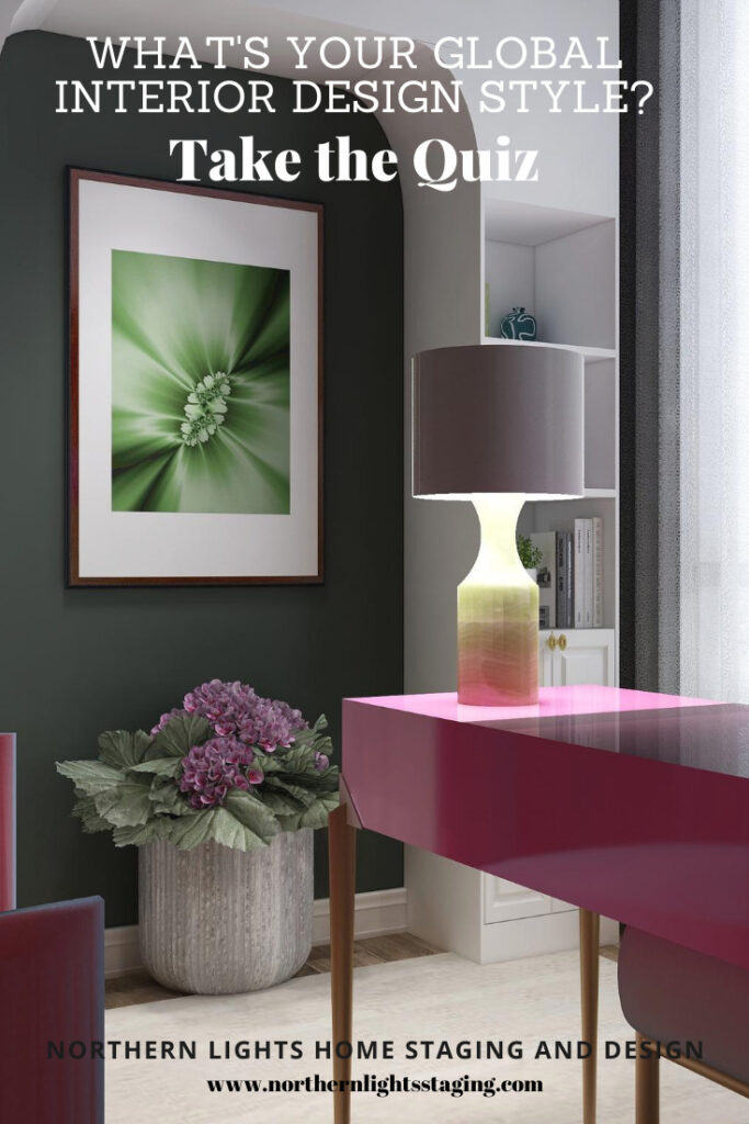
What is Your Global Design Style? Take the Quiz


What's Your Global Interior Design Style? Take the Quiz. Northern Lights Home Staging and Design

Aligned Design- All Rights Reserved.

Terms of Service  |  Privacy Policy  |  Disclaimer |  Brochure

Prices are subject to change without notice.

Call 907-362-0065 today