When I first saw Sherwin William’s “Urbane Bronze”, I was unsure how I felt about it. Browns can be nice to work with, rather serene and a color of nature so nice to “bring the outside in”.
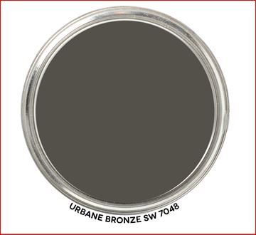
Sherwin Williams 2021 Color of the Year, Urbane Bronze. Graphic by Camp Chroma.
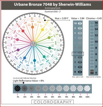
According to the color data Urbane Bronze is actually a yellow hue (really, it’s true) that looks brown because of it’s low chroma and lightness.
Colorography of Urbane Bronze by Lori Sawaya of Camp Chroma.
Sherwin Williams describes Urbane Bronze as as a color to
“Tap into nature with a hue whose warmth and comfort breathe down-to-earth tranquility”.
“As we’re looking to create the ultimate retreat for reflection and renewal, we’re turning to a hue whose natural simplicity and nature-inspired energy cultivate a sense of calm from the ground up.”
“The trend for biophilia continues to shape our spaces, proving that nature is never far away. Urbane Bronze might be a color rooted in nature, but it also has a unique ability to ground a room through organic appeal.”
OK, so it is supposed to help us feel rooted to nature. I thought about where I may have seen this color in nature. Maybe along mudflats at the beach, possibly in rocks and some types of earth. It does remind me a bit of the color of sea otter fur.
Sea otter. Photo by Andrew Smarius on Unsplash
Master Bedroom Design
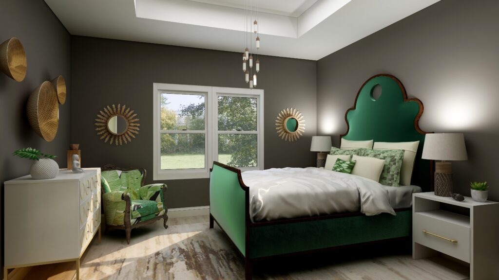
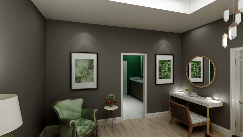
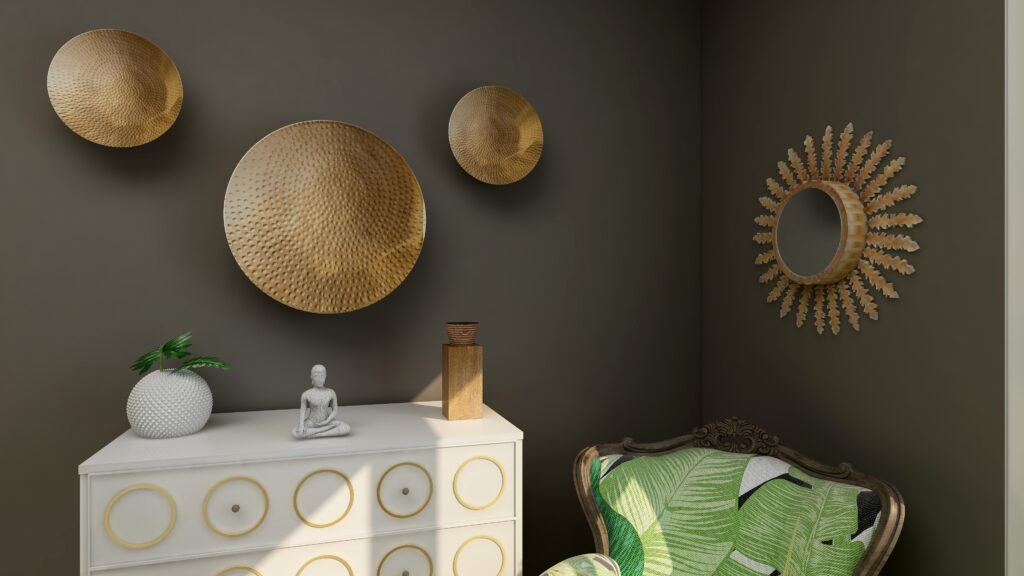
I used Urbane Bronze as the wall color with primarily dark and light greens, browns and white to create a color palette from nature.
Urbane Bronze is actually a Yellow hue, so this works because it is creating an analogous color scheme with yellow, yellow-green and green that are next to each other on the color wheel.
The mixture of soft fabrics with different metals, wood and pottery add natural elements and a variety of textures.
Edesign using Urbane Bronze by Northern Lights Home Staging and DesignEdesign using Urbane Bronze by Northern Lights Home Staging and DesignEdesign using Urbane Bronze by Northern Lights Home Staging and Design
What are the Pros and Cons of Choosing a Bronze Paint Color?
Pros of Working with a Bronze Colored Paint:
Warm and Inviting: Bronze paint adds warmth to a room and can create a cozy and welcoming ambiance.
Versatile: Suits both modern and traditional interiors, complementing a wide range of décor styles.
Sophisticated: The metallic sheen can lend an air of sophistication and luxury.
Pairs Well: It complements a variety of other colors, especially earth tones, deep blues, and greens.
Accentuates Features: Great for highlighting architectural details, moldings, or feature walls.
Durability: Metallic bronze paints can often be more durable and resistant to damage than flat finishes.
Light Reflectivity: Its slight sheen can reflect light, making spaces feel more vibrant and sometimes larger.
Cons of Working with a Bronze Colored Paint:
Application Difficulty: Metallic and bronze paints can show brush strokes or roller marks more easily than flat paints.
Prep Work: Imperfections on walls, like dents or scratches, can be accentuated, requiring more prep work.
Trend Sensitivity: While classic, certain shades of bronze may go in and out of trend, potentially dating the décor.
Overwhelming: In small spaces or spaces without a lot of natural light, bronze can feel a bit overwhelming or dark.
Cost: Quality metallic paints, including bronze, can sometimes be more expensive than standard paints.
Maintenance: Fingerprints, smudges, or dirt can be more noticeable, requiring more frequent cleaning.
Limited Availability: Not all paint brands offer a wide variety of bronze shades, limiting choices.
Remember, the success of using bronze paint largely depends on the specific shade of bronze, the room’s lighting, its size, and the accompanying decor. Always test a sample on the wall before committing to a full paint job.
Are You Inspired?
Get your colors right the first time with an expert science based color consultation.
As the new year approaches, you will probably hear a lot about trends in design, color and the latest, greatest ideas in furniture and accessories. My mind is focused inward on a different way of transforming your home.
I think about 2019, what I accomplished and what my life and home felt like. I’m compelled to plan for 2020 to re-invent my life, health, business and home to be the ideal expression of myself. How about you?
I have been inspired lately listening to Jim Fortin’s podcast, “Transform your life from the inside out”, and watching videos by Dr. Joe Dispenza. They both talk about how to re-program your brain to transform your life by working from the inside out. Jim Fortin talks about the idea of HAVE, DO, BE that most of us operate from. If I only “had” that, I could “do” this and “be” happy. He says it should be the other ways around. BE, DO, HAVE. BE your ideal self so you can DO the things you want to and the “HAVE” will come as a result. Start on the inside and work your way out. Dr Joe Dispenza talks about how re-programming your brain through meditation can totally change your life, health and more. Change your thoughts, which change your emotions which change your physiology. I know, a little Woo Woo perhaps, but you never know until you try. It’s a new year, what can it hurt!
As a designer, I can’t help but think about how all this translates to your home, and how transforming your home from the inside out can affect the way you feel and can help re-invent your life too. Is it time for you to make a change? If so, how do you do it?
Color
The easiest way is by changing your colors, which have a profound effect on how you feel. There is lots of information online about the psychology of color and how different colors make you feel for inspiration. Color is easy to change! And so, it is easy not to change. How long have you had the same colors in your home? Change the paint color of a main room, change the color of your accessories, put up new and colorful art, change your pillow colors, get a new area rug.
Because color is easy to change, it’s easy to change again if you don’t like it. Be brave and go for it. Forget about grays, whites and neutrals. Try something bolder, or one of the new 2020 colors of the year. Or, if you prefer neutral colors on your walls, add pops of color in other ways. Maybe you have a bold color scheme going on now that you could change if you want a calmer and more serene environment.
Most people get stressed out about picking new colors. What colors go together? What if I hate it? Who has time to paint? What if my friends don’t like it? The only thing that matters is if you like it and it makes you feel good. Tell your own story. Of course, it is always great if the colors work well with your home and fixed finishes. A certified color strategist can help you with that.
Get Rid of the Monkey Chatter
What??? Yes, monkey chatter. Jim Fortin talks about how our brains are filled with monkey chatter, the endless thoughts of our past and current problems, and negative things we say to ourselves and others all day long. In other words, our heads are filled with X#$%@ most of the day. How can we re-invent ourselves with all that mental clutter?
This of course makes me think of our homes and all our clutter (me included). When we get rid of it, just like in our minds, doesn’t it feel so good? Remove the clutter, let the things you love have a place of honor with room to breathe so they shine, and you can enjoy them more. Maybe switch a few things out so something different (like art, accessories or a treasure) has a chance to take center stage.
Be Here Now
Yes, more Woo Woo:). Part of my re-invention involves learning to meditate. I’m finding this hard due to all the monkey chatter. They really are annoying?. The key is to tell the monkeys to be quiet, get centered, relaxed and calm. I feel much more relaxed and calmer in a space that is clean, organized, and not overwhelmed with stuff. Part of my re-invention continues to include getting rid of more stuff!
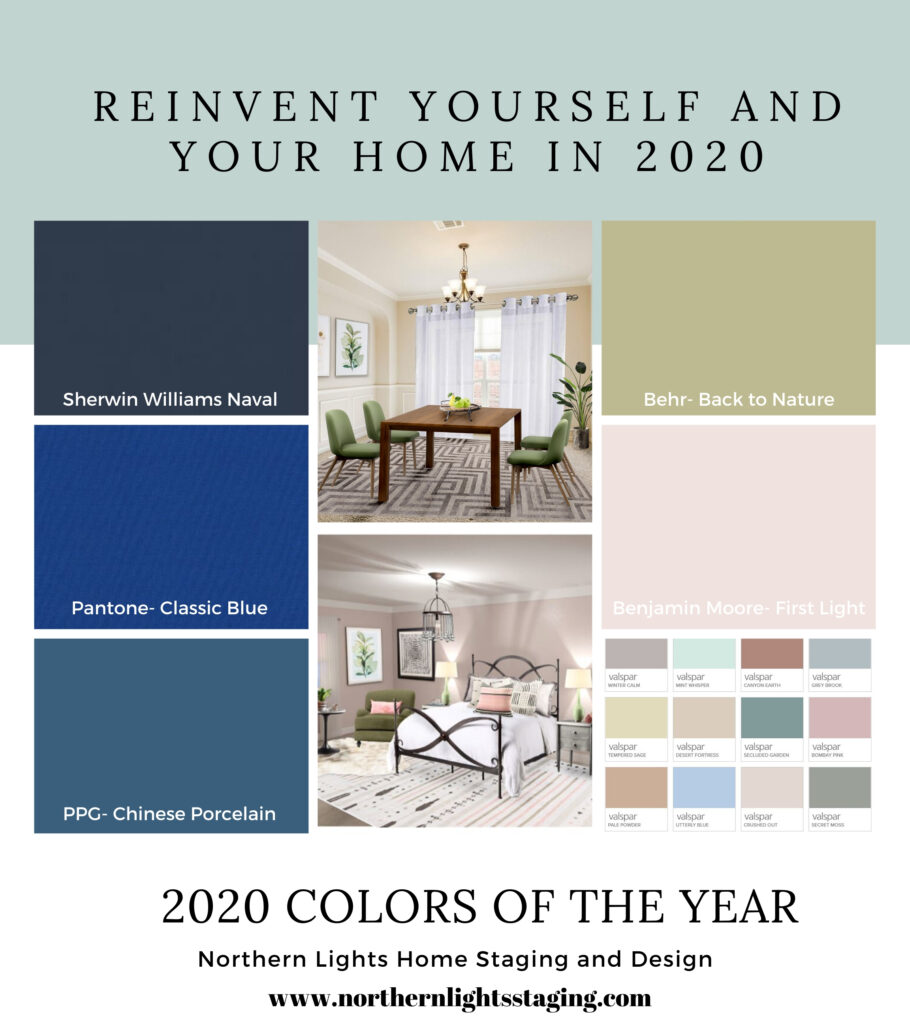
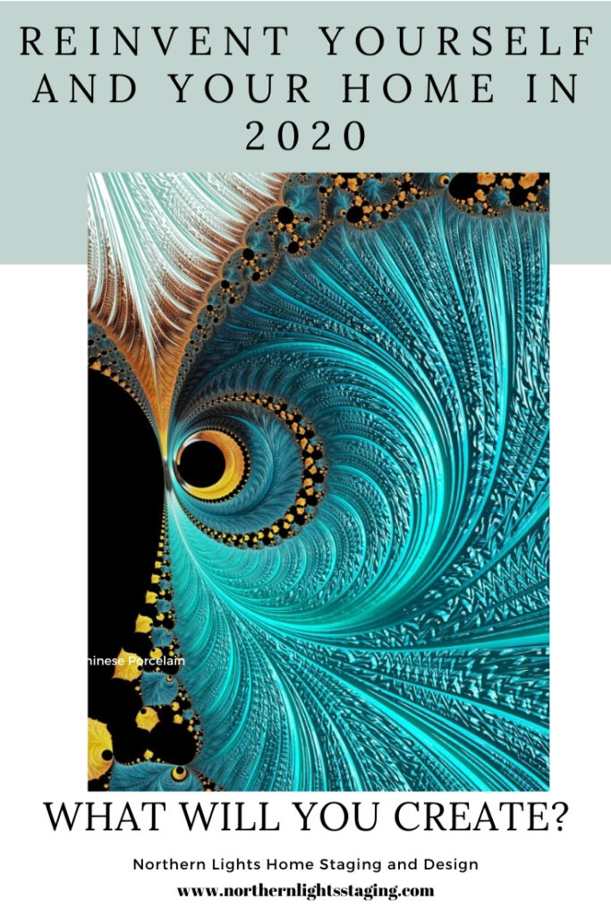
Color can also create a calm environment. Benjamin Moore’s 2020 color of the year First Light (a soft blush pink) is a calm, relaxing color that is great for a bedroom. Sherwin William’s 2020 color of the year Naval (dark navy), is described as a “rich navy that creates a calm and grounding environment infused with quiet confidence”. Sherwin Williams says that “Naval merges the desire for rich, inspiring color with our yearning for relaxation and retreat.” Even Pantone’s color of the year, Classic Blue, is described as a shade that would “bring a sense of calm to our fast-paced, technology-filled world”. “Reminiscent of a twilight sky, the deep shade of blue evokes a tranquil feeling.” Deep blue is considered one of the most soothing shades. PPG’s color of the year Chinese Porcelain, is also a deep blue, described as “a shade of blue that instills calmness, reduces anxiety, and encourages sleep”. “This soothing blue imparts slowness, encouraging consumers to practice mindfulness and be more present in their lives”. Sounds like these paint companies were thinking about getting rid of the monkey chatter too!
Get Connected
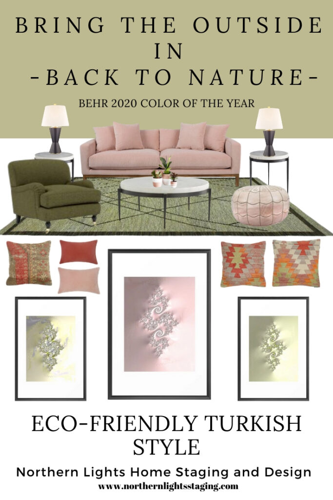
One benefit of meditation is to connect to something greater than yourself. The universal energy. Get comfortable with yourself and then connect with everything around you and the energy of other living things. This need for connection with other living things is called “biophilia”, which I will write more about in an upcoming blog article. In terms of home design, to me that means “bringing the outside in”. One way to do this besides having lots of windows with views of nature is again, with color. Behr’s 2020 color of the year Back to Nature is a nice green they describe as a “restorative and revitalizing green hue that engages the senses and pairs well with other colors both inside and outside your home”. Classic Blue, Pantone’s 2020 color of the year, described as the color of “twilight” can also work. Valspar came up with 20 colors of the year for 2020, in shades of pinks, greens and neutrals all based on nature.
If you decide to try one of the “colors of the year”, most vendors in the design industry are in tune with these colors so it is easy to find furnishings, accessories and art to work with them.
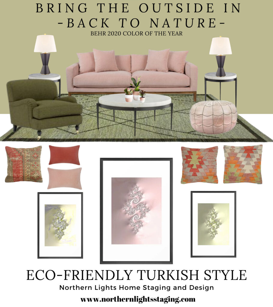
Here is an example of how you can pull together all the ideas that I mentioned. I created this global style, eco-friendly design for a living room using Behr’s color of the year, Back to Nature. This design uses elements of Turkish style, with a beautiful handmade, authentic new kilim rug that has many of the traditional elements of true vintage Turkish Kilims. It is 10 x 13 and made of wool, so is eco-friendly. The Kilim pillow covers, (pillow 1, pillow 2, and pillow 3) are hand woven and made of 40-50 years old Turkish kilim fragments backed with cotton cloth. You can get 5% off the rug and pillows and anything you like at Kilim.com with code nls2019 at check out. I adore the soft look of the pink velvet sofa, which also comes in a beautiful shade very close to Back to Nature. The velvet lumbar pillows come in both coral and moss colors. The clean hour-glass shape of the black lamps go beautifully with the design of the Turkish rug. I also love the pink Moroccan pouf! The iron and marble side tables and coffee table add a modern, simple element and are eco-friendly.
Recommendations contain affiliate links, meaning they give me a small commission for sharing at no additional cost to you.
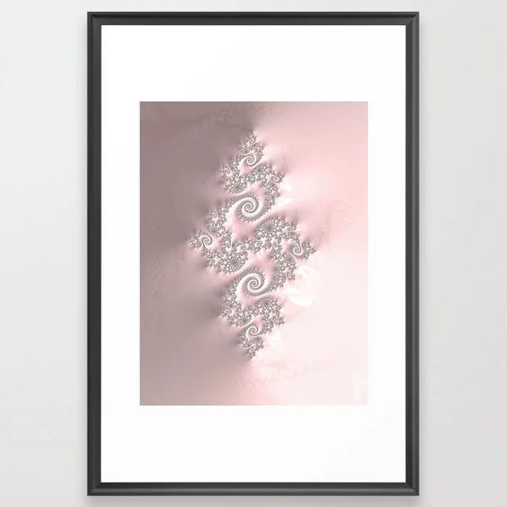
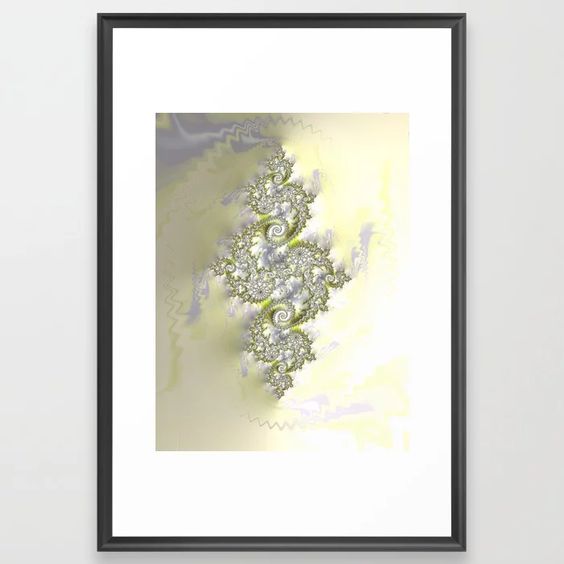
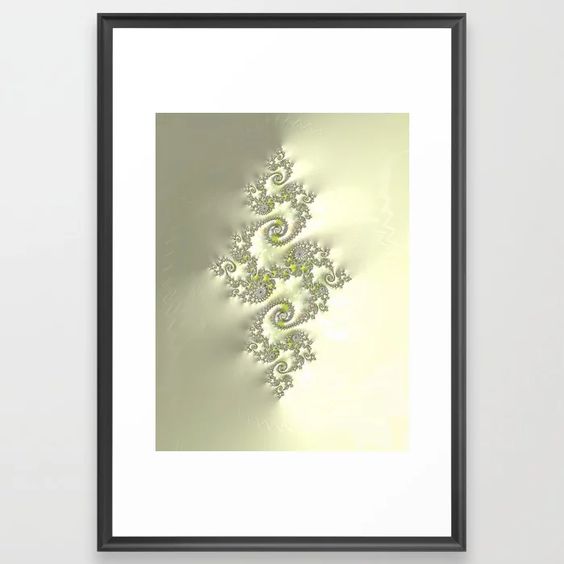
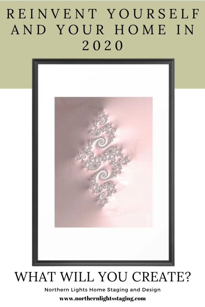
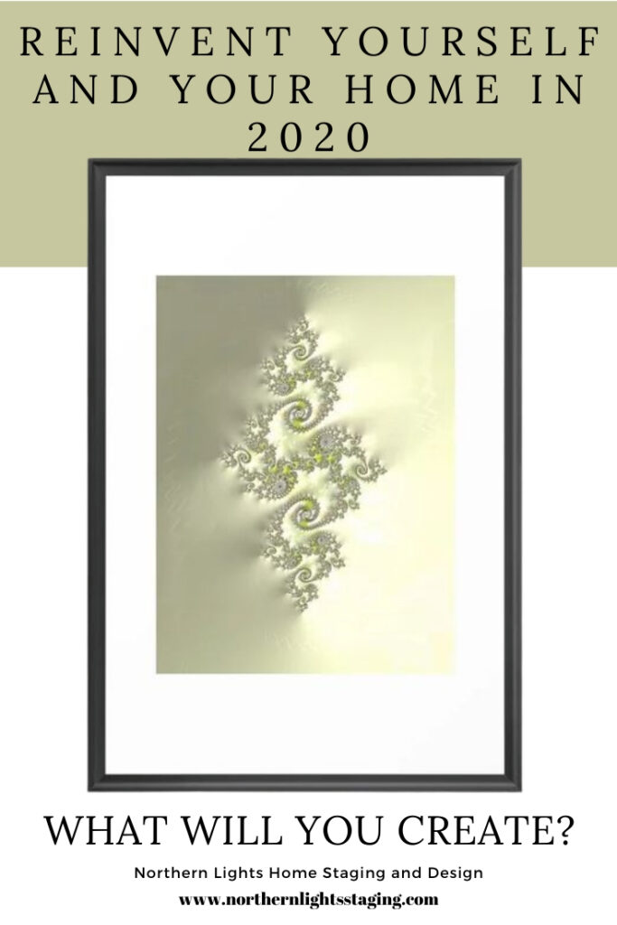
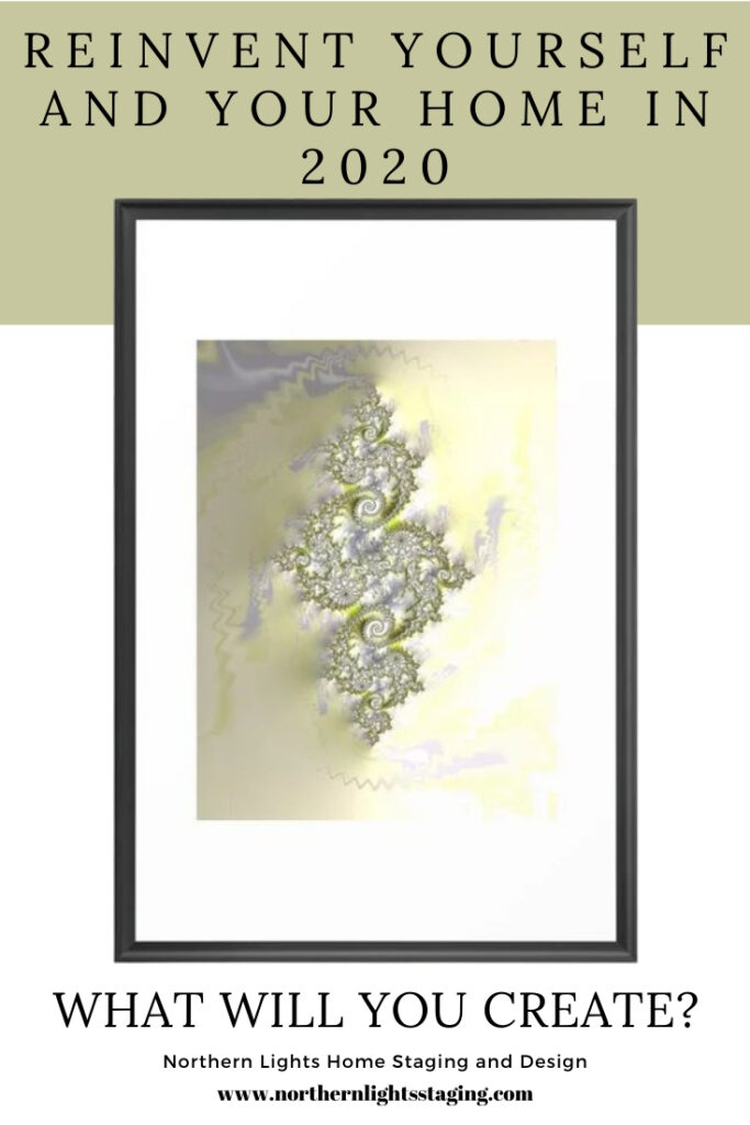
I created fractal art for this design to work with both Turkish style and the color Back to Nature. I think these elements would also go beautifully with Benjamin Moore’s First Light. The three designs, called Connection, Connecting and Connect work together and are available at my store on Society6. Learn more about my fractal art in my article Fractal Art for Interior Design.
Connection- Fractal art by Mary Ann Benoit of Northern Lights Home Staging and Design.
Connecting- Fractal art by Mary Ann Benoit of Northern Lights Home Staging and Design.
Connect- Fractal art by Mary Ann Benoit of Northern Lights Home Staging and Design.
As I write this article, I realize that even though I was not thinking about design “trends”, the colors of the year perfectly reflect the direction I want to go in 2020. I assume many others feel the same, as the colors of the year tend to reflect the direction our culture is moving.
I hope this article inspires you to be your best self in the coming year and gives you a few ideas to get there. Happy New Year!
Need Help with Your Colors?
If you are ready to make a change, I’m here to help. Why not start with a color consultation. Learn more.