Evolve with Transmutation: The Art of Alchemy & Transformation

Transmutation: The Power of Turning Lead into Gold

True transformation isn’t just about change—it’s about evolution. It’s about taking what feels heavy, stagnant, or limiting and refining it into something luminous, powerful, and free.

That’s the essence of the Transmutation Collection—a visual alchemy of energy, movement, and personal awakening. Inspired by the ancient metaphor of turning lead into gold, this series reflects the profound journey of spiritual refinement—the shift from density into light, from fear into wisdom, from doubt into confidence.

Each piece within this collection represents a different phase of transformation, from the initial spark of awakening to the final stage of elevation and mastery. Whether you are navigating personal growth, deepening your spiritual practice, or stepping into a new chapter, the Transmutation Collection is a reminder of your limitless ability to evolve.
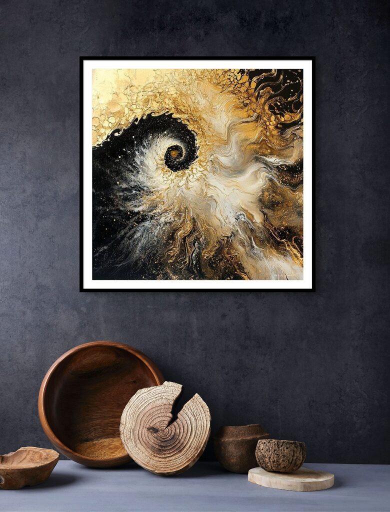

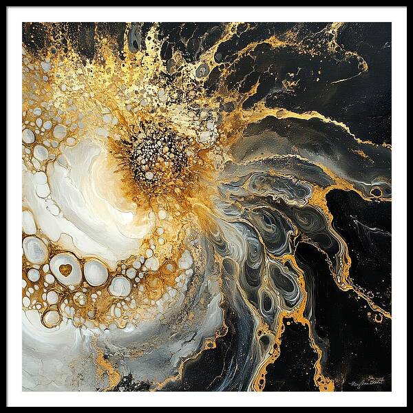
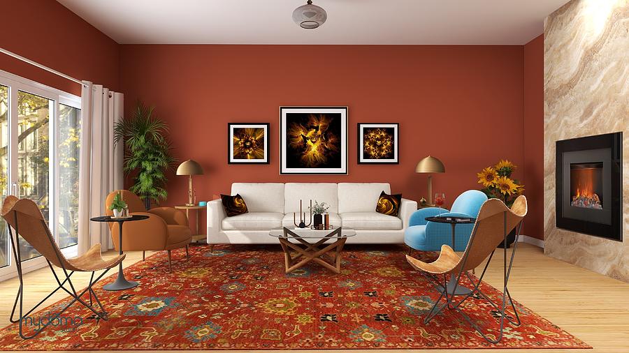
Transmutation Energy Art Collection – a visual alchemy of transformation, turning stagnant energy into light, clarity, and evolution.
“Transmutation” energy art by Mary Ann Benoit

How Energy Art Supports Transformation & Growth

Energy art is more than decoration—it’s a portal. Every color, movement, and form within the Transmutation Collection has been intentionally designed to help you:

  • Release old patterns that keep you stuck in the past.
  • Shift your energy from lower frequencies to higher states of clarity and empowerment.
  • Align with your highest potential, embracing new opportunities and personal expansion.
  • Transmute negative energy into fuel for growth and self-mastery.

The swirling golden and black hues throughout the series create a cosmic vortex, drawing you into deep self-reflection while radiating a frequency of renewal and inspiration. Just as the alchemist turns base metals into gold, this collection serves as a daily reminder that you have the power to transform yourself and your reality.
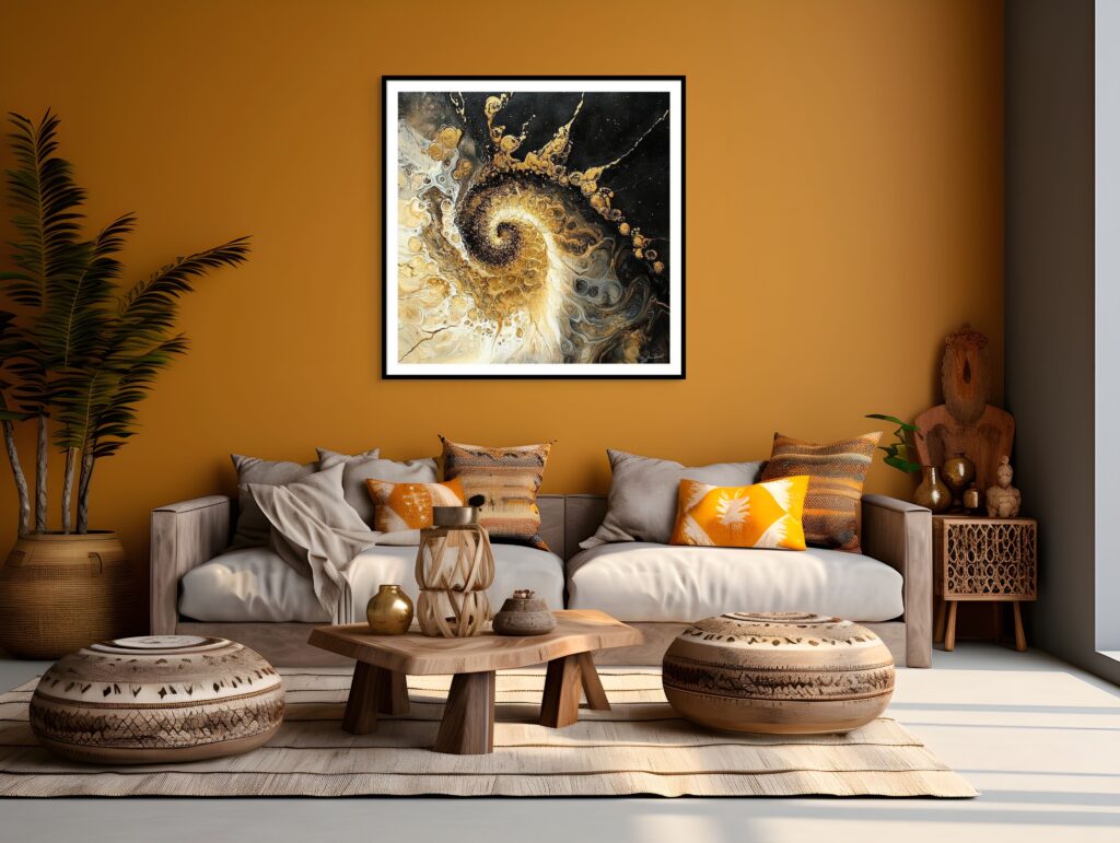

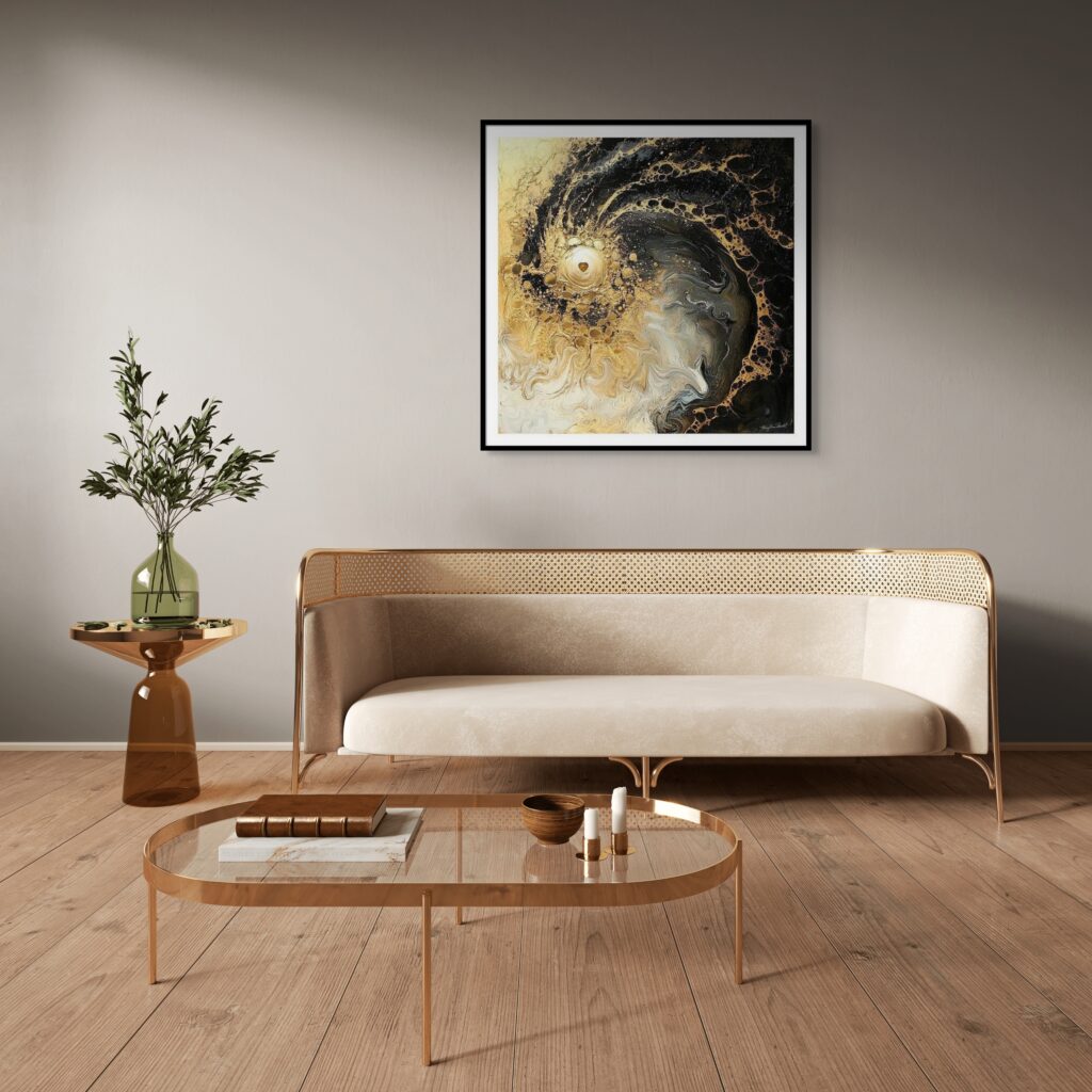
Transmutation Energy Art Collection – a visual alchemy of transformation, turning stagnant energy into light, clarity, and evolution.
“Transmutation #5” energy art by Mary Ann Benoit

The Intentional Creation Process: How I Infuse Energy into Transmutation

The Transmutation Collection is created through a deeply intentional process, blending:

  • Guidance from Spiritual Wisdom – I use the words and wisdom of spiritual teachings to shape the digital layers of my art, setting the intention of transformation, elevation, and inner alchemy.
  • Sacred Symbols & Fractal Energy – Using fractal designs , I weave sacred symbols into each piece, adding depth, meaning, and energetic charge to the artwork.
  • Layering & Subliminal Messaging – Some pieces may feature overlays of my other artworks, carefully chosen to enhance the energy of transformation and create hidden layers of meaning that reinforce the subconscious energy of growth and renewal.
  • Infusion of Intention – Beyond the colors and forms, I set the intention of transformation and expansion into this series, creating a powerful synergy between the energy of the art and your personal journey of growth.

Each piece in this collection is a step in the process of transmutation, guiding you through release, elevation, and expansion
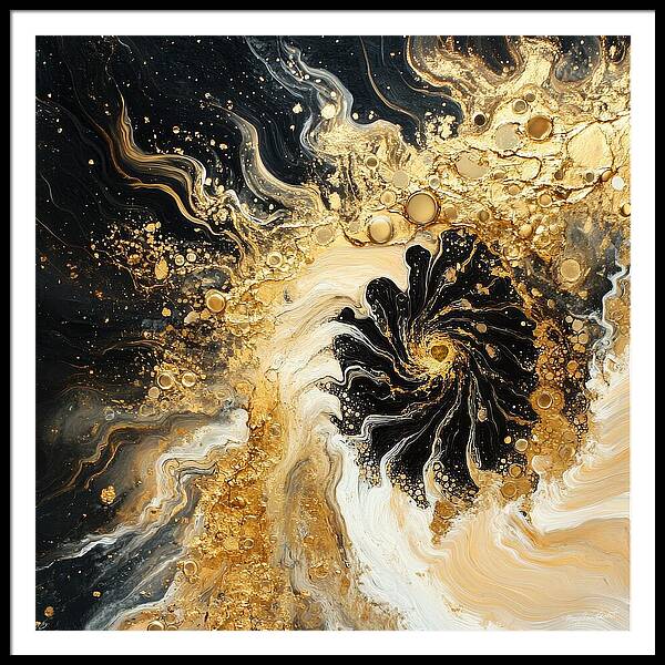
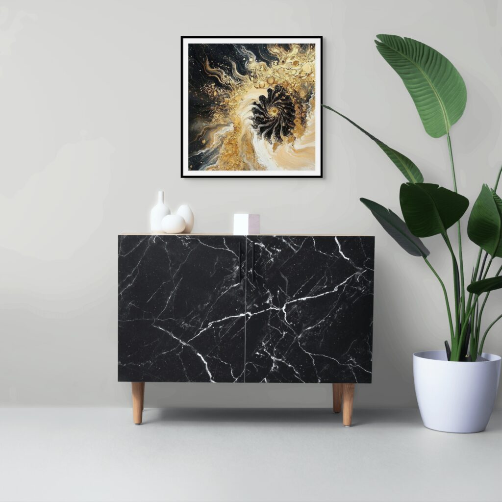
"Transmutation #6" energy art by Mary Ann Benoit
“Transmutation #6” energy art by Mary Ann Benoit

Transmutation Energy Art Collection – a visual alchemy of transformation, turning stagnant energy into light, clarity, and evolution.
Step into the alchemy of transformation—Transmutation Energy Art invites you to evolve, expand, and awaken your highest self.

Where to Use Transmutation in Your Space

Because this collection radiates a frequency of expansion, evolution, and empowerment, it is ideal for:

🔹 Meditation & Healing Spaces – Supports deep reflection, clarity, and energetic clearing.
🔹 Offices & Creative Workspaces – Inspires visionary thinking, innovation, and bold action.
🔹 Entryways or Personal Altars – A daily reminder that transformation is always within reach.

🔗 Shop the Transmutation Collection Here
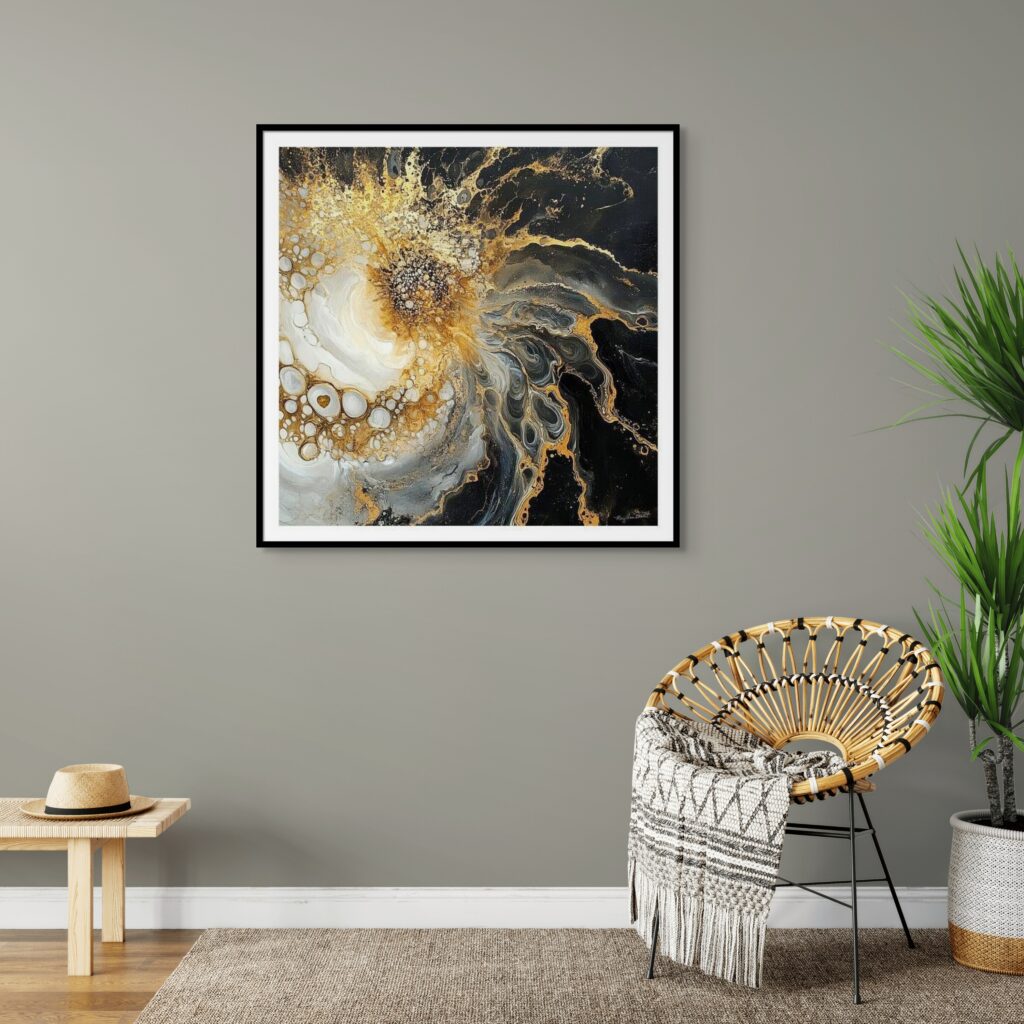

Transmutation Energy Art Collection – a visual alchemy of transformation, turning stagnant energy into light, clarity, and evolution.
The Transmutation Collection – a powerful series of energy art for growth, awakening, and transformation.

"Transmutation #2" energy art by Mary Ann Benoit
“Transmutation #2” energy art by Mary Ann Benoit

Transmutation & The Power of Evolving Energy

The Transmutation Collection is part of my Evolve Energy Art Series, which supports those on a path of growth, awakening, and deeper alignment.

If you are drawn to this collection, you may also be inspired by:

🔹 White Space Collection – Art designed for clarity, stillness, and expansion.
🔹 Awakening Collection – Energy art that guides you into higher states of awareness. Find inner peace, and connect with your true self. Let go of old patterns and embrace love and compassion.
🔹 Transforming Collection – A collection of ethereal abstracts inspiring personal and spiritual transformation.

➡️ Explore the Full Evolve Collection Here
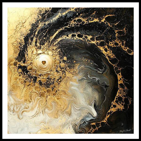

Transmutation Energy Art Collection – a visual alchemy of transformation, turning stagnant energy into light, clarity, and evolution.
“Transmutation #8” energy art by Mary Ann Benoit

Transmutation Energy Art Collection – a visual alchemy of transformation, turning stagnant energy into light, clarity, and evolution.
Let the energy of transmutation fill your space with clarity, renewal, and transformation

See It in Action: Transmutation in My Saturday Night Live Art Shows

Energy art is more than just something to admire—it’s an experience. In my Saturday Night Live Art Shows, I dive deeper into the meaning, energy, and creation process behind each piece, showing you how my Transmutation Energy Art can shift your space and your energy.

Watch the transformation unfold as I showcase the layers of sacred symbols, fractal geometry, and intentional energy that bring each piece to life.
See how it works in real spaces—discover how these artworks can enhance your home in one of my interior designs.
Feel the energy for yourself—each piece carries a powerful vibration designed to help you release, evolve, and align with your highest self.

🔗 Watch the latest episode & explore the Transmutation Collection in action!

💫 Join me live every Saturday night on YouTube to experience the magic of energy art!
📺 Subscribe & Watch Here.

Wear the Energy of Transmutation

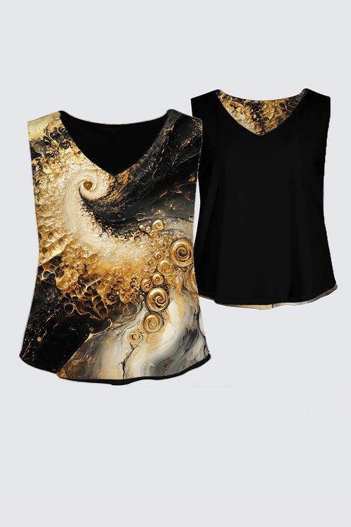
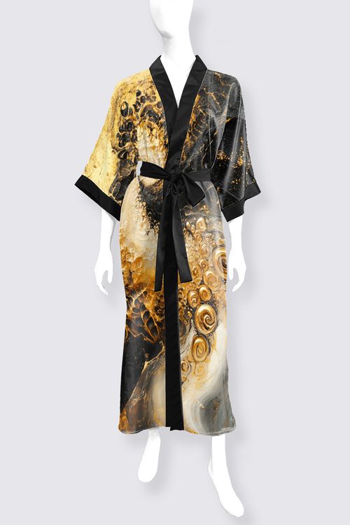
Energy isn’t just something you surround yourself with—it’s something you carry with you. My Transmutation Energy Art isn’t limited to your walls—it’s available as wearable art so you can embody transformation wherever you go.

Infuse your daily life with powerful energy—whether through a flowing robe, an elegant dress, or a bold statement bag.


Let the symbolism of transmutation guide you—each piece is infused with sacred geometry, fractal layers, and deep intentional energy.
Move through your day with confidence & alignment—wearable art allows you to bring the essence of transformation, release, and renewal into your personal style.

🔗 Explore the Transmutation Collection in Wearable Art!

Transform not just your space, but your presence. Wear the energy. Live the change.
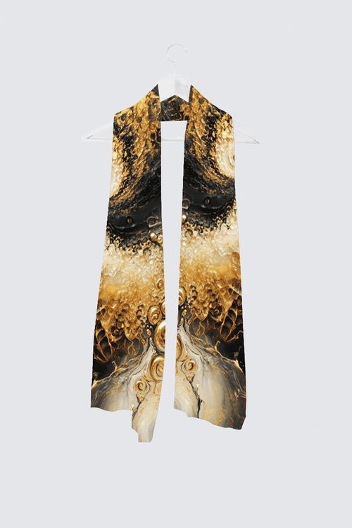

Transmutation Vivienne Scarf

Transmutation Kaplan+ Tank

Transmutation Phoenix Long Satin Kimono

Ready to Step Into Your Power?

Your ability to evolve and transform is infinite. Just like the alchemists who turned lead into gold, you are constantly refining, growing, and shifting into higher versions of yourself.

Let the Transmutation Collection be your energetic reminder that you are always in motion toward something greater. Whether it’s placed in your home, workspace, or meditation area, these pieces are here to amplify your energy and empower your journey.

Are you ready to step into the next version of yourself?

🔹 Shop the Transmutation Collection
🔹 Explore More Energy Art for Evolution 
🔹 Wear the Energy of Transformation with Le Galeriste Fashion: 

🔹Commission your own energy art for transformation.

Evolve. Transform. Rise. 

Custom Energy Art
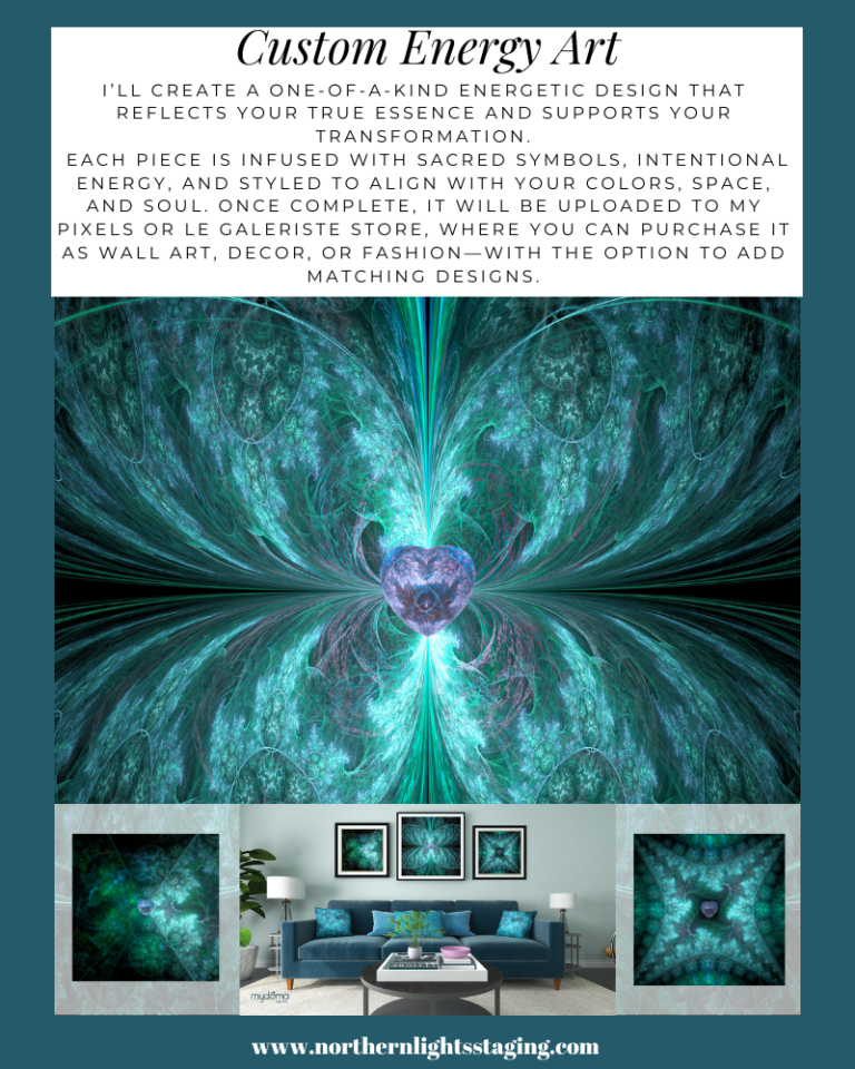
Custom energy art by Mary Ann Benoit featuring sacred symbols, intentional color, and aligned styling for transformation. Available as wall art, décor, or fashion with optional matching designs.

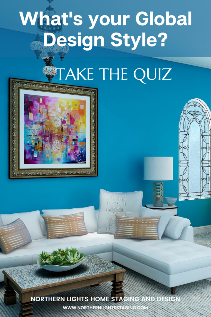
What's Your Global Design Style? Take the Quiz


Aligned Design©– All Rights Reserved.

Terms of Service  |  Privacy Policy  |  Disclaimer |  Brochure

Prices are subject to change without notice.

Call 907-362-0065 today


Bring the Outdoors in with Interior Design

As humans, we want to be connected with nature and other living things such as people, animals, and plants because it makes us feel good. This longing for “connection” is called “biophilia”.

There are numerous ways that we could use Interior Design to get that connection for a happier, healthier home including using natural materials, plants, animals, color, art, scents, and lighting.

Some tips include”

  • Bringing the outdoors “in” through the use of design, strategic window placement, and use of colors that harmonize with the outdoor environment. Use your outdoor windows as indoor “art”.
  • Using the colors of nature in your home such as blues, greens, browns, off whites and grays since they are prominent in trees, shrubs, the sky and water.
  • Using color from your outdoor landscaping visible from your windows in your color scheme.
  • Using art that shows landscapes, plants, animals, or other natural elements.
  • Designing to make it easy to live with pets such as pet-friendly upholstery, washable rugs, etc.
  • Creating exterior landscapes that are visible through your windows and are beautiful, colorful, smell great, and attract wildlife.

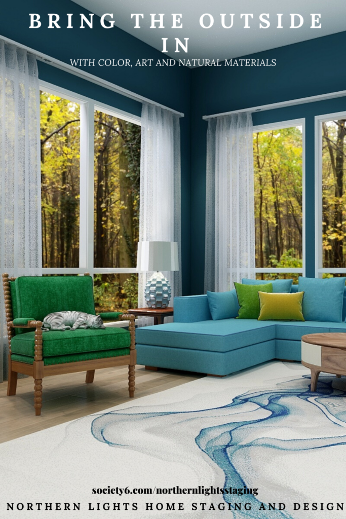
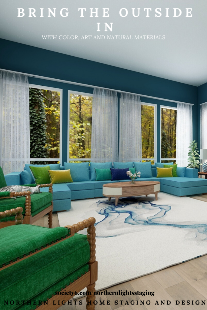
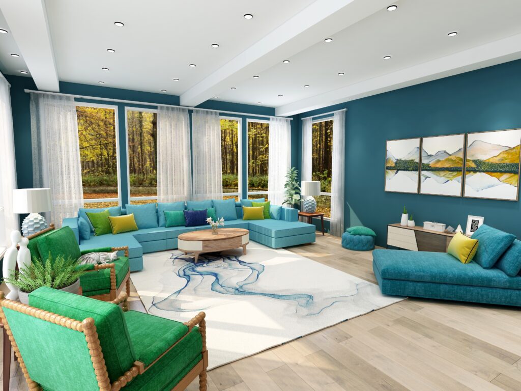
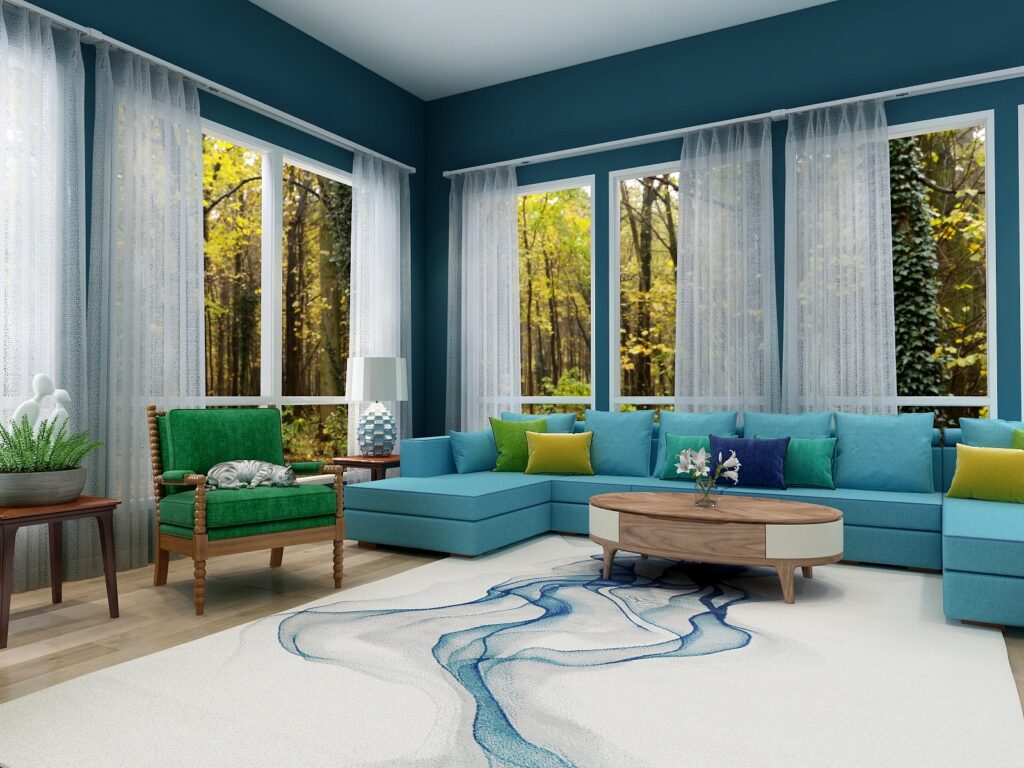
This Edesign for a global style living and dining room is a nice example of how to apply some of these ideas.


Modern Global Style Living Room by Northern Lights Home Staging and Design
Global Style Living Room by Northern Lights Home Staging and Design. Bring the Outdoors In.

In this design, the windows and beautiful views of the forest provide the perfect indoor “art” and create a focal point and color scheme for the design.

  • The color palette from this “art” or view includes greens, yellows, browns and blue from the sky which are incorporated in the furniture, pillows and wall color. Various shades of green are used to highlight the various shades outside. The area rug creates the illusion of flowing water.
  • The art shows a natural mountain landscape showing yellow birch trees similar to what is in the outdoor landscape.
  • The furnishings use pet friendly materials, and as you can see, makes it comfy cozy for pets such as the kitty on the chair.
  • The décor includes plants and flowers.
  • The furnishings and flooring are wood and include different wood types and colors for variety.
  • The window treatments allow in natural light and are simple in color and pattern to keep the focus on the outdoor view.
  • The lamps use the shape and pattern of a natural element (pineapple).

Global Style Living Room by Northern Lights Home Staging and Design. Bring the Outdoors In.

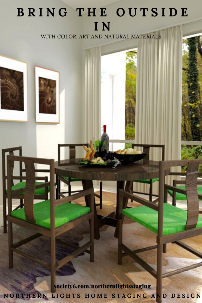
In the adjacent dining room, the forest theme continues.

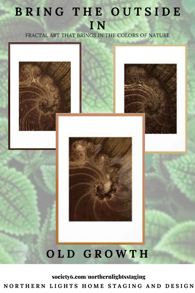
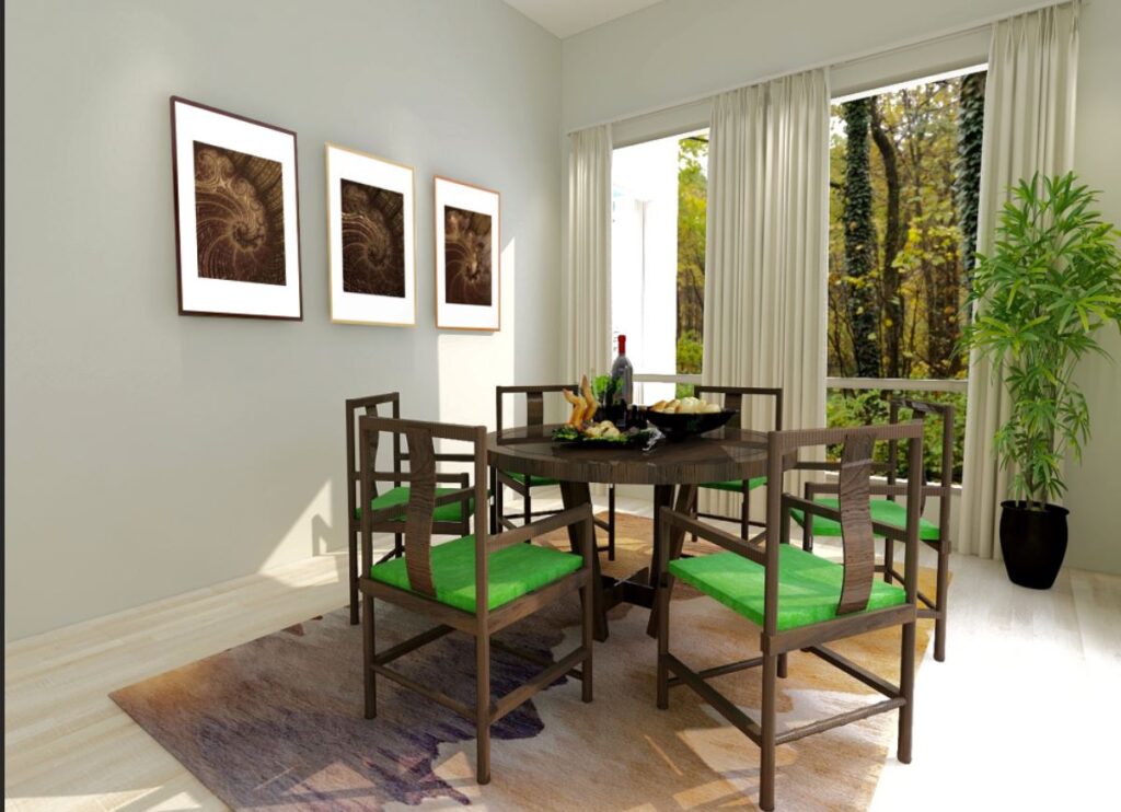
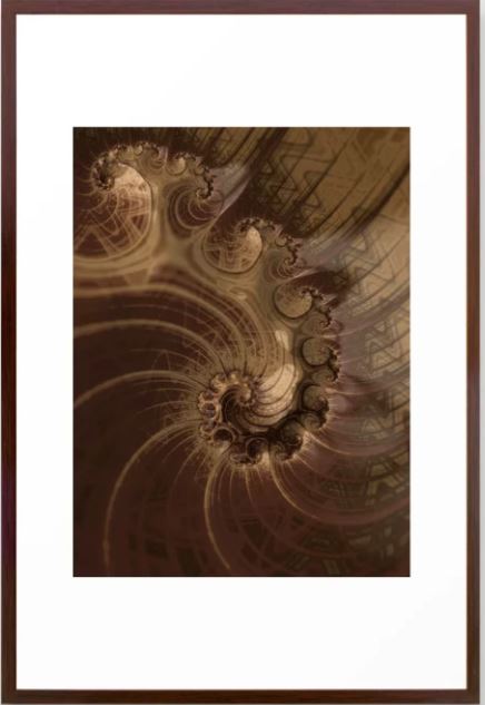
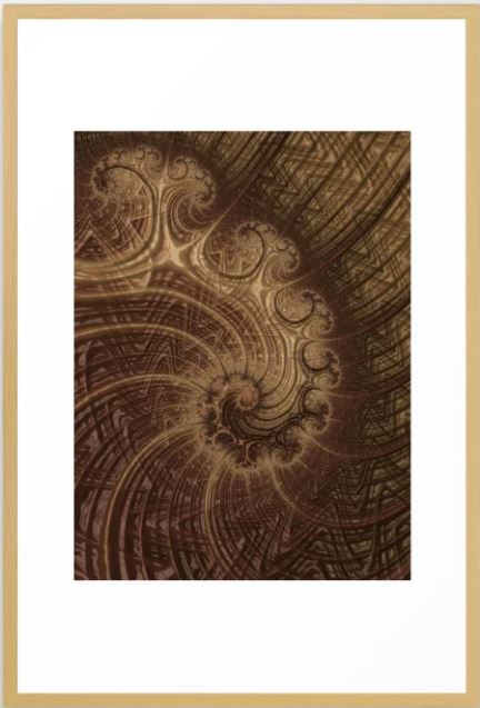
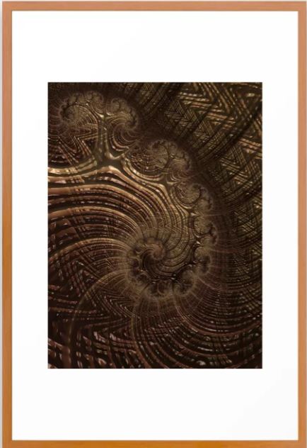
In this room, the browns of the forest are highlighted in the wood of the chairs and table the area rug with various shades of brown on the wood floor and the art. The fractal art which I designed is part of my “Old Growth” series I developed because it reminds me of the colors and patterns of an old growth forest. Each frame is in a different wood tone.


Old Growth Fractal Art by Northern Lights Home Staging and Design
Global Style Dining Room by Northern Lights Home Staging and Design. Bring the Outdoors In.

Old Growth Fractal Art
Old Growth

OLd Growth #2 Fractal Art
Old Growth #2

Old Growth #3 Fractal Art
Old Growth #3

The greens in the chair cushions add a pop of color and harmonize with the outdoor view and the living room colors. The décor includes plants.

The wall color here and window treatments are neutral to keep the focus on the outdoor views and the art.

Overall, this design is simple, affordable to create using color, natural elements such as wood and plants and art that highlights nature. The overall feeling is one of serenity with a focus on the amazing forest views. The look of this room will change as the seasons change and the yellow from the fall foliage changes to green, but it will still look great.

Ready to Bring the Outside in To Your Home?

Need help with your home? Try my Aligned Design consultation or my Design Coach package.


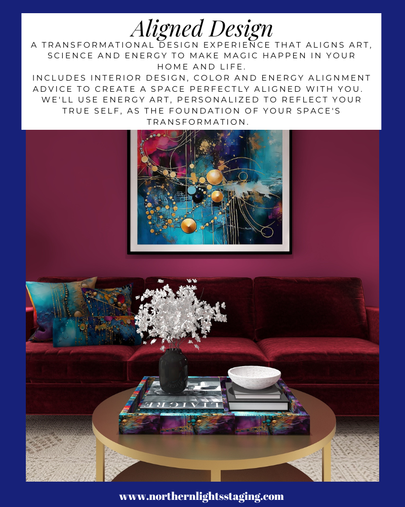
A transformational design experience that aligns Art, Science and Energy to Make Magic Happen in your Home and Life. Includes Interior Design, Color and Energy alignment advice to create a space perfectly aligned with you. We'll use Energy Art, personalized to reflect your true self, as the foundation of your space's transformation.


Online or In Person?


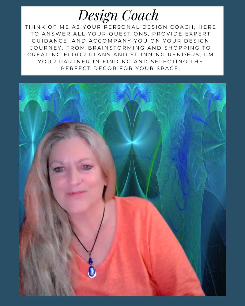
Think of me as your personal design coach, here to answer all your questions, provide expert guidance, and accompany you on your design journey. From brainstorming and shopping to creating floor plans and stunning renders, I'm your partner in finding and selecting the perfect decor for your space.


Online or In Person?


Pin These and Follow me on Pinterest

Bring the Outside in with Interior Design using color, natural materials, art and pet friendly fabrics. #edesign #edesigntribe #edesignrevolution #onlinedesign #virtualdesign #interiordesign #homedecor #interiordecor #homedesign #interiordecorating #interiorinspiration #interiorstyle #interior4all #interiordesigner #colorfulhome #interiorstyling #moderndesign #modern #globaldesign #bohemian #globalstyle #contemporary #boho #biophilia #greendesign #sustainabledesign #fractal art #nature

What's Your Global Design Style? Take the Quiz


Why Work with Northern Lights Home Staging and Design

Aligned Design©– All Rights Reserved.

Terms of Service  |  Privacy Policy  |  Disclaimer |  Brochure

Prices are subject to change without notice.

Call 907-362-0065 today


Ways to Use Sherwin Williams Urbane Bronze

When I first saw Sherwin William’s “Urbane Bronze”, I was unsure how I felt about it. Browns can be nice to work with, rather serene and a color of nature so nice to “bring the outside in”.


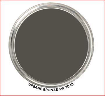
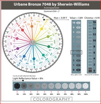
Urbane Bronze- Graphic by Camp Chroma
Sherwin Williams 2021 Color of the Year, Urbane Bronze. Graphic by Camp Chroma.

According to the color data Urbane Bronze is actually a yellow hue (really, it’s true) that looks brown because of it’s low chroma and lightness.


Urbane Bronze- Colorography by Camp Chroma
Colorography of Urbane Bronze by Lori Sawaya of Camp Chroma.

Sherwin Williams describes Urbane Bronze as as a color to

“Tap into nature with a hue whose warmth and comfort breathe down-to-earth tranquility”.

“As we’re looking to create the ultimate retreat for reflection and renewal, we’re turning to a hue whose natural simplicity and nature-inspired energy cultivate a sense of calm from the ground up.”

“The trend for biophilia continues to shape our spaces, proving that nature is never far away. Urbane Bronze might be a color rooted in nature, but it also has a unique ability to ground a room through organic appeal.”

OK, so it is supposed to help us feel rooted to nature. I thought about where I may have seen this color in nature. Maybe along mudflats at the beach, possibly in rocks and some types of earth. It does remind me a bit of the color of sea otter fur.

andrew-smarius-jZWgpG8k6Ec-unsplash
Sea otter. Photo by Andrew Smarius on Unsplash

Master Bedroom Design

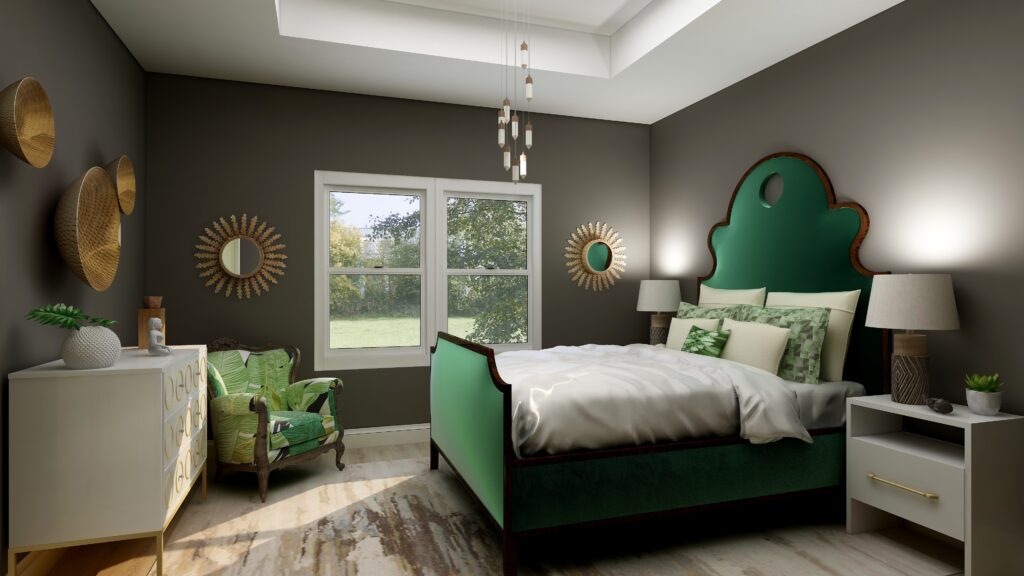
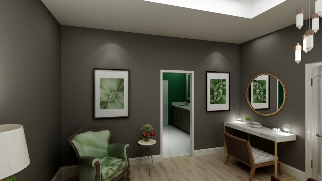
I used Urbane Bronze as the wall color with primarily dark and light greens,  browns and white to create a color palette from nature.

Urbane Bronze is actually a Yellow hue, so this works because it is creating an analogous color scheme with yellow, yellow-green and green that are next to each other on the color wheel.

See my blog article on how to use analogous color schemes,  Create a Harmonious Color Scheme- Go Analogous. 

The mixture of soft fabrics with different metals, wood and pottery add natural elements and a variety of textures.

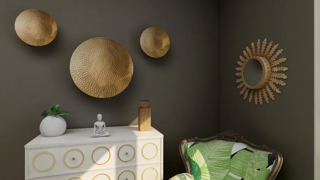
Ways to Use Sherwin Williams 2021 Color of the Year Urbane Bronze
Edesign using Urbane Bronze by Northern Lights Home Staging and Design
Ways to Use Sherwin Williams 2021 Color of the Year Urbane Bronze
Edesign using Urbane Bronze by Northern Lights Home Staging and Design
Ways to Use Sherwin Williams 2021 Color of the Year Urbane Bronze
Edesign using Urbane Bronze by Northern Lights Home Staging and Design

What are the Pros and Cons of Choosing a Bronze Paint Color?

Pros of Working with a Bronze Colored Paint:

  1. Warm and Inviting: Bronze paint adds warmth to a room and can create a cozy and welcoming ambiance.
  2. Versatile: Suits both modern and traditional interiors, complementing a wide range of décor styles.
  3. Sophisticated: The metallic sheen can lend an air of sophistication and luxury.
  4. Pairs Well: It complements a variety of other colors, especially earth tones, deep blues, and greens.
  5. Accentuates Features: Great for highlighting architectural details, moldings, or feature walls.
  6. Durability: Metallic bronze paints can often be more durable and resistant to damage than flat finishes.
  7. Light Reflectivity: Its slight sheen can reflect light, making spaces feel more vibrant and sometimes larger.

Cons of Working with a Bronze Colored Paint:

  1. Application Difficulty: Metallic and bronze paints can show brush strokes or roller marks more easily than flat paints.
  2. Prep Work: Imperfections on walls, like dents or scratches, can be accentuated, requiring more prep work.
  3. Trend Sensitivity: While classic, certain shades of bronze may go in and out of trend, potentially dating the décor.
  4. Overwhelming: In small spaces or spaces without a lot of natural light, bronze can feel a bit overwhelming or dark.
  5. Cost: Quality metallic paints, including bronze, can sometimes be more expensive than standard paints.
  6. Maintenance: Fingerprints, smudges, or dirt can be more noticeable, requiring more frequent cleaning.
  7. Limited Availability: Not all paint brands offer a wide variety of bronze shades, limiting choices.

Remember, the success of using bronze paint largely depends on the specific shade of bronze, the room’s lighting, its size, and the accompanying decor. Always test a sample on the wall before committing to a full paint job.

Are You Inspired?

Get your colors right the first time with an expert science based color consultation.


Not Your Average Color Consultation


Ten Ways To Not Screw Up Picking Your Paint Colors

Why Work with Northern Lights Home Staging and Design

Aligned Design©– All Rights Reserved.

Terms of Service  |  Privacy Policy  |  Disclaimer |  Brochure

Prices are subject to change without notice.

Call 907-362-0065 today


How can I work with an Interior Designer on my budget?

How can I work with an Interior Designer on my budget?

Many perceive hiring an Interior Designer as a lavish expenditure during home renovation or updates. Yet, partnering with an expert can prevent costly errors, ensuring your investment aligns with your vision.


However, remodeling isn’t cheap, and budget constraints are real. Seeking professional advice that’s budget-friendly? Enter Edesign!


Edesign is the future-forward approach to Interior Design – completely online. It doesn’t matter if your preferred designer is local or states away; with Edesign, geographical boundaries blur.


It’s the answer to achieving stylish interiors swiftly, affordably, and at your convenience.

Solar Plexus Chakra
Edesign and custom energy art by Mary Ann Benoit of Northern Lights Home Staging and Design.

Edesign accelerates the design process and is budget-friendly primarily because it taps into retail sources instead of custom designs. You receive a curated shopping list and have the autonomy to decide what to buy and when.

Additionally, by taking on roles typically handled by a designer, like measuring and overseeing installations, you save both time and money. You also have the reins when it comes to hiring and managing contractors for any revamps.

In essence, Edesign is a synergized effort between the designer and you. With discussions over phone, email, or video calls, it fits seamlessly into your schedule, offering both convenience and control.

Becoming on the pillows.
Edesign and custom energy art by Mary Ann Benoit of Northern Lights Home Staging and Design.

Is an Edesigner right for you? 

Considering Edesign? It might be a good fit if you:

  • Seek affordable design solutions and are open to hands-on involvement.
  • Enjoy a DIY approach and collaborating in the design process.
  • Can measure and photograph your space with guidance.
  • Are adept at sharing your preferences through online images and product links.
  • Need a swift design plan and can help expedite the process.
  • Are okay with managing online purchases, including potential returns.
  • Can independently hire and oversee any required tradespeople.
  • Prefer to personally inspect local items before purchasing them. While the designer will recommend reputable brands and sources, it’s beneficial if you can review items firsthand
Edesign by Northern Lights Home Staging and Design
Edesign and custom energy art by Mary Ann Benoit of Northern Lights Home Staging and Design.

Consider hiring a local designer if:

  • You value face-to-face consultations and communication.
  • You want the designer to handle measurements and photography.
  • You like to personally review material samples, like fabric or tile.
  • Your project requires detailed construction plans.
  • You’re interested in custom-made furniture or cabinetry.
  • Handling online orders and potential returns isn’t your forte.
  • You desire simultaneous delivery and setup of items.
  • You prefer the designer oversees installation.
Edesign and custom energy art by Mary Ann Benoit of Northern Lights Home Staging and Design.

Remember, selecting Edesign with an Interior Designer doesn’t mean compromising quality for cost; it’s about smartly distributing tasks to achieve affordability.

Maximize Your Design Experience

Many designers offer both traditional and Edesign. If budget is a concern, ask your local designer if they provide Edesign options.

Northern Lights Home Staging and Design caters to both in-person and online needs, including Interior Design, Color Consulting, and Vacation Rental Design. I also create custom energy art for your design.

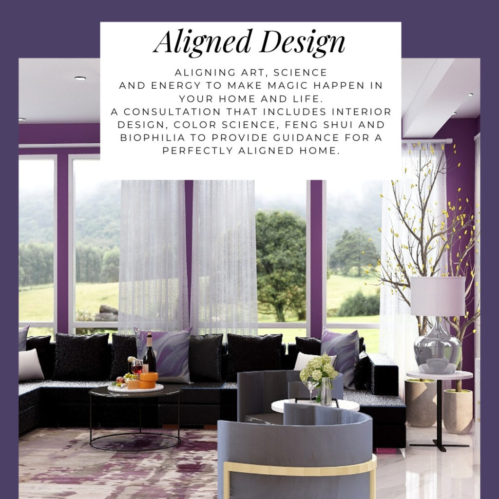
I use my exclusive Aligned Design system for both in person and online projects

A transformational design experience that aligns Art, Science and Energy to Make Magic Happen in your Home and Life. Includes Interior Design, Color and Energy alignment advice to create a space perfectly aligned with you. We'll use Energy Art, personalized to reflect your true self, as the foundation of your space's transformation.
Why Work with Northern Lights Home Staging and Design

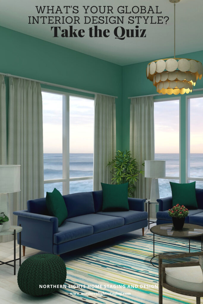
What is Your Global Design Style? Take the Quiz


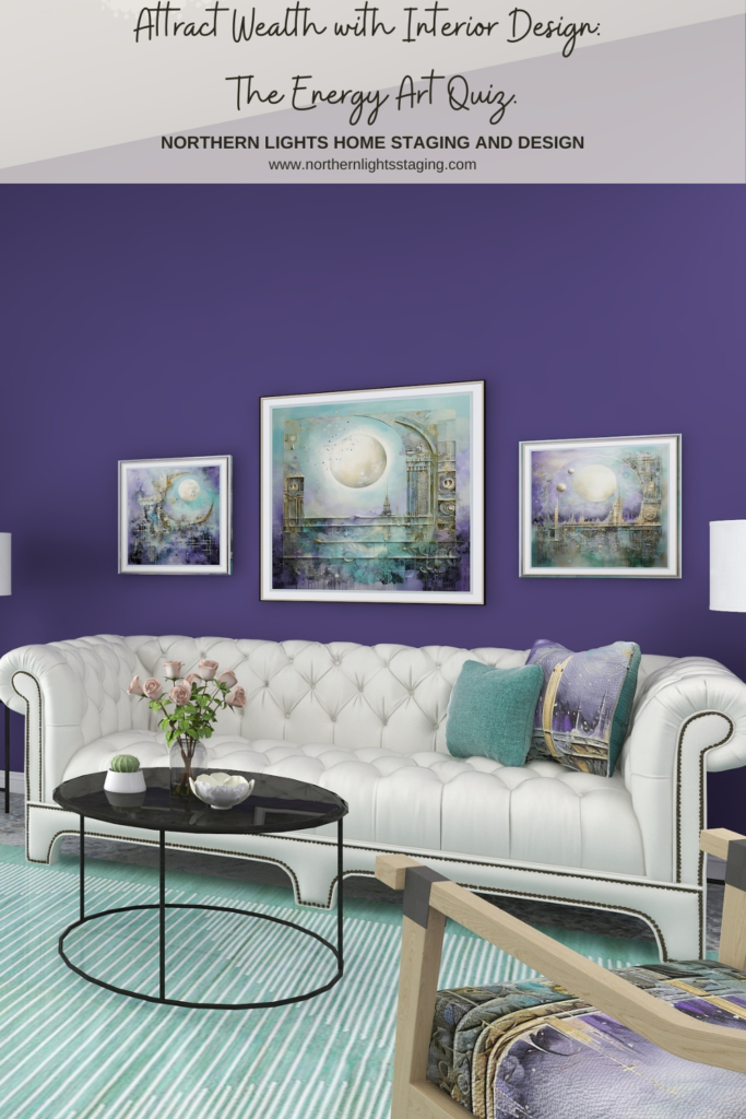
Attract Wealth with Interior Design: The Energy Art Quiz"- Northern Lights Home Staging and Design.

Aligned Design- All Rights Reserved.

Terms of Service  |  Privacy Policy  |  Disclaimer |  Brochure

Prices are subject to change without notice.

Call 907-362-0065 today


Create an Exotic Global Style Living Room with a Gorgeous Blue Rug

Bohemian style celebrates warm earthy colors, metals and jewel tones. Bohemian decor often uses deep browns, greens, grays or other neutral colors for base colors, then accessorizes with saturated purple, fiery orange, and electric blue and other jewel tones.

Bohemian style lovers are often carefree, dislike rules and want to follow their heart’s desire!

Do you like vintage furniture and light fixtures, globally inspired textiles and rugs, and love displaying your collections of cool things found at markets. thrift stores and in your travels?

I bet you like glamorous fabrics, lighting and accessories with well-worn items, antiques or cool pieces from other styles. Anything goes if it makes you happy. More is more!

Bohemian style is a global design style. Global styles are all about your worldly adventures and telling your story! They are usually very colorful, rich in bold designs and natural textures, patterns, colors, and arts and crafts of various cultures.

Get the Look and Celebrate Your Favorite Color- Blue!

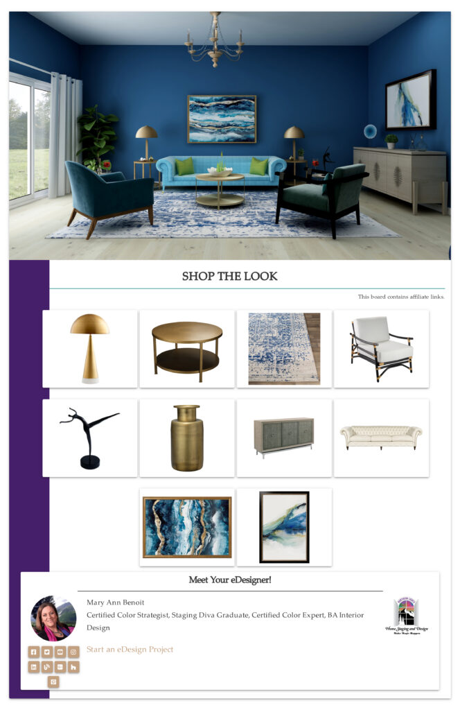
A great way to get the look of Bohemian style is with a beautiful area rug. It can become a focal point for your room and help guide the color scheme and your choices for accents and accessories such as throw pillows, art, lighting, and more.

Celebrate your favorite color by picking a rug that highlights it and build the rest of your room around the work of art you picked for your floor.

One of my favorite colors is blue, so here are some examples of my favorite blue Bohemian or global style rugs.

My Favorite Blue Global Style Rugs

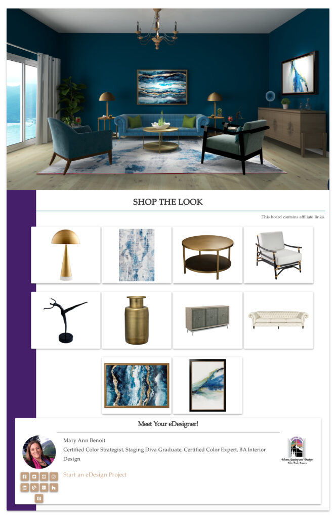
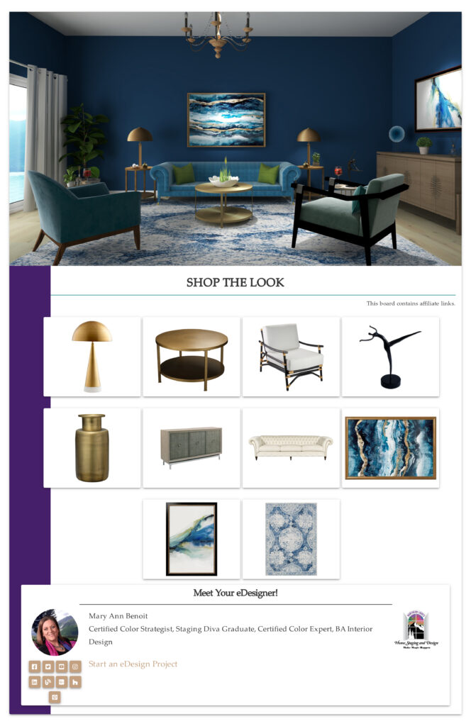
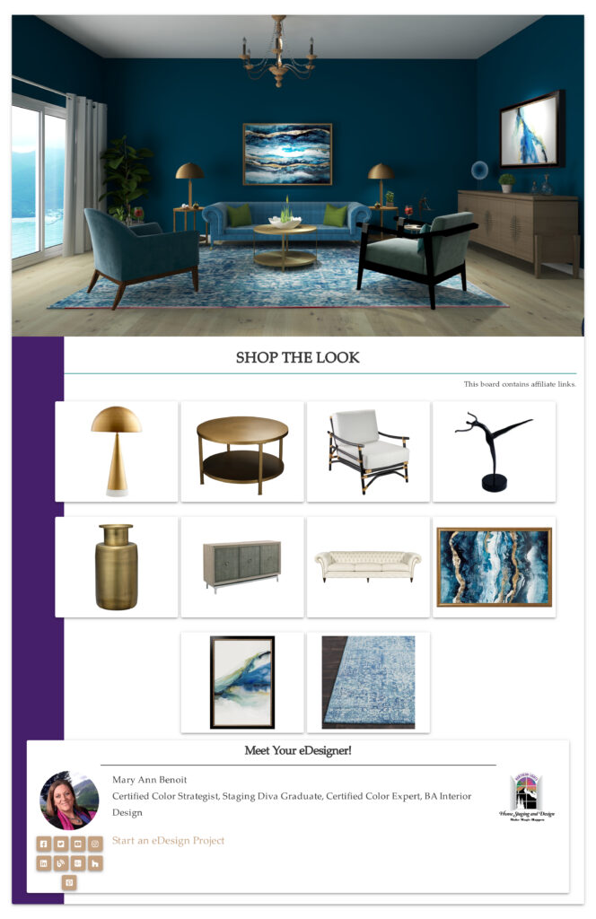
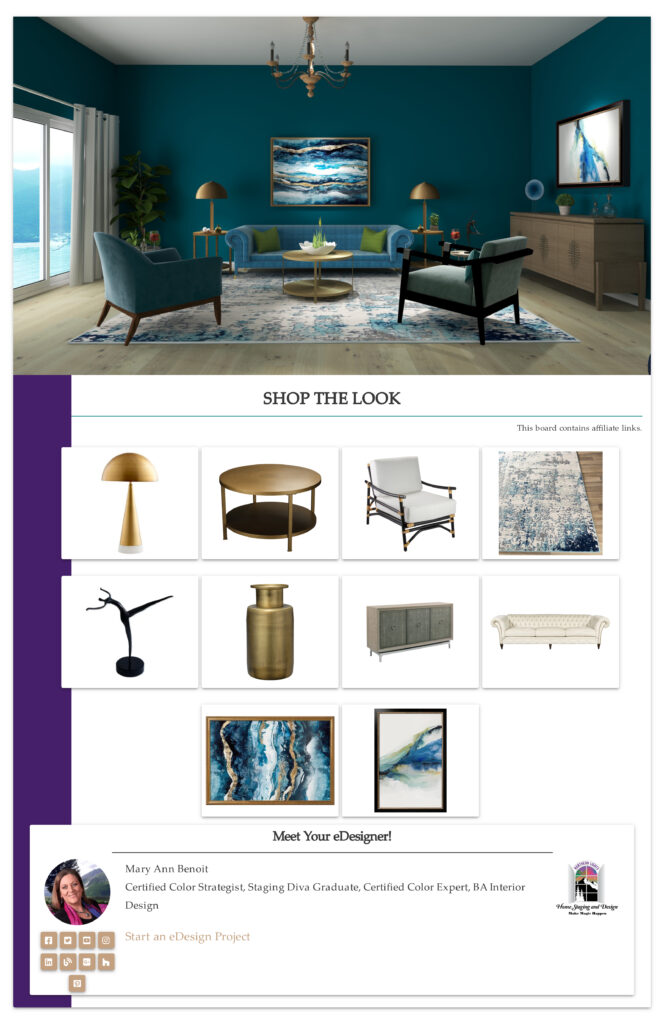
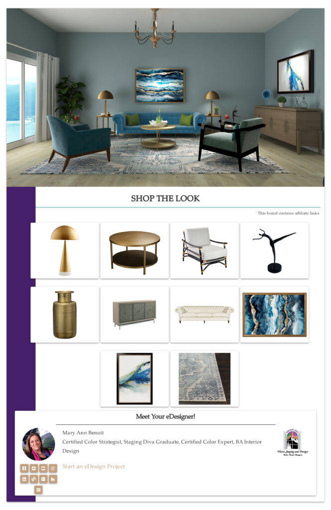
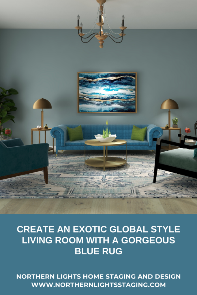
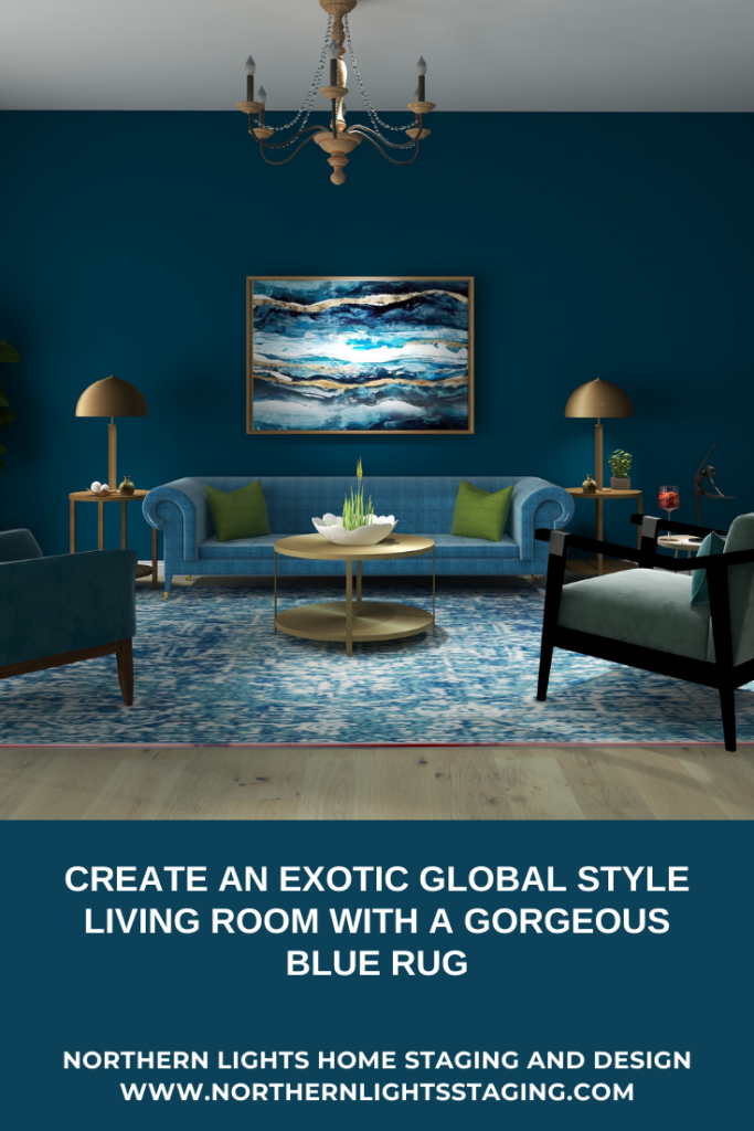
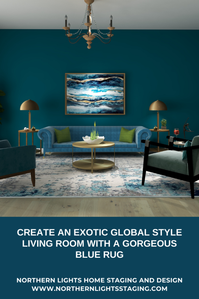
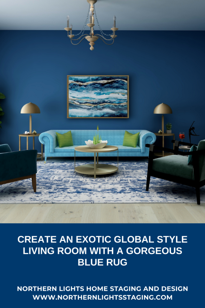
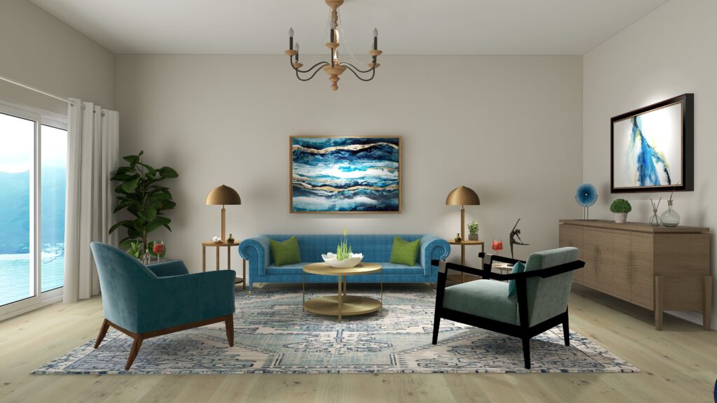
I changed the look of the following living room by changing the rug and sometimes the paint color. See how the room changes its look and feeling just by changing the pattern of the rug and shades of blue in the room, while still using the same art, furniture and accessories.

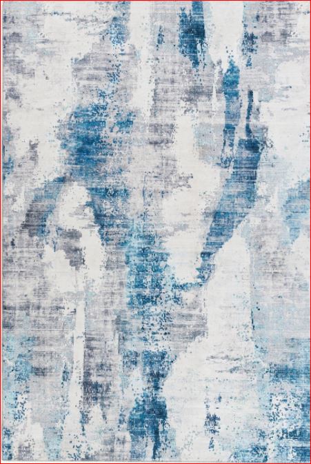
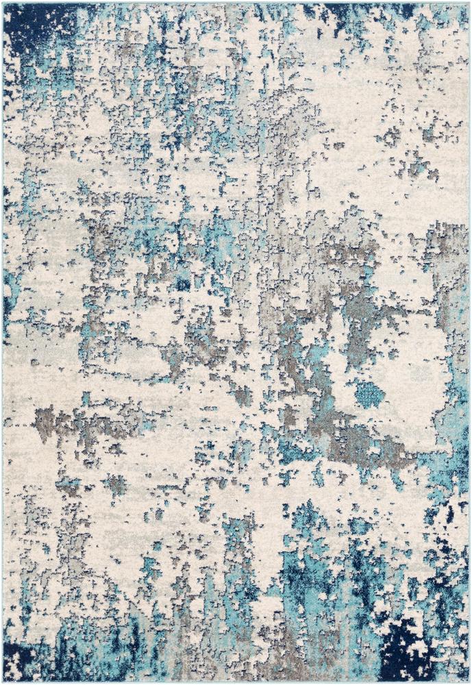
CRAIL AREA RUG

I love the colors and the abstract modern watercolor design of this rug.


Create an exotic global style living room with a gorgeous blue rug
Edesign by Northern Lights Home Staging and Design

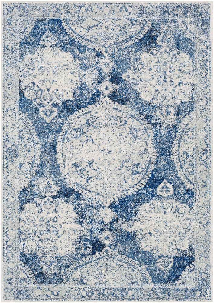
BARN AREA RUG

This rug has a Transitional, Bohemian, Vintage vibe.


Create an exotic global style living room with a gorgeous blue rug
Edesign by Northern Lights Home Staging and Design

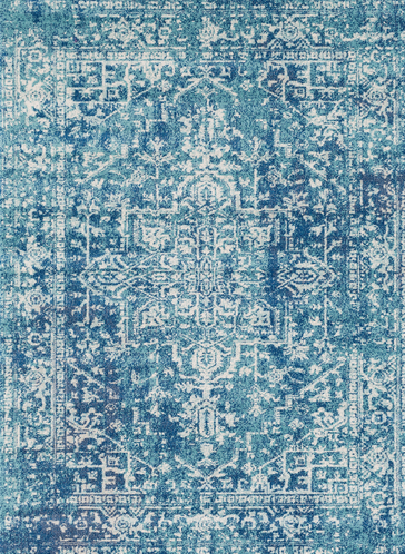
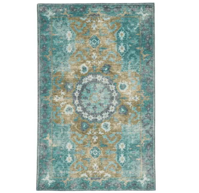
THOUSANDSTICKS AREA RUG

Love the rich teal colors in this  Bohemian, Vintage rug made in Turkey.


Create an exotic global style living room with a gorgeous blue rug
Edesign by Northern Lights Home Staging and Design

BEVERLY AREA RUG


Love the colors and the textured look of this more contemporary design.


Create an exotic global style living room with a gorgeous blue rug
Edesign by Northern Lights Home Staging and Design

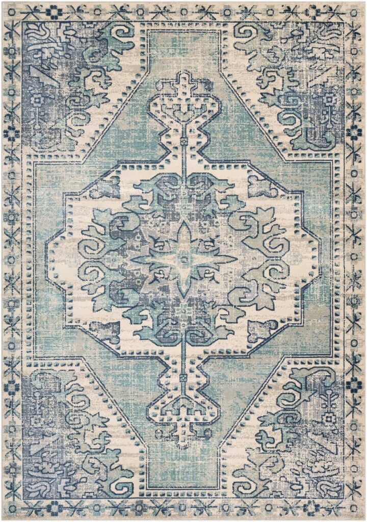
KENMARE AREA RUG

One of my favorites, I just love the design and colors of this Bohemian, Vintage rug.


Create an exotic global style living room with a gorgeous blue rug
Edesign by Northern Lights Home Staging and Design

And for those of you a little scared of so much color, you can still get your blue fix with the rugs, furnishings and art and go neutral on the walls.


Edesign by Northern Lights Home Staging and Design

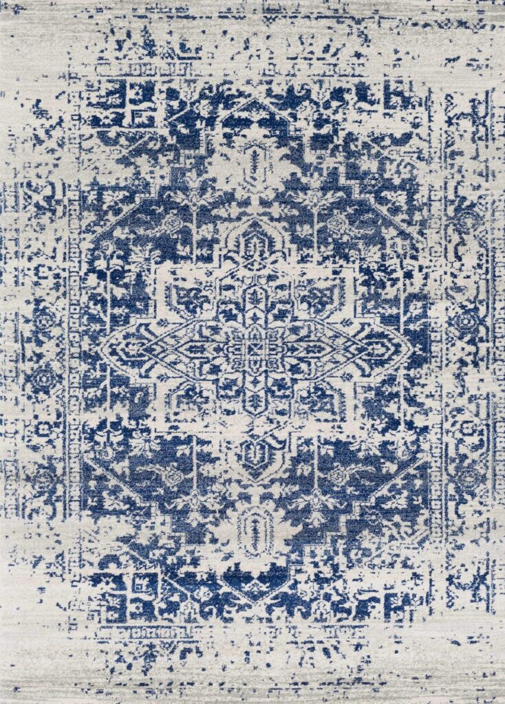
LIMESTONE AREA RUG

I love the vintage look of this area rug, and it is a great rug if you love darker blues.


limestone


Create an exotic global style living room with a gorgeous blue rug
Edesign by Northern Lights Home Staging and Design

KAI Area Rug

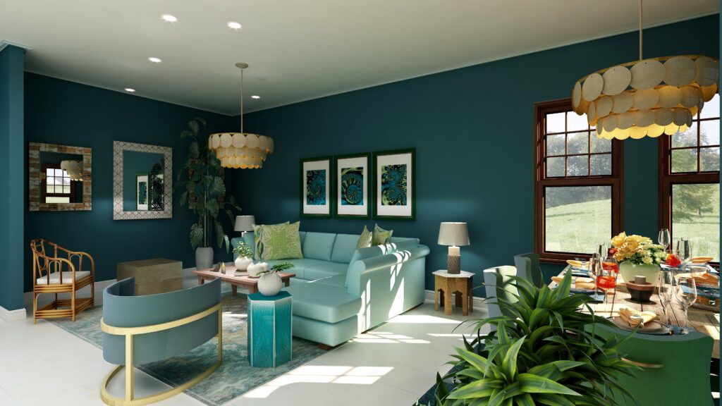
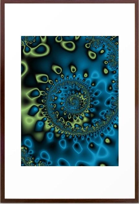
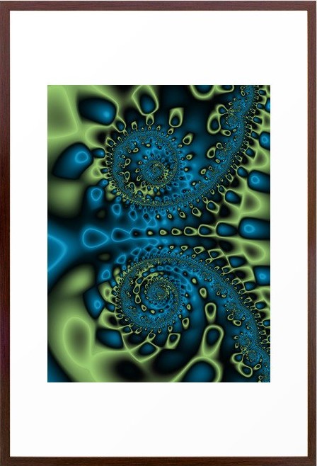
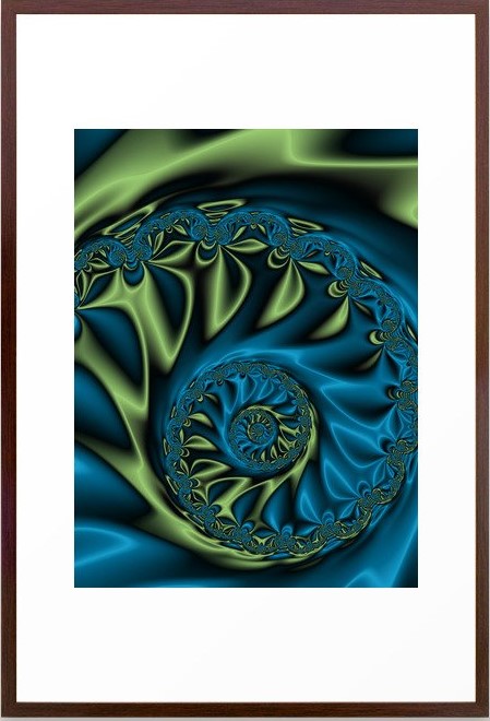
Here is a beautiful Bohemian-style rug that you could use with a dramatic blue room or a more neutral room. I have also used some of my fractal art, called Bioluminescence in this design.


Get the Look- Global Style-Bohemian
Bohemian Style Living Room Edesign by Northern Lights Home Staging and Design.

Bioluminescence Fractal Art by Northern Lights Home Staging and Design
Bioluninescence Framed Fractal Art Print by Northern Lights Home Staging and Design.

Bioluminescence 2 Fractal Art by Northern Lights Home Staging and Design
Bioluninescence #2 Framed Fractal Art Print by Northern Lights Home Staging and Design.

Bioluminescence 3 Fractal Art by Northern Lights Home Staging and Design
Bioluninescence #3 Framed Fractal Art Print by Northern Lights Home Staging and Design.

Get the Look-Bohemian Style Living Room. Edesign by Northern Lights Home Staging and Design
Edesign by Northern Lights Home Staging and Design

Let’s Create Your Global Style Design

Are you ready for your house to go to the next level where your house looks great, feels great, and supports you to be great? Imagine that. 

What’s it like when you are living in the perfect space for you?

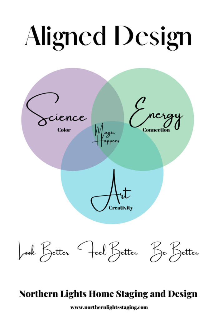
My philosophy of great Interior Design, which I call Aligned Design, considers three key factors; art, science and energy. The intersection of the three is where the magic happens.

Creating a space that envelops you in your vision of beauty and color, while fine-tuning the energy of your space to promote wealth, health, love, and perfect self-expression aligns you with the universe, allowing you to live your best life so you can make a positive impact on the world.

Global style Interior Design is part of the art of great design and one of the things you are really going to love about creating the perfect space for yourself. Are you ready to immerse yourself in rich beautiful colors and truly tell your story?


Aligned Design System

Curious about your Interior Design style? Take the quiz and find out.


What is Your Global Design Style? Take the Quiz
Edesign by Northern Lights Home Staging and Design
Why work with Northern Lights Home Staging and Design

Terms of Service  |  Privacy Policy  |  Disclaimer

Prices subject to change without notice.

Call 907-362-0065 today
 info@northernlightsstaging.com

Pin These

Create an exotic global style living room with a gorgeous blue rug


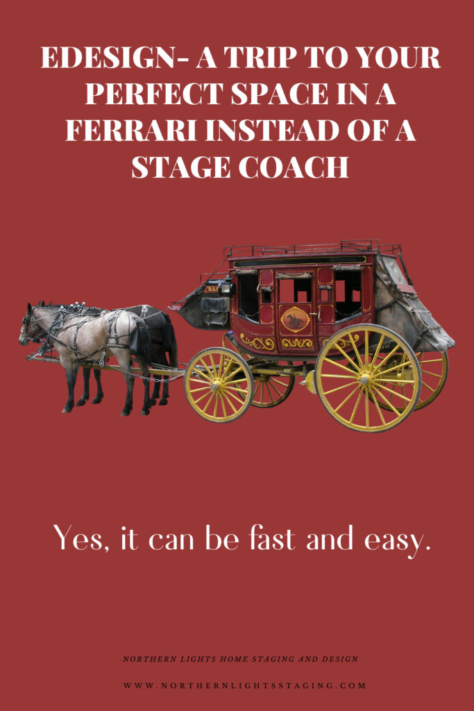
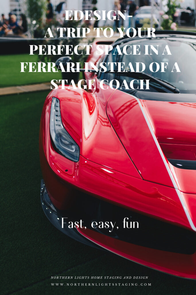
Edesign- A Trip to Your Perfect Space in a Ferrari Instead of a Stage Coach

By now, you have probably heard of Edesign, which is sometimes called online Interior Design or Virtual Design. It is a fast way to work together with your favorite designer to create your perfect space.

People put off creating their perfect space for the right time, the right house, the right budget, the right whatever. Before you know it, it has never happened and you have lost such a great chance to improve your life. Why not make it happen now?

Edesign is one way to get there fast. It is a collaboration between the designer (me) and the client (you), where we can work together online to create your perfect space, even if you are in another state.  Or it can be a convenient way to work together with a combination of in-person and online work. 

Edesign- A Trip to Your Perfect Space in a Ferrari instead of a Stage Coach

I always recommend starting with a consultation, such as my Aligned Design consultation, whether we are working together in person or online. It is important to take a holistic look at your whole house or space, both inside and outside to develop a plan before you do any work or spend money on “things”.  This gives you the guidance you need to work on different rooms or projects over time and as your budget allows, knowing in the end, everything will work together and create that perfect space for you.


I Learned to Solve all My Interior Design Problems by Dancing
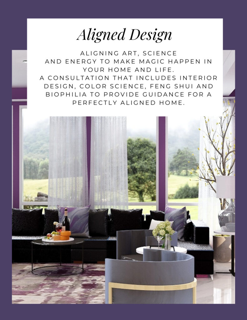
Aligned Design


Learn More


You get to take on some of the fun, and the responsibility by taking room measurements, ordering the products I recommend, and putting everything in place. Because of this shared workload, Edesign may be more affordable, but it is important to invest in quality design and products. You can not get your perfect space by spending $89 for a room from one of the big box online stores that don’t pay a good designer enough to consider working for them.

The video below shows my process of how Edesign works. Different designers may offer different services or work with you in different ways. Most will likely provide all or some of the following services which may include a floorplan, concept or mood board, shopping list, 3D render of the final design, and set up instructions

https://northernlightsstaging.com/wp-content/uploads/2020/01/Edesign_how_it_works2_bohooffice.mp4

Most Edesigners will start by getting to know you, your style and tastes, your lifestyle, your design issues, etc. A local designer does this with an in-person visit. I send you a questionnaire or we may do a video or phone call.

 Once I know what you like and need, I will start developing a design for you. This usually starts with space planning and developing a floor plan for each room so we know what will fit and how things can be arranged to best fit your lifestyle.

An in-person designer will usually take room measurements of the space and any existing furnishings that you may want to use. Because most Edesigners can’t visit your home, they will ask you to take these measurements and photos for them so they know what they are working with. This information may be requested as part of the questionnaire.

The next step includes developing a concept of a design including furnishings, accessories, paint colors and finishes to create a space that meets all your needs functionally and makes your heart sing with the beauty of the finished design.

While a local designer may present all the pieces of the plan to you in person, with samples that you can see and feel, the Edesigner will provide a concept board or rendering showing all the elements and how they look together.

I Learned to Solve all My Interior Design Problems by Dancing- Create Drama with Shapes
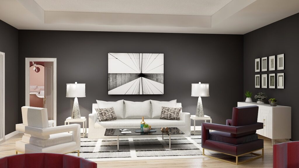
Example of a Rendering
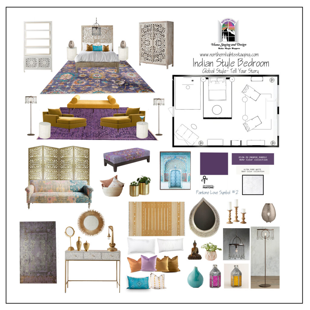
Global Design Style-Indian. Laid back, earthy, vibrant and luxurious. Indian design creates inviting, informal, relaxed spaces filled with bright colored hand spun fabrics with paisley patterns, floor cushions around colorful rugs, intricate mandala motifs and nature-inspired themes with flowers, birds, animals. Beautiful bedroom design by Northern Lights Home Staging and Design #globalstyle #interiordesign #mexicanstyle #bohemian #globaldecor #furniture #livingroom #eco-friendly #sustainabledesign #interiordecorating #edesign #onlinedesign #homedecor #moderndesigno-friendly #sustainabledesign #interiordecorating #edesign #onlinedesign #homedecor #moderndesign
Example of a concept board This one shows all the products as well as a floor plan.

You will then get a shopping list of all the parts for you to order and put in place with any final instructions. Most Edesigners will have a follow-up process to make sure it all looks good and answer any final questions.


Get the Look- Mid-Century Modern/Global
Example of a shopping list. Links to products are included.

Hop in the Ferrari

Are you ready to tell your unique story and find the alignment of art, science, and energy that makes you happy now rather than waiting forever?  Take that trip to your perfect space in a Ferrari instead of a stagecoach. Try my Aligned Design consultation and let’s get started


Let’s Create Your Perfect Space

Aligned Design System by Northern Lights Home Staging and Design


Online or In Person?


Why work with Northern Lights Home Staging and Design

Terms of Service  |  Privacy Policy  |  Disclaimer

Prices subject to change without notice.

Call 907-362-0065 today
 info@northernlightsstaging.com

Pin These

Edesign- A Trip to Your Perfect Space in a Ferrari instead of a Stage Coach


Ways to Use Pantone’s 2021 Colors of the Year

In my last five articles I have been exploring the 2021 colors of the year of different paint companies and comparing them in the same Edesign I created for a master bedroom.  I started by exploring Benjamin Moore’s Agean Teal and Sherwin Williams Urbane Bronze.  I found that PPG had a color palette of 3 colors of the year instead of one as you can see in my article Ways to Use PPG’s Colors of the Year. I admitted I felt a little let down that they did not just commit to one color.   

Then I checked on Behr’s Colors of the Year and found they had a palette of 21 colors!! Talk about non-committal.   I highlighted 3 of my favorites in my article, Ways to Use Behr’s 2021 Colors of the Year.

HGTV Home by Sherwin-Williams listed their 2021 Color of the Year: as Passionate, which you can see in my last article, How to Use Sherwin William’s HGTV Home 2021 Color of the Year Passionate.

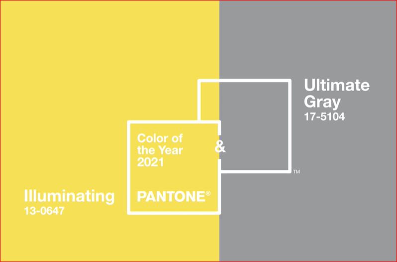
Here, I will explore using Pantone’s 2021 Colors of the Year. They have two colors, Illuminating and Ultimate Gray. Pantone does not create paint colors. They create ink used in graphics, but their color selections influence many of the colors of products you will find available such as art, accessories, bedding and furniture.


Pantone colors of the year 2021
Pantone says these colors are “A marriage of color conveying a message of strength and hopefulness that is both enduring and uplifting”..

I am a little surprised at their pick of Ultimate Gray…..I feel like gray is our past and we have moved on. I am also surprised at their pick of Illuminating. It feels like the color of a yellow safety vest or a yellow warning light at a traffic signal, rather than one I would pick for accessories in my home. “Uplifting” is not a word I would use to describe it. Well, I am up for a challenge. Let us see what we can do with this combination!

The Design

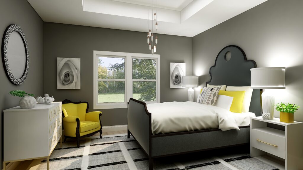
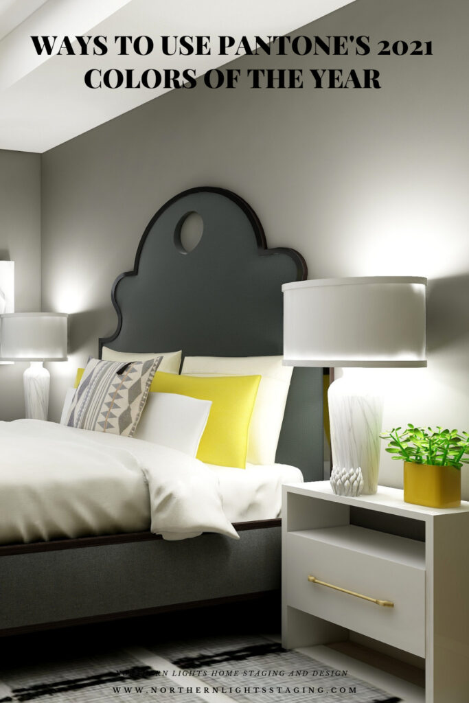
In this design, I used the color data to create a room that would look like Ultimate Gray on the walls, if Pantone made paint. The closest real paint color I could find to match this was Benjamin Moore, Tucker Gray, CW-705. 

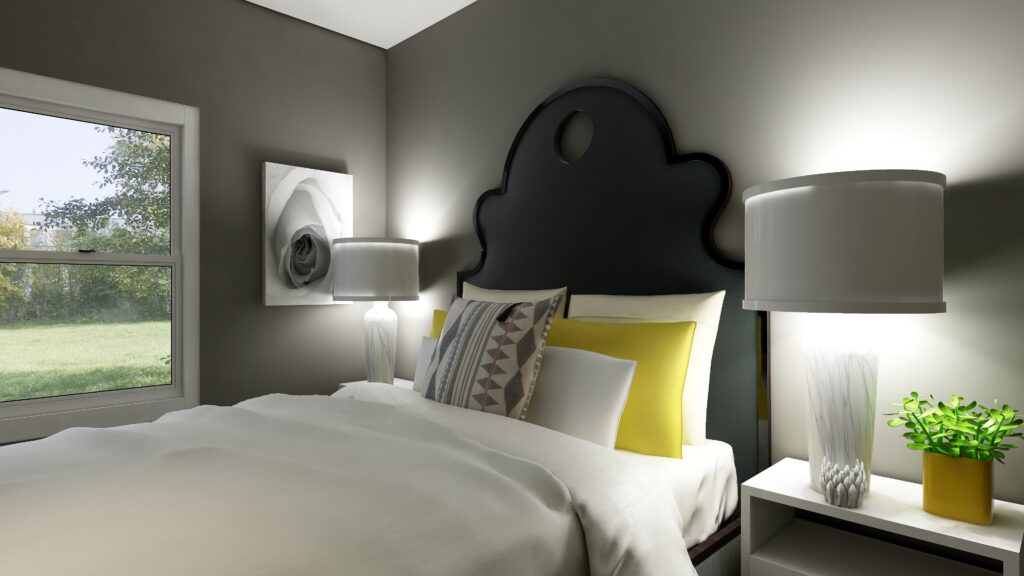
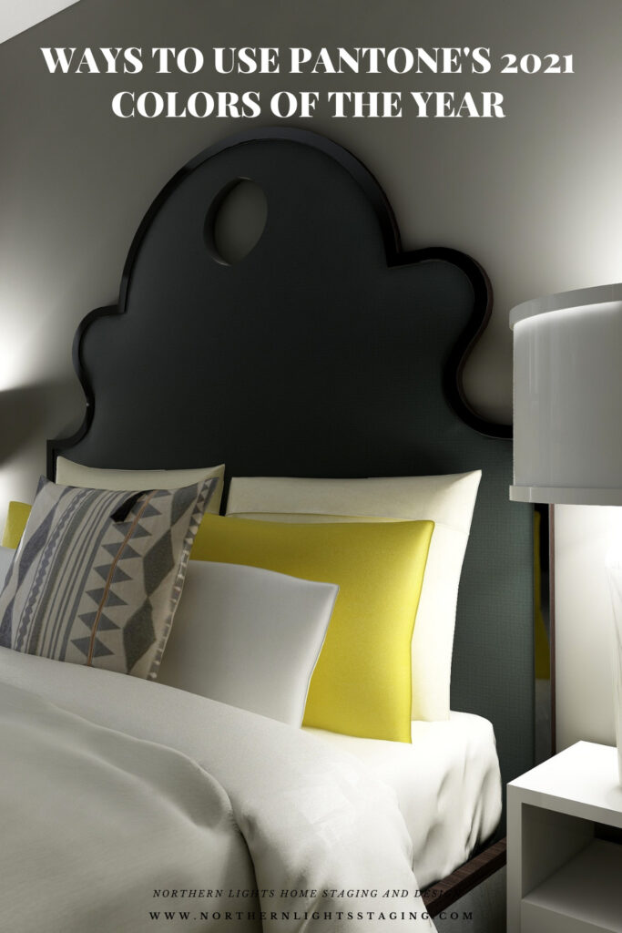
I think this bedroom feels relaxing, serene but with a little bit of energy and sweetness that comes from the cheery pops of yellow. I do like yellow and gray together, although I think this yellow is a little too saturated for my taste. I prefer a yellow with a little less chroma.

In my previous designs I have played with more saturated wall colors to show what you can do with color and how it feels. Sorry, I can not bring myself to try this color on the wall….I am not going to go there!

How to Use Pantone's 2021 Colors of the Year Illuminating and Ultimate Gray
Master bedroom Edesign using Pantone’s 2021 Colors of the Year by Northern Lights Home Staging and Design
How to Use Pantone's 2021 Colors of the Year Illuminating and Ultimate Gray
Master bedroom Edesign using Pantone’s 2021 Colors of the Year by Northern Lights Home Staging and Design

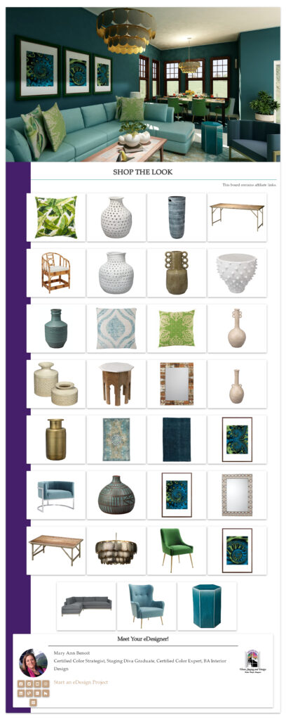
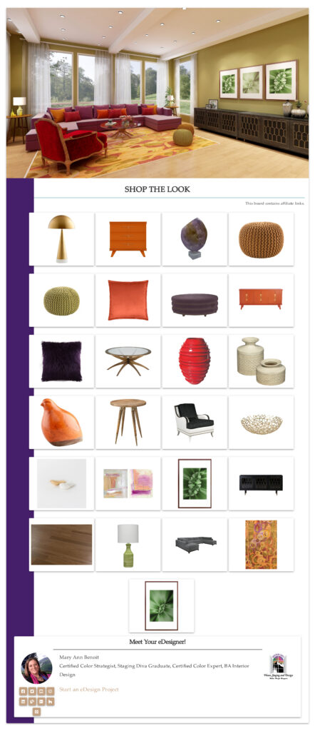
Shop this Look

Here are some of the pieces I used or alternative ideas for my designs. Some contain affiliate links, meaning I may receive a small commission for sharing this with you at no additional cost to you if you purchase anything.

Which Color of the Year is Your Favorite?

I enjoyed working with all these colors, and think they could each work nicely to create a relaxing master bedroom, although Big Cypress feels a little more energizing than relaxing. Of all the colors, I like Aegean Teal and Euphoric Magenta the best, how about you?  

How to Use Pantone's 2021 Colors of the Year Illuminating and Ultimate Gray
Pantone’s 2021 Colors Illuminant and Ultimate Gray
HGTV Home by Sherwin-Williams 2021 Color of the Year: Passionate. Edesign by Northern Lights Home Staging and Design
Sherwin Williams HGTV Home Passionate
Master bedroom Edesign using Behr Euphoric Magenta by Northern Lights Home Staging and Design
Behr’s 2021 color Euphoric Magenta

Using Benjamin Moore's 2021 Color of the Year Aegean Teal by NOrthern Lights Home Staging and Design
Benjamin Moore’s 2021 Color of the Year Aegean Teal
Master bedroom Edesign using Behr Voyage by Northern Lights Home Staging and Design
Behr’s 2021 color Voyage
PPG's 2021 Colors of the Year with Mystic Aqua
PPG’s 2021 Color Palette with Mystic Aqua.
PPG's 2021 Colors of the Year = my version
Mystic Aqua but with my my own rebel color scheme:)
Master bedroom Edesign using Behr Royal Orchard by Northern Lights Home Staging and Design
Behr’s 2021 color Royal Orchard

Ways to Use Sherwin Williams 2021 Color of the Year Urbane Bronze
Sherwin Williams 2021 Color of the Year Urbane Bronze
PPG's 2021 Colors of the Year with Transcend
PPG’s 2021 Color Palette with Transcend
PPG's 2021 Colors of the Year with Big Cypress on the walls
PPG’s 2021 Color Palette with Big Cypress.

Are You Inspired?

When your space is better, you are better.
When you are better, the world is better. 

Are you ready to create the perfect space for you? Try my Aligned Design consultation. It is a wholistic Interior Design and Color consultation that considers art, science and energy to give you a game plan for your whole home. I use the art of eco-friendly Interior Design mixed with color science and consider Feng Shui, transformative design, biophilia and color psychology to make your space feel great and support the life you want to live.

 Once you have your game plan, we can work on specific rooms with one of my Edesign packages. 

The designs above are examples of full service Edesign, where you get a floor plan, a concept board, a 3D render and a complete shopping list with set up instructions. Or, be brave and try some new color with an expert color consultation.


Aligned Design System by Northern Lights Home Staging and Design


Full Service Edesign by Northern Lights Home Staging and Design

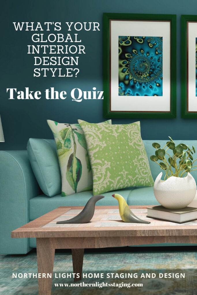
What’s Your Global Design Style?

The designs in this article are examples of global style design. Are you curious what your global style is? Take the quiz and find out.


What is Your Global Design Style? Take the Quiz


Why work with Northern Lights Home Staging and Design


Call 907-362-0065 today

 info@northernlightsstaging.com

Terms of Service

Privacy Policy

Disclaimer

Prices subject to change without notice.

Pin These

How to Use Pantone's 2021 Colors of the Year
How to Use Pantone’s 2021 Colors of the Year
How to Use Pantone's 2021 Colors of the Year
How to Use Pantone’s 2021 Colors of the Year


Ways to Use Sherwin Williams HGTV 2021 Color of the Year- Passionate

In my last few articles I have been exploring the 2021 colors of the year of different paint companies and comparing them in the same Edesign I created for a master bedroom.  I enjoyed exploring Benjamin Moore’s Agean Teal and Sherwin Williams Urbane Bronze.  I found that PPG had a color palette of 3 colors of the year instead of one as you can see in my article Ways to Use PPG’s Colors of the Year. I admitted I felt a little let down that they did not just commit to one color.

Then I checked on Behr’s Colors of the Year and found they had a palette of 21 colors!! Talk about non-committal.   I highlighted 3 of my favorites in my article, Ways to Use Behr’s 2021 Colors of the Year.

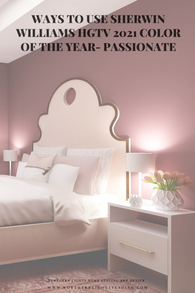
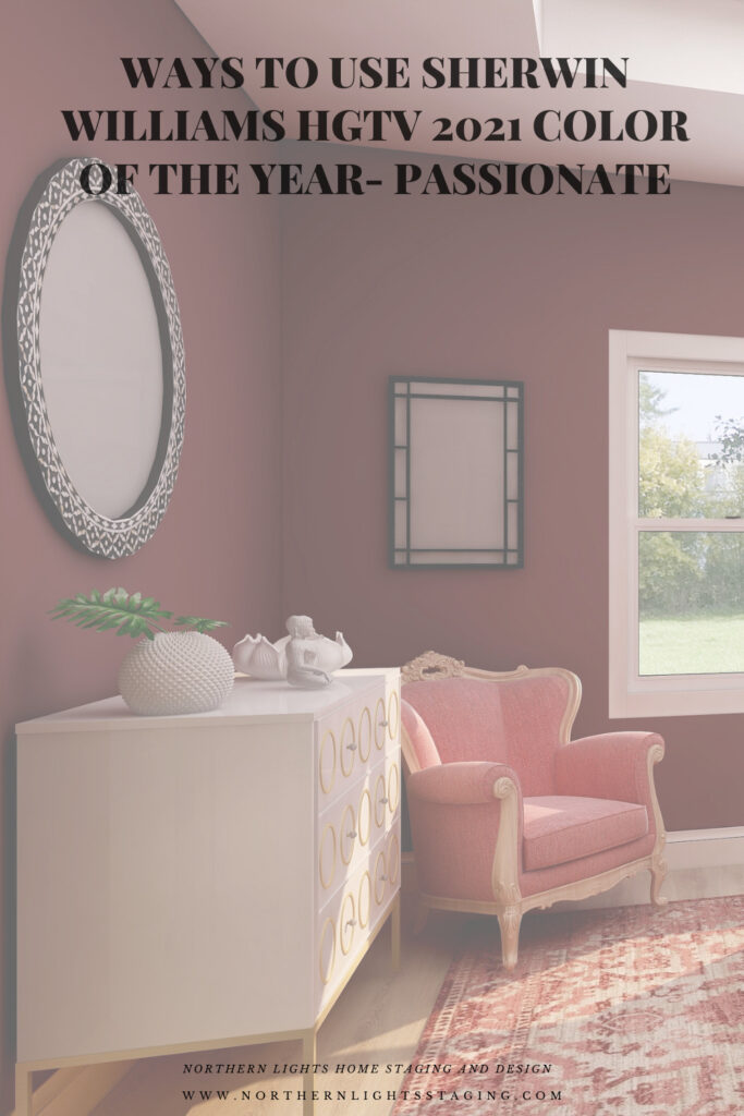
HGTV Home by Sherwin-Williams lists their 2021 Color of the Year: as Passionate, which is part of their 2021 Delightfully Daring Color Collection.  They hope to inspire homeowners to have confidence using bold colors to  create emotion and have fun!

Is this color too exciting for a bedroom where most of us prefer a calm, relaxing atmosphere? I thought I would play with it in my master bedroom Edesign in comparison to the other colors of the year and see what happens. With a name like Passionate, I hope it would work in a bedroom:).

I experimented with a couple different ideas, to see how it might feel with a more dramatic look, and if I could create a relaxing room with a color like this.

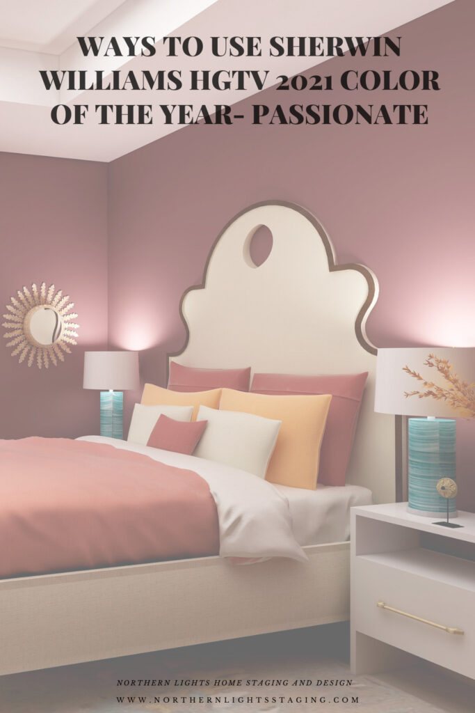
Design 1

My first design feels dramatic and colorful, but still feels warm and cozy, I think.

HGTV Home by Sherwin-Williams 2021 Color of the Year: Passionate. Edesign by Northern Lights Home Staging and Design
Master bedroom Edesign using Sherwin Williams HGTV Home color Passionate by Northern Lights Home Staging and Design

Shop this Look

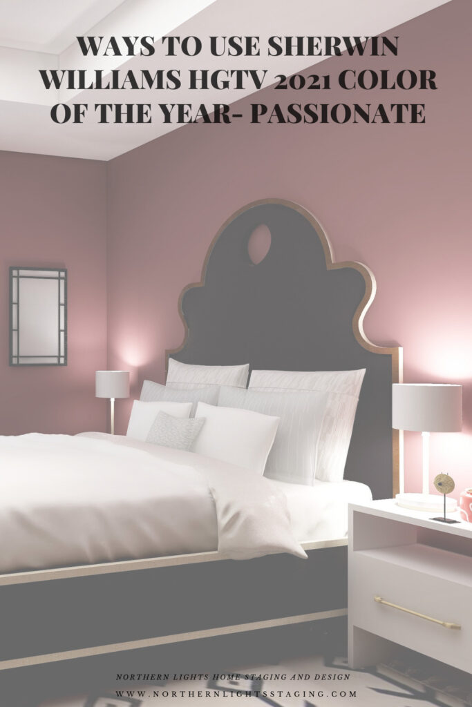
Design 2

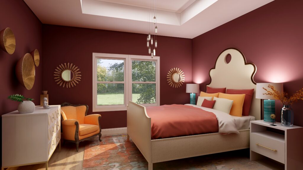
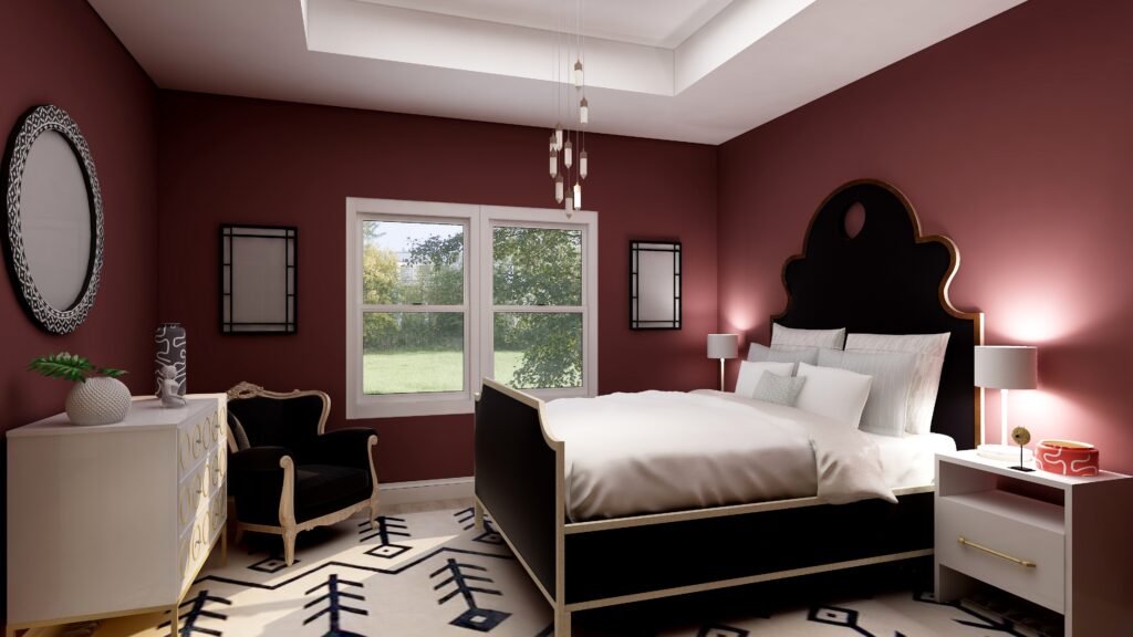
Design 2 is more dramatic with the high contrast of black and white against the deep red walls. The red walls still give a feeling of being enveloped, a sense of coziness, but the black and white rug might be too bold to inspire relaxation. What do you think?

HGTV Home by Sherwin-Williams 2021 Color of the Year: Passionate. Edesign by Northern Lights Home Staging and Design
Sherwin Williams HGTV Home Passionate- Edesign by Northern Lights Home Staging and Design

Shop This Look

Design 3

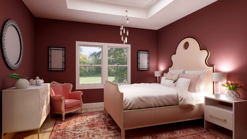
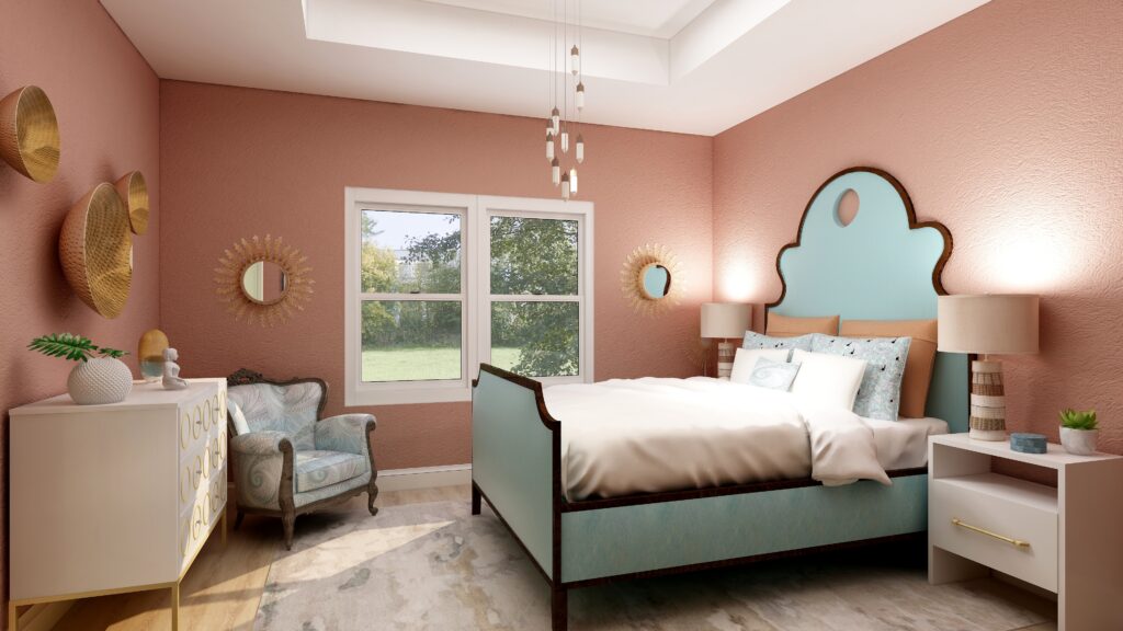
This monochromatic color scheme feels relaxing to me. The addition of pinks and blushes creates a softness that balances the rich dramatic wall color. This shows me that you can create a relaxing space, even with rich red walls if you balance everything else correctly, creating both drama and calm at the same time. An interesting combination!

HGTV Home by Sherwin-Williams 2021 Color of the Year: Passionate. Edesign by Northern Lights Home Staging and Design
Sherwin Williams HGTV Home Passionate- Edesign by Northern Lights Home Staging and Design

Shop This Look

Which Color of the Year is Your Favorite?

I enjoyed working with all these colors, and think they could each work nicely to create a relaxing master bedroom, although Big Cypress feels a little more energizing than relaxing. Of all the colors, I am not sure if Aegean Teal or Euphoric Magenta is my favorite, how about you?

HGTV Home by Sherwin-Williams 2021 Color of the Year: Passionate. Edesign by Northern Lights Home Staging and Design
Sherwin Williams HGTV Home Passionate
Master bedroom Edesign using Behr Euphoric Magenta by Northern Lights Home Staging and Design
Behr’s 2021 color Euphoric Magenta

Using Benjamin Moore's 2021 Color of the Year Aegean Teal by NOrthern Lights Home Staging and Design
Benjamin Moore’s 2021 Color of the Year Aegean Teal
Master bedroom Edesign using Behr Voyage by Northern Lights Home Staging and Design
Behr’s 2021 color Voyage
PPG's 2021 Colors of the Year with Mystic Aqua
PPG’s 2021 Color Palette with Mystic Aqua.
PPG's 2021 Colors of the Year = my version
Mystic Aqua but with my my own rebel color scheme:)
Master bedroom Edesign using Behr Royal Orchard by Northern Lights Home Staging and Design
Behr’s 2021 color Royal Orchard

Ways to Use Sherwin Williams 2021 Color of the Year Urbane Bronze
Sherwin Williams 2021 Color of the Year Urbane Bronze
PPG's 2021 Colors of the Year with Transcend
PPG’s 2021 Color Palette with Transcend
PPG's 2021 Colors of the Year with Big Cypress on the walls
PPG’s 2021 Color Palette with Big Cypress.

Are You Inspired?

When your space is better, you are better.
When you are better, the world is better. 

Are you ready to create the perfect space for you? Try my Aligned Design consultation. It is a wholistic Interior Design and Color consultation that considers art, science and energy to give you a game plan for your whole home. I use the art of eco-friendly Interior Design mixed with color science and consider Feng Shui, transformative design, biophilia and color psychology to make your space feel great and support the life you want to live.

Once you have your game plan, we can work on specific rooms with one of my Edesign packages.

The designs above are examples of full service Edesign, where you get a floor plan, a concept board, a 3D render and a complete shopping list with set up instructions. Or, be brave and try some new color with an expert color consultation.


Aligned Design System by Northern Lights Home Staging and Design


Full Service Edesign by Northern Lights Home Staging and Design

What’s Your Global Design Style?

The designs in this article are examples of global style design. Are you curious what your global style is? Take the quiz and find out.


What is Your Global Design Style? Take the Quiz

Why work with Northern Lights Home Staging and Design

Call 907-362-0065 today
 info@northernlightsstaging.com

Terms of Service

Privacy Policy

Disclaimer

Prices subject to change without notice.

Pin These

Ways to Use Sherwin Williams HGTV 2021 Color of the Year- Passionate


Ways to Use Behr’s 2021 Colors of the Year

In my last few articles I have been exploring the 2021 colors of the year of different paint companies and comparing them in the same Edesign I created for a master bedroom.  I enjoyed exploring Benjamin Moore’s Agean Teal and Sherwin Williams Urbane Bronze.  I found that PPG had a color palette of 3 colors of the year instead of one as you can see in my article Ways to Use PPG’s Colors of the Year. I admitted I felt a little let down that they did not just commit to one color.

This week I decided to check on Behr’s Color of the Year.

Oh for the love of God, can you believe they have 21 colors!! Talk about non-committal.  No, I will not be doing 21 renders to show you those.

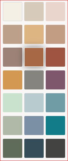
According to Behr, colors that “encourage comfort and wellbeing will be at the forefront, and Behr’s Color Trends 2021 Palette has all the tranquil shades you’ll need to stay grounded. Here is their palette.

Behr 2021 color palette

My Favorites

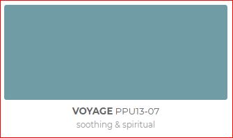
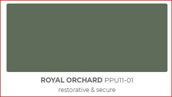
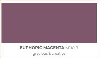
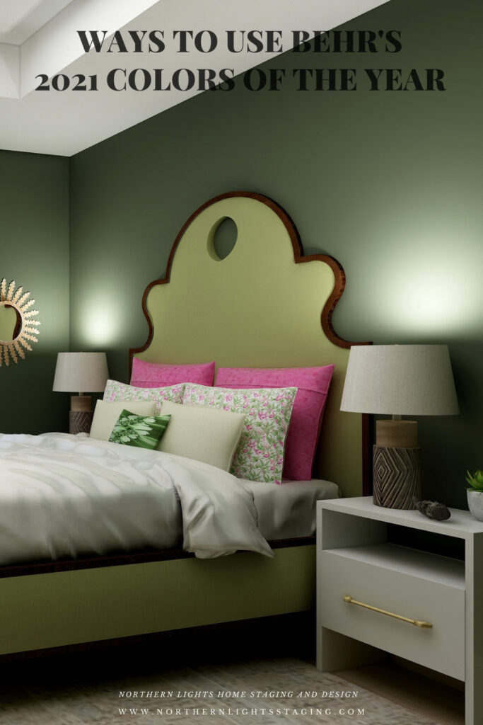
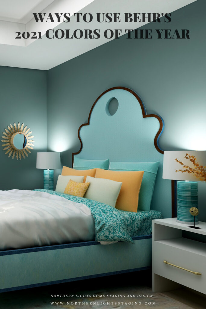
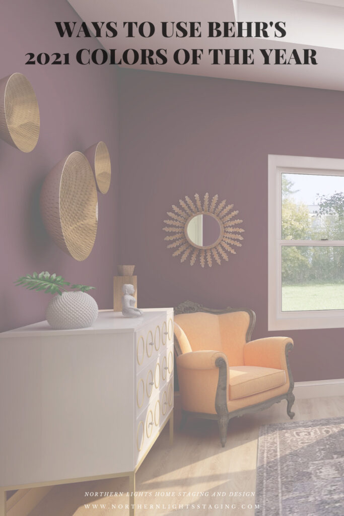
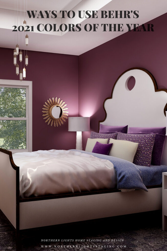
I decided to highlight my three favorites, Voyage, Royal Orchard and Euphoric Magenta, because I like the way they look and I like what they represent (soothing and spiritual, restorative and secure, and gracious and creative). They fit with my philosophy and new Aligned Design system, which combines art, science and energy to create a perfect space for you.

Behr Voyage
Behr Royal Orchard
Behr Euphoric Magenta

I have included a list of products I used or something similar for each design. Note they contain affiliate links, meaning I receive a small commission for sharing with you at no additional cost to you.

Royal Orchard

Royal Orchard is part of their “Quiet Haven” palette. They say “Deep hues have a reassuringly sublime and dependable nature, delivering the effect of a peaceful oasis in your home.”

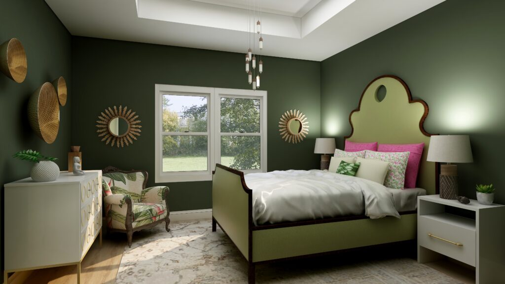
I like it because I believe this shade of green is prevalent in nature, and one of my goals in my designs is to bring the outside in and help people feel more connected to nature with biophilia. I think this creates that feeling of a “peaceful oasis” in your home. To continue that theme I used other greens in the furniture, plants, natural materials such as metals (mirrors, wall art) and wood (lamp). The fabric on the chair reflects a plant theme. I have also included some of my framed fractal art called spring (not visible in this part of the room. The area rug highlights metallic details in cream, gray, silver, and gold.

Master bedroom Edesign using Behr Royal Orchard by Northern Lights Home Staging and Design

Shop this Look

Voyage

Voyage is part of their Calm Zone palette. They say “Soothing blues and greens create a restorative escape offering ease and solace”.  I agree and blues and greens are some of my favorites to work with as they are also colors of nature and help bring the outside in.

They describe this shade as “soothing and spiritual”. Lately, I have really been considering the energy aspects of color and feng shui and how it all works together to create a space that feels great and helps support you in BEING your best. This color works with this idea. It is part of my Aligned Design system the considers art, science and energy in all my designs.

Master bedroom Edesign using Behr Voyage by Northern Lights Home Staging and Design

Shop this Look

Euphoric Magenta

According to Behr, Euphoric Magenta is part of their bold and saturated “Optimistic View” palette.  With this collection you can “add a touch of playful fun to eclectic and global decor styles.” Since I am all about global style design and love rich color, I picked this one to highlight:) 

Master bedroom Edesign using Behr Euphoric Magenta by Northern Lights Home Staging and Design

Shop this Look

Which Color of the Year is Your Favorite?

I enjoyed working with all these colors, and think they could each work nicely to create a relaxing master bedroom, although Big Cypress feels a little more energizing than relaxing. Of all the colors, I am not sure if Aegean Teal or Euphoric Magenta is my favorite, how about you?

Master bedroom Edesign using Behr Euphoric Magenta by Northern Lights Home Staging and Design
Behr’s 2021 color Euphoric Magenta

Using Benjamin Moore's 2021 Color of the Year Aegean Teal by NOrthern Lights Home Staging and Design
Benjamin Moore’s 2021 Color of the Year Aegean Teal
Master bedroom Edesign using Behr Voyage by Northern Lights Home Staging and Design
Behr’s 2021 color Voyage
PPG's 2021 Colors of the Year with Mystic Aqua
PPG’s 2021 Color Palette with Mystic Aqua.
PPG's 2021 Colors of the Year = my version
Mystic Aqua but with my my own rebel color scheme:)
Master bedroom Edesign using Behr Royal Orchard by Northern Lights Home Staging and Design
Behr’s 2021 color Royal Orchard

Ways to Use Sherwin Williams 2021 Color of the Year Urbane Bronze
Sherwin Williams 2021 Color of the Year Urbane Bronze
PPG's 2021 Colors of the Year with Transcend
PPG’s 2021 Color Palette with Transcend
PPG's 2021 Colors of the Year with Big Cypress on the walls
PPG’s 2021 Color Palette with Big Cypress.

Are You Inspired?

When your space is better, you are better.
When you are better, the world is better. 

Are you ready to create the perfect space for you? Try my Aligned Design consultation. It is a wholistic Interior Design and Color consultation that considers art, science and energy to give you a game plan for your whole home. I use the art of eco-friendly Interior Design mixed with color science and consider Feng Shui, transformative design, biophilia and color psychology to make your space feel great and support the life you want to live.

Once you have your game plan, we can work on specific rooms with one of my Edesign packages.

The designs above are examples of full service Edesign, where you get a floor plan, a concept board, a 3D render and a complete shopping list with set up instructions. Or, be brave and try some new color with an expert color consultation.


Aligned Design System by Northern Lights Home Staging and Design


Full Service Edesign by Northern Lights Home Staging and Design

What’s Your Global Design Style?

The designs in this article are examples of global style design. Are you curious what your global style is? Take the quiz and find out.


What is your Global Design Style? Tae the Quiz

Why work with Northern Lights Home Staging and Design

Call 907-362-0065 today
 info@northernlightsstaging.com

Terms of Service

Privacy Policy
Disclaimer

Prices subject to change without notice.

Pin These

Ways to use Behr's 2021 Colors of the Year


Ways to Use PPG’s 2021 Colors of the Year

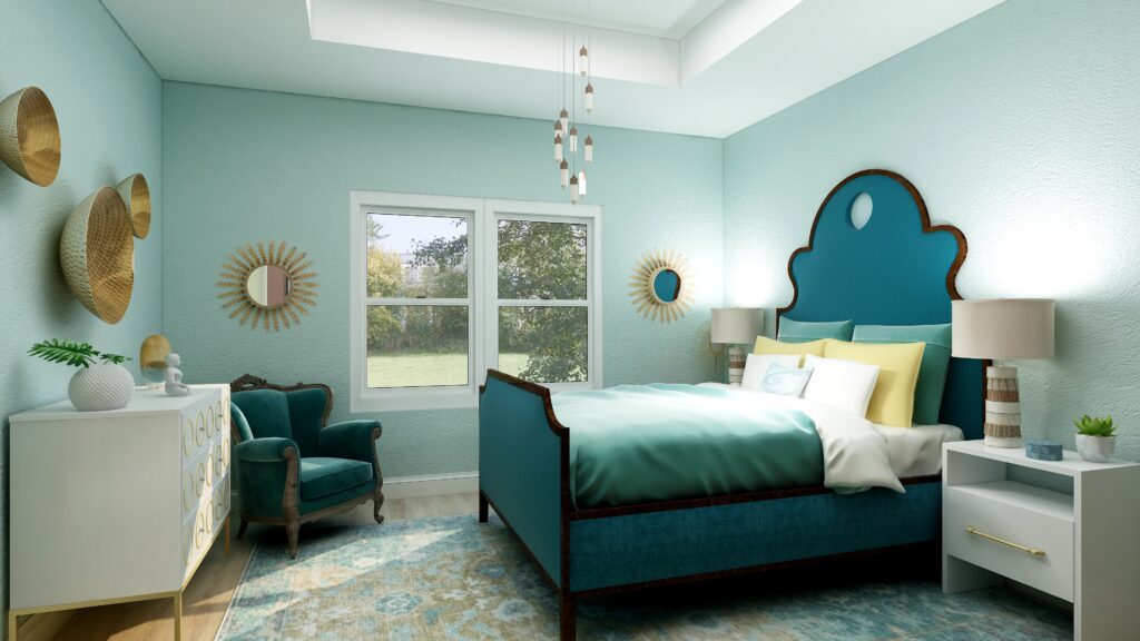
In several articles I explored the 2021 colors of the year of different paint companies and compared them in the same Edesign I created for a master bedroom.  I enjoyed exploring Benjamin Moore’s Agean Teal and Sherwin Williams Urbane Bronze.  I was excited to see what PPG’s color of the year was.

But wait….they didn’t have one!! What??? No, they had a color palette for 2021 but not a particular color of the year. Honestly, I felt  let down.

I guess I  don’t like the idea of a color palette, because I don’t want to be told or encouraged to use a series of colors together. I like to decide that for myself!

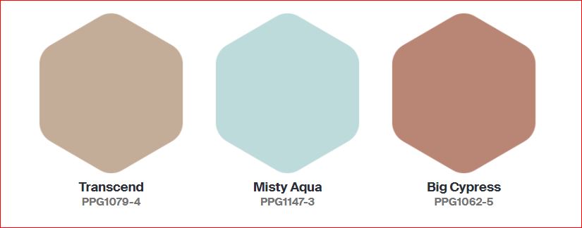
The PPG 2021 Color Palette includes Transcend, Mystic Aqua and Big Cypress, which are meant to work together.

PPG's 2021 Colors

Here is what PPG says about their 2021 color palette:

Transcend: A mid-tone oatmeal-colored hue that draws on earthy influences and nostalgia.

Big Cypress, a shaded ginger with persimmon undertones, is the equivalent of a big, comforting hug for your home.

Misty Aqua, a watercolor cerulean blue, provides an unexpected pairing of freshness against the other warm, earthy tones.

I like the Misty Aqua. Transcend or really any beige makes me yawn. Big Cypress reminds me of the desert, and I am not sure it makes me feel like my home got a hug.

I am trying to have an open mind here and just get over the fact they didn’t just pick one color. I find it a little annoying, as if they are trying to sell me three paints instead of one.

I am not sure why they paired these colors together. Looking at the color data, they do not really fit into any traditional color scheme in relation to hue angle.  They are not similar in terms of chroma or lightness to create a harmonious pairing. I don’t really get it, but will see what amazing and beautiful design I can create anyway! Here goes.

Master Bedroom Design

Design 1- Transcend and the PPG 2021 Palette

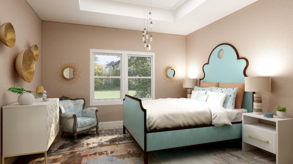
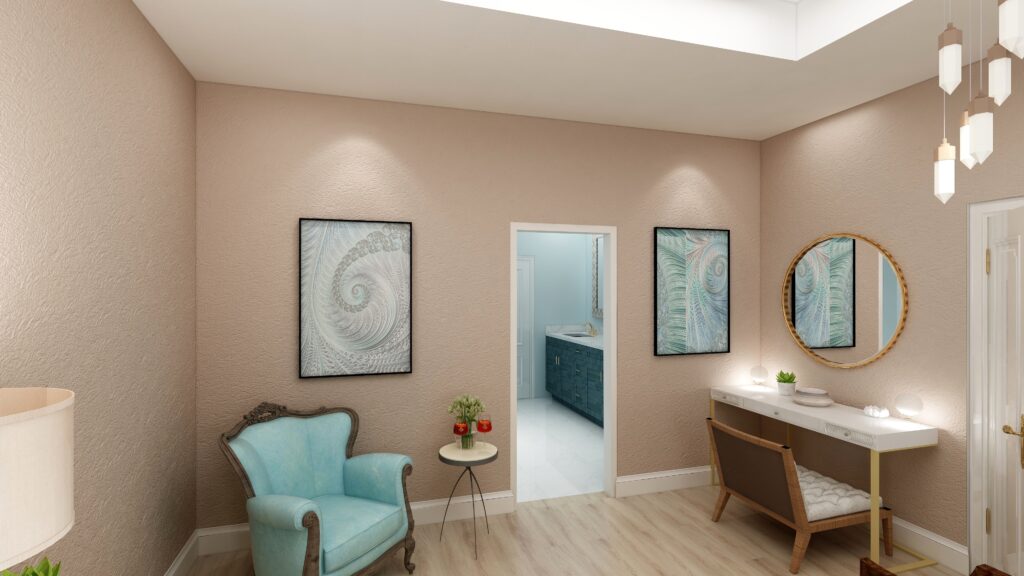
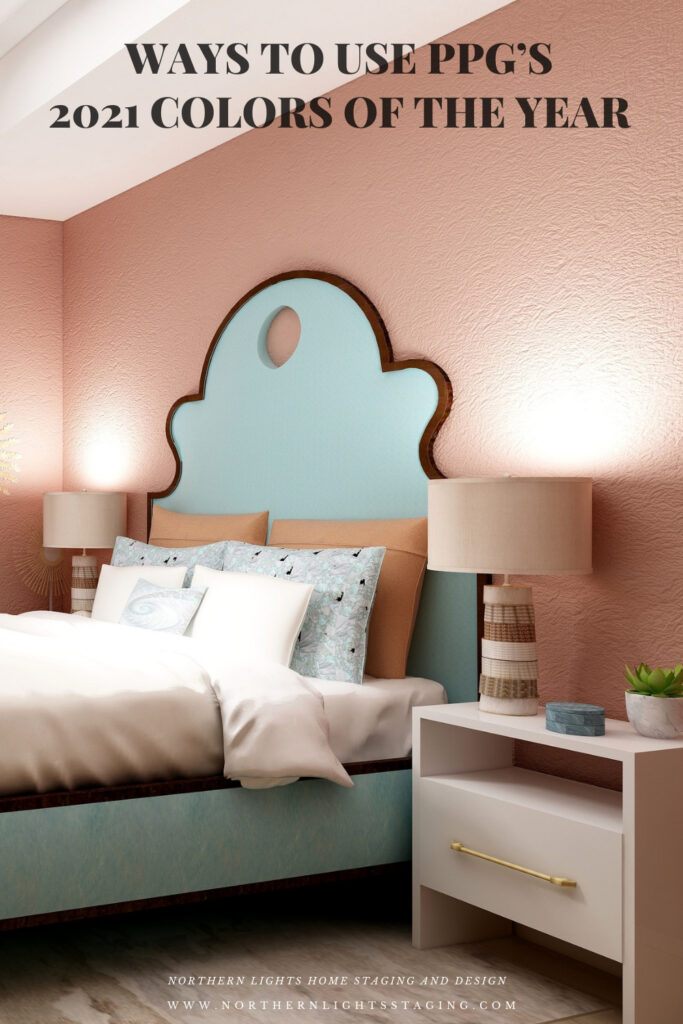
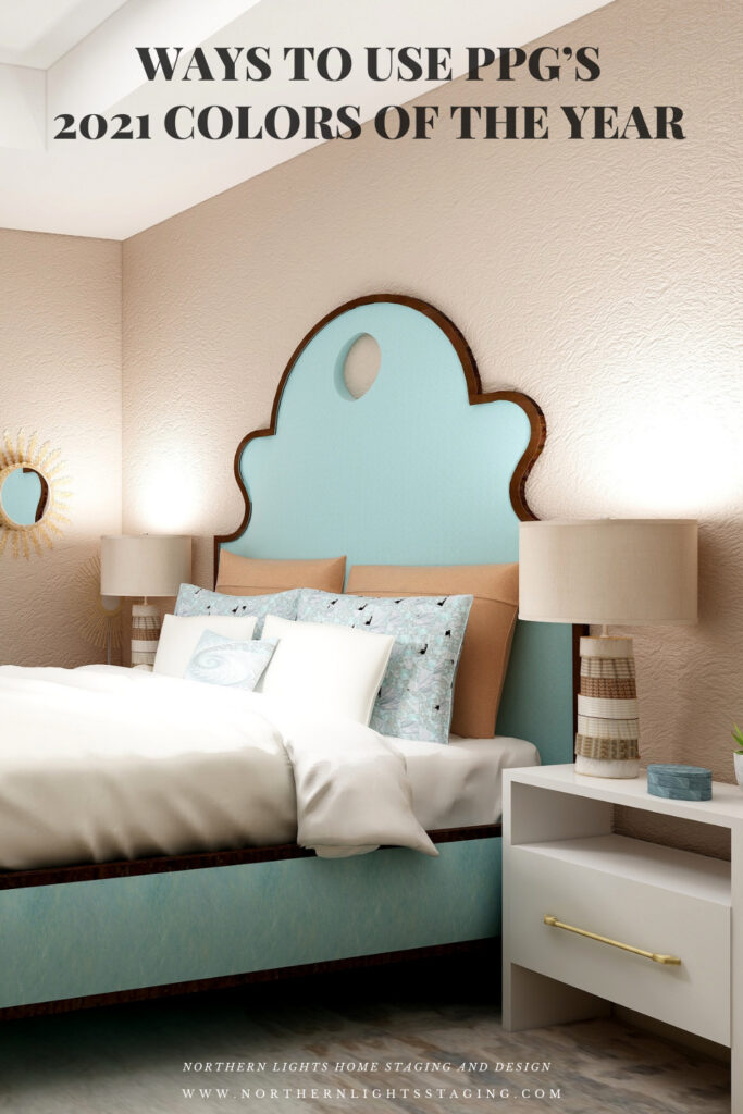
In this design, I used Transcend as the main color on the walls, and used the two other colors as accents or supporting colors. I used a shade of Mystic Aqua on the bed. The larger pillow shams and the lamps tie in Big Cypress. The area rug has some Transcend and Big Cypress colors in it and also a lighter shade of Mystic Aqua. My design celebrates circles and curves, mixes modern pieces with antiques, and mixes soft fabrics with glass, metal and pottery. I used my fractal art from the “Jenna” collection which has some of the Mystic Aqua color in the pillow shams and accent pillow, the wall art, and on one of the antique chairs. My fractal art celebrates curves and spirals. To learn more about spirals and fractal art, see my blog article What Does Your Art Mean?


PPG's 2021 Colors of the Year with Transcend
.Design 1-Master Bedroom Edesign with PPG’s 2021 color Transcend on the wall.

PPG's 2021 Colors of the Year with Transcend
Design 1- Master Bedroom Edesign and Jenna Fractal Art by Northern Lights Home Staging and Design.

Design 2- Big Cypress and the PPG 2021 Palette

In the design below, I used Big Cypress as the primary color on the walls with the other two colors as supporting colors. I changed the area rug to one that contains colors similar to Transcend.


PPG's 2021 Colors of the Year with Big Cypress on the walls
Design 2- Master Bedroom Edesign and fractal art on the chair by Northern Lights Home Staging and Design using Big Cypress as the wall color

Design 3- Mystic Aqua and the PPG 2021 Palette

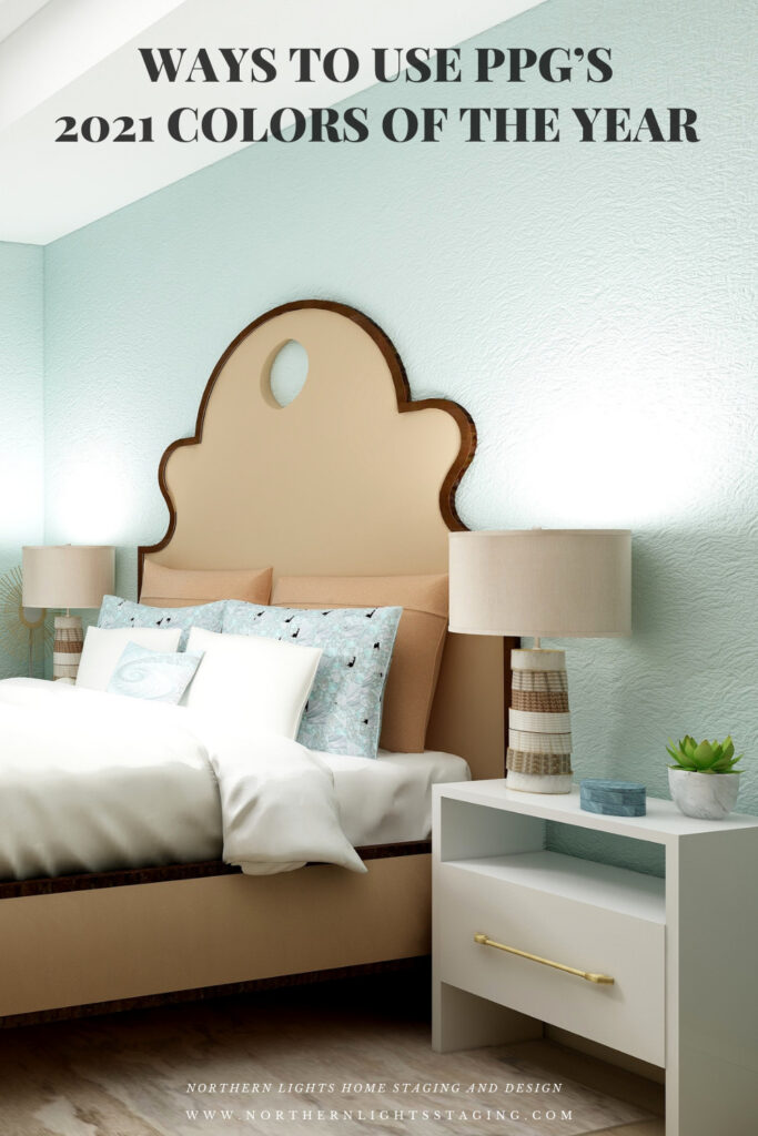
In the design below, I changed the wall color to Mystic Aqua, and changed the bed upholstery to a color similar to Transcend.

PPG's 2021 Colors of the Year with Mystic Aqua
Design 3- Master Bedroom Edesign and fractal art on the chair by Northern Lights Home Staging and Design using Mystic Aqua as the wall color

Design 4- Mystic Aqua and my own color palette

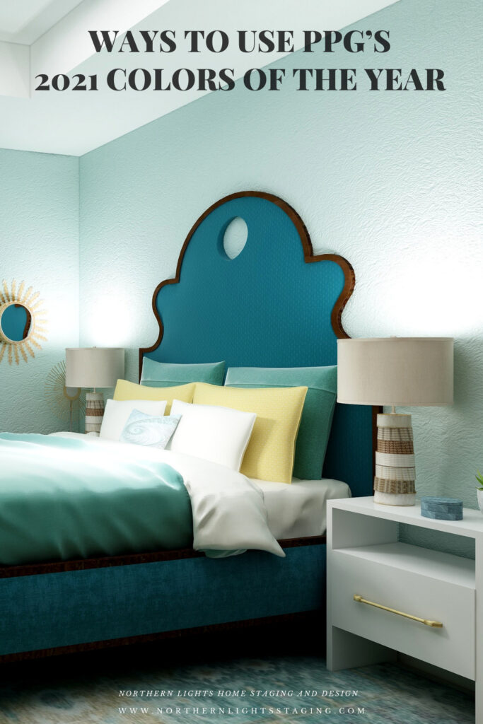
In the design below, I did my own thing.  I liked Mystic Aqua the best of the three wall colors. I developed my own palette using various shades of blue/greens and yellow, it’s opposite on the color wheel.

PPG's 2021 Colors of the Year = my version
Design 4- Master Bedroom Edesign by Northern Lights Home Staging and Design using Mystic Aqua as the wall color and my own color palette.

Which Color of the Year is Your Favorite?

I enjoyed working with all the colors of 2021, and think they could all work nicely to create a relaxing master bedroom, although Big Cypress feels a little more energizing than relaxing. Of all the colors, I think Aegean Teal is my favorite, how about you?

PPG's 2021 Colors of the Year with Transcend
PPG’s 2021 Color Palette with Transcend
PPG's 2021 Colors of the Year with Big Cypress on the walls
PPG’s 2021 Color Palette with Big Cypress.
PPG's 2021 Colors of the Year with Mystic Aqua
PPG’s 2021 Color Palette with Mystic Aqua.
PPG's 2021 Colors of the Year = my version
Mystic Aqua but with my my own rebel color scheme:)

Using Benjamin Moore's 2021 Color of the Year Aegean Teal by NOrthern Lights Home Staging and Design
Benjamin Moore’s 2021 Color of the Year Aegean Teal

Ways to Use Sherwin Williams 2021 Color of the Year Urbane Bronze
Sherwin Williams 2021 Color of the Year Urbane Bronze

Are You Inspired?

Get your colors right the first time with a science based color consultation.


Not Your Average Color Consultation

Get Your Free Report


Ten Ways To Not Screw Up Picking Your Paint Colors


What is Your Global Design Style? Take the Quiz

Pin These

Ways to Use PPG's 2021 Colors of the Year

Ways to Use PPG's 2021 Colors of the Year