Let’s Solve Your Paint Color Dilemma


Considering a fresh coat of paint for your home’s exterior? It’s amazing how a new shade can give both your home and your spirits a lift. However, this exciting change can sometimes lead to the all-too-common paint color dilemma.

It’s something every homeowner encounters. Whether you’re updating the entire exterior, adding a pop to a single room, or just revamping a door, choosing the right shade is crucial. The stakes? Picking a color that doesn’t match your vision, leaving you wondering if the neighbors are silently judging. But fear not, for every paint predicament, there’s a perfect solution waiting to be discovered!


Facing the dreaded paint color dilemma! No worries, there is a solution!

Navigating the maze of paint colors can often feel like an unsolvable puzzle. Most people often resort to:

  1. Choosing their favorite shade and crossing their fingers.
  2. Seeking the collective wisdom of friends and family.
  3. Posting on design forums like Houzz, only to get overwhelmed with diverse suggestions.
  4. Going down the rabbit hole of color blogs and becoming perplexed by the term “undertones”.
  5. Painting multiple sample colors on their wall and feeling like they’re in a never-ending loop of indecision.
  6. Consulting a certified color strategist.

Among these, the last option is truly the game-changer. Here’s why:

  • Your favorite color might not necessarily match your home’s permanent fixtures. Whether it’s your exterior finishes or your interior countertops and flooring, you need to ensure harmony.
  • Everyone has an opinion, but remember, you’re the one living in your space. What’s aesthetically pleasing to others might not resonate with you.
  • Online experts, though well-intentioned, aren’t privy to the specific lighting conditions and nuances of your home. Computer screens rarely capture true colors!
  • The term “undertones” often muddies the waters. Colors in different lighting conditions can be deceiving. It’s essential not to get bogged down by the jargon.
  • Using multiple swatches is a good start. But remember, colors can influence each other, and it’s essential to view each shade in isolation.
  • A certified color strategist is your best ally. They blend the art and science of color, offering a trained eye and understanding the physics of color. This ensures your chosen shade complements the specific fixtures and lighting conditions of your home.

In essence, while color can be subjective, its impact on a space is tangible. With tools like a colorimeter, experts can objectively measure colors, aligning them perfectly with your home’s needs. So, next time you’re caught in the color conundrum, remember, there’s a science to it, and the right expert can make your colorful dreams a reality!
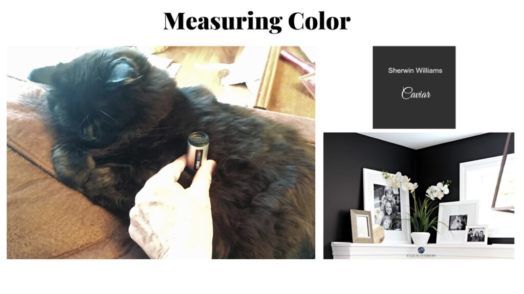


So what is this magical device? A Color Muse! While this device can be used by anyone to find paint colors to match an existing color, the real power comes from understanding what the color data means and how to use it.

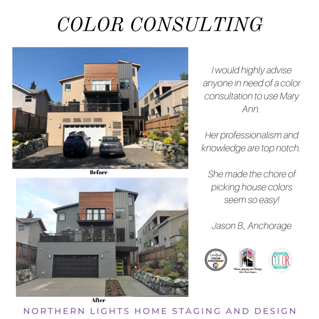
Diving into a color dilemma is akin to playing detective. Let’s unravel one such case I encountered. Upon arriving at the residence, what greeted me was a splash of color swatches on the walls and the door. A classic sign of the homeowner’s quest and confusion in pinpointing that elusive perfect shade. The scene screamed ‘color dilemma’ loud and clear.

At the outset, the intention was evident: the homeowner wanted a fresh look but was overwhelmed by the options. They had tried multiple colors, hoping one would stand out and feel “right”. But instead, what they had was a mosaic of possibilities, with no clear winner.
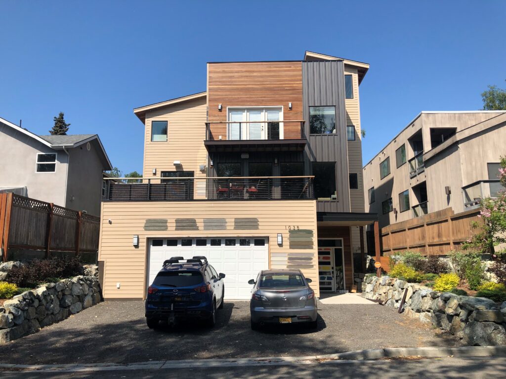

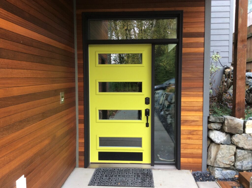
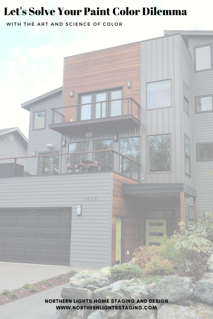
Let me walk you through the art and science of solving this color dilemma. My clients had a vision of their ideal color palette: a hue that struck a balance between gray, green, and brown. They also wanted to preserve the natural wood and metal trim while introducing a vibrant front door. A classic scenario where husband and wife couldn’t quite agree on the perfect color.

The wood siding and metal trim had now transformed into fixed finishes, dictating the color harmony for the entire exterior. The roof color remained hidden from sight, so it didn’t play a role in the selection. Additionally, there was almost black metal trim on the deck railings and around the front door, which was not up for a paint makeover and thus became another fixed finish. To add to the equation, a stark white garage door stood prominently, making it the most eye-catching feature due to its lighter shade than the rest of the elements.

Applying the art of color, I decided to make the garage door recede by painting it a dark color. The trim color on the railings, determined by measurement, also seemed ideal for the window trim and garage to maintain harmony amidst the three other colors designated for the walls, wood, and metal vertical trim. This color turned out to be Sherwin Williams Caviar, aligning perfectly with the measured hue, chroma, and values of the wood and metal vertical wall.

Next, it was time to identify a wall color that would complement these fixed finishes in terms of hue, chroma, or lightness. Several options on the color wheel were considered, such as an analogous scheme (colors close to each other on the wheel), a complimentary scheme (opposite colors), or a triadic scheme (colors evenly spaced on the wheel). By narrowing down the choices, my clients ultimately selected Benjamin Moore Amherst Gray with a hint of “green” that aligned with their preferences.

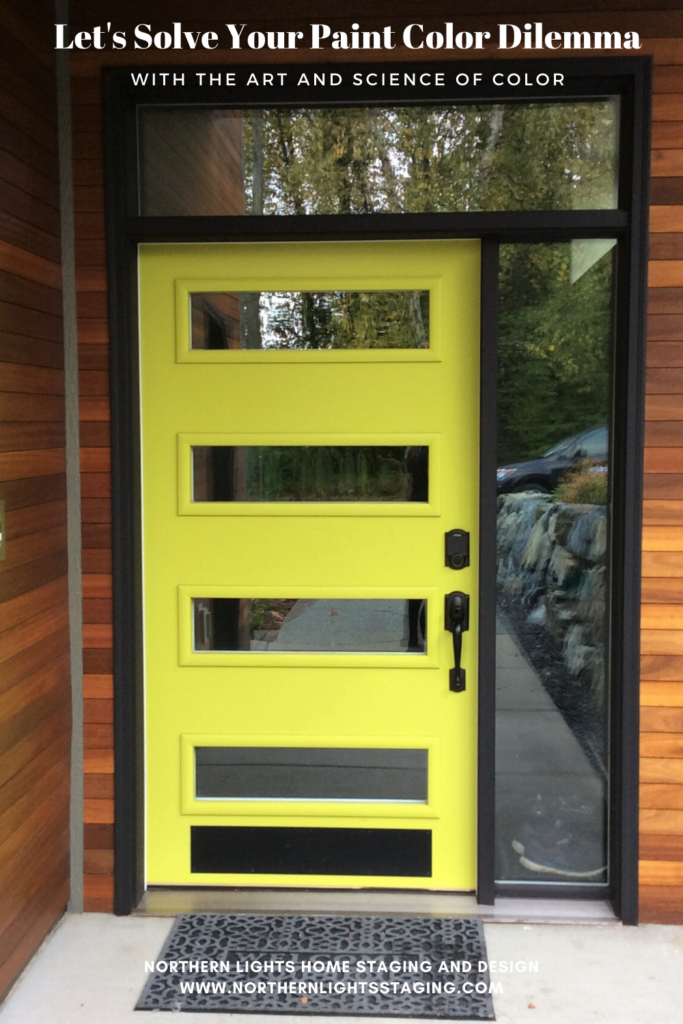
The final piece of the puzzle was the front door. To create a harmonious connection with the landscaping, a color inspired by the vibrant green bushes in the front was proposed. Measuring a leaf with my trusty colorimeter led us to the perfect shade: Sherwin Williams Hep Green.

And voilà! The color dilemma was elegantly resolved, resulting in a stunning transformation.
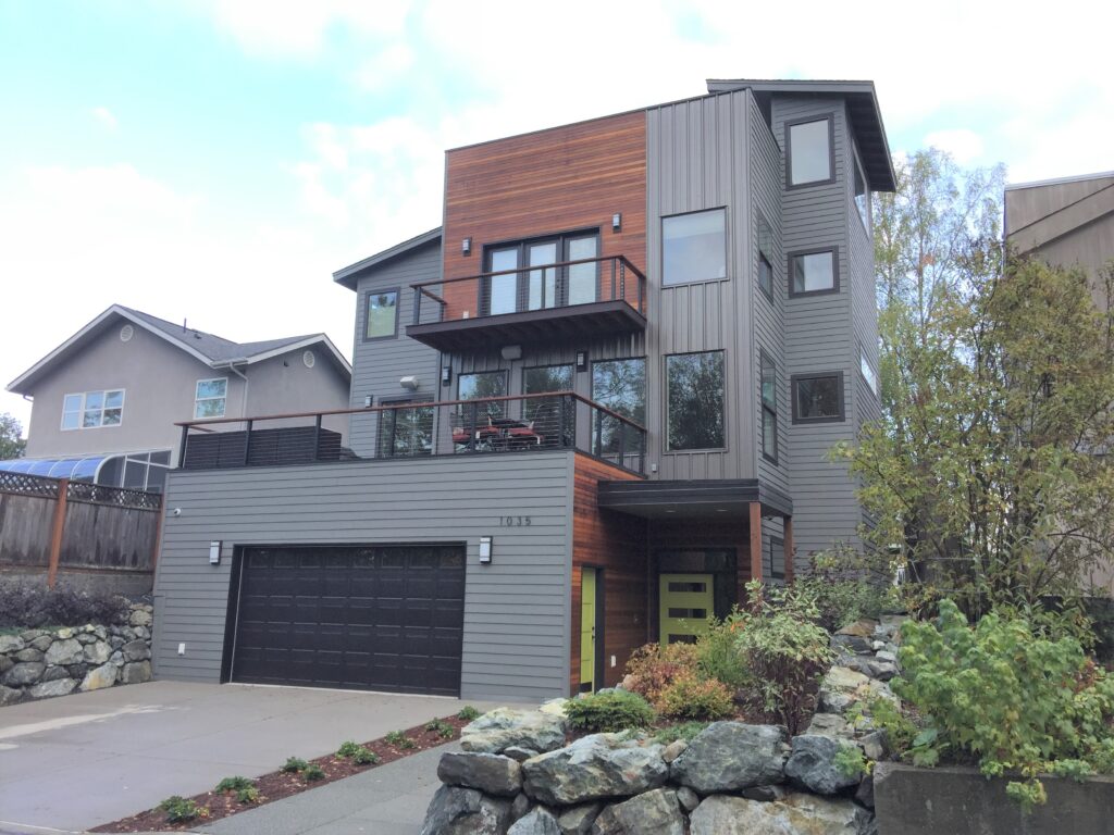


Did they like the end result? Here is what they said.
Need Help with Your Color Dilemma?

Set up a color consultation today. I can work with you locally or online nationwide.  Easy, collaborative and fun!


Having problems picking the right color because you are stumped by so called “undertones”? Are the paint colors you have selected shifting blue, green or another color once they are on the wall? Not sure how to pick the right white? Wondering what paint colors will go with the countertops you have selected for your kitchen or bath remodel? Wondering if that countertop will go with your existing flooring or other fixed finishes? Not sure how to find the right paint colors to go with that rug, piece of art or furniture that you want to use in your design? I can take the guesswork out of all of these things by using color measurements. Northern Lights Home Staging and Design. Certified Color Strategist.

Get Your Free Report

Ten Ways To Not Screw Up Picking Your Paint Colors
Why Work with Northern Lights Home Staging and Design

Aligned Design©– All Rights Reserved.

Terms of Service  |  Privacy Policy  |  Disclaimer |  Brochure

Prices are subject to change without notice.

Call 907-362-0065 today

Follow me on Pinterest
Let's Solve Your Paint Color Dillema- Northern Lights Home Staging and Design


Ten Ways To Not Screw Up Picking Your Paint Colors

Does choosing paint colors make you anxious?

It’s common because many don’t understand color science, even some experts. There’s a lot of misleading information about selecting paint colors, leaving many confused and unsure.

Don’t worry!


The easiest way to confidently choose your colors is by seeking advice from a real color expert. Ignore the internet clutter and well-meaning, but potentially misguided, advice from friends and family. Here are some essential things to remember.

Don’t Listen to Friends, Family or the Internet

Ten Ways To Not Screw Up Picking Your Paint Colors

Everyone might suggest colors for your space, but remember, most of these suggestions may not be right for you. Why?

They aren’t you; they don’t know your personal tastes. They don’t live in your home; they don’t know how your fixed finishes look in various lights. They don’t see colors the way you do; everyone’s vision and perception are unique. Unless they’re trained color strategists, capable of interpreting color data, they don’t have the full picture to make the best color choices

Ten Ways To Not Screw Up Picking Your Paint Colors

Steer clear of seeking advice from online forums like Houzz. Photos of your home can’t accurately convey your space’s unique colors – they’ll look different on every screen and won’t reflect your home’s true hues. A color combo that works in one home might not suit yours. 

Anyone advising based on a photo simply doesn’t understand color well enough.

Determine What Colors You Really Like

Seems straightforward, but choosing from countless colors can be daunting! Start by identifying colors that bring you joy and make you feel good. It might be easier to start by ruling out colors you strongly dislike

Ten Ways To Not Screw Up Picking Your Paint Colors

Narrow Color Choices Based on Fixed Finishes

Once you know what you really like, you do need to consider some “limitations” on what you can pick. They are your fixed finishes and narrow your choices to ones that look good with those things you are unlikely to change any time soon such as flooring, countertops, stonework, and more, Some Colors Are Bossy. Will You Listen to Them? to learn more.

Ten Ways To Not Screw Up Picking Your Paint Colors

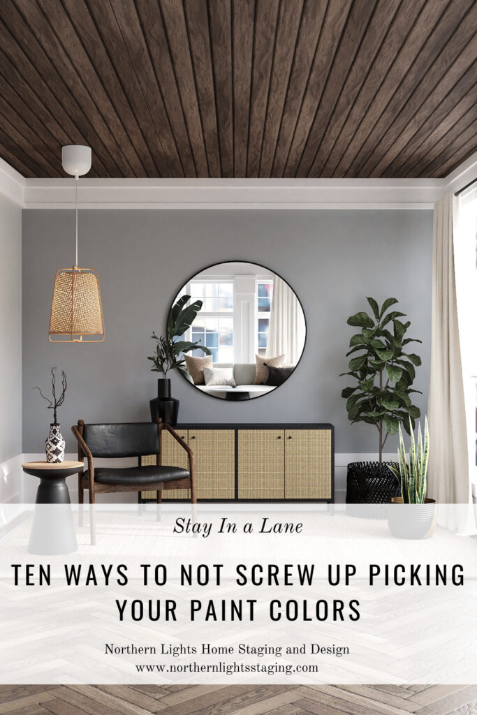
Stay in a Lane

Commonly, homeowners mix grays and browns, leading to less-than-ideal results. With the passing gray trend, many people paired gray elements with their brown woodwork, but this often looks off.

The key to blending grays and browns is using the right hues, values, and chroma – something color science can help with.


But without this understanding, it’s best to stick to either grays or browns. Choose a lane (gray or brown) and select colors that harmonize with your choice

Ten Ways To Not Screw Up Picking Your Paint Colors

Ignore Undertones

There’s a lot of misinformation online about ‘undertones.’ People often use ‘undertone’ to describe how they see a color in a specific location, lighting, and time. However, this is subjective and inconsistent.


In reality, an ‘undertone’ is the color revealed when a paint layer is scraped off.


So, don’t get caught up in discussions about undertones. It’s likely to add confusion rather than clarity.

Ten Ways To Not Screw Up Picking Your Paint Colors

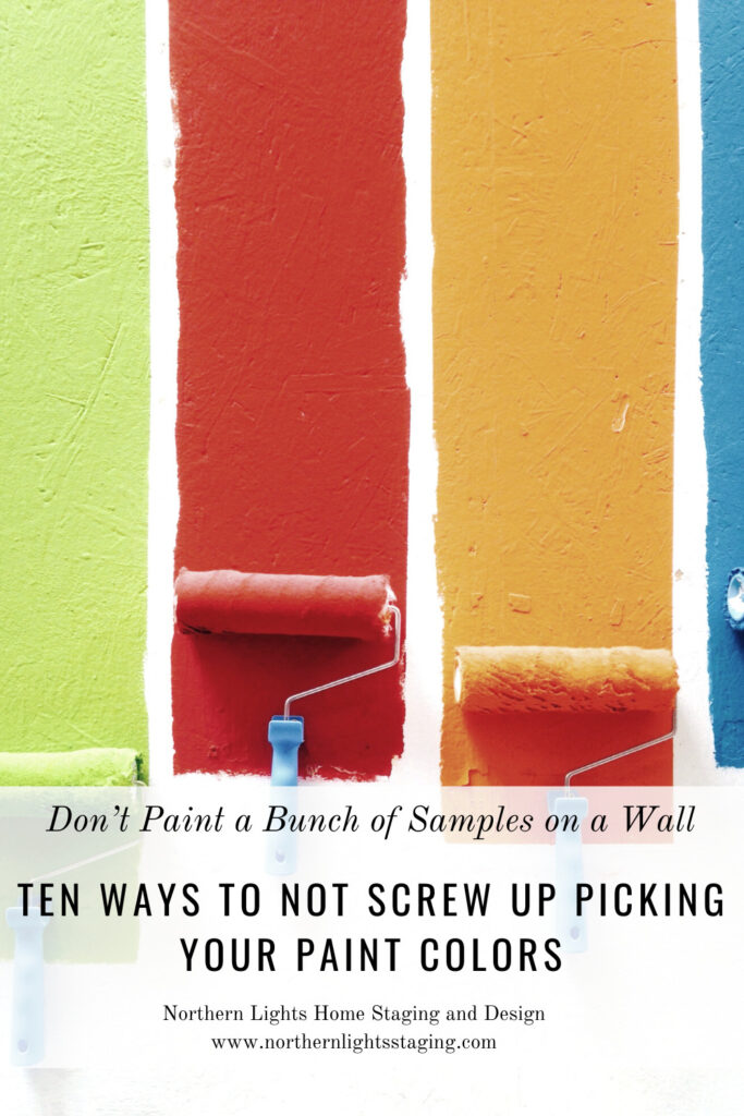
Don’t Paint a Bunch of Samples on a Wall Next to Each Other

When choosing paint colors, whether on your own or with an expert, painting samples in your space to observe them under different lighting conditions is crucial.


Many people paint various color samples side by side on a white background to compare. However, this isn’t effective. Why?


 Because each color alters how you perceive the adjacent one due to a phenomenon called ‘simultaneous contrast.


For instance, if you paint a dark color like ‘Moscow Midnight’ on a white background, the white makes it seem darker and grayer. Similarly, painting complementary colors (those opposite each other on the color wheel) side by side can make them appear more vibrant. For example, green seems greener when next to red, and vice versa. 


So, be mindful of this when comparing color samples.

It is better to paint on paper or something moveable rather than the wall, and look at colors individually in different light conditions.

Ten Ways To Not Screw Up Picking Your Paint Colors

When colors that aren’t complementary, like red and orange, are placed next to each other, they subtly affect each other’s appearance. For instance, red might make orange look slightly greenish, and orange could give red a slightly bluish tint.


I know, it might sound odd! But that’s one of the fascinating aspects of color science.


So, when evaluating colors, avoid painting a wall full of samples side by side. It complicates things! Instead, examine each color individually.

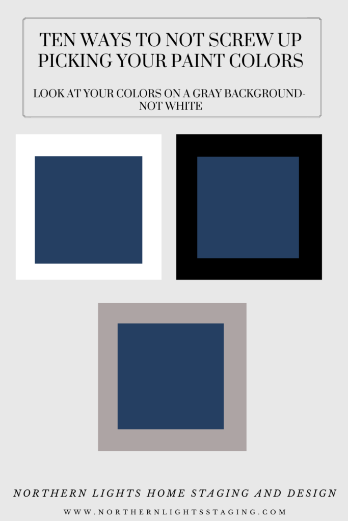
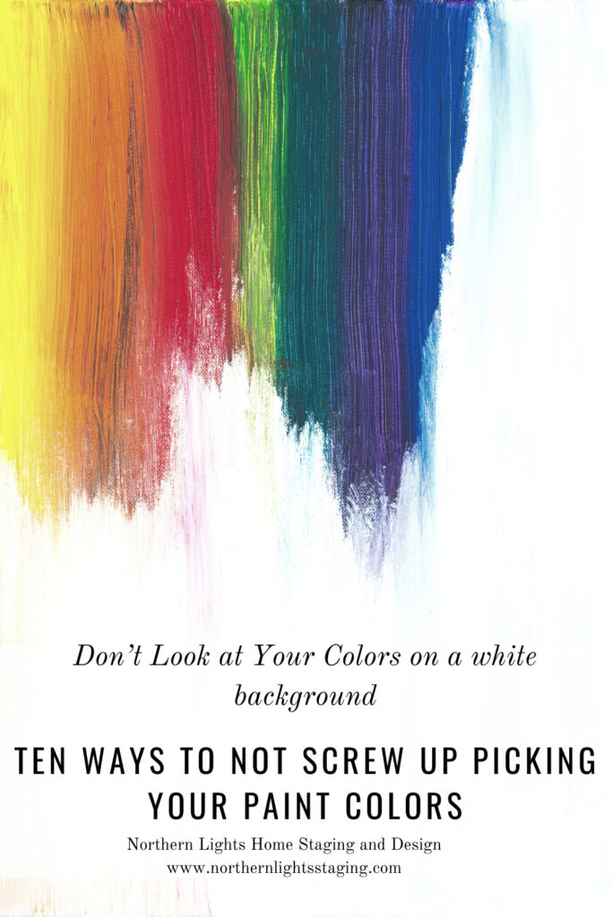
Look at Your Colors on a Gray Background- Not White

Many think white is the perfect neutral background to test colors. While it’s true that adjacent colors can influence your perception, white is not the solution. Just like other colors, white comes in various shades and can influence how your chosen color appears.

More importantly, the concept of ‘undertones’ that many refer to is often just a subjective opinion about the origin of a particular white or gray. In reality, this can be scientifically determined in seconds without painting anything.


The key issue with testing colors against a white background is that it can make all colors seem washed out, darker, duller, and less colorful. But once you paint your space, the color will appear much lighter, brighter, and more vibrant than expected.


For example, if you test Sherwin Williams ‘Moscow Midnight’ against a white background, it will look different than when applied to a full room.

Ten Ways To Not Screw Up Picking Your Paint Colors

Testing colors against a black background? It also distorts the appearance of your color, but in the opposite way to white. Black makes colors look lighter, brighter, and more colorful. When applied to a whole room, the color might look darker and duller than expected.


So, what’s the solution? Test your colors on a gray background. Gray is the most neutral color and will have the least influence on your chosen color. For example, Moscow Midnight appears truer to its actual color when viewed against gray.

Don’t Let Your Whites Look Dirty

Choosing white might seem simple, but it can be trickier than you think. Every white has a hint of color, or hue, with minimal chroma or saturation. If you’re planning to use different whites in the same space, ensure they harmonize well.


Whites that are too similar in color values can make each other appear ‘dirty’. So, picking the right whites can be just as important as choosing your main colors.

Find One Thing In Common

Creating a harmonious color scheme involves having a shared element – be it hue, value, or chroma – across your selections. Make sure to maintain this common thread throughout your home for a cohesive look

Ten Ways To Not Screw Up Picking Your Paint Colors

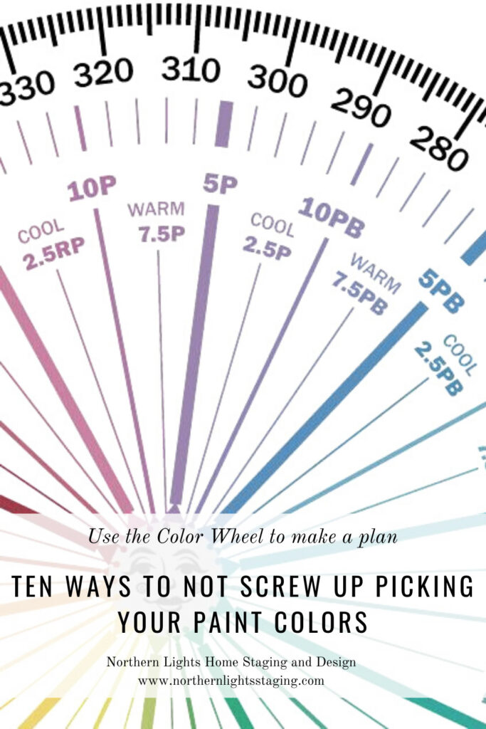
Use the Color Wheel to Make a Plan

After identifying your favorite colors that also complement your fixed finishes, the next step is forming a color scheme. A color wheel can be a great tool here, helping you see which color relationships you’re drawn to. You might prefer a monochromatic or complementary scheme, or perhaps a diad, triad, or tetrad arrangement. A split complementary scheme could also work well. 

With the help of a color wheel and color science, you can create a scheme that truly resonates with you. A color strategist can really help with this.

Ten Ways To Not Screw Up Picking Your Paint Colors

Use the Science of Color to get Extraordinary Color

Color science is a powerful tool. It helps pinpoint your favorite colors, select options that match your fixed finishes, create a harmonious color palette, and even choose the ideal whites. It removes the guesswork, ensuring fantastic results the first time around.


Embracing color science can elevate your color choices to a new level, leading to extraordinary results. If you’re unsure, consider hiring a professional with color science knowledge. The outcome will undoubtedly be worthwhile.

Ten Ways To Not Screw Up Picking Your Paint Colors

You are Making My Head Hurt

Now that I have told you how to not screw up your paint colors, you may be realizing that color is more complex than you thought.

Understanding the complexity of color might make you second-guess advice from well-meaning friends or even online experts. But why listen to me? Well, don’t just take my word for it – trust the science.


Many might ignore the science of color, preferring to rely solely on their ‘eyes’ and the art of color, as it seems simpler and more enjoyable. However, combining both the science and art of color leads to quicker, easier, and ultimately more stunning results

Ten Ways To Not Screw Up Picking Your Paint Colors
You are making my head hurt.Photo by Zdeněk Macháček on Unsplash

Are You Ready to Try a New Approach?

As a certified color strategist, I combine the art and science of color to eliminate guesswork and help you select the perfect paint colors. Let’s bypass the misinformation and aim for accurate, stress-free color selection the first time around, saving you time and money. Ready for a fresh approach?

Stop stressing about picking your paint colors and finishes with this science-based 2-hour color consultation. Learn More.


Having problems picking the right color because you are stumped by so called “undertones”? Are the paint colors you have selected shifting blue, green or another color once they are on the wall? Not sure how to pick the right white? Wondering what paint colors will go with the countertops you have selected for your kitchen or bath remodel? Wondering if that countertop will go with your existing flooring or other fixed finishes? Not sure how to find the right paint colors to go with that rug, piece of art or furniture that you want to use in your design? I can take the guesswork out of all of these things by using color measurements. Northern Lights Home Staging and Design. Certified Color Strategist.


Online or In Person?


Get Your Free Report


Ten Ways To Not Screw Up Picking Your Paint Colors


Attract Wealth with Interior Design: The Energy Art Quiz"- Northern Lights Home Staging and Design.


Why work with Northern Lights Home Staging and Design

Terms of Service  |  Privacy Policy  |  Disclaimer

Prices subject to change without notice.

Blog may contain affiliate links, meaning I receive a small commission for sharing at no additional cost to you.

Call 907-362-0065 today

 info@northernlightsstaging.com

Pin These

Ten Ways To Not Screw Up Picking Your Paint Colors


Staying Healthy and Happy During this Difficult Time

During these uncertain times, it is likely we are going to all be spending more time at home. Whether that is working from home or spending leisure time there rather than going out, it may be the best way to stay safe and healthy for now.

If you have not spent much time at home before, you may be looking around and thinking, wow, I wish my home looked or functioned better! I wish it was more comfortable, cozy, more of a sanctuary or an easy place to work from.


Create a sanctuary at home.
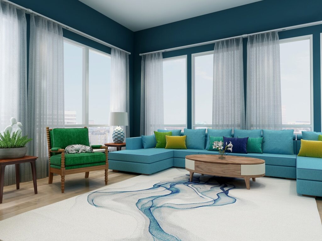
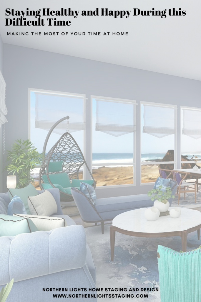
Create a sanctuary at home. Edesign by Northern Lights Home Staging and Design.

Think of it this way. Maybe it is the perfect time to do some updates or projects to create your perfect sanctuary. All those projects or ideas that you have meant to do but didn’t have time for. Why not now.

It could be painting an interior room, re-organizing, redecorating or refreshing a room or series of rooms. Maybe updating your office space so that it is more beautiful and works better for you.


Vintage Boho Office
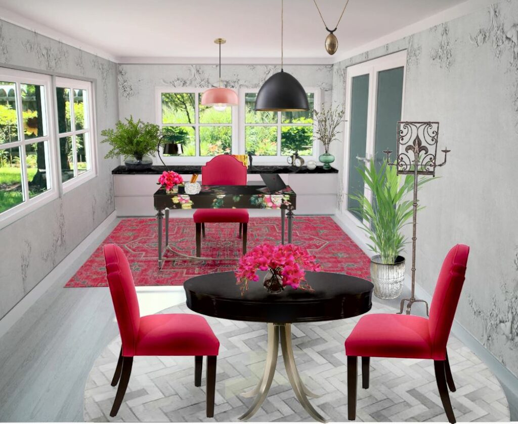
Create the perfect office space to work from home. Edesign by Northern Lights Home Staging and Design.

Maybe it is a great time to set up a workout area to stay healthy and avoid the gym. Maybe set up a place to meditate and relax or listen to music. How about an entertainment area to watch movies or play games? A reading nook with a window seat? Update your kitchen or dining area and do more cooking and entertaining at home with your family.


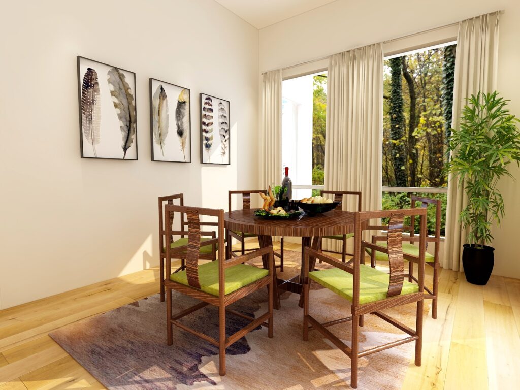
Update the look of your kitchen or dining area and do more cooking and entertaining at home. Edesign by Northern Lights Home Staging and Design.

How about a craft room to start working on those projects you have put off forever or to learn a new art form you always wanted to try? How about a great outdoor living space to relax, read, get fresh air or get more connected to nature. How about starting a garden or working on your landscaping? Why not update your décor so it is more healthy and eco-friendly?  Take an online course,  learn a new language, start a blog or research a future trip.


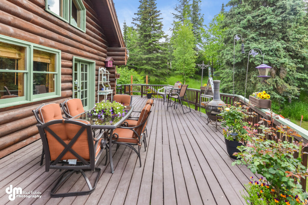
Create a great outdoor living area. Home staging by Northern Lights Home Staging and Design.

Grow a garden. Photo by Northern Lights Home Staging and Design.

Staging the stager's house- Northern Lights Home Staging and Design
Connect to nature. Photo by Northern Lights Home Staging and Design.

While social distancing is one way to stay healthy, we are still all connected online and can enjoy each other on Facebook, Instagram, Twitter, through Skype or Zoom calls or Facetime.

This too shall pass; we just don’t know how long before that happens. So, why not make the most of the extra time we may have at home and do something productive or make our surroundings more beautiful and fun.

This too shall pass. Photo from Unsplash.

If that idea appeals to you, you might consider Edesign as an option to work online with a designer to come up with great ideas to refresh a room or your whole house.  Create the perfect sanctuary or a home office.  You can take the ideas from your designer and implement them yourself while ordering everything you need online. Check out my Edesign services and let me know if I can help.

In the meantime, I will be writing blog articles on things you can do at home yourself to create your perfect sanctuary, so stay tuned! Or sign up for my monthly design, color or home staging tips so you never miss a great idea.


Edesign and Online SErvices of Northern Lights Home Staging and Design


What's your Global Interior Design Style? Take the quiz.

Why work with Northern Lights Home Staging and Design

Terms of Service  |  Privacy Policy  |  Disclaimer

Prices subject to change without notice.

Call 907-362-0065 today

 info@northernlightsstaging.com

Follow me on Pinterest
Staying Healthy and Happy During this Difficult Time- Northern Lights Home Staging and Design