After potentially spending more time than usual at home in the last few years, have you found yourself yearning for a change? Perhaps you’ve felt your space is too cramped, cluttered, or simply doesn’t resonate with your tastes anymore.
Amidst ambitions of career growth, health, and nurturing relationships, our surroundings can often take a backseat. Yet, they hold profound influence over our well-being. In times of uncertainty, refining our living spaces can provide a semblance of control and positivity.
It’s time to prioritize our living environment. Making even small changes can be a refreshing step towards creating a harmonious sanctuary that supports all aspects of your life.
Are you open to embracing change? Personally, during times when the world feels chaotic, I find solace in cleaning, decluttering, organizing, and redecorating. Enhancing my living environment brings a sense of control and stability to my life.
Have you realized how important living in a great space is to your well-being?
While you have a keen eye for decor and a passion for design, do you ever feel like things just aren’t falling into place? Perhaps you’ve collected beautiful pieces over the years, but your space doesn’t feel cohesive. Maybe the task of selecting the right paint shade leaves you overwhelmed, or decluttering seems like a monumental task. Over time, instead of getting better, does it feel like your decor challenges are amplifying?
You’re not alone; I’ve walked in those shoes too.
I faced those challenges as well. Picking colors used to be a source of frustration for me until I became a certified color strategist and delved into the world of color science. Designing a home that truly resonated with me was a struggle before I embraced the role of a designer and learned more about how everything is energy.
In my personal transformation journey, I realized how design nourishes who we want to be so we can live our best lives. I delved more deeply into how Feng Shui and Biophilia can connect our homes to nature to create positive, healthy energy in our spaces. To learn more about personal transformation, check out the Jim Fortin podcast.
We all spend more time at home than almost anywhere else. Living in a place that we love, that reflects us, nourishes our spirit, and supports our journey to be who we are meant to be is important!
After all, the world needs us.
The better we are, the more we can contribute to the world. A beautiful, colorful, and energetically aligned home is the perfect environment to make that happen.
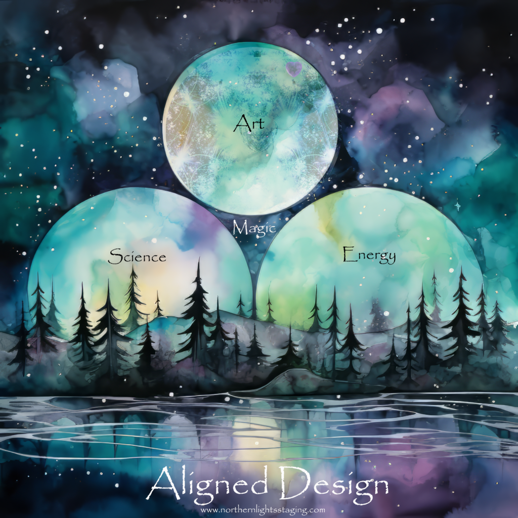
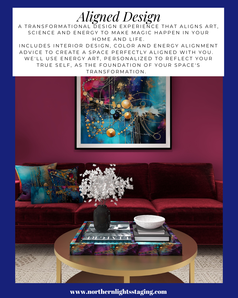
My Aligned Design philosophy aligns Art, Science, and Energy to make magic happen in your home and life.
I believe in creating beautiful, colorful homes that look and feel great and energetically enhance your life.
When your space is better, you are better. When you are better, the world is better.
Are You Ready to Create Your Perfect Space?
I assume if you have read this far, you are serious about making a change you know will make you happy.
Let me help you take that trip to your perfect space in a Ferrari instead of a stagecoach. Try my Aligned Design consultation and let’s get started.
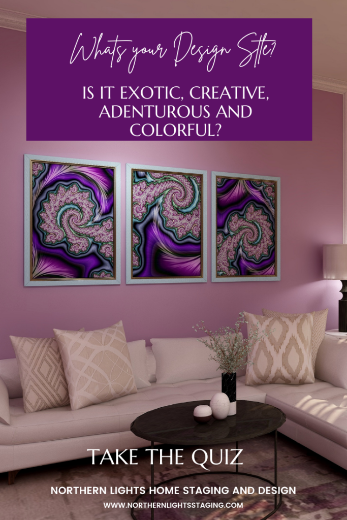
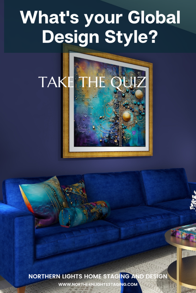
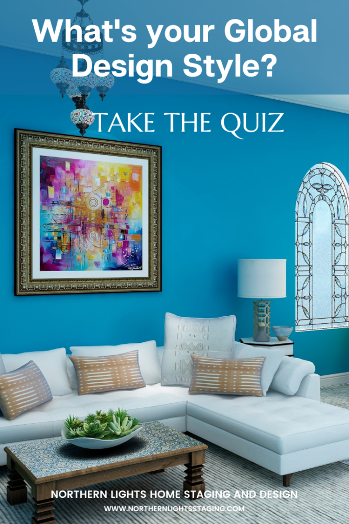
Curious about your Interior Design style? Take the quiz and find out.
People often struggle with creating a great color scheme. Often, we start the conversation by talking about the limitations, or the box of colors you need to play with based on your fixed finishes.
In my last article, Celebrate Your Favorite Color- Go Monochromatic, we talked about how you could take your favorite color and celebrate it in all it’s glory with a monochromatic color scheme. Simple and easy!
What if you would like a little more color variety, but still want something that is simple and easy to create? Go analogous!
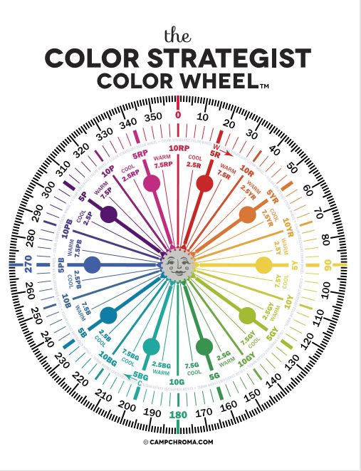
Analogous color schemes are based on three hues that are next to each other on the color wheel. They are friendly neighbors, they like each other and play well together:)
Analogous colors are harmonious and often found in nature.
Example of an analogous color scheme found in nature.
Why does it work? They go well together because one of the three colors is usually a combination of the other two as with the red, yellow and orange peppers above.
Analogous schemes offer more color variety than monochromatic schemes while still retaining that harmonious and often serene quality, although it can also be more dramatic too based on the hues you use. It is also a simple scheme to create by using your color wheel and picking three adjacent colors that you like.
Which three adjacent colors are your favorites?
MY favorite color training course, Camp Chroma.
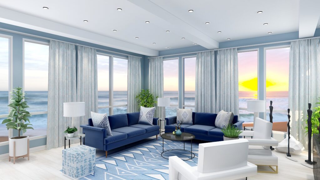
For example, in my last article, I created a monochromatic design using blues and blue/purples around the range of 250-270 on the color wheel.
Monochromatic Blue color scheme. Edesign by Northern Lights Home Staging and Design.
If I wanted to take this monochromatic design, and create a more analogous scheme, I could go clockwise around the color wheel and add the neighbors of blue in including purple and red-purple. Or, I could go counter-clockwise and add blue-green and green.
I could also pick neighbors on either side and add purple and blue green. Let’s play.
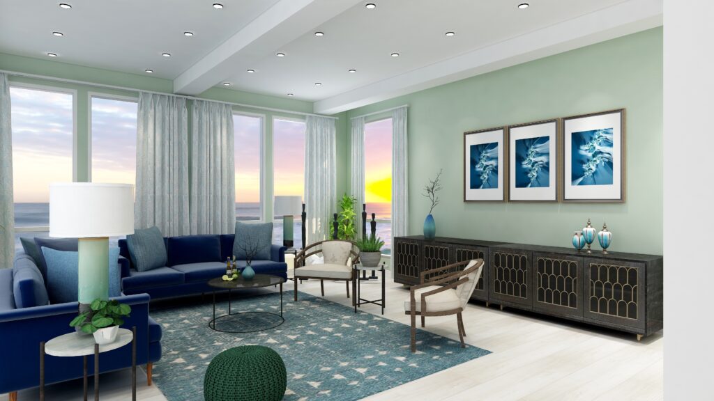
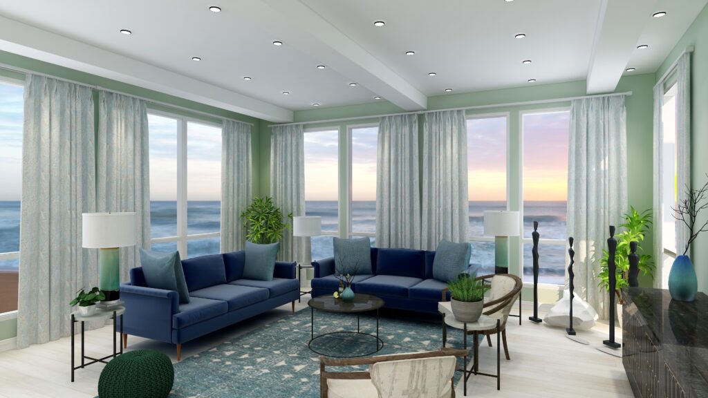
Analogous Color Scheme #1
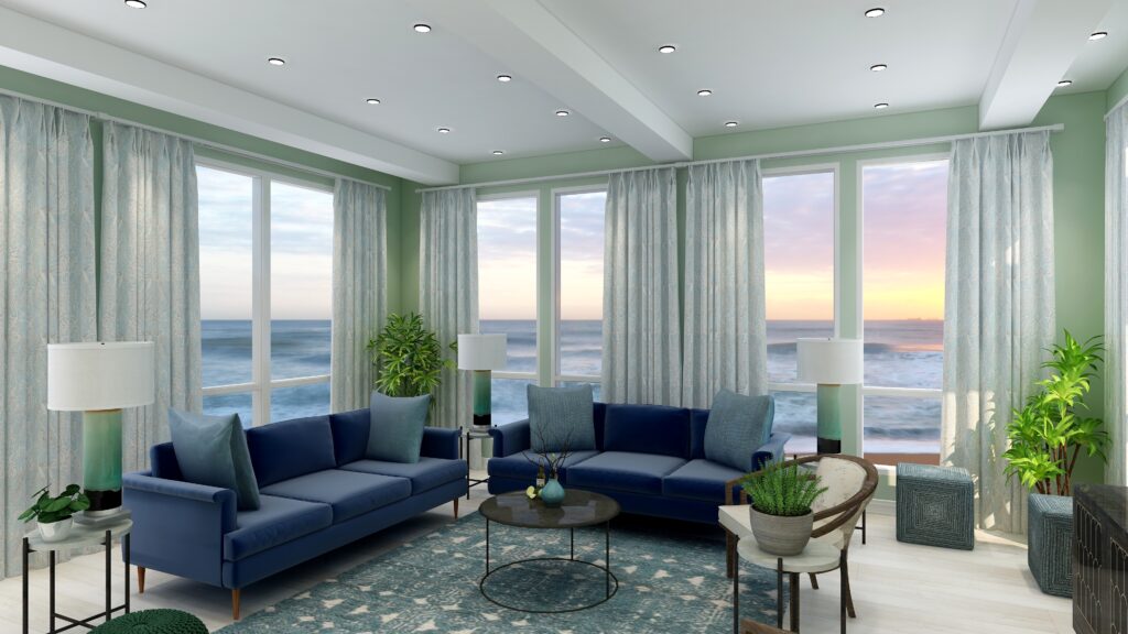
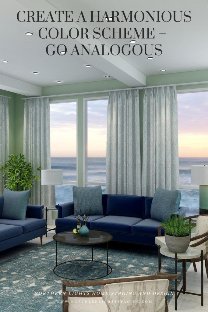
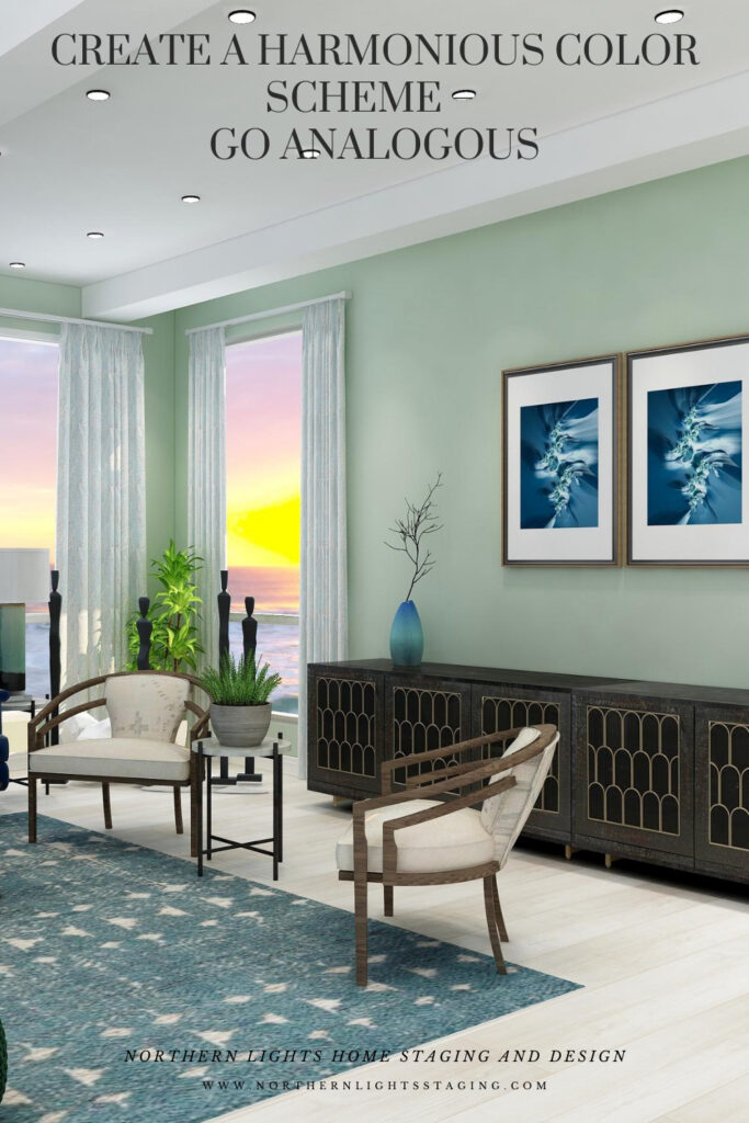
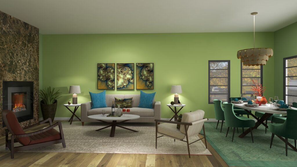
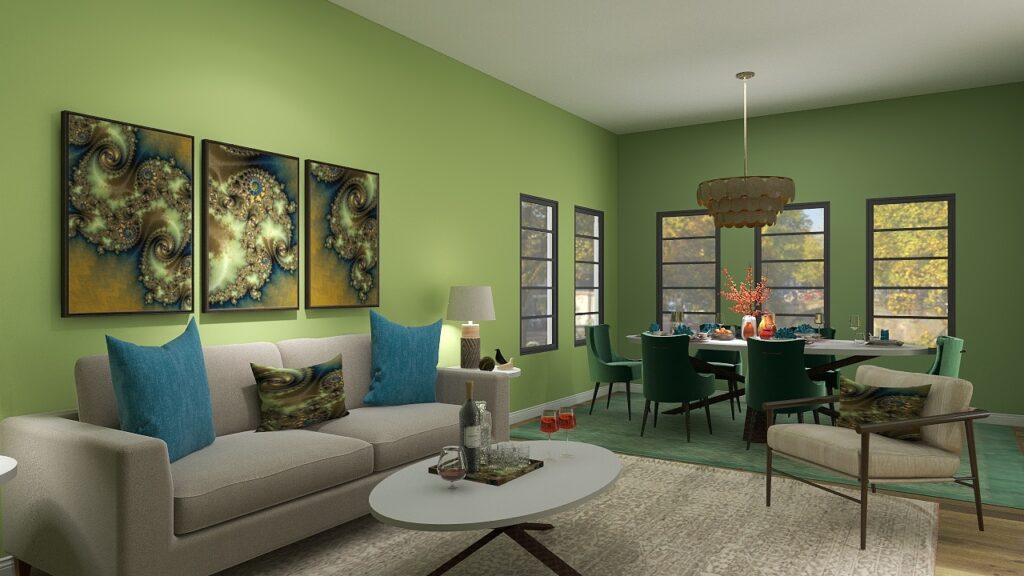
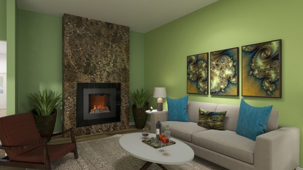
This design starts with our base blue as in the sofas and moves counter-clockwise along the color wheel to include blue greens and greens. I set the tone for this design with a new rug in blue green and then changed the paint color, lamps, side chairs and some of the accessories. I maintained the sofas and art as the anchor of the main blue color I wanted to harmonize with.
This design still maintains a calm, serene feeling similar to the original monochromatic scheme, but feels a little richer and warmer with the greens and blue greens.
Analogous color scheme and Edesign by Northern Lights Home Staging and DesignAnalogous color scheme and Edesign by Northern Lights Home Staging and Design
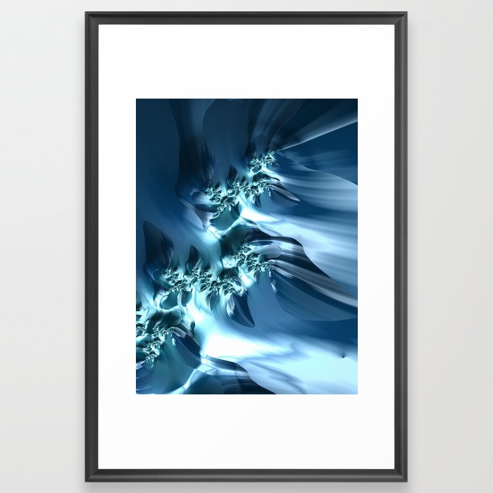
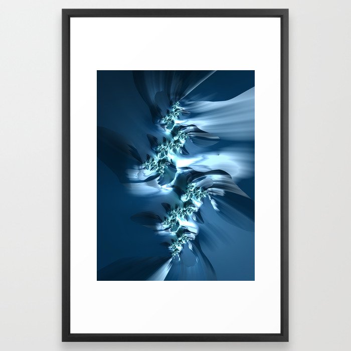
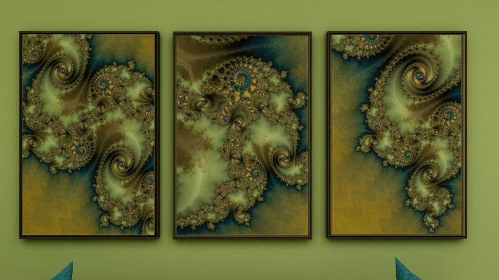
Fractal Art
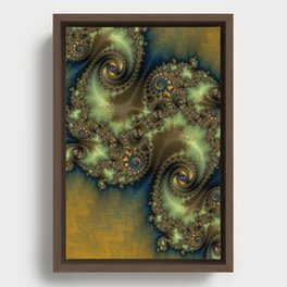
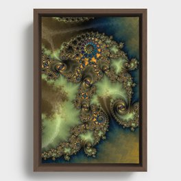
This design, as with the monochromatic design, incorporates some of my original fractal art in a collection called “The Sea”, which reminded me of white caps on the ocean and also uses variety of blue shades.
The Sea The Sea #2 The Sea #3
Analogous Color Scheme #2
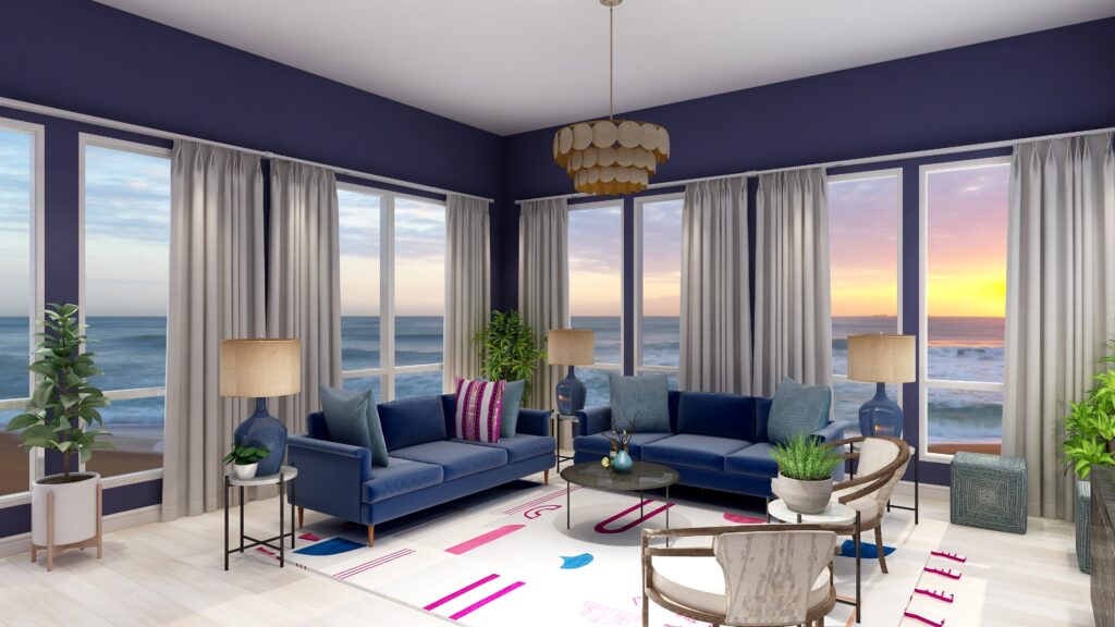
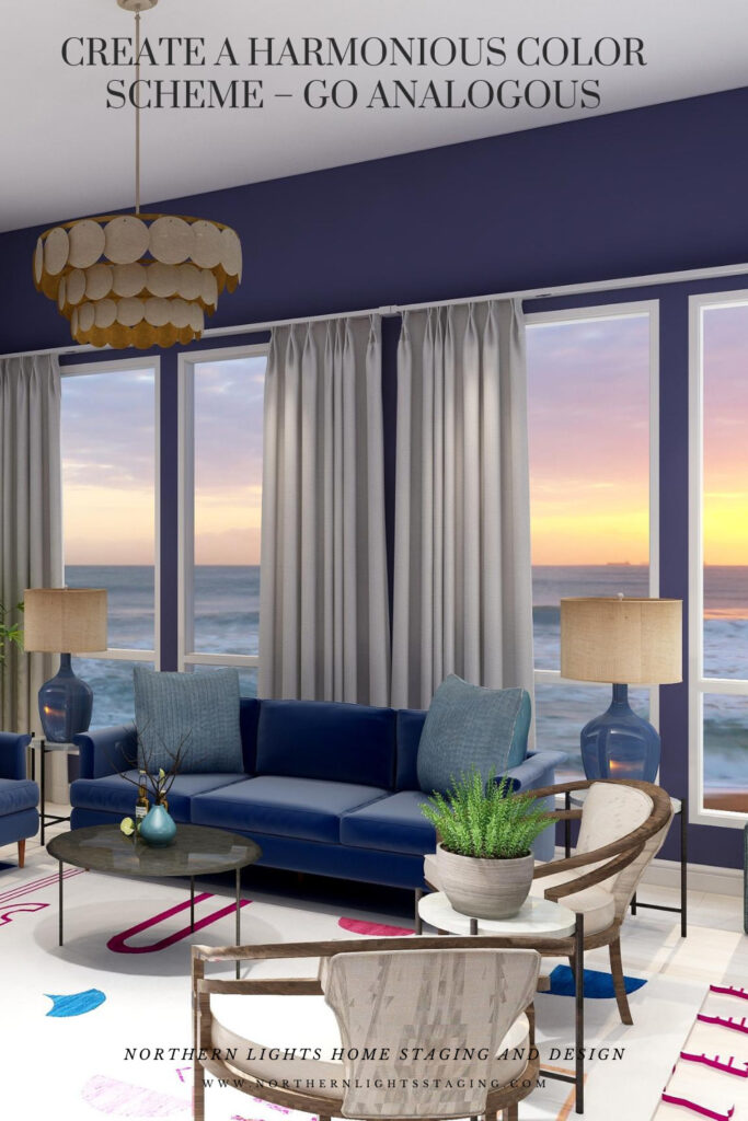
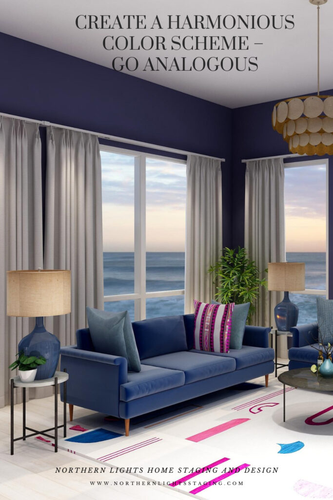
In this case, I again maintained the blue sofas as the base color from the previous design and went clockwise around the color wheel to include purple and red/purple.
I found a nice rug that contained the 3 main colors I wanted to work with to tie everything together. Then I switched the paint color, lamps, one accent pillow and some of the art to bring in some of the other colors.
This design is a little more dramatic due to the deep, rich moody wall color and the high contrast of colors against the white background of the rug. I still think it looks calm and relaxing too.
Analogous Color Scheme #2. Edesign by Northern Lights Home Staging and Design
Fractal Art
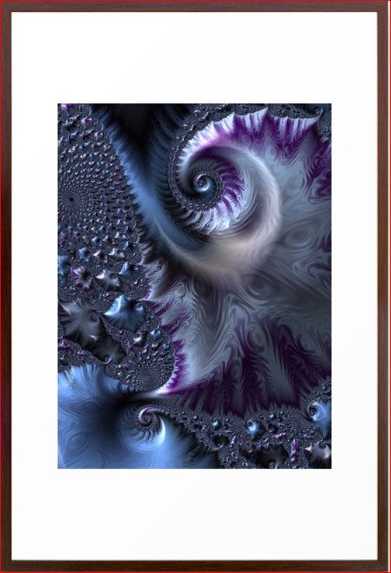
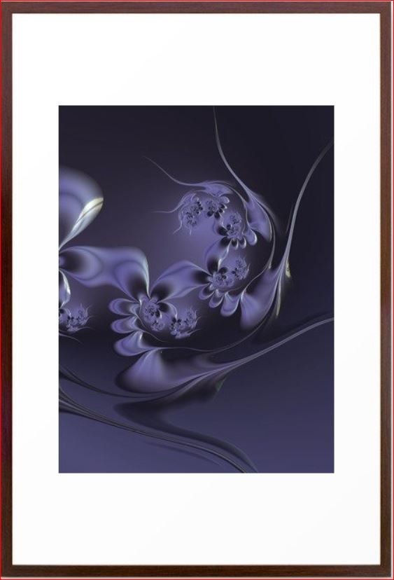
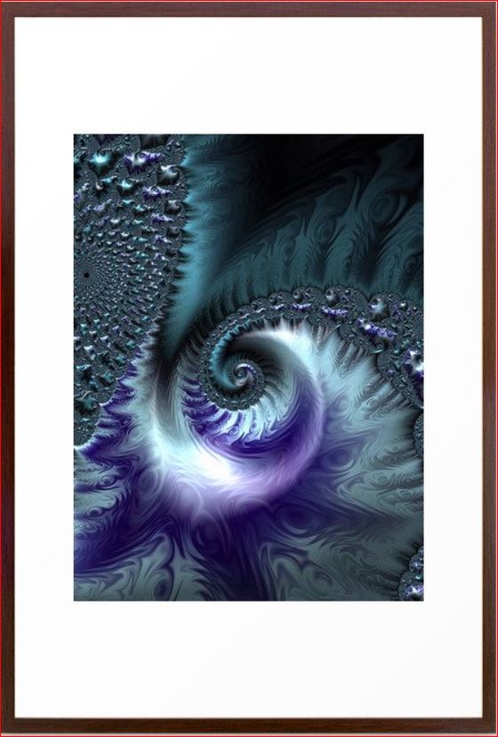
Here is some fractal art I designed that could be used in this design. My Forest Floor designs were inspired by colors in the boreal forest here in Alaska which have a lot of water in them (streams, ponds, rivers, lakes), thus the blues. The purples represent many of our purple wildflowers. Mystery is a mystery…..use your imagination of what it means to you.
Forest Floor #3 Mystery Fractal Art Forest Floor #4
Benefits of an Analogous Color Scheme
Analogous color schemes use colors that are adjacent to each other on the color wheel. These schemes offer a harmonious and visually pleasing palette. Here are the benefits of using an analogous color scheme:
Harmony and Cohesiveness: Analogous colors have a natural harmony because they share common color components. This results in a unified and cohesive look that’s easy on the eyes.
Subtle Contrasts: While the colors in an analogous scheme are similar, there are still subtle contrasts that can be used to highlight or differentiate design elements.
Versatility: Analogous colors can be adapted to both vibrant and muted tones, offering flexibility in setting the mood or theme of a design.
Richness and Depth: Using several shades and tints of a color range adds richness and depth to designs.
Natural and Comforting: Analogous color schemes often mimic how colors appear in nature, making them inherently familiar and comforting to the human eye.
Easy Color Matching: It’s easier to match colors within an analogous palette because they share similar undertones, reducing the risk of clashing hues.
Reduced Visual Tension: Analogous colors create a more relaxed visual experience because there’s a lack of high contrast between the colors.
Flexibility in Highlighting: One can easily highlight an element by choosing a color from either end of the analogous range, making it slightly more vibrant or darker than the surrounding hues.
Aesthetic Appeal: This type of color scheme tends to be naturally pleasing and aesthetically appealing because of its harmonious nature. An analogous color scheme can look richer and add more color diversity and interest than a monochromatic color scheme.
Enhanced Mood Setting: Due to their close relation, analogous colors can be effectively used to evoke specific moods or feelings, like warmth (reds, oranges, yellows) or calmness (blues, greens). These are really nice for living rooms, dining rooms and bedrooms. Analogous color schemes can also be more dramatic based on the hues you select, placement of colors and how saturated they are.
While analogous color schemes offer many advantages, it’s essential to ensure adequate contrast within designs to avoid them becoming monotonous or washed out. Using a neutral color or even a complementary color in small amounts can help add interest and break up the scheme.
Celebrate Your Favorite Colors
Imagine stepping into your space where every hue resonates with your spirit. It’s not just a room; it’s a reflection of you – a haven of happiness and tranquility. In a world where everything aligns, your surroundings uplift and rejuvenate you. When your home mirrors your essence, harmony is effortless.
Purchase an Aligned Design or Color Consultation today.
Saturday Night Live Art Shows-Aligned Energy Art- “Release”
Welcome to Saturday Night Live Art Shows ! I am Mary Ann Benoit and am with you tonight from Seward Alaska! So excited to be with you tonight to share my new idea, called Aligned Energy Art and three fractal art pieces I designed to introduce it.
Be sure to check out all the other artists from around the world, having art shows in their Facebook and social media feeds at 6-9 pm in their time zones. Follow Saturday Night Live Art Shows on Facebook by searching #snlartshows.
Introducing “Release” Aligned Energy Art
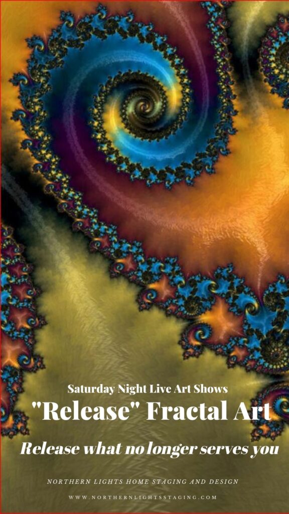
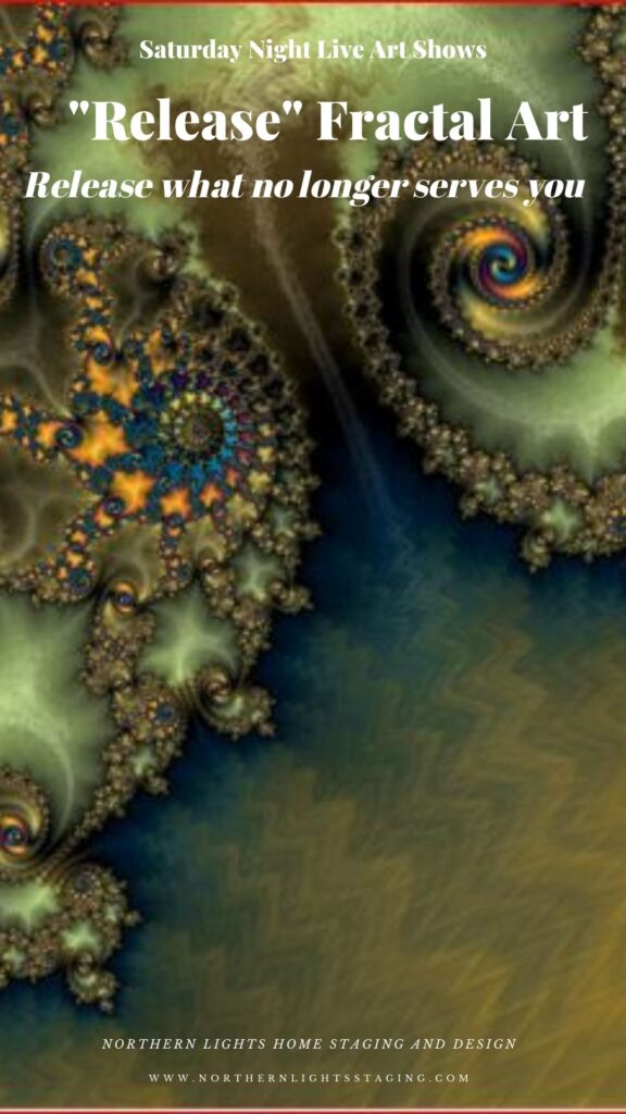
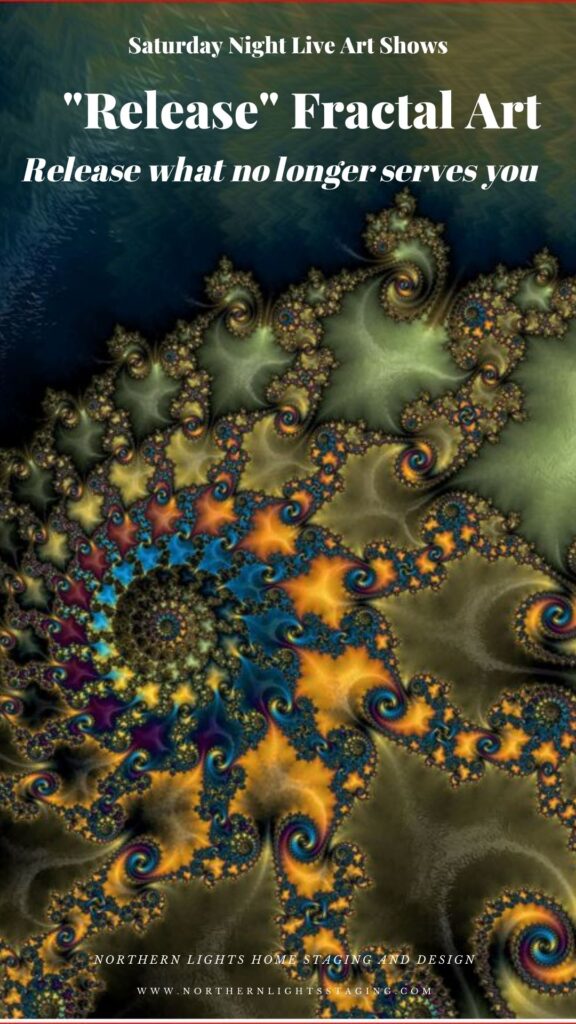
My latest fractal art, named “Release” was inspired by the idea of releasing all the things in our lives that do not serve us and make us feel heavy. One of my teachers, Jim Fortin, often repeats this quote from his mentor, DX, that “when you think too much, you make yourself heavy, and when you are heavy, you can not fly”.
What does that mean? We all have things in our lives that make us feel heavy, uncomfortable, angry, resentful, and other ways that do not promote well-being.
They take our time and energy and stress us out. It might be things, like clutter, or things we do, or over-do that we really don’t enjoy or do to please others.
When was the last time you took an inventory of those things to see how many were really adding anything important or meaningful to your life?
I decided many months ago that I wanted to release things that were taking up too much of my time and causing me to feel stressed and overwhelmed. “Release” became my new motto, and favorite word.
I noticed, the more I released, the better I felt. Thinking about the word “Release” daily, helped me improve my well-being.
I was thinking about the concept of releasing things when I created this art.
As I described in my previous Saturday Night Art Show, creating fractal art, which is digital art, is like traveling through a kaleidoscope until you find the perfect spot to stop and then you can adjust any element you want.
The place I chose looks like a landscape filled with mountains and rivers from above, releasing the energy of the water and soil down to the ocean where you see it expanding out from there.
It has the colors of fall, and the energy of the changing of the seasons, when the trees release their leaves and transform themselves to be ready for winter.
It has the colors of nature and the earth, greens and browns, blues, yellow and orange.
“Release” fractal art by Mary Ann Benoit of Northern Lights Home Staging and Design
The greens and colors of nature add a feeling of calmness and well-being, as if sitting in a beautiful forest. This is the feeling I want to have as a result of releasing what no longer serves me.
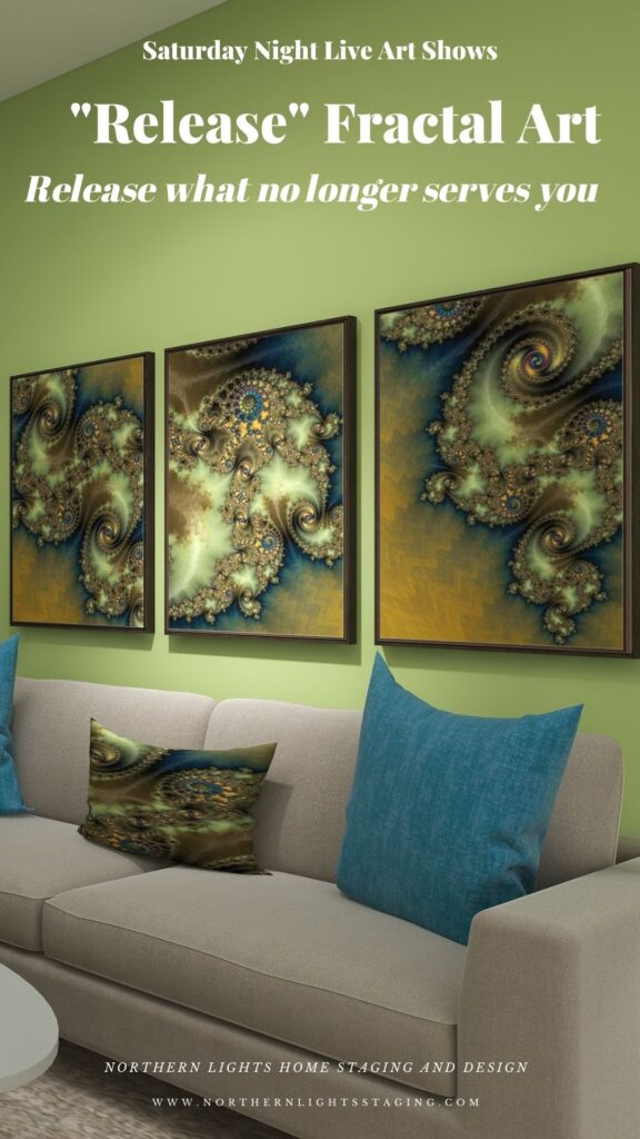
As I usually do, I created 2 more pieces to go with it, so you can see the movement between pieces and use three together over a sofa t create a focal point in a room.
“Release 2” fractal art by Mary Ann Benoit of Northern Lights Home Staging and Design “Release 3” fractal art by Mary Ann Benoit of Northern Lights Home Staging and Design
How can you use Aligned Energy Art in your space?
If the message of “Release”, or future concepts I plan to create resonate with you, then adding art that is meaningful as well as beautiful is a great way to create your perfect space and remind yourself of what is important in your life each day when you see it.
Art like “Release” can be added to your living room, bedroom, meditation or work out area or wherever your intuition guides you to put it.
Because this art is digital, it can also be put on a variety of home decor products such as pillows, bedding, serving trays, coffee mugs, notebooks and more. So you could think about “Release” as you sip your morning coffee out of a “Release” coffee mug while writing things you want to release your “Release” journal for example, drinking out of your travel cup on the way to work or doing yoga on a “Release” mat.
Aligned Energy Art is another layer of meaning beyond the visual beauty in creating your perfect space that is aligned with who you want to be.
An Example
I created this Edesign, or virtual design as an example of how you could created a space using this art and expressing the energy of “Release” in your space. Note the “Release” fractal art on the framed canvases on the wall, the serving tray on the coffee table, the pillow on one of the chairs and the place settings on the table.
Your selection of art determines the energy you want to surround yourself with.
How do you want to feel?
What is Fractal Art?
Fractal art is digital art I create on my computer.I love creating fractal art because it allows me to work with brilliant colors, interesting textures, and incredible detail. Learn more about how it is created in my last Saturday Night Live Art Show, ” A Passion for Purple” where I show some video of the process. See examples at my store on Society 6.
https://youtu.be/Ha0e7-NUpE4?si=bN1ObYbHebxXW-Y8
Check out my Fractal/ Energy Art Studios
Edesign and fractal art home decor by Northern Lights Home Staging and Design
Are You Ready to Create Your Perfect Space with Art?
Are you ready to create your perfect space with amazing art? Let’s tell your unique story and find the alignment of art, science, and energy that makes you happy. Try my Aligned Design consultation and let’s get started.
Crafting the perfect color palette can be a daunting task for many. Often, the starting point revolves around fixed finishes and certain constraints. In my recent blog posts, we’ve delved into constructing color schemes from a favorite hue, like blue. We’ve explored monochromatic and analogous palettes, and today, we’re diving into complementary color schemes.
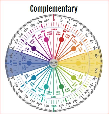
Complementary colors are a pairing of hues that sit opposite each other on the color wheel. When juxtaposed, they amplify each other’s vibrancy and intensity. The beauty of complementary colors lies in their mutual ability to enhance one another’s brilliance.
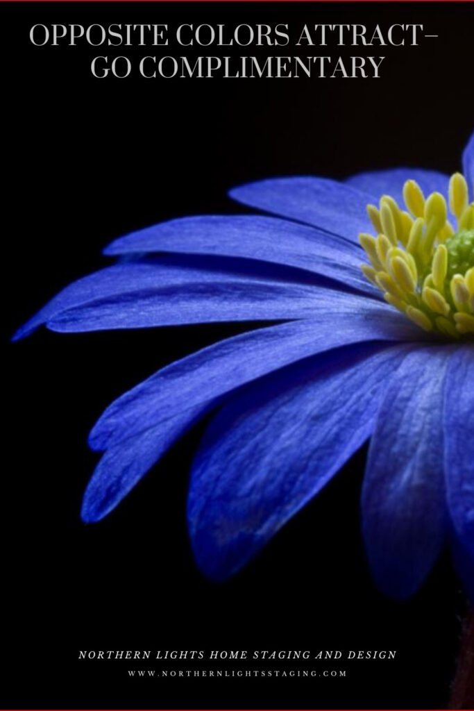
Blue and Yellow glass from Creative Commons CC0.
Complementary color schemes, offer several benefits when used in design:
Visual Contrast: The stark contrast between complementary colors makes each hue stand out distinctly, creating an eye-catching and vibrant look.
Balanced Visual Stimulation: Complementary colors provide a sense of balance; one color might be warm (like red) while its complementary color is cool (like green).
Enhanced Vibrancy: When placed next to each other, complementary colors can make each other appear brighter and more vivid.
Versatility: Complementary color schemes can be adapted to fit various moods and styles. For a bold and energetic look, you can use the colors in their full saturation. For a more subdued and harmonious look, you can use toned-down versions of the colors.
Focus and Attention: Because of their contrast, complementary colors can be used to draw attention to specific elements in a design or space.
Harmony: Even though they’re opposites on the color wheel, complementary colors inherently work well together and create a harmonious design.
Flexibility in Decor: A complementary color scheme allows for flexibility. For instance, if you have a room with predominantly blue decor, introducing some orange accents (like pillows, art, or rugs) can instantly invigorate the space.
Depth and Dimension: In art, especially painting, complementary colors can be used to create depth, with one color serving as a shadow or highlight against its opposite.
Enhancement of Features: Complementary colors can be used to make features stand out. For example, putting orange flowers in a blue vase draws attention to the arrangement and makes both colors pop.
The key to a successful complementary color scheme is balance. Use in moderation and pair with neutral tones to provide a visual rest.
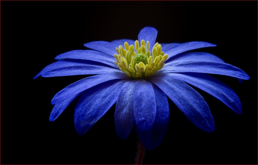
Complementary colors can create interesting optical illusions. For example, if you stare at a square of color for thirty seconds to a minute, and then look at a white paper or wall, you will briefly see an afterimage of the square in its complementary color. Try it with this blue square and see if you see an after image of yellow.
Why does it work? Leonardo da Vinci observed that the finest color harmonies were those between colors exactly opposed. Maybe that is where the saying opposites attract came from?
It’s opposite or compliment on the color wheel is yellow, which ranges from Yellow/red to Green/Yellow and can have varying degrees of saturation or chroma, and lightness. In other words, there are lots of yellows we can work with:)
Complimentary Colors- Created by Camp Chroma- The Best Color Training Ever.
The Design
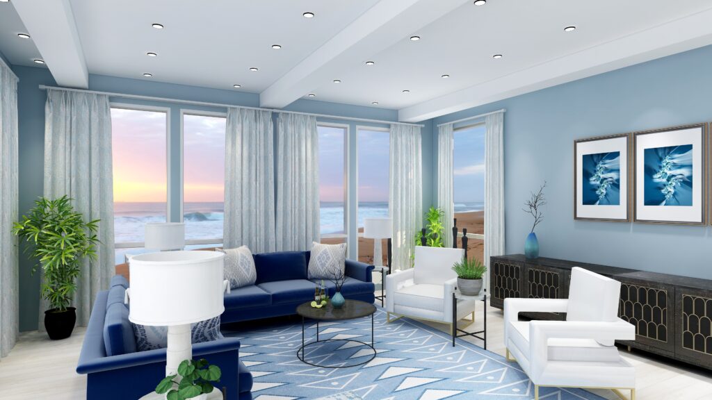
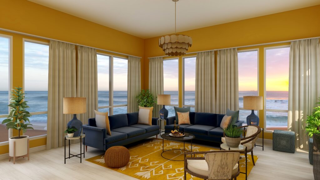
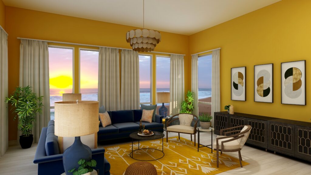
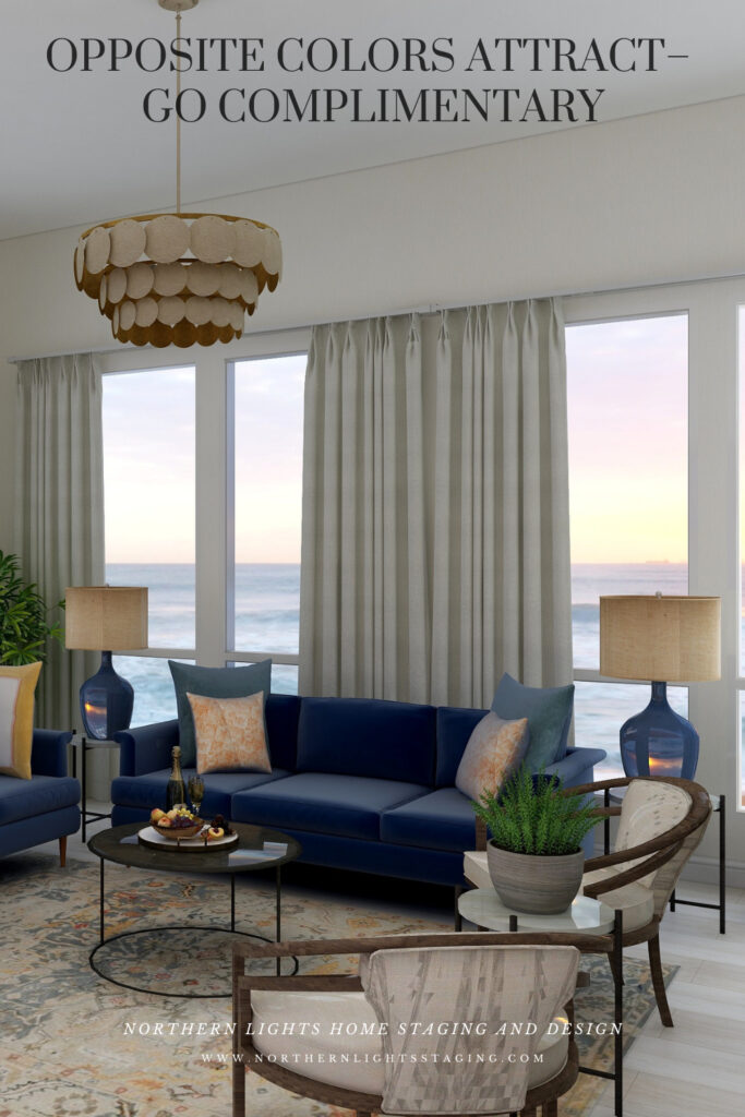
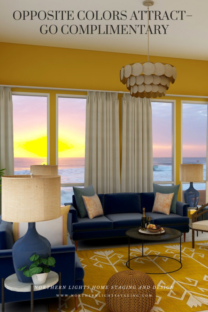
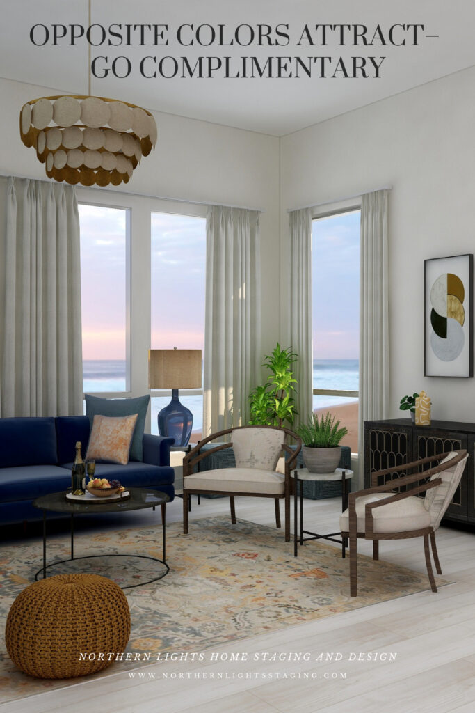
Here are examples of two living rooms I created using a blue and yellow complimentary color scheme. The first is bright and dramatic. The second is more relaxed and neutral.
Complimentary blue and yellow Living Room Edesign by Northern Lights Home Staging and Design. Complimentary blue and yellow Living Room Edesign by Northern Lights Home Staging and Design.
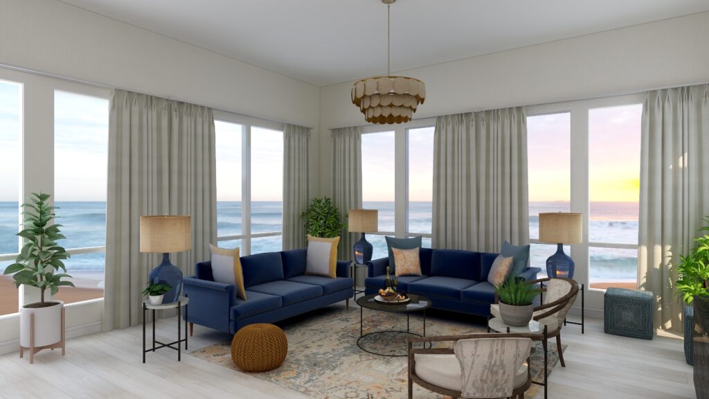
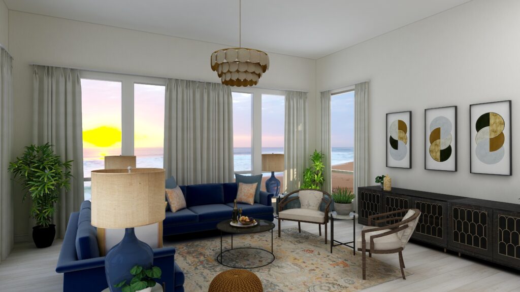
Complimentary color schemes don’t have to be bright and colorful. They can use darker, less saturated or more muted tones of opposite colors for a more understated look. The design below uses an area rug with muted yellows and blues, and wallpaper with minimal yellow. Otherwise everything is the same.
Complimentary blue and yellow Living Room Edesign by Northern Lights Home Staging and Design. Complimentary blue and yellow Living Room Edesign by Northern Lights Home Staging and Design.
Benefits of A Complimentary Color Scheme
Navigating the world of complementary color schemes is easy and straightforward. Begin by pinpointing your favorite hue on the color wheel, then locate its direct opposite. This partnership is where the magic happens.
Complementary colors inherently possess a dynamic tension, making them ideal for spaces meant for lively conversations and gatherings, such as living rooms and dining areas.
However, this boldness can be tempered using muted or desaturated versions of these hues. Then you can craft a serene and sophisticated palette, perfect for spaces meant for relaxation and introspection.
Whether you seek vibrancy or tranquility, complementary color schemes offer versatility to match your vision.
Click on the picture to find out more about the best training class on color available, the Four Pillars of Color!.
Birds of a Feather- What Birds Can Teach Us About Designing the Perfect Room.
Previously, I showed you how flat lays give a bird’s eye view of a lot of magic possibilities about to unfold before you.
A flat lay creates endless possibilities for creating a perfect space.
I showed you three flat lays inspired by bird feathers and asked what room you visualized each could become.
I created some magic with the first design and wanted to share that possibility with you.
A flat lay is an idea filled with possibilities.
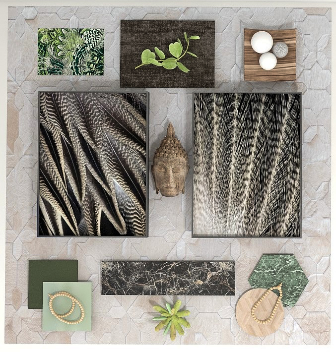
This flat lay and design was inspired by the beauty of Pintail duck and eagle feathers. Birds provide endless inspiration for creating beautiful designs with the intricate patterns, colors, and textures of their feathers! Who else but Mother Nature could come up with such great designs.
This flat lay showed initial ideas for flooring, tile, carpeting, fabrics, and more that I thought looked beautiful and created a feeling or mood for a room. I wanted the room to feel peaceful, earthy, spiritual and a little exotic, as if you were relaxing on the forest floor in an old-growth forest where it was totally quiet except for bird calls.
Flat lay and Edesign by Northern Lights Home Staging and Design
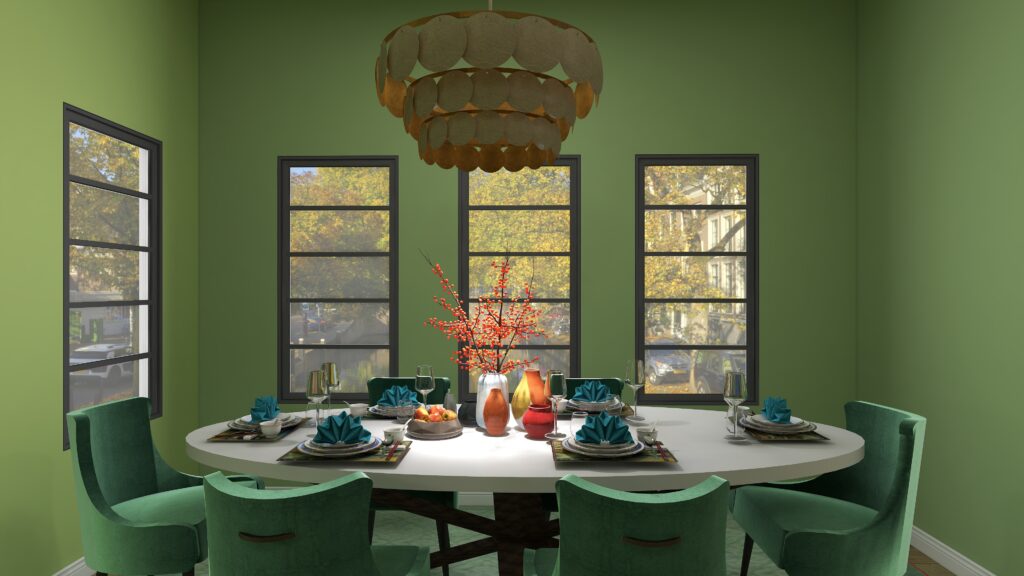
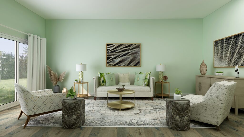
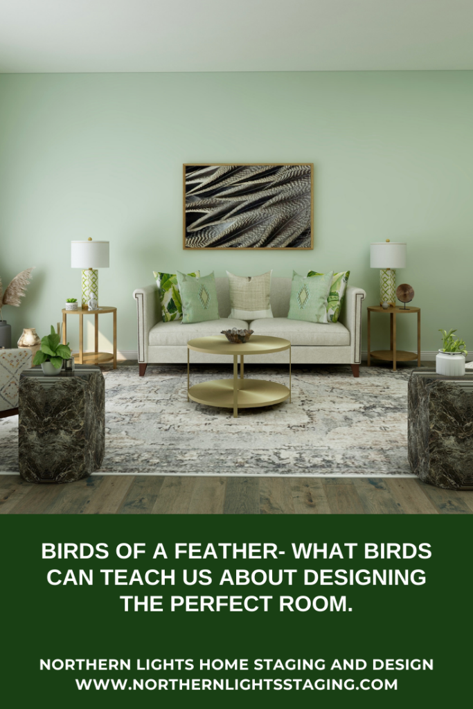
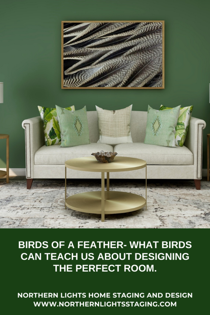
I decided to create a living room with the idea. I tried using the two shades of green for paint colors to see how it would change the look and feel of the room. I think the darker green evokes more of a feeling of the forest. Which do you prefer?
Here is the final design. Does this look like any of the possibilities you imagined from the flat lay?
Edesign by Northern Lights Home Staging and Design
Are You Ready to Create Your Perfect Space?
Are you ready to create your perfect space? I assume you are since you are reading my blog post. Let’s tell your unique story and find the alignment of art, science, and energy that makes you happy. Let me help you take that trip to your perfect space in a Ferrari instead of a stagecoach. Try my Aligned Design consultation and let’s get started.
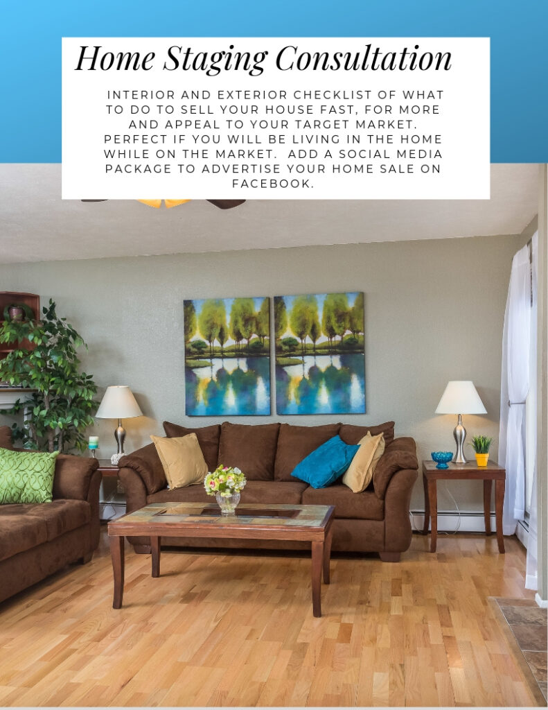
Considering selling your 1980’s home? Want to modernize it to attract younger buyers without breaking the bank? It’s crucial to identify updates that yield a return on investment. Consult with your realtor on worthwhile upgrades.
On one home staging project, I revitalized an ’80s home by painting the interior, updating the carpet, lighting, master bath countertop, and some hardware. I swapped out older furniture for trendy rental pieces, added modern art, and introduced vibrant colors.
The outcome? A rejuvenated, contemporary space that resonated with younger families. It sold on its first day at the full asking price! Which version would you choose?
Are You Ready to Stage Your Home?
Let’s get your house looking like one that buyers will love. Call today for a consultation.
What message does your home’s color broadcast to the world? Every facade tells a story about its inhabitants. Is your home a reflection of your personality? Does it uplift your spirits daily? Does it warmly welcome guests or potential clients for those with home businesses? And if you’re selling, does your home appeal to prospective buyers? The hue of your home reveals hints of your identity.
When it comes time to paint the exterior, you have a lot of options and some limitations you need to consider.
Limitations when Picking Paint Colors
Let’s start with the limitations. Just as with the interior, you need to consider the “fixed finishes”, the things which rarely change like the roof or stone features. Your wall and trim colors should complement these fixed finishes and each other.
Consider your Environment
Consider your surroundings when choosing colors. Ensure they complement your landscape and local views, and fit within the neighborhood’s color palette. While a vibrant hue might stand out in a neutral area, it could blend perfectly in a more colorful neighborhood.
Consider Guests and Clients
Do you run a business from your house, such as a vacation rental? What image will the colors project to your customers? Is it consistent with your brand? You may be using photos of your house to attract customers online. Will the photos attract your ideal customer?
Selling your Home? Consider the Buyer
Are you selling the home? Consider more neutral shades to appeal to a broader audience. However, a standout front door color can make it memorable and can be easily changed if the buyer prefers.
Make a Statement with your Front Door Color
Your front door color sets the tone for your home. Even neutral homes can pop with a vibrant door. Everyone perceives and feels about colors differently. Consider what emotions a color evokes for you. Do you want your home to relax, uplift, or energize you? Choose colors that reflect your desired ambiance.
Consider how Color Affects Your Home’s Comfort
The colors you choose can impact costs and practical factors. Dark colors might need more paint layers if covering a light base and can absorb more heat, potentially making deck areas too warm in the sun.
Consider how Color can Affect Your Home Based Business
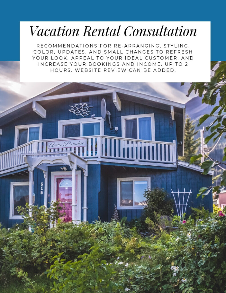
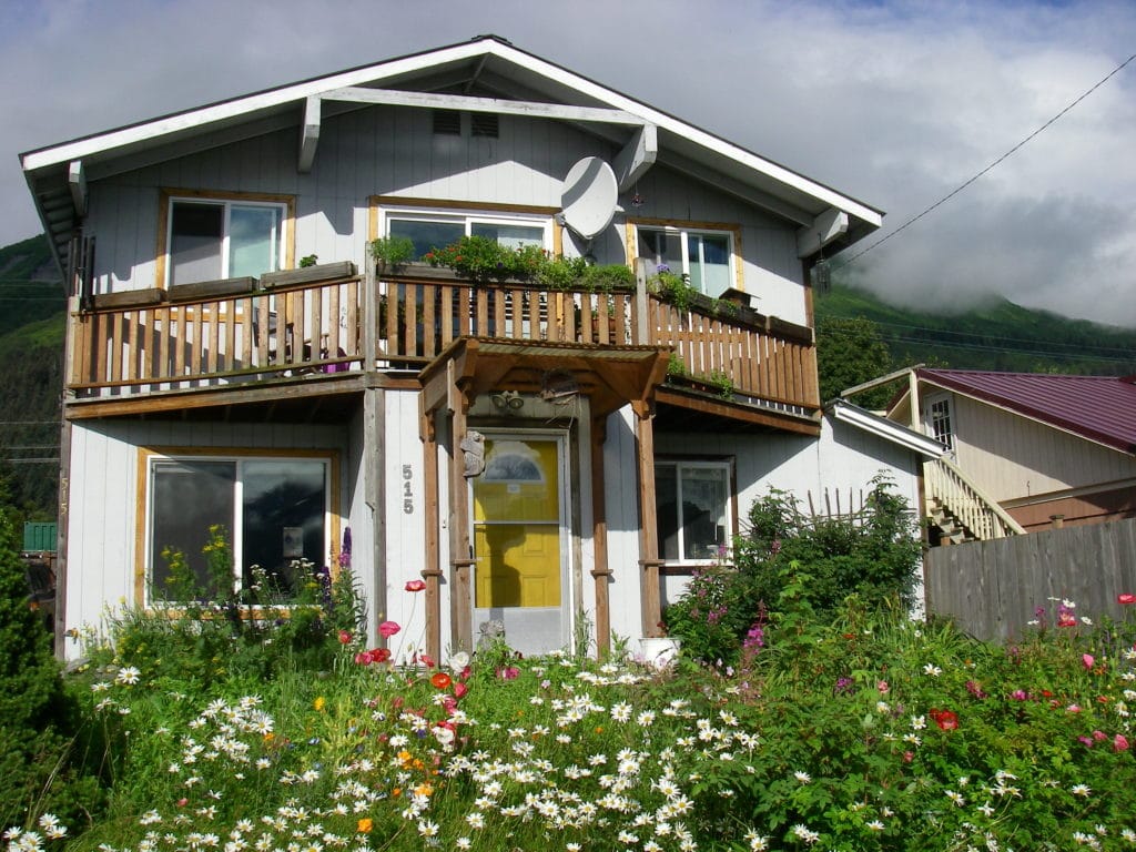
I provided a color consultation for a Bed and Breakfast located in a residential area. The aim was to design a welcoming exterior that resonated with the mountainous and oceanic surroundings and blended with the neighborhood’s mix of homes. The garden was dominated by colorful flowers, especially fuchsia rose bushes. The house had a blue roof and no other fixed elements. I had previously enhanced the interior of this B&B, which increased their bookings and revenue. The target clientele were retired professionals keen on outdoor adventures, wildlife, bird-watching, and art. The brand was vibrant, luxurious yet earthy with a coastal style, reflecting its proximity to the ocean.
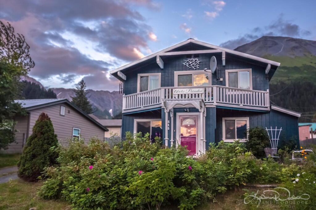
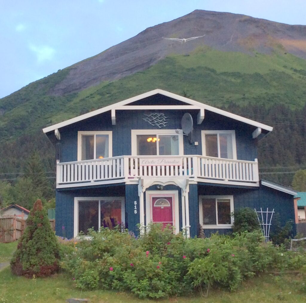
A rich teal (Sherwin Williams Moscow Midnight) was chosen for the walls to complement the roof, nearby mountains, ocean, and the neighborhood’s blue-toned homes. This deep shade enhanced the garden’s vibrant flower colors and matched the local greenery.
The trim was painted a warm white (Sherwin Williams Alabaster) to accentuate the teal and echo the natural hues of clouds and snowy peaks. The cedar trim and decks were transformed from their natural color to white for a more cohesive look and to ensure the upper deck remained cooler. This white backdrop makes colorful outdoor furniture and plants stand out, creating a peaceful retreat.
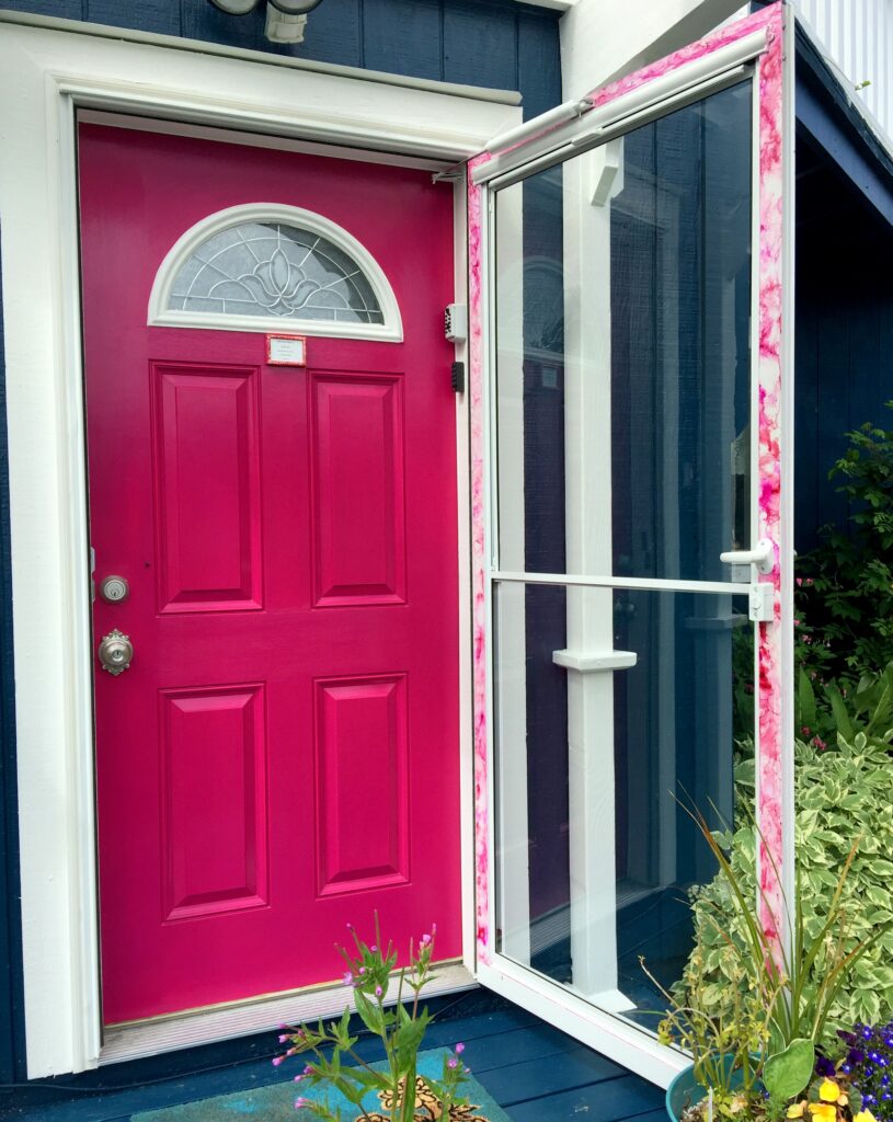
The front and back doors were painted in Forward Fuchsia, echoing the roses outside and offering a welcoming and distinctive entrance.
Arctic Paradise Bed and Breakfast after exterior painting- Photo, color selection, sign and door design by Northern Lights Home Staging and Design. Exterior painting by Petrosius the Renovator. Photo by Kalani Woodlock.
A sign with a trim-colored background and wall-colored lettering was designed, featuring two fuchsia lines. This subtle sign complements the balcony and discreetly showcases the business name in the residential area. A white metal sculpture of sea gulls, aligning with the brand’s wildlife viewing theme, was placed near the home’s peak.
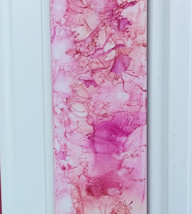
A new white screen door with full glass was added to showcase the vibrant fuchsia door. Its border features a distinct alcohol ink design, mirroring the door’s colors and emphasizing the brand’s artistic flair. The outdated brass doorknob was swapped for a stylish satin nickel one.
Original alcohol ink art done on the new screen door. Alcohol Ink Art and photo by Mary Ann Benoit of Northern Lights Home Staging and Design.
Feedback on the new look has been overwhelmingly positive, with descriptions such as “bright”, “cheerful”, “artistic”, and “the most charming B&B in Alaska”. This refreshing transformation has even inspired neighbors to consider updating their own homes, potentially revitalizing the entire neighborhood.
The harmonious trio of colors was meticulously chosen using both artistic intuition and color science, ensuring they complement each other perfectly. If you’re thinking of repainting, consider consulting a certified color strategist. Choose colors that truly resonate with you and leave a lasting impression on everyone who sees them.
Are you ready to paint your house?
Get a color consultation today and get your colors right the first time so you avoid making costly mistakes and really love the end result. I can work with you wherever you live with an online consultation. Learn more.
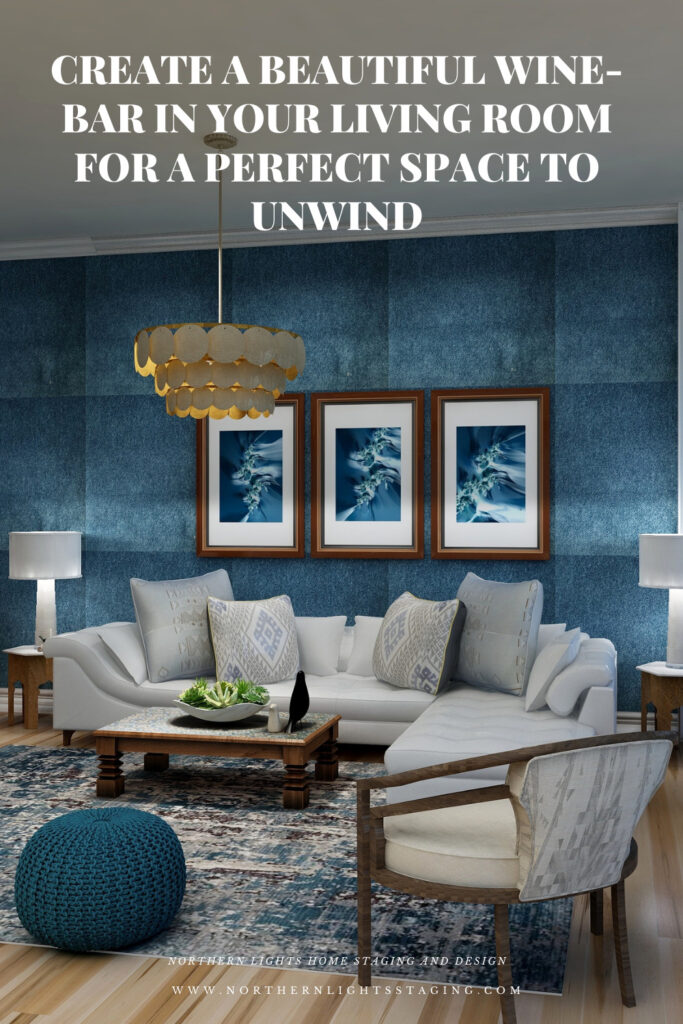
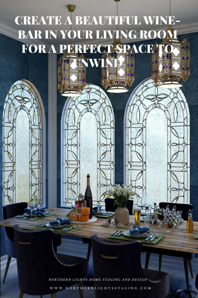
Create a Beautiful Wine-Bar in Your Living Room for a Perfect Space to Unwind
At the end of a long day, what is nicer than having a beautiful space that you love to unwind and relax.
Kick back and enjoy a wonderful glass of wine with your family, friends, or just your amazing self.
So what do you need? Your perfect space and a perfect glass of wine.
Create Your Perfect Space
Let’s start with creating your perfect space. A place that feels like your sanctuary, tells your story, and gives you a feeling of comfort and relaxation as soon as you walk in.
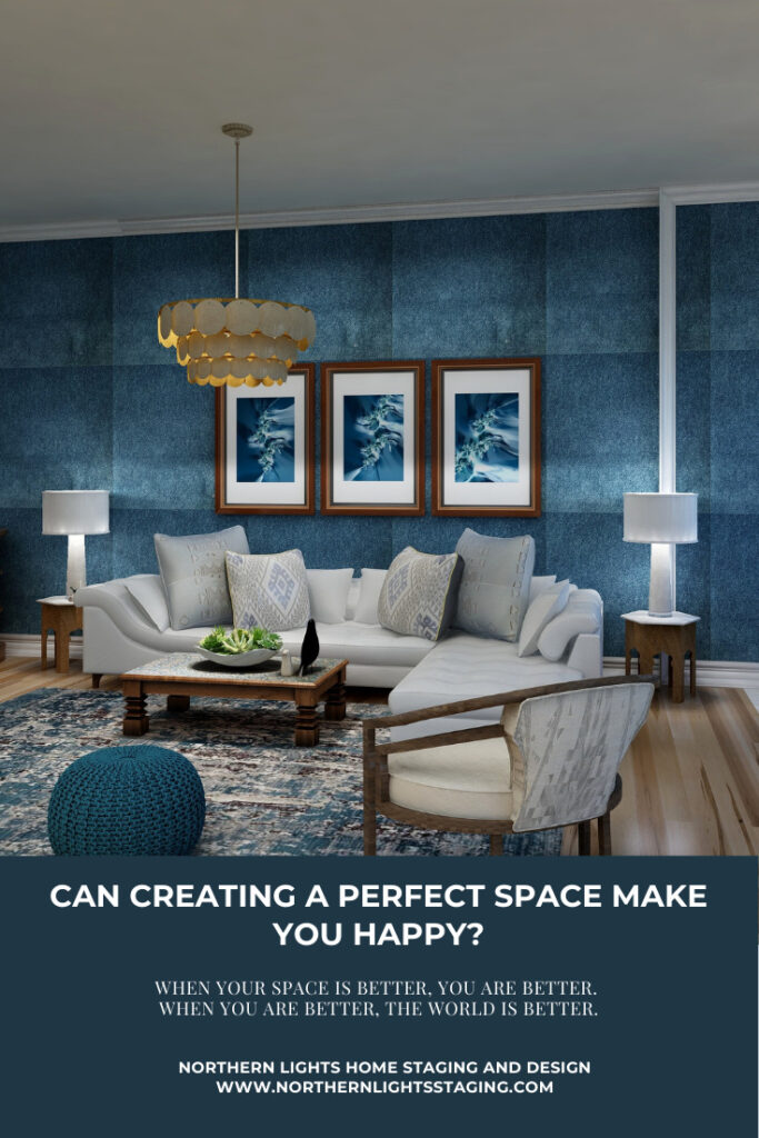
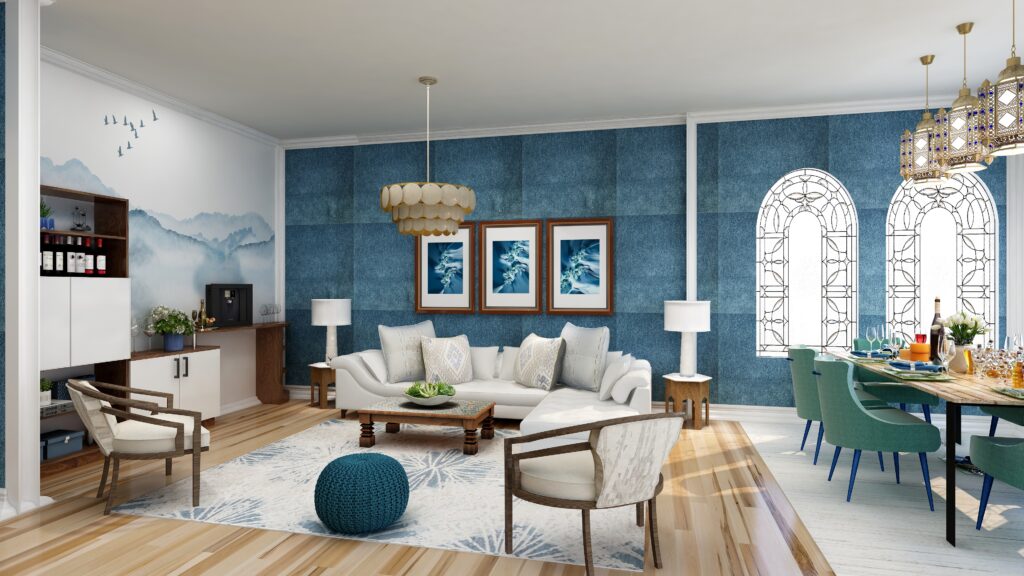
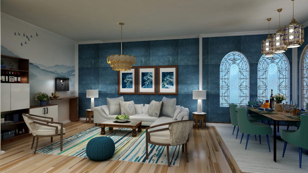
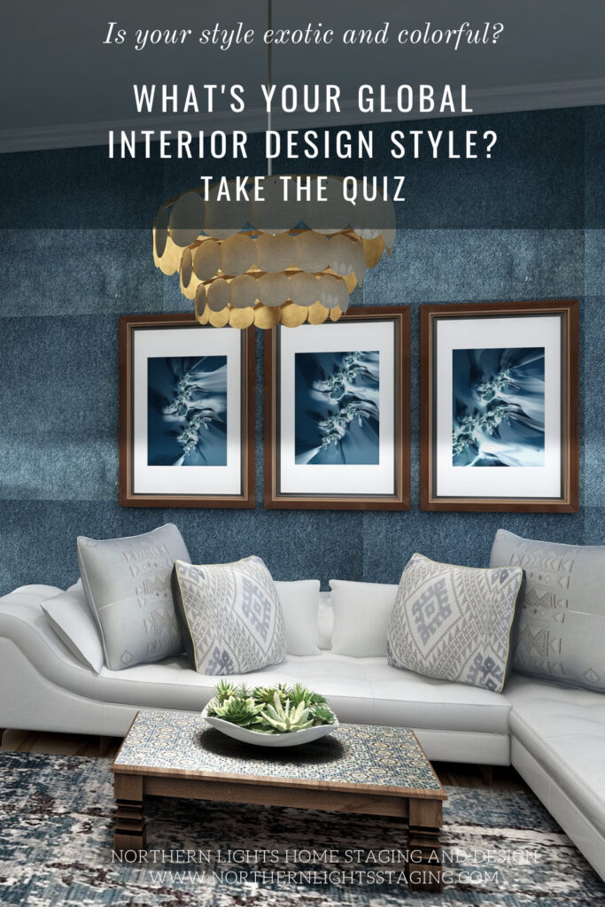
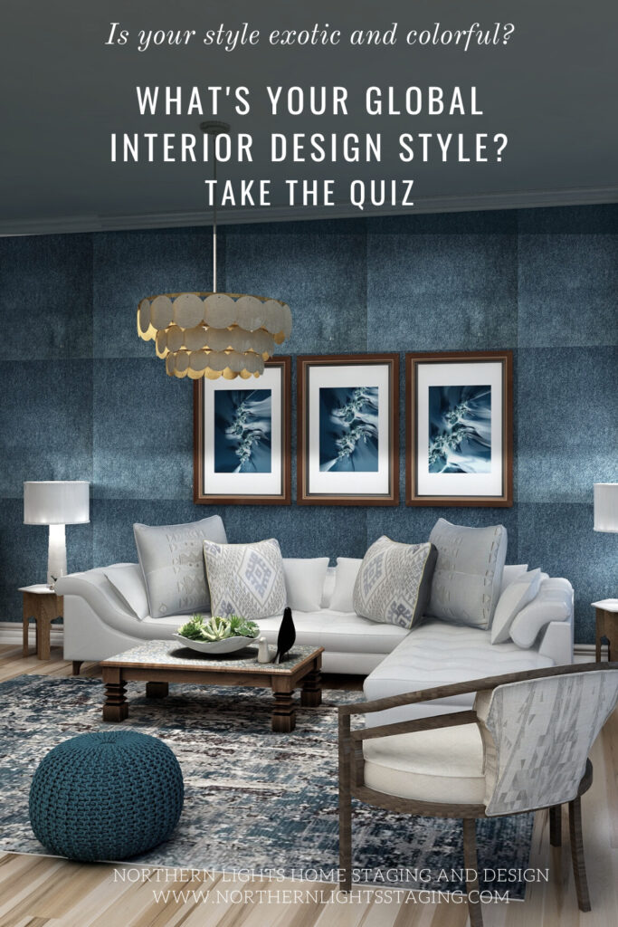
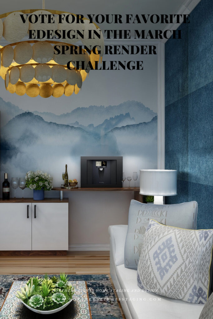
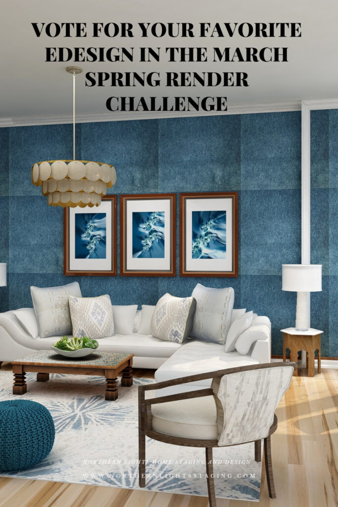
As an example, I created this beautiful Bohemian style living room that celebrates jewel tones mixed with beautiful woods, soft denim. upholstered walls, colorful global style rugs and pillows, unique artisan tables, one-of-a-kind art, and beautiful lighting.
Follow your heart’s desire!
Add vintage pieces, globally inspired textiles, and rugs, and display your collections of cool things found at markets. thrift stores and in your travels.
Add glamorous fabrics, lighting, and accessories. Anything goes if it makes you happy.
Bohemian style is a global design style. Global styles are all about your worldly adventures and telling your story! They are usually very colorful, rich in bold designs and natural textures, patterns, colors, and arts and crafts of various cultures.
Each piece has a story and becomes a conversation starter. Treasures are displayed without rules or grouping by the part of the world each piece is from. Mix antiques with modern pieces, and natural objects such as animal horns, plants, and rocks add to the charm.
While global design styles are eclectic and may mix and match items from a variety of countries, you may be drawn to the colors and cultural artifacts of some countries more than others.
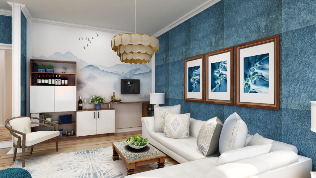
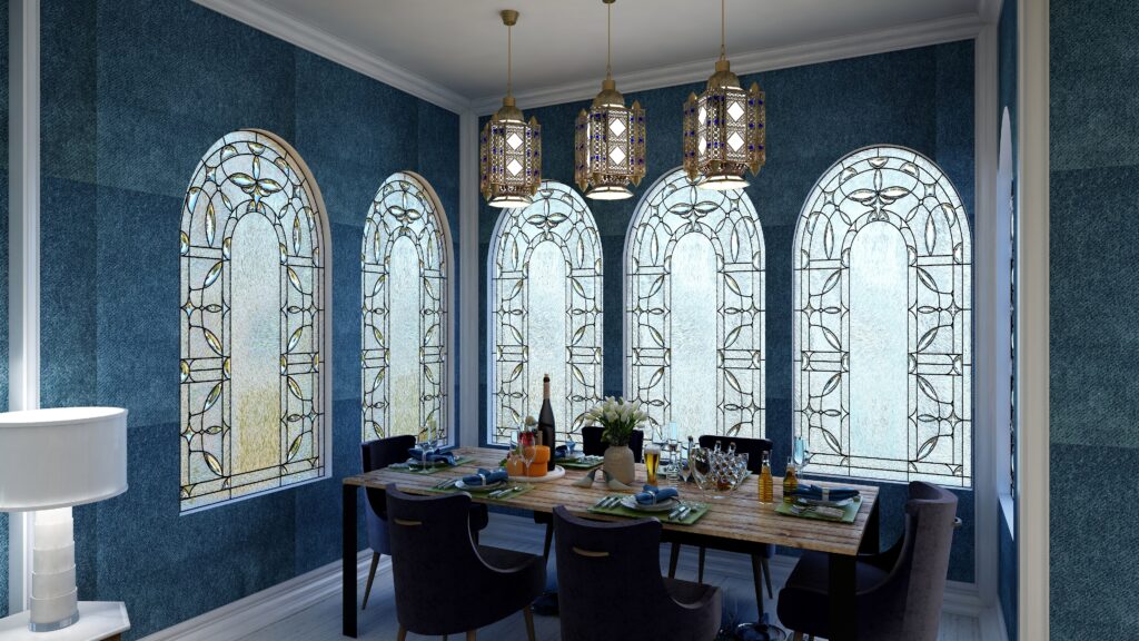
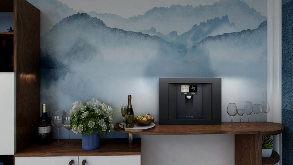
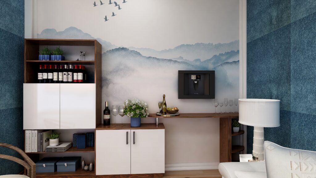
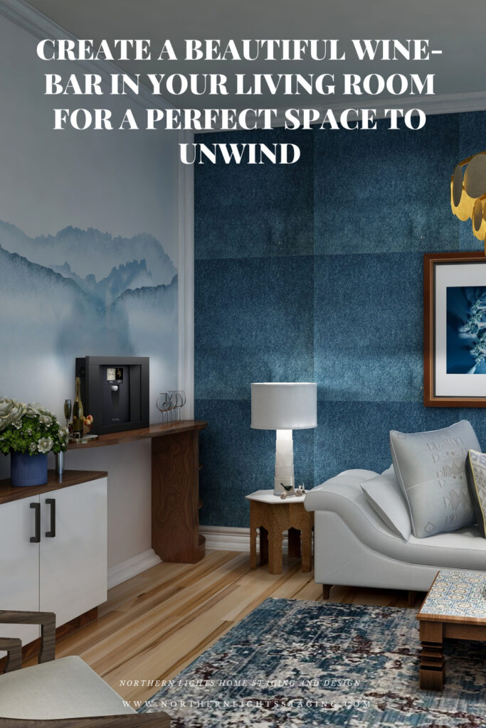
Bohemian Style Living Room Edesign and custom fractal art by Northern Lights Home Staging and Design. Wine-bar area featuring a Plum wine dispenser. Bohemian Style Living Room Edesign and custom fractal art by Northern Lights Home Staging and Design. Wine-bar area featuring a Plum wine dispenser.
For style elements, I created a mono-chromatic color scheme using denim blue for the relaxing feeling it evokes. I upholstered the walls with denim for a unique look. I mixed that with beautiful wood furniture and hardwood maple flooring to give an earthy and relaxed feeling that brings the outside in, mixed with my unique fractal art. I mixed different textures and styles with velvet, cotton, leather, wood, rattan, textured pottery and wool.
I mixed modern side chairs with a more rustic and ethnic coffee table and side tables. I mixed my modern computer fractal art with faux horn mirrors. The rug has a vintage look against the modern sofa and velvet side chair.
My design is more curated, and less is more.
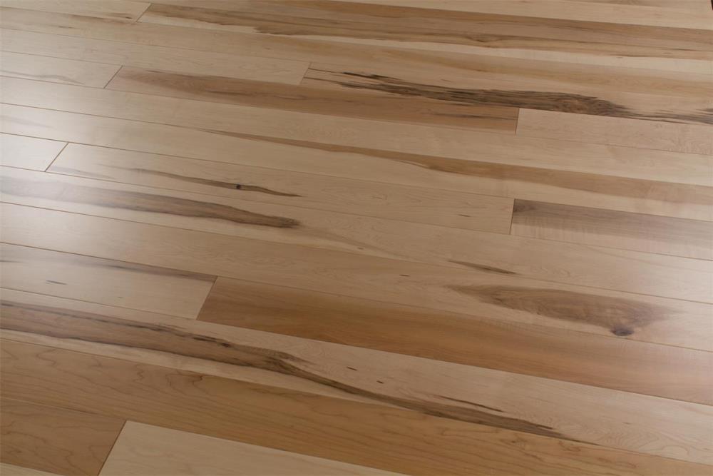
I used this beautiful Kachina maple flooring from the Revel Woods Skyway Collection.
Kachina maple flooring by Revel Woods
Named for the petroglyphs, this natural bridge in National Monument, Utah is the widest and youngest bridge in the park. The rich colors and variation of this natural maple floor are inspired by this natural bridge.
According to Revel Woods, “Perhaps the most important symbol of human ingenuity is the bridge. Whether it’s crossing a fast-moving river, or spanning a dangerous crevasse, a bridge makes these impossible tasks so simple we tend to take them for granted, yet there is a tremendous amount of science and technology that goes into each one. For our American Skyways Collection we looked to these engineering marvels for inspiration as we present a flooring collection that bridges the gap between traditional looks and modern technology. This collection is a very traditional look, but contains several technological advancements such as a bleeding-edge flex core technology to improve performance, as well as our new R-air finish, which neutralizes harmful compounds to create cleaner air in the space”.
Bohemian Style Living Room and open dining area. Edesign by Northern Lights Home Staging and Design.
My fractal art is called The Sea and is based on the beautiful colors and feeling of white caps on the ocean. The blues bring the outside in and create a calm and relaxing atmosphere. They work beautifully with the denim velvet upholstered walls.
Sea Framed Fractal Art Print by Northern Lights Home Staging and Design. Sea #2 Framed Fractal Art Print by Northern Lights Home Staging and Design. Sea #3 Framed Fractal Art Print by Northern Lights Home Staging and Design.
Create Your Wine-Bar
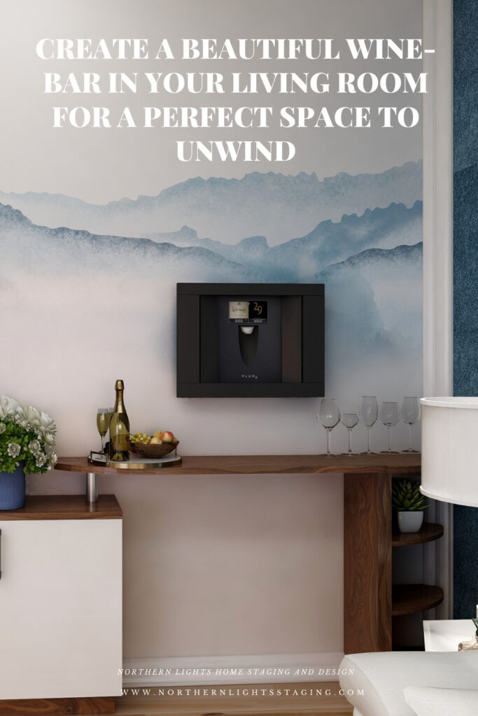
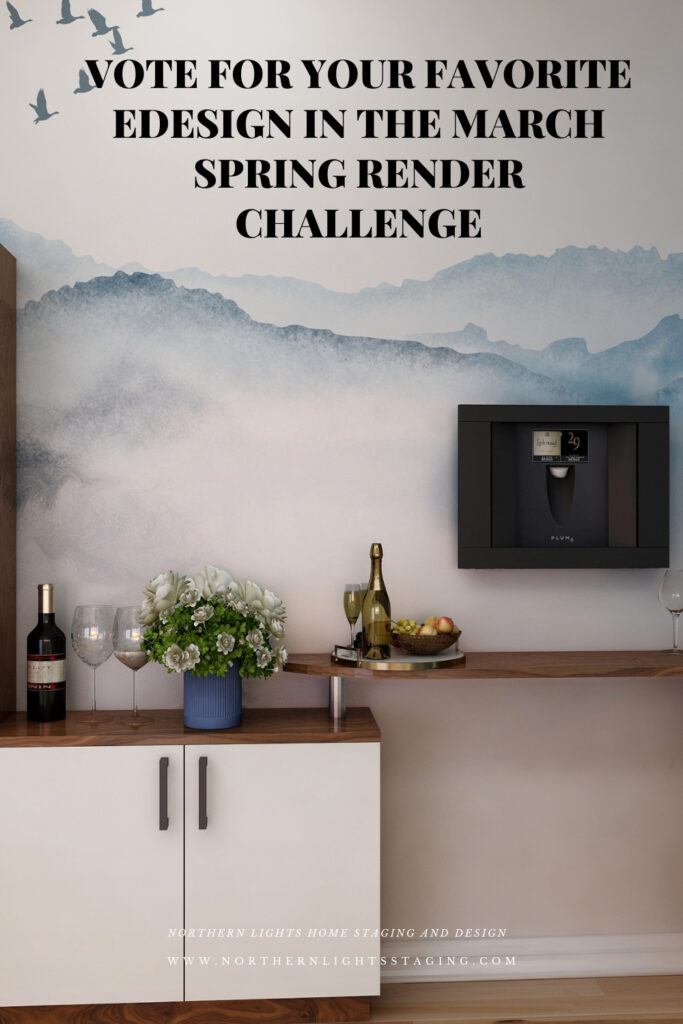
Creating a small wine bar area is easy. Find a cabinet that you love that can store some of your favorite bottles of wine, and your favorite glassware, and a Plum Wine Dispenser! It does not need to take a lot of space. The setup in your living room enables you to enjoy the perfect glass of your favorite wine in your favorite room, easily. And, it is a great place to entertain friends.
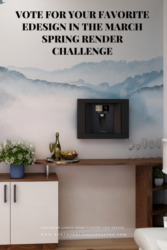
In this design, I used a cabinet with a combination of open and closed shelves with room for wine bottles, glasses, and a few decorative items, and of course the Plum Wine Dispenser. The Plum can sit on a countertop or can be built in to the wall. The focal point is the beautiful watercolor wallpaper mural that sets the space apart.
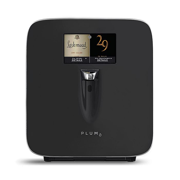
Bohemian Style Living Room Edesign by Northern Lights Home Staging and Design. Wine-bar area featuring a Plum wine dispenser. Bohemian Style Living Room Edesign and custom fractal art by Northern Lights Home Staging and Design. Wine-bar area featuring a Plum wine dispenser. The Plum Wine Dispenser
The Plum Wine Dispenser fits right on your countertop or wherever you choose to create your mini-bar.
It holds two bottles of wine and automatically preserves, chills, and serves any bottle by the glass.
Change the Look
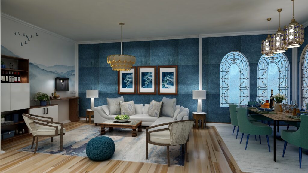
Change the look with some different area rugs or paint colors. All of these could work.
Learn More about Bohemian and Global Style Design
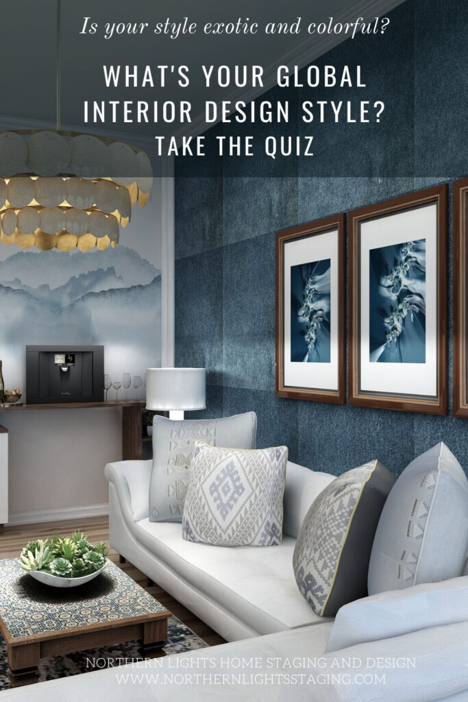
I have written numerous articles on Bohemian style Interior Design and other Global Style you may like. Check out my articles and why not take my style quiz and see which style might be right for you!
Are you ready for your house to go to the next level where your house looks great, feels great and supports you to be great?Imagine that.
What’s it like when you are living in the perfect space for you?
My philosophy of great Interior Design, which I call Aligned Design, considers three key factors; art, science and energy. The intersection of the three is where the magic happens.
Creating a space that envelops you in your vision of beauty and color, while fine tuning the energy of your space to promote wealth, health, love and perfect self-expression aligns you with the universe, allowing you to live your best life so you can make a positive impact on the world.
Global style Interior Design is part of the art of great design and one of things you are really going to love about creating the perfect space for you.
Every initial inquiry about home staging usually begins with, “What’s the cost?”
Likewise, if you offer a service or product, you’ve likely been asked the same.
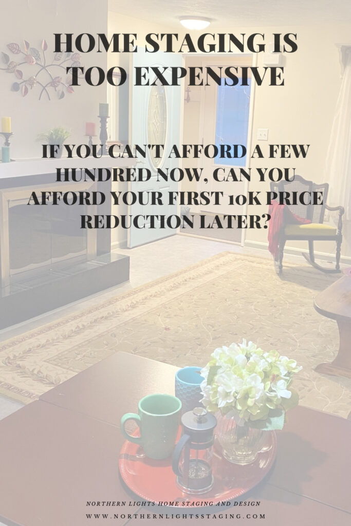
While the cost of home staging might catch some off guard, it’s essential to consider its value. Thinking it’s “too expensive” is relative. Compared to the price drop on your home? It’s a wise investment!
“Home staging is more expensive than I expected.” More expensive compared to what? Not your first price reduction.
I completely understand the instinct to seek the best deal possible. A recent client expressed that the staging costs exceeded her expectations, but she chose to proceed. She recalled instances where investing a bit more yielded significant returns and satisfaction.
She’s insightful! She hoped for a specific selling price, yet a realtor confided that, given its present state, her home might fall short by $20K. Homes that don’t outshine the competition often linger on the market, frequently leading to reductions of around $10K. This protraction not only causes stress but also escalates costs, including mortgages and utilities.
The outcome? After staging, her home attracted two offers above the asking price within a day and 15 offers in a week, finally selling at a price $30K beyond her initial expectation!
Her investment in staging yielded a return 30 times its cost. Rather than potentially losing $20K, she sold rapidly, netting an extra $30K. So, is staging an expense you can overlook?
Consider another scenario: After staging a client’s home, it was snapped up on its very first day on the market at the full asking price. Although they didn’t secure an amount above their initial price due to maintenance and repair needs, the swift sale spared them the hassle of countless showings and the stress associated with it. Moreover, they saved a considerable sum on monthly maintenance costs.
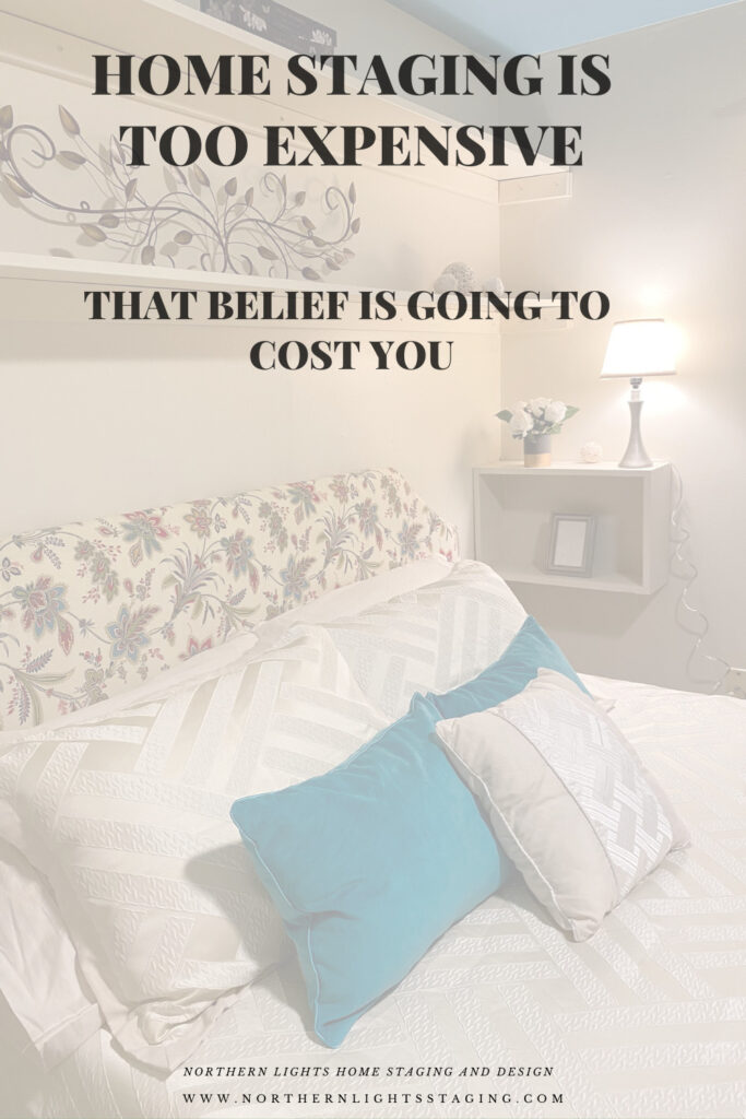
“Home staging is too expensive. That belief is going to cost you.”
In another case, I staged a home that had been on the market several years without selling. In the beginning, the owner did not want to spend money on staging and tried to sell it vacant. No luck. They had numerous price reductions. After a year or more they decided to stage with a lower priced staging service that did minimal staging in some of the rooms. No luck. Finally, two years later they contacted me. After doing a professional staging job, the house sold in 6 weeks. That was actually very fast considering the home had been on the market for years and had the stigma of “what is wrong with that house that it has not sold yet”. Think of all the money and time this seller lost in trying to save a little on home staging costs.
How much are you prepared to shave off your sales price for a cut-rate staging service, or by skipping staging altogether?
Is the immediate savings on staging worth the potential loss in your final sale price? What truly matters: a short-term saving or a quicker, more profitable sale in the long run?
Ready to drop your expensive belief?
Get your online home staging consultation or staging service today. For in person consultations or staging, call for a custom quote.
Pin These
Interested in becoming a home stager? I recommend the Staging Diva Home Staging Training program!
How can I work with an Interior Designer on my budget?
How can I work with an Interior Designer on my budget?
Many perceive hiring an Interior Designer as a lavish expenditure during home renovation or updates. Yet, partnering with an expert can prevent costly errors, ensuring your investment aligns with your vision.
However, remodeling isn’t cheap, and budget constraints are real. Seeking professional advice that’s budget-friendly? Enter Edesign!
Edesign is the future-forward approach to Interior Design – completely online. It doesn’t matter if your preferred designer is local or states away; with Edesign, geographical boundaries blur.
It’s the answer to achieving stylish interiors swiftly, affordably, and at your convenience.
Edesign and custom energy art by Mary Ann Benoit of Northern Lights Home Staging and Design.
Edesign accelerates the design process and is budget-friendly primarily because it taps into retail sources instead of custom designs. You receive a curated shopping list and have the autonomy to decide what to buy and when.
Additionally, by taking on roles typically handled by a designer, like measuring and overseeing installations, you save both time and money. You also have the reins when it comes to hiring and managing contractors for any revamps.
In essence, Edesign is a synergized effort between the designer and you. With discussions over phone, email, or video calls, it fits seamlessly into your schedule, offering both convenience and control.
Edesign and custom energy art by Mary Ann Benoit of Northern Lights Home Staging and Design.
Is an Edesigner right for you?
Considering Edesign? It might be a good fit if you:
Seek affordable design solutions and are open to hands-on involvement.
Enjoy a DIY approach and collaborating in the design process.
Can measure and photograph your space with guidance.
Are adept at sharing your preferences through online images and product links.
Need a swift design plan and can help expedite the process.
Are okay with managing online purchases, including potential returns.
Can independently hire and oversee any required tradespeople.
Prefer to personally inspect local items before purchasing them. While the designer will recommend reputable brands and sources, it’s beneficial if you can review items firsthand
Edesign and custom energy art by Mary Ann Benoit of Northern Lights Home Staging and Design.
Consider hiring a local designer if:
You value face-to-face consultations and communication.
You want the designer to handle measurements and photography.
You like to personally review material samples, like fabric or tile.
Your project requires detailed construction plans.
You’re interested in custom-made furniture or cabinetry.
Handling online orders and potential returns isn’t your forte.
You desire simultaneous delivery and setup of items.
You prefer the designer oversees installation.
Edesign and custom energy art by Mary Ann Benoit of Northern Lights Home Staging and Design.
Remember, selecting Edesign with an Interior Designer doesn’t mean compromising quality for cost; it’s about smartly distributing tasks to achieve affordability.
Maximize Your Design Experience
Many designers offer both traditional and Edesign. If budget is a concern, ask your local designer if they provide Edesign options.
Northern Lights Home Staging and Design caters to both in-person and online needs, including Interior Design, Color Consulting, and Vacation Rental Design. I also create custom energy art for your design.
I use my exclusive Aligned Design system for both in person and online projects