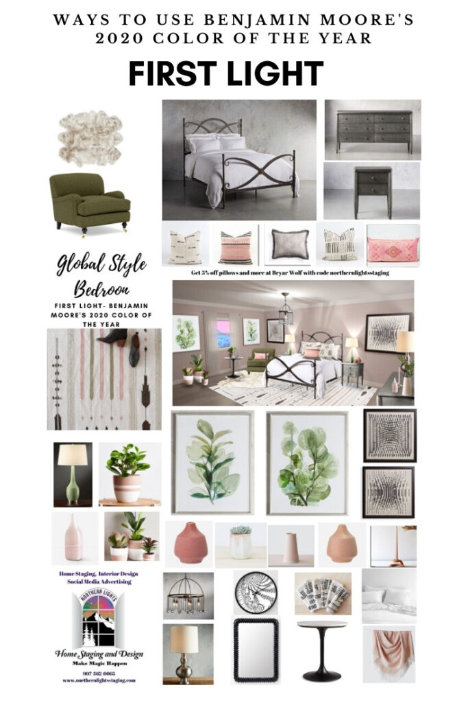
Attract Health & Balance with Mocha Muse: Grounding Art for Self-Care & Renewal

Well-Being Begins With Energy

Your well-being begins with the energy you surround yourself with. When you cultivate a space that feels grounding, restorative, and nourishing, you naturally attract greater health—physically, emotionally, and spiritually.

The Mocha Muse Collection was created to support self-care, balance, and renewal, helping you attract a sense of deep well-being through grounding energy. Inspired by Pantone’s Color of the Year: Mocha Mousse, this collection embodies the warmth and richness of chocolate, coffee, and earth, much like the ritual of sipping a warm mocha while reconnecting with nature.

If you’re looking for art that invites restoration, healing, and mindful self-care, Mocha Muse is your invitation to pause, realign, and nurture yourself so you can thrive.
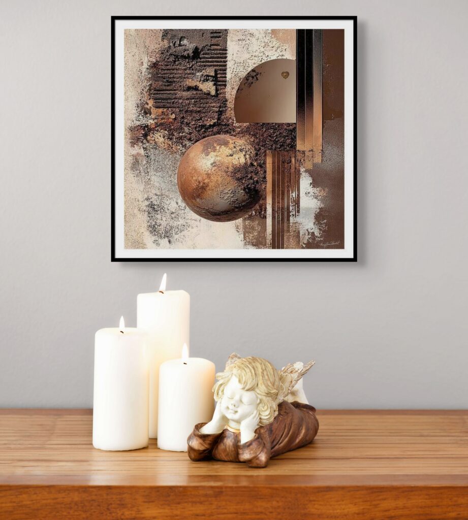
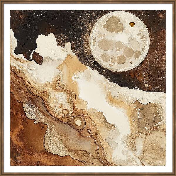
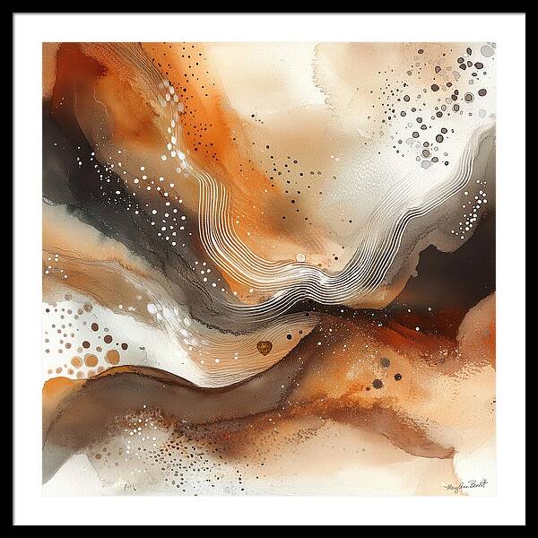
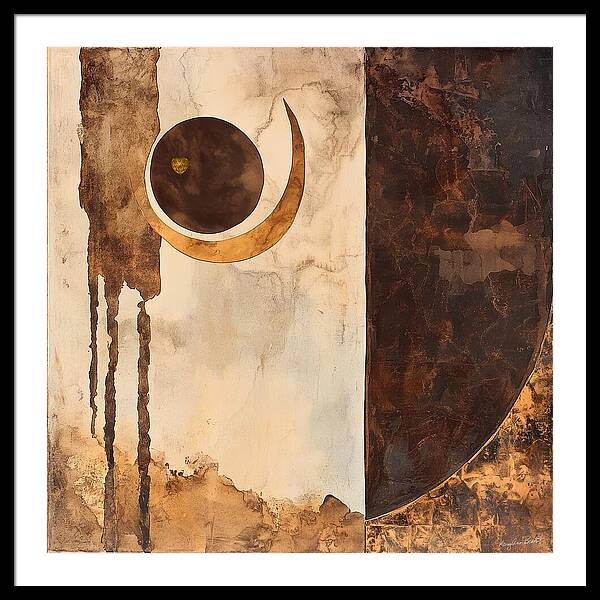
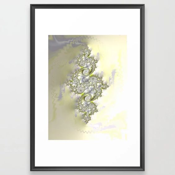
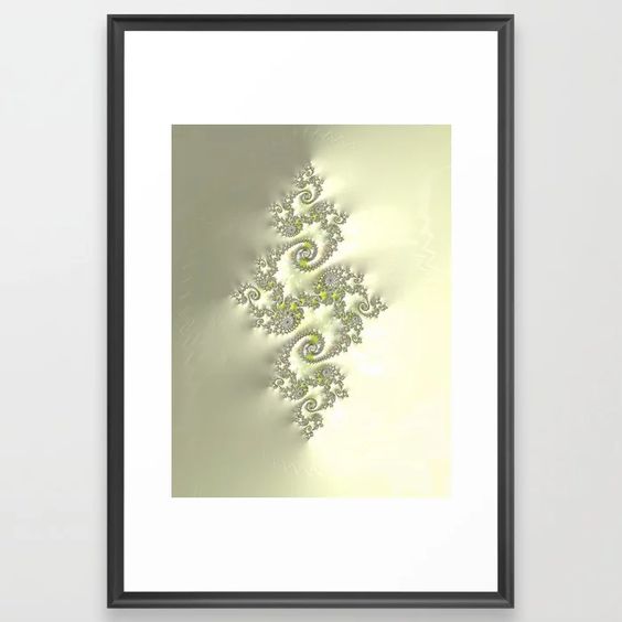
"Mocha Muse Energy Art Collection – grounding fractal and sacred geometry art inspired by Pantone Mocha Mousse, designed to attract balance, warmth, and self-care."

Why Grounding & Self-Care Help You Attract Better Health

In a fast-paced world, stress, exhaustion, and disconnection can take a toll on your well-being. True health isn’t just about what you do—it’s about the energy you cultivate around you.

💫 Grounding helps you release stress and stabilize your energy.
💫 Self-care strengthens your emotional and physical well-being.
💫 Surrounding yourself with warm, grounding tones invites comfort and renewal.

Like the feeling of barefoot grounding on the earth while enjoying a warm mocha, this collection encourages a slower, more mindful approach to health—one where self-care isn’t a luxury, but a necessity.

The Energy Behind Mocha Muse

The Mocha Muse Collection was designed with earthy hues, flowing textures, and soft warmth to create an atmosphere of calm, stability, and restoration. Each piece is a reminder to:

🌿 Slow down and listen to your body’s wisdom
🌿 Create an environment that supports healing and well-being
🌿 Embrace rituals of self-care that nourish your mind, body, and spirit
🌿 Cultivate balance so you can attract greater health and vitality

When your space feels restorative, your body and mind naturally follow.
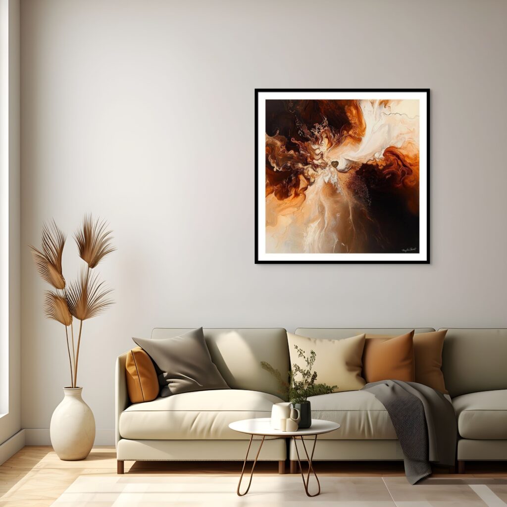
"Ground your energy, find balance, and embrace self-care with my Mocha Muse Energy Art collection. Inspired by Pantone Mocha Mousse, this artwork invites warmth and transformation.
“Ground your energy, find balance, and embrace self-care with my Mocha Muse Energy Art collection. Inspired by Pantone Mocha Mousse, this artwork invites warmth and transformation.

Featured Pieces from the Mocha Muse Collection

Here are some of my favorite standout pieces from the Mocha Muse collection. Each one features the same rich, grounding color palette but showcases unique styles and textures. They are designed to complement each other beautifully, whether displayed individually or grouped in sets of three for a cohesive, harmonious look. Plus, each piece has similar variations, giving you endless possibilities to mix and match while maintaining a balanced, intentional aesthetic.
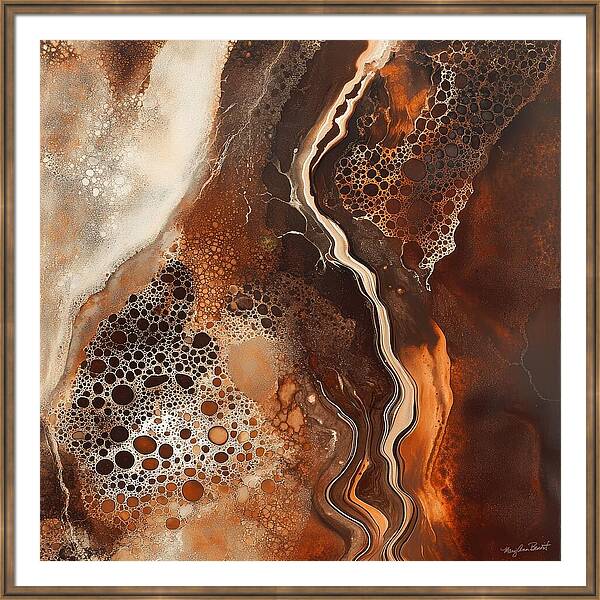
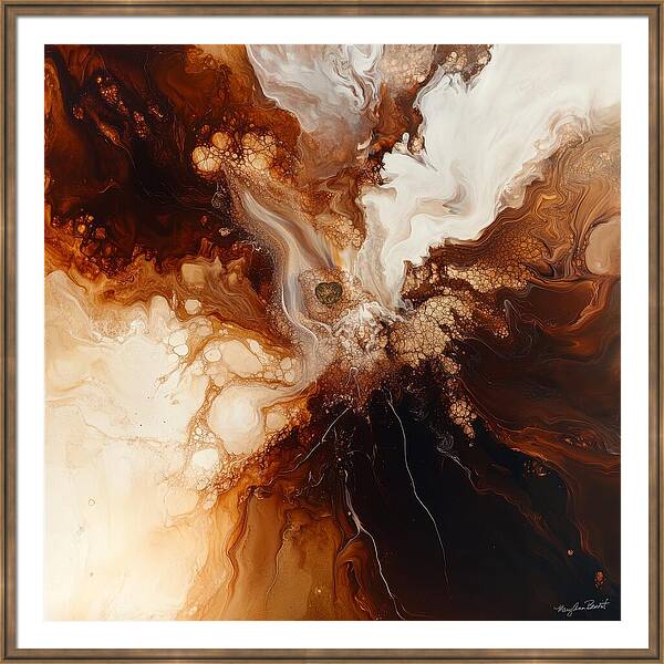
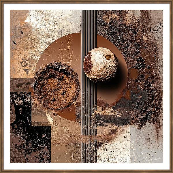
https://maryann-benoit.pixels.com/featured/mocha-muse-12-mary-ann-benoit.html
Mocha Muse

Mocha Muse #3 energy art by Mary Ann Benoit.
Mocha Muse #2

"Mocha Muse Energy Art Collection – grounding fractal and sacred geometry art inspired by Pantone Mocha Mousse, designed to attract balance, warmth, and self-care."
Mocha Muse #12

"Mocha Muse Energy Art Collection – grounding fractal and sacred geometry art inspired by Pantone Mocha Mousse, designed to attract balance, warmth, and self-care."
Mocha Muse #14

"Mocha Muse Energy Art Collection – grounding fractal and sacred geometry art inspired by Pantone Mocha Mousse, designed to attract balance, warmth, and self-care."
Mocha Muse #28

"Mocha Muse Energy Art Collection – grounding fractal and sacred geometry art inspired by Pantone Mocha Mousse, designed to attract balance, warmth, and self-care."
Mocha Muse #19

See the whole collection here.


See the collection

See Mocha Muse in Action: Saturday Night Live Art Shows

Want to experience the energy of Mocha Muse? Watch my Saturday Night Live Art Shows, where I dive into the inspiration and meaning behind this collection.

Each episode explores how art can be a powerful tool for attracting health, balance, and renewal in your life.

Create a Space That Attracts Health & Well-Being

💫 Your home should feel like a sanctuary—one that nurtures your energy and supports your well-being. When you surround yourself with grounding, healing art, you naturally attract a sense of health, renewal, and balance.

Explore the Mocha Muse Collection and find the perfect piece to bring calm, grounding, and self-care into your space.

➡️ [Browse the Collection Here]
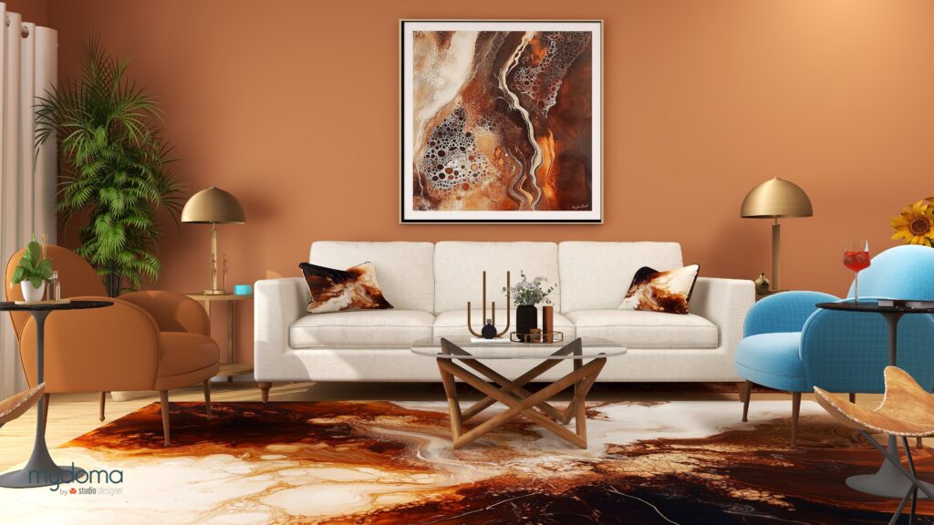
"Mocha Muse Energy Art Collection – grounding fractal and sacred geometry art inspired by Pantone Mocha Mousse, designed to attract balance, warmth, and self-care."
“Mocha Muse Energy Art Collection – grounding fractal and sacred geometry art inspired by Pantone Mocha Mousse, designed to attract balance, warmth, and self-care.” Energy art and Edesign by Mary Ann Benoit.

Surround Yourself with Mocha Muse Energy – Beyond the Walls

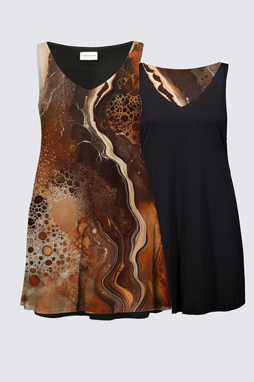
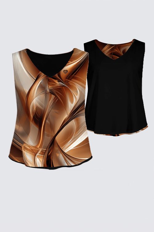
The energy of Mocha Muse isn’t limited to framed art—it’s something you can wear, live with, and fully embody. By incorporating this grounding energy into different areas of your life, you enhance its benefits in a way that feels natural and effortless.

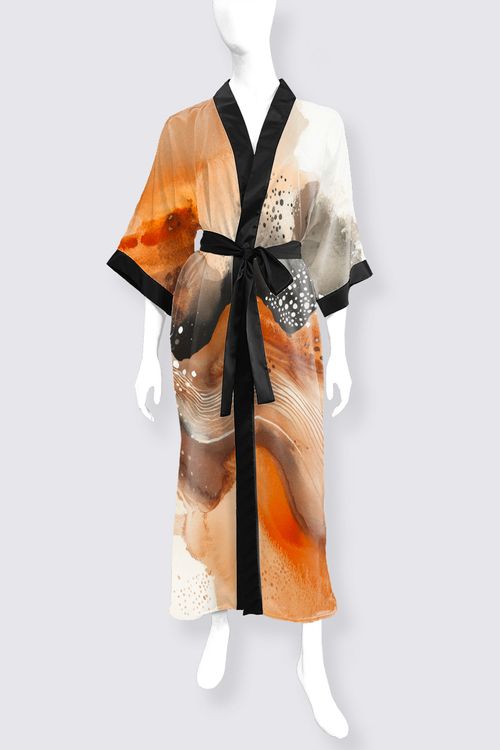
Wearable Art: Carry the warmth and balance of Mocha Muse with you wherever you go. From flowing robes to statement bags, these pieces allow you to attract grounding energy, self-care, and inner strength throughout your day.

Home Accents: Infuse your space with the transformative energy of Mocha Muse through pillows, blankets, and other decor pieces. These small touches create a cohesive, nurturing environment that supports relaxation, clarity, and well-being. Click on any piece of art in the collection to see all the decor options.

No matter how you bring it into your life—on your walls, in your wardrobe, or through accent pieces—Mocha Muse is a daily reminder to stay grounded, embrace self-care, and move through life with balance and intention.

🔗 Explore Mocha Muse Wearable Art & Decor


Create Your Perfect Space with Art

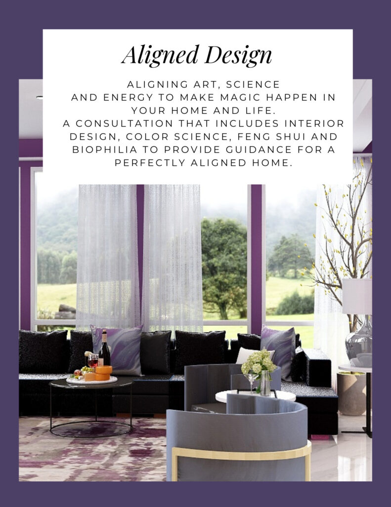
Aligned Design is a holistic, spiritual approach to interior design that supports you to be the person you are meant to be when in alignment with who you truly are.

Aligned Design harmonizes art, science, and energy, which is the foundation. It includes:

The Art of Beauty – Beyond mere aesthetics, it create spaces that celebrate art, and create an extraordinary sensory experience.

The Science of Color – With a scientific approach to color, and as Alaska’s sole certified color strategist, I ensure every hue sings in harmony based on science and not guesswork. Color makes a huge difference in how your space looks and feels.

The Energy of Well-Being –  I assess the unseen energy of your environment, what you need, and create energy art and a design to enhance your space that captures your true essence, and supports your potential.

By combining art, science, and energy, we create magic that looks great, feels great and supports you to be great.

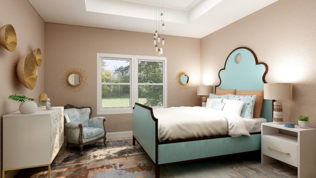
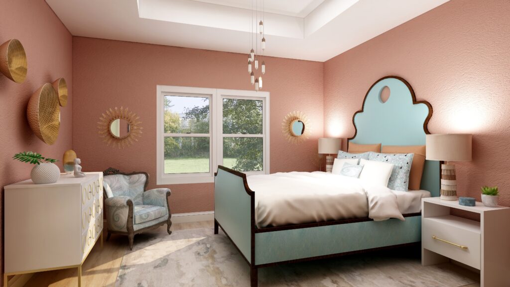
Energy art forms the foundation, guiding the style and color for the rest of the space.

It is like listening to a symphony orchestra playing a beautiful and moving musical masterpiece. All the instruments work in harmony together, and Aligned Design is the music they are playing.  The energy art is the conductor, the individual instruments are the design elements.The sheet music is the color.

Is the sound of the orchestra tuning up individually before the show what your space is like now?

Are you ready to create your masterpiece? Try my Aligned Design consultation and let’s get started.
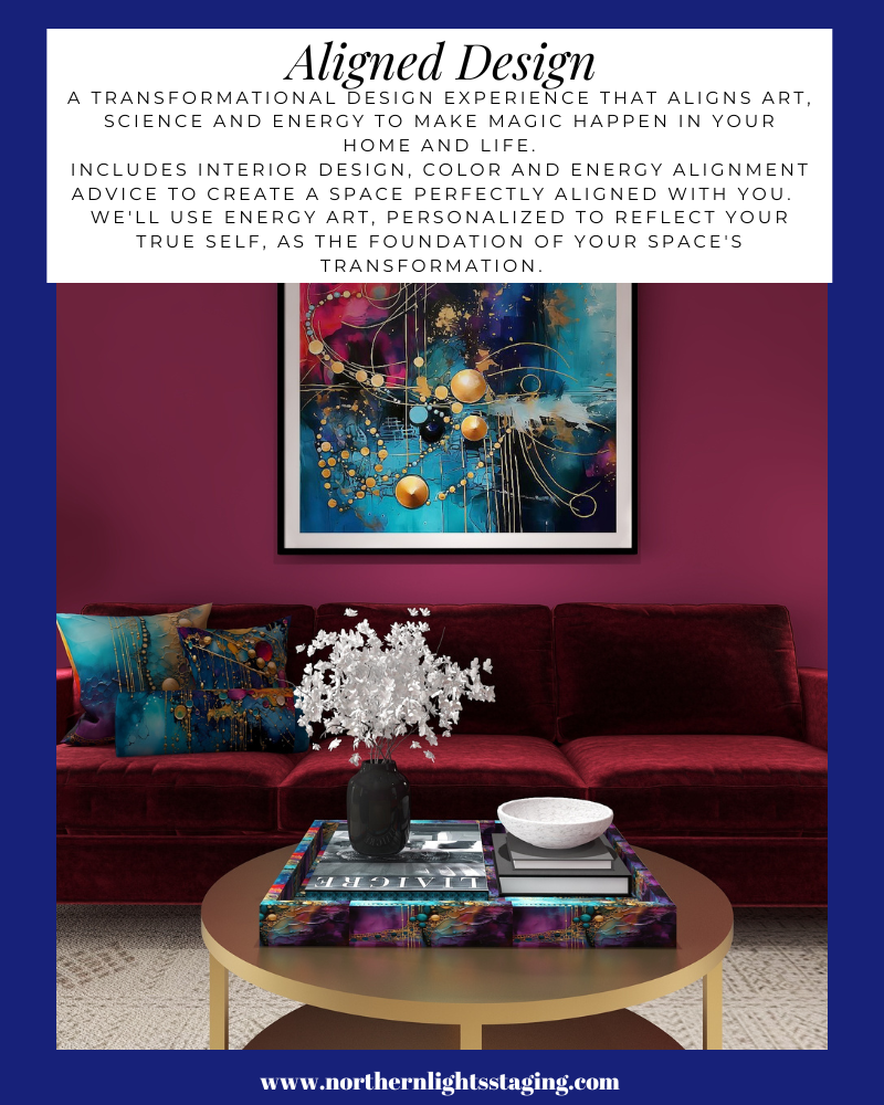

A transformational design experience that aligns Art, Science and Energy to Make Magic Happen in your Home and Life. Includes Interior Design, Color and Energy alignment advice to create a space perfectly aligned with you. We'll use Energy Art, personalized to reflect your true self, as the foundation of your space's transformation.


Online or In Person?


Do you just need an expert color consultation for your interior or exterior colors? Try my science based color consultation.

Online or In Person?


Not Your Average Color Consultation


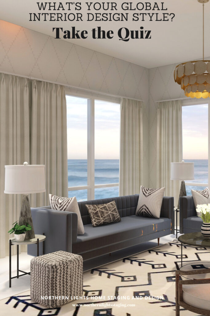
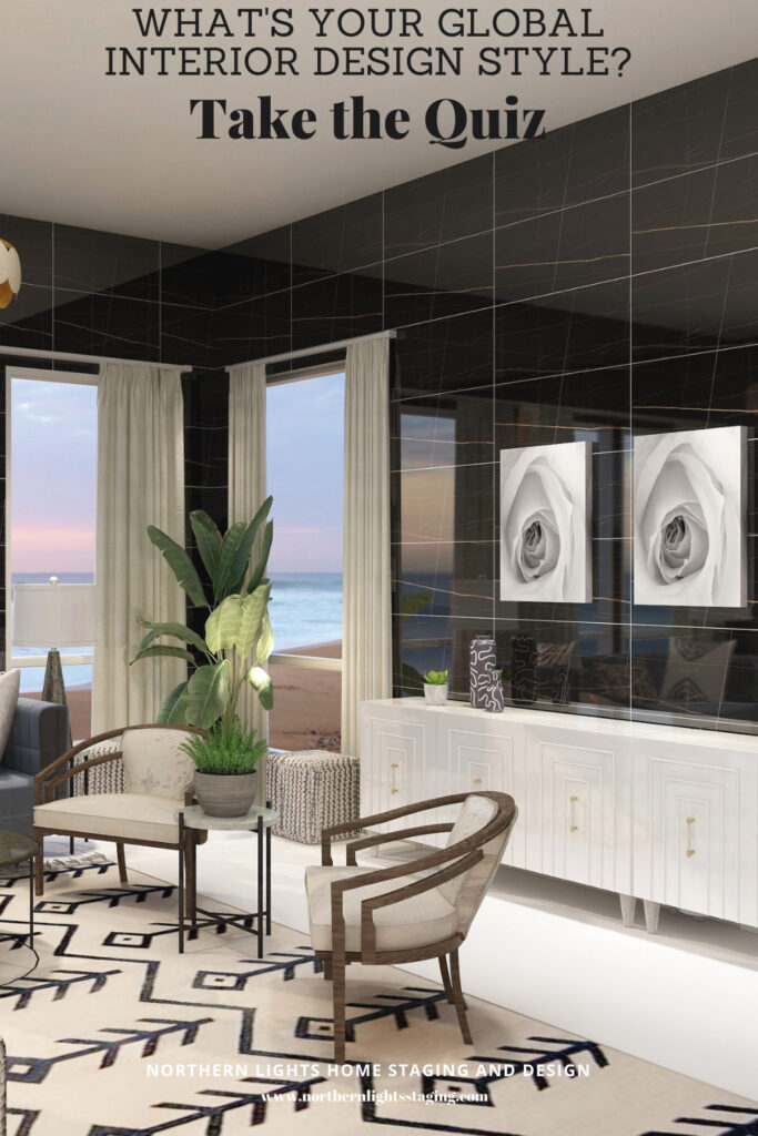
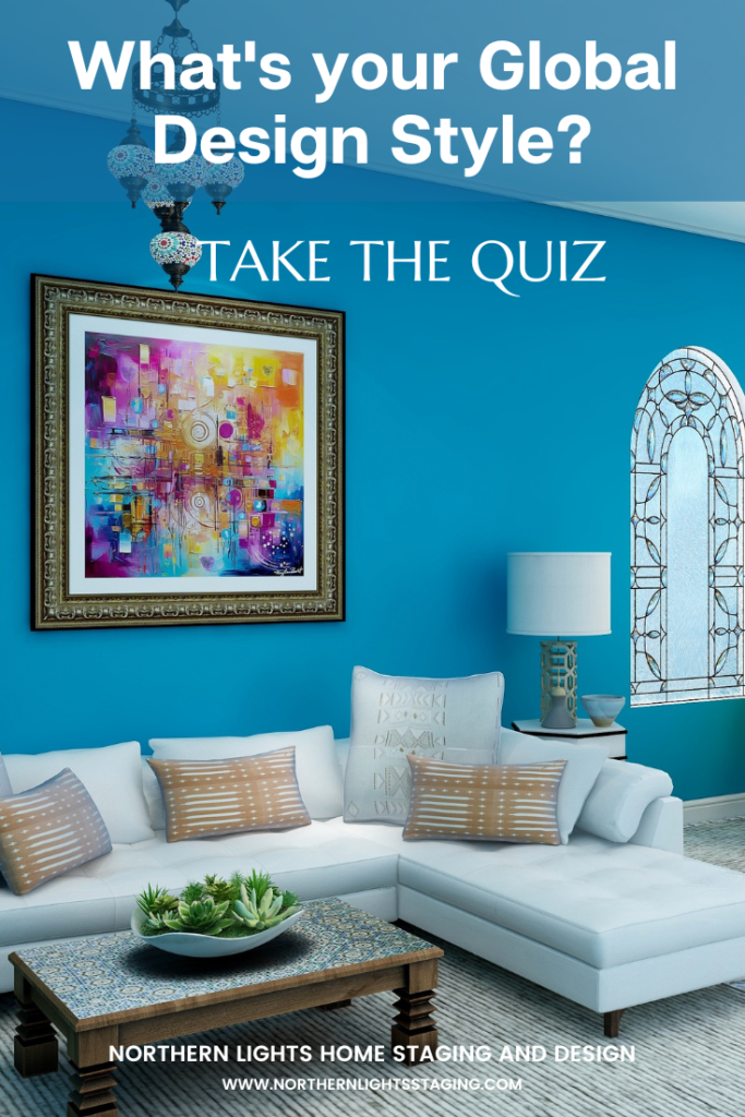
What's Your Global Design Style? Take the Quiz

Aligned Design©– All Rights Reserved.

Terms of Service  |  Privacy Policy  |  Disclaimer |  Brochure

Prices are subject to change without notice.

Call 907-362-0065 today


Why Work with Northern Lights Home Staging and Design


Ways to Use Sherwin Williams Urbane Bronze

When I first saw Sherwin William’s “Urbane Bronze”, I was unsure how I felt about it. Browns can be nice to work with, rather serene and a color of nature so nice to “bring the outside in”.


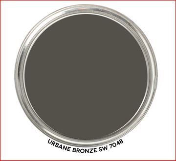
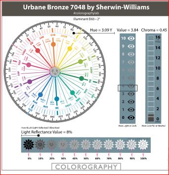
Urbane Bronze- Graphic by Camp Chroma
Sherwin Williams 2021 Color of the Year, Urbane Bronze. Graphic by Camp Chroma.

According to the color data Urbane Bronze is actually a yellow hue (really, it’s true) that looks brown because of it’s low chroma and lightness.


Urbane Bronze- Colorography by Camp Chroma
Colorography of Urbane Bronze by Lori Sawaya of Camp Chroma.

Sherwin Williams describes Urbane Bronze as as a color to

“Tap into nature with a hue whose warmth and comfort breathe down-to-earth tranquility”.

“As we’re looking to create the ultimate retreat for reflection and renewal, we’re turning to a hue whose natural simplicity and nature-inspired energy cultivate a sense of calm from the ground up.”

“The trend for biophilia continues to shape our spaces, proving that nature is never far away. Urbane Bronze might be a color rooted in nature, but it also has a unique ability to ground a room through organic appeal.”

OK, so it is supposed to help us feel rooted to nature. I thought about where I may have seen this color in nature. Maybe along mudflats at the beach, possibly in rocks and some types of earth. It does remind me a bit of the color of sea otter fur.

andrew-smarius-jZWgpG8k6Ec-unsplash
Sea otter. Photo by Andrew Smarius on Unsplash

Master Bedroom Design

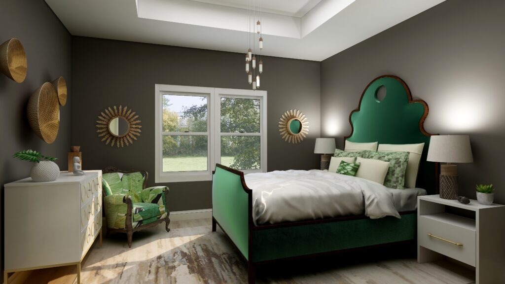
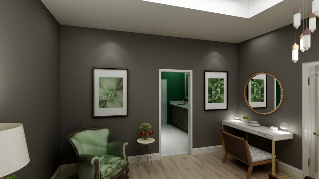
I used Urbane Bronze as the wall color with primarily dark and light greens,  browns and white to create a color palette from nature.

Urbane Bronze is actually a Yellow hue, so this works because it is creating an analogous color scheme with yellow, yellow-green and green that are next to each other on the color wheel.

See my blog article on how to use analogous color schemes,  Create a Harmonious Color Scheme- Go Analogous. 

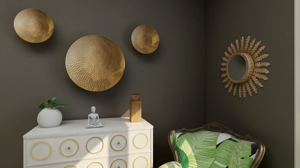
The mixture of soft fabrics with different metals, wood and pottery add natural elements and a variety of textures.

Ways to Use Sherwin Williams 2021 Color of the Year Urbane Bronze
Edesign using Urbane Bronze by Northern Lights Home Staging and Design
Ways to Use Sherwin Williams 2021 Color of the Year Urbane Bronze
Edesign using Urbane Bronze by Northern Lights Home Staging and Design
Ways to Use Sherwin Williams 2021 Color of the Year Urbane Bronze
Edesign using Urbane Bronze by Northern Lights Home Staging and Design

What are the Pros and Cons of Choosing a Bronze Paint Color?

Pros of Working with a Bronze Colored Paint:

  1. Warm and Inviting: Bronze paint adds warmth to a room and can create a cozy and welcoming ambiance.
  2. Versatile: Suits both modern and traditional interiors, complementing a wide range of décor styles.
  3. Sophisticated: The metallic sheen can lend an air of sophistication and luxury.
  4. Pairs Well: It complements a variety of other colors, especially earth tones, deep blues, and greens.
  5. Accentuates Features: Great for highlighting architectural details, moldings, or feature walls.
  6. Durability: Metallic bronze paints can often be more durable and resistant to damage than flat finishes.
  7. Light Reflectivity: Its slight sheen can reflect light, making spaces feel more vibrant and sometimes larger.

Cons of Working with a Bronze Colored Paint:

  1. Application Difficulty: Metallic and bronze paints can show brush strokes or roller marks more easily than flat paints.
  2. Prep Work: Imperfections on walls, like dents or scratches, can be accentuated, requiring more prep work.
  3. Trend Sensitivity: While classic, certain shades of bronze may go in and out of trend, potentially dating the décor.
  4. Overwhelming: In small spaces or spaces without a lot of natural light, bronze can feel a bit overwhelming or dark.
  5. Cost: Quality metallic paints, including bronze, can sometimes be more expensive than standard paints.
  6. Maintenance: Fingerprints, smudges, or dirt can be more noticeable, requiring more frequent cleaning.
  7. Limited Availability: Not all paint brands offer a wide variety of bronze shades, limiting choices.

Remember, the success of using bronze paint largely depends on the specific shade of bronze, the room’s lighting, its size, and the accompanying decor. Always test a sample on the wall before committing to a full paint job.

Are You Inspired?

Get your colors right the first time with an expert science based color consultation.


Not Your Average Color Consultation


Ten Ways To Not Screw Up Picking Your Paint Colors

Why Work with Northern Lights Home Staging and Design

Aligned Design©– All Rights Reserved.

Terms of Service  |  Privacy Policy  |  Disclaimer |  Brochure

Prices are subject to change without notice.

Call 907-362-0065 today


Ways to Use Benjamin Moore’s Aegean Teal

As  a certified color strategist, love playing with beautiful color. One of my favorites is Benjamin Moore’s “Aegean Teal”.


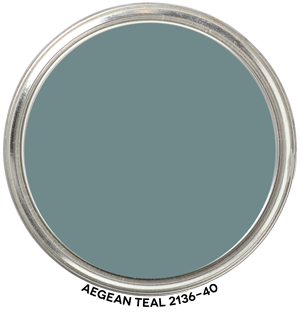
Benjamin Moore Aegean Teal- Graphic by Camp Chroma
Benjamin Moore’s 2021 Color of the Year, Aegean Teal. Graphic by Camp Chroma.

Benjamin Moore describes Aegean Teal,  as  “A blend of blue-green and gray, Aegean Teal 2136-40 is an intriguing mid-tone that creates natural harmony.”

According to the color data (LCH), “Aegean Teal” is a blue/green hue (209.5),  with a Lightness of 56 and Chroma of 8.8. In other words,  it is a pretty saturated and rich blue green that on a scale of 1 to 10 for lightness it is just over the halfway point.

Ways to Use Aegean Teal

Aegean Teal is a versatile, calming, and deep color that beautifully balances blue-green hues. Here are some ways to incorporate this rich shade into various spaces:

  1. Accent Walls: Use Aegean Teal on a single wall in a room to create a focal point without overwhelming the space.
  2. Kitchen Cabinets: For a chic and modern feel, paint your kitchen cabinets with Aegean Teal. Pair it with gold or brass hardware for a touch of elegance.
  3. Front Door: Make a statement by painting your front door in Aegean Teal, especially against neutral exterior shades.
  4. Furniture: Revamp old furniture pieces by painting them in this hue for a fresh, updated look.
  5. Bathroom: Aegean Teal can be a tranquil choice for bathrooms, creating a spa-like feel. Consider it for vanity cabinets or walls.
  6. Bedroom: Use this color as the main wall shade for a serene and restful bedroom ambiance.
  7. Accessories: If you’re not ready for a major color change, introduce Aegean Teal through accessories like throw pillows, vases, or lampshades.
  8. Trim or Moulding: Painting trims, mouldings, or built-in shelves with Aegean Teal can accentuate architectural details.
  9. Ceiling: For a twist, paint the ceiling in Aegean Teal while keeping walls in a soft complementary shade.
  10. Textiles: Consider curtains, upholstery, or bed linens in this shade to bring warmth and depth to a room.
  11. Pair with Complementary Colors: Aegean Teal pairs beautifully with warm earth tones, soft beiges, and even some muted corals or terracottas.
  12. Home Office: Create a focused and calming environment by using Aegean Teal in your home workspace.

Consider the room’s lighting and other color elements, as this can affect how the color is perceived. Regardless of how you choose to incorporate it, Aegean Teal can bring a sophisticated and balanced feel to any space.

Master Bedroom Design

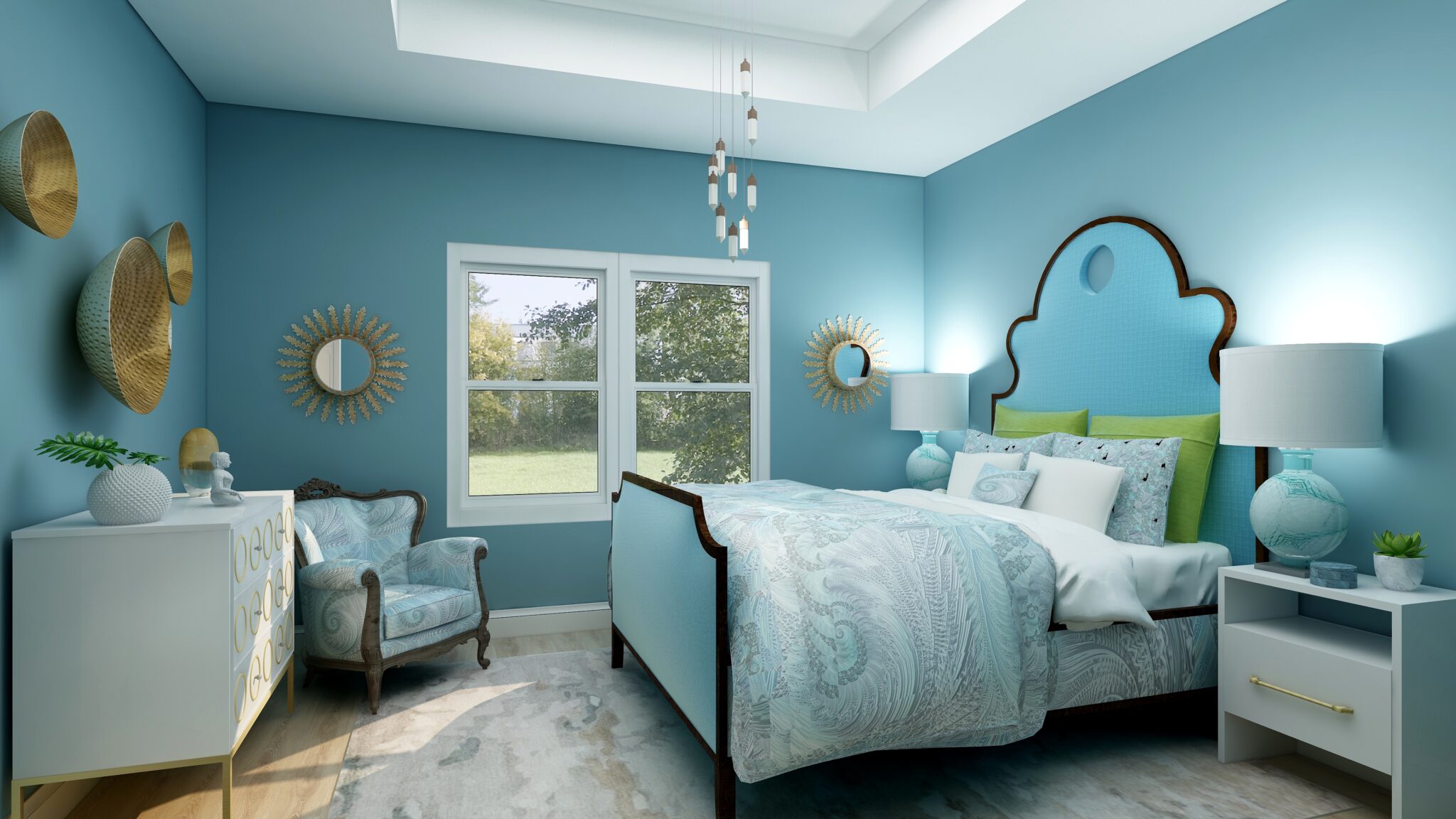
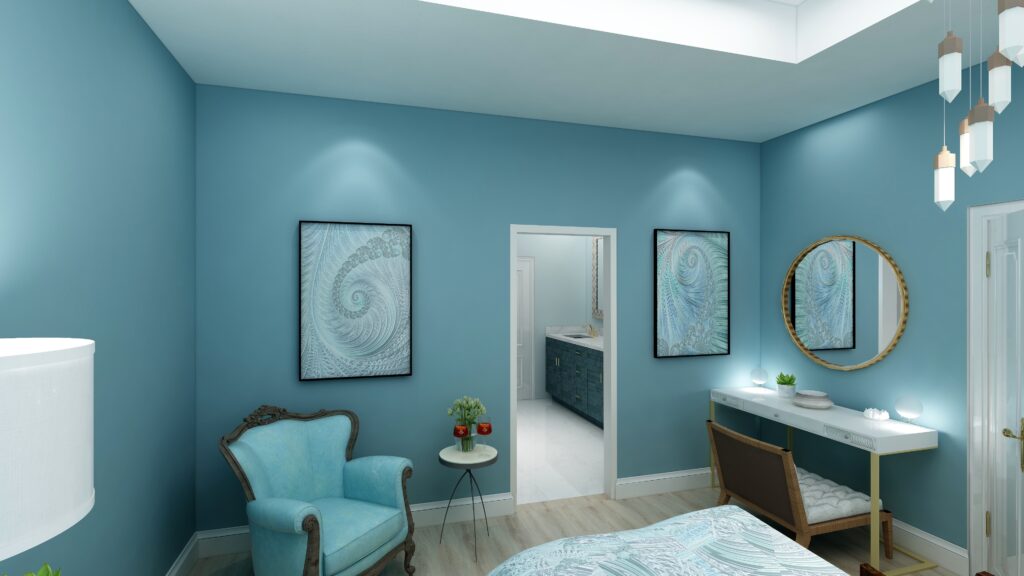
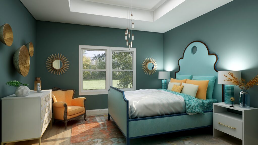
I  decidec to create a master bedroom design using Aegean Teal for the wall color and chose a primarily monotone color scheme with other similar blues and a few green accents.

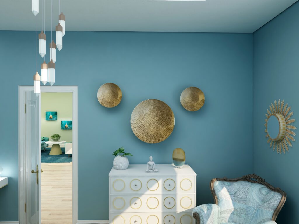
My design celebrates circles and curves, mixes modern pieces with antiques, and mixes soft fabrics with glass, metal and pottery. I used my fractal art from the “Jenna” collection in the comforter, the pillow shams and accent pillow, the wall art, and on one of the antique chairs. My fractal art celebrates curves and spirals. To learn more about spirals and fractal art, see my blog article What Does Your Art Mean?

By using this beautiful color and a monotone color scheme, I think the room has a very relaxing and serene feeling. The energy in the room seems soft and flowing with all the curves, but still interesting with the mixture of hard and soft textures.


Using Benjamin Moore's 2021 Color of the Year Aegean Teal by NOrthern Lights Home Staging and Design
Master Bedroom Edesign and fractal art on the comforter and pillows by Northern Lights Home Staging and Design. Wall color is Agean Teal.

Using Benjamin Moore's 2021 Color of the Year Aegean Teal by NOrthern Lights Home Staging and Design
Master Bedroom Edesign and Jenna Fractal Art by Northern Lights Home Staging and Design.

Using Benjamin Moore's 2021 Color of the Year Aegean Teal by NOrthern Lights Home Staging and Design
Master Bedroom Edesign and fractal art on the chair by Northern Lights Home Staging and Design using Agean Teal

Are You Inspired?

Be brave and try some  new color with an expert color consultation.


Not Your Average Color Consultation

What’s Your Global Design Style?

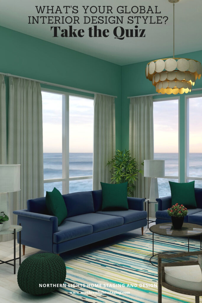
The project above is an example of global style design. Are you curious about what your global style is? Take the quiz and find out.

What is Your Global Design Style? Take the Quiz
Why Work with Northern Lights Home Staging and Design

Aligned Design- All Rights Reserved.

Terms of Service  |  Privacy Policy  |  Disclaimer |  Brochure

Prices are subject to change without notice.

Call 907-362-0065 today


Ways to Use Pantone’s 2021 Colors of the Year

In my last five articles I have been exploring the 2021 colors of the year of different paint companies and comparing them in the same Edesign I created for a master bedroom.  I started by exploring Benjamin Moore’s Agean Teal and Sherwin Williams Urbane Bronze.  I found that PPG had a color palette of 3 colors of the year instead of one as you can see in my article Ways to Use PPG’s Colors of the Year. I admitted I felt a little let down that they did not just commit to one color.   

Then I checked on Behr’s Colors of the Year and found they had a palette of 21 colors!! Talk about non-committal.   I highlighted 3 of my favorites in my article, Ways to Use Behr’s 2021 Colors of the Year.

HGTV Home by Sherwin-Williams listed their 2021 Color of the Year: as Passionate, which you can see in my last article, How to Use Sherwin William’s HGTV Home 2021 Color of the Year Passionate.

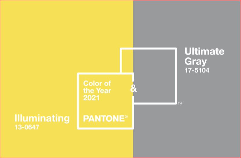
Here, I will explore using Pantone’s 2021 Colors of the Year. They have two colors, Illuminating and Ultimate Gray. Pantone does not create paint colors. They create ink used in graphics, but their color selections influence many of the colors of products you will find available such as art, accessories, bedding and furniture.


Pantone colors of the year 2021
Pantone says these colors are “A marriage of color conveying a message of strength and hopefulness that is both enduring and uplifting”..

I am a little surprised at their pick of Ultimate Gray…..I feel like gray is our past and we have moved on. I am also surprised at their pick of Illuminating. It feels like the color of a yellow safety vest or a yellow warning light at a traffic signal, rather than one I would pick for accessories in my home. “Uplifting” is not a word I would use to describe it. Well, I am up for a challenge. Let us see what we can do with this combination!

The Design

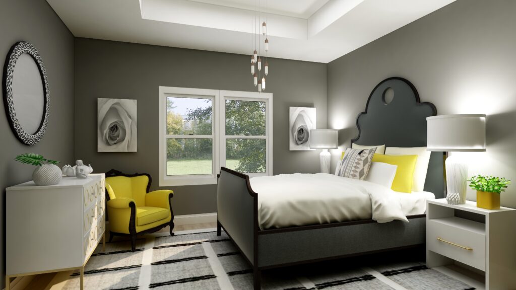
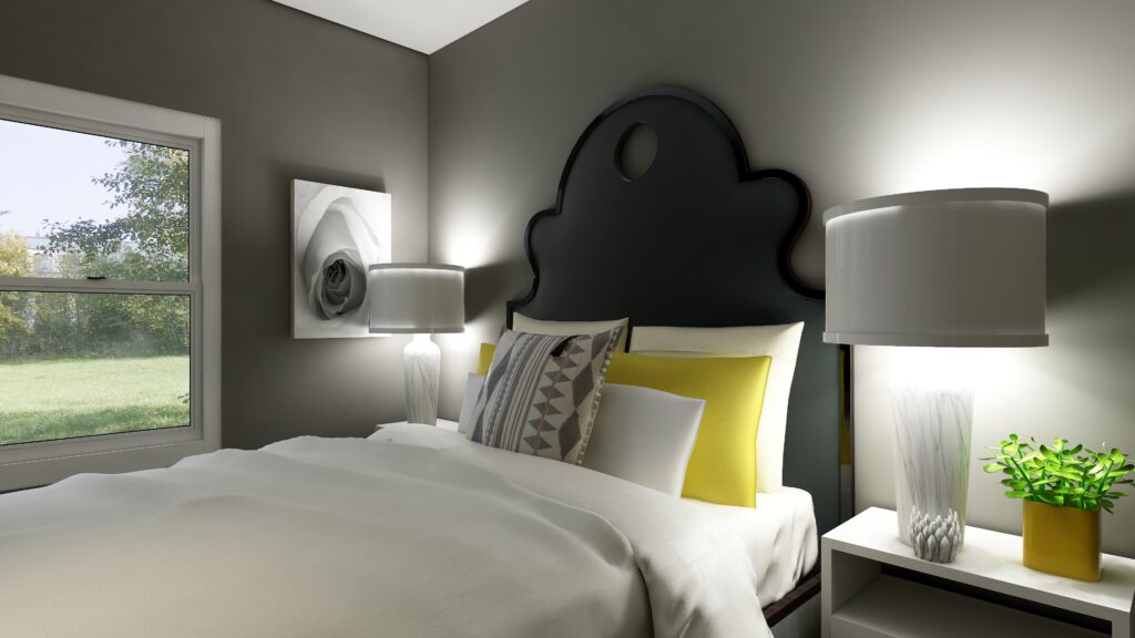
In this design, I used the color data to create a room that would look like Ultimate Gray on the walls, if Pantone made paint. The closest real paint color I could find to match this was Benjamin Moore, Tucker Gray, CW-705. 

I think this bedroom feels relaxing, serene but with a little bit of energy and sweetness that comes from the cheery pops of yellow. I do like yellow and gray together, although I think this yellow is a little too saturated for my taste. I prefer a yellow with a little less chroma.

In my previous designs I have played with more saturated wall colors to show what you can do with color and how it feels. Sorry, I can not bring myself to try this color on the wall….I am not going to go there!

How to Use Pantone's 2021 Colors of the Year Illuminating and Ultimate Gray
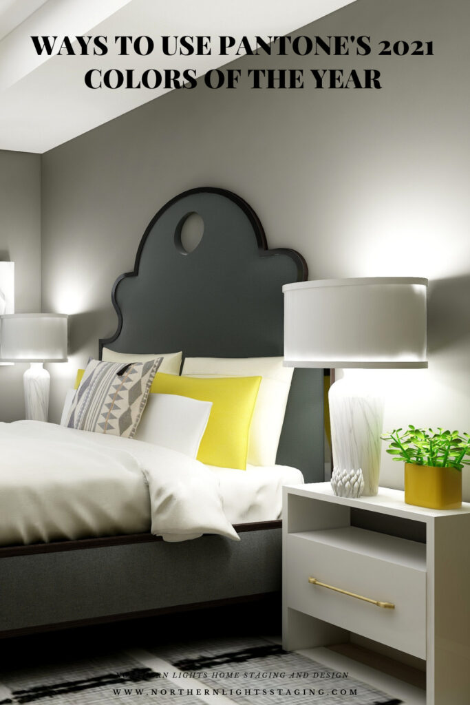
Master bedroom Edesign using Pantone’s 2021 Colors of the Year by Northern Lights Home Staging and Design
How to Use Pantone's 2021 Colors of the Year Illuminating and Ultimate Gray
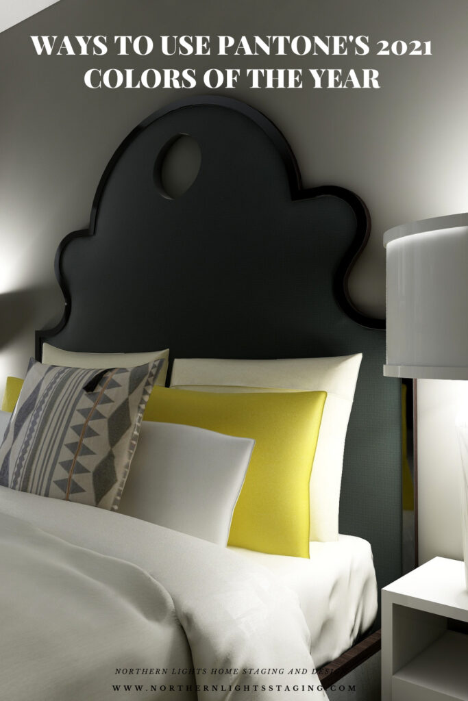
Master bedroom Edesign using Pantone’s 2021 Colors of the Year by Northern Lights Home Staging and Design

Shop this Look

Here are some of the pieces I used or alternative ideas for my designs. Some contain affiliate links, meaning I may receive a small commission for sharing this with you at no additional cost to you if you purchase anything.

Which Color of the Year is Your Favorite?

I enjoyed working with all these colors, and think they could each work nicely to create a relaxing master bedroom, although Big Cypress feels a little more energizing than relaxing. Of all the colors, I like Aegean Teal and Euphoric Magenta the best, how about you?  

How to Use Pantone's 2021 Colors of the Year Illuminating and Ultimate Gray
Pantone’s 2021 Colors Illuminant and Ultimate Gray
HGTV Home by Sherwin-Williams 2021 Color of the Year: Passionate. Edesign by Northern Lights Home Staging and Design
Sherwin Williams HGTV Home Passionate
Master bedroom Edesign using Behr Euphoric Magenta by Northern Lights Home Staging and Design
Behr’s 2021 color Euphoric Magenta

Using Benjamin Moore's 2021 Color of the Year Aegean Teal by NOrthern Lights Home Staging and Design
Benjamin Moore’s 2021 Color of the Year Aegean Teal
Master bedroom Edesign using Behr Voyage by Northern Lights Home Staging and Design
Behr’s 2021 color Voyage
PPG's 2021 Colors of the Year with Mystic Aqua
PPG’s 2021 Color Palette with Mystic Aqua.
PPG's 2021 Colors of the Year = my version
Mystic Aqua but with my my own rebel color scheme:)
Master bedroom Edesign using Behr Royal Orchard by Northern Lights Home Staging and Design
Behr’s 2021 color Royal Orchard

Ways to Use Sherwin Williams 2021 Color of the Year Urbane Bronze
Sherwin Williams 2021 Color of the Year Urbane Bronze
PPG's 2021 Colors of the Year with Transcend
PPG’s 2021 Color Palette with Transcend
PPG's 2021 Colors of the Year with Big Cypress on the walls
PPG’s 2021 Color Palette with Big Cypress.

Are You Inspired?

When your space is better, you are better.
When you are better, the world is better. 

Are you ready to create the perfect space for you? Try my Aligned Design consultation. It is a wholistic Interior Design and Color consultation that considers art, science and energy to give you a game plan for your whole home. I use the art of eco-friendly Interior Design mixed with color science and consider Feng Shui, transformative design, biophilia and color psychology to make your space feel great and support the life you want to live.

 Once you have your game plan, we can work on specific rooms with one of my Edesign packages. 

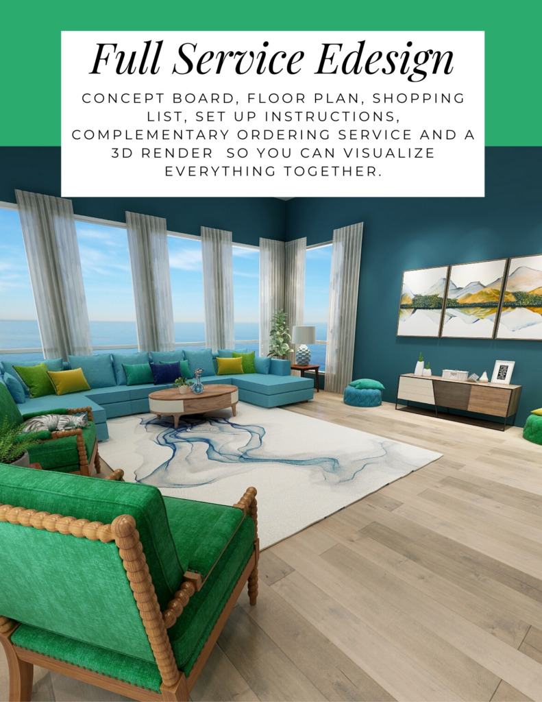
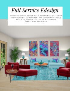
The designs above are examples of full service Edesign, where you get a floor plan, a concept board, a 3D render and a complete shopping list with set up instructions. Or, be brave and try some new color with an expert color consultation.


Aligned Design System by Northern Lights Home Staging and Design


Full Service Edesign by Northern Lights Home Staging and Design

What’s Your Global Design Style?

The designs in this article are examples of global style design. Are you curious what your global style is? Take the quiz and find out.


What is Your Global Design Style? Take the Quiz


Why work with Northern Lights Home Staging and Design


Call 907-362-0065 today
 info@northernlightsstaging.com

Terms of Service

Privacy Policy

Disclaimer

Prices subject to change without notice.

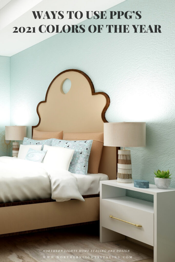
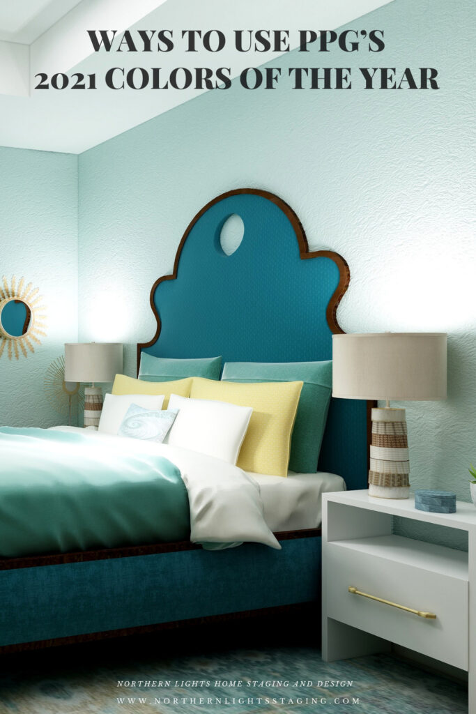
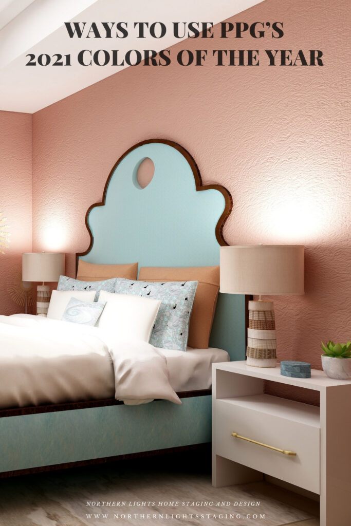
Pin These

How to Use Pantone's 2021 Colors of the Year
How to Use Pantone’s 2021 Colors of the Year
How to Use Pantone's 2021 Colors of the Year
How to Use Pantone’s 2021 Colors of the Year


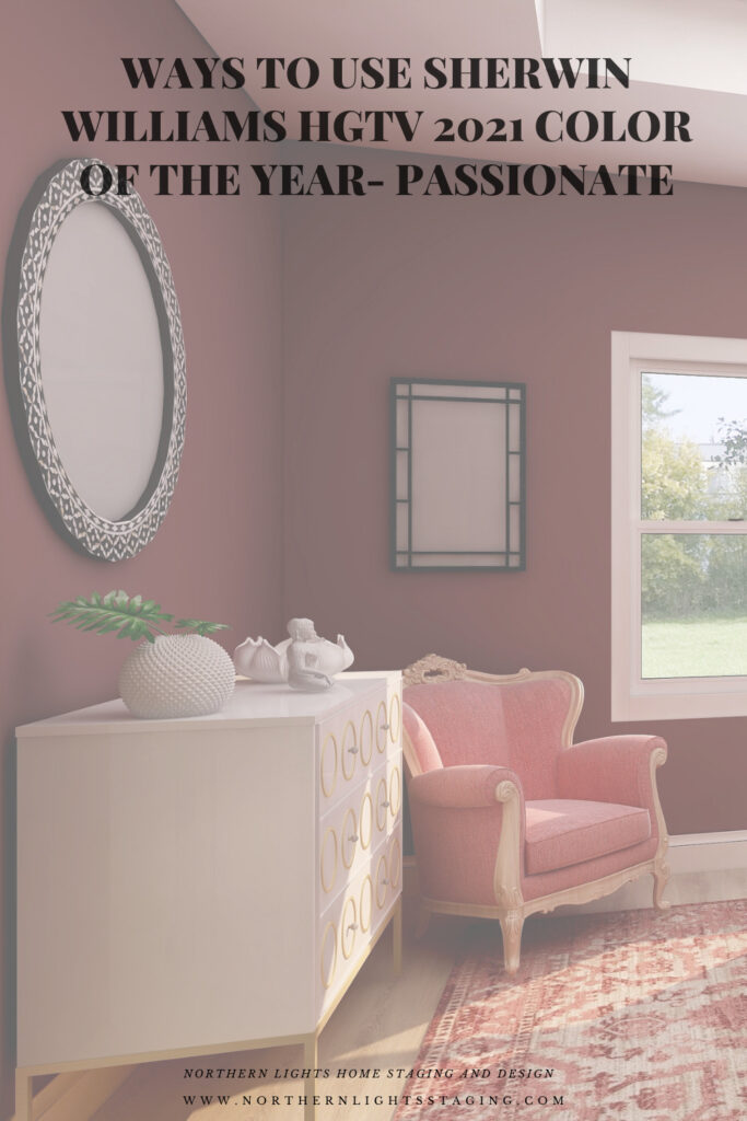
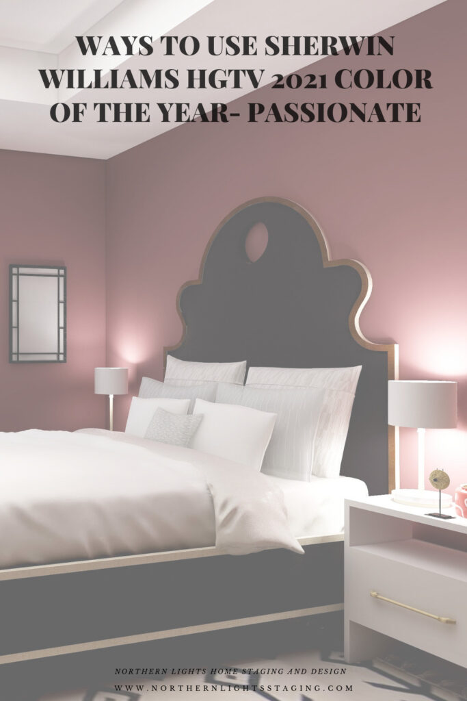
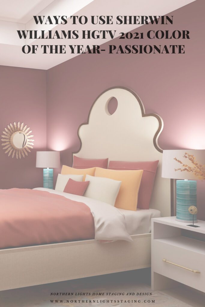
Ways to Use Sherwin Williams HGTV 2021 Color of the Year- Passionate

In my last few articles I have been exploring the 2021 colors of the year of different paint companies and comparing them in the same Edesign I created for a master bedroom.  I enjoyed exploring Benjamin Moore’s Agean Teal and Sherwin Williams Urbane Bronze.  I found that PPG had a color palette of 3 colors of the year instead of one as you can see in my article Ways to Use PPG’s Colors of the Year. I admitted I felt a little let down that they did not just commit to one color.

Then I checked on Behr’s Colors of the Year and found they had a palette of 21 colors!! Talk about non-committal.   I highlighted 3 of my favorites in my article, Ways to Use Behr’s 2021 Colors of the Year.

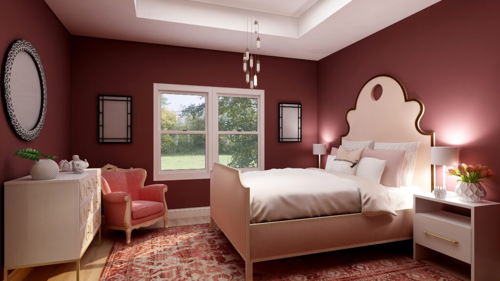
HGTV Home by Sherwin-Williams lists their 2021 Color of the Year: as Passionate, which is part of their 2021 Delightfully Daring Color Collection.  They hope to inspire homeowners to have confidence using bold colors to  create emotion and have fun!

Is this color too exciting for a bedroom where most of us prefer a calm, relaxing atmosphere? I thought I would play with it in my master bedroom Edesign in comparison to the other colors of the year and see what happens. With a name like Passionate, I hope it would work in a bedroom:).

I experimented with a couple different ideas, to see how it might feel with a more dramatic look, and if I could create a relaxing room with a color like this.

Design 1

My first design feels dramatic and colorful, but still feels warm and cozy, I think.

HGTV Home by Sherwin-Williams 2021 Color of the Year: Passionate. Edesign by Northern Lights Home Staging and Design
Master bedroom Edesign using Sherwin Williams HGTV Home color Passionate by Northern Lights Home Staging and Design

Shop this Look

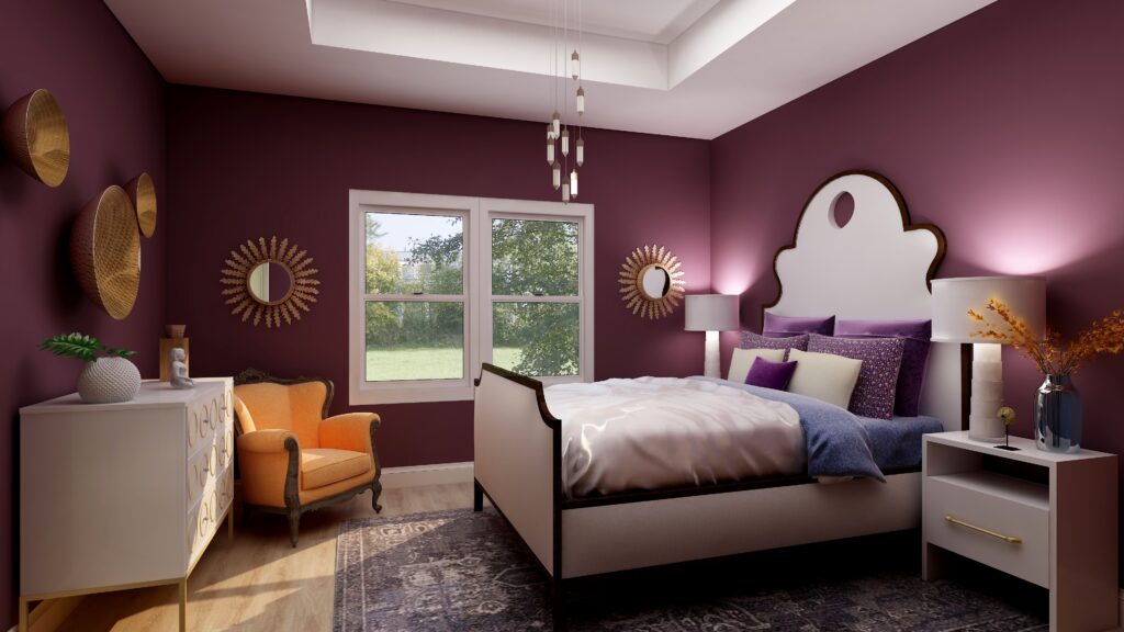
Design 2

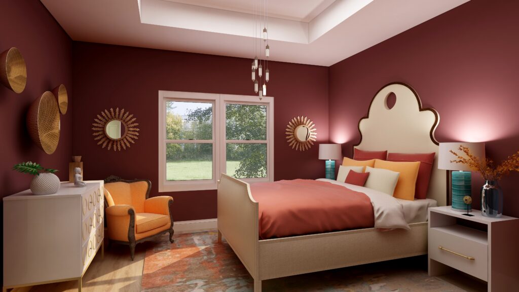
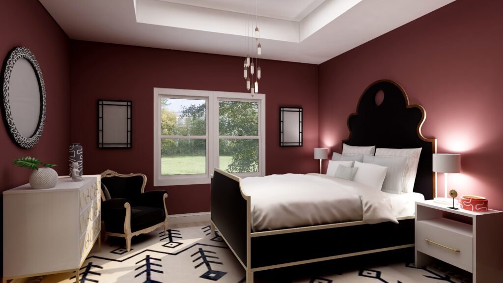
Design 2 is more dramatic with the high contrast of black and white against the deep red walls. The red walls still give a feeling of being enveloped, a sense of coziness, but the black and white rug might be too bold to inspire relaxation. What do you think?

HGTV Home by Sherwin-Williams 2021 Color of the Year: Passionate. Edesign by Northern Lights Home Staging and Design
Sherwin Williams HGTV Home Passionate- Edesign by Northern Lights Home Staging and Design

Shop This Look

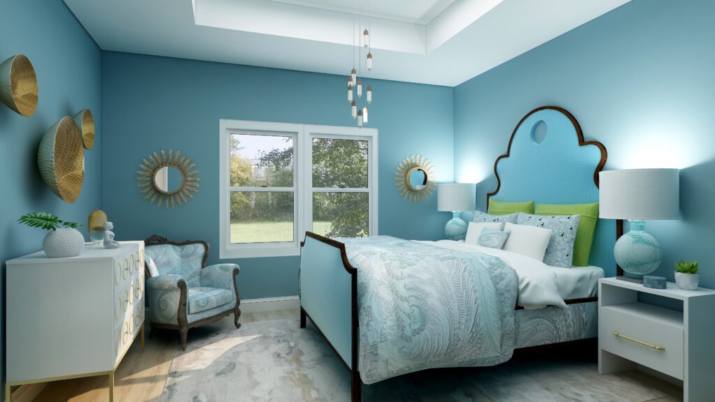
Design 3

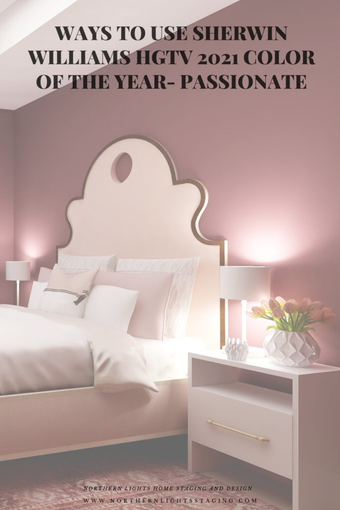
This monochromatic color scheme feels relaxing to me. The addition of pinks and blushes creates a softness that balances the rich dramatic wall color. This shows me that you can create a relaxing space, even with rich red walls if you balance everything else correctly, creating both drama and calm at the same time. An interesting combination!

HGTV Home by Sherwin-Williams 2021 Color of the Year: Passionate. Edesign by Northern Lights Home Staging and Design
Sherwin Williams HGTV Home Passionate- Edesign by Northern Lights Home Staging and Design

Shop This Look

Which Color of the Year is Your Favorite?

I enjoyed working with all these colors, and think they could each work nicely to create a relaxing master bedroom, although Big Cypress feels a little more energizing than relaxing. Of all the colors, I am not sure if Aegean Teal or Euphoric Magenta is my favorite, how about you?

HGTV Home by Sherwin-Williams 2021 Color of the Year: Passionate. Edesign by Northern Lights Home Staging and Design
Sherwin Williams HGTV Home Passionate
Master bedroom Edesign using Behr Euphoric Magenta by Northern Lights Home Staging and Design
Behr’s 2021 color Euphoric Magenta

Using Benjamin Moore's 2021 Color of the Year Aegean Teal by NOrthern Lights Home Staging and Design
Benjamin Moore’s 2021 Color of the Year Aegean Teal
Master bedroom Edesign using Behr Voyage by Northern Lights Home Staging and Design
Behr’s 2021 color Voyage
PPG's 2021 Colors of the Year with Mystic Aqua
PPG’s 2021 Color Palette with Mystic Aqua.
PPG's 2021 Colors of the Year = my version
Mystic Aqua but with my my own rebel color scheme:)
Master bedroom Edesign using Behr Royal Orchard by Northern Lights Home Staging and Design
Behr’s 2021 color Royal Orchard

Ways to Use Sherwin Williams 2021 Color of the Year Urbane Bronze
Sherwin Williams 2021 Color of the Year Urbane Bronze
PPG's 2021 Colors of the Year with Transcend
PPG’s 2021 Color Palette with Transcend
PPG's 2021 Colors of the Year with Big Cypress on the walls
PPG’s 2021 Color Palette with Big Cypress.

Are You Inspired?

When your space is better, you are better.
When you are better, the world is better. 

Are you ready to create the perfect space for you? Try my Aligned Design consultation. It is a wholistic Interior Design and Color consultation that considers art, science and energy to give you a game plan for your whole home. I use the art of eco-friendly Interior Design mixed with color science and consider Feng Shui, transformative design, biophilia and color psychology to make your space feel great and support the life you want to live.

Once you have your game plan, we can work on specific rooms with one of my Edesign packages.

The designs above are examples of full service Edesign, where you get a floor plan, a concept board, a 3D render and a complete shopping list with set up instructions. Or, be brave and try some new color with an expert color consultation.


Aligned Design System by Northern Lights Home Staging and Design


Full Service Edesign by Northern Lights Home Staging and Design

What’s Your Global Design Style?

The designs in this article are examples of global style design. Are you curious what your global style is? Take the quiz and find out.


What is Your Global Design Style? Take the Quiz

Why work with Northern Lights Home Staging and Design

Call 907-362-0065 today
 info@northernlightsstaging.com

Terms of Service

Privacy Policy

Disclaimer

Prices subject to change without notice.

Pin These

Ways to Use Sherwin Williams HGTV 2021 Color of the Year- Passionate


Ways to Use Behr’s 2021 Colors of the Year

In my last few articles I have been exploring the 2021 colors of the year of different paint companies and comparing them in the same Edesign I created for a master bedroom.  I enjoyed exploring Benjamin Moore’s Agean Teal and Sherwin Williams Urbane Bronze.  I found that PPG had a color palette of 3 colors of the year instead of one as you can see in my article Ways to Use PPG’s Colors of the Year. I admitted I felt a little let down that they did not just commit to one color.

This week I decided to check on Behr’s Color of the Year.

Oh for the love of God, can you believe they have 21 colors!! Talk about non-committal.  No, I will not be doing 21 renders to show you those.

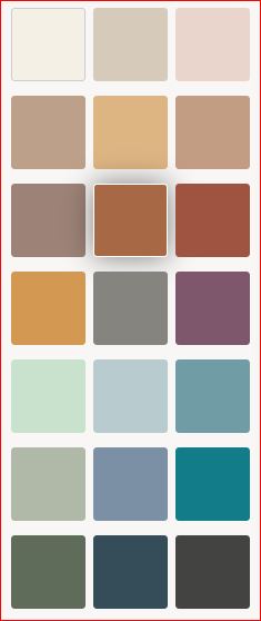
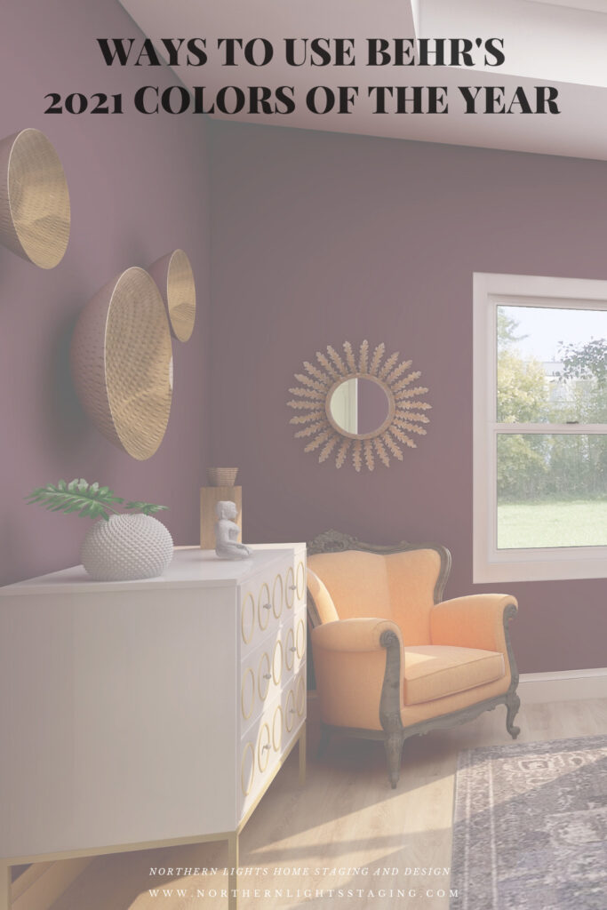
According to Behr, colors that “encourage comfort and wellbeing will be at the forefront, and Behr’s Color Trends 2021 Palette has all the tranquil shades you’ll need to stay grounded. Here is their palette.

Behr 2021 color palette

My Favorites

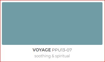
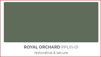
I decided to highlight my three favorites, Voyage, Royal Orchard and Euphoric Magenta, because I like the way they look and I like what they represent (soothing and spiritual, restorative and secure, and gracious and creative). They fit with my philosophy and new Aligned Design system, which combines art, science and energy to create a perfect space for you.

Behr Voyage
Behr Royal Orchard
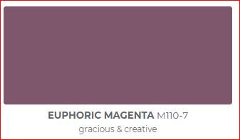
Behr Euphoric Magenta

I have included a list of products I used or something similar for each design. Note they contain affiliate links, meaning I receive a small commission for sharing with you at no additional cost to you.

Royal Orchard

Royal Orchard is part of their “Quiet Haven” palette. They say “Deep hues have a reassuringly sublime and dependable nature, delivering the effect of a peaceful oasis in your home.”

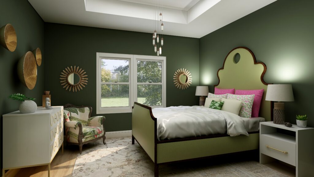
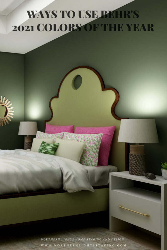
I like it because I believe this shade of green is prevalent in nature, and one of my goals in my designs is to bring the outside in and help people feel more connected to nature with biophilia. I think this creates that feeling of a “peaceful oasis” in your home. To continue that theme I used other greens in the furniture, plants, natural materials such as metals (mirrors, wall art) and wood (lamp). The fabric on the chair reflects a plant theme. I have also included some of my framed fractal art called spring (not visible in this part of the room. The area rug highlights metallic details in cream, gray, silver, and gold.

Master bedroom Edesign using Behr Royal Orchard by Northern Lights Home Staging and Design

Shop this Look

Voyage

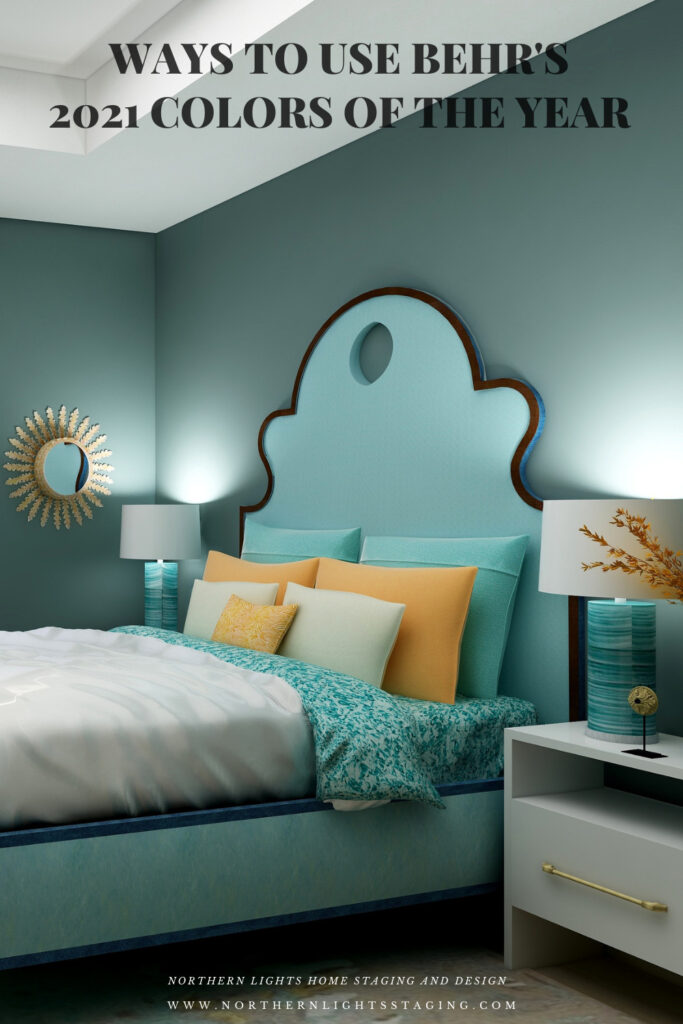
Voyage is part of their Calm Zone palette. They say “Soothing blues and greens create a restorative escape offering ease and solace”.  I agree and blues and greens are some of my favorites to work with as they are also colors of nature and help bring the outside in.

They describe this shade as “soothing and spiritual”. Lately, I have really been considering the energy aspects of color and feng shui and how it all works together to create a space that feels great and helps support you in BEING your best. This color works with this idea. It is part of my Aligned Design system the considers art, science and energy in all my designs.

Master bedroom Edesign using Behr Voyage by Northern Lights Home Staging and Design

Shop this Look

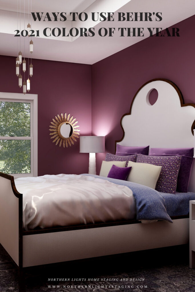
Euphoric Magenta

According to Behr, Euphoric Magenta is part of their bold and saturated “Optimistic View” palette.  With this collection you can “add a touch of playful fun to eclectic and global decor styles.” Since I am all about global style design and love rich color, I picked this one to highlight:) 

Master bedroom Edesign using Behr Euphoric Magenta by Northern Lights Home Staging and Design

Shop this Look

Which Color of the Year is Your Favorite?

I enjoyed working with all these colors, and think they could each work nicely to create a relaxing master bedroom, although Big Cypress feels a little more energizing than relaxing. Of all the colors, I am not sure if Aegean Teal or Euphoric Magenta is my favorite, how about you?

Master bedroom Edesign using Behr Euphoric Magenta by Northern Lights Home Staging and Design
Behr’s 2021 color Euphoric Magenta

Using Benjamin Moore's 2021 Color of the Year Aegean Teal by NOrthern Lights Home Staging and Design
Benjamin Moore’s 2021 Color of the Year Aegean Teal
Master bedroom Edesign using Behr Voyage by Northern Lights Home Staging and Design
Behr’s 2021 color Voyage
PPG's 2021 Colors of the Year with Mystic Aqua
PPG’s 2021 Color Palette with Mystic Aqua.
PPG's 2021 Colors of the Year = my version
Mystic Aqua but with my my own rebel color scheme:)
Master bedroom Edesign using Behr Royal Orchard by Northern Lights Home Staging and Design
Behr’s 2021 color Royal Orchard

Ways to Use Sherwin Williams 2021 Color of the Year Urbane Bronze
Sherwin Williams 2021 Color of the Year Urbane Bronze
PPG's 2021 Colors of the Year with Transcend
PPG’s 2021 Color Palette with Transcend
PPG's 2021 Colors of the Year with Big Cypress on the walls
PPG’s 2021 Color Palette with Big Cypress.

Are You Inspired?

When your space is better, you are better.
When you are better, the world is better. 

Are you ready to create the perfect space for you? Try my Aligned Design consultation. It is a wholistic Interior Design and Color consultation that considers art, science and energy to give you a game plan for your whole home. I use the art of eco-friendly Interior Design mixed with color science and consider Feng Shui, transformative design, biophilia and color psychology to make your space feel great and support the life you want to live.

Once you have your game plan, we can work on specific rooms with one of my Edesign packages.

The designs above are examples of full service Edesign, where you get a floor plan, a concept board, a 3D render and a complete shopping list with set up instructions. Or, be brave and try some new color with an expert color consultation.


Aligned Design System by Northern Lights Home Staging and Design


Full Service Edesign by Northern Lights Home Staging and Design

What’s Your Global Design Style?

The designs in this article are examples of global style design. Are you curious what your global style is? Take the quiz and find out.


What is your Global Design Style? Tae the Quiz

Why work with Northern Lights Home Staging and Design

Call 907-362-0065 today
 info@northernlightsstaging.com

Terms of Service

Privacy Policy

Disclaimer

Prices subject to change without notice.

Pin These

Ways to use Behr's 2021 Colors of the Year


Ways to Use PPG’s 2021 Colors of the Year

In several articles I explored the 2021 colors of the year of different paint companies and compared them in the same Edesign I created for a master bedroom.  I enjoyed exploring Benjamin Moore’s Agean Teal and Sherwin Williams Urbane Bronze.  I was excited to see what PPG’s color of the year was.

But wait….they didn’t have one!! What??? No, they had a color palette for 2021 but not a particular color of the year. Honestly, I felt  let down.

I guess I  don’t like the idea of a color palette, because I don’t want to be told or encouraged to use a series of colors together. I like to decide that for myself!

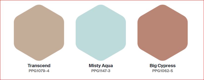
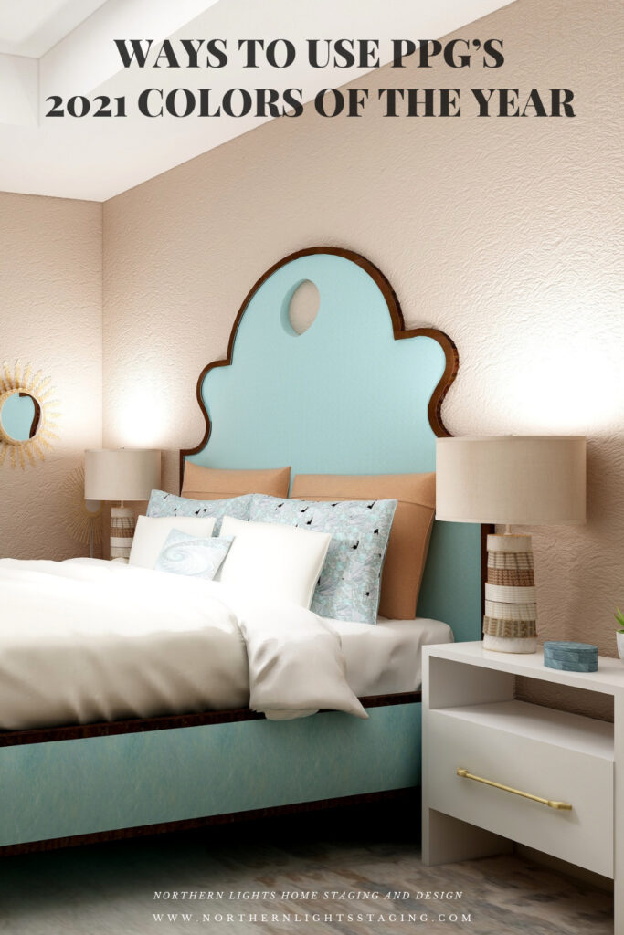
The PPG 2021 Color Palette includes Transcend, Mystic Aqua and Big Cypress, which are meant to work together.

PPG's 2021 Colors

Here is what PPG says about their 2021 color palette:

Transcend: A mid-tone oatmeal-colored hue that draws on earthy influences and nostalgia.

Big Cypress, a shaded ginger with persimmon undertones, is the equivalent of a big, comforting hug for your home.

Misty Aqua, a watercolor cerulean blue, provides an unexpected pairing of freshness against the other warm, earthy tones.

I like the Misty Aqua. Transcend or really any beige makes me yawn. Big Cypress reminds me of the desert, and I am not sure it makes me feel like my home got a hug.

I am trying to have an open mind here and just get over the fact they didn’t just pick one color. I find it a little annoying, as if they are trying to sell me three paints instead of one.

I am not sure why they paired these colors together. Looking at the color data, they do not really fit into any traditional color scheme in relation to hue angle.  They are not similar in terms of chroma or lightness to create a harmonious pairing. I don’t really get it, but will see what amazing and beautiful design I can create anyway! Here goes.

Master Bedroom Design

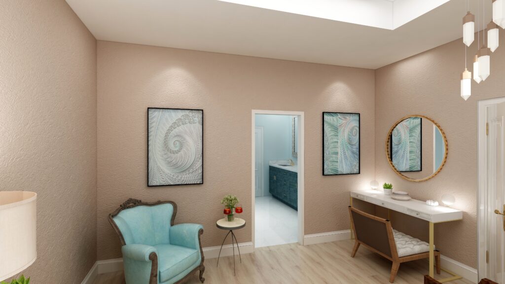
Design 1- Transcend and the PPG 2021 Palette

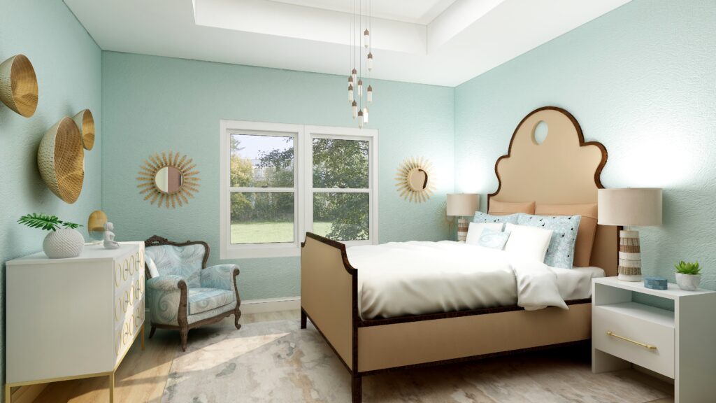
In this design, I used Transcend as the main color on the walls, and used the two other colors as accents or supporting colors. I used a shade of Mystic Aqua on the bed. The larger pillow shams and the lamps tie in Big Cypress. The area rug has some Transcend and Big Cypress colors in it and also a lighter shade of Mystic Aqua. My design celebrates circles and curves, mixes modern pieces with antiques, and mixes soft fabrics with glass, metal and pottery. I used my fractal art from the “Jenna” collection which has some of the Mystic Aqua color in the pillow shams and accent pillow, the wall art, and on one of the antique chairs. My fractal art celebrates curves and spirals. To learn more about spirals and fractal art, see my blog article What Does Your Art Mean?


PPG's 2021 Colors of the Year with Transcend
.Design 1-Master Bedroom Edesign with PPG’s 2021 color Transcend on the wall.

PPG's 2021 Colors of the Year with Transcend
Design 1- Master Bedroom Edesign and Jenna Fractal Art by Northern Lights Home Staging and Design.

Design 2- Big Cypress and the PPG 2021 Palette

In the design below, I used Big Cypress as the primary color on the walls with the other two colors as supporting colors. I changed the area rug to one that contains colors similar to Transcend.


PPG's 2021 Colors of the Year with Big Cypress on the walls
Design 2- Master Bedroom Edesign and fractal art on the chair by Northern Lights Home Staging and Design using Big Cypress as the wall color

Design 3- Mystic Aqua and the PPG 2021 Palette

In the design below, I changed the wall color to Mystic Aqua, and changed the bed upholstery to a color similar to Transcend.

PPG's 2021 Colors of the Year with Mystic Aqua
Design 3- Master Bedroom Edesign and fractal art on the chair by Northern Lights Home Staging and Design using Mystic Aqua as the wall color

Design 4- Mystic Aqua and my own color palette

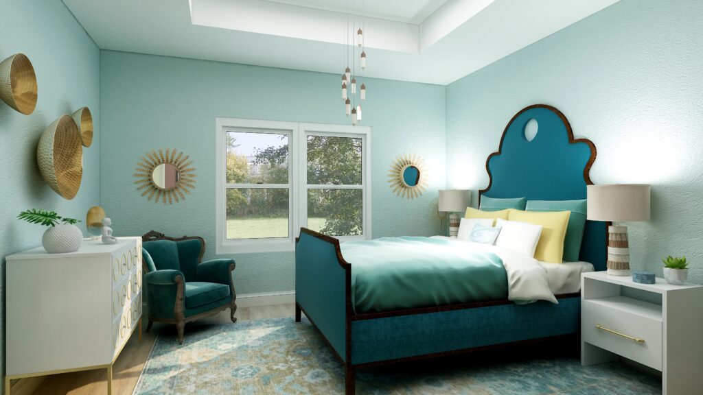
In the design below, I did my own thing.  I liked Mystic Aqua the best of the three wall colors. I developed my own palette using various shades of blue/greens and yellow, it’s opposite on the color wheel.

PPG's 2021 Colors of the Year = my version
Design 4- Master Bedroom Edesign by Northern Lights Home Staging and Design using Mystic Aqua as the wall color and my own color palette.

Which Color of the Year is Your Favorite?

I enjoyed working with all the colors of 2021, and think they could all work nicely to create a relaxing master bedroom, although Big Cypress feels a little more energizing than relaxing. Of all the colors, I think Aegean Teal is my favorite, how about you?

PPG's 2021 Colors of the Year with Transcend
PPG’s 2021 Color Palette with Transcend
PPG's 2021 Colors of the Year with Big Cypress on the walls
PPG’s 2021 Color Palette with Big Cypress.
PPG's 2021 Colors of the Year with Mystic Aqua
PPG’s 2021 Color Palette with Mystic Aqua.
PPG's 2021 Colors of the Year = my version
Mystic Aqua but with my my own rebel color scheme:)

Using Benjamin Moore's 2021 Color of the Year Aegean Teal by NOrthern Lights Home Staging and Design
Benjamin Moore’s 2021 Color of the Year Aegean Teal

Ways to Use Sherwin Williams 2021 Color of the Year Urbane Bronze
Sherwin Williams 2021 Color of the Year Urbane Bronze

Are You Inspired?

Get your colors right the first time with a science based color consultation.


Not Your Average Color Consultation

Get Your Free Report


Ten Ways To Not Screw Up Picking Your Paint Colors


What is Your Global Design Style? Take the Quiz

Pin These

Ways to Use PPG's 2021 Colors of the Year

Ways to Use PPG's 2021 Colors of the Year


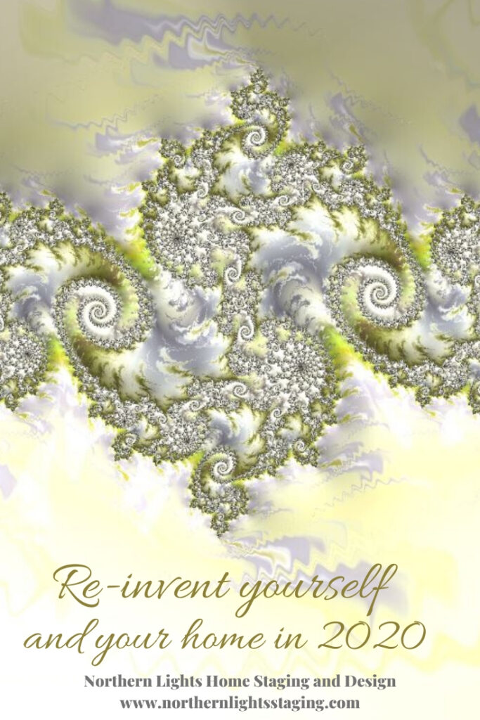
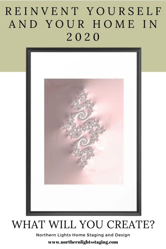
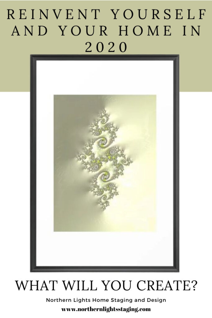
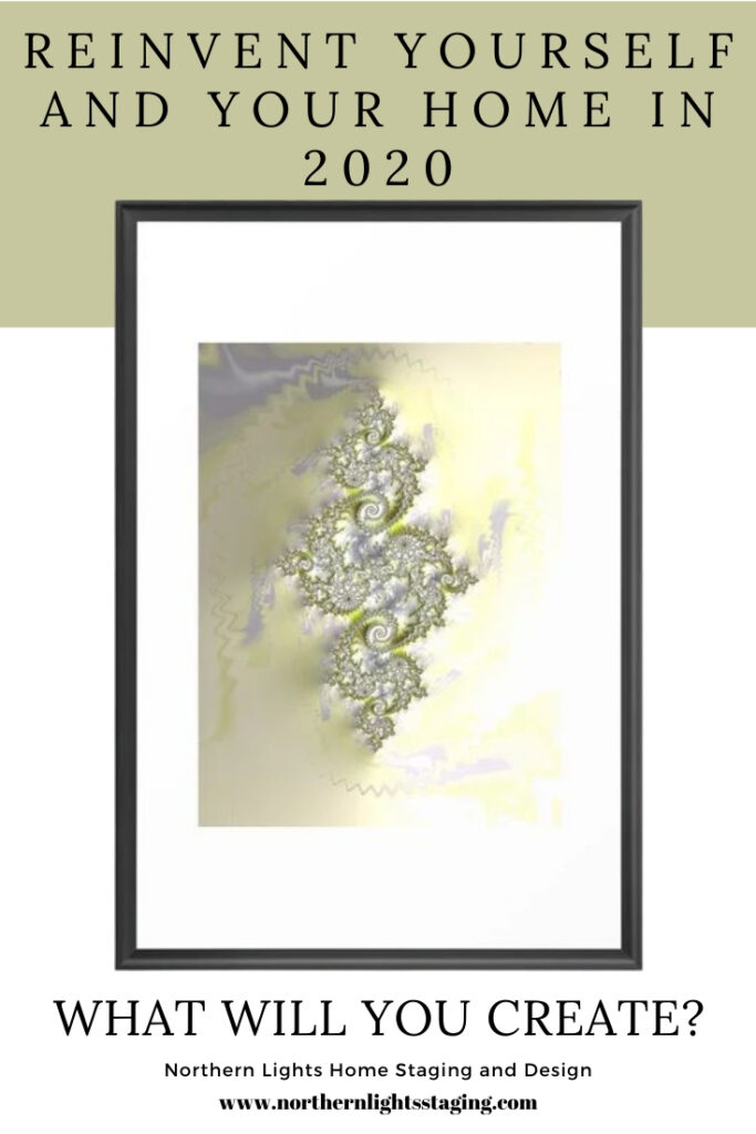
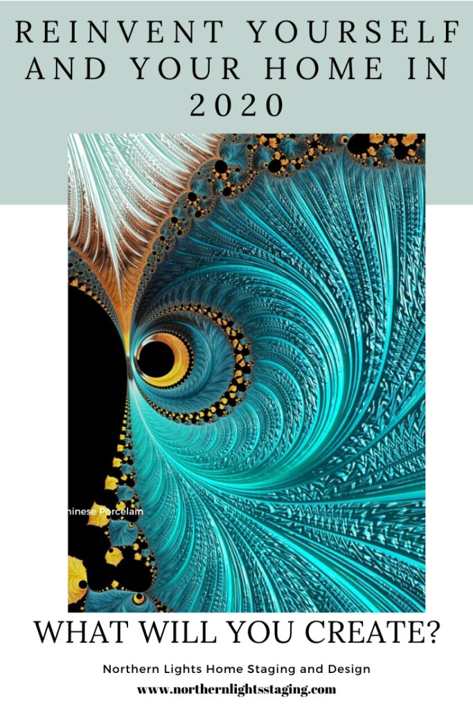
Re-Invent Yourself and Your Home in 2020

As the new year approaches, you will probably hear a lot about trends in design, color and the latest, greatest ideas in furniture and accessories. My mind is focused inward on a different way of transforming your home.

I think about 2019, what I accomplished and what my life and home felt like. I’m compelled to plan for 2020 to re-invent my life, health, business and home to be the ideal expression of myself. How about you?

I have been inspired lately listening to Jim Fortin’s podcast, “Transform your life from the inside out”,  and watching videos by Dr. Joe Dispenza. They both talk about how to re-program your brain to transform your life by working from the inside out. Jim Fortin talks about the idea of HAVE, DO, BE that most of us operate from. If I only “had” that, I could “do” this and “be” happy. He says it should be the other ways around. BE, DO, HAVE.  BE your ideal self so you can DO the things you want to and the “HAVE” will come as a result. Start on the inside and work your way out. Dr Joe Dispenza talks about how re-programming your brain through meditation can totally change your life, health and more. Change your thoughts, which change your emotions which change your physiology.  I know, a little Woo Woo perhaps, but you never know until you try. It’s a new year, what can it hurt!

As a designer, I can’t help but think about how all this translates to your home, and how transforming your home from the inside out can affect the way you feel and can help re-invent your life too.  Is it time for you to make a change? If so, how do you do it?

Color

The easiest way is by changing your colors, which have a profound effect on how you feel. There is lots of information online about the psychology of color and how different colors make you feel for inspiration. Color is easy to change! And so, it is easy not to change. How long have you had the same colors in your home? Change the paint color of a main room, change the color of your accessories, put up new and colorful art, change your pillow colors, get a new area rug.

Because color is easy to change, it’s easy to change again if you don’t like it. Be brave and go for it. Forget about grays, whites and neutrals. Try something bolder, or one of the new 2020 colors of the year. Or, if you prefer neutral colors on your walls, add pops of color in other ways. Maybe you have a bold color scheme going on now that you could change if you want a calmer and more serene environment.

Most people get stressed out about picking new colors. What colors go together? What if I hate it? Who has time to paint?  What if my friends don’t like it? The only thing that matters is if you like it and it makes you feel good.  Tell your own story. Of course, it is always great if the colors work well with your home and fixed finishes. A certified color strategist can help you with that.

Get Rid of the Monkey Chatter

What???  Yes, monkey chatter. Jim Fortin talks about how our brains are filled with monkey chatter, the endless thoughts of our past and current problems, and negative things we say to ourselves and others all day long. In other words, our heads are filled with X#$%@ most of the day. How can we re-invent ourselves with all that mental clutter?

This of course makes me think of our homes and all our clutter (me included). When we get rid of it, just like in our minds, doesn’t it feel so good? Remove the clutter, let the things you love have a place of honor with room to breathe so they shine, and you can enjoy them more. Maybe switch a few things out so something different (like art, accessories or a treasure) has a chance to take center stage.

Be Here Now

Yes, more Woo Woo:). Part of my re-invention involves learning to meditate. I’m finding this hard due to all the monkey chatter. They really are annoying?. The key is to tell the monkeys to be quiet, get centered, relaxed and calm.  I feel much more relaxed and calmer in a space that is clean, organized, and not overwhelmed with stuff. Part of my re-invention continues to include getting rid of more stuff!

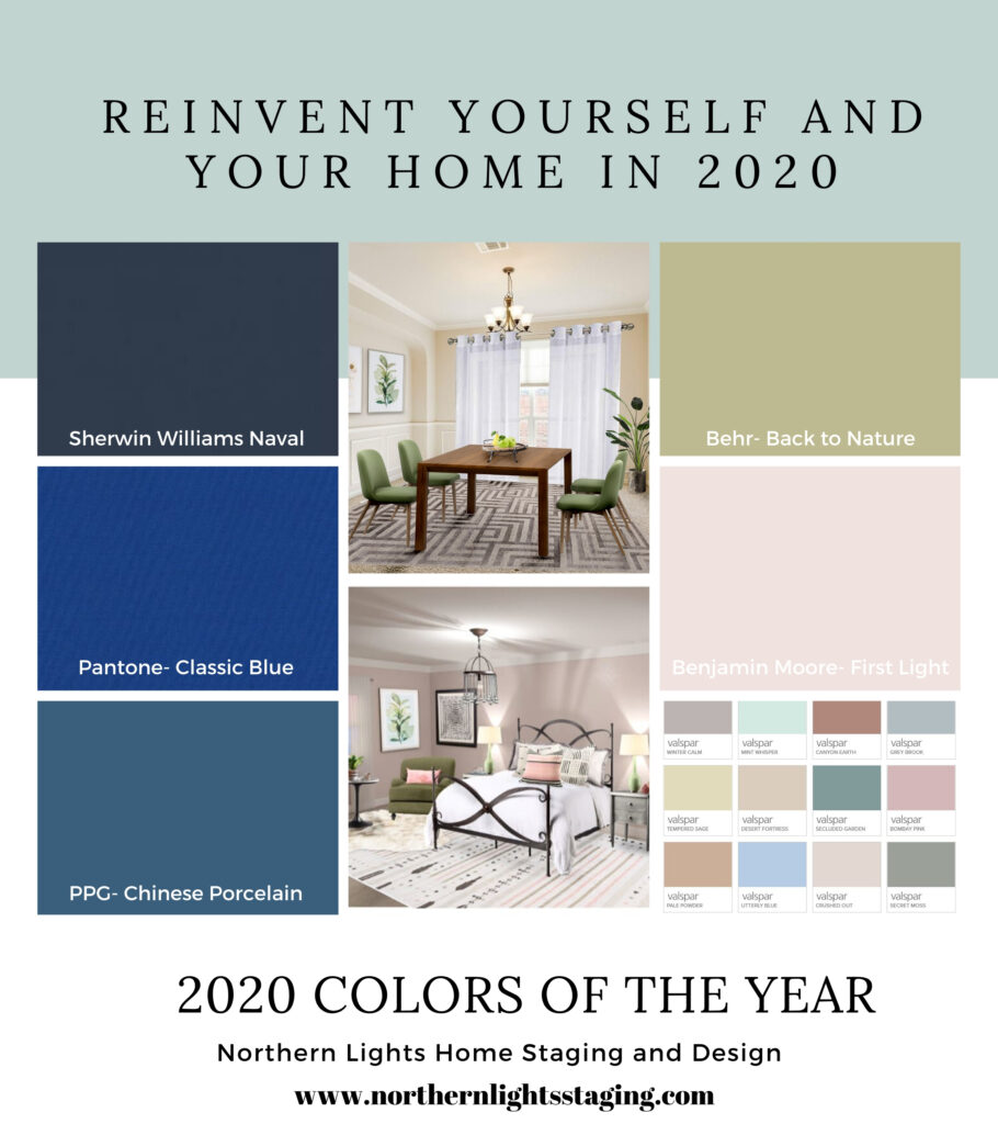
Color can also create a calm environment. Benjamin Moore’s 2020 color of the year First Light (a soft blush pink) is a calm, relaxing color that is great for a bedroom. Sherwin William’s 2020 color of the year Naval (dark navy), is described as a “rich navy that creates a calm and grounding environment infused with quiet confidence”.  Sherwin Williams says that “Naval merges the desire for rich, inspiring color with our yearning for relaxation and retreat.”  Even Pantone’s color of the year, Classic Blue, is described as a shade that would “bring a sense of calm to our fast-paced, technology-filled world”. “Reminiscent of a twilight sky, the deep shade of blue evokes a tranquil feeling.”  Deep blue is considered one of the most soothing shades. PPG’s color of the year Chinese Porcelain, is also a deep blue, described as “a shade of blue that instills calmness, reduces anxiety, and encourages sleep”. “This soothing blue imparts slowness, encouraging consumers to practice mindfulness and be more present in their lives”. Sounds like these paint companies were thinking about getting rid of the monkey chatter too!

Get Connected

One benefit of meditation is to connect to something greater than yourself. The universal energy. Get comfortable with yourself and then connect with everything around you and the energy of other living things. This need for connection with other living things is called “biophilia”, which I will write more about in an upcoming blog article. In terms of home design, to me that means “bringing the outside in”. One way to do this besides having lots of windows with views of nature is again, with color. Behr’s 2020 color of the year Back to Nature is a nice green they describe as a “restorative and revitalizing green hue that engages the senses and pairs well with other colors both inside and outside your home”. Classic Blue, Pantone’s 2020 color of the year, described as the color of “twilight” can also work. Valspar came up with 20 colors of the year for 2020, in shades of pinks, greens and neutrals all based on nature.

How to re-invent your life and home to be the ideal expression of yourself with the 2020 colors of the year and by connecting with nature.#edesign #onlinedesign #interiordesign #homedecor #coloroftheyear #backtonature #homedesign #homestyle #interiordecorating #interiorinspiration #interiorstyle #interiordesigner #moderndesign #globaldesign #global #bohemian #globalstyle #contemporary #boho #firstlight #paintcolors #reinventyourself #transformyourhome

If you decide to try one of the “colors of the year”, most vendors in the design industry are in tune with these colors so it is easy to find furnishings, accessories and art to work with them.

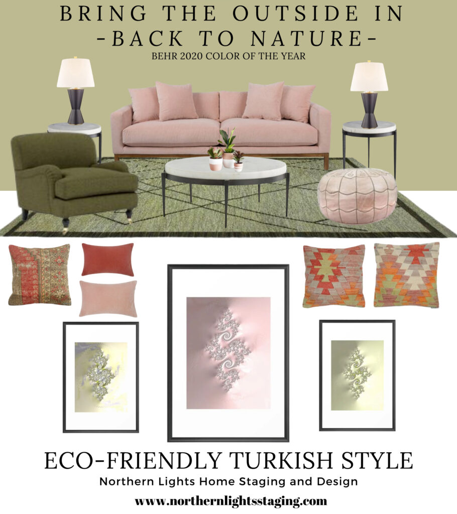
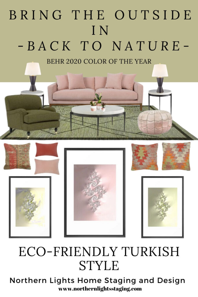
Here is an example of how you can pull together all the ideas that I mentioned.  I created this global style, eco-friendly design for a living room using Behr’s color of the year, Back to Nature. This design uses elements of Turkish style, with a beautiful handmade, authentic new kilim rug that has many of the traditional elements of true vintage Turkish Kilims. It is 10 x 13 and made of wool, so is eco-friendly. The Kilim pillow covers, (pillow 1, pillow 2, and pillow 3) are hand woven and made of 40-50 years old Turkish kilim fragments backed with cotton cloth. You can get 5% off the rug and pillows and anything you like at Kilim.com with code nls2019 at check out. I adore the soft look of the pink velvet sofa, which also comes in a beautiful shade very close to Back to Nature. The velvet lumbar pillows come in both coral and moss colors. The clean hour-glass shape of the black lamps go beautifully with the design of the Turkish rug. I also love the pink Moroccan pouf! The iron and marble side tables and coffee table add a modern, simple element and are eco-friendly.

Re-Invent Yourself and Your Home in 2020 with the 2020 colors of the year. #edesign #onlinedesign #interiordesign #homedecor #coloroftheyear #backtonature #homedesign #homestyle #interiordecorating #interiorinspiration #interiorstyle #interiordesigner #interiorforinspo #interiorandhome #moderndesign #globaldesign #bohemian #globalstyle #firstlight #paintcolors #reinventyourself #transformyourhome
Recommendations contain affiliate links, meaning they give me a small commission for sharing at no additional cost to you.

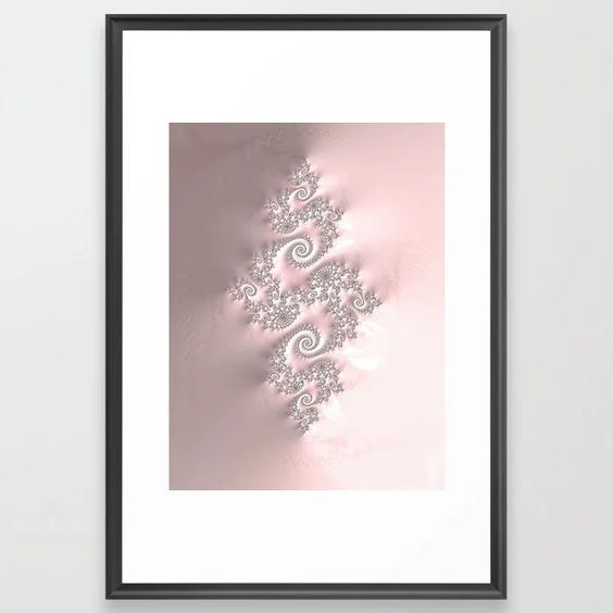
I created fractal art for this design to work with both Turkish style and the color Back to Nature. I think these elements would also go beautifully with Benjamin Moore’s First Light. The three designs, called Connection, Connecting and Connect work together and are available at my store on Society6.  Learn more about my fractal art in my article Fractal Art for Interior Design.

Connection- Fractal art by Mary Ann Benoit of Northern Lights Home Staging and Design.

Connecting- Fractal art by Mary Ann Benoit of Northern Lights Home Staging and Design.

 Connect- Fractal art by Mary Ann Benoit of Northern Lights Home Staging and Design.
Connect- Fractal art by Mary Ann Benoit of Northern Lights Home Staging and Design.

As I write this article, I realize that even though I was not thinking about design “trends”, the colors of the year perfectly reflect the direction I want to go in 2020. I assume many others feel the same, as the colors of the year tend to reflect the direction our culture is moving.

I hope this article inspires you to be your best self in the coming year and gives you a few ideas to get there. Happy New Year!


Need Help with Your Colors?

If you are ready to make a change, I’m here to help. Why not start with a color consultation. Learn more.


What's Your Global Design Style? Take this fun quiz to find out. Northern Lights Home Staging and Design #globalstyle #designstyle #interiordesign #onlinedesign #stylequiz #interiordesignquiz #interiorstylequiz


Call 907-362-0065 today
 info@northernlightsstaging.com

Northern Lights Home Staging and Design is an award winning company with training in home staging, Interior Design and color consulting. We have won numerous awards for customer service, our blog, youtube channel and Interior design.

Terms of Service

Privacy Policy

Disclaimer

Prices subject to change without notice.

Follow me on Pinterest

Re-Invent Yourself and Your Home in 2020 with the 2020 colors of the year. #edesign #onlinedesign #interiordesign #homedecor #coloroftheyear #backtonature #homedesign #homestyle #interiordecorating #interiorinspiration #interiorstyle #interiordesigner #interiorforinspo #interiorandhome #moderndesign #globaldesign #bohemian #globalstyle #firstlight #paintcolors #reinventyourself #transformyourhome

Re-Invent Yourself and Your Home in 2020 with the 2020 colors of the year. #edesign #onlinedesign #interiordesign #homedecor #coloroftheyear #backtonature #homedesign #homestyle #interiordecorating #interiorinspiration #interiorstyle #interiordesigner #interiorforinspo #interiorandhome #moderndesign #globaldesign #bohemian #globalstyle #firstlight #paintcolors #reinventyourself #transformyourhome How to re-invent your life and home to be the ideal expression of yourself with the 2020 colors of the year and by connecting with nature.#edesign #onlinedesign #interiordesign #homedecor #coloroftheyear #backtonature #homedesign #interiordecorating  #interiorstyling #interiordesigners #moderndesign #modern #globaldesign #global #bohemian #globalstyle #contemporary #boho #firstlight #paintcolors #reinventyourself #transformyourhome How to re-invent your life and home to be the ideal expression of yourself with the 2020 colors of the year and by connecting with nature.#edesign #onlinedesign #interiordesign #homedecor #coloroftheyear #backtonature #homedesign #interiordecorating  #interiorstyling #interiordesigners #moderndesign #modern #globaldesign #global #bohemian #globalstyle #contemporary #boho #firstlight #paintcolors #reinventyourself #transformyourhome How to re-invent your life and home to be the ideal expression of yourself with the 2020 colors of the year and by connecting with nature.#edesign #onlinedesign #interiordesign #homedecor #coloroftheyear #backtonature #homedesign #interiordecorating  #interiorstyling #interiordesigners #moderndesign #modern #globaldesign #global #bohemian #globalstyle #contemporary #boho #firstlight #paintcolors #reinventyourself #transformyourhome How to re-invent your life and home to be the ideal expression of yourself with the 2020 colors of the year and by connecting with nature.#edesign #onlinedesign #interiordesign #homedecor #coloroftheyear #backtonature #homedesign #interiordecorating  #interiorstyling #interiordesigners #moderndesign #modern #globaldesign #global #bohemian #globalstyle #contemporary #boho #firstlight #paintcolors #reinventyourself #transformyourhome Re-Invent Yourself and Your Home in 2020 with the 2020 colors of the year. #edesign #onlinedesign #interiordesign #homedecor #coloroftheyear #backtonature #homedesign #homestyle #interiordecorating #interiorinspiration #interiorstyle #interiordesigner #interiorforinspo #interiorandhome #moderndesign #globaldesign #bohemian #globalstyle #firstlight #paintcolors #reinventyourself #transformyourhome


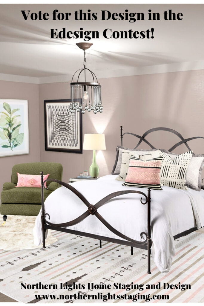
Vote for my Master Bedroom Design in the Edesign Contest

I recently entered an Edesign for this global style master bedroom in a contest! We were given room dimensions and a photo, and could develop any design we wanted. I had recently seen Benjamin Moore’s new 2020 color of the year, First Light, and was not really a fan, as I am not fond of “pink or blush” for wall colors. I decided to challenge myself to come up with a design I loved using “First Light” as the wall color for this contest.

The contest is for Edesigners of the Edesign Tribe of which I am a proud member. We were required to submit a concept board and a 3D render of the design.

I hope you will consider voting for my design:)

Voting is open for the contest now 12-20-19 through Tuesday, 12-24-19. Hope you will stop by and vote for my design here!

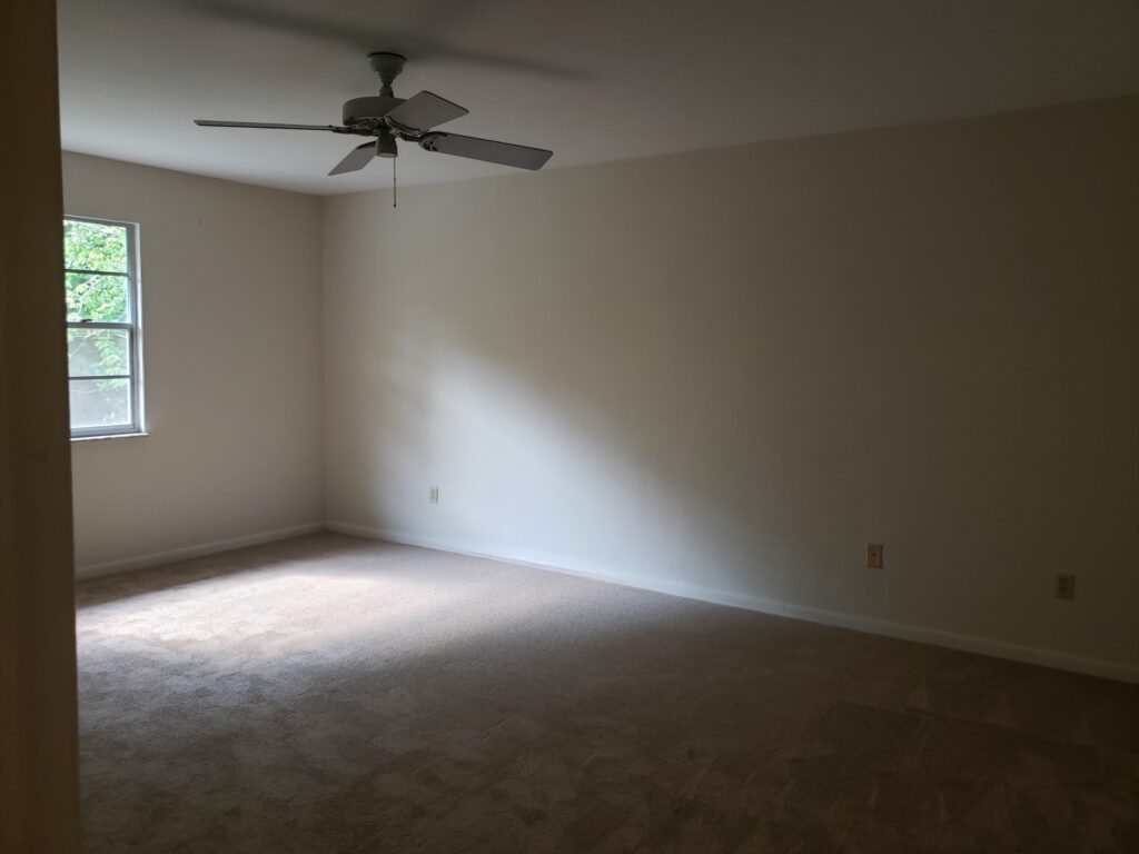
Before

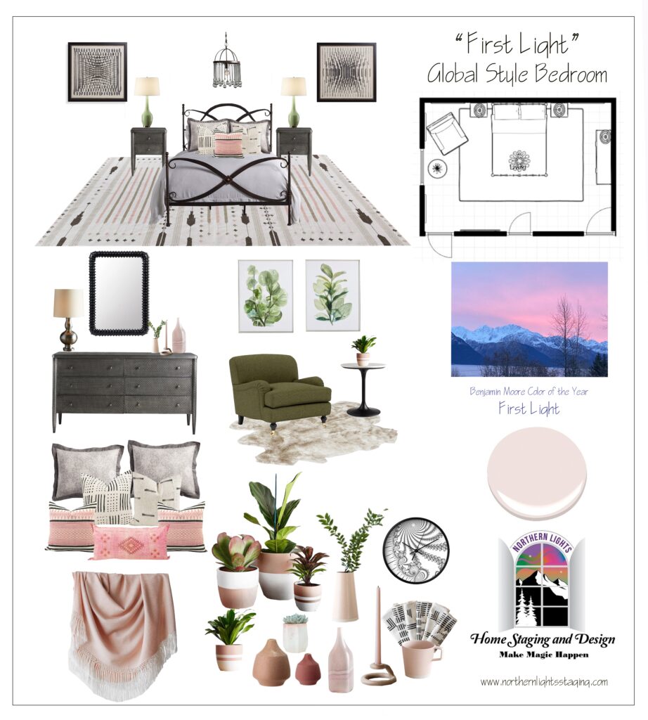
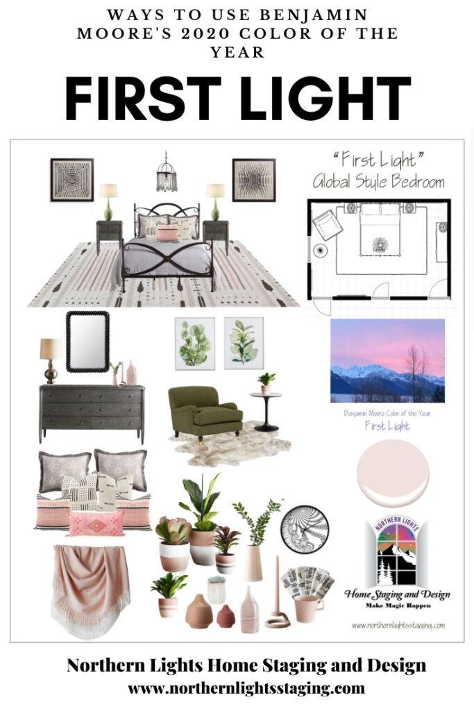
The Concept Board

My “ideal client” for this design was a single professional woman who prefers a more neutral palette, wants a serene space for her bedroom and of course, likes pink. She likes mixing modern and vintage pieces with a touch of glam and global style elements.

Ways to Use Benjamin Moore's 2020 Color of the Year- First Light even if you don't like the color. Global style master bedroom Edesign, online Interior Design. #edesign #onlinedesign #firstlight #benjaminmoore #coloroftheyear #colorconsulting #colorstrategist #masterbedroom #globalstyle #bohemian

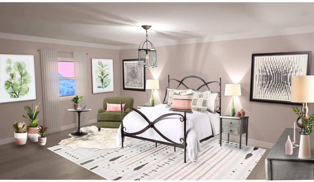
Final Design

Ways to Use Benjamin Moore's 2020 Color of the Year- First Light even if you don't like the color. Global style master bedroom Edesign, online Interior Design. #edesign #onlinedesign #firstlight #benjaminmoore #coloroftheyear #colorconsulting #colorstrategist #masterbedroom #globalstyle #bohemian

Learn More about this Design

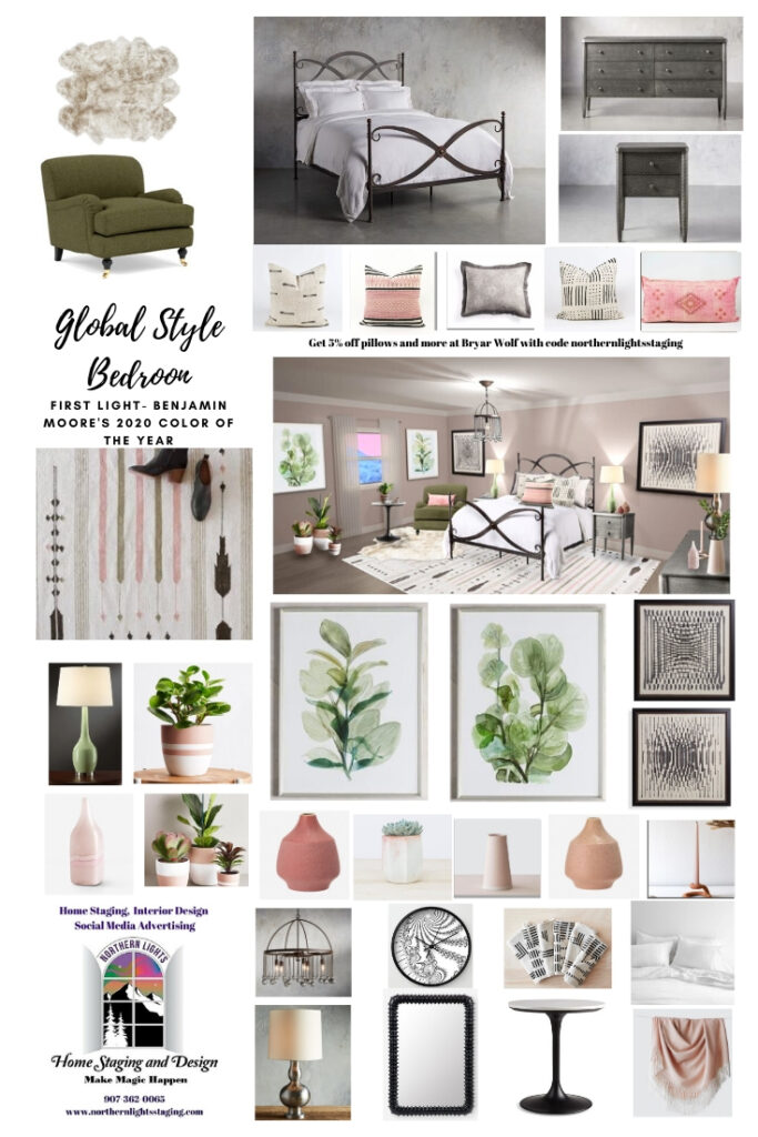
See my blog article, Ways to Use Benjamin Moore’s 2020 Color of the Year- First Light for the full story on how I developed this design. Like the products I used? Download this free shopping list.

Downloadable Free Shopping List

Ways to Use Benjamin Moore's 2020 Color of the Year- First Light even if you don't like the color. Global style master bedroom Edesign, online Interior Design. #edesign #onlinedesign #firstlight #benjaminmoore #coloroftheyear #colorconsulting #colorstrategist #masterbedroom #globalstyle #bohemian

Learn More about Edesign

Wondering what Edesign is? Check out my latest blog article, Edesign- How it Works.

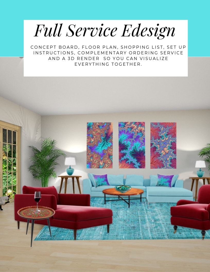
The design above is an example of full service Edesign, where you would get a floor plan, a concept board, a 3D render and a complete shopping list with set up instructions. Check out my Full Service Edesign package. See all my Edesign and Online packages here.

Full Service Edesign package by Northern Lights Home Staging and Design.

What’s Your Global Design Style?

The project above is an example of global style design. Are you curious what your global style is? Take the quiz and find out.

What's Your Global Design Style? Take this fun quiz to find out. Northern Lights Home Staging and Design #globalstyle #designstyle #interiordesign #onlinedesign #stylequiz #interiordesignquiz #interiorstylequiz

Give the Gift of a Beautiful Home

Know someone that could use a hand with their home? Why not give a gift card for Edesign for an online Interior Design or Color consultation to a friend?

Call 907-362-0065 today
 info@northernlightsstaging.com

Northern Lights Home Staging and Design is an award winning company with training in home staging, Interior Design and color consulting. We have won numerous awards for customer service, our blog, youtube channel and Interior design.

Terms of Service

Privacy Policy

Disclaimer

Prices subject to change without notice.


Follow me on Pinterest

Vote for this Design in the Edesign Contest.Ways to Use Benjamin Moore's 2020 Color of the Year- First Light even if you don't like the color. Global style master bedroom Edesign, online Interior Design. #edesign #onlinedesign #firstlight #benjaminmoore #coloroftheyear #colorconsulting #colorstrategist #masterbedroom #globalstyle #bohemianvirtual


Ways to Use Benjamin Moore's 2020 Color of the Year- First Light even if you don't like the color. Global style master bedroom Edesign, online Interior Design. #edesign #onlinedesign #firstlight #benjaminmoore #coloroftheyear #colorconsulting #colorstrategist #masterbedroom #globalstyle #bohemian Ways to Use Benjamin Moore's 2020 Color of the Year- First Light even if you don't like the color. Global style master bedroom Edesign, online Interior Design. #edesign #onlinedesign #firstlight #benjaminmoore #coloroftheyear #colorconsulting #colorstrategist #masterbedroom #globalstyle #bohemian


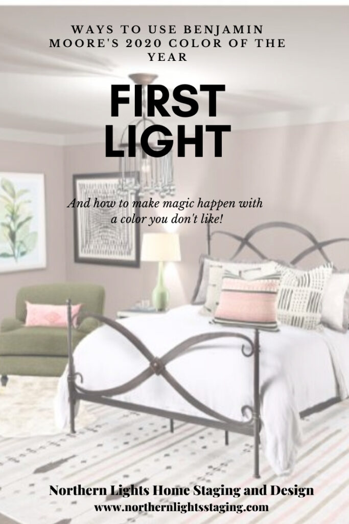
Ways to Use Benjamin Moore’s 2020 Color of the Year- First Light

How to Make Magic Happen with a Color You Don’t Like

As  a certified color strategist, I get excited when the major paint brands announce their colors of the year, and dream about how I can use the colors in a design, various global styles, or create color palettes for you to use the new colors.

When I first saw Benjamin Moore’s color of the year for 2020, “First Light”, I thought “meh”.

Ways to Use Benjamin Moore's 2020 Color of the Year- First Light even if you don't like the color. Global style master bedroom Edesign, online Interior Design. #edesign #onlinedesign #firstlight #benjaminmoore #coloroftheyear #colorconsulting #colorstrategist #masterbedroom #globalstyle #bohemian

I am not a pink/blush person, and generally love working with rich saturated colors over pastel colors. I also love global style Interior Design, and most global styles have a richer color palette. If I use pink, I like to go bold or go home such as with a  deep rich fuchsia! I thought “First Light” was boring. Even for home staging, where I usually select more neutral colors to help sell homes, this color has enough chroma to look “too pink” for most buyers.

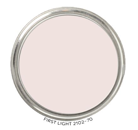
Benjamin Moore describes it as a  “soft, rosy hue blooming with potential”, and they say  “a refreshing wash of pink, First Light 2102-70 uplifts”.

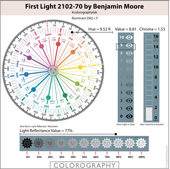
According to the color data, “First Light” is a warm Red hue bordering on yellow/red, that is very light and that has low color saturation or chroma. Notice I said nothing about “undertones” (just put that meaningless term out of your mind). The way it will look on your wall is based on the hue family (red), the light, surrounding colors and your own vision. Here is the magic tool I use to measure color.

Ways to Use Benjamin Moore's 2020 Color of the Year- First Light even if you don't like the color. Global style master bedroom Edesign, online Interior Design. #edesign #onlinedesign #firstlight #benjaminmoore #coloroftheyear #colorconsulting #colorstrategist #masterbedroom #globalstyle #bohemian

I decided to challenge myself to come up with a design I love using “First Light” as the wall color. Soon after, I heard of a design contest for Edesigners of the Edesign Tribe of which I am a proud member, to provide a design for a master bedroom. I thought, OK First Light, Bring It On! How can I use you to create a beautiful global style bedroom that is interesting, unique and still colorful?

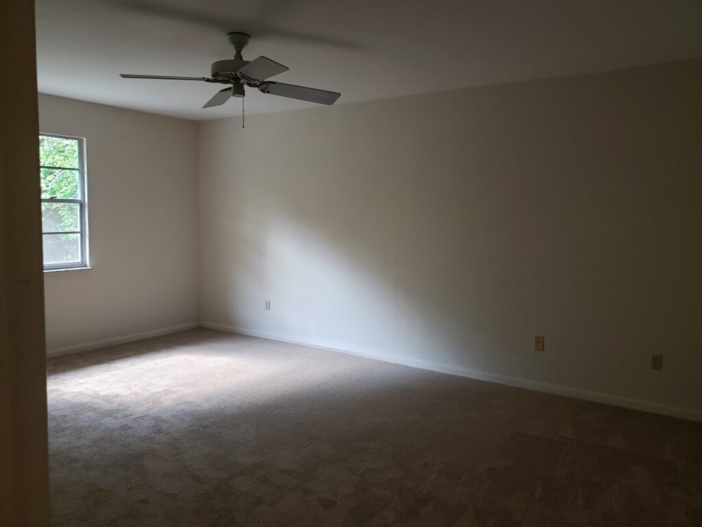
Before

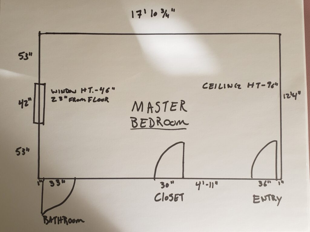
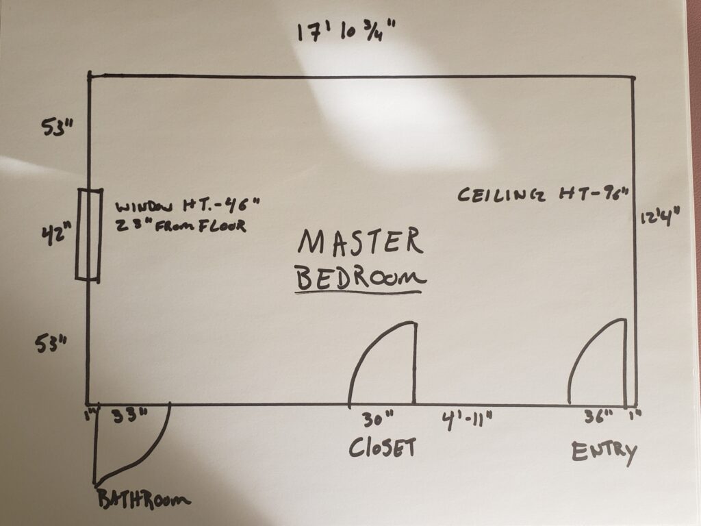
For the contest, we were provided some empty room photos and measurements. We could do whatever style we wanted and could choose who our ideal client was.

The Concept

My “ideal client” is a single professional woman who prefers a more neutral palette, wants a serene space for her bedroom and of course, likes pink. She likes mixing modern and vintage pieces with a touch of glam and global style elements.

Here is the concept board showing the floor plan and the elements I chose for the design. The door on the left goes to the master bath, center door is the closet and right hand door is the entry to the bedroom. Because this south wall is mainly a travel corridor, there is no furniture. Only a ” The Frame TV” that can display art when not in use near the bathroom door, and my unique fractal art clock on the wall between the entry and the closet.

Ways to Use Benjamin Moore's 2020 Color of the Year- First Light even if you don't like the color. Global style master bedroom Edesign, online Interior Design. #edesign #onlinedesign #firstlight #benjaminmoore #coloroftheyear #colorconsulting #colorstrategist #masterbedroom #globalstyle #bohemian

Inspiration

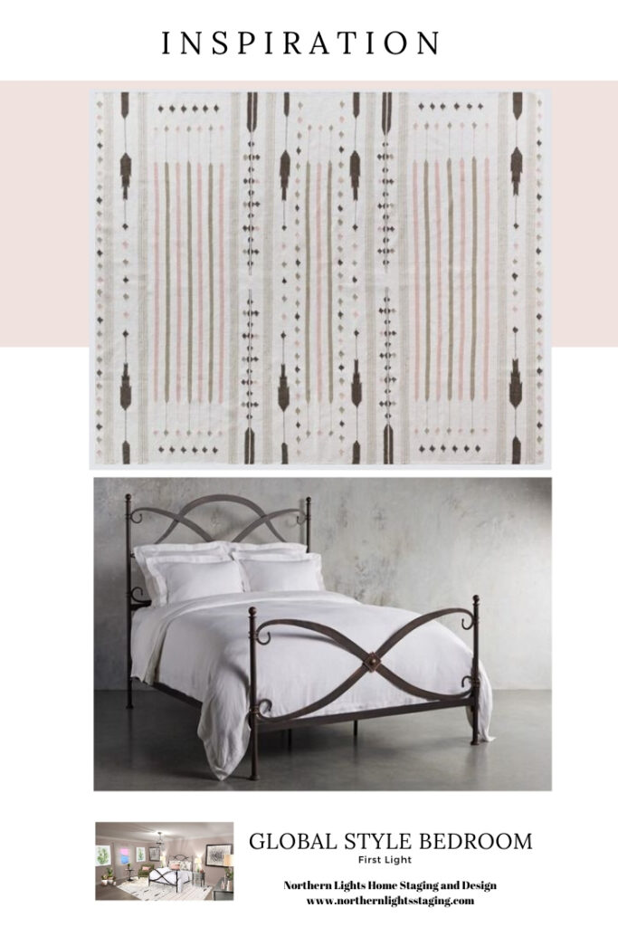
I searched for inspiration by looking for two key pieces, a global style rug and a beautiful bed.

I found this gorgeous handwoven wool area rug from India in tones of blush, olive, cream and black which provided a global style focal point and set the color palette for the rest of the room.

The gorgeous bed has beautiful curves to contrast with the straight lines of the rug, it’s dark metal worked nicely with the black in the rug and it has old world charm and a vintage feel.

Ways to Use Benjamin Moore's 2020 Color of the Year- First Light even if you don't like the color. Global style master bedroom Edesign, online Interior Design. #edesign #onlinedesign #firstlight #benjaminmoore #coloroftheyear #colorconsulting #colorstrategist #masterbedroom #globalstyle #bohemian

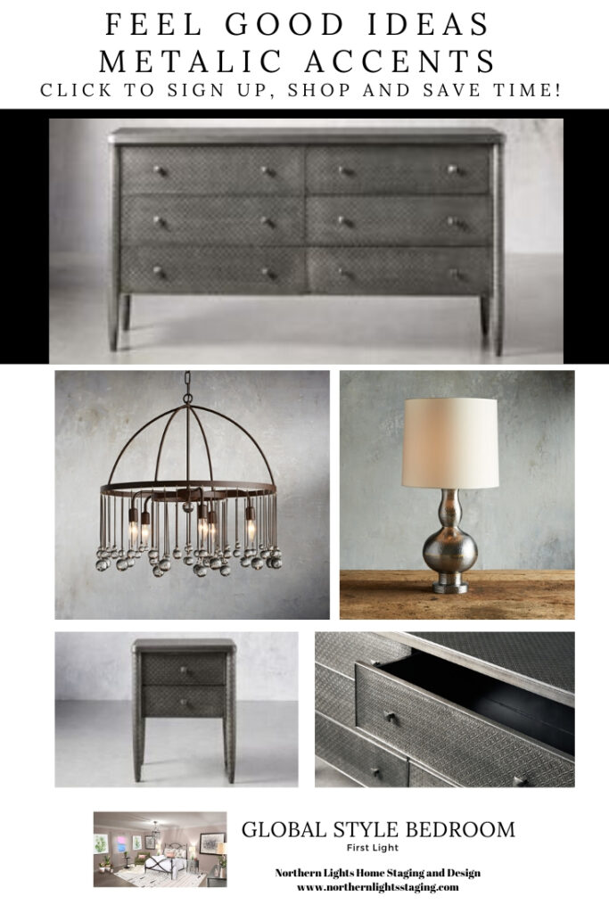
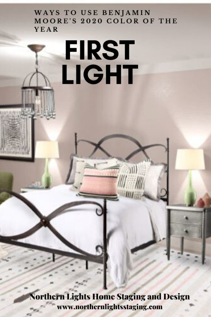
To work with the wrought iron and vintage look of the bed, I chose other metal accents such as the dresser and end tables made with aluminum sheets pressed with a delicate pattern, an iron and crystal chandelier for a touch of glam, and an antique hammered metal lamp. I thought the metals would provide a little masculine energy to balance out the feminine energy of the pink walls.

Ways to Use Benjamin Moore's 2020 Color of the Year- First Light even if you don't like the color. Global style master bedroom Edesign, online Interior Design. #edesign #onlinedesign #firstlight #benjaminmoore #coloroftheyear #colorconsulting #colorstrategist #masterbedroom #globalstyle #bohemian

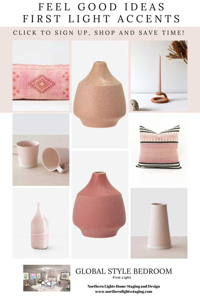
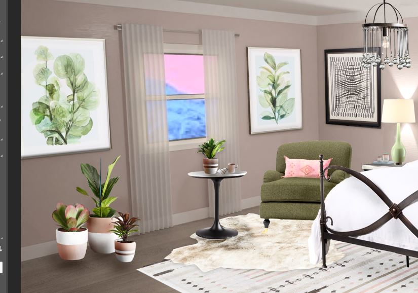
I added a variety of global style and natural elements in pink, blush and various shades similar to “First Light”.

Ways to Use Benjamin Moore's 2020 Color of the Year- First Light even if you don't like the color. Global style master bedroom Edesign, online Interior Design. #edesign #onlinedesign #firstlight #benjaminmoore #coloroftheyear #colorconsulting #colorstrategist #masterbedroom #globalstyle #bohemian

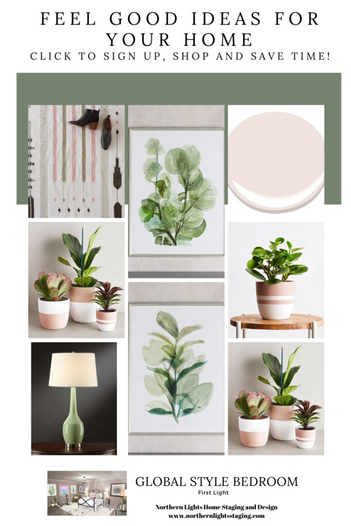
To pull in the olive color from the rug and other harmonious shades of green, I selected a soft side chair, green end table lamps, art and plants. The greens and green/blues work perfectly with First Light as they are complimentary colors on the opposite side of the color wheel.

Ways to Use Benjamin Moore's 2020 Color of the Year- First Light even if you don't like the color. Global style master bedroom Edesign, online Interior Design. #edesign #onlinedesign #firstlight #benjaminmoore #coloroftheyear #colorconsulting #colorstrategist #masterbedroom #globalstyle #bohemian

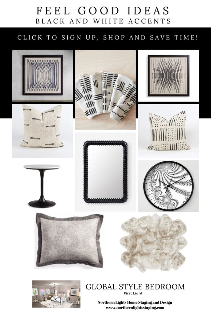
To provide depth and highlight the other colors, I added black and white accents.

Ways to Use Benjamin Moore's 2020 Color of the Year- First Light even if you don't like the color. Global style master bedroom Edesign, online Interior Design. #edesign #onlinedesign #firstlight #benjaminmoore #coloroftheyear #colorconsulting #colorstrategist #masterbedroom #globalstyle #bohemian

Final Design

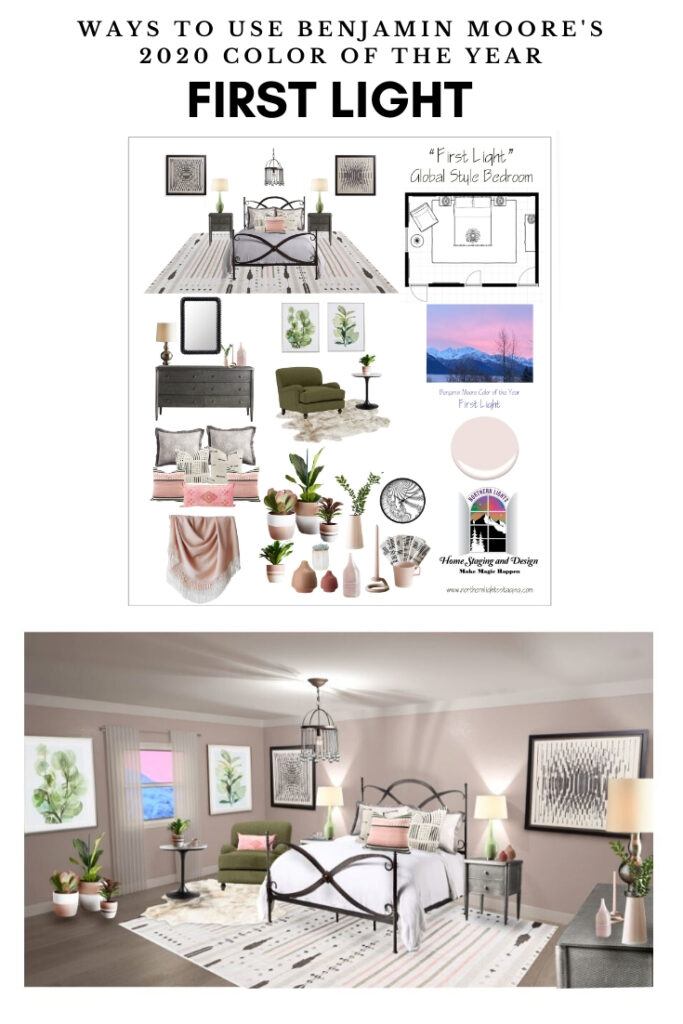
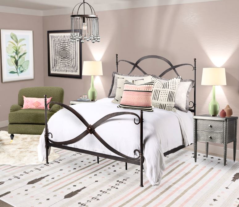
Here is the final design, created as a 3D computer render, and several close up views.

Ways to Use Benjamin Moore's 2020 Color of the Year- First Light even if you don't like the color. Global style master bedroom Edesign, online Interior Design. #edesign #onlinedesign #firstlight #benjaminmoore #coloroftheyear #colorconsulting #colorstrategist #masterbedroom #globalstyle #bohemian Ways to Use Benjamin Moore's 2020 Color of the Year- First Light even if you don't like the color. Global style master bedroom Edesign, online Interior Design. #edesign #onlinedesign #firstlight #benjaminmoore #coloroftheyear #colorconsulting #colorstrategist #masterbedroom #globalstyle #bohemian Ways to Use Benjamin Moore's 2020 Color of the Year- First Light even if you don't like the color. Global style master bedroom Edesign, online Interior Design. #edesign #onlinedesign #firstlight #benjaminmoore #coloroftheyear #colorconsulting #colorstrategist #masterbedroom #globalstyle #bohemian

Shopping List

Do you love the products in this design? Sign up to get a clickable pdf with links to all the products as well as my monthly design and color tips. Unsubscribe anytime. It contains affiliate links, meaning they give me a small commission for sharing at no additional cost to you.

Downloadable Shopping List

Ways to Use Benjamin Moore's 2020 Color of the Year- First Light even if you don't like the color. Global style master bedroom Edesign, online Interior Design. #edesign #onlinedesign #firstlight #benjaminmoore #coloroftheyear #colorconsulting #colorstrategist #masterbedroom #globalstyle #bohemian

Vote in the Contest!

I hope you love this design as much as I do, and you will stop by and vote for my design in the contest! Contest voting will be December 13-15. I will post the link to vote HERE on December 13.

Do I like First Light Now?

You might be wondering if I like the color now that the design is done. Not really. I do love the design though!  I love the color combinations, the mix of masculine and feminine, softness and hardness, the mix of straight lines and curves, the feeling of serenity the room evokes. It seems like a wonderful place to wake up at “first light” in a gorgeous bed, and then snuggle up on the soft chair with bare feet on the sheepskin rug and a great cup of coffee while watching the sun comes up.

It just goes to show that you can create something beautiful by putting the right design elements together, even if you don’t have everything you want. This is great thing to remember as you develop your design plan, or if you choose to do Redesign, working with what you already have. I hope it also re-assures you that a good designer can design to create something you love, even if it is not something they love. It is all about you, after all!

Are You Inspired?

The design above is an example of full service Edesign, where you would get a floor plan, a concept board, a 3D render and a complete shopping list with set up instructions. Check out my Full Service Edesign package. Learn more.

Full Service Edesign package by Northern Lights Home Staging and Design.

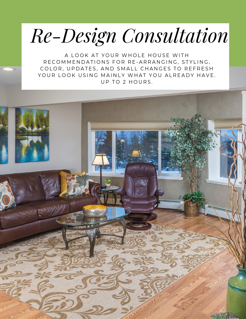
Above, I mentioned Redesign, where we work with what you already have. Here is my Interior ReDesign consultation package. Learn More.

Interior Redesign Services by Northern Lights Home Staging and Design #interiordesign #redesign

You can see all my other online and Edesign services here, as well as my color consultation packages if you need help with your own colors. I offer science based color consulting, using both the art and science of color together to get your colors right the first time!.

Having problems picking the right color because you are stumped by so called “undertones”? Are the paint colors you have selected shifting blue, green or another color once they are on the wall? Not sure how to pick the right white? Wondering what paint colors will go with the countertops you have selected for your kitchen or bath remodel? Wondering if that countertop will go with your existing flooring or other fixed finishes? Not sure how to find the right paint colors to go with that rug, piece of art or furniture that you want to use in your design? I can take the guesswork out of all of these things by using color measurements. Northern Lights Home Staging and Design. Certified Color Strategist.


What’s Your Global Design Style?

The project above is an example of global style design. Are you curious what your global style is? Take the quiz and find out.

What's Your Global Design Style? Take this fun quiz to find out. Northern Lights Home Staging and Design #globalstyle #designstyle #interiordesign #onlinedesign #stylequiz #interiordesignquiz #interiorstylequiz

Why work with Northern Lights Home Staging and Design

Call 907-362-0065 today
 info@northernlightsstaging.com

Terms of Service

Privacy Policy
Disclaimer

Prices subject to change without notice.


Follow me on Pinterest


Ways to Use Benjamin Moore's 2020 Color of the Year- First Light even if you don't like the color. Global style master bedroom Edesign, online Interior Design. #edesign #onlinedesign #firstlight #benjaminmoore #coloroftheyear #colorconsulting #colorstrategist #masterbedroom #globalstyle #bohemian Ways to Use Benjamin Moore's 2020 Color of the Year- First Light even if you don't like the color. Global style master bedroom Edesign, online Interior Design. #edesign #onlinedesign #firstlight #benjaminmoore #coloroftheyear #colorconsulting #colorstrategist #masterbedroom #globalstyle #bohemian Ways to Use Benjamin Moore's 2020 Color of the Year- First Light even if you don't like the color. Global style master bedroom Edesign, online Interior Design. #edesign #onlinedesign #firstlight #benjaminmoore #coloroftheyear #colorconsulting #colorstrategist #masterbedroom #globalstyle #bohemian Ways to Use Benjamin Moore's 2020 Color of the Year- First Light even if you don't like the color. Global style master bedroom Edesign, online Interior Design. #edesign #onlinedesign #firstlight #benjaminmoore #coloroftheyear #colorconsulting #colorstrategist #masterbedroom #globalstyle #bohemian Ways to Use Benjamin Moore's 2020 Color of the Year- First Light even if you don't like the color. Global style master bedroom Edesign, online Interior Design. #edesign #onlinedesign #firstlight #benjaminmoore #coloroftheyear #colorconsulting #colorstrategist #masterbedroom #globalstyle #bohemian