Whether you are remodeling, selling your house, updating your vacation rental or just want to give your home a new look or feel, we can help you with a color consultation.
Bed and Breakfast Exterior Color and Design
What does the color of your house say about you? Is it inviting to guests or customers if you have a home based business? Does it send a message to others about who you are? Do you run a business from your house, such as a vacation rental? What image will the colors project to your customers? Is it consistent with your brand? You may be using photos of your house to attract customers online. Will the photos attract your ideal customer?
Color is a personal thing. People see colors differently and have an emotional response to what they see and surround themselves with. People tend to be drawn to different colors based on their nature. Does the color make you feel relaxed, happy, energized, inspired, or depressed? How do you want to feel in the home?
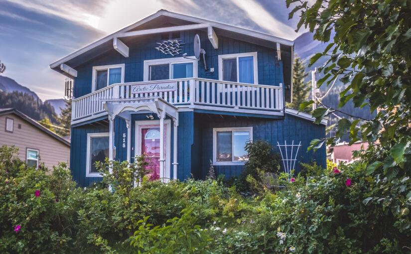
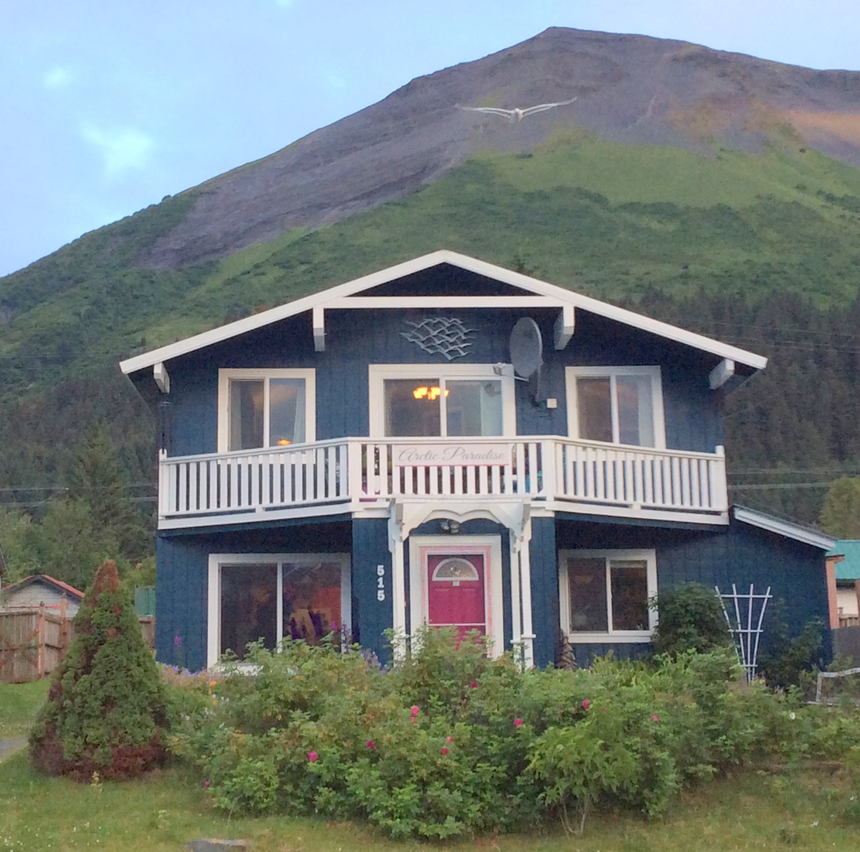
As a color strategist, I helped this Bed and Breakfast owner determine exterior colors and other decorative aspects for the business in a residential neighborhood. The goal was to create a unique but welcoming and relaxing color scheme that would fit into the surroundings (mountains ocean, glaciers), the neighborhood (an eclectic mix of neutral and colorful homes) and work with the landscaping (colorful flowers, primarily in shades of purple dominated by rose bushes with primarily fuchsia blooms. The roof was blue and there were no other fixed finishes to consider. I had previously done Interior Design work for this Bed and Breakfast which helped at least double the income and bookings and helped with branding and attracting the ideal customer identified for the business. Ideal customers were retired professional couples interested in outdoor adventures, wildlife viewing, bird watching and art. The current brand was colorful, relaxing, artistic and luxurious, but comfortable and down to earth.
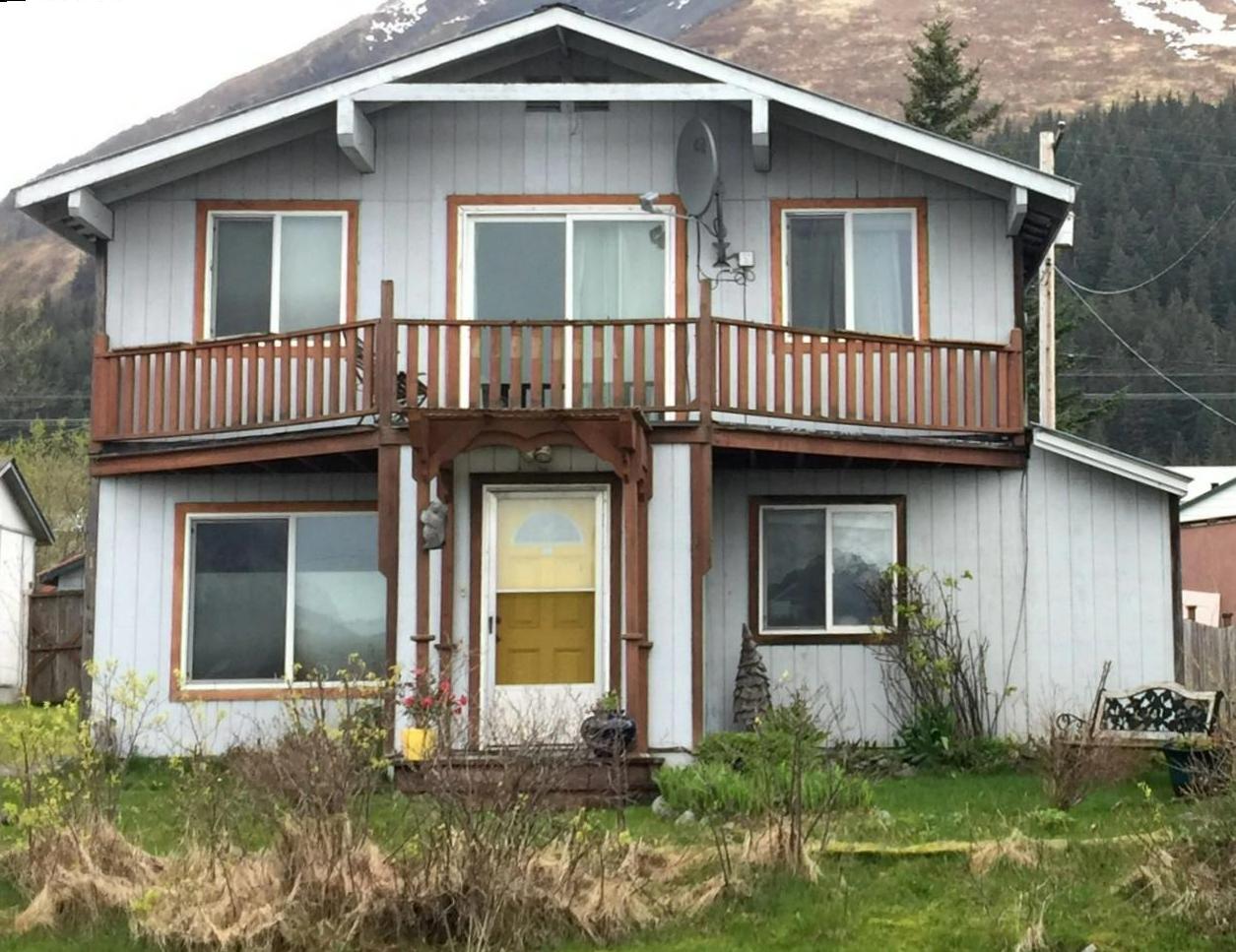
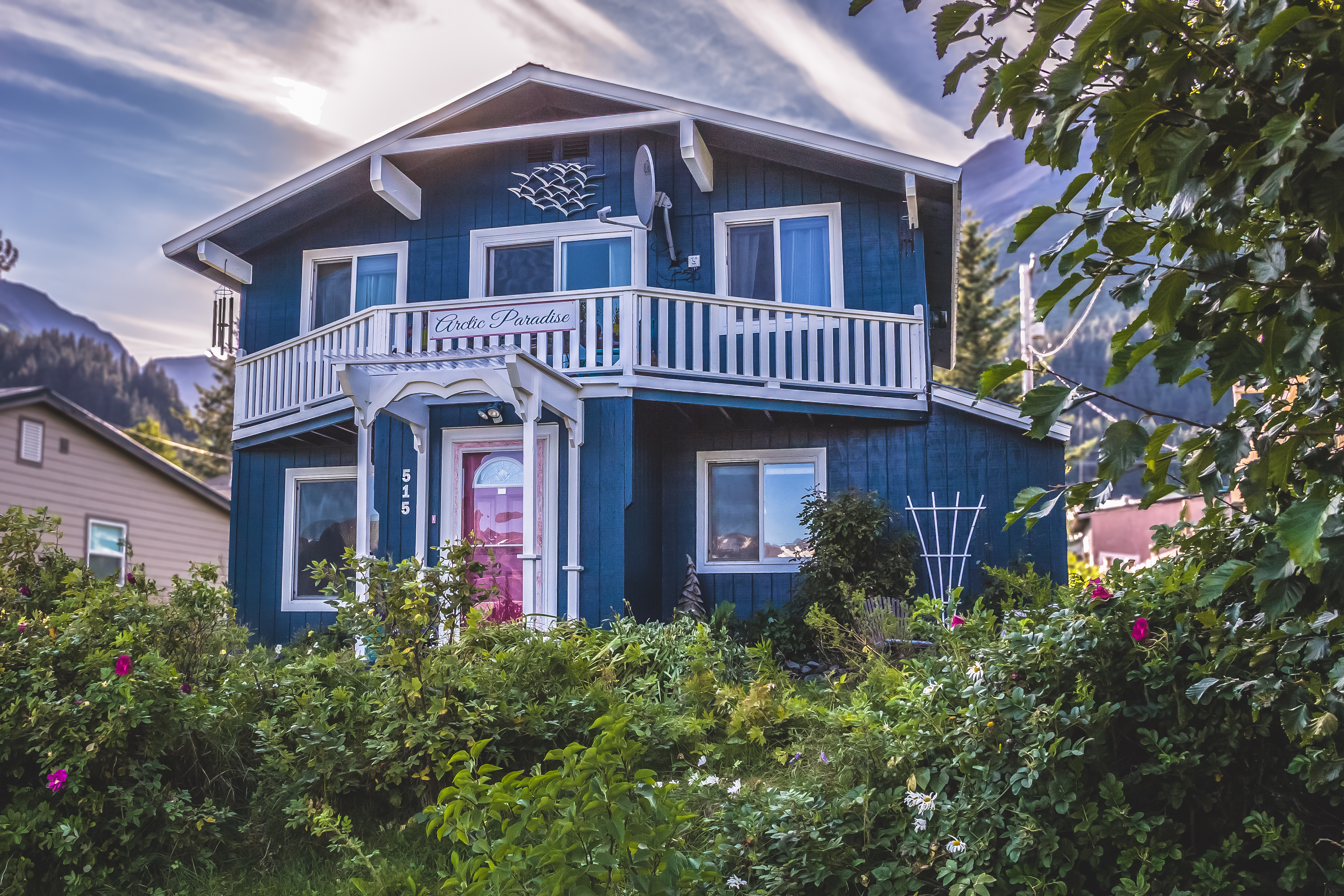
A deep, rich teal color (Sherwin Williams Moscow Midnight) was selected for the walls to harmonize with the roof and surrounding mountains and ocean. It also worked well with the neighborhood which had numerous blue and turquoise houses (mainly lighter shades). The dark color made the colors of all the flowers in the landscaping “pop”, particularly the purples, yellows and reds. It also blended perfectly with the greenery of the landscaping and mountains.
A warm white trim color (Sherwin Williams Alabaster) was selected to highlight the blue and harmonize with colors of the clouds and snow-capped peaks in the surroundings. This bright but warm white with a touch of yellow was selected to provide a nice balance to the cool blue walls. Leaving the cedar trim and decks their natural color, although convenient, would not have worked with the blue. White was also selected for the second floor deck to keep the temperature cooler, as the deep blue of the walls would absorb heat. The white deck and trim provided a background for colorful outdoor furniture and plants that were harmonious with the rich teal walls and provides a relaxing sanctuary for the owner.
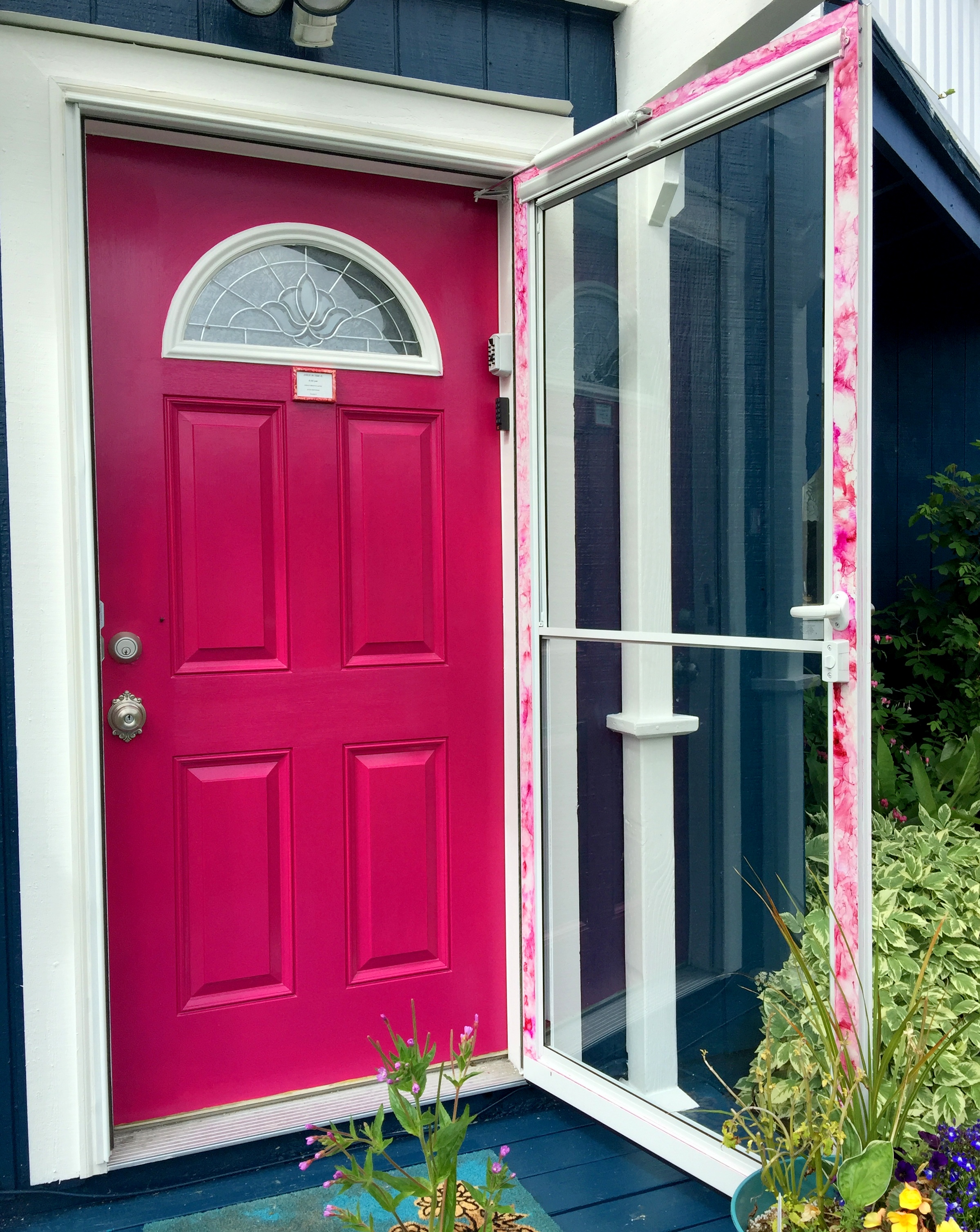
Forward Fuchsia was selected for the front and back door to highlight the color of roses in front of the house and provide an inviting, unique and fun front door.
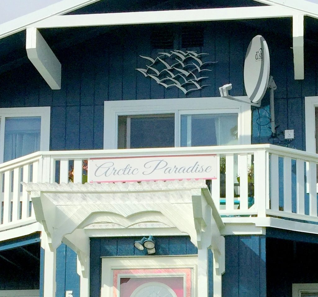
A sign was designed using the trim color for the background, the wall color for the lettering and two lines in Fuchsia. The sign blends nicely with the balcony, providing the business name without standing out too much in the residential neighborhood.
A metal bird sculpture depicting a flock of sea gulls was painted white to match the trim and placed near the peak of the home to highlight the brand and focus on wildlife viewing for the business.
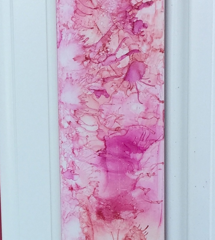
A new white screen door was placed at the front door with full glass to highlight the fuchsia door. The border was decorated with a unique alcohol ink design to highlight the colors of the door and flowers and add the artistic element of the brand. The front doorknob was replaced with an artistic satin nickel design to replace the older brass doorknob.
Even the shed in the back was painted with the new colors, including a fuchsia door.
Comments from neighbors, customers and friends on the new look included that it looks “Bright, cheery and comfortable looking, a beautiful work of art in progress, lovely, beautiful transformation, beautiful use of color, love the door, love the birds, has to be the most charming B&B in Alaska!”
It also has started a wave of comments from the neighbors about how they needed to paint their house too, which over time will help update the look of the whole neighborhood!
The triad of colors were selected and measured to work together in terms of warm and cool aspects, saturation, brightness and a perfect balance of hue families using both the art and science of color. If you are getting ready to paint your house, consider getting help from a certified color strategist. Get your colors right the first time! Make a statement that reflects you, makes you happy and is welcoming to your guests and neighbors.
Vacation Rental Color Consultation and Staging
I staged this property, that had been a rental unit for the owner to sell. They realized they could make more money by keeping it as a rental and used the staging to increase their income and bookings instead! The new beautiful photos created a buzz online, attracting more interest than they had previously had and allowed them to increase their rental price and bookings. A key to success on this property was changing the paint colors that had been selected by renters over time to a more neutral color palette that would appeal to most customers. Color was added through the accents and art to create an appealing space with great photos that attracted lots of vacation rental guest online.
Download our free brochure here.
Check out our publications
Call 907-362-0065 today
info@northernlightsstaging.com

