The Beauty of Seeing the World in Shades of Red

The Beauty of Seeing the World in Shades of Red

Do you love the look of Global Style Design? It is filled with rich colors, exotic designs, and hand-made works of art that bring the beauty of different cultures to life in your space.

Is red your favorite color?

Red is often associated with love, passion, fire and heat, strength, power, courage,  vibrant energy, and excitement.

Red can be dramatic when used in your décor.

Like all colors, red means different things in different cultures. Often, when you see red as a color in a country’s flag,  it is often an important color in that culture.

One thing is for sure.  Red is not a  boring color and can make a dramatic statement. Be bold and use it as your primary color or as an accent.

Get the Look

Get the look of various global styles with a great red paint color, global style rugs, pillows, art, and lighting. See examples of some of my Edesigns below.

Shades of Red in Mexican Style Design

Shades of red are prevalent in Mexican Style Design.

The Beauty of Seeing the World in Shades of Red
Red is often used in Mexican Style design. Edesign and original fractal art by Northern Lights Home Staging and Design.

Great Conjunction fractal art by Mary Ann Benoit.  

Mexican Style Edesign by Northern Lights Home Staging and Design
Heart of Mexico #3 energy art by Mary Ann Benoit.

Shades of Red in Turkish Style Design

Shades of red are often used in Turkish-style designs.

The Beauty of Seeing the World in Shades of Red
Edesign by Northern Lights Home Staging and Design
Turkish style Edesign by Northern Lights Home Staging and Design
"Heart of Turkey #3" energy art by Mary Ann Benoit
"Heart of Turkey" energy art by Mary Ann Benoit

Shades of Red in Modern Global Styles

Modern global styles are clean and uncluttered, with more straight lines but mixed with patterns and textures from a variety of countries in the rugs, pillows and often the art.

Notice how the same room looks very different by using different shades of red for the wall color.

"Roses" energy art and edesign by Northern Lights Home Staging and Design
"Rose" fractal art by Mary Ann Benoit

See how the whole look changes by changing the paint color and trying a different shade of red.


The Beauty of Seeing the World in Shades of Red
Edesign by Northern Lights Home Staging and Design
The Beauty of Seeing the World in Shades of Red
Edesign by Northern Lights Home Staging and Design
The Beauty of Seeing the World in Shades of Red
Edesign by Northern Lights Home Staging and Design

Are You Ready to See the Beauty of Red in Your Home?

Are you ready to create your perfect space with Global Style design? Let’s tell your unique story and find the alignment of art, science, and energy that makes you happy.  Let me help you take that trip to your perfect space in a Ferrari instead of a stagecoach. Try my Aligned Design consultation and let’s get started.

Pin This

The Beauty of Seeing the World in Shades of Red

By Mary Ann Benoit

President- Northern Lights Home Staging and Design Owner- Arctic Paradise Bed and Breakfast Artist- Stained Glass, Jewelry and Alcohol Ink Art Wildlife Biologist Director- Kaleido World Percussion and Dance Company Director- Tavus Dance Company of Alaska Lover of music, art, dance and animals.

12 comments

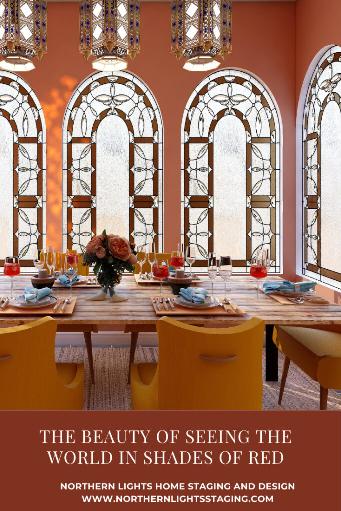
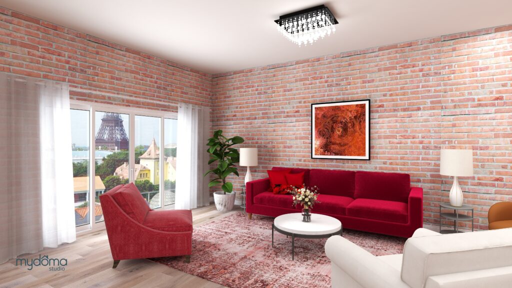
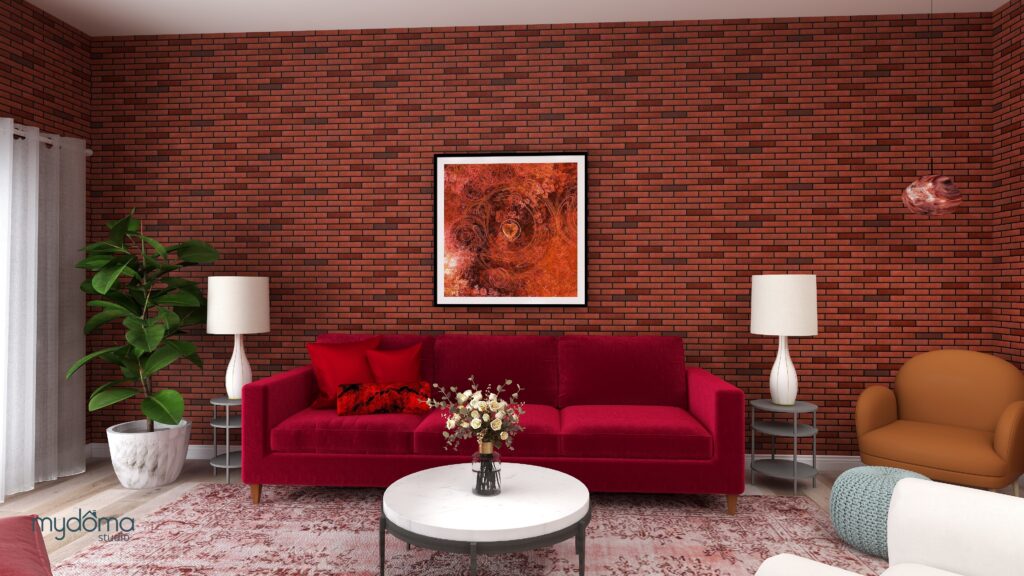
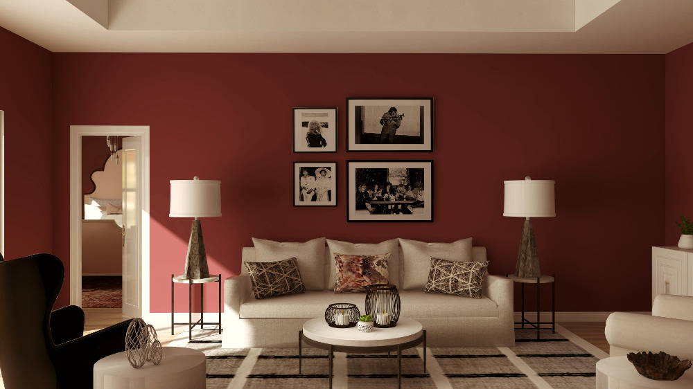
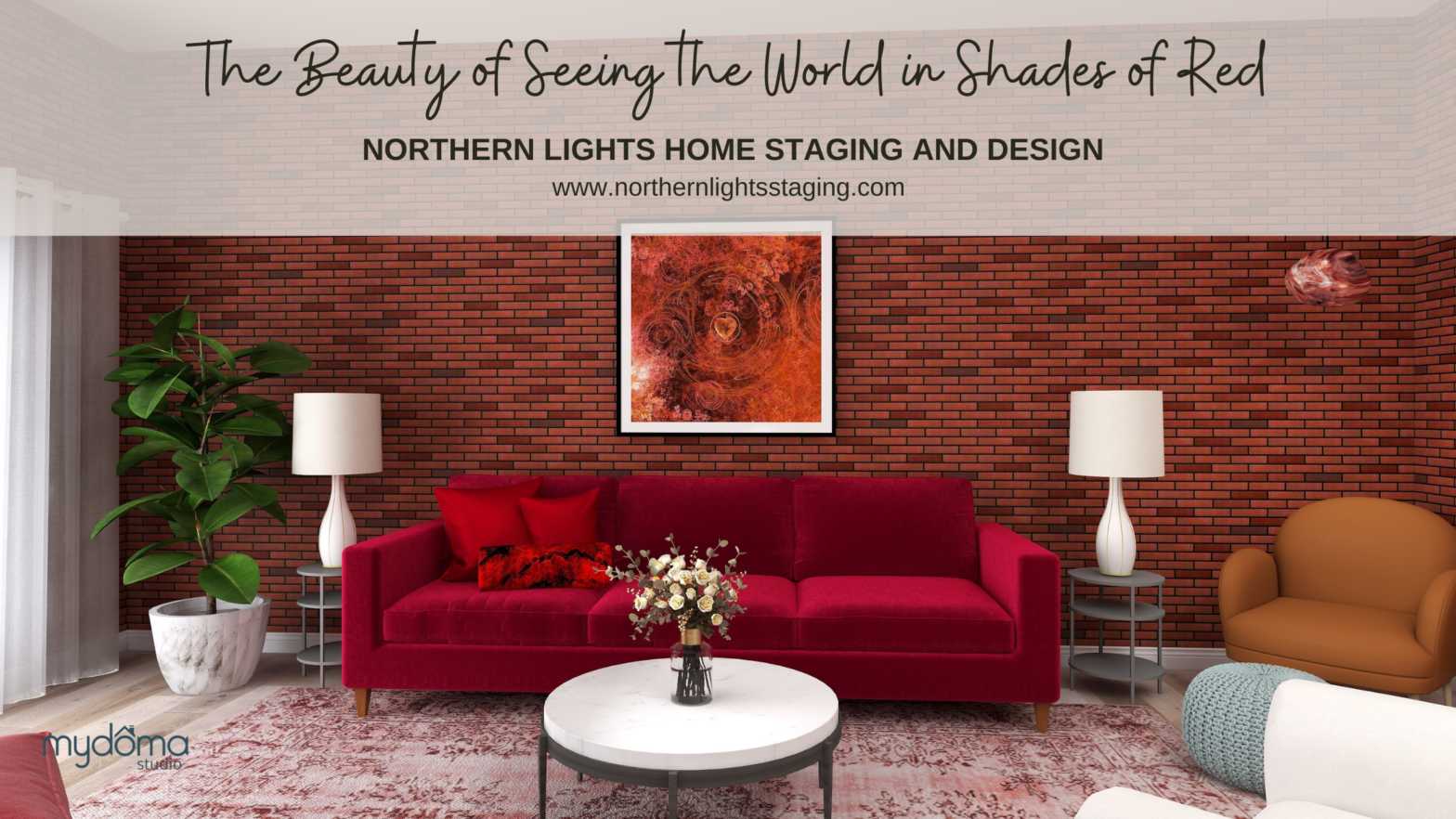
  1. I love the energy red brings to a room, even though I am a blue-green girl at heart :). The room, the house, and the preferences of the occupants always set the color story for me.

    1. Thanks, so true. So many things to consider, but finding colors that the occupants love is at the top of the list:)

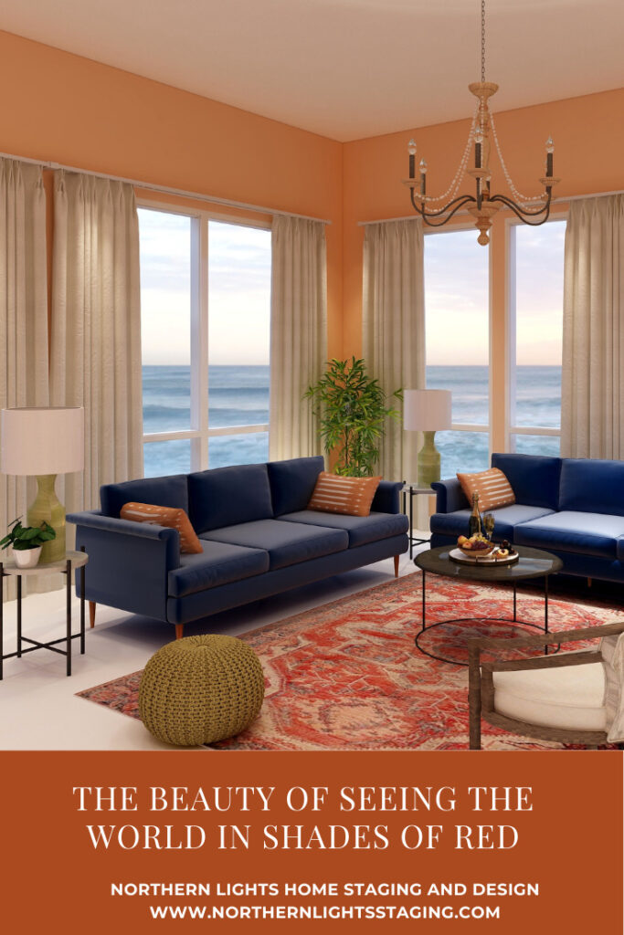
  2. Red is certainly a strong color. I love how you showed the same room with several wall colors and how that color can completely change the feel of the space.

    1. Thanks, it is fun playing with the colors and seeing how totally different you can make it look and feel!

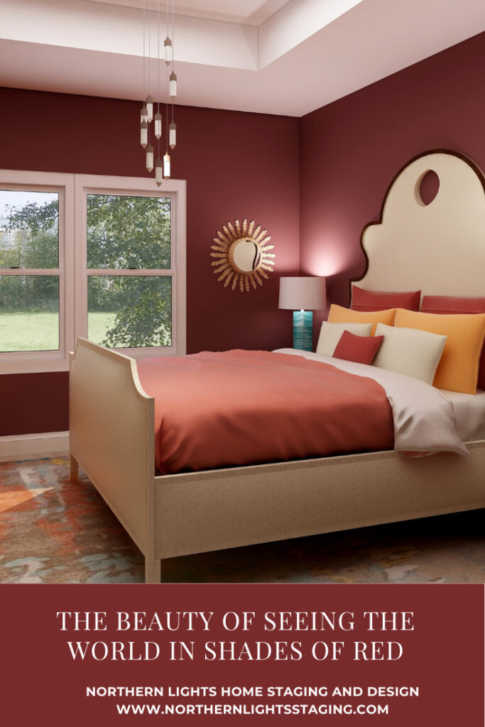
  3. I really love those terra cotta shades of red. I think they are always a winner. Pretty post!

  4. I love the way you show the same room with different shades of red. While I am not a personal fan of red (I don’t believe I have any of it in my own home), I love how you have shown the potential for me.

    1. Thanks so much. It really is amazing how different the room looks by changing the color, especially the contrast between the pink and the deep rich reds.

  5. Loved reading about your red inspiration, and your variety of images is great! Seeing is believing, well done Mary Ann!

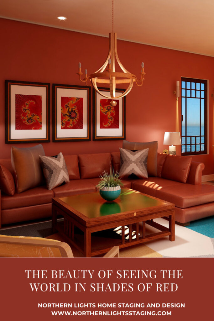
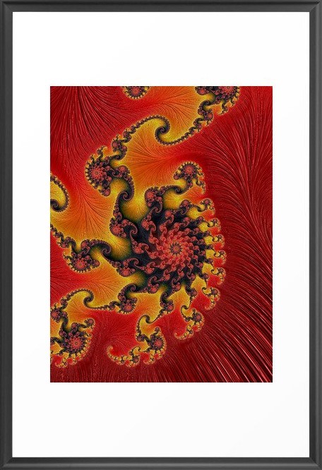
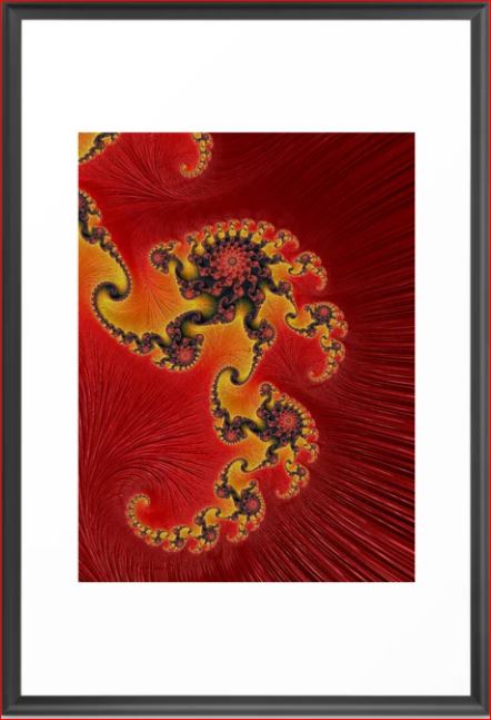
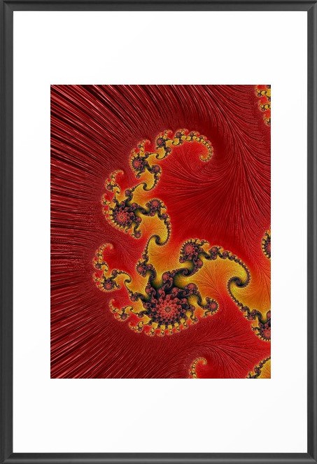
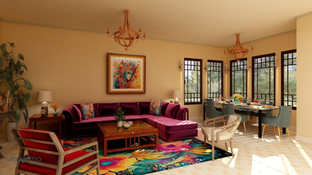
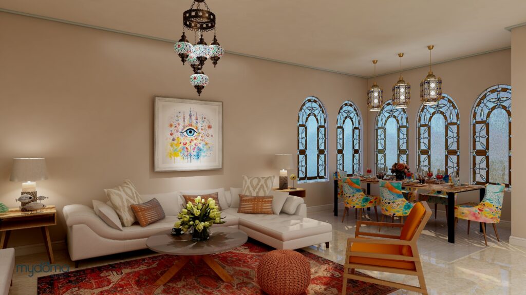
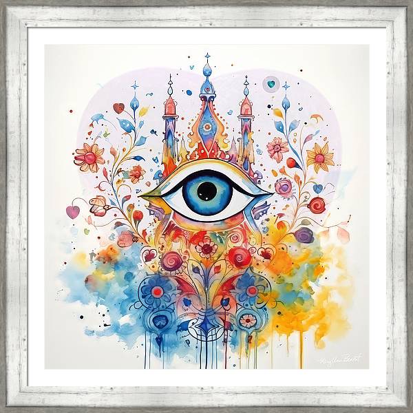
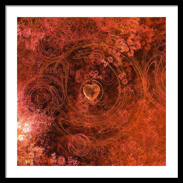
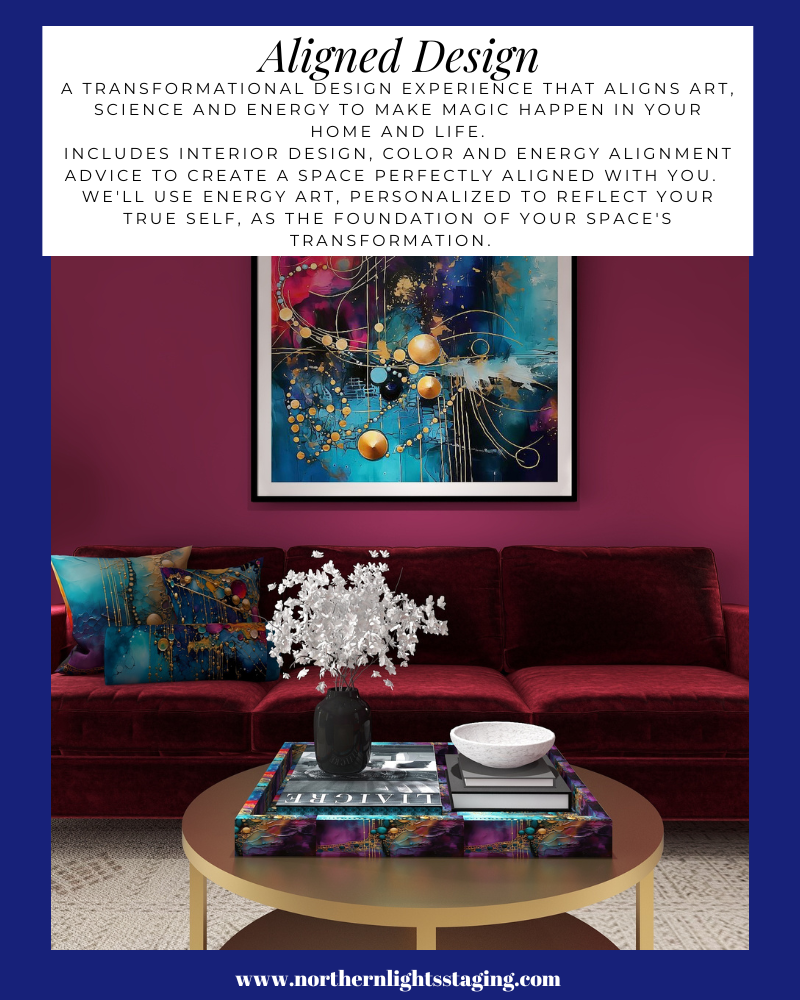
  6. Thank you so much for including my art in your beautiful design. Red is one of my favorite colors:)

    1. Thank you! It was such a pleasure to design this room around your beautiful art! So colorful and full of energy. I hope people will check out your website and see all the amazing works of art you have there!

Comments are closed.

https://zotabox.com/dashboard/embeddedcode/