
Mary Ann Benoit-Northern Lights Home Staging and Design
"Making Magic Happen—Create a Home & Life in Alignment with Your Highest Self", 907-362-0065
Comments are closed.
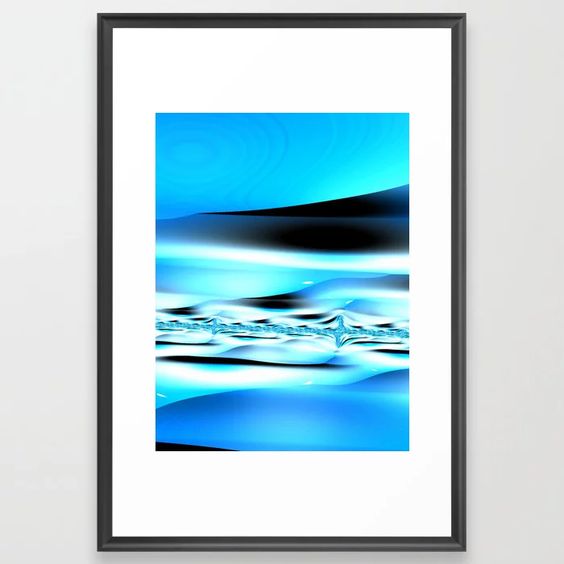
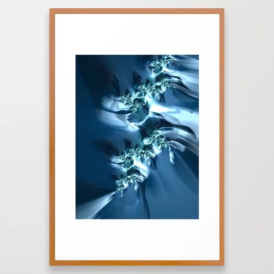
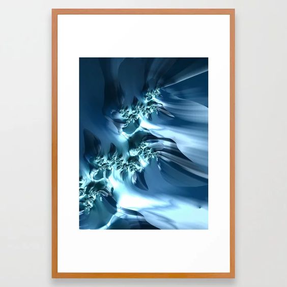
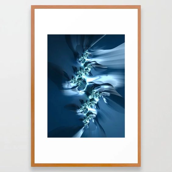
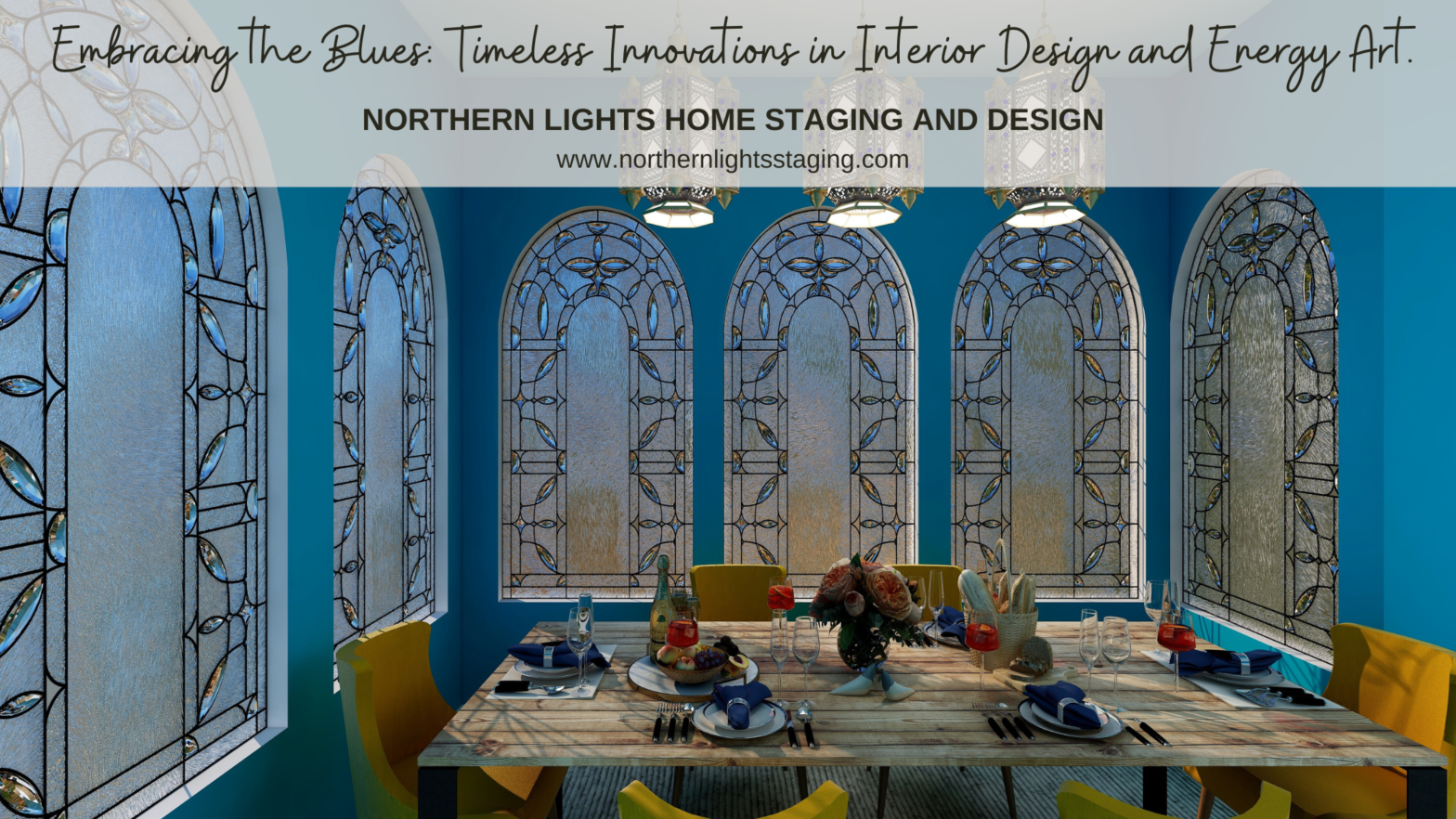
I love how you’re interpreting nature and the Classic Blue in your fractal art!
Thanks Jeri!
Great post Mary Ann, I love seeing all the ways you used Blues in the designs and used it on different materials; such an inspiring post!
Thank you Amy!
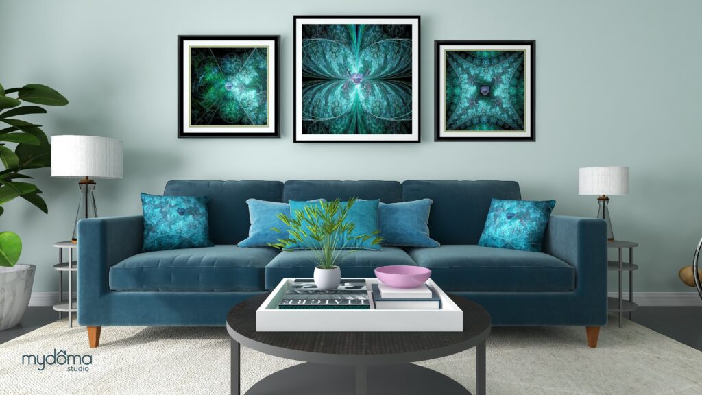
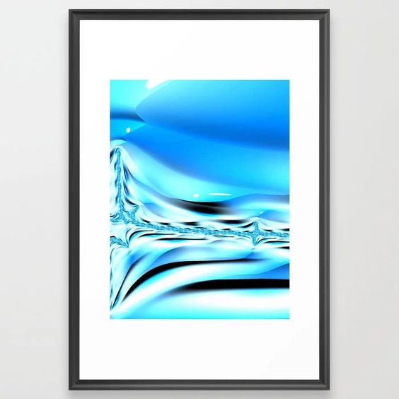
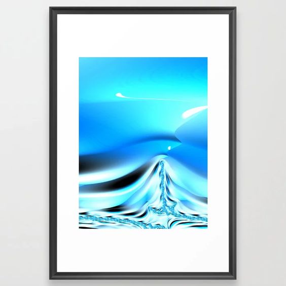
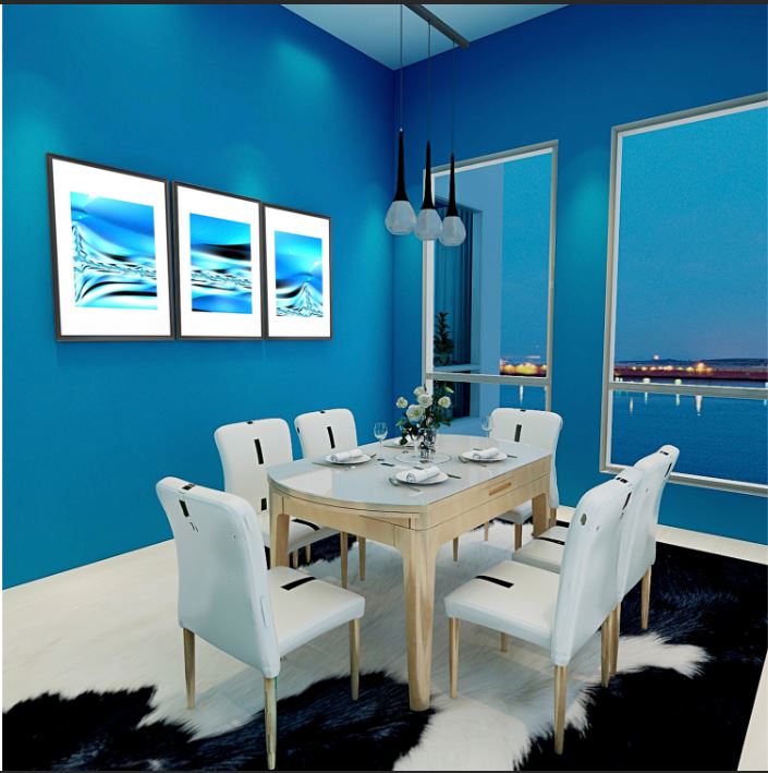
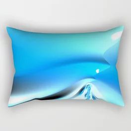
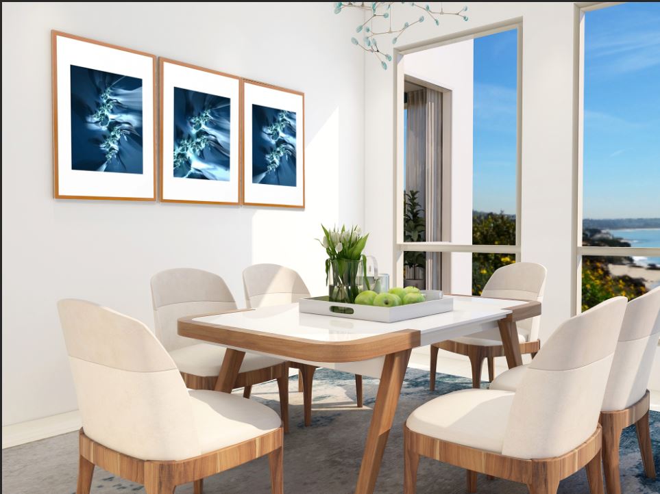
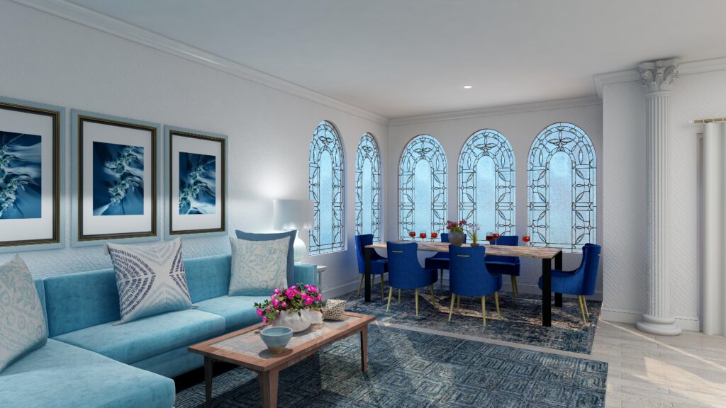
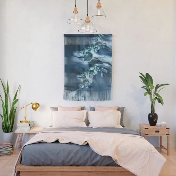
In love with your fractal art! Especially the “Sea” with the light dining set. Very neat idea to match the colour of the walls with the ocean and sky, I never thought of that before. Beautiful rooms and wonderful renders!
Thanks so much Sabina! I love the feeling of that room as if it is actually part of the outdoors. I was playing with a new rendering program I just learned a week ago and was really happy with the results:)
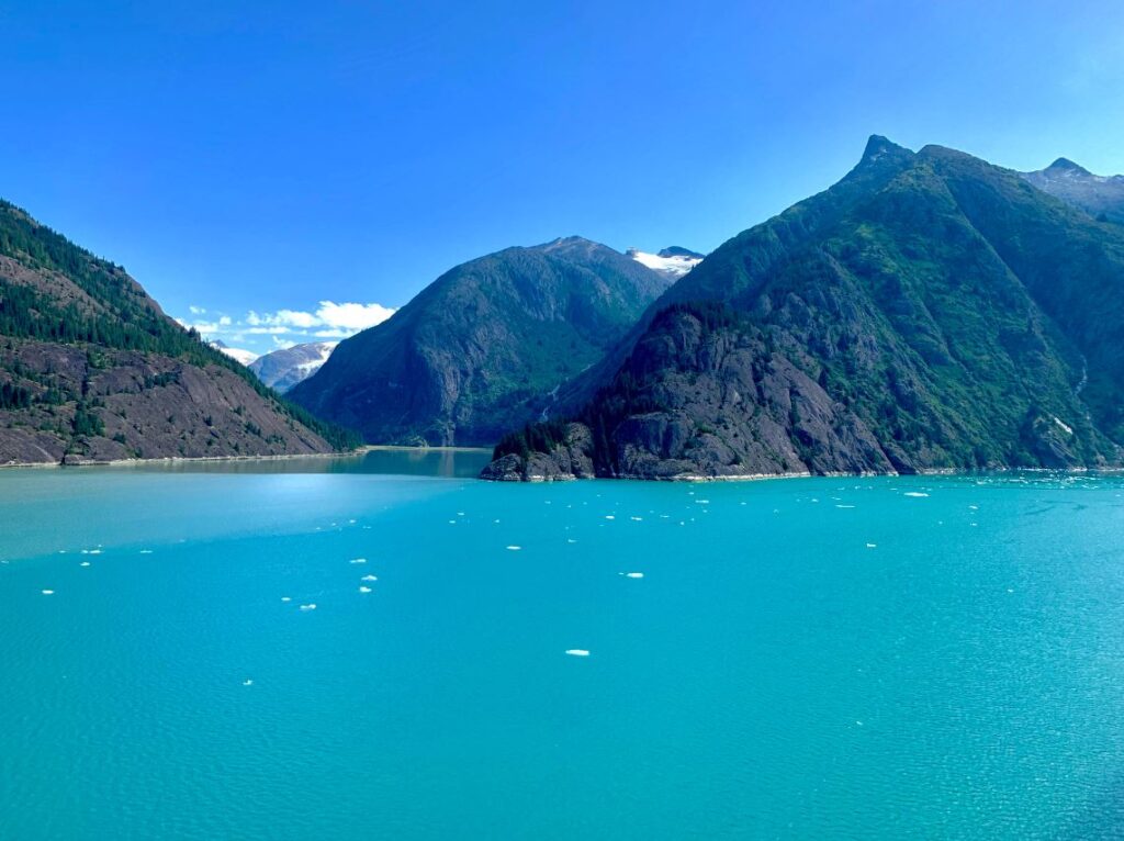
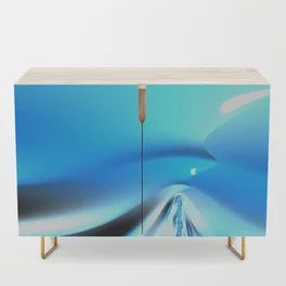
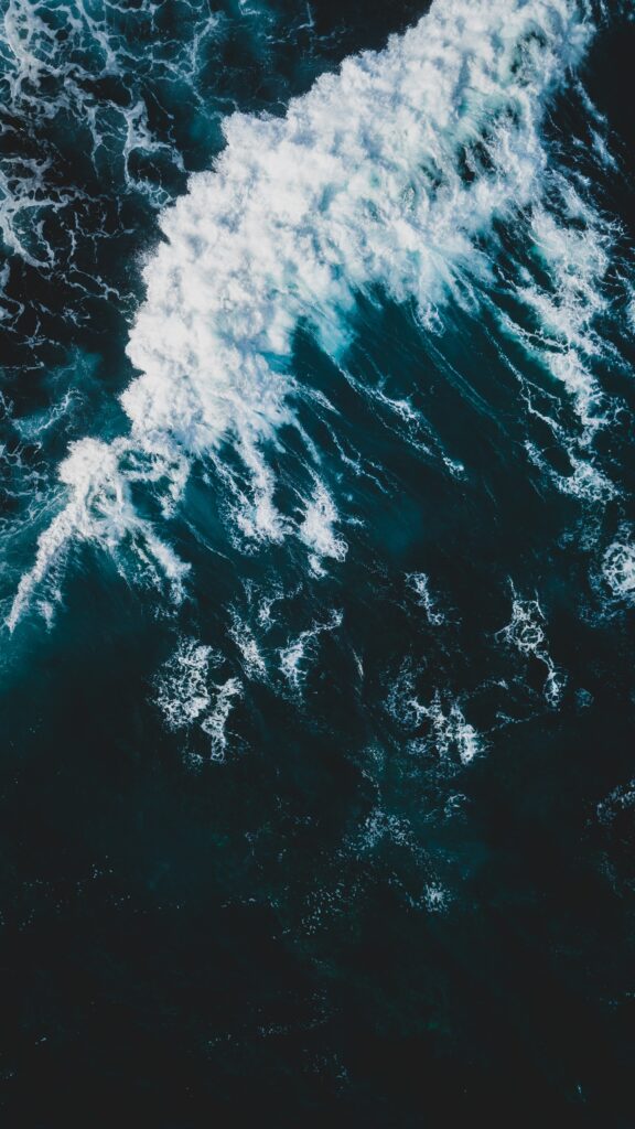
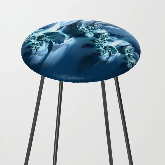
I love how you bring in, and use nature as your inspiration. I’m a ‘sea sick’ kind-of girl so looking at the whitecap image brought back some yucky memories. That being said, the art is so beautiful! I also love your renderings!
Thank you Sheri! Sorry to bring back a bad memory. I am lucky to never have experienced sea sickness, so never thought of that. I am enjoying the rendering program, it is so fun to bring a vision to life so others can see it:)
What a beautiful way you’ve incorporated nature’s blues into your art.
Thanks so much Lisa. I think blues are almost universally loved by people, probably because we all connect with this color as a color from nature, even if some of us are removed from it in our daily lives. We still all see the sky!!
The art is amazing and so is your rendering! The blues feel so calm and lovely!!
Thank you so much Leslie! I love that, calm and lovely!
I love your fractal art anyway, and these blue sea-inspired ones particularly! The ocean is one of my favorite nature connections and these are such a lovely interpretation of it in art!
Thanks so much Janet! So glad you like them. The ocean is so inspiring to me and I am lucky to get to see it everyday. It is one of my favorite nature connections too!
The ocean is so inspiring and so is your art!
Thanks so much Wendy! I am glad you enjoyed it and thanks for reading!