Call 907-362-0065 today
info@northernlightsstaging.com
Terms of Service
Privacy Policy
Disclaimer
Prices subject to change without notice.
Mary Ann Benoit-Northern Lights Home Staging and Design
"Making Magic Happen—Create a Home & Life in Alignment with Your Highest Self", 907-362-0065

info@northernlightsstaging.com
Prices subject to change without notice.
Comments are closed.
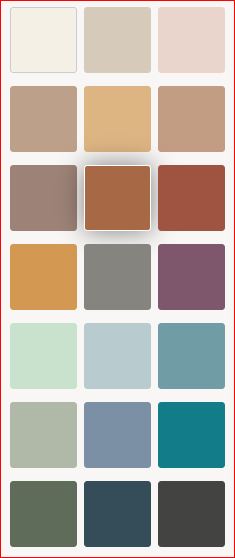
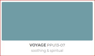
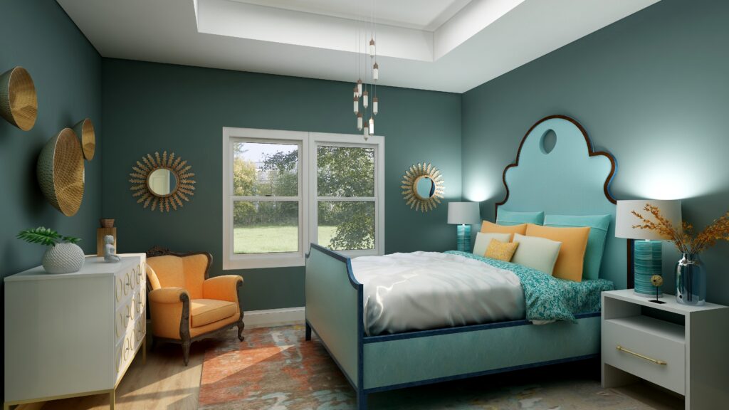
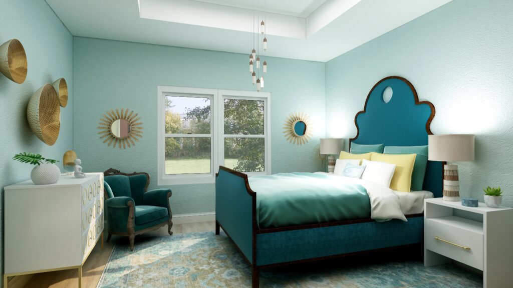
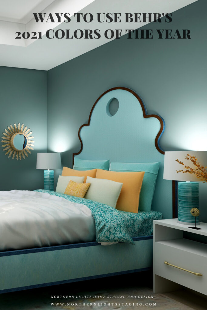
Wow! Lovely to see all the paint colours in a room setting. My favourite is Voyage. Enjoyed the blog!
Thanks! Yes, Voyage is a beautiful color!
I haven’t used many of these Behr Paint colors. Thanks for sharing how you used these colors. Great to know about these.
Thanks for reading Diana!
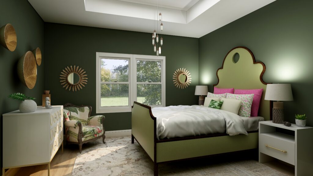
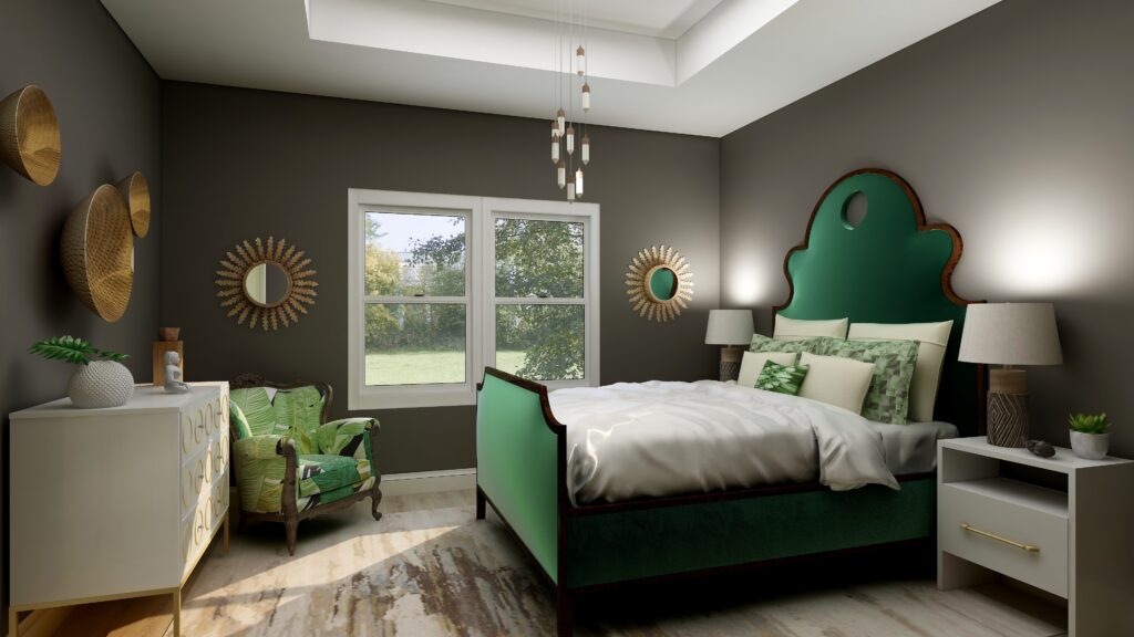
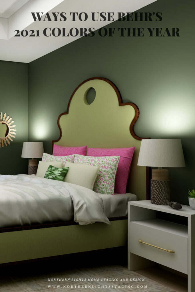
This is genius Mary Ann! Love how you show each color in the room. Urban Bronze is my jam. Love it!!
Thanks so much Kari! Urbane Bronze is very rich and calming and dramatic at the same time.
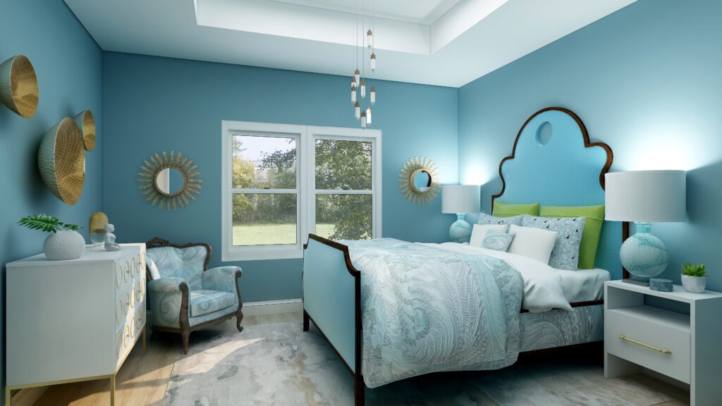
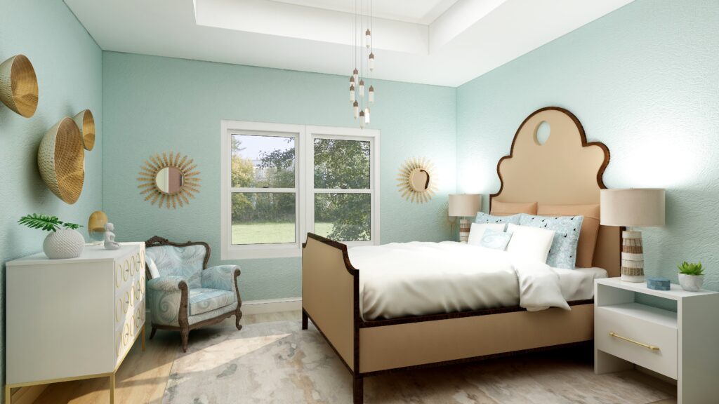
What a beautiful serene palette. I love the colors you chose to highlight.
Thank you! Haha, there were so many to choose from!
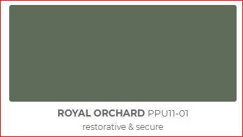
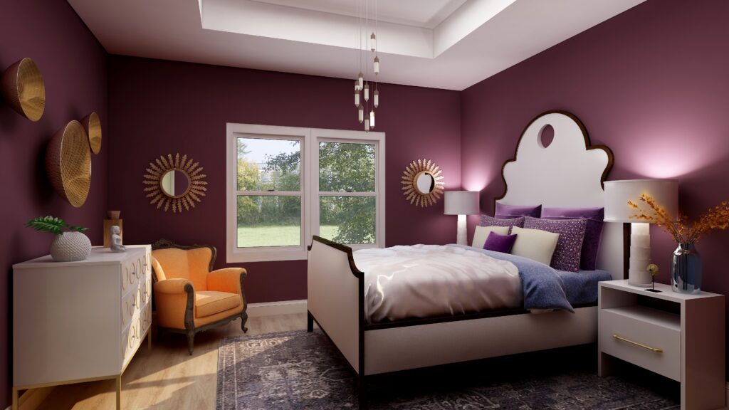
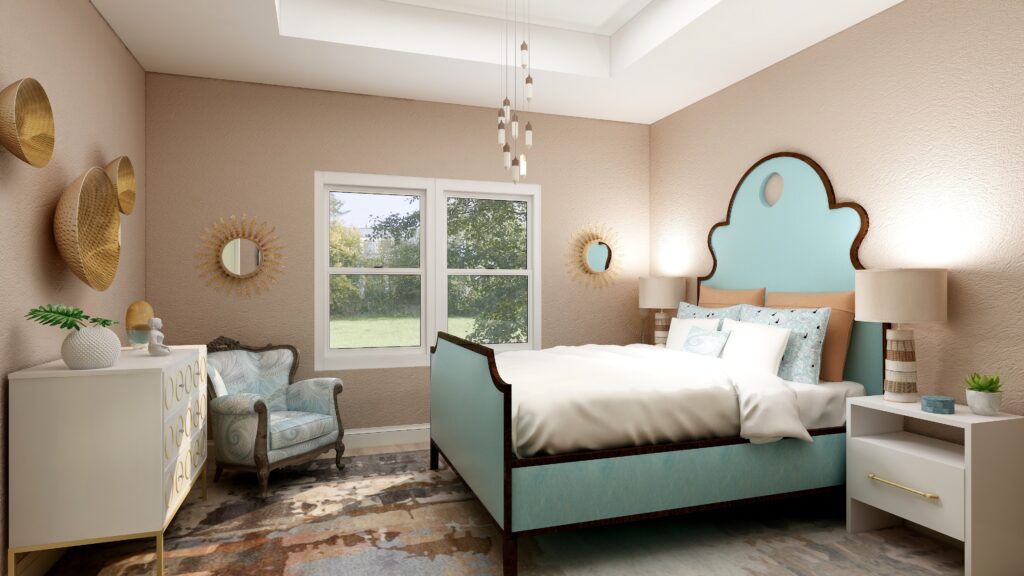
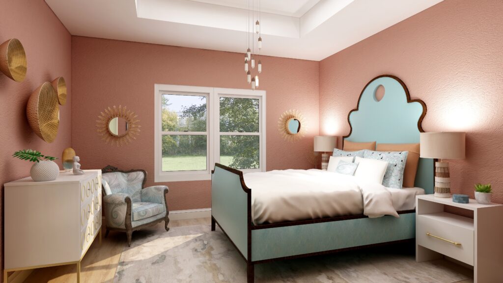
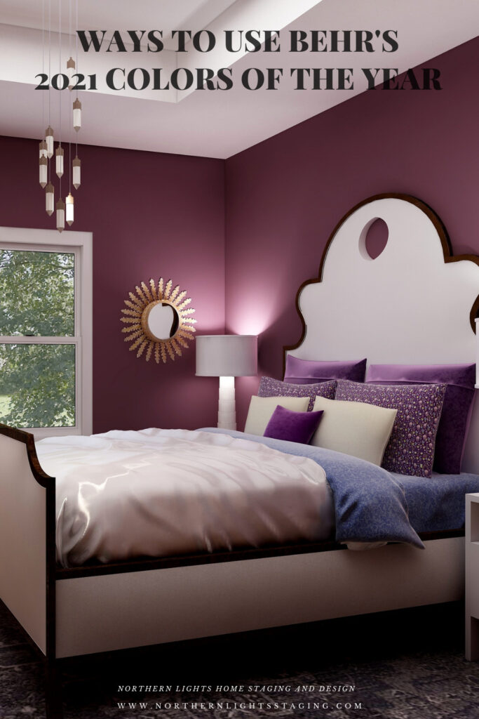
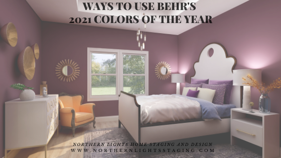
I love the Behr palette this year. There are so many colors I would use. And I especially love the rendering you’ve done with Royal Orchard. I would use shade in my mudroom, study, or Butler’s Pantry in an instant.
Thanks Lauren, it really is a beautiful color and way to bring the outside in to any room.