


Mary Ann Benoit-Northern Lights Home Staging and Design
"Making Magic Happen—Create a Home & Life in Alignment with Your Highest Self", 907-362-0065
Comments are closed.
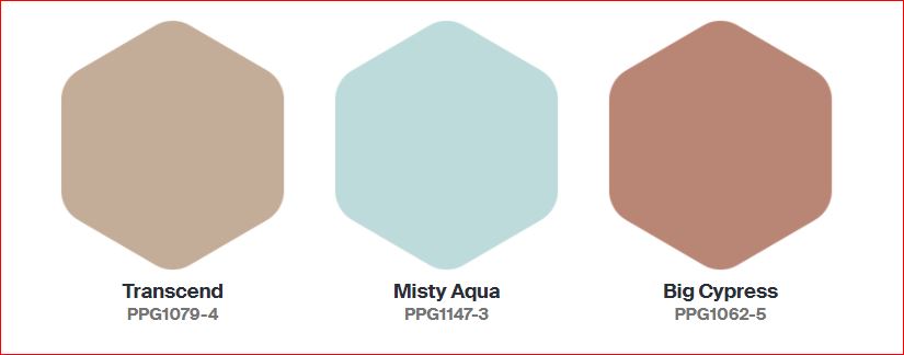
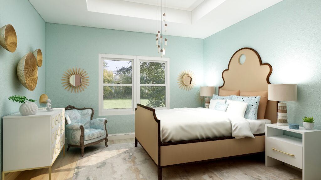
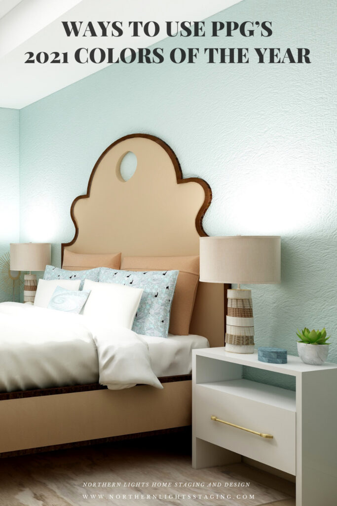
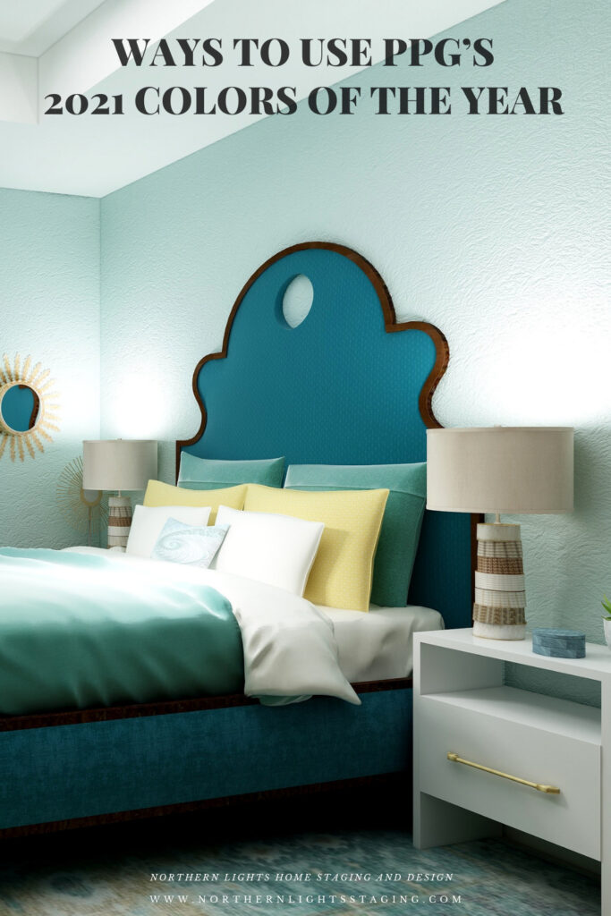
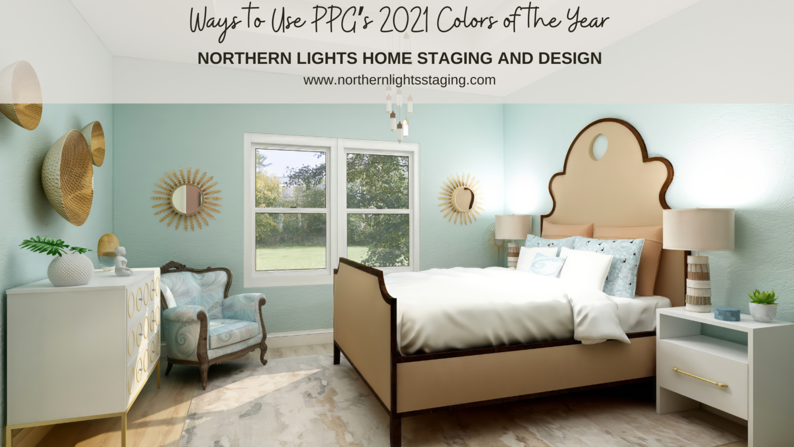
Haha, I’m with you all the way. Not feeling the big cypress and fine with the misty aqua…I’m neutral on the beige (lol). I actually like the room you showed with the aqua walls and the beige on the bed, but I love that bed in almost any color so there’s that… and while COTY is always basically a marketing hype ploy, I think choosing 3 is cheating a little 🙂
Haha, totally agree! Big Cypress reminds me of Cavern Clay which was Sherwin Williams color of the year in 2019. I used it for a Turkish style living room and liked it there, but not a fan for a bedroom.
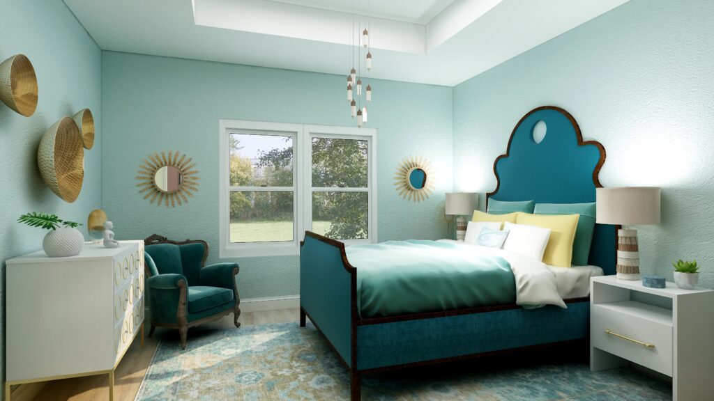
This palette is serene but can be so dramatic too. Thanks for showing us through the use of you renderings how the colors can be implemented.
Thanks! Yes, I find it interesting that the rich and often darker colors can be serene but dramatic at the same time.
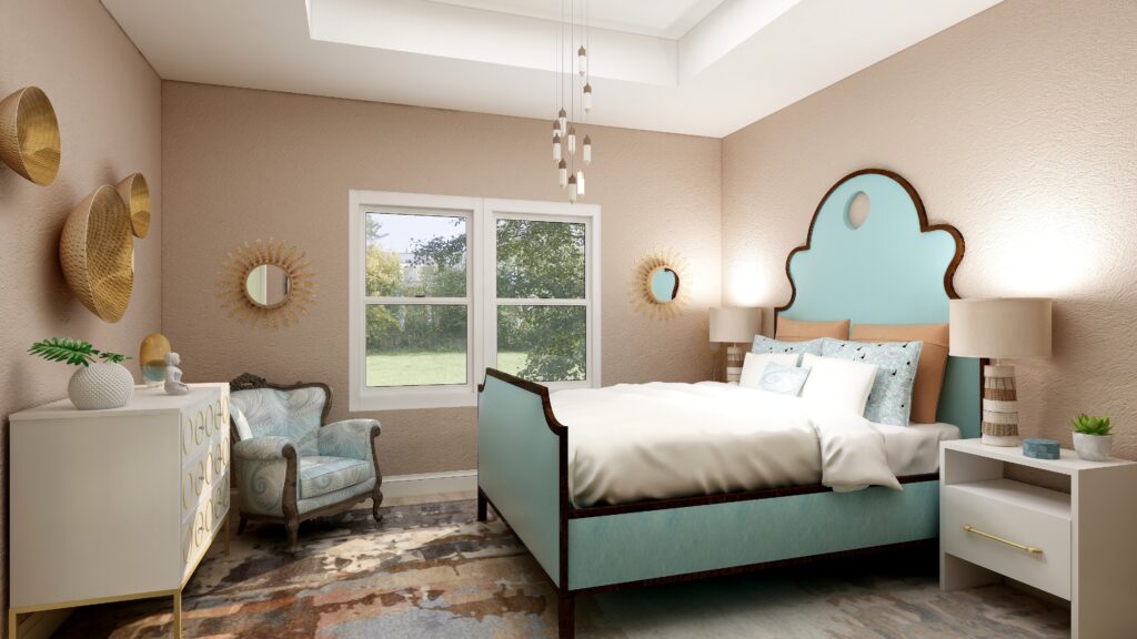
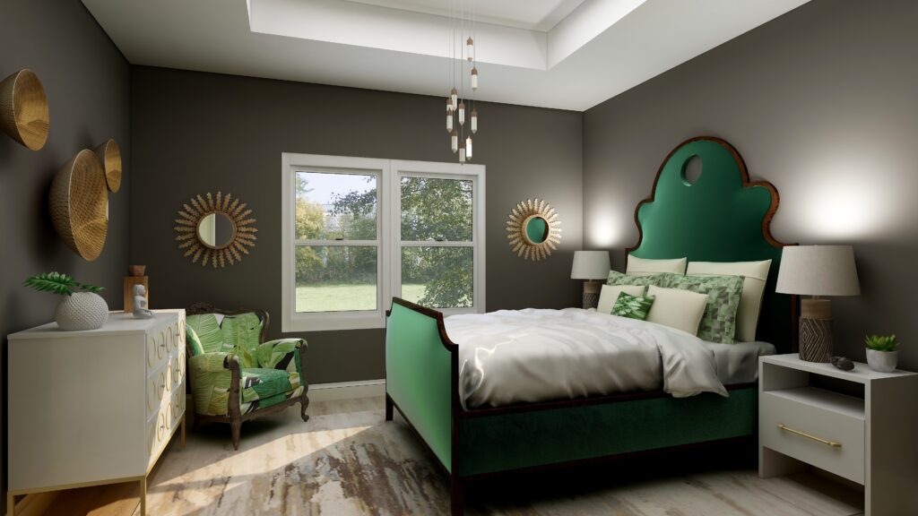
First of all, I love your ‘rebel’ room the best.
For all of the colours of the year, I don’t really have a favourite. It’s unusual for me not to have a favourite.
Thank you!! So glad you like my “rebel room” and I love that name:)
Lovely Post MaryAnn! I love how you transformed the room with the different color palettes!
Thanks so much Lauren!
It’s fun to see all of the dramatic changes color can make in each image.
Thank you! Color really is the amazing secret sauce of a design:)
You did a good job showing us how these colors could work together, MaryAnn, despite an uninspiring set of choices by PPG. Your comments about this mirror my own thoughts.
Thanks so much Leslie!
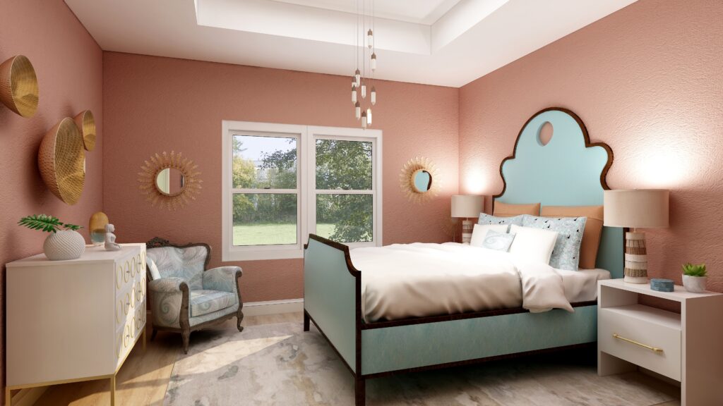
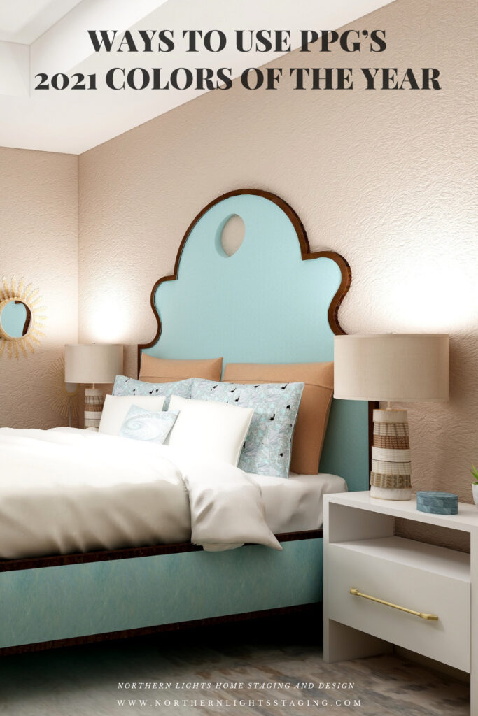
Great post but I admit, what were they thinking? I appreciate PPG trying a new approach. We’ll leave it at that. In terms of color choices, your own color palette is my favorite by far. Well done Mary, great color choices!
Thanks so much Amy!
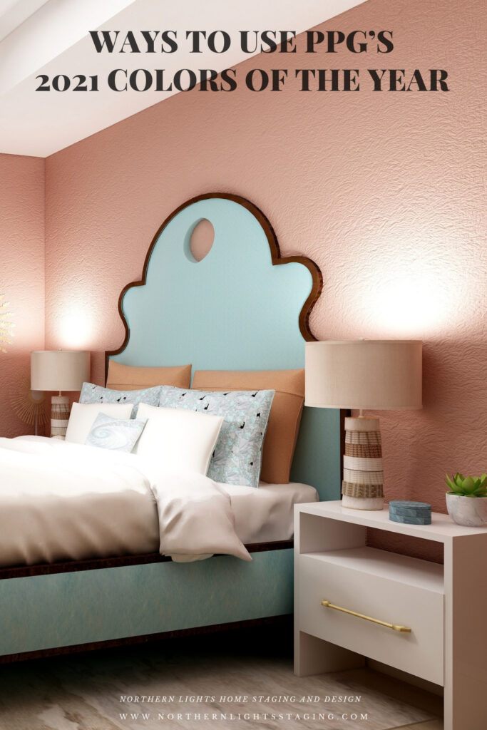
Yes, I hear you on three colors at once not so cool for me either. But as always, your expertise at paints and combos pulled this palette off beautifully. Not a fan of the crimson one though for myself …:(
Thanks Mitzi! Yes, that is my least favorite of them all, but sure it would work nicely in the right space. Just not in this bedroom.