Call 907-362-0065 today
info@northernlightsstaging.com
Terms of Service
Privacy Policy
Disclaimer
Prices subject to change without notice.
Mary Ann Benoit-Northern Lights Home Staging and Design
"Making Magic Happen—Create a Home & Life in Alignment with Your Highest Self", 907-362-0065

info@northernlightsstaging.com
Prices subject to change without notice.
Comments are closed.
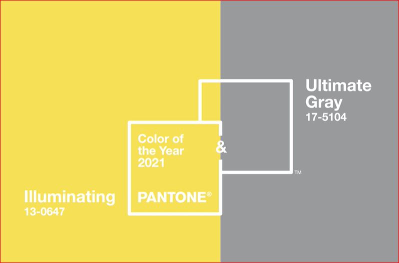
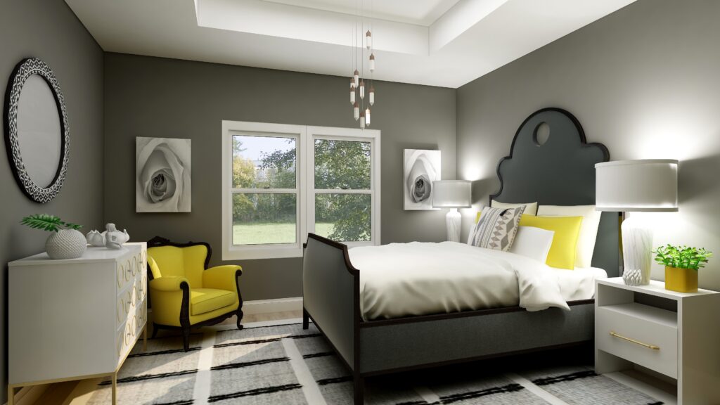
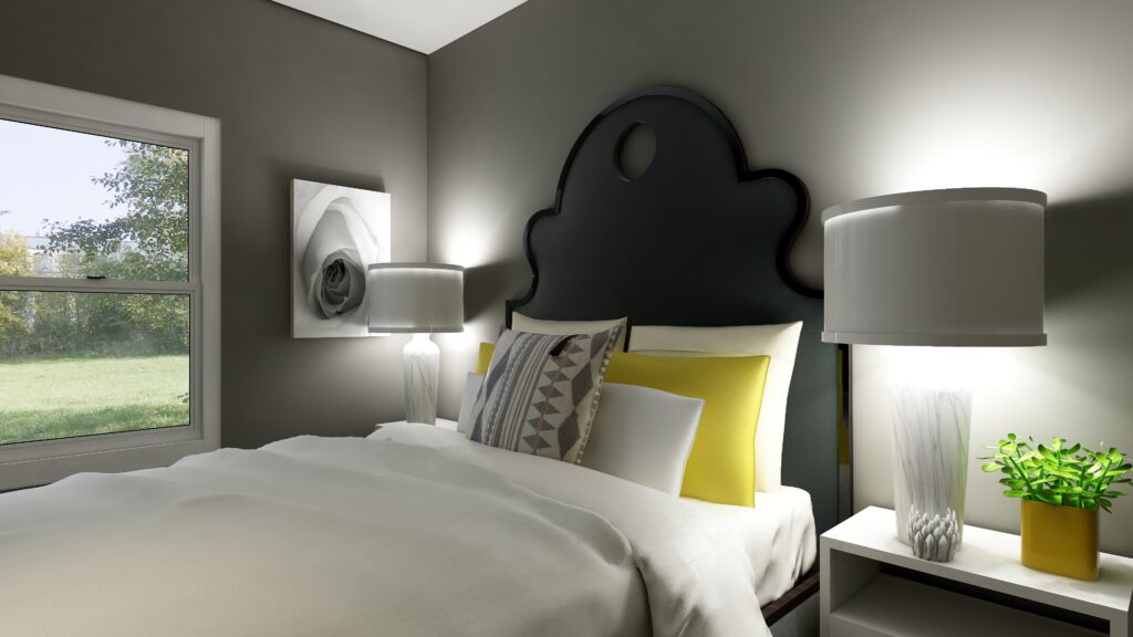
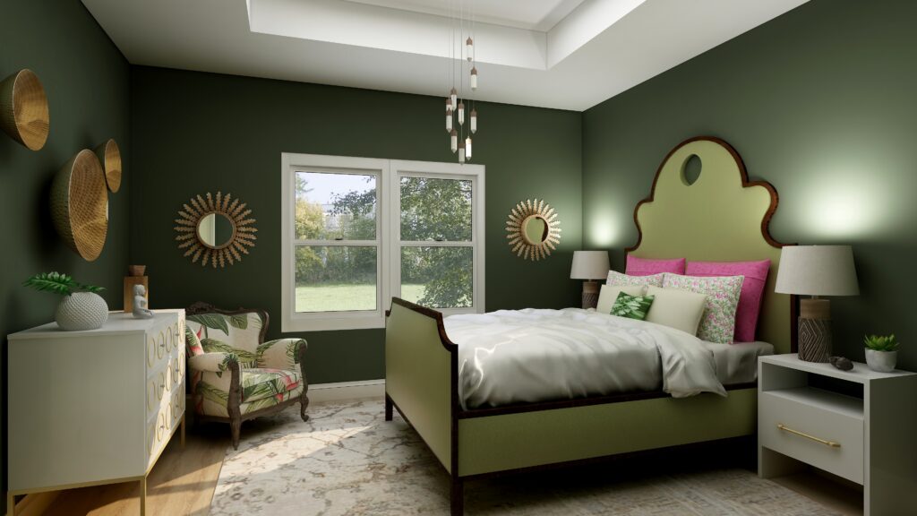
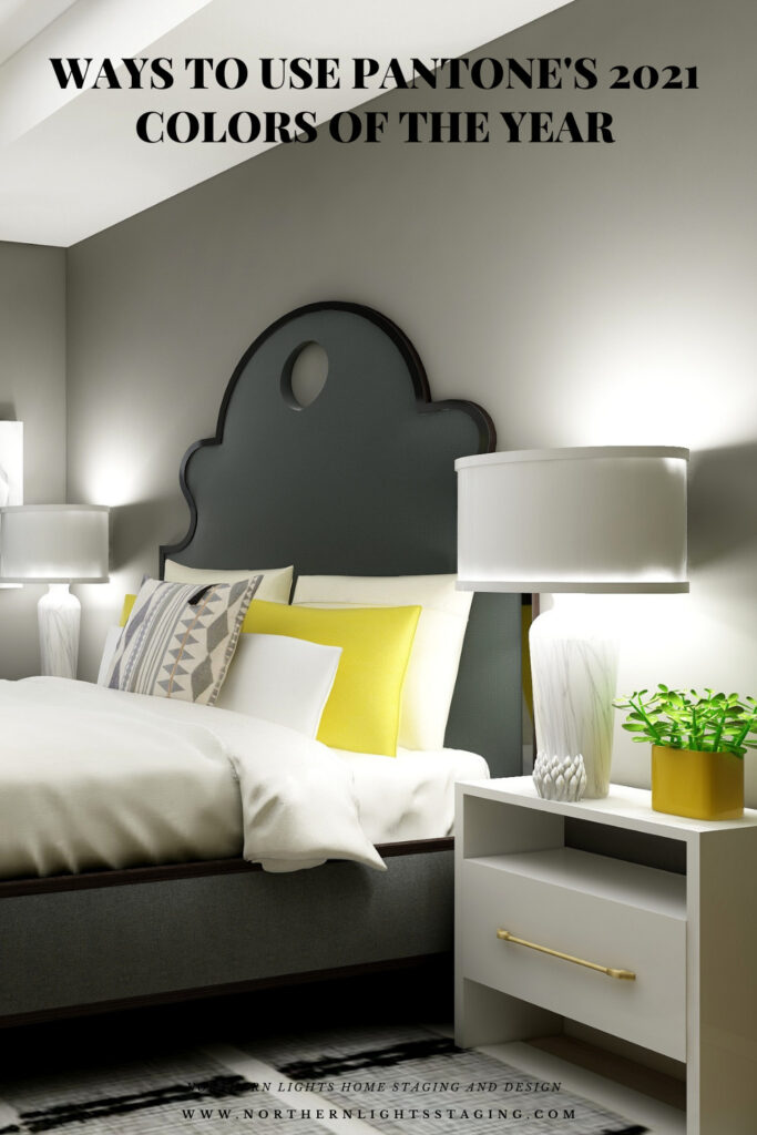
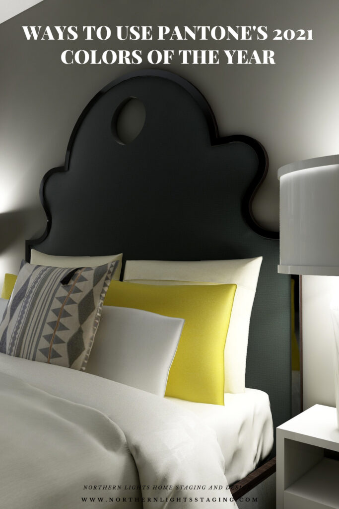
Haha, yes! I was also a little disappointed in the Pantone picks. Traffic light yellow and battleship gray…I guess that sums up 2020 fairly accurately, but let’s hope it doesn’t define 2021! You managed a decent bedroom with these though, proving once again that designers are also magicians!
Haha, that is so true Janet. Traffic light yellow and battleship gray are really perfect descriptions. And thank you and great point. Designers really are like magicians!
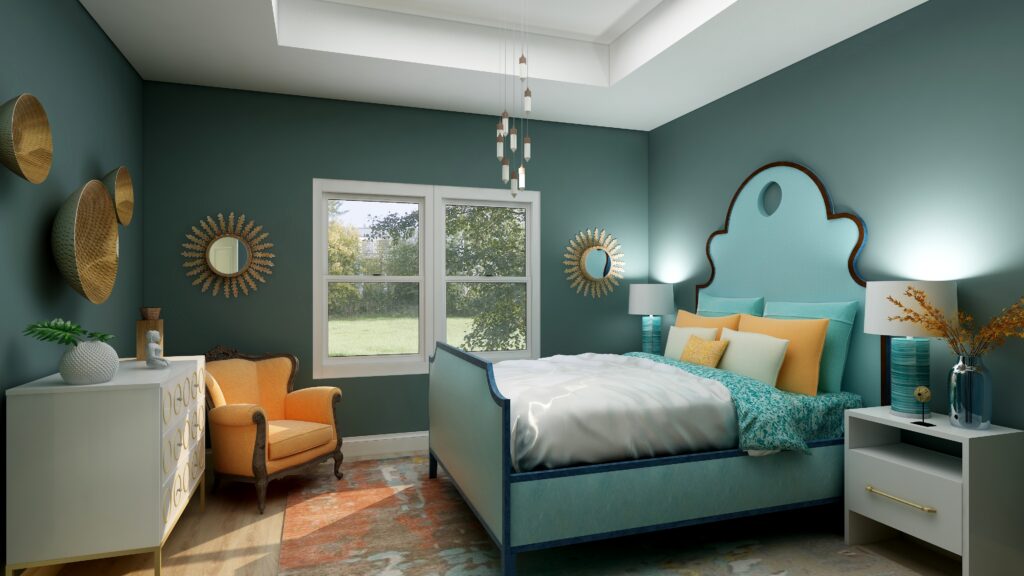
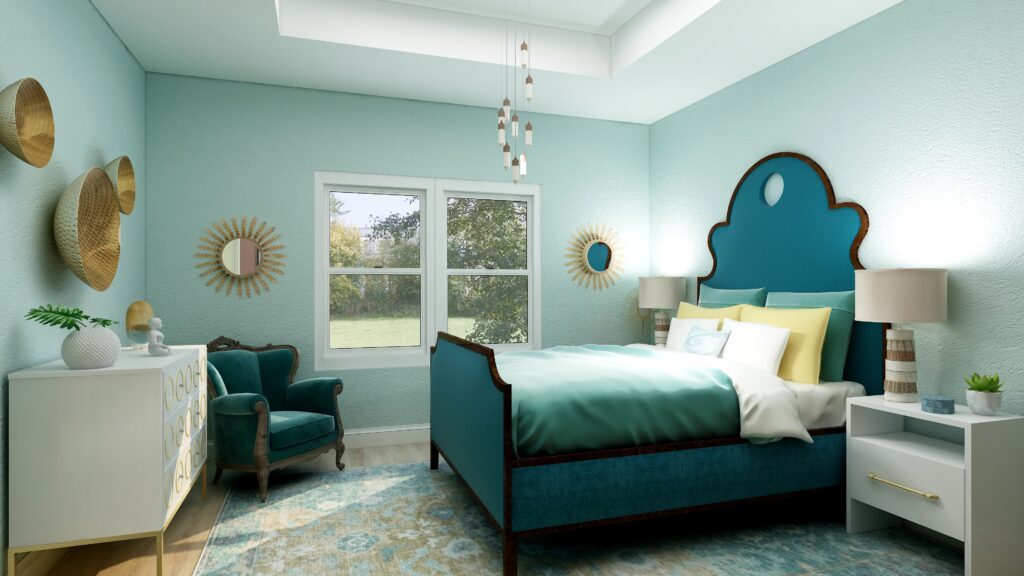
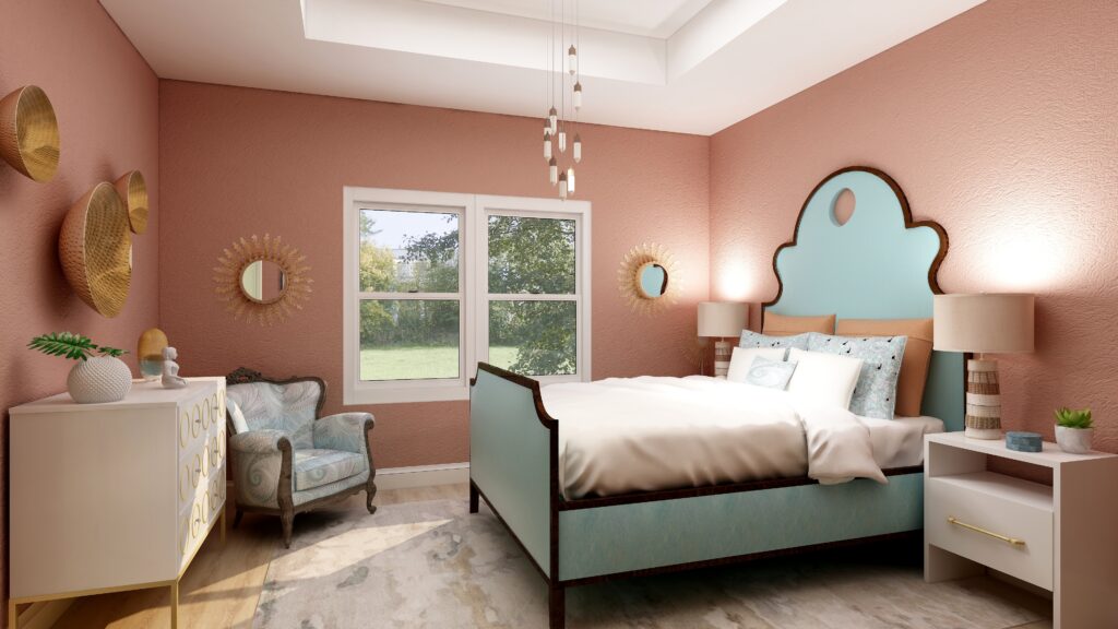
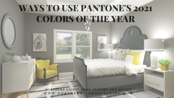
Not my favorite color combination but you used it beautifully in the bedroom. I love the cheerful yellow chair.
Thank you Linda! The yellow chair is my favorite part f that room:)
Mary Ann: As much as I don’t like Pantone’s COY choice of gray, the room you’ve designed using the gray and yellow is really lovely.
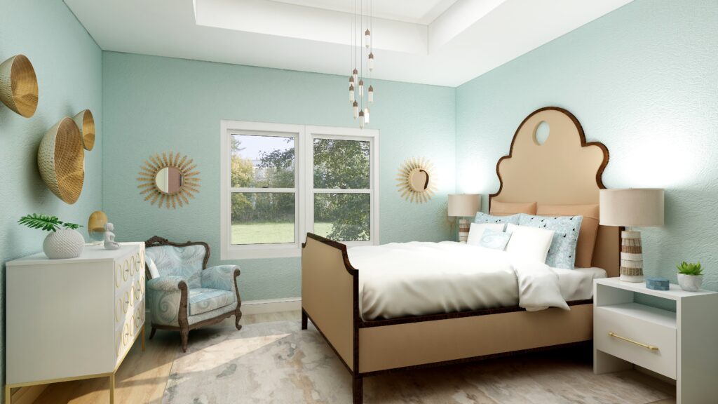
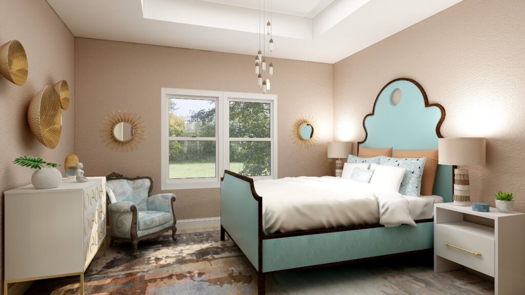
I love how you’ve taken all of these COY’s and are showing us how they would look, using the same set of furniture and accessories. It’s interesting to see.
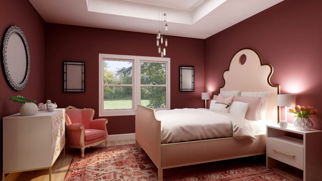
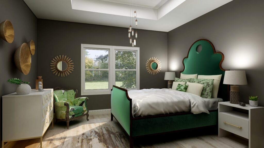
Re: the one I could probably most easily live in, myself?
Sherwin Williams’ Urbane Bronze, but I would swap out the accent color and use the Schiaparelli pink vs. the green with that deep bronzy brown.
Thank you Leslie! That sounds like an interesting and pretty mix with Urbane Bronze and the pink. I will have to look that color up!
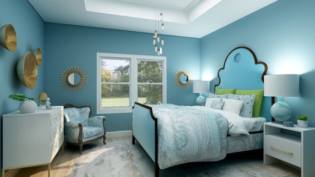
Great ideas for using these colors. I actually still like grays but feel like you need to be mindful of the shade of gray.
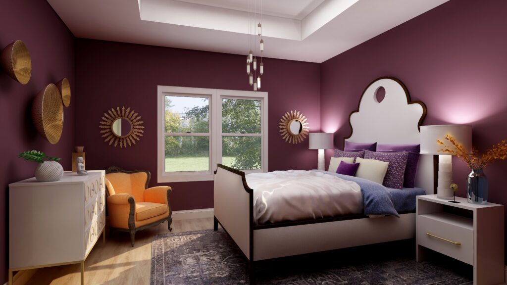
Thank you Lisa, that is so true. This shade was rather dark, but like the examples with the other richer dark colors, it seems to work nicely in a bedroom and give it a comforting and relaxing feel.
I agree with your take on Pantone’s colors of the year. While I LOVE yellow, this does remind me of a safety vest.
As always, I love how you have put together the same room with all of the colour choices. Surprisingly, I’m leaning towards Sherwin Williams’ Urban Bronze.
Thank you Sheri! Something about Urbance Bronze…it is like being surrounded by rich delicious chocolate. There is something really appealing about that!
Great post Mary Ann, I am equally perplexed by the Pantone Color of the Year choices. As a color palette Pantones choice can be flexible, but looking at all the major companies they each seem to going their own direction this year!
Thanks Amy! They are definitely some interesting choices. Doing this series has been an interesting look at how the different companies think, in similar and different ways. One similarity though has been the inability to commit to one color, hahah!