To take a look inside the brain of a designer, at least this designer, and see how I developed this Vintage Boho office design.
This design emerged from a contest that challenged participants to craft an ‘edesign’ for an office tailored to our ‘ideal client.’ The onus was on us to define that client and to conceptualize within their budget. Our tools of representation were a concept board and a digital render. The canvas for our creativity was an existing room, complete with photos and dimensions to guide our design journey.
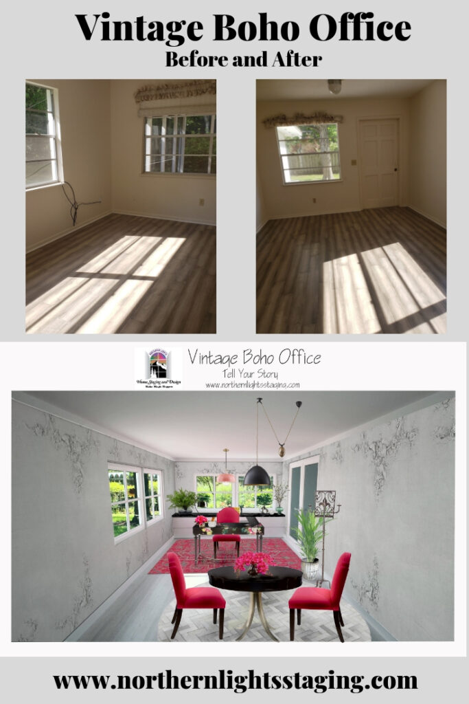
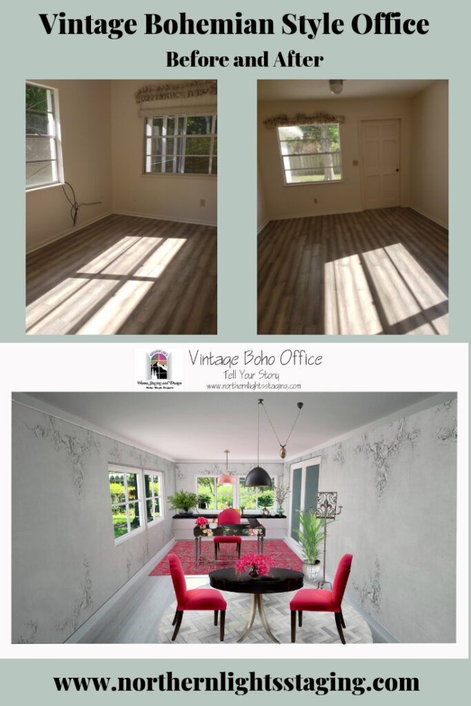
Before
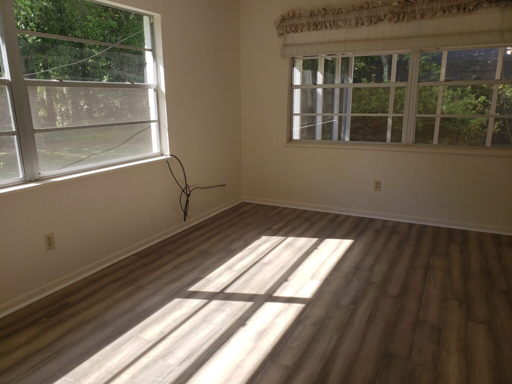
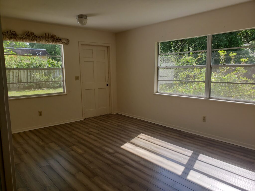
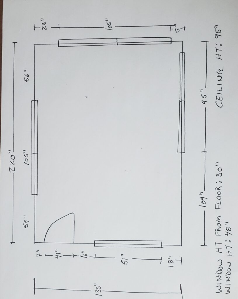
My Client
My ideal client for this design was a woman who loves color and Bohemian or global style design with a mid-high range budget. She worked in a creative field such as graphic, fashion, color or Interior Design. Yes, my ideal client was someone like me! Well, of course, I know myself better than anyone else, so why not!
Function First
My first step was to understand the client’s energy and what she needed in the space to be in alignment with who she truly is. Since this was an imaginary client, I pictured myself and what I would want.
Then, my focus revolved around functionality and the practical requirements that would make this space not just aesthetically pleasing but genuinely functional for the client.
I determined that the client would need:
Ample Storage: To house client files, sample materials, and essential reference books, ensuring easy accessibility.
Meeting Space: A designated area to accommodate 2 to 3 clients comfortably, facilitating design presentations.
Aesthetics and Atmosphere: Given her creative profession and the likelihood of client meetings in this space, it was paramount that the office exuded style, uniqueness, and an element of fun. It needed to serve as an inspirational yet relaxed haven for clients, enhancing their overall experience.
Floor Plan
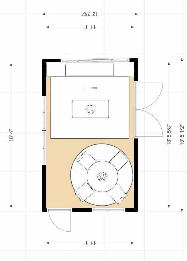
Next, I considered how she would want to move in the space and created a floor plan to bring the functional aspects of the design to life. My primary focus was on optimizing the layout to cater to the client’s work requirements, ensuring seamless access to essential elements.
The key considerations were:
Desk and Storage Placement: I explored various desk configurations, complete with accessible file cabinets and bookshelves. Equally crucial was creating a designated area for meetings and presentations, equipped with adequate overhead and task lighting.
Traffic Flow: I meticulously designed the layout to facilitate smooth movement into the office from the outside entrance while also maintaining accessibility to the adjoining room.
Strategic Wall Usage: After careful assessment, I determined that the back wall offered the ideal location for two flanking file cabinets and a central bookshelf. Placing the desk in front allowed for effortless access, enabling the client to pivot their chair and access everything with ease. This setup not only improved functionality but also visually balanced the elongated room.
Aesthetic Cohesion: To tie the units together and create an appealing display area, I envisioned a custom countertop spanning the file cabinets and shelves. This surface could showcase plants, books, or decor, taking advantage of the adjacent window.
Furniture Dimensions: Sizing up the furniture was a crucial step, factoring in the room’s traffic flow. The chosen layout accommodated a circular table that maximized seating while maintaining clear pathways. To define the two distinct work zones, I considered rugs for each area. An 8-foot-diameter circular rug appeared to be the perfect fit for the table area.
This meticulous planning ensured not only functional efficiency but also a harmonious aesthetic within the office space.
Inspiration
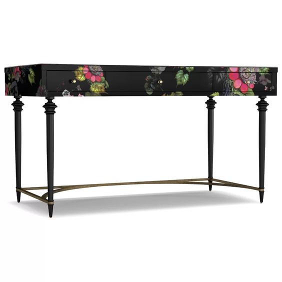
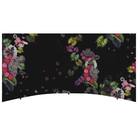
Then I started researching pieces for the design, looking for foundational pieces that would direct the rest of the design. I started with the desk, as it would be the focal point as you entered the room, and the most important piece functionally for the client. When I found this gorgeous desk, I knew it was the one! It was unique, colorful and had a vintage Bohemian vibe. it inspired the color scheme, the feeling for the room and the rest of the design!
Color Scheme
The desk’s striking aesthetics naturally suggested a palette of pinks, greens, black, and subtle shades of gray or off-white. A hint of yellow, used sparingly, could accentuate key elements. The room’s expansive windows offered a lush green backdrop, seamlessly integrating nature’s touch. I visualized using pink either in one of the rugs or the upholstery for the desk or table chairs. A black marble countertop atop the file cabinets and shelves would elegantly frame the desk zone. With an emphasis on preserving the room’s luminosity, I considered a light gray or an antique white as the ideal wall shade, ensuring the space felt open and airy.
Major Design Elements
While seeking complementary pieces for the desk, I stumbled upon a rug that resonated beautifully with both the color scheme and the Bohemian vibe. My next discovery was a captivating wallpaper, its hue in perfect harmony with the room. Its design, reminiscent of antique ceilings or walls, subtly enhanced the space without overshadowing the desk—something wall art might have inadvertently done. This vintage essence further steered my search, leading me to incorporate vintage or vintage-inspired accents and lighting, enriching the evolving theme.
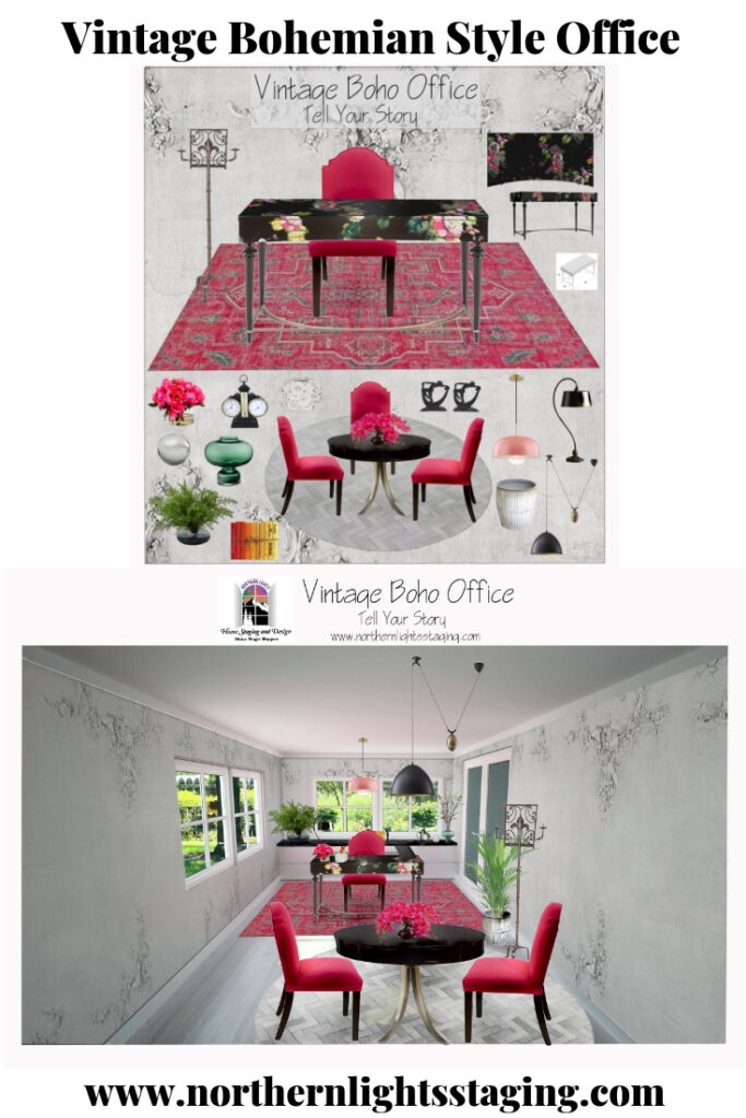
While exploring furniture and accessories for the design, I integrated each find into my Photoshop workspace where I curated the concept board. This digital canvas enabled a holistic view, letting me juxtapose various items. Through this iterative process, I tweaked, added, or removed elements to strike the right balance in terms of color, form, style, and functionality.
Concept Board
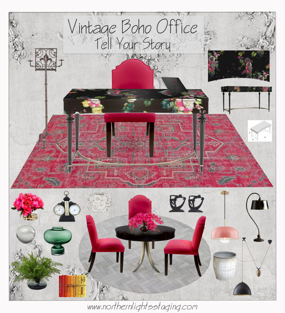
Design Products
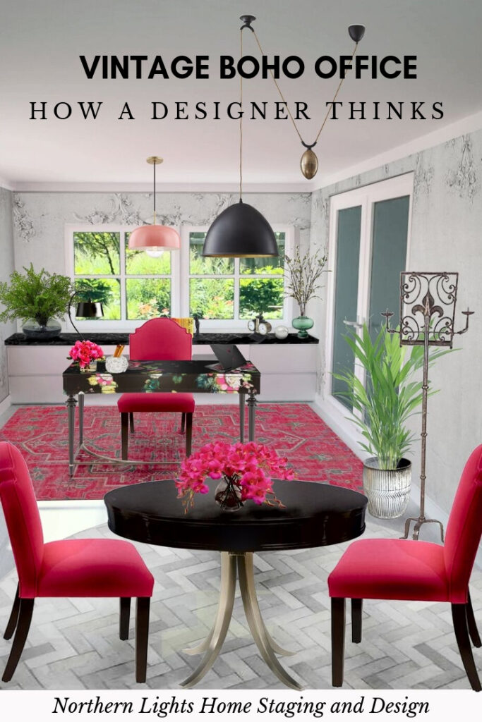
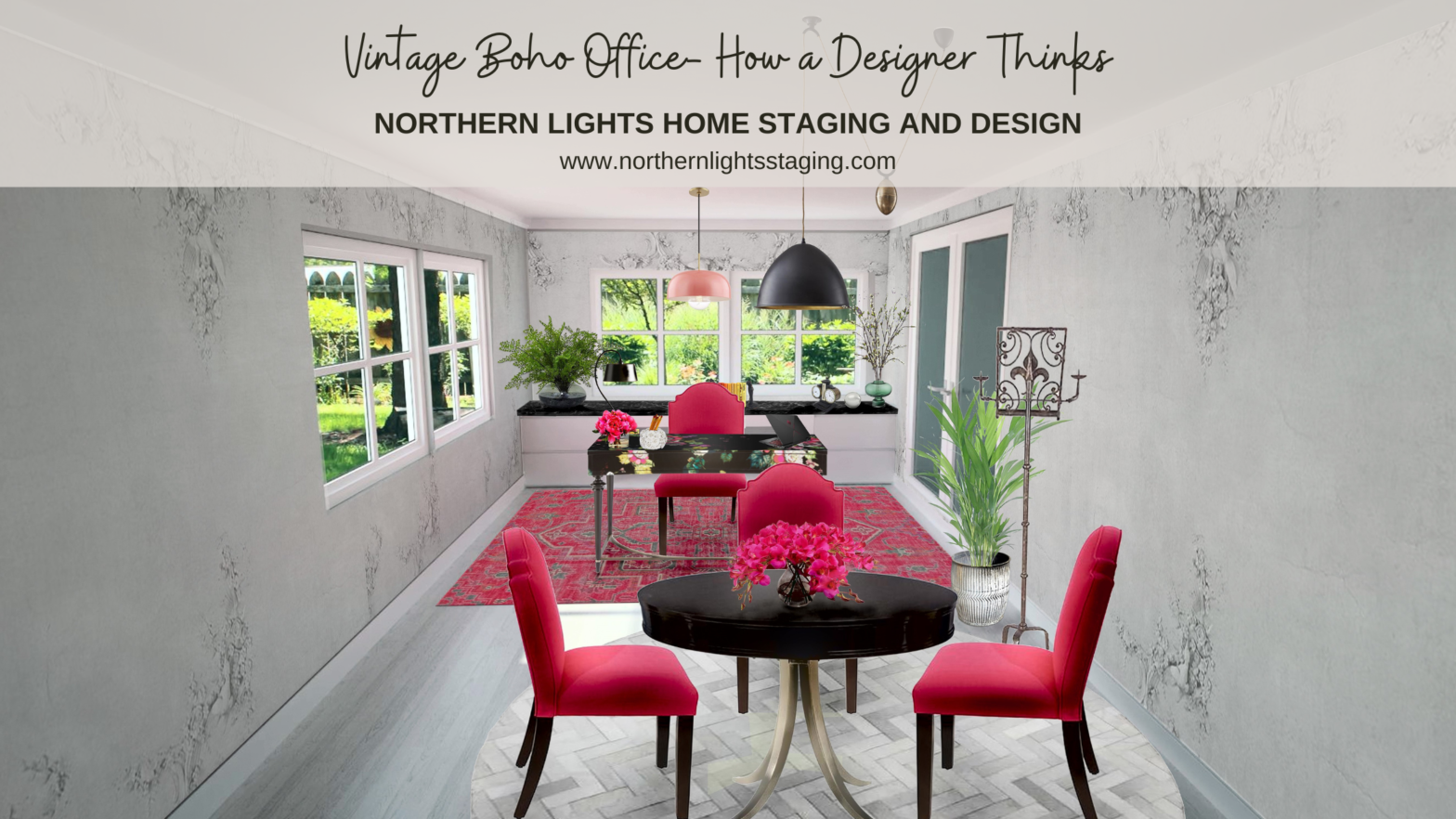
I sourced a variety of beautiful furniture and accessories and created a render to help visualize the final design.
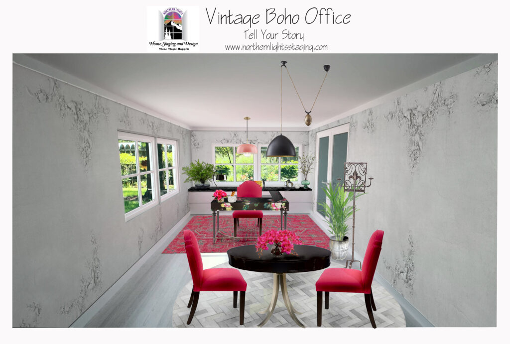
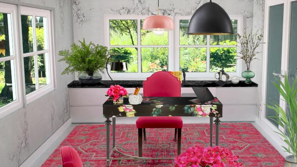
Voilà!
My design journey always begins by getting to know the client, understanding what they need to be in alignment with who they truly are and how the design can enhance that. Then I delve into their functional and space needs. From there, I seek out inspiration pieces that resonate with the client’s style, often creating energy art specifically for them.
These foundational elements set the tone, directing the design’s evolution and color narrative.
Are You Inspired?
Want to create a beautiful office or other space that is perfect for you? Try an Aligned Design consultation with my to get started.
Aligned Design©– All Rights Reserved.
Terms of Service | Privacy Policy | Disclaimer | Brochure
Prices are subject to change without notice.
Call 907-362-0065 today



What a great peek at your process! I love the desk, of course 🙂 and the vintage music stand as a presentation board holder is a brilliant and unique idea!
Thanks Janet! I am also a musician, and when I saw that piece I knew it would work perfectly and loved the design!
This is such a great example of the thought process that goes into designing a space. While it may look easy, there are so many steps and things to consider when designing a space! What a great example of what Interior Designers do to create a space.
Thanks Sheri! So true, because we as designers can visualize, we might make this look easy to our clients, but there are so many things to consider to making a beautiful and functional space that is perfect for our clients. Thanks for reading.
I really love that FLEUR DE GLEE WRITING DESK. Such a beautiful piece.
I know, me too. It was such a great inspirational piece for this whole design! Thanks for reading.
I love this design. Isn’t it great when a light bulb goes on and you know you found exactly the right pieces for a design! I feel inspired after seeing this>
Awww, thanks so much Ilse. I do love it when you find the perfect piece for a design and everything just comes together after that! I am so happy you feel inspired!
I really enjoyed reading about your process, MaryAnn. This turned out beautifully!
Thank you Leslie! I wish I had room for this design in my house!
Mary Ann this is beautiful!! Of course I love all your choices and selections. But how you lay out how an E-design consult works is inspiring. Thanks for sharing your wonderful talent!
Thank you Deborah! I often think people would like to work with a designer but the whole process is a mystery to them and they may be apprehensive about trying it. I hope this post will help people feel more comfortable with the idea:)