You may think that home staging is just cleaning, reducing clutter, fixing things, painting, and putting your house on the market.
Those things are all important and are all things you can do to help save money in preparing your house for sale.
You can also clean your yard, put things away, trim your trees and shrubs, and repair things. Get a fresh welcome mat for the door.
So why bother hiring a home stager when you can do all those things yourself?
There are a lot of decisions to be made that can make or cost you money. Do you have the confidence you know the right answers to the following questions?
What paint colors should you use for a higher sales price?
Who is your target market based on a variety of factors related to the real estate market?
How should your home look compared to others in a similar price range so you can outshine the competition?
What do buyers in a different age group than you really want and what will attract them to connect with your house?
What repairs and upgrades will give you a good return on your investment and which ones will just cost you the money you will never get back.
What things can you do to emotionally connect with buyers, without looking like you are trying to do that?
Will your furniture and current decor really work for staging and attracting buyers or do you just think so because you are not seeing things objectively?
Is your furniture perfectly arranged to highlight the space and best features of the house?
Can you get furniture, art, and more for staging if needed, without having to buy it? After all, you are moving. Who wants to buy more stuff.
Do you know good, reliable tradespeople to do the work needed for you in a timely manner for your home sale?
If your answer is no, it is really worth it for you to hire a professional home stager. They want to make sure you get the most for your home sale!
Sell Your House Faster and For More
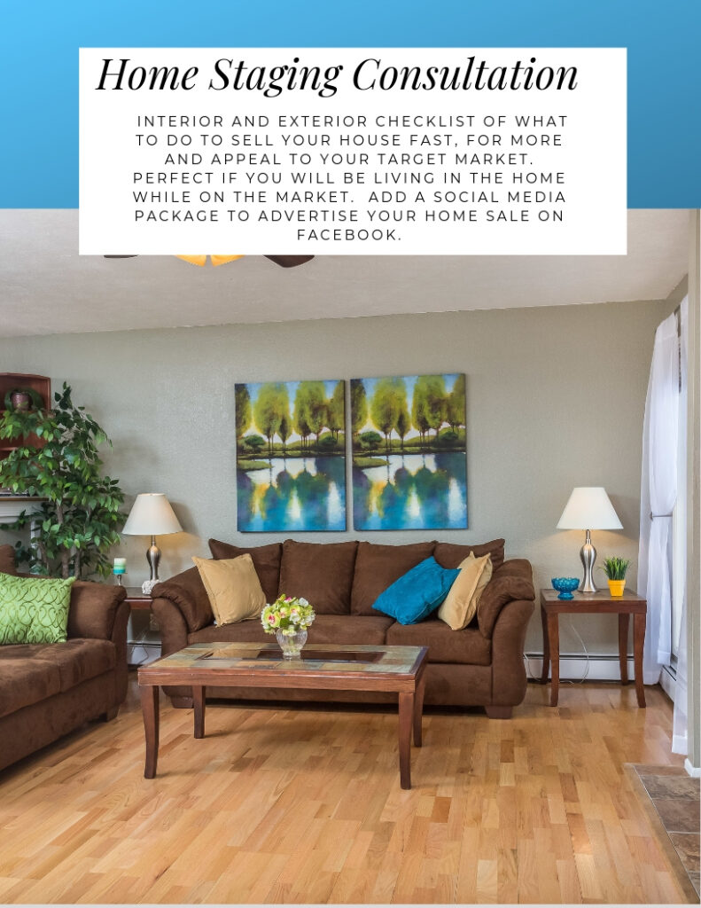
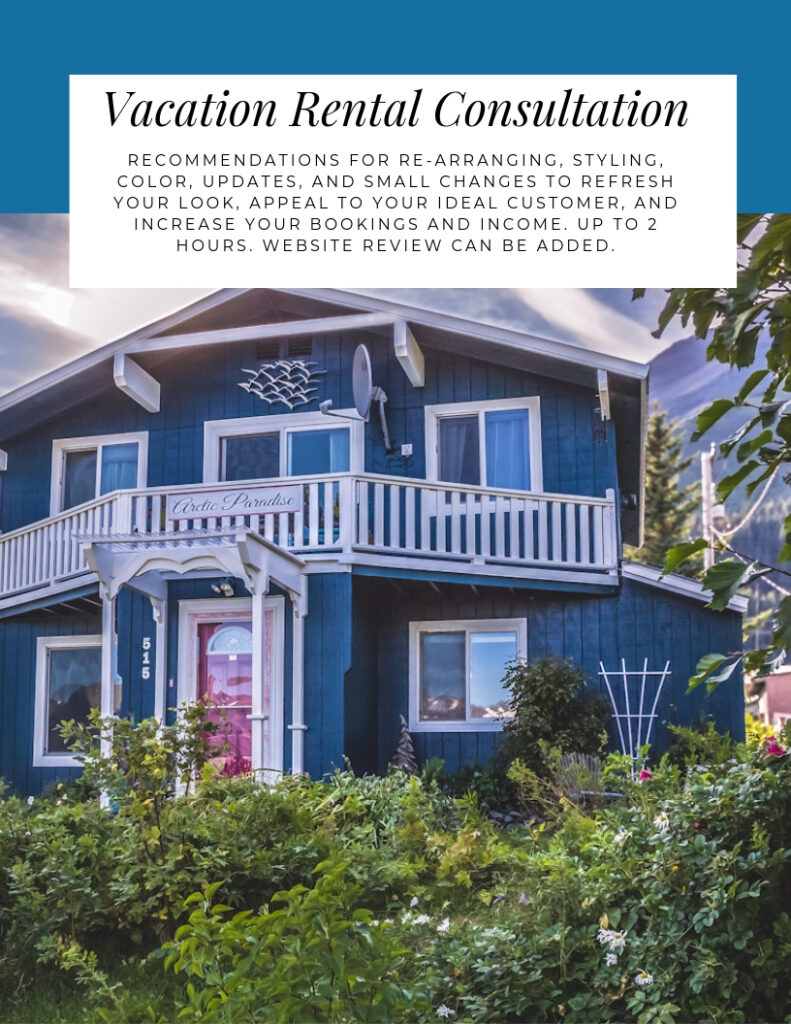
Check out my online home staging services. For in-person consultations or staging, call for a custom quote. Click on the pictures to learn more.
Color Your Way to a Swift and Profitable Home Sale with These Top Paint Colors
How Much Can Paint Color Increase Your Home’s Sale Price?
The impact of paint color on a home’s sale price has been the topic of numerous studies and analyses, primarily conducted by real estate companies and platforms who have access to vast amounts of sale data. One of the most cited sources on this topic is Zillow, an online real estate marketplace. Zillow released an analysis in their “Zillow Paint Color Analysis” that looked at how certain paint colors in specific home areas impacted the sale price compared to homes with white walls.
Painting walls in fresh light, neutral colors help buyers picture themselves living in the space because they are neutral enough to go with most buyers furnishings and they make the space look larger. Zillow found some colors in specific rooms, particularly light blues, increased the sales price in homes, and a lack of color or certain colors decreased the sales price. Why? Color affects emotion and buyers buy because of emotion!
Neutral colors are generally gray or beige. Picking the right paint is really about making sure the neutral colors and whites work with your fixed finishes. “Greiges” are a mixture of gray and beige that are versatile and will work with a wide variety of floorings, countertops and other finishes. Greiges are great for living and family rooms and exterior colors.
This color data makes sense when you think about the fact that universally, blue is a favorite color worldwide, and that the easiest way for most people to match their existing belongings to a color without having to replaint is if it is a neutral color.
Here are some highlights from Zillow’s findings over the years:
Front Doors:
Homes with black or charcoal gray front doors sold for as much as $6,271 more than expected.
Living Rooms:
Homes with living rooms painted in light taupe saw an increase of approximately $2,793.
Kitchens:
Kitchens painted in light blue to soft gray-blue boosted the sale price by about $1,809.
However, homes with straw yellow or marigold kitchens reportedly sold for $820 less than expected.
Bedrooms:
Homes with light cerulean to cadet blue bedrooms saw an increase in sale price by about $1,856.
Bathrooms:
Bathrooms painted in powder blue to periwinkle had homes selling for $5,440 more than expected.
On the other hand, homes with white bathrooms sold for an average of $4,035 less than similar homes.
Dining Rooms:
Slate blue to pale gray blue dining rooms boosted the sale price by roughly $1,926.
Exteriors:
Homes painted in greige (gray + beige) on the exterior sold for $3,496 more than similar homes painted in a medium brown or with tan stucco.
These figures are averages and may vary depending on the local market, the overall condition of the house, and other factors. The numbers are also based on Zillow’s data and may not reflect the broader market as a whole.
Which Colors Are Best?
Several studies and real estate analyses have shown that certain paint colors can positively affect a home’s sale price. Here are some colors that have been recognized for their potential to boost home value, along with specific brands and color names where applicable.
Colors that become top sellers are often influenced by the annual “color of the year” selections made by major paint companies, as well as broader design and decor trends. I have added some additional choices similar to those recognized to boost home value based on top selling paint colors, color trends and personal experience.
Front Doors
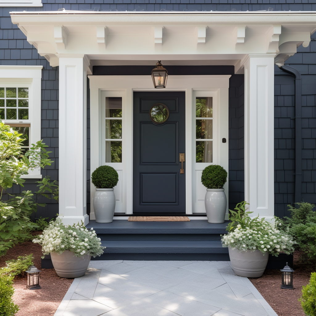
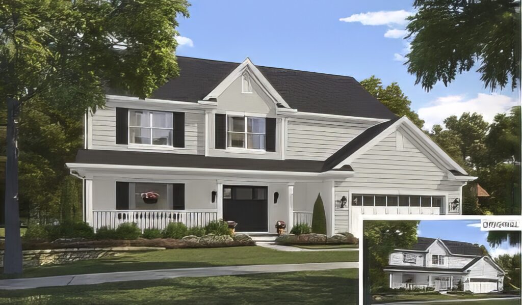
Navy Blue or Dark Gray: Houses with doors painted shades of navy blue to dark gray reportedly sold for a higher price. Here are top selling navy blue and dark gray colors that are popular and could be good choices. Example: “Hale Navy” from Benjamin Moore.
Benjamin Moore “Hale Navy”Benjamin Moore “Kendall Charcoal”Sherwin Williams “Naval”Sherwin Williams “Iron Ore”Sherwin Williams “Caviar”Behr “Starless Night”
The color trends for door colors in 2023 featured a lot of black and natural wood tones. Trends for 2024, you will see pops of color as well as traditional black and wood. Personally, I think the front door is a great place to add a pop of color and make your home more memorable to buyers. It is something they can easily change if they like.
AI generated image of home with front door painted in Benjamin Moore’s “Hale Navy” paint color.
Living Rooms:
Light Beige, Pale Taupe, or Oatmeal: Neutral colors in the living room can be appealing. Example: “Accessible Beige” or “Repose Gray” from Sherwin-Williams.
Sherwin Williams “Accessible Beige”Sherwin Williams “Repose Gray”Benjamin Moore “Revere Pewter”Benjamin Moore “Muslin”Sherwin Williams “Alpaca”Behr “Wheat Bread”
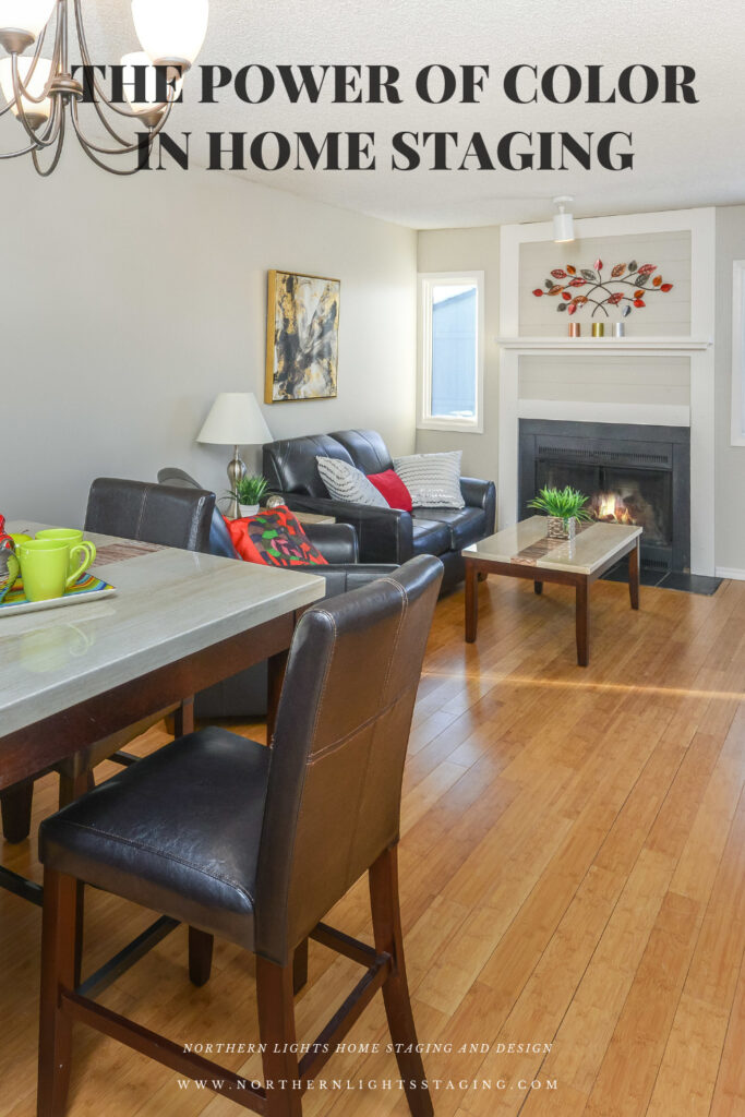
I have used Accessible Beige many times for home staging and found it to be a great color that works with a variety of fixed finishes and flooring.
I used Sherwin Williams “Accessible Beige” in the living room as part or a home staging project.
Kitchens
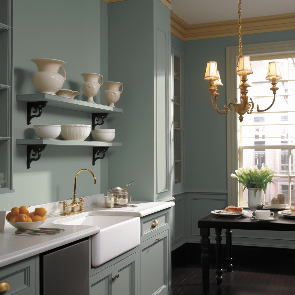
Light Blue to Soft Gray-Blue: These colors in kitchens reportedly increase home value. Example: “Smoke” or “Pale Oak” from Benjamin Moore.
.
Benjamin Moore “Smoke”Behr Light “French Gray”Benjamin Moore IcebrrgBenjamin Moore Woodlawn BlueSherwin Williams RainSherwin Williams Sea SaltAI generated image of a kitchen that uses Benjamin Moore’s “Smoke” paint color.
Bedrooms
Light Cerulean to Cadet Blue: These are reported to increase selling prices when used in bedrooms. Example: “Breath of Fresh Air” from Benjamin Moore.
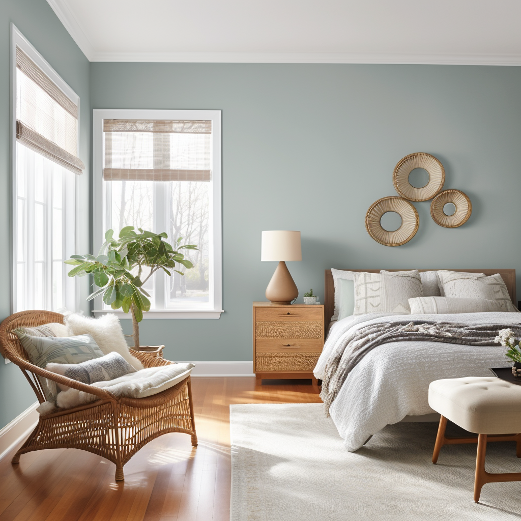
Benjamin Moore Breathe of Fresh AirBenjamin Moore Palladian BlueBenjamin Moore Wedgewood GraySherwin Williams RainwashedSherwin Williams Sleepy BlueSherwin Williams “Meditative”AI generated bedroom in Bohemian style that uses Benjamin Moore’s Wedgewood Gray paint color.
Bathrooms
Powder Blue to Periwinkle: Homes with bathrooms this color reportedly fetched a higher selling price. Example: “Bit of Sugar” from Behr or “Atmospheric” from Sherwin-Williams.
Behr “Bit of Sugar”Sherwin Williams “Atmospheric”Benjamin Moore “Quiet Moments”Benjamin Moore “Woodlawn Blue”Sherwin Williams “Watery”Sherwin Williams “Silver Mist”
Dining Rooms
Slate Blue to Pale Gray Blue: They can reportedly increase the sale price. Example: “Palladian Blue” from Benjamin Moore.
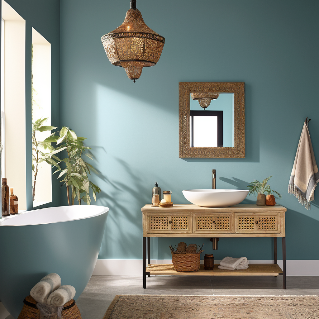
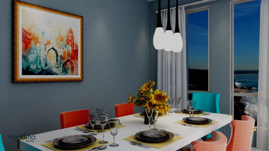
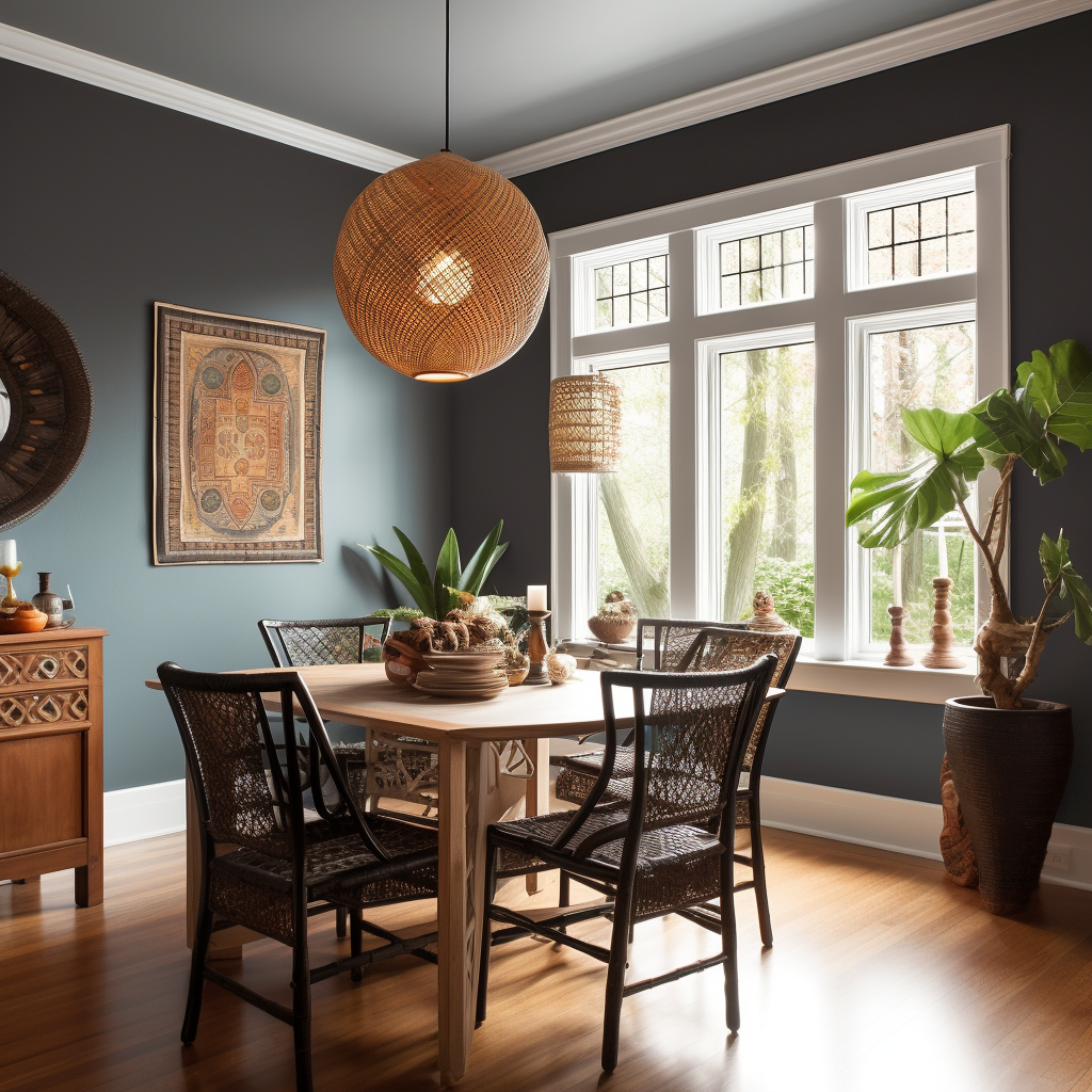
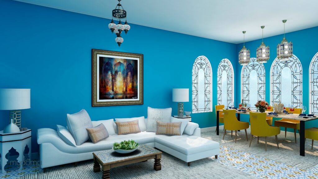
Benjamin Moore “Palladian Blue”Benjamin Moore “Yorktowne Green”Behr “Seagull Gray”Benjamin Moore “Smoke”Sherwin-Williams “Silver Strand”Sherwin-Williams “Slate Tile”An AI generated image of a global style bathroom that uses Sherwin Williams “Atmospheric” paint color. A global style dining room using Sherwin-Williams “Slate Tile” paint color. Edesign and Heart of India energy art by Northern Lights home Staging and Design.AI generated image of a global style dining room using Sherwin-Williams “Slate Tile paint color.
Exterior Colors
Greige (Mix of Gray and Beige): Homes painted this color often sell for more. Example: “Perfect Greige” from Sherwin-Williams.
Light Gray: This can boost the selling price. Example: “Gray Screen” from Sherwin-Williams.
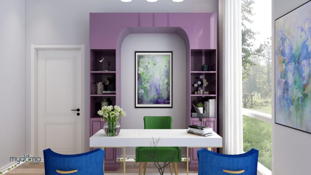
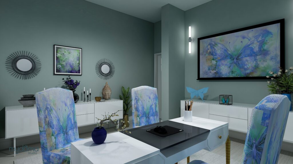
Sherwin Williams “Gray Screen”Benjamin Moore: “Gray Owl”Benjamin Moore: “Classic Gray”Sherwin-Williams: “Repose Gray”Sherwin-Williams: “Agreeable Gray”Behr: “Seagull Gray”Office using Sherwin Williams “Gray Screen” paint color.Edesign and Butterfly Medicine energy art by Northern Lights Home Staging and Design.
Putting it All Together
You might be wondering if you can simply choose your favorite colors from the recommended list and expect a higher selling price. The answer is not quite that straightforward. These recommendations serve as guidelines, but your entire color palette must work cohesively, starting from the exterior of your home and flowing seamlessly to the interior. Both exterior and interior colors should align with and complement fixed finishes that you don’t plan to change much, such as your roofing material, stonework, interior countertops, fireplaces, and flooring. It’s like solving a puzzle where each piece must fit together to create the whole picture.
When executed correctly, your color choices can be extraordinary, enhancing the overall appeal of your home. However, if the colors clash or feel disjointed, even if you can’t pinpoint the issue, potential buyers may sense that something isn’t quite right. The most effective strategy is to enlist the expertise of a certified color strategist who can curate a harmonious color palette based on your fixed finishes. By following these guidelines and working with a professional, you can increase your chances of selling your home faster and at a higher price.
Now that you understand more about color, why not let me help you get your colors right with a science based color consultation? Let’s get you the most possible on your home sale.
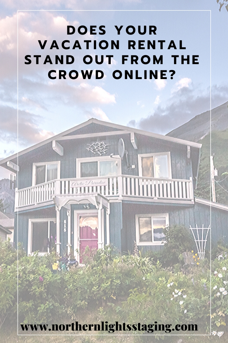
Does your Vacation Rental Stand Out From the Crowd Online?
Does your Vacation Rental Stand Out From the Crowd Online?
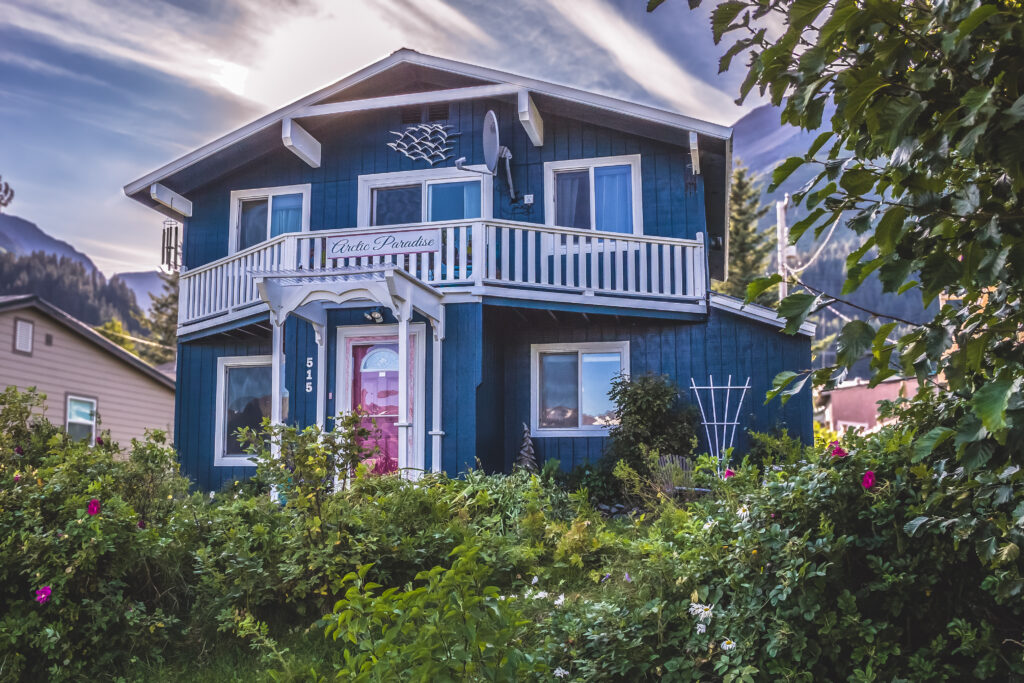
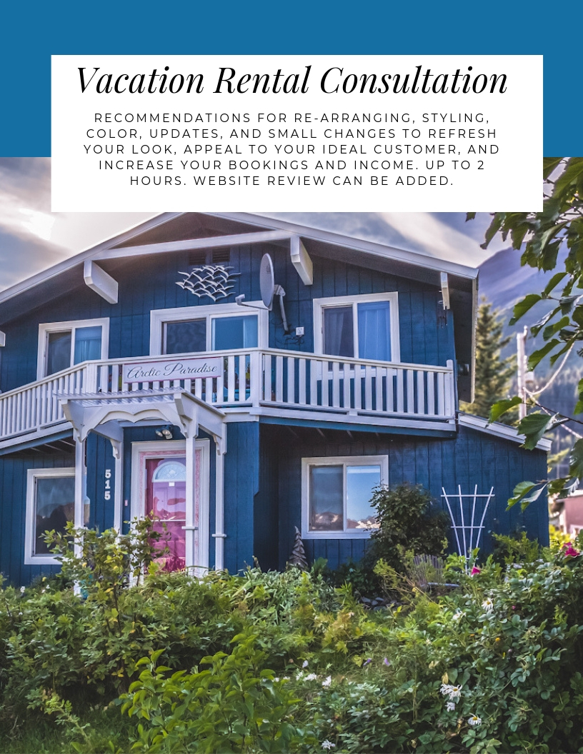
My vacation rental, Arctic Paradise B&B, is in Seward, Alaska, a place that is unbelievably beautiful and everyone wants to come on their once in a lifetime Alaska vacation.
Does Your Vacation Rental Stand Out form the Crowd?
And so, our market here is saturated with Bed and Breakfasts and other vacation rentals. The season here is about 100 days, so if you have a rental, you want to make sure it is booked every one of those days!
“The market here has become so saturated” said Nicole Lawrence of Seward Properties on a recent interview I did with her on Seward Public Radio’s Market Minute show. “There are so many people doing nightly rentals now. And especially the smaller places. At some point, when you are a customer traveling and checking vacation rental sites such as Airbnb or VRBO, all the vacation rentals start to look the same. There is a bed, there is a kitchen table. People don’t always put a lot of thought and personal choices into decorating their B&B. So it becomes really impersonal. They all start to blend together and at some point you just start looking for the best deal because everything just looks the same”.
So, unless you plan to just compete on price and offer the lowest rates, how do you get the bookings and income you want? And, more importantly, how do you get your ideal customers? They may not be the ones looking for the cheapest price. And you want to get people that will work with your situation, whether the Bed and Breakfast is in your house where you live or in a separate property in a residential area where the neighbors may be impacted if guests are noisy.
“For you, your guests are in your house where you live and interact with them daily. Some of my rentals are above my office, where of course I want guests that are respectful and quiet” said Nicole.
“I heard you talk about this to a group of people before and thought it was really interesting, on how you can attract the type of guests you want and how you can increase your income and bookings” said Nicole. “What kind of tips can you give us on that?”
Tips to Attract Your Ideal Customer and Increase your Vacation Rental Income
Who are you?
Figuring out what makes you and your rental unique and what you have to offer is the key. This is called “branding”. In home staging, we try to do this with the house…figure out what is special and unique about it and highlight that for buyers. So consider: • What makes you special? • What makes your rental special? • What are the things that only you and your rental can offer?
Your ideal customer will be attracted to you and your rental if you let them know who you really are and what you offer. Figuring out your “brand” will help direct the way you update the look of your property, how you portray what you are offering on your website and in your advertising and help your Ideal Customer find you.
For example, I am a retired wildlife biologist, an artist that creates stained glass, jewelry and alcohol ink art, a dancer and musician. I sell my art at my B&B and I also offer private lessons in music, art and dance as part of the experience for guests that want to explore their creative side. My decor has a wildlife theme and I display my art in the room and in my website photos. My ideal customers, call all the time and say, “I love your website because”, and then they mention one of these things.
Highlight your brand with your decor. Home staging by Northern Lights Home Staging and DesignReflect the interests of your ideal customer.Home staging by Northern Lights Home Staging and DesignHighlight things that make you unique in your decor. Home staging by Northern Lights Home Staging and Design
What do you want?
How much do you want to make and how much do you want to work? Answering this will help you determine your prices and what you need to do to justify those prices.
What income do you want and how much do you want to work for your Bed and Breakfast. Photo by Priscilla Du Preez on Unsplash.
I decided I wanted to make more and work less! I would rather have higher prices and less bookings than get bookings because my place was one of the cheapest.
Who is your Ideal Customer and what do they want?
Specific customers are going to be attracted to the brand you project. Is your brand attracting your ideal customer?
Who is your ideal customer?
What kind of place do they want to stay in? Do they want luxury or a more rustic experience?
What activities do they want to participate in? Do you offer them or can you help them find those activities nearby?
I wanted retired professionals with money to spend on a little luxury while still wanting to go on outdoor adventures such as wildlife viewing. I also wanted to attract people that appreciated art, music and dance and might be interested in exploring their creative side while traveling or purchasing one of a kind local art.
Update your Vacation Rental to Appeal to your Ideal Customer
Does the current look of your vacation rental appeal to that ideal customer?
Does the current look of your vacation rental justify the price you are charging in the eyes of your ideal customer?
Home stage it! Home Staging can update the look of your rental to reflect your “brand”, appeal to your ideal customer and justify the price you want to charge.
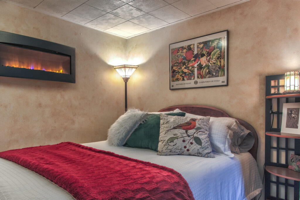
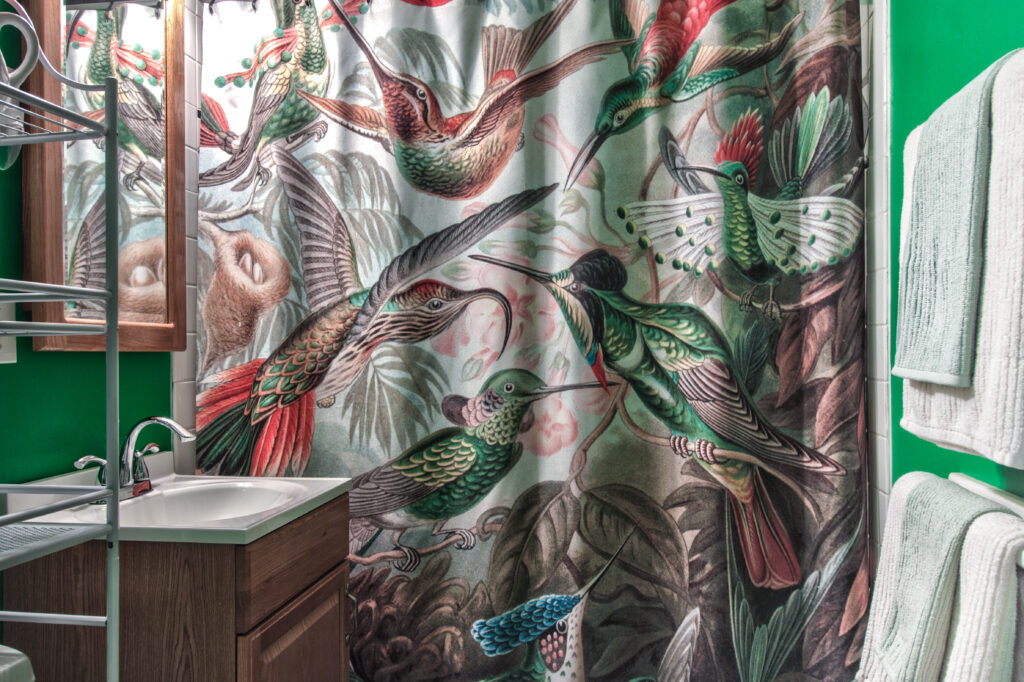
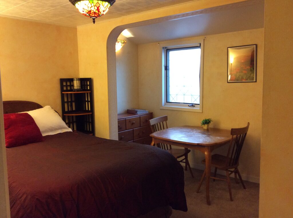
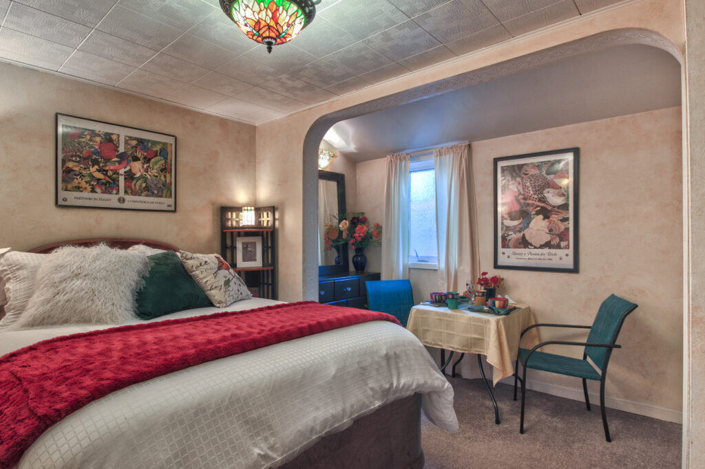
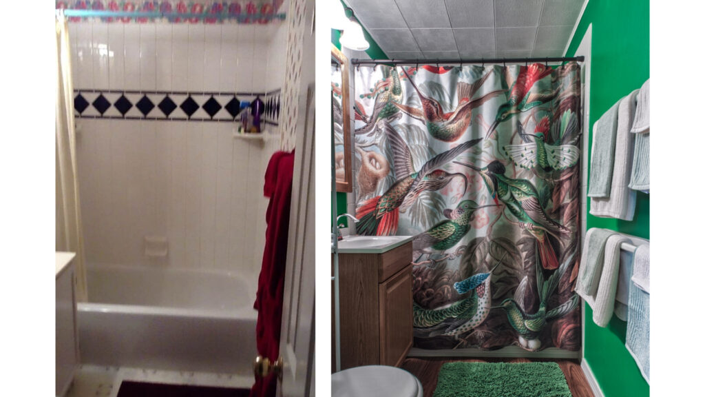
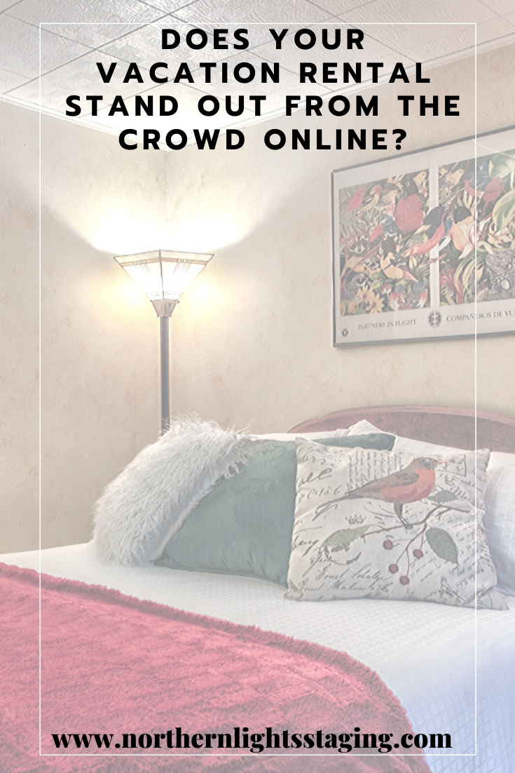
Here is an example of my Bed and Breakfast before and after home staging. Before, it did not reflect my brand or justify the price I wished. I was not attracting my ideal customers. Instead, I was attracting those looking for a cheaper price. After staging, I raised my prices substantially, and at least doubled my income and bookings.
Before home stagingAfter home stagingBathroom before and after home staging
Market your Property to attract your Ideal Customer
Market your property with great design to attract your ideal customer.
Get professional photos of your beautifully staged rental property.
Highlight your brand and what makes you and your property unique at the top of your home page.
Use your photos on social media them to create a great video.
I hired a professional photographer to get photos that highlighted my branding and updated my website and descriptions to reflect that.
Beyond Aesthetics: How Stunning Designs Boost Your Rental Income
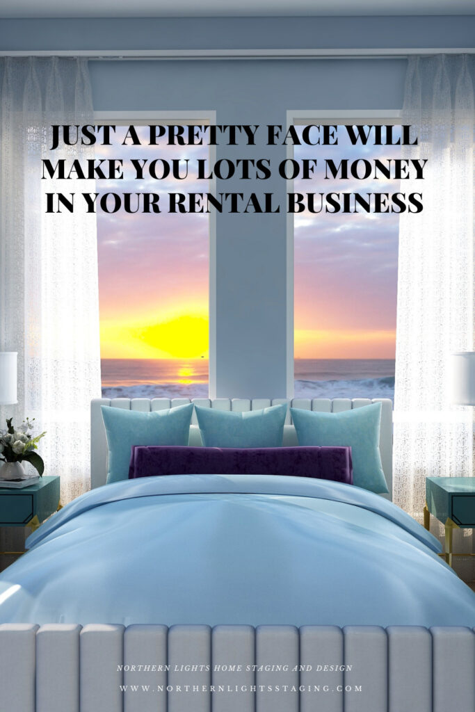
Do You Think Just Having a Pretty Face Won’t Cut It?
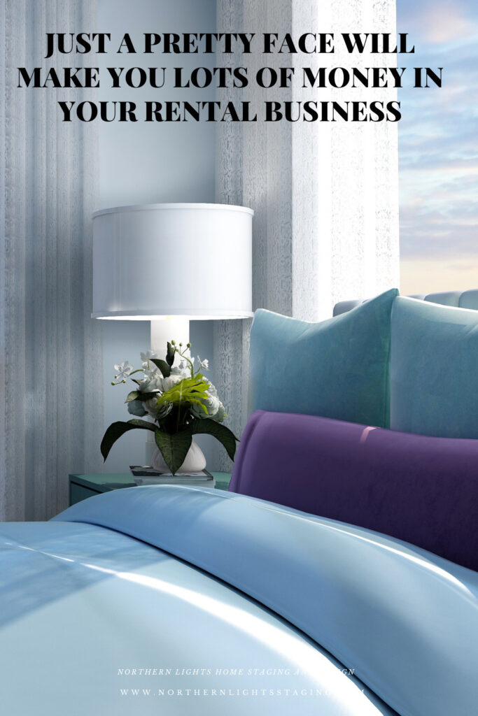
Many say that beauty is only skin deep, but in the rental business, a stunning first impression is invaluable. An attractive property lures customers in, setting the stage for a deeper connection. While maintaining them requires more than just aesthetics, it’s that initial allure that opens the door to potential success
What is a Pretty Face?
What do I mean by a ‘pretty face’? It’s your presentation – the outward appearance of your product, the energy it radiates, and the emotional connection it establishes with your customers. It’s the factor that determines whether they’ll get to know, like, and trust you and embrace what you’re offering. Simply put, it can’t just be good; it needs to be nothing short of amazing.”
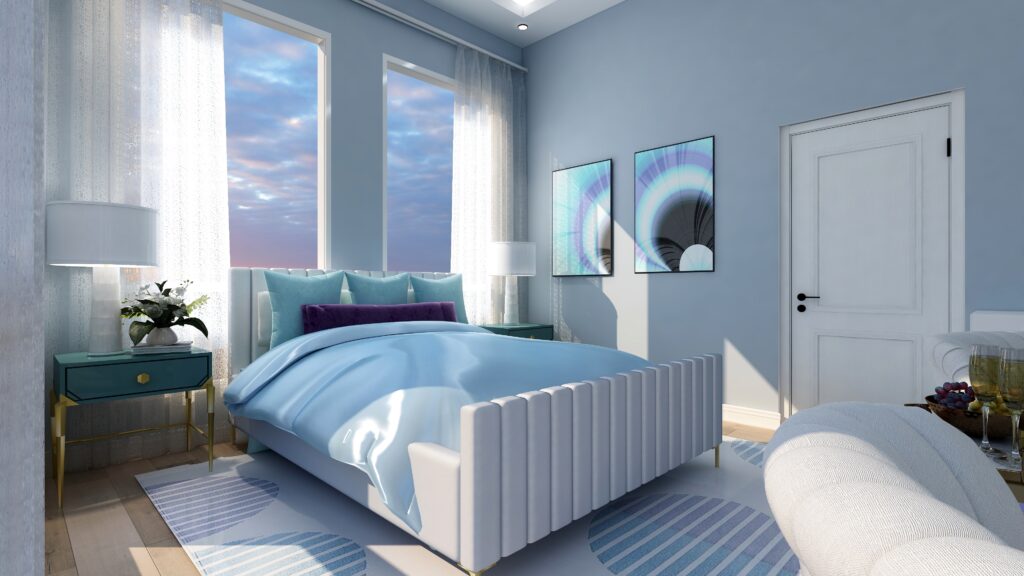
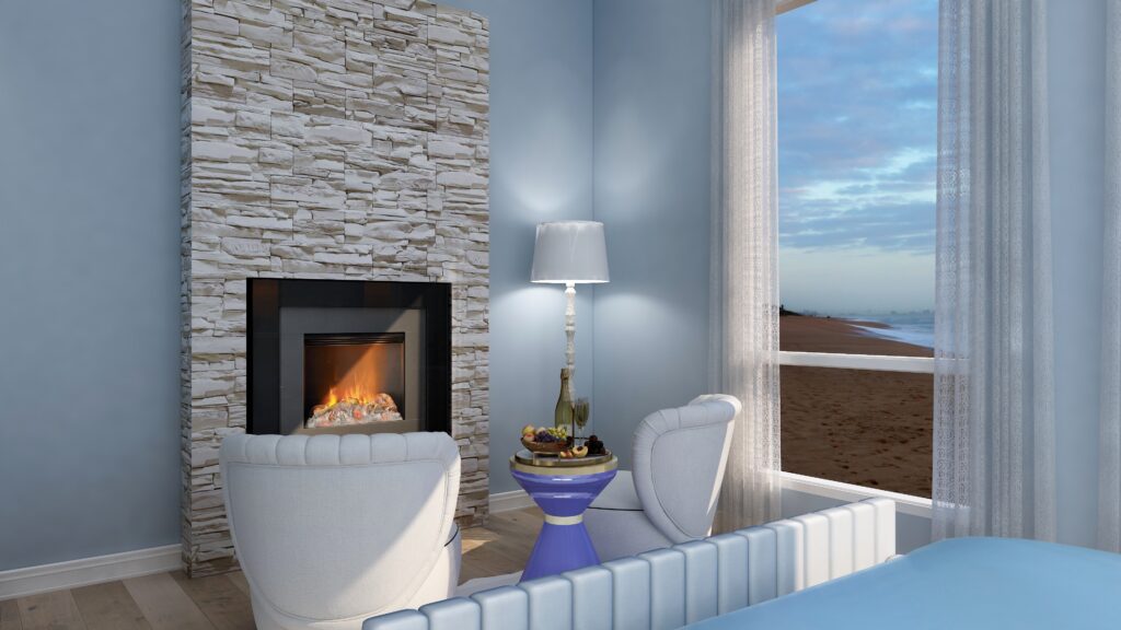
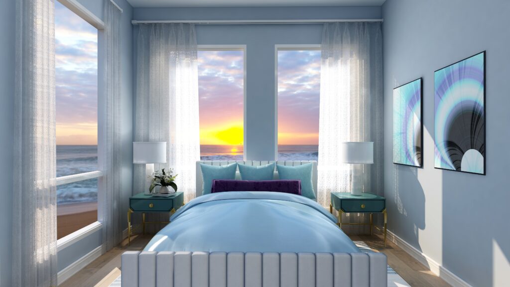
Vacation Rental Edesign and Energy Art by Northern Lights Home Staging and Design
It needs to provide a sense of expansion….giving the person something better than they have now so their life will feel better in your space.
Vacation Rental Edesign and Energy Art by Northern Lights Home Staging and Design
You can do that with home staging, decorating, Interior Design. It really all is the same thing, it is just the focus of who you are trying to please and how you do it that is different.
Vacation Rental Edesign and Energy Art by Northern Lights Home Staging and Design
Unlocking Wealth: The Potential of Real Estate Investments
Many people believe that investing in real estate can yield a significant return on their investment. Some choose to renovate their properties and sell them for a substantial profit. In these situations, home staging serves as the ‘pretty face’ that creates a sense of improved living, connecting with buyers and ensuring a swift and lucrative sale
Vacation Rental Edesign and Energy Art by Northern Lights Home Staging and Design
Some buy real estate with the intent of making money off short or long-term rentals. In this case, the key to success is not to have vacancies but to fully book your rentals as much as possible.
If you are renting apartments or houses that are unfurnished, photos of vacant spaces are not your friend. People do not emotionally connect to empty rooms. Home staging can be a great way to show the possibilities, how the rental can actually look and be used, and the wonderful life you will have if you only rent this place! Great photos of a beautifully staged rental are a wonderful marketing tool.
Maximizing Rental Profits: The Role of Home Staging in Real Estate Investments”
If you’re offering furnished rentals, it’s wise to collaborate with a professional stager or designer for decor selection and setup. A tastefully curated rental not only commands a higher price but also attracts more tenants and the right tenants for you.
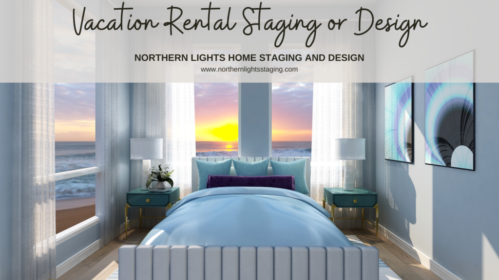
For those venturing into short-term vacation rentals or running a Bed & Breakfast, a well-staged or designed space is essential. It’s the first impression online leading to bookings, and it ensures guests have a pleasant experience during their stay. Engage a professional to enhance aesthetics, produce captivating marketing images, attract your ideal guests, and guarantee their satisfaction throughout their visit.
Vacation Rental Edesign and Energy Art by Northern Lights Home Staging and Design
The Key to Making Money on Rentals
The secret to rental success, be it short or long-term, lies in presenting your property at its finest through captivating marketing photos. Attracting a steady stream of customers, thereby eliminating vacancies, is paramount. Moreover, ensuring the happiness of your customers, leading to glowing reviews, is essential.
Let the charm of your property be your key to profitability.
Let that pretty face make you lots of money.
Vacation Rental Edesign and Energy Art by Northern Lights Home Staging and Design
Ready to Update Your Rental for More Profits?
Ready to pivot and elevate your business? Think about where you might stand a year from now without taking decisive action.
Leverage my vacation rental design, home staging or Interior Design expertise to maximize your rental returns. With hands-on experience owning a Bed & Breakfast, I specialize in refining vacation rentals, enhancing their appeal, and increasing profitability.
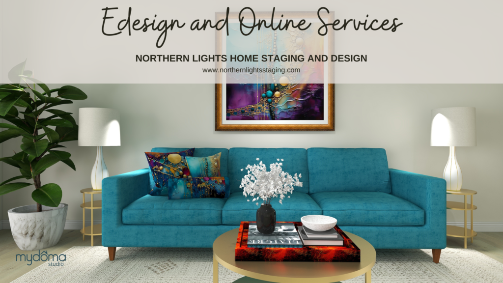
Benefit from my Edesign Services, producing stunning visuals like the ones showcased in this blog, spotlighting the potential of your vacant rental spaces.
Unlocking the Truth About Choosing Paint Colors
Unlocking the Truth About Choosing Paint Colors
Choosing paint colors can be a daunting task, causing stress and potential costly mistakes. Why is it so challenging? The truth is, much of the advice out there on selecting harmonious paint colors is misleading. Making the wrong choice can either drain your wallet or haunt you daily in your living space. Let’s set the record straight.”
Seeking Answers in All the Wrong Places
Perhaps you’ve scoured blogs by renowned color experts or relied on the advice of your local paint store. Maybe you’ve taken to online forums like Houzz, seeking the perfect color for your space, only to receive a multitude of well-intentioned yet ultimately inconclusive responses. It’s possible you trust your own color intuition implicitly, thinking you’ve got it all figured out. But how’s that working for you?
I embarked on a personal journey to comprehend the intricacies of color, and I’ve come to a profound realization. I now understand more than ever why people grapple with paint color choices and why costly mistakes are nearly inevitable. I’ve been down that road myself!”
Ever screw up picking your paint colors?
I’ve always had a deep love for color and a keen sense of what shades complemented each other. My exceptional memory for colors served me well when shopping for items that needed to match a particular hue. I relied on my innate ‘color sense’ for years.
When I started my home staging and design business, I quickly realized the significance of selecting the right paint colors to help homeowners sell their properties.
While I grasped the importance of neutral tones to appeal to a broader spectrum of buyers, the process of picking specific colors often boiled down to following guidelines created by others. These guidelines were often based on personal, subjective opinions and their own ‘color sense.’ Unfortunately, the rationale behind these color choices was rarely explained in detail.
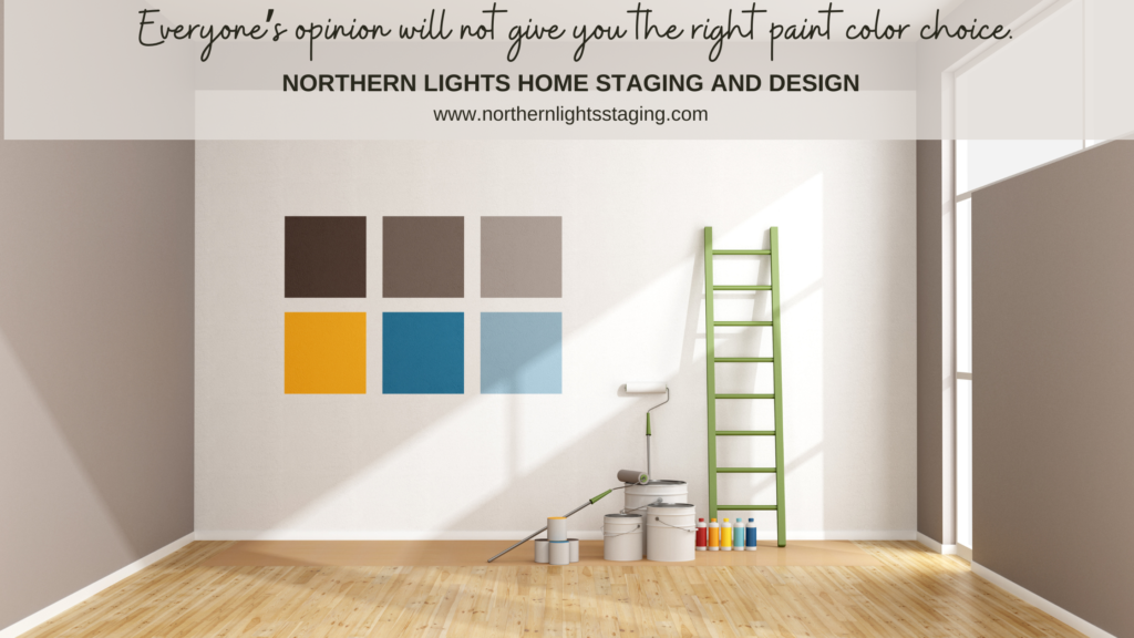
Every space is unique, and relying on others’ opinions for your color choices won’t necessarily yield the right answer. In fact, painting a bunch of swatches on your wall, like this, can invite color mistakes. Discover why by downloading my free report, ‘Ten Ways Not to Make Mistakes When Choosing Your Paint Colors.
Desiring a deeper understanding and grappling with the challenge of identifying ‘undertones,’ I decided to undergo color training to become a certified color expert. The training provided insights into identifying ‘warm and cool’ color schemes and recognizing ‘undertones.’ However, these insights were based on the trainer’s visual perception, leaving me without clear instructions on how to determine ‘undertones’ independently. Essentially, I was instructed to assess colors against a ‘white’ background and rely on my own visual perception.
My quest for knowledge led me to explore various blogs and podcasts by numerous ‘color experts,’ each of whom had developed their unique methods for explaining color relationships and their perceptions of what worked harmoniously together. The conflicting information left me feeling increasingly bewildered.
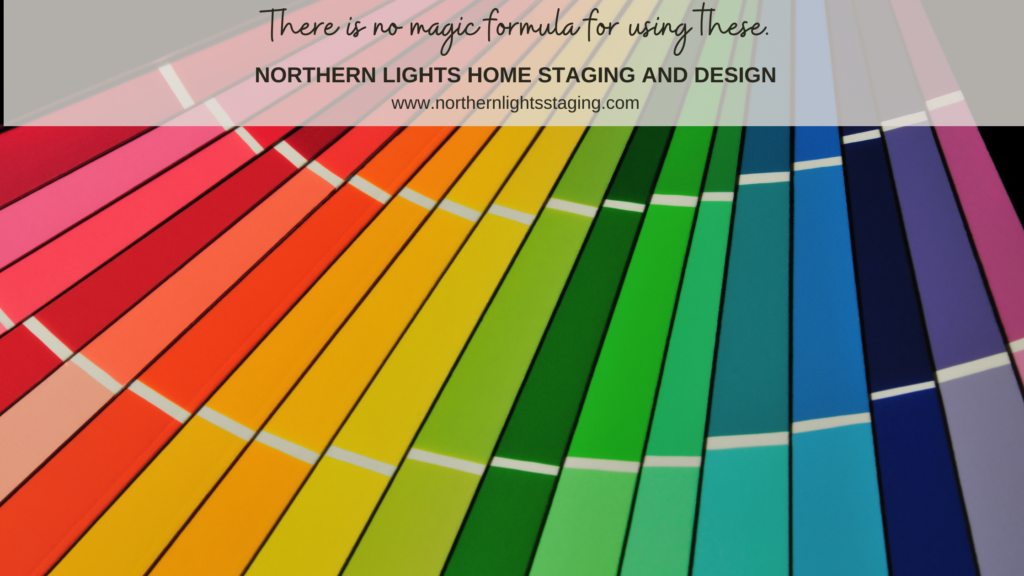
At one point, I even considered the possibility that paint companies held the secret to understanding undertones. I reached out to them, seeking answers about whether certain colors would complement one another. I spent hours examining color fan decks, convinced that hidden secrets lay in the arrangement of colors on those sheets. I couldn’t have been more wrong!”
There really is no secret code to how paint fan decks are ordered.
My understanding of how color worked seemed to improve over time. I had accumulated a wealth of ‘rules of thumb,’ advice, and lists of harmonious color combinations from well-intentioned color experts. Yet, a sense of mystery persisted, and I felt like I hadn’t truly grasped the essence of color theory, especially given the divergent approaches of these experts.
The Turning Point: The Science of Color
My quest for answers eventually led me to the world of color science—a turning point in my journey. Here, I discovered how color truly operates, from the principles governing its behavior to the rules of color order, and how to solve intricate color puzzles.
I learned that the term ‘undertone,’ often used by those who lack an understanding of color science, is an inaccurate description. It merely represents a subjective opinion of color based on individual visual perception. Remarkably, we all perceive color in our unique ways.
My breakthrough came when I enrolled in ‘The Four Pillars of Color,’ a course taught by Lori Sawaya through Camp Chroma. This course introduced me to the Munsell Color System, a century-old foundation for comprehending color. It provides the framework for how colors are organized, how paint shades are determined, and how color remains consistent in various products. It specifies colors based on three properties of color: hue (basic color), chroma (color intensity), and value (lightness).
Each color can be likened to having its own ‘DNA,’ consisting of four distinct aspects that render it unique. While it may sound intricate, this system offers an orderly and logical approach to understanding color.”
The Munsell Color Space Color science makes understanding , measuring and describing color easy.
I discovered that the fan decks from paint companies lack logical ordering, and the concept of ‘undertones,’ as most color experts use it, doesn’t hold water. Surprisingly, a significant portion of the color information available is simply incorrect.
While some artists and designers may dismiss the use of science as a fun spoiler, I challenge them to consider whether they’ve ever made color mistakes and wished they had a clear understanding of why. Are they aware that each person perceives color slightly differently? How can they be certain that their perception aligns with that of their clients? Relying solely on ‘color sense’ is a highly subjective approach. Even those who believe they’ve found a magic formula through color-measuring tools and apps can benefit immensely from comprehending the underlying data and its practical applications.
The True Magic Lies in Blending Art and Color Science
In truth, selecting appealing color combinations still hinges on your personal preferences and those of your clients. There exists a beautiful synergy between the art and science of color selection. A proficient color strategist possesses the ability to merge these elements seamlessly, offering not only a keen eye for color but also the scientific knowledge to refine selections. With the right expertise, the perfect colors become an achievable reality.
Get Your Colors Right the First Time
Now that you understand more about color, why not let me help you get your colors right with a science based color consultation?
Inspiration- What gets you going! Why I am a Home Stager and Designer.
Reflecting on my 2016 musings about inspiration, I revisited them in 2020 and now again in 2024. This recurring introspection reveals the evolution of both myself and my business. It’s vital to periodically assess if our current direction aligns with our evolving selves.
What sparks your enthusiasm each day? What drives the essence of who you are? What ignited my passion for establishing a home staging and design venture, and why does it hold significance?
Many term this as one’s “brand”. What makes you the go-to choice over competitors? Likely, it’s that ineffable quality that motivates you, resonating with others, fostering connection and trust. While most discuss their exceptional products or services, the true differentiator is personal. What sets you apart?
For me, it’s not just beauty that captivates me, but also the underlying energy of everything I observe. It’s what you feel and how it transforms you.
Nature, with its myriad of colors, patterns, light, and textures, still feeds my definition of beauty. Undoubtedly, nature is the ultimate designer, offering magic at every glance!
During my alternate career spanning nearly 25 years as a wildlife biologist, I’ve minutely observed nature, from grand landscapes to microscopic details. This keen observation translates to my designs—whether envisioning a room inspired by a vibrant bird’s colors or imagining a fabric pattern based on a microscopic plant structure. Every natural element, from a glacial lake’s hue to a rising full moon’s light, propels my creativity. And now, I delve deeper into understanding the energetic messages of the natural world and how they can enhance your space and ultimately, you.
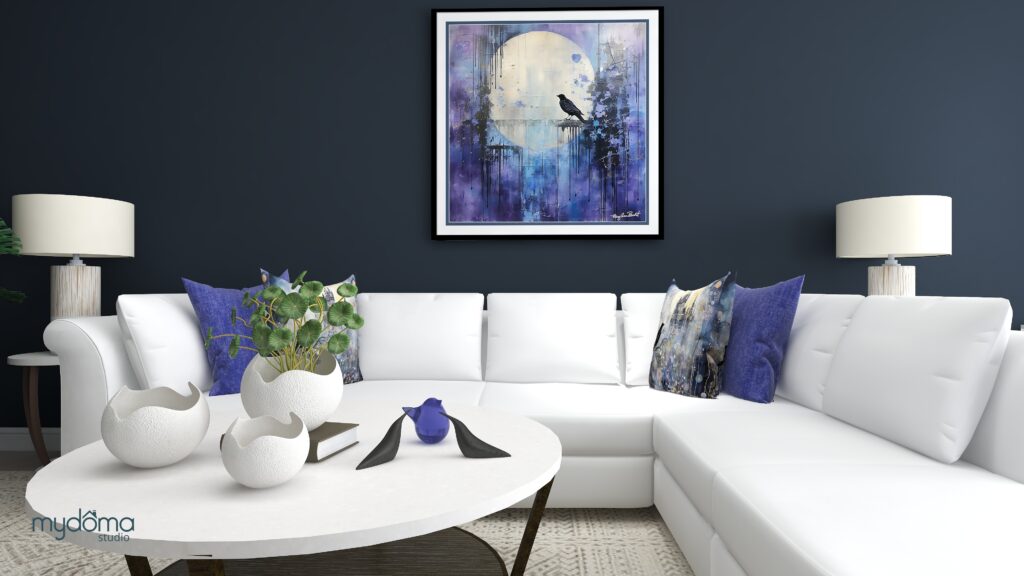
Crow Medicine Energy Art and Edesign by Mary Ann Benoit.
This awe of nature, especially from witnessing the northern lights, inspired my business’s name—Northern Lights Home Staging and Design. It embodies the wonder I aim for clients to feel upon seeing their transformed space.
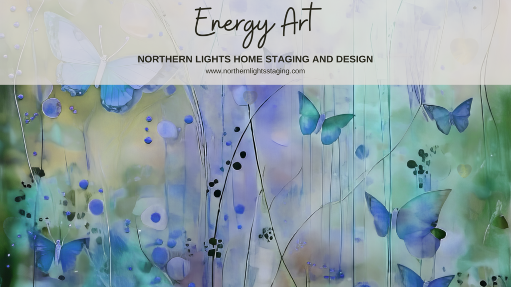
Butterfly Medicine Energy Art and Edesign by Mary Ann Benoit.
With each project, once I perceive a home’s potential, it occupies my thoughts until the vision materializes.
Over time, my core inspirations have remained constant, yet layers of depth and meaning keep expanding my vision and guiding my business’s trajectory. Nature’s allure steered me towards Biophilia and global style based designs, fostering a connection between interiors and the natural world.
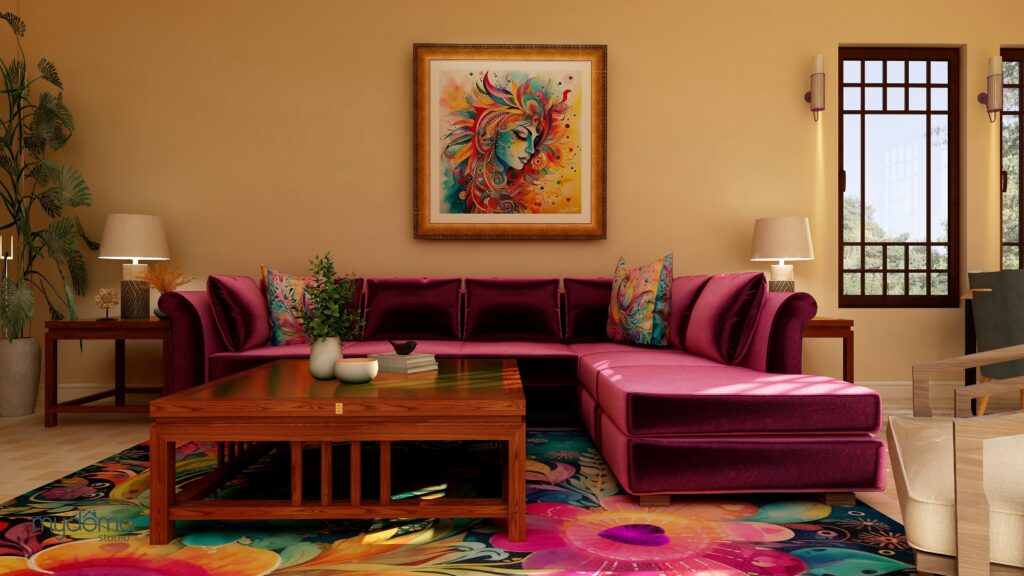
Global Style- Moroccan Energy Art and Edesign by Mary Ann Benoit.Global Style- Mexican Energy Art and Edesign by Mary Ann Benoit.
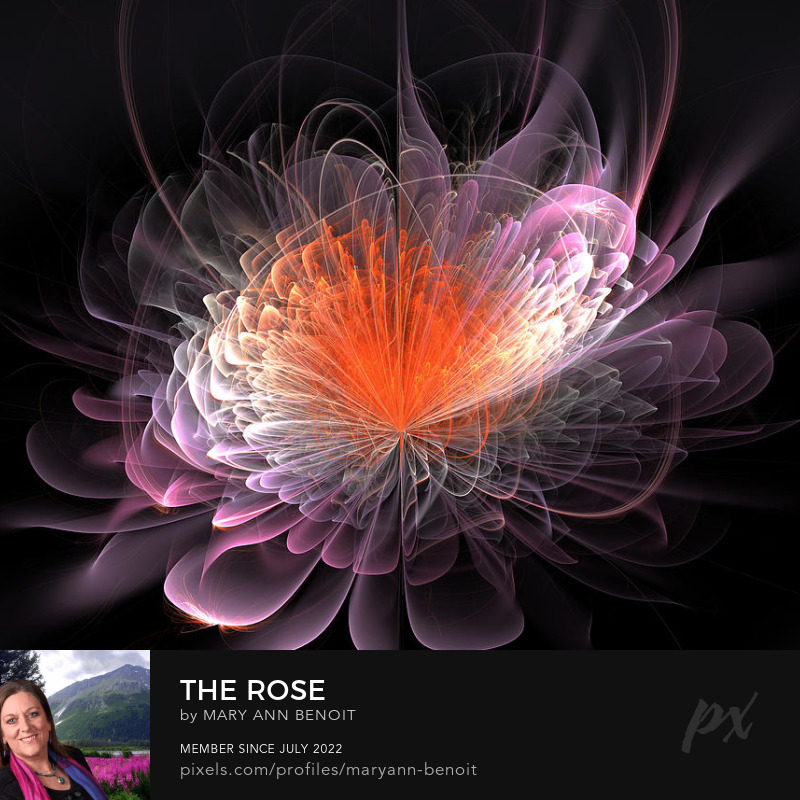
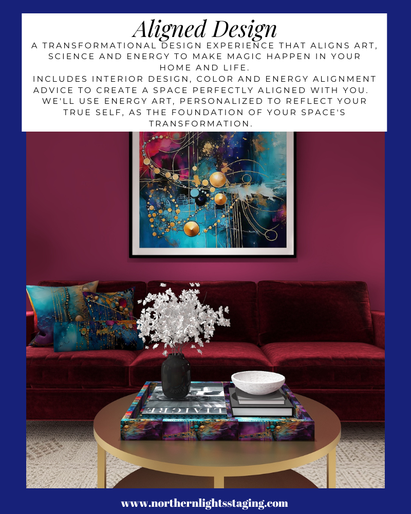
My color fascination led to my certification as a color strategist, harmonizing both the art and science of colors. Notably, I’ve delved deeper into creating energy art which has become the foundation of my design and the unique Aligned Design philosophy which guides me. I’ve also ventured into creating home décor lines inspired by my energy art on platforms like Pixels.com, Society 6, Le Galeriste, and Contrado.
I eagerly anticipate the innovations the upcoming decade holds.
So, what fuels your life and business aspirations?
Me, with some of my energy art, “The Shiny Ones” in the background.
There are lots of simple things homeowners can do on their own to decorate their homes to sell. They can get rid of clutter, repaint, clean or put out fresh flowers. So why hire a home stager?
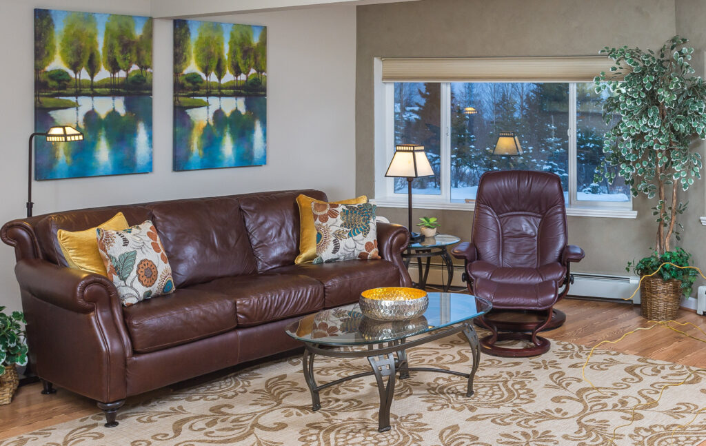
Home Staging by Northern Lights Home Staging and Design.
Many homeowners are unsure of what paint colors to choose or where to move the clutter. The process of selling a home can be completely overwhelming. They often lack real estate knowledge about their local markets and how homes in their price range should look.
A home stager has the ability to look at a home with a fresh pair of eyes. They view the home as a highly critical buyer would see it. Home staging expert Debra Gould provides five examples of how a professional home stager can benefit you:
A home stager knows what’s needed to create the right environment quickly and at the lowest cost.
A home stager knows what homes in different price ranges look like and what’s selling. They will give homeowners suggestions that their real estate agent may be afraid to offer because the agent does not want to risk losing the listing.
A home stager is not emotionally attached to any of the home’s contents, which means that they can see the home in a way that someone who has been living there for years simply cannot. Using their fresh vision, they recommend the optimal way to rearrange existing furniture, art and accessories.
A home stager can quickly choose new paint colors, flooring, tiles, countertops or any number of finishes. They have a ready source of painters, cleaners, handymen, off-site storage and a myriad of other services that may be needed on short notice.
A home stager can bring in replacement furniture, accessories and art if what is there isn’t appropriate for the home’s target market or the home is empty.
Home staging is not just for multimillion dollar homes. Even for modest homes, staging can have a dramatic effect on the selling price and the number of days spent on the market. For example, one of the homes Gould staged had previously been on the market for months with the best offer being $350,000. She spent 90 minutes with the owner rearranging the furniture, putting items in storage and telling him what needed to be cleaned. He sold the house the following week for $361,000!
How many other (legal) ways can you think of to invest $600 and get an $11,000 return on your investment the following week?
Home Staging by Northern Lights Home Staging and Design.
Internationally recognized home staging expert Debra Gould is president of Six Elements and creator of the Staging Diva Home Staging Business Training Program with over 4,000 students worldwide. Gould is the author of four home staging guides and offers a Directory of Home Stagers to help homeowners and real estate agents locate home stagers who will decorate homes to sell quickly and for top dollar. To learn more, visit www.stagingdivadirectoryofhomestagers.com
Home Staging by Northern Lights Home Staging and Design.
5 Steps to Attract Your Ideal Customer and Increase Your Vacation Rental Income
Would you like to attract your ideal customer and increase your vacation rental income? Whether you have a Bed and Breakfast or other vacation rental, it is important to have your property stand out online to attract the guests you want and make the income you want. Learn more by listening to this interview with Mary Ann Benoit on Seward Public Radio’s “Market Minute” with Nicole Lawrence.
These five tips can dramatically increase your Bed and Breakfast or vacation rental income and bookings and attract your ideal guests! I used home staging to make a huge difference at my own B&B and at least doubled my income and bookings. Now my branding attracts guests I love to have stay. Report includes video examples. Download your report now. Price: $4.99.
Many people struggle with finding the perfect color scheme, often bound by the constraints of their existing finishes. But what if we make this more fun? Imagine magnifying and embracing your favorite color wholeheartedly. Welcome to the world of Monochromatic design!
Monochromatic schemes delve deep into one hue, exploring its diverse shades, tones, and tints. Visualize your cherished color transitioning from its lightest whisper to its richest depth, seamlessly incorporating white and black.
Example of a monochromatic blue color palette. Photo by
Why is it effective? The singular hue fosters visual harmony, resulting in a seamless design. Think of the design principle: “All greens blend” or “Every blue complements the other.” Their shared base hue unifies them, ensuring a cohesive look.
But isn’t monochromatic boring? NO! The absence of contrasting colors can be offset by using a range of “blue” hues for example rather than just one. You can also create drama and interest with patterns and textures.
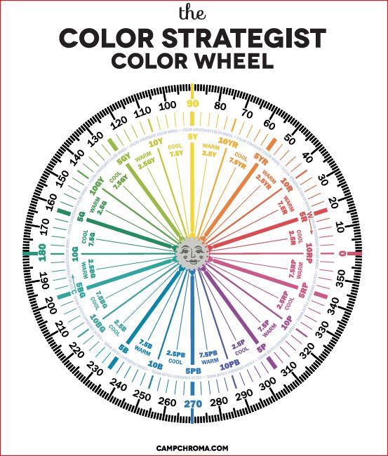
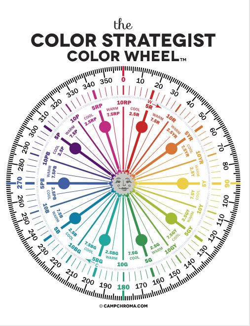
For instance, I could craft a monochromatic palette starting with the blue at 230 degrees on the color wheel. From there, I’d explore its spectrum, transitioning from pure white (unsaturated) to shades of light blue, deepening to dark blue, and ultimately black. To add richness, I might dabble with hues ranging from 235 to 250 degrees, all within the blue family, while experimenting with different saturation levels.
When I select my design pieces, I look for various materials, textures and patterns to add variety, such as mixing soft and hard, matte and shiny, smooth and rough, curves and straight lines etc.
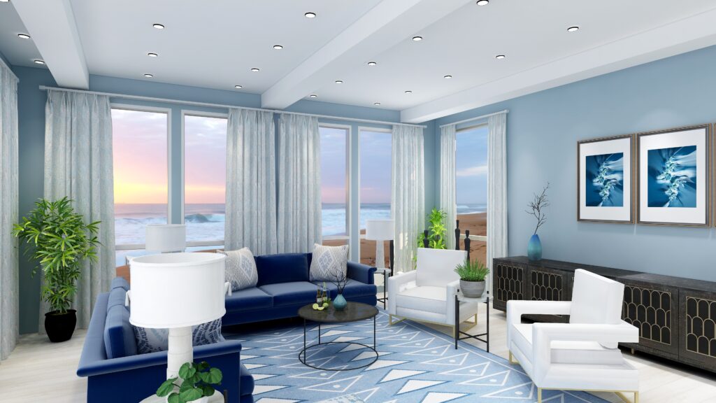
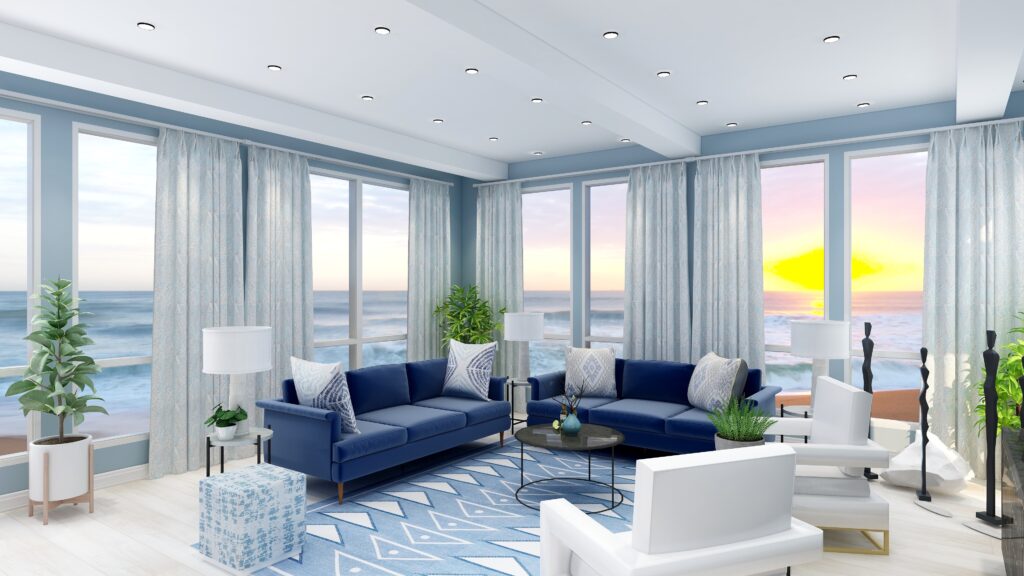
Mastering Monochrome: A Singular Hue Living Room Transformation”
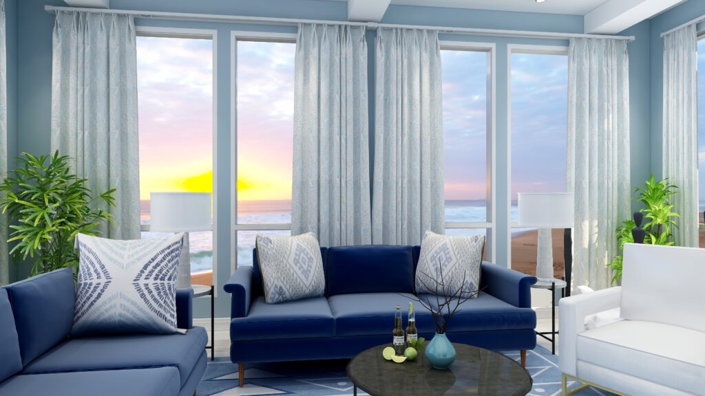
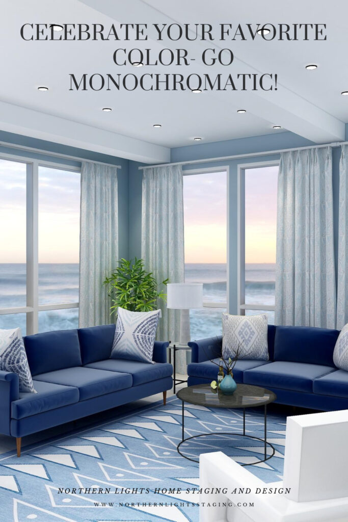
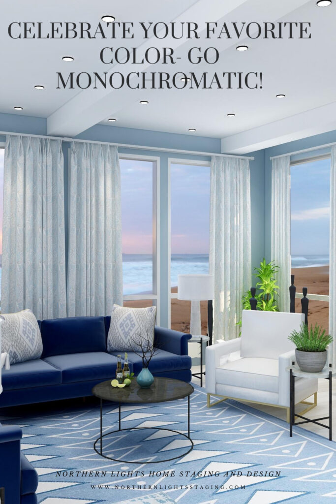
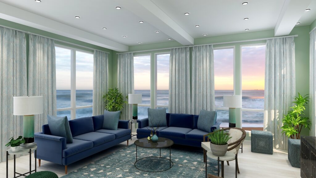
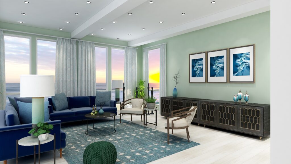
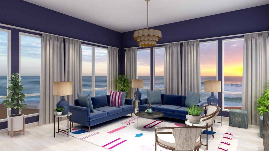
I created this living room design where I embraced a blue monochromatic palette. From pristine white to profound black, the spectrum features diverse blue hues manifesting in paint, furniture, drapery, lighting, and accents. Admittedly, the greenery introduces a dash of contrast, lending the space a touch beyond strict monochrome.”
Monochromatic Blue Living Room Edesign and Spring Fractal Art by Northern Lights Home Staging and Design.Monochromatic Blue Living Room Edesign and Spring Fractal Art by Northern Lights Home Staging and Design.
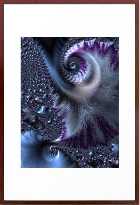
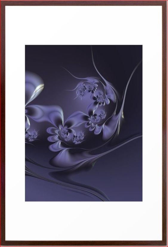
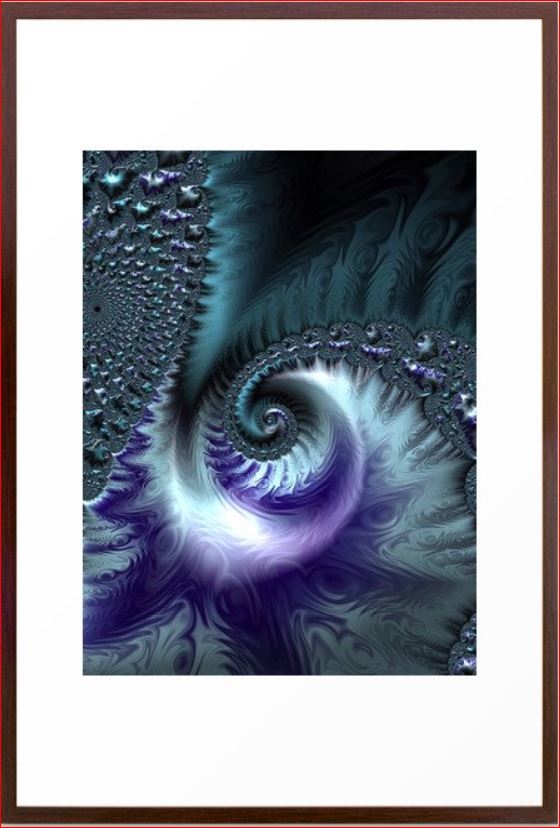
This design incorporates some of my original fractal art in a collection called “The Sea”, which reminded me of white caps on the ocean and also uses variety of blue shades.
The Sea The Sea #2 The Sea #3
See More of My Blue Energy Art
See a collection of my blue energy art which could work beautifully together in creating your own blue monchromatic color scheme.
Benefits of A Monochromatic Color Scheme
A monochromatic color scheme offers several benefits, including:
Cohesiveness: By using variations of a single hue, the design inherently feels unified and harmonious.
Visual Simplicity: Monochromatic designs reduce visual clutter, making spaces feel more organized and easier on the eyes.
Flexibility: With one dominant color, it’s easier to mix and match patterns, textures, and shades without overwhelming the space.
Depth and Dimension: By using tints, tones, and shades of a single color, you can create depth and dimension in a space without introducing multiple colors.
Creates Mood: Depending on the color chosen, monochromatic schemes can evoke specific moods – blues for tranquility, reds for warmth, greens for rejuvenation, and so on.
Easier Color Coordination: Choosing decor, furnishings, and finishes become simpler when you’re working within a single color spectrum.
Timelessness: Monochromatic rooms often have a timeless quality and can stay relevant despite changing design trends.
Highlights Architectural Features: In a monochromatic setting, architectural features can stand out more as they aren’t competing with varied colors.
Enhanced Spatial Perception: In some cases, using a monochromatic scheme can make spaces seem larger or cozier, depending on the hue and its intensity.
Focus on Texture and Form: With color variation minimized, there’s a greater focus on other design elements like texture, form, and material, allowing for richer tactile experiences.
Using a monochromatic scheme can be a strategic design choice to bring tranquility, unity, and a unique aesthetic appeal to any space.
Edesign by Northern Lights Home Staging and Desigo
Celebrate Your Favorite Color
Imagine entering a room where every hue resonates with your spirit, instilling a profound sense of joy and tranquility. A sanctuary where you rejuvenate and spark inspiration. When your space mirrors your essence, harmony effortlessly follows.
Why not infuse the vibrant colors of summer into your dwelling? Or perhaps the palette of your cherished season?
Elevate your space with an Aligned Design Consultation today.
People often struggle with creating a great color scheme. Often, we start the conversation by talking about the limitations, or the box of colors you need to play with based on your fixed finishes.
In my last article, Celebrate Your Favorite Color- Go Monochromatic, we talked about how you could take your favorite color and celebrate it in all it’s glory with a monochromatic color scheme. Simple and easy!
What if you would like a little more color variety, but still want something that is simple and easy to create? Go analogous!
Analogous color schemes are based on three hues that are next to each other on the color wheel. They are friendly neighbors, they like each other and play well together:)
Analogous colors are harmonious and often found in nature.
Example of an analogous color scheme found in nature.
Why does it work? They go well together because one of the three colors is usually a combination of the other two as with the red, yellow and orange peppers above.
Analogous schemes offer more color variety than monochromatic schemes while still retaining that harmonious and often serene quality, although it can also be more dramatic too based on the hues you use. It is also a simple scheme to create by using your color wheel and picking three adjacent colors that you like.
Which three adjacent colors are your favorites?
MY favorite color training course, Camp Chroma.
For example, in my last article, I created a monochromatic design using blues and blue/purples around the range of 250-270 on the color wheel.
Monochromatic Blue color scheme. Edesign by Northern Lights Home Staging and Design.
If I wanted to take this monochromatic design, and create a more analogous scheme, I could go clockwise around the color wheel and add the neighbors of blue in including purple and red-purple. Or, I could go counter-clockwise and add blue-green and green.
I could also pick neighbors on either side and add purple and blue green. Let’s play.
Analogous Color Scheme #1
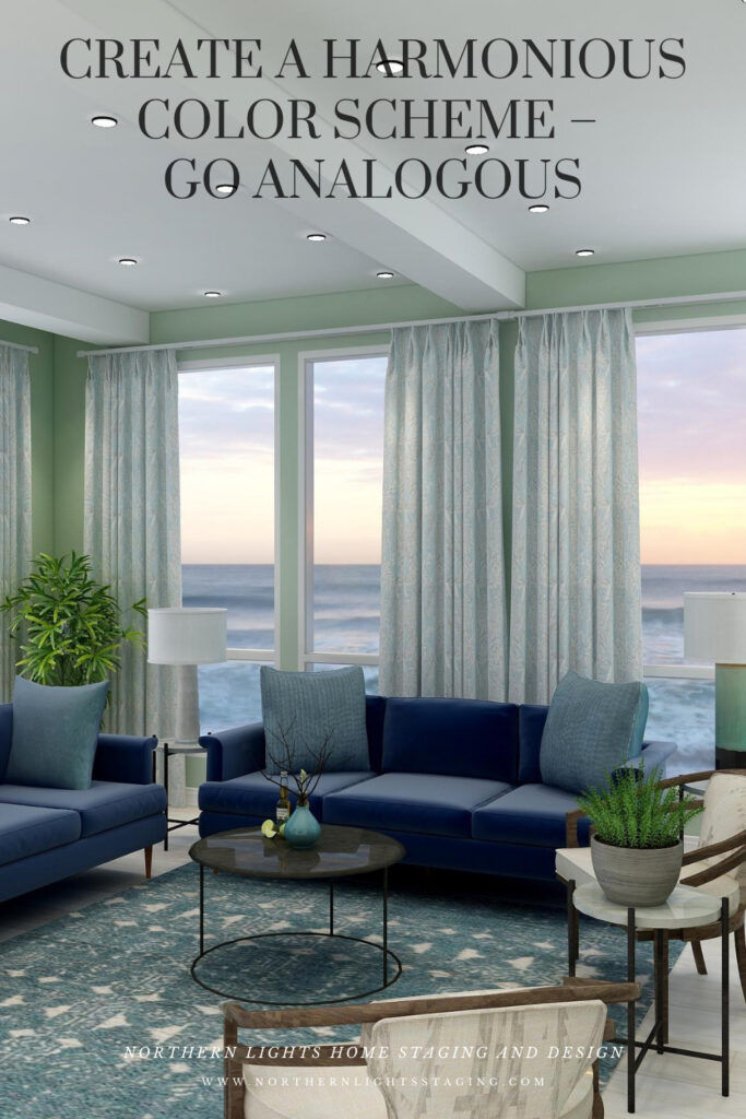
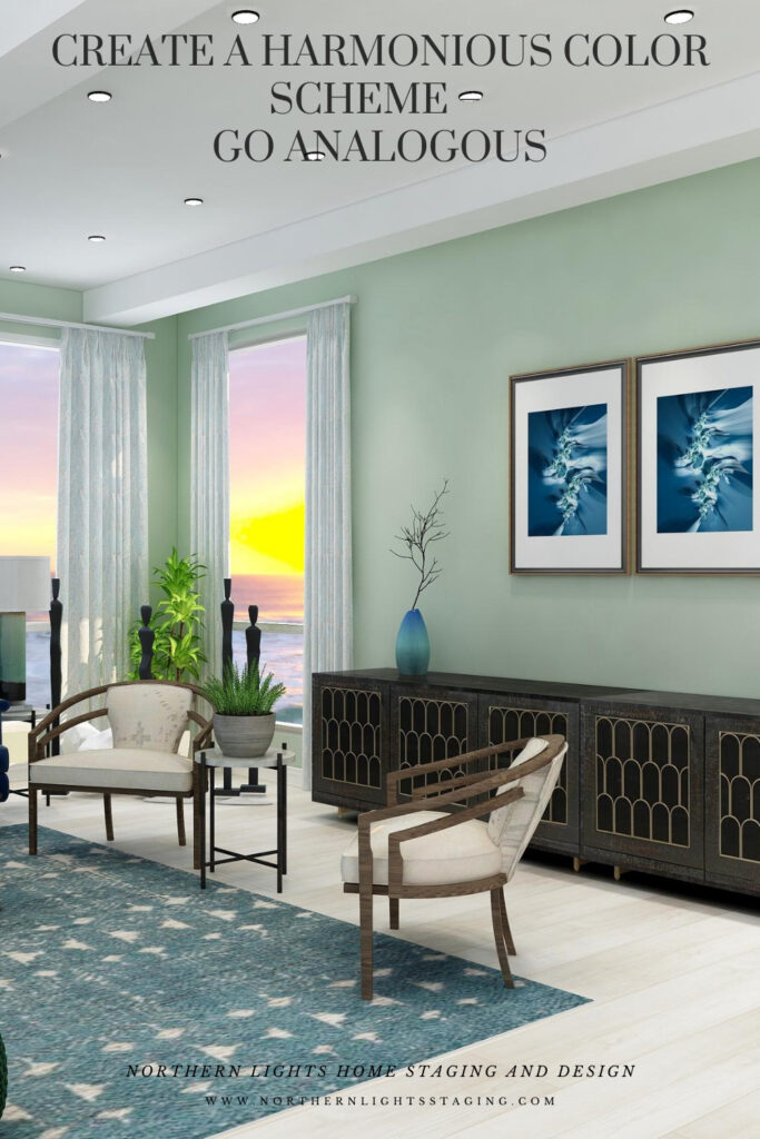
This design starts with our base blue as in the sofas and moves counter-clockwise along the color wheel to include blue greens and greens. I set the tone for this design with a new rug in blue green and then changed the paint color, lamps, side chairs and some of the accessories. I maintained the sofas and art as the anchor of the main blue color I wanted to harmonize with.
This design still maintains a calm, serene feeling similar to the original monochromatic scheme, but feels a little richer and warmer with the greens and blue greens.
Analogous color scheme and Edesign by Northern Lights Home Staging and DesignAnalogous color scheme and Edesign by Northern Lights Home Staging and Design
Fractal Art
This design, as with the monochromatic design, incorporates some of my original fractal art in a collection called “The Sea”, which reminded me of white caps on the ocean and also uses variety of blue shades.
The Sea The Sea #2 The Sea #3
Analogous Color Scheme #2
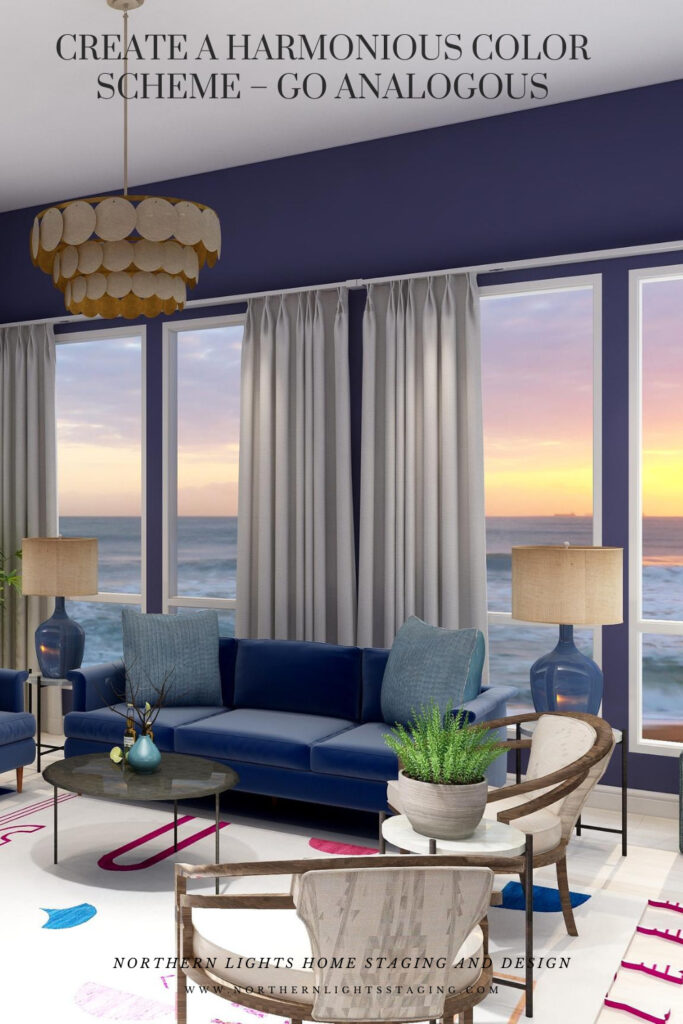
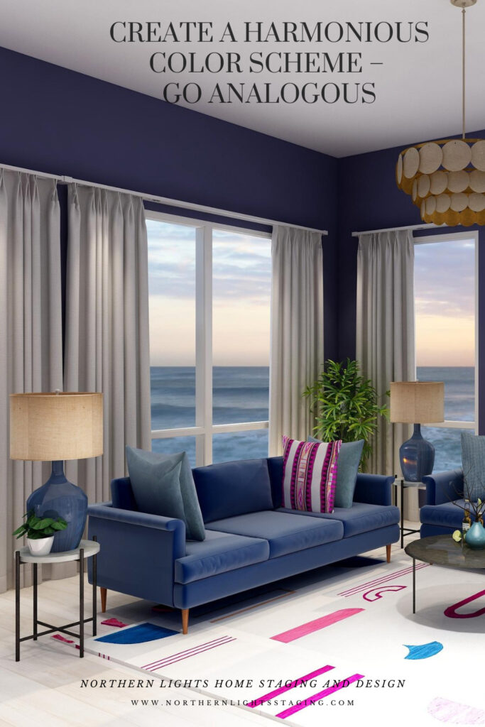
In this case, I again maintained the blue sofas as the base color from the previous design and went clockwise around the color wheel to include purple and red/purple.
I found a nice rug that contained the 3 main colors I wanted to work with to tie everything together. Then I switched the paint color, lamps, one accent pillow and some of the art to bring in some of the other colors.
This design is a little more dramatic due to the deep, rich moody wall color and the high contrast of colors against the white background of the rug. I still think it looks calm and relaxing too.
Analogous Color Scheme #2. Edesign by Northern Lights Home Staging and Design
Fractal Art
Here is some fractal art I designed that could be used in this design. My Forest Floor designs were inspired by colors in the boreal forest here in Alaska which have a lot of water in them (streams, ponds, rivers, lakes), thus the blues. The purples represent many of our purple wildflowers. Mystery is a mystery…..use your imagination of what it means to you.
Forest Floor #3 Mystery Fractal Art Forest Floor #4
Benefits of an Analogous Color Scheme
Analogous color schemes use colors that are adjacent to each other on the color wheel. These schemes offer a harmonious and visually pleasing palette. Here are the benefits of using an analogous color scheme:
Harmony and Cohesiveness: Analogous colors have a natural harmony because they share common color components. This results in a unified and cohesive look that’s easy on the eyes.
Subtle Contrasts: While the colors in an analogous scheme are similar, there are still subtle contrasts that can be used to highlight or differentiate design elements.
Versatility: Analogous colors can be adapted to both vibrant and muted tones, offering flexibility in setting the mood or theme of a design.
Richness and Depth: Using several shades and tints of a color range adds richness and depth to designs.
Natural and Comforting: Analogous color schemes often mimic how colors appear in nature, making them inherently familiar and comforting to the human eye.
Easy Color Matching: It’s easier to match colors within an analogous palette because they share similar undertones, reducing the risk of clashing hues.
Reduced Visual Tension: Analogous colors create a more relaxed visual experience because there’s a lack of high contrast between the colors.
Flexibility in Highlighting: One can easily highlight an element by choosing a color from either end of the analogous range, making it slightly more vibrant or darker than the surrounding hues.
Aesthetic Appeal: This type of color scheme tends to be naturally pleasing and aesthetically appealing because of its harmonious nature. An analogous color scheme can look richer and add more color diversity and interest than a monochromatic color scheme.
Enhanced Mood Setting: Due to their close relation, analogous colors can be effectively used to evoke specific moods or feelings, like warmth (reds, oranges, yellows) or calmness (blues, greens). These are really nice for living rooms, dining rooms and bedrooms. Analogous color schemes can also be more dramatic based on the hues you select, placement of colors and how saturated they are.
While analogous color schemes offer many advantages, it’s essential to ensure adequate contrast within designs to avoid them becoming monotonous or washed out. Using a neutral color or even a complementary color in small amounts can help add interest and break up the scheme.
Celebrate Your Favorite Colors
Imagine stepping into your space where every hue resonates with your spirit. It’s not just a room; it’s a reflection of you – a haven of happiness and tranquility. In a world where everything aligns, your surroundings uplift and rejuvenate you. When your home mirrors your essence, harmony is effortless.
Purchase an Aligned Design or Color Consultation today.