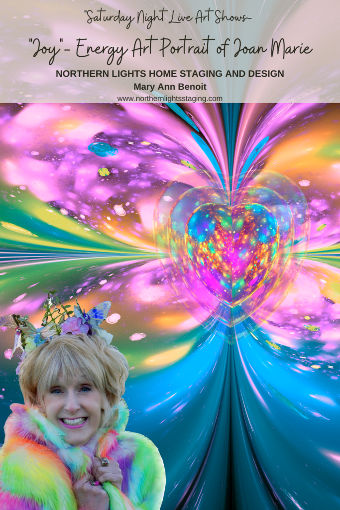
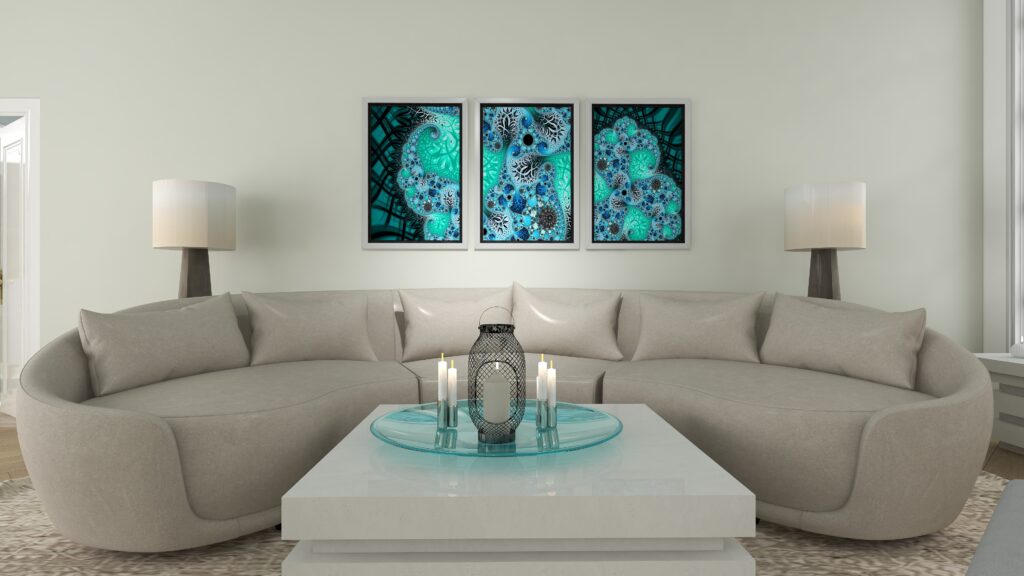
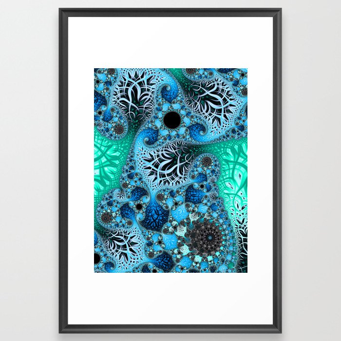
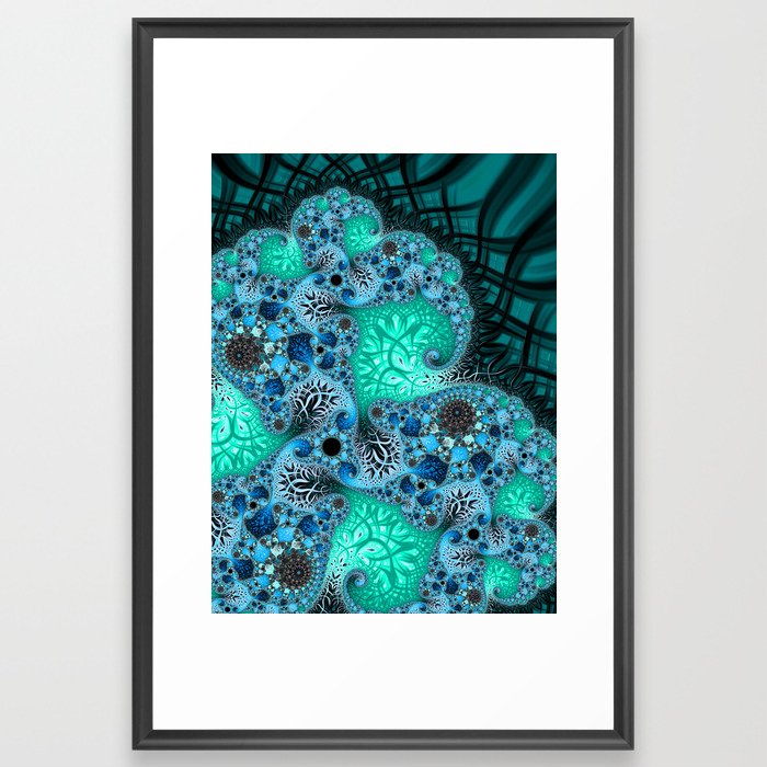
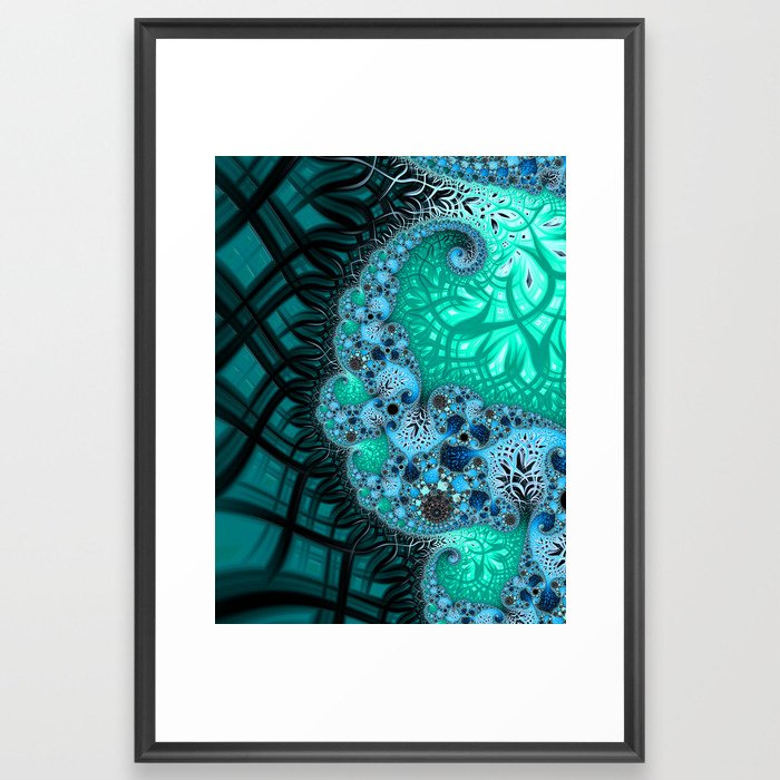
Saturday Night Live Art Shows: “Joy”- Energy Art portrait of Joan Marie.
Welcome to Saturday Night Live Art Shows. I’m Mary Ann Benoit, an energy artist and Interior Designer from Seward, Alaska.
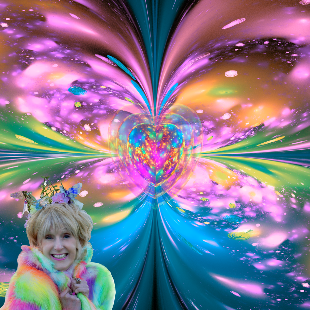
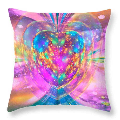
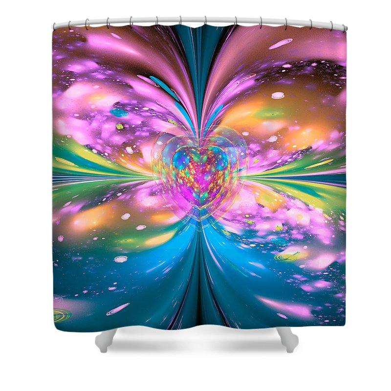
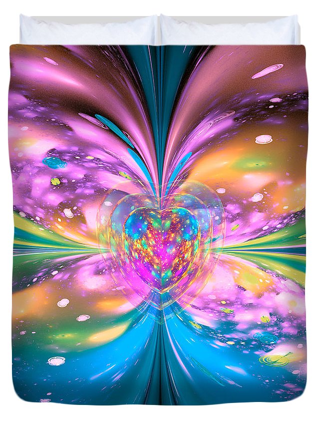
Energy art portraits express who you truly are when you shine your light. I created this fractal art piece, inspired by this photo, to express Joan Marie, a Visionary Artist of Joan Marie Art, shining her light to the world.
What do I see in this photo?
A huge heart exploding with creativity, joy, and love. A spirit filled with fun, colorful abandon, and spiritual wisdom. In my art, I portrayed a butterfly, which is a symbol of joy. And hearts, for Joan Marie is living a path with heart, and doing what she loves. Joan Marie loves brilliant colors and is adventurous, energetic, and fun. With a triple-exploding heart that touches the world. A heart so big, it can not be contained. It affects everything around it. Healing itself and others in the process.
Thank you for sharing your joy and love for the world.
Be sure to check out all the other artists from around the world, having art shows in their Facebook and social media feeds at 6-9 pm in their time zones. Follow Saturday Night Live Art Shows on Facebook by searching #snlartshows.
Joan Marie’s Energy Art Portrait.
See Joan Marie’s exquisite visionary art and power portraits she creates at Joan Marie Art.
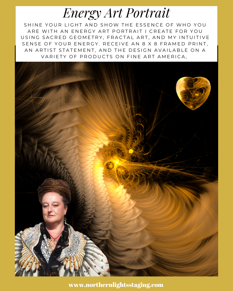
Get Your Own Energy Art Portrait
How Does it Work?
Purchase your Energy Art Portrait
Tell me three words others would use to describe you, and three words you would use to describe yourself, and your favorite colors.
Send me a picture that really express who you are.
I will create a few examples and check in with you once to see which you like best.
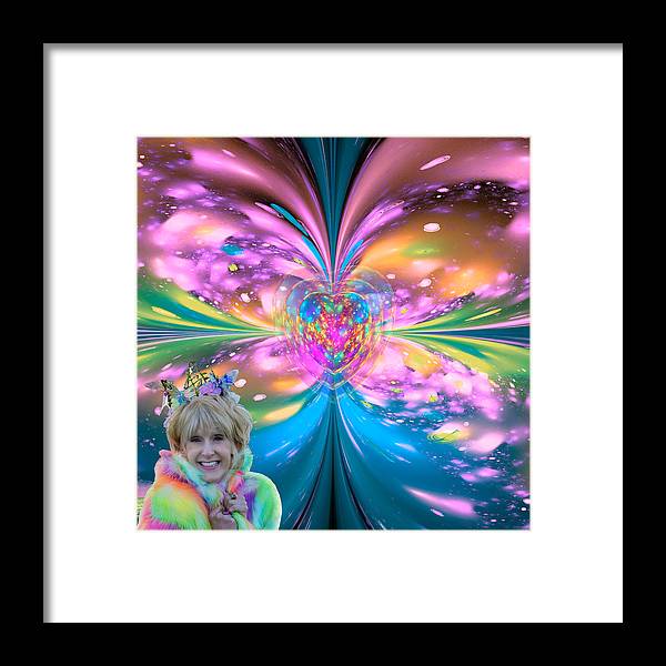
I will send you a framed energy art portrait of your favorite piece, in a black wooden frame, with an 8″ x 8″ image (total size 13.5″ x 13.5″) printed on Archival Matte Paper, The finishing is 1/8″ Clear Acrylic – Foam Core Mounting.
I will upload the high-resolution image, with or without your Photo (your choice) to my store on Fine Art America. Then you may purchase the design on other products if you choose.
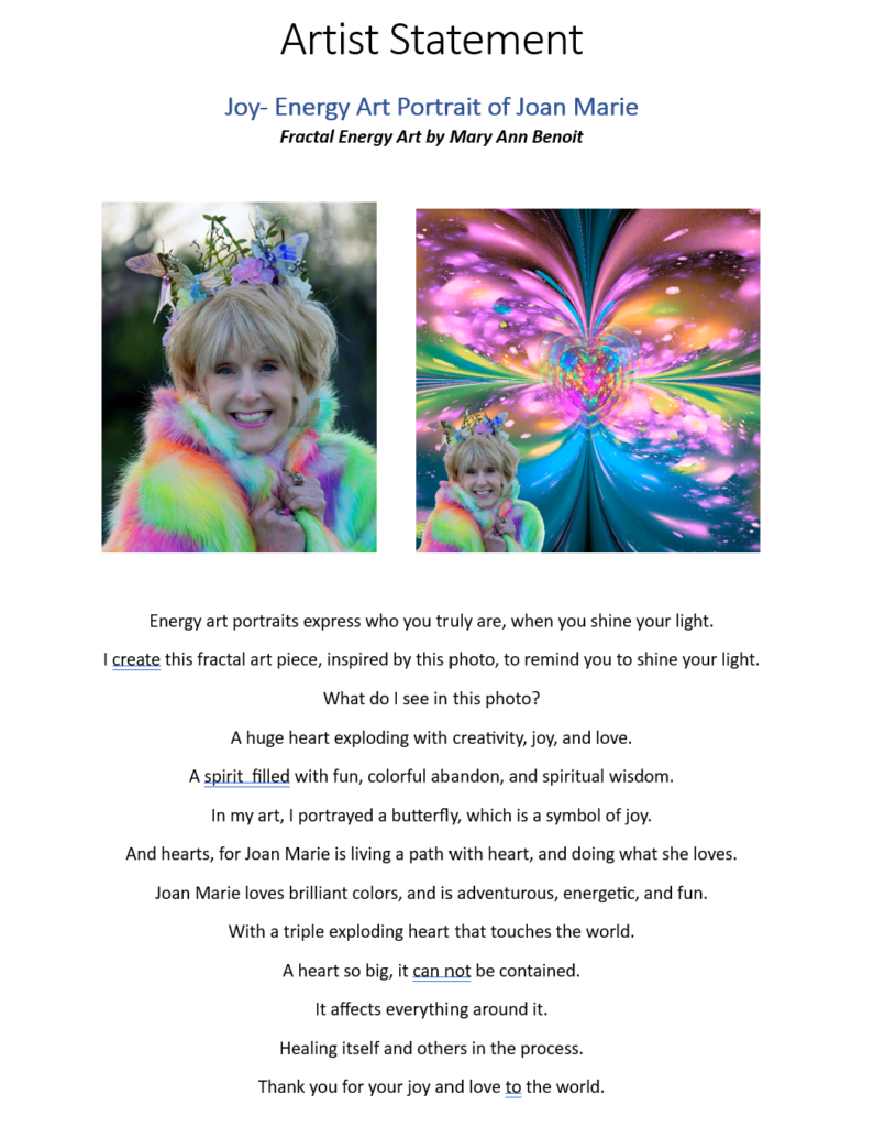
I will send you an artist statement of what I saw in your energy that I portrayed in the art.
Example
Joan Marie provided this picture with her words (creative, imaginative, fun) and favorite colors (pink, yellow, aqua).
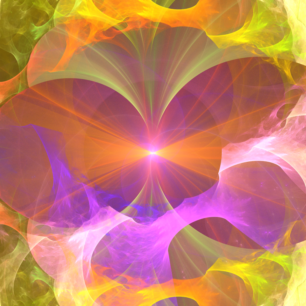
Here were three of the different designs I created, and selected the first one.
Here is what the framed art looks like of the final portrait that I would ship to her.
Here is the artist statement she would recieve.
I upload the design to Fine Art America, so if Joan wants to purchase any number of possible items with this design on it she is free to do that, as you can see a few examples below.
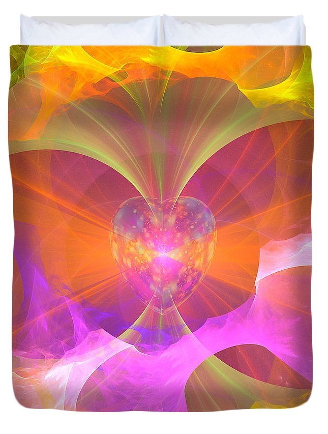
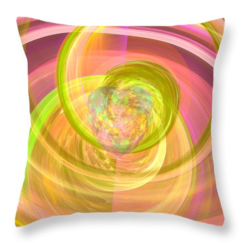
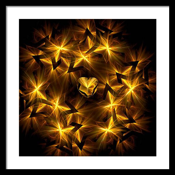
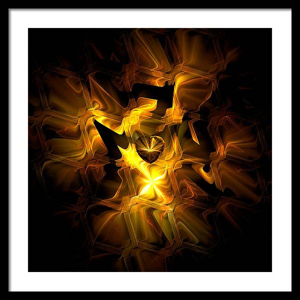
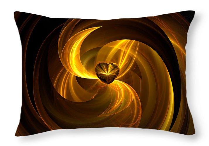
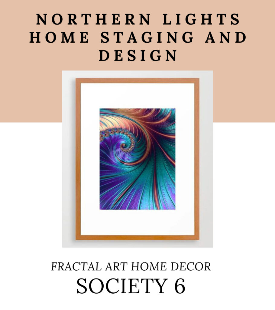
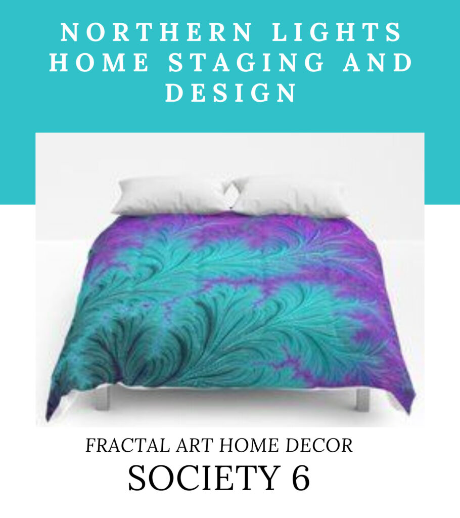
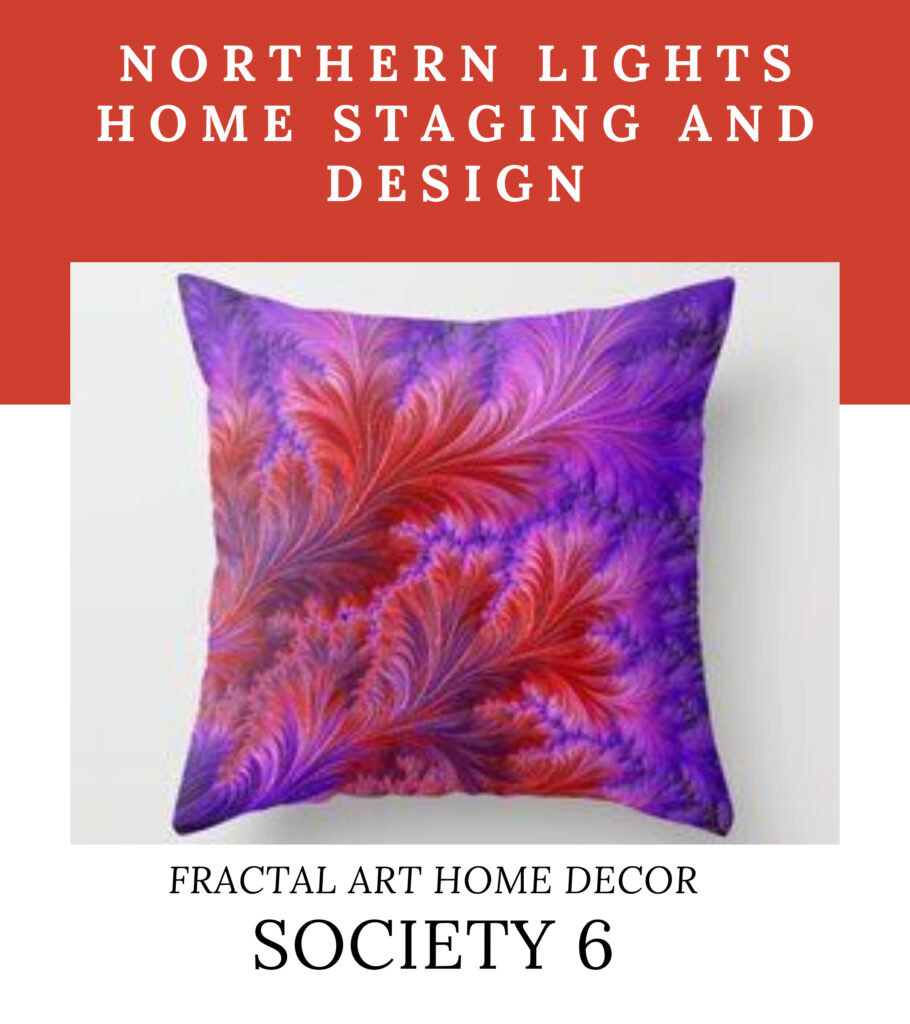
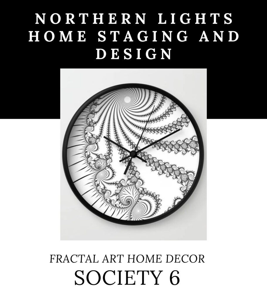
Joy Fractal Energy Art Pillow by Mary Ann Benoit.Joy Fractal Energy Art shower curtain by Mary Ann Benoit.Joy Fractal Energy Art Duvet Cover by Mary Ann Benoit. Joy #2 Duvet Cover Joy #3 pillow
Get Yours Now
What is Fractal Art?
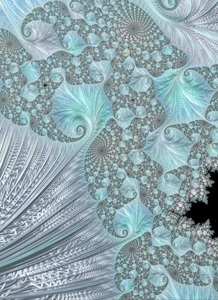
Fractal art is digital art I create on my computer.I love creating fractal art because it allows me to work with brilliant colors, interesting textures, and incredible detail. Learn more about how it is created in my Saturday Night Live Art Show, ” A Passion for Purple” where I show some videos of the process.
Aligned Energy Art adds another layer of energy and meaning beyond visual beauty to create a space that is aligned with who you really are “.
Are You Ready to Create Your Perfect Space with Art?
Isn’t it time to create a space that is aligned with who you truly are?
My unique Interior Design philosophy combines:
The ART of beauty
The SCIENCE of color
The ENERGY of well-being
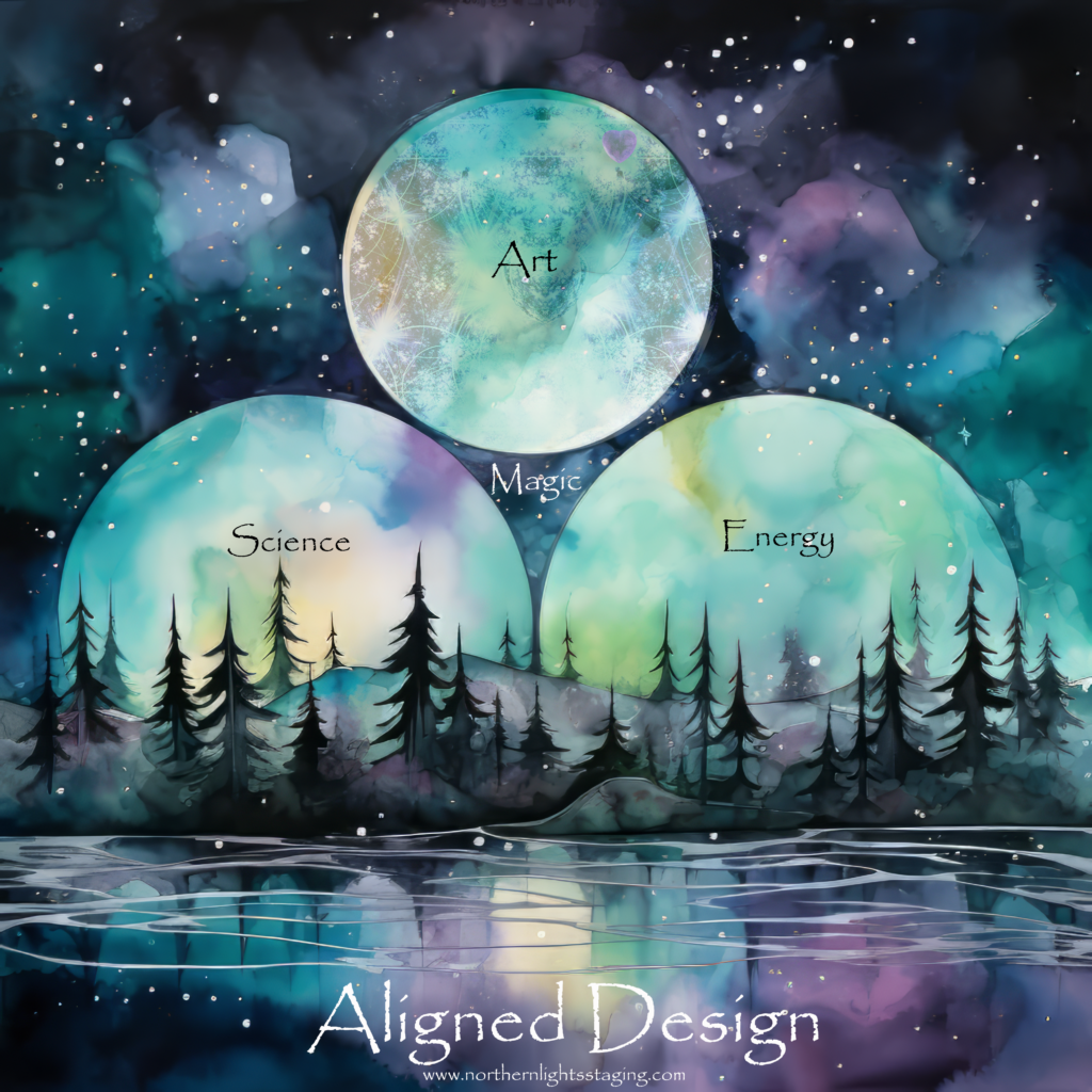
Art + Science + Energy = Magic
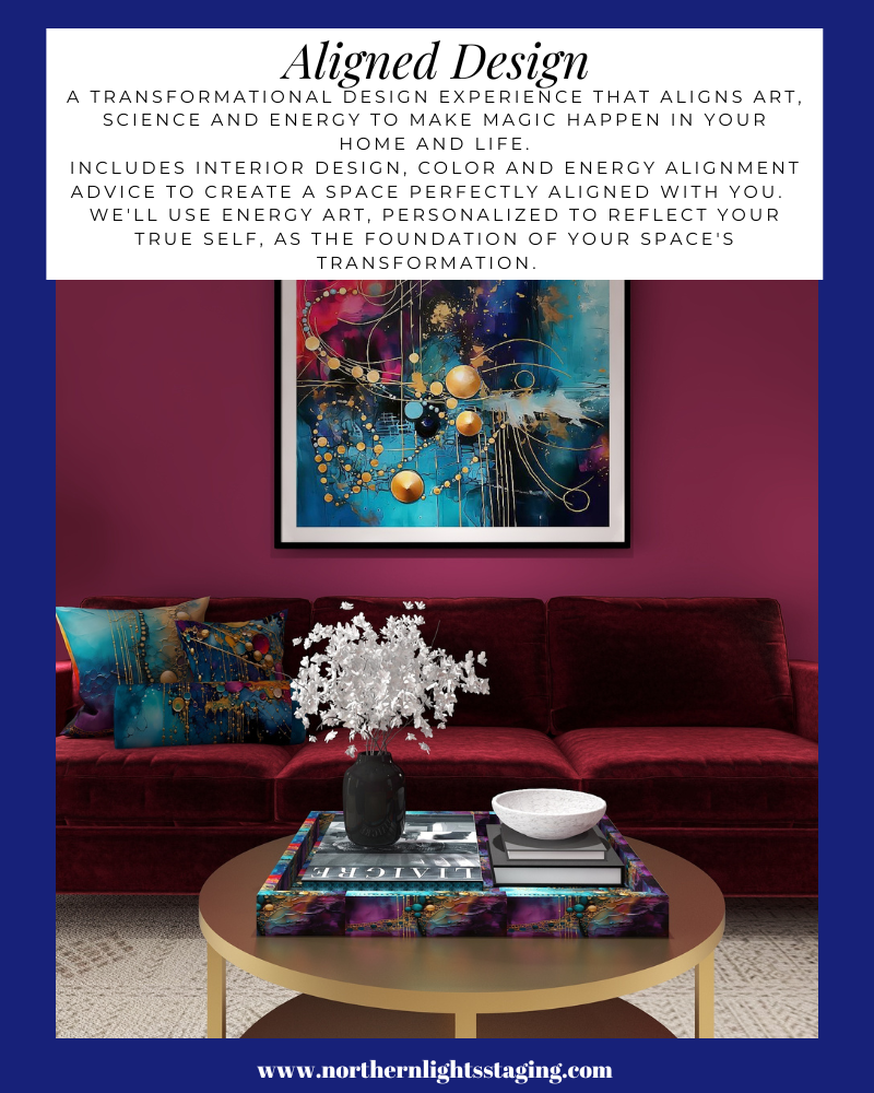
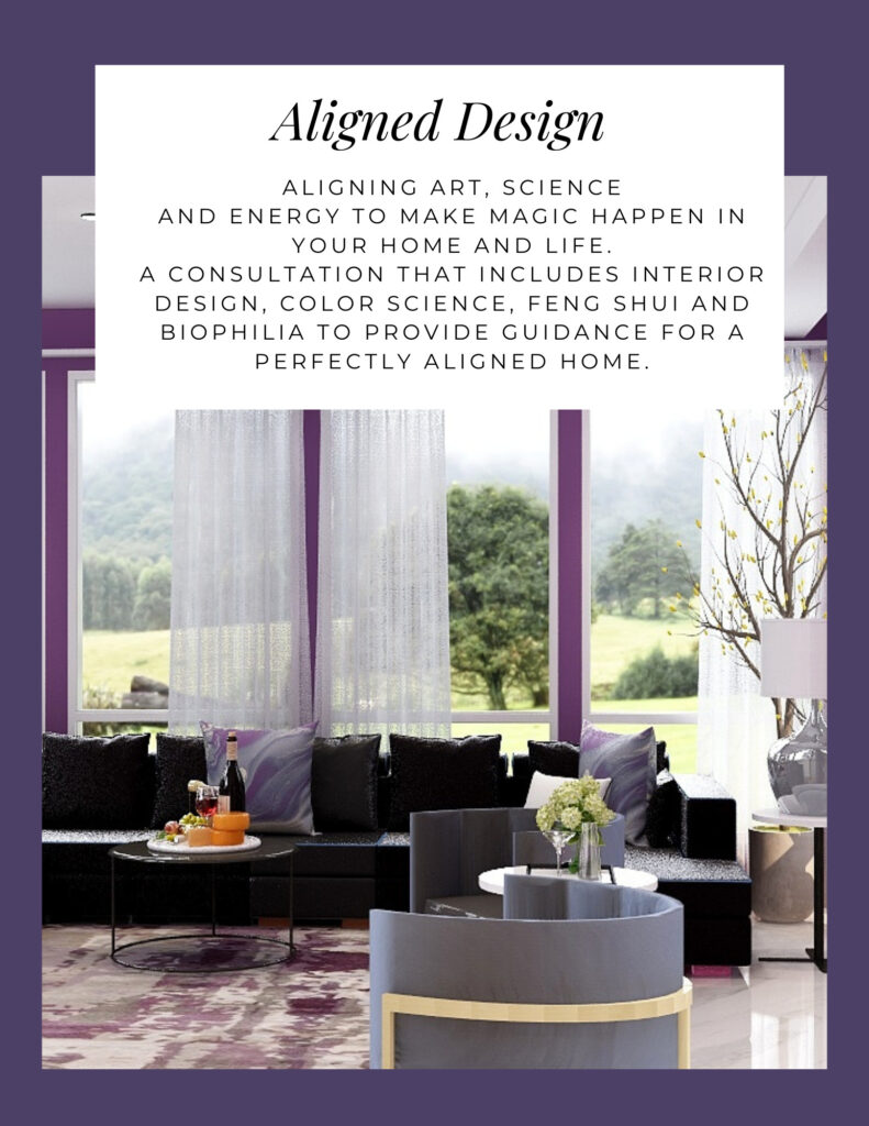
Get an Aligned Design consultation which includes an Interior Design, Color, and Energy consultation, and custom fractal art to tie it all together.
When your space is better, you are better. When you are better, the world is better. The world needs you. Choose to create a space that is aligned with You.
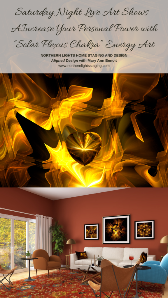
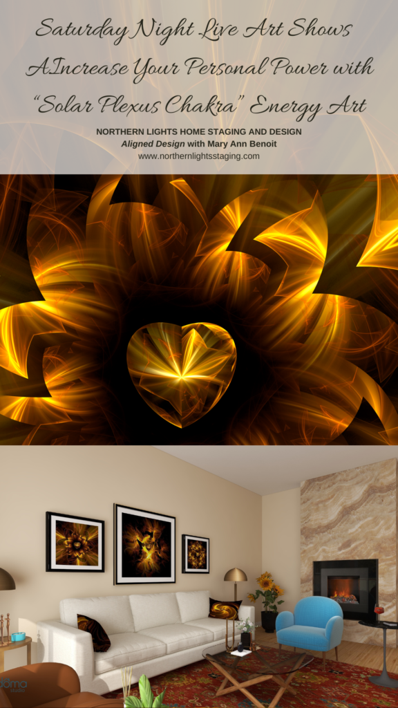
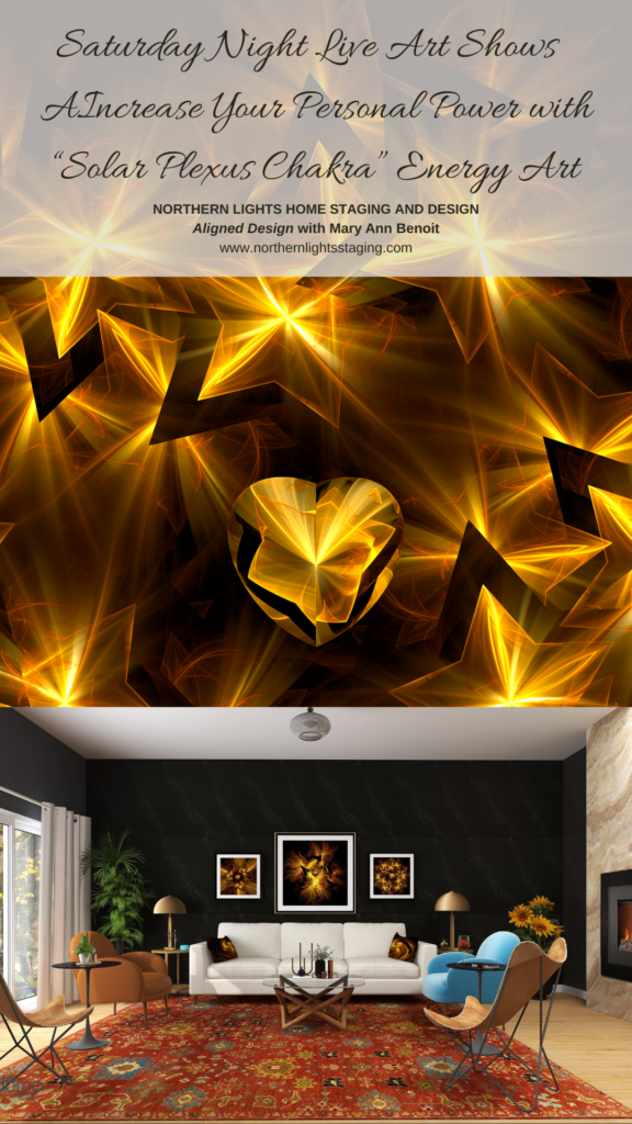
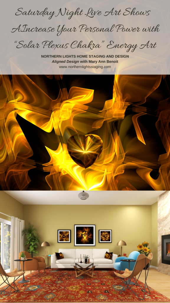
Saturday Night Live Art Shows- Increase Your Personal Power with “Solar Plexus Chakra” Energy Art
Welcome to Saturday Night Live Art Shows. I’m Mary Ann Benoit, an energy artist and Interior Designer from Seward, Alaska. In this show, I share four fractal art designs in my “Solar Plexus Chakra” series and show you how you can increase your personal power and sense of well-being with energy art and the design of your space.
Would you like to enhance your self-confidence and feel more powerful?
Do you worry about what people think of you, and seek constant approval?
Do you often doubt or mistrust people? Do you have digestive issues?
The energy of your solar plexus chakra may be blocked.
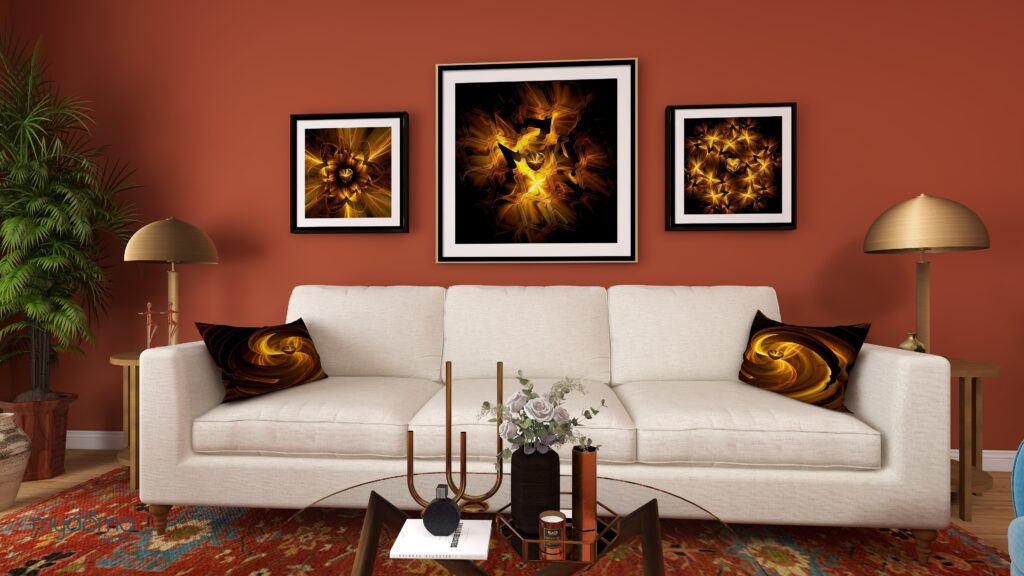
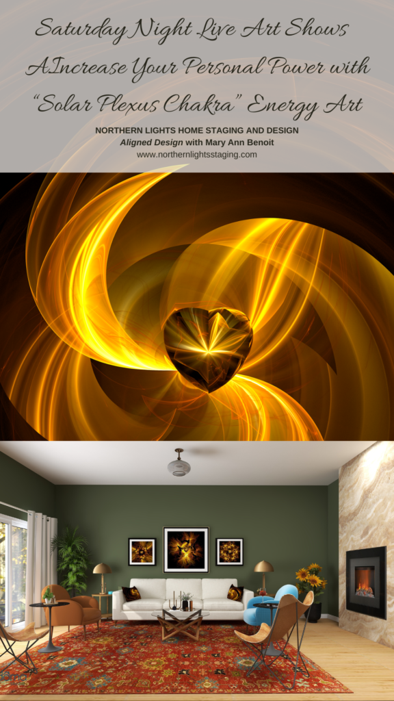
Solar Plexus fractal art and Interior Design by Mary Ann Benoit of Northern Lights Home Staging and Design
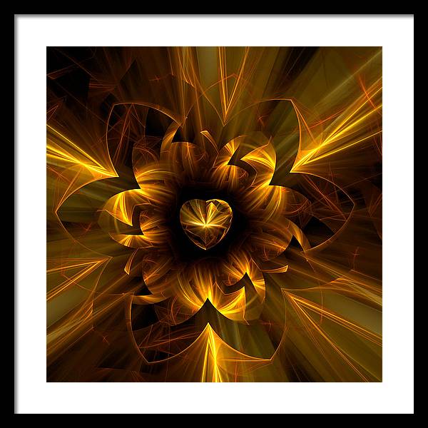
Everything is energy. This chakra is also called the Manipura chakra, which means a beautiful gem. My fractal art shows gem-like qualities and contains the energy and color of the solar plexus chakra.
Yellow inspires happiness, optimism, energy, creativity, and sharp thinking. I infuse my energy into my art and designs, to help give you what you need. Mixing that with your intention to heal yourself, makes for a powerful combination of energy in your home.
Use this art to create new beginnings, stand in your power, boost your self-confidence, and proudly shine your light. See how to use this art in these Edesigns I created for this show.
Everything is energy. My fractal art is sacred geometry. It represents the building blocks of life and what energy might look like if you could see it. Why not raise the energy around you to a higher level with art, for your health and well-being? Surround yourself with art that reminds you what is important and enhances the energy of your space.
See my “Solar Plexus Chakra” Collection at https://maryann-benoit.pixels.com/collections/solar+plexus+chakra
Learn more about each piece of art and how it affects the energy of the room, All combined create a living room that is supportive and inspires you to live joyfully and stay in alignment with who you are meant to be.
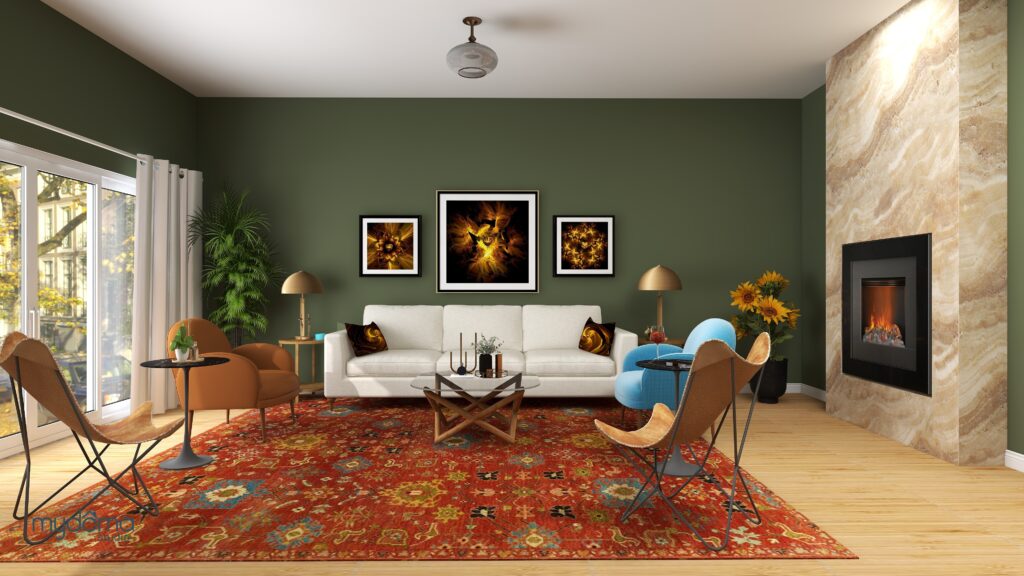
Solar Plexus fractal art and Interior Design by Mary Ann Benoit of Northern Lights Home Staging and Design Solar Plexus Chakra framed print by Mary Ann Benoit Solar Plexus Chakra #2 fractal art by Mary Ann Benoit Solar Plexus Chakra #4 framed fractal art by Mary Ann Benoit Solar Plexus Chakra #3 Throw Pillow by Mary Ann Benoit
And you can vary the look and feel of the room with the same art but different paint colors. Need help picking colors? Call for a color consultation.
Be sure to check out all the other artists from around the world, having art shows in their Facebook and social media feeds at 6-9 pm in their time zones. Follow Saturday Night Live Art Shows on Facebook by searching #snlartshows.
Aligned Energy Art is another layer of meaning beyond the visual beauty in creating your perfect space that is aligned with who you want to be.
What is Fractal Art?
Fractal art is digital art I create on my computer.I love creating fractal art because it allows me to work with brilliant colors, interesting textures, and incredible detail. Learn more about how it is created in my Saturday Night Live Art Show, ” A Passion for Purple” where I show some videos of the process.
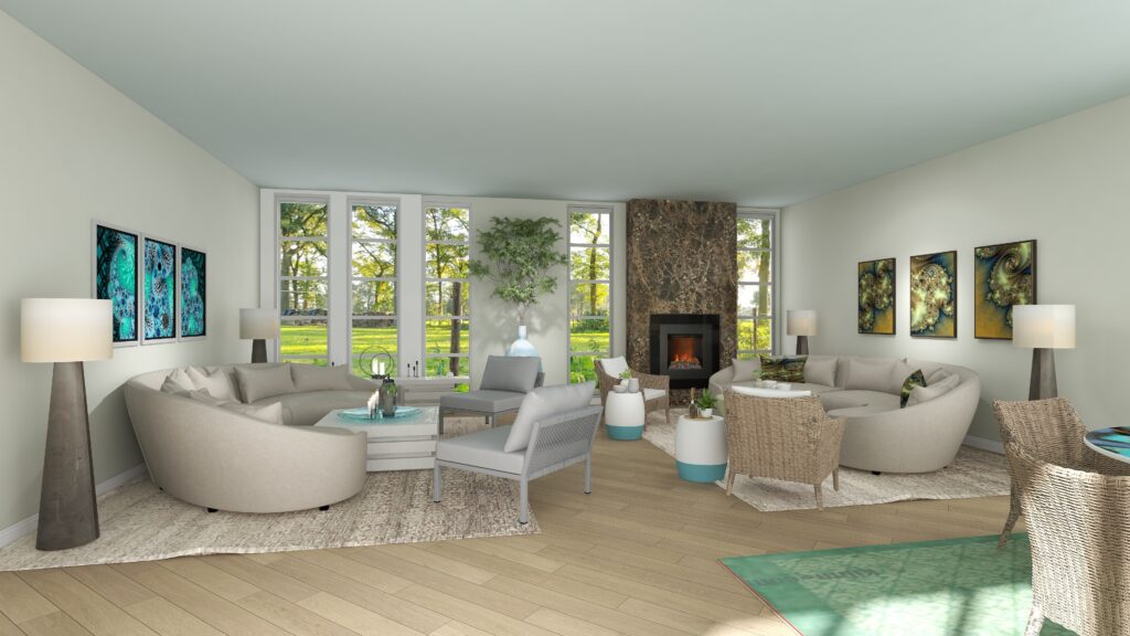
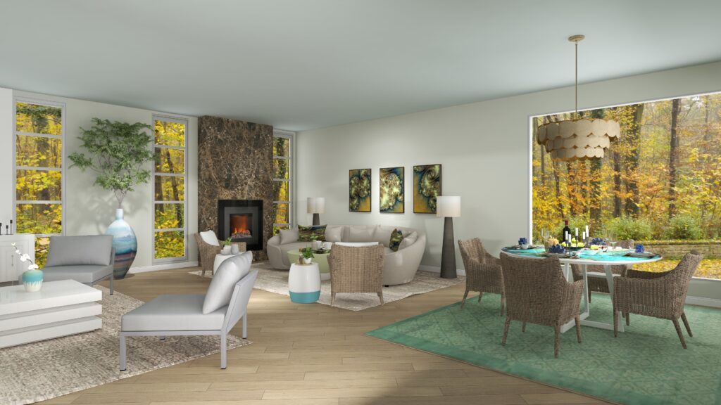
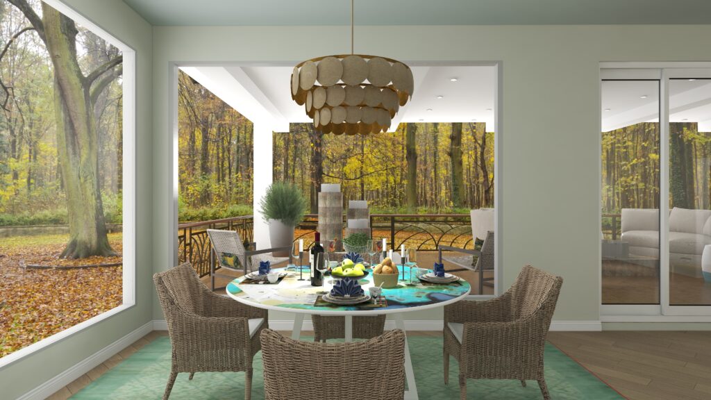
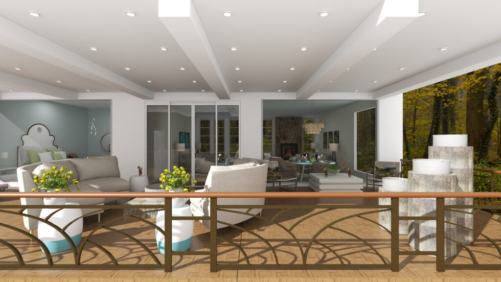
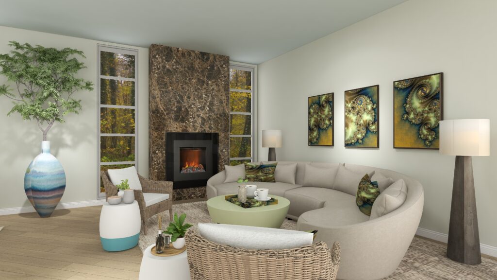
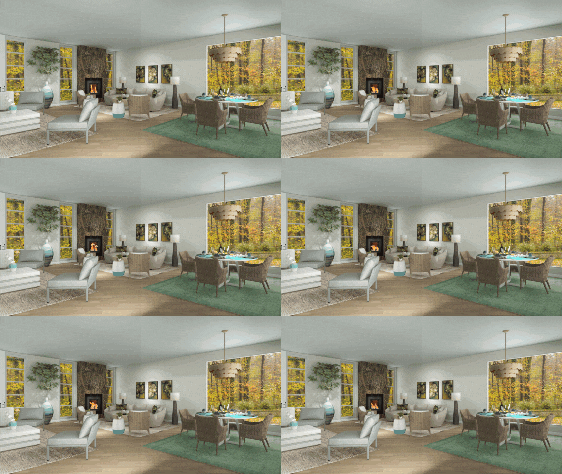
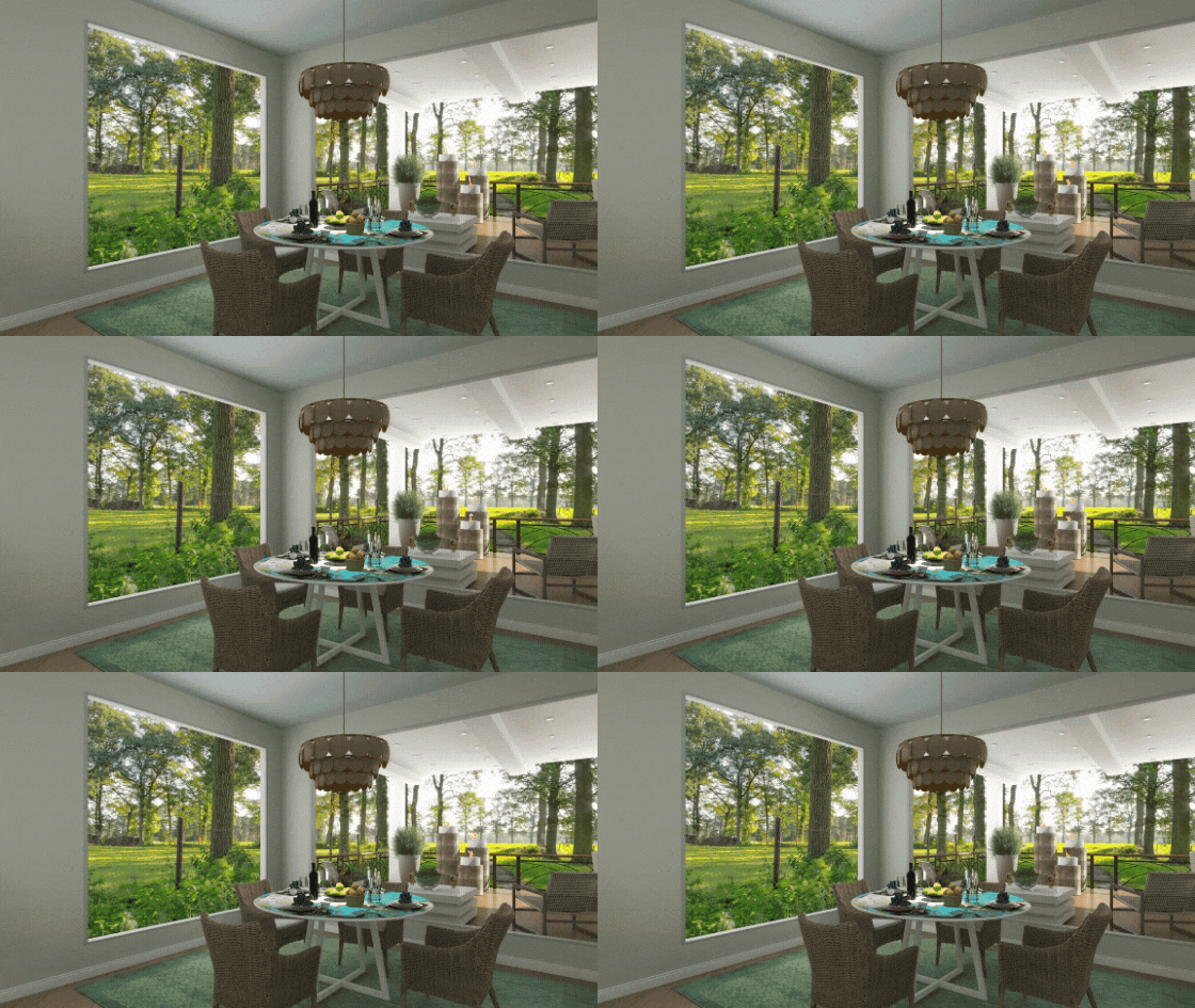
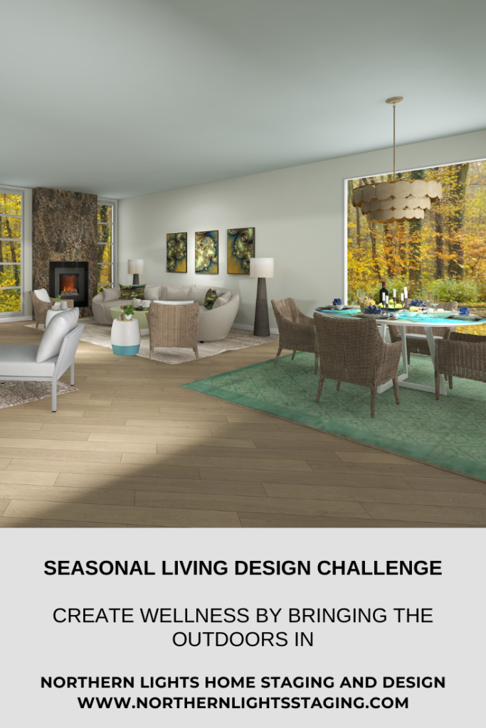
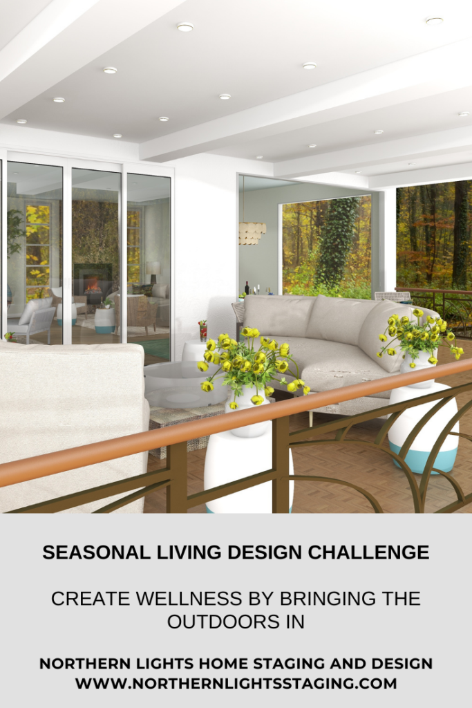
Do you love bringing the outdoors in? I do too. A beautiful example is this Edesign I created for the Seasonal Living Design Challenge.
Participants were to design a space in a Modern to Modern Farmhouse higher-end residential home, containing at least 3 Seasonal Living products, and 2 seasons should be reflected in the use of each space. Spaces should emphasize the concept of “Wellness”.
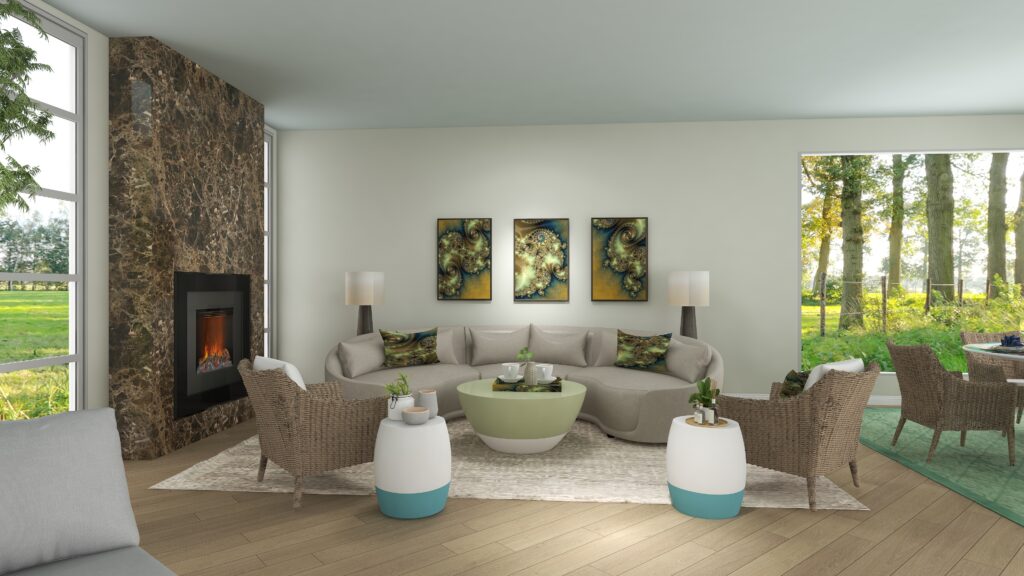
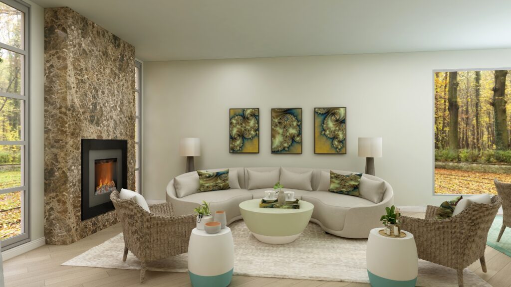
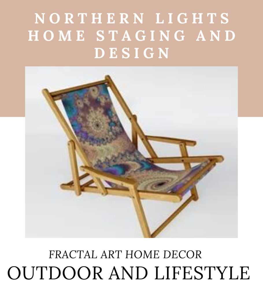
Open concept living/dining area and deck that uses flexible indoor/outdoor sustainable artisan furniture and my one of a kind “Attachment” and “Release” fractal art.Open concept living/dining area and deck that uses flexible indoor/outdoor sustainable artisan furniture and my one of a kind ‘Attachment” fractal art.Open concept living/dining area and deck that uses flexible indoor/outdoor sustainable artisan furniture and my one of a kind fractal art.
Seasonal Living
Designing a space that enhances the use of outdoor space as well as indoor space and is usable for more than just one season of the year is wonderful for making the most of your space and your well-being.
I believe my design is perfect for spring, summer, fall, and winter with its indoor and outdoor fire features and roof that covers the outdoor space.
Wellness
I believe the concept of wellness is critical in creating the perfect space for you. Wellness is about having a healthy environment that inspires peace and well-being. Bring wellness into your space in the following ways.
Color– Use the energy of color to bring peace, calm, well-being, or inspiration to your space.
Biophilia- Bring the outside in by creating a seamless interplay between the outside view and the interior. Use natural materials and elements in your space.
Art- Select art that has a meaningful message that inspires you whenever you see it.
Natural Materials- Use natural materials such as wood, metal, glass, wool, clay, stone, cotton, etc. for a healthy environment.
Light, Fire, and Sound- Let your space and yourself breathe in an area with plenty of light, fresh air, quiet, and the comfort of a fire in the fireplace.
Uncluttered space– Give yourself room to breathe, move freely and relax. Too much clutter feels chaotic and does not allow your eyes to rest.
Color
This design uses a primarily neutral color scheme interspersed with greens, blues, and yellows to harmonize with the outdoor landscape. The colors are peaceful, relaxing and give the feeling of relaxing in the forest. The walls are a very light green and the ceiling a light blue, to blend with the forest and sky increase the flow between outdoors and in.
Increase your wellness and well-being with relaxing natural colors, lots of light and fresh air, views of nature, using natural materials and incorporating and uncluttered space.
Biophilia
As humans, we want to be connected with nature and other living things such as people, animals, and plants. This longing for “connection” with other life forms is called “biophilia”. See my article on biophilia for more details.
Some of the ways of doing that, which I incorporated in this design include:
Use natural and eco-friendly materials for building and decor. In this design, I used lots of glass, wood, wool, wicker, stone. Seasonal Living also uses natural and recycled material whenever possible.
Use indoor plants to provide a variety of colors, textures and improve your indoor air quality.
Use the colors of nature in your home, inside and out. The furnishings are primarily neutral colors, allowing the art, plants and accessories to add colors and textures to harmonize with the outdoor environment. The walls are green and ceiling blue to allow the eyes to rest and help the inside flow into the outside.
Use lots of strategically placed windows for an abundance of natural light and views.
Select art that enhances the energy you want to surround yourself with, inspires you and helps remind you who you want to be.
Increase your wellness and well-being with relaxing natural colors, lots of light and fresh air, views of nature, using natural materials and incorporating and uncluttered space.Increase your wellness with flexible indoor/outdoor living that provides lots of light and fresh air.
Art
Art can have a big impact on the energy of the space and how your feel in it.
Consider art that shows landscapes, plants, animals, or other natural elements that bring you joy and work with your design and color palette.
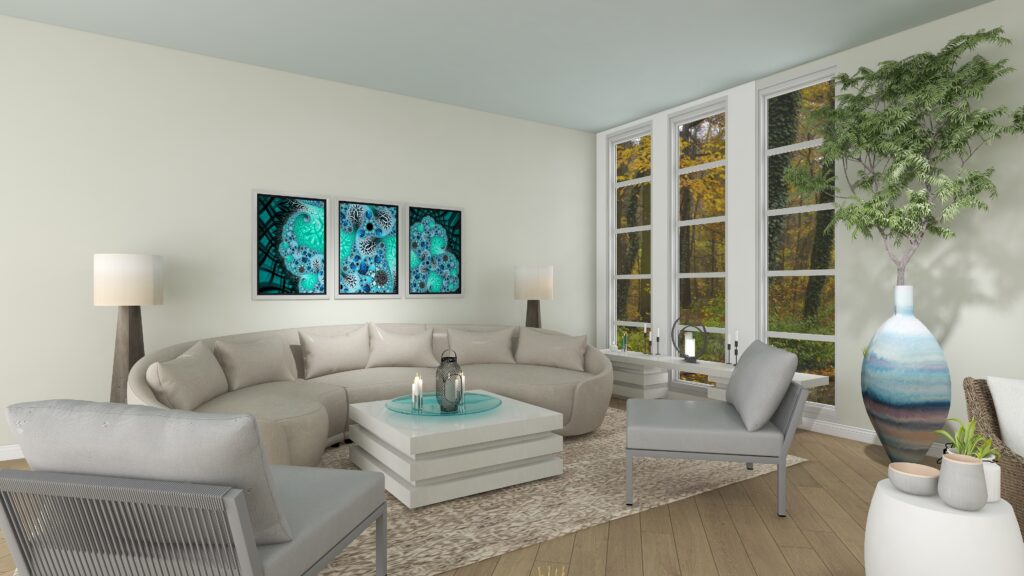
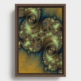
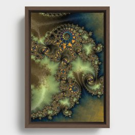
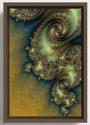
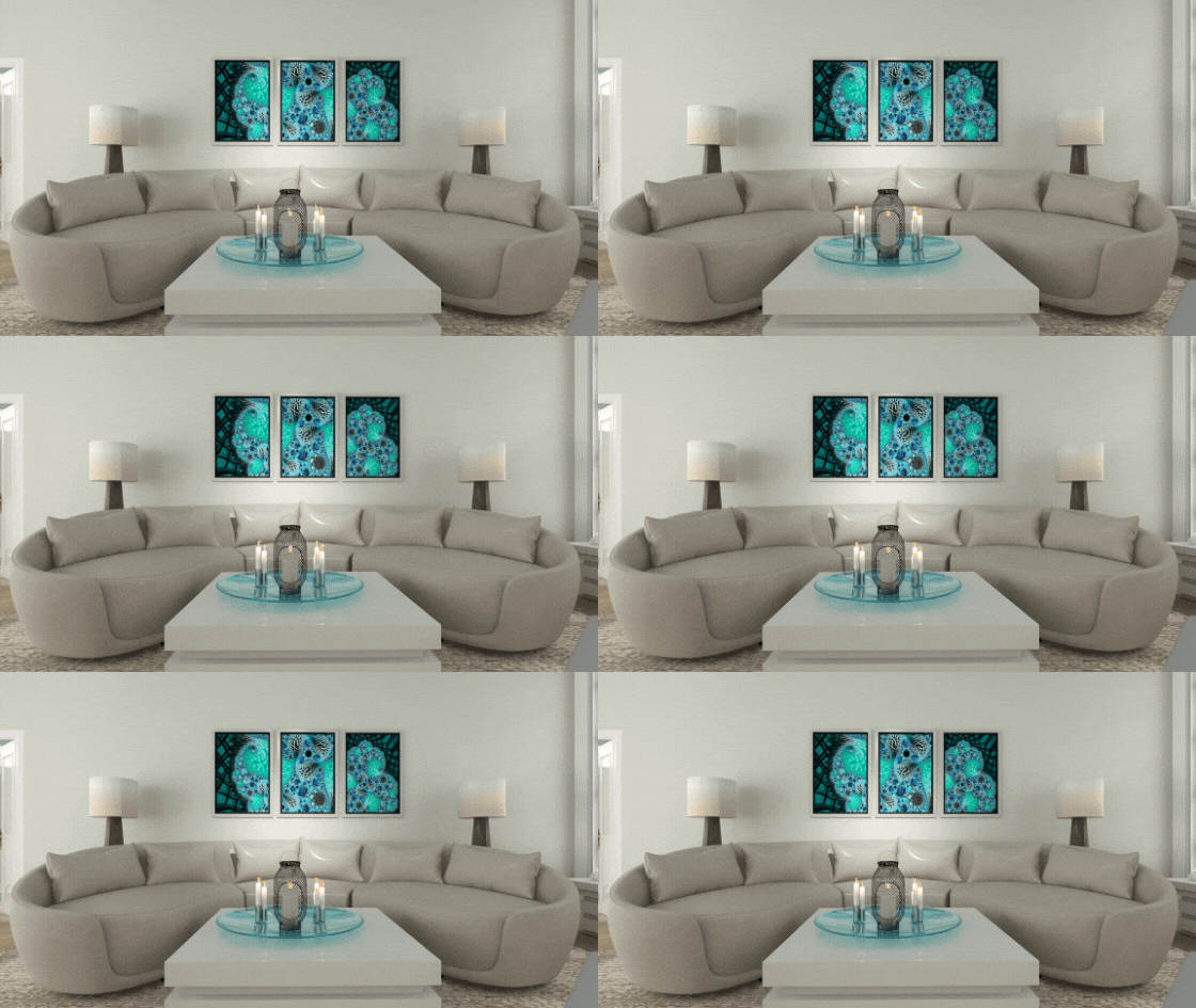
Consider art that tells the story of something important to your well-being. In this design, I used 2 of my recent fractal energy art series. The first, in shades of greens, is called “Release”. It not only portrays the release of the season of fall into winter but the release of all the things that no longer serve you or your well-being. Note the design in the wall art, pillows and tray on the coffee table.
“Release” Fractal Art
See my Saturday Night Live Art Show on my “Release” art to learn how it was made and more about the energy behind the design. “Release” is all about releasing all the things in life that do not serve you or contribute to your well-being.
The greens and fall colors add a feeling of calmness and well-being as if sitting in a beautiful forest. This is the feeling I want to have as a result of releasing what no longer serves me. It works together perfectly with the exterior landscape and the Seasonal Living furniture.
Living Room in the spring and summer, with “Release” fractal art by Mary Ann Benoit and furnishings by Seasonal Living.Living Room in the fall. Notice the colors and art work wonderfully for both seasons.The fireplace adds the perfect energy for any time of year and warmth for all seasons, including cool summer nights. “Release” fractal art by Mary Ann Benoit of Northern Lights Home Staging and Design
I created 2 more pieces to go with it, so you can see the movement between pieces and use three together over a sofa t create a focal point in a room.
“Release 2” fractal art by Mary Ann Benoit of Northern Lights Home Staging and Design “Release 3” fractal art by Mary Ann Benoit of Northern Lights Home Staging and Design
“Attachments” Fractal Art
See my Saturday Night Live Art Show on my “Attachments” fractal art to learn more about these pieces. Buddha said that attachment is the root of all suffering. This art reminds us to release the attachment to outcomes and trying to control things, and let them be how they are meant to be.
Attachments Fractal Art by Mary Ann Benoit of Northern Lights Home Staging and Design Attachments #2 Fractal Art by Mary Ann Benoit of Northern Lights Home Staging and Design Attachments #3 Fractal Art by Mary Ann Benoit of Northern Lights Home Staging and Design
Light, Fire and Sound
Lots of sunlight, a warm, beautiful fire in the fireplace or outdoor fire pits, candlelight and the sounds of nature are the extra touches that make magic happen and increase your wellness in un-measurable ways!
Nothing beats the magic of a toasty fire to increase your well-being.
A beautiful place to relax and think about the new year ahead.Dinner by candlelight with a view of the outdoor fire features.
The Experience
I enjoyed developing a design using Seasonal Living products and exploring the flexible concept of indoor/outdoor living. I love that their products are sustainable and created or inspired by artisans. I liked being about to meld it with my own fractal art and loved the experience of creating a design that flowed seamlessly between inside and outside and could be used in all seasons of the year.
What is Fractal Art?
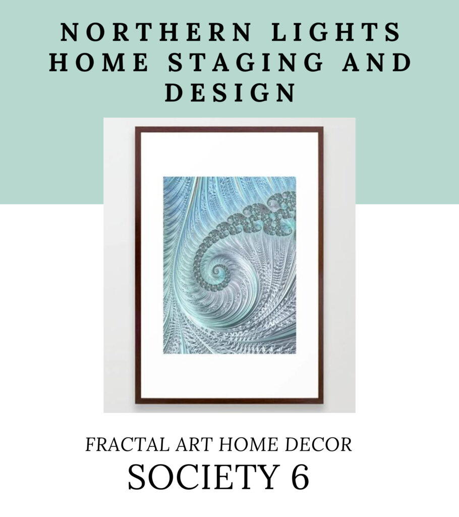
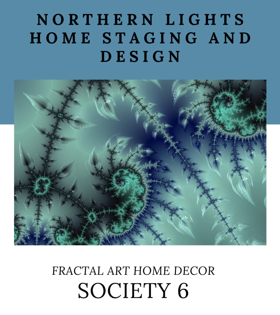
Fractal art is digital art I create on my computer.I love creating fractal art because it allows me to work with brilliant colors, interesting textures, and incredible detail. Learn more about how it is created in my last Saturday Night Live Art Show, ” A Passion for Purple” where I show some video of the process. See examples at my store on Fine Art America and Society6.
Create Seasonal Living and Wellness in your space.
Are you ready to bring the outside in and bring more peace and well-being into your space? Let’s tell your unique story and find the alignment of art, science, and energy that makes you happy. Try my Aligned Design consultation and let’s get started.
Cyber Week Deals on Home Decor and Interior Design
Looking for some great holiday gifts online so you don’t have to go shopping in the stores and can socially distance?
Interested in giving the gift of something beautiful with one of a kind art or some design help to someone you care about?
You’ve come to the right place!
At my store on Society 6 I have some great Cyber Week Deals going on with 50% off my wall art, 40% Bed, Bath and Home Decor and 30% off everything else!
50% Off Wall Art
My wall art is available in framed prints, canvas, metal art, wood and wall hangings.
40% Off Bed, Bath and Home Decor
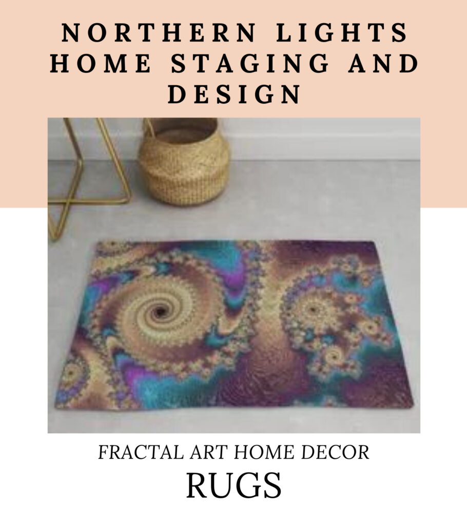
My Bed and Bath department has a variety of bedding, shower curtains, pillows, towels, rugs and more. For Home Decor, check out my curtains, pillows, wallpaper, clocks tapestries and more.
30% off Everything Else
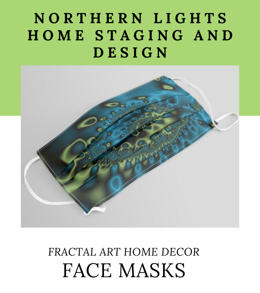
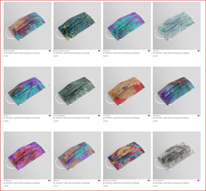
What is everything else? One of my favorites are face masks. How often can you give a gift that can save someone’s life?
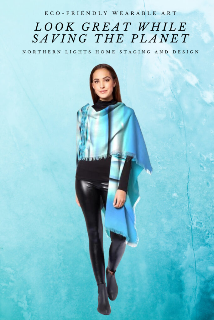
Check out my eco-friendly fashions at my store on Vida. Get 15% off everything with the code JOYOFSMALL.
What is Fractal Art Anyway?
You may be wondering what the heck fractal art is? It is a captivating art form with the brilliant colors, intricate designs and perfect symmetry that I create on my computer!
Creating fractal art is like traveling through a kaleidoscope that has no beginning or end. When traveling, you find a place you want to stop and stay a while. While there, you can manipulate the color, texture, light, shine, spectrum, hue and other elements around you until you have created the perfect place, and then you save it as an image. It is impossible to ever find that place again if I did want to replicate it…it would be like finding a single drop of water within the ocean. That is why each piece is one of a kind.
Here is an example of what I mean. Let’s go on a little journey together through the “kaleidoscope”.
Ready to create your perfect space and do something amazing with your new art and home decor? For Cyber week get 1 extra hour of design time for free, worth $125 on this 5 hour consultation that includes an online wholistic Interior Design and Color Consultation for your whole house. Receive this extra 1 hour when you order by 12pm Alaska time, December 5. Learn More.
Great Paint Color Schemes- Black, White and Shades of Gray
People often struggle with creating a great color scheme. In my recent series of blog articles we discussed how you could take your favorite color, blue for example, and create different color schemes. We explored monochromatic, analogous, Complimentary, Diad, Triad, Tetrad, Split-Complimentary and Double Complimentary.
Today, lets talk about using black, white and shades of gray.
Monochromatic Color Scheme Analogous Color SchemeAnalogous Color Scheme Complimentary Color Scheme Complimentary Color Scheme Diad Color Scheme Diad Color Scheme Triad Color Scheme Triad Color Scheme Tetrad Color Scheme Tetrad Color SchemeSpilt Complimentary SchemeSpilt Complimentary Scheme Double Complimentary Color Scheme Double Complimentary Color Scheme
Technically, using black, white or grays is really a monochromatic color scheme and could be done with any color. If you take the color and adjust it’s chroma or saturation level to the lowest you can go, you get white. If you adjust it a little higher, you get shades of gray. If you adjust it to the maximum it becomes black.
Most people do not think of black, white and gray as actually being a color. Many people like to work with these colors as they think it is a very neutral color palette.
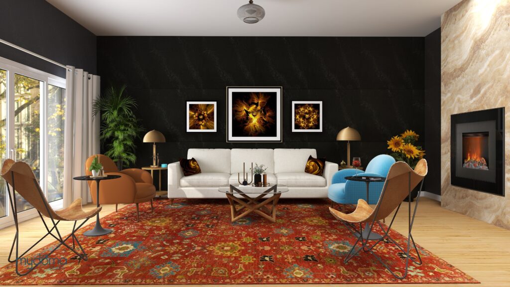
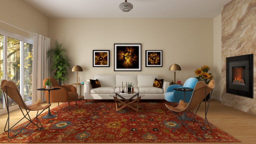
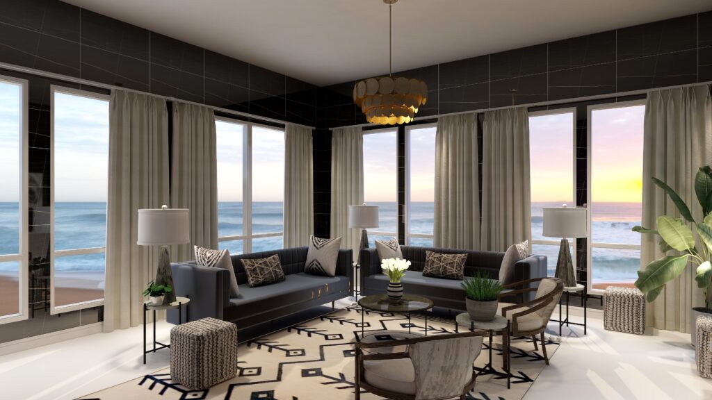
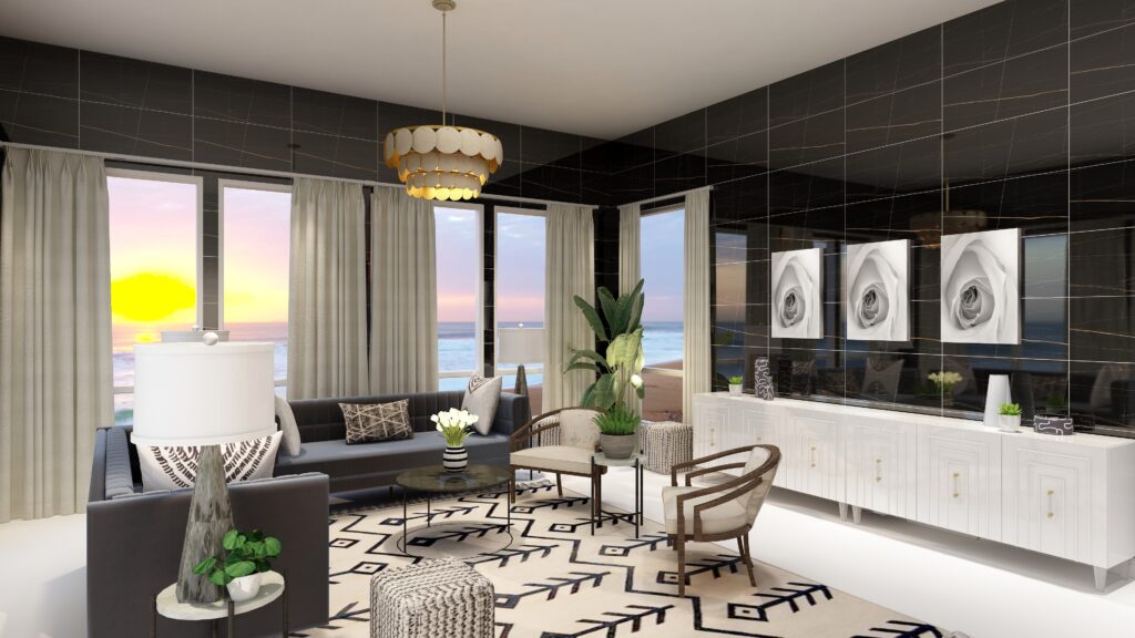
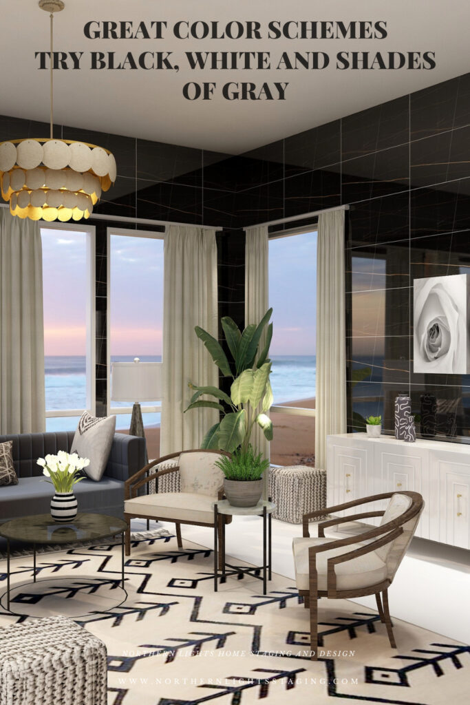
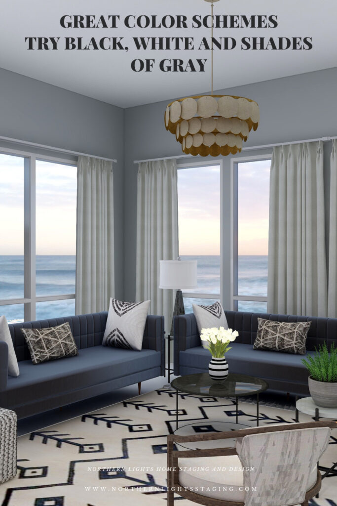
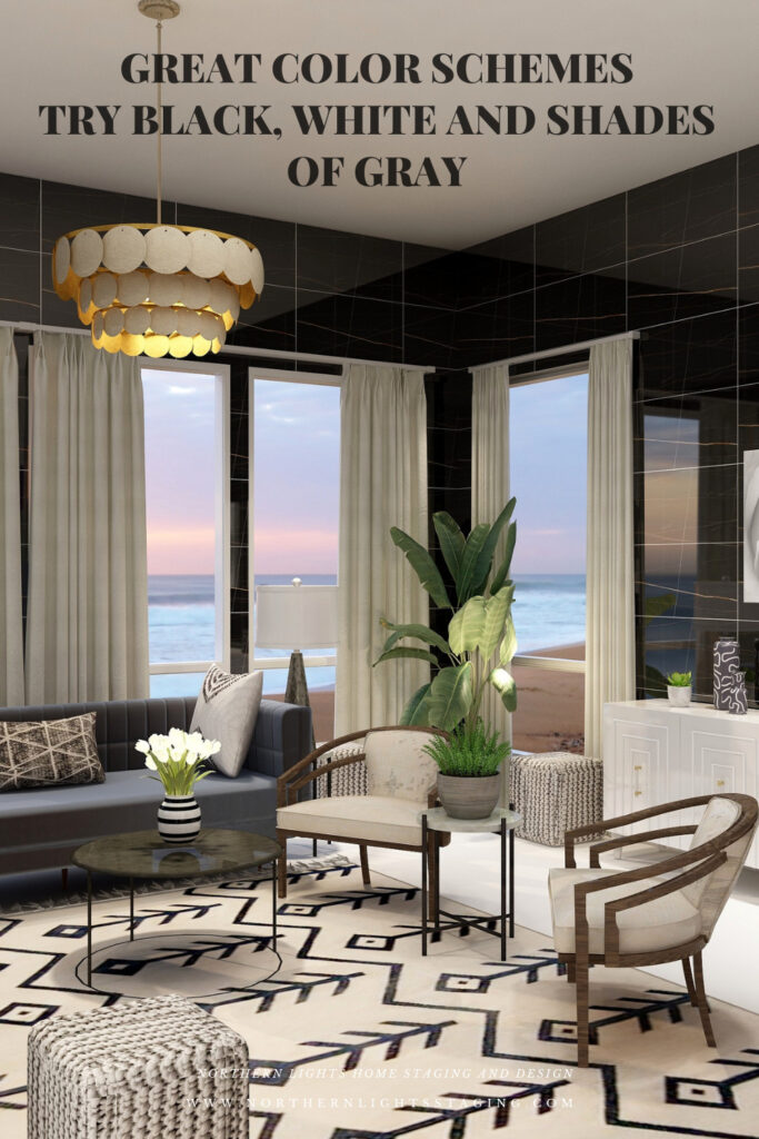
Let’s play around with a design I created that uses mainly black, white and gray home decor items where I mainly changed the wall color or treatment to create drama or highlight different things.
Design
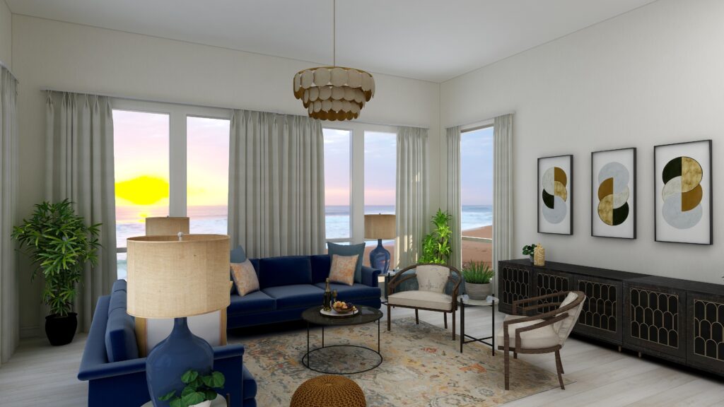
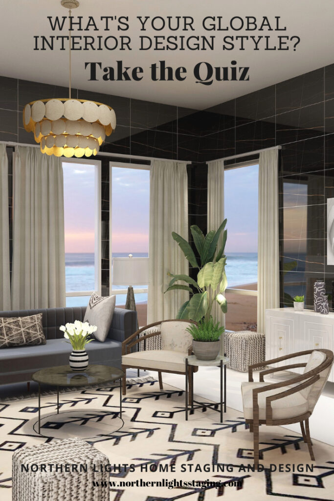
In this design I created maximum drama by using black walls which a striking due to the color, but I also used shiny wall tiles which also add texture and reflect light. The dark walls recede, giving a feeling of being cocooned and enveloped within the color. The color also highlights the black design in the area rug, making it pop.
Double Complimentary Color Scheme. Edesign and Fractal Art by Northern Lights Home Staging and Design.
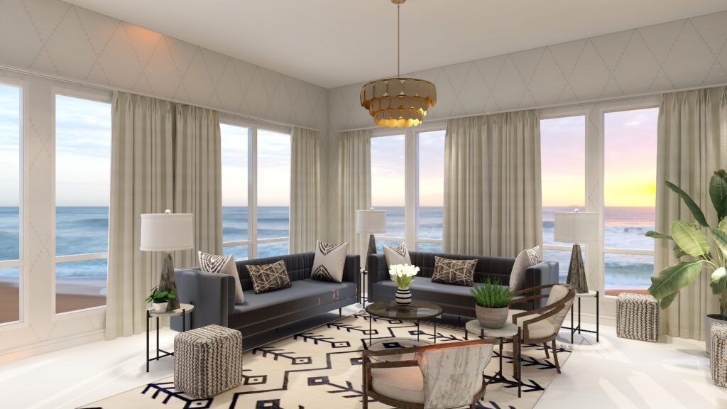
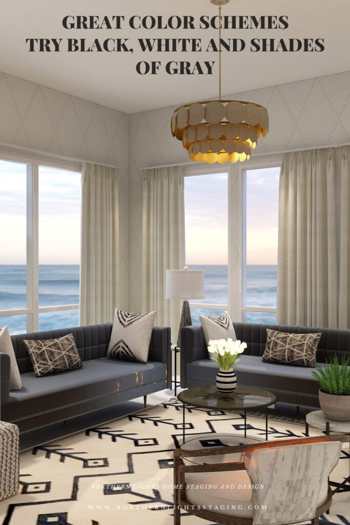
In the design below, I used wall paper in white with a gray diamond pattern. The wall, although it still has texture and interest due to the pattern, disappears with the light color, putting more emphasis on the view outside.
Double Complimentary Color Scheme. Edesign by Northern Lights Home Staging and Design.
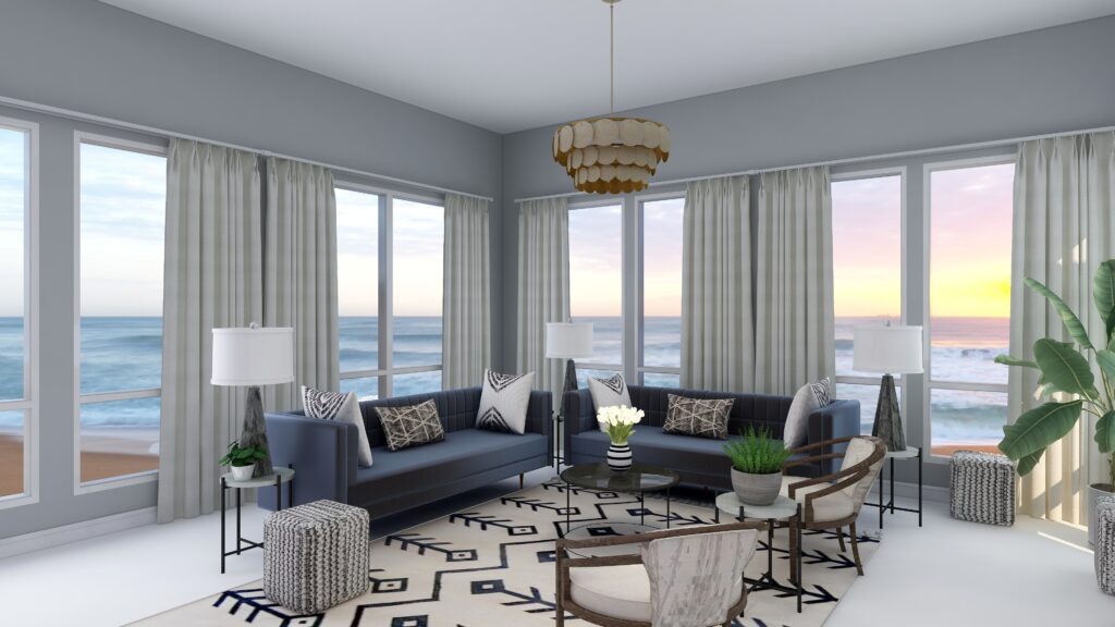
In the design below, the gray paint color feels cool and elegant, and creates more of a connection with the furnishings and decor of the gray sofas and the accent pillows.
Shop the Look
Check out the pieces I selected for this design. Some include affiliate links, meaning I receive a small commission for sharing at no additional cost to you.
My design also incorporates some of my unique fractal art from my “Spring” Collection.
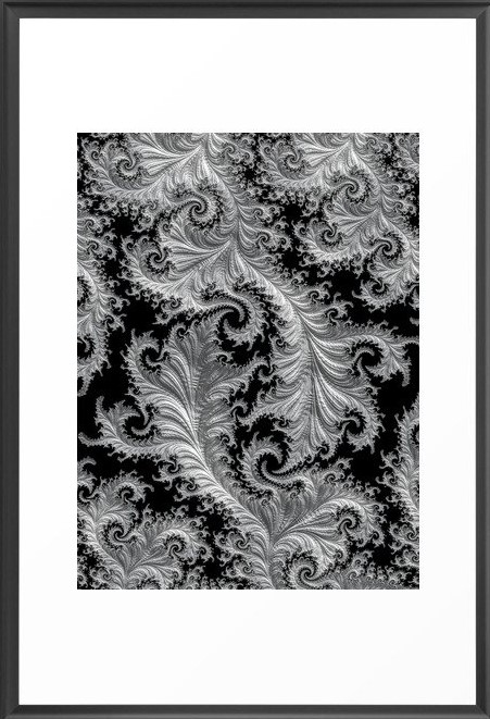
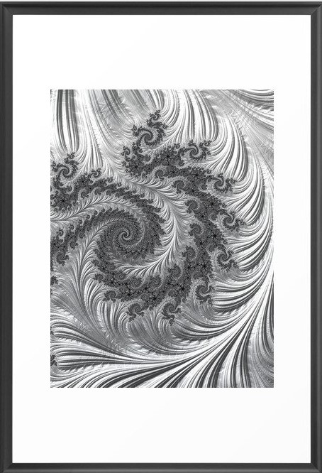
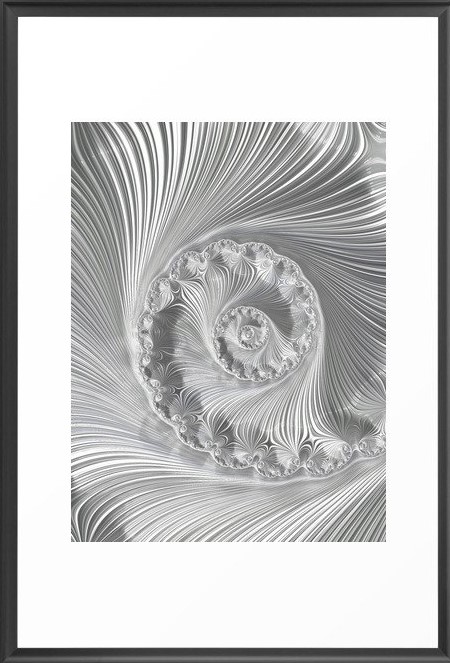
Arctic Evening Fractal Art by Northern Lights Home Staging and Design Arctic Night Fractal Art by Northern Lights Home Staging and Design Icefield Fractal Art by Northern Lights Home Staging and Design
A black, white and gray scheme is fairly easy to put together. It is best if you keep you black, white and grays all within the same color family so they are harmonious.
A black, white and gray scheme can be really dramatic or relaxing based on the saturation and placement of the colors you choose. Dark gray and black walls are more dramatic than white walls.
A black, white and gray scheme really highlights any other colors that are used, or the colors of the views outside.
Very nice for living rooms, dining rooms and areas that you like to entertain.
Create Beauty with Color in Your Space
Each moment in life is YOUR choice. surround yourself with BEAUTY, color and positive energy now.
Or not, it’s up to you.
Everything in life is easier when you love your space.When your space is better, you are better. When you are better, the world is better.
Click on the picture to find out more about the best training class on color available, the Four Pillars of Color!.
Subscribe to Seasonal Living Magazine
Check out this free bi-monthly online Seasonal Living Magazine, full of inspirational images, videos and articles for you about seasonal home decor, travel, food and entertaining!
Great Paint Color Schemes- Try a Double-Complimentary
People often struggle with creating a great color scheme. In my last few blog articles we discussed how you could take your favorite color, blue for example, and create different color schemes. We explored monochromatic, analogous, complimentary, diad, triad and tetrad color schemes. Today, lets look at a Split-Complimentary!
A tetrad uses four colors which include two complimentary color pairings. It can be difficult to balance if you use all four colors in equal amounts it may feel like too much. You can use one to three colors as dominant colors and and let the rest be more subdued. By subdued, I mean you can use less of the colors proportionally. Or you could use less saturated versions of the colors so they don’t stand out as much, but color schemes tend to look more harmonious if you are using similar saturation or chroma levels. Here are some examples.
Let’s create a split-complimentary color scheme with the blue we have been working with in the last several articles. You can see this blue in the sofas.
Monochromatic Color Scheme Analogous Color SchemeAnalogous Color Scheme Complimentary Color Scheme Complimentary Color Scheme Diad Color Scheme Diad Color Scheme Triad Color Scheme Triad Color Scheme Tetrad Color Scheme Tetrad Color SchemeSpilt Complimentary SchemeSpilt Complimentary Scheme
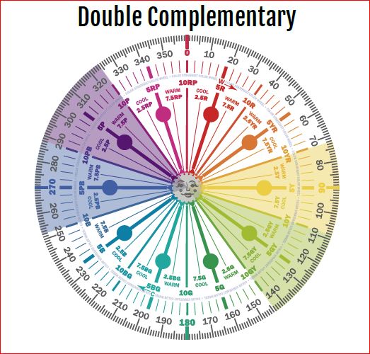
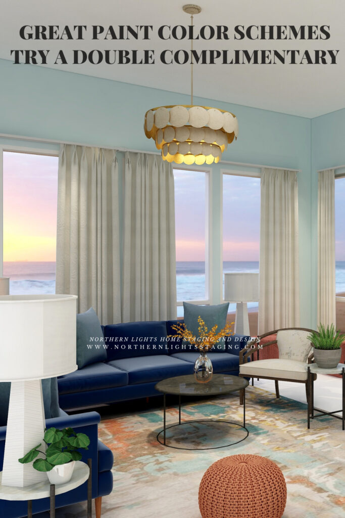
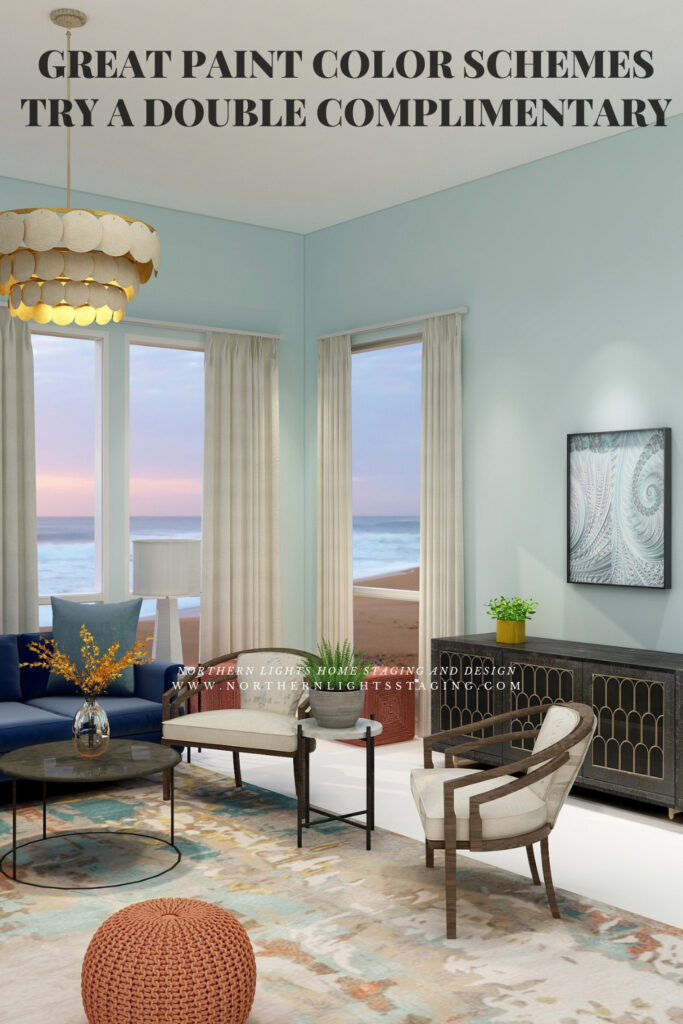
In a double complementary color scheme, you use a primary color such as our blue, its compliment yellow, and then the pair of complimentary colors of one of its neighbors on either side such as blue/purple and yellow/green or blue/green and orange.
Double Complimentary Color Schemes Illustrations by Camp Chroma, the Best Color Training Ever!
Design 1
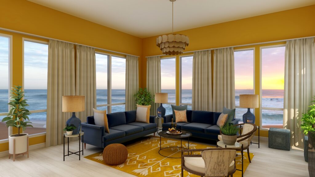
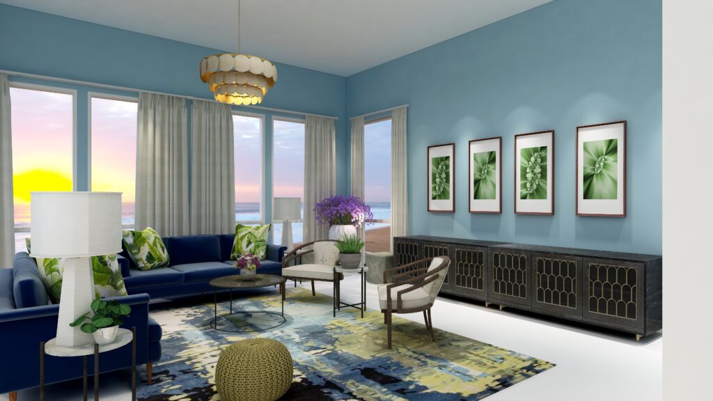
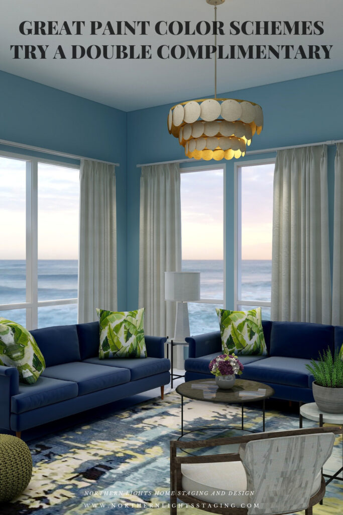
With a Double-Complimentary scheme we are working with 4 colors, or two sets of compliments. We have a large variety of tints, tones and shades to play with within those colors, but it is always most harmonious if you work with colors with similar chroma (saturation). In other words it looks best if you are not mixing rich, bright colors with pastels. You can get dramatic or keep it more neutral based on the colors you choose. I find adding rich color to the walls creates drama, while using a more neutral wall color feels more relaxing.
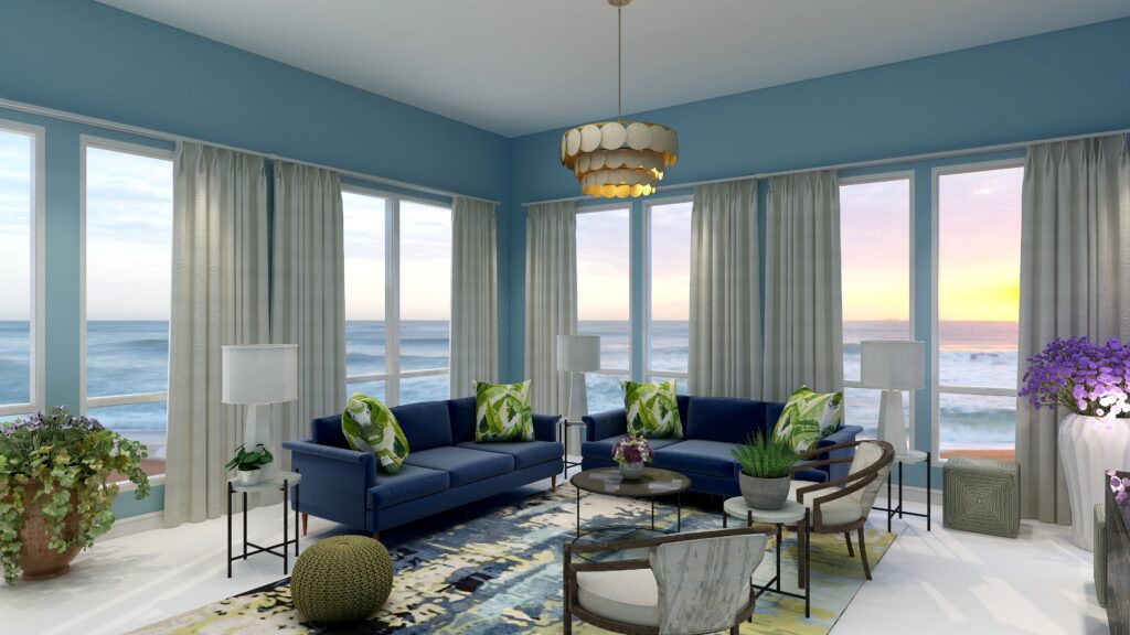
In this design I used the blue/yellow compliment pair in the sofas and the beautiful area rug. I used the green/yellow of the neighboring compliment pair in the area rug, pillows and my fractal art. I decided to bring in purple in small amounts as an accent, and used plants with purple flowers to highlight that color.
Double Complimentary Color Scheme. Edesign by Northern Lights Home Staging and Design. Double Complimentary Color Scheme. Edesign and Fractal Art by Northern Lights Home Staging and Design.
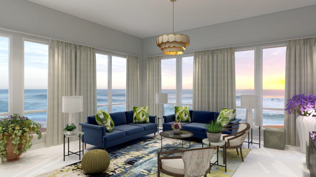
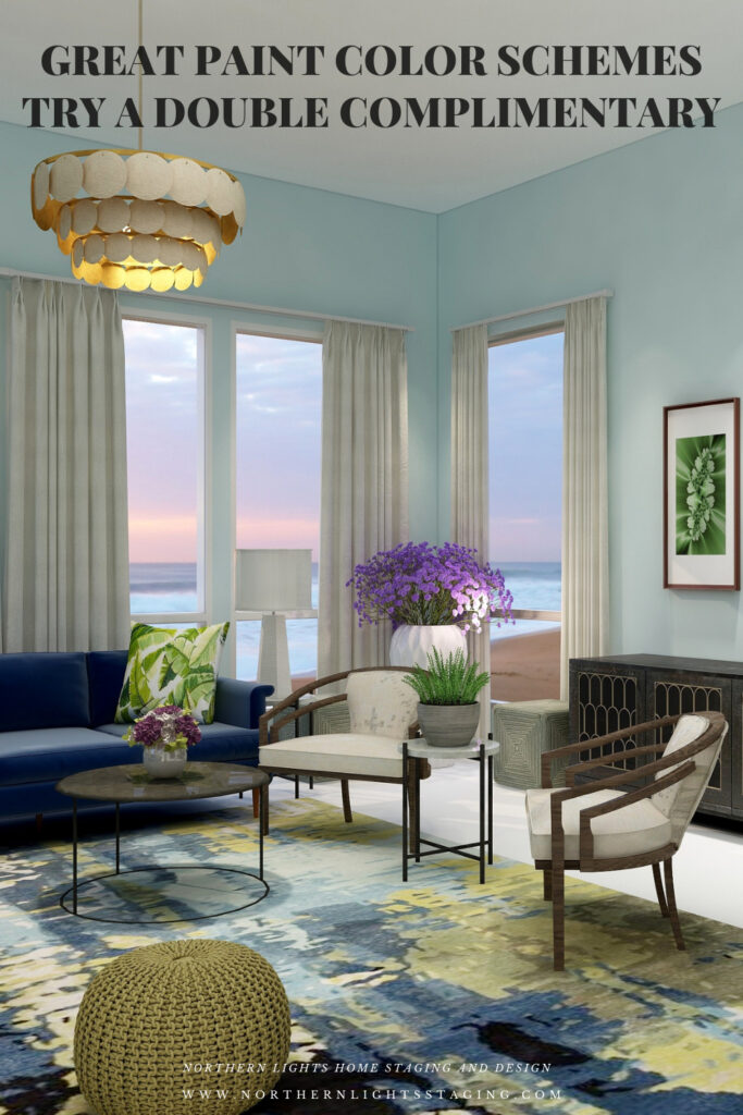
In the examples above, I created drama by using a more saturated shade of blue for the wall color. To create a more neutral look, I created a second version below where I used the same color but with very low saturation so it is almost gray.
Double Complimentary Color Scheme. Edesign by Northern Lights Home Staging and Design.
Shop the Look- Design 1
Check out the pieces I selected for this design. Some include affiliate links, meaning I receive a small commission for sharing at no additional cost to you.
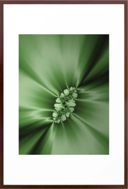
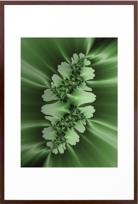
My design also incorporates some of my unique fractal art from my “Spring” Collection.
Spring Fractal Art by Nofthern Lights Home Staging and Design Spring 2 Fractal Art by Northern Lights Home Staging and Design
Design #2
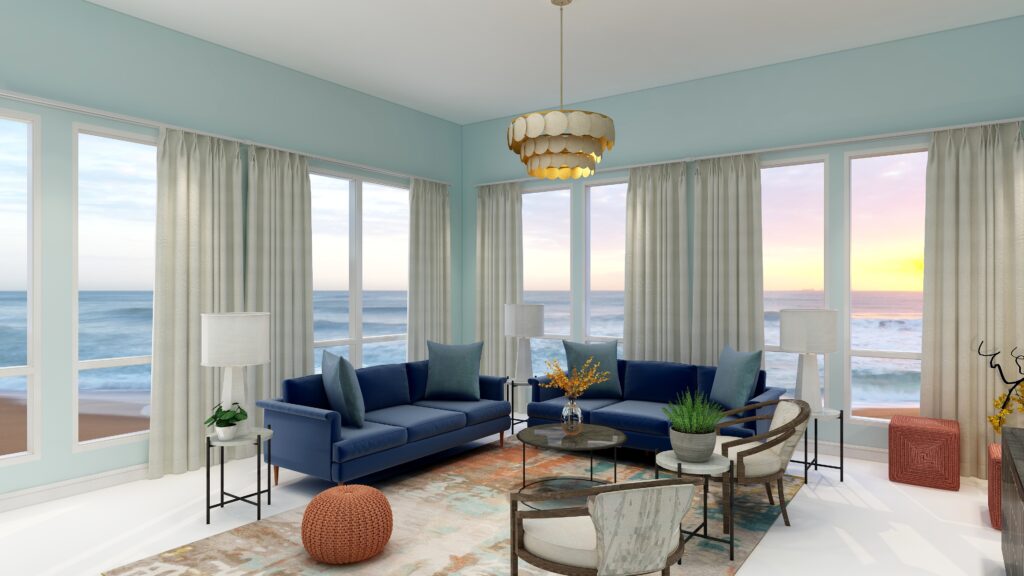
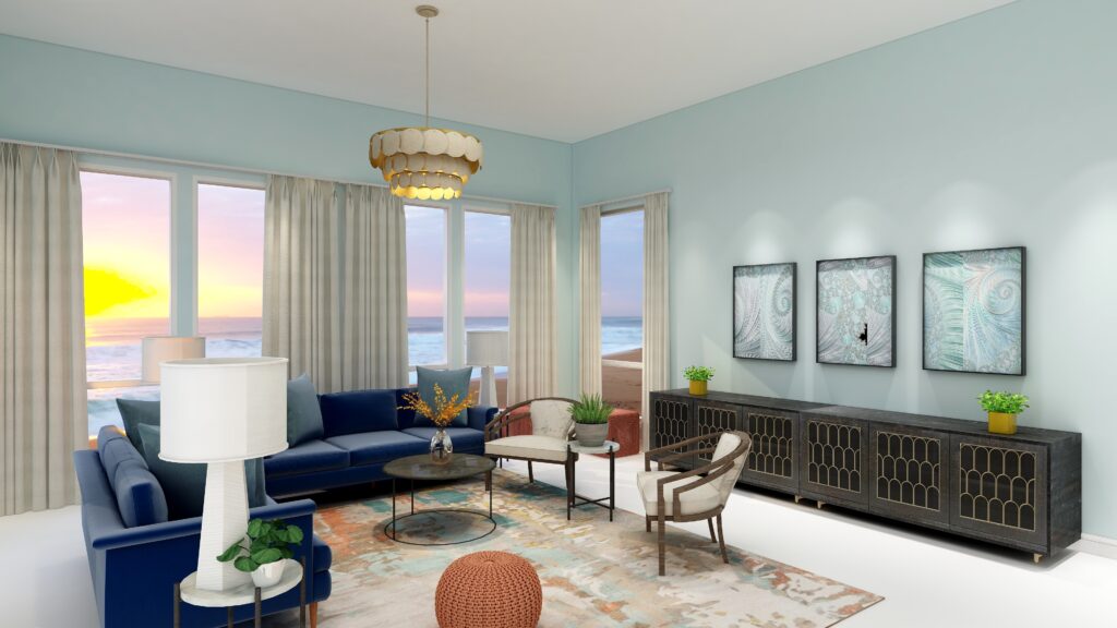
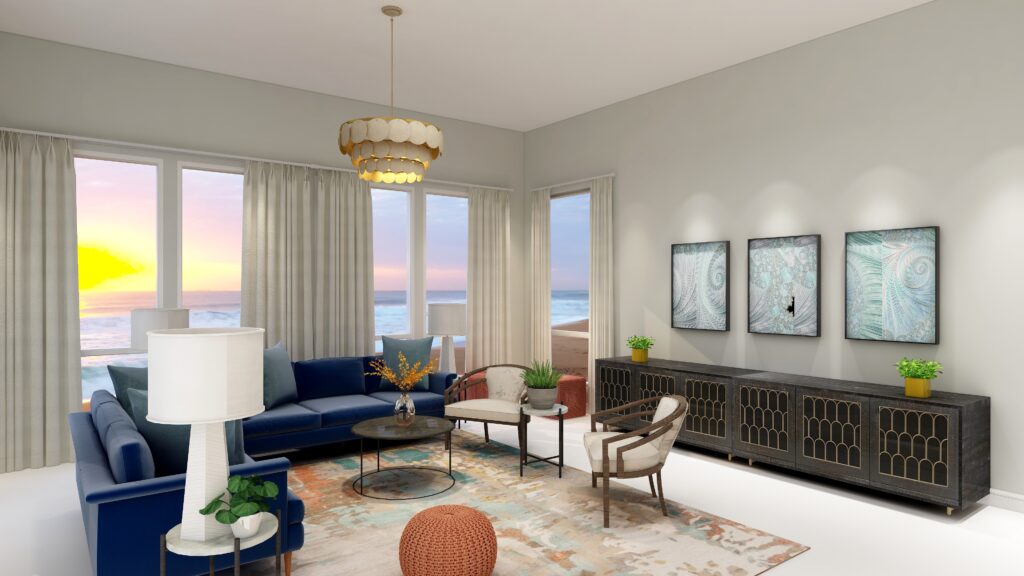
In this second design I used the blue/yellow complimentary pair again but this time worked with blue/green and orange. I found a beautiful area rug as an inspiration piece that has the blue, blue green, orange and a touch of yellow to tie everything together. I highlighted the orange in the 3 poufs. I used the blue/green in the pillows, the wall color and in my “Jenna” fractal art collection. The yellow I used as a small accent with flowers or flower vases.
Double Complimentary color scheme. Edesign by Northern Lights Home Staging and Design. Double Complimentary color scheme. Edesign and Fractal Art by Northern Lights Home Staging and Design. Double Complimentary color scheme. Edesign and Fractal Art by Northern Lights Home Staging and Design.
Shop the Look Design #2
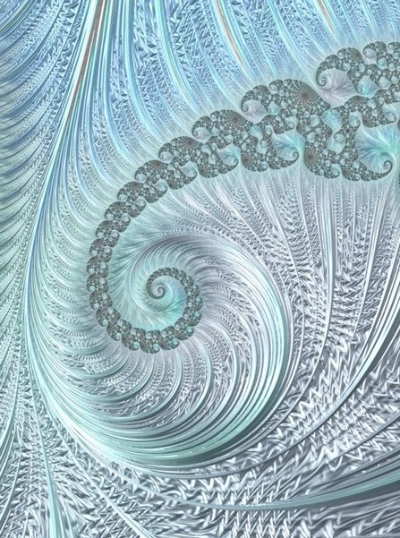
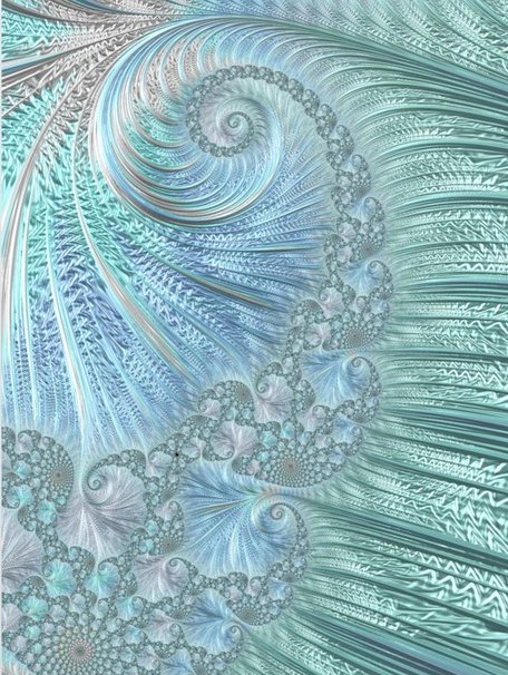
Here is a closer view of my fractal art collection called “Jenna” which I created in honor of Jenna Gaidusek of the Edesign Tribe when creating something for her office with her favorite colors. In my design, the art is on canvas prints, but they are available framed or on a variety of materials as well as on other home decor in my store at Society 6.
Jenna Fractal Art by Northern Lights Home Staging and Design Jenna 2 Fractal Art by Northern Lights Home Staging and Design Jenna 3 Fractal Art by Northern Lights Home Staging and Design
Benefits of A Double Complimentary Color Scheme
A double complimentary color scheme is easy to put together using 4 colors. You can give all colors equal weight in the design for more drama, or make one or two colors more dominant based on the mood you want to create. The challenge will be trying not allow too many strong colors to compete with each other. Vary the saturation or better yet, the amount of the colors showing by making 1-2 colors as accents.
A double complimentary color scheme can be really dramatic or relaxing based on the saturation and placement of the colors you choose. Very nice for living rooms, dining rooms and areas that you like to entertain. You could try the more relaxing color combinations in a bedroom or office.
Create Beauty with Color in Your Space
EACH MOMENT IN LIFE IS YOUR CHOICE.
YOU HAVE THE OPPORTUNITY TO SURROUND YOURSELF WITH beautiful color RIGHT NOW.
Click on the picture to find out more about the best training class on color available, the Four Pillars of Color!.
Great Paint Color Schemes- Try a Split-Complimentary
People often struggle with creating a great color scheme. In my last few blog articles we discussed how you could take your favorite color, blue for example, and create different color schemes. We explored monochromatic, analogous, complimentary, diad, triad and tetrad color schemes. Today, lets look at a Split-Complimentary!
A double-complimentary scheme uses four colors which include two complimentary color pairings. It can be difficult to balance if you use all four colors in equal amounts it may feel like too much. You can use one to three colors as dominant colors and and let the rest be more subdued. By subdued, I mean you can use less of the colors proportionally. Or you could use less saturated versions of the colors so they don’t stand out as much, but color schemes tend to look more harmonious if you are using similar saturation or chroma levels. Here are some examples.
Let’s create a split-complimentary color scheme with the blue we have been working with in the last several articles. You can see this blue in the sofas.
Monochromatic Color Scheme Analogous Color SchemeAnalogous Color Scheme Complimentary Color Scheme Complimentary Color Scheme Diad Color Scheme Diad Color Scheme Triad Color Scheme Triad Color Scheme Tetrad Color Scheme Tetrad Color Scheme
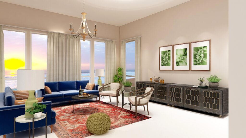
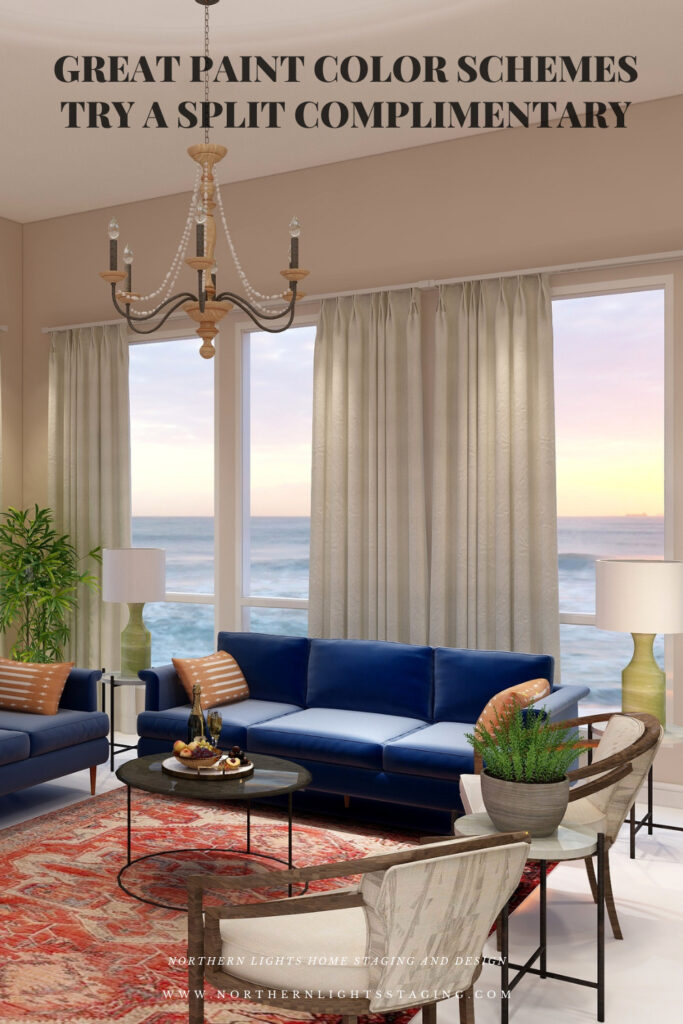
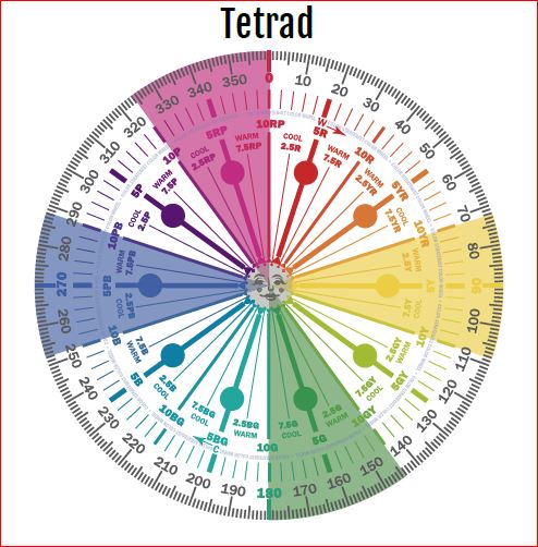
In a split complementary color scheme, you use a primary color such as our blue, and then the two analogous colors to its complement. In this case it’s compliment is yellow and yellow/red and green/yellow are next to yellow or analogous colors to yellow.
Split Complimentary Color Scheme Illustrations by Camp Chroma, the Best Color Training Ever!
The Design
With a split-Complimentary scheme we are working with 3 colors. We have a large variety of tints, tones and shades to play with within those colors, but it is always most harmonious if you work with colors with similar chroma (saturation). In other words it looks best if you are not mixing rich, bright colors with pastels. You can get dramatic or keep it more neutral based on the colors you choose. I find adding rich color to the walls creates drama, while using a more neutral wall color feels more relaxing.
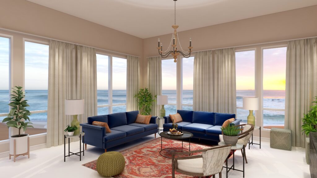
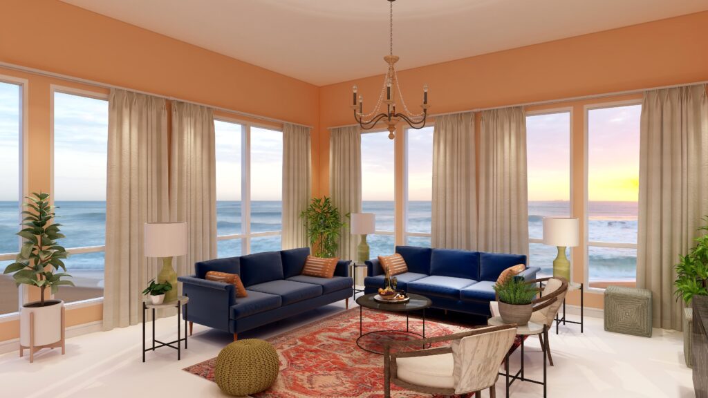
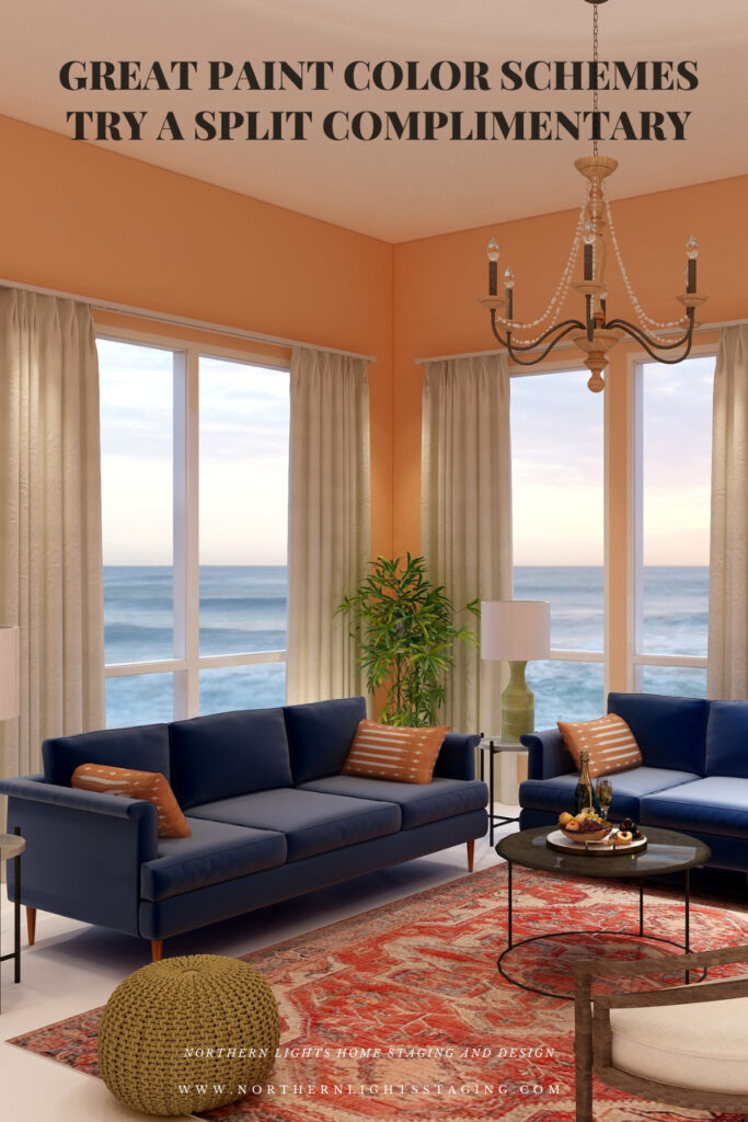
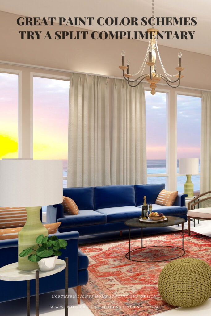
For example, below I created a split complimentary scheme with our blue sofas as the base color. I used red/orange in the rug, pillows and in the wall color where I used a very unsaturated, neutral tint of orange/red.
Split Complimentary color scheme. Edesign by Northern Lights Home Staging and Design.Split Complimentary color scheme. Edesign and Fractal Art by Northern Lights Home Staging and Design.
My design also incorporates some of my unique fractal art from my “Spring” Collection.
Spring Fractal Art by Nofthern Lights Home Staging and Design Spring 2 Fractal Art by Northern Lights Home Staging and Design
The design, although using 3 colors still feels fairly neutral and calm with some pops of color for excitement.
Shop the Look
Check out the pieces I selected for this design. Some include affiliate links, meaning I receive a small commission for sharing at no additional cost to you.
I selected pieces of various materials with different textures and patterns within the 3 hue families.
Design 2
In this second version of the design, all I changed was the wall color, which is a more saturated or has higher chroma than the color I used in design 1. As you can see, it looks much more dramatic with the rich wall color.
Split Complimentary color scheme. Edesign by Northern Lights Home Staging and Design
Benefits of A Split Complimentary Color Scheme
A split complimentary color scheme is easy to put together using 3 colors. You can give all three colors equal weight in the design for more drama, or make one or two colors more dominant based on the mood you want to create.
A split complimentary color scheme can be really dramatic or relaxing based on the saturation and placement of the colors you choose. Very nice for living rooms, dining rooms and areas that you like to entertain. You could try the more relaxing color combinations in a bedroom or office.
Create Beauty with Color in Your Space
EACH MOMENT IN LIFE IS YOUR CHOICE.
YOU HAVE THE OPPORTUNITY TO SURROUND YOURSELF WITH beautiful color RIGHT NOW.
Click on the picture to find out more about the best training class on color available, the Four Pillars of Color!.
Great Paint Color Schemes- Try a Tetrad
People often struggle with creating a great color scheme. In my last few blog articles we discussed how you could take your favorite color, blue for example, and create different color schemes. We explored monochromatic, analogous, complimentary, diad and triad color schemes. Today, lets look at a Tetrad!
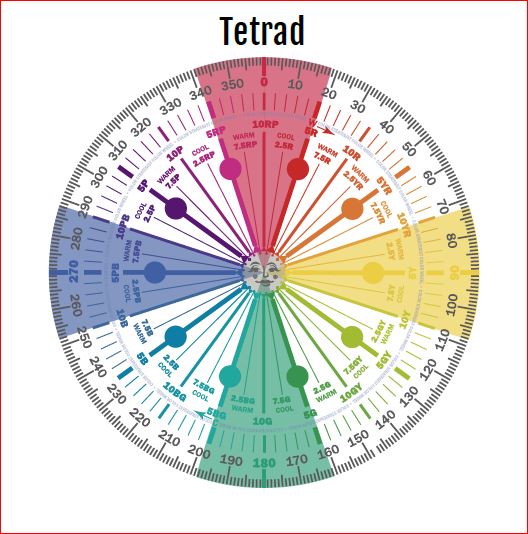
A tetrad uses four colors which include two complimentary color pairings. It can be difficult to balance if you use all four colors in equal amounts it may feel like too much. You can use one to three colors as dominant colors and and let the rest be more subdued. By subdued, I mean you can use less of the colors proportionally. Or you could use less saturated versions of the colors so they don’t stand out as much, but color schemes tend to look more harmonious if you are using similar saturation or chroma levels. Here are some examples.
Let’s create a tetrad color scheme with the blue we have been working with in the last several articles. You can see this blue in the sofas.
Monochromatic Color Scheme Analogous Color SchemeAnalogous Color Scheme Complimentary Color Scheme Complimentary Color Scheme Diad Color Scheme Diad Color Scheme Triad Color Scheme Triad Color Scheme
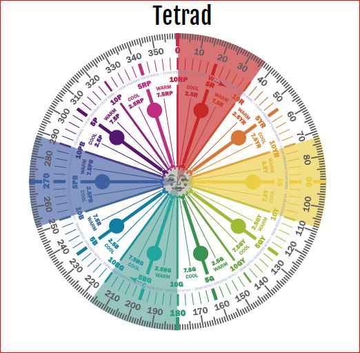
There are three different Tetrads we could choose from that use our blue (which is a blue/purple). For this article, lets work with the first two.
Tetrad Color Scheme Illustrations by Camp Chroma, the Best Color Training Ever!
The Design
With a tetrad you are using 4 colors and have a large variety of tints, tones and shades to play with within those colors. You can get dramatic or keep it mpre neutral based on the colors you choose.
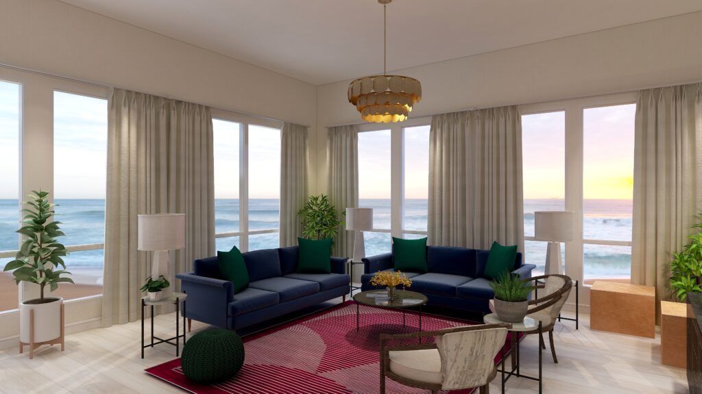
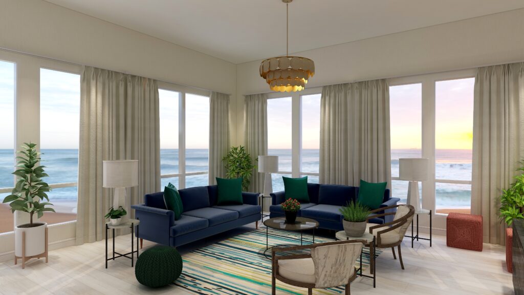
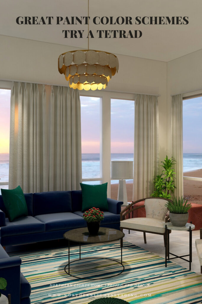
For example, below I created a tetrad with our blue as in the sofas as the base color. It’s compliment is yellow. I chose to use yellow in the wall color, in a a less saturated and lighter yellow than in it’s blue compliment to keep it more neutral. I also used yellow in the buff colored leather ottomans and an accent in the flowers on the coffee table.
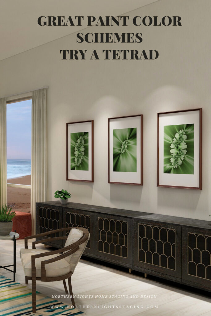
The other pair of compliments are the red/purple and green. I used the red/purple in the area rug, and the green in the pillows, pouf and plants and the art.
The rest of the design I kept neutral with the white chairs, accent tables and lamps and plant stands.
Overall in this design the blue and red-purple are most dominant, followed by the green and with yellow mainly as an accent.
My design also incorporates some of my unique fractal art from my “Spring” Collection.
Spring Fractal Art by Nofthern Lights Home Staging and Design Spring 2 Fractal Art by Northern Lights Home Staging and Design
The design, although using 4 colors still feels fairly neutral and calm with some pops of color for excitement.
Shop the Look
Check out the pieces I selected for this design. Some include affiliate links, meaning I receive a small commission for sharing at no additional cost to you.
I selected pieces of various materials with different textures and patterns within the 3 hue families.
Design 2
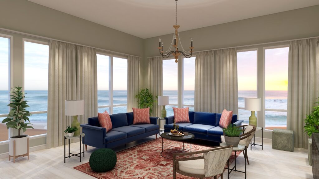
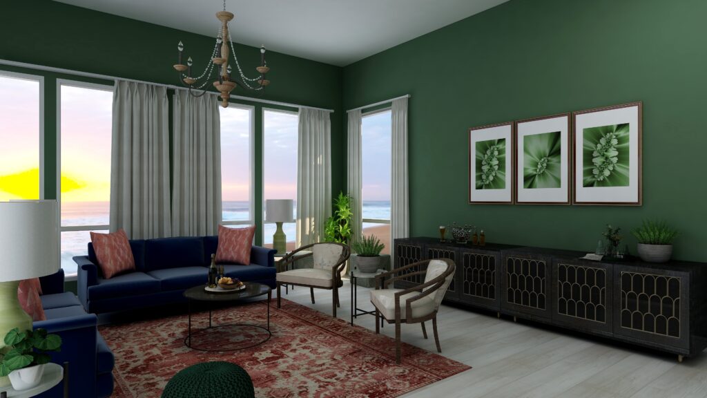
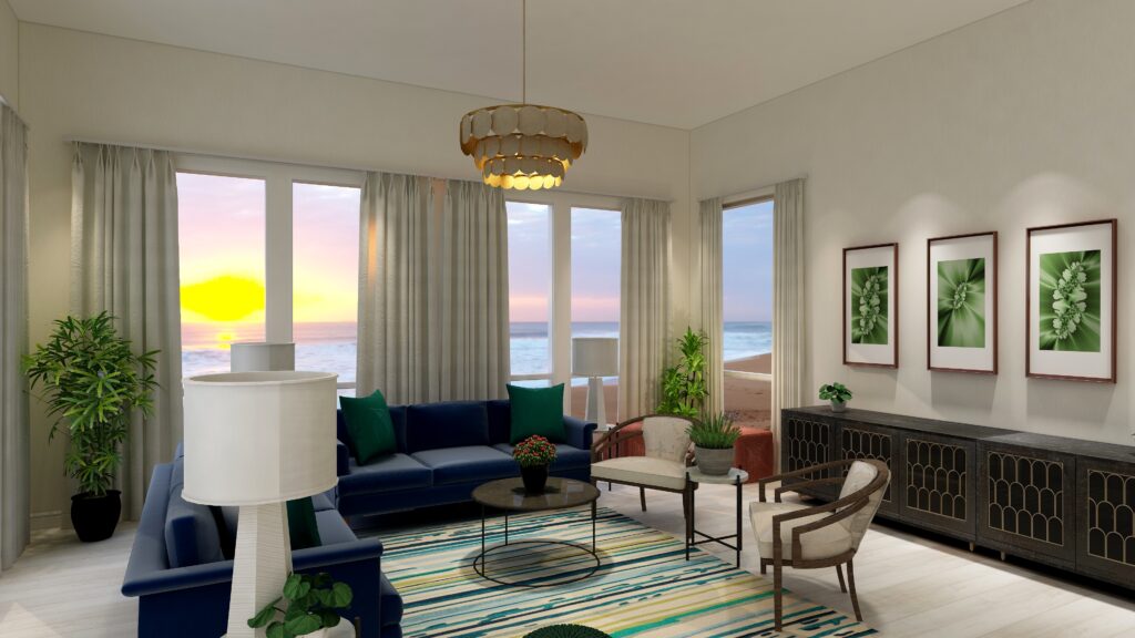
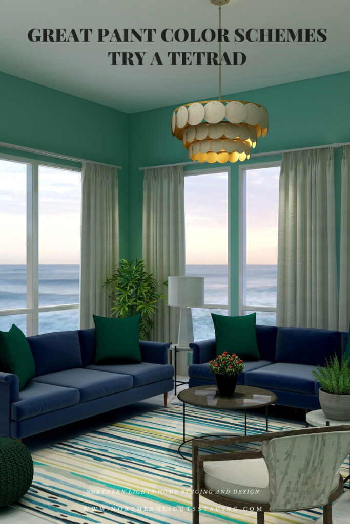
In this second version of a tetrad design, I once again used blue in the sofas and a soft neutral yellow paint color as it’s complement as in the first design.
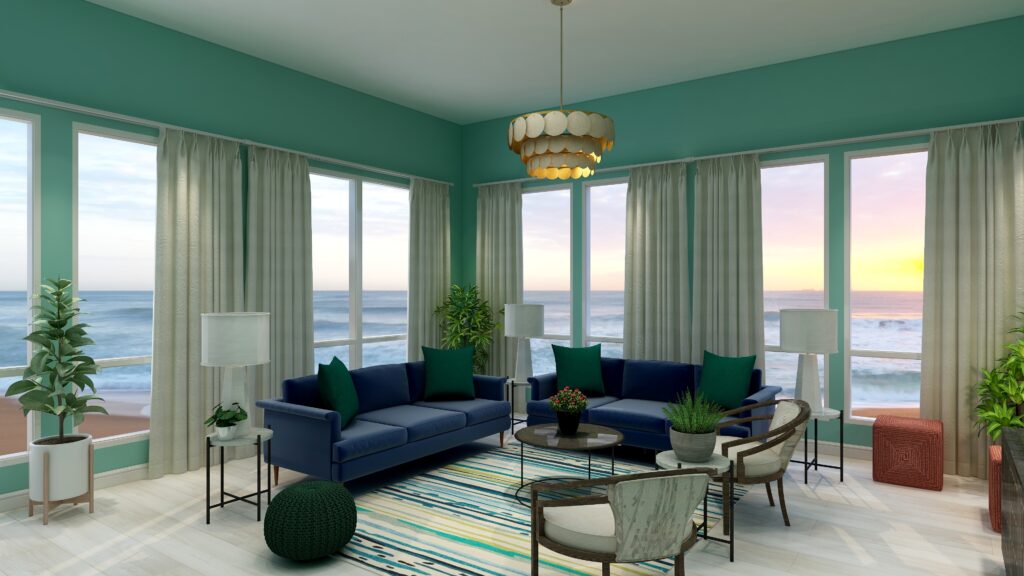
I added the blue green from the second pair of complements into a new area rug (which also ties in the deep blue, yellow and greens). I maintained the green pillows and pouf and added the red in with the two ottomans and the flower centerpiece on the coffee table. As you can see, this time the red is just an accent, where as the blue, blue green and yellow are more dominant.
Tetrad color Scheme. Edesign by Northern Lights Home Staging and DesignTetrad color Scheme. Edesign by Northern Lights Home Staging and Design
The design, although using 4 colors still also feels fairly neutral and calm with some pops of color for excitement.
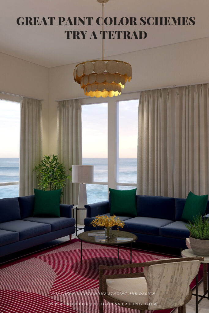
If you wanted to get more dramatic, you could pull in one of the 4 colors with greater saturation or chroma in the wall color as I did below. In this case, I used the blue-green and it changes the whole look and feel, even though everything else is the same.
Tetrad color Scheme. Edesign by Northern Lights Home Staging and Design
Shop the Look- Design #2
Benefits of A Tetrad Color Scheme
A tetrad color scheme is relatively easy to put together using two sets of complimentary colors. The tricky part is determining which colors you want to be more dominant, and balancing the rest so it is not overwhelming.
Tetrad color schemes can be really dramatic or relaxing based on the saturation and placement of the colors you choose. Very nice for living rooms, dining rooms and areas that you like to entertain. You could try the more relaxing color combinations in a bedroom, especially if you are using blues and greens.
You can play with this color scheme for different effects by how many colors you allow to be more dominant, and how much weight each carries in the design. Each color brings it’s own feeling to the space so highlight one over the others to get the mood you want.
Create Beauty with Color in Your Space
EACH MOMENT IN LIFE IS YOUR CHOICE.
YOU HAVE THE OPPORTUNITY TO SURROUND YOURSELF WITH BEAUTY RIGHT NOW.
Click on the picture to find out more about the best training class on color available, the Four Pillars of Color!.
Great Paint Color Schemes- Try a Triad
People often struggle with creating a great color scheme. In my last few blog articles we have discussed how you could take your favorite color, blue for example and create different color schemes. We explored monochromatic, analogous, complimentary and diad color schemes. Today, lets look at a Triad!
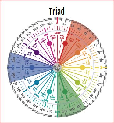
A triad uses three colors with the equal distance between all colors on the color wheel, causing no clear dominance of one color.
Monochromatic Color Scheme Analogous Color SchemeAnalogous Color Scheme Complimentary Color Scheme Complimentary Color Scheme Triad Color Scheme Triad Color Scheme
To create a triad with our blue (which is a blue/purple), we will add reds and greens.
A Triad- Created by Camp Chroma- The Best Color Training Ever.
The Design
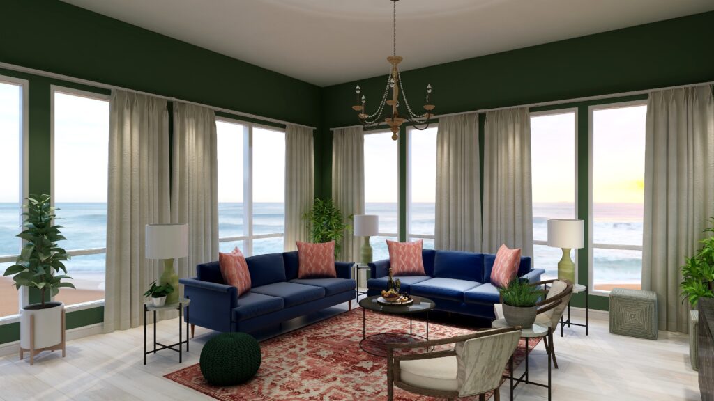
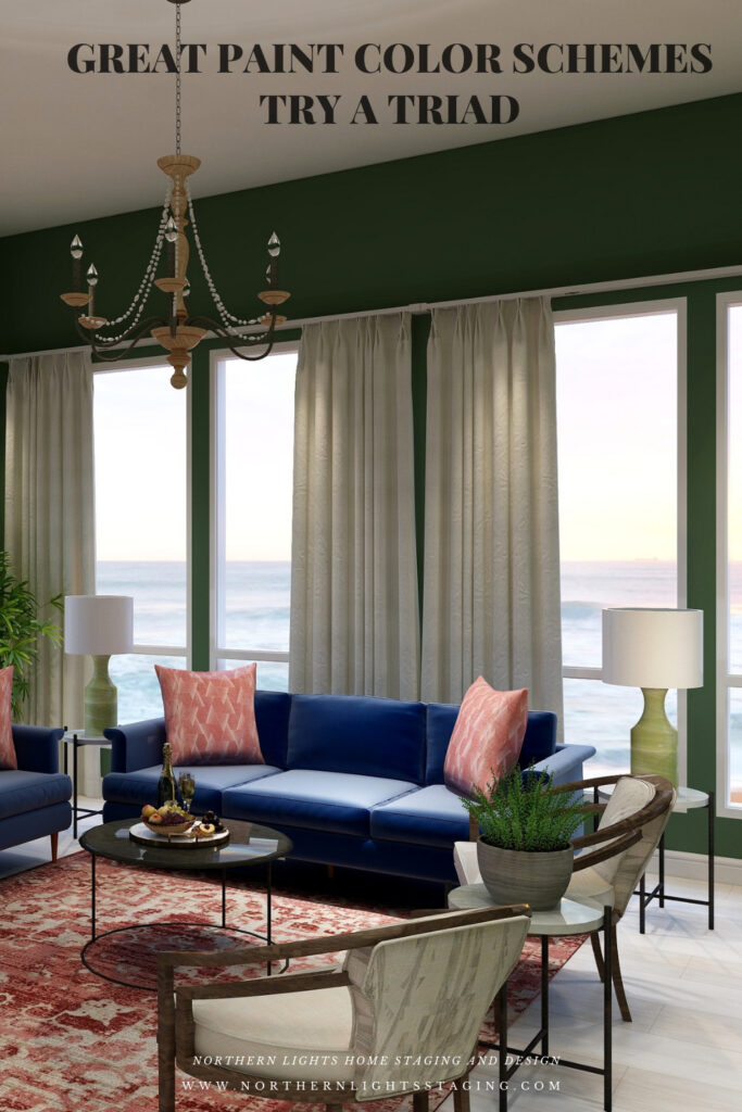
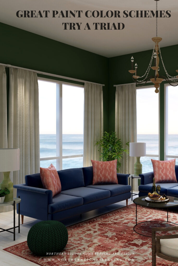
With a triad, you are using 3 colors and have a large variety of tints, tones and shades to play with within those colors. You can get dramatic or keep it simple based on the colors you choose. For example, below I created a triad with our blue as in the sofas as the base color and incorporating reds in the rug and pillows and greens in the pouf, lamps, art, plants and wall color. I used saturated colors from each of the hue families. The deep rich wall color creates a more dramatic look.
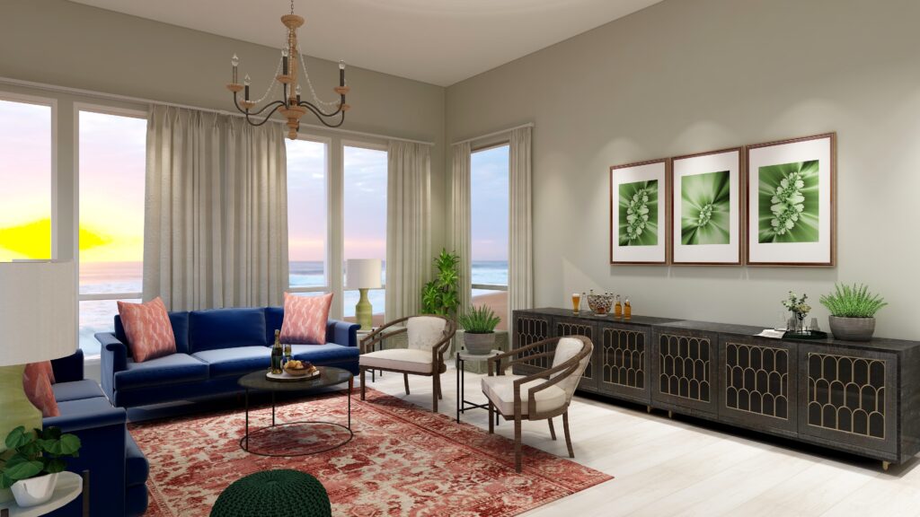
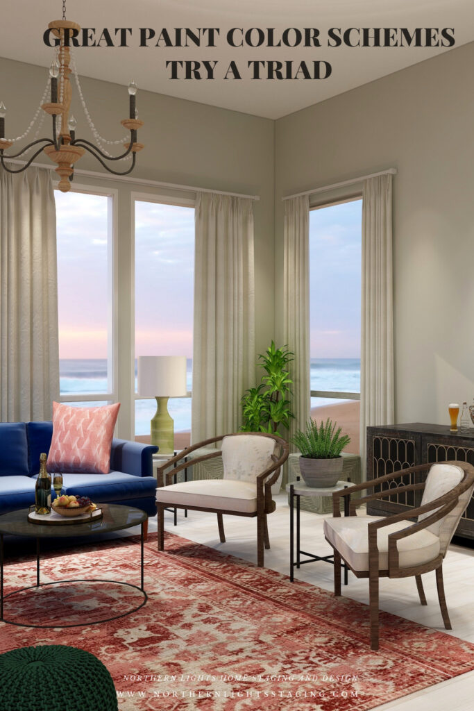
If drama is not your thing, you can tone it down by changing the saturation of the wall color. Below, the only thing I changed was the wall color, which is still green, but with such low saturation levels it is approaching a gray. This more neutral colored wall creates a more serene atmosphere.
My design also incorporates some of my unique fractal art from my “Spring” Collection.
Spring Fractal Art by Nofthern Lights Home Staging and Design Spring 2 Fractal Art by Northern Lights Home Staging and Design
Shop the Look
Check out the pieces I selected for this design. Some include affiliate links, meaning I receive a small commission for sharing at no additional cost to you.
I selected pieces of various materials with different textures and patterns within the 3 hue families.
Benefits of A Triad Color Scheme
A triad color scheme is relatively easy to put together. Pick your favorite color and find 2 neighbors, equal distant apart on the color wheel.
Triad color schemes can be really dramatic or relaxing based on the saturation and placement of the colors you choose. Very nice for living rooms, dining rooms and areas that you like to entertain. You could try the more relaxing color combinations in a bedroom, especially if you are using blues and greens.
You can play with this color scheme for different effects by having one color as the dominant color and the other 2 as accents, or give all colors equal weights. Each color brings it’s own feeling to the space so highlight one over the others to get the mood you want.
Create Beauty with Color in Your Space
EACH MOMENT IN LIFE IS YOUR CHOICE.
YOU HAVE THE OPPORTUNITY TO SURROUND YOURSELF WITH BEAUTY RIGHT NOW.
Click on the picture to find out more about the best training class on color available, the Four Pillars of Color!.
Great Paint Color Schemes- Do a Diad
People often struggle with creating a great color scheme. In my last few blog articles we have discussed how you could take your favorite color, blue for example and create different color schemes. We explored monochromatic, analogous and complimentary schemes. Today, lets look at Diad!
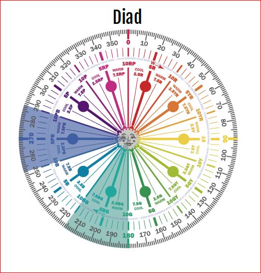
A diadic or diad color scheme uses two colors that are separated by one color on the color wheel.
Monochromatic Color Scheme Analogous Color Scheme Complimentary Color Scheme Complimentary Color Scheme
To create a diad with our blue (which is a blue/purple), we will add blue-greens. We could always go the other direction and work with red/purple. We will try that in a future article.
A Diad- Created by Camp Chroma- The Best Color Training Ever.
The Design
With a diad, you are only using 2 hues, but you have a large variety of tints, tones and shades to play with. You can get dramatic or keep it simple based on the colors you choose, and highlight textures and patterns.
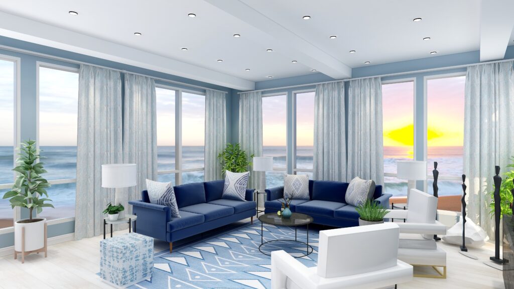
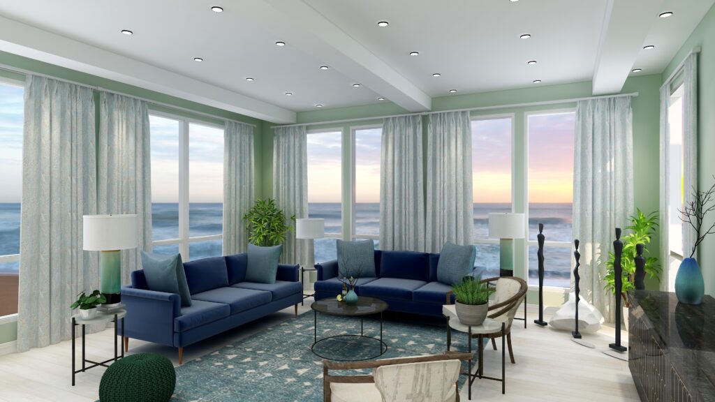
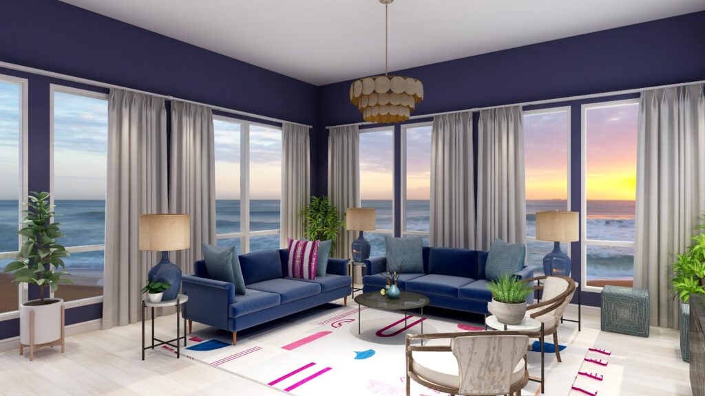
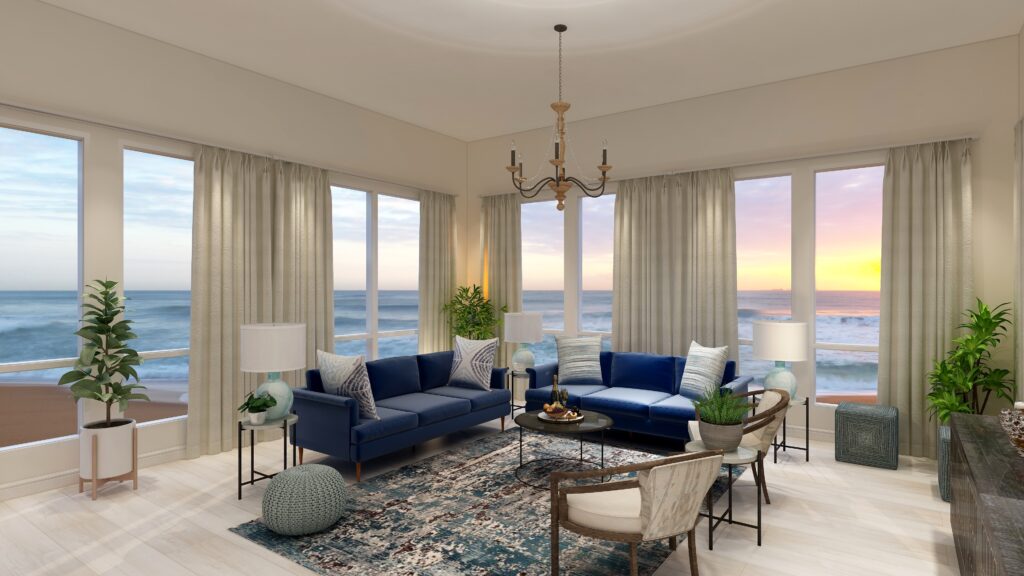
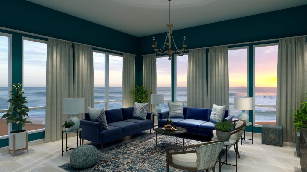
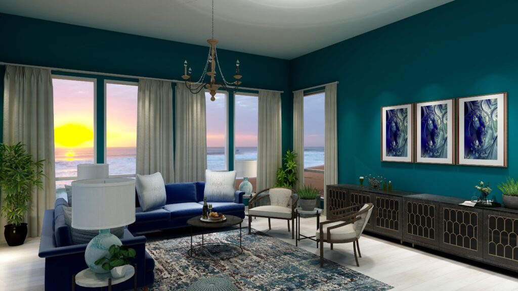
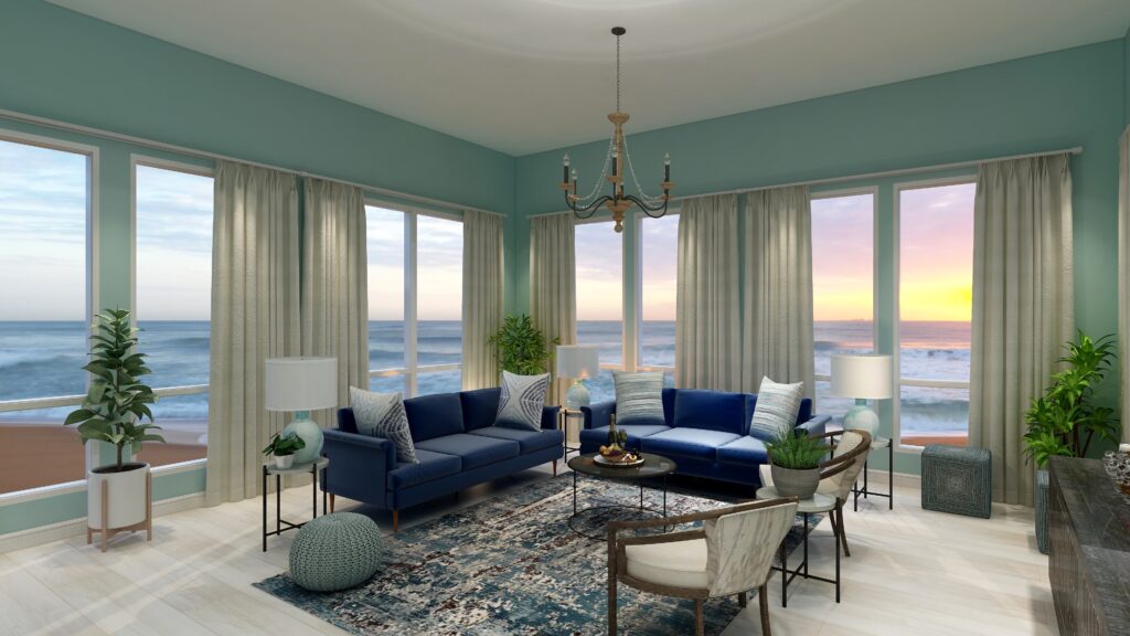
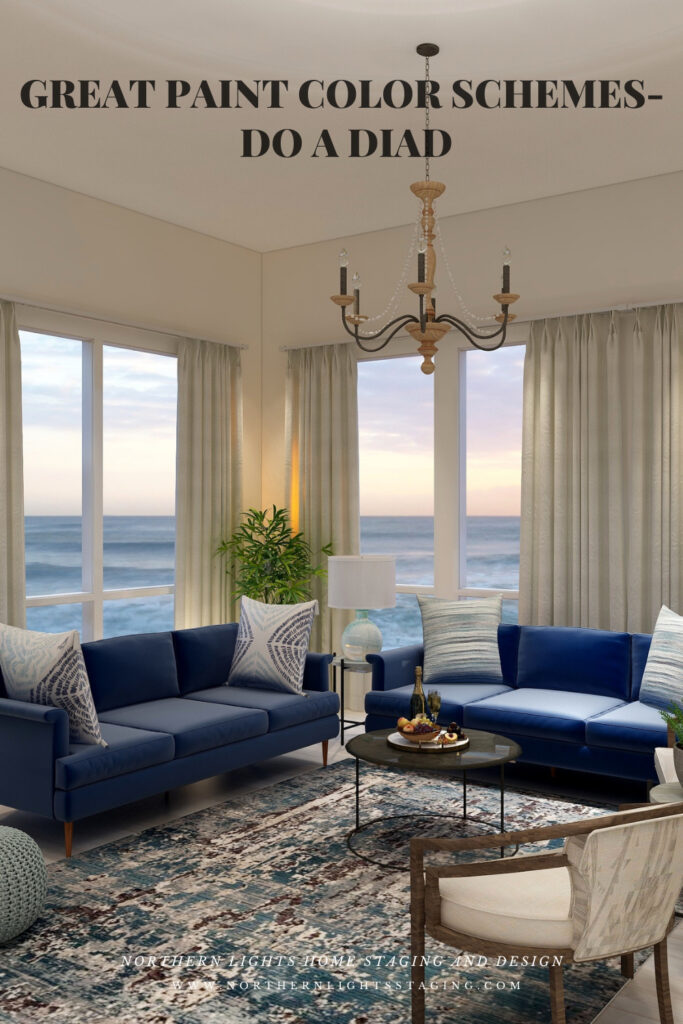
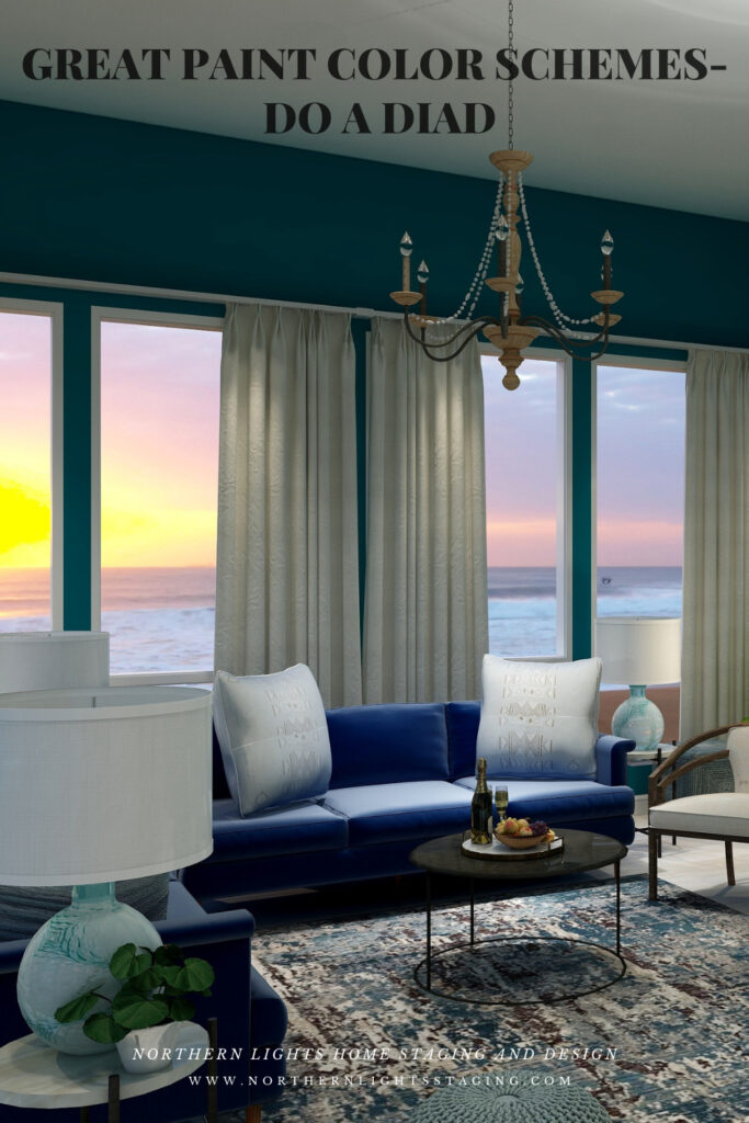
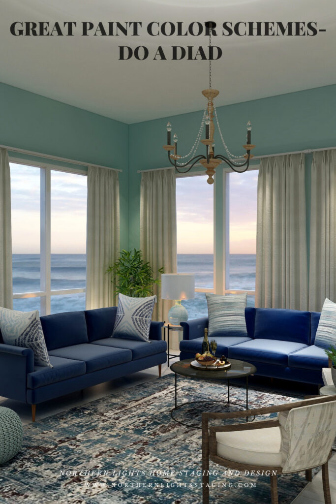
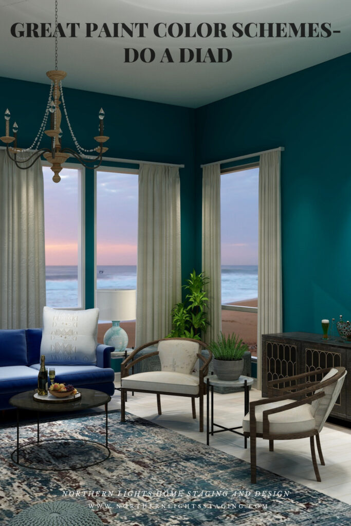
Below you can see the same design using various shades of blue/green paint and then “white flour”. The design is more dramatic with saturated wall colors and more relaxed with a neutral wall color.
Dark and dramatic diad color scheme. Edesign by Northern Lights Home Staging and Design.Dark and dramatic diad color scheme. Edesign and fractal art by Northern Lights Home Staging and Design.Light and airy diad color scheme. Edesign by Northern Lights Home Staging and Design.Neautral and serene diad color scheme. Edesign by Northern Lights Home Staging and Design.
Shop the Look
Check out the pieces I selected for this design. Some include affiliate links, meaning I receive a small commission for sharing at no additional cost to you.
I selected pieces of various materials with different textures and patterns within the 2 hue families. The design includes my own original fractal art, called “Night Dive”. I called it that because it reminded me of what it looks like underwater when diving at night, and the magical colors and textures of the water.
Benefits of A Diad Color Scheme
A diad color scheme is relatively easy to put together. Pick your favorite color and find it’s neighbor, skipping one hue family on the color wheel.
Diad color schemes can be really dramatic or relaxing based on the saturation and placement of the colors you choose. Very nice for living rooms, dining rooms and areas that you like to entertain. You could try the more relaxing color combinations in a bedroom, especially if you are using blues and greens.
Diads are simpler color schemes, similar to analogous schemes that offer opportunities to highlight more texture and pattern in your design.
Create Beauty with Color in Your Space
EACH MOMENT IN LIFE IS YOUR CHOICE.
YOU HAVE THE OPPORTUNITY TO SURROUND YOURSELF WITH BEAUTY RIGHT NOW.