


Click on the picture to find out more about the best training class on color available, the Four Pillars of Color!.
Mary Ann Benoit-Northern Lights Home Staging and Design
"Making Magic Happen—Create a Home & Life in Alignment with Your Highest Self", 907-362-0065

Click on the picture to find out more about the best training class on color available, the Four Pillars of Color!.
Comments are closed.
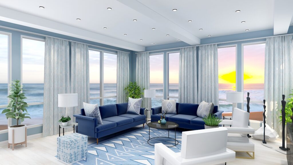
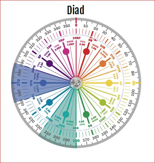
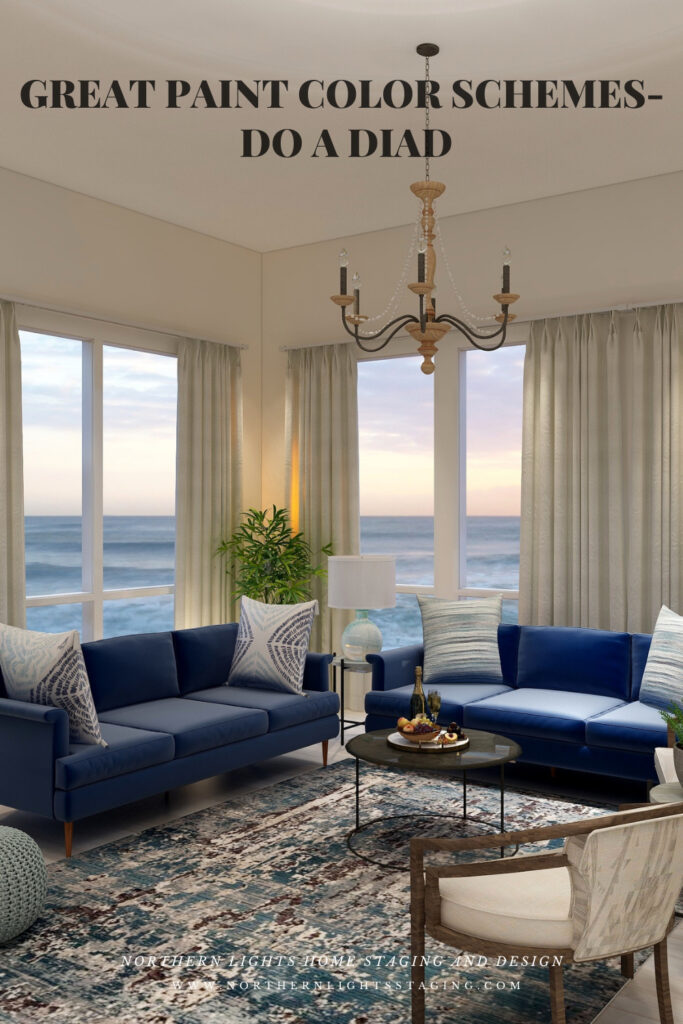
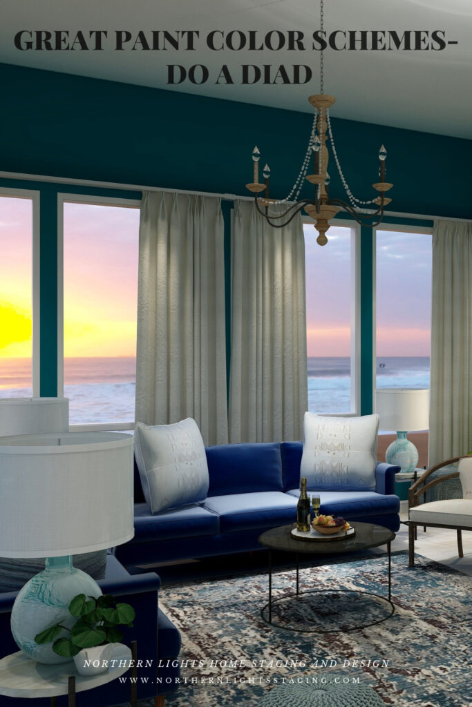
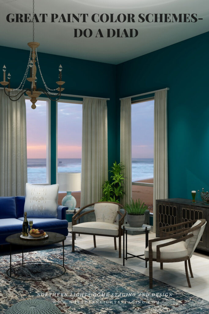
What fun! I love seeing how you played with colour. Using a sophisticated colour scheme like a diad really makes a room look like it was done by a pro!
Thank you Judith! It is a scheme most people have not heard of but so easy to implement.
I absolutely love this. A diad color scheme is serene and harmonious. Perfect and great tutorial.
Thank you so much! I love hearing this from a fellow artist!
I love all of your examples that make it easy for clients to understand what an important role color plays in creating a room!
Thank you Christie. I think color is the magic secret sauce that brings a room to life:)
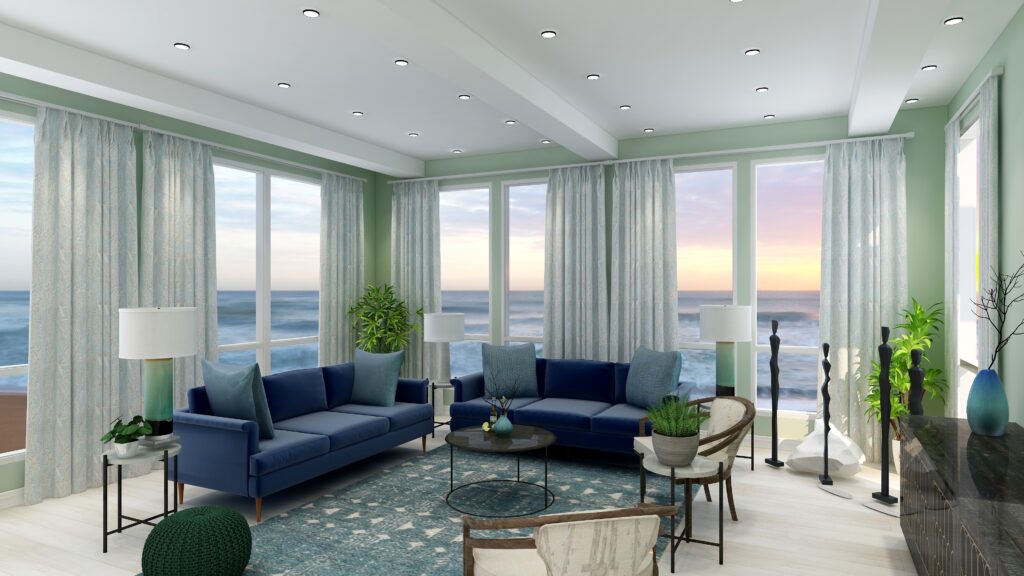
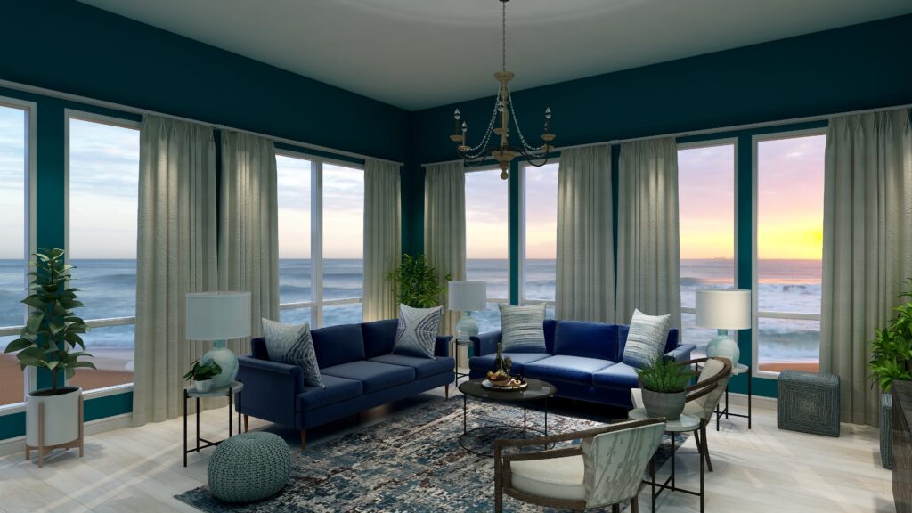
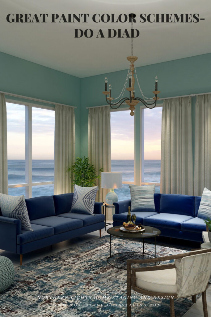
Love this, MaryAnn and love all your blue/green selections! That rug is striking!
Thank you Janet! It is a beautiful rug!! Something about blues and greens together is just so relaxing and beautiful. Probably because they are the colors of nature, plants and water.
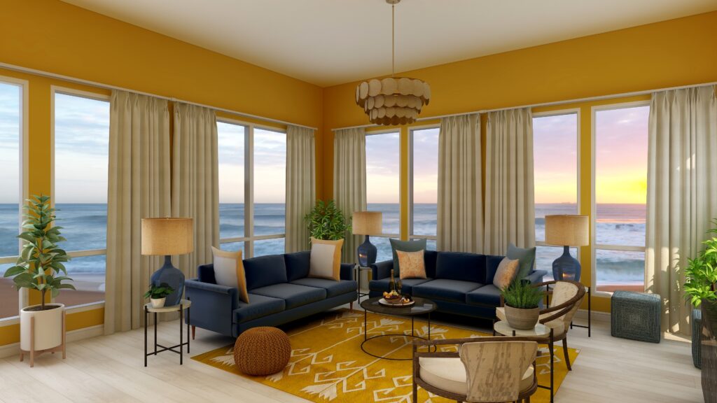
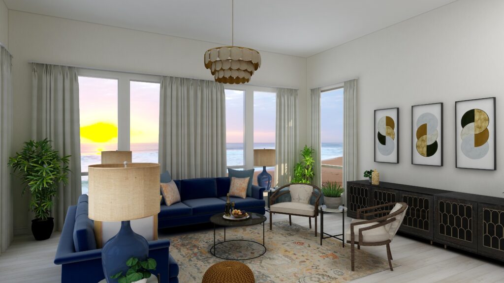
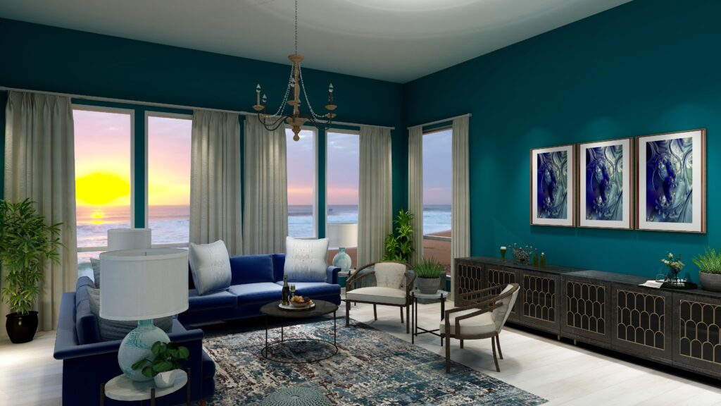
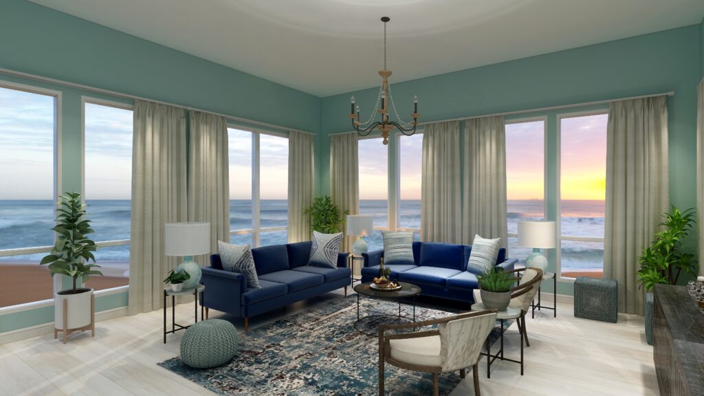
This is wonderful, Mary Ann. I know there were 2 schemes that I was totally drawn to (light & airy and neutral & serene) but I can see some of my clients being drawn to the others.
Thank you! Yes, I think you can take any of these schemes and go more serene and neutral or more dramatic based on your own or a client’s taste. Lot’s of possibilities!