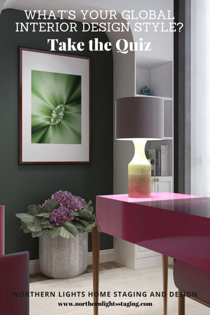


Click on the picture to find out more about the best training class on color available, the Four Pillars of Color!.
Mary Ann Benoit-Northern Lights Home Staging and Design
"Making Magic Happen—Create a Home & Life in Alignment with Your Highest Self", 907-362-0065

Click on the picture to find out more about the best training class on color available, the Four Pillars of Color!.
Comments are closed.
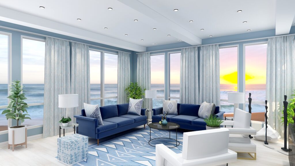
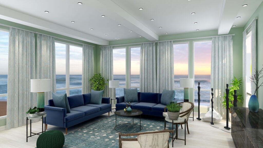
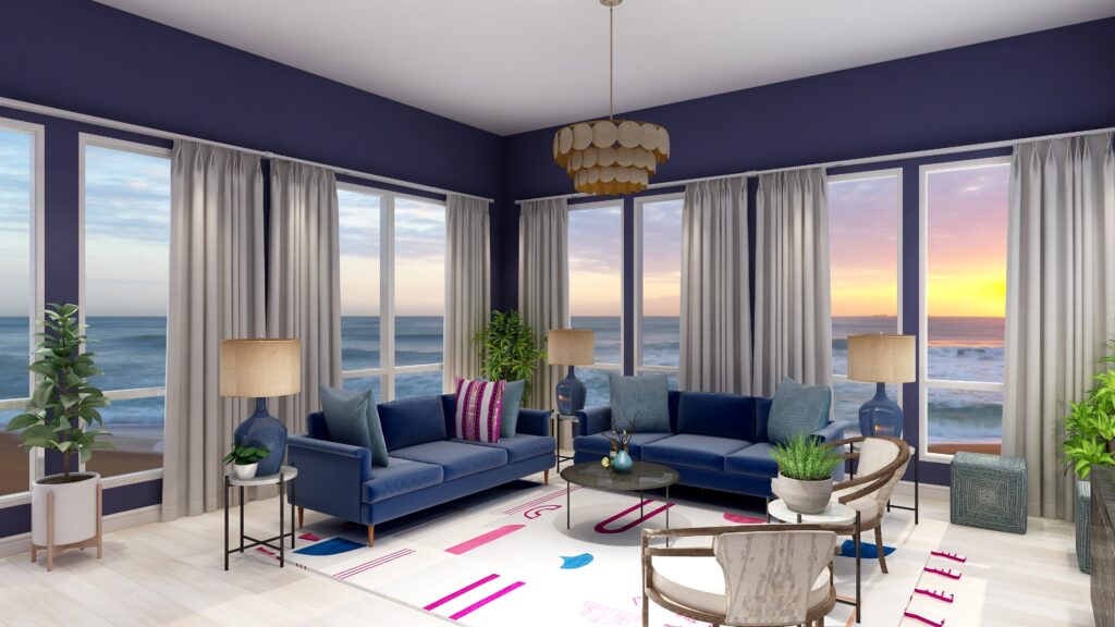
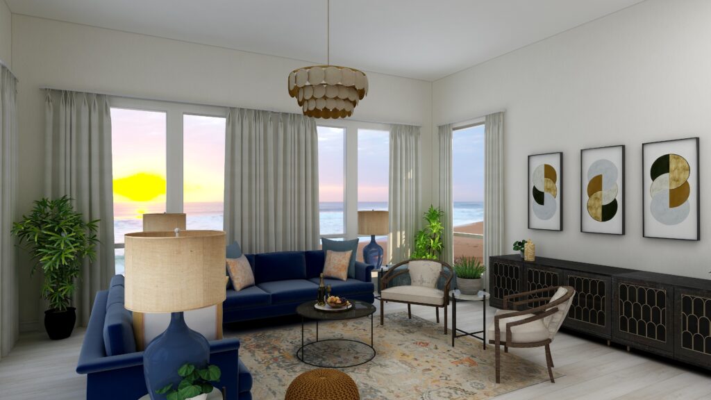
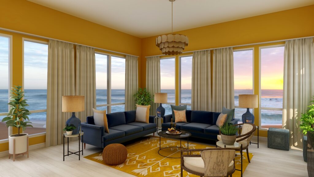
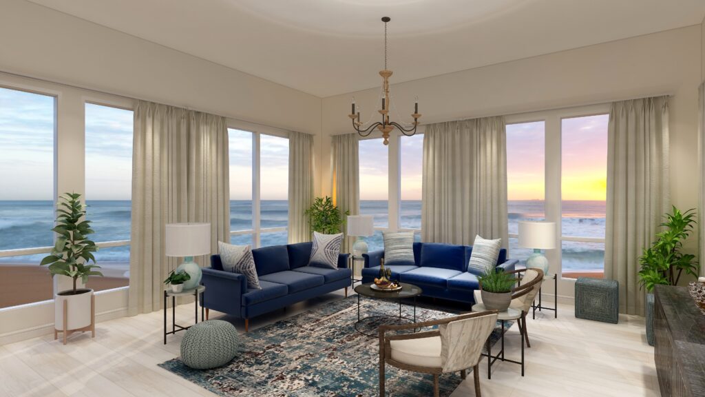
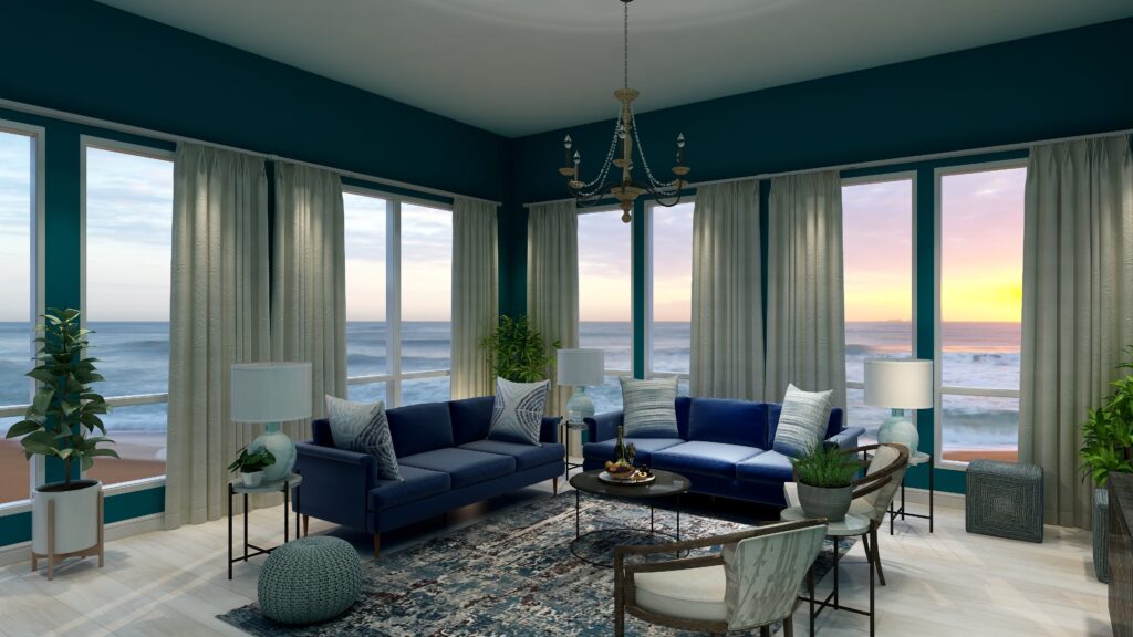
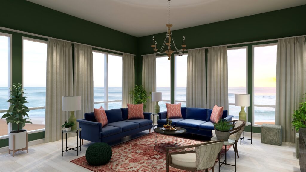
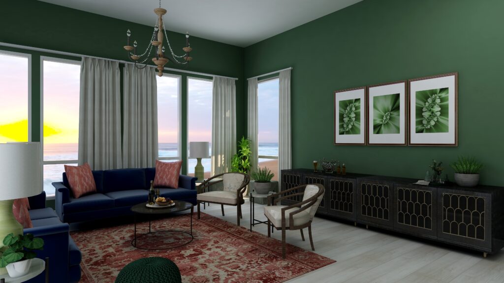
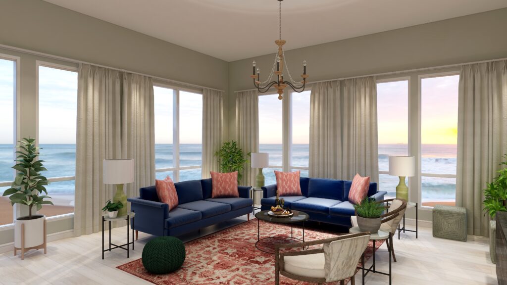
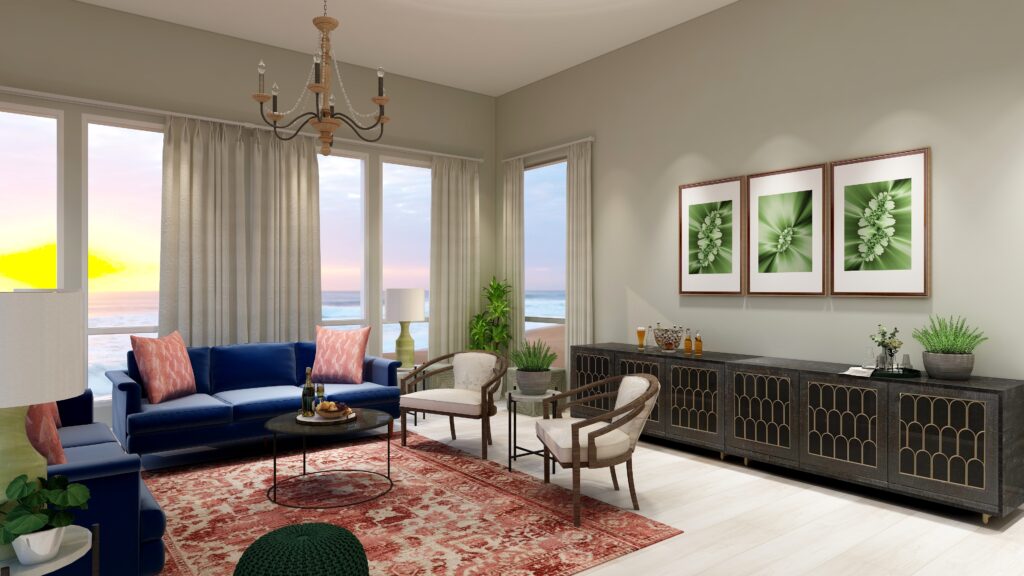
Great color series illustrations. I love how you show so clearly what changing one piece does to the mood and feeling of the room!
Thanks Janet! This series has been a lot of fun to experiment with. Changing color really does totally change the look and feel of a room so much!
This is a great post! I really appreciate how you so clearly illustrate the impact saturation of color makes in how a room feels. The renderings are a great way to do that.
Thank you Lisa! Yes, saturation can make a huge difference in how a room feels and also what colors play well together. Similar saturation or chroma levels help create color harmony.
How beautifully you explained by your expressive illustrations the concepts of the color wheel , Mary Ann. This goes back to color 101 for most of us but yet you raised the bar by your expert designing eyes to bring out the perfect examples to teach us how to implement it in our spaces. Well done!
Thank you so much!
What a lovely series showing how color can have such an impact!
Thank you so much Charmain!
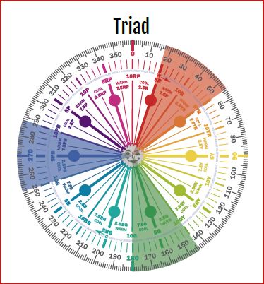
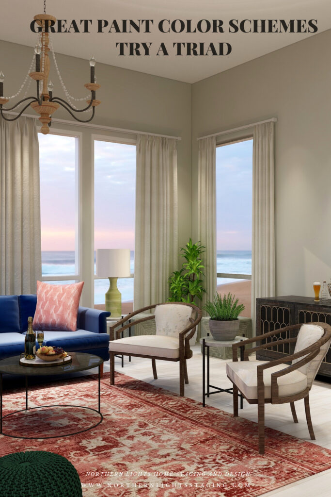
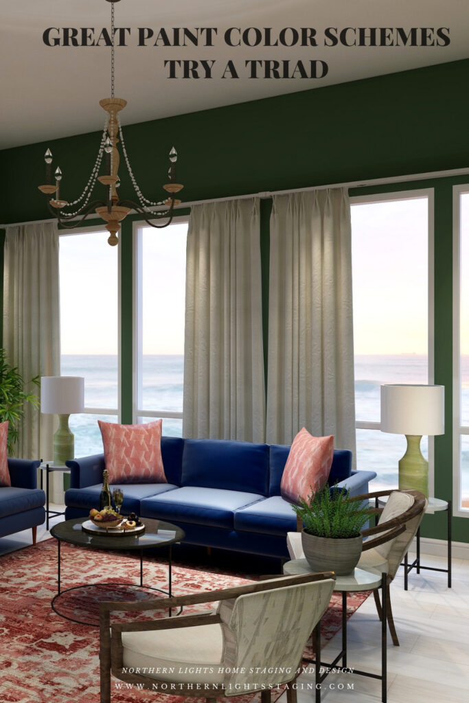
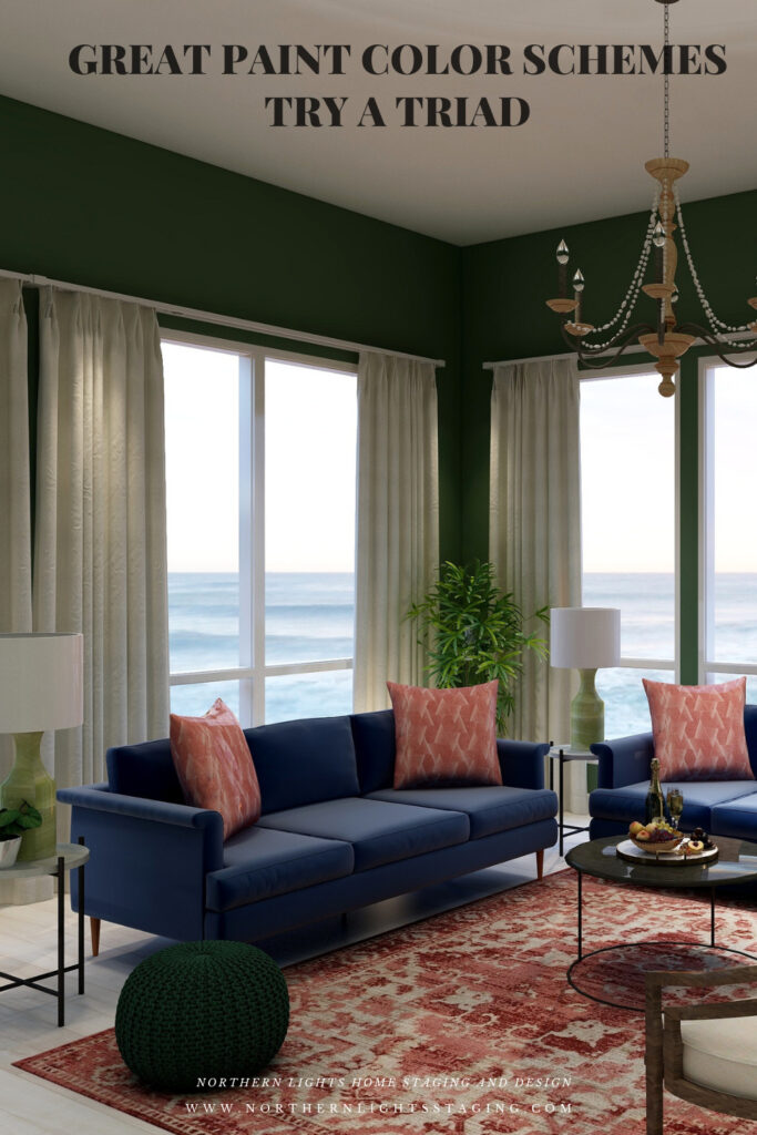
Loved seeing how you were able to show the same room in different colors. The triad color system is helpful too.
Thanks Deborah, and it is so easy to figure out from the color wheel to help people come up with ideas for their spaces.
I am really enjoying this series and seeing your renderings! It’s great to see one room with so many different looks.
Thanks so much! It is fun to play with and just goes to show what a huge impact color has on a space. Paint color can often be the easiest and most inexpensive thing to change and that alone can transform a space.