
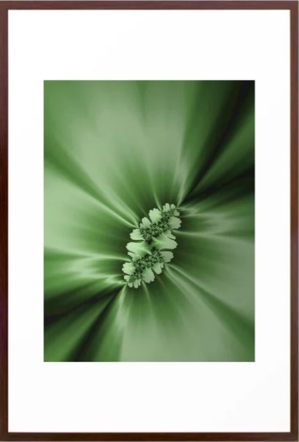
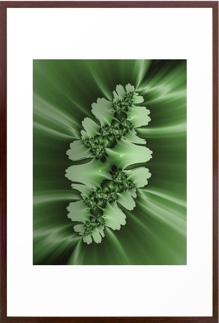


Click on the picture to find out more about the best training class on color available, the Four Pillars of Color!.
Mary Ann Benoit-Northern Lights Home Staging and Design
"Making Magic Happen—Create a Home & Life in Alignment with Your Highest Self", 907-362-0065
Click on the picture to find out more about the best training class on color available, the Four Pillars of Color!.
Comments are closed.
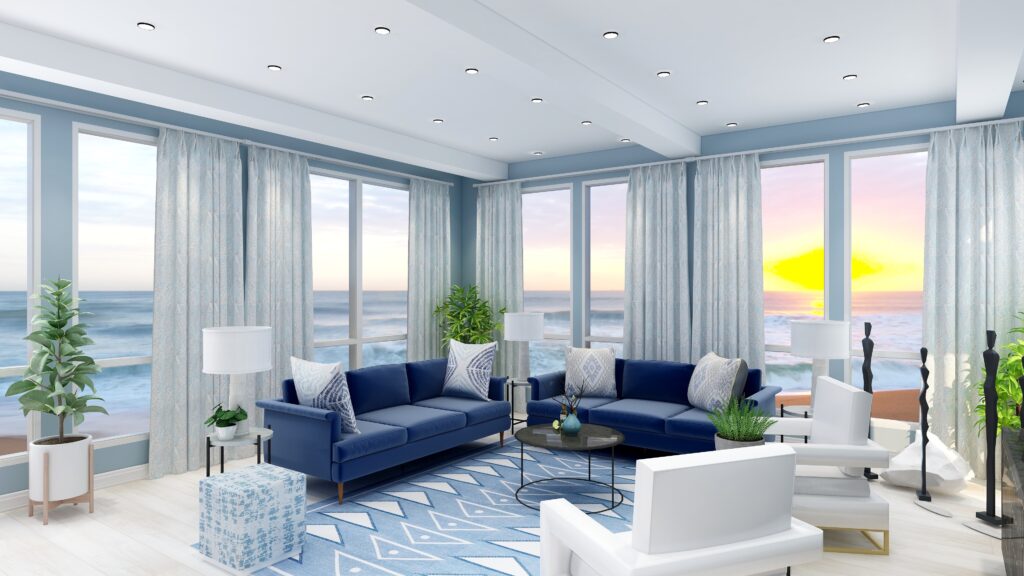
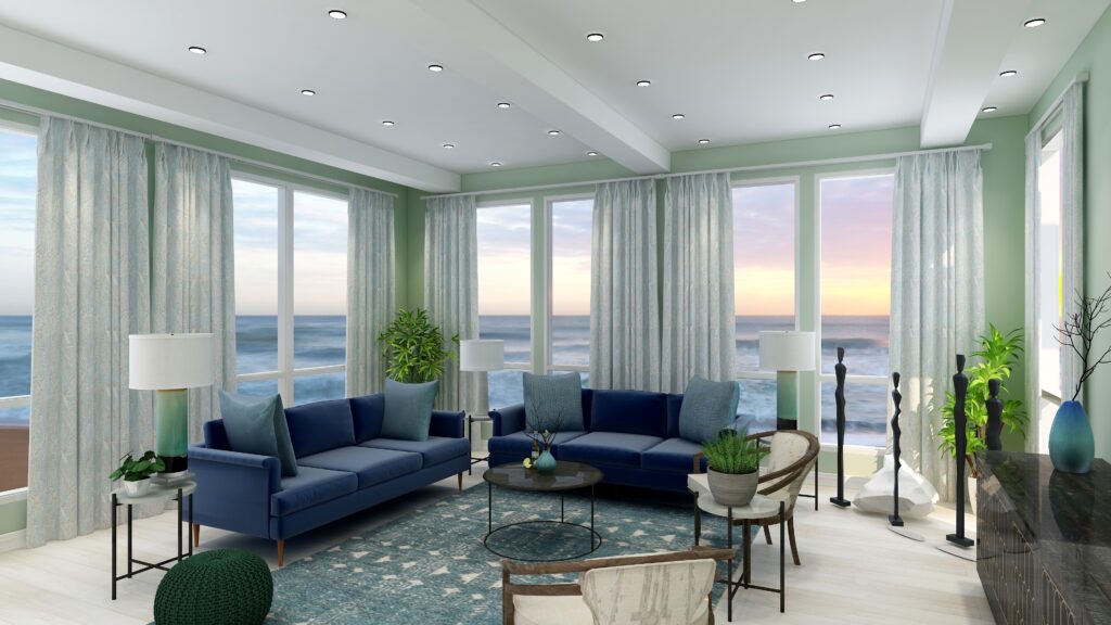
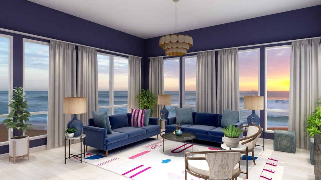
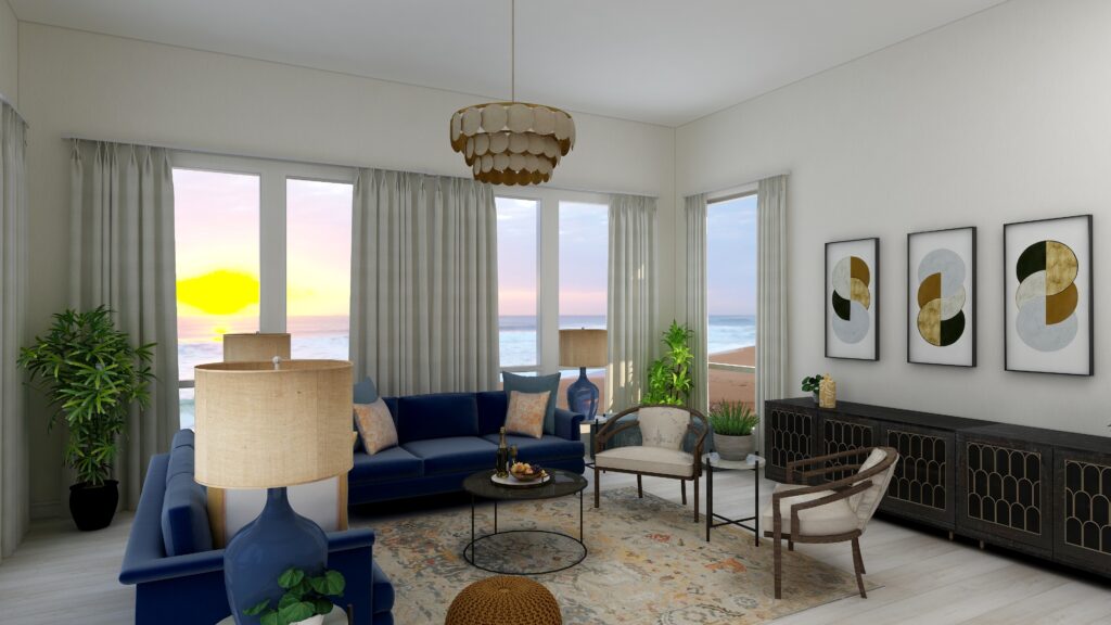
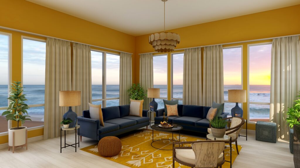
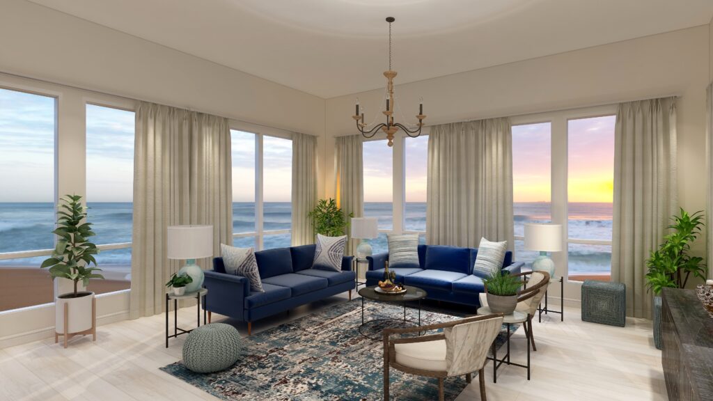
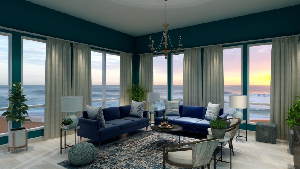
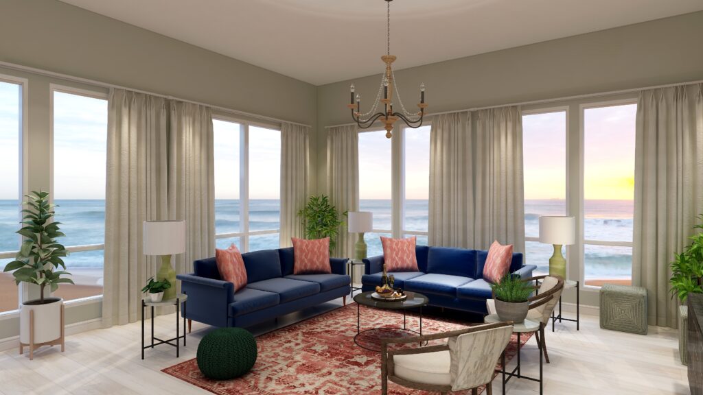
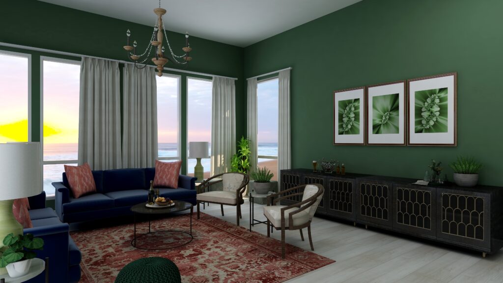
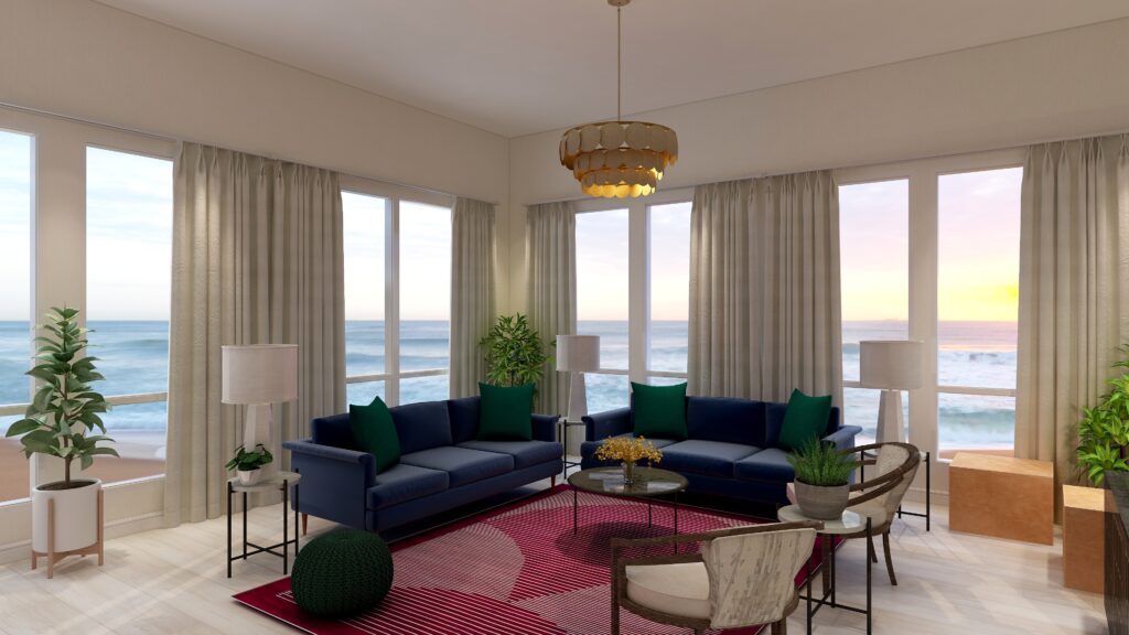
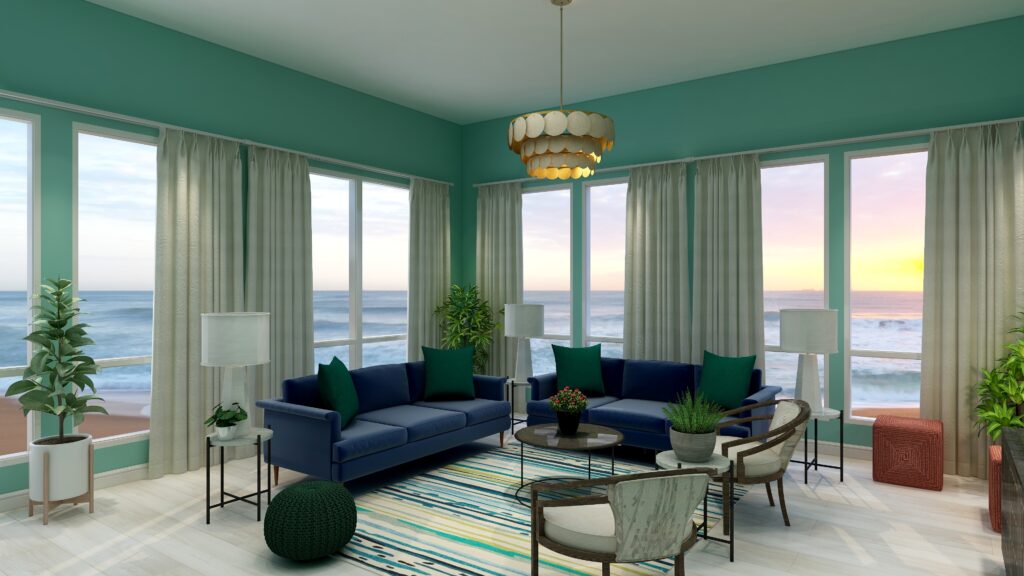
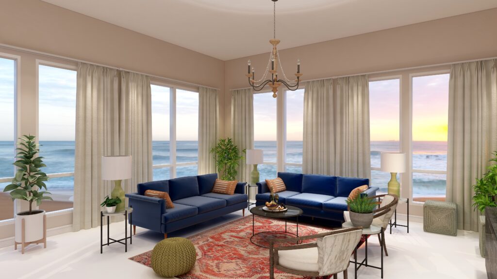
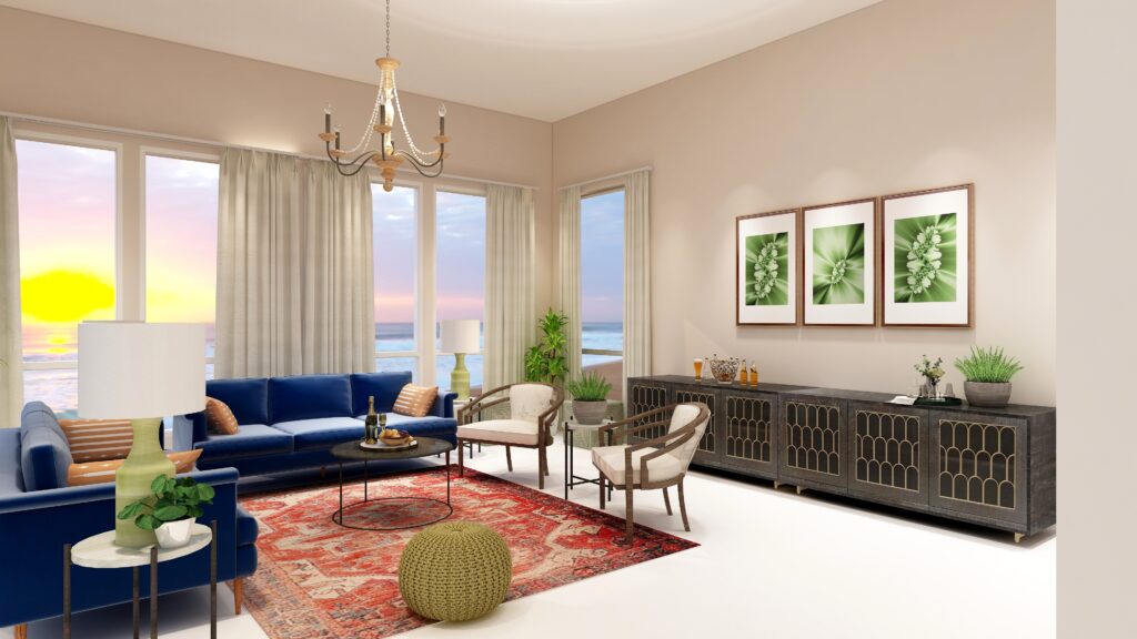
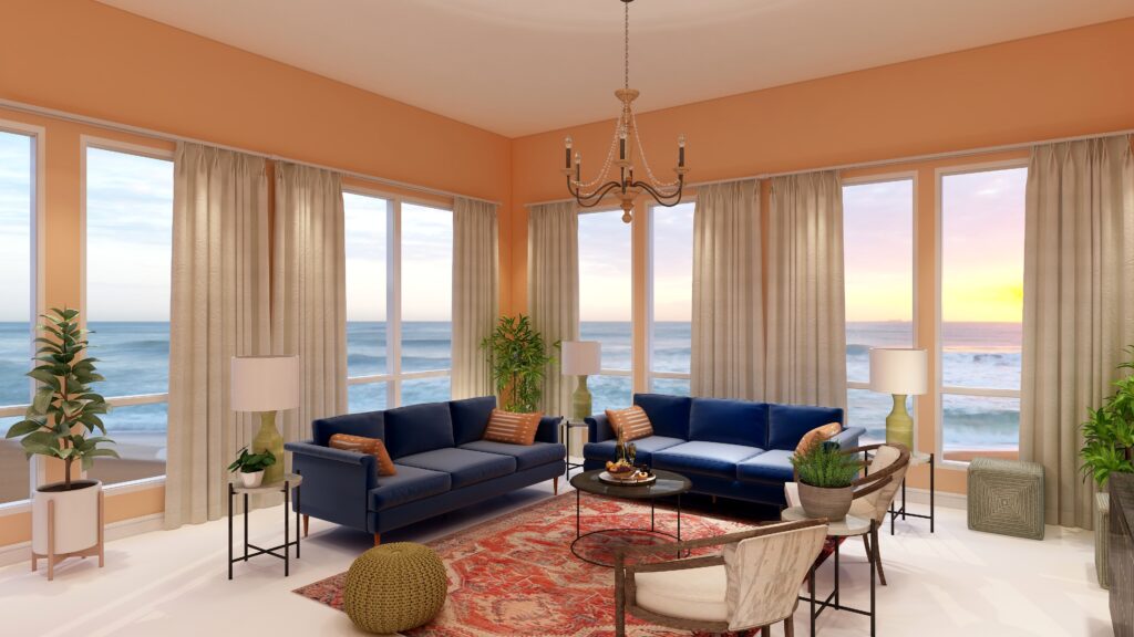
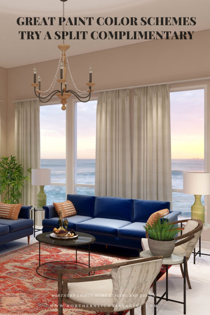
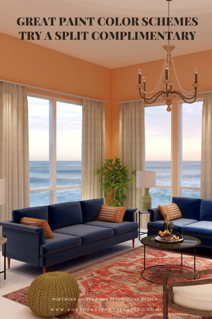
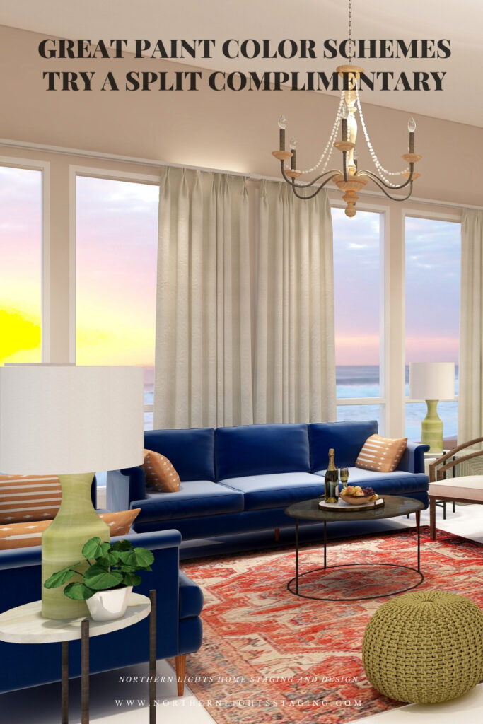
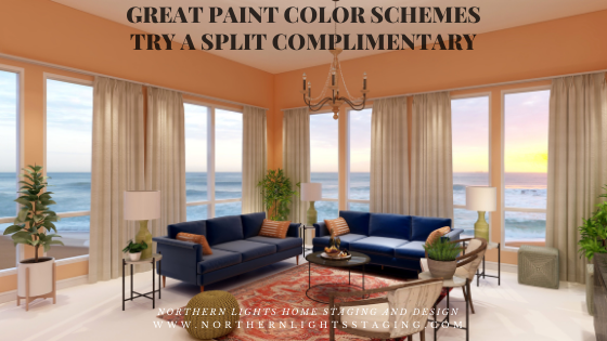
Great information on creating a split complementary color scheme! And beautiful examples to help us understand the concepts.
Thanks so much Lisa!
This is so informative and well illustrated!
Thanks so much for reading!
So many great examples of how to play with color in a space. It really helps that you explain and show examples – it makes it so much easier to understand the concepts. Thanks for the tips!
Thank you Jeanne! I agree, this would be a hard one to explain without pictures! Thanks for reading!
This is such a useful series, Mary Ann. Your examples make it really easy to understand the differences in these color schemes!
Thanks Leslie! Color is so important to any design yet so hard for people to visualize. I hope it makes it a little easier and inspires people to be braver with color:)
Very well composed. Love this and the examples.
Thank you Chari!