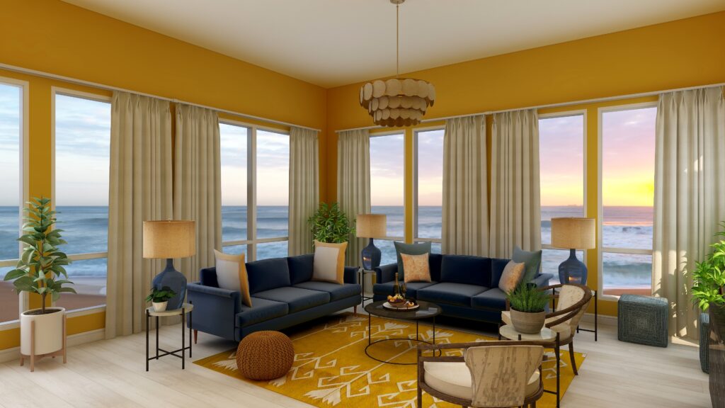
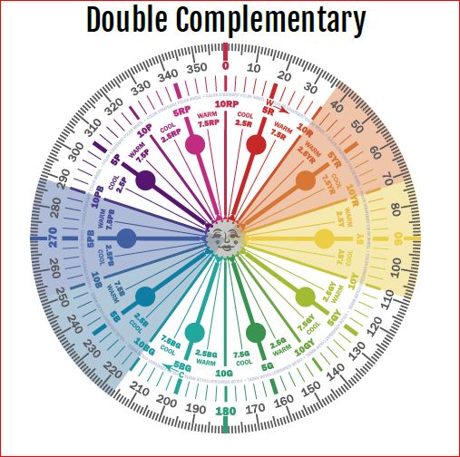
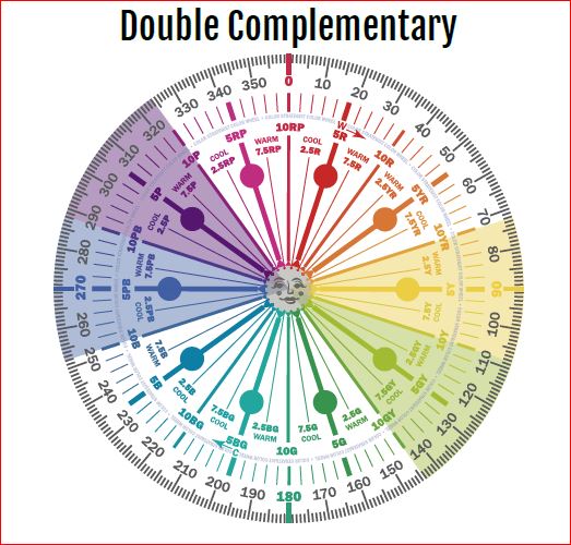


Click on the picture to find out more about the best training class on color available, the Four Pillars of Color!.
Mary Ann Benoit-Northern Lights Home Staging and Design
"Making Magic Happen—Create a Home & Life in Alignment with Your Highest Self", 907-362-0065
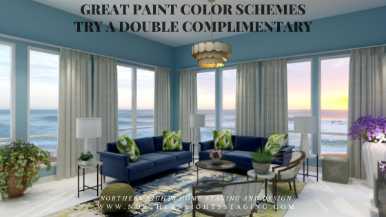
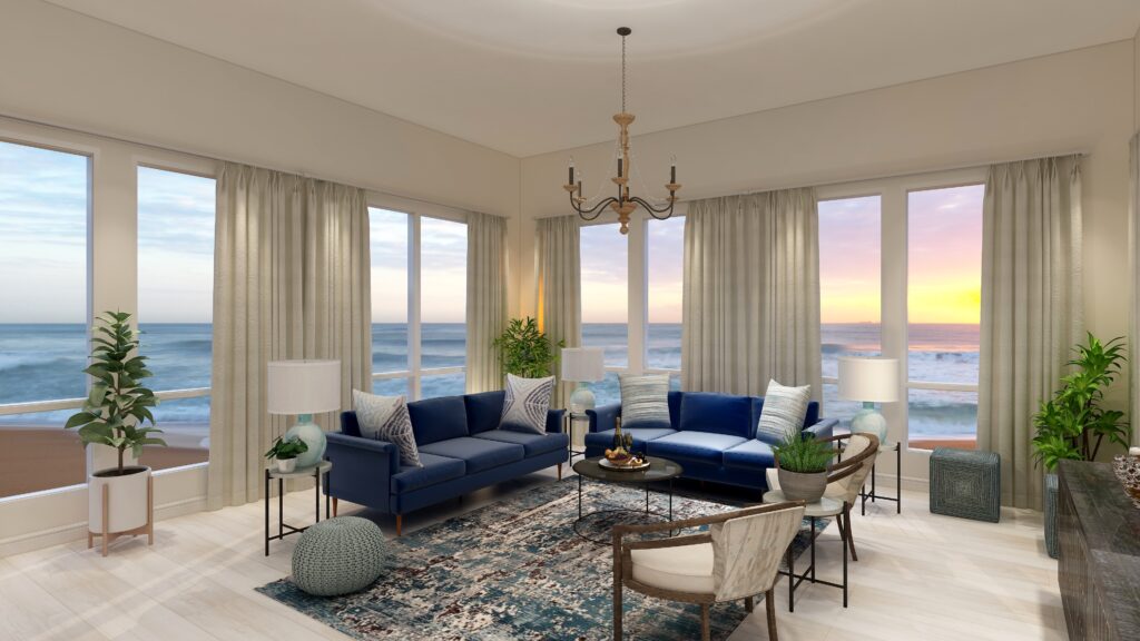
Click on the picture to find out more about the best training class on color available, the Four Pillars of Color!.
Comments are closed.
Your blogs on color schemes are so intriguing I was thinking about last week’s post while I was driving this week! Very inspiring.
Thank you so much. That makes me so happy to know you were thinking about my post and inspired by it!!
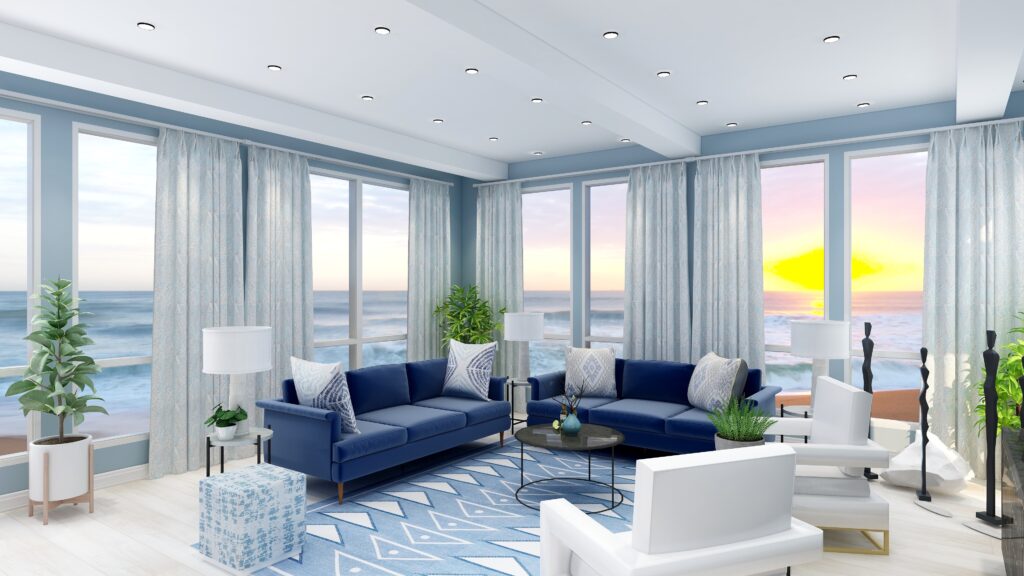
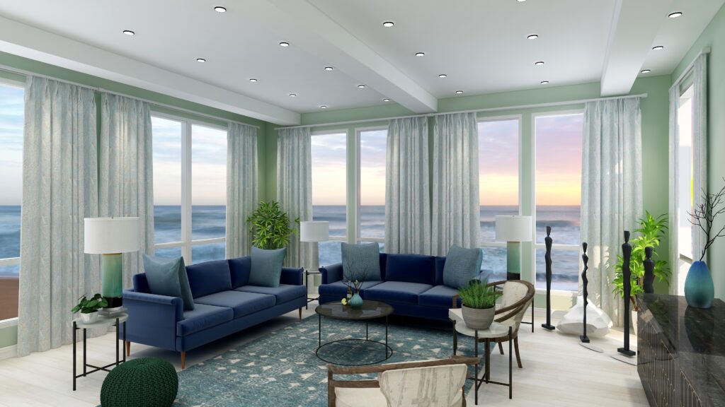
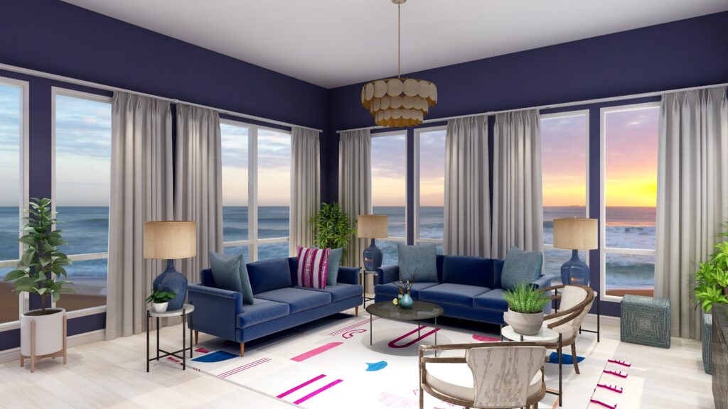
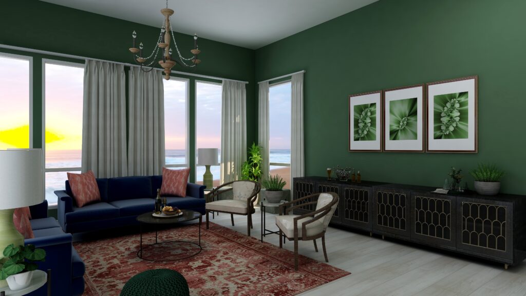
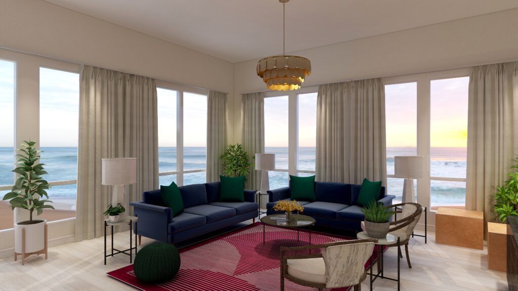
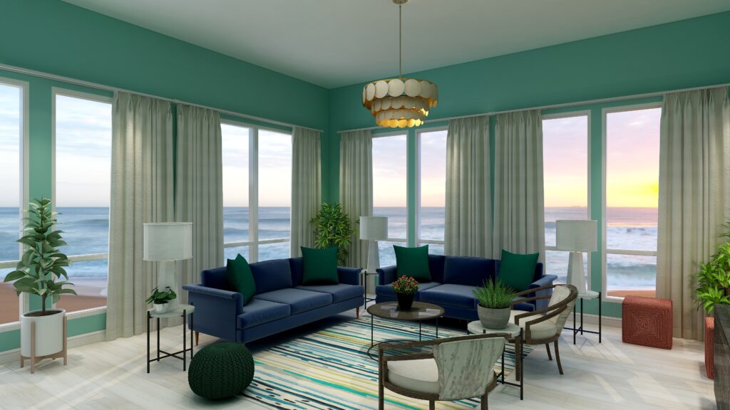
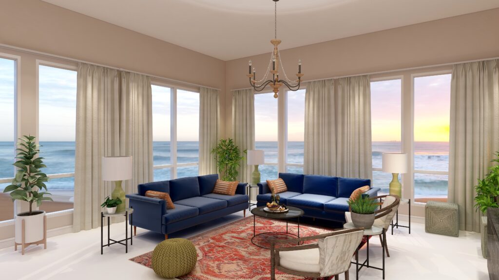
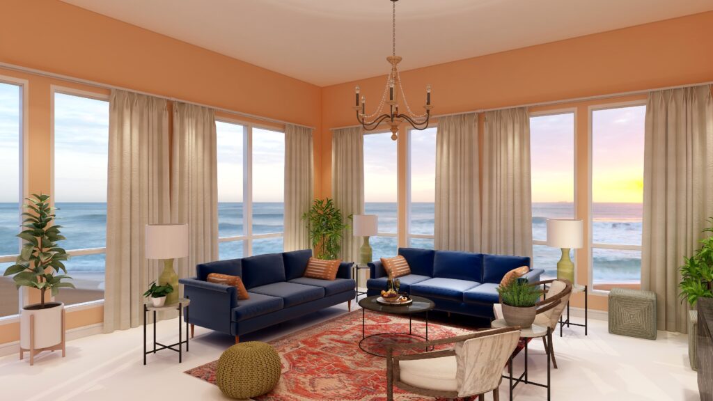
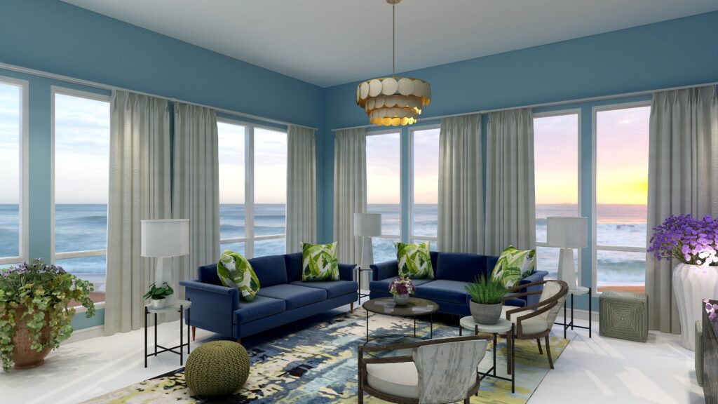
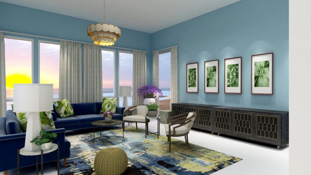
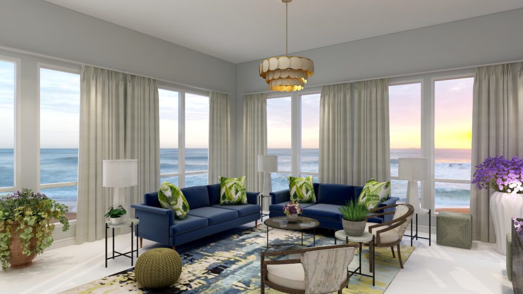
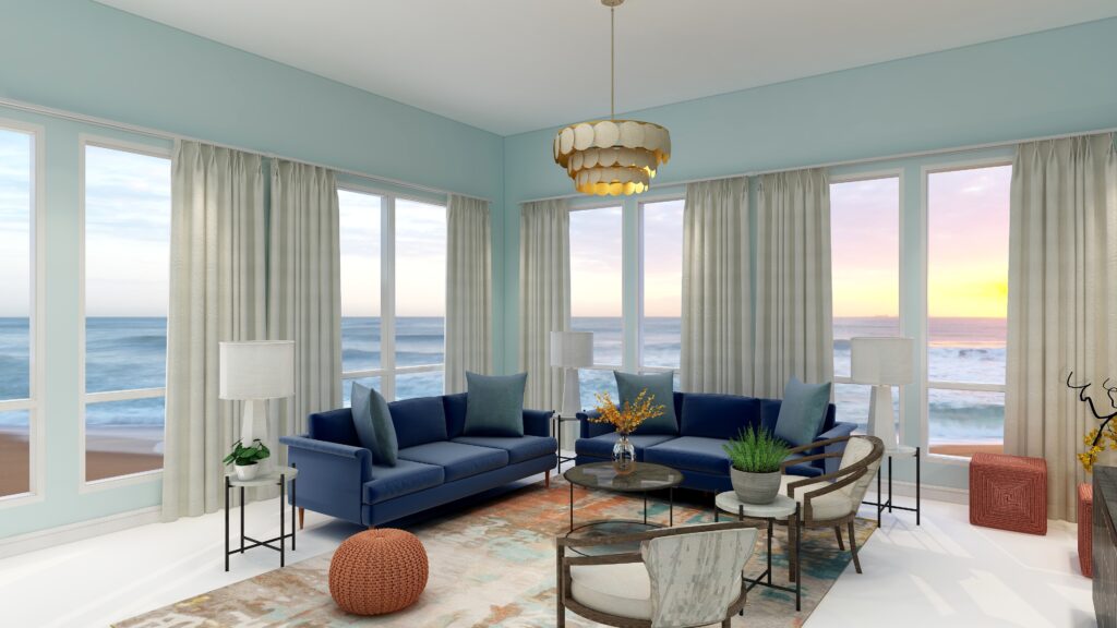
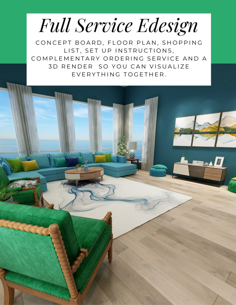
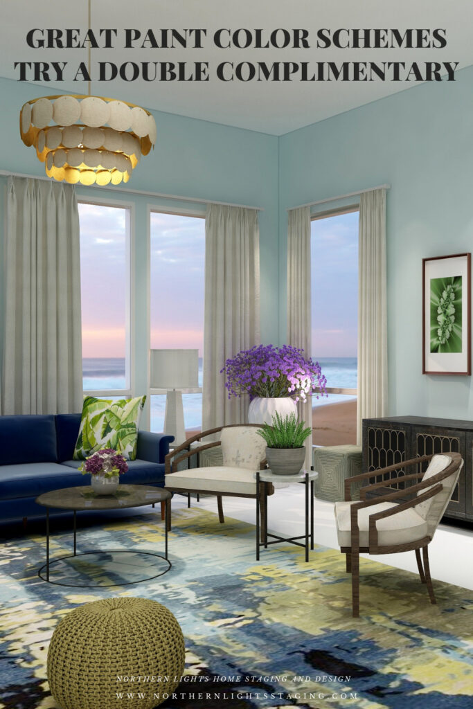
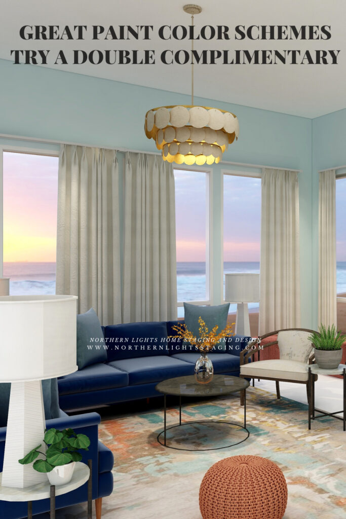
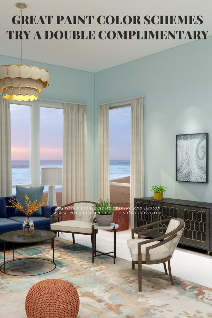
Your renderings are always amazing!! Love how you illustrate everything with the perfect visual!
Thank you so much! I hope the visuals really help people to understand color and all the possibilities open to them:)
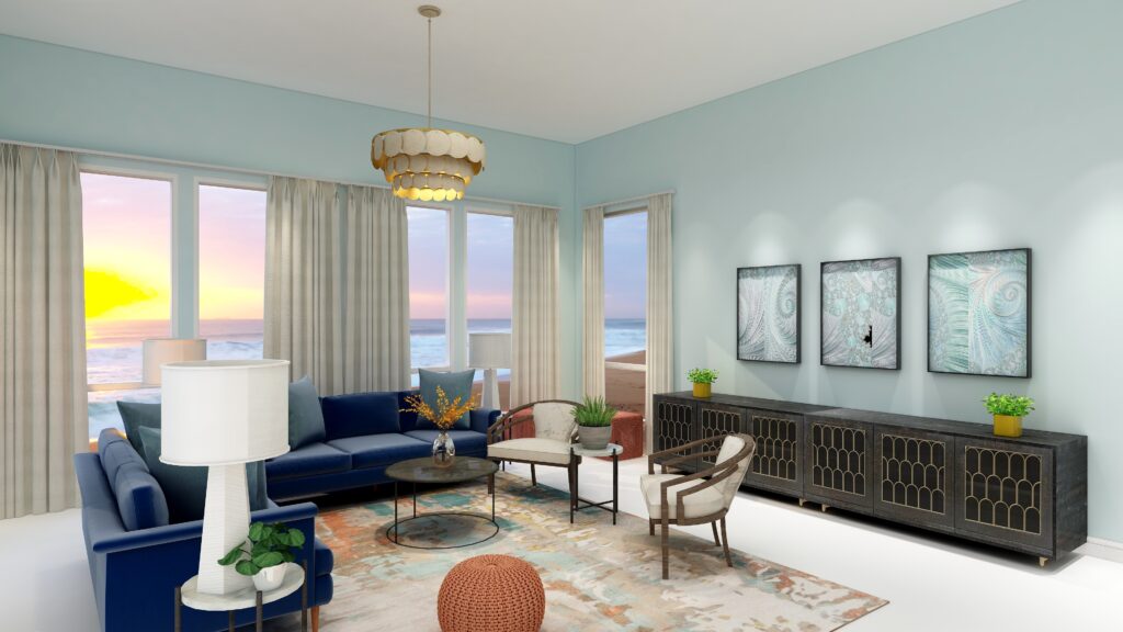
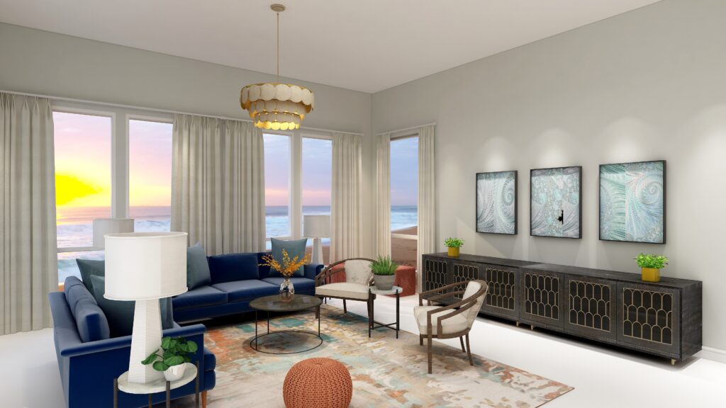
I love how your renderings solidify the explanation. This series has given me thought on an upcoming project!
Wonderful! I look forward to reading about your project and so happy this series inspired you!
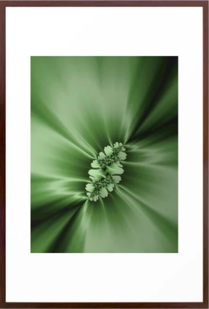
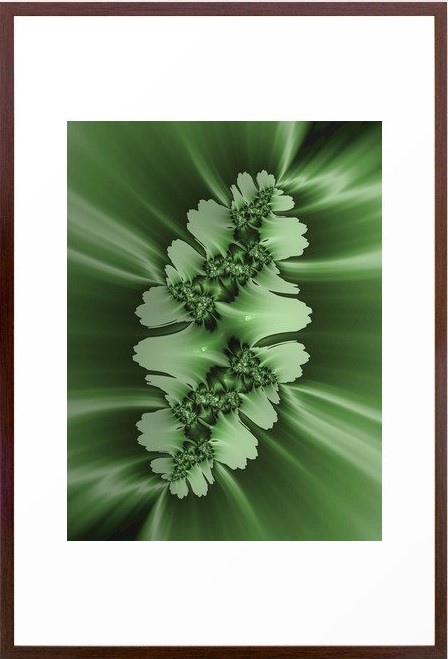
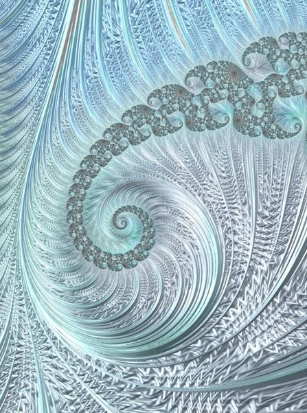
This is a great series, Mary Ann and you KNOW I love your fractal art!
Thank you so much Janet! I really appreciate your support for my fractal art:)