Crafting the perfect color palette can be a daunting task for many. Often, the starting point revolves around fixed finishes and certain constraints. In my recent blog posts, we’ve delved into constructing color schemes from a favorite hue, like blue. We’ve explored monochromatic and analogous palettes, and today, we’re diving into complementary color schemes.
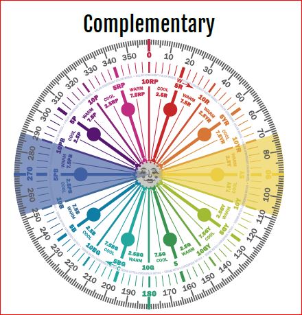
Complementary colors are a pairing of hues that sit opposite each other on the color wheel. When juxtaposed, they amplify each other’s vibrancy and intensity. The beauty of complementary colors lies in their mutual ability to enhance one another’s brilliance.

Complementary color schemes, offer several benefits when used in design:
Visual Contrast: The stark contrast between complementary colors makes each hue stand out distinctly, creating an eye-catching and vibrant look.
Balanced Visual Stimulation: Complementary colors provide a sense of balance; one color might be warm (like red) while its complementary color is cool (like green).
Enhanced Vibrancy: When placed next to each other, complementary colors can make each other appear brighter and more vivid.
Versatility: Complementary color schemes can be adapted to fit various moods and styles. For a bold and energetic look, you can use the colors in their full saturation. For a more subdued and harmonious look, you can use toned-down versions of the colors.
Focus and Attention: Because of their contrast, complementary colors can be used to draw attention to specific elements in a design or space.
Harmony: Even though they’re opposites on the color wheel, complementary colors inherently work well together and create a harmonious design.
Flexibility in Decor: A complementary color scheme allows for flexibility. For instance, if you have a room with predominantly blue decor, introducing some orange accents (like pillows, art, or rugs) can instantly invigorate the space.
Depth and Dimension: In art, especially painting, complementary colors can be used to create depth, with one color serving as a shadow or highlight against its opposite.
Enhancement of Features: Complementary colors can be used to make features stand out. For example, putting orange flowers in a blue vase draws attention to the arrangement and makes both colors pop.
The key to a successful complementary color scheme is balance. Use in moderation and pair with neutral tones to provide a visual rest.
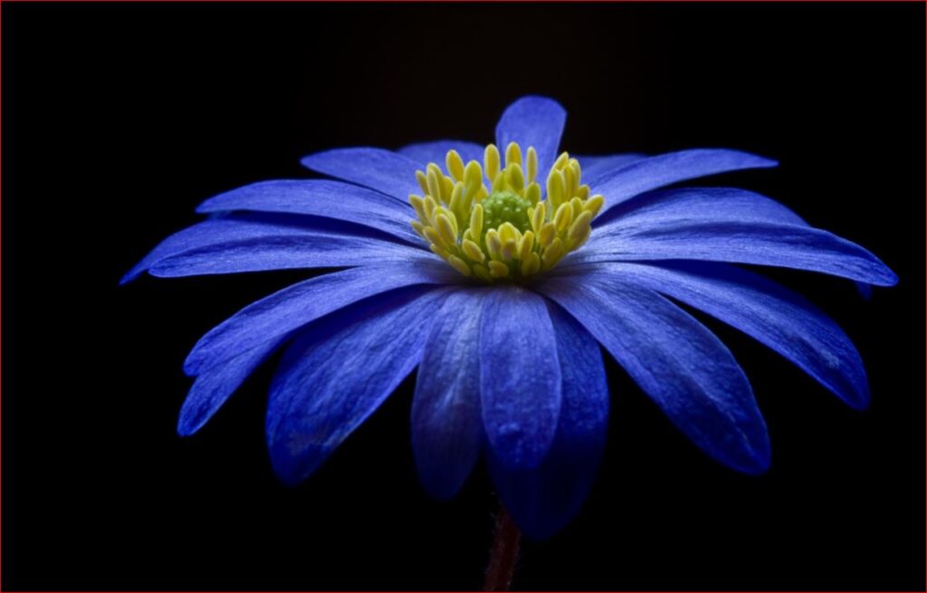
Complementary colors can create interesting optical illusions. For example, if you stare at a square of color for thirty seconds to a minute, and then look at a white paper or wall, you will briefly see an afterimage of the square in its complementary color. Try it with this blue square and see if you see an after image of yellow.

Why does it work? Leonardo da Vinci observed that the finest color harmonies were those between colors exactly opposed. Maybe that is where the saying opposites attract came from?
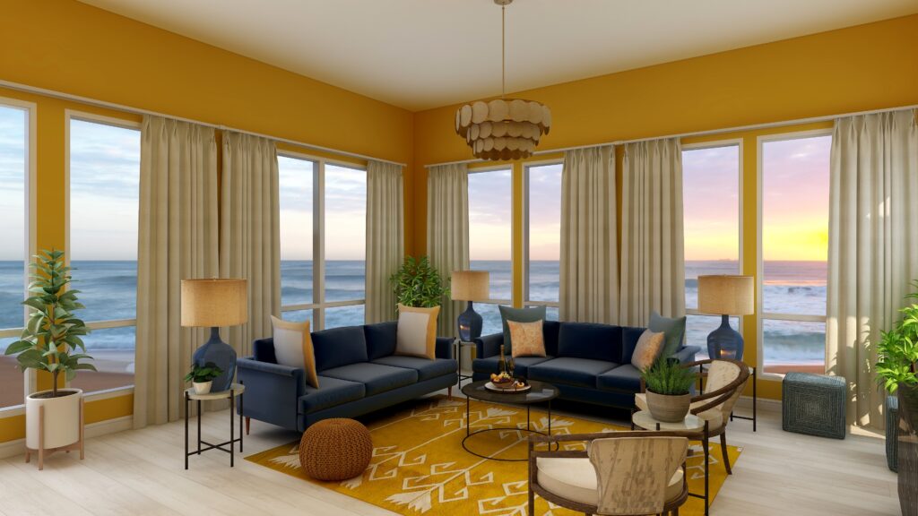
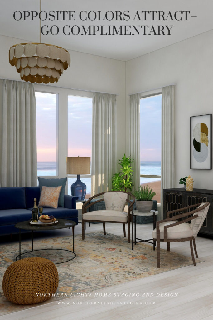
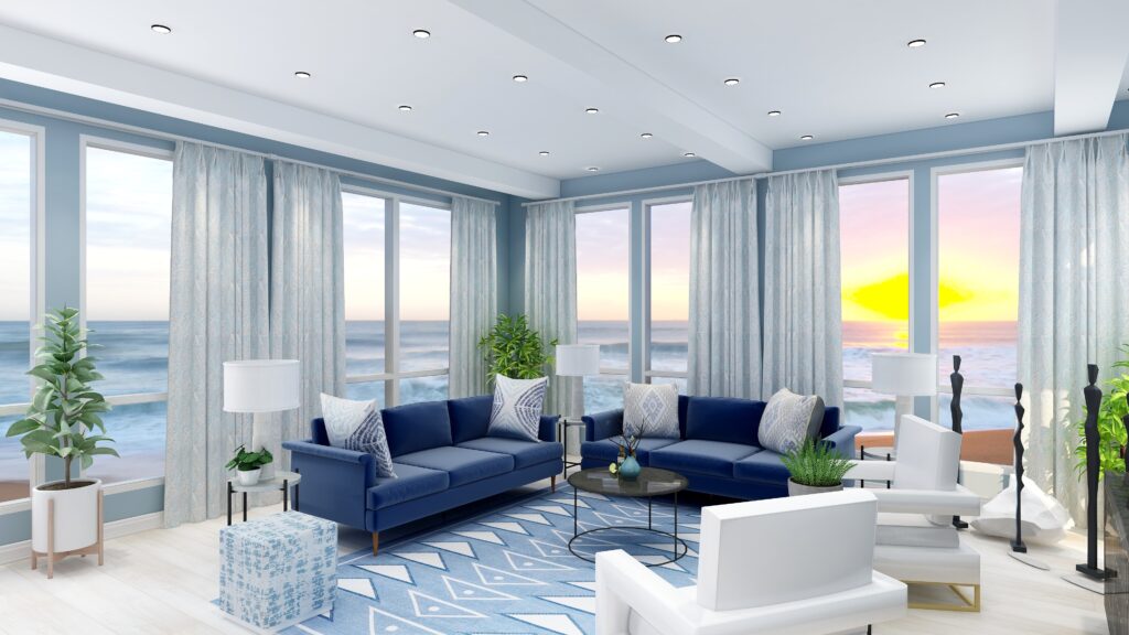
So, let’s create a complementary color scheme with the blue we have been working with in several other articles, as you see the sofas. See these other color schemes see my articles Celebrate Your Favorite Color- Go Monochromatic and Create a Harmonious Color Scheme- Go Analogous.
It’s opposite or compliment on the color wheel is yellow, which ranges from Yellow/red to Green/Yellow and can have varying degrees of saturation or chroma, and lightness. In other words, there are lots of yellows we can work with:)
The Design
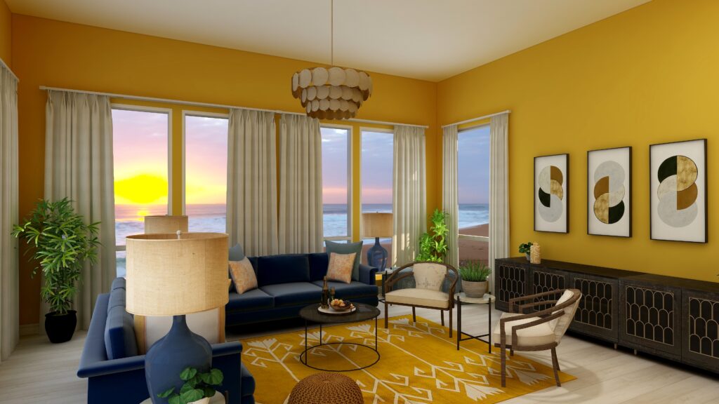
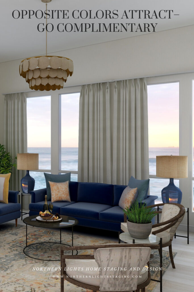
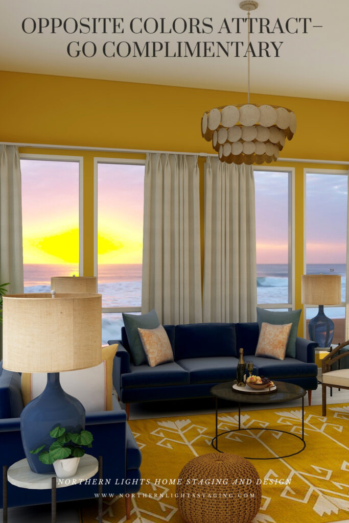
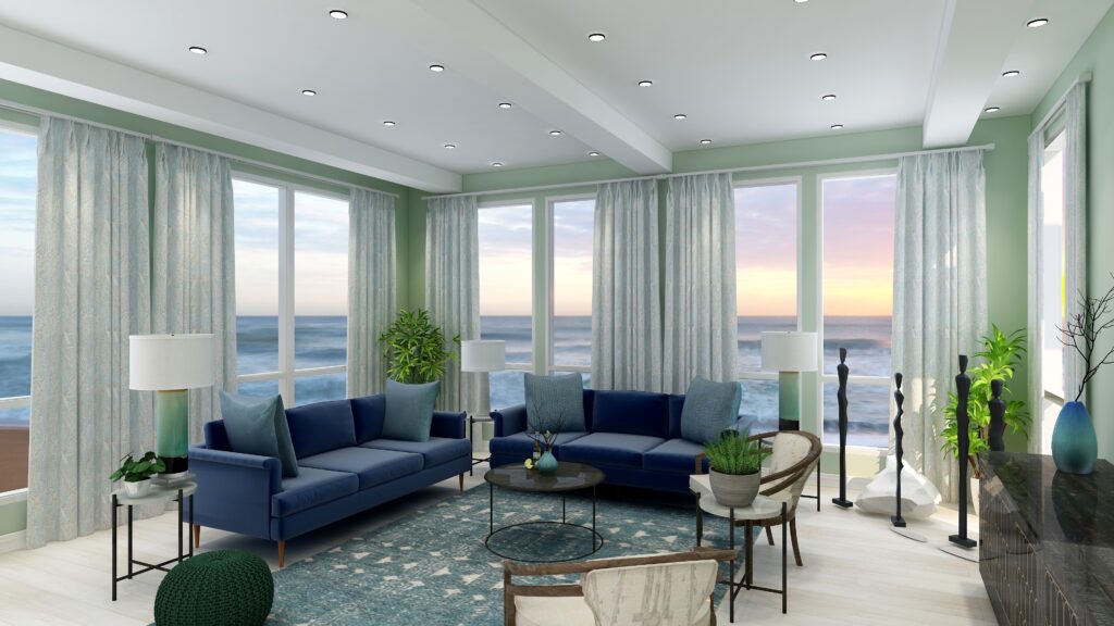
Here are examples of two living rooms I created using a blue and yellow complimentary color scheme. The first is bright and dramatic. The second is more relaxed and neutral.
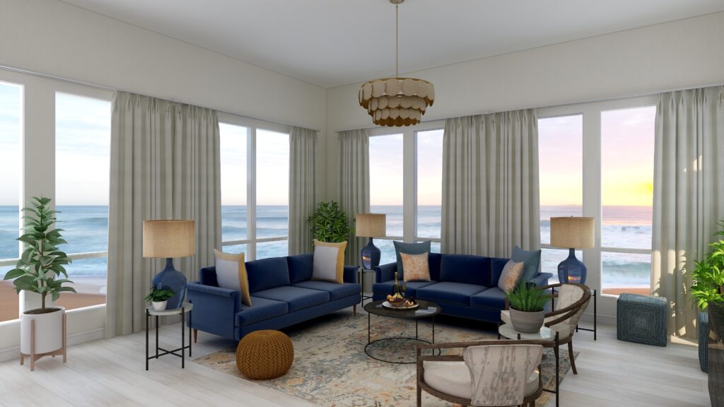
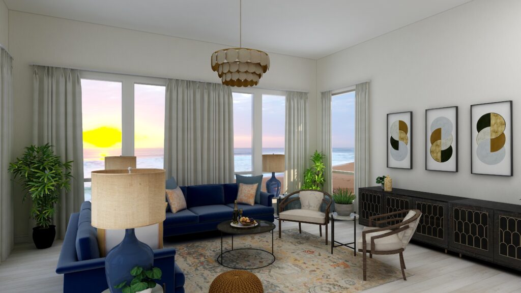
Complimentary color schemes don’t have to be bright and colorful. They can use darker, less saturated or more muted tones of opposite colors for a more understated look. The design below uses an area rug with muted yellows and blues, and wallpaper with minimal yellow. Otherwise everything is the same.
Benefits of A Complimentary Color Scheme
Navigating the world of complementary color schemes is easy and straightforward. Begin by pinpointing your favorite hue on the color wheel, then locate its direct opposite. This partnership is where the magic happens.
Complementary colors inherently possess a dynamic tension, making them ideal for spaces meant for lively conversations and gatherings, such as living rooms and dining areas.
However, this boldness can be tempered using muted or desaturated versions of these hues. Then you can craft a serene and sophisticated palette, perfect for spaces meant for relaxation and introspection.
Whether you seek vibrancy or tranquility, complementary color schemes offer versatility to match your vision.
Create Beauty with Color in Your Space
What is Your Global Design Style? Take the Quiz
Aligned Design- All Rights Reserved.
Terms of Service | Privacy Policy | Disclaimer | Brochure
Prices are subject to change without notice.
Call 907-362-0065 today

Pin These
Click on the picture to find out more about the best training class on color available, the Four Pillars of Color!.



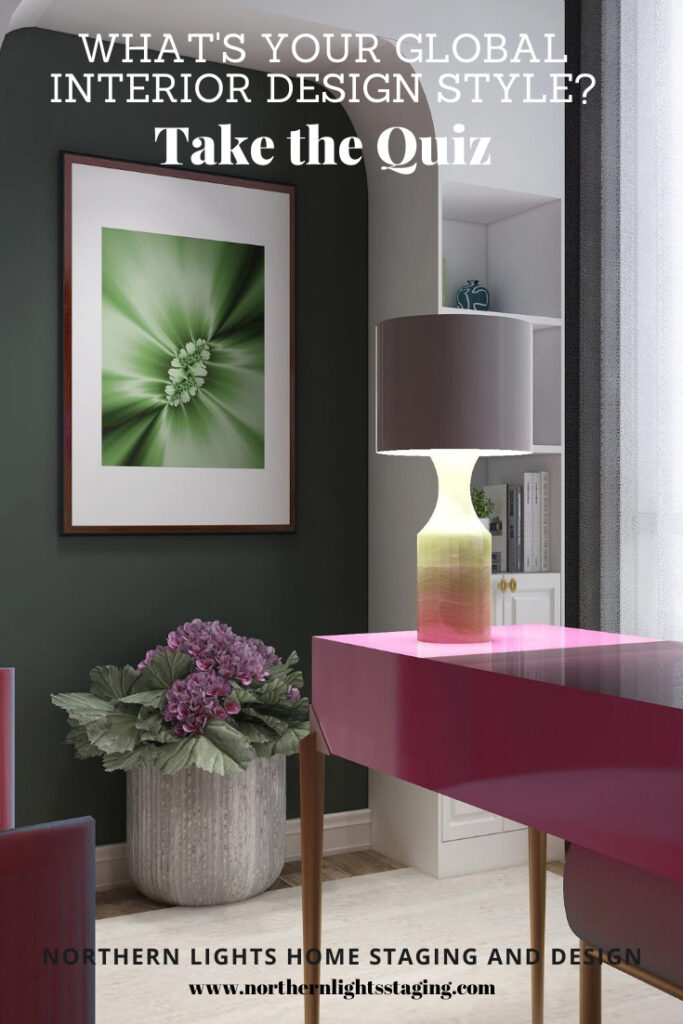


Love these side by side variations on all the different color schemes! And that flower picture is stunning!
Thanks so much Janet!
Great post and I love the links to the products!!
Thank you Christie!
Very pretty spaces using blue and yellow together! Thanks for the inspiration.
Thanks so much!
I love complementary colours, Mary Ann! What I especially appreciate are the images that really show the beauty!
Thank you Sheri! It has been fun creating images in this series and playing with the different color schemes.