I Bet you. Why? Because most people do. Why? Because this bad advice is all over the internet. Why? Because people continue to repeat this bad information on blogs and in forums, so most people think it is true.
Mistake #1-Testing paint colors against a white background
People often think white is a perfect neutral background to see the true characteristics of the color they are testing. Looking at your color against the old paint color can affect your perception of the new color. White seems like a great solution. Some believe that painting colors on a white background can magically make those mystical undertones appear.
The only thing that is true about the information above is that your perception of color can be influenced by adjacent colors. Whites are hues just like any other color, they just have so little chroma that it is hard to tell what hue family they came from. There are lots of shades of white, so of course a white can still influences how your color looks in comparison. In addition, there is no such thing as an “undertone” the way most people describe it. That is just a term people use when they are subjectively expressing their opinion of what hue family that white or gray came from. It is just an opinion that is often wrong and can easily be measured and determined scientifically in about 5 seconds without having to paint anything.
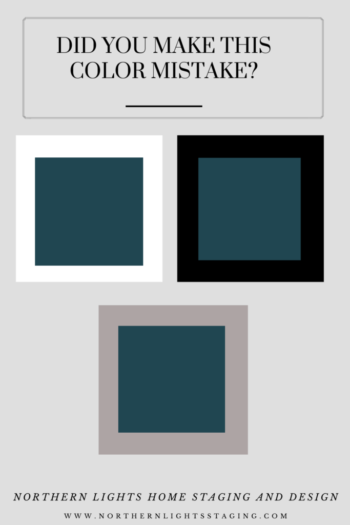
The biggest reason however not to test your color against a white background is that the “white” will make all colors look washed out. The intensity of the white can cause you to misread both the lightness and chroma or saturation of the color you are testing. The color will appear darker, duller or grayer, and less colorful than it is. So, it is deceiving and when you paint your room or house, it will appear much lighter, brighter and more colorful than you expected. See the example below in which I put Sherwin Williams “Moscow Midnight” on a white background.
What if you put your color against a black background? It has the opposite effect, but still has the effect of distorting how your color may look in your room. Black makes your color look lighter, brighter and more colorful than it is, so when you paint your room you may be surprised with how much darker and duller the color appears than you expected. In the picture above, see how Moscow Midnight looks on a black background compared to on the white background.
So, what can you do then? Paint on a gray background! Gray is the most neutral and will have the least effect in changing how the color appears. Look at the example of Moscow Midnight on the gray background to see what I mean.
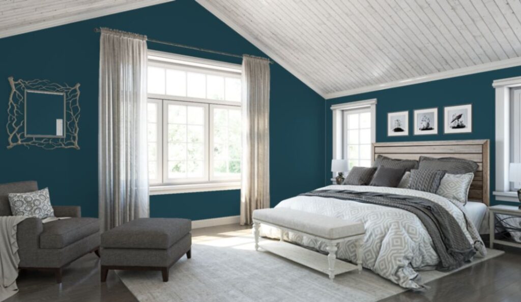
Of course, you can use this effect of the contrast between two colors in your designs if you choose as in the example above where the walls are painted Moscow Midnight and the ceiling and trim are painted a shade of white. It is just something to be aware of when you are determining your colors to start with.
Mistake #2-Testing several paint colors next to each other
People often take their white background and then paint a variety of colors next to each other in a line to compare and see what they like best. This is a totally ineffective way to compare color because each color is affecting the way you see the adjacent color.
This happens because of what is called “simultaneous contrast”. This could happen when one color is laid on top of the other such as in the examples in “Mistake #1”, where for example you put Moscow Midnight on a white background and the white makes it look darker and grayer.
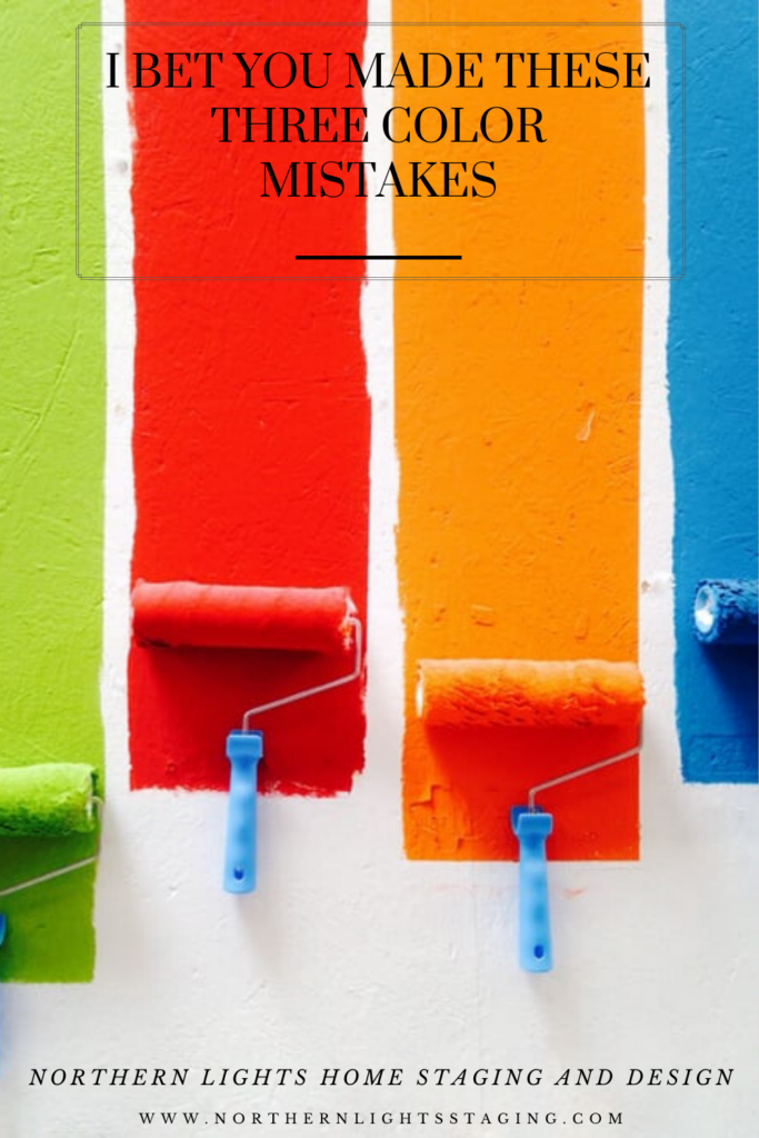
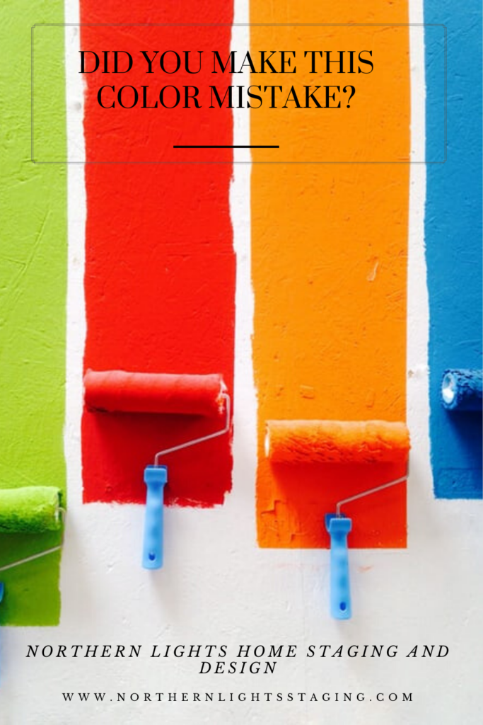
Or it can happen when you paint a bunch of test samples next to each other as in the picture below. If you place color compliments next to each other (colors opposite each other on a color wheel) like red and green, they each make the other look more colorful and brighter. So, in the picture below, the green next to the red is making the red look redder, and the red is making the green look greener.
If the two colors are not complimentary like the red and orange next to each other, each color tends to influence the other by add a touch of its own compliment color to the adjacent one. For example, the compliment of red is green, so the red is adding a slightly greenish tint to the way the orange looks. The compliment of the orange is blue, so it is adding a slightly bluish tint to the way the red looks.
I realize right now you are thinking, What the Heck is she Talking About?? Yes, I know. It sounds weird but it’s true. One of those cool things about color science you never knew!!
In any case, if you are trying to evaluate a color, do not paint a wall full of samples right next to each other. You are just making things harder on yourself!! Look at each color by its little lonesome self.
Mistake #3- Painting several test colors on your wall
Why is this a mistake? Well, for one, as I mentioned above, you probably confused yourself. But also, after you have chosen your new color and you paint over your test swatches, you may have raised streaks under the new paint job that are now visible. Yes, it happens a lot. The only way to get rid of these is to sand down the raised edges before painting or continue to put more coats on until they are not visible which is time consuming and expensive.
You can avoid this mistake by purchasing removable stick on swatches of the color you want to test rather that painting on the wall. Try Swatch Rite samples . Not only are they removable, but the shape (round) is easier on the eyes in terms of evaluating colors.
Is that Cussing I Hear?
Now that I have told you the three common mistakes I bet you have made, I can hear some of you cussing me through the computer because you may have made them all at the same time last time you painted. You are not alone.
And you may be thinking, well, why should I listen to you since it was another “color expert” that told me to make these mistakes in the first place?
Bottom line, science is science. It is what it is. Most people do not know the science of color and many don’t want to know. They want to just use their “eyes” and the art of color, because it may appear to be more fun. I prefer to use both. It makes life a lot easier and quicker when trying to come up with great paint colors!

Sorry, There's More
As a certified color strategist that uses the art and science of color, I regret to inform you that there is lots of bad color information out there on the internet besides what I have told you above. Yup, it’s true. But guess what? The science of color can cut through all the BS and help you get your colors right the first time, saving you time, money and stress! Are you ready to try a new approach? And, even though there is some science involved, it is still fun!!
Set up a color consultation today. I can work with you locally or online nationwide. To work together online, I will have you purchase a Color Muse and teach you how to use it to send me the data. Easy, collaborative and fun!

Aligned Design©– All Rights Reserved.
Terms of Service | Privacy Policy | Disclaimer | Brochure
Prices are subject to change without notice.
Call 907-362-0065 today
Learn More About the Art and Science of Color
I am proud to say I am a certified color strategist! And, the only one in Alaska! As a design professional, I was truly impressed with the color training I received from Lori Sawaya of Camp Chroma. Finally, a training program that uses the scientific method of explaining how color works based on an established color system that skips all the subjective talk about undertones that leaves everyone feeling confused. Color is complex and this training explained color data so we can make informed decisions based on the science, rather than on subjective opinion or color sense.Click on the picture to find out more about the best training class on color available, the Four Pillars of Color!.





This is such an informative post, MaryAnn. Thanks so much for writing it. It’s good to know there’s a science to color and that you, as the only certified color strategist in Alaska, understand it and can help your clients get colors right, the first time, saving them time and money and stress!
Thanks Leslie! The science of color makes everything so much easier to understand and it is so fun to work with. As with anything, once you know the rules you can break them for a wonderful effect! But the biggest benefit is helping people through their stressful color issues… the science makes it wasy!
I love the science of color and the art of color – environment is everything in choosing colors! (And that sherwin williams moscow midnight is a straight up gorgeous color!)
Thanks Janet. Most designers and color specialist all have the ability to use their eyes and the art of color to put things together. Having the science in your toolbox as well can really help solve difficult problems, create unexpected solutions and it is so much faster and easier than shuffling a load of paint chips and painting samples. It really helps narrow down those choices. Yes, I love that Moscow Midnight!! I painted my house that color and admire it every day!
Amazing information!! Color is so complex! ???
Thanks Rachel. There is a lot to it which is why so many people are confused by it. But, once you take the time to understand how color works it all makes sense!
The science of colour – I love that. I to have seen many ‘interesting’ tips to test colour and I really have to shake my head.
Yes, there is a lot of nonsense out there. but the science always tells the truth:) Thanks for reading!
This is great advice on selecting color and avoiding some common mistakes.
Thanks Lisa! Some easy things to do that will make a big difference:)
So interesting!
Thanks Christina, I hope it was helpful.
Great advice, and I know there are many more than three mistakes people often make but I love the 3 you chose to talk about today! Great choices and you explained them so clearly, well done!
Thank you Amy! I figure I will get around to the other ones eventually. So many to talk about!