

Mary Ann Benoit-Northern Lights Home Staging and Design
"Making Magic Happen—Create a Home & Life in Alignment with Your Highest Self", 907-362-0065
Comments are closed.
Mary Ann, this blog post is chock full of goodness – well done!
Thank you Anne!
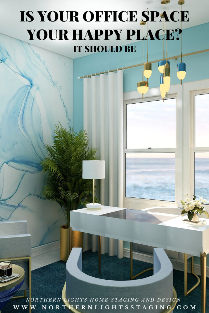
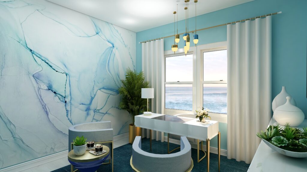
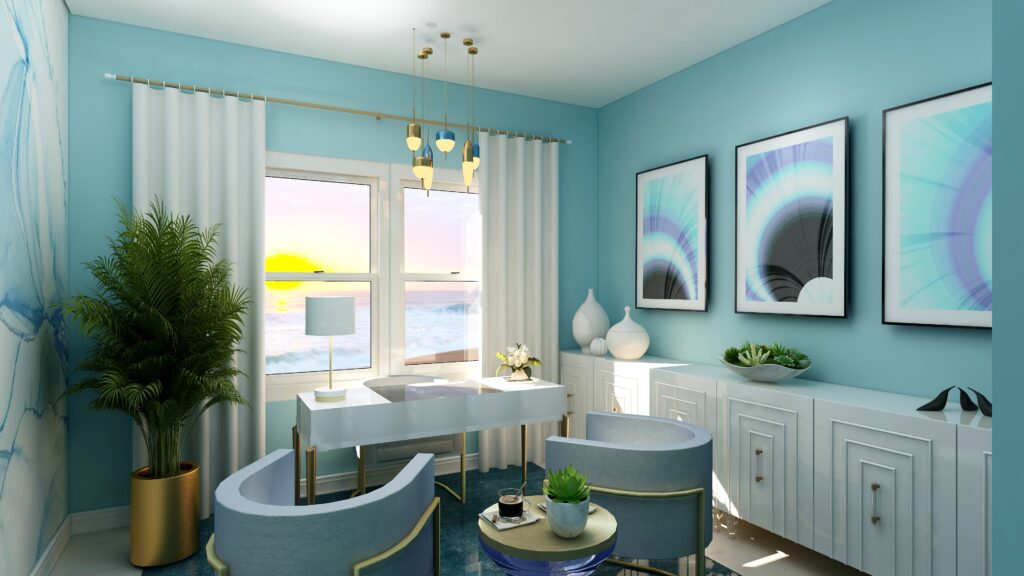
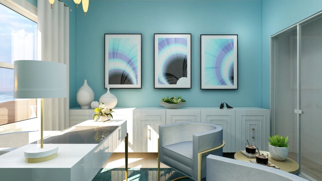
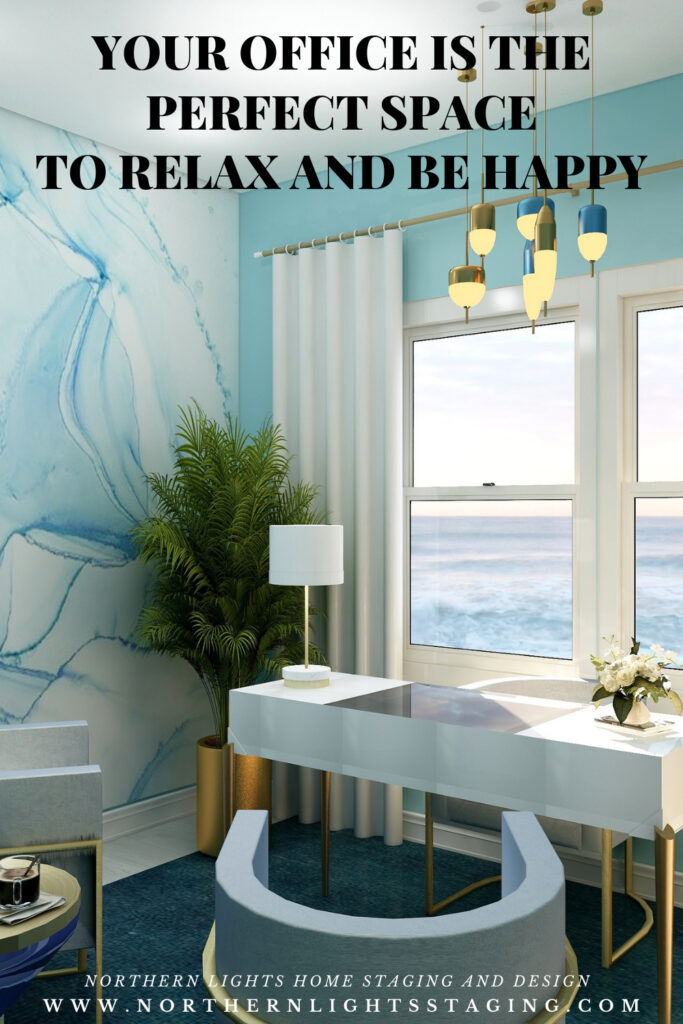
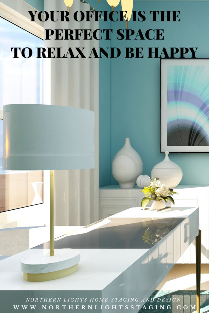
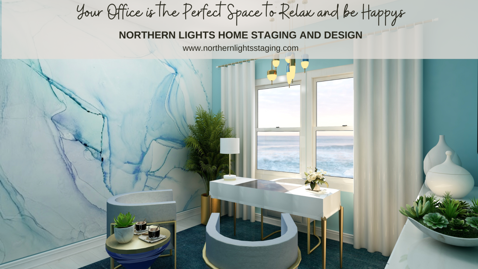
Such a pretty office in one of my favorite colors! And great outline for the ingredients to make an office productive and inspiring!
Thanks Janet, I knew you would like it:) We are on the same color wavelength!
I love your use of color here MaryAnn!
Thank you!! I always find this mix of colors very soothing.
Congrats on your Houzz award!! Loving the office design – the colors are wonderful!
Thanks so much on both and so glad you are enjoying the colors. Combining blues and purples together has always been a favorite of mine.
I love the idea of creating an inspiring home office! Love the colors and the artwork.
Thanks Lisa! Yes, a home office should inspire you. Love that idea. It was fun using wallpaper as an inspiration for my artwork. That was new for me but I like the wall it came out.
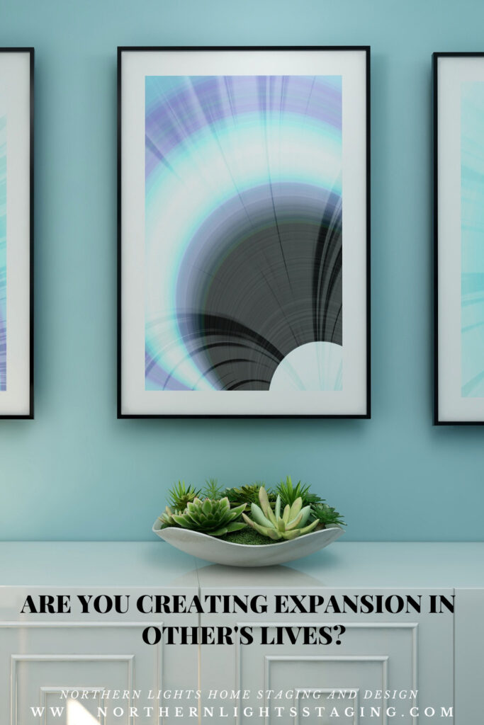
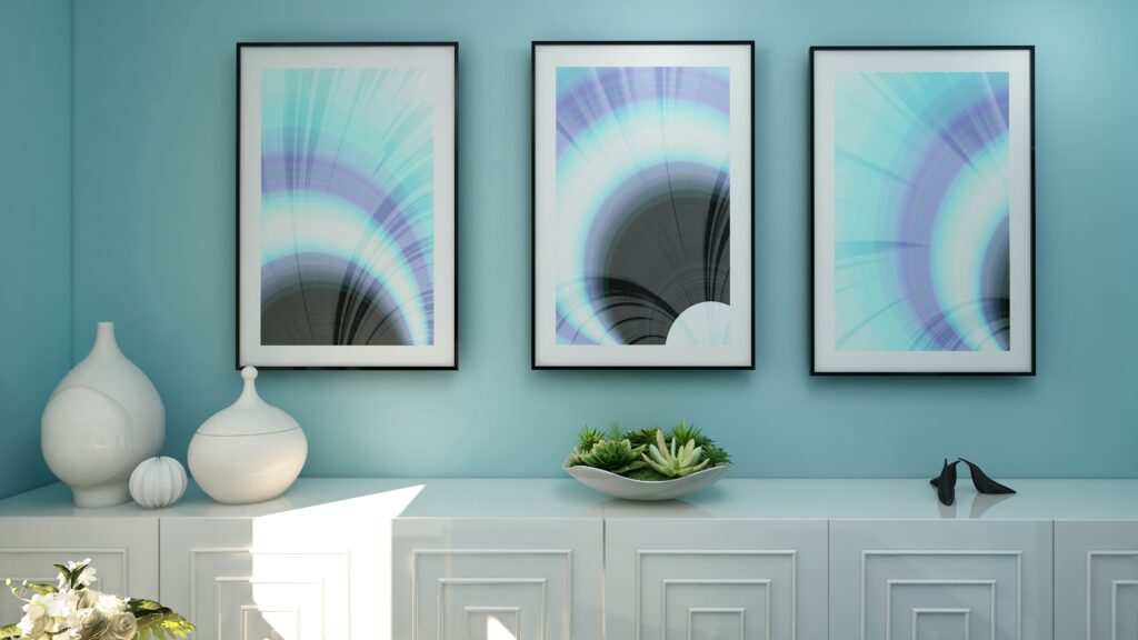
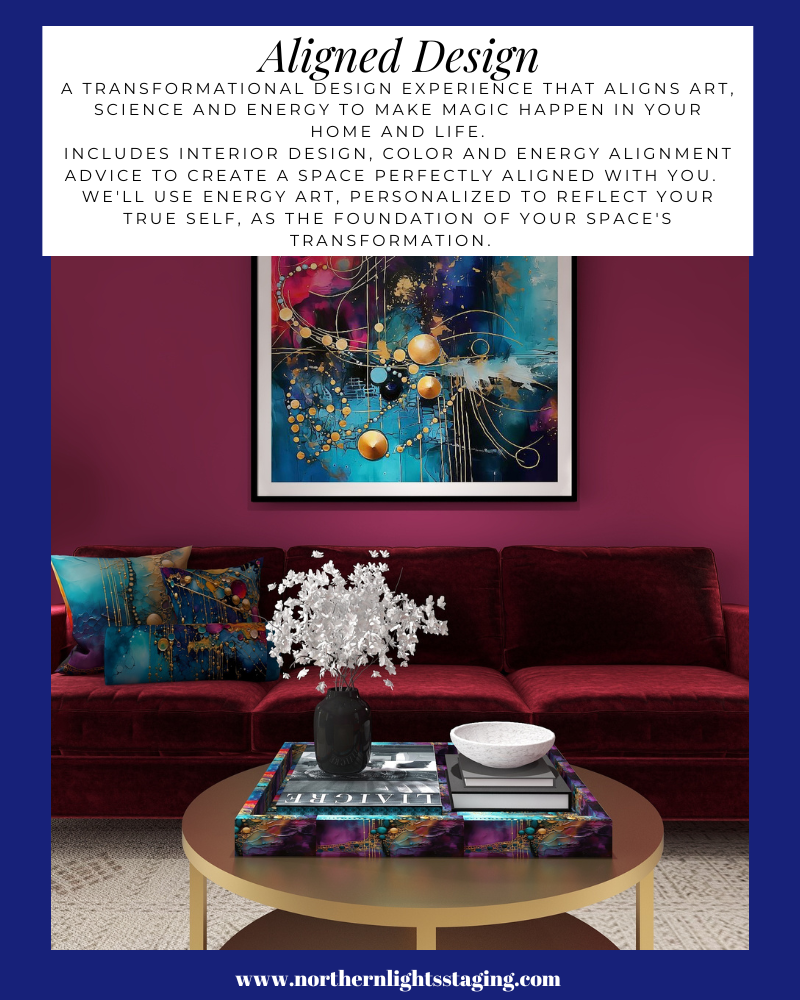
Aligning art, science, and energy is such a perfect way to explain the way you work with clients. You have given such great examples on how you can pull those three into one, beautiful space.
Thank you Sheri! That was my whole point of writing this article and I am so happy that came through! I appreciate this comment so much!
What a pretty office space, these are the color I love too and that accent wall is to die for!
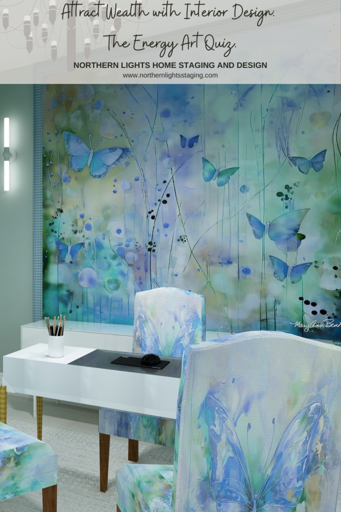
Thank you! I love that wallpaper. It reminds me of alcohol ink art which I do and enjoy. Love the flow.