Opposite Colors Attract – Go Complimentary

Opposite Colors Attract-Go Complimentary

People often struggle with creating a great color scheme.  Often, we start the conversation by talking about the limitations, or the box of colors you need to stay within based on your fixed finishes. In my last few blog articles we have discussed how you could take your favorite color, blue for example and create different color schemes. We explored monochromatic and analogous schemes. Today, lets look at complimentary schemes.

Complimentary color schemes are based on using two hues that are opposite to each other on the color wheel.  When placed next to each other, they create the strongest contrast for those two colors.  They each make the other look more intense and brighter than they look apart.


blue and yellow- complimentary colors
Blue and Yellow glass from Creative Commons CC0.

Complementary colors can create interesting optical illusions. For example, if you stare at a square of color for thirty seconds to a minute, and then look at a white paper or wall, you will briefly see an afterimage of the square in its complementary color. Try it with this blue square and see if you see an after image of yellow.

blue square

Why does it work? Leonardo da Vinci observed that the finest color harmonies were those between colors exactly opposed. Maybe that is where the saying opposites attract came from?

So, let’s create a complementary color scheme with the blue we have been working on within the last 2 articles. You can see the blue in the sofas. To catch up on these other color schemes see my articles Celebrate Your Favorite Color- Go Monochromatic and Create a Harmonious Color Scheme- Go Analogous.

Celebrate your favorite color- go monochromatic! Edesign by NOrthern Lights Home Staging and Design
Monochromatic Color Scheme
Analogous Color Scheme

It’s opposite or compliment on the color wheel is yellow, which ranges from Yellow/red to Green/Yellow and can have varying degrees of saturation or chroma, and lightness. In other words, there are lots of yellows we can work with:)

complimentary colors- Camp Chroma
Complimentary Colors- Created by Camp Chroma- The Best Color Training Ever.

The Design

Here are examples of two living rooms I created using a blue and yellow complimentary color scheme. The first is bright and dramatic. The second is more relaxed and neutral.

Complimentary Color Scheme Edesign by Northern Lights Home Staging and Design
Complimentary blue and yellow Living Room Edesign by Northern Lights Home Staging and Design.
Complimentary Color Scheme Edesign by Northern Lights Home Staging and Design
Complimentary blue and yellow Living Room Edesign by Northern Lights Home Staging and Design.

Complimentary color schemes don’t have to be bright and colorful. They can use darker, less saturated or more muted tones of opposite colors for a more understated look. The design below uses an area rug with muted yellows and blues, and wallpaper with minimal yellow. Otherwise everything is the same.

Complimentary Color Scheme Edesign by Northern Lights Home Staging and Design
Complimentary blue and yellow Living Room Edesign by Northern Lights Home Staging and Design.
Complimentary Color Scheme Edesign by Northern Lights Home Staging and Design
Complimentary blue and yellow Living Room Edesign by Northern Lights Home Staging and Design.

Shop the Look

Here are some of the pieces I used to create both of these spaces.  Some contain affiliate links meaning I receive a small commission at no additional charge to you.

Benefits of A Complimentary Color Scheme

  • A complimentary color scheme is relatively easy to put together. Pick your favorite color and find it’s opposite on the color wheel. 
  • Complimentary color schemes can be really dramatic because of the high contrast. Very nice for living rooms, dining rooms and areas that you like to entertain.
  • Complimentary color schemes can also use darker, less saturated or more muted tones for a more understated and relaxing look.
complimentary color scheme
Purple flower from Pexels.com

Create Beauty with Color in Your Space

EACH MOMENT IN LIFE IS YOUR CHOICE.
YOU HAVE THE OPPORTUNITY TO SURROUND YOURSELF WITH BEAUTY RIGHT NOW.
OR NOT, IT’S UP TO YOU.
EVERYTHING IS EASIER WHEN YOU LOVE YOUR SPACE.

What is Your Global Design Style? Take the Quiz

Why work with Northern Lights Home Staging and Design

Terms of Service  |  Privacy Policy  |  Disclaimer

Prices subject to change without notice.

Call 907-362-0065 today

 info@northernlightsstaging.com

Pin These

Opposite Colors Attract-Go Complimentary

Click on the picture to find out more about the best training class on color available, the Four Pillars of Color!.

By Mary Ann Benoit

President- Northern Lights Home Staging and Design Owner- Arctic Paradise Bed and Breakfast Artist- Stained Glass, Jewelry and Alcohol Ink Art Wildlife Biologist Director- Kaleido World Percussion and Dance Company Director- Tavus Dance Company of Alaska Lover of music, art, dance and animals.

8 comments

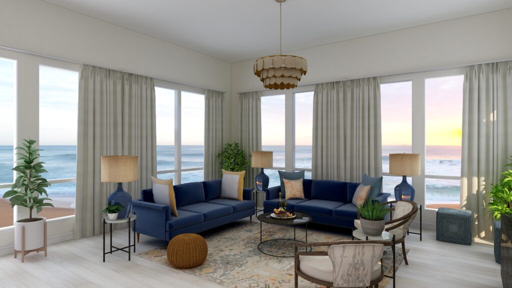
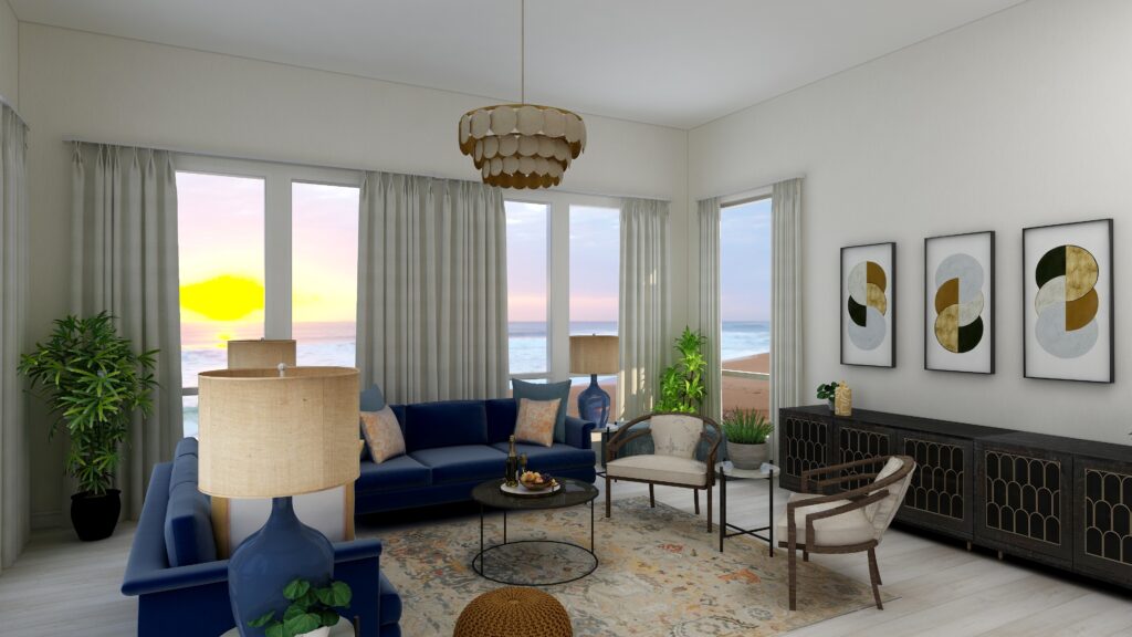
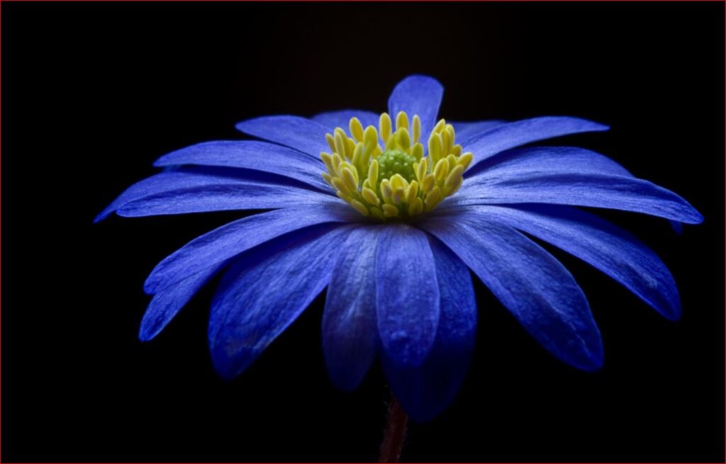
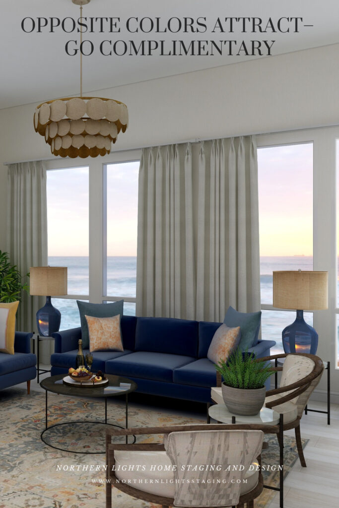
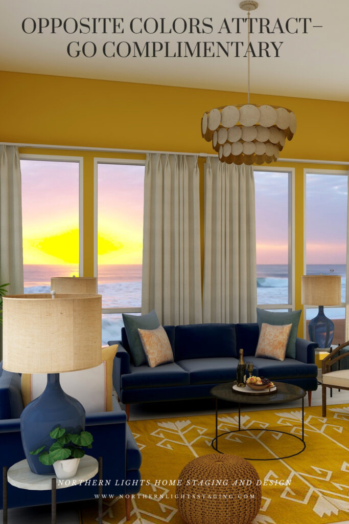
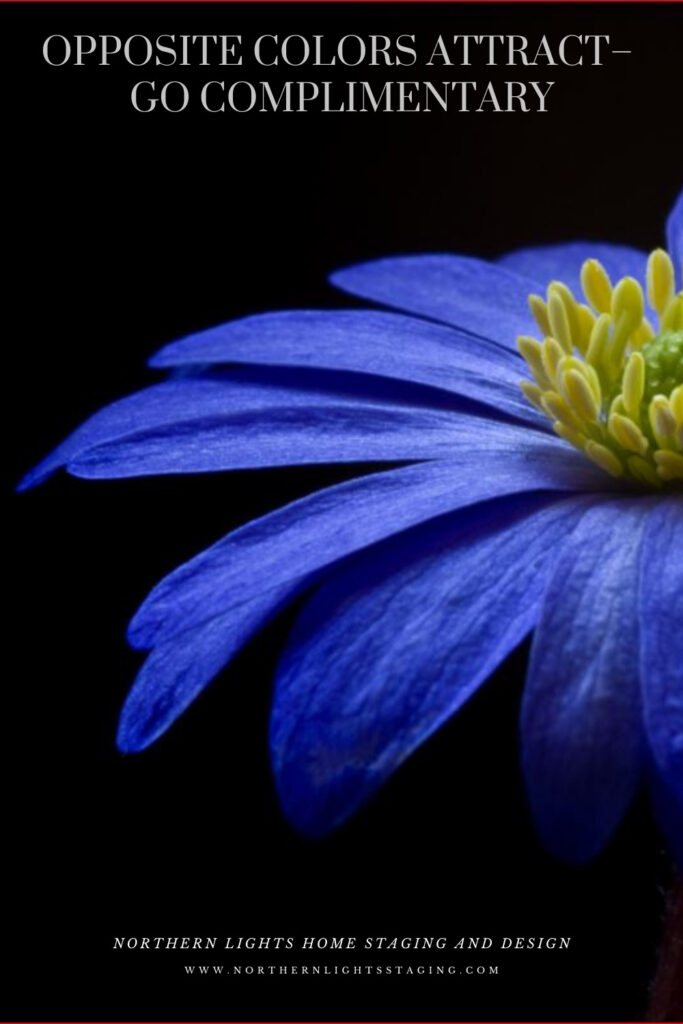
  1. Love these side by side variations on all the different color schemes! And that flower picture is stunning!

  2. Great post and I love the links to the products!!

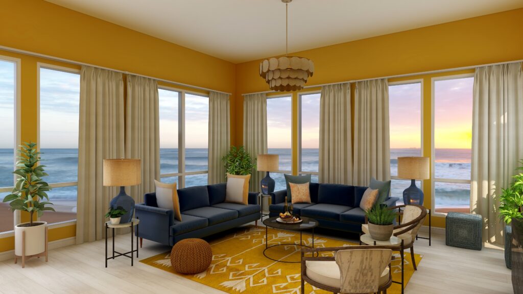
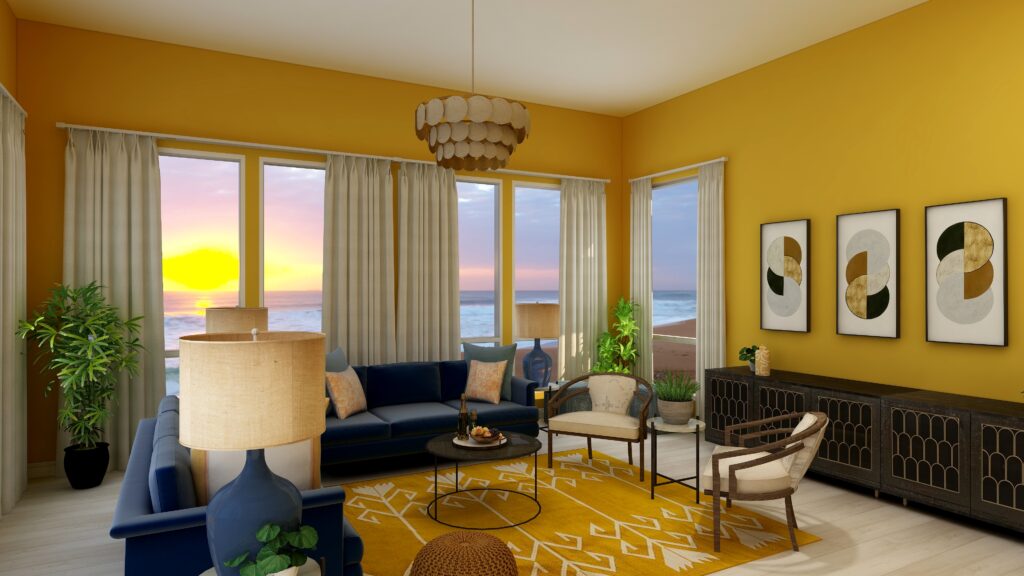
  3. Very pretty spaces using blue and yellow together! Thanks for the inspiration.

  4. I love complementary colours, Mary Ann! What I especially appreciate are the images that really show the beauty!

    1. Thank you Sheri! It has been fun creating images in this series and playing with the different color schemes.

Comments are closed.

https://zotabox.com/dashboard/embeddedcode/