Ten Ways To Not Screw Up Picking Your Paint Colors

Ten Ways To Not Screw Up Picking Your Paint Colors

Does the thought of picking paint colors make you uneasy, nervous, and maybe a little scared?

I think that is normal. Why? Because most people don’t understand how color actually works, in other words, the science of color. Even many so-called experts.

And so, there is a lot of bad information out there on picking paint colors and the average person is confused about how to do it and get the results they want.

It is no wonder.

The best way to not mess up your paint colors is to get help from an expert that really understands color and ignore all the noise on the internet and from well-meaning friends and family.  Whether working with a pro or not, here are some key things to consider. 


Don't Listen to Friends, Family or the Internet

Ten Ways To Not Screw Up Picking Your Paint Colors

Everyone will have an opinion of what colors you should pick.  About 99% of those opinions will be wrong. Why?

They are not you to know what you like. They are not living in your house to have knowledge of all your fixed finishes and what they look like in different light. They see color differently than you as we all have different eyesight and brains. Unless they are color strategists and know how to measure color data and interpret it, they will not have all the information to make the best color choices.

Ten Ways To Not Screw Up Picking Your Paint Colors

Avoid the temptation to post questions on Houzz and other sites asking for advice. No one can tell anything by looking at a picture of your home on their computer screen. The same photo will look different on everyone’s screen and will not reflect the reality of the colors in your home. Just because a color or combination worked in one home, does not mean it will look good in your home. Anyone who tries to tell you what to do based on a photo just proves how little they know about color.

Determine What Colors You Really Like

Sounds simple, but there are a lot of colors out there! Think about the ones you really like. The ones that bring you joy and make you feel good. Figure out colors you really dislike. That is often easier. 

Ten Ways To Not Screw Up Picking Your Paint Colors

Narrow Color Choices Based on Fixed Finishes

Once you know what you really like, you do need to consider some “limitations” on what you can pick. They are your fixed finishes and narrow your choices to ones that look good with those things you are unlikely to change any time soon such as flooring, countertops, stonework, and more. See my recent article, Some Colors Are Bossy. Will You Listen to Them? to learn more.

Ten Ways To Not Screw Up Picking Your Paint Colors

Stay in a Lane

A mistake I see a lot of homeowners make is mixing grays and browns. Many have lots of wood cabinets or floors and select countertops, backsplashes, and paint colors using a lot of grays since we have been in a gray trend for the last 10 years many options available are based on grays. 

In many cases, they do not work well together. They can be stunning together if you use the right combination of hues, values, and chroma together. The science of color can give you that information.

Most people, not having that information or knowledge combine the two and it looks off. You can avoid this problem by picking a lane (gray or brown) and staying in it.  Either go with browns and colors that will work with brown or go with grays and colors that work with gray.

Ten Ways To Not Screw Up Picking Your Paint Colors

Ignore Undertones

There is lots of information on the internet about so-called undertones that is wrong.  

People use the word undertone to describe color the way they see it in a particular place, time, and lighting. It is based on nothing more than their eyes and subjective opinion. It is not consistent, repeatable, measurable, or true. And it is confusing. 

An undertone is actually the color you see if you scrape a paint layer off and can see a color underneath.

So, just ignore all the talk of undertones. It will not help you.

Ten Ways To Not Screw Up Picking Your Paint Colors

Don’t Paint a Bunch of Samples on a Wall Next to Each Other

Whether you are going it alone or working with an expert, you will want to paint some samples of potential colors in your space to see how you like them in different light conditions.

People often take their white background and then paint a variety of colors next to each other in a line to compare and see what they like best. This is a totally ineffective way to compare color because each color is affecting the way you see the adjacent color.   

 This happens because of what is called “simultaneous contrast”.  This could happen when one color is laid on top of the other such as in the examples in “Mistake #1”, where for example you put Moscow Midnight on a white background and the white makes it look darker and grayer.

Or it can happen when you paint a bunch of test samples next to each other as in the picture below. If you place color compliments next to each other (colors opposite each other on a color wheel) like red and green, they each make the other look more colorful and brighter. So, in the picture below, the green next to the red is making the red look redder, and the red is making the green look greener.

Ten Ways To Not Screw Up Picking Your Paint Colors

If the two colors are not complimentary like the red and orange next to each other, each color tends to influence the other by adding a touch of its own complement color to the adjacent one. For example, the complement of red is green, so the red is adding a slightly greenish tint to the way the orange looks. The compliment of the orange is blue, so it is adding a slightly bluish tint to the way the red looks.

I realize right now you are thinking, What is she smoking?  Yes, I know. It sounds weird but it’s true. One of those cool things about color science you never knew!!

In any case, if you are trying to evaluate color, do not paint a wall full of samples right next to each other. You are just making things harder on yourself!! Look at each color by its little lonesome self.

Look at Your Colors on a Gray Background- Not White

People often think white is a perfect neutral background to see the true characteristics of the color they are testing.  Looking at your color against the old paint color can affect your perception of the new color. White seems like a great solution. Some believe that painting colors on a white background can magically make those mystical undertones appear.

The only thing that is true about the information above is that your perception of color can be influenced by adjacent colors. Whites are hues just like any other color, they just have so little chroma that it is hard to tell what hue family they came from. There are lots of shades of white, so of course a white can still influences how your color looks in comparison. In addition, there is no such thing as an “undertone” the way most people describe it. That is just a term people use when they are subjectively expressing their opinion of what hue family that white or gray came from. It is just an opinion that is often wrong and can easily be measured and determined scientifically in about 5 seconds without having to paint anything.

The biggest reason however not to test your color against a white background is that the “white” will make all colors look washed out. The intensity of the white can cause you to misread both the lightness and chroma or saturation of the color you are testing. The color will appear darker, duller or grayer, and less colorful than it is. So, it is deceiving and when you paint your room or house, it will appear much lighter, brighter and more colorful than you expected. See the example below in which I put  Sherwin Williams “Moscow Midnight” on a white background.

Ten Ways To Not Screw Up Picking Your Paint Colors

What if you put your color against a black background? It has the opposite effect, but still has the effect of distorting how your color may look in your room. Black makes your color look lighter, brighter and more colorful than it is, so when you paint your room you may be surprised with how much darker and duller the color appears than you expected. In the picture above, see how Moscow Midnight looks on a black background compared to on the white background.

So, what can you do then? Paint on a gray background! Gray is the most neutral and will have the least effect in changing how the color appears. Look at the example of Moscow Midnight on the gray background to see what I mean.

Don't Let Your Whites Look Dirty

Most likely some of your color choices will be white. It may only be your ceiling or trim or maybe some cabinets. Most people think it’s white, how hard can it be to pick? Every white is actually color or hue, with very little chroma or saturation of that color. Unless you are going to use the same white everywhere, you need to make sure your whites work together and one does not make the other look “dirty”. This can happen if they are too close in their color values to be clearly different.

Find One Thing In Common

Your color scheme should have something in common, either hue, value, or chroma to create harmony.  Carry that common theme throughout your home.

Ten Ways To Not Screw Up Picking Your Paint Colors

Use the Color Wheel to Make a Plan

When you have identified the colors you truly love and narrowed down your list to work with your fixed finishes, it is time to consider a color scheme. The color wheel can help you decide what relationships make you happy and pull in your favorite colors. For example, you could do a monochromatic or complementary color scheme. Or maybe try a diad, triad, tetrad, split complementary or other option. A color wheel, and once again, color science can guide you.

Ten Ways To Not Screw Up Picking Your Paint Colors

Use the Science of Color to get Extraordinary Color

Color science can help you determine what colors you really like. It can help you narrow down your choices by understanding which will work with your fixed finishes. It can help you find color harmony and pick a great color palette. It can help you pick the perfect whites to go with your colors and each other. It can take the guesswork out of what may seem complex and give you great results the first time.

Understanding and using the science of color can bring your color to the next level.  Get extraordinary color. If you don’t have the knowledge, hire someone who does. The results will be worth it.

Ten Ways To Not Screw Up Picking Your Paint Colors

You are Making My Head Hurt

Now that I have told you how to not screw up your paint colors, you may be realizing that color is more complex than you thought. And maybe all those that want to tell you what to pick may not be the best sources of information.

And you may be wondering why you should I listen to me?  Don’t listen to me. Listen to the science.

Most people do not know the science and don’t want to know. They just want to use their “eyes” and the art of color, because it may appear simpler and more fun. I prefer to use both. It makes life a lot easier, quicker, and with more beautiful results.

Ten Ways To Not Screw Up Picking Your Paint Colors
You are making my head hurt.Photo by Zdeněk Macháček on Unsplash

Are You Ready to Try a New Approach?

As a certified color strategist, I use the art and science of color, to get rid of the guesswork of picking great paint colors. Let’s cut through all the BS and help you get your colors right the first time, saving you time, money, and stress! Are you ready to try a new approach? 

Set up a color consultation today. I can work with you locally or online nationwide. To work together online, I will have you purchase a Color Muse and teach you how to use it to send me the data. Easy, collaborative and fun!

Learn More About the Art and Science of Color

I am proud to say I am a certified color strategist! And, the only one in Alaska! As a design professional, I was truly impressed with the color training I received from Lori Sawaya​ of Camp Chroma. Finally, a training program that uses the scientific method of explaining how color works based on an established color system that skips all the subjective talk about undertones that leaves everyone feeling confused. Color is complex and this training explained color data so we can make informed decisions based on the science, rather than on subjective opinion or color sense.Click on the picture to find out more about the best training class on color available, the Four Pillars of Color!


What's Your Global Design Style? Take this fun quiz to find out. Northern Lights Home Staging and Design #globalstyle #designstyle #interiordesign #onlinedesign #stylequiz #interiordesignquiz #interiorstylequiz

Why work with Northern Lights Home Staging and Design

Terms of Service  |  Privacy Policy  |  Disclaimer

Prices subject to change without notice.

Blog may contain affiliate links, meaning I receive a small commission for sharing at no additional cost to you.

Call 907-362-0065 today

 info@northernlightsstaging.com

Ten Ways To Not Screw Up Picking Your Paint Colors

By Mary Ann Benoit

President- Northern Lights Home Staging and Design Owner- Arctic Paradise Bed and Breakfast Artist- Stained Glass, Jewelry and Alcohol Ink Art Wildlife Biologist Director- Kaleido World Percussion and Dance Company Director- Tavus Dance Company of Alaska Lover of music, art, dance and animals.

12 comments

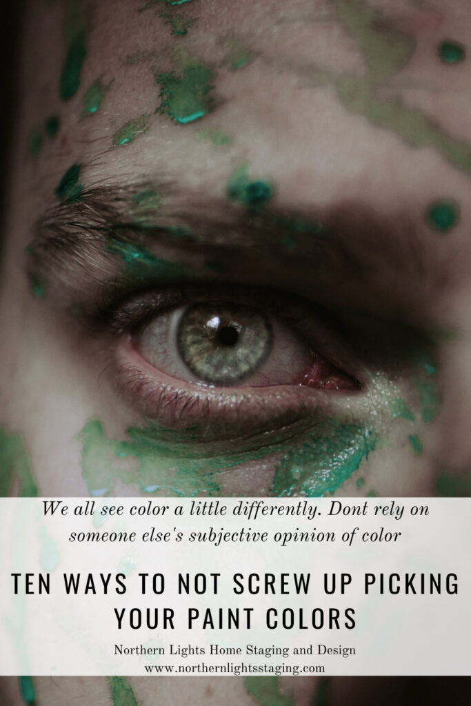
  1. Great advice, Mary Ann! Color selection is the alchemy of science and art! I especially love the admonition to stop painting a bunch of swatches on the wall next to each other, which is the first thing most people do thinking they are being really diligent…just say no!

    1. Thank you! I have had numerous consultations where they have painted a whole wall of color swatches. No wonder they are confused and stressed about color!

  2. This post is a bonanza of valuable color scheme information. I feel like it is a perfect summary of what was a whole semester of color theory in school. Well done.

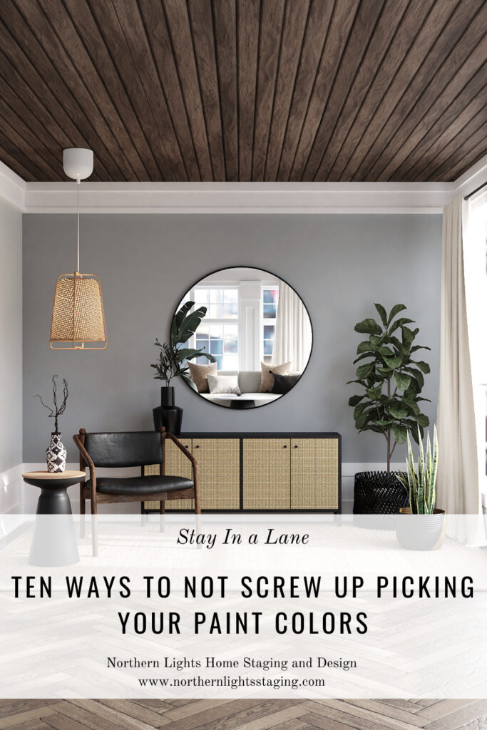
  3. My top 2 favourite tips: don’t listen to friends and stay in a lane! Loved all of your tips, but those 2 are my top ones! Great advice as always.

  4. Wow! What a lot of great info. Your imagery is really impressive.

  5. I love that you demonstrated how choosing colors can actually be quite complicated. Great instructions and inspiration for those who are “green” to this complex process!

Comments are closed.

https://zotabox.com/dashboard/embeddedcode/