
Mary Ann Benoit-Northern Lights Home Staging and Design
"Making Magic Happen—Create a Home & Life in Alignment with Your Highest Self", 907-362-0065

Comments are closed.
Such a great article and I love your designs Mary Ann!
Thank you so much Debra!
Thanks, Mary Ann, for a great post on all the different purples there are out there. I used a shade of purple for the LIVING part of Design Happy Living’s logo.
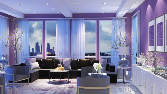
I love that you show the wide range of colors that fall in the purple category! Well done, and very inspiring post.
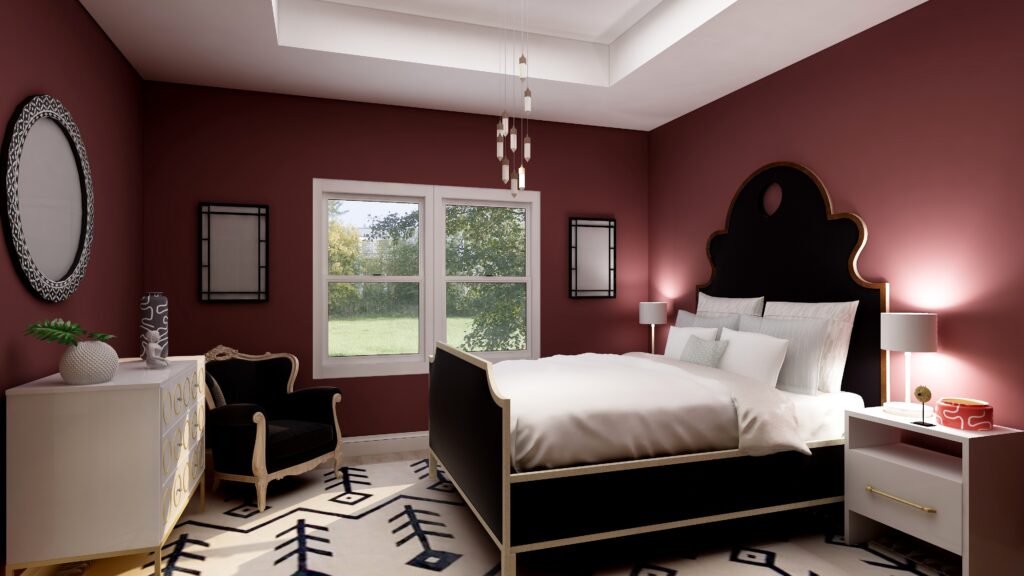
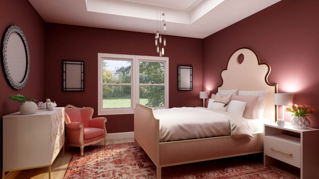
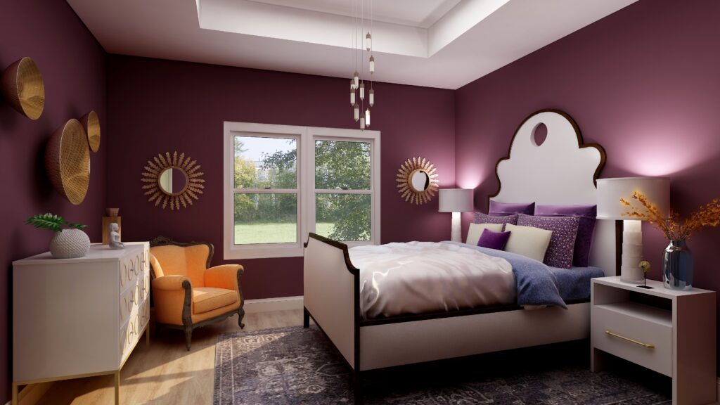
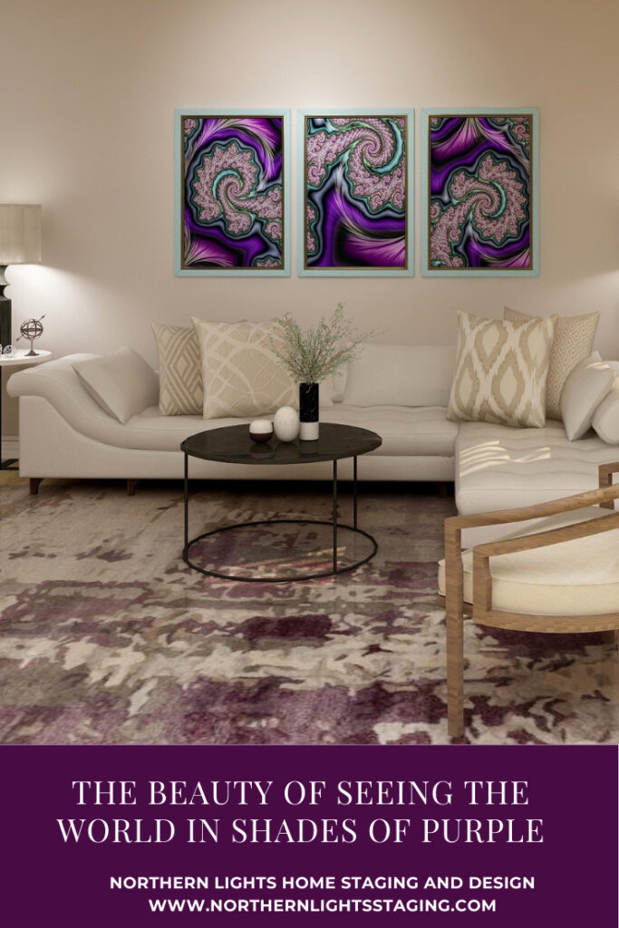
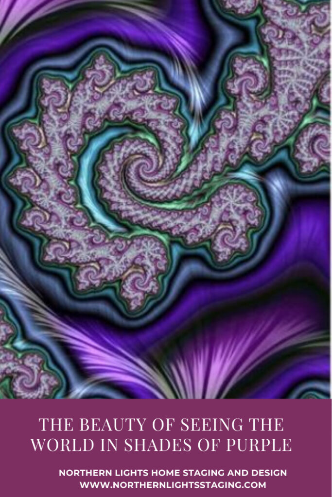
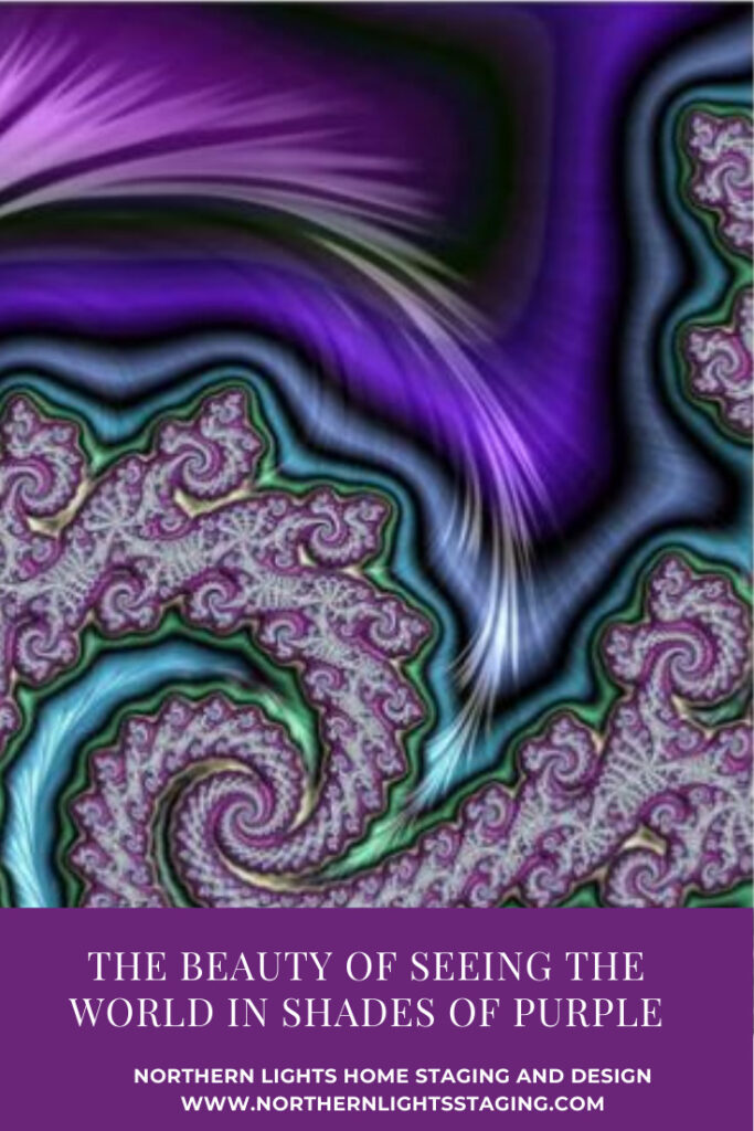
Purple is such a varied and rich color..great examples of using it here and of how radically it changes depending on whether it is closer to the red or blue end of the range!
So many great ideas and inspiration!!
This is such a timely post as I just worked with my sister-in-law to select colours for her home that also include colours for her cabinetry in her powder room. We selected a very muted purple for the colour of her vanity. At first I thought she was going to think I was crazy suggesting it, but she fully embraced it!
Thank you for shedding light on this magnificent colour!
Although I am one of the few out there that are not a fan of purple, your post is showing color combos that are very appealing to me, a non-purple fan! Great job again!
Purple is my favorite color! Love to see how it can be used in so many different design styles. Great post as always!
Thank you! Yes, it is mine too!