People often struggle with creating a great color scheme. Often, we start the conversation by talking about the limitations, or the box of colors you need to play with based on your fixed finishes.
In my last article, Celebrate Your Favorite Color- Go Monochromatic, we talked about how you could take your favorite color and celebrate it in all it’s glory with a monochromatic color scheme. Simple and easy!
What if you would like a little more color variety, but still want something that is simple and easy to create? Go analogous!
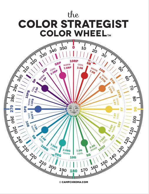
Analogous color schemes are based on three hues that are next to each other on the color wheel. They are friendly neighbors, they like each other and play well together:)
Analogous colors are harmonious and often found in nature.
Why does it work? They go well together because one of the three colors is usually a combination of the other two as with the red, yellow and orange peppers above.
Analogous schemes offer more color variety than monochromatic schemes while still retaining that harmonious and often serene quality, although it can also be more dramatic too based on the hues you use. It is also a simple scheme to create by using your color wheel and picking three adjacent colors that you like.
Which three adjacent colors are your favorites?
For example, in my last article, I created a monochromatic design using blues and blue/purples around the range of 250-270 on the color wheel.
If I wanted to take this monochromatic design, and create a more analogous scheme, I could go clockwise around the color wheel and add the neighbors of blue in including purple and red-purple. Or, I could go counter-clockwise and add blue-green and green.
I could also pick neighbors on either side and add purple and blue green. Let’s play.
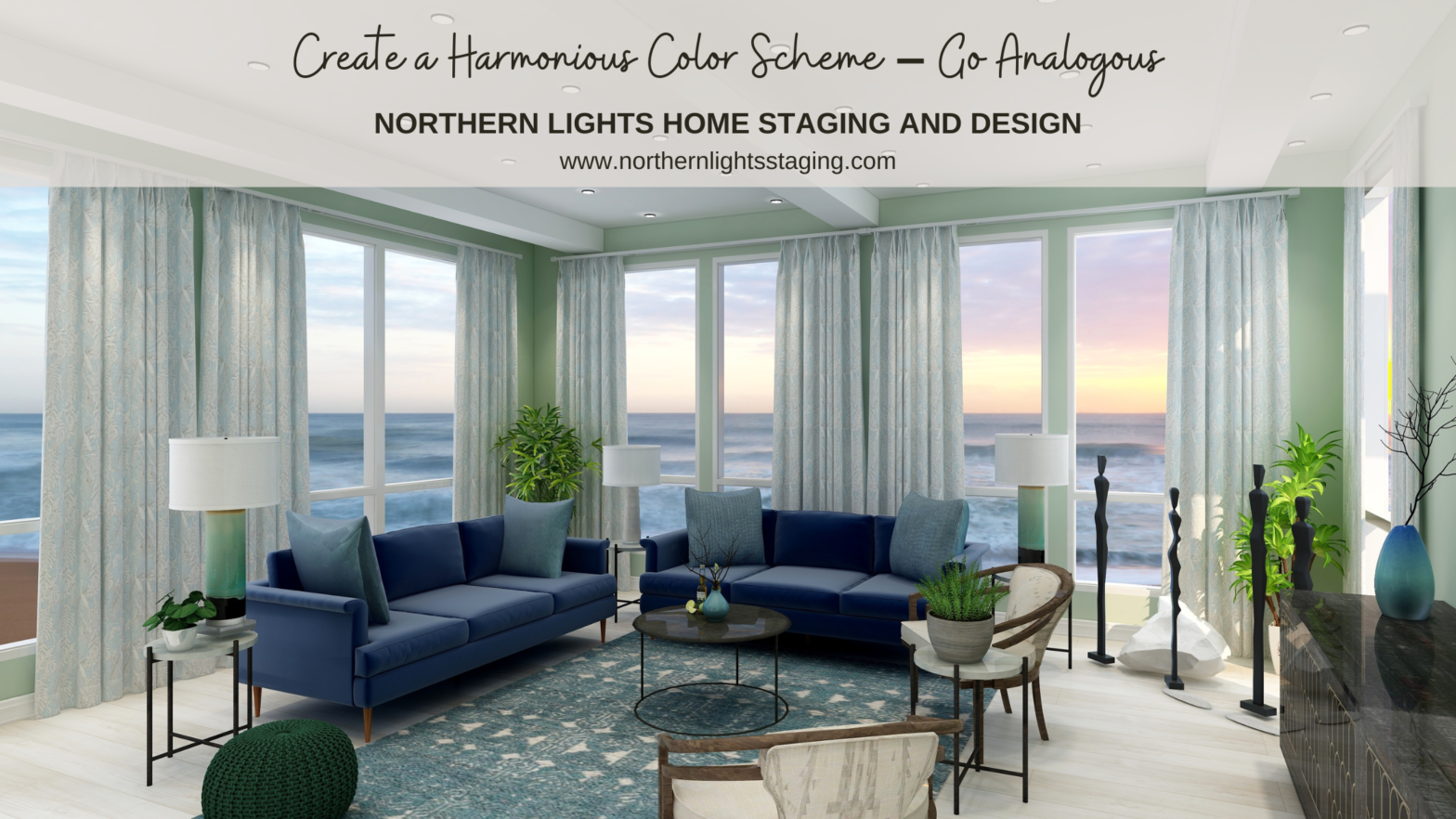
Analogous Color Scheme #1
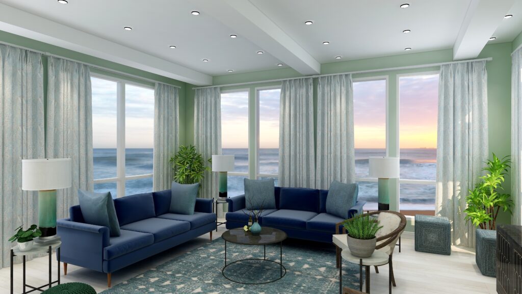
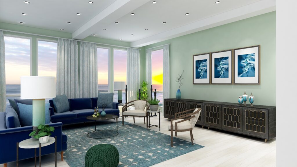
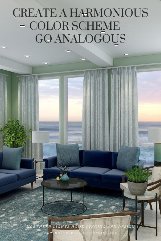
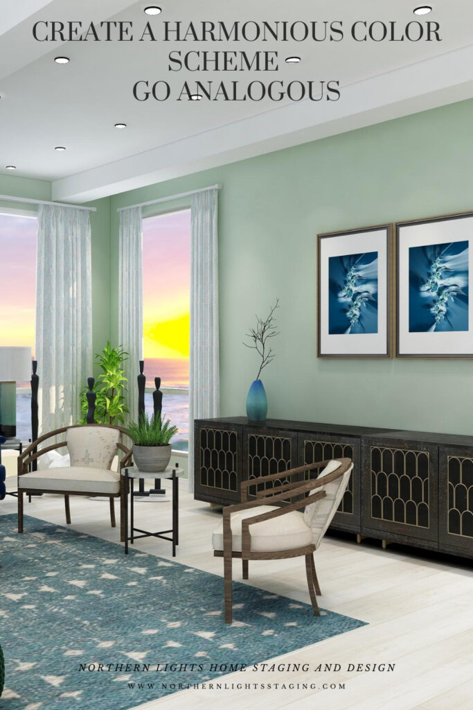
This design starts with our base blue as in the sofas and moves counter-clockwise along the color wheel to include blue greens and greens. I set the tone for this design with a new rug in blue green and then changed the paint color, lamps, side chairs and some of the accessories. I maintained the sofas and art as the anchor of the main blue color I wanted to harmonize with.
This design still maintains a calm, serene feeling similar to the original monochromatic scheme, but feels a little richer and warmer with the greens and blue greens.
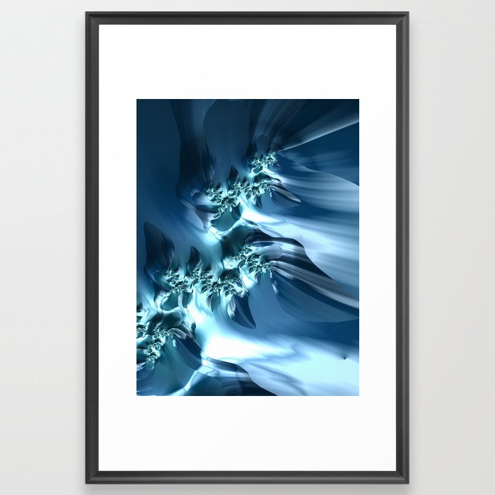
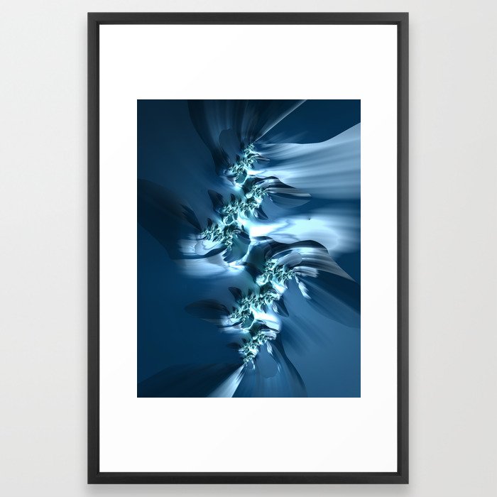
Fractal Art
This design, as with the monochromatic design, incorporates some of my original fractal art in a collection called “The Sea”, which reminded me of white caps on the ocean and also uses variety of blue shades.
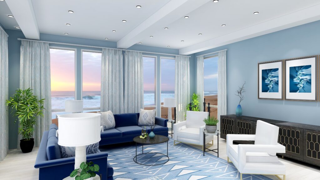
Analogous Color Scheme #2
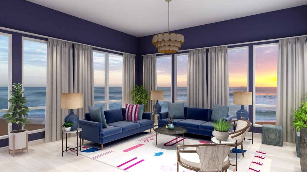
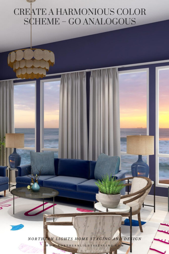
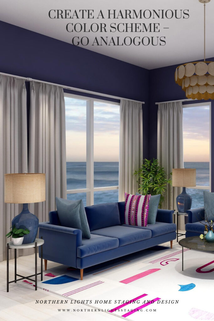
In this case, I again maintained the blue sofas as the base color from the previous design and went clockwise around the color wheel to include purple and red/purple.
I found a nice rug that contained the 3 main colors I wanted to work with to tie everything together. Then I switched the paint color, lamps, one accent pillow and some of the art to bring in some of the other colors.
This design is a little more dramatic due to the deep, rich moody wall color and the high contrast of colors against the white background of the rug. I still think it looks calm and relaxing too.
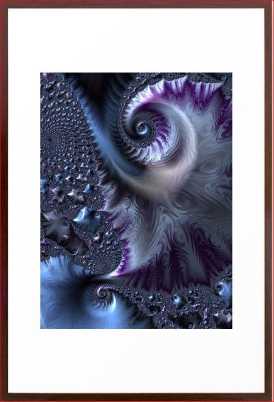
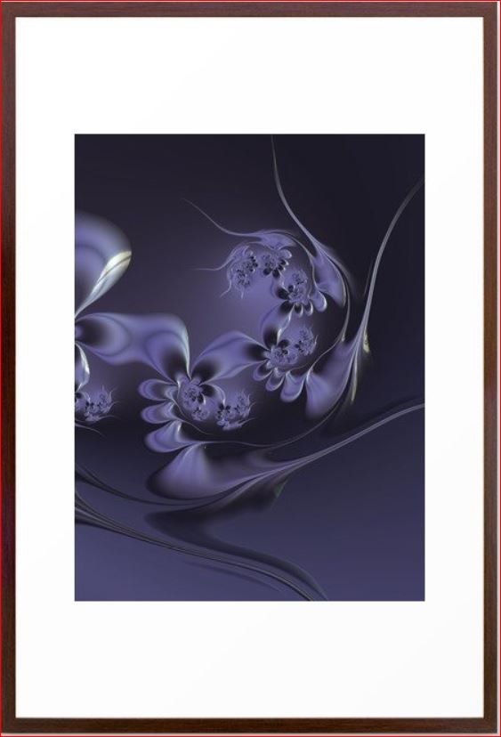
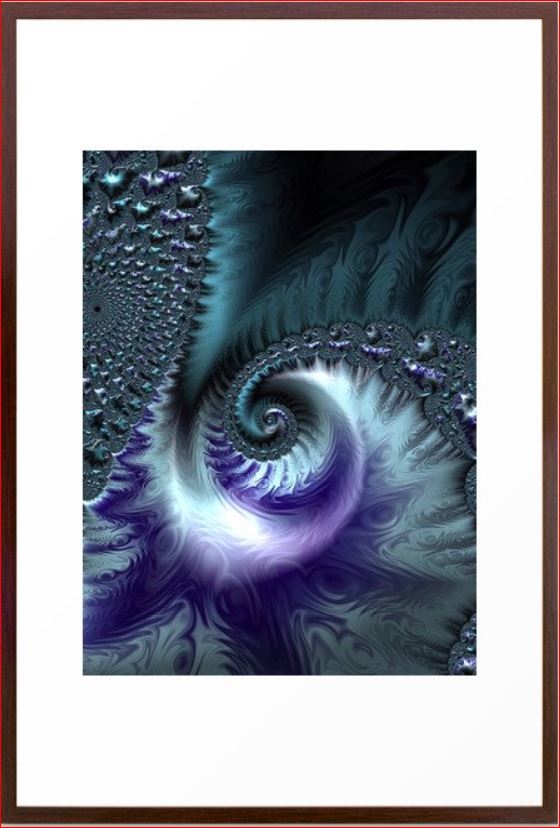
Fractal Art
Here is some fractal art I designed that could be used in this design. My Forest Floor designs were inspired by colors in the boreal forest here in Alaska which have a lot of water in them (streams, ponds, rivers, lakes), thus the blues. The purples represent many of our purple wildflowers. Mystery is a mystery…..use your imagination of what it means to you.
Benefits of an Analogous Color Scheme
Analogous color schemes use colors that are adjacent to each other on the color wheel. These schemes offer a harmonious and visually pleasing palette. Here are the benefits of using an analogous color scheme:
Harmony and Cohesiveness: Analogous colors have a natural harmony because they share common color components. This results in a unified and cohesive look that’s easy on the eyes.
Subtle Contrasts: While the colors in an analogous scheme are similar, there are still subtle contrasts that can be used to highlight or differentiate design elements.
Versatility: Analogous colors can be adapted to both vibrant and muted tones, offering flexibility in setting the mood or theme of a design.
Richness and Depth: Using several shades and tints of a color range adds richness and depth to designs.
Natural and Comforting: Analogous color schemes often mimic how colors appear in nature, making them inherently familiar and comforting to the human eye.
Easy Color Matching: It’s easier to match colors within an analogous palette because they share similar undertones, reducing the risk of clashing hues.
Reduced Visual Tension: Analogous colors create a more relaxed visual experience because there’s a lack of high contrast between the colors.
Flexibility in Highlighting: One can easily highlight an element by choosing a color from either end of the analogous range, making it slightly more vibrant or darker than the surrounding hues.
Aesthetic Appeal: This type of color scheme tends to be naturally pleasing and aesthetically appealing because of its harmonious nature. An analogous color scheme can look richer and add more color diversity and interest than a monochromatic color scheme.
Enhanced Mood Setting: Due to their close relation, analogous colors can be effectively used to evoke specific moods or feelings, like warmth (reds, oranges, yellows) or calmness (blues, greens). These are really nice for living rooms, dining rooms and bedrooms. Analogous color schemes can also be more dramatic based on the hues you select, placement of colors and how saturated they are.
While analogous color schemes offer many advantages, it’s essential to ensure adequate contrast within designs to avoid them becoming monotonous or washed out. Using a neutral color or even a complementary color in small amounts can help add interest and break up the scheme.
Celebrate Your Favorite Colors
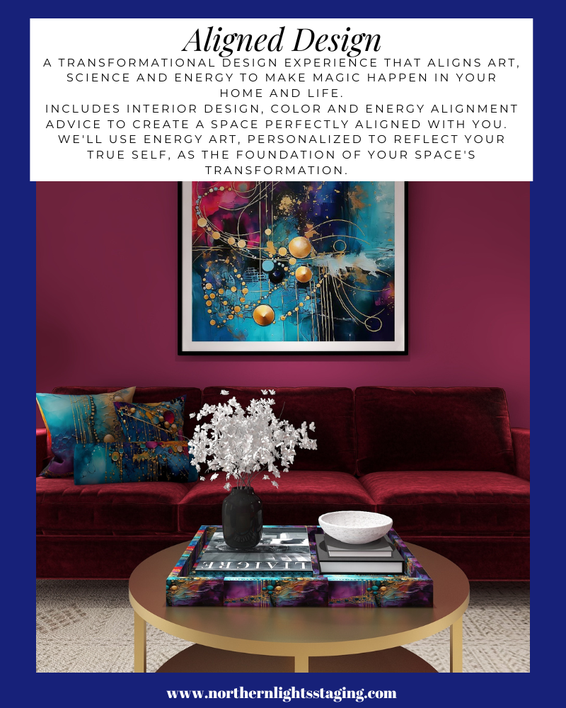
Imagine stepping into your space where every hue resonates with your spirit. It’s not just a room; it’s a reflection of you – a haven of happiness and tranquility. In a world where everything aligns, your surroundings uplift and rejuvenate you. When your home mirrors your essence, harmony is effortless.
Purchase an Aligned Design or Color Consultation today.
What is Your Global Design Style? Take the Quiz

Aligned Design- All Rights Reserved.
Terms of Service | Privacy Policy | Disclaimer | Brochure
Prices are subject to change without notice.
Call 907-362-0065 today
Pin These



Wonderful color schemes and explanation of analogous color schemes!
Thanks so much Linda!
Love your examples of analogous color schemes – you are on my favorite side of the color wheel :). And I couldn’t agree more – your home should make you happy, re-energized, and refreshed! Living your best life starts at home!
Thank Janet! I agree, I think a beautiful home that reflects you can make a huge difference in how you feel every day.
Mary Ann, what beautiful examples of analogous color schemes and the serene looks you can create.
Love your examples- your renderings are just amazing!!
Thank you so much Christie!
Lovely examples! You’re clients will be so happy!
Thank you Suzi!