Several years ago I was listening to Tony Robbins online inspiring people to discover their “life’s purpose”. I decided at the time that mine was to create beautiful things (whether it is a home interior, piece of jewelry or stained glass, a piece of music or a dance) and share it with others to give them (and me) joy.
That was my inspiration in starting Northern Lights Home Staging and Design i 2014. For those of you who do not know me, I am also an artist (stained glass, jewelry, alcohol ink, fractal art), musician and dancer. All these things give me joy, and I hope I can pass a little bit of that on to you.
When I create a beautiful space for you, whether it is to sell your home or to live in it, I want you to say “Wow!!!” and feel some of the magic you might experience if you saw northern lights. That is my goal and how Northern Lights Home Staging and Design got it’s name.
At the time, I silently thanked Tony Robbins for helping me put into words what I knew to be true about myself.
Now, five years later, I am looking back and wondering, is this still my life’s purpose?
The answer is YES!
And that makes me happy, because it makes me feel as if I am aligned with my true purpose, what I am meant to do. Are you? One of my favorite quotes is from another dancer and I truly believe this.
“There is a vitality, a life force, an energy, a quickening that is translated through you into action, and because there is only one of you in all time, this expression is unique. And if you block it, it will never exist through any other medium and will be lost.”
Martha Graham
So, while I still believe my life’s purpose is to create beautiful things, I realize that the outward beauty has more depth and layers than it used to. Whether it is in one of my Interior designs, pieces of art or a dance, the magic comes from a beautiful intersection of art, science and energy that goes into each creation. The more I learn about each aspect and grow as an artist, the more interesting and beautiful my creations become. To me anyways:) And hopefully to you!
Create Beauty in your home
I would like to show you how to create beauty in your home by aligning art, science and energy. An Aligned Design consultation to create a holistic plan is a great first step to map out your journey to a perfect space.
Imagine what that would feel like.
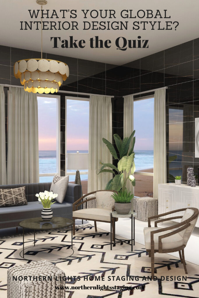
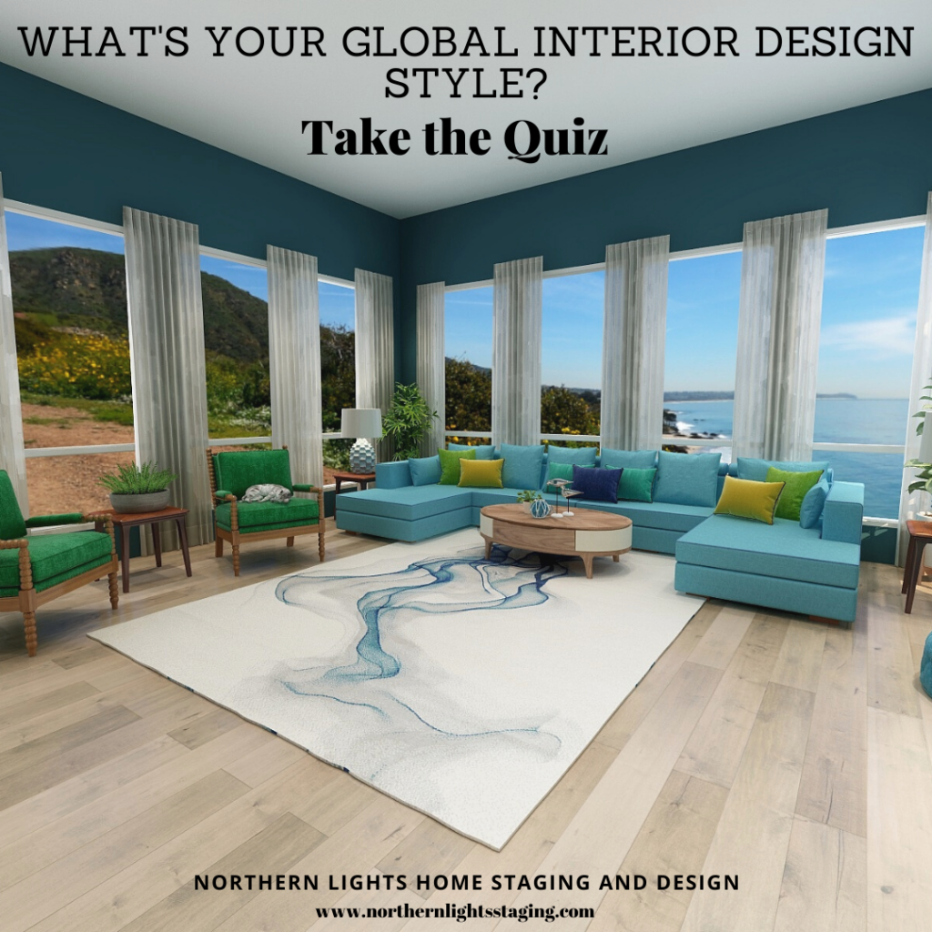
Curious about your Interior Design style? Take the quiz and find out.
Great Paint Color Schemes- Black, White and Shades of Gray
People often struggle with creating a great color scheme. In my recent series of blog articles we discussed how you could take your favorite color, blue for example, and create different color schemes. We explored monochromatic, analogous, Complimentary, Diad, Triad, Tetrad, Split-Complimentary and Double Complimentary.
Today, lets talk about using black, white and shades of gray.
Monochromatic Color Scheme Analogous Color SchemeAnalogous Color Scheme Complimentary Color Scheme Complimentary Color Scheme Diad Color Scheme Diad Color Scheme Triad Color Scheme Triad Color Scheme Tetrad Color Scheme Tetrad Color SchemeSpilt Complimentary SchemeSpilt Complimentary Scheme Double Complimentary Color Scheme Double Complimentary Color Scheme
Technically, using black, white or grays is really a monochromatic color scheme and could be done with any color. If you take the color and adjust it’s chroma or saturation level to the lowest you can go, you get white. If you adjust it a little higher, you get shades of gray. If you adjust it to the maximum it becomes black.
Most people do not think of black, white and gray as actually being a color. Many people like to work with these colors as they think it is a very neutral color palette.
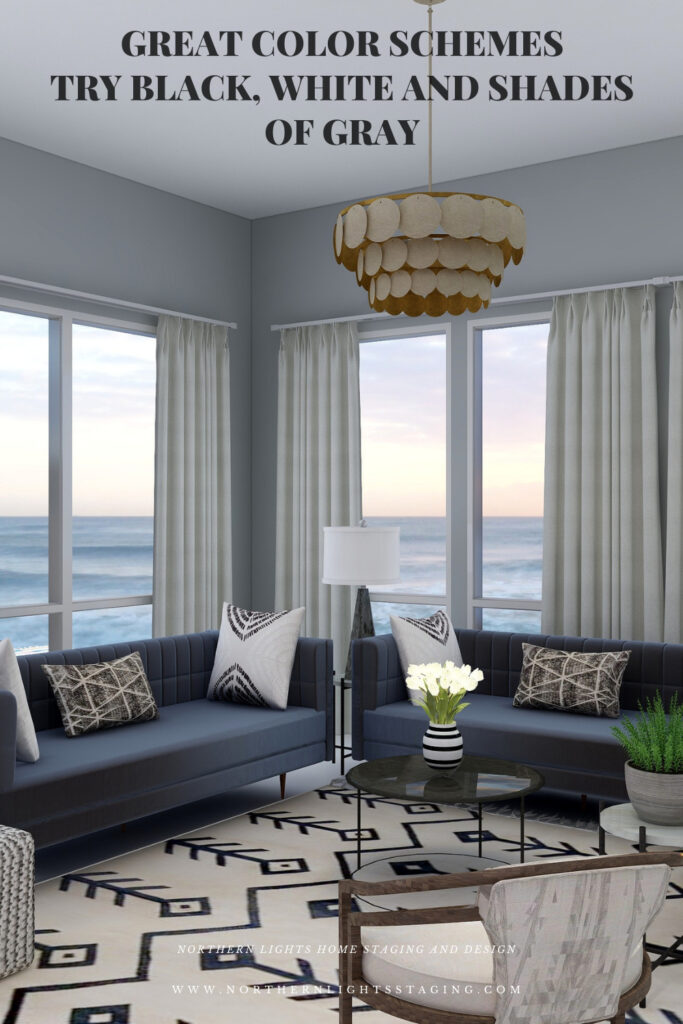
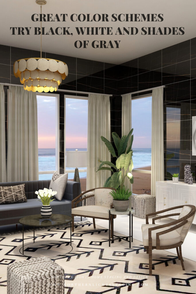
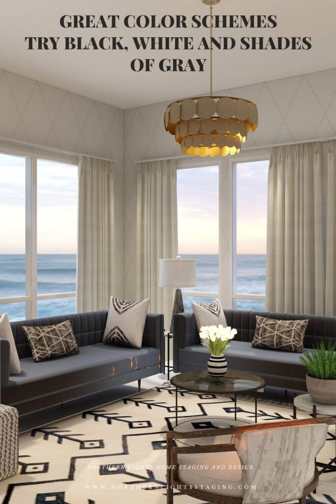
Let’s play around with a design I created that uses mainly black, white and gray home decor items where I mainly changed the wall color or treatment to create drama or highlight different things.
Design
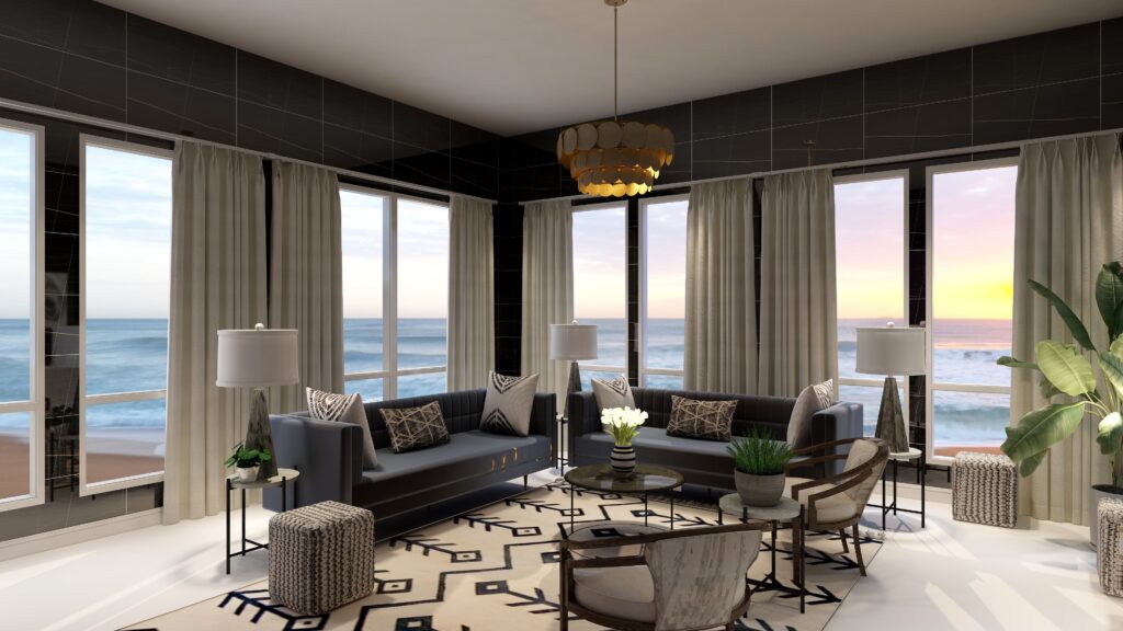
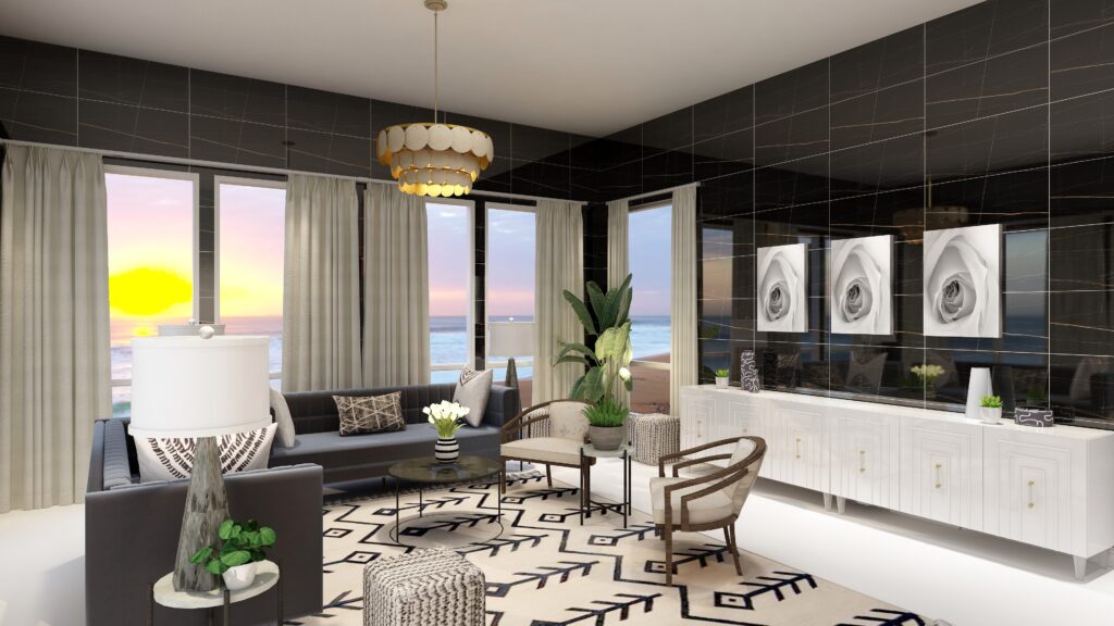
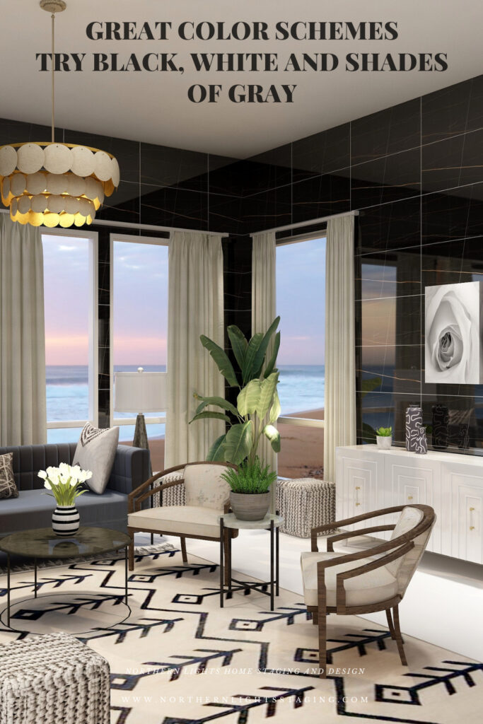
In this design I created maximum drama by using black walls which a striking due to the color, but I also used shiny wall tiles which also add texture and reflect light. The dark walls recede, giving a feeling of being cocooned and enveloped within the color. The color also highlights the black design in the area rug, making it pop.
Double Complimentary Color Scheme. Edesign and Fractal Art by Northern Lights Home Staging and Design.
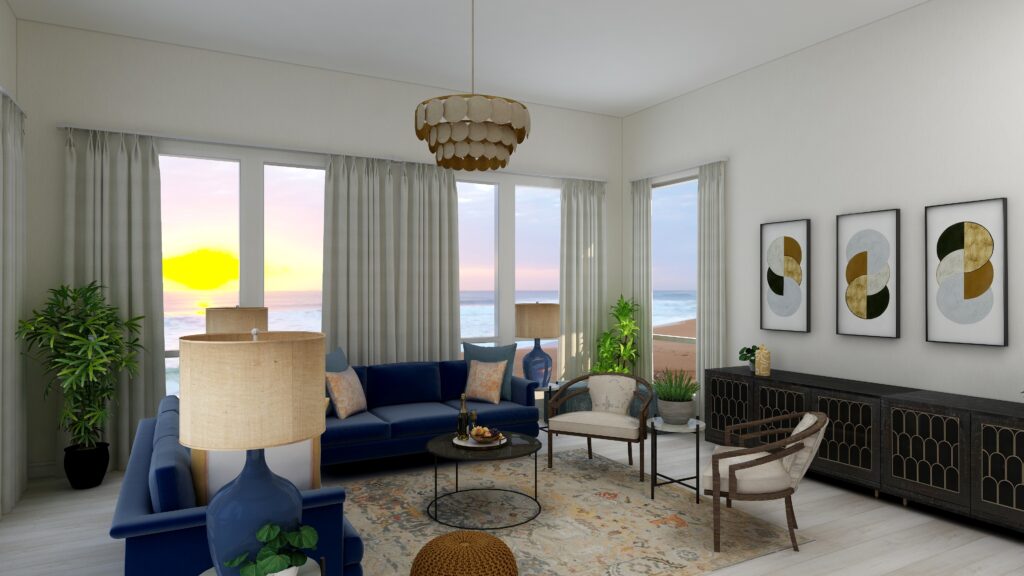
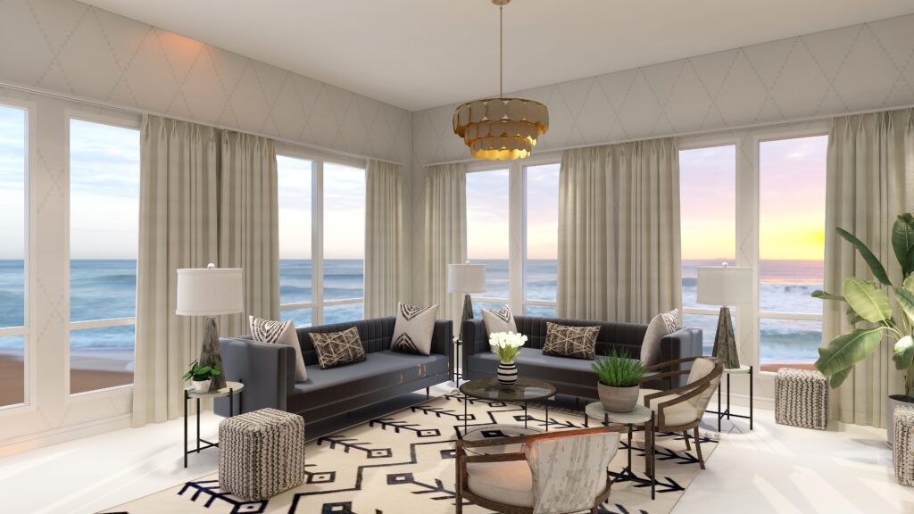
In the design below, I used wall paper in white with a gray diamond pattern. The wall, although it still has texture and interest due to the pattern, disappears with the light color, putting more emphasis on the view outside.
Double Complimentary Color Scheme. Edesign by Northern Lights Home Staging and Design.
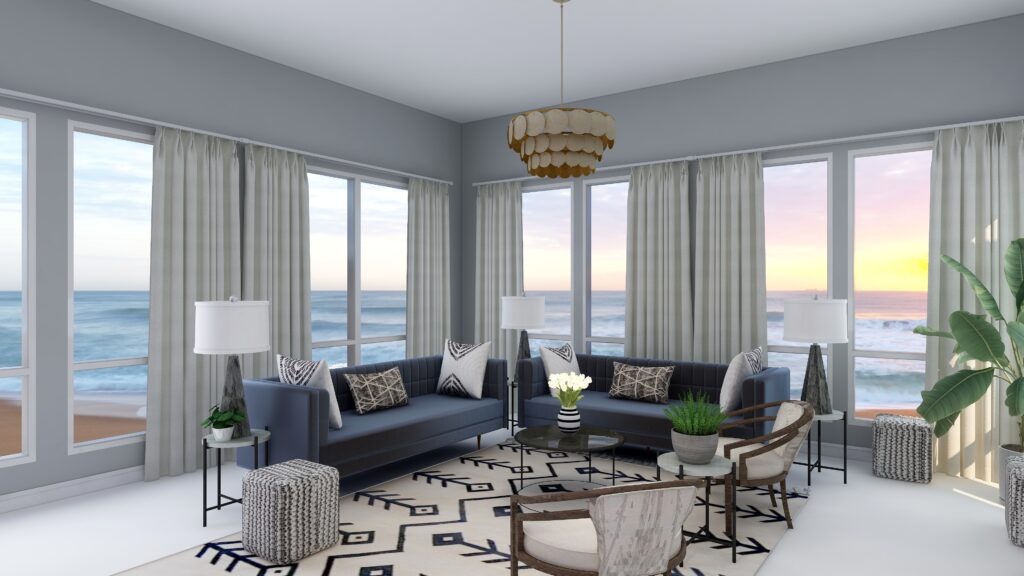
In the design below, the gray paint color feels cool and elegant, and creates more of a connection with the furnishings and decor of the gray sofas and the accent pillows.
Shop the Look
Check out the pieces I selected for this design. Some include affiliate links, meaning I receive a small commission for sharing at no additional cost to you.
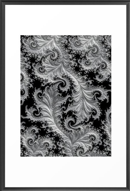
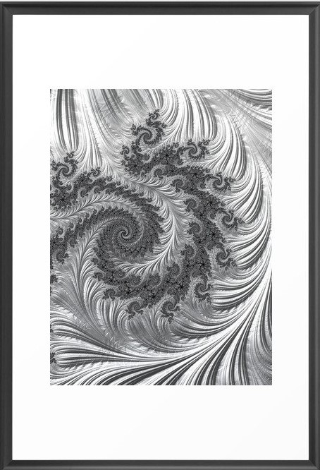
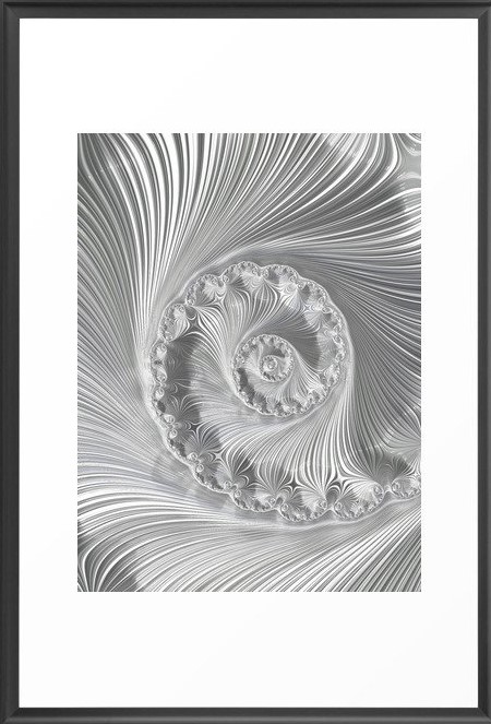
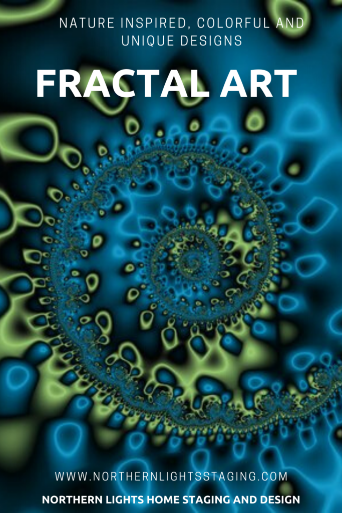
My design also incorporates some of my unique fractal art from my “Spring” Collection.
Arctic Evening Fractal Art by Northern Lights Home Staging and Design Arctic Night Fractal Art by Northern Lights Home Staging and Design Icefield Fractal Art by Northern Lights Home Staging and Design
A black, white and gray scheme is fairly easy to put together. It is best if you keep you black, white and grays all within the same color family so they are harmonious.
A black, white and gray scheme can be really dramatic or relaxing based on the saturation and placement of the colors you choose. Dark gray and black walls are more dramatic than white walls.
A black, white and gray scheme really highlights any other colors that are used, or the colors of the views outside.
Very nice for living rooms, dining rooms and areas that you like to entertain.
Create Beauty with Color in Your Space
Each moment in life is YOUR choice. surround yourself with BEAUTY, color and positive energy now.
Or not, it’s up to you.
Everything in life is easier when you love your space.When your space is better, you are better. When you are better, the world is better.
Click on the picture to find out more about the best training class on color available, the Four Pillars of Color!.
Subscribe to Seasonal Living Magazine
Check out this free bi-monthly online Seasonal Living Magazine, full of inspirational images, videos and articles for you about seasonal home decor, travel, food and entertaining!
Great Paint Color Schemes- Try a Double-Complimentary
People often struggle with creating a great color scheme. In my last few blog articles we discussed how you could take your favorite color, blue for example, and create different color schemes. We explored monochromatic, analogous, complimentary, diad, triad and tetrad color schemes. Today, lets look at a Split-Complimentary!
A tetrad uses four colors which include two complimentary color pairings. It can be difficult to balance if you use all four colors in equal amounts it may feel like too much. You can use one to three colors as dominant colors and and let the rest be more subdued. By subdued, I mean you can use less of the colors proportionally. Or you could use less saturated versions of the colors so they don’t stand out as much, but color schemes tend to look more harmonious if you are using similar saturation or chroma levels. Here are some examples.
Let’s create a split-complimentary color scheme with the blue we have been working with in the last several articles. You can see this blue in the sofas.
Monochromatic Color Scheme Analogous Color SchemeAnalogous Color Scheme Complimentary Color Scheme Complimentary Color Scheme Diad Color Scheme Diad Color Scheme Triad Color Scheme Triad Color Scheme Tetrad Color Scheme Tetrad Color SchemeSpilt Complimentary SchemeSpilt Complimentary Scheme
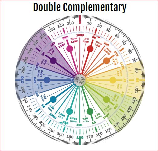
In a double complementary color scheme, you use a primary color such as our blue, its compliment yellow, and then the pair of complimentary colors of one of its neighbors on either side such as blue/purple and yellow/green or blue/green and orange.
Double Complimentary Color Schemes Illustrations by Camp Chroma, the Best Color Training Ever!
Design 1
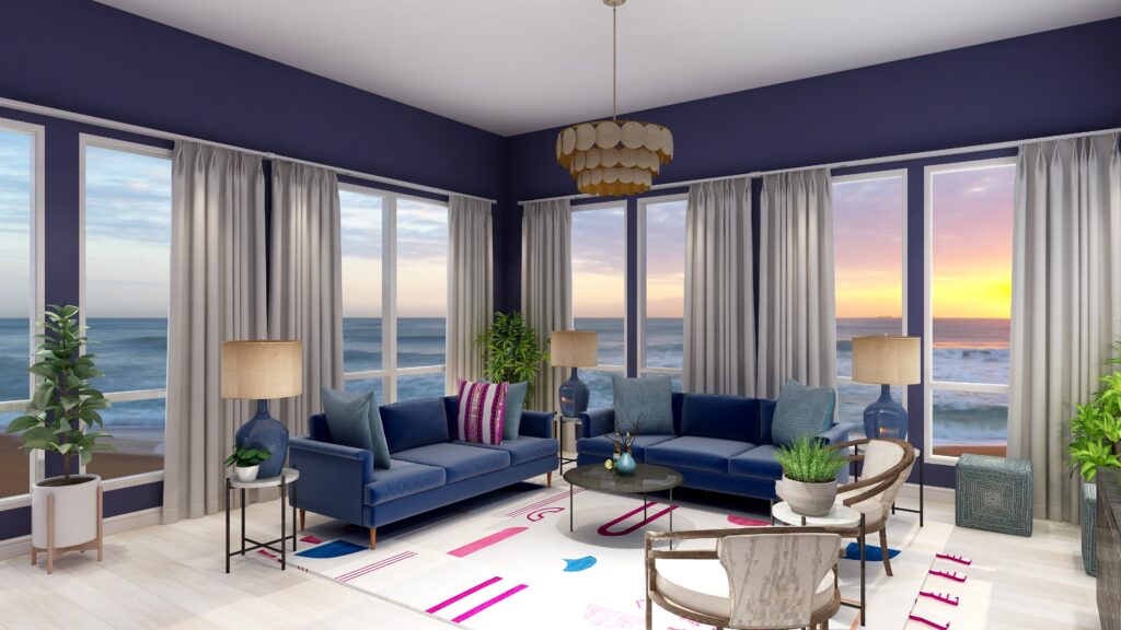
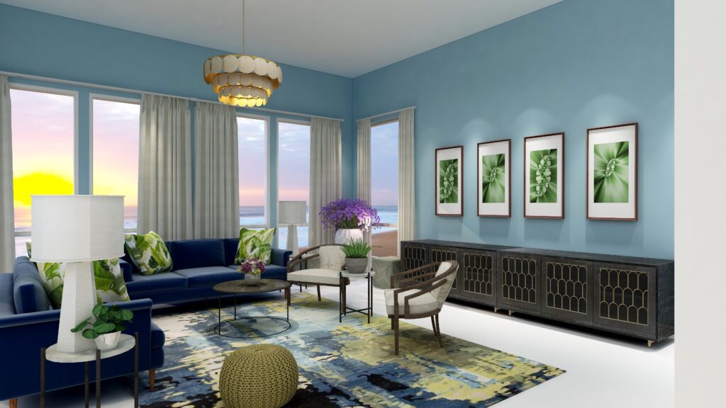
With a Double-Complimentary scheme we are working with 4 colors, or two sets of compliments. We have a large variety of tints, tones and shades to play with within those colors, but it is always most harmonious if you work with colors with similar chroma (saturation). In other words it looks best if you are not mixing rich, bright colors with pastels. You can get dramatic or keep it more neutral based on the colors you choose. I find adding rich color to the walls creates drama, while using a more neutral wall color feels more relaxing.
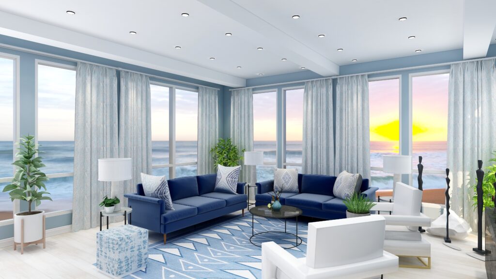
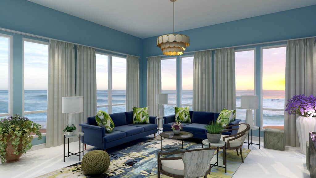
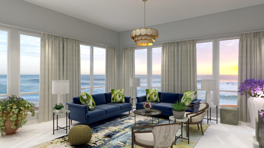
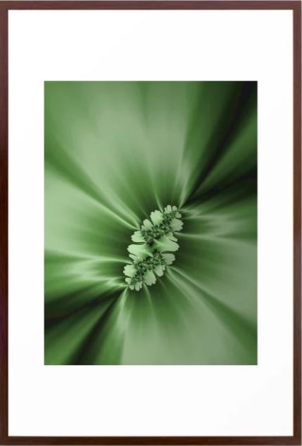
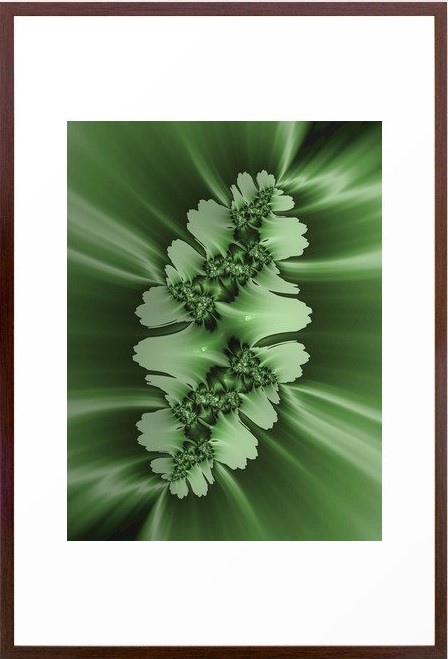
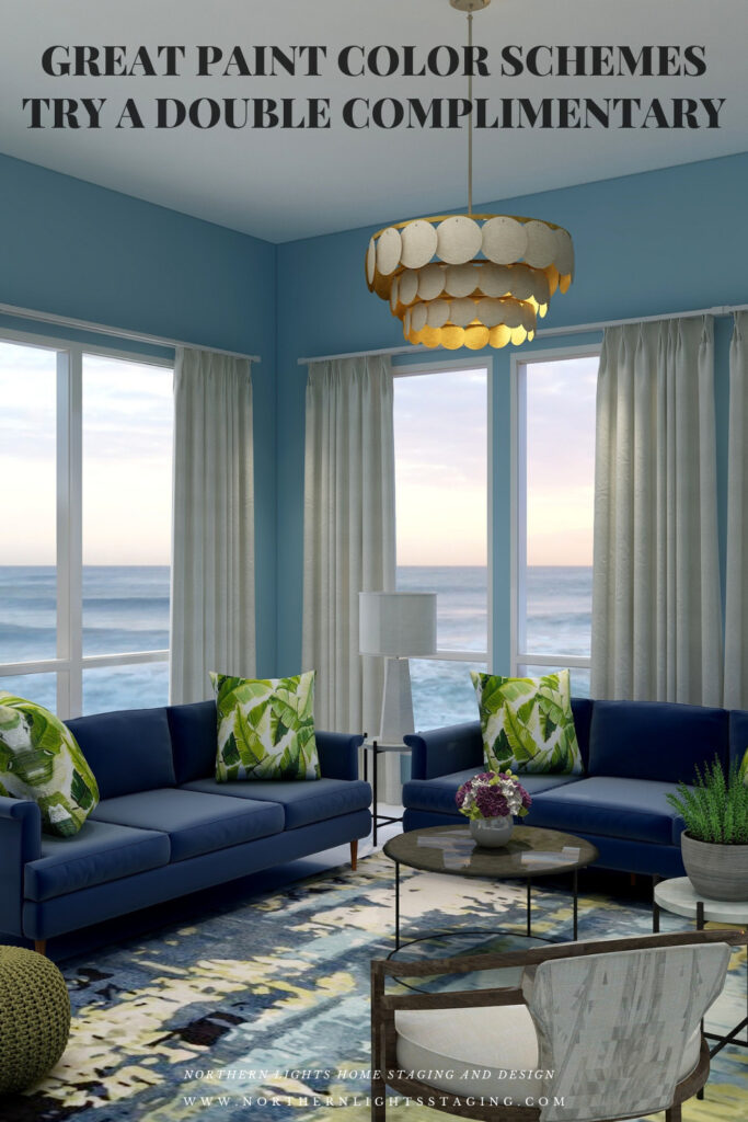
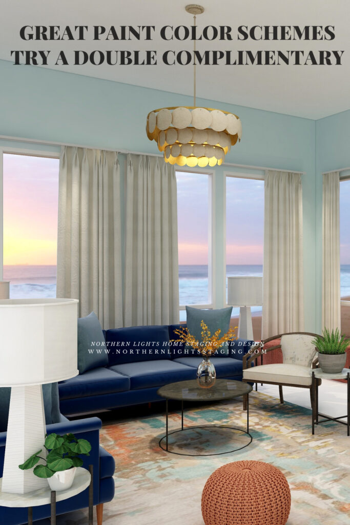
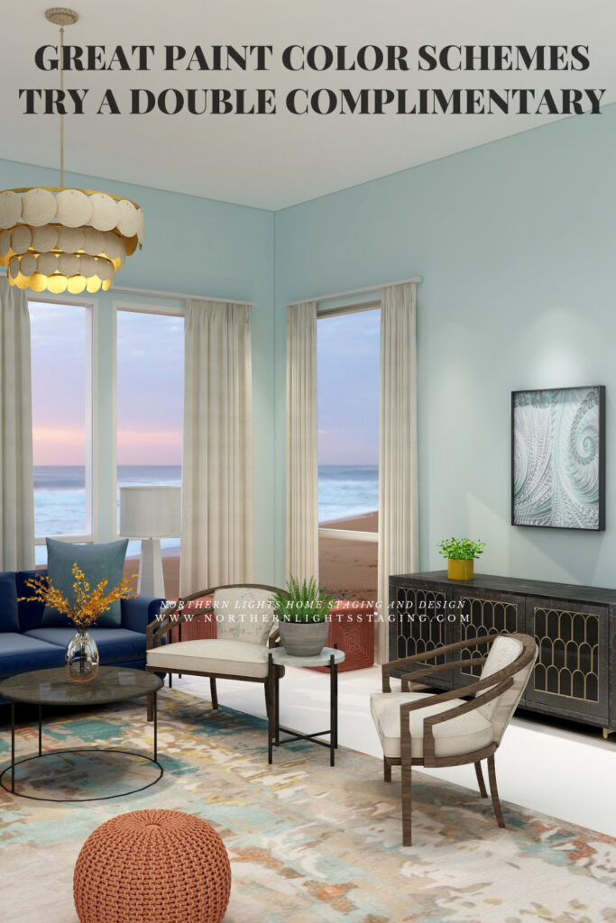
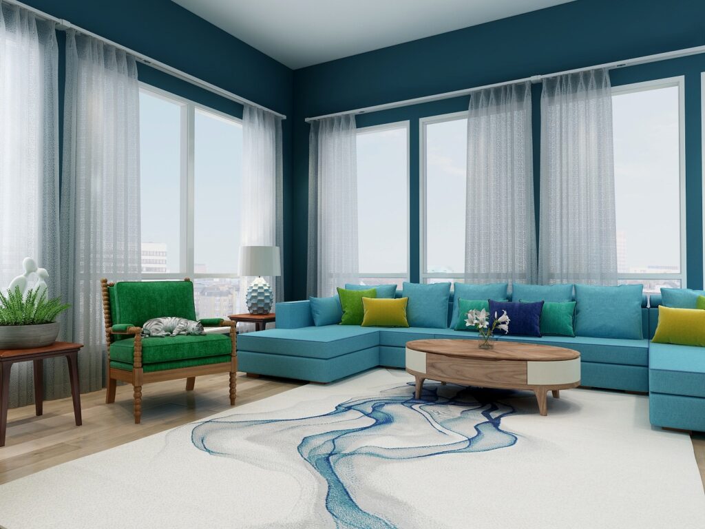
In this design I used the blue/yellow compliment pair in the sofas and the beautiful area rug. I used the green/yellow of the neighboring compliment pair in the area rug, pillows and my fractal art. I decided to bring in purple in small amounts as an accent, and used plants with purple flowers to highlight that color.
Double Complimentary Color Scheme. Edesign by Northern Lights Home Staging and Design. Double Complimentary Color Scheme. Edesign and Fractal Art by Northern Lights Home Staging and Design.
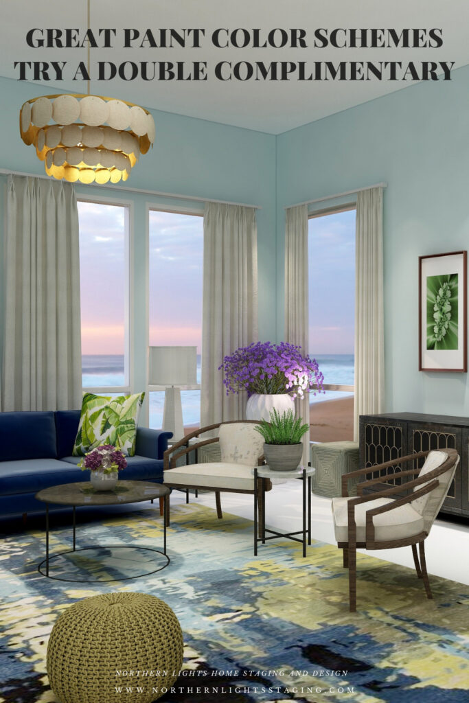
In the examples above, I created drama by using a more saturated shade of blue for the wall color. To create a more neutral look, I created a second version below where I used the same color but with very low saturation so it is almost gray.
Double Complimentary Color Scheme. Edesign by Northern Lights Home Staging and Design.
Shop the Look- Design 1
Check out the pieces I selected for this design. Some include affiliate links, meaning I receive a small commission for sharing at no additional cost to you.
My design also incorporates some of my unique fractal art from my “Spring” Collection.
Spring Fractal Art by Nofthern Lights Home Staging and Design Spring 2 Fractal Art by Northern Lights Home Staging and Design
Design #2
In this second design I used the blue/yellow complimentary pair again but this time worked with blue/green and orange. I found a beautiful area rug as an inspiration piece that has the blue, blue green, orange and a touch of yellow to tie everything together. I highlighted the orange in the 3 poufs. I used the blue/green in the pillows, the wall color and in my “Jenna” fractal art collection. The yellow I used as a small accent with flowers or flower vases.
Double Complimentary color scheme. Edesign by Northern Lights Home Staging and Design. Double Complimentary color scheme. Edesign and Fractal Art by Northern Lights Home Staging and Design. Double Complimentary color scheme. Edesign and Fractal Art by Northern Lights Home Staging and Design.
Shop the Look Design #2
Here is a closer view of my fractal art collection called “Jenna” which I created in honor of Jenna Gaidusek of the Edesign Tribe when creating something for her office with her favorite colors. In my design, the art is on canvas prints, but they are available framed or on a variety of materials as well as on other home decor in my store at Society 6.
Jenna Fractal Art by Northern Lights Home Staging and Design Jenna 2 Fractal Art by Northern Lights Home Staging and Design Jenna 3 Fractal Art by Northern Lights Home Staging and Design
Benefits of A Double Complimentary Color Scheme
A double complimentary color scheme is easy to put together using 4 colors. You can give all colors equal weight in the design for more drama, or make one or two colors more dominant based on the mood you want to create. The challenge will be trying not allow too many strong colors to compete with each other. Vary the saturation or better yet, the amount of the colors showing by making 1-2 colors as accents.
A double complimentary color scheme can be really dramatic or relaxing based on the saturation and placement of the colors you choose. Very nice for living rooms, dining rooms and areas that you like to entertain. You could try the more relaxing color combinations in a bedroom or office.
Create Beauty with Color in Your Space
EACH MOMENT IN LIFE IS YOUR CHOICE.
YOU HAVE THE OPPORTUNITY TO SURROUND YOURSELF WITH beautiful color RIGHT NOW.
Click on the picture to find out more about the best training class on color available, the Four Pillars of Color!.
Great Paint Color Schemes- Try a Split-Complimentary
People often struggle with creating a great color scheme. In my last few blog articles we discussed how you could take your favorite color, blue for example, and create different color schemes. We explored monochromatic, analogous, complimentary, diad, triad and tetrad color schemes. Today, lets look at a Split-Complimentary!
A double-complimentary scheme uses four colors which include two complimentary color pairings. It can be difficult to balance if you use all four colors in equal amounts it may feel like too much. You can use one to three colors as dominant colors and and let the rest be more subdued. By subdued, I mean you can use less of the colors proportionally. Or you could use less saturated versions of the colors so they don’t stand out as much, but color schemes tend to look more harmonious if you are using similar saturation or chroma levels. Here are some examples.
Let’s create a split-complimentary color scheme with the blue we have been working with in the last several articles. You can see this blue in the sofas.
Monochromatic Color Scheme Analogous Color SchemeAnalogous Color Scheme Complimentary Color Scheme Complimentary Color Scheme Diad Color Scheme Diad Color Scheme Triad Color Scheme Triad Color Scheme Tetrad Color Scheme Tetrad Color Scheme
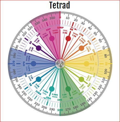
In a split complementary color scheme, you use a primary color such as our blue, and then the two analogous colors to its complement. In this case it’s compliment is yellow and yellow/red and green/yellow are next to yellow or analogous colors to yellow.
Split Complimentary Color Scheme Illustrations by Camp Chroma, the Best Color Training Ever!
The Design
With a split-Complimentary scheme we are working with 3 colors. We have a large variety of tints, tones and shades to play with within those colors, but it is always most harmonious if you work with colors with similar chroma (saturation). In other words it looks best if you are not mixing rich, bright colors with pastels. You can get dramatic or keep it more neutral based on the colors you choose. I find adding rich color to the walls creates drama, while using a more neutral wall color feels more relaxing.
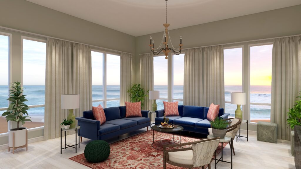
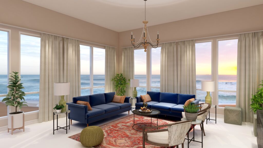
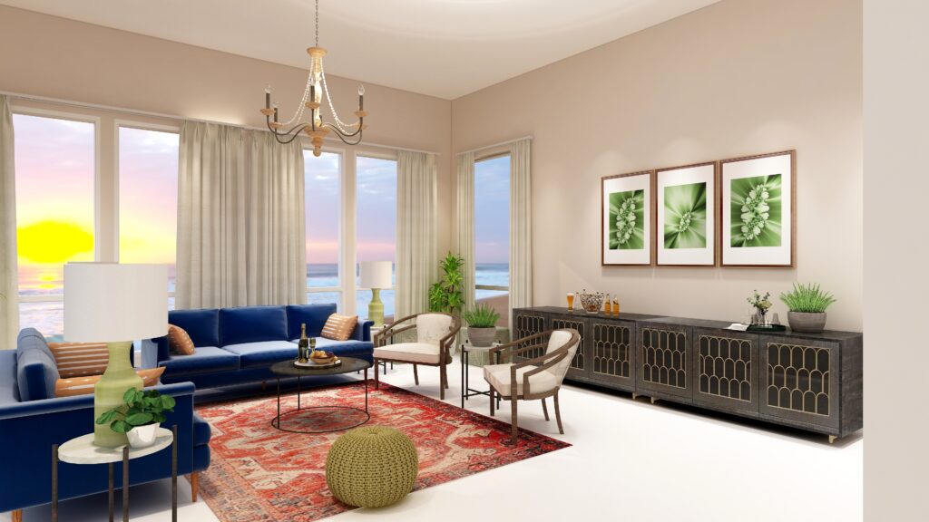
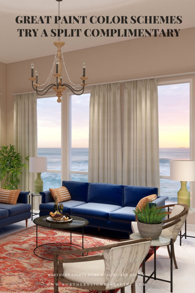
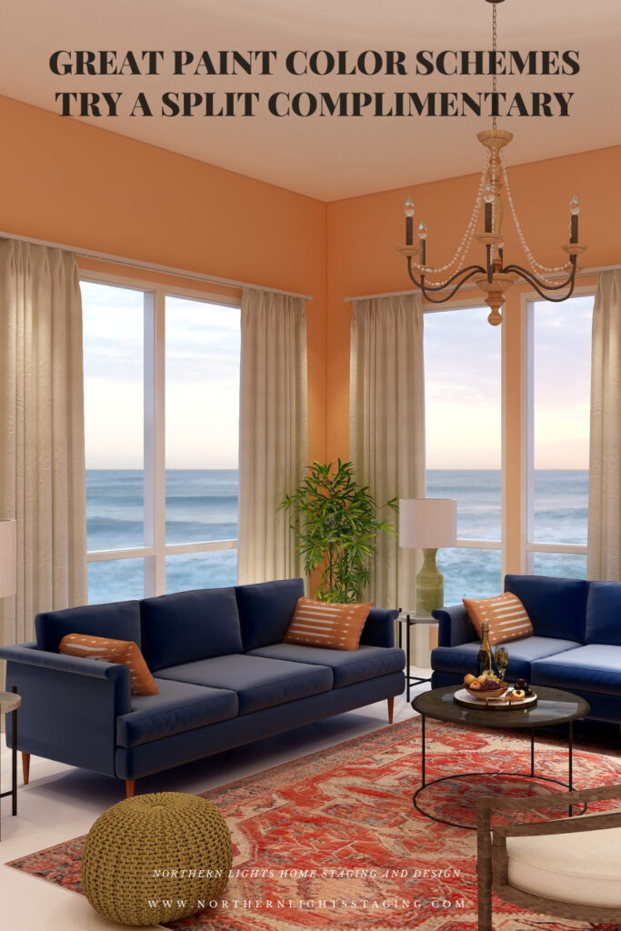
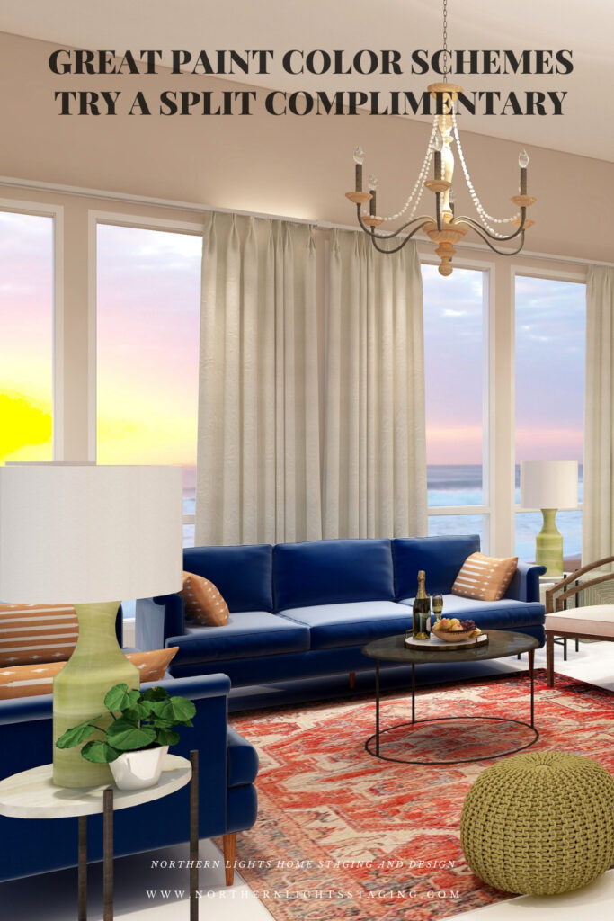
For example, below I created a split complimentary scheme with our blue sofas as the base color. I used red/orange in the rug, pillows and in the wall color where I used a very unsaturated, neutral tint of orange/red.
Split Complimentary color scheme. Edesign by Northern Lights Home Staging and Design.Split Complimentary color scheme. Edesign and Fractal Art by Northern Lights Home Staging and Design.
My design also incorporates some of my unique fractal art from my “Spring” Collection.
Spring Fractal Art by Nofthern Lights Home Staging and Design Spring 2 Fractal Art by Northern Lights Home Staging and Design
The design, although using 3 colors still feels fairly neutral and calm with some pops of color for excitement.
Shop the Look
Check out the pieces I selected for this design. Some include affiliate links, meaning I receive a small commission for sharing at no additional cost to you.
I selected pieces of various materials with different textures and patterns within the 3 hue families.
Design 2
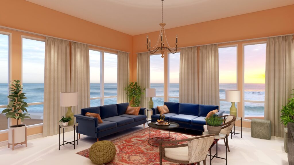
In this second version of the design, all I changed was the wall color, which is a more saturated or has higher chroma than the color I used in design 1. As you can see, it looks much more dramatic with the rich wall color.
Split Complimentary color scheme. Edesign by Northern Lights Home Staging and Design
Benefits of A Split Complimentary Color Scheme
A split complimentary color scheme is easy to put together using 3 colors. You can give all three colors equal weight in the design for more drama, or make one or two colors more dominant based on the mood you want to create.
A split complimentary color scheme can be really dramatic or relaxing based on the saturation and placement of the colors you choose. Very nice for living rooms, dining rooms and areas that you like to entertain. You could try the more relaxing color combinations in a bedroom or office.
Create Beauty with Color in Your Space
EACH MOMENT IN LIFE IS YOUR CHOICE.
YOU HAVE THE OPPORTUNITY TO SURROUND YOURSELF WITH beautiful color RIGHT NOW.
Click on the picture to find out more about the best training class on color available, the Four Pillars of Color!.
Great Paint Color Schemes- Try a Tetrad
People often struggle with creating a great color scheme. In my last few blog articles we discussed how you could take your favorite color, blue for example, and create different color schemes. We explored monochromatic, analogous, complimentary, diad and triad color schemes. Today, lets look at a Tetrad!
A tetrad uses four colors which include two complimentary color pairings. It can be difficult to balance if you use all four colors in equal amounts it may feel like too much. You can use one to three colors as dominant colors and and let the rest be more subdued. By subdued, I mean you can use less of the colors proportionally. Or you could use less saturated versions of the colors so they don’t stand out as much, but color schemes tend to look more harmonious if you are using similar saturation or chroma levels. Here are some examples.
Let’s create a tetrad color scheme with the blue we have been working with in the last several articles. You can see this blue in the sofas.
Monochromatic Color Scheme Analogous Color SchemeAnalogous Color Scheme Complimentary Color Scheme Complimentary Color Scheme Diad Color Scheme Diad Color Scheme Triad Color Scheme Triad Color Scheme
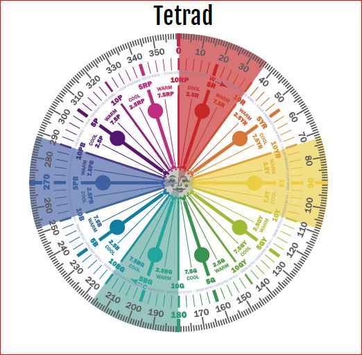
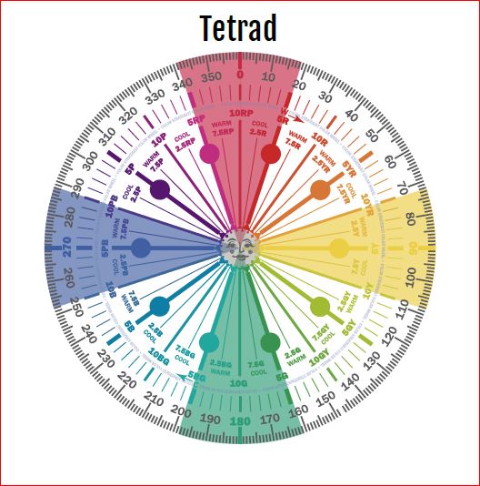
There are three different Tetrads we could choose from that use our blue (which is a blue/purple). For this article, lets work with the first two.
Tetrad Color Scheme Illustrations by Camp Chroma, the Best Color Training Ever!
The Design
With a tetrad you are using 4 colors and have a large variety of tints, tones and shades to play with within those colors. You can get dramatic or keep it mpre neutral based on the colors you choose.
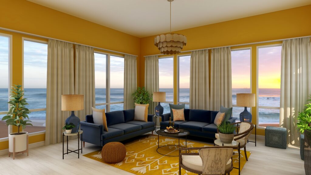
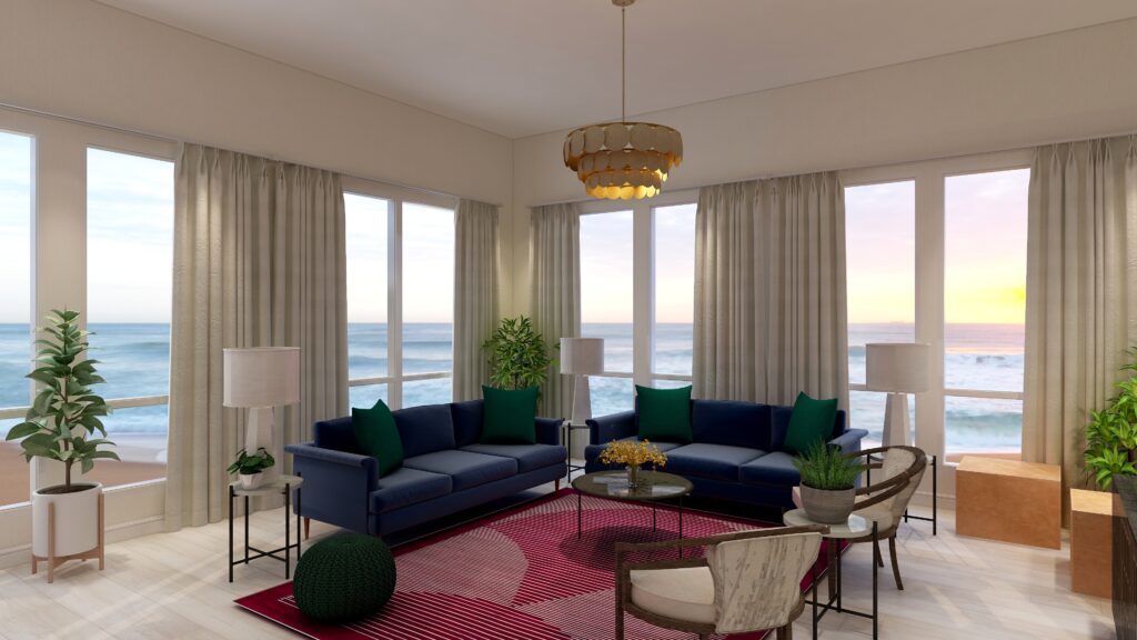
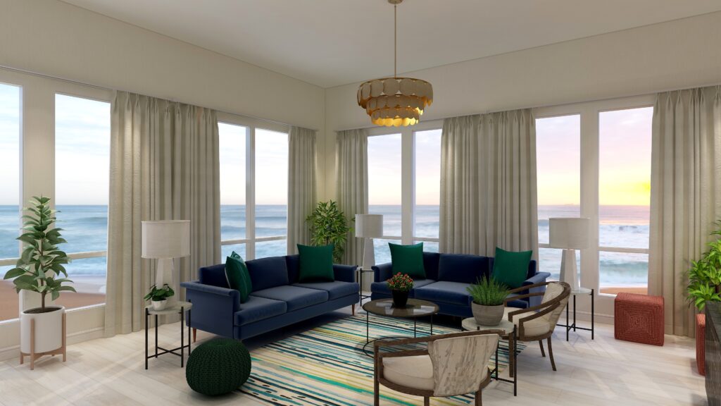
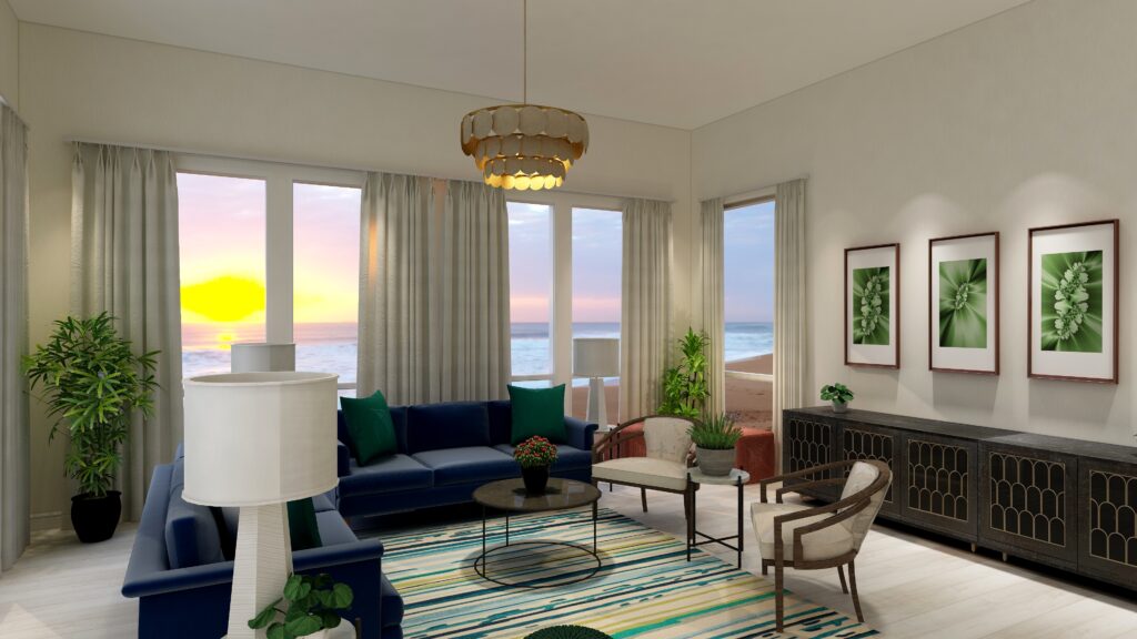
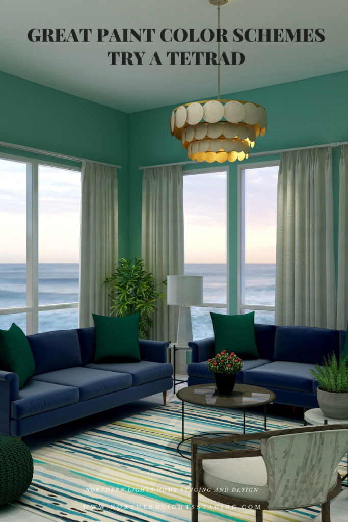
For example, below I created a tetrad with our blue as in the sofas as the base color. It’s compliment is yellow. I chose to use yellow in the wall color, in a a less saturated and lighter yellow than in it’s blue compliment to keep it more neutral. I also used yellow in the buff colored leather ottomans and an accent in the flowers on the coffee table.
The other pair of compliments are the red/purple and green. I used the red/purple in the area rug, and the green in the pillows, pouf and plants and the art.
The rest of the design I kept neutral with the white chairs, accent tables and lamps and plant stands.
Overall in this design the blue and red-purple are most dominant, followed by the green and with yellow mainly as an accent.
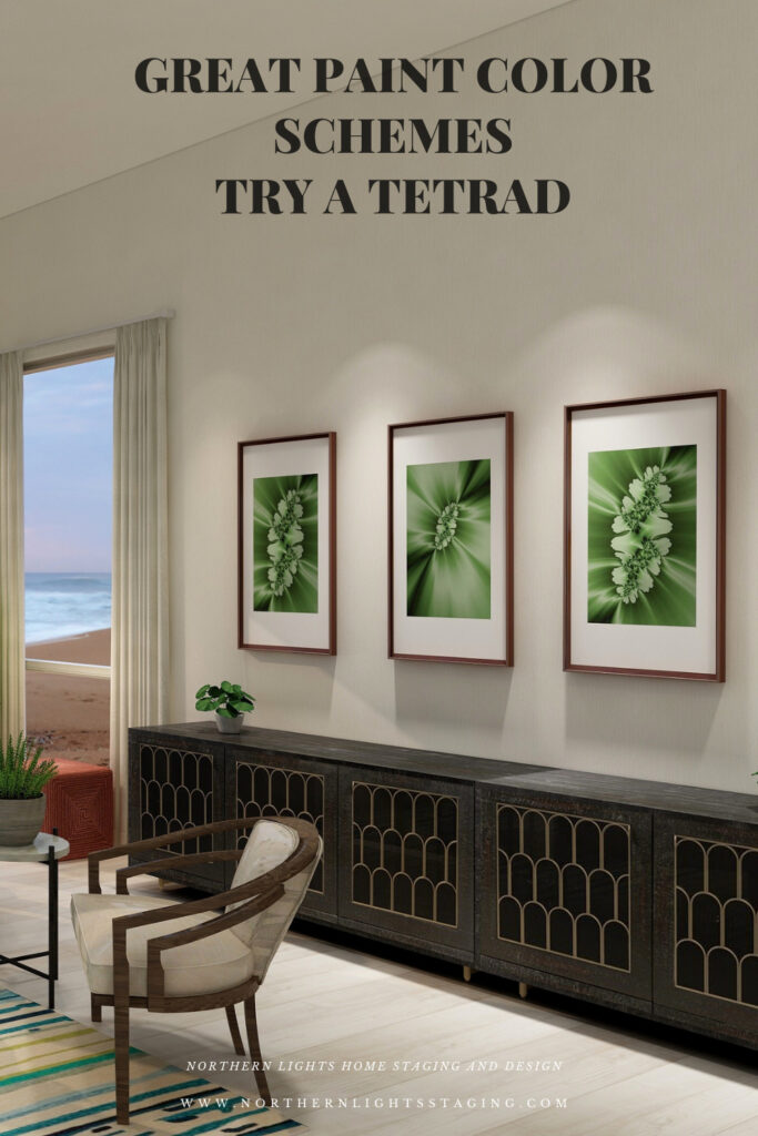
My design also incorporates some of my unique fractal art from my “Spring” Collection.
Spring Fractal Art by Nofthern Lights Home Staging and Design Spring 2 Fractal Art by Northern Lights Home Staging and Design
The design, although using 4 colors still feels fairly neutral and calm with some pops of color for excitement.
Shop the Look
Check out the pieces I selected for this design. Some include affiliate links, meaning I receive a small commission for sharing at no additional cost to you.
I selected pieces of various materials with different textures and patterns within the 3 hue families.
Design 2
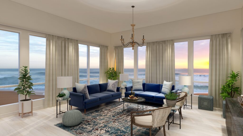
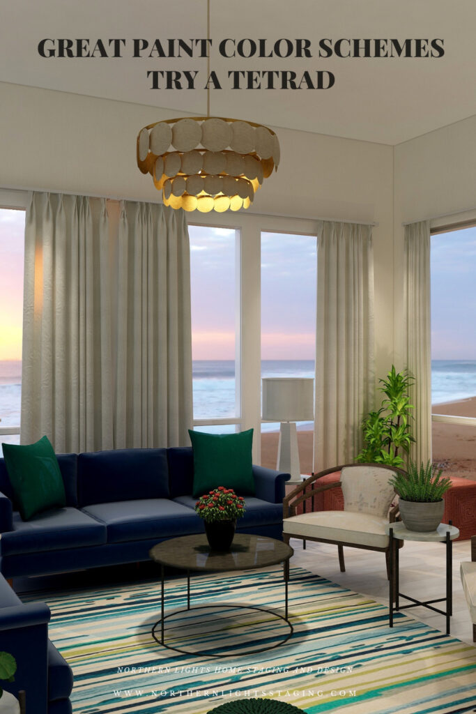
In this second version of a tetrad design, I once again used blue in the sofas and a soft neutral yellow paint color as it’s complement as in the first design.
I added the blue green from the second pair of complements into a new area rug (which also ties in the deep blue, yellow and greens). I maintained the green pillows and pouf and added the red in with the two ottomans and the flower centerpiece on the coffee table. As you can see, this time the red is just an accent, where as the blue, blue green and yellow are more dominant.
Tetrad color Scheme. Edesign by Northern Lights Home Staging and DesignTetrad color Scheme. Edesign by Northern Lights Home Staging and Design
The design, although using 4 colors still also feels fairly neutral and calm with some pops of color for excitement.
If you wanted to get more dramatic, you could pull in one of the 4 colors with greater saturation or chroma in the wall color as I did below. In this case, I used the blue-green and it changes the whole look and feel, even though everything else is the same.
Tetrad color Scheme. Edesign by Northern Lights Home Staging and Design
Shop the Look- Design #2
Benefits of A Tetrad Color Scheme
A tetrad color scheme is relatively easy to put together using two sets of complimentary colors. The tricky part is determining which colors you want to be more dominant, and balancing the rest so it is not overwhelming.
Tetrad color schemes can be really dramatic or relaxing based on the saturation and placement of the colors you choose. Very nice for living rooms, dining rooms and areas that you like to entertain. You could try the more relaxing color combinations in a bedroom, especially if you are using blues and greens.
You can play with this color scheme for different effects by how many colors you allow to be more dominant, and how much weight each carries in the design. Each color brings it’s own feeling to the space so highlight one over the others to get the mood you want.
Create Beauty with Color in Your Space
EACH MOMENT IN LIFE IS YOUR CHOICE.
YOU HAVE THE OPPORTUNITY TO SURROUND YOURSELF WITH BEAUTY RIGHT NOW.
Click on the picture to find out more about the best training class on color available, the Four Pillars of Color!.
Great Paint Color Schemes- Try a Triad
People often struggle with creating a great color scheme. In my last few blog articles we have discussed how you could take your favorite color, blue for example and create different color schemes. We explored monochromatic, analogous, complimentary and diad color schemes. Today, lets look at a Triad!
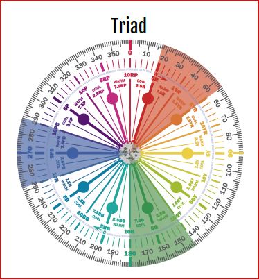
A triad uses three colors with the equal distance between all colors on the color wheel, causing no clear dominance of one color.
Monochromatic Color Scheme Analogous Color SchemeAnalogous Color Scheme Complimentary Color Scheme Complimentary Color Scheme Triad Color Scheme Triad Color Scheme
To create a triad with our blue (which is a blue/purple), we will add reds and greens.
A Triad- Created by Camp Chroma- The Best Color Training Ever.
The Design
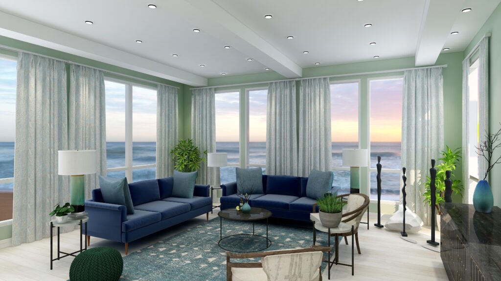
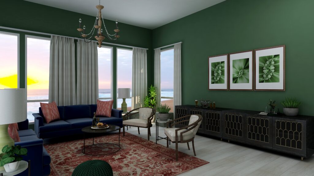
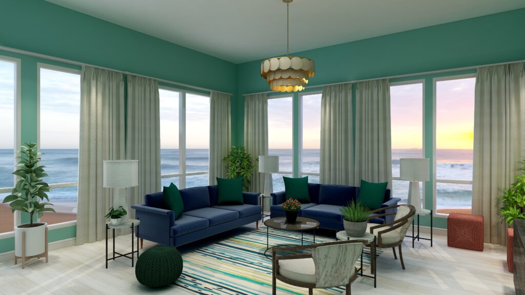
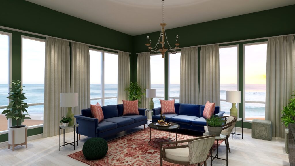
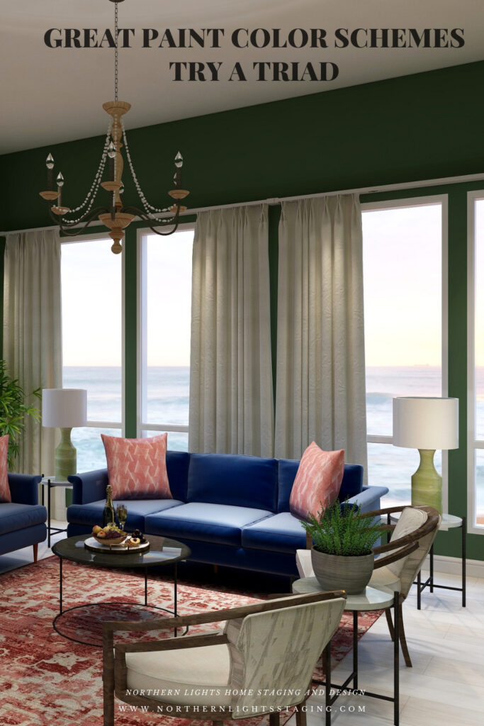
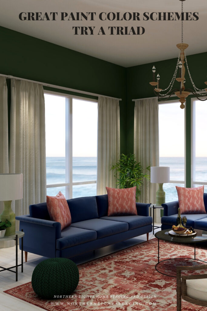
With a triad, you are using 3 colors and have a large variety of tints, tones and shades to play with within those colors. You can get dramatic or keep it simple based on the colors you choose. For example, below I created a triad with our blue as in the sofas as the base color and incorporating reds in the rug and pillows and greens in the pouf, lamps, art, plants and wall color. I used saturated colors from each of the hue families. The deep rich wall color creates a more dramatic look.
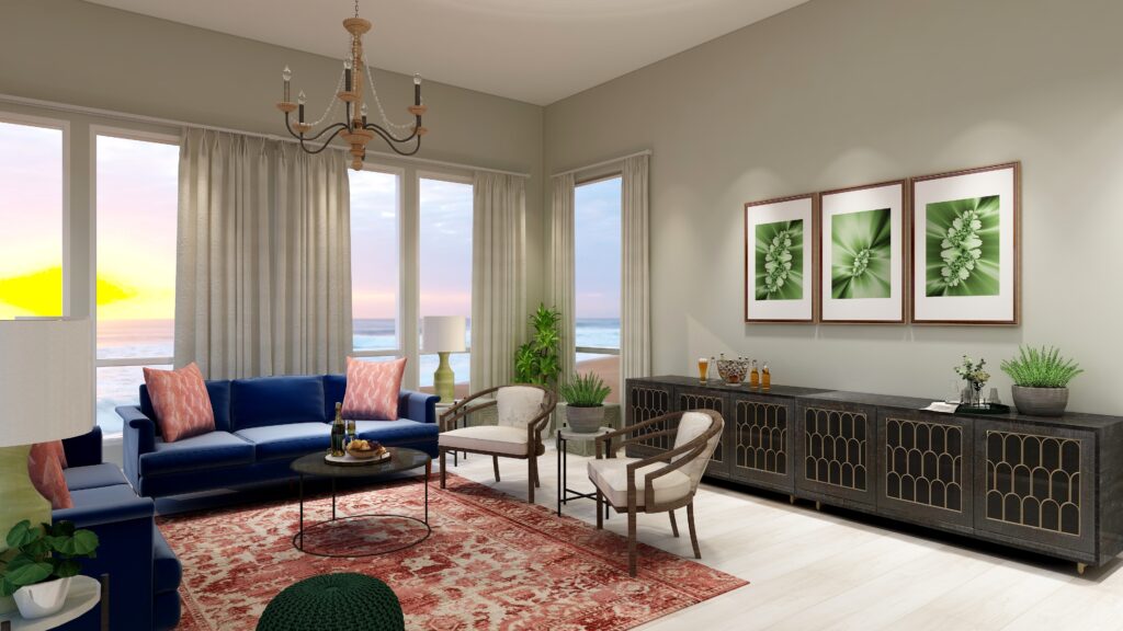
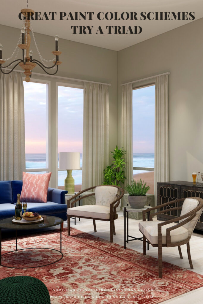
If drama is not your thing, you can tone it down by changing the saturation of the wall color. Below, the only thing I changed was the wall color, which is still green, but with such low saturation levels it is approaching a gray. This more neutral colored wall creates a more serene atmosphere.
My design also incorporates some of my unique fractal art from my “Spring” Collection.
Spring Fractal Art by Nofthern Lights Home Staging and Design Spring 2 Fractal Art by Northern Lights Home Staging and Design
Shop the Look
Check out the pieces I selected for this design. Some include affiliate links, meaning I receive a small commission for sharing at no additional cost to you.
I selected pieces of various materials with different textures and patterns within the 3 hue families.
Benefits of A Triad Color Scheme
A triad color scheme is relatively easy to put together. Pick your favorite color and find 2 neighbors, equal distant apart on the color wheel.
Triad color schemes can be really dramatic or relaxing based on the saturation and placement of the colors you choose. Very nice for living rooms, dining rooms and areas that you like to entertain. You could try the more relaxing color combinations in a bedroom, especially if you are using blues and greens.
You can play with this color scheme for different effects by having one color as the dominant color and the other 2 as accents, or give all colors equal weights. Each color brings it’s own feeling to the space so highlight one over the others to get the mood you want.
Create Beauty with Color in Your Space
EACH MOMENT IN LIFE IS YOUR CHOICE.
YOU HAVE THE OPPORTUNITY TO SURROUND YOURSELF WITH BEAUTY RIGHT NOW.
Click on the picture to find out more about the best training class on color available, the Four Pillars of Color!.
Great Paint Color Schemes- Do a Diad
People often struggle with creating a great color scheme. In my last few blog articles we have discussed how you could take your favorite color, blue for example and create different color schemes. We explored monochromatic, analogous and complimentary schemes. Today, lets look at Diad!
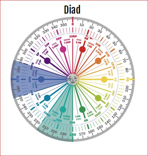
A diadic or diad color scheme uses two colors that are separated by one color on the color wheel.
Monochromatic Color Scheme Analogous Color Scheme Complimentary Color Scheme Complimentary Color Scheme
To create a diad with our blue (which is a blue/purple), we will add blue-greens. We could always go the other direction and work with red/purple. We will try that in a future article.
A Diad- Created by Camp Chroma- The Best Color Training Ever.
The Design
With a diad, you are only using 2 hues, but you have a large variety of tints, tones and shades to play with. You can get dramatic or keep it simple based on the colors you choose, and highlight textures and patterns.
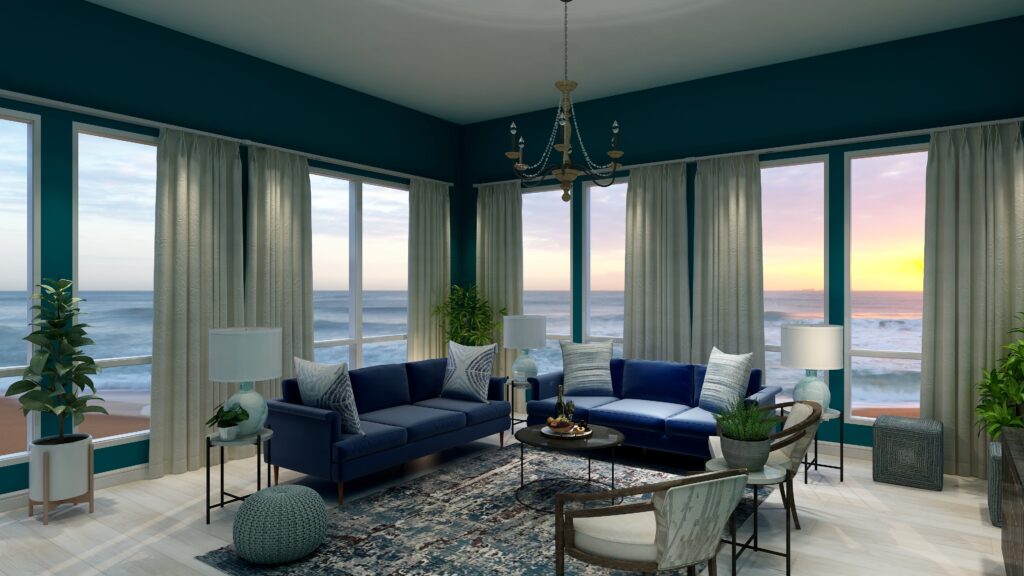
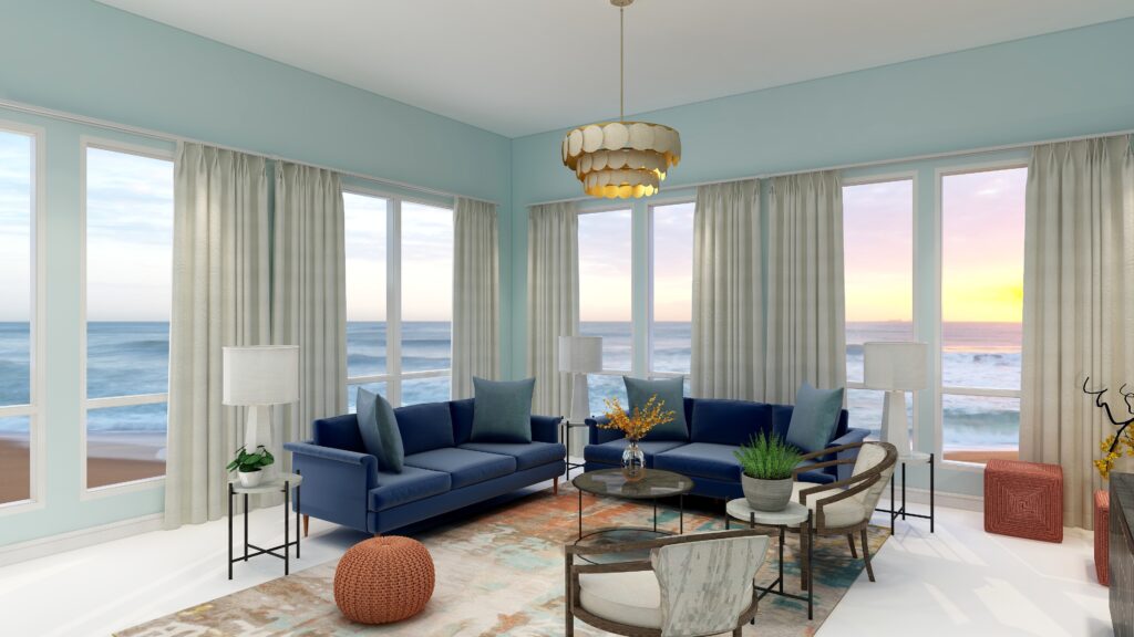
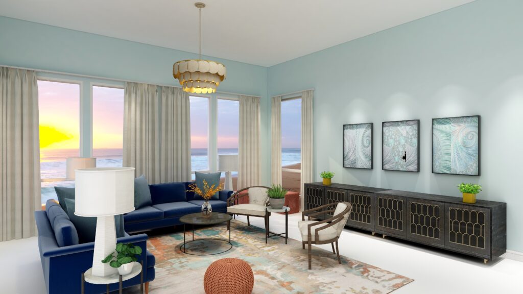
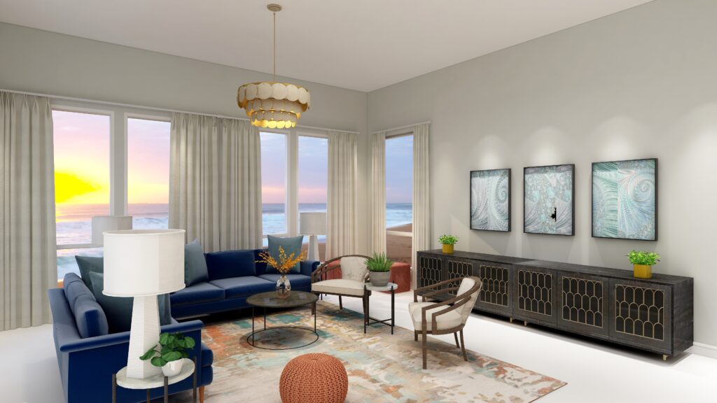
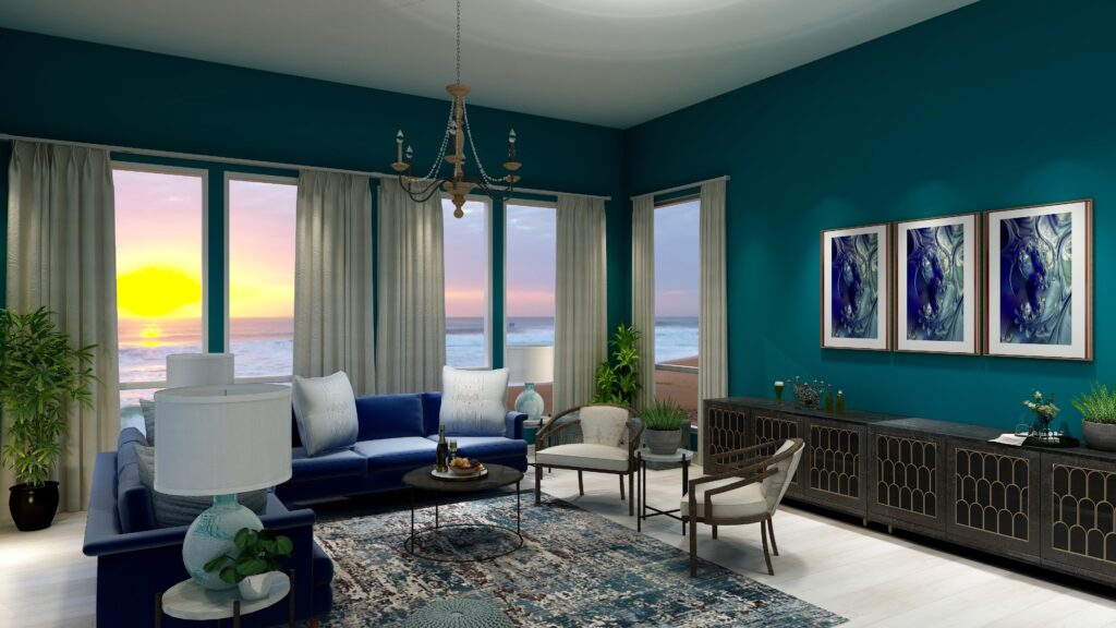
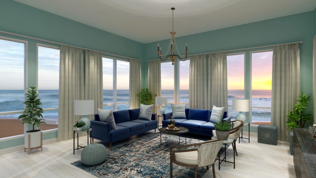
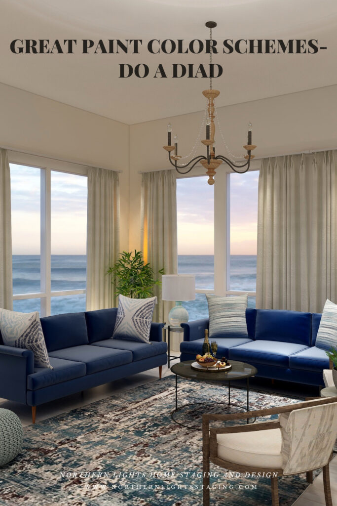
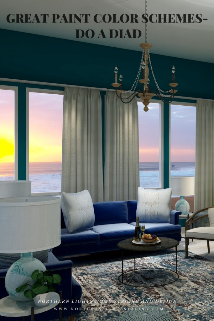
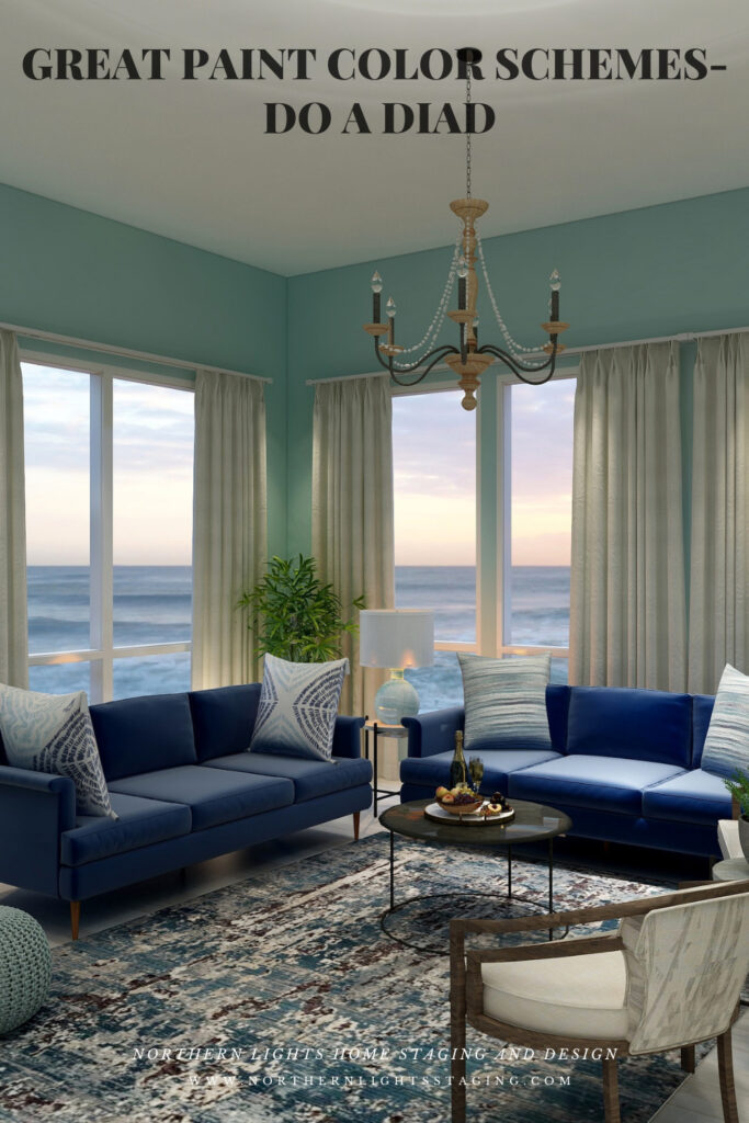
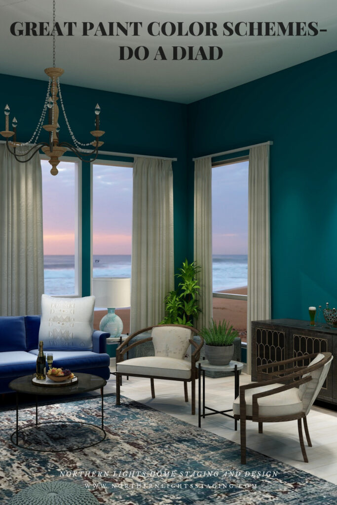
Below you can see the same design using various shades of blue/green paint and then “white flour”. The design is more dramatic with saturated wall colors and more relaxed with a neutral wall color.
Dark and dramatic diad color scheme. Edesign by Northern Lights Home Staging and Design.Dark and dramatic diad color scheme. Edesign and fractal art by Northern Lights Home Staging and Design.Light and airy diad color scheme. Edesign by Northern Lights Home Staging and Design.Neautral and serene diad color scheme. Edesign by Northern Lights Home Staging and Design.
Shop the Look
Check out the pieces I selected for this design. Some include affiliate links, meaning I receive a small commission for sharing at no additional cost to you.
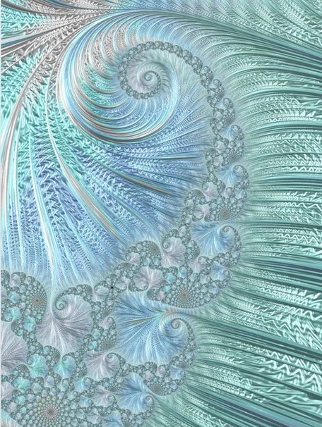
I selected pieces of various materials with different textures and patterns within the 2 hue families. The design includes my own original fractal art, called “Night Dive”. I called it that because it reminded me of what it looks like underwater when diving at night, and the magical colors and textures of the water.
Benefits of A Diad Color Scheme
A diad color scheme is relatively easy to put together. Pick your favorite color and find it’s neighbor, skipping one hue family on the color wheel.
Diad color schemes can be really dramatic or relaxing based on the saturation and placement of the colors you choose. Very nice for living rooms, dining rooms and areas that you like to entertain. You could try the more relaxing color combinations in a bedroom, especially if you are using blues and greens.
Diads are simpler color schemes, similar to analogous schemes that offer opportunities to highlight more texture and pattern in your design.
Create Beauty with Color in Your Space
EACH MOMENT IN LIFE IS YOUR CHOICE.
YOU HAVE THE OPPORTUNITY TO SURROUND YOURSELF WITH BEAUTY RIGHT NOW.
Click on the picture to find out more about the best training class on color available, the Four Pillars of Color!.
Tips for Converting Your Home into a Rental Property
When most people move into a new home, they sell their old property. But this isn’t your only option! If you want to skip the stress of marketing your home and negotiating with buyers—especially during the age of social distancing—consider turning it into a rental property. Converting your residence into a rental is a great way to get into the world of real estate investing and earn some passive income. Here are some tips and tricks to help you get set up and find your first tenants!
Make a Few Upgrades
Of course, before you can rent your home out to tenants, you will have to repair anything that needs fixing. One of your responsibilities is to provide a well-maintained property. After this, consider making some upgrades! For example, give the walls a fresh coat of paint, replace your plumbing fixtures, and if you have hardwood floors, get them refinished and polished. Think about lighting that gives the home a welcoming vibe. You might even want to make some home efficiency upgrades to reduce your utility bills. At the very least, Mashvisor explains that adding in-demand features to your property should let you charge higher rental rates!
If you’re going to be doing any major renovations, make sure you come up with the funding first. Cash-out refinancing could be a viable option, especially right now—the coronavirus pandemic has resulted in low mortgage rates! As PMUSA explains, cash-out refinancing involves replacing your existing mortgage loan with a loan of a higher amount and receiving the difference in cash. It’s common for homeowners to use this cash to make home upgrades, and with such tantalizing rates, you might want to strike while the iron is hot.
Protect Your Finances
Renting out property is always somewhat risky, even if you already own the home. Planning ahead will ensure your cash flow is secure. This is especially important given the financial uncertainty surrounding the virus! Start by estimating your monthly expenses and comparing these to your desired rental rate, remembering to account for hidden costs like emergency maintenance, insurance premiums, and vacancies. To get an idea of what you can charge for rent, look at the average rates for other rentals in your area, specifically for properties that are similar to yours.
It’s also important to update your insurance when you become a landlord. Allstate explains that your existing homeowner’s insurance won’t cover accidents, robberies, or disasters that occur in your rental, so be sure to protect yourself with landlord insurance!
Photo via Rawpixel
Consider Long Term versus Short Term Rentals
Consider whether you want to do a short-term rentals such as vacation rentals, or a long term rentals for housing. Short term rentals require more work and time on your part but may give you a higher return per night and more flexibility to list your home for sale when the time is right. Short term rentals will like need to be designed and furnished to attract your ideal renters. Long term rentals may be more appealing to renters but offer you less flexibility when you want to sell.
Start Looking for Tenants
When you’re finally ready to look for tenants, start with a good rental listing. Write a catchy headline, include several quality photos, and list any information potential renters might want from you regarding the rental rate, security deposit, amenities, parking situation, move-in date, pet policy, and utilities.
Before signing a lease, make sure you screen your potential tenants thoroughly. Dealing with bad tenants is expensive and incredibly stressful, so you want to take all possible precautions to avoid issues. Some important steps in the screening process include running a background check, verifying the tenant’s income, and calling their previous landlords.
Create a Management Plan
Many first-time landlords don’t realize just how much work it is to manage a rental property. You will have to create lease agreements, collect rent, perform regular maintenance, and deal with all of the financial aspects of renting out a home. On top of all this, you must be prepared to respond to tenant concerns and requests at any hour. If you have the budget for it, hiring a property manager will take a lot of these responsibilities off your plate. Your property manager can even help you set your rental rates and find tenants!
If you’re hesitant to put your home on the market during the coronavirus pandemic, consider renting it out instead! Renting out your home can be an exciting and rewarding endeavor, especially if you want to try real estate investing. Take the right steps to prepare your rental and you’re sure to enjoy success!
Need Help Getting Your Rental Property to Stand Out from the Crowd Online?
Whether you are putting your home on the market, or renting it as a vacation or other rental, home staging and a color consultation can help you. Make sure your property stands out from the crowd and has great photos to attract your ideal renters, guests or your target buyers.
Prices subject to change without notice. This post may contain affiliate links.
Follow My Home Staging , Design and Color boards on Pinterest
Today I Had a Moment I Will Always Remember
Today I had a “moment” I will always remember.
I started the day feeling a little depressed. The stock market has been insane and my retirement funds…well I basically just stopped looking.
My Bed and Breakfast got it’s first cancellation, and I expect many more to come. Not sure how my design business will fare.
People are freaked out and have cleaned out the stores of hand sanitizer, hand wipes, chlorox and toilet paper. What? I just don’t get the toilet paper thing. Then my 90 year old mom told me why. “When 1 person sneezes, 300 people crap in their pants”. Haha, apparently her pastor told her congregation this nugget of wisdom at church today. Now I get it:) Luckily, I have plenty of TP.
I decide I will have a positive day and get outside in the fresh air and not allow myself to dwell on fear, negativity or the virus. I decide to go on a gray whale watching trip in Kenai Fjords National Park adjacent to Seward, Alaska where I live.
The boat is fairly empty, and people spread themselves out in the booths, trying to maintain 6′ apart. I find a booth where I sit alone, after wiping off the table with the Lysol wipes in my backpack. It is a gorgeous sunny, cold day. As we head out, we see some bald eagles and sea otters. Then some Dall’s porpoises came to play next to the boat. They are super cute and look like mini Orcas.
Dall’s Porpoise. Photo by PIXNIO
Soon we see a large group of Orca whales. Some had calves. The males have extra tall dorsal fins. I see a mom with 2 babies and the male swimming behind them. A picture of a happy family.
Mother Orca with 2 babies, and the male trailing behind. Photo by Northern Lights Home Staging and Design
Then I luck out and an Orca (adult female I think) swims up close to the boat to model for me, and then swims under the boat!
Female Orca. Photo by Northern Lights Home Staging and Design
The Orcas are everywhere and I enjoyed watching this male swimming alone in the beautiful light.
Male Orca. Photo by Northern Lights Home Staging and Design
We weave in and out of harbors I had not been to, and around various islands. We see a magic cove that has caves that cormorants like to nest in. We go by an area where a group of Harbor Seals have hauled out on a rock.
A group of Harbor Seals. Photo by Northern Lights Home Staging and Design.
They feed us lunch, and later hot chocolate chip cookies fresh from the oven. The scenery is beautiful, the air is fresh and clean and it is a bluebird day filled with amazing wildlife.
As we head in to port, once again there is cell phone coverage and an email pops in. I shouldn’t look, but I do. I get a message I find very upsetting. My eyes tear up a little as I read it. I decide to close it and save it for later, not wanting to ruin the day. After leaving the boat, while still on the dock, I see a cute sea otter, just hanging around and eating. Sounds like a good plan and I wonder if I have any chocolate at home:)
Sea Otter. Photo by Northern Lights Home Staging and Design.
I head to my car, and as I reach it, it happened. My moment. A total stranger, a younger woman who had been on the boat in a nearby booth approaches me.
“Can I give you a hug? I saw you tear up on the boat and thought maybe you needed one”.
I thank her, and tell her I am OK and we “elbow bump” instead.
When I got home, I could not stop thinking about this. That someone would notice a total stranger feeling a little upset and then even during these times of social distancing want to say something and offer a hug was moving. The kindness of strangers is a powerful thing.
While some are out there hoarding toilet paper and price gouging, others are taking the time to connect and come together, even at risk to themselves.
I felt the need to share the experience so put a blurb about it on my personal Facebook page. I received more likes and comments on this than anything in recent memory. It also spurred a lot of concerned emails checking to make sure I was OK from good friends as well as acquaintances.
Kindness is apparently as contagious as the virus.
That really made my day, and I hope by sharing it with you, it will make yours too. Let’s be kind and take care of each other in the difficult times ahead.
Mary Ann
Feeling Stressed? Make Some Magic Happen in Your Home- You’ll Feel Better.
Art Inspired by the Ocean in Alaska
See my fractal art designs for home decor and clothing. Custom designs available.
Staying Healthy and Happy During this Difficult Time
During these uncertain times, it is likely we are going to all be spending more time at home. Whether that is working from home or spending leisure time there rather than going out, it may be the best way to stay safe and healthy for now.
If you have not spent much time at home before, you may be looking around and thinking, wow, I wish my home looked or functioned better! I wish it was more comfortable, cozy, more of a sanctuary or an easy place to work from.
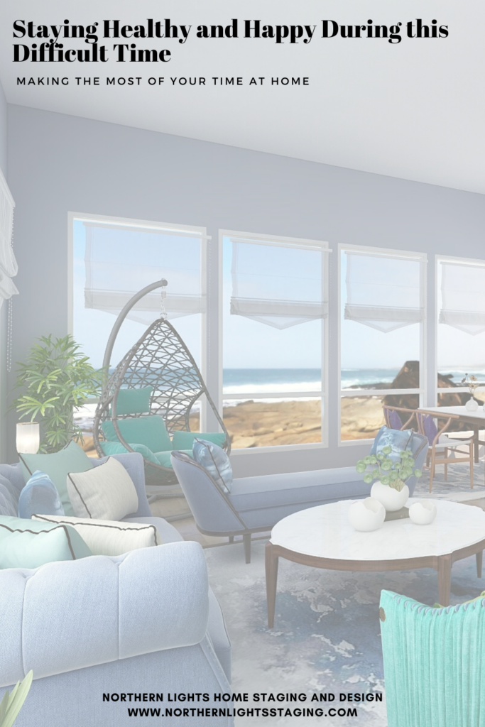
Create a sanctuary at home. Edesign by Northern Lights Home Staging and Design.
Think of it this way. Maybe it is the perfect time to do some updates or projects to create your perfect sanctuary. All those projects or ideas that you have meant to do but didn’t have time for. Why not now.
It could be painting an interior room, re-organizing, redecorating or refreshing a room or series of rooms. Maybe updating your office space so that it is more beautiful and works better for you.
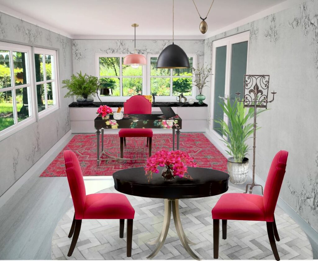
Create the perfect office space to work from home. Edesign by Northern Lights Home Staging and Design.
Maybe it is a great time to set up a workout area to stay healthy and avoid the gym. Maybe set up a place to meditate and relax or listen to music. How about an entertainment area to watch movies or play games? A reading nook with a window seat? Update your kitchen or dining area and do more cooking and entertaining at home with your family.
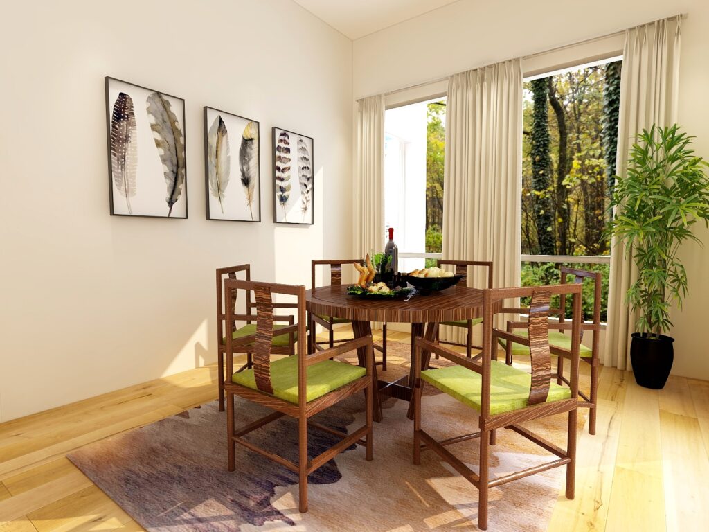
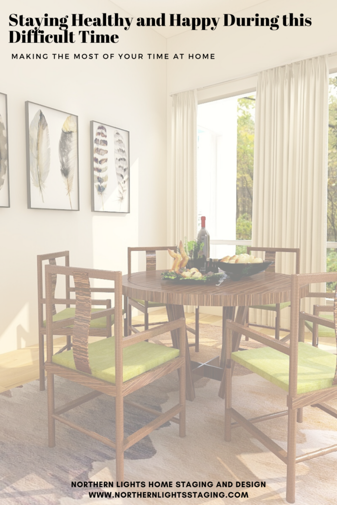
Update the look of your kitchen or dining area and do more cooking and entertaining at home. Edesign by Northern Lights Home Staging and Design.
How about a craft room to start working on those projects you have put off forever or to learn a new art form you always wanted to try? How about a great outdoor living space to relax, read, get fresh air or get more connected to nature. How about starting a garden or working on your landscaping? Why not update your décor so it is more healthy and eco-friendly? Take an online course, learn a new language, start a blog or research a future trip.
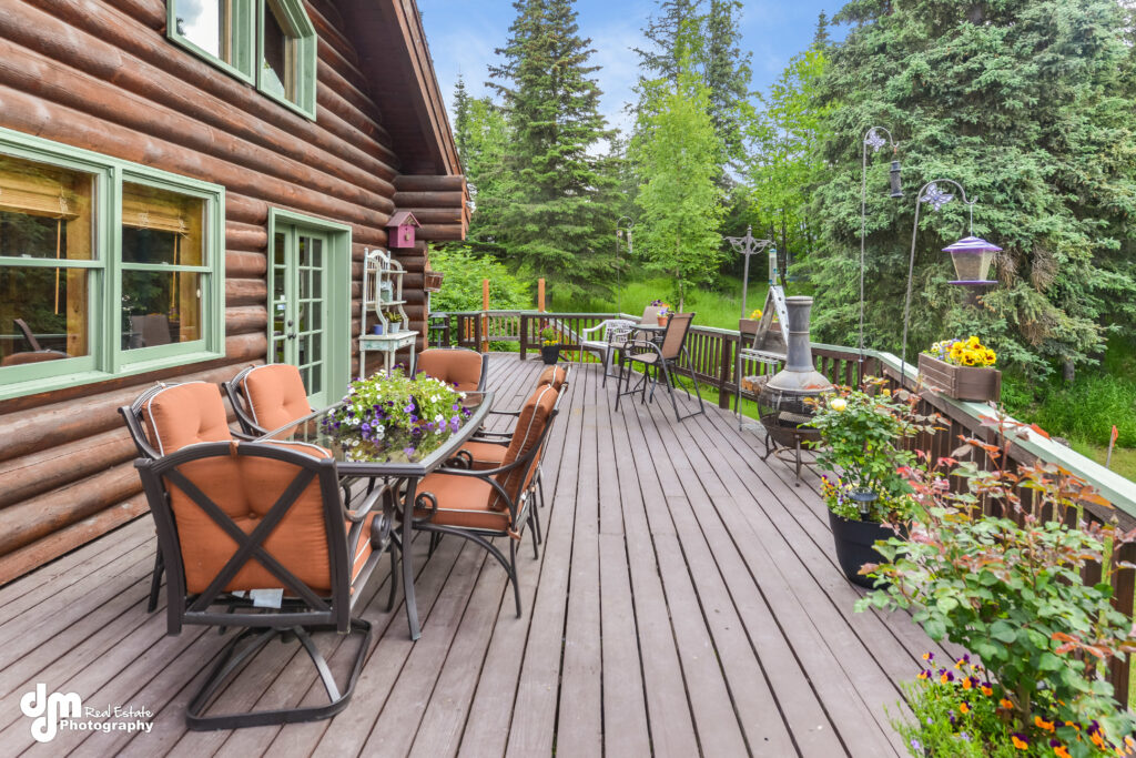
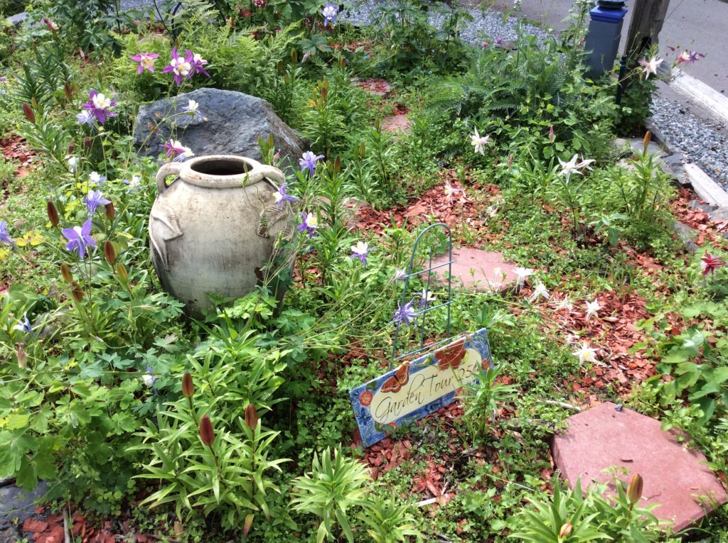
Create a great outdoor living area. Home staging by Northern Lights Home Staging and Design. Grow a garden. Photo by Northern Lights Home Staging and Design. Connect to nature. Photo by Northern Lights Home Staging and Design.
While social distancing is one way to stay healthy, we are still all connected online and can enjoy each other on Facebook, Instagram, Twitter, through Skype or Zoom calls or Facetime.
This too shall pass; we just don’t know how long before that happens. So, why not make the most of the extra time we may have at home and do something productive or make our surroundings more beautiful and fun.
This too shall pass. Photo from Unsplash.
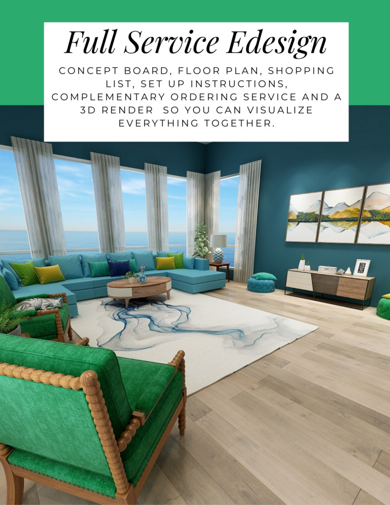
If that idea appeals to you, you might consider Edesign as an option to work online with a designer to come up with great ideas to refresh a room or your whole house. Create the perfect sanctuary or a home office. You can take the ideas from your designer and implement them yourself while ordering everything you need online. Check out my Edesign services and let me know if I can help.