What message does your home’s color broadcast to the world? Every facade tells a story about its inhabitants. Is your home a reflection of your personality? Does it uplift your spirits daily? Does it warmly welcome guests or potential clients for those with home businesses? And if you’re selling, does your home appeal to prospective buyers? The hue of your home reveals hints of your identity.
When it comes time to paint the exterior, you have a lot of options and some limitations you need to consider.
Limitations when Picking Paint Colors
Let’s start with the limitations. Just as with the interior, you need to consider the “fixed finishes”, the things which rarely change like the roof or stone features. Your wall and trim colors should complement these fixed finishes and each other.
Consider your Environment
Consider your surroundings when choosing colors. Ensure they complement your landscape and local views, and fit within the neighborhood’s color palette. While a vibrant hue might stand out in a neutral area, it could blend perfectly in a more colorful neighborhood.
Consider Guests and Clients
Do you run a business from your house, such as a vacation rental? What image will the colors project to your customers? Is it consistent with your brand? You may be using photos of your house to attract customers online. Will the photos attract your ideal customer?
Selling your Home? Consider the Buyer
Are you selling the home? Consider more neutral shades to appeal to a broader audience. However, a standout front door color can make it memorable and can be easily changed if the buyer prefers.
Make a Statement with your Front Door Color
Your front door color sets the tone for your home. Even neutral homes can pop with a vibrant door. Everyone perceives and feels about colors differently. Consider what emotions a color evokes for you. Do you want your home to relax, uplift, or energize you? Choose colors that reflect your desired ambiance.
Consider how Color Affects Your Home's Comfort
The colors you choose can impact costs and practical factors. Dark colors might need more paint layers if covering a light base and can absorb more heat, potentially making deck areas too warm in the sun.
Consider how Color can Affect Your Home Based Business
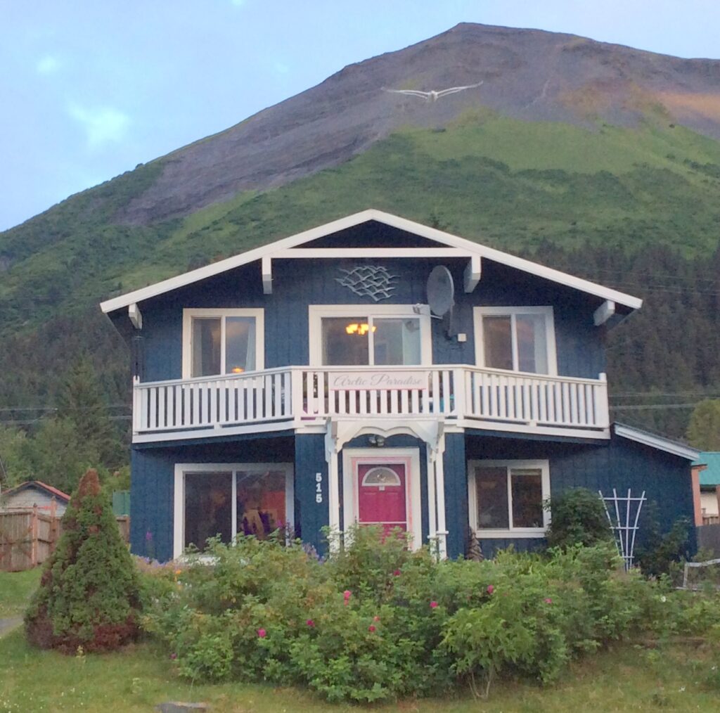
I provided a color consultation for a Bed and Breakfast located in a residential area. The aim was to design a welcoming exterior that resonated with the mountainous and oceanic surroundings and blended with the neighborhood’s mix of homes. The garden was dominated by colorful flowers, especially fuchsia rose bushes. The house had a blue roof and no other fixed elements. I had previously enhanced the interior of this B&B, which increased their bookings and revenue. The target clientele were retired professionals keen on outdoor adventures, wildlife, bird-watching, and art. The brand was vibrant, luxurious yet earthy with a coastal style, reflecting its proximity to the ocean.
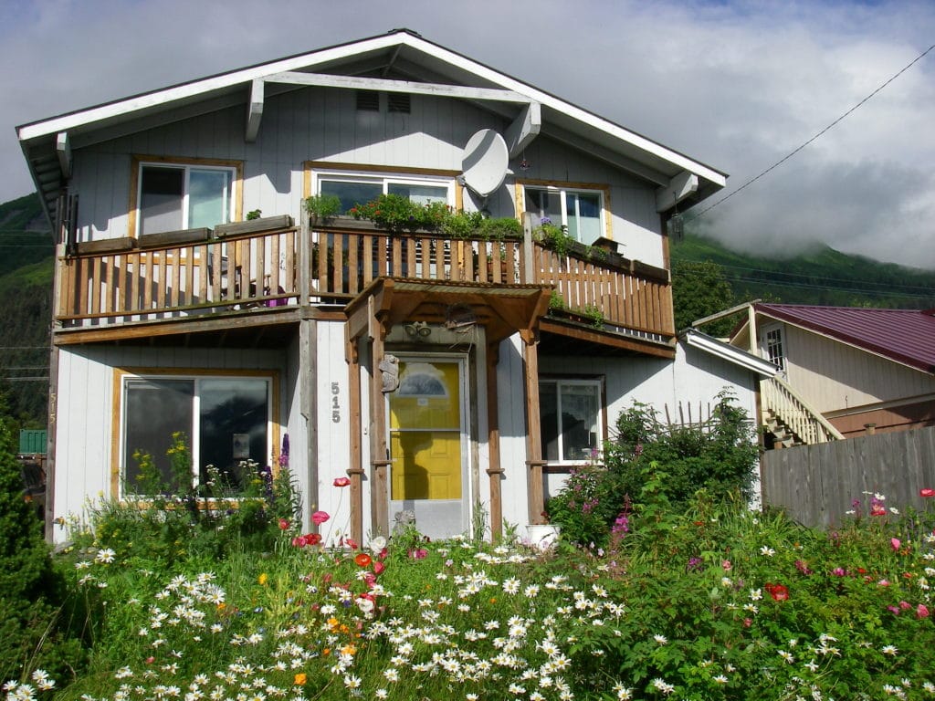
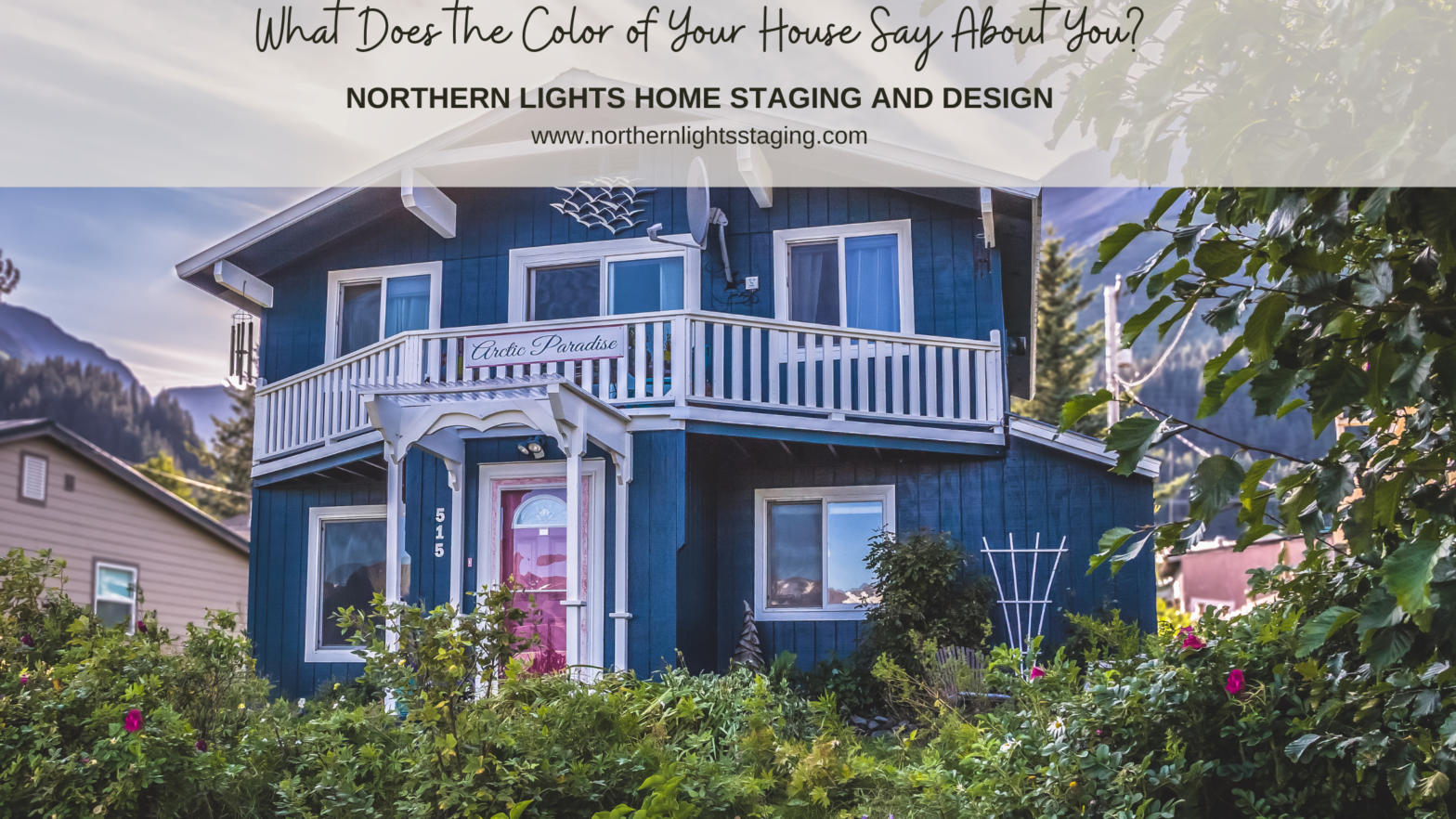
A rich teal (Sherwin Williams Moscow Midnight) was chosen for the walls to complement the roof, nearby mountains, ocean, and the neighborhood’s blue-toned homes. This deep shade enhanced the garden’s vibrant flower colors and matched the local greenery.
The trim was painted a warm white (Sherwin Williams Alabaster) to accentuate the teal and echo the natural hues of clouds and snowy peaks. The cedar trim and decks were transformed from their natural color to white for a more cohesive look and to ensure the upper deck remained cooler. This white backdrop makes colorful outdoor furniture and plants stand out, creating a peaceful retreat.
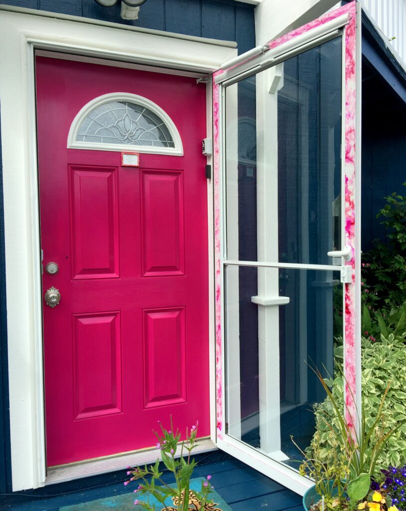
The front and back doors were painted in Forward Fuchsia, echoing the roses outside and offering a welcoming and distinctive entrance.

A sign with a trim-colored background and wall-colored lettering was designed, featuring two fuchsia lines. This subtle sign complements the balcony and discreetly showcases the business name in the residential area. A white metal sculpture of sea gulls, aligning with the brand’s wildlife viewing theme, was placed near the home’s peak.

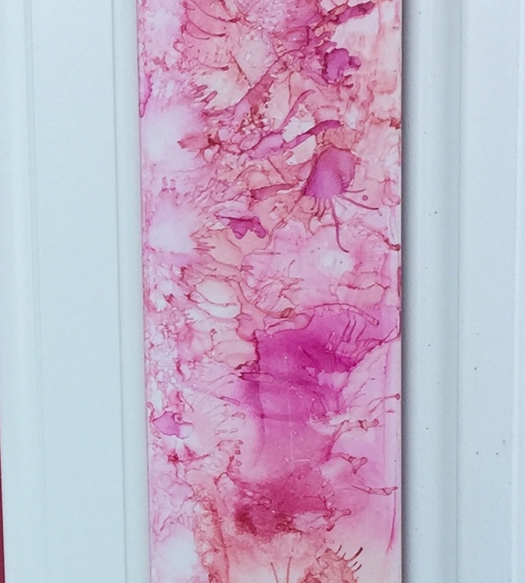
A new white screen door with full glass was added to showcase the vibrant fuchsia door. Its border features a distinct alcohol ink design, mirroring the door’s colors and emphasizing the brand’s artistic flair. The outdated brass doorknob was swapped for a stylish satin nickel one.
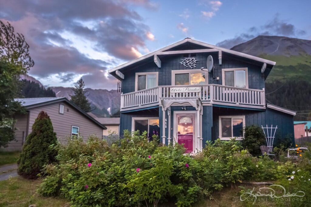
Feedback on the new look has been overwhelmingly positive, with descriptions such as “bright”, “cheerful”, “artistic”, and “the most charming B&B in Alaska”. This refreshing transformation has even inspired neighbors to consider updating their own homes, potentially revitalizing the entire neighborhood.
The harmonious trio of colors was meticulously chosen using both artistic intuition and color science, ensuring they complement each other perfectly. If you’re thinking of repainting, consider consulting a certified color strategist. Choose colors that truly resonate with you and leave a lasting impression on everyone who sees them.
Are you ready to paint your house?
Get a color consultation today and get your colors right the first time so you avoid making costly mistakes and really love the end result. I can work with you wherever you live with an online consultation. Learn more.

Aligned Design- All Rights Reserved.
Terms of Service | Privacy Policy | Disclaimer | Brochure
Prices are subject to change without notice.
Call 907-362-0065 today


Now I’m curious what my house color says about me! What a fun transformation, Mary Ann!
Thank you Shelby! Our houses really do have a way of telling our secrets:) Just like with the inside of the house, we see it everyday and often don’t think about the impressions others have of us by our selections.
Love the deep teal and hot pink together! What a great combo! I know what my current color says about me, it says lazy… it’s still the ugly yellow-beige color it was when bought it 18 months ago. I want it to be a very light spa blue and cream with faux wood on the garage and front door… but I haven’t gotten around to it yet! LOL! Nice post Mary Ann!
Hahaha! Thank you Julie. That color combination sounds beautiful!
Such a pretty color combination! And WOW the before and after pics really emphasize the importance of color in branding! Beautiful job!
Thanks Janet! Yes, color can make a huge difference in branding for any business and how your customers feel. Thanks for reading!
Great advice! From the color of the walls to the door color! A pop of color on a door can be so friendly and inviting. Love the transformation of the B&B. So pretty now!
Thanks Lisa! I see so many houses where I think if only they had an interesting front door color it could transform the way the whole house looks! And it is such a simple and affordable way to make a big difference!
Mary Ann, what an amazing transformation of this Bed and Breakfast! That gorgeous front door colour is so cheerful and inviting.
Thanks Sheri, I think it is the only door that color in town and it definitely looks inviting! The perfect feeling for a Bed and Breakfast.
MaryAnn:
I really love the bright pink door and can only imagine how welcoming it is in those dark Alaska days to those who rent this Airbnb!
Thanks for the education about color, too!
Thank you Leslie, it really is a great color for Seward Alaska, as most of the older houses in town have the same rose bushes in front of the houses. The Sitka roses are one of the few that grow really well here, so the color is everywhere in the summer. Our native roses that grow in the forests are a lighter version of this color and many people have those as well. A nice color to tie to our Alaska landscape.
Holy cow Mary Ann! The after color transformation is beyond fabulous! I love your boldness in color but yet still classic in it finished result. Only a color expert like yourself would do the pink door and storm door alcohol paint trim(this is new to me).
Very very impressive post that I really appreciated in its depth of knowledge and advice. Thank you!
Thank you so much! The pink door and the alcohol ink accent was a first for me as well but I loved the end result.
A poppin’ front door color always reminds me of bag end from Tolkien’s the Hobbit. I wonder how much the bright green door was a status symbol in the shire. Awesome post!
Haha! I bet it was! Thanks for reading.