Birds provide endless inspiration for creating beautiful designs with the intricate patterns, colors, and textures of their feathers!
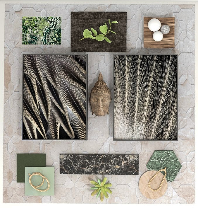
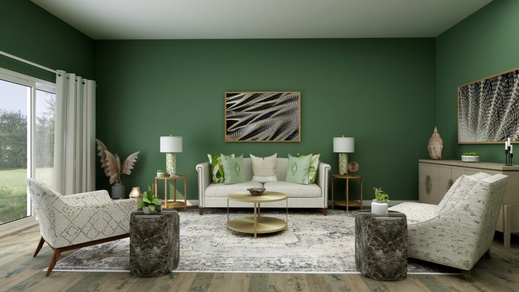
In my article Birds of a Feather- What Birds Can Teach Us About Designing the Perfect Room, I shared some ideas for one of those flat lays inspired by realistic photo art of Pintail duck and eagle feathers. I designed a room with a calm and earthy feeling that reminds me of being in the forest using the feather art and colors of nature.
Flat lay and Edesign by Northern Lights Home Staging and Design
Edesign by Northern Lights Home Staging and Design
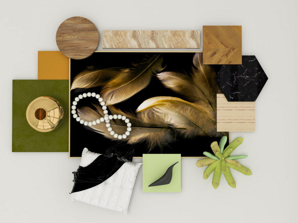
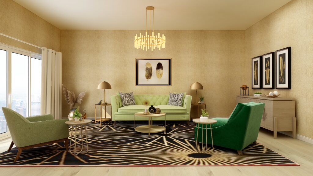
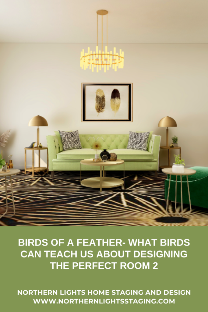
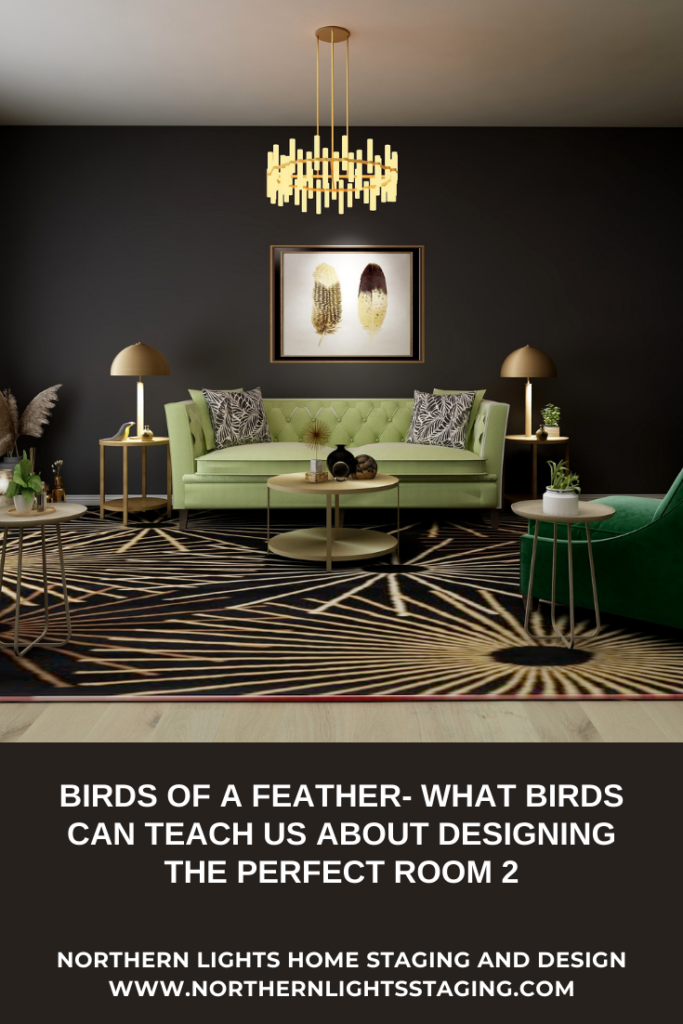
This second flat lay, to me, evoked a much more glamorous style and feeling, like a cross between Modern Global Style and Hollywood Glam.
Flat lay and Edesign by Northern Lights Home Staging and Design.
I am not sure what bird the feathers in the photo came from, but the art is less realistic and more stylized. The black and gold color combination felt very luxurious, and like a great place to add a variety of metallic finishes.
The natural theme of bird feathers still evoked a sense of nature, inviting wood, stone, and natural materials such as velvet, leather, and cotton. I selected green, which is a wonderful color of nature, for the fabrics and added plants.
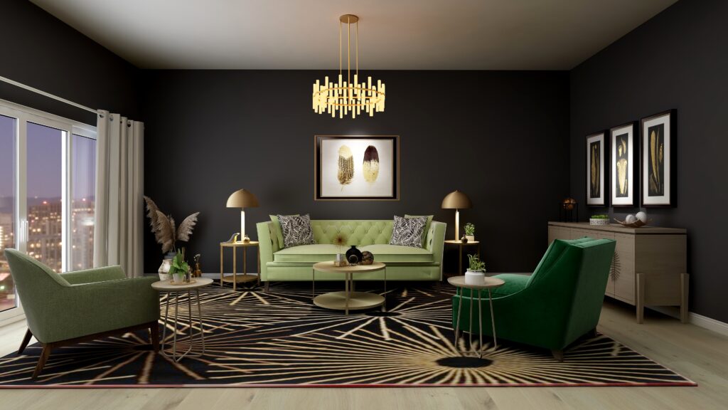
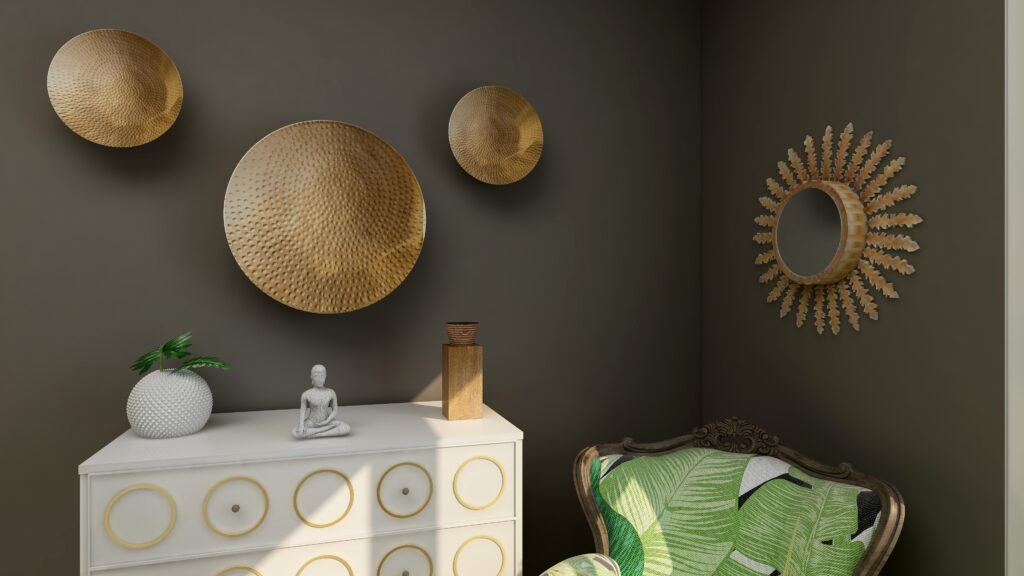
I decided to create a living room, that was dark and moody, with black or deep chocolate walls, and lots of different gold-tone metals. Dramatic lighting enhances the art and brings out the shine of the various brass and gold-toned lights and accessories.
Instead of the photo in the flat lay, I found several other art prints of feathers in black and gold that I used as inspiration.
I could see this combination in a living room, master bedroom, master bathroom, or powder room. How about you?
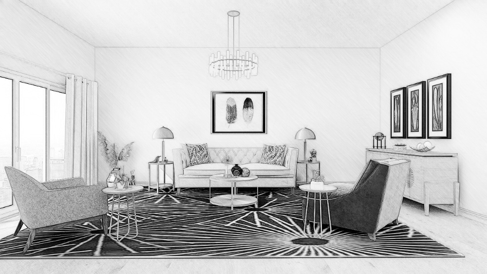
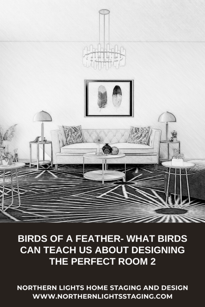
I decided to try a living room. A flat lay can first evolve into a drawing or floor plan to get a feel for how the room will work spatially.
Edesign by Northern Lights Home Staging and Design.
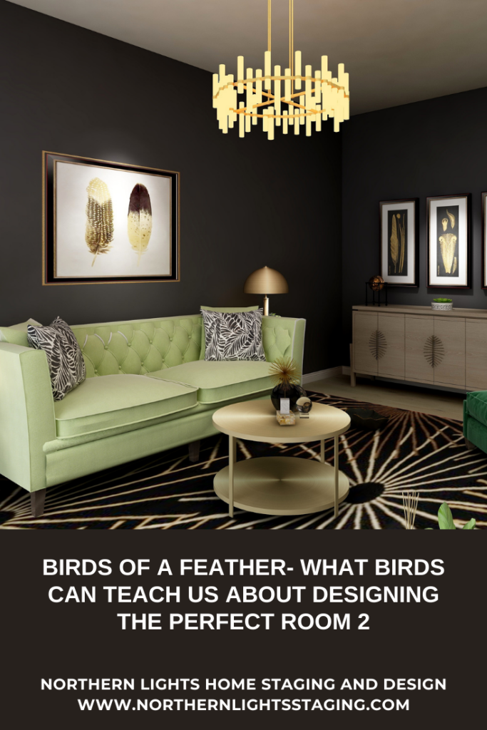
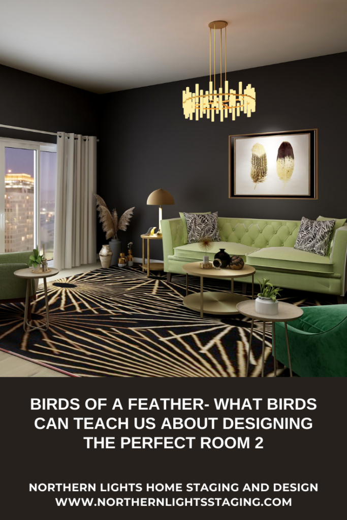
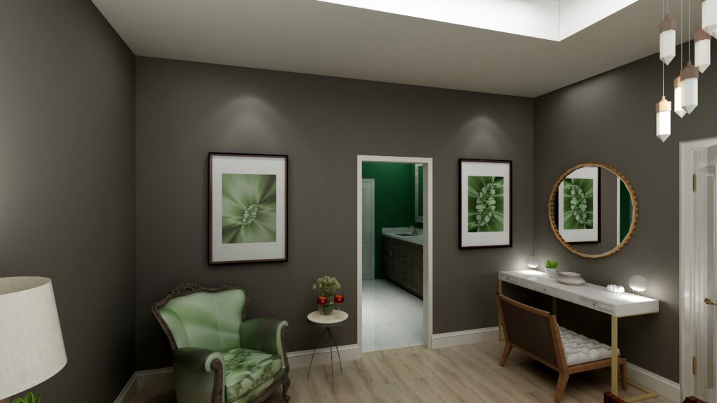
To get the feeling of drama and glamour, I decided to try the idea of a black wall. I love it! It beautifully highlights the feather art and sets off the beautiful greens in the furniture. Of course, lighting, strategically placed and lots of it, is important when using black.
Edesign by Northern Lights Home Staging and Design. Edesign by Northern Lights Home Staging and Design. Edesign by Northern Lights Home Staging and Design.
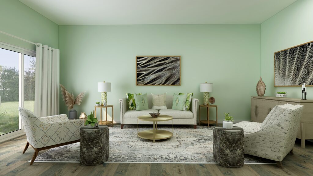
For variety, I tried a textured light-colored wallpaper similar in color to the feathers to give the room a more light and airy feeling. I think I like the black better for a glamorous feeling.
Edesign by Northern Lights Home Staging and Design.
And here is it in a shade of off-white. While still pretty, I like the black walls best, and the feeling of dimension the textured wallpaper gives over the white walls. How about you?
The moral of this flat lay tale is that you can use natural elements like bird feathers to inspire glamorous, dramatic, modern, and sleek designs while still bringing the outdoors in. And, don’t be scared to use black!
Bird feathers can inspire many design styles. Look for my next article on the design for my third flat lay inspired by bird feathers.
Are You Ready to Create Your Perfect Space?
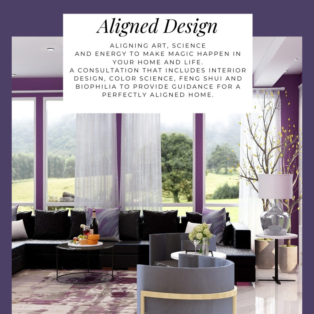
Are you ready to create your perfect space? I assume you are since you are reading my blog post. Let’s tell your unique story and find the alignment of art, science, and energy that makes you happy. Try my Aligned Design consultation and let’s get started
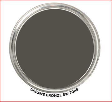
When I first saw Sherwin William’s “Urbane Bronze”, I was unsure how I felt about it. Browns can be nice to work with, rather serene and a color of nature so nice to “bring the outside in”.
Sherwin Williams 2021 Color of the Year, Urbane Bronze. Graphic by Camp Chroma.
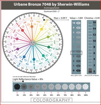
According to the color data Urbane Bronze is actually a yellow hue (really, it’s true) that looks brown because of it’s low chroma and lightness.
Colorography of Urbane Bronze by Lori Sawaya of Camp Chroma.
Sherwin Williams describes Urbane Bronze as as a color to
“Tap into nature with a hue whose warmth and comfort breathe down-to-earth tranquility”.
“As we’re looking to create the ultimate retreat for reflection and renewal, we’re turning to a hue whose natural simplicity and nature-inspired energy cultivate a sense of calm from the ground up.”
“The trend for biophilia continues to shape our spaces, proving that nature is never far away. Urbane Bronze might be a color rooted in nature, but it also has a unique ability to ground a room through organic appeal.”
OK, so it is supposed to help us feel rooted to nature. I thought about where I may have seen this color in nature. Maybe along mudflats at the beach, possibly in rocks and some types of earth. It does remind me a bit of the color of sea otter fur.
Sea otter. Photo by Andrew Smarius on Unsplash
Master Bedroom Design
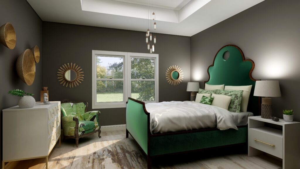
I used Urbane Bronze as the wall color with primarily dark and light greens, browns and white to create a color palette from nature.
Urbane Bronze is actually a Yellow hue, so this works because it is creating an analogous color scheme with yellow, yellow-green and green that are next to each other on the color wheel.
The mixture of soft fabrics with different metals, wood and pottery add natural elements and a variety of textures.
Edesign using Urbane Bronze by Northern Lights Home Staging and DesignEdesign using Urbane Bronze by Northern Lights Home Staging and DesignEdesign using Urbane Bronze by Northern Lights Home Staging and Design
What are the Pros and Cons of Choosing a Bronze Paint Color?
Pros of Working with a Bronze Colored Paint:
Warm and Inviting: Bronze paint adds warmth to a room and can create a cozy and welcoming ambiance.
Versatile: Suits both modern and traditional interiors, complementing a wide range of décor styles.
Sophisticated: The metallic sheen can lend an air of sophistication and luxury.
Pairs Well: It complements a variety of other colors, especially earth tones, deep blues, and greens.
Accentuates Features: Great for highlighting architectural details, moldings, or feature walls.
Durability: Metallic bronze paints can often be more durable and resistant to damage than flat finishes.
Light Reflectivity: Its slight sheen can reflect light, making spaces feel more vibrant and sometimes larger.
Cons of Working with a Bronze Colored Paint:
Application Difficulty: Metallic and bronze paints can show brush strokes or roller marks more easily than flat paints.
Prep Work: Imperfections on walls, like dents or scratches, can be accentuated, requiring more prep work.
Trend Sensitivity: While classic, certain shades of bronze may go in and out of trend, potentially dating the décor.
Overwhelming: In small spaces or spaces without a lot of natural light, bronze can feel a bit overwhelming or dark.
Cost: Quality metallic paints, including bronze, can sometimes be more expensive than standard paints.
Maintenance: Fingerprints, smudges, or dirt can be more noticeable, requiring more frequent cleaning.
Limited Availability: Not all paint brands offer a wide variety of bronze shades, limiting choices.
Remember, the success of using bronze paint largely depends on the specific shade of bronze, the room’s lighting, its size, and the accompanying decor. Always test a sample on the wall before committing to a full paint job.
Are You Inspired?
Get your colors right the first time with an expert science based color consultation.
I Learned to Solve All My Interior Design Problems by Dancing-Distractions Ruin Everything
Essential Elements for a Beautiful Stage or Design.
Recently I took a dance class called From Practice to Professional Presentation with professional dancer and instructor Helia Bandeh.
This class discussed essential elements to create a beautiful stage or background to highlight your dance performance on a stage or video. She discussed decor, lighting, and costumes.
So many things related to creating your perfect space with Interior Design! This article focuses on decor.
Some critical factors related to set decoration included:
The dancer is part of the stage environment. There needs to be a visual balance between the dancer and the background. Consider how the dancer looks compared to the background based on the colors she is wearing, how large or small she appears compared to the background, or how interesting she might be in context. For example, if you are dancing in front of the Taj Mahal, will people be looking at you or the building?
Eliminate visual disparity between the dance and the background. For example, don’t perform a dance about a love story in a Catholic Church with the cross behind the dancer. A background in nature would be more appropriate.
Interactive elementsin the decor add dimension to the performance (such as a chair or flowers).
Removing distracting elements is more important than adding supporting elements. If you are doing a Persian dance on a stage filled with chords, speakers, signs, and more, adding some Persian decorations only makes it worse, not better. It is essential to neutralize the stage and removing unneeded things first, then add decoration if it highlights the dance. Otherwise, the audience looks at everything, not just the dancer, and in essence, sees nothing but distractions.
Simorgh performing an Azeri Drum Dance at the AlAska Shriners in Anchorage.
For example, above, we are performing an Azeri Drum Dance. The room is brightly lit. The stage decor is permanently set up with a design specific to the Alaska Shriners. The background also has flags and other decorative items unrelated to the dance we are doing. The background colors do not go with our costumes and the lights do not highlight the dancers.
While the stage itself is pretty, there are a lot of distracting elements for the audience to look at that have nothing to do with, and do not enhance the dance performance.
By contrast, below I am performing a Qashqai scarf dance on a beautiful stage that perfectly shows off my dance, costume, and the scarves with it’s simplicity, colors and lighting.
Me performing a Qashqai Scarf Dance in Anchorage Alaska on a beautiful stage, perfectly set up to highlight the dancers.
How Does This Relate to Interior Design?
All these things relate, but in particular, this is key to creating a beautiful room.
Removing distracting elements is more important than adding supporting elements.
The more time goes by, I realize the connections between all things artistic. The same principles apply to making the magic happen in Interior Design or any other art form. You just need to open your eyes, listen, and feel it to notice.
It always seems to come back to the alignment between art (creativity), science (color), and energy (connection) that makes the magic happen. I use this alignment to create both beautiful dance pieces and interiors.
Creating a Magical Stage
Let’s look at the three elements in stage design that help create a beautiful performance and see how they relate to that room you are designing.
We are Part of the Design
We are part of the design of our rooms and need to consider how we look and feel within them.
For example, if navy blue makes me look old when I wear it, but I look beautiful in turquoise, I will not design my living room with navy blue because I will not look good surrounded by that color. And if I don’t look good, I will not feel good in the room.
Think about how you will look and feel in the room. After all, when you are in it, you will be the star of that show.
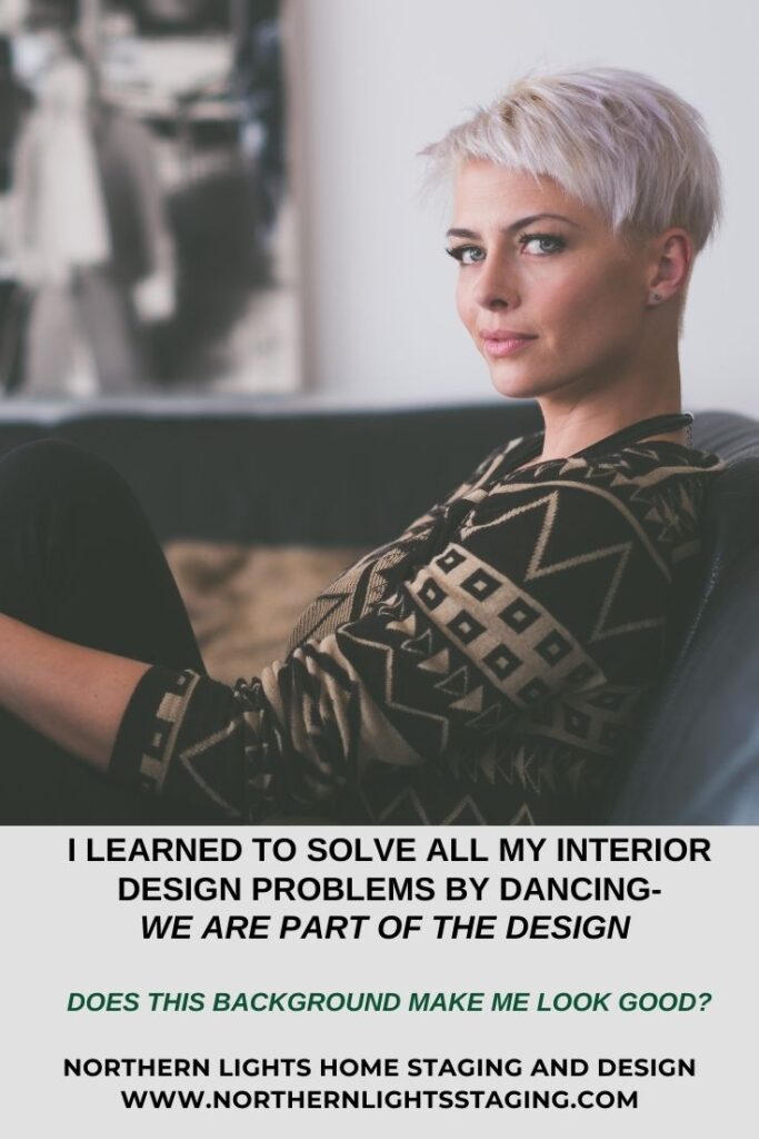
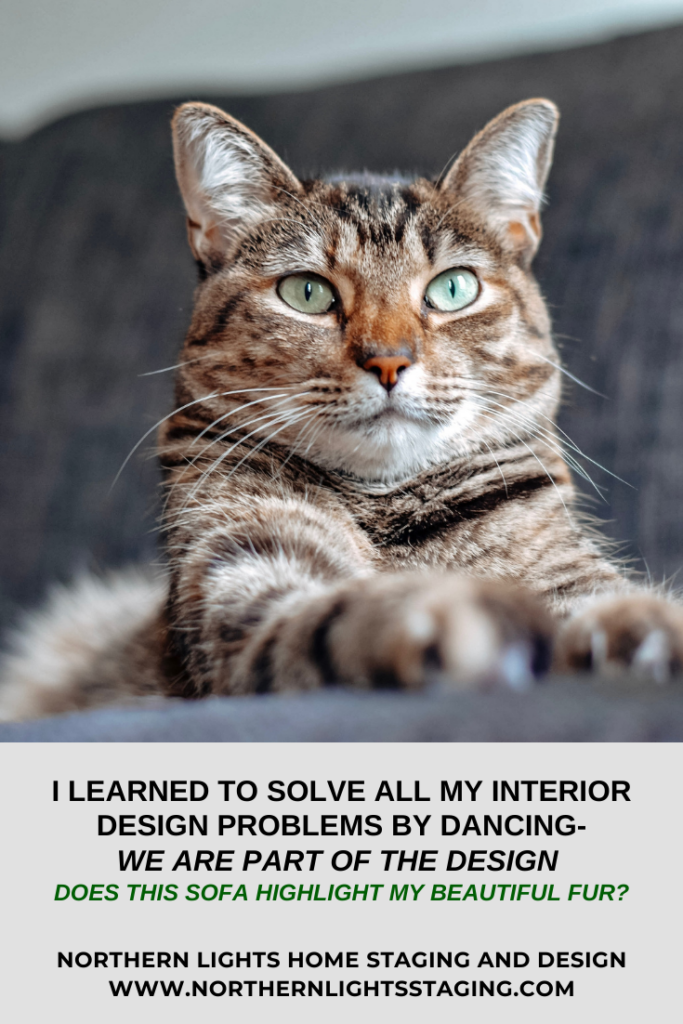
We are part of the design. Does it make you look good? Photo by Jens Lidner on Unsplash. We are part of the design. Does it make you look good? Photo by TheWonderAlice on Unsplash.
Eliminate Visual Disparity
Eliminating visual disparity is important. What is your personality and story? Are you being true to it and does it fit with the architecture of the building?
For example, are you a maximalist that loves to be surrounded by lots of things and color, creating that style in an ultra-modern space?
Or, are you trying to create an ultra-modern look in an ornate Victorian living room? The contrast might be interesting, but can you live with that visual disparity every day?
Some may call this eclectic, but even eclectic styles need a balance with one primary style.
There needs to be a connection between the architecture, style, and story you are portraying. Otherwise, it will always be distracting to the viewer.
Interacting with Your Design Elements
In design, we interact with almost all the elements in our spaces. It is critical to make sure elements such as furniture and decor are comfortable, support how we live, are beautiful to us, and there is not too much of it!
Do you enjoy interacting with everything, and like the touch, feel, smell, and comfort of your decor items?
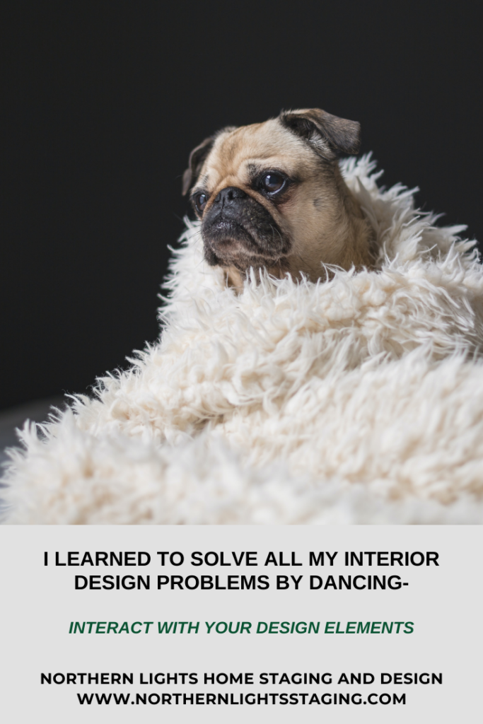
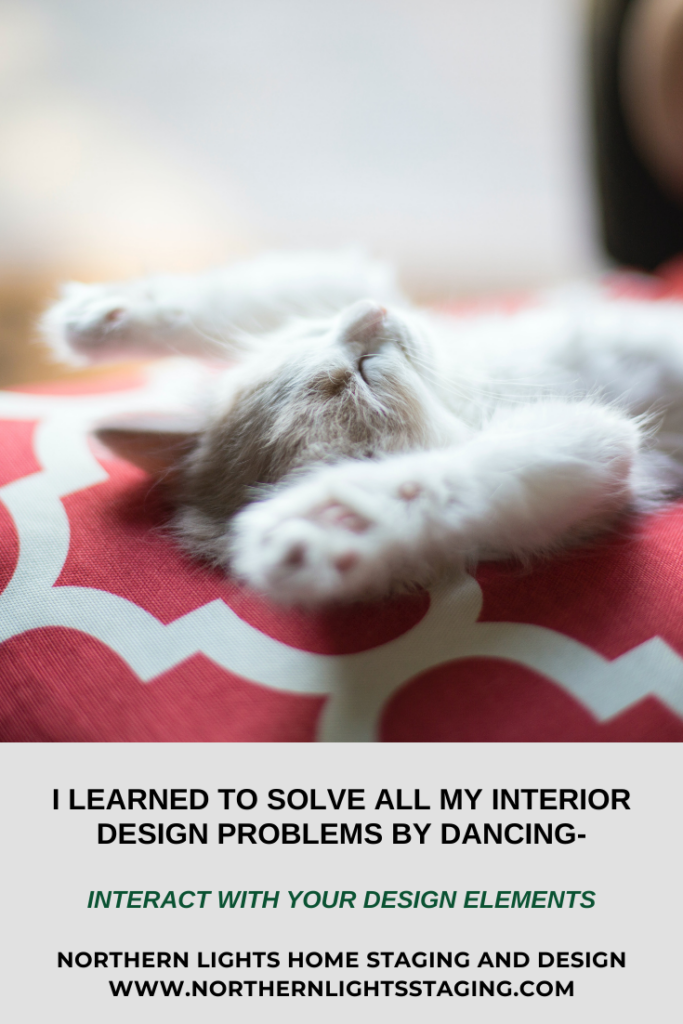
Do you enjoy the touch, feel, smell, and comfort of your decor items? Photo by Matthew Henry on Unsplash. Do you enjoy the touch, feel, smell, and comfort of your decor items? Photo by Johnathon Fink on Unsplash. Do you enjoy the touch, feel, smell, and comfort of your decor items? Photo by Gemma Evans on Unsplash.
Removing Distractions is More Important than Adding Supporting Details
Removing distracting elements is more important than adding supporting details, which will make or break a room.
If you have a room filled with clutter and distracting things, no amount of adding more of your favorite decorative elements such as art or pillows or knick-nacks will fix the problem.
The most important thing is to neutralize the “stage” and eliminate all the unnecessary elements first. Then begin adding layers until you have created the effect you want. Otherwise, you and everyone else using the room will only see the distraction
Its better to remove distractions than add more decor when creating a beautiful room. Photo by Ayla Verschueren on Unsplash.
Neutralize First
The first step in creating a beautiful stage or a room is to neutralize it first by removing distractions. Once that is done, then you can add meaningful decor items to create the perfect background for your performance or your perfect space.
A problem I often see, is when people have too many distractions in their room, usually in the form of clutter. The room may also have too much decor or furniture. They think that adding beautiful decor items will fix the problem, and create the look they want.
It does not work.
The key is remove the distractions first, then add decor to get the look you want.
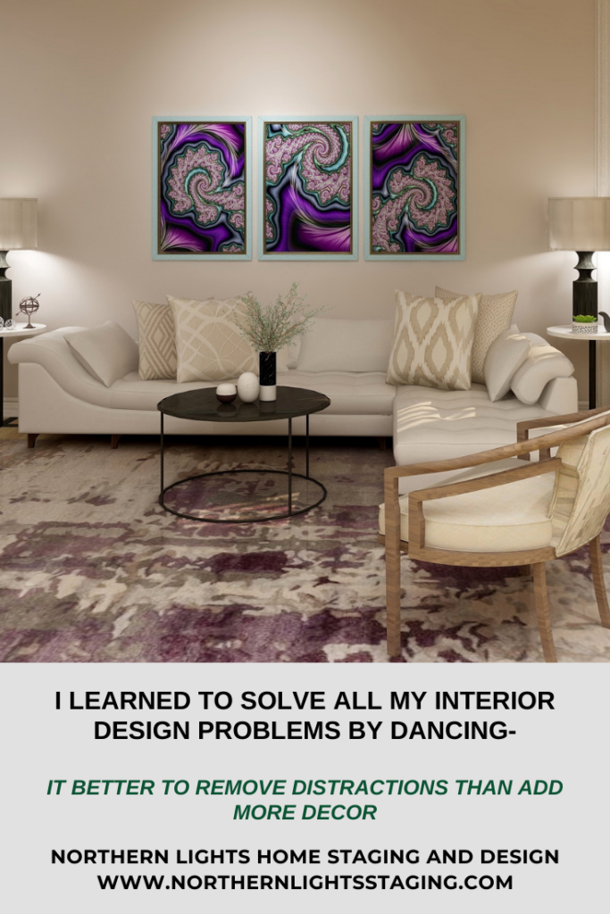
In the example below the focal point of the room is the art. To make it stand out as much as possible, the rest of the room was designed with neutral colors.
In a similar way, a neutral background on a stage could highlight a dancer in a purple dress and her beautiful movements without distractions.
Edesign and “A Passion for Purple” fractal art by Northern Lights Home Staging and Design.
This design highlights my fractal art, “A Passion for Purple” which you can purchase at my studio on Society 6.
Before you start decorating, take everything out of the room you really don’t need, neutralize things as much as possible and then add on your layers.
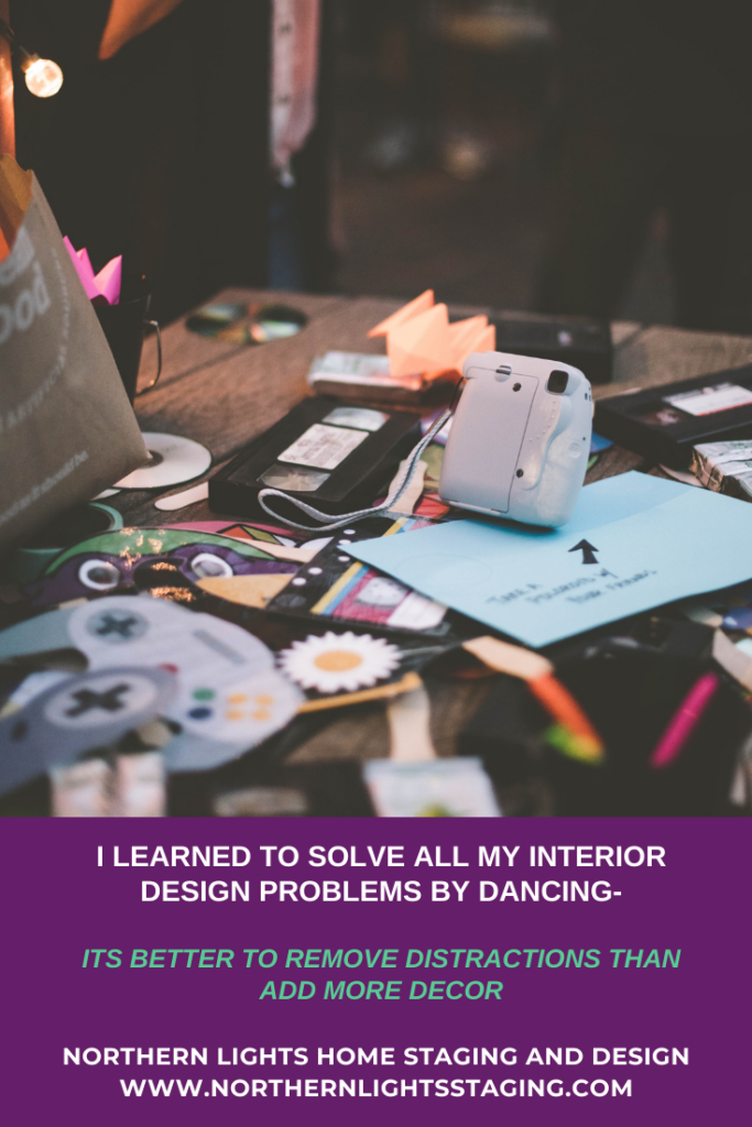
Its better to remove distractions than add more decor when creating a beautiful room. Photo by Samantha Gades on Unsplash.
Learn More
To learn more, see some other articles in this series:
Now that you know some of the elements that work together to create your perfect space, are you ready to take action to make it happen in your home? If you knew absolutely for certain that creating a perfect space would create a better life for you, you would do it, wouldn’t you?
Let’s tell your unique story and find the alignment of art, science, and energy that makes you happy. Let me help you take that trip to your perfect space in a Ferrari instead of a stagecoach. Try my Aligned Design consultation and let’s get started.
Curious about your Interior Design style? Take the quiz and find out.
Create an Exotic Global Style Living Room with a Gorgeous Blue Rug
Bohemian style celebrates warm earthy colors, metals and jewel tones. Bohemian decor often uses deep browns, greens, grays or other neutral colors for base colors, then accessorizes with saturated purple, fiery orange, and electric blue and other jewel tones.
Bohemian style lovers are often carefree, dislike rules and want to follow their heart’s desire!
Do you like vintage furniture and light fixtures, globally inspired textiles and rugs, and love displaying your collections of cool things found at markets. thrift stores and in your travels?
I bet you like glamorous fabrics, lighting and accessories with well-worn items, antiques or cool pieces from other styles. Anything goes if it makes you happy. More is more!
Bohemian style is a global design style. Global styles are all about your worldly adventures and telling your story! They are usually very colorful, rich in bold designs and natural textures, patterns, colors, and arts and crafts of various cultures.
Get the Look and Celebrate Your Favorite Color- Blue!
A great way to get the look of Bohemian style is with a beautiful area rug. It can become a focal point for your room and help guide the color scheme and your choices for accents and accessories such as throw pillows, art, lighting, and more.
Celebrate your favorite color by picking a rug that highlights it and build the rest of your room around the work of art you picked for your floor.
One of my favorite colors is blue, so here are some examples of my favorite blue Bohemian or global style rugs.
My Favorite Blue Global Style Rugs
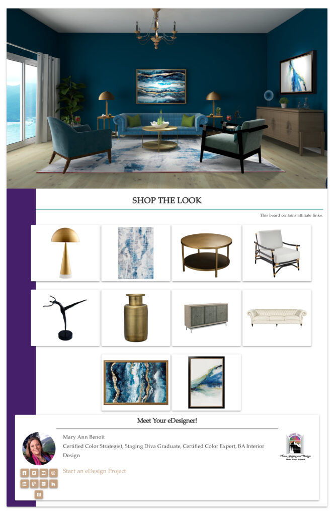
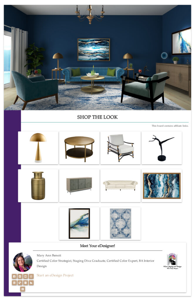
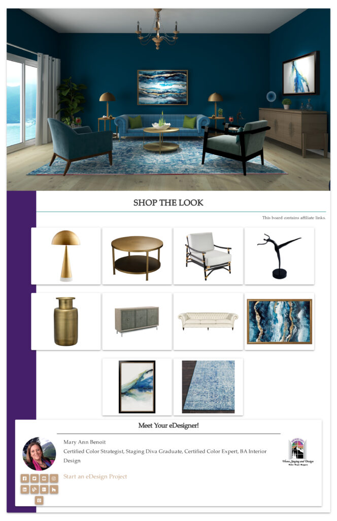
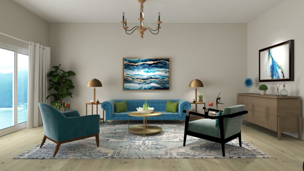
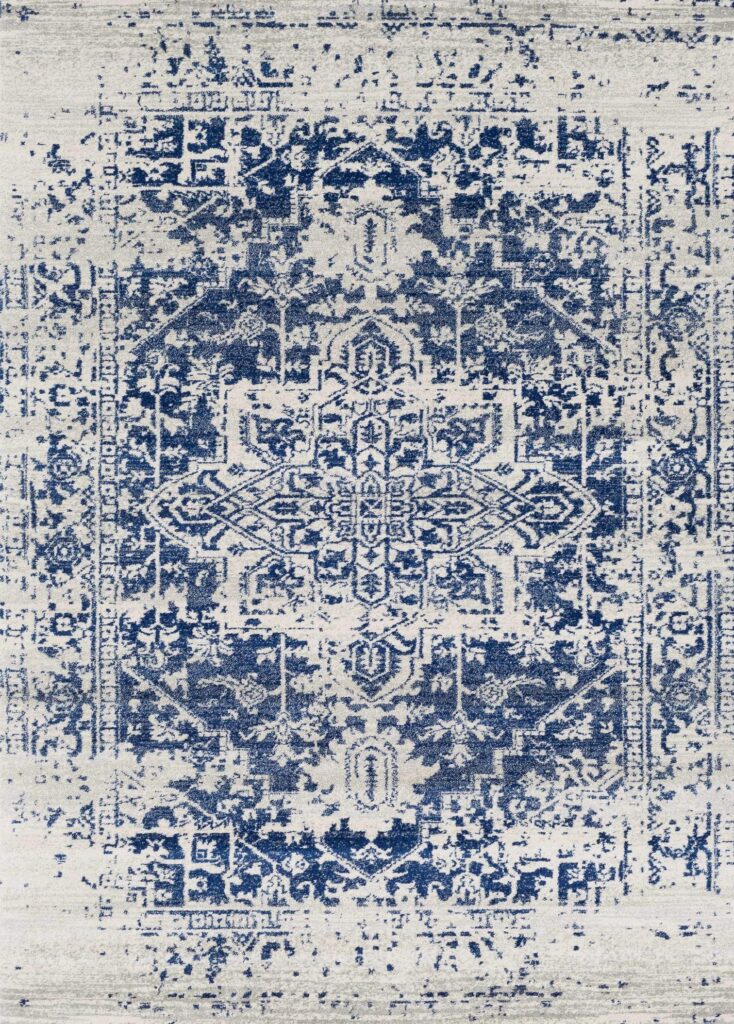
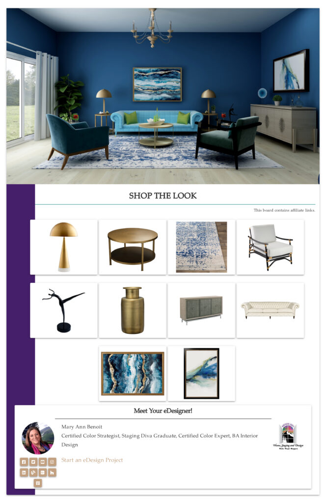
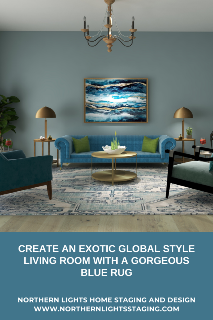
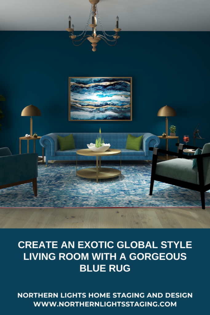
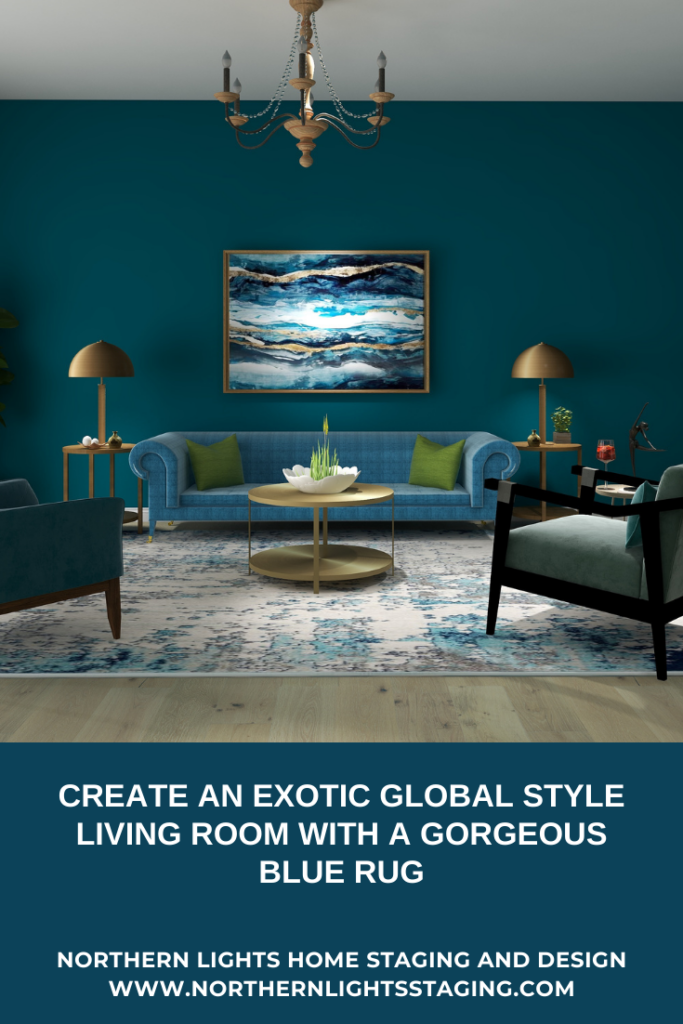
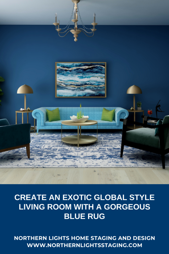
I changed the look of the following living room by changing the rug and sometimes the paint color. See how the room changes its look and feeling just by changing the pattern of the rug and shades of blue in the room, while still using the same art, furniture and accessories.
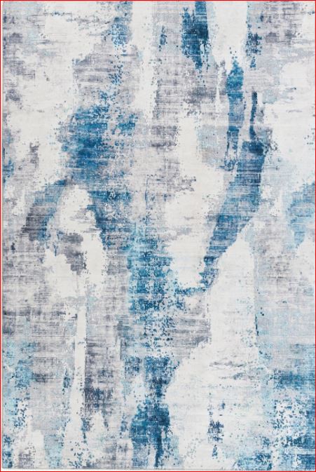
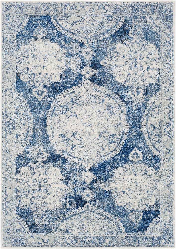
CRAIL AREA RUG
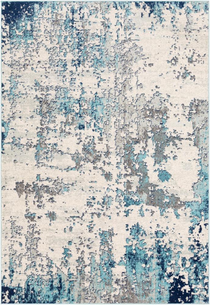
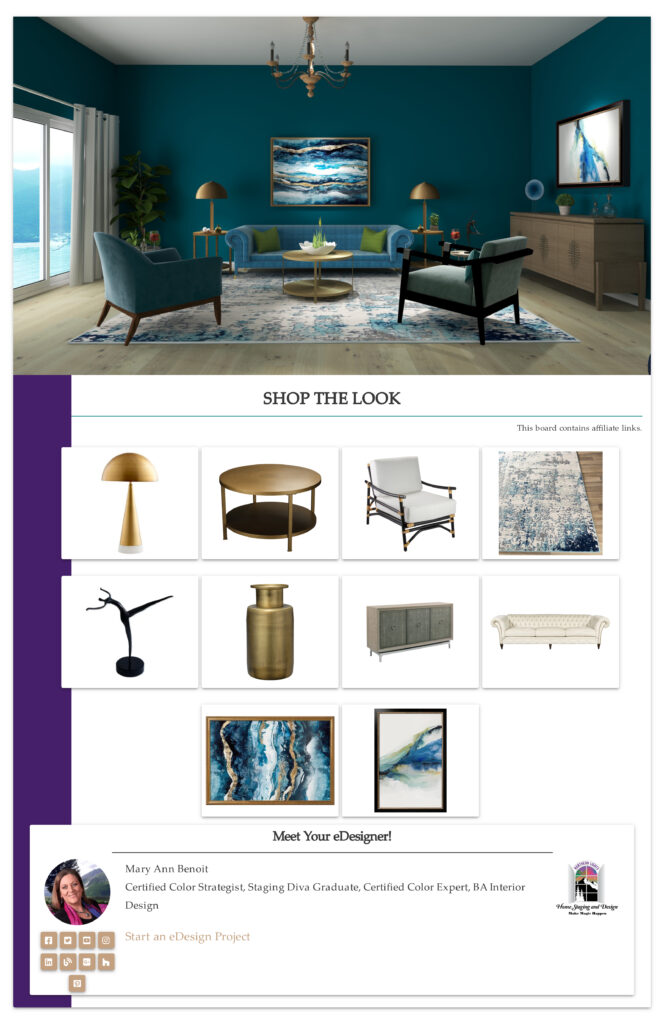
I love the colors and the abstract modern watercolor design of this rug.
Edesign by Northern Lights Home Staging and Design
BARN AREA RUG
This rug has a Transitional, Bohemian, Vintage vibe.
Edesign by Northern Lights Home Staging and Design
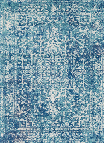
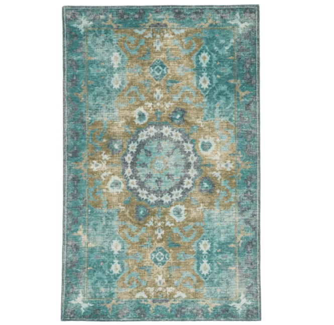
THOUSANDSTICKS AREA RUG
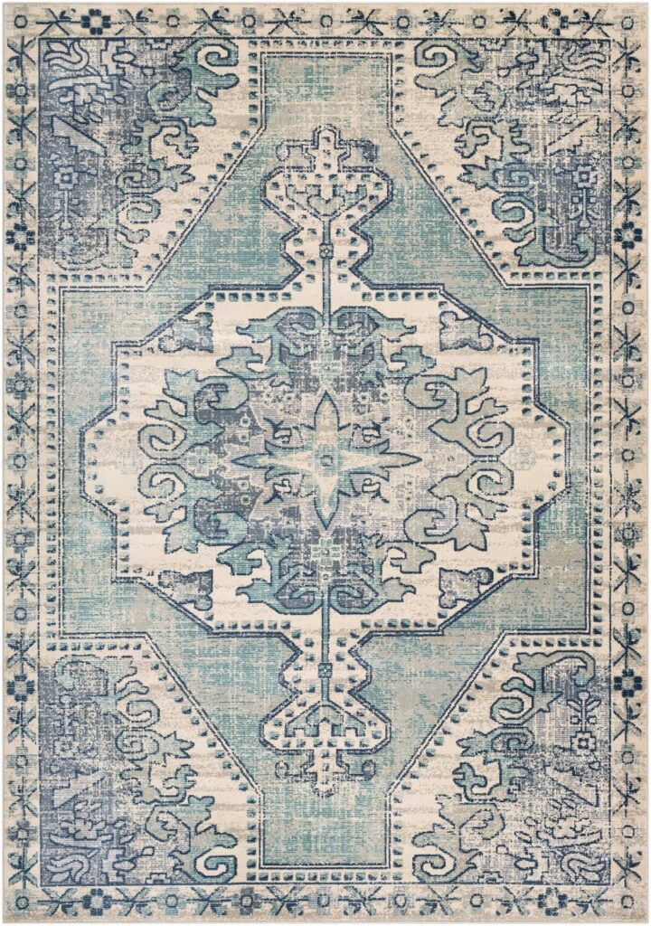
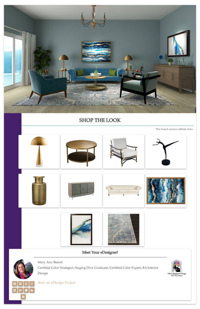
Love the rich teal colors in this Bohemian, Vintage rug made in Turkey.
Edesign by Northern Lights Home Staging and Design
BEVERLY AREA RUG
Love the colors and the textured look of this more contemporary design.
Edesign by Northern Lights Home Staging and Design
KENMARE AREA RUG
One of my favorites, I just love the design and colors of this Bohemian, Vintage rug.
Edesign by Northern Lights Home Staging and Design
And for those of you a little scared of so much color, you can still get your blue fix with the rugs, furnishings and art and go neutral on the walls.
Edesign by Northern Lights Home Staging and Design
LIMESTONE AREA RUG
I love the vintage look of this area rug, and it is a great rug if you love darker blues.
Edesign by Northern Lights Home Staging and Design
KAI Area Rug
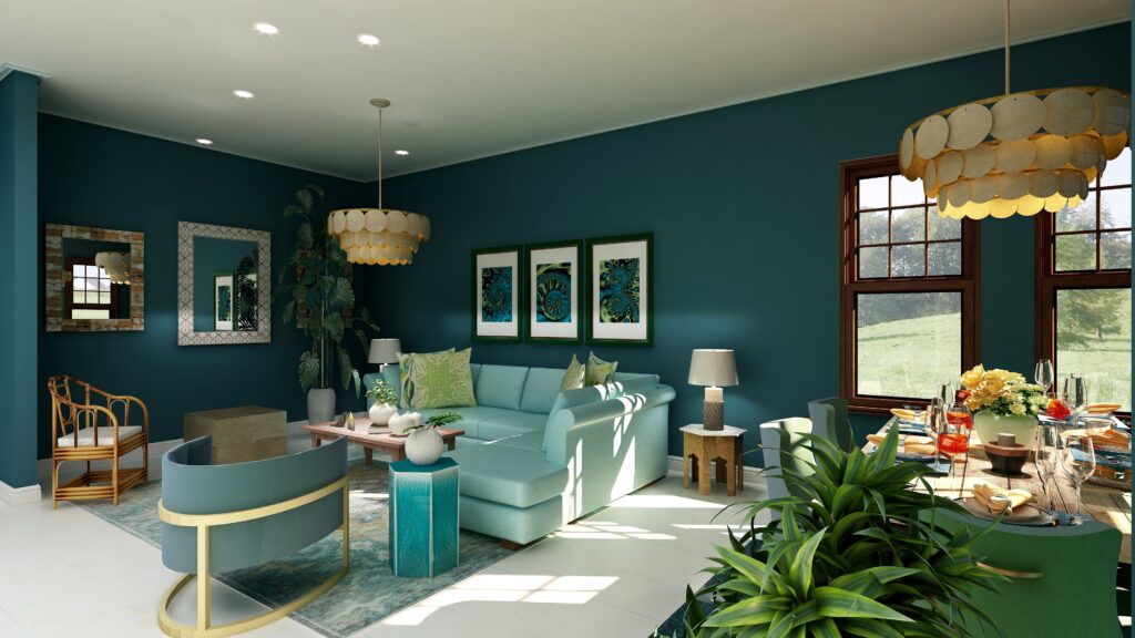
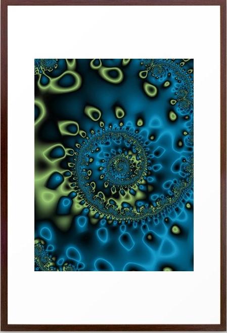
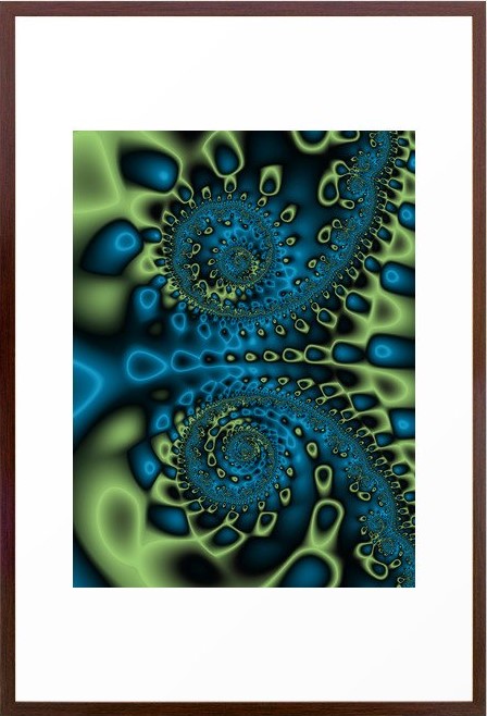
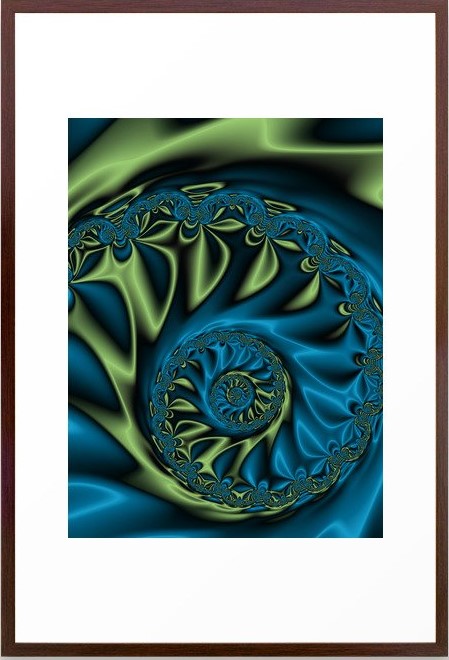
Here is a beautiful Bohemian-style rug that you could use with a dramatic blue room or a more neutral room. I have also used some of my fractal art, called Bioluminescence in this design.
Bohemian Style Living Room Edesign by Northern Lights Home Staging and Design. Bioluninescence Framed Fractal Art Print by Northern Lights Home Staging and Design. Bioluninescence #2 Framed Fractal Art Print by Northern Lights Home Staging and Design. Bioluninescence #3 Framed Fractal Art Print by Northern Lights Home Staging and Design. Edesign by Northern Lights Home Staging and Design
Let’s Create Your Global Style Design
Are you ready for your house to go to the next level where your house looks great, feels great, and supports you to be great?Imagine that.
What’s it like when you are living in the perfect space for you?
My philosophy of great Interior Design, which I call Aligned Design, considers three key factors; art, science and energy. The intersection of the three is where the magic happens.
Creating a space that envelops you in your vision of beauty and color, while fine-tuning the energy of your space to promote wealth, health, love, and perfect self-expression aligns you with the universe, allowing you to live your best life so you can make a positive impact on the world.
Global style Interior Design is part of the art of great design and one of the things you are really going to love about creating the perfect space for yourself. Are you ready to immerse yourself in rich beautiful colors and truly tell your story?
Curious about your Interior Design style? Take the quiz and find out.
Edesign by Northern Lights Home Staging and Design
In my last five articles I have been exploring the 2021 colors of the year of different paint companies and comparing them in the same Edesign I created for a master bedroom. I started by exploring Benjamin Moore’s Agean Teal and Sherwin Williams Urbane Bronze. I found that PPG had a color palette of 3 colors of the year instead of one as you can see in my article Ways to Use PPG’s Colors of the Year. I admitted I felt a little let down that they did not just commit to one color.
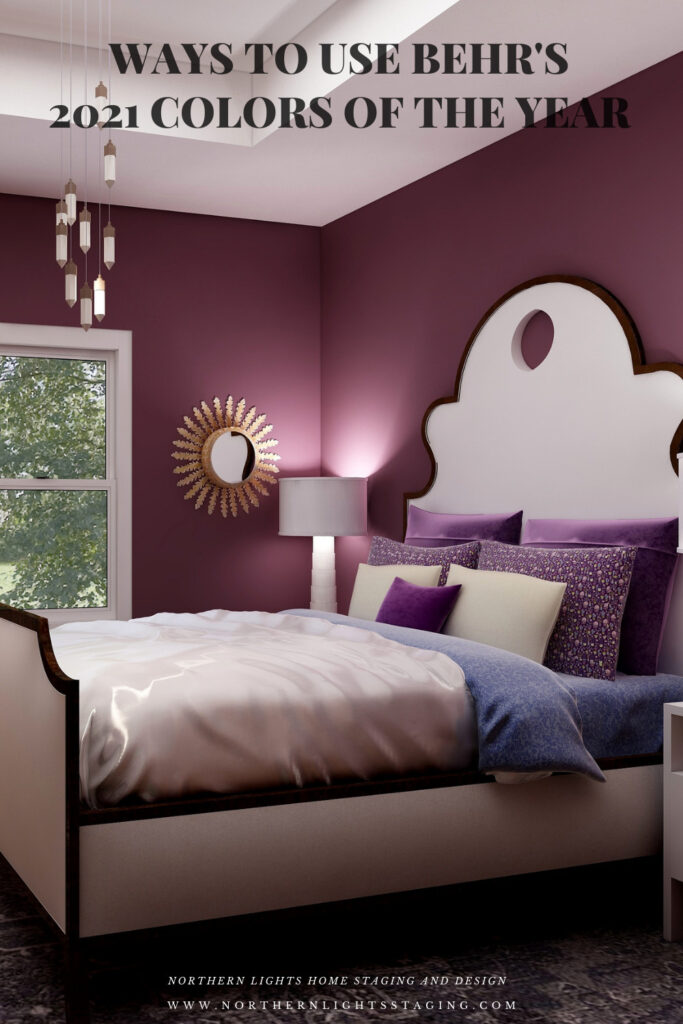
Then I checked on Behr’s Colors of the Year and found they had a palette of 21 colors!! Talk about non-committal. I highlighted 3 of my favorites in my article, Ways to Use Behr’s 2021 Colors of the Year.
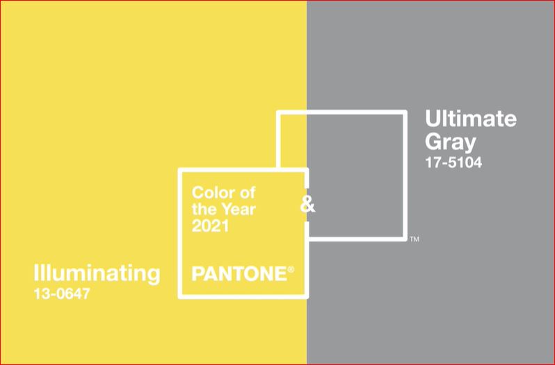
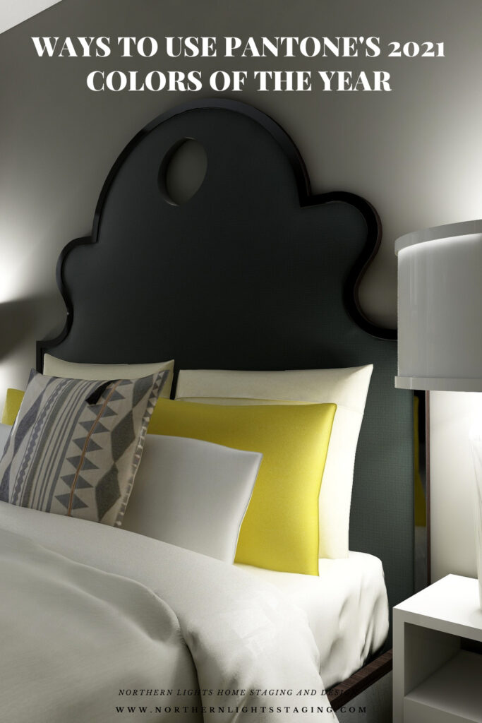
Here, I will explore using Pantone’s 2021 Colors of the Year. They have two colors, Illuminating and Ultimate Gray. Pantone does not create paint colors. They create ink used in graphics, but their color selections influence many of the colors of products you will find available such as art, accessories, bedding and furniture.
Pantone says these colors are “A marriage of color conveying a message of strength and hopefulness that is both enduring and uplifting”..
I am a little surprised at their pick of Ultimate Gray…..I feel like gray is our past and we have moved on. I am also surprised at their pick of Illuminating. It feels like the color of a yellow safety vest or a yellow warning light at a traffic signal, rather than one I would pick for accessories in my home. “Uplifting” is not a word I would use to describe it. Well, I am up for a challenge. Let us see what we can do with this combination!
The Design
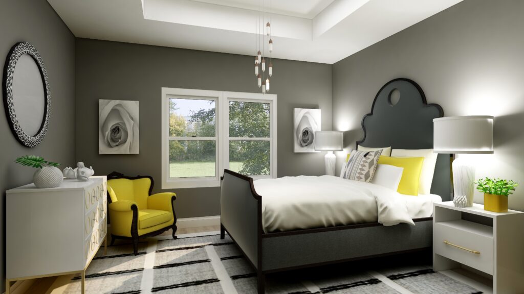
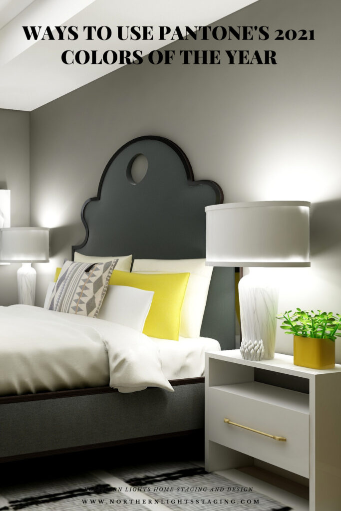
In this design, I used the color data to create a room that would look like Ultimate Gray on the walls, if Pantone made paint. The closest real paint color I could find to match this was Benjamin Moore, Tucker Gray, CW-705.
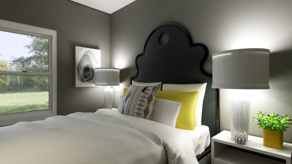
I think this bedroom feels relaxing, serene but with a little bit of energy and sweetness that comes from the cheery pops of yellow. I do like yellow and gray together, although I think this yellow is a little too saturated for my taste. I prefer a yellow with a little less chroma.
In my previous designs I have played with more saturated wall colors to show what you can do with color and how it feels. Sorry, I can not bring myself to try this color on the wall….I am not going to go there!
Master bedroom Edesign using Pantone’s 2021 Colors of the Year by Northern Lights Home Staging and DesignMaster bedroom Edesign using Pantone’s 2021 Colors of the Year by Northern Lights Home Staging and Design
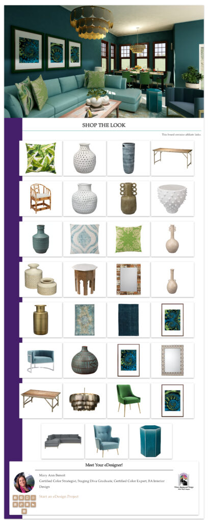
Shop this Look
Here are some of the pieces I used or alternative ideas for my designs. Some contain affiliate links, meaning I may receive a small commission for sharing this with you at no additional cost to you if you purchase anything.
Which Color of the Year is Your Favorite?
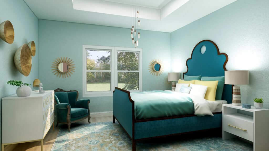
I enjoyed working with all these colors, and think they could each work nicely to create a relaxing master bedroom, although Big Cypress feels a little more energizing than relaxing. Of all the colors, I like Aegean Teal and Euphoric Magenta the best, how about you?
Pantone’s 2021 Colors Illuminant and Ultimate GraySherwin Williams HGTV Home PassionateBehr’s 2021 color Euphoric Magenta Benjamin Moore’s 2021 Color of the Year Aegean TealBehr’s 2021 color Voyage PPG’s 2021 Color Palette with Mystic Aqua.Mystic Aqua but with my my own rebel color scheme:)Behr’s 2021 color Royal Orchard Sherwin Williams 2021 Color of the Year Urbane BronzePPG’s 2021 Color Palette with TranscendPPG’s 2021 Color Palette with Big Cypress.
Are You Inspired?
When your space is better, you are better. When you are better, the world is better.
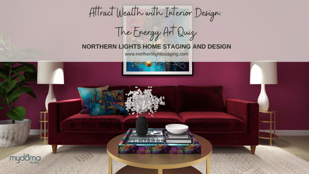
Are you ready to create the perfect space for you? Try my Aligned Design consultation. It is a wholistic Interior Design and Color consultation that considers art, science and energy to give you a game plan for your whole home. I use the art of eco-friendly Interior Design mixed with color science and consider Feng Shui, transformative design, biophilia and color psychology to make your space feel great and support the life you want to live.
Once you have your game plan, we can work on specific rooms with one of my Edesign packages.
The designs above are examples of full service Edesign, where you get a floor plan, a concept board, a 3D render and a complete shopping list with set up instructions. Or, be brave and try some new color with an expert color consultation.
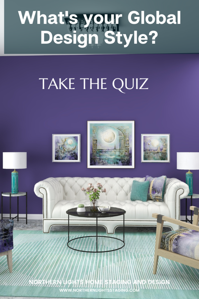
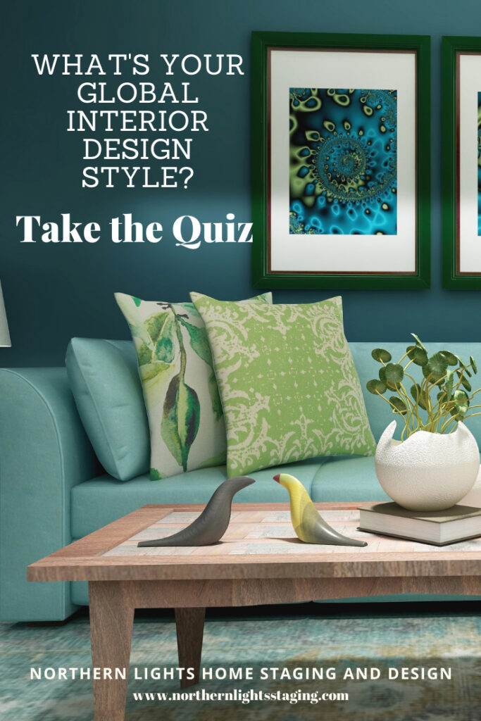
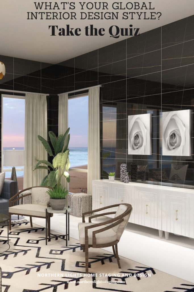
What’s Your Global Design Style?
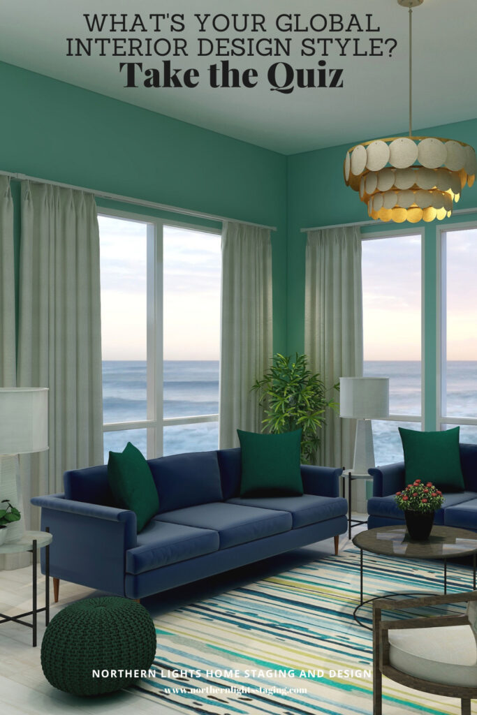
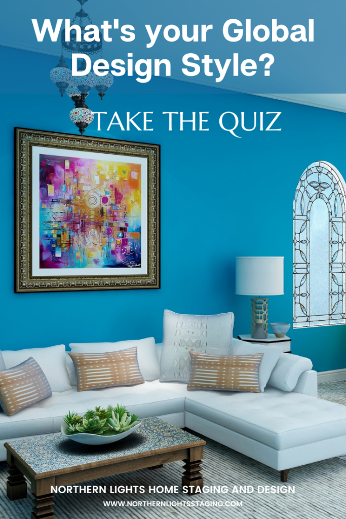
The designs in this article are examples of global style design. Are you curious what your global style is? Take the quiz and find out.
How to Use Pantone’s 2021 Colors of the YearHow to Use Pantone’s 2021 Colors of the Year
Ways to Use Sherwin Williams HGTV 2021 Color of the Year- Passionate
In my last few articles I have been exploring the 2021 colors of the year of different paint companies and comparing them in the same Edesign I created for a master bedroom. I enjoyed exploring Benjamin Moore’s Agean Teal and Sherwin Williams Urbane Bronze. I found that PPG had a color palette of 3 colors of the year instead of one as you can see in my article Ways to Use PPG’s Colors of the Year. I admitted I felt a little let down that they did not just commit to one color.
Then I checked on Behr’s Colors of the Year and found they had a palette of 21 colors!! Talk about non-committal. I highlighted 3 of my favorites in my article, Ways to Use Behr’s 2021 Colors of the Year.
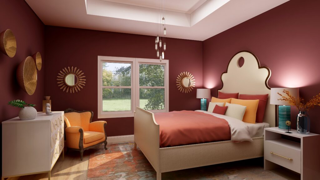
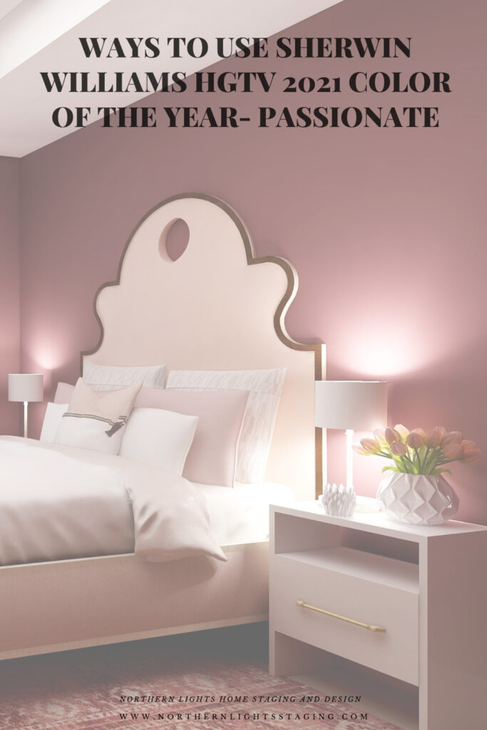
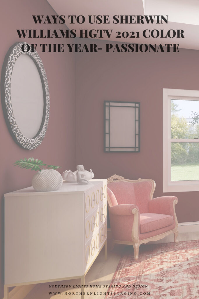
HGTV Home by Sherwin-Williams lists their 2021 Color of the Year: as Passionate, which is part of their 2021 Delightfully Daring Color Collection. They hope to inspire homeowners to have confidence using bold colors to create emotion and have fun!
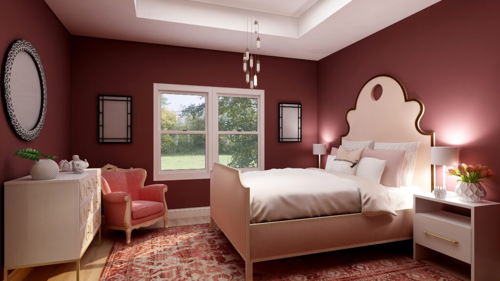
Is this color too exciting for a bedroom where most of us prefer a calm, relaxing atmosphere? I thought I would play with it in my master bedroom Edesign in comparison to the other colors of the year and see what happens. With a name like Passionate, I hope it would work in a bedroom:).
I experimented with a couple different ideas, to see how it might feel with a more dramatic look, and if I could create a relaxing room with a color like this.
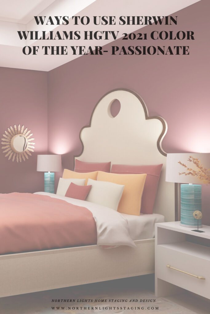
Design 1
My first design feels dramatic and colorful, but still feels warm and cozy, I think.
Master bedroom Edesign using Sherwin Williams HGTV Home color Passionate by Northern Lights Home Staging and Design
Shop this Look
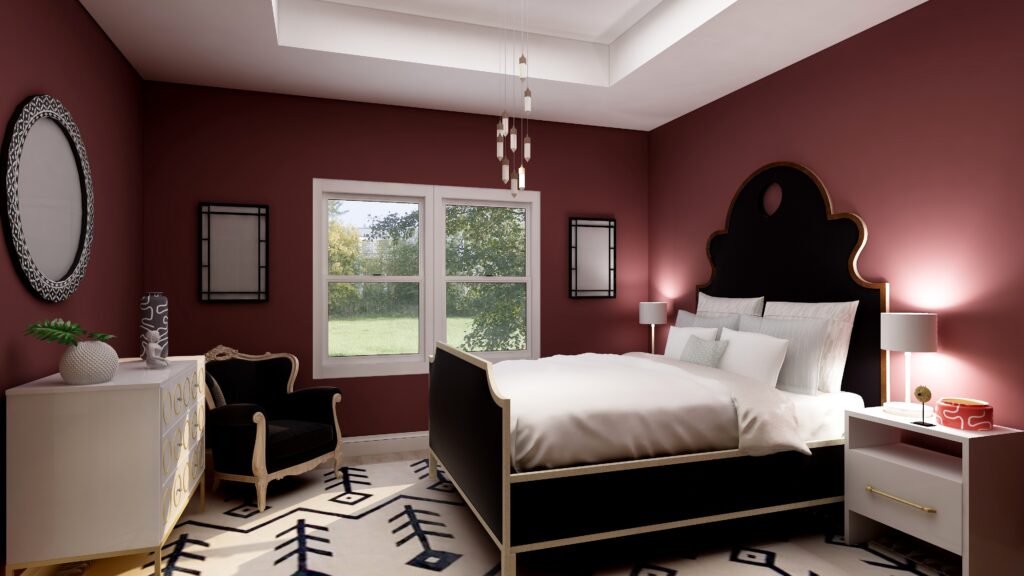
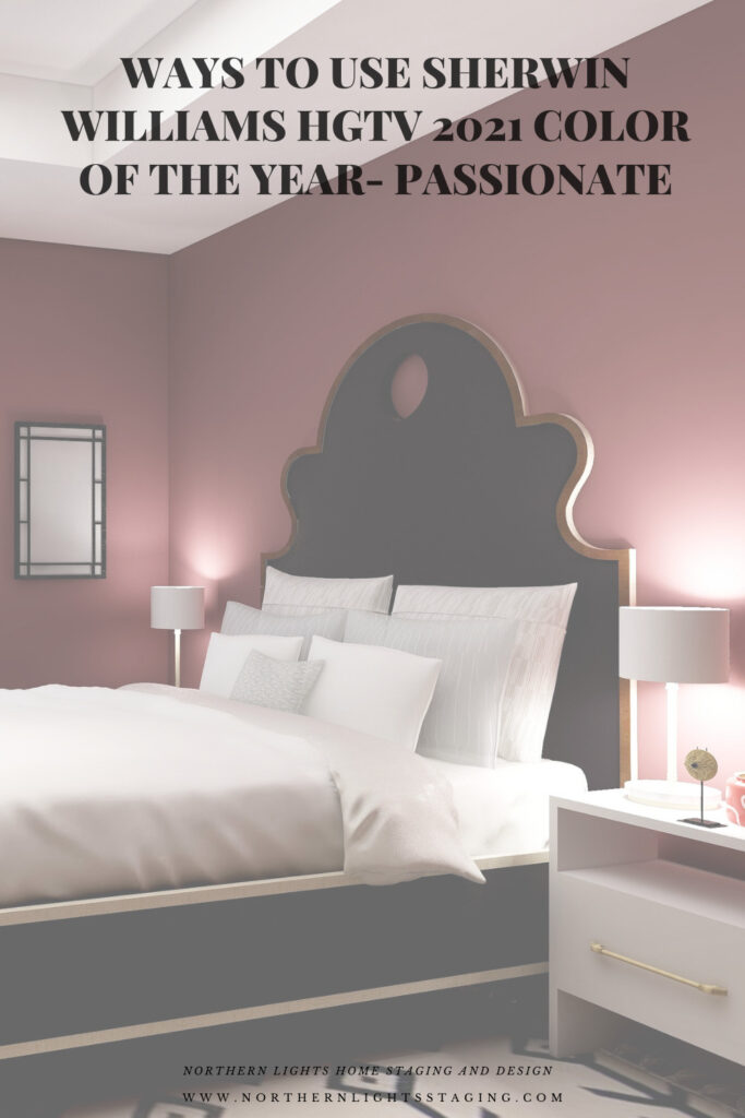
Design 2
Design 2 is more dramatic with the high contrast of black and white against the deep red walls. The red walls still give a feeling of being enveloped, a sense of coziness, but the black and white rug might be too bold to inspire relaxation. What do you think?
Sherwin Williams HGTV Home Passionate- Edesign by Northern Lights Home Staging and Design
Shop This Look
Design 3
This monochromatic color scheme feels relaxing to me. The addition of pinks and blushes creates a softness that balances the rich dramatic wall color. This shows me that you can create a relaxing space, even with rich red walls if you balance everything else correctly, creating both drama and calm at the same time. An interesting combination!
Sherwin Williams HGTV Home Passionate- Edesign by Northern Lights Home Staging and Design
Shop This Look
Which Color of the Year is Your Favorite?
I enjoyed working with all these colors, and think they could each work nicely to create a relaxing master bedroom, although Big Cypress feels a little more energizing than relaxing. Of all the colors, I am not sure if Aegean Teal or Euphoric Magenta is my favorite, how about you?
Sherwin Williams HGTV Home PassionateBehr’s 2021 color Euphoric Magenta Benjamin Moore’s 2021 Color of the Year Aegean TealBehr’s 2021 color VoyagePPG’s 2021 Color Palette with Mystic Aqua.Mystic Aqua but with my my own rebel color scheme:)Behr’s 2021 color Royal Orchard Sherwin Williams 2021 Color of the Year Urbane BronzePPG’s 2021 Color Palette with TranscendPPG’s 2021 Color Palette with Big Cypress.
Are You Inspired?
When your space is better, you are better. When you are better, the world is better.
Are you ready to create the perfect space for you? Try my Aligned Design consultation. It is a wholistic Interior Design and Color consultation that considers art, science and energy to give you a game plan for your whole home. I use the art of eco-friendly Interior Design mixed with color science and consider Feng Shui, transformative design, biophilia and color psychology to make your space feel great and support the life you want to live.
Once you have your game plan, we can work on specific rooms with one of my Edesign packages.
The designs above are examples of full service Edesign, where you get a floor plan, a concept board, a 3D render and a complete shopping list with set up instructions. Or, be brave and try some new color with an expert color consultation.
What’s Your Global Design Style?
The designs in this article are examples of global style design. Are you curious what your global style is? Take the quiz and find out.
In my last few articles I have been exploring the 2021 colors of the year of different paint companies and comparing them in the same Edesign I created for a master bedroom. I enjoyed exploring Benjamin Moore’s Agean Teal and Sherwin Williams Urbane Bronze. I found that PPG had a color palette of 3 colors of the year instead of one as you can see in my article Ways to Use PPG’s Colors of the Year. I admitted I felt a little let down that they did not just commit to one color.
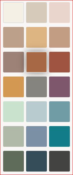
This week I decided to check on Behr’s Color of the Year.
Oh for the love of God, can you believe they have 21 colors!! Talk about non-committal. No, I will not be doing 21 renders to show you those.
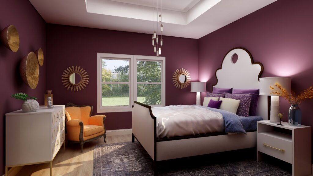
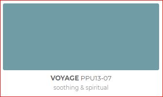
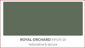
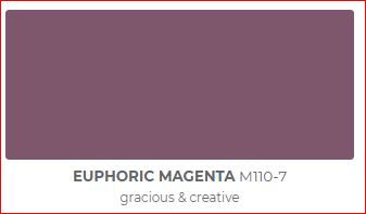
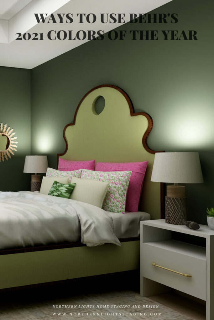
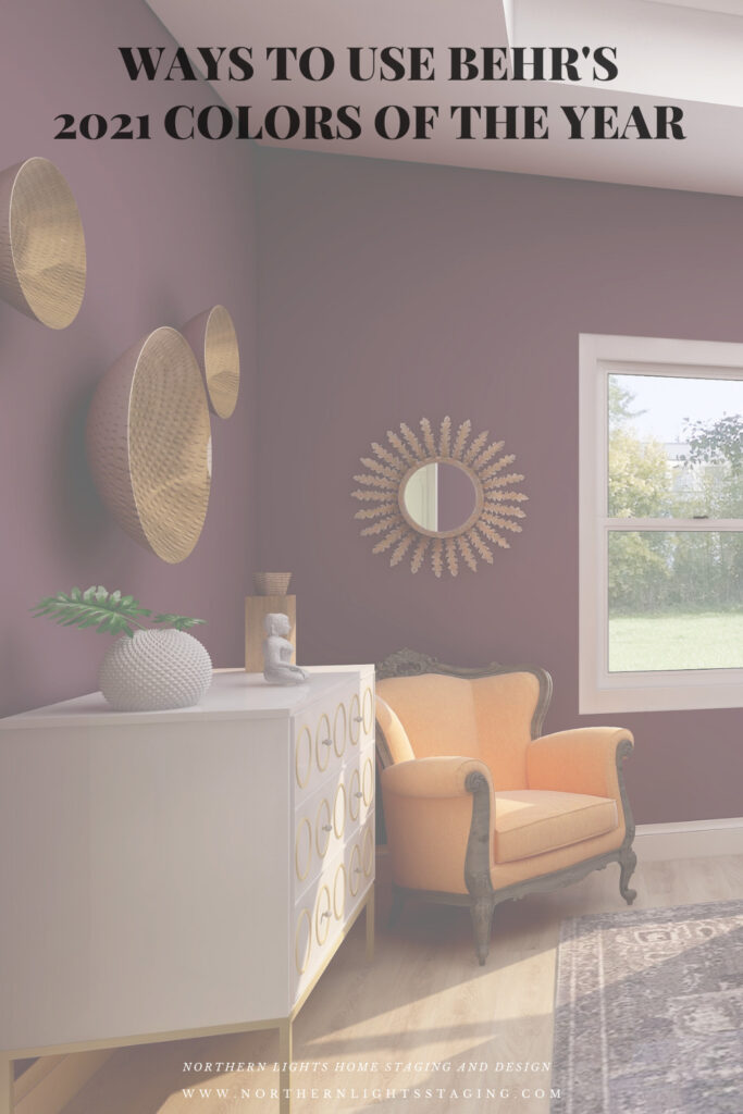
I decided to highlight my three favorites, Voyage, Royal Orchard and Euphoric Magenta, because I like the way they look and I like what they represent (soothing and spiritual, restorative and secure, and gracious and creative). They fit with my philosophy and new Aligned Design system, which combines art, science and energy to create a perfect space for you.
I have included a list of products I used or something similar for each design. Note they contain affiliate links, meaning I receive a small commission for sharing with you at no additional cost to you.
Royal Orchard
Royal Orchard is part of their “Quiet Haven” palette. They say “Deep hues have a reassuringly sublime and dependable nature, delivering the effect of a peaceful oasis in your home.”
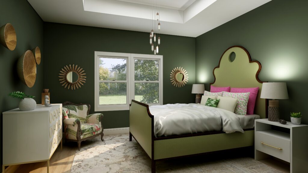
I like it because I believe this shade of green is prevalent in nature, and one of my goals in my designs is to bring the outside in and help people feel more connected to nature with biophilia. I think this creates that feeling of a “peaceful oasis” in your home. To continue that theme I used other greens in the furniture, plants, natural materials such as metals (mirrors, wall art) and wood (lamp). The fabric on the chair reflects a plant theme. I have also included some of my framed fractal art called spring (not visible in this part of the room. The area rug highlights metallic details in cream, gray, silver, and gold.
Master bedroom Edesign using Behr Royal Orchard by Northern Lights Home Staging and Design
Shop this Look
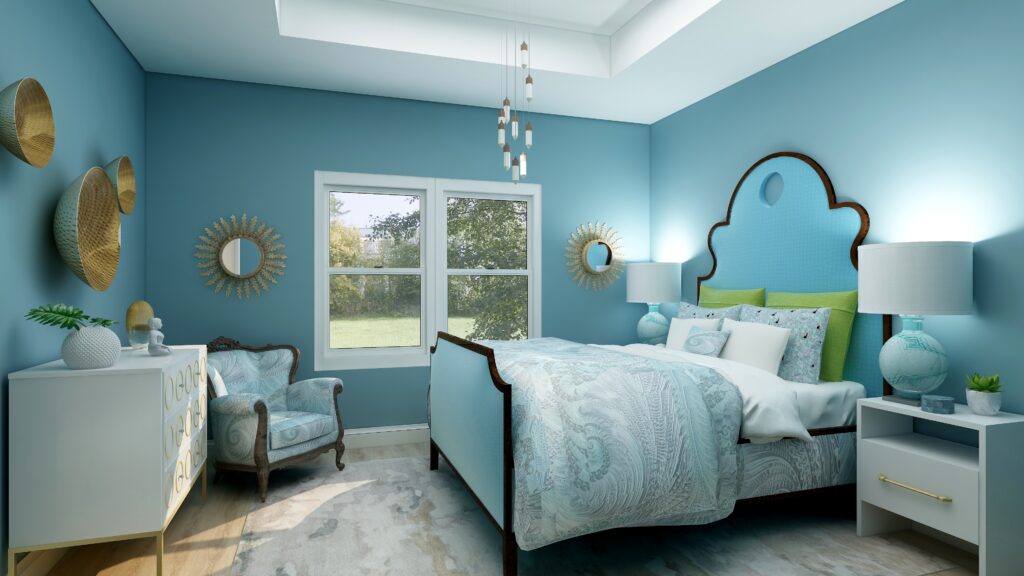
Voyage
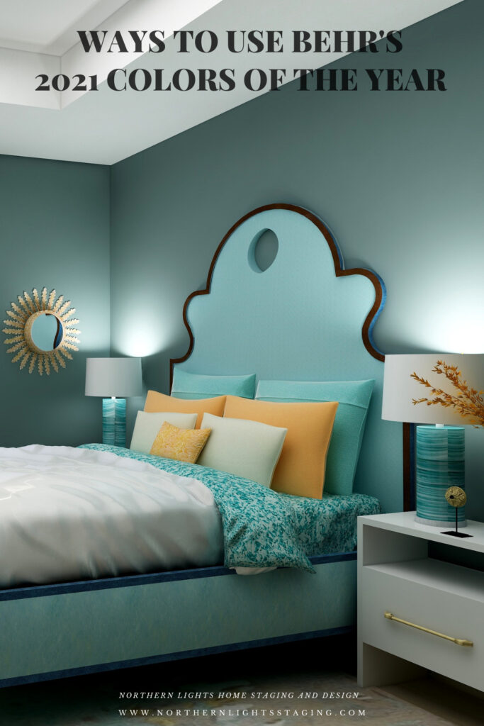
Voyage is part of their Calm Zone palette. They say “Soothing blues and greens create a restorative escape offering ease and solace”. I agree and blues and greens are some of my favorites to work with as they are also colors of nature and help bring the outside in.
They describe this shade as “soothing and spiritual”. Lately, I have really been considering the energy aspects of color and feng shui and how it all works together to create a space that feels great and helps support you in BEING your best. This color works with this idea. It is part of my Aligned Design system the considers art, science and energy in all my designs.
Master bedroom Edesign using Behr Voyage by Northern Lights Home Staging and Design
Shop this Look
Euphoric Magenta
According to Behr, Euphoric Magenta is part of their bold and saturated “Optimistic View” palette. With this collection you can “add a touch of playful fun to eclectic and global decor styles.” Since I am all about global style design and love rich color, I picked this one to highlight:)
Master bedroom Edesign using Behr Euphoric Magenta by Northern Lights Home Staging and Design
Shop this Look
Which Color of the Year is Your Favorite?
I enjoyed working with all these colors, and think they could each work nicely to create a relaxing master bedroom, although Big Cypress feels a little more energizing than relaxing. Of all the colors, I am not sure if Aegean Teal or Euphoric Magenta is my favorite, how about you?
Behr’s 2021 color Euphoric Magenta Benjamin Moore’s 2021 Color of the Year Aegean TealBehr’s 2021 color VoyagePPG’s 2021 Color Palette with Mystic Aqua.Mystic Aqua but with my my own rebel color scheme:)Behr’s 2021 color Royal Orchard Sherwin Williams 2021 Color of the Year Urbane BronzePPG’s 2021 Color Palette with TranscendPPG’s 2021 Color Palette with Big Cypress.
Are You Inspired?
When your space is better, you are better. When you are better, the world is better.
Are you ready to create the perfect space for you? Try my Aligned Design consultation. It is a wholistic Interior Design and Color consultation that considers art, science and energy to give you a game plan for your whole home. I use the art of eco-friendly Interior Design mixed with color science and consider Feng Shui, transformative design, biophilia and color psychology to make your space feel great and support the life you want to live.
Once you have your game plan, we can work on specific rooms with one of my Edesign packages.
The designs above are examples of full service Edesign, where you get a floor plan, a concept board, a 3D render and a complete shopping list with set up instructions. Or, be brave and try some new color with an expert color consultation.
What’s Your Global Design Style?
The designs in this article are examples of global style design. Are you curious what your global style is? Take the quiz and find out.
In several articles I explored the 2021 colors of the year of different paint companies and compared them in the same Edesign I created for a master bedroom. I enjoyed exploring Benjamin Moore’s Agean Teal and Sherwin Williams Urbane Bronze. I was excited to see what PPG’s color of the year was.
But wait….they didn’t have one!! What??? No, they had a color palette for 2021 but not a particular color of the year. Honestly, I felt let down.
I guess I don’t like the idea of a color palette, because I don’t want to be told or encouraged to use a series of colors together. I like to decide that for myself!
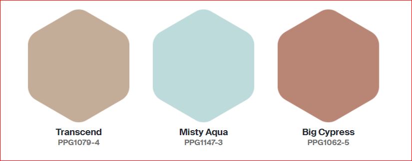
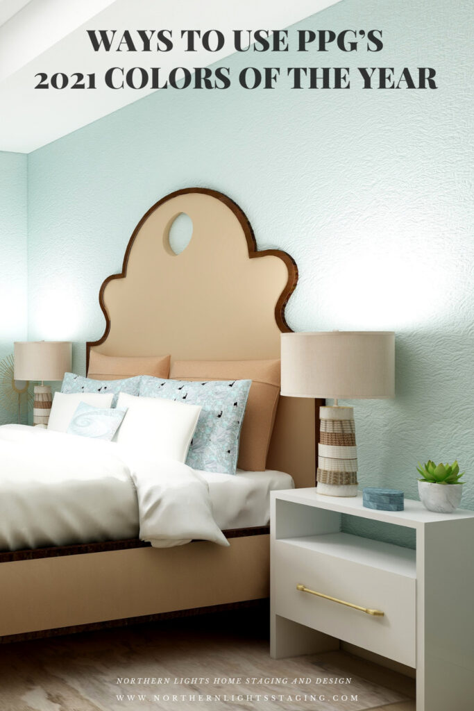
The PPG 2021 Color Palette includes Transcend, Mystic Aqua and Big Cypress, which are meant to work together.
Here is what PPG says about their 2021 color palette:
Transcend: A mid-tone oatmeal-colored hue that draws on earthy influences and nostalgia.
Big Cypress, a shaded ginger with persimmon undertones, is the equivalent of a big, comforting hug for your home.
Misty Aqua, a watercolor cerulean blue, provides an unexpected pairing of freshness against the other warm, earthy tones.
I like the Misty Aqua. Transcend or really any beige makes me yawn. Big Cypress reminds me of the desert, and I am not sure it makes me feel like my home got a hug.
I am trying to have an open mind here and just get over the fact they didn’t just pick one color. I find it a little annoying, as if they are trying to sell me three paints instead of one.
I am not sure why they paired these colors together. Looking at the color data, they do not really fit into any traditional color scheme in relation to hue angle. They are not similar in terms of chroma or lightness to create a harmonious pairing. I don’t really get it, but will see what amazing and beautiful design I can create anyway! Here goes.
Master Bedroom Design
Design 1- Transcend and the PPG 2021 Palette
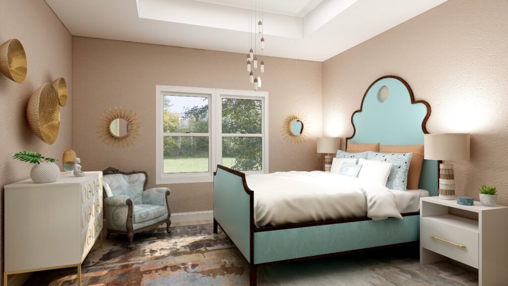
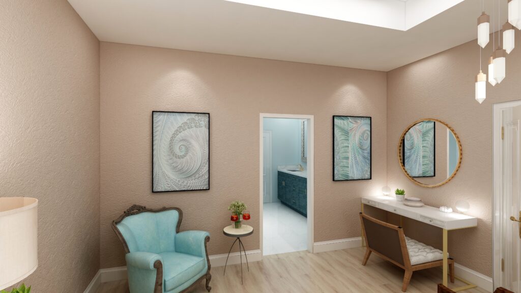
In this design, I used Transcend as the main color on the walls, and used the two other colors as accents or supporting colors. I used a shade of Mystic Aqua on the bed. The larger pillow shams and the lamps tie in Big Cypress. The area rug has some Transcend and Big Cypress colors in it and also a lighter shade of Mystic Aqua. My design celebrates circles and curves, mixes modern pieces with antiques, and mixes soft fabrics with glass, metal and pottery. I used my fractal art from the “Jenna” collection which has some of the Mystic Aqua color in the pillow shams and accent pillow, the wall art, and on one of the antique chairs. My fractal art celebrates curves and spirals. To learn more about spirals and fractal art, see my blog article What Does Your Art Mean?
.Design 1-Master Bedroom Edesign with PPG’s 2021 color Transcend on the wall. Design 1- Master Bedroom Edesign and Jenna Fractal Art by Northern Lights Home Staging and Design.
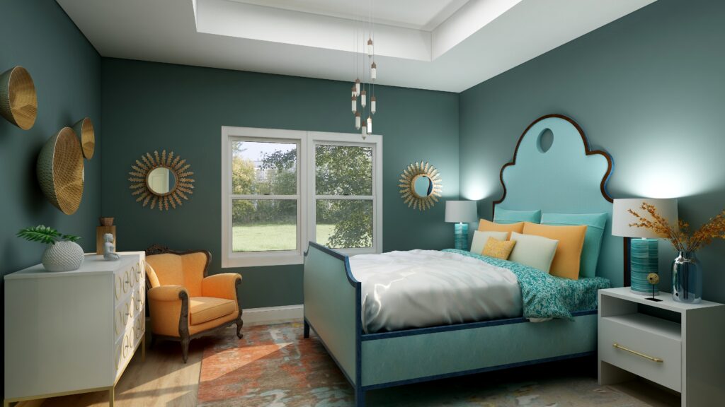
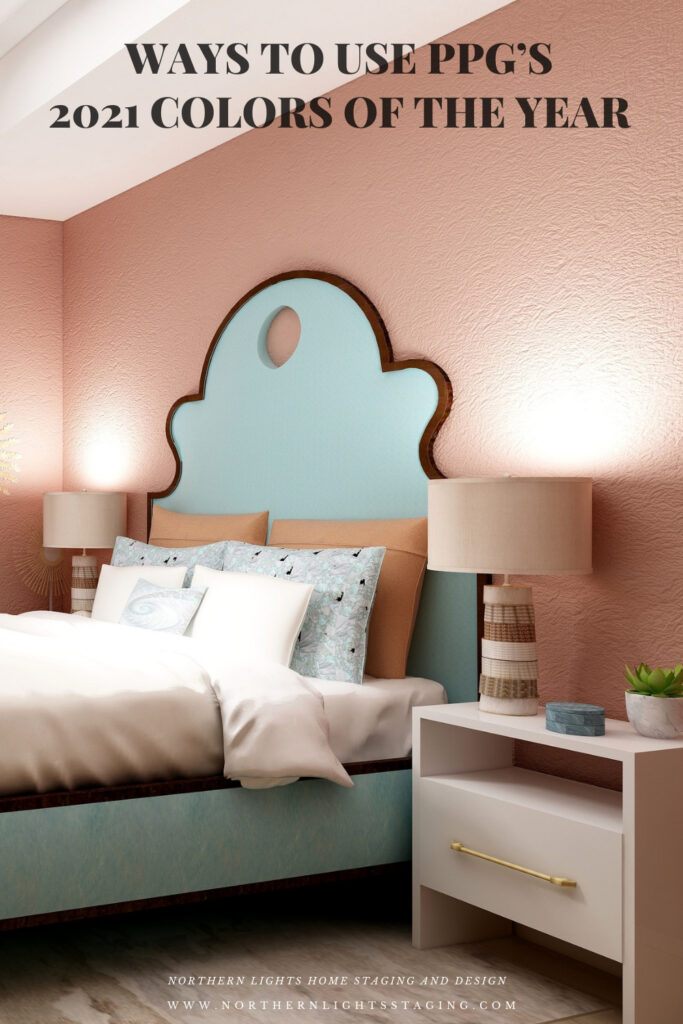
Design 2- Big Cypress and the PPG 2021 Palette
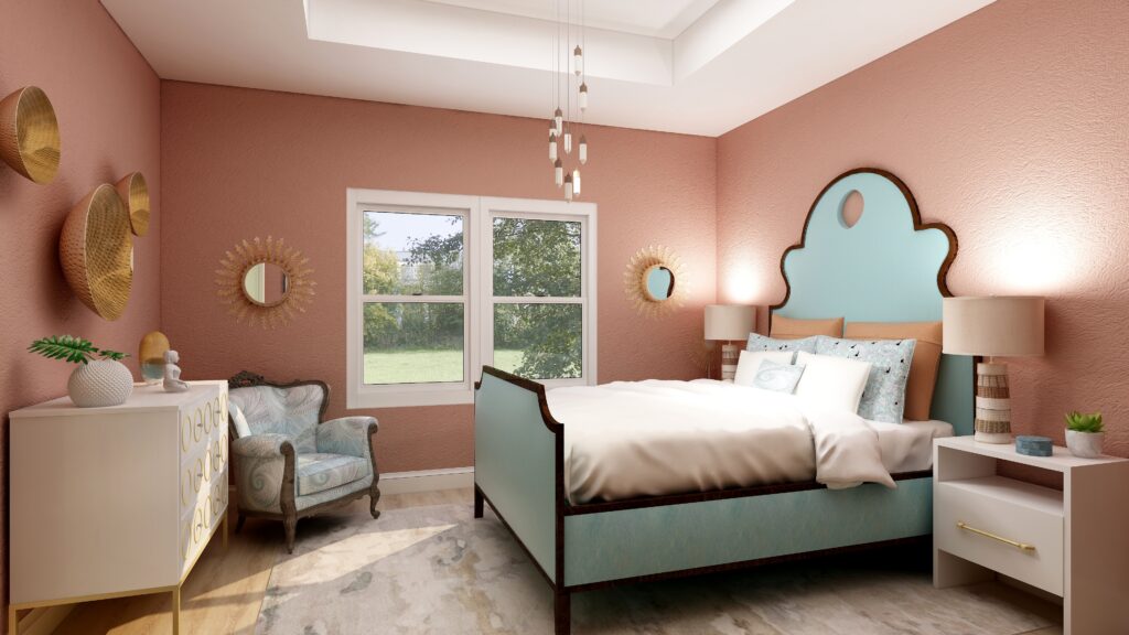
In the design below, I used Big Cypress as the primary color on the walls with the other two colors as supporting colors. I changed the area rug to one that contains colors similar to Transcend.
Design 2- Master Bedroom Edesign and fractal art on the chair by Northern Lights Home Staging and Design using Big Cypress as the wall color
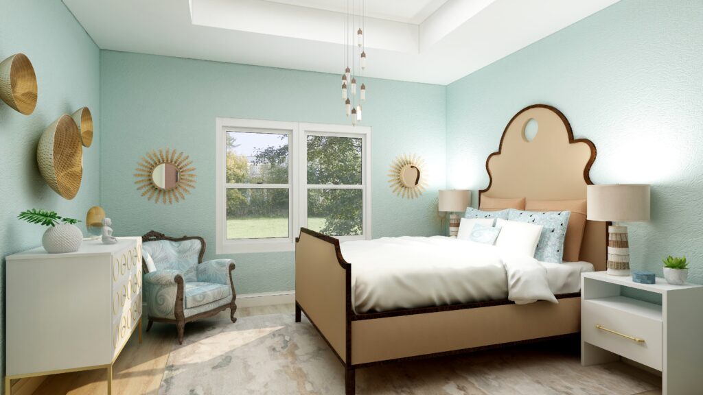
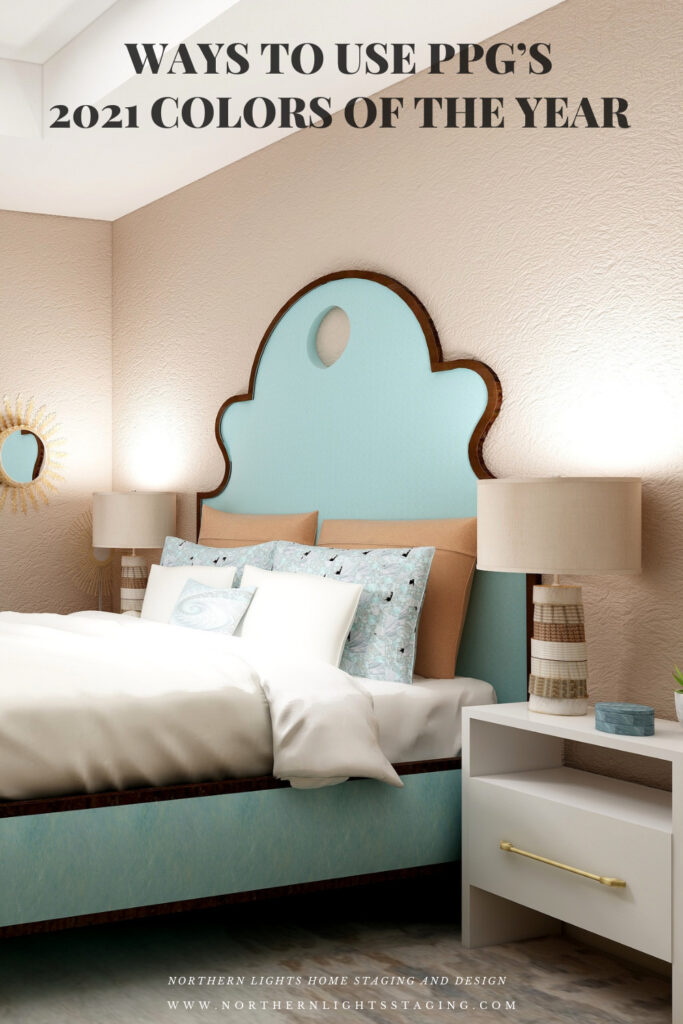
Design 3- Mystic Aqua and the PPG 2021 Palette
In the design below, I changed the wall color to Mystic Aqua, and changed the bed upholstery to a color similar to Transcend.
Design 3- Master Bedroom Edesign and fractal art on the chair by Northern Lights Home Staging and Design using Mystic Aqua as the wall color
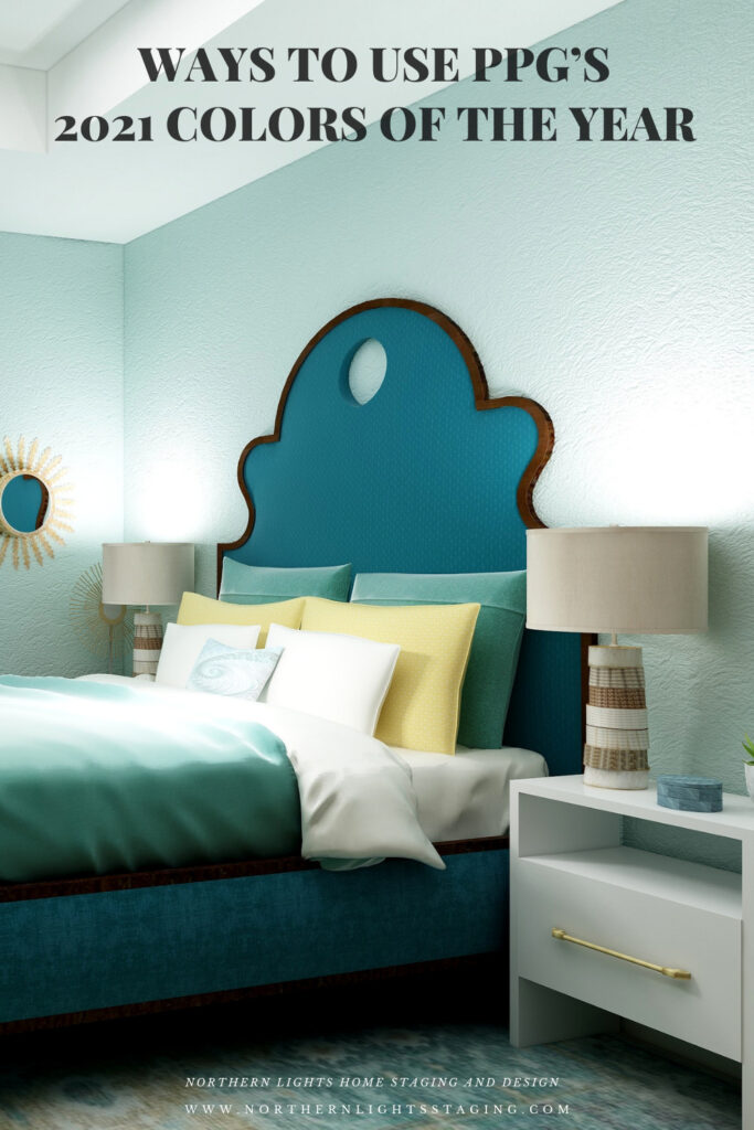
Design 4- Mystic Aqua and my own color palette
In the design below, I did my own thing. I liked Mystic Aqua the best of the three wall colors. I developed my own palette using various shades of blue/greens and yellow, it’s opposite on the color wheel.
Design 4- Master Bedroom Edesign by Northern Lights Home Staging and Design using Mystic Aqua as the wall color and my own color palette.
Which Color of the Year is Your Favorite?
I enjoyed working with all the colors of 2021, and think they could all work nicely to create a relaxing master bedroom, although Big Cypress feels a little more energizing than relaxing. Of all the colors, I think Aegean Teal is my favorite, how about you?
PPG’s 2021 Color Palette with TranscendPPG’s 2021 Color Palette with Big Cypress.PPG’s 2021 Color Palette with Mystic Aqua.Mystic Aqua but with my my own rebel color scheme:) Benjamin Moore’s 2021 Color of the Year Aegean Teal Sherwin Williams 2021 Color of the Year Urbane Bronze
Are You Inspired?
Get your colors right the first time with a science based color consultation.