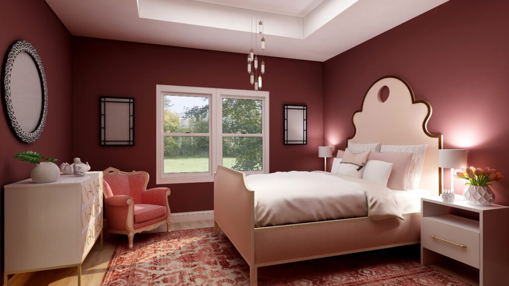
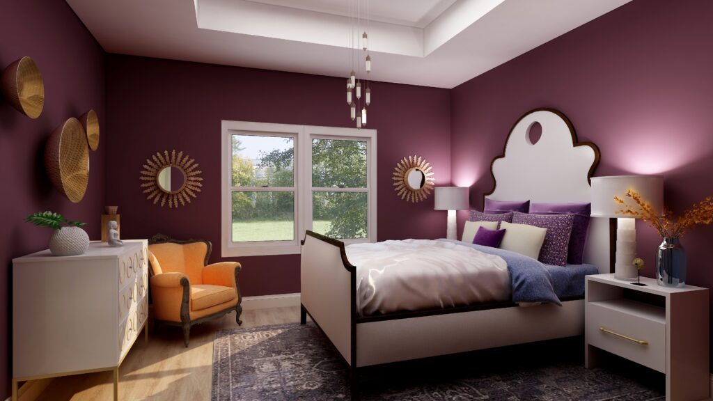
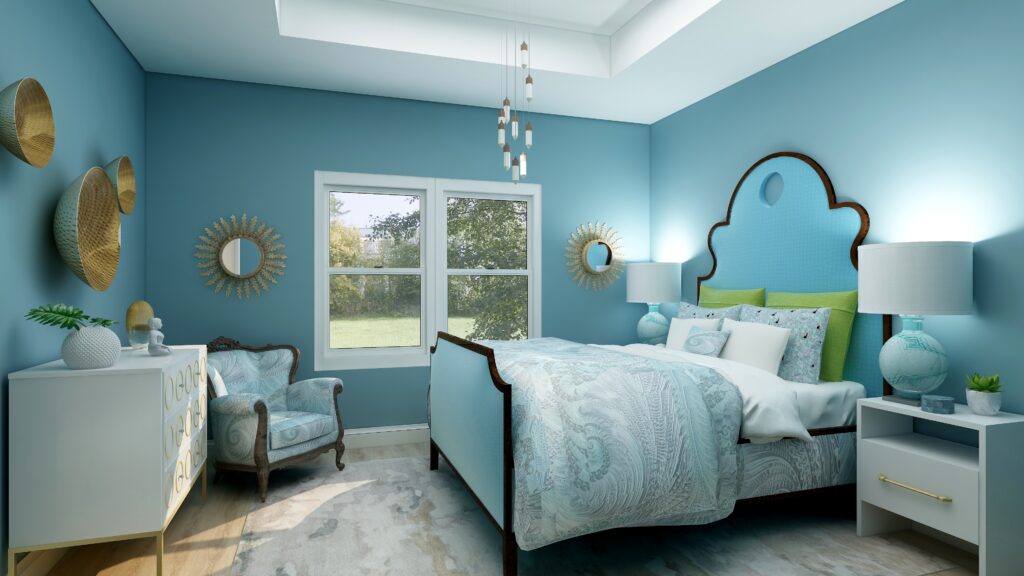
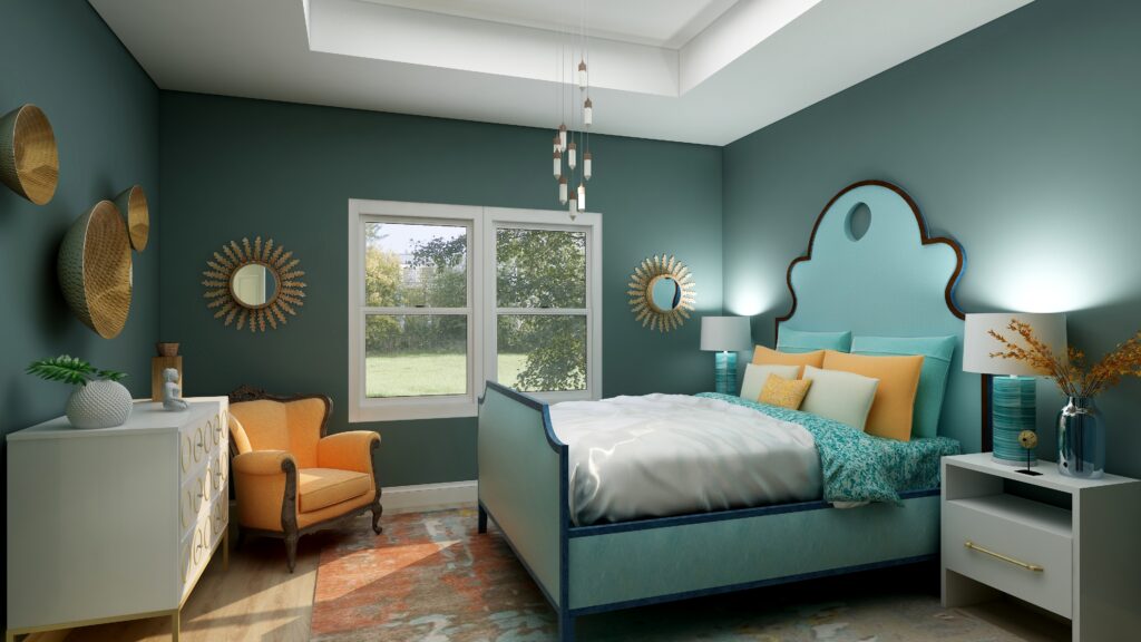
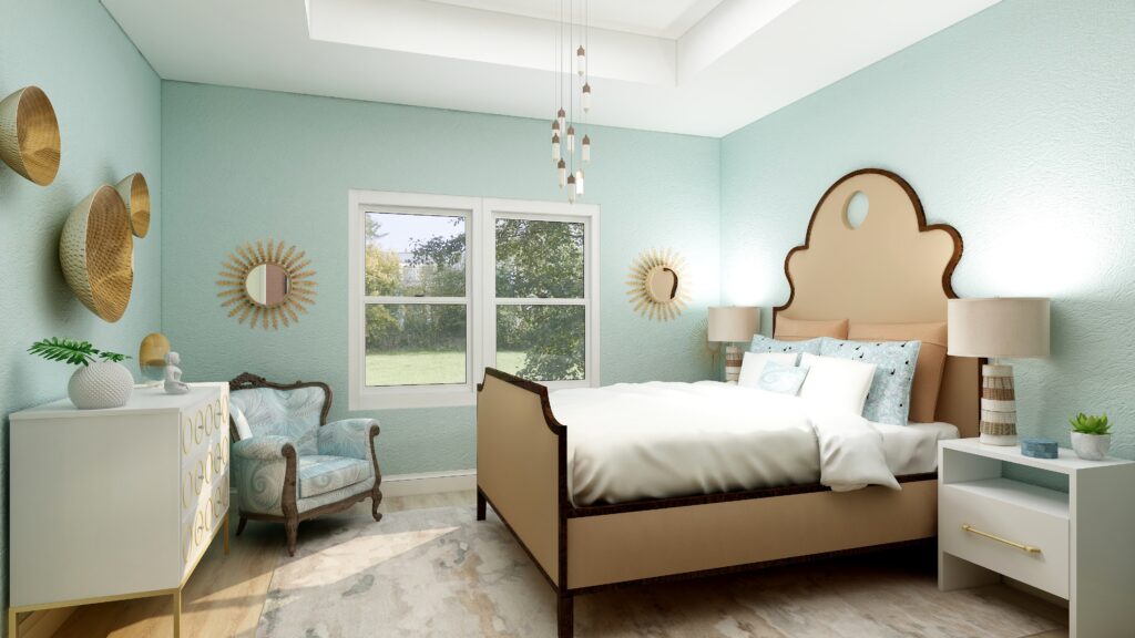
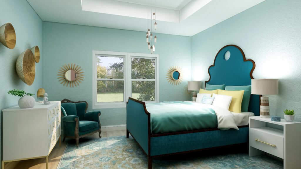
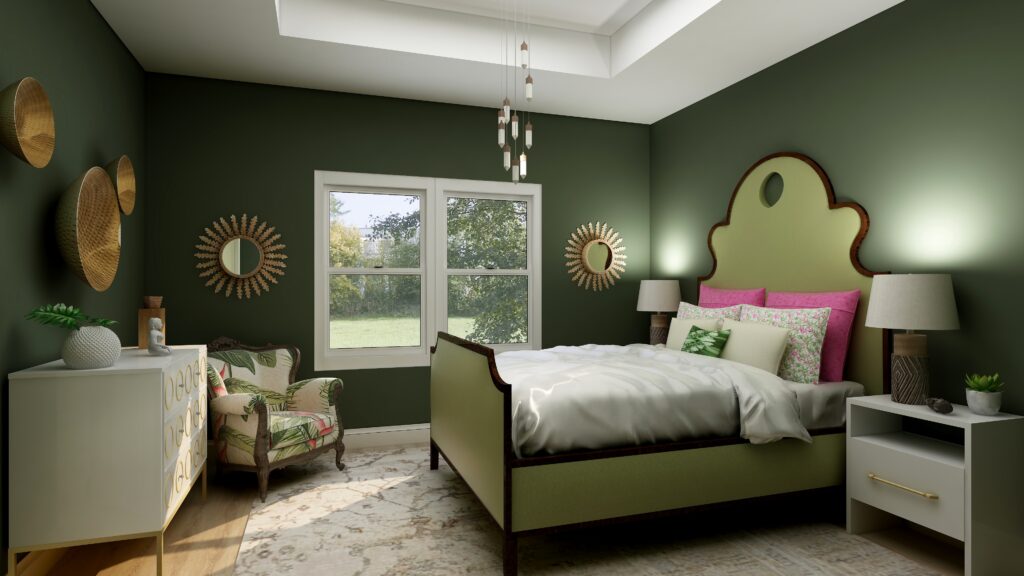
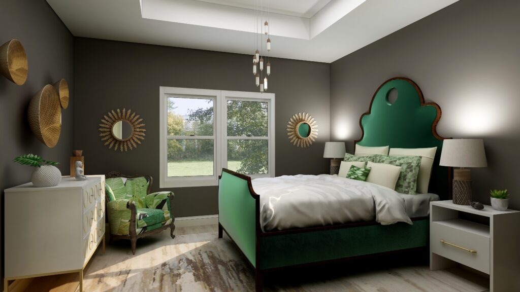
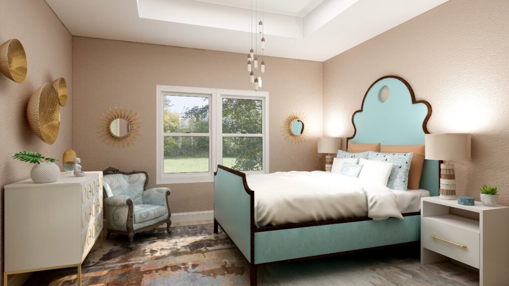
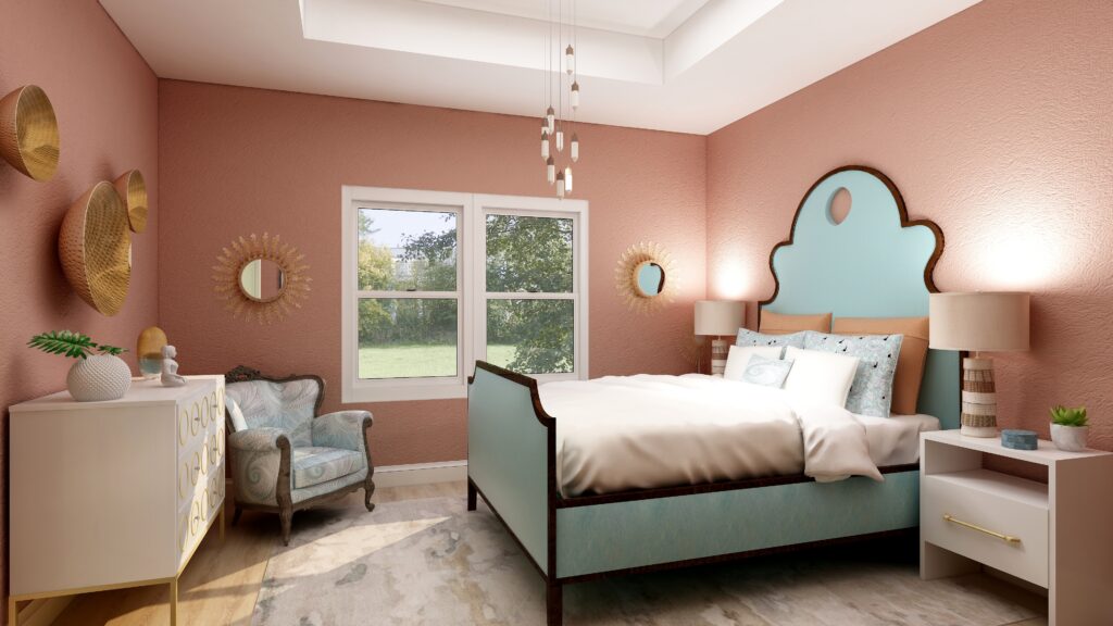
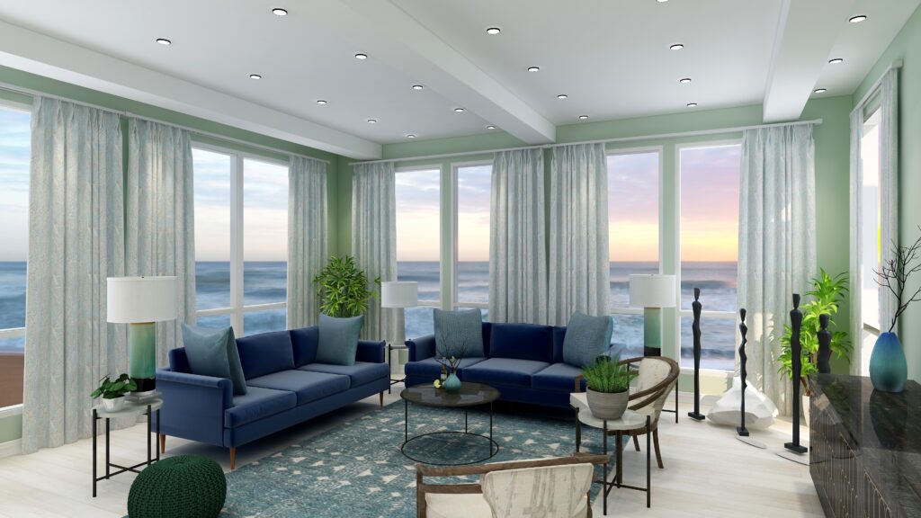
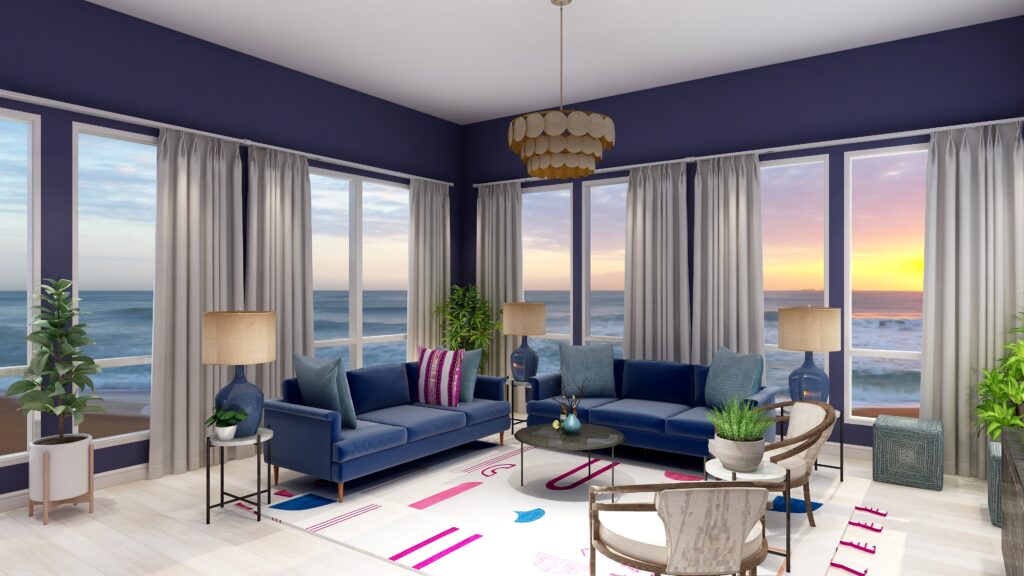
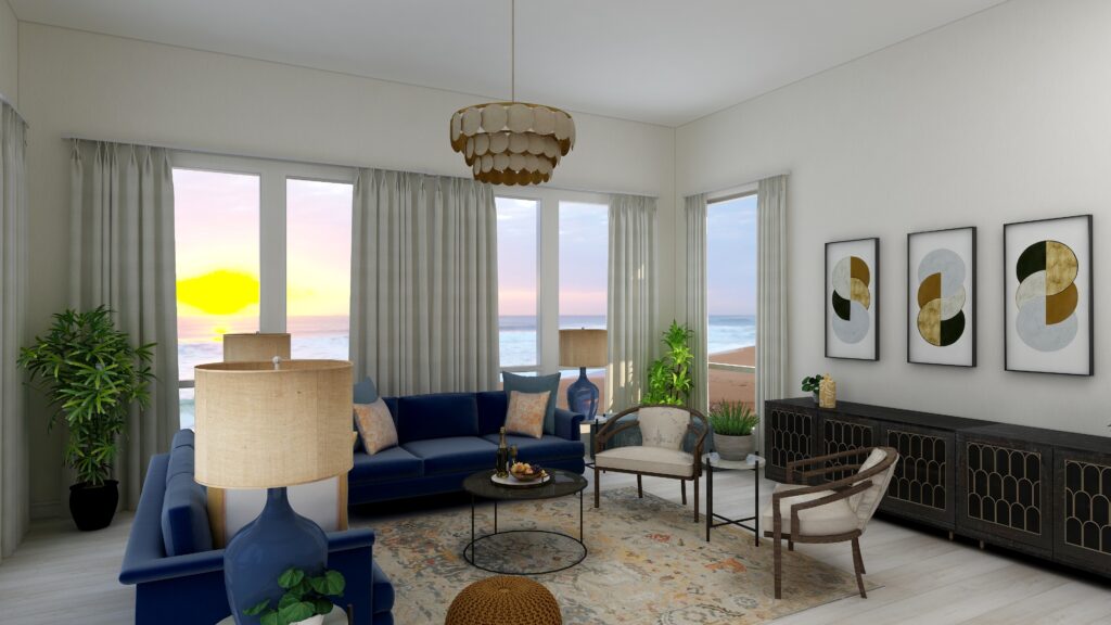
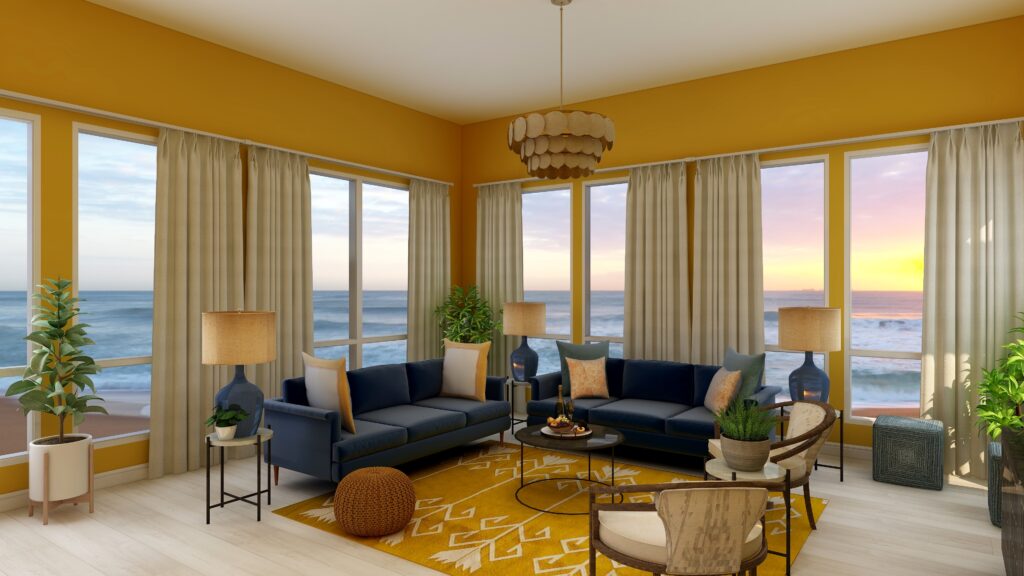
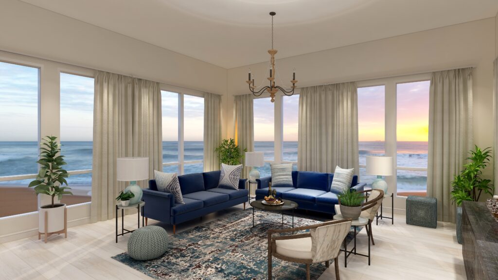
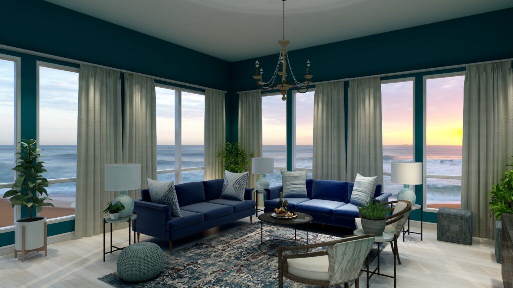
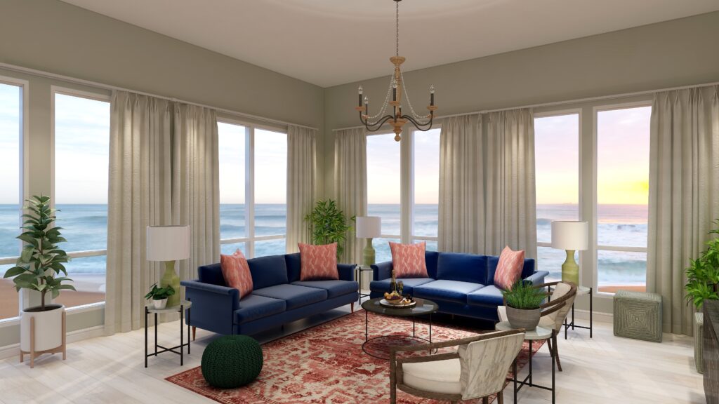
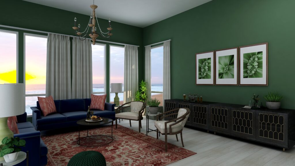
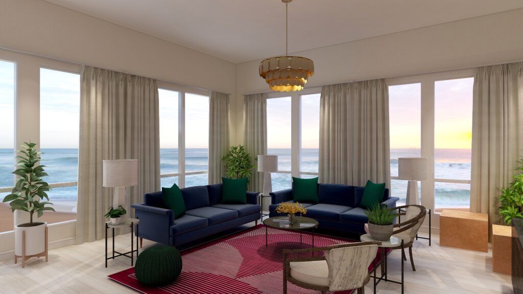
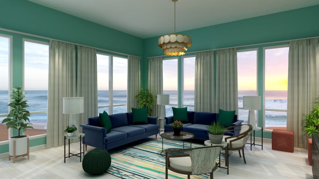
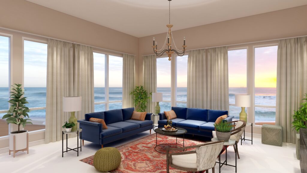
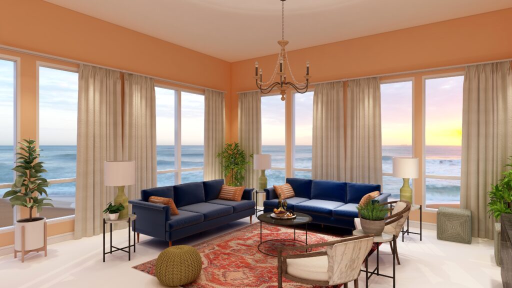
Northern Lights Home Staging and Design awarded Best of Houzz 2021 for Customer Service

Best of Houzz 2021 for Customer Service- Northern Lights Home Staging and Design

Northern Lights Home Staging and Design of Seward, Alaska

Awarded Best Of Houzz 2021

Coveted annual award highlights home remodeling and design professionals with top ratings and most popular designs among the Houzz community.

Seward, Alaska, February 5, 2021Northern Lights Home Staging and Design of Seward, Alaska has won a “Best Of Houzz” award for Customer Service on Houzz®, the leading platform for home renovation and design. This Edesign, Interior Design, Color Consulting and Home Staging firm was chosen by the millions of homeowners that comprise the Houzz community from among more than 2.5 million active home building, remodeling and design industry professionals.

The Best Of Houzz badge is awarded annually, in three categories: Design, Customer Service and Photography. Design awards honor professionals whose work was the most popular among the Houzz community. Customer Service honors are based on several factors, including a pro’s overall rating on Houzz and client reviews submitted in 2020. Architecture and interior design photographers whose images were most popular are recognized with the Photography award.

A “Best Of Houzz 2021” badge will appear on winners’ profiles as a sign of their commitment to excellence. These badges help homeowners identify popular and top-rated home professionals in every metro area on Houzz.

Best of Houzz 2021 for Customer Service- NOrthern Lights Home Staging and Design


“Thank you to all my customers for the privilege of working with you, your 5-star reviews on Houzz and for making it possible to receive this award for 6 years in a row”!

“This year’s Best Of Houzz awards go to an incredibly talented and service-oriented group of home remodeling and design professionals, and we’re proud to highlight the winners on the Houzz website and app,” said Liza Hausman, vice president of Industry Marketing for Houzz. “This award is particularly meaningful as it reflects the sentiment of the millions of homeowners in the Houzz community who are hiring home professionals for their projects across the U.S. and around the world.”

Follow Northern Lights Home Staging and Design on Houzz.

About Northern Lights Home Staging and Design

Northern Lights Home Staging and Design provides an award winning, versatile, and unique one-stop shop for  Interior Design, Edesign, Home Staging,  and Color Consulting, for homes and vacation rental properties. They provide in person service in South Central Alaska, and online consultations and Edesign services nationwide.

Mary Ann Benoit is the only certified color strategist in Alaska as well as the leading home stager in south-central Alaska, trained as both a professional home stager and with a degree in Interior Design. Customers and colleagues describe her as “the best at what she does” and her work as “stellar,” “fantastic,” ”amazing,” “innovative,” “prompt and professional.”  She is known for giving “above and beyond service,” being a “delight to work with,” and “a great coach and mentor.”  Learn more.

About Houzz

Houzz is the leading platform for home remodeling and design, providing people with everything they need to improve their homes from start to finish – online or from a mobile device. From decorating a small room to building a custom home and everything in between, Houzz connects millions of homeowners, home design enthusiasts and home improvement professionals across the country and around the world. With the largest residential design database in the world and a vibrant community empowered by technology, Houzz is the easiest way for people to find inspiration, get advice, buy products and hire the professionals they need to help turn their ideas into reality. Headquartered in Palo Alto, Calif., Houzz also has international offices in London, Berlin, Sydney, Moscow, Tel Aviv and Tokyo. Houzz is a registered trademark of Houzz Inc. worldwide. For more information, visit houzz.com.

Pin This
Best of Houzz 2021 for Customer Service- NOrthern Lights Home Staging and Design


Ways to Use Pantone’s 2021 Colors of the Year

In my last five articles I have been exploring the 2021 colors of the year of different paint companies and comparing them in the same Edesign I created for a master bedroom.  I started by exploring Benjamin Moore’s Agean Teal and Sherwin Williams Urbane Bronze.  I found that PPG had a color palette of 3 colors of the year instead of one as you can see in my article Ways to Use PPG’s Colors of the Year. I admitted I felt a little let down that they did not just commit to one color.   

Then I checked on Behr’s Colors of the Year and found they had a palette of 21 colors!! Talk about non-committal.   I highlighted 3 of my favorites in my article, Ways to Use Behr’s 2021 Colors of the Year.

HGTV Home by Sherwin-Williams listed their 2021 Color of the Year: as Passionate, which you can see in my last article, How to Use Sherwin William’s HGTV Home 2021 Color of the Year Passionate.

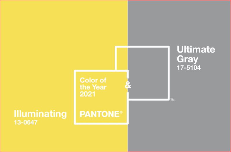
Here, I will explore using Pantone’s 2021 Colors of the Year. They have two colors, Illuminating and Ultimate Gray. Pantone does not create paint colors. They create ink used in graphics, but their color selections influence many of the colors of products you will find available such as art, accessories, bedding and furniture.


Pantone colors of the year 2021
Pantone says these colors are “A marriage of color conveying a message of strength and hopefulness that is both enduring and uplifting”..

I am a little surprised at their pick of Ultimate Gray…..I feel like gray is our past and we have moved on. I am also surprised at their pick of Illuminating. It feels like the color of a yellow safety vest or a yellow warning light at a traffic signal, rather than one I would pick for accessories in my home. “Uplifting” is not a word I would use to describe it. Well, I am up for a challenge. Let us see what we can do with this combination!

The Design

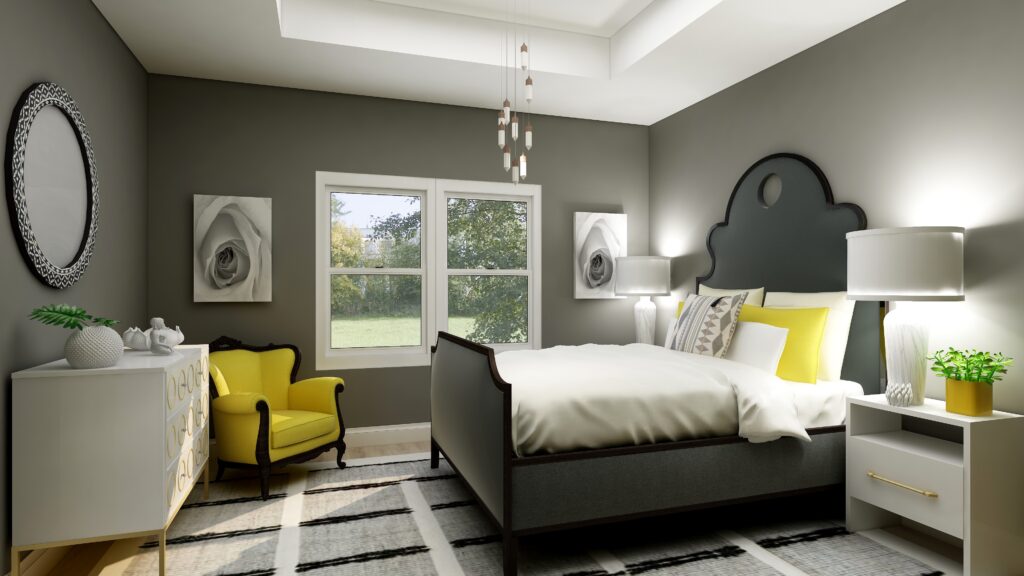
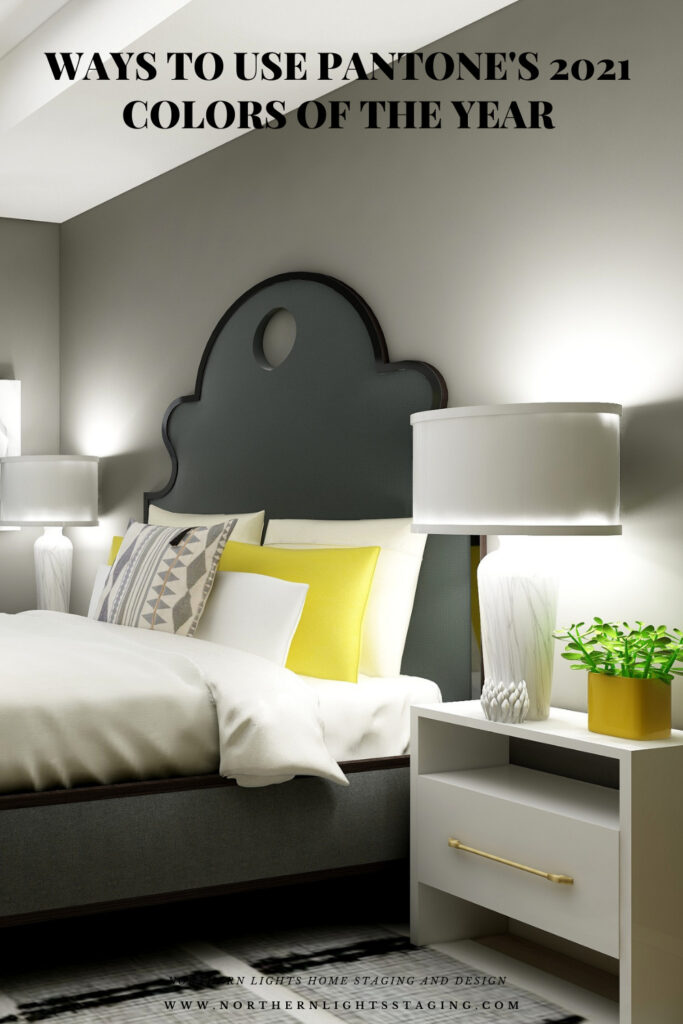
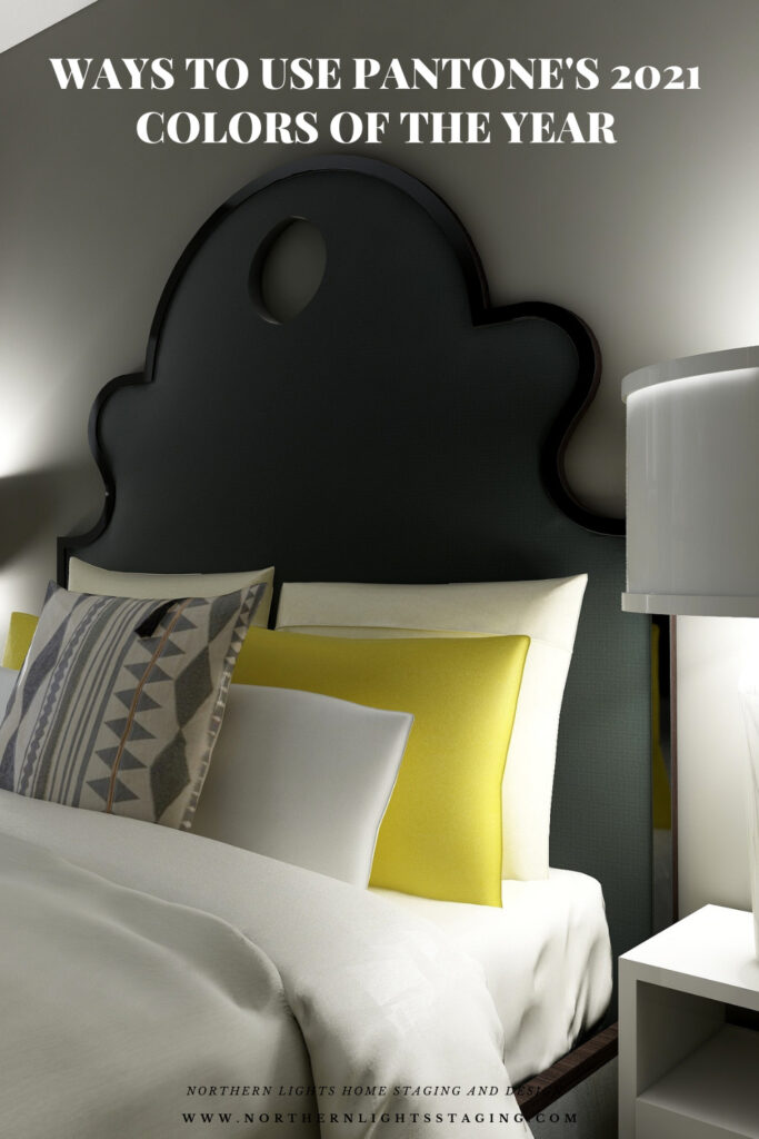
In this design, I used the color data to create a room that would look like Ultimate Gray on the walls, if Pantone made paint. The closest real paint color I could find to match this was Benjamin Moore, Tucker Gray, CW-705. 

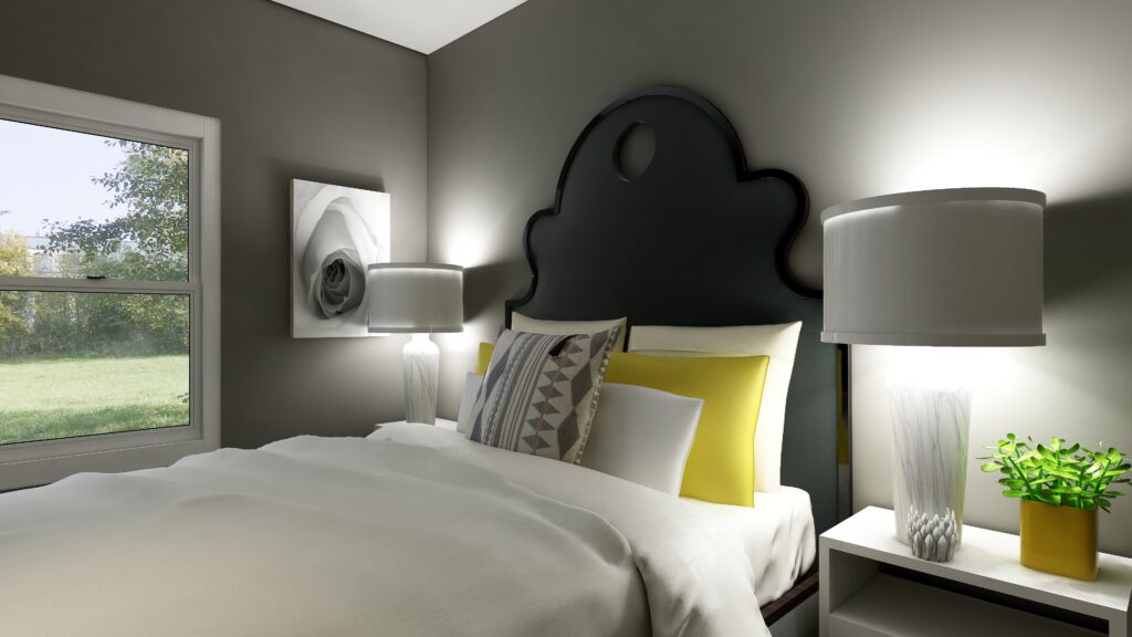
I think this bedroom feels relaxing, serene but with a little bit of energy and sweetness that comes from the cheery pops of yellow. I do like yellow and gray together, although I think this yellow is a little too saturated for my taste. I prefer a yellow with a little less chroma.

In my previous designs I have played with more saturated wall colors to show what you can do with color and how it feels. Sorry, I can not bring myself to try this color on the wall….I am not going to go there!

How to Use Pantone's 2021 Colors of the Year Illuminating and Ultimate Gray
Master bedroom Edesign using Pantone’s 2021 Colors of the Year by Northern Lights Home Staging and Design
How to Use Pantone's 2021 Colors of the Year Illuminating and Ultimate Gray
Master bedroom Edesign using Pantone’s 2021 Colors of the Year by Northern Lights Home Staging and Design

Shop this Look

Here are some of the pieces I used or alternative ideas for my designs. Some contain affiliate links, meaning I may receive a small commission for sharing this with you at no additional cost to you if you purchase anything.

Which Color of the Year is Your Favorite?

I enjoyed working with all these colors, and think they could each work nicely to create a relaxing master bedroom, although Big Cypress feels a little more energizing than relaxing. Of all the colors, I like Aegean Teal and Euphoric Magenta the best, how about you?  

How to Use Pantone's 2021 Colors of the Year Illuminating and Ultimate Gray
Pantone’s 2021 Colors Illuminant and Ultimate Gray
HGTV Home by Sherwin-Williams 2021 Color of the Year: Passionate. Edesign by Northern Lights Home Staging and Design
Sherwin Williams HGTV Home Passionate
Master bedroom Edesign using Behr Euphoric Magenta by Northern Lights Home Staging and Design
Behr’s 2021 color Euphoric Magenta

Using Benjamin Moore's 2021 Color of the Year Aegean Teal by NOrthern Lights Home Staging and Design
Benjamin Moore’s 2021 Color of the Year Aegean Teal
Master bedroom Edesign using Behr Voyage by Northern Lights Home Staging and Design
Behr’s 2021 color Voyage
PPG's 2021 Colors of the Year with Mystic Aqua
PPG’s 2021 Color Palette with Mystic Aqua.
PPG's 2021 Colors of the Year = my version
Mystic Aqua but with my my own rebel color scheme:)
Master bedroom Edesign using Behr Royal Orchard by Northern Lights Home Staging and Design
Behr’s 2021 color Royal Orchard

Ways to Use Sherwin Williams 2021 Color of the Year Urbane Bronze
Sherwin Williams 2021 Color of the Year Urbane Bronze
PPG's 2021 Colors of the Year with Transcend
PPG’s 2021 Color Palette with Transcend
PPG's 2021 Colors of the Year with Big Cypress on the walls
PPG’s 2021 Color Palette with Big Cypress.

Are You Inspired?

When your space is better, you are better.
When you are better, the world is better. 

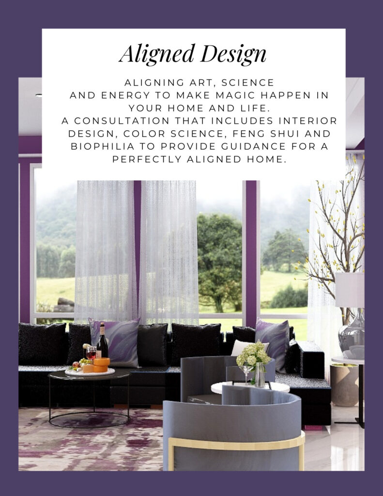
Are you ready to create the perfect space for you? Try my Aligned Design consultation. It is a wholistic Interior Design and Color consultation that considers art, science and energy to give you a game plan for your whole home. I use the art of eco-friendly Interior Design mixed with color science and consider Feng Shui, transformative design, biophilia and color psychology to make your space feel great and support the life you want to live.

 Once you have your game plan, we can work on specific rooms with one of my Edesign packages. 

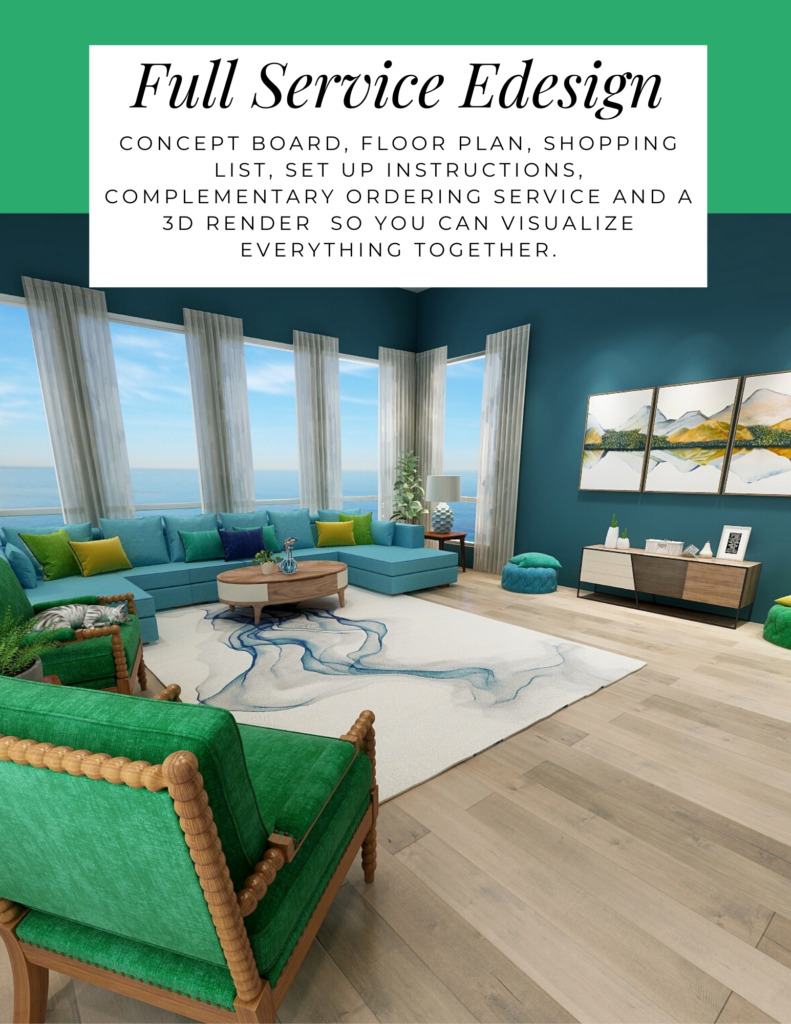
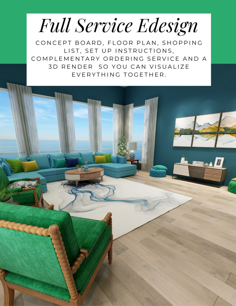
The designs above are examples of full service Edesign, where you get a floor plan, a concept board, a 3D render and a complete shopping list with set up instructions. Or, be brave and try some new color with an expert color consultation.


Aligned Design System by Northern Lights Home Staging and Design


Full Service Edesign by Northern Lights Home Staging and Design

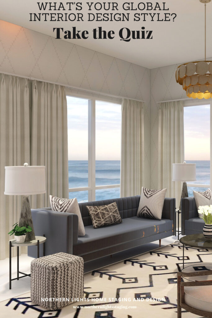
What’s Your Global Design Style?

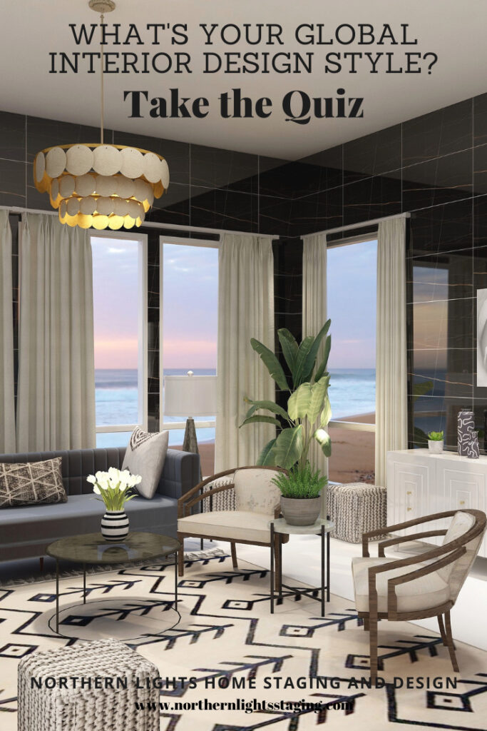
The designs in this article are examples of global style design. Are you curious what your global style is? Take the quiz and find out.


What is Your Global Design Style? Take the Quiz


Why work with Northern Lights Home Staging and Design


Call 907-362-0065 today

 info@northernlightsstaging.com

Terms of Service

Privacy Policy

Disclaimer

Prices subject to change without notice.

Pin These

How to Use Pantone's 2021 Colors of the Year
How to Use Pantone’s 2021 Colors of the Year
How to Use Pantone's 2021 Colors of the Year
How to Use Pantone’s 2021 Colors of the Year


7 Things to Consider Before You Rent Out Your Home to Vacationers

Some families own a second home that’s rarely used, and others travel frequently enough that renting out their residence can become an income source. With numerous websites available that give you access to millions of vacationers and short-term renters, there’s a high chance that you can find someone to rent your property while you’re away. To attract visitors to your home and get the best return on investment, you should consider upgrading and sprucing up your place. Here are a few upgrades to include, as well as other considerations to make during the process.

Northern Lights Home Staging and Design offers award-winning staging and design for homes and vacation properties! Call 907-362-0065 or email info@northernlightsstaging.com

Know the Rules

    • First things first: Can you even rent out your place? Some areas won’t allow you to rent out your property, and those that do might only allow longer rentals, such as gated communities that require a six-month minimum lease for renters. Check on the rules about short-term vacation rentals in your area before you consider going this route.

Location

Location is a big part of why renters choose to stay somewhere. If you’re looking to buy a vacation property, focus on areas that are central or in proximity to the city’s hottest tourist attractions and hippest neighborhoods. If you already own a home, highlight the best of what the neighborhood has to offer. Your listing should emphasize things to do nearby and walkability to restaurants and shops.


7 things to consider before renting your home
Photo courtesy of Pixaby

Pricing

Figuring out how to price your property is tricky because you want to attract visitors who are looking to spend less than they would at a hotel, but you also want to profit from the arrangement. It’s not just the mortgage that you need to recoup, but HOA fees as well. When your listing is still new, it’s important to have an attractive price for renters who are unsure about a new property with no reviews. As you build up a solid reputation, you can price your property higher.

Listing

When renters search for homes to stay in during their vacation, they first look at the location, number of bedrooms, and price. Beyond that, there’s more that can draw renters to your listing. Be sure to make your listing stand out by posting quality photos taken in good light and showcasing the best features of your place. Five-star reviews can also go a long way toward getting renters to trust you. The happier your first guests are, the more likely they’ll leave good reviews so that your listing gains popularity and you can charge higher rates in the future.

Amenities

Renters want the comforts of a home away from home. A nice fridge, dishwasher, laundry in the unit, A/C, heater, parking spots, and high-speed internet are attractive features that make guests enjoy their stay. If your place has a pool and/or hot tub, then you’ll have an even easier time attracting guests.

7 Things to Consider Before Renting Out Your Home to Vacationers

Design

Unless you’re renting out a rustic cabin in the mountains, you’re probably better off with a clean, modern design inside your home. Potential upgrades include new wood flooring and panels, countertops made of granite, quartz or marble, upgraded lighting fixtures to replace old lamps, new doorknobs and faucet handles, and a fresh paint job. Great design and color are key to attracting your ideal guests and increasing your income and bookings. Know who your target market is, what they want and decorate to attract them. You can also opt to redecorate the home by settling on a theme or style and choosing design elements that complement that style. Enlisting the help of a professional designer or color consultant can make a big difference in getting the results you want.

Mind Your Business

An important part of gearing up to run a vacation rental is setting up the proper business structure. There are many different business structures, but the one that typically works best in the vacation rental industry is a limited liability corporation (LLC). An LLC is more flexible and protective than a traditional corporation, it can be used for property purchases, and any debts will belong to the business solely. If you opt to set up an LLC, a formation service can quickly and easily guide you through the step-by-step process to put your mind at ease.


If your home is sitting around unused for part of the year, why not make some income from it? The key is to own property that’s comfortable for you while being inviting for guests. With the right upgrades — in addition to enlisting the help of a home stager like Northern Lights Home Staging and Design — your home will become a desirable rental property.

Written by guest blogger Dennis Kane of the WinterizeGuys. Dennis and his brother Ron are experts on what it takes to protect your home and family from winter weather and they created their website and new book to help keep you warm!

Need Help Desgigning Your Vacation Rental or Bed and Breakfast?

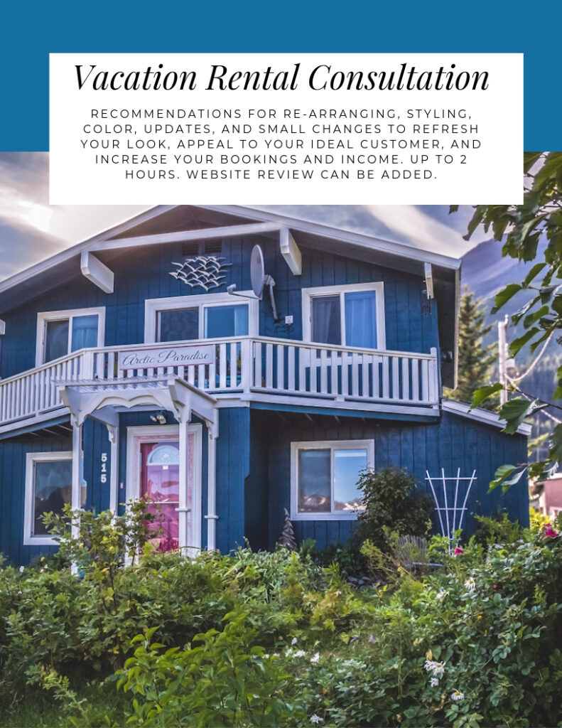
Why not try my online Vacation Rental Consultation. Find out everything you need to do to create a beautiful space that attracts your ideal customer, increases your income and bookings  and gives you great photos for your online marketing.  


What's Your Global Design Style? Take this fun quiz to find out. Northern Lights Home Staging and Design #globalstyle #designstyle #interiordesign #onlinedesign #stylequiz #interiordesignquiz #interiorstylequiz

Pin These

Download my Brochure

Interior Design, Color and Home Staging Services. Brochure of Northern Lights Home Staging and Design


Why work with Northern Lights Home Staging and Design

Terms of Service  |  Privacy Policy  |  Disclaimer

Prices subject to change without notice.

Pin These

7 Things to Consider Before Renting Out Your Home to Vacationers


Ways to Use Sherwin Williams HGTV 2021 Color of the Year- Passionate

In my last few articles I have been exploring the 2021 colors of the year of different paint companies and comparing them in the same Edesign I created for a master bedroom.  I enjoyed exploring Benjamin Moore’s Agean Teal and Sherwin Williams Urbane Bronze.  I found that PPG had a color palette of 3 colors of the year instead of one as you can see in my article Ways to Use PPG’s Colors of the Year. I admitted I felt a little let down that they did not just commit to one color.

Then I checked on Behr’s Colors of the Year and found they had a palette of 21 colors!! Talk about non-committal.   I highlighted 3 of my favorites in my article, Ways to Use Behr’s 2021 Colors of the Year.

HGTV Home by Sherwin-Williams lists their 2021 Color of the Year: as Passionate, which is part of their 2021 Delightfully Daring Color Collection.  They hope to inspire homeowners to have confidence using bold colors to  create emotion and have fun!

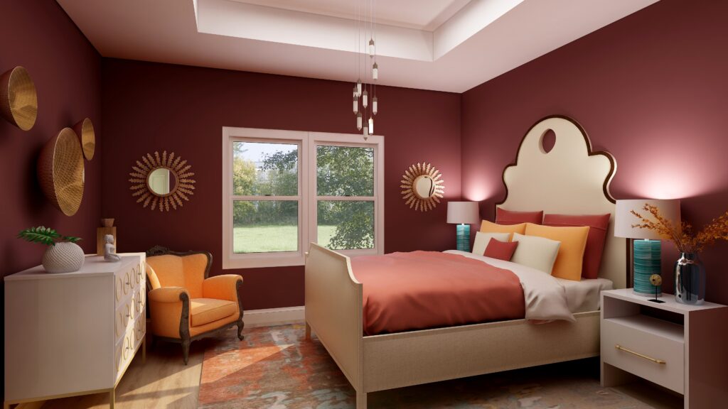
Is this color too exciting for a bedroom where most of us prefer a calm, relaxing atmosphere? I thought I would play with it in my master bedroom Edesign in comparison to the other colors of the year and see what happens. With a name like Passionate, I hope it would work in a bedroom:).

I experimented with a couple different ideas, to see how it might feel with a more dramatic look, and if I could create a relaxing room with a color like this.

Design 1

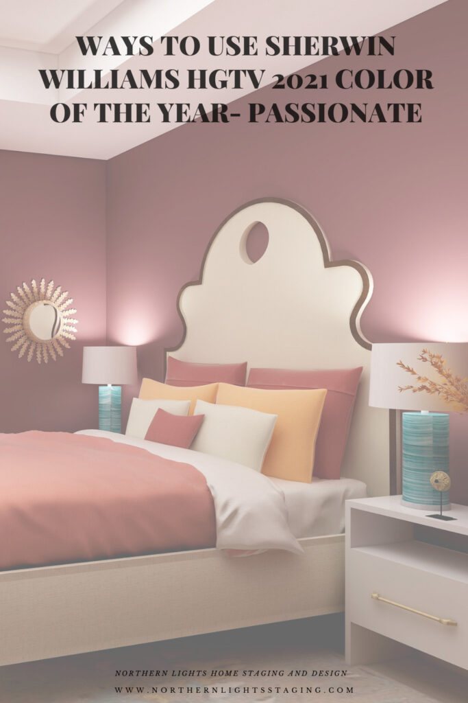
My first design feels dramatic and colorful, but still feels warm and cozy, I think.

HGTV Home by Sherwin-Williams 2021 Color of the Year: Passionate. Edesign by Northern Lights Home Staging and Design
Master bedroom Edesign using Sherwin Williams HGTV Home color Passionate by Northern Lights Home Staging and Design

Shop this Look

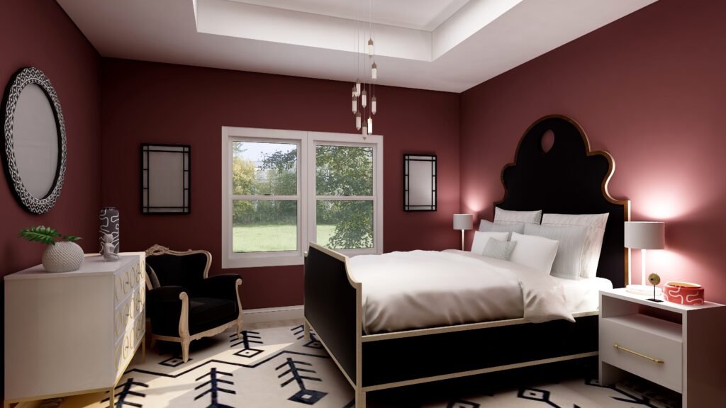
Design 2

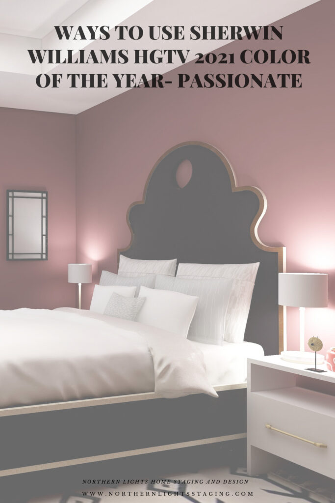
Design 2 is more dramatic with the high contrast of black and white against the deep red walls. The red walls still give a feeling of being enveloped, a sense of coziness, but the black and white rug might be too bold to inspire relaxation. What do you think?

HGTV Home by Sherwin-Williams 2021 Color of the Year: Passionate. Edesign by Northern Lights Home Staging and Design
Sherwin Williams HGTV Home Passionate- Edesign by Northern Lights Home Staging and Design

Shop This Look
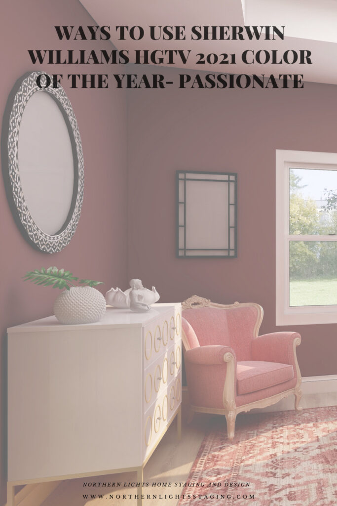
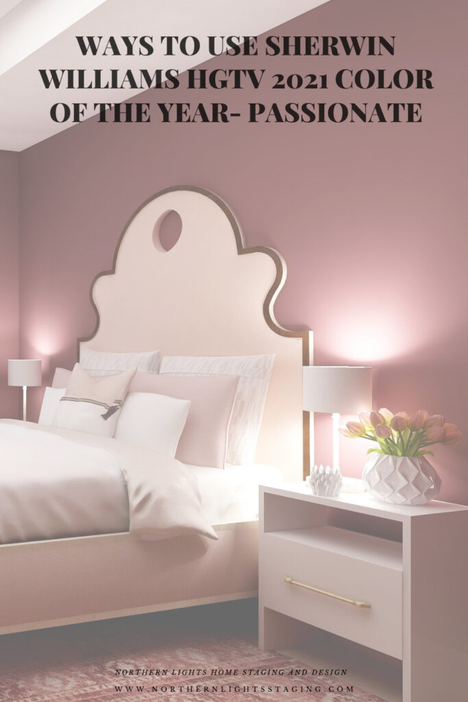
Design 3

This monochromatic color scheme feels relaxing to me. The addition of pinks and blushes creates a softness that balances the rich dramatic wall color. This shows me that you can create a relaxing space, even with rich red walls if you balance everything else correctly, creating both drama and calm at the same time. An interesting combination!
HGTV Home by Sherwin-Williams 2021 Color of the Year: Passionate. Edesign by Northern Lights Home Staging and Design
Sherwin Williams HGTV Home Passionate- Edesign by Northern Lights Home Staging and Design

Shop This Look
Which Color of the Year is Your Favorite?
I enjoyed working with all these colors, and think they could each work nicely to create a relaxing master bedroom, although Big Cypress feels a little more energizing than relaxing. Of all the colors, I am not sure if Aegean Teal or Euphoric Magenta is my favorite, how about you?

HGTV Home by Sherwin-Williams 2021 Color of the Year: Passionate. Edesign by Northern Lights Home Staging and Design
Sherwin Williams HGTV Home Passionate
Master bedroom Edesign using Behr Euphoric Magenta by Northern Lights Home Staging and Design
Behr’s 2021 color Euphoric Magenta

Using Benjamin Moore's 2021 Color of the Year Aegean Teal by NOrthern Lights Home Staging and Design
Benjamin Moore’s 2021 Color of the Year Aegean Teal
Master bedroom Edesign using Behr Voyage by Northern Lights Home Staging and Design
Behr’s 2021 color Voyage
PPG's 2021 Colors of the Year with Mystic Aqua
PPG’s 2021 Color Palette with Mystic Aqua.
PPG's 2021 Colors of the Year = my version
Mystic Aqua but with my my own rebel color scheme:)
Master bedroom Edesign using Behr Royal Orchard by Northern Lights Home Staging and Design
Behr’s 2021 color Royal Orchard

Ways to Use Sherwin Williams 2021 Color of the Year Urbane Bronze
Sherwin Williams 2021 Color of the Year Urbane Bronze
PPG's 2021 Colors of the Year with Transcend
PPG’s 2021 Color Palette with Transcend
PPG's 2021 Colors of the Year with Big Cypress on the walls
PPG’s 2021 Color Palette with Big Cypress.

Are You Inspired?

When your space is better, you are better.
When you are better, the world is better. 

Are you ready to create the perfect space for you? Try my Aligned Design consultation. It is a wholistic Interior Design and Color consultation that considers art, science and energy to give you a game plan for your whole home. I use the art of eco-friendly Interior Design mixed with color science and consider Feng Shui, transformative design, biophilia and color psychology to make your space feel great and support the life you want to live.

Once you have your game plan, we can work on specific rooms with one of my Edesign packages.

The designs above are examples of full service Edesign, where you get a floor plan, a concept board, a 3D render and a complete shopping list with set up instructions. Or, be brave and try some new color with an expert color consultation.


Aligned Design System by Northern Lights Home Staging and Design


Full Service Edesign by Northern Lights Home Staging and Design

What’s Your Global Design Style?

The designs in this article are examples of global style design. Are you curious what your global style is? Take the quiz and find out.


What is Your Global Design Style? Take the Quiz

Why work with Northern Lights Home Staging and Design

Call 907-362-0065 today

 info@northernlightsstaging.com

Terms of Service

Privacy Policy

Disclaimer

Prices subject to change without notice.

Pin These

Ways to Use Sherwin Williams HGTV 2021 Color of the Year- Passionate


Ways to Use Behr’s 2021 Colors of the Year

In my last few articles I have been exploring the 2021 colors of the year of different paint companies and comparing them in the same Edesign I created for a master bedroom.  I enjoyed exploring Benjamin Moore’s Agean Teal and Sherwin Williams Urbane Bronze.  I found that PPG had a color palette of 3 colors of the year instead of one as you can see in my article Ways to Use PPG’s Colors of the Year. I admitted I felt a little let down that they did not just commit to one color.

This week I decided to check on Behr’s Color of the Year.

Oh for the love of God, can you believe they have 21 colors!! Talk about non-committal.  No, I will not be doing 21 renders to show you those.

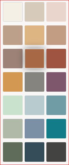
According to Behr, colors that “encourage comfort and wellbeing will be at the forefront, and Behr’s Color Trends 2021 Palette has all the tranquil shades you’ll need to stay grounded. Here is their palette.

Behr 2021 color palette

My Favorites

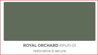
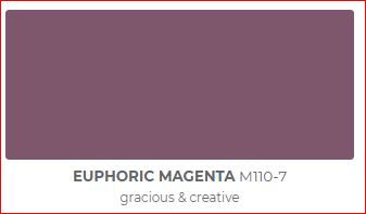
I decided to highlight my three favorites, Voyage, Royal Orchard and Euphoric Magenta, because I like the way they look and I like what they represent (soothing and spiritual, restorative and secure, and gracious and creative). They fit with my philosophy and new Aligned Design system, which combines art, science and energy to create a perfect space for you.

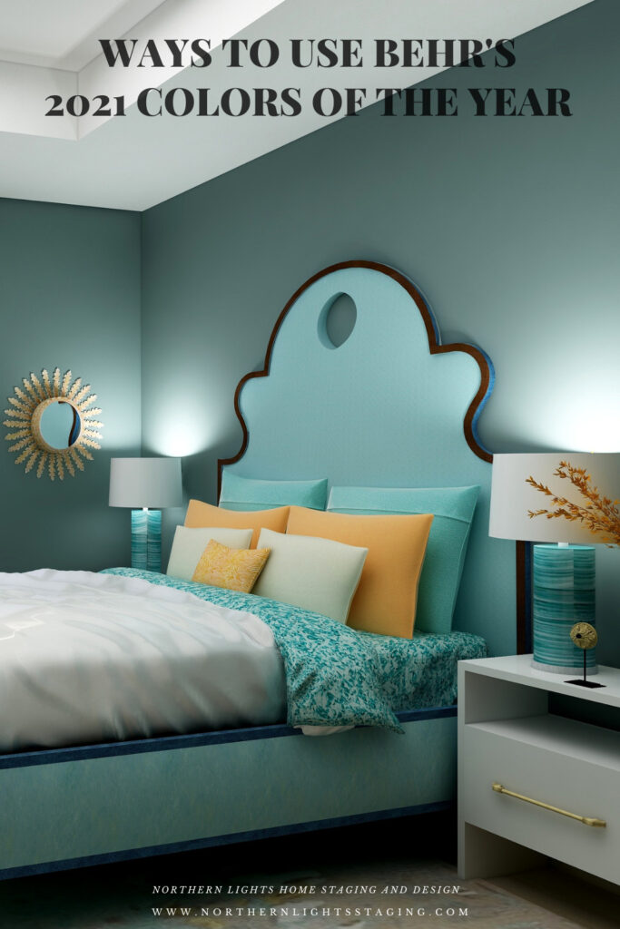
Behr Voyage
Behr Royal Orchard
Behr Euphoric Magenta

I have included a list of products I used or something similar for each design. Note they contain affiliate links, meaning I receive a small commission for sharing with you at no additional cost to you.

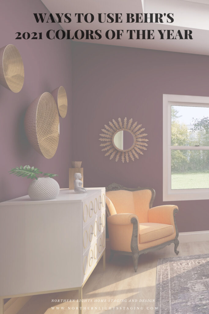
Royal Orchard

Royal Orchard is part of their “Quiet Haven” palette. They say “Deep hues have a reassuringly sublime and dependable nature, delivering the effect of a peaceful oasis in your home.”

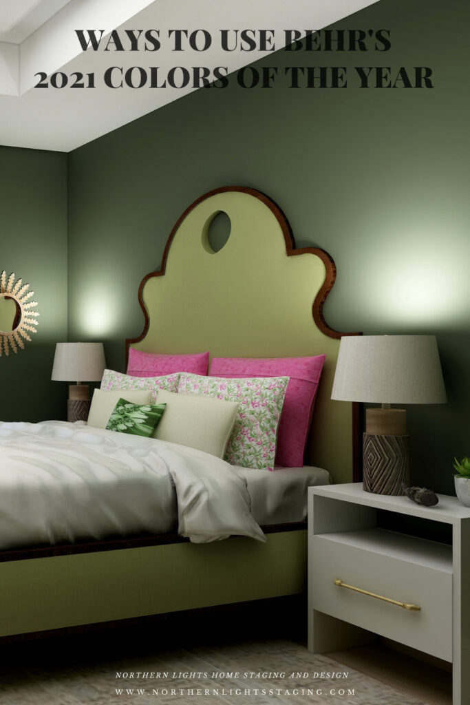
I like it because I believe this shade of green is prevalent in nature, and one of my goals in my designs is to bring the outside in and help people feel more connected to nature with biophilia. I think this creates that feeling of a “peaceful oasis” in your home. To continue that theme I used other greens in the furniture, plants, natural materials such as metals (mirrors, wall art) and wood (lamp). The fabric on the chair reflects a plant theme. I have also included some of my framed fractal art called spring (not visible in this part of the room. The area rug highlights metallic details in cream, gray, silver, and gold.

Master bedroom Edesign using Behr Royal Orchard by Northern Lights Home Staging and Design

Shop this Look

Voyage

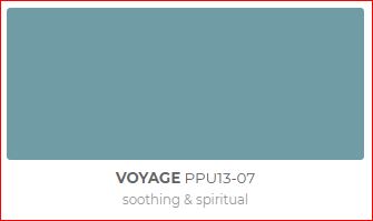
Voyage is part of their Calm Zone palette. They say “Soothing blues and greens create a restorative escape offering ease and solace”.  I agree and blues and greens are some of my favorites to work with as they are also colors of nature and help bring the outside in.

They describe this shade as “soothing and spiritual”. Lately, I have really been considering the energy aspects of color and feng shui and how it all works together to create a space that feels great and helps support you in BEING your best. This color works with this idea. It is part of my Aligned Design system the considers art, science and energy in all my designs.
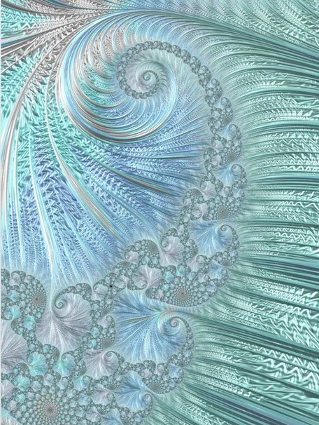
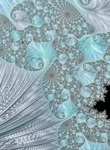
Master bedroom Edesign using Behr Voyage by Northern Lights Home Staging and Design

Shop this Look

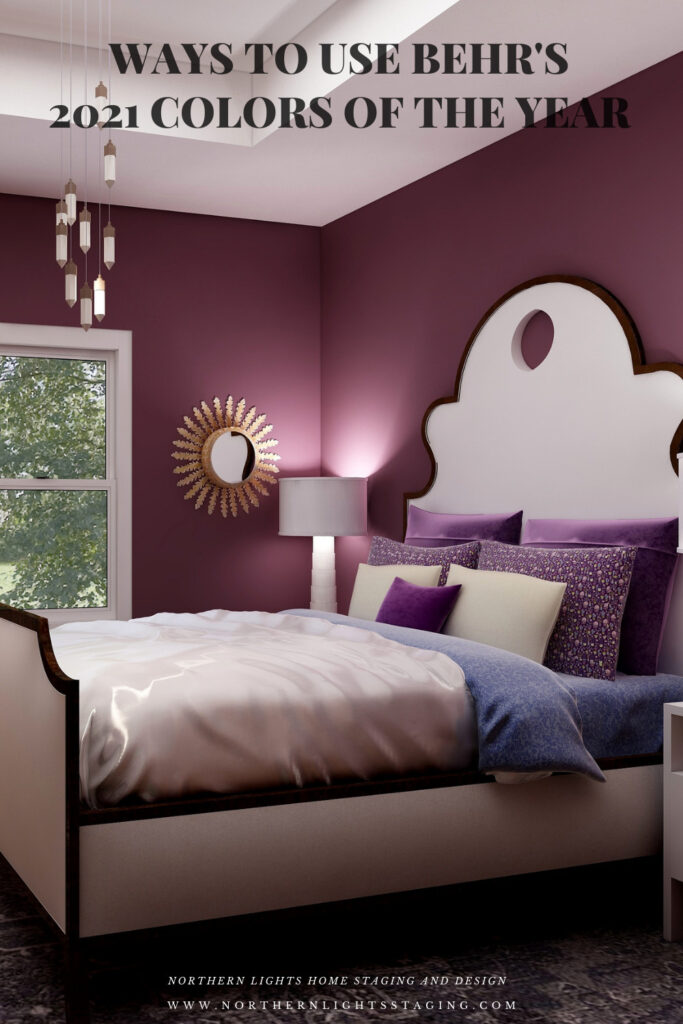
Euphoric Magenta

According to Behr, Euphoric Magenta is part of their bold and saturated “Optimistic View” palette.  With this collection you can “add a touch of playful fun to eclectic and global decor styles.” Since I am all about global style design and love rich color, I picked this one to highlight:) 

Master bedroom Edesign using Behr Euphoric Magenta by Northern Lights Home Staging and Design

Shop this Look

Which Color of the Year is Your Favorite?

I enjoyed working with all these colors, and think they could each work nicely to create a relaxing master bedroom, although Big Cypress feels a little more energizing than relaxing. Of all the colors, I am not sure if Aegean Teal or Euphoric Magenta is my favorite, how about you?

Master bedroom Edesign using Behr Euphoric Magenta by Northern Lights Home Staging and Design
Behr’s 2021 color Euphoric Magenta

Using Benjamin Moore's 2021 Color of the Year Aegean Teal by NOrthern Lights Home Staging and Design
Benjamin Moore’s 2021 Color of the Year Aegean Teal
Master bedroom Edesign using Behr Voyage by Northern Lights Home Staging and Design
Behr’s 2021 color Voyage
PPG's 2021 Colors of the Year with Mystic Aqua
PPG’s 2021 Color Palette with Mystic Aqua.
PPG's 2021 Colors of the Year = my version
Mystic Aqua but with my my own rebel color scheme:)
Master bedroom Edesign using Behr Royal Orchard by Northern Lights Home Staging and Design
Behr’s 2021 color Royal Orchard

Ways to Use Sherwin Williams 2021 Color of the Year Urbane Bronze
Sherwin Williams 2021 Color of the Year Urbane Bronze
PPG's 2021 Colors of the Year with Transcend
PPG’s 2021 Color Palette with Transcend
PPG's 2021 Colors of the Year with Big Cypress on the walls
PPG’s 2021 Color Palette with Big Cypress.

Are You Inspired?

When your space is better, you are better.
When you are better, the world is better. 

Are you ready to create the perfect space for you? Try my Aligned Design consultation. It is a wholistic Interior Design and Color consultation that considers art, science and energy to give you a game plan for your whole home. I use the art of eco-friendly Interior Design mixed with color science and consider Feng Shui, transformative design, biophilia and color psychology to make your space feel great and support the life you want to live.

Once you have your game plan, we can work on specific rooms with one of my Edesign packages.

The designs above are examples of full service Edesign, where you get a floor plan, a concept board, a 3D render and a complete shopping list with set up instructions. Or, be brave and try some new color with an expert color consultation.


Aligned Design System by Northern Lights Home Staging and Design


Full Service Edesign by Northern Lights Home Staging and Design

What’s Your Global Design Style?

The designs in this article are examples of global style design. Are you curious what your global style is? Take the quiz and find out.


What is your Global Design Style? Tae the Quiz

Why work with Northern Lights Home Staging and Design

Call 907-362-0065 today

 info@northernlightsstaging.com

Terms of Service

Privacy Policy

Disclaimer

Prices subject to change without notice.

Pin These

Ways to use Behr's 2021 Colors of the Year


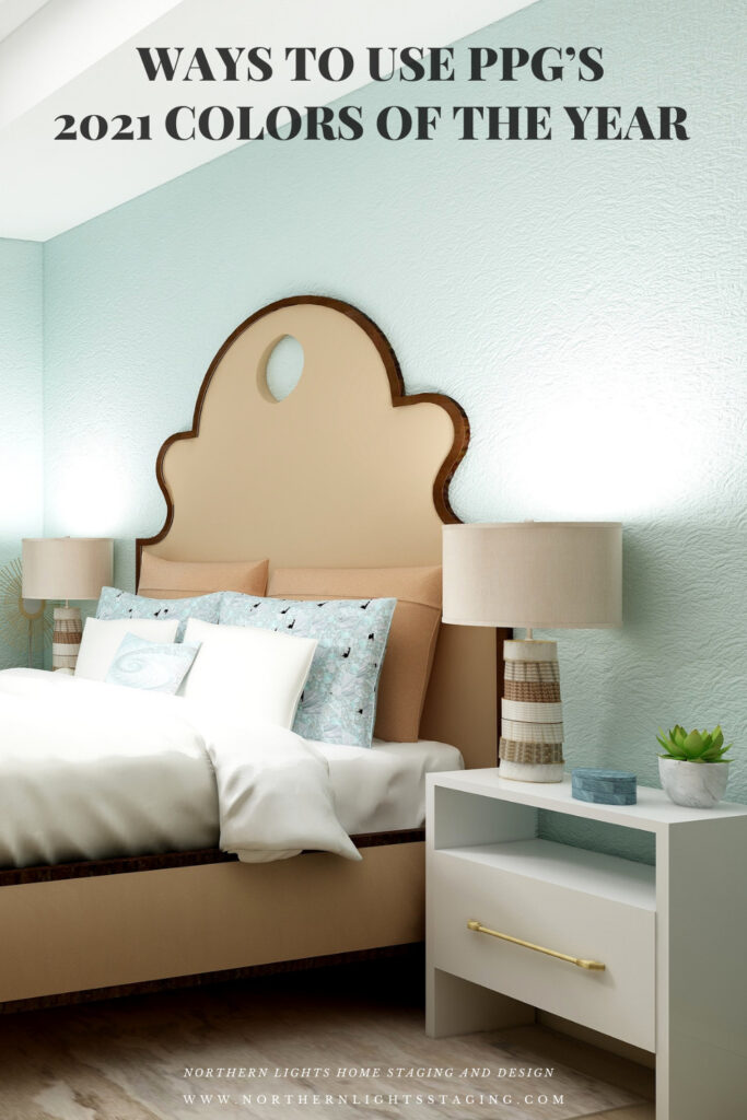
Ways to Use PPG’s 2021 Colors of the Year

In several articles I explored the 2021 colors of the year of different paint companies and compared them in the same Edesign I created for a master bedroom.  I enjoyed exploring Benjamin Moore’s Agean Teal and Sherwin Williams Urbane Bronze.  I was excited to see what PPG’s color of the year was.

But wait….they didn’t have one!! What??? No, they had a color palette for 2021 but not a particular color of the year. Honestly, I felt  let down.

I guess I  don’t like the idea of a color palette, because I don’t want to be told or encouraged to use a series of colors together. I like to decide that for myself!

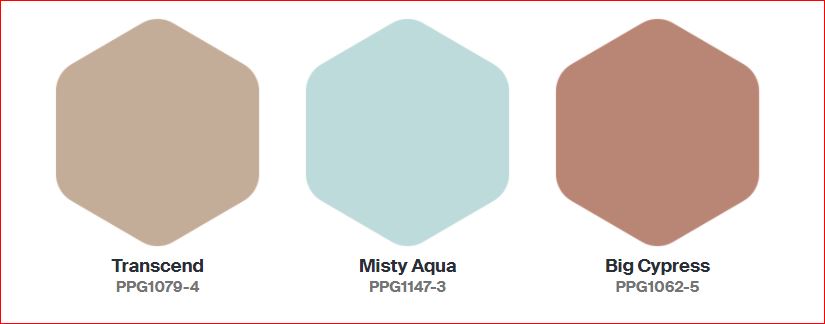
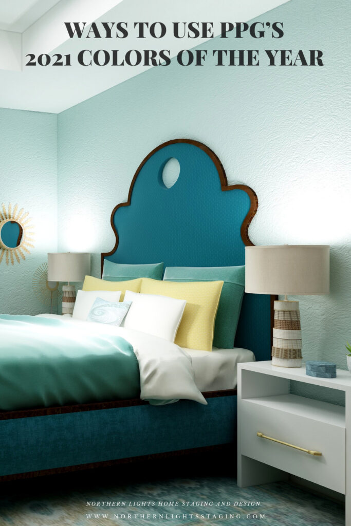
The PPG 2021 Color Palette includes Transcend, Mystic Aqua and Big Cypress, which are meant to work together.

PPG's 2021 Colors

Here is what PPG says about their 2021 color palette:

Transcend: A mid-tone oatmeal-colored hue that draws on earthy influences and nostalgia.

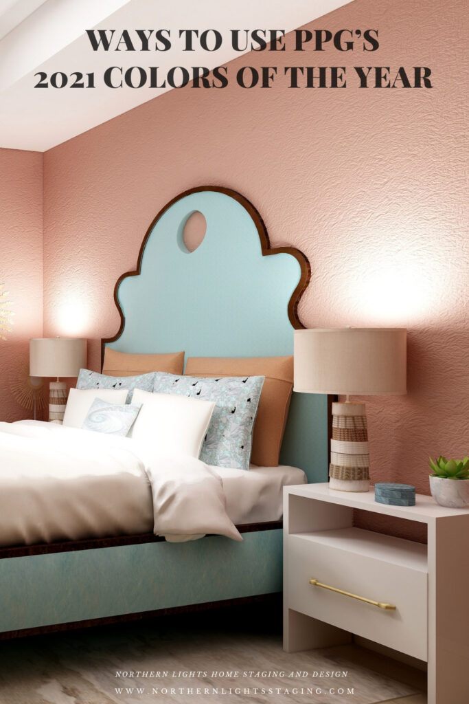
Big Cypress, a shaded ginger with persimmon undertones, is the equivalent of a big, comforting hug for your home.

Misty Aqua, a watercolor cerulean blue, provides an unexpected pairing of freshness against the other warm, earthy tones.

I like the Misty Aqua. Transcend or really any beige makes me yawn. Big Cypress reminds me of the desert, and I am not sure it makes me feel like my home got a hug.

I am trying to have an open mind here and just get over the fact they didn’t just pick one color. I find it a little annoying, as if they are trying to sell me three paints instead of one.

I am not sure why they paired these colors together. Looking at the color data, they do not really fit into any traditional color scheme in relation to hue angle.  They are not similar in terms of chroma or lightness to create a harmonious pairing. I don’t really get it, but will see what amazing and beautiful design I can create anyway! Here goes.

Master Bedroom Design

Design 1- Transcend and the PPG 2021 Palette

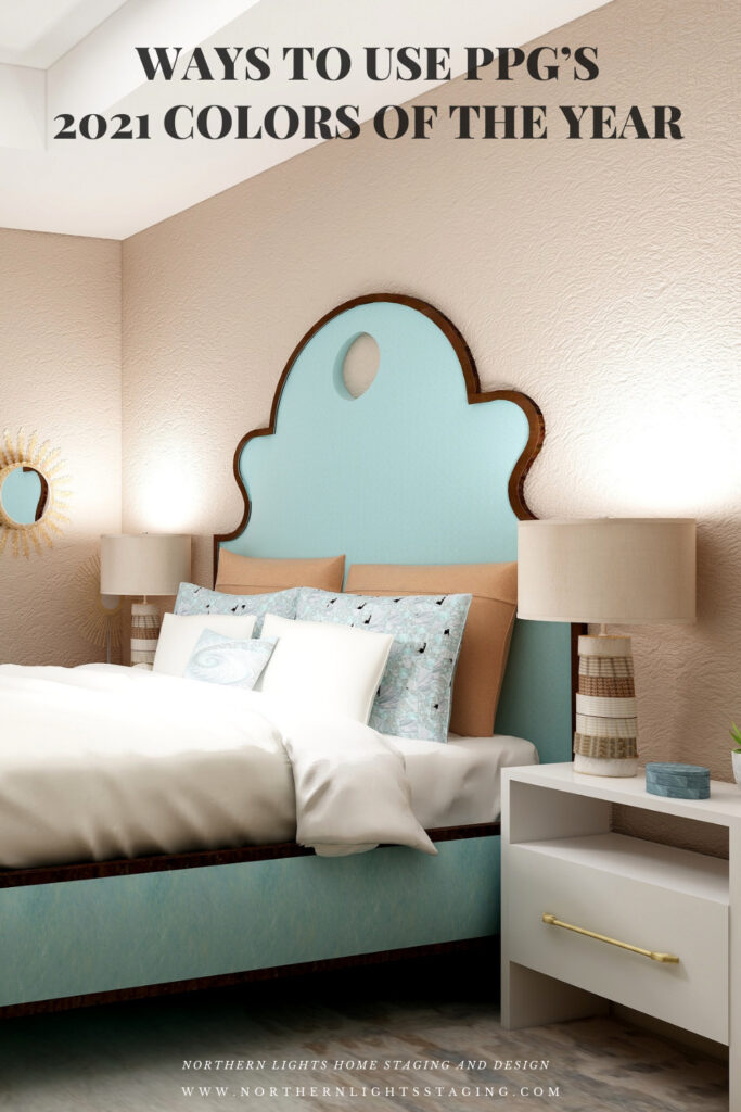
In this design, I used Transcend as the main color on the walls, and used the two other colors as accents or supporting colors. I used a shade of Mystic Aqua on the bed. The larger pillow shams and the lamps tie in Big Cypress. The area rug has some Transcend and Big Cypress colors in it and also a lighter shade of Mystic Aqua. My design celebrates circles and curves, mixes modern pieces with antiques, and mixes soft fabrics with glass, metal and pottery. I used my fractal art from the “Jenna” collection which has some of the Mystic Aqua color in the pillow shams and accent pillow, the wall art, and on one of the antique chairs. My fractal art celebrates curves and spirals. To learn more about spirals and fractal art, see my blog article What Does Your Art Mean?


PPG's 2021 Colors of the Year with Transcend
.Design 1-Master Bedroom Edesign with PPG’s 2021 color Transcend on the wall.

PPG's 2021 Colors of the Year with Transcend
Design 1- Master Bedroom Edesign and Jenna Fractal Art by Northern Lights Home Staging and Design.

Design 2- Big Cypress and the PPG 2021 Palette

In the design below, I used Big Cypress as the primary color on the walls with the other two colors as supporting colors. I changed the area rug to one that contains colors similar to Transcend.


PPG's 2021 Colors of the Year with Big Cypress on the walls
Design 2- Master Bedroom Edesign and fractal art on the chair by Northern Lights Home Staging and Design using Big Cypress as the wall color

Design 3- Mystic Aqua and the PPG 2021 Palette

In the design below, I changed the wall color to Mystic Aqua, and changed the bed upholstery to a color similar to Transcend.

PPG's 2021 Colors of the Year with Mystic Aqua
Design 3- Master Bedroom Edesign and fractal art on the chair by Northern Lights Home Staging and Design using Mystic Aqua as the wall color

Design 4- Mystic Aqua and my own color palette

In the design below, I did my own thing.  I liked Mystic Aqua the best of the three wall colors. I developed my own palette using various shades of blue/greens and yellow, it’s opposite on the color wheel.

PPG's 2021 Colors of the Year = my version
Design 4- Master Bedroom Edesign by Northern Lights Home Staging and Design using Mystic Aqua as the wall color and my own color palette.

Which Color of the Year is Your Favorite?

I enjoyed working with all the colors of 2021, and think they could all work nicely to create a relaxing master bedroom, although Big Cypress feels a little more energizing than relaxing. Of all the colors, I think Aegean Teal is my favorite, how about you?

PPG's 2021 Colors of the Year with Transcend
PPG’s 2021 Color Palette with Transcend
PPG's 2021 Colors of the Year with Big Cypress on the walls
PPG’s 2021 Color Palette with Big Cypress.
PPG's 2021 Colors of the Year with Mystic Aqua
PPG’s 2021 Color Palette with Mystic Aqua.
PPG's 2021 Colors of the Year = my version
Mystic Aqua but with my my own rebel color scheme:)

Using Benjamin Moore's 2021 Color of the Year Aegean Teal by NOrthern Lights Home Staging and Design
Benjamin Moore’s 2021 Color of the Year Aegean Teal

Ways to Use Sherwin Williams 2021 Color of the Year Urbane Bronze
Sherwin Williams 2021 Color of the Year Urbane Bronze

Are You Inspired?

Get your colors right the first time with a science based color consultation.


Not Your Average Color Consultation

Get Your Free Report


Ten Ways To Not Screw Up Picking Your Paint Colors


What is Your Global Design Style? Take the Quiz

Pin These

Ways to Use PPG's 2021 Colors of the Year

Ways to Use PPG's 2021 Colors of the Year


Great Paint Color Schemes- Black, White and Shades of Gray

People often struggle with creating a great color scheme.   In my recent series of blog articles we discussed how you could take your favorite color, blue for example, and create different color schemes. We explored monochromatic, analogous, Complimentary, Diad, Triad, Tetrad, Split-Complimentary and Double Complimentary.

Today, lets talk about using black, white and shades of gray.  

To catch up on these other color schemes see my articles Celebrate Your Favorite Color- Go Monochromatic and Create a Harmonious Color Scheme- Go Analogous,  Opposite Colors Attract, Go Complimentary and Great Paint Color Schemes- Do a DiadGreat Paint Color Schemes- Try a Triad ,  Great Color Schemes- Try a Tetrad and Great Color Schemes- Try a Split Complimentary and Great Color Schemes- Try a Double-Complimentary.  See examples of those color schemes below.


Celebrate your favorite color- go monochromatic! Edesign by NOrthern Lights Home Staging and Design
Monochromatic Color Scheme

Analogous Color Scheme
Analogous Color Scheme 2. Northern Lights Home Staging and Design
Analogous Color Scheme

Complimentary Color Scheme Edesign by Northern Lights Home Staging and Design
Complimentary Color Scheme

Complimentary Color Scheme Edesign by Northern Lights Home Staging and Design
Complimentary Color Scheme

Edesign using a Diad color scheme by Northern Lights Home Staging and Design
Diad Color Scheme

Edesign using a Diad color scheme by Northern Lights Home Staging and Design
Diad Color Scheme

Great Paint Color Schemes- Try a Triad
Triad Color Scheme

Great Paint Color Schemes- Try a Triad
Triad Color Scheme

Great Paint Color Schemes- Try a Tetrad
Tetrad Color Scheme

Great Paint Color Schemes- Try a Tetrad
Tetrad Color Scheme
Great Paint Color Schemes- Try Split Complimentary
Spilt Complimentary Scheme
Great Paint Color Schemes- Try Split Complimentary
Spilt Complimentary Scheme

Great Paint Color Schemes- Try Double Complimentary
Double Complimentary Color Scheme

Great Paint Color Schemes- Try Double Complimentary
Double Complimentary Color Scheme

Technically, using black, white or grays  is really a monochromatic color scheme and could be done with any color. If you take the color and adjust it’s chroma or saturation level to the lowest you can go, you get white. If you adjust it a little higher, you get shades of gray. If you adjust it to the maximum it becomes black.

Most people do not think of black, white and gray as actually being a color. Many people like to work with these colors as they think it is a very neutral color palette.

Let’s play around with a design I created that uses mainly black, white and gray home decor items where I mainly changed the wall color or treatment to create drama or highlight different things.

Design

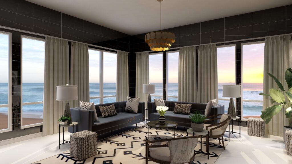
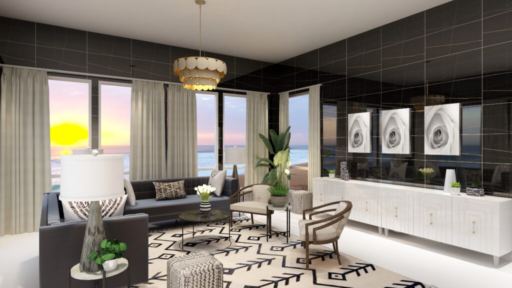
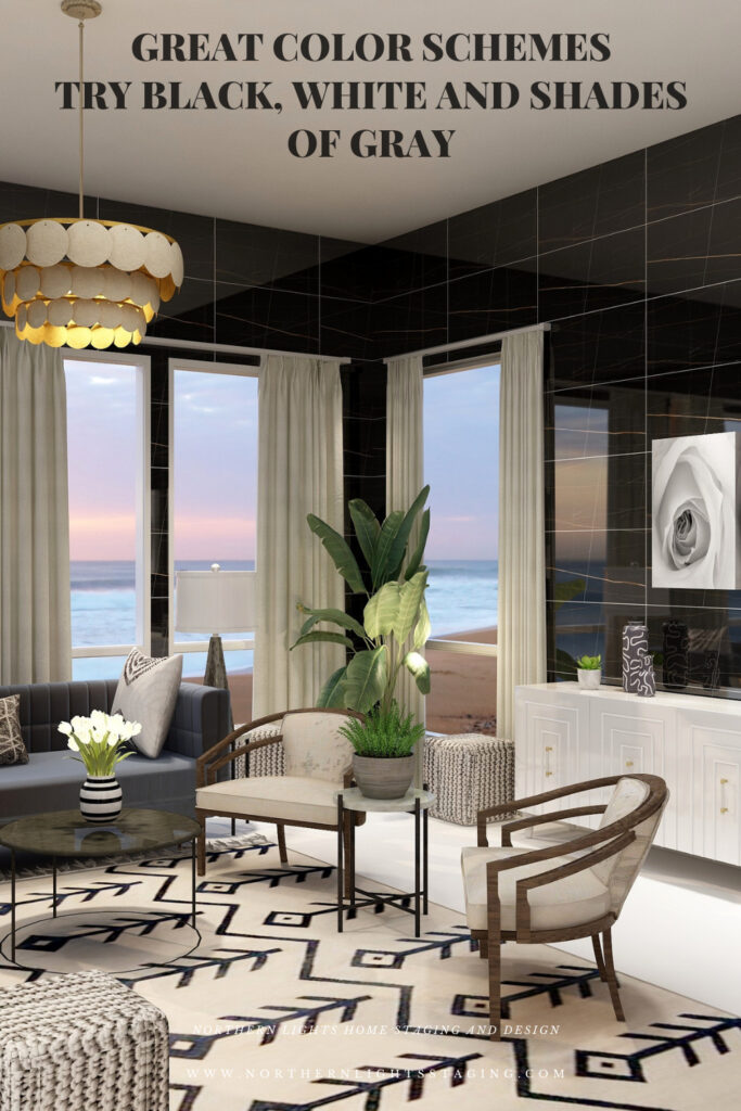
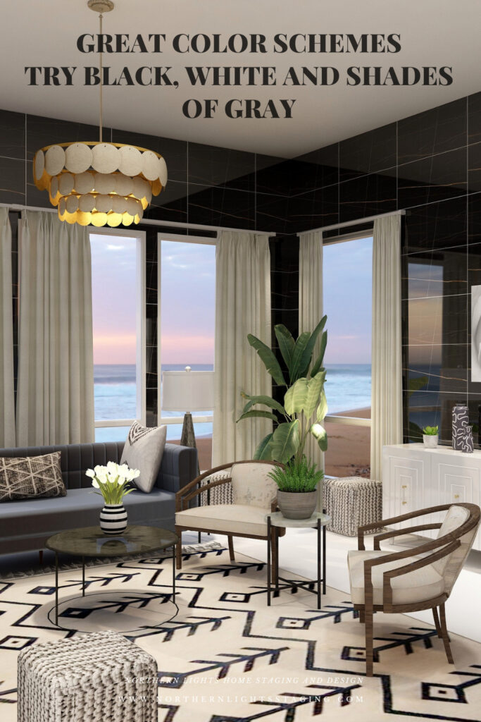
 In this design I created maximum drama by using black walls which a striking due to the color, but I also used shiny wall tiles which also add texture and reflect light. The dark walls recede, giving a feeling of being cocooned and enveloped within the color. The color also highlights the black design in the area rug, making it pop.


Great Color Schemes- Try Black, White and Shades of Gray
Double Complimentary Color Scheme. Edesign and Fractal Art by Northern Lights Home Staging and Design.


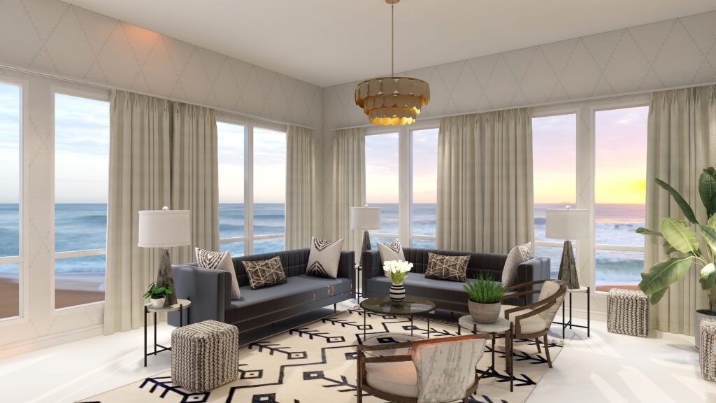
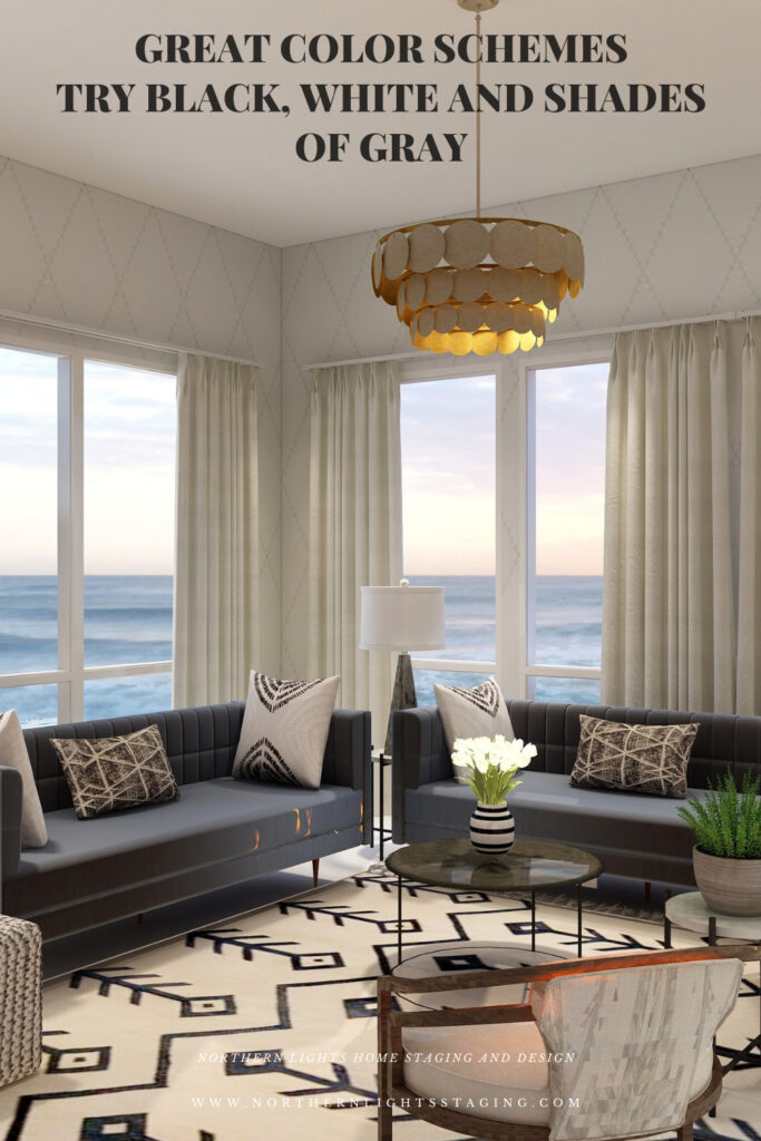
In the design below, I used wall paper in white with a gray diamond pattern. The wall, although it still has texture and interest due to the pattern, disappears with the light color, putting more emphasis on the view outside.


Great Color Schemes- Try Black, White and Shades of Gray
Double Complimentary Color Scheme. Edesign by Northern Lights Home Staging and Design.

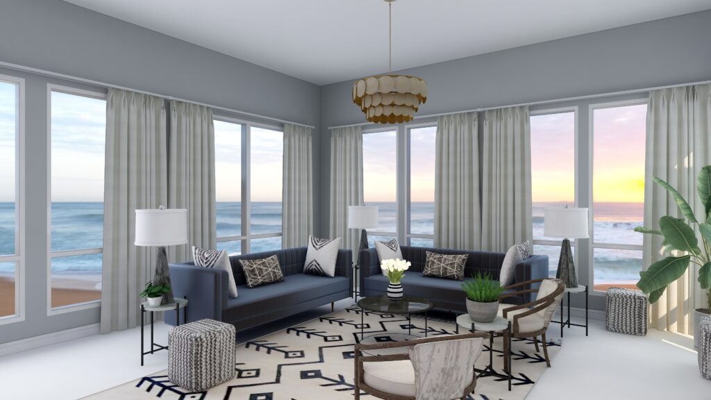
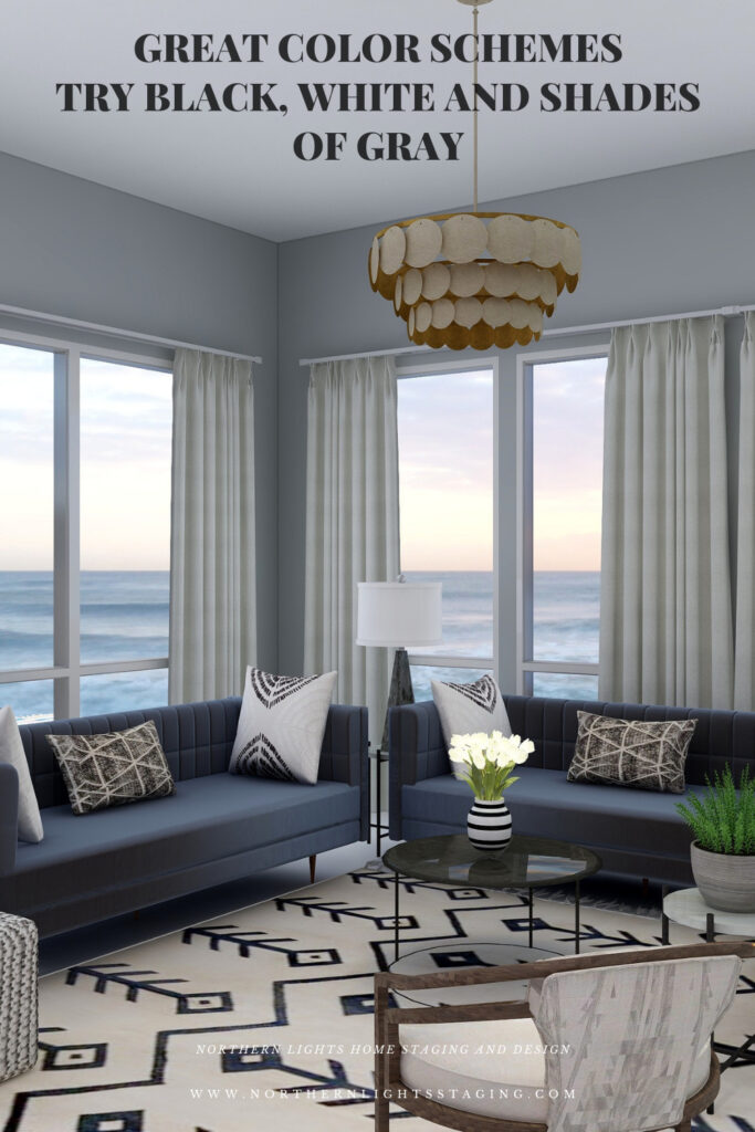
In the design below, the gray paint color feels cool and elegant, and creates more of a connection with the furnishings and decor of the gray sofas and the accent pillows.


Great Color Schemes- Try Black, White and Shades of Gray

Shop the Look

Check out  the pieces I selected for this design. Some include affiliate links, meaning I receive a small commission for sharing at no additional cost to you.


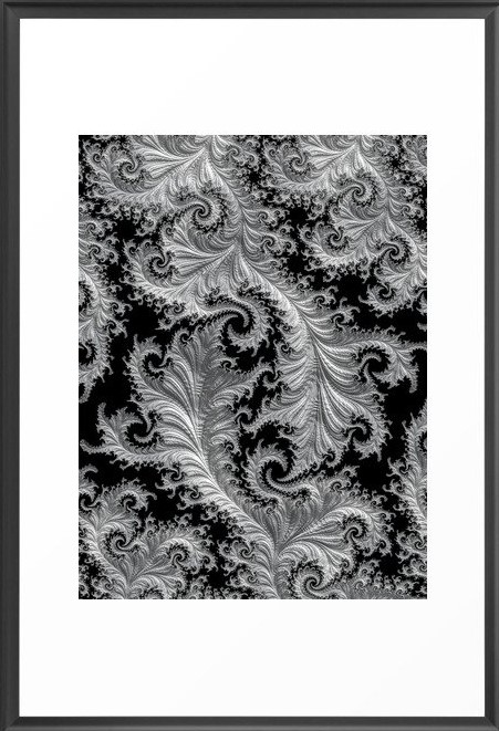
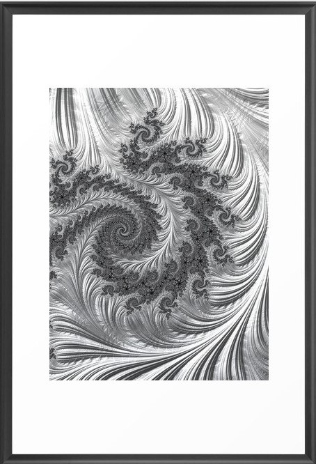
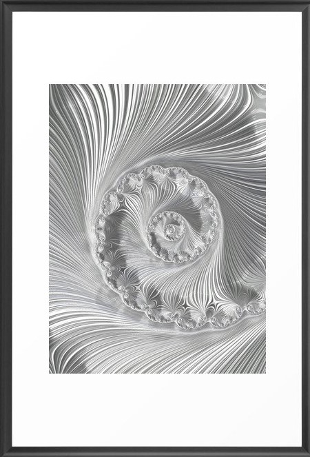
My design also incorporates some of my unique fractal art from my “Spring” Collection. 


Lacey Fractal Art by Northern Lights Home Staging and Design
Arctic Evening Fractal Art by Northern Lights Home Staging and Design

Arctic Night Fractal Art by Northern Lights Home Staging and Design

Icefield Fractal Art by Northern Lights Home Staging and Design

Design Ideas to Highlight More Gray

Here are some additional ideas to highlight more grays in your design.

Design Ideas to Highlight More White

Here are some other ideas to highlight more whites in your design.

Benefits of A Black, White and Gray Color Scheme

  • A black, white and gray scheme is fairly easy to put together. It is best if you keep you black, white and grays all within the same color family so they are harmonious.  
  • A black, white and gray scheme can be really dramatic or relaxing based on the saturation and placement of the colors you choose. Dark gray and black walls are more dramatic than white walls.
  • A black, white and gray scheme really highlights any other colors that are used, or the colors of the views outside.
  • Very nice for living rooms, dining rooms and areas that you like to entertain.  

Create Beauty with Color in Your Space

Each moment in life is YOUR choice. surround yourself with BEAUTY, color and positive energy now.
Or not, it’s up to you.
Everything in life is easier when you love your space.When your space is better, you are better. When you are better, the world is better. 


Full Service Edesign


Not Your Average Color Consultation

What is Your Global Design Style? Take the Quiz


Whats Your Global Interior Design Style? Take the Quiz

Download my Brochure

Interior Design, Color and Home Staging Services. Brochure of Northern Lights Home Staging and Design

Why work with Northern Lights Home Staging and Design

Terms of Service  |  Privacy Policy  |  Disclaimer

Prices subject to change without notice.

Call 907-362-0065 today

 info@northernlightsstaging.com

Pin These


Great Color Schemes- Try Black, White and Shades of Gray


Great Color Schemes- Try Black, White and Shades of Gray


Great Color Schemes- Try Black, White and Shades of Gray


Great Color Schemes- Try Black, White and Shades of Gray


Great Color Schemes- Try Black, White and Shades of Gray


Great Color Schemes- Try Black, White and Shades of Gray

Click on the picture to find out more about the best training class on color available, the Four Pillars of Color!.

Subscribe to Seasonal Living Magazine

Check out this free bi-monthly online Seasonal Living Magazine, full of inspirational images, videos and articles for you about seasonal home decor, travel, food and entertaining!  


Seasonal Living Magazine


Great Paint Color Schemes- Try a Double-Complimentary

People often struggle with creating a great color scheme.   In my last few blog articles we discussed how you could take your favorite color, blue for example, and create different color schemes. We explored monochromatic, analogous, complimentary, diad, triad and tetrad color schemes. Today, lets look at a Split-Complimentary!

A tetrad uses four colors  which include two complimentary color pairings. It can be difficult to balance  if you use all four colors in equal amounts it may feel like too much. You can use one to three colors as dominant colors and and let the rest be more subdued. By subdued, I mean you can use less of the colors proportionally.  Or you could use less saturated versions of the colors so they don’t stand out as much, but color schemes tend to look more harmonious if you are using similar saturation or chroma levels. Here are some examples.

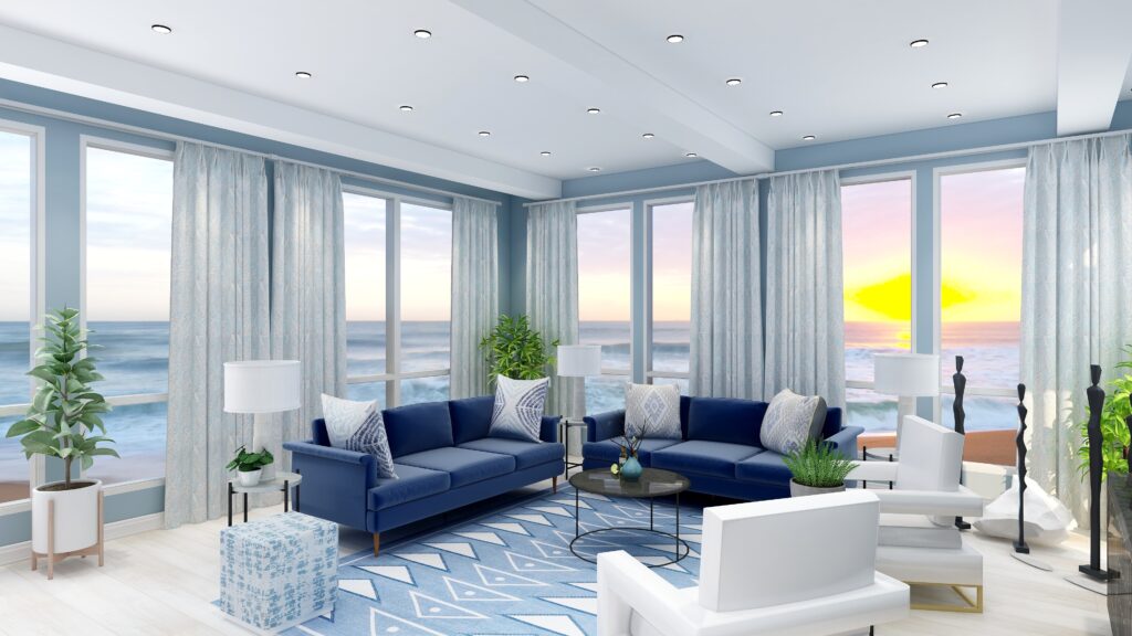
Let’s create a split-complimentary color scheme with the blue we have been working with in the last several articles. You can see this blue in the sofas. 

To catch up on these other color schemes see my articles Celebrate Your Favorite Color- Go Monochromatic and Create a Harmonious Color Scheme- Go Analogous,  Opposite Colors Attract, Go Complimentary and Great Paint Color Schemes- Do a DiadGreat Paint Color Schemes- Try a Triad ,  Great Color Schemes- Try a Tetrad and Great Color Schemes- Try a Split Complimentary.  See examples of those color schemes below.


Celebrate your favorite color- go monochromatic! Edesign by NOrthern Lights Home Staging and Design
Monochromatic Color Scheme

Analogous Color Scheme
Analogous Color Scheme 2. Northern Lights Home Staging and Design
Analogous Color Scheme

Complimentary Color Scheme Edesign by Northern Lights Home Staging and Design
Complimentary Color Scheme

Complimentary Color Scheme Edesign by Northern Lights Home Staging and Design
Complimentary Color Scheme

Edesign using a Diad color scheme by Northern Lights Home Staging and Design
Diad Color Scheme

Edesign using a Diad color scheme by Northern Lights Home Staging and Design
Diad Color Scheme

Great Paint Color Schemes- Try a Triad
Triad Color Scheme

Great Paint Color Schemes- Try a Triad
Triad Color Scheme

Great Paint Color Schemes- Try a Tetrad
Tetrad Color Scheme

Great Paint Color Schemes- Try a Tetrad
Tetrad Color Scheme
Great Paint Color Schemes- Try Split Complimentary
Spilt Complimentary Scheme
Great Paint Color Schemes- Try Split Complimentary
Spilt Complimentary Scheme

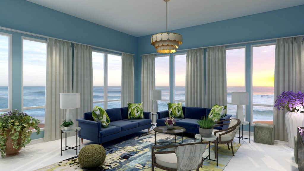
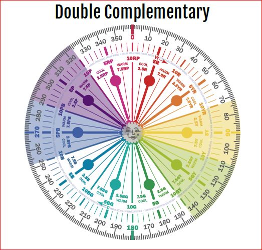
In a double complementary color scheme, you use a primary color such as our blue, its compliment yellow, and then the pair of complimentary colors of one of its neighbors on either side such as blue/purple and yellow/green or blue/green and orange.


Great Paint Color Schemes- Try a Double Complimentary


Great Paint Color Schemes- Try a Double Complimentary

Double Complimentary Color Schemes Illustrations by Camp Chroma, the Best Color Training Ever!

Design 1


Great Paint Color Schemes- Try a Double Complimentary

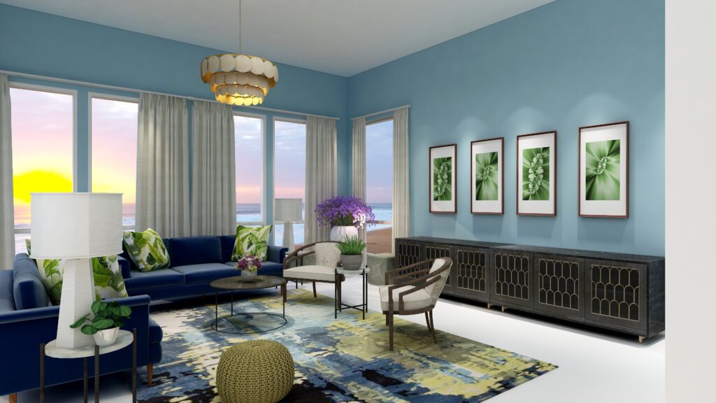
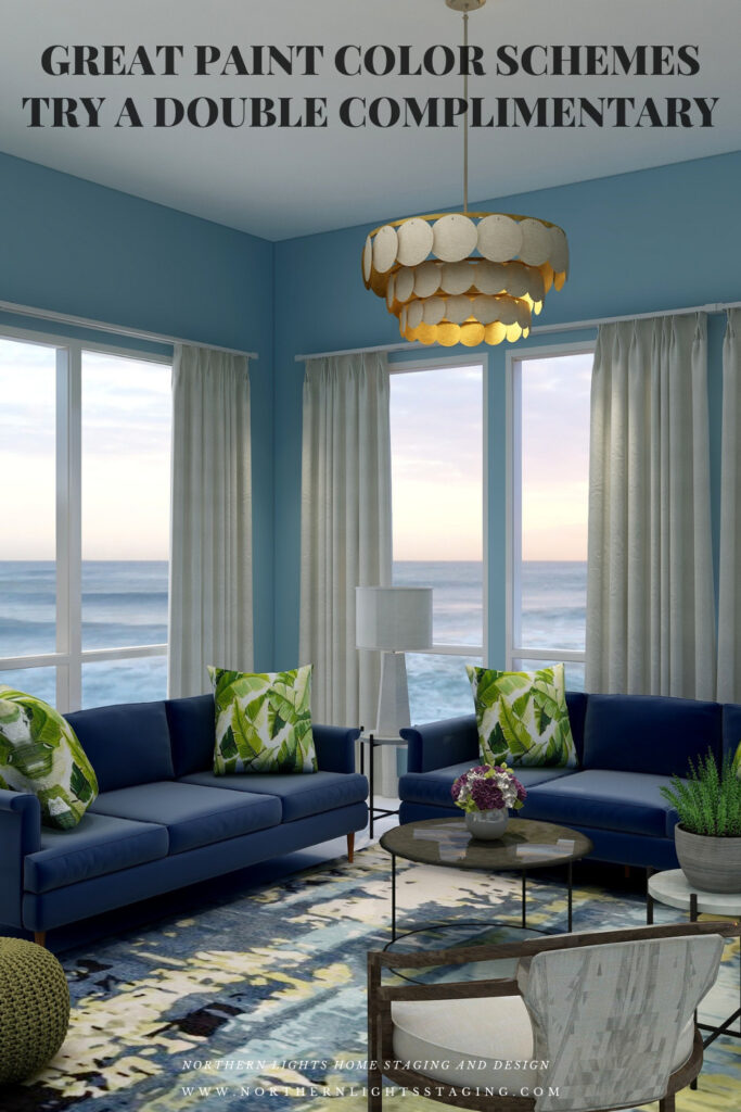
With a Double-Complimentary scheme we are working with 4 colors, or two sets of compliments. We have a large variety of tints, tones and shades to play with within those colors, but it is always most harmonious if you work with colors with similar chroma (saturation).  In other words it looks best if you are not mixing rich, bright colors with pastels. You can get dramatic or keep it more neutral based on the colors you choose.  I find adding rich color to the walls creates drama, while using a more neutral wall color feels more relaxing.

In this design I used the blue/yellow compliment pair in the sofas and the beautiful area rug.  I used the green/yellow of the neighboring compliment pair in the area rug, pillows and my fractal art.  I decided to bring in purple in small amounts as an accent, and used plants with purple flowers to highlight that color.  


Great Paint Color Schemes- Try Double Complimentary
Double Complimentary Color Scheme. Edesign by Northern Lights Home Staging and Design.

Great Paint Color Schemes- Try Double Complimentary
Double Complimentary Color Scheme. Edesign and Fractal Art by Northern Lights Home Staging and Design.

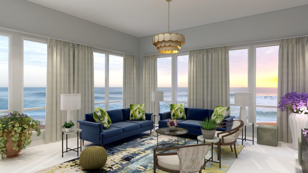
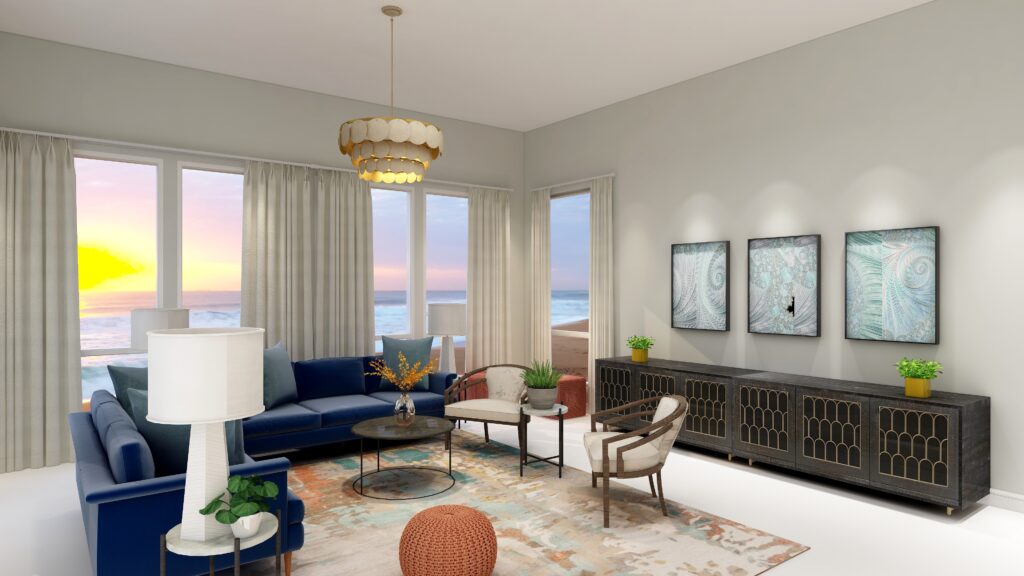
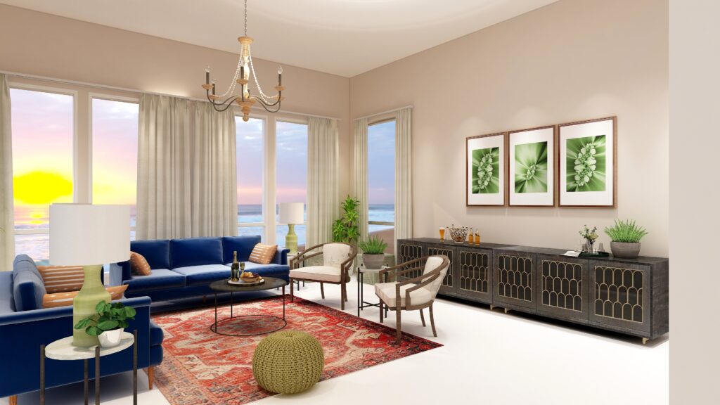
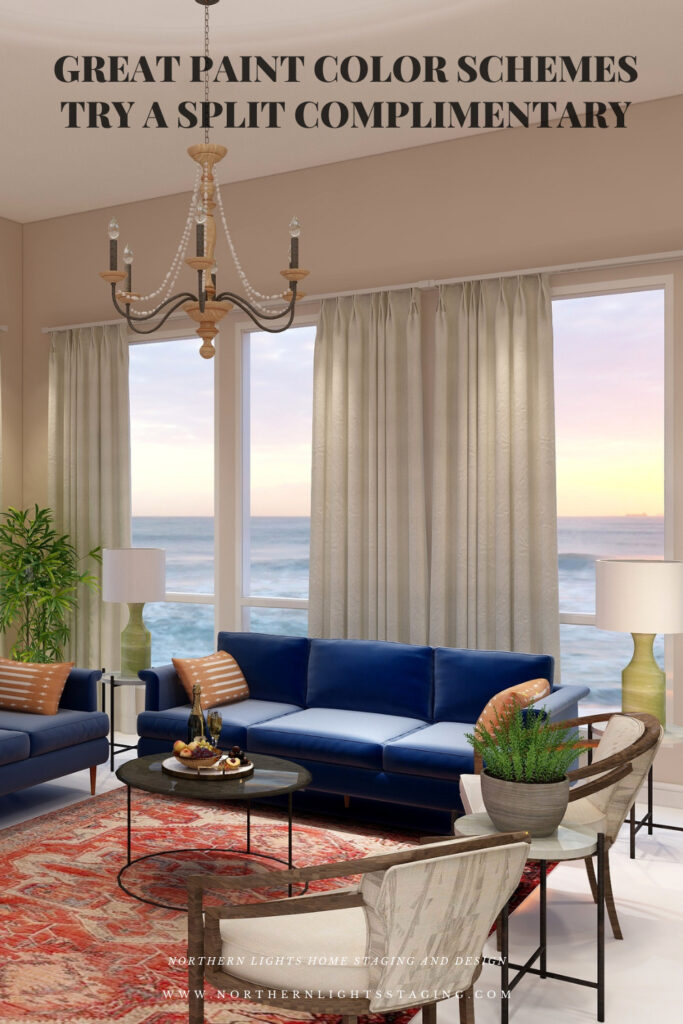
In the examples above, I created drama by using a more saturated shade of  blue for the wall color. To create a more neutral look, I created a second version below where I used the same color but with very low saturation so it is almost gray.


Great Paint Color Schemes- Try Double Complimentary
Double Complimentary Color Scheme. Edesign by Northern Lights Home Staging and Design.

Shop the Look- Design 1

Check out  the pieces I selected for this design. Some include affiliate links, meaning I receive a small commission for sharing at no additional cost to you.


My design also incorporates some of my unique fractal art from my “Spring” Collection. 


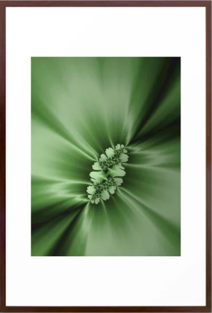
Spring Fractal Art by Northern Lights Home Staging and Design
Spring Fractal Art by Nofthern Lights Home Staging and Design

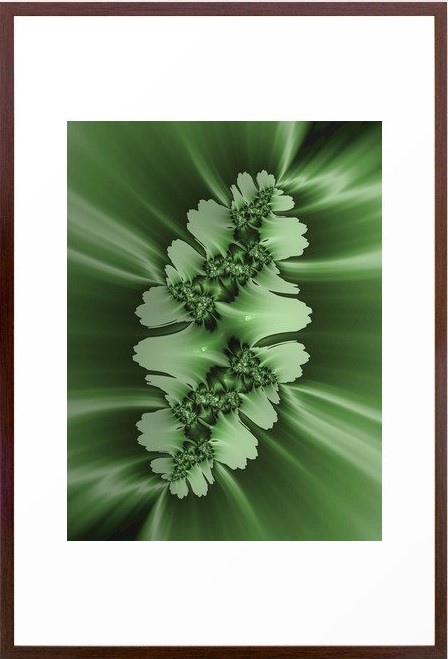
Spring #2 Fractal Art by Northern Lights Home Staging and Design
Spring 2 Fractal Art by Northern Lights Home Staging and Design

Design #2


Great Paint Color Schemes- Try a Double Complimentary

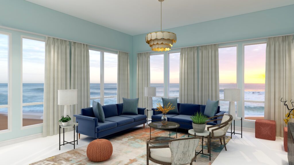
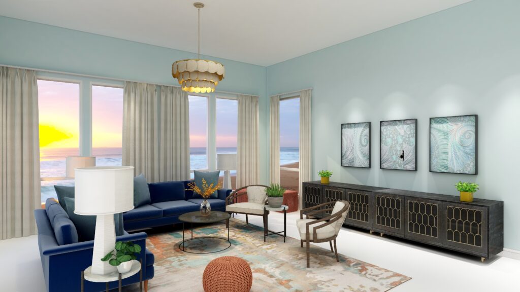
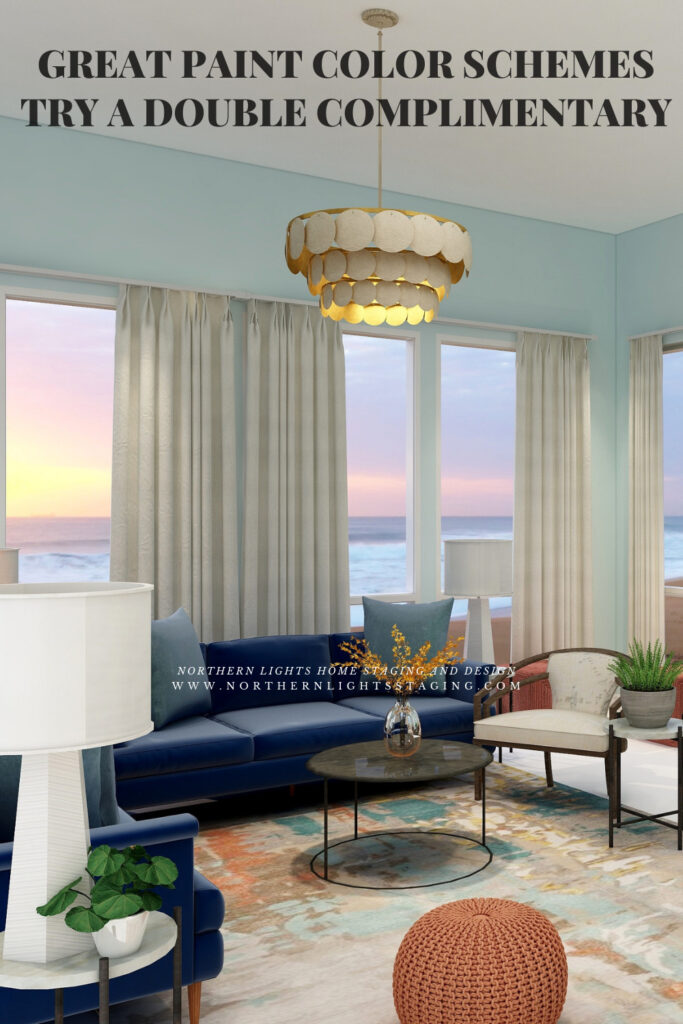
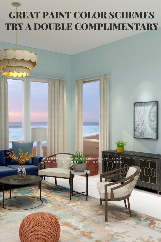
In this second design I used the blue/yellow complimentary pair again but this time worked with blue/green and orange. I found a beautiful area rug as an inspiration piece that has the blue, blue green, orange and a touch of yellow to tie everything together. I highlighted the orange in the 3 poufs. I used the blue/green in the pillows, the wall color and in my “Jenna” fractal art collection. The yellow I used as a small accent with flowers or flower vases.


Great Paint Color Schemes- Try Double Complimentary
Double Complimentary color scheme. Edesign by Northern Lights Home Staging and Design.

Great Paint Color Schemes- Try Double Complimentary
Double Complimentary color scheme. Edesign and Fractal Art by Northern Lights Home Staging and Design.

Great Paint Color Schemes- Try Double Complimentary
Double Complimentary color scheme. Edesign and Fractal Art by Northern Lights Home Staging and Design.

Shop the Look Design #2

Here is a closer view of my fractal art collection called “Jenna” which I created in honor of Jenna Gaidusek of the Edesign Tribe when creating something for her office with her favorite colors. In my design, the art is on canvas prints, but they are available framed or on a variety of materials as well as on other home decor in my store at Society 6.


Jenna Fractal Art by Northern Lights Home Staging and Design

Jenna 2 Fractal Art by Northern Lights Home Staging and Design

Jenna 3 Fractal Art by Northern Lights Home Staging and Design

Benefits of A Double Complimentary Color Scheme

  • A double complimentary color scheme is easy to put together using 4 colors.  You can give all colors equal weight in the design for more drama, or make one or two colors more dominant based on the mood you want to create. The challenge will be trying not allow too many strong colors to compete with each other. Vary the saturation or better yet, the amount of the colors showing by making 1-2 colors as accents.
  • A double complimentary color scheme can be really dramatic or relaxing based on the saturation and placement of the colors you choose. Very nice for living rooms, dining rooms and areas that you like to entertain. You could try the more relaxing color combinations in a bedroom or office.

Create Beauty with Color in Your Space

EACH MOMENT IN LIFE IS YOUR CHOICE.
YOU HAVE THE OPPORTUNITY TO SURROUND YOURSELF WITH beautiful color RIGHT NOW.
OR NOT, IT’S UP TO YOU.
EVERYTHING IS EASIER WHEN YOU LOVE YOUR SPACE.


Full Service Edesign


Not Your Average Color Consultation

What is Your Global Design Style? Take the Quiz


What's Your Global Interior Design Style? Take the Quiz. Northern Lights Home Staging and Design

Download my Brochure

Interior Design, Color and Home Staging Services. Brochure of Northern Lights Home Staging and Design

Why work with Northern Lights Home Staging and Design

Terms of Service  |  Privacy Policy  |  Disclaimer

Prices subject to change without notice.

Call 907-362-0065 today

 info@northernlightsstaging.com

Pin These


Great Paint Color Schemes- Try Double Complimentary


Great Paint Color Schemes- Try Double Complimentary


Great Paint Color Schemes- Try Double Complimentary


Great Paint Color Schemes- Try Double Complimentary

Click on the picture to find out more about the best training class on color available, the Four Pillars of Color!.


Great Paint Color Schemes- Try a Split-Complimentary

People often struggle with creating a great color scheme.   In my last few blog articles we discussed how you could take your favorite color, blue for example, and create different color schemes. We explored monochromatic, analogous, complimentary, diad, triad and tetrad color schemes. Today, lets look at a Split-Complimentary!

A double-complimentary scheme uses four colors  which include two complimentary color pairings. It can be difficult to balance  if you use all four colors in equal amounts it may feel like too much. You can use one to three colors as dominant colors and and let the rest be more subdued. By subdued, I mean you can use less of the colors proportionally.  Or you could use less saturated versions of the colors so they don’t stand out as much, but color schemes tend to look more harmonious if you are using similar saturation or chroma levels. Here are some examples.

Let’s create a split-complimentary color scheme with the blue we have been working with in the last several articles. You can see this blue in the sofas. 

To catch up on these other color schemes see my articles Celebrate Your Favorite Color- Go Monochromatic and Create a Harmonious Color Scheme- Go Analogous,  Opposite Colors Attract, Go Complimentary and Great Paint Color Schemes- Do a DiadGreat Paint Color Schemes- Try a Triad and Great Color Schemes- Try a Tetrad. See examples of those color schemes below.


Celebrate your favorite color- go monochromatic! Edesign by NOrthern Lights Home Staging and Design
Monochromatic Color Scheme

Analogous Color Scheme
Analogous Color Scheme 2. Northern Lights Home Staging and Design
Analogous Color Scheme

Complimentary Color Scheme Edesign by Northern Lights Home Staging and Design
Complimentary Color Scheme

Complimentary Color Scheme Edesign by Northern Lights Home Staging and Design
Complimentary Color Scheme

Edesign using a Diad color scheme by Northern Lights Home Staging and Design
Diad Color Scheme

Edesign using a Diad color scheme by Northern Lights Home Staging and Design
Diad Color Scheme

Great Paint Color Schemes- Try a Triad
Triad Color Scheme

Great Paint Color Schemes- Try a Triad
Triad Color Scheme

Great Paint Color Schemes- Try a Tetrad
Tetrad Color Scheme

Great Paint Color Schemes- Try a Tetrad
Tetrad Color Scheme

In a split complementary color scheme, you use a primary color such as our blue, and then the two analogous colors to its complement. In this case it’s compliment is yellow and yellow/red and green/yellow are next to yellow or analogous colors to yellow.  


Split Complimentary by Camp Chroma

Split Complimentary Color Scheme Illustrations by Camp Chroma, the Best Color Training Ever!

The Design

With a split-Complimentary scheme we are working with 3 colors. We have a large variety of tints, tones and shades to play with within those colors, but it is always most harmonious if you work with colors with similar chroma (saturation).  In other words it looks best if you are not mixing rich, bright colors with pastels. You can get dramatic or keep it more neutral based on the colors you choose.  I find adding rich color to the walls creates drama, while using a more neutral wall color feels more relaxing.

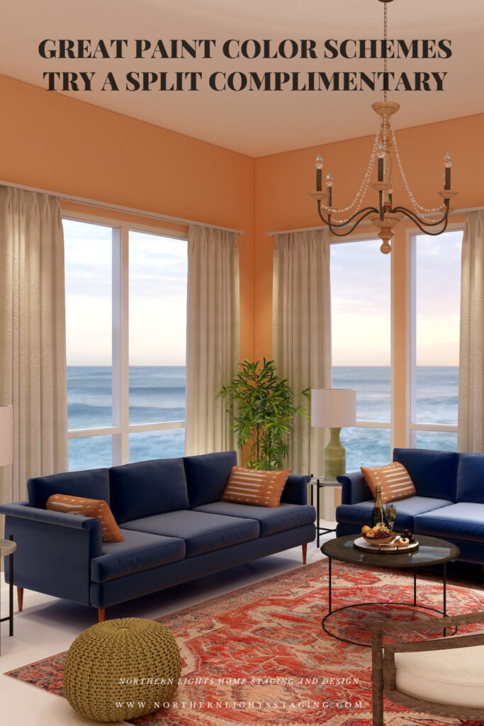
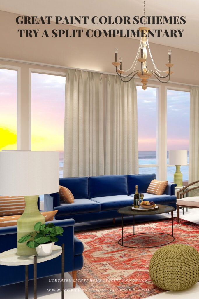
For example, below I created a split complimentary  scheme with our blue sofas as the base color.  I used red/orange in the rug, pillows and in the wall color where I used a very unsaturated, neutral tint of orange/red.

Great Paint Color Schemes- Try Split Complimentary
Split Complimentary color scheme. Edesign by Northern Lights Home Staging and Design.
Great Paint Color Schemes- Try Split Complimentary
Split Complimentary color scheme. Edesign and Fractal Art by Northern Lights Home Staging and Design.

My design also incorporates some of my unique fractal art from my “Spring” Collection. 


Spring Fractal Art by Northern Lights Home Staging and Design
Spring Fractal Art by Nofthern Lights Home Staging and Design

Spring #2 Fractal Art by Northern Lights Home Staging and Design
Spring 2 Fractal Art by Northern Lights Home Staging and Design

The design, although using 3 colors still feels fairly neutral and calm with some pops of color for excitement.

Shop the Look

Check out  the pieces I selected for this design. Some include affiliate links, meaning I receive a small commission for sharing at no additional cost to you.

I selected pieces of various materials with different textures and patterns within the 3 hue families. 

Design 2

 In this second version of the design, all I changed was the wall color, which is a more saturated or has higher chroma than the color I used in design 1. As you can see, it looks much more dramatic with the rich wall color.

Great Paint Color Schemes- Try Split Complimentary
Split Complimentary color scheme. Edesign by Northern Lights Home Staging and Design

Benefits of A Split Complimentary Color Scheme

  • A split complimentary color scheme is easy to put together using 3 colors.  You can give all three colors equal weight in the design for more drama, or make one or two colors more dominant based on the mood you want to create.
  • A split complimentary color scheme can be really dramatic or relaxing based on the saturation and placement of the colors you choose. Very nice for living rooms, dining rooms and areas that you like to entertain. You could try the more relaxing color combinations in a bedroom or office.

Create Beauty with Color in Your Space

EACH MOMENT IN LIFE IS YOUR CHOICE.
YOU HAVE THE OPPORTUNITY TO SURROUND YOURSELF WITH beautiful color RIGHT NOW.
OR NOT, IT’S UP TO YOU.
EVERYTHING IS EASIER WHEN YOU LOVE YOUR SPACE.


Full Service Edesign


Not Your Average Color Consultation

What is Your Global Design Style? Take the Quiz


What's Your Global Interior Design Style? Take the Quiz. Northern Lights Home Staging and Design

Download my Brochure

Interior Design, Color and Home Staging Services. Brochure of Northern Lights Home Staging and Design

Why work with Northern Lights Home Staging and Design

Terms of Service  |  Privacy Policy  |  Disclaimer

Prices subject to change without notice.

Call 907-362-0065 today

 info@northernlightsstaging.com

Pin These

Great Paint Color Schemes- Try Split Complimentary

Click on the picture to find out more about the best training class on color available, the Four Pillars of Color!.


Great Paint Color Schemes- Try a Tetrad

People often struggle with creating a great color scheme.   In my last few blog articles we discussed how you could take your favorite color, blue for example, and create different color schemes. We explored monochromatic, analogous, complimentary, diad and triad color schemes. Today, lets look at a Tetrad!

A tetrad uses four colors  which include two complimentary color pairings. It can be difficult to balance  if you use all four colors in equal amounts it may feel like too much. You can use one to three colors as dominant colors and and let the rest be more subdued. By subdued, I mean you can use less of the colors proportionally.  Or you could use less saturated versions of the colors so they don’t stand out as much, but color schemes tend to look more harmonious if you are using similar saturation or chroma levels. Here are some examples.

Let’s create a tetrad color scheme with the blue we have been working with in the last several articles. You can see this blue in the sofas. 

To catch up on these other color schemes see my articles Celebrate Your Favorite Color- Go Monochromatic and Create a Harmonious Color Scheme- Go Analogous,  Opposite Colors Attract, Go Complimentary and Great Paint Color Schemes- Do a Diad and Great Paint Color Schemes- Try a Triad. See examples of those color schemes below.


Celebrate your favorite color- go monochromatic! Edesign by NOrthern Lights Home Staging and Design
Monochromatic Color Scheme

Analogous Color Scheme
Analogous Color Scheme 2. Northern Lights Home Staging and Design
Analogous Color Scheme

Complimentary Color Scheme Edesign by Northern Lights Home Staging and Design
Complimentary Color Scheme

Complimentary Color Scheme Edesign by Northern Lights Home Staging and Design
Complimentary Color Scheme

Edesign using a Diad color scheme by Northern Lights Home Staging and Design
Diad Color Scheme

Edesign using a Diad color scheme by Northern Lights Home Staging and Design
Diad Color Scheme

Great Paint Color Schemes- Try a Triad
Triad Color Scheme

Great Paint Color Schemes- Try a Triad
Triad Color Scheme

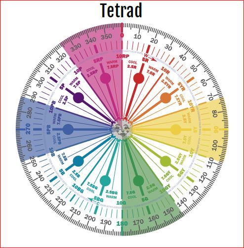
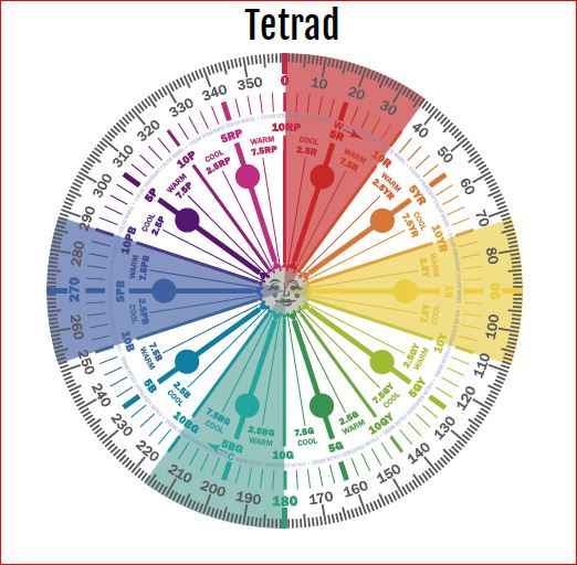
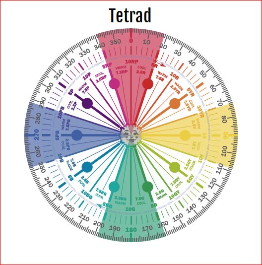
There are three different Tetrads we could choose from that use our blue (which is a blue/purple). For this article, lets work with the first two.


Tetrad by Cam Chroma


Tetrad by Cam Chroma


Tetrad by Cam Chroma

Tetrad Color Scheme Illustrations by Camp Chroma, the Best Color Training Ever!

The Design


Tetrad by Cam Chroma

With a tetrad you are using 4 colors and have a large variety of tints, tones and shades to play with within those colors. You can get dramatic or keep it mpre neutral based on the colors you choose. 

For example, below I created a tetrad with our blue as in the sofas as the base color. It’s compliment is yellow. I chose to use yellow in the wall color, in a  a less saturated and lighter yellow than in it’s blue compliment to keep it more neutral. I also used yellow in the buff colored leather ottomans and an accent in the flowers on the coffee table.

The other pair of compliments are the red/purple and green. I used the red/purple in the area rug, and the green in the pillows, pouf and plants and the art.

The rest of the design I kept neutral with the white chairs, accent tables and lamps and plant stands.

Overall in this design the blue and red-purple are most dominant, followed by the green and with yellow mainly as an accent. 

Great Paint Color Schemes- Try a Tetrad

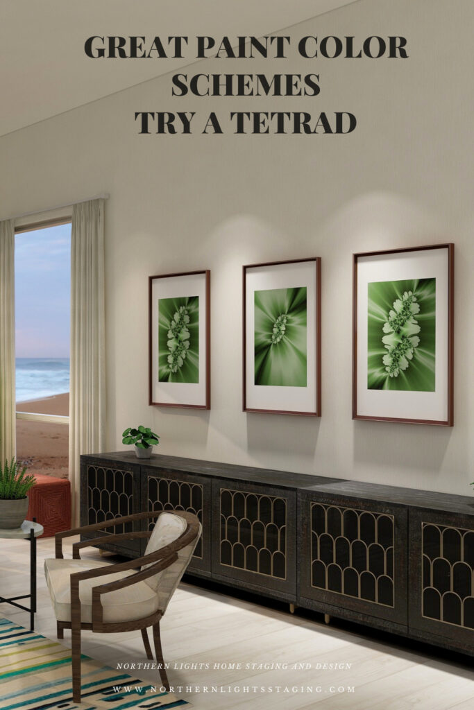
My design also incorporates some of my unique fractal art from my “Spring” Collection. 


Spring Fractal Art by Northern Lights Home Staging and Design
Spring Fractal Art by Nofthern Lights Home Staging and Design

Spring #2 Fractal Art by Northern Lights Home Staging and Design
Spring 2 Fractal Art by Northern Lights Home Staging and Design

The design, although using 4 colors still feels fairly neutral and calm with some pops of color for excitement.

Shop the Look

Check out  the pieces I selected for this design. Some include affiliate links, meaning I receive a small commission for sharing at no additional cost to you.

I selected pieces of various materials with different textures and patterns within the 3 hue families. 

Design 2


Tetrad by Cam Chroma

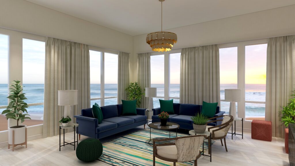
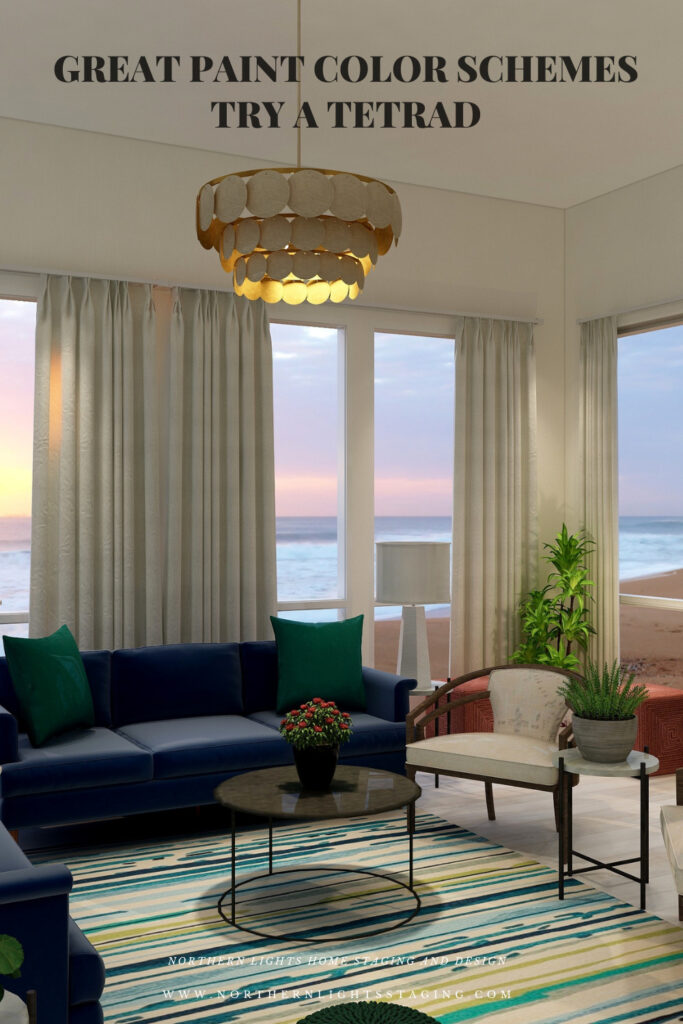
In this second version of a tetrad design, I once again used blue in the sofas and a soft neutral yellow paint color as it’s complement as in the first design.

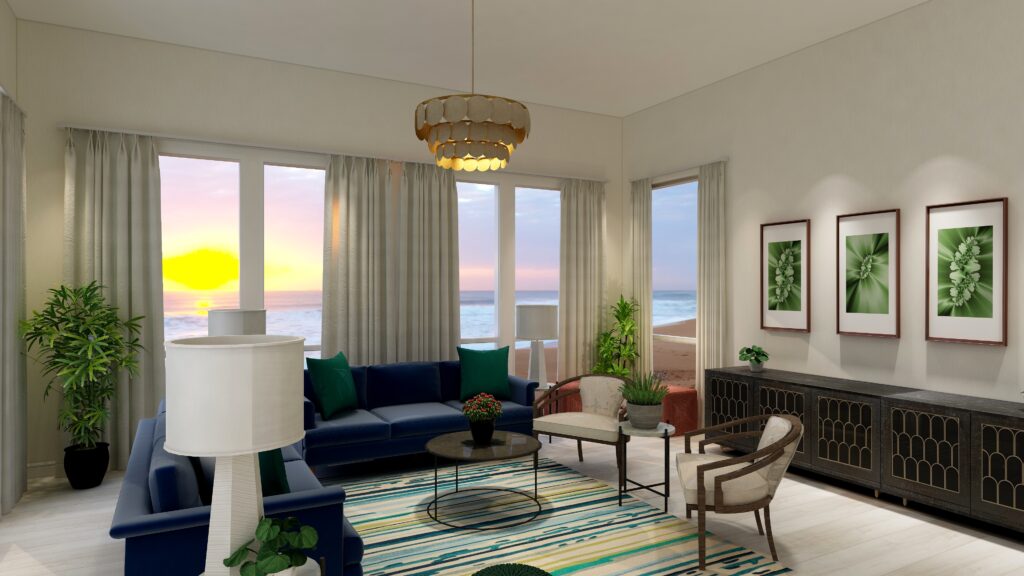
 I added the blue green from the second pair of complements into a new area rug (which also ties in the deep blue, yellow and greens). I maintained the green pillows and pouf and added the red in with the two ottomans and the flower centerpiece on the coffee table. As you can see, this time the red is just an accent, where as the blue, blue green and yellow are more dominant.

Great Paint Color Schemes- Try a Tetrad
Tetrad color Scheme. Edesign by Northern Lights Home Staging and Design
Great Paint Color Schemes- Try a Tetrad
Tetrad color Scheme. Edesign by Northern Lights Home Staging and Design

The design, although using 4 colors still also feels fairly neutral and calm with some pops of color for excitement.

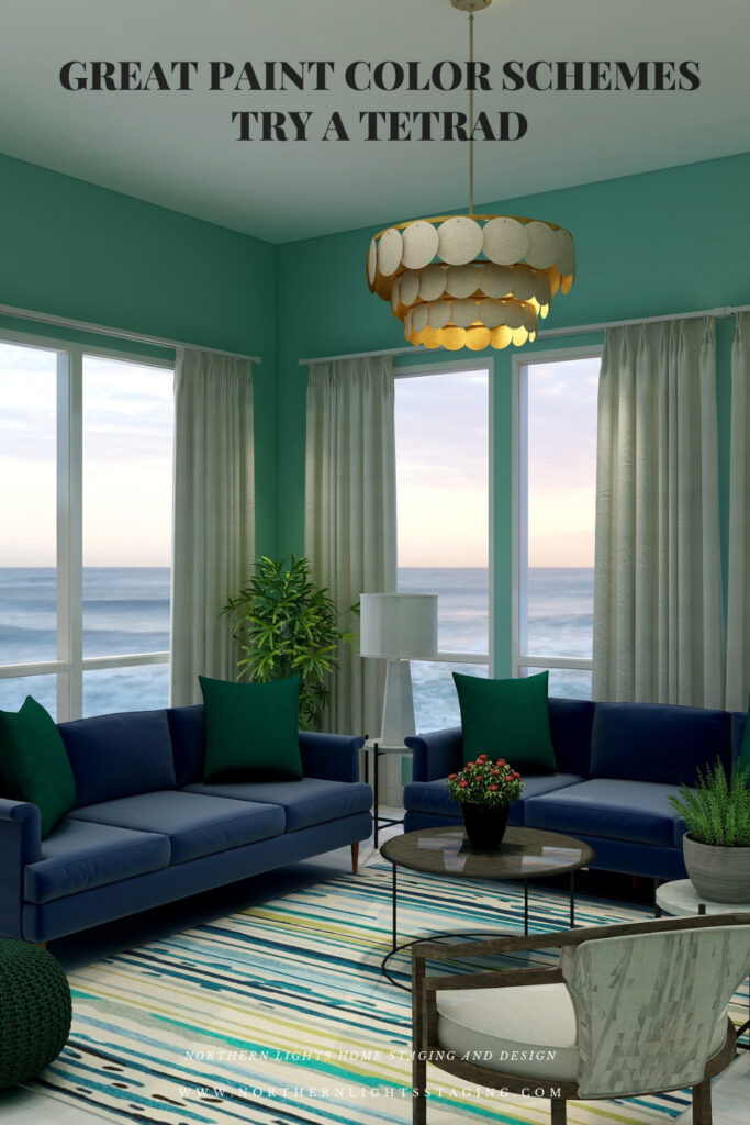
If you wanted to get more dramatic, you could pull in one of the 4 colors with greater saturation or chroma in the wall color as I did below. In this case, I used the blue-green and it changes the whole look and feel, even though everything else is the same.

Great Paint Color Schemes- Try a Tetrad
Tetrad color Scheme. Edesign by Northern Lights Home Staging and Design

Shop the Look- Design #2

Benefits of A Tetrad Color Scheme

  • A tetrad color scheme is relatively easy to put together using two sets of complimentary colors.  The tricky part is determining which colors you want to be more dominant, and balancing the rest so it is not overwhelming.
  • Tetrad color schemes can be really dramatic or relaxing based on the saturation and placement of the colors you choose. Very nice for living rooms, dining rooms and areas that you like to entertain. You could try the more relaxing color combinations in a bedroom, especially if you are using blues and greens.
  •  You can play with this color scheme for different effects by how many colors you allow to be more dominant, and how much weight each carries in the design. Each color brings it’s own feeling to the space so highlight one over the others to get the mood you want.

Create Beauty with Color in Your Space

EACH MOMENT IN LIFE IS YOUR CHOICE.
YOU HAVE THE OPPORTUNITY TO SURROUND YOURSELF WITH BEAUTY RIGHT NOW.
OR NOT, IT’S UP TO YOU.
EVERYTHING IS EASIER WHEN YOU LOVE YOUR SPACE.


Full Service Edesign


Not Your Average Color Consultation

What is Your Global Design Style? Take the Quiz


What's Your Global Interior Design Style? Take the Quiz. Northern Lights Home Staging and Design

Download my Brochure

Interior Design, Color and Home Staging Services. Brochure of Northern Lights Home Staging and Design

Why work with Northern Lights Home Staging and Design

Terms of Service  |  Privacy Policy  |  Disclaimer

Prices subject to change without notice.

Call 907-362-0065 today

 info@northernlightsstaging.com

Pin These

Great Paint Color Schemes- Try a Tetrad

Click on the picture to find out more about the best training class on color available, the Four Pillars of Color!.