Generational Harmony: Designing a Home for Every Age

The trend of multi-generational living is gaining momentum, transforming the dynamics of family homes. Navigating this arrangement requires a blend of empathy, strategy, and creativity. This article aims to shed light on effective methods for organizing a home that accommodates grandparents, parents, and children, ensuring a balanced and peaceful coexistence.
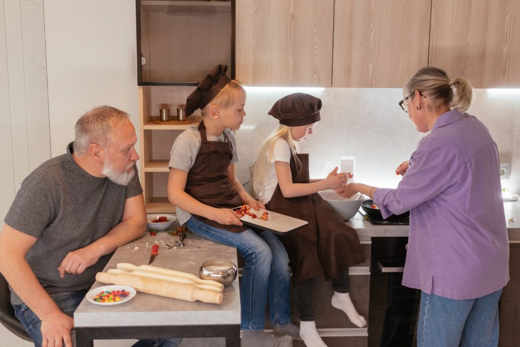
Photo by Mikhail Nilov on Pexels.

Create Designated Living Areas

Allocating specific living spaces for different generations is crucial in a multi-generational home. This strategy ensures that each family member has their own sanctuary, fostering independence and privacy. By doing so, grandparents can enjoy their quiet time, parents can maintain their routines, and children can play without hindrances. Thoughtful zoning of the house not only respects individual preferences but also minimizes potential conflicts arising from overlapping activities.

Ensure Accessibility for Everyone

A home that is welcoming to all ages and abilities is a cornerstone of multi-generational living. Incorporating features like ramps, handrails, and wider doorways caters to the elderly and those with mobility challenges. Simple modifications can significantly enhance the livability and safety of the home, making it a comfortable space for every family member. These adjustments demonstrate consideration and respect for each generation’s needs, promoting an inclusive living environment.

Maximize Storage Solutions

Effective storage solutions are vital in a multi-generational household. Investing in clever storage systems helps in organizing personal belongings and reducing clutter. This approach ensures that each family member has their space to store items, maintaining order and cleanliness. Smart storage solutions also help in optimizing available space, making the home feel more spacious and organized.
Generational Harmony: Designing a Home for Every Age

Simplify Home Maintenance

Managing home maintenance in a multi-generational setting can be complex. Utilizing digital solutions to coordinate and track home repairs and maintenance simplifies this process. These tools help in scheduling services, monitoring repair progress, and connecting with professionals. Streamlining home maintenance tasks reduces the burden on family members and ensures the smooth functioning of the household.

Design Common Areas for Bonding

Shared common areas play a significant role in nurturing family relationships. Designating areas for family gatherings and activities encourages interaction and bonding among generations. Whether it’s a cozy living room for movie nights or a spacious kitchen for communal cooking, these spaces become the heart of the home. They foster a sense of community and belonging, which is crucial in a multi-generational setting.

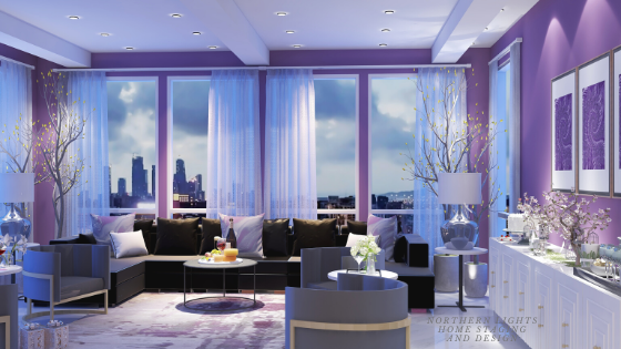
For example, see this example of a home designed for mulit-generational living by Northern Lights Home Staging and Design with lots of common areas for being together, indoors and outdoors.

https://youtu.be/Th3wt3gv39U?si=AysTjVVHHN-tsH63

Personalize Private Quarters

Customizing private spaces is key to creating a comfortable multi-generational home. Personalization allows each family member to express their individuality and feel a sense of ownership over their space. Whether it’s through decor, color schemes, or layout, tailoring these areas to individual tastes and needs makes the home more welcoming and comforting for everyone.
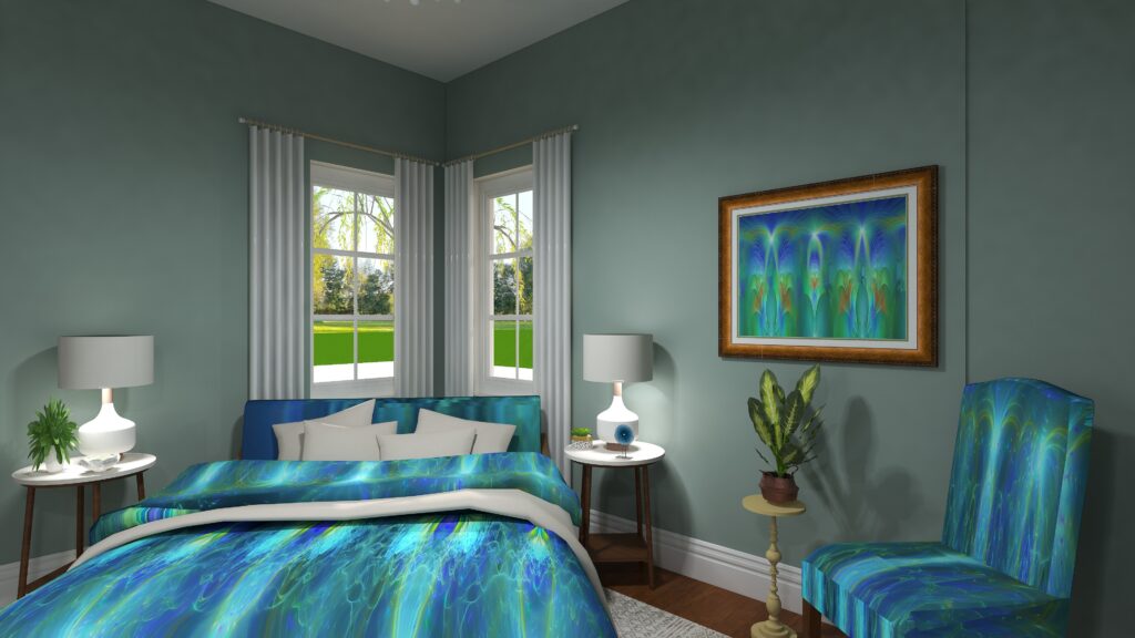
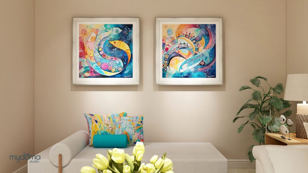
Bonus Room MyDoma Designer Virtual Home Tour
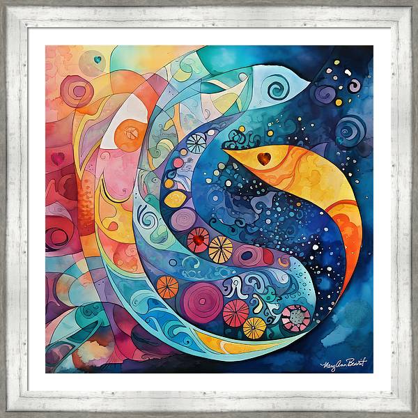
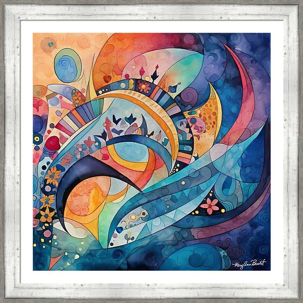
Bedroom energy art and Edesign by Mary Ann Benoit of Northern Lights Home Staging and Design.

Consider Joint Entrepreneurship

Embarking on a family business adventure serves as a powerful catalyst for reinforcing family ties across generations. The creation of a Limited Liability Company (LLC) emerges as a strategic choice, providing significant benefits, including limited liability protection, tax advantages, and operational flexibility. To streamline the establishment process, families may consider setting up an LLC through a formation service like Zenbusiness, which simplifies the legalities and paperwork involved. Engaging in a collaborative business endeavor not only unifies the family under a shared goal but also imparts crucial business acumen and life skills to its younger members.

Maintain Effective Communication

Establishing clear communication and boundaries is essential in a multi-generational home. Regular family meetings provide a platform for discussing issues, setting house rules, and planning activities. This practice ensures that everyone’s voice is heard and respected, fostering a harmonious living environment. Clear communication helps in resolving conflicts amicably and strengthens the family bond.

Creating a cohesive environment in a multi-generational home is a fulfilling yet complex task, demanding attention to the unique needs and preferences of each family member. By adopting these outlined strategies, families can cultivate a living space that harmonizes collective togetherness with personal autonomy. Balancing private and shared spaces, ensuring ease of access for all, and nurturing open communication are pivotal in this endeavor. Additionally, integrating tools like a home maintenance and repair app can further streamline household management. This approach not only fortifies family connections but also enhances the quality of life for every generation sharing the home.
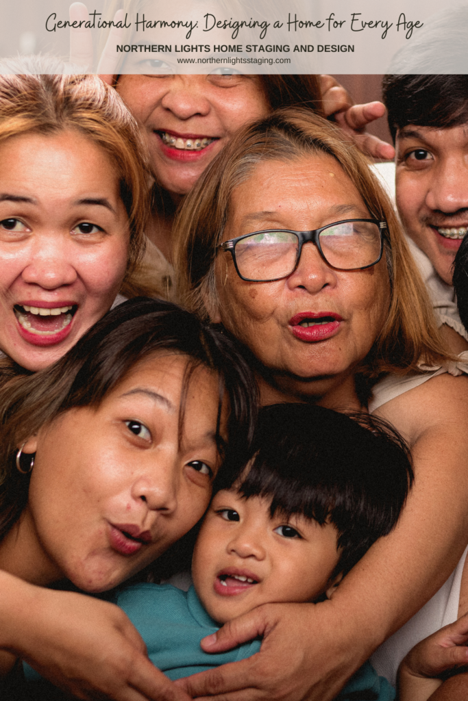
Generational Harmony: Designing a Home for Every Age

Written for Northern Lights Home Staging and Design by Dennis Kane of the Winterize Guys at winterizeguys.com.

Create Your Perfect Multi-Generational Space

My Aligned Design philosophy aligns Art, Science, and Energy to make magic happen in your home and life.

I believe in creating beautiful, colorful homes that look and feel great and energetically enhance your life.When your space is better, you are better. When you are better, the world is better.
Aligning art, science and energy to make magic happen in your home and life.

Now that you more tips to creating your perfect multi-generational space, are you ready to take action to make it happen in your home? 

Try my Aligned Design consultation and let’s get started
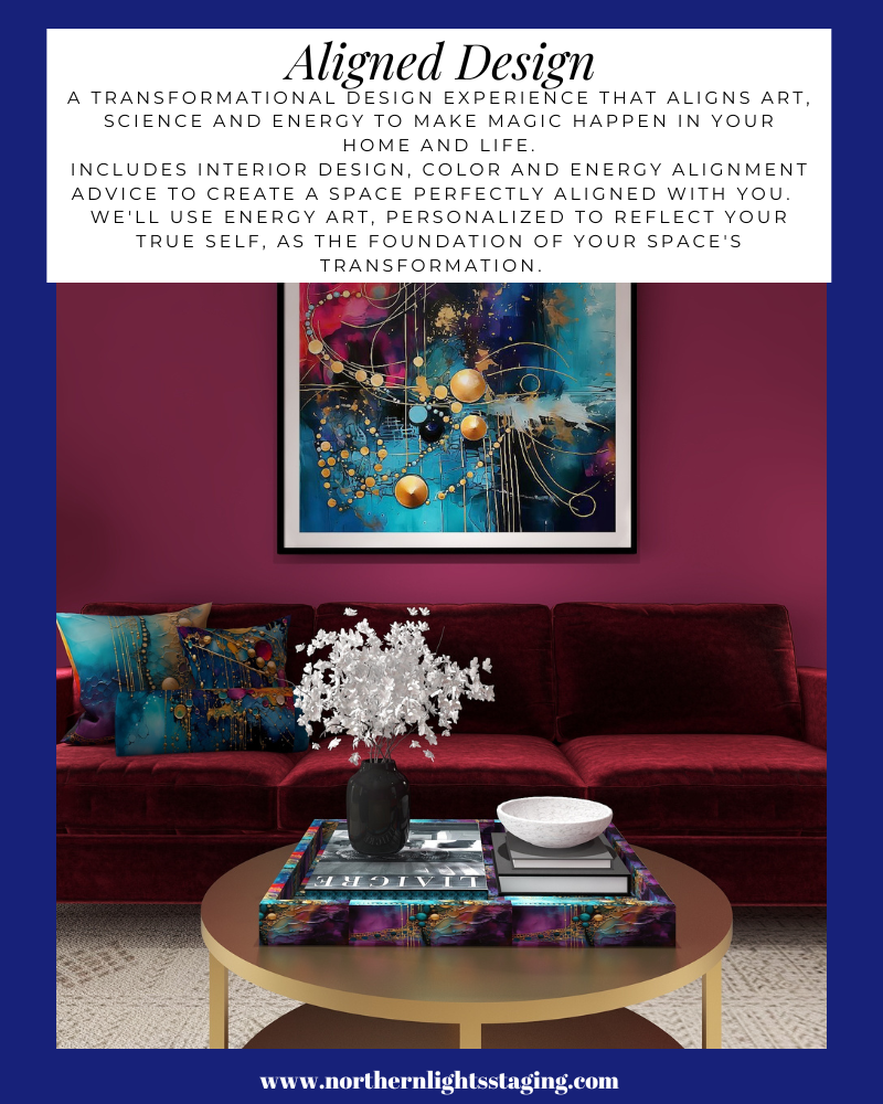

A transformational design experience that aligns Art, Science and Energy to Make Magic Happen in your Home and Life. Includes Interior Design, Color and Energy alignment advice to create a space perfectly aligned with you. We'll use Energy Art, personalized to reflect your true self, as the foundation of your space's transformation.

Curious about your Interior Design style? Take the quiz and find out.

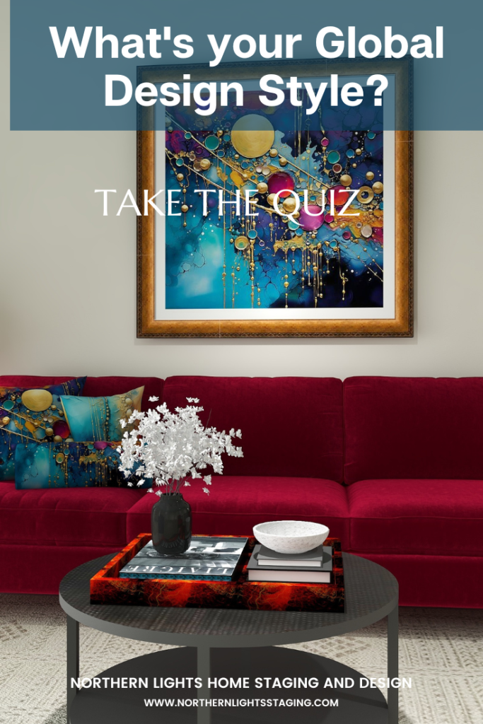
What is Your Global Design Style? Take the Quiz


Why Work with Northern Lights Home Staging and Design

Aligned Design©– All Rights Reserved.

Terms of Service  |  Privacy Policy  |  Disclaimer |  Brochure

Prices are subject to change without notice.

Call 907-362-0065 today


Are You Attached to an Ugly House? Six Tips to Set Yourself Free

This week I had a design consultation that gave me a lot of insights into why people have ugly houses.

Attachment, attachment, attachment! Let it all go.

I have learned that attachment to people, things, outcomes, etc. is the cause of most of our suffering. We stress over outcomes and how people behave. We try to control things because we get “attached” to an end result we want. We expect people to behave a certain way because we are attached to our beliefs of how they should act.

We get attached to outcomes because we are afraid of the unknown.

Are You Attached to an Ugly House? Six Tips to Set Yourself Free

Attachment steals our well-being. Letting go of attachment to certain outcomes, and of trying to control everything can make us feel so much better.

Control is just an illusion anyway. When it comes right down to it, we do not have control over anything or anyone. Things can happen in an instant to take away whatever control we thought we had.

Attachment can also affect the way our house looks and feels, and how likely we are to be able to create that perfect space we wish we had.

Are You Attached to an Ugly House? Six Tips to Set Yourself Free

How to Release Attachment

Think about your own home. Are you attached to any of these things?

Let Go of Your Pain

During the design consultation, I realized that attachment would likely stop my client from getting the end result she really wanted.

She told me she had never liked the house and had been pressured to buy it by her partner.   She described its many issues and that it never looked the way she wanted it to.

Every room was filled with clutter, furniture covered with unattractive and mismatched covers to protect it from the dogs, furniture barriers created to keep the dog away from the cat.

Rooms, instead of being used for their intended purposes, were used for many purposes. For example, the living room also served as a playroom and an office. The separate office was also a craft room and a TV room.

For every suggestion I gave, there were ten reasons why nothing could change. She was attached to her “pain”.

We took the pet covers off the living room furniture and re-arranged a bit, creating an amazing transformation. Sadly, I think after I left it will likely go back to looking the way it did previously.

Instead of thinking of ten reasons you can’t make changes in your home, think of one reason you can. Your home will look more beautiful for it.


Are You Attached to an Ugly House? Six Tips to Set Yourself Free

Let Go of Fear

All attachment stems from fear, mainly of the unknown. Are you afraid of making changes with color, flooring, furniture, and more?

The unknown can be much better than what you have now.  Embrace it and see what beauty might stem from it. Making changes requires taking risks. Beauty could be on the other side of that scary door.


Are You Attached to an Ugly House? Six Tips to Set Yourself Free

Let Go of the Past

You have probably grown and changed over time.  Embrace that. No need to hang on to a style from a bygone era just because you are used to it.


Are You Attached to an Ugly House? Six Tips to Set Yourself Free

Let Go of the Status Quo

Just because it has always been that way, doesn’t mean it needs to stay that way. Let it go. The pile of things in the corner has been there for years. Does that mean it should remain there forever? We fear change. There is that word again. Fear.

Are You Attached to an Ugly House? Six Tips to Set Yourself Free

Let go of Control

Feeling the need to control everything is just another aspect of fear of the unknown. The unknown might just be the most beautiful room you have ever seen! Take a chance.

Are You Attached to an Ugly House? Six Tips to Set Yourself Free

Let Go of Clutter

I know, if you get rid of it, you might need it next week. If you haven’t used it or worn it in 10 years, that probably won’t happen. Everyone I know, including me, has too much stuff.

It NEVER looks good in a room.

Set it free so it can go to someone who really needs it and will love it.

Are You Attached to an Ugly House? Six Tips to Set Yourself Free

Are You Ready to Let Go?

I know. Sounds hard.

It’s really not though. Hire a designer. They have your best interest at heart and can take a lot of the risk of making a mistake out of the process. They know what looks good and what works. It is a lot less risky enlisting the help of a pro and listening to them than going it alone.

Hire someone with good reviews. Listen to them. Let go of fear and control. Enjoy the ride and see what joy is on the other side.

And if you really don’t like the end result, there is no law that says you can’t change your mind and make adjustments.

Are You Attached to an Ugly House? Six Tips to Set Yourself Free

Set Yourself Free

My Aligned Design philosophy aligns Art, Science, and Energy to make magic happen in your home and life.

I believe in creating beautiful, colorful homes that look and feel great and energetically enhance your life.

When your space is better, you are better. When you are better, the world is better.


Aligning art, science and energy to make magic happen in your home and life.

Now that you more tips to creating your perfect space, are you ready to take action to make it happen in your home? If you knew absolutely for certain that creating a perfect space would create a better life for you, you would do it, wouldn’t you?

I assume if you have read this far, you are serious about making a change you know will make you happy.

Let me help you take that trip to your perfect space in a Ferrari instead of a stagecoach. Try my Aligned Design consultation and let’s get started.


A transformational design experience that aligns Art, Science and Energy to Make Magic Happen in your Home and Life. Includes Interior Design, Color and Energy alignment advice to create a space perfectly aligned with you. We'll use Energy Art, personalized to reflect your true self, as the foundation of your space's transformation.

Curious about your Interior Design style? Take the quiz and find out.


What is Your Global Design Style? Take the Quiz


Why Work with Northern Lights Home Staging and Design

Aligned Design©– All Rights Reserved.

Terms of Service  |  Privacy Policy  |  Disclaimer |  Brochure

Prices are subject to change without notice.

Call 907-362-0065 today


Birds of a Feather- What Birds Can Teach Us About Designing the Perfect Room 3

Previously, I showed you how flat lays create endless possibilities for creating a perfect space and three flat lays inspired by bird feathers.

Birds provide endless inspiration for creating beautiful designs with the intricate patterns,  colors, and textures of their feathers!

Flat Lay #1- The Forest

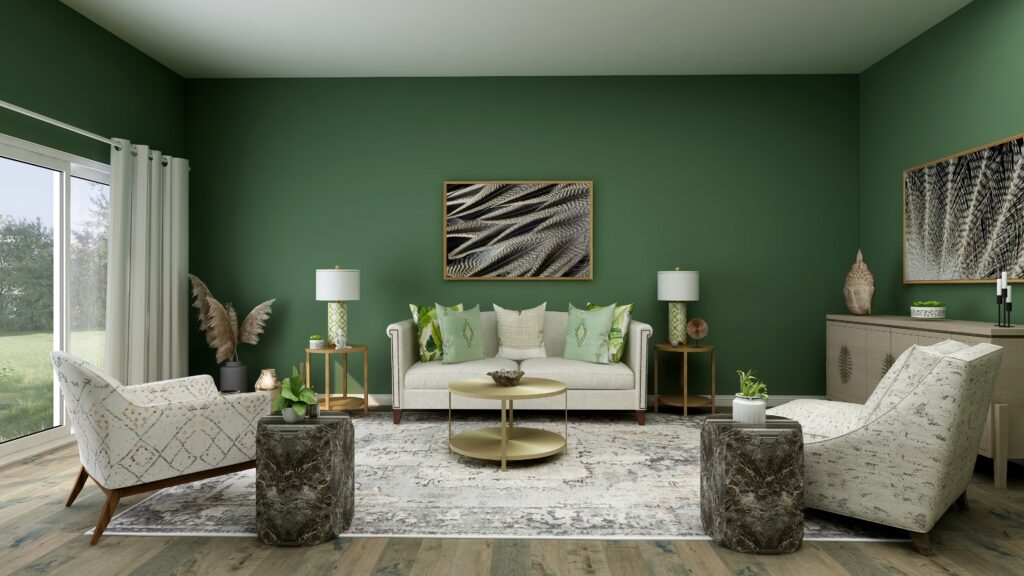
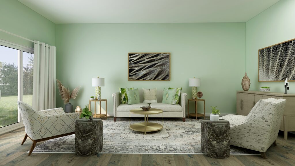
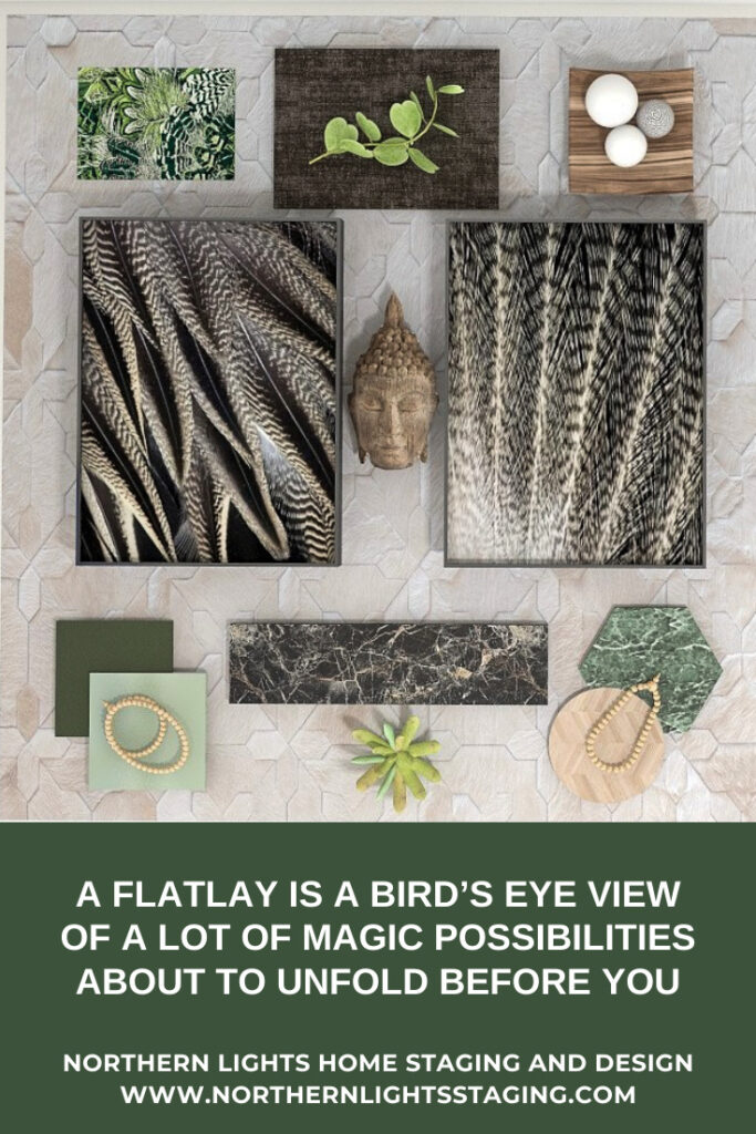
In my article Birds of a Feather- What Birds Can Teach Us About Designing the Perfect Room, I shared a design for the first flat lay, inspired by realistic photo art of Pintail duck and eagle feathers. I designed a room with a calm and earthy feeling that reminds me of being in the forest using the feather art and colors of nature.

A Flatlay is a Bird’s Eye View of a lot of Magic Possibilities About to Unfold Before You
Flat lay and Edesign by Northern Lights Home Staging and Design


Birds of a Feather- What Birds Can Teach Us About Designing the Perfect Room


Birds of a Feather- What Birds Can Teach Us About Designing the Perfect Room
Edesign by Northern Lights Home Staging and Design

Flat Lay #2- Bohemian Meets Hollywood Glam

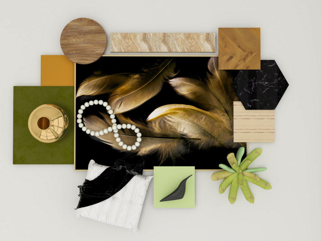
The second flat lay, evoked a much more glamorous style and feeling, like a cross between Modern Global Style and Hollywood Glam. I developed several ideas capturing the drama and glamour with different color walls.


A Flat Lay is a Bird’s Eye View of a lot of Magic Possibilities About to Unfold Before You
Flat lay and Edesign by Northern Lights Home Staging and Design.

Birds of a Feather- What Birds Can Teach Us About Designing the Perfect Room 2
Edesign by Northern Lights Home Staging and Design.

Birds of a Feather- What Birds Can Teach Us About Designing the Perfect Room 2
Edesign by Northern Lights Home Staging and Design.

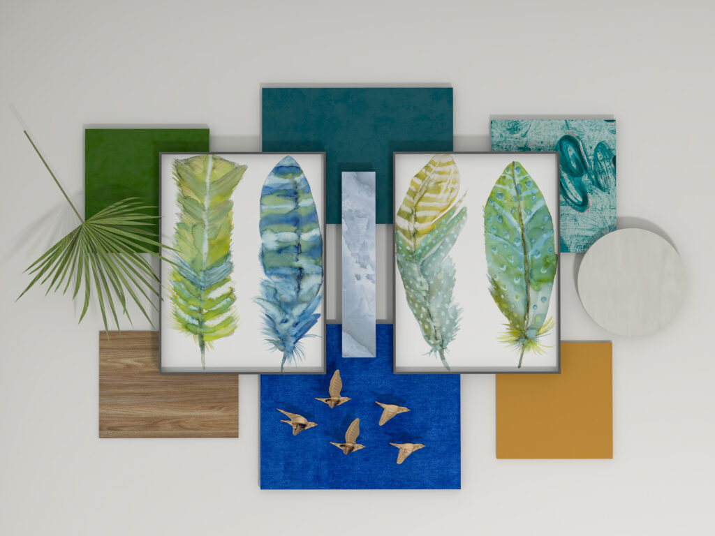
Flat Lay #3- A Time for Whimsy- Let’s Fly

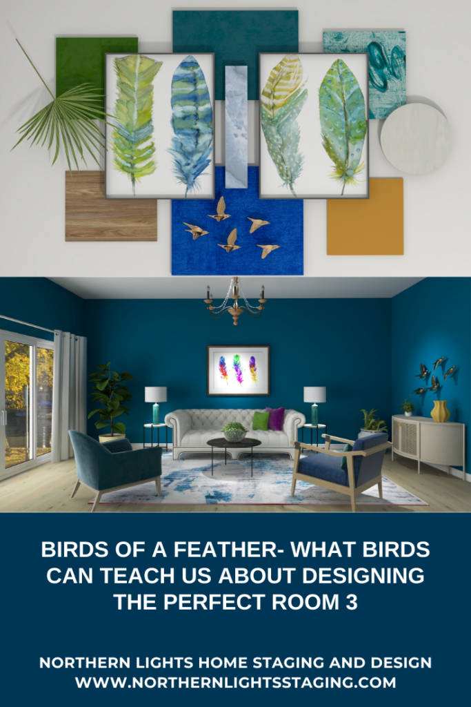
The third flat lay to me evoked a sense of whimsy and playfulness, filled with color and the sense that you can take flight and soar to any place you want to go.

A Flat Lay is a Bird’s Eye View of a lot of Magic Possibilities About to Unfold Before You
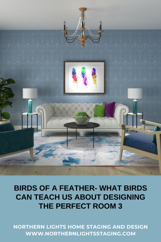
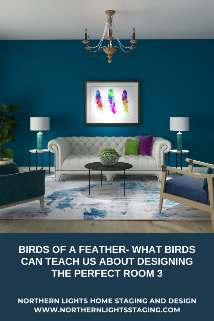
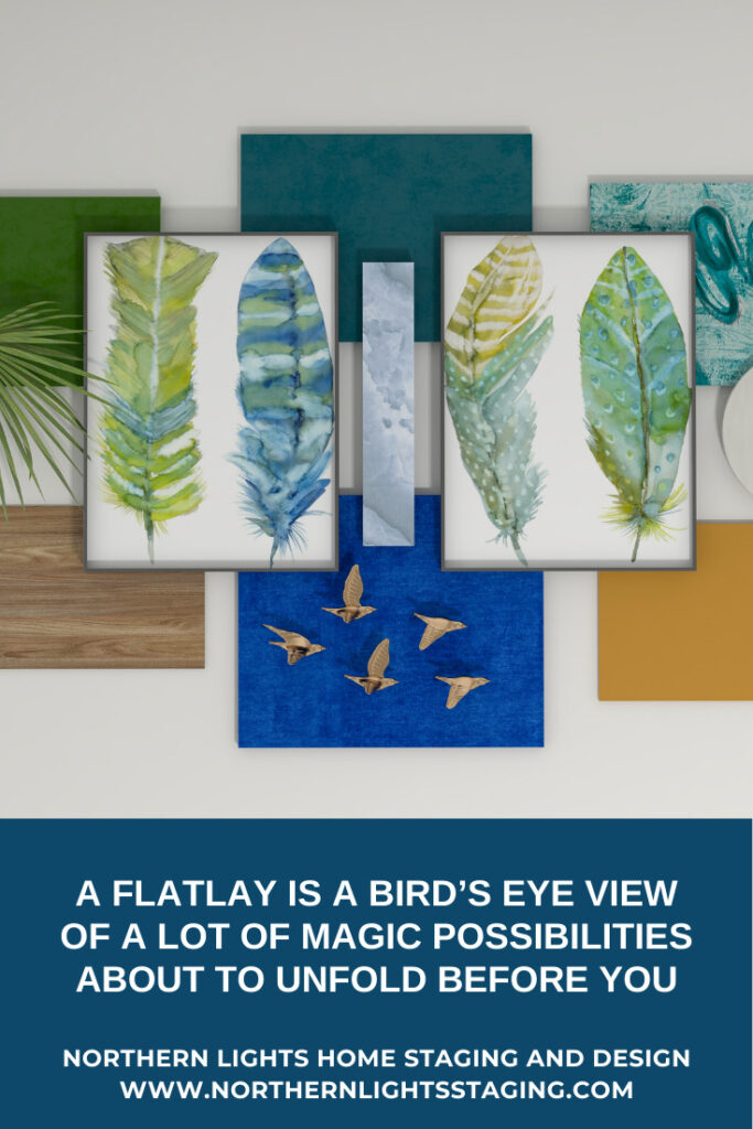
Birds of a Feather- What Birds Can Teach Us About Designing the Perfect Room 3

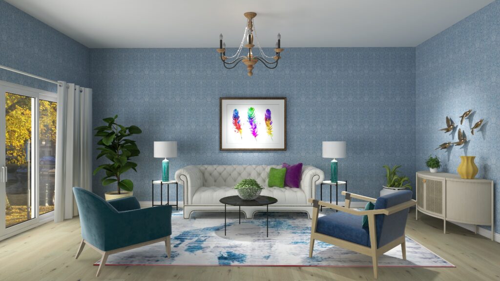
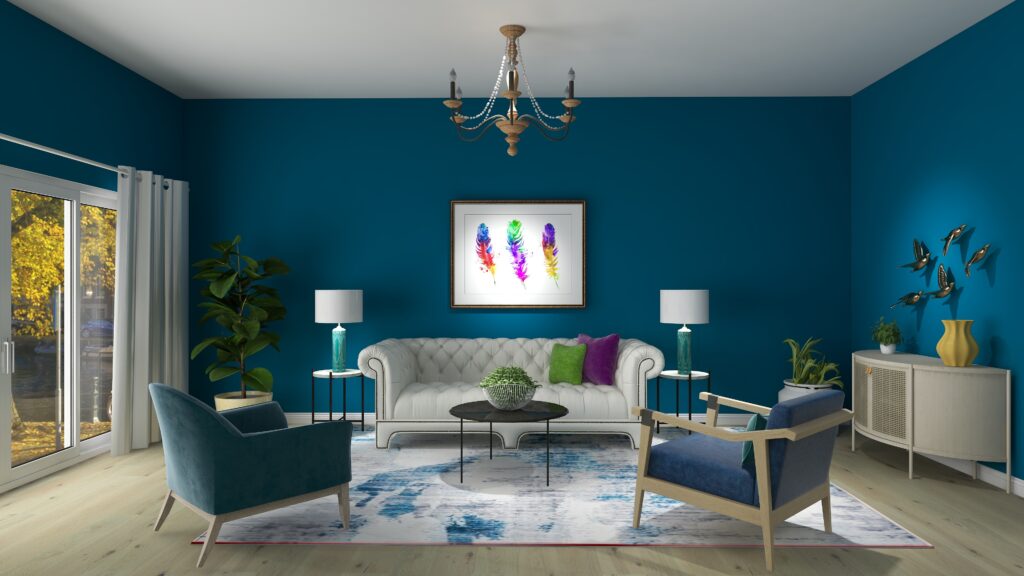
As in Flat Lay #2, the feathers are stylized rather than realistic, and more colorful and playful than the gold and black feathers. Even though it has a sense of fun and whimsy, it also feels calm and relaxing with the blues and greens.

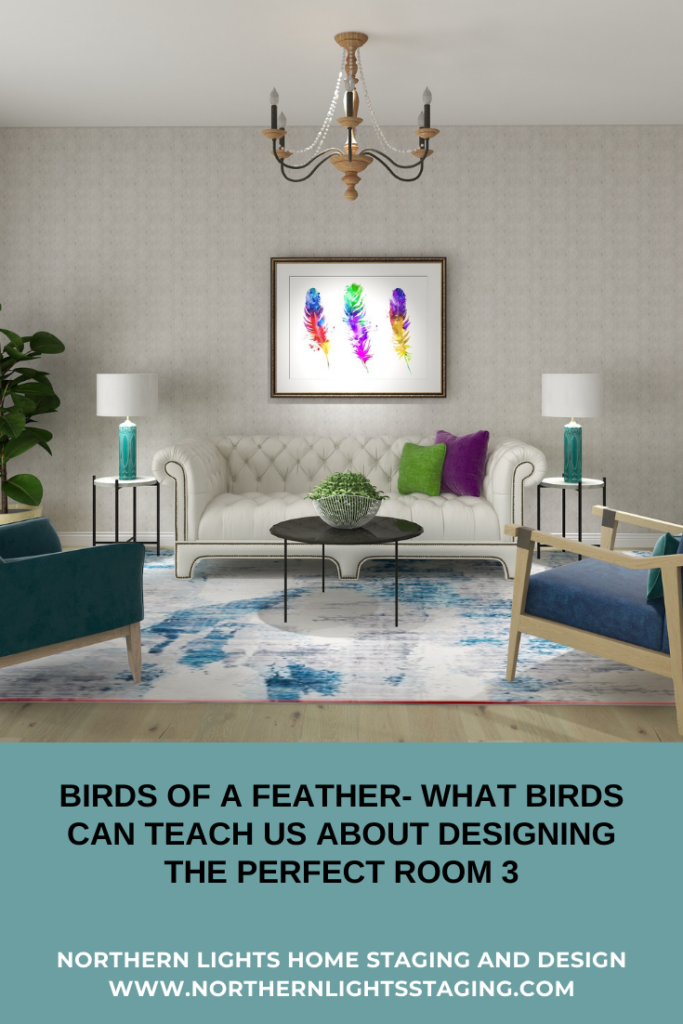
I designed two living rooms. One uses wallpaper and is more light and airy yet has texture. The deep blue wall adds more drama with the darker, rich blue.

Which is your favorite?

Bird Feathers Are a Great Source of Inspiration!

As you can see, you can use natural elements like bird feathers to inspire earthy, glamorous, and dramatic, or whimsical and playful designs!

Bird feathers can inspire many design styles and are fun to work with. There is a huge amount of variety.

Did you know you can often identify a bird just by the feathers? That is how unique they are. Mother Nature provides endless inspiration. Try your own flat lay and see what it inspires.

Birds of a Feather- What Birds Can Teach Us About Designing the Perfect Room 3

Are You Ready to Create Your Perfect Space?

Are you ready to create your perfect space? I assume you are since you are reading my blog post. Let’s tell your unique story and find the alignment of art, science, and energy that makes you happy.  Let me help you take that trip to your perfect space in a Ferrari instead of a stagecoach. Try my Aligned Design consultation and let’s get started.


A transformational design experience that aligns Art, Science and Energy to Make Magic Happen in your Home and Life. Includes Interior Design, Color and Energy alignment advice to create a space perfectly aligned with you. We'll use Energy Art, personalized to reflect your true self, as the foundation of your space's transformation.


What is Your Global Design Style? Take the Quiz


Why Work with Northern Lights Home Staging and Design

Aligned Design©– All Rights Reserved.

Terms of Service  |  Privacy Policy  |  Disclaimer |  Brochure

Prices are subject to change without notice.

Call 907-362-0065 today
Pin These

Birds of a Feather- What Birds Can Teach Us About Designing the Perfect Room 3


I Learned to Solve All My Interior Design Problems by Dancing-Light Transforms Ordinary to Extraordinary

Light isn’t merely an illuminating force—it’s a storyteller, a guide, and an artist. In the intricate dance between shadow and glow, there lies the potential to transform any space into an evocative sanctuary of feelings and experiences.

As in my philosophy of Aligned Design, the combination of artistry, science, and energectic connection captivates the power of light.and its ability to spotligh the unique facets of your environment and create an atmosphere of enchantment.

Light Makes the Magic Happen.

I have a love for many forms of art, including one of my favorites, dance. I am always noticing the similarities between what is important in the different art forms I explore.


I had the privilege of attending a dance workshop titled “From Practice to Professional Presentation,” led by the renowned dancer and instructor, Helia Bandeh. This immersive experience delved deep into the nuances of creating a visually captivating stage or backdrop for dance performances, whether live or on video. Helia shed light on crucial aspects such as décor, lighting, and costuming.


It’s astonishing how much it intersects with the principles of Interior Design! In this article, we’ll zoom in on the magic of lighting.

According to Helia, “light is the most important element in your visual presentation and can totally transform the performance or the space”. I agree, whether it is dance or Interior Design.

How to Make Magic Happen in Your Home with Lighting by Northern Lights Home Staging and Design
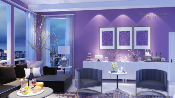
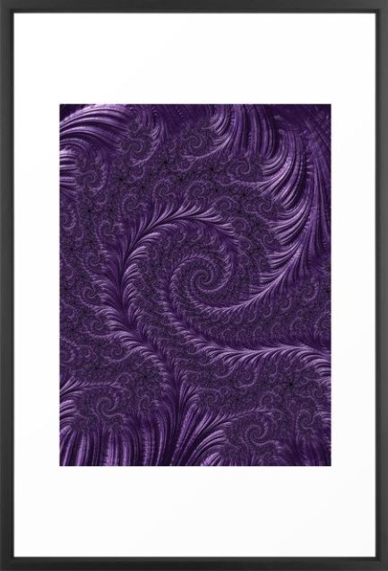
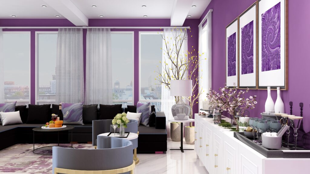
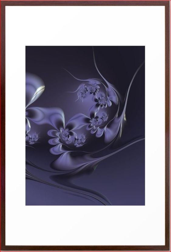
Edesign and “Deep Purple” fractal art by Mary Ann Benoit.

"Deep Purple" custom Fractal Art by Northern Lights Home Staging and Design
Deep Purple Fractal Art by Mary Ann Benoit

Light Shapes Perception

The power of light extends beyond mere illumination. It serves as a director, guiding one’s gaze. Whether illuminating an entire auditorium – encompassing both audience and stage – or narrowing down to a singular performer, light dictates where our attention lies.

In our homes and workplaces, strategic lighting can accentuate a piece of art, create a cozy reading nook, illuminate a kitchen countertop, or guide a path. The right play of light can alter our perception of space, both in terms of size and ambiance.

For instance, during a performance, when a specific area is spotlighted, it not only commands focus but can also transform the vastness of a stage or room into a cozy, intimate setting, allowing external distractions to fade into obscurity.

 
Saturday Night Live Art Shows- Turkish Style
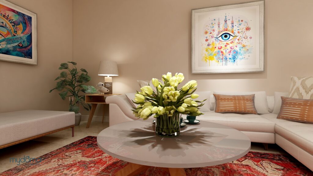
Edesign and “Heart of Turkey” energy art by Mary Ann Benoit.

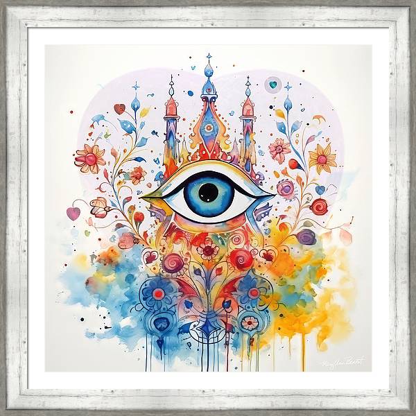
"Heart of Turkey" energy art by Mary Ann Benoit
Heart of Turkey energy art by Mary Ann Benoit

"Heart of Turkey #4" energy art by Mary Ann Benoit
Heart of Turkey #4 energy art by Mary Ann Benoit

Light is the Master of Color

In the realm of the stage, light serves as a masterful tool for manipulating color, all without altering the physical aspects of the set. Consider, for instance, the transformative effect of various lights on a dancer adorned in a white dress. Colored lighting has the capacity to envelop the backdrop, intensify the hues enveloping the performer, or instill a distinct mood.

Within your interior spaces, the presence of colored light can profoundly impact the perceived warmth or coolness of the surroundings, thereby orchestrating the very essence of your colors. Here, light reigns supreme as it can effortlessly usher in a festive ambiance, as exemplified by the twinkling charm of Christmas lights.

How to Make Magic Happen in Your Home with Lighting by Northern Lights Home Staging and Design
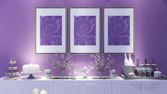
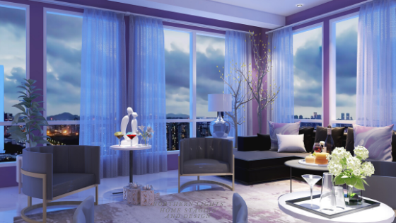
Edesign and “Deep Purple” fractal art by Mary Ann Benoit. Notice color difference between night lighting in this picture and day light in the picture below.
Edesign and “Deep Purple” fractal art by Mary Ann Benoit.

Light is the Maestro of Drama

Sharp, hard light, characterized by its pronounced contrast between luminosity and shadow, isn’t just a source of illumination; it’s a storytelling tool. By carving out a space with stark differences between light and dark, hard light can evoke intense emotions, channel focus, and create a cinematic atmosphere.

Imagine a room bathed in soft, uniform light. Now, introduce a singular beam of hard light, spotlighting a piece of art on the wall or a vintage table in the center. Instantly, that object becomes the room’s protagonist, drawing eyes and sparking intrigue. This interplay isn’t merely about visibility, but about imbuing significance.

Similarly, in the realm of theater and dance, hard lighting can elevate a scene or movement, turning a simple gesture into a moment of raw, emotional power. The way it carves shadows and highlights can echo the intricacies of the human condition – our vulnerabilities, our strengths, our moments of introspection.

In essence, light doesn’t just illuminate; it punctuates, intensifies, and narrates, shaping our experience of any given space or moment.

 
How to Make Magic Happen in Your Home with Lighting by Northern Lights Home Staging and Design
Lighting creates drama.

Light- The Ultimate Designer’s Tool

In the realm of design, light isn’t just an element; it’s the alchemy that metamorphoses a space. “Light stands as the cornerstone of design, wielding the power to wholly redefine an environment.”

As I journey through life, my appreciation deepens for the interwoven tapestry of artistic disciplines. The parallels between Interior Design and other artistic endeavors are striking. At their core, they share foundational principles that breathe life into masterpieces. It requires a keen sense of observation, a discerning ear, and a heart that resonates with the ambient energy to truly discern these connections.

The artistry (innate creativity), melded with the precision of science (understanding of colors), and the profoundness of energy (the emotive connection), orchestrates a harmonious ballet of elements. This trinity of alignment is my guiding compass, allowing me to choreograph exquisite dance performances and craft evocative interior spaces.

 
Light highlights the energy of the art and it’sobvious and subliminal messages as well as the flowers.

"Heart of Turkey #3" energy art by Mary Ann Benoit
“Heart of Turkey #3” energy art by Mary Ann Benoit

Light- The Unspoken Director

Within the canvas of your interior, light is the artist’s brush, poised to highlight key facets of your environment. It possesses the remarkable ability to draw the viewer’s focus with pinpoint precision – whether it’s accentuating a cherished piece of art, carving out a serene reading alcove, illuminating a workspace in your kitchen or office, or gently guiding you along a well-defined pathway.

Moreover, the art of spotlighting and dimming is akin to wielding a magician’s wand. It bestows the power to sculpt how we perceive space, deftly crafting an atmosphere of intimacy and charm. Envision yourself nestled before a flickering fireplace, with the remainder of the room bathed in a soft, subdued glow. Or picture a cozy reading nook or a captivating game corner, bathed in the gentle embrace of selectively dimmed lighting, beckoning you to unwind and lose yourself in the moment. These are the artful manipulations of light that transform mere spaces into immersive experiences.

Light- The Master of Energy

How to Make Magic Happen in Your Home with Lighting by Northern Lights Home Staging and Design
Light directs your attention to what you want to highlight such as the art sculpture on the table, and the elements of the celebration on the other tables. Edesign by Mary Ann Benoit.

The energy of lighting profoundly influences the energy, or ambiance, of a space through how it affects  our senses, emotions, and perceptions:

  1. Emotional Resonance: Different lighting can evoke different feelings. Warm, soft lighting often feels cozy and inviting, evoking feelings of relaxation and warmth. In contrast, cool, bright lighting can energize and invigorate a space, making it feel active and alert.

  2. Focus and Perception: Lighting can be used to draw attention to specific elements of a room, guiding one’s gaze and perceptions. By spotlighting a particular object or area, it becomes a focal point, altering how the space is experienced. Conversely, shadows can be used to create depth and mystery, lending a room an air of intimacy or contemplation.

  3. Spatial Dynamics: The way light spreads throughout a space can make it feel larger or smaller. Bright, evenly distributed light gives the sensation of openness, making a space feel larger. Dim lighting or selectively illuminated areas can make a space feel cozy, intimate, and more segmented.

  4. Temporal Ambiance: The changing nature of lighting, especially natural light, sets the rhythm of our day. Morning light can feel fresh and invigorating, while evening light is often warm and settling. By mimicking these natural transitions, artificial lighting can set the mood or change the energy of a room to align with our circadian rhythms.

  5. Color Interaction: Light affects the way we perceive colors. The hue and intensity of light can enhance or mute the colors in a room, thereby changing its overall energy. A room bathed in golden hour light will feel vastly different from the same room illuminated by the bluish light of a cloudy day.

  6. Cultural and Personal Associations: Different cultures, and even individuals, might have varying associations with light based on experiences and upbringing. For example, candlelight might evoke feelings of romance, spirituality, or introspection depending on one’s personal experiences.

  7. Energetic Flow: In metaphysical terms, light is often associated with positive energy flow. A well-lit space is considered to have good ‘Chi’, encouraging vitality, clarity, and well-being.


In essence, the energy of lighting is intrinsically linked with the energy of a space. It’s more than just visibility; the beauty it creates or its effects on color,  it’s about creating an ambiance, invoking emotions, and influencing the very essence of a space’s character.

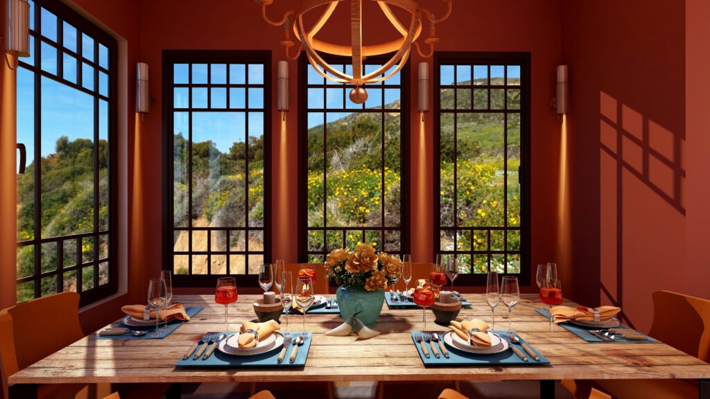
See the Beauty of the World in Shades of Orange
Edesign of a Mexican style dining table with beuutiful outdoor amd indoor lighting by Mary Ann Benoit.

Learn More

Learn more about some of the unique lessons I have learned about creating great interiors from dance and music in some of my other blog posts below.

Illuminate Your Space with Aligned Design

Light isn’t merely an illuminating force—it’s a storyteller, a guide, and an artist. In the intricate dance between shadow and glow, there lies the potential to metamorphose any space into an evocative sanctuary of feelings and experiences.

Drawing on the sacred triad of artistry, science, and connection, we invite you to embark on an Aligned Design journey with us. Together, we’ll harness the captivating power of light, spotlighting the unique facets of your environment and crafting an atmosphere of intimacy and enchantment.

Imagine your cherished art pieces bathed in precise illumination, a serene reading nook beckoning you to lose yourself in a book, or a workspace radiant with just the right balance of light, enhancing both functionality and ambiance.

Dive into the transformative world of lighting with our specialized consultation, and let’s co-create spaces that don’t just look good, but feel magical


A transformational design experience that aligns Art, Science and Energy to Make Magic Happen in your Home and Life. Includes Interior Design, Color and Energy alignment advice to create a space perfectly aligned with you. We'll use Energy Art, personalized to reflect your true self, as the foundation of your space's transformation.

Curious about your Interior Design style? Take the quiz and find out.


What's Your Global Design Style? Take the Quiz


Why Work with Northern Lights Home Staging and Design

Aligned Design©– All Rights Reserved.

Terms of Service  |  Privacy Policy  |  Disclaimer |  Brochure

Prices are subject to change without notice.

Call 907-362-0065 today


Birds of a Feather- What Birds Can Teach Us About Designing the Perfect Room 2

Previously, I showed you how flat lays create endless possibilities for creating a perfect space and three flat lays inspired by bird feathers.

Birds provide endless inspiration for creating beautiful designs with the intricate patterns,  colors, and textures of their feathers!

In my article Birds of a Feather- What Birds Can Teach Us About Designing the Perfect Room, I shared some ideas for one of those flat lays inspired by realistic photo art of Pintail duck and eagle feathers. I designed a room with a calm and earthy feeling that reminds me of being in the forest using the feather art and colors of nature.

A Flatlay is a Bird’s Eye View of a lot of Magic Possibilities About to Unfold Before You
Flat lay and Edesign by Northern Lights Home Staging and Design


Birds of a Feather- What Birds Can Teach Us About Designing the Perfect Room


Birds of a Feather- What Birds Can Teach Us About Designing the Perfect Room
Edesign by Northern Lights Home Staging and Design

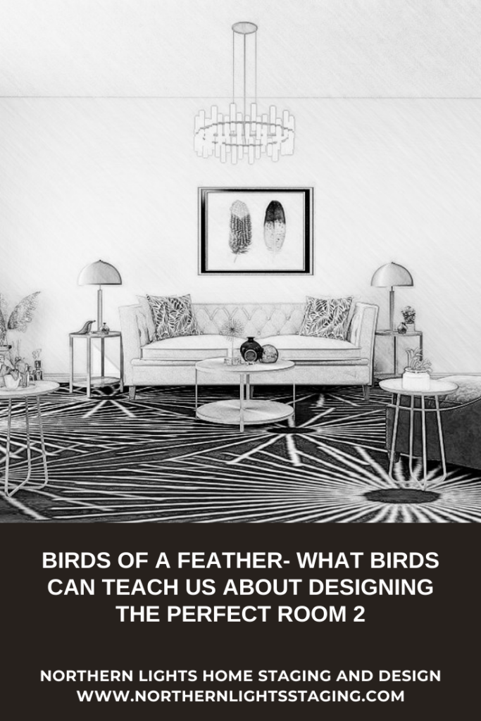
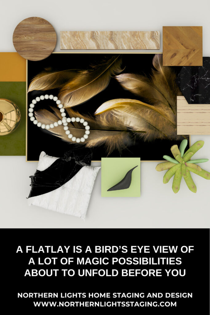
This second flat lay, to me, evoked a much more glamorous style and feeling, like a cross between Modern Global Style and Hollywood Glam.


A Flat Lay is a Bird’s Eye View of a lot of Magic Possibilities About to Unfold Before You
Flat lay and Edesign by Northern Lights Home Staging and Design.

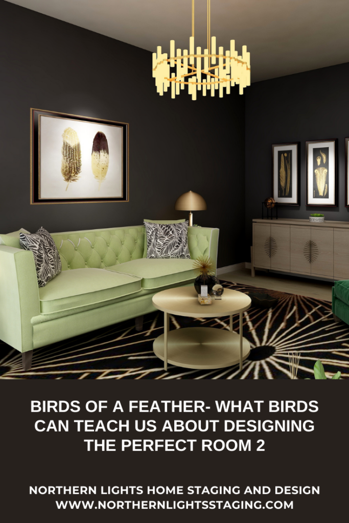
I am not sure what bird the feathers in the photo came from, but the art is less realistic and more stylized.  The black and gold color combination felt very luxurious, and like a great place to add a variety of metallic finishes.

The natural theme of bird feathers still evoked a sense of nature, inviting wood, stone,  and natural materials such as velvet, leather, and cotton.  I selected green, which is a wonderful color of nature, for the fabrics and added plants.

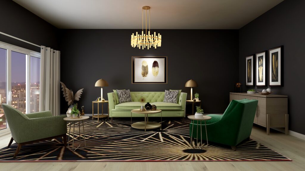
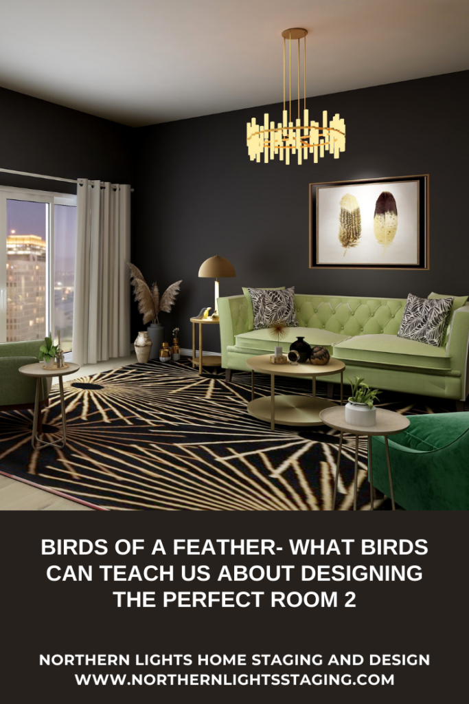
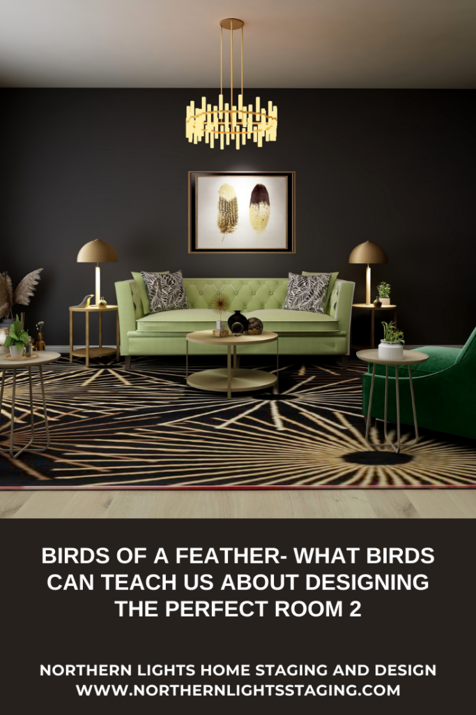
I decided to create a living room, that was dark and moody, with black or deep chocolate walls, and lots of different gold-tone metals. Dramatic lighting enhances the art and brings out the shine of the various brass and gold-toned lights and accessories.

Instead of the photo in the flat lay, I found several other art prints of feathers in black and gold that I used as inspiration.

I could see this combination in a living room, master bedroom, master bathroom, or powder room. How about you?

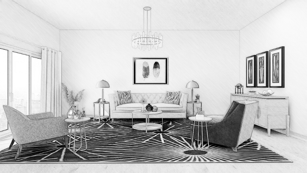
I decided to try a living room. A flat lay can first evolve into a drawing or floor plan to get a feel for how the room will work spatially.

Birds of a Feather- What Birds Can Teach Us About Designing the Perfect Room 2
Edesign by Northern Lights Home Staging and Design.

To get the feeling of drama and glamour, I decided to try the idea of a black wall. I love it! It beautifully highlights the feather art and sets off the beautiful greens in the furniture. Of course, lighting, strategically placed and lots of it, is important when using black.


Birds of a Feather- What Birds Can Teach Us About Designing the Perfect Room 2
Edesign by Northern Lights Home Staging and Design.

Birds of a Feather- What Birds Can Teach Us About Designing the Perfect Room 2
Edesign by Northern Lights Home Staging and Design.

Birds of a Feather- What Birds Can Teach Us About Designing the Perfect Room 2
Edesign by Northern Lights Home Staging and Design.

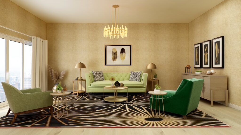
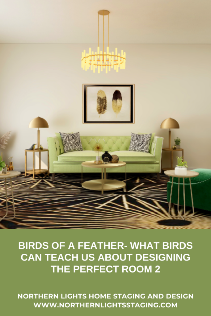
For variety, I tried a textured light-colored wallpaper similar in color to the feathers to give the room a more light and airy feeling. I think I like the black better for a glamorous feeling.


Birds of a Feather- What Birds Can Teach Us About Designing the Perfect Room 2
Edesign by Northern Lights Home Staging and Design.

And here is it in a shade of off-white. While still pretty, I like the black walls best, and the feeling of dimension the textured wallpaper gives over the white walls. How about you?


Birds of a Feather- What Birds Can Teach Us About Designing the Perfect Room 2

The moral of this flat lay tale is that you can use natural elements like bird feathers to inspire glamorous, dramatic, modern, and sleek designs while still bringing the outdoors in. And, don’t be scared to use black!

Bird feathers can inspire many design styles. Look for my next article on the design for my third flat lay inspired by bird feathers.

Are You Ready to Create Your Perfect Space?

Are you ready to create your perfect space? I assume you are since you are reading my blog post. Let’s tell your unique story and find the alignment of art, science, and energy that makes you happy.  Try my Aligned Design consultation and let’s get started


A transformational design experience that aligns Art, Science and Energy to Make Magic Happen in your Home and Life. Includes Interior Design, Color and Energy alignment advice to create a space perfectly aligned with you. We'll use Energy Art, personalized to reflect your true self, as the foundation of your space's transformation.


What is Your Global Design Style? Take the Quiz


Why Work with Northern Lights Home Staging and Design


What's Your Global Design Style? Take the Quiz


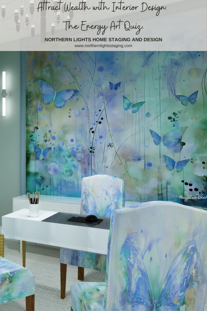
Attract Wealth with Interior Design: The Energy Art Quiz"- Northern Lights Home Staging and Design.

Aligned Design©– All Rights Reserved.

Terms of Service  |  Privacy Policy  |  Disclaimer |  Brochure

Prices are subject to change without notice.

Call 907-362-0065 today
Pin These


Birds of a Feather- What Birds Can Teach Us About Designing the Perfect Room 2


Birds of a Feather- What Birds Can Teach Us About Designing the Perfect Room 2

Birds of a Feather- What Birds Can Teach Us About Designing the Perfect Room 2


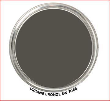
Ways to Use Sherwin Williams Urbane Bronze

When I first saw Sherwin William’s “Urbane Bronze”, I was unsure how I felt about it. Browns can be nice to work with, rather serene and a color of nature so nice to “bring the outside in”.


Urbane Bronze- Graphic by Camp Chroma
Sherwin Williams 2021 Color of the Year, Urbane Bronze. Graphic by Camp Chroma.

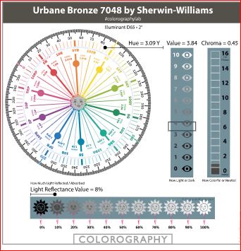
According to the color data Urbane Bronze is actually a yellow hue (really, it’s true) that looks brown because of it’s low chroma and lightness.


Urbane Bronze- Colorography by Camp Chroma
Colorography of Urbane Bronze by Lori Sawaya of Camp Chroma.

Sherwin Williams describes Urbane Bronze as as a color to

“Tap into nature with a hue whose warmth and comfort breathe down-to-earth tranquility”.

“As we’re looking to create the ultimate retreat for reflection and renewal, we’re turning to a hue whose natural simplicity and nature-inspired energy cultivate a sense of calm from the ground up.”

“The trend for biophilia continues to shape our spaces, proving that nature is never far away. Urbane Bronze might be a color rooted in nature, but it also has a unique ability to ground a room through organic appeal.”

OK, so it is supposed to help us feel rooted to nature. I thought about where I may have seen this color in nature. Maybe along mudflats at the beach, possibly in rocks and some types of earth. It does remind me a bit of the color of sea otter fur.

andrew-smarius-jZWgpG8k6Ec-unsplash
Sea otter. Photo by Andrew Smarius on Unsplash

Master Bedroom Design

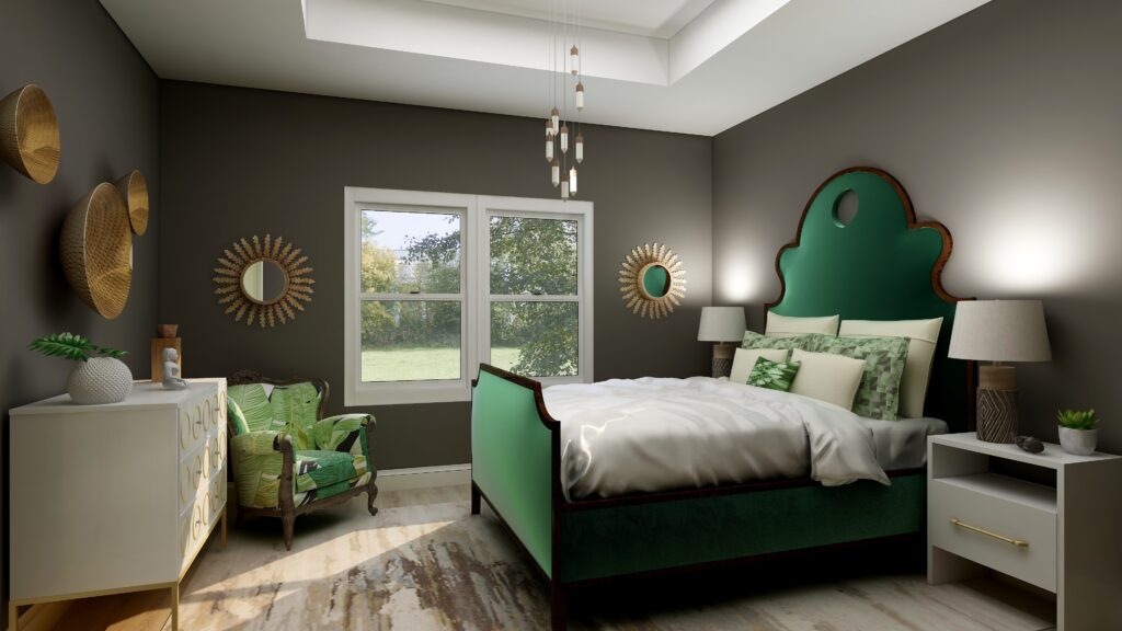
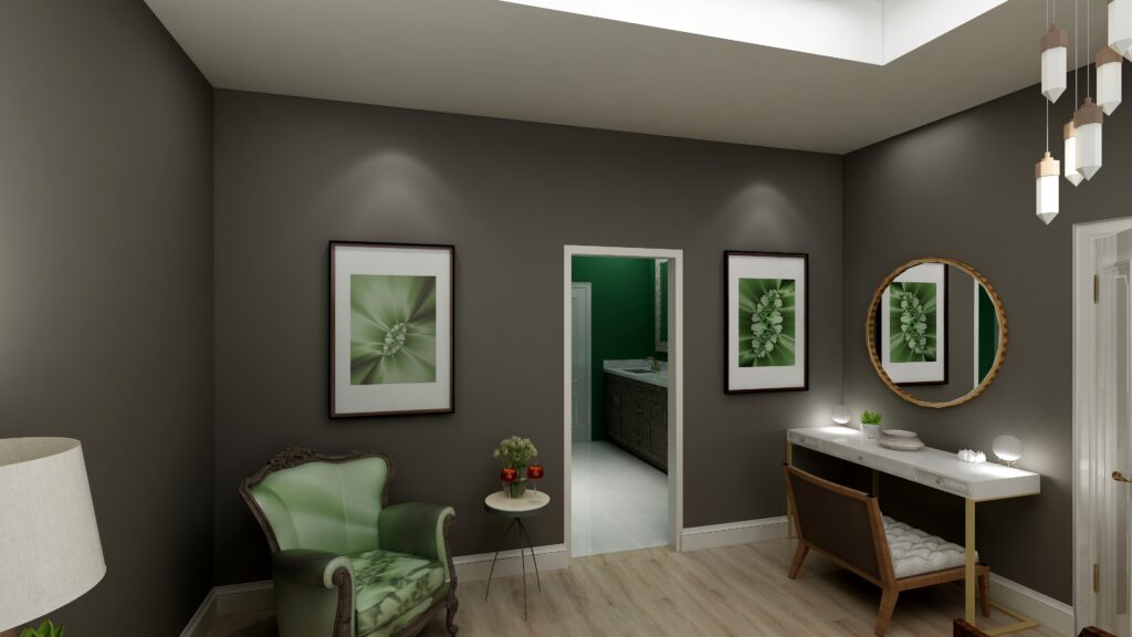
I used Urbane Bronze as the wall color with primarily dark and light greens,  browns and white to create a color palette from nature.

Urbane Bronze is actually a Yellow hue, so this works because it is creating an analogous color scheme with yellow, yellow-green and green that are next to each other on the color wheel.

See my blog article on how to use analogous color schemes,  Create a Harmonious Color Scheme- Go Analogous. 

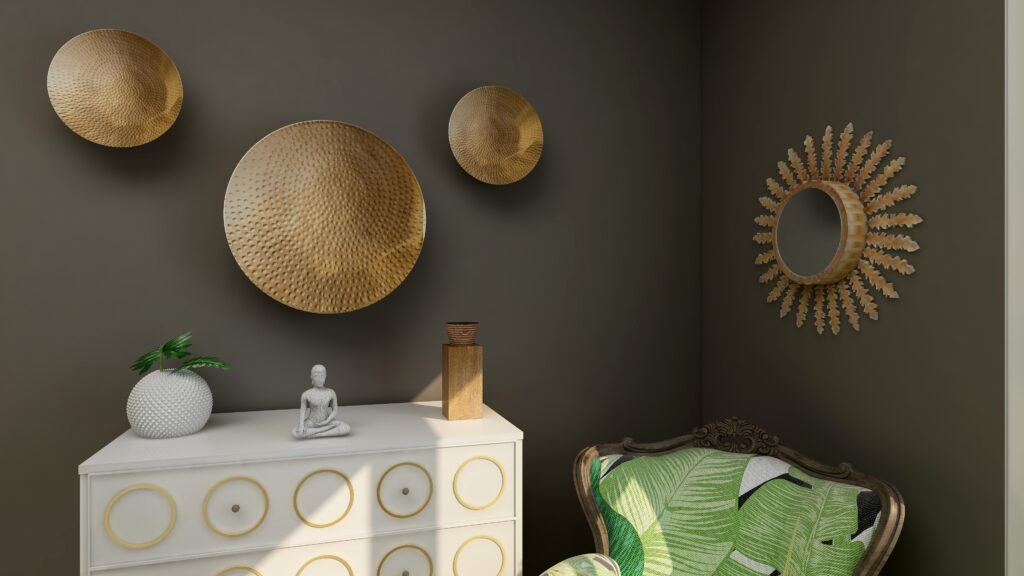
The mixture of soft fabrics with different metals, wood and pottery add natural elements and a variety of textures.

Ways to Use Sherwin Williams 2021 Color of the Year Urbane Bronze
Edesign using Urbane Bronze by Northern Lights Home Staging and Design
Ways to Use Sherwin Williams 2021 Color of the Year Urbane Bronze
Edesign using Urbane Bronze by Northern Lights Home Staging and Design
Ways to Use Sherwin Williams 2021 Color of the Year Urbane Bronze
Edesign using Urbane Bronze by Northern Lights Home Staging and Design

What are the Pros and Cons of Choosing a Bronze Paint Color?

Pros of Working with a Bronze Colored Paint:

  1. Warm and Inviting: Bronze paint adds warmth to a room and can create a cozy and welcoming ambiance.
  2. Versatile: Suits both modern and traditional interiors, complementing a wide range of décor styles.
  3. Sophisticated: The metallic sheen can lend an air of sophistication and luxury.
  4. Pairs Well: It complements a variety of other colors, especially earth tones, deep blues, and greens.
  5. Accentuates Features: Great for highlighting architectural details, moldings, or feature walls.
  6. Durability: Metallic bronze paints can often be more durable and resistant to damage than flat finishes.
  7. Light Reflectivity: Its slight sheen can reflect light, making spaces feel more vibrant and sometimes larger.

Cons of Working with a Bronze Colored Paint:

  1. Application Difficulty: Metallic and bronze paints can show brush strokes or roller marks more easily than flat paints.
  2. Prep Work: Imperfections on walls, like dents or scratches, can be accentuated, requiring more prep work.
  3. Trend Sensitivity: While classic, certain shades of bronze may go in and out of trend, potentially dating the décor.
  4. Overwhelming: In small spaces or spaces without a lot of natural light, bronze can feel a bit overwhelming or dark.
  5. Cost: Quality metallic paints, including bronze, can sometimes be more expensive than standard paints.
  6. Maintenance: Fingerprints, smudges, or dirt can be more noticeable, requiring more frequent cleaning.
  7. Limited Availability: Not all paint brands offer a wide variety of bronze shades, limiting choices.

Remember, the success of using bronze paint largely depends on the specific shade of bronze, the room’s lighting, its size, and the accompanying decor. Always test a sample on the wall before committing to a full paint job.

Are You Inspired?

Get your colors right the first time with an expert science based color consultation.


Not Your Average Color Consultation


Ten Ways To Not Screw Up Picking Your Paint Colors

Why Work with Northern Lights Home Staging and Design

Aligned Design©– All Rights Reserved.

Terms of Service  |  Privacy Policy  |  Disclaimer |  Brochure

Prices are subject to change without notice.

Call 907-362-0065 today


Unfolding Magic: The Bird’s Eye Brilliance of Flat Lays

A flat lay is a bird’s eye view of a lot of magic possibilities about to unfold before you.

At its simplest, it is a picture of objects arranged on a flat surface being viewed from above. But it is so much more!

When used in Interior Design, a flat lay creates endless possibilities for creating a perfect space.

A Flat Lay is a Bird’s Eye View of a lot of Magic Possibilities About to Unfold Before You
A flat lay is an idea filled with possibilities.

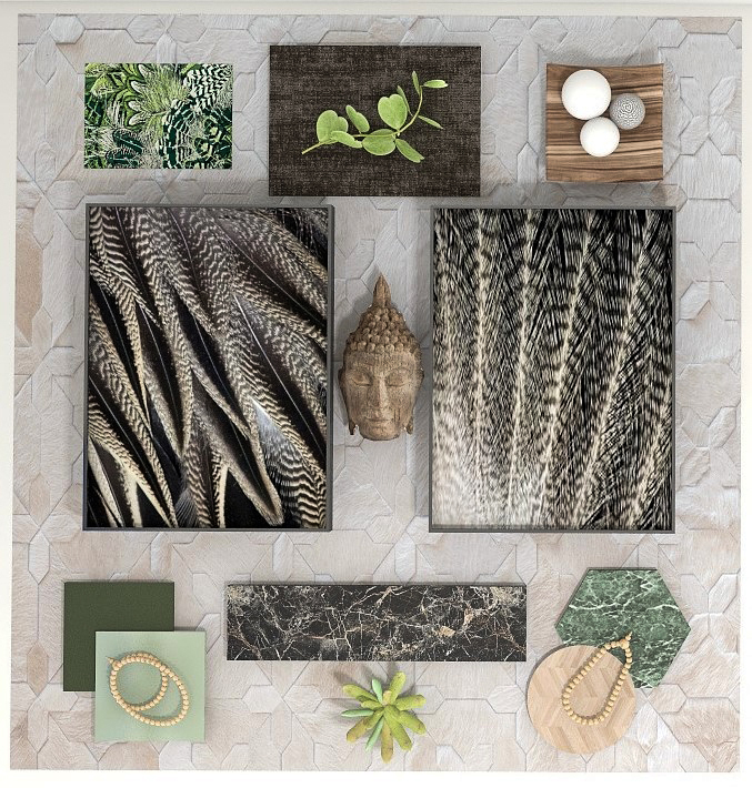
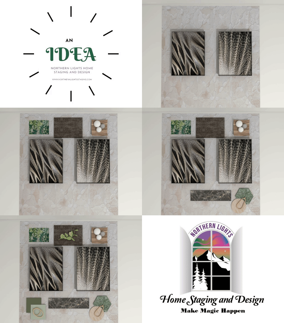
As an example, here is a flat lay I created that was inspired by the beauty of Pintail duck and eagle feathers. Being a wildlife biologist in a past career, I think birds provide endless inspiration for creating beautiful designs!

I started with art of feather details. Then I selected samples of flooring, tile, carpeting, fabrics and more that I thought looked nice with the art and arranged them.

A Flatlay is a Bird’s Eye View of a lot of Magic Possibilities About to Unfold Before You

What room will this become? Who knows, the possibilities are endless.

Will the room have all these exact tiles, fabrics, woods, etc.? Probably not. It is just an idea to build on.

Other Bird Feather Inspired Flat Lays

I created two additional flat lays that were also inspired by bird feathers. The first seems like a cross between Hollywood Glam and Bohemian waiting to happen.

A Flat Lay is a Bird’s Eye View of a lot of Magic Possibilities About to Unfold Before You

The second seems like more of a Modern Global/Bohemian Style.

A Flat Lay is a Bird’s Eye View of a lot of Magic Possibilities About to Unfold Before You

What rooms do you envision these flat lays inspiring?

See my next article, Birds of a Feather- What Birds Can Teach Us About Designing the Perfect Room and see the designs that came from these flat lays.

Are You Ready to Create Your Perfect Space?

Are you ready to create your perfect space? I assume you are since you are reading my blog post. Let’s tell your unique story and find the alignment of art, science, and energy that makes you happy.  Let me help you take that trip to your perfect space in a Ferrari instead of a stagecoach. Try my Aligned Design consultation and let’s get started.


A transformational design experience that aligns Art, Science and Energy to Make Magic Happen in your Home and Life. Includes Interior Design, Color and Energy alignment advice to create a space perfectly aligned with you. We'll use Energy Art, personalized to reflect your true self, as the foundation of your space's transformation.


What is Your Global Design Style? Take the Quiz

Why Work with Northern Lights Home Staging and Design

Aligned Design©– All Rights Reserved.

Terms of Service  |  Privacy Policy  |  Disclaimer |  Brochure

Prices are subject to change without notice.

Call 907-362-0065 today

Pin These

A Flat Lay is a Bird’s Eye View of a lot of Magic Possibilities About to Unfold Before You


Celebrate Your Favorite Color – Go Monochromatic

Many people struggle with finding the perfect color scheme, often bound by the constraints of their existing finishes. But what if we make this more fun? Imagine magnifying and embracing your favorite color wholeheartedly. Welcome to the world of Monochromatic design!

Monochromatic schemes delve deep into one hue, exploring its diverse shades, tones, and tints. Visualize your cherished color transitioning from its lightest whisper to its richest depth, seamlessly incorporating white and black.


Celebrate your favorite color- go monochromatic!
Example of a monochromatic blue color palette. Photo by

Why is it effective? The singular hue fosters visual harmony, resulting in a seamless design. Think of the design principle: “All greens blend” or “Every blue complements the other.” Their shared base hue unifies them, ensuring a cohesive look.

But isn’t monochromatic boring? NO! The absence of contrasting colors can be offset by using a range of “blue” hues for example rather than just one.  You can also create drama and interest with patterns and textures.

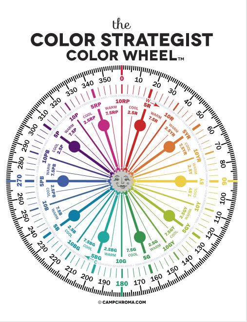
For instance, I could craft a monochromatic palette starting with the blue at 230 degrees on the color wheel. From there, I’d explore its spectrum, transitioning from pure white (unsaturated) to shades of light blue, deepening to dark blue, and ultimately black. To add richness, I might dabble with hues ranging from 235 to 250 degrees, all within the blue family, while experimenting with different saturation levels.

When I select my design pieces, I look for various materials, textures and patterns to add variety, such as mixing soft and hard, matte and shiny, smooth and rough, curves and straight lines etc.

Mastering Monochrome: A Singular Hue Living Room Transformation”

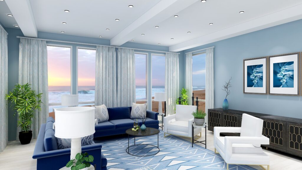
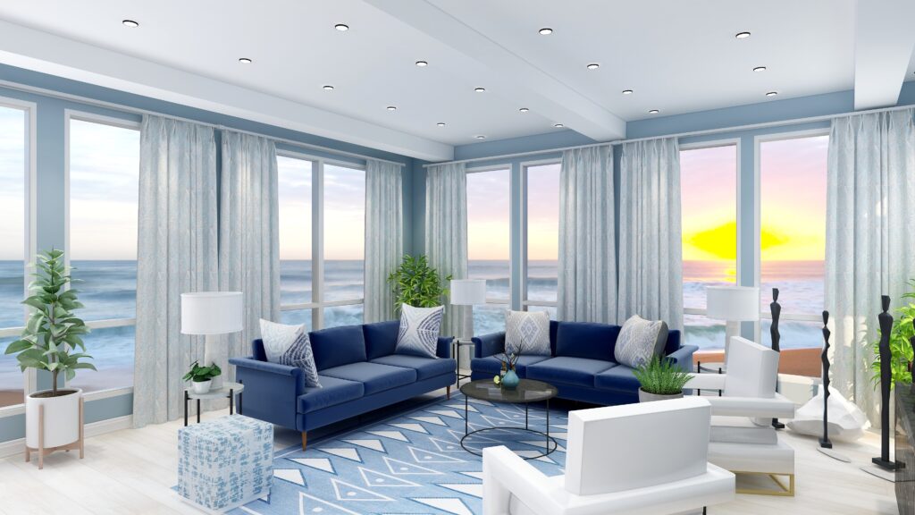
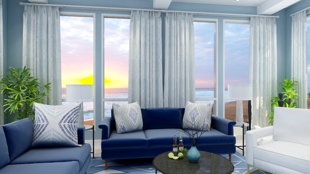
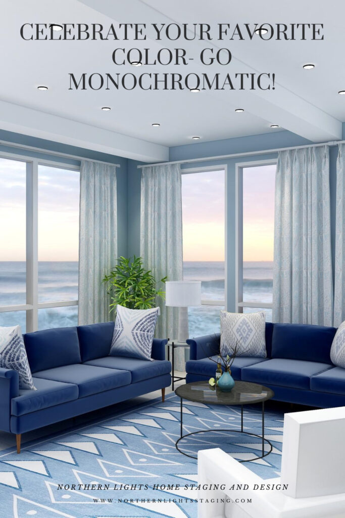
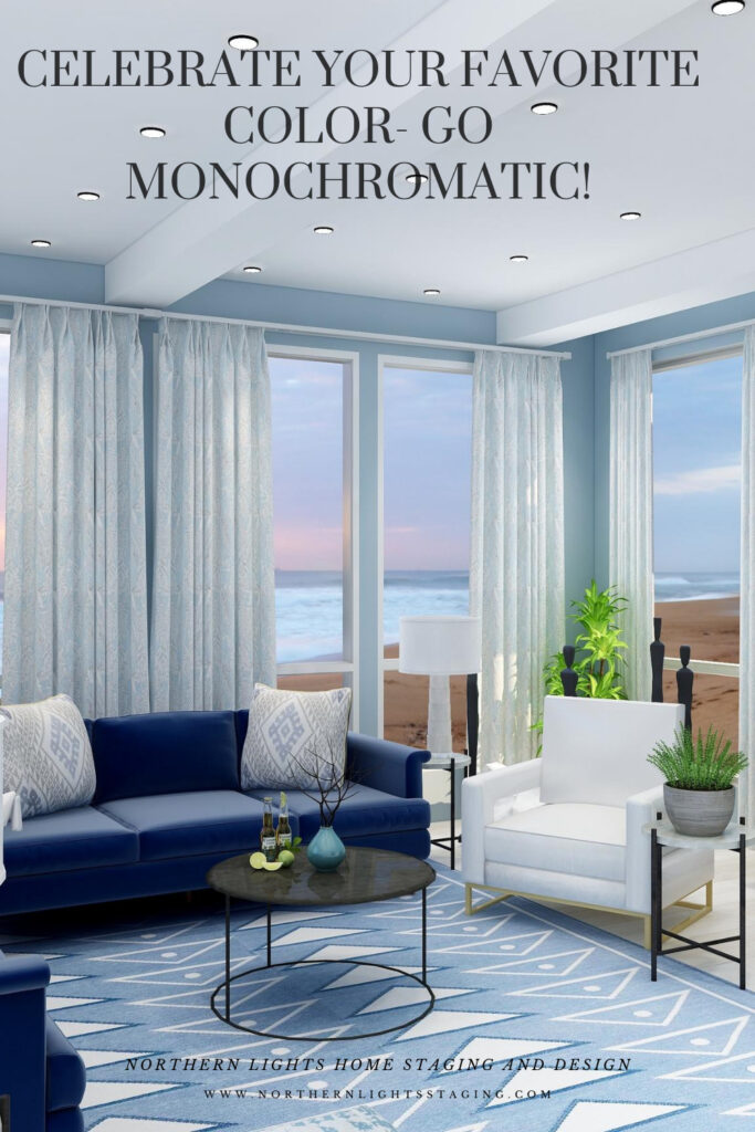
I created this living room design where I embraced a blue monochromatic palette. From pristine white to profound black, the spectrum features diverse blue hues manifesting in paint, furniture, drapery, lighting, and accents. Admittedly, the greenery introduces a dash of contrast, lending the space a touch beyond strict monochrome.”

Celebrate your favorite color- go monochromatic! Edesign by NOrthern Lights Home Staging and Design
Monochromatic Blue Living Room Edesign and Spring Fractal Art by Northern Lights Home Staging and Design.
Celebrate your favorite color- go monochromatic! Edesign by NOrthern Lights Home Staging and Design
Monochromatic Blue Living Room Edesign and Spring Fractal Art by Northern Lights Home Staging and Design.

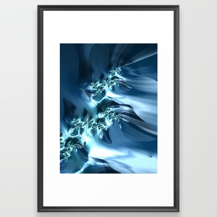
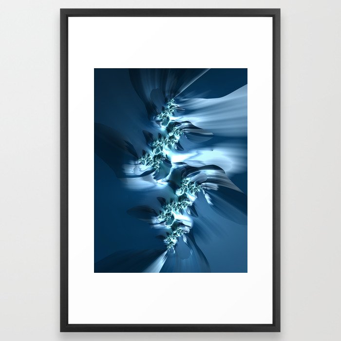
This design incorporates some of my original fractal art in a collection called “The Sea”, which reminded me of white caps on the ocean and also uses variety of blue shades.


The Sea fractal art by Northern Lights Home Staging and Design
The Sea

The Sea #2 fractal art by Northern Lights Home Staging and Design
The Sea #2

The Sea #3 fractal art by Northern Lights Home Staging and Design
The Sea #3

See More of My Blue Energy Art

See a collection of my blue energy art which could work beautifully together in creating your own blue monchromatic color scheme.


Mary Ann Benoit Energy Art on Fine Art America

Benefits of A Monochromatic Color Scheme

  • A monochromatic color scheme offers several benefits, including:
    1. Cohesiveness: By using variations of a single hue, the design inherently feels unified and harmonious.
    2. Visual Simplicity: Monochromatic designs reduce visual clutter, making spaces feel more organized and easier on the eyes.
    3. Flexibility: With one dominant color, it’s easier to mix and match patterns, textures, and shades without overwhelming the space.
    4. Depth and Dimension: By using tints, tones, and shades of a single color, you can create depth and dimension in a space without introducing multiple colors.
    5. Creates Mood: Depending on the color chosen, monochromatic schemes can evoke specific moods – blues for tranquility, reds for warmth, greens for rejuvenation, and so on.
    6. Easier Color Coordination: Choosing decor, furnishings, and finishes become simpler when you’re working within a single color spectrum.
    7. Timelessness: Monochromatic rooms often have a timeless quality and can stay relevant despite changing design trends.
    8. Highlights Architectural Features: In a monochromatic setting, architectural features can stand out more as they aren’t competing with varied colors.
    9. Enhanced Spatial Perception: In some cases, using a monochromatic scheme can make spaces seem larger or cozier, depending on the hue and its intensity.
    10. Focus on Texture and Form: With color variation minimized, there’s a greater focus on other design elements like texture, form, and material, allowing for richer tactile experiences.

    Using a monochromatic scheme can be a strategic design choice to bring tranquility, unity, and a unique aesthetic appeal to any space.

Celebrate your favorite color- go monochromatic!
Edesign by Northern Lights Home Staging and Desigo

Celebrate Your Favorite Color

Imagine entering a room where every hue resonates with your spirit, instilling a profound sense of joy and tranquility. A sanctuary where you rejuvenate and spark inspiration. When your space mirrors your essence, harmony effortlessly follows.

Why not infuse the vibrant colors of summer into your dwelling? Or perhaps the palette of your cherished season?

Elevate your space with an Aligned Design Consultation today.


A transformational design experience that aligns Art, Science and Energy to Make Magic Happen in your Home and Life. Includes Interior Design, Color and Energy alignment advice to create a space perfectly aligned with you. We'll use Energy Art, personalized to reflect your true self, as the foundation of your space's transformation.

What is Your Global Design Style? Take the Quiz


What's Your Global Interior Design Style? Take the Quiz. Northern Lights Home Staging and Design

Why Work with Northern Lights Home Staging and Design

Aligned Design©– All Rights Reserved.

Terms of Service  |  Privacy Policy  |  Disclaimer |  Brochure

Prices are subject to change without notice.

Call 907-362-0065 today
Pin These

Celebrate your favorite color- go monochromatic! Edesign by NOrthern Lights Home Staging and Design
Celebrate your favorite color- go monochromatic!


Create a Harmonious Color Scheme – Go Analogous

People often struggle with creating a great color scheme.  Often, we start the conversation by talking about the limitations, or the box of colors you need to play with based on your fixed finishes.

In my last article, Celebrate Your Favorite Color- Go Monochromatic, we talked about how you could take your favorite color and celebrate it in all it’s glory with a monochromatic color scheme. Simple and easy!

What if you would like a little more color variety,  but still want something that is simple and easy to create?  Go analogous!

Analogous color schemes are based on three hues that are next to each other on the color wheel. They are friendly neighbors, they like each other and  play well together:)

Analogous colors are harmonious and often found in nature.


peppers-analogous colors
Example of an analogous color scheme found in nature.

Why does it work? They go well together because one of the three colors is usually a combination of the other two as with the red, yellow and orange peppers above.

Analogous schemes offer more color variety than monochromatic schemes while still retaining that harmonious and often serene quality, although it can also be more dramatic too based on the hues you use. It is also a simple scheme to create by using your color wheel and picking three adjacent colors that you like.    

Which three adjacent colors are your favorites?


MY favorite color training course, Camp Chroma.

For example, in my last article, I created a monochromatic design using blues and blue/purples around the range of 250-270 on the color wheel.


Celebrate your favorite color- go monochromatic! Edesign by NOrthern Lights Home Staging and Design
Monochromatic Blue color scheme. Edesign by Northern Lights Home Staging and Design.

If I wanted to take this monochromatic design, and create a more analogous scheme, I could go clockwise around the color wheel and add the neighbors of blue in including purple and red-purple.  Or, I could go counter-clockwise  and add blue-green and green. 

I could also pick neighbors on either side and add purple and blue green. Let’s play.

Analogous Color Scheme #1

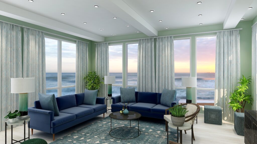
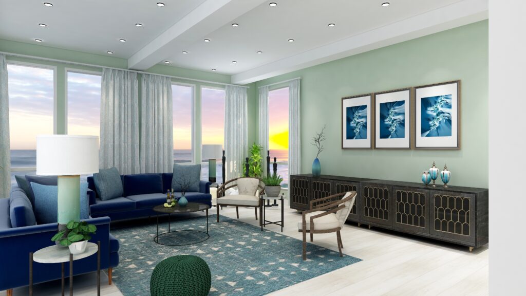
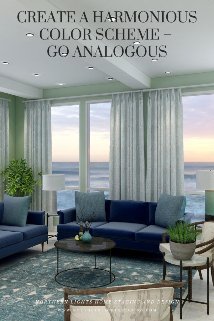
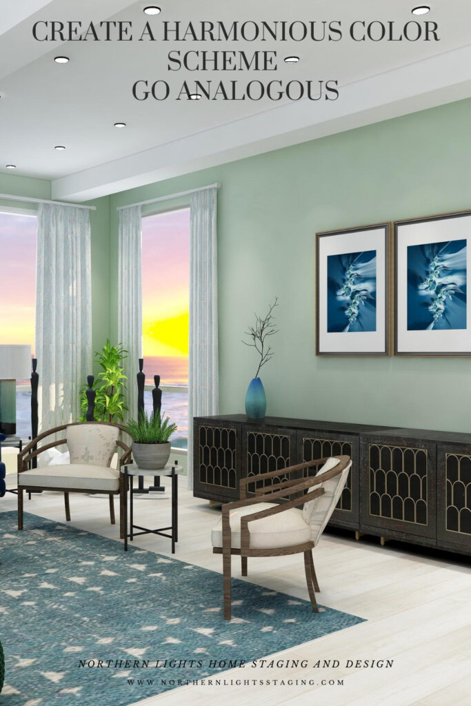
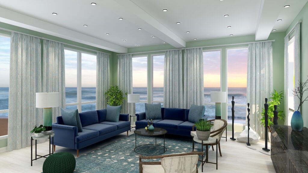
This design starts with our base blue as in the sofas and moves counter-clockwise along the color wheel to include blue greens and greens. I set the tone for this design with a new rug in blue green and then changed the paint color, lamps, side chairs and some of the accessories. I maintained the sofas and art as the anchor of the main blue color I wanted to harmonize with.

This design still maintains a calm, serene feeling similar to the original monochromatic scheme, but feels a little richer and warmer with the greens and blue greens.

Analogous color scheme. Edesign by Northern Lights Home Staging and Design.
Analogous color scheme and Edesign by Northern Lights Home Staging and Design
Analogous color scheme. Edesign by Northern Lights Home Staging and Design.
Analogous color scheme and Edesign by Northern Lights Home Staging and Design

Fractal Art

This design, as with the monochromatic design, incorporates some of my original fractal art in a collection called “The Sea”, which reminded me of white caps on the ocean and also uses variety of blue shades.


The Sea fractal art by Northern Lights Home Staging and Design
The Sea

The Sea #2 fractal art by Northern Lights Home Staging and Design
The Sea #2

The Sea #3 fractal art by Northern Lights Home Staging and Design
The Sea #3

Analogous Color Scheme #2

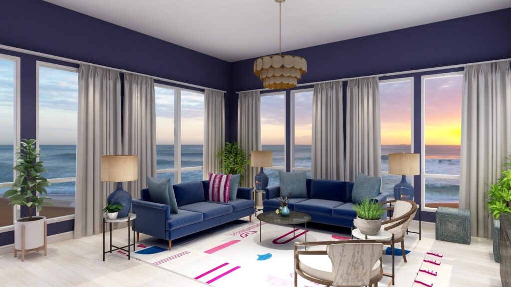
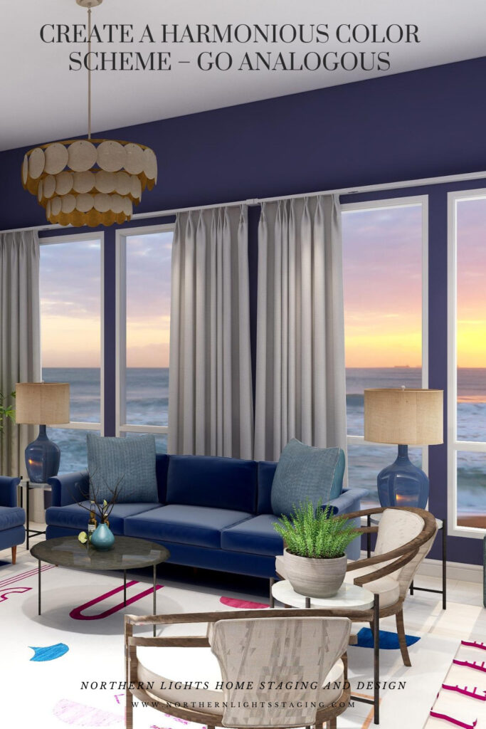
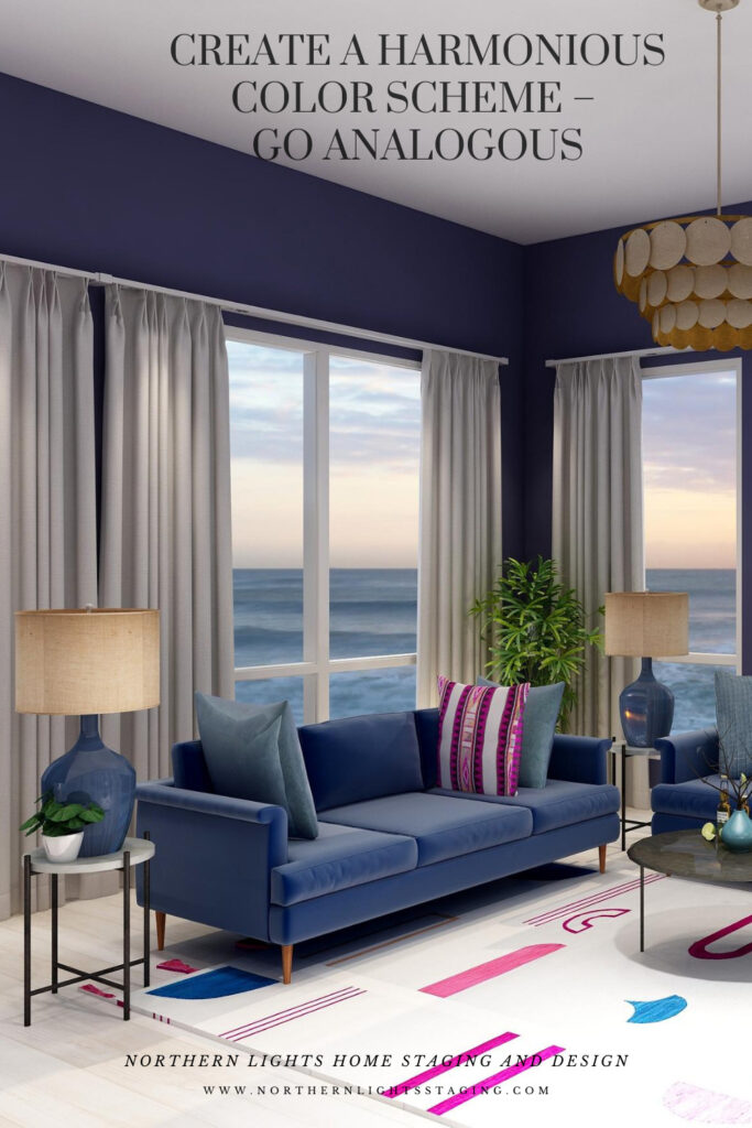
In this case, I again maintained the blue sofas as the base color from the previous design and went clockwise around the color wheel to include purple and red/purple.

I found a nice rug that contained the 3 main colors I wanted to work with to tie everything together. Then I switched the paint color, lamps, one accent pillow and some of the art to bring in some of the other colors.

This design is a little more dramatic due to the deep, rich moody wall color and the high contrast of colors against the white background of the rug. I still think it looks calm and relaxing too.


Analogous Color Scheme 2. Northern Lights Home Staging and Design
Analogous Color Scheme #2. Edesign by Northern Lights Home Staging and Design

Fractal Art

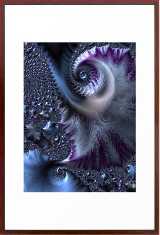
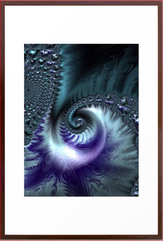
Here is some fractal art I designed that could be used in this design. My Forest Floor designs were inspired by colors in the boreal forest here in Alaska which have a lot of water in them (streams, ponds, rivers, lakes), thus the blues.  The purples represent many of our purple wildflowers. Mystery is a mystery…..use your imagination of what it means to you.


Forest Floor #3 Fractal Art.
Forest Floor #3

Mystery Fractal Art
Mystery Fractal Art

Forest Floor #4 Fractal Art.
Forest Floor #4

Benefits of an Analogous Color Scheme

Analogous color schemes use colors that are adjacent to each other on the color wheel. These schemes offer a harmonious and visually pleasing palette. Here are the benefits of using an analogous color scheme:


  • Harmony and Cohesiveness: Analogous colors have a natural harmony because they share common color components. This results in a unified and cohesive look that’s easy on the eyes.

  • Subtle Contrasts: While the colors in an analogous scheme are similar, there are still subtle contrasts that can be used to highlight or differentiate design elements.

  • Versatility: Analogous colors can be adapted to both vibrant and muted tones, offering flexibility in setting the mood or theme of a design.

  • Richness and Depth: Using several shades and tints of a color range adds richness and depth to designs.

  • Natural and Comforting: Analogous color schemes often mimic how colors appear in nature, making them inherently familiar and comforting to the human eye.

  • Easy Color Matching: It’s easier to match colors within an analogous palette because they share similar undertones, reducing the risk of clashing hues.

  • Reduced Visual Tension: Analogous colors create a more relaxed visual experience because there’s a lack of high contrast between the colors.

  • Flexibility in Highlighting: One can easily highlight an element by choosing a color from either end of the analogous range, making it slightly more vibrant or darker than the surrounding hues.

  • Aesthetic Appeal: This type of color scheme tends to be naturally pleasing and aesthetically appealing because of its harmonious nature. An analogous color scheme can look richer and add more color diversity and interest than a monochromatic color scheme.

  • Enhanced Mood Setting: Due to their close relation, analogous colors can be effectively used to evoke specific moods or feelings, like warmth (reds, oranges, yellows) or calmness (blues, greens).  These are really nice for living rooms, dining rooms and bedrooms. Analogous color schemes can also be more dramatic based on the hues you select, placement of colors and how saturated they are.

  •  

While analogous color schemes offer many advantages, it’s essential to ensure adequate contrast within designs to avoid them becoming monotonous or washed out. Using a neutral color or even a complementary color in small amounts can help add interest and break up the scheme.

Celebrate Your Favorite Colors

Imagine stepping into your space where every hue resonates with your spirit. It’s not just a room; it’s a reflection of you – a haven of happiness and tranquility. In a world where everything aligns, your surroundings uplift and rejuvenate you. When your home mirrors your essence, harmony is effortless.

Purchase an Aligned Design  or Color Consultation today.


A transformational design experience that aligns Art, Science and Energy to Make Magic Happen in your Home and Life. Includes Interior Design, Color and Energy alignment advice to create a space perfectly aligned with you. We'll use Energy Art, personalized to reflect your true self, as the foundation of your space's transformation.


Not Your Average Color Consultation

What is Your Global Design Style? Take the Quiz


What's Your Global Interior Design Style? Take the Quiz. Northern Lights Home Staging and Design

Aligned Design- All Rights Reserved.

Terms of Service  |  Privacy Policy  |  Disclaimer |  Brochure

Prices are subject to change without notice.

Call 907-362-0065 today
Pin These

Create a Harmonious Color Scheme- Go Analogous


Opposite Colors Attract – Go Complimentary

Crafting the perfect color palette can be a daunting task for many. Often, the starting point revolves around fixed finishes and certain constraints. In my recent blog posts, we’ve delved into constructing color schemes from a favorite hue, like blue. We’ve explored monochromatic and analogous palettes, and today, we’re diving into complementary color schemes.


Complementary colors are a pairing of hues that sit opposite each other on the color wheel. When juxtaposed, they amplify each other’s vibrancy and intensity. The beauty of complementary colors lies in their mutual ability to enhance one another’s brilliance.

blue and yellow- complimentary colors
Blue and Yellow glass from Creative Commons CC0.

Complementary color schemes, offer several benefits when used in design:

  1. Visual Contrast: The stark contrast between complementary colors makes each hue stand out distinctly, creating an eye-catching and vibrant look.

  2. Balanced Visual Stimulation: Complementary colors provide a sense of balance; one color might be warm (like red) while its complementary color is cool (like green).

  3. Enhanced Vibrancy: When placed next to each other, complementary colors can make each other appear brighter and more vivid.

  4. Versatility: Complementary color schemes can be adapted to fit various moods and styles. For a bold and energetic look, you can use the colors in their full saturation. For a more subdued and harmonious look, you can use toned-down versions of the colors.

  5. Focus and Attention: Because of their contrast, complementary colors can be used to draw attention to specific elements in a design or space.

  6. Harmony: Even though they’re opposites on the color wheel, complementary colors inherently work well together and create a harmonious design.

  7. Flexibility in Decor: A complementary color scheme allows for flexibility. For instance, if you have a room with predominantly blue decor, introducing some orange accents (like pillows, art, or rugs) can instantly invigorate the space.

  8. Depth and Dimension: In art, especially painting, complementary colors can be used to create depth, with one color serving as a shadow or highlight against its opposite.

  9. Enhancement of Features: Complementary colors can be used to make features stand out. For example, putting orange flowers in a blue vase draws attention to the arrangement and makes both colors pop.


The key to a successful complementary color scheme is balance. Use in moderation and pair with neutral tones to provide a visual rest.

Complementary colors can create interesting optical illusions. For example, if you stare at a square of color for thirty seconds to a minute, and then look at a white paper or wall, you will briefly see an afterimage of the square in its complementary color. Try it with this blue square and see if you see an after image of yellow.

blue square

Why does it work? Leonardo da Vinci observed that the finest color harmonies were those between colors exactly opposed. Maybe that is where the saying opposites attract came from?

So, let’s create a complementary color scheme with the blue we have been working with in several other articles, as you  see the  sofas. See these other color schemes see my articles Celebrate Your Favorite Color- Go Monochromatic and Create a Harmonious Color Scheme- Go Analogous.


Celebrate your favorite color- go monochromatic! Edesign by NOrthern Lights Home Staging and Design
Monochromatic Color Scheme

Analogous Color Scheme

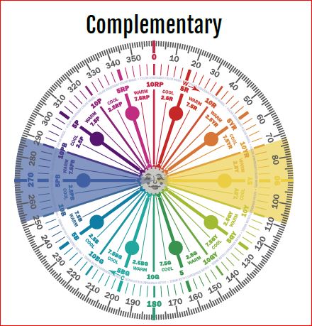
It’s opposite or compliment on the color wheel is yellow, which ranges from Yellow/red to Green/Yellow and can have varying degrees of saturation or chroma, and lightness. In other words, there are lots of yellows we can work with:)


complimentary colors- Camp Chroma
Complimentary Colors- Created by Camp Chroma- The Best Color Training Ever.

The Design

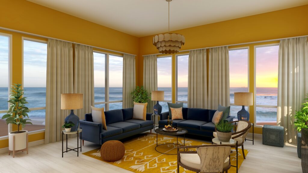
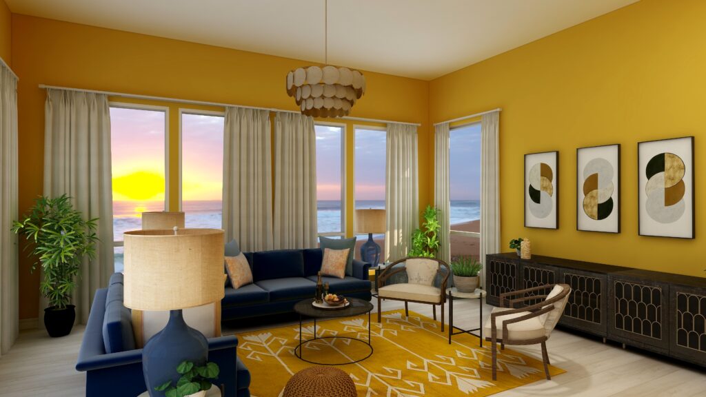
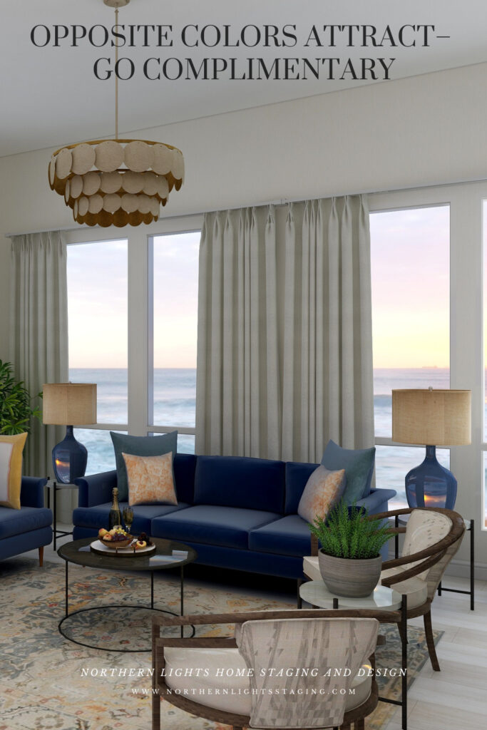
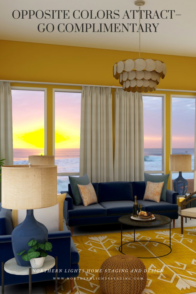
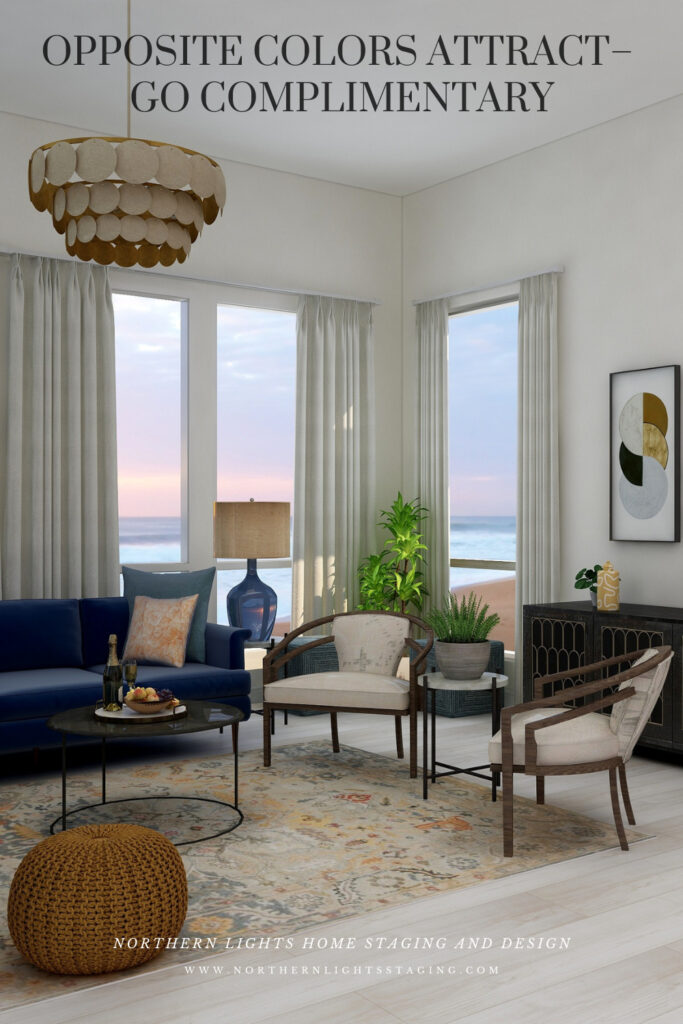
Here are examples of two living rooms I created using a blue and yellow complimentary color scheme. The first is bright and dramatic. The second is more relaxed and neutral.

Complimentary Color Scheme Edesign by Northern Lights Home Staging and Design
Complimentary blue and yellow Living Room Edesign by Northern Lights Home Staging and Design.
Complimentary Color Scheme Edesign by Northern Lights Home Staging and Design
Complimentary blue and yellow Living Room Edesign by Northern Lights Home Staging and Design.

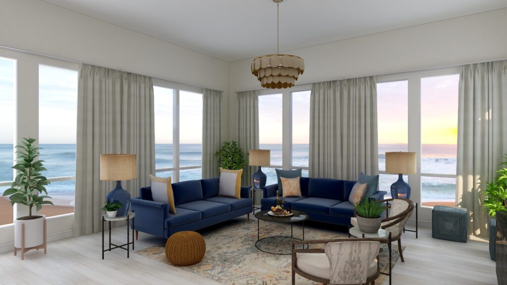
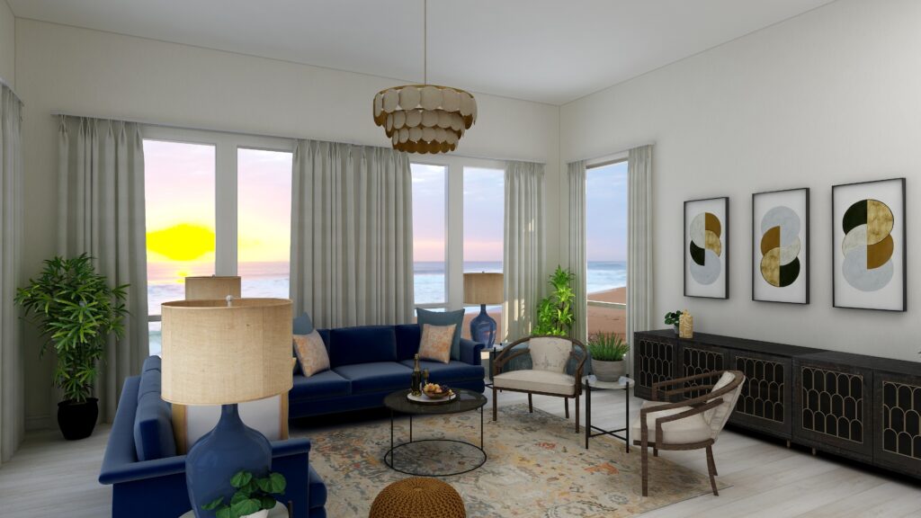
Complimentary color schemes don’t have to be bright and colorful. They can use darker, less saturated or more muted tones of opposite colors for a more understated look. The design below uses an area rug with muted yellows and blues, and wallpaper with minimal yellow. Otherwise everything is the same.

Complimentary Color Scheme Edesign by Northern Lights Home Staging and Design
Complimentary blue and yellow Living Room Edesign by Northern Lights Home Staging and Design.
Complimentary Color Scheme Edesign by Northern Lights Home Staging and Design
Complimentary blue and yellow Living Room Edesign by Northern Lights Home Staging and Design.

Benefits of A Complimentary Color Scheme

Navigating the world of complementary color schemes is easy and straightforward. Begin by pinpointing your favorite hue on the color wheel, then locate its direct opposite. This partnership is where the magic happens.


Complementary colors inherently possess a dynamic tension, making them ideal for spaces meant for lively conversations and gatherings, such as living rooms and dining areas.


However, this boldness can be tempered using muted or desaturated versions of these hues. Then you can craft a serene and sophisticated palette, perfect for spaces meant for relaxation and introspection.


Whether you seek vibrancy or tranquility, complementary color schemes offer versatility to match your vision.

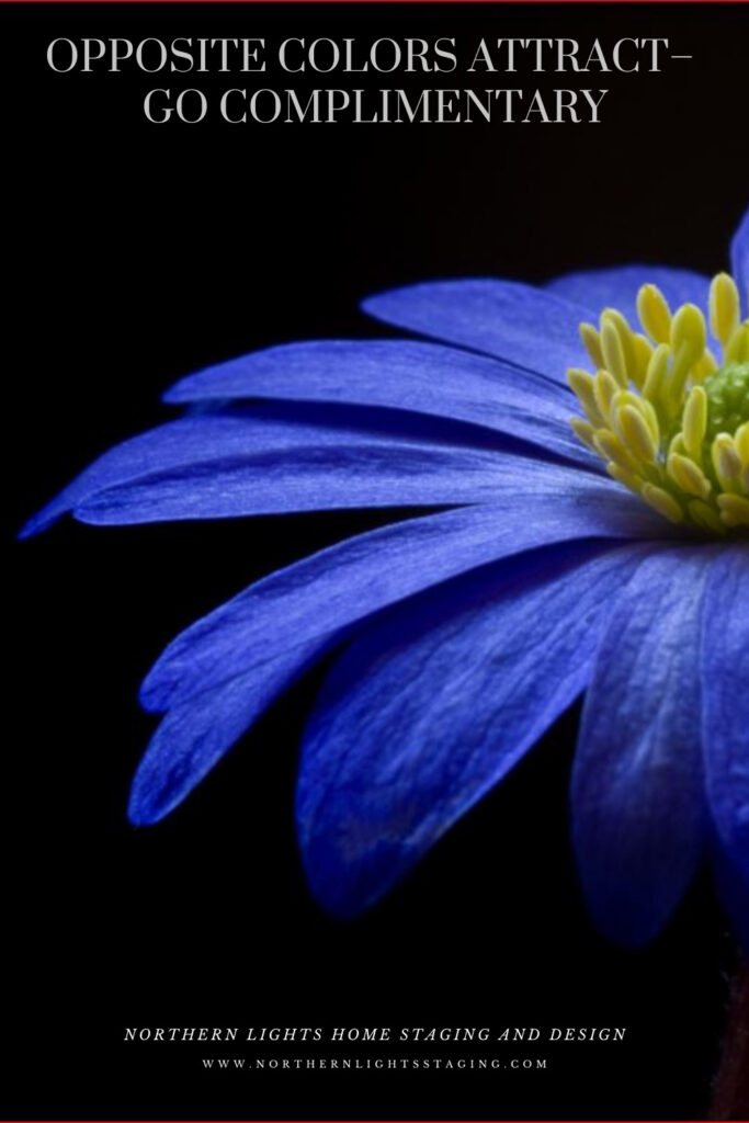
complimentary color scheme
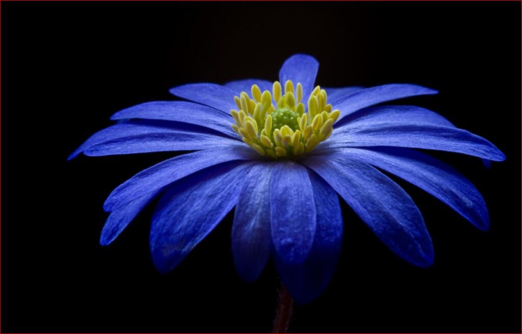
Purple flower from Pexels.com

Create Beauty with Color in Your Space


A transformational design experience that aligns Art, Science and Energy to Make Magic Happen in your Home and Life. Includes Interior Design, Color and Energy alignment advice to create a space perfectly aligned with you. We'll use Energy Art, personalized to reflect your true self, as the foundation of your space's transformation.


Not Your Average Color Consultation

What is Your Global Design Style? Take the Quiz


What's Your Global Interior Design Style? Take the Quiz. Northern Lights Home Staging and Design

Aligned Design- All Rights Reserved.

Terms of Service  |  Privacy Policy  |  Disclaimer |  Brochure

Prices are subject to change without notice.

Call 907-362-0065 today
Why Work with Northern Lights Home Staging and Design
Download my Brochure
Interior Design, Color and Home Staging Services. Brochure of Northern Lights Home Staging and Design


Pin These

Opposite Colors Attract-Go Complimentary

Click on the picture to find out more about the best training class on color available, the Four Pillars of Color!.