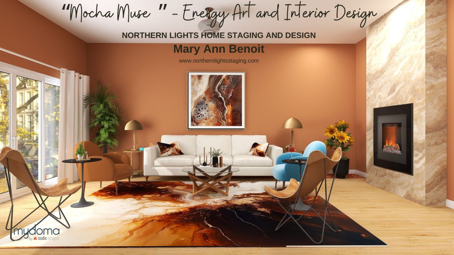
Well-Being Begins With Energy Your well-being begins with the energy you surround yourself with. When you cultivate a space that feels grounding, restorative, and nourishing, you naturally attract greater health—physically, emotionally, and spiritually. The Mocha Muse Collection was created to support self-care, balance, and renewal, helping you attract a sense of deep well-being through grounding… Continue reading Attract Health & Balance with Mocha Muse: Grounding Art for Self-Care & Renewal
Category: Color of the Year
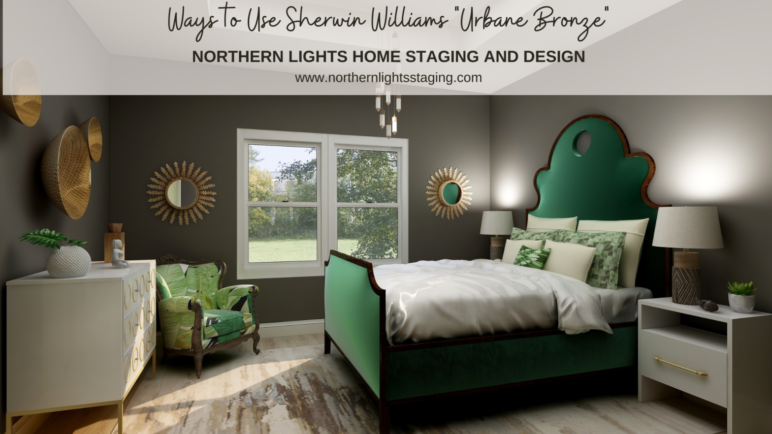
Ways to Use Sherwin Williams Urbane Bronze
When I first saw Sherwin William’s “Urbane Bronze”, I was unsure how I felt about it. Browns can be nice to work with, rather serene and a color of nature so nice to “bring the outside in”. Sherwin Williams 2021 Color of the Year, Urbane Bronze. Graphic by Camp Chroma. According to the color data… Continue reading Ways to Use Sherwin Williams Urbane Bronze
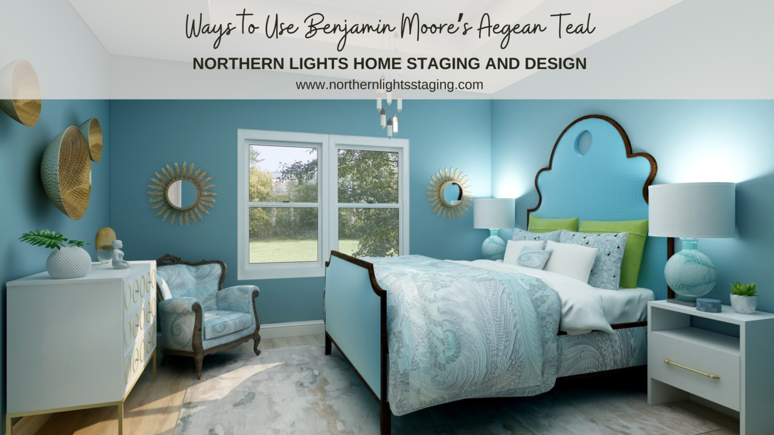
Ways to Use Benjamin Moore’s Aegean Teal
As a certified color strategist, love playing with beautiful color. One of my favorites is Benjamin Moore’s “Aegean Teal”. Benjamin Moore’s 2021 Color of the Year, Aegean Teal. Graphic by Camp Chroma. Benjamin Moore describes Aegean Teal, as “A blend of blue-green and gray, Aegean Teal 2136-40 is an intriguing mid-tone that creates natural harmony.” According… Continue reading Ways to Use Benjamin Moore’s Aegean Teal
Ways to Use Pantone’s 2021 Colors of the Year
In my last five articles I have been exploring the 2021 colors of the year of different paint companies and comparing them in the same Edesign I created for a master bedroom. I started by exploring Benjamin Moore’s Agean Teal and Sherwin Williams Urbane Bronze. I found that PPG had a color palette of 3 colors of the… Continue reading Ways to Use Pantone’s 2021 Colors of the Year
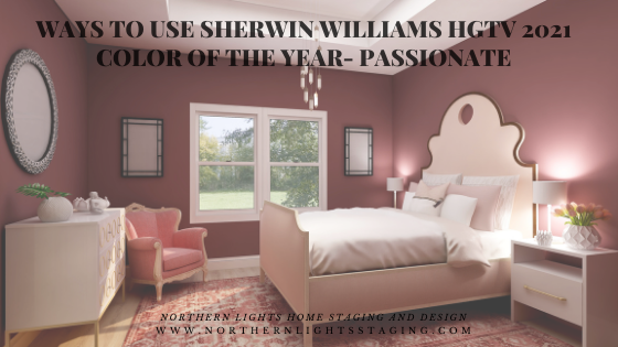
Ways to Use Sherwin Williams HGTV 2021 Color of the Year- Passionate
In my last few articles I have been exploring the 2021 colors of the year of different paint companies and comparing them in the same Edesign I created for a master bedroom. I enjoyed exploring Benjamin Moore’s Agean Teal and Sherwin Williams Urbane Bronze. I found that PPG had a color palette of 3 colors of the year… Continue reading Ways to Use Sherwin Williams HGTV 2021 Color of the Year- Passionate
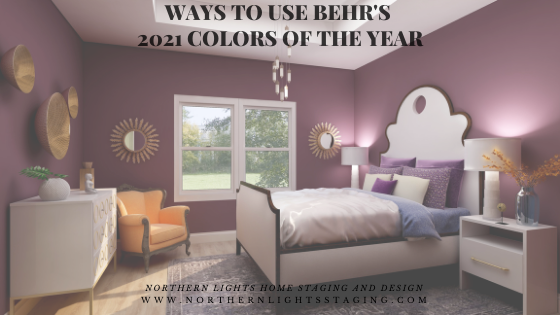
Ways to Use Behr’s 2021 Colors of the Year
In my last few articles I have been exploring the 2021 colors of the year of different paint companies and comparing them in the same Edesign I created for a master bedroom. I enjoyed exploring Benjamin Moore’s Agean Teal and Sherwin Williams Urbane Bronze. I found that PPG had a color palette of 3 colors of the year… Continue reading Ways to Use Behr’s 2021 Colors of the Year
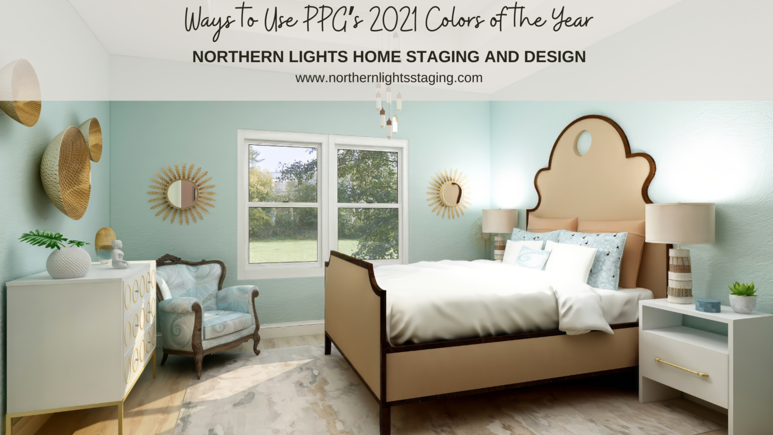
Ways to Use PPG’s 2021 Colors of the Year
In several articles I explored the 2021 colors of the year of different paint companies and compared them in the same Edesign I created for a master bedroom. I enjoyed exploring Benjamin Moore’s Agean Teal and Sherwin Williams Urbane Bronze. I was excited to see what PPG’s color of the year was. But wait….they didn’t have one!! What???… Continue reading Ways to Use PPG’s 2021 Colors of the Year
Re-Invent Yourself and Your Home in 2020
As the new year approaches, you will probably hear a lot about trends in design, color and the latest, greatest ideas in furniture and accessories. My mind is focused inward on a different way of transforming your home. I think about 2019, what I accomplished and what my life and home felt like. I’m compelled… Continue reading Re-Invent Yourself and Your Home in 2020
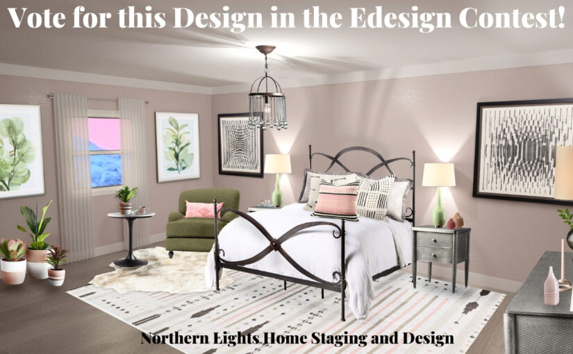
Vote for my Master Bedroom Design in the Edesign Contest
I recently entered an Edesign for this global style master bedroom in a contest! We were given room dimensions and a photo, and could develop any design we wanted. I had recently seen Benjamin Moore’s new 2020 color of the year, First Light, and was not really a fan, as I am not fond of… Continue reading Vote for my Master Bedroom Design in the Edesign Contest
Ways to Use Benjamin Moore’s 2020 Color of the Year- First Light
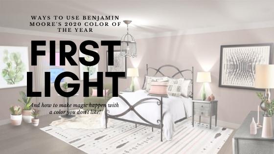
How to Make Magic Happen with a Color You Don’t Like As a certified color strategist, I get excited when the major paint brands announce their colors of the year, and dream about how I can use the colors in a design, various global styles, or create color palettes for you to use the new… Continue reading Ways to Use Benjamin Moore’s 2020 Color of the Year- First Light
