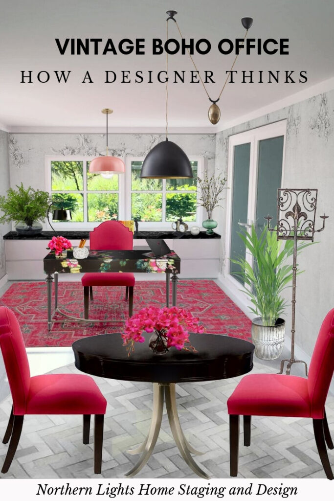
Vintage Boho Office- How a Designer Thinks

Have you ever wondered how Interior Designers come up with designs for you?  Are you curious what it might be like to work with an Interior Designer or what Edesign is all about?
I’m sure all designers have their own ways of creating that perfect space for you!  One of the reasons you hire us is because we can visualize the possibilities of an empty space, which is something most people have difficulty with. So how do we do it?

To take a look inside the brain of a designer, at least this designer, and see how I developed this Vintage Boho office design.
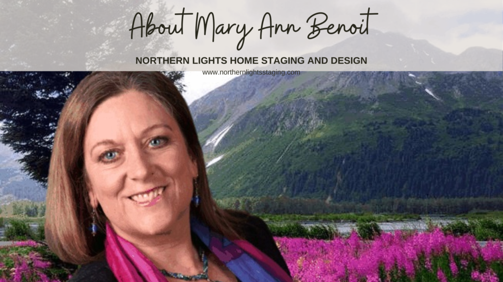

About Me- Mary Ann Benoit of Northern Lights Home Staging and Design
Come on into my brain for a bit and see how all this works:)

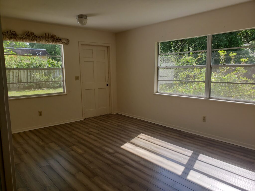
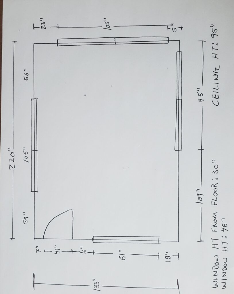
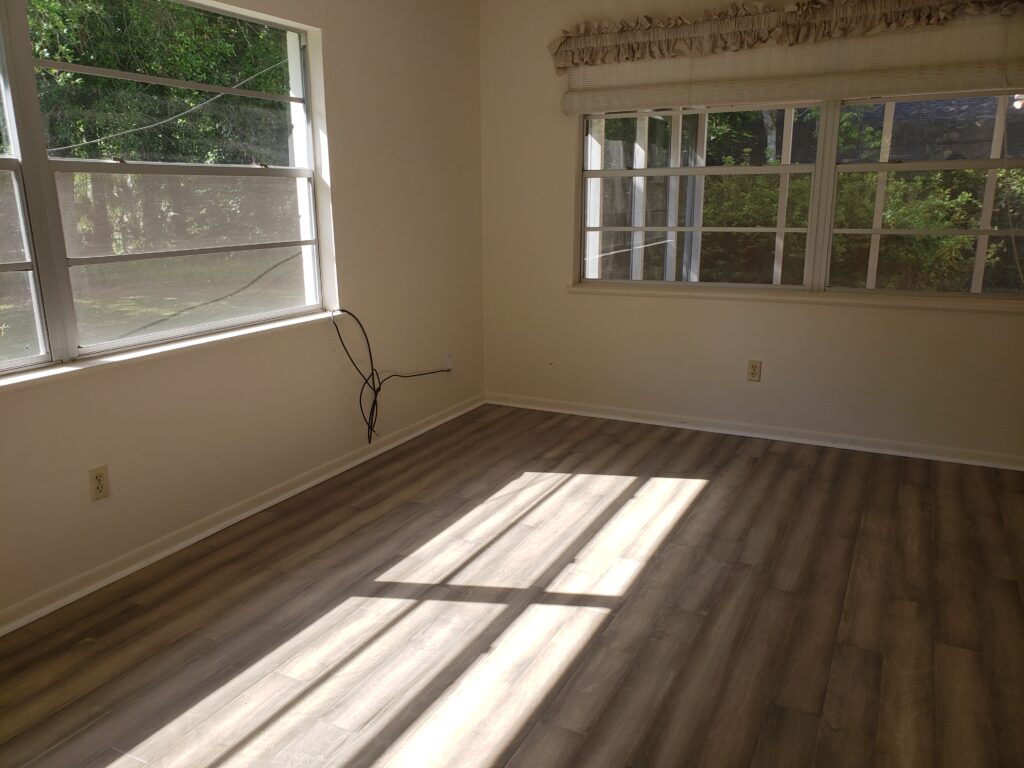
This design emerged from a contest that challenged participants to craft an ‘edesign’ for an office tailored to our ‘ideal client.’ The onus was on us to define that client and to conceptualize within their budget. Our tools of representation were a concept board and a digital render. The canvas for our creativity was an existing room, complete with photos and dimensions to guide our design journey.

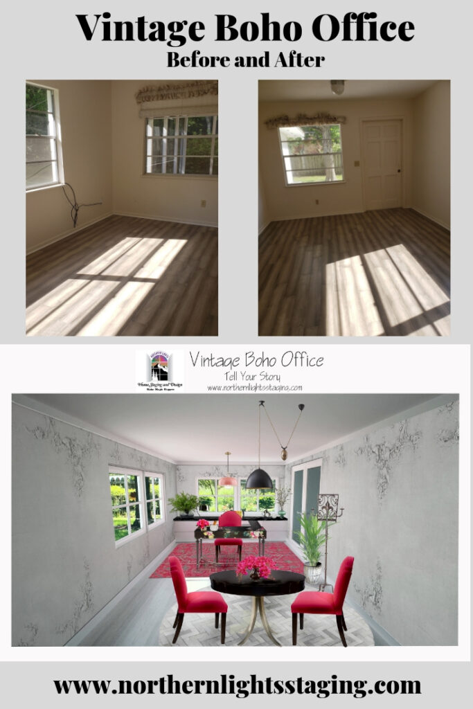
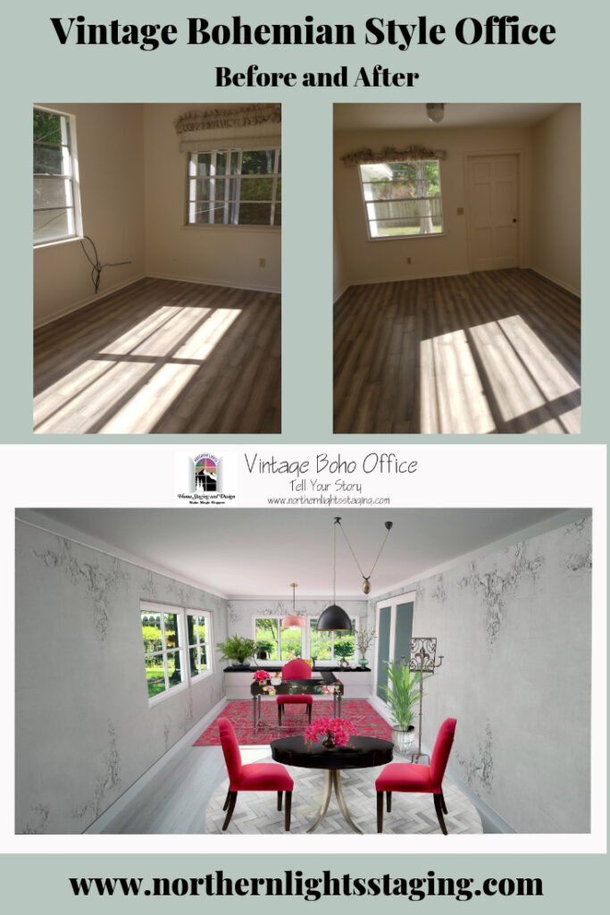
Before


My Client

My ideal client for this design was a woman who loves color and Bohemian or global style design with a mid-high range budget. She worked in a creative field such as  graphic, fashion, color or Interior Design.  Yes, my ideal client was someone like me! Well, of course, I know myself better than anyone else, so why not!

Function First

My first step was to understand the client’s energy and what she needed in the space to be in alignment with who she truly is. Since this was an imaginary client, I pictured myself and what I would want.

Then, my focus revolved around functionality and the practical requirements that would make this space not just aesthetically pleasing but genuinely functional for the client.

I determined that the client would need:

  1. Ample Storage: To house client files, sample materials, and essential reference books, ensuring easy accessibility.
  2. Meeting Space: A designated area to accommodate 2 to 3 clients comfortably, facilitating design presentations.
  3. Aesthetics and Atmosphere: Given her creative profession and the likelihood of client meetings in this space, it was paramount that the office exuded style, uniqueness, and an element of fun. It needed to serve as an inspirational yet relaxed haven for clients, enhancing their overall experience.
 

Floor Plan

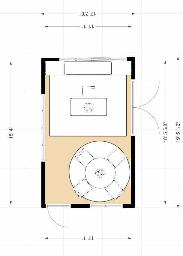
Next, I considered how she would want to move in the space and created a floor plan to bring the functional aspects of the design to life. My primary focus was on optimizing the layout to cater to the client’s work requirements, ensuring seamless access to essential elements.

The key considerations were:

  • Desk and Storage Placement: I explored various desk configurations, complete with accessible file cabinets and bookshelves. Equally crucial was creating a designated area for meetings and presentations, equipped with adequate overhead and task lighting.
  • Traffic Flow: I meticulously designed the layout to facilitate smooth movement into the office from the outside entrance while also maintaining accessibility to the adjoining room.
  • Strategic Wall Usage: After careful assessment, I determined that the back wall offered the ideal location for two flanking file cabinets and a central bookshelf. Placing the desk in front allowed for effortless access, enabling the client to pivot their chair and access everything with ease. This setup not only improved functionality but also visually balanced the elongated room.
  • Aesthetic Cohesion: To tie the units together and create an appealing display area, I envisioned a custom countertop spanning the file cabinets and shelves. This surface could showcase plants, books, or decor, taking advantage of the adjacent window.
  • Furniture Dimensions: Sizing up the furniture was a crucial step, factoring in the room’s traffic flow. The chosen layout accommodated a circular table that maximized seating while maintaining clear pathways. To define the two distinct work zones, I considered rugs for each area. An 8-foot-diameter circular rug appeared to be the perfect fit for the table area.

This meticulous planning ensured not only functional efficiency but also a harmonious aesthetic within the office space.
Vintage Boho Office- How a Designer Thinks. Northern Lights Home Staging and Design #Bohemian #Boho #globalstyle #designstyle #interiordesign #onlinedesign #globaldecor #vintage #officedesign #interiordesignstyle #modern #decor #eclectic #rustic #colorfuldecor #ethicdecor

Inspiration

Then I started researching pieces for the design, looking for foundational pieces that would direct the rest of the design. I started with the desk, as it would be the focal point as you entered the room, and the most important piece functionally for the client. When I found this gorgeous desk, I knew it was the one! It was unique, colorful and had a vintage Bohemian vibe.  it inspired the color scheme, the feeling for the room and the rest of the design!
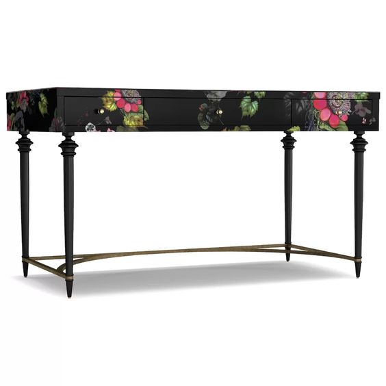

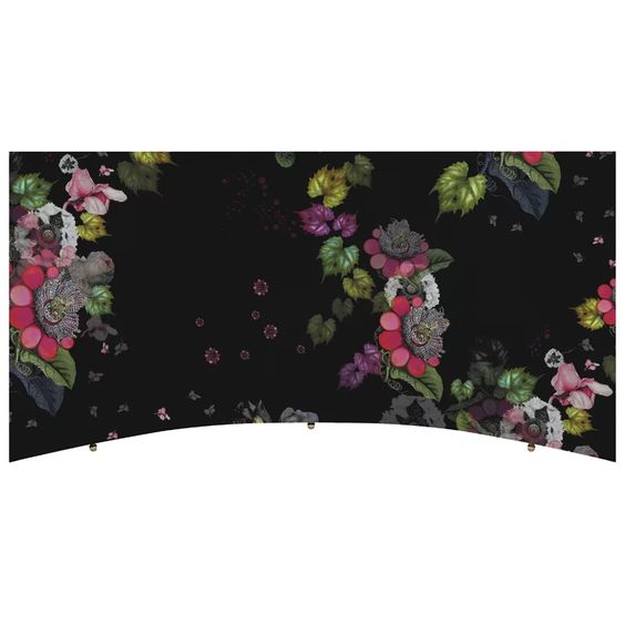
FLEUR DE GLEE WRITING DESK by Cynthia Rowley

Top View

Color Scheme

The desk’s striking aesthetics naturally suggested a palette of pinks, greens, black, and subtle shades of gray or off-white. A hint of yellow, used sparingly, could accentuate key elements. The room’s expansive windows offered a lush green backdrop, seamlessly integrating nature’s touch. I visualized using pink either in one of the rugs or the upholstery for the desk or table chairs. A black marble countertop atop the file cabinets and shelves would elegantly frame the desk zone. With an emphasis on preserving the room’s luminosity, I considered a light gray or an antique white as the ideal wall shade, ensuring the space felt open and airy.

Major Design Elements

While seeking complementary pieces for the desk, I stumbled upon a rug that resonated beautifully with both the color scheme and the Bohemian vibe. My next discovery was a captivating wallpaper, its hue in perfect harmony with the room. Its design, reminiscent of antique ceilings or walls, subtly enhanced the space without overshadowing the desk—something wall art might have inadvertently done. This vintage essence further steered my search, leading me to incorporate vintage or vintage-inspired accents and lighting, enriching the evolving theme.


Medina Rug

Coordonne Wallpaper

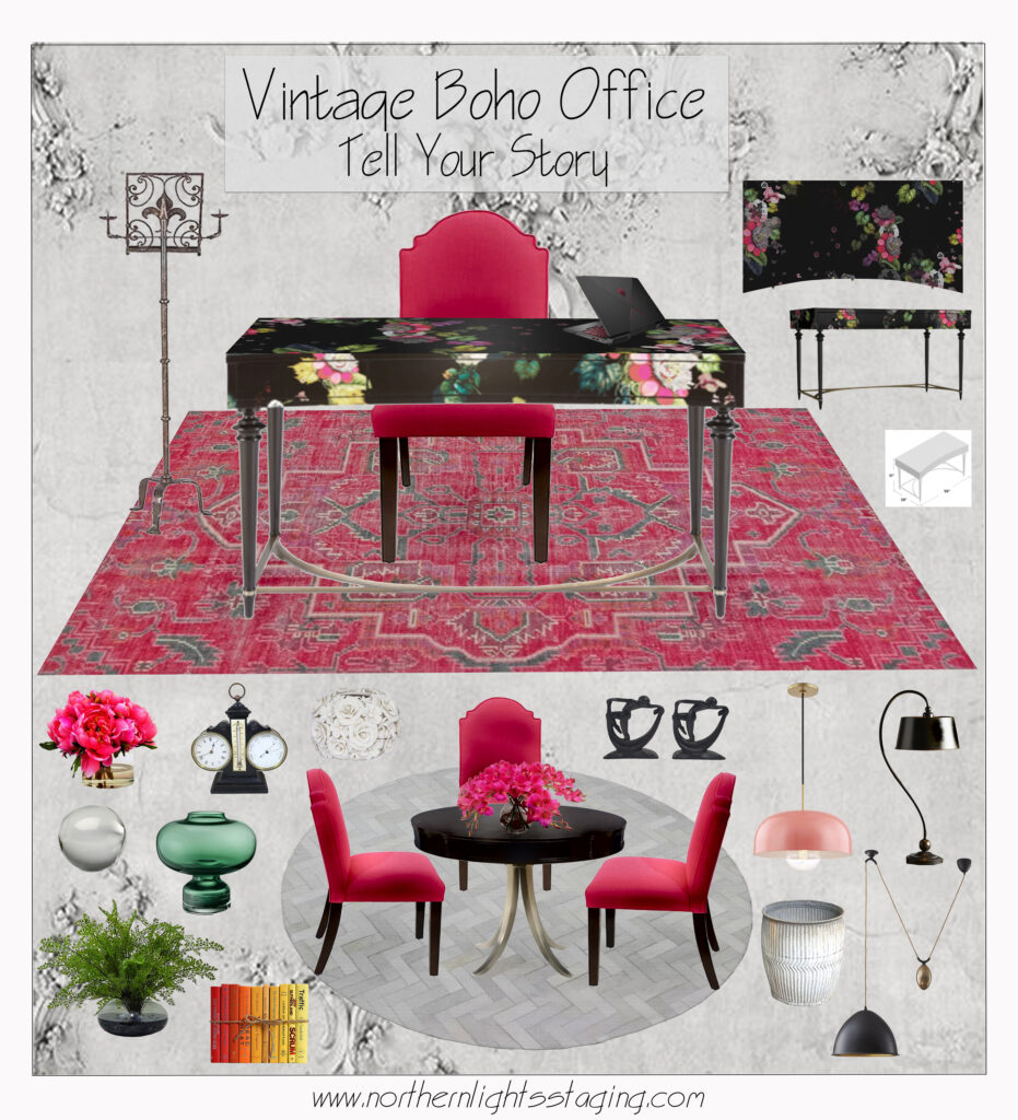
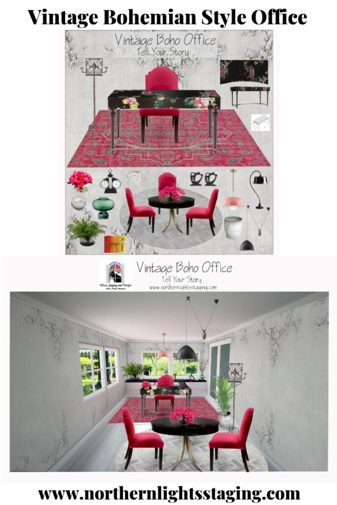
While exploring furniture and accessories for the design, I integrated each find into my Photoshop workspace where I curated the concept board. This digital canvas enabled a holistic view, letting me juxtapose various items. Through this iterative process, I tweaked, added, or removed elements to strike the right balance in terms of color, form, style, and functionality.

Concept Board
Vintage Boho Office- How a Designer Thinks. Northern Lights Home Staging and Design #Bohemian #Boho #globalstyle #designstyle #interiordesign #onlinedesign #globaldecor #vintage #officedesign #interiordesignstyle #modern #decor #eclectic #rustic #colorfuldecor #ethicdecor

Design Products

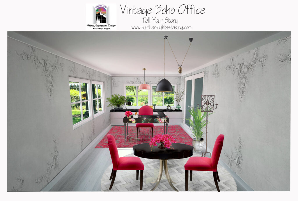
I sourced a variety of beautiful furniture and accessories and created a render to help visualize the final design.
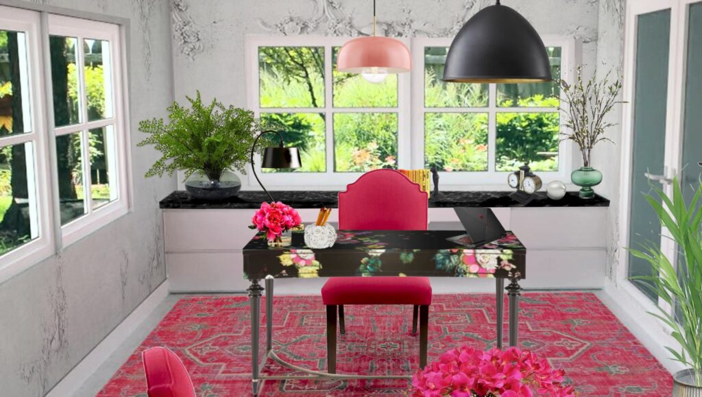
Vintage Boho Office- How a Designer Thinks. Northern Lights Home Staging and Design #Bohemian #Boho #globalstyle #designstyle #interiordesign #onlinedesign #globaldecor #vintage #officedesign #interiordesignstyle #modern #decor #eclectic #rustic #colorfuldecor #ethicdecor

Voilà!

My design journey always begins by getting to know the client, understanding what they need to be in alignment with who they truly are and how the design can enhance that. Then I delve into their functional and space needs. From there, I seek out inspiration pieces that resonate with the client’s style, often creating energy art specifically for them.

These foundational elements set the tone, directing the design’s evolution and color narrative.

Are You Inspired?

Want to create a beautiful office or other space that is perfect for you? Try an Aligned Design consultation with my to get started.
A transformational design experience that aligns Art, Science and Energy to Make Magic Happen in your Home and Life. Includes Interior Design, Color and Energy alignment advice to create a space perfectly aligned with you. We'll use Energy Art, personalized to reflect your true self, as the foundation of your space's transformation.


What's Your Global Design Style? Take the Quiz


Attract Wealth with Interior Design: The Energy Art Quiz"- Northern Lights Home Staging and Design.

Why Work with Northern Lights Home Staging and Design

Aligned Design©– All Rights Reserved.

Terms of Service  |  Privacy Policy  |  Disclaimer |  Brochure

Prices are subject to change without notice.

Call 907-362-0065 today
Vintage Boho Office- How a Designer Thinks. Northern Lights Home Staging and Design #Bohemian #Boho #globalstyle #designstyle #interiordesign #onlinedesign #globaldecor #vintage #officedesign #interiordesignstyle #modern #decor #eclectic #rustic #colorfuldecor #ethicdecor
Why Work with Northern Lights Home Staging and Design
Vintage Boho Office- How a Designer Thinks. Northern Lights Home Staging and Design #Bohemian #Boho #globalstyle #designstyle #interiordesign #onlinedesign #globaldecor #vintage #officedesign #interiordesignstyle #modern #decor #eclectic #rustic #colorfuldecor #ethicdecor


Celebrate Your Favorite Color – Go Monochromatic

Many people struggle with finding the perfect color scheme, often bound by the constraints of their existing finishes. But what if we make this more fun? Imagine magnifying and embracing your favorite color wholeheartedly. Welcome to the world of Monochromatic design!

Monochromatic schemes delve deep into one hue, exploring its diverse shades, tones, and tints. Visualize your cherished color transitioning from its lightest whisper to its richest depth, seamlessly incorporating white and black.


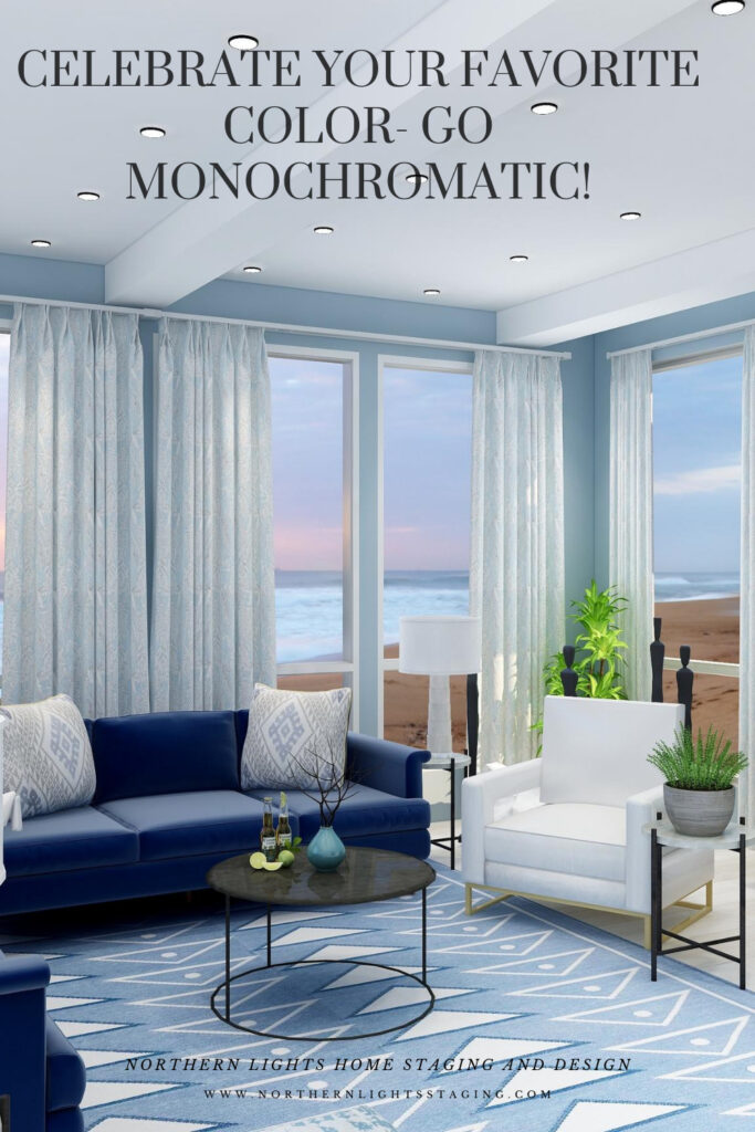
Celebrate your favorite color- go monochromatic!
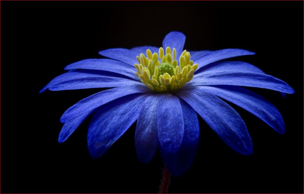
Example of a monochromatic blue color palette. Photo by

Why is it effective? The singular hue fosters visual harmony, resulting in a seamless design. Think of the design principle: “All greens blend” or “Every blue complements the other.” Their shared base hue unifies them, ensuring a cohesive look.

But isn’t monochromatic boring? NO! The absence of contrasting colors can be offset by using a range of “blue” hues for example rather than just one.  You can also create drama and interest with patterns and textures.

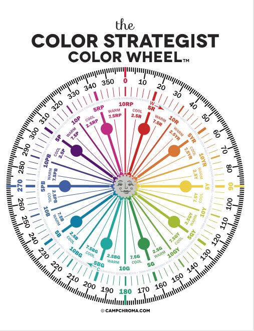
For instance, I could craft a monochromatic palette starting with the blue at 230 degrees on the color wheel. From there, I’d explore its spectrum, transitioning from pure white (unsaturated) to shades of light blue, deepening to dark blue, and ultimately black. To add richness, I might dabble with hues ranging from 235 to 250 degrees, all within the blue family, while experimenting with different saturation levels.

When I select my design pieces, I look for various materials, textures and patterns to add variety, such as mixing soft and hard, matte and shiny, smooth and rough, curves and straight lines etc.

Mastering Monochrome: A Singular Hue Living Room Transformation”

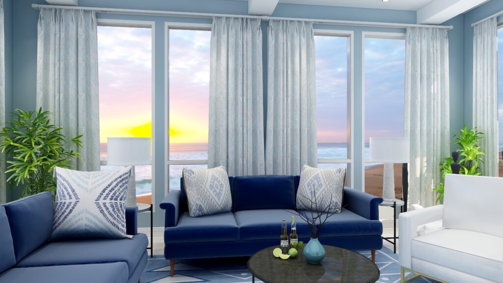
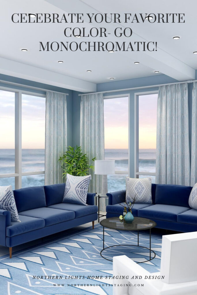
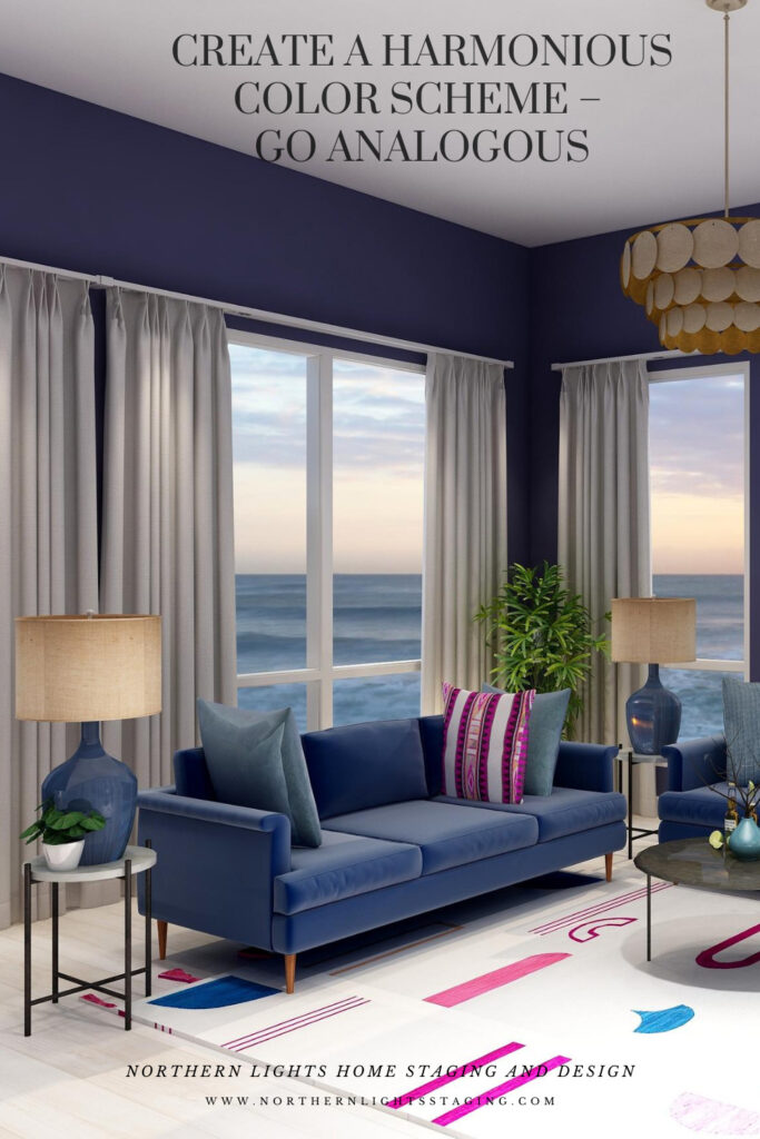
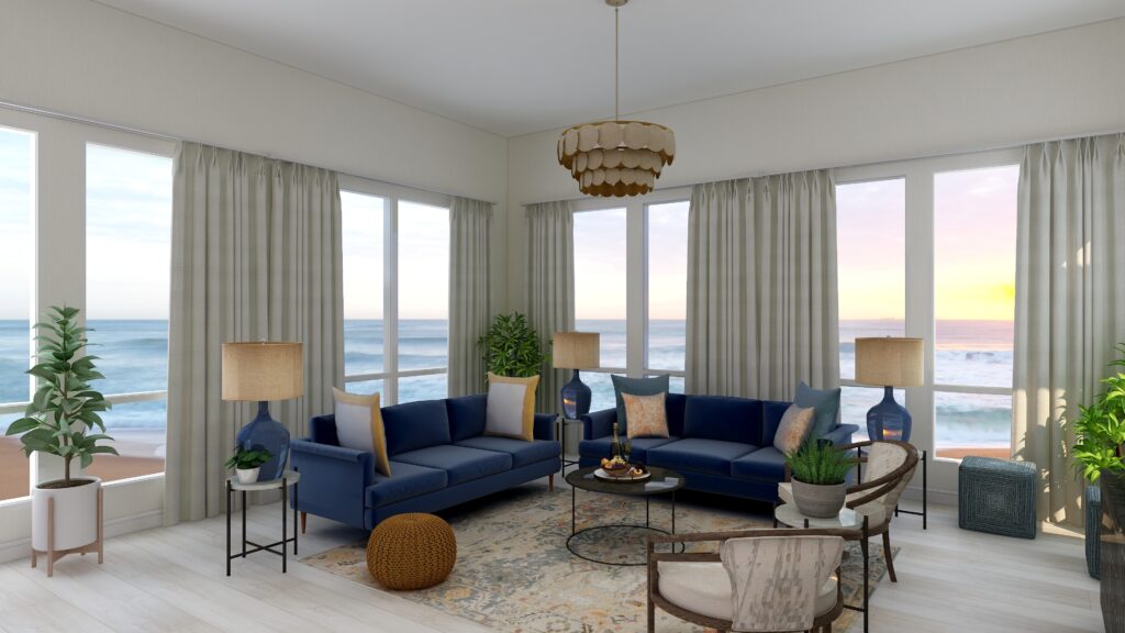
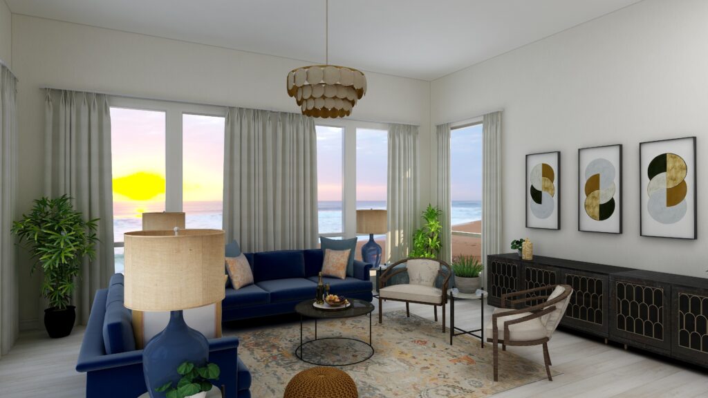
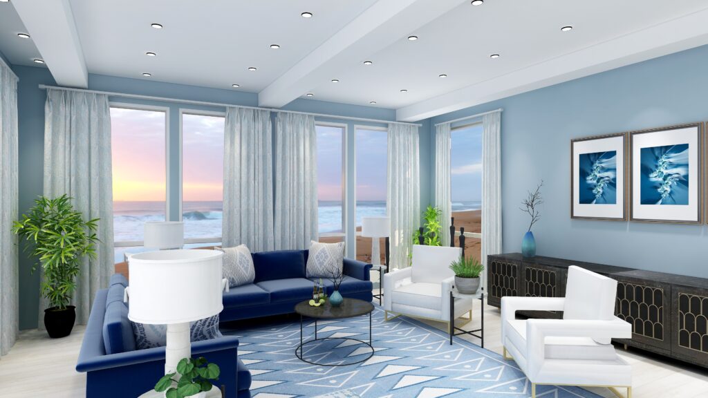
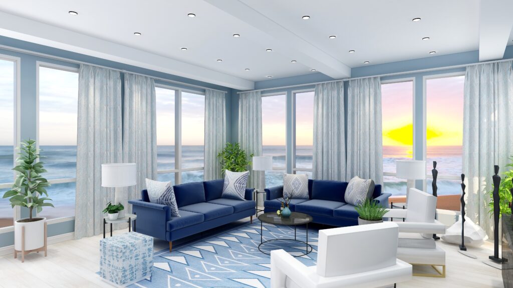
I created this living room design where I embraced a blue monochromatic palette. From pristine white to profound black, the spectrum features diverse blue hues manifesting in paint, furniture, drapery, lighting, and accents. Admittedly, the greenery introduces a dash of contrast, lending the space a touch beyond strict monochrome.”

Celebrate your favorite color- go monochromatic! Edesign by NOrthern Lights Home Staging and Design
Monochromatic Blue Living Room Edesign and Spring Fractal Art by Northern Lights Home Staging and Design.
Celebrate your favorite color- go monochromatic! Edesign by NOrthern Lights Home Staging and Design
Monochromatic Blue Living Room Edesign and Spring Fractal Art by Northern Lights Home Staging and Design.

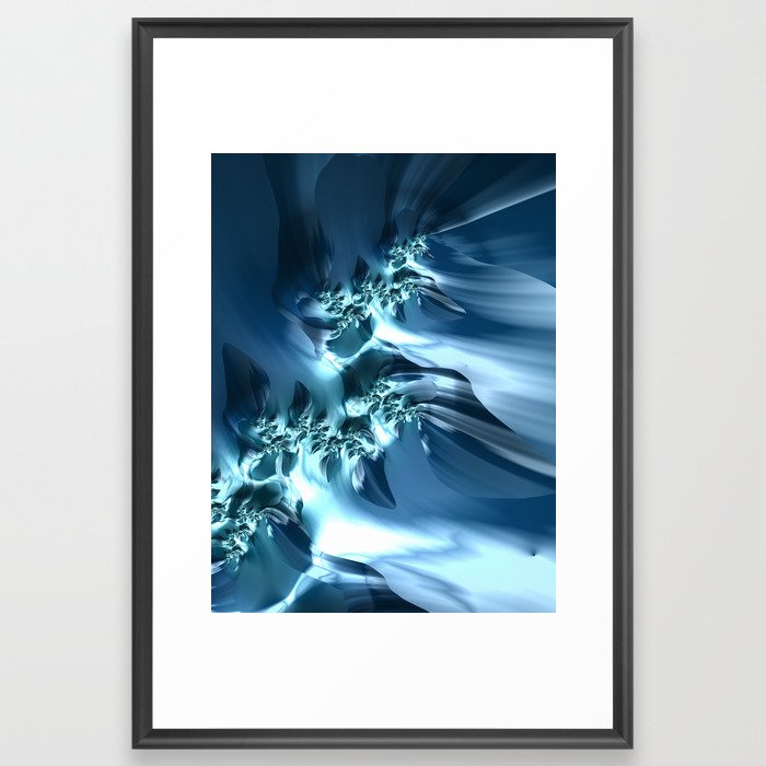
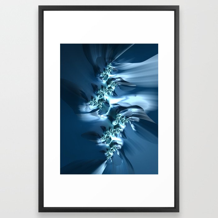
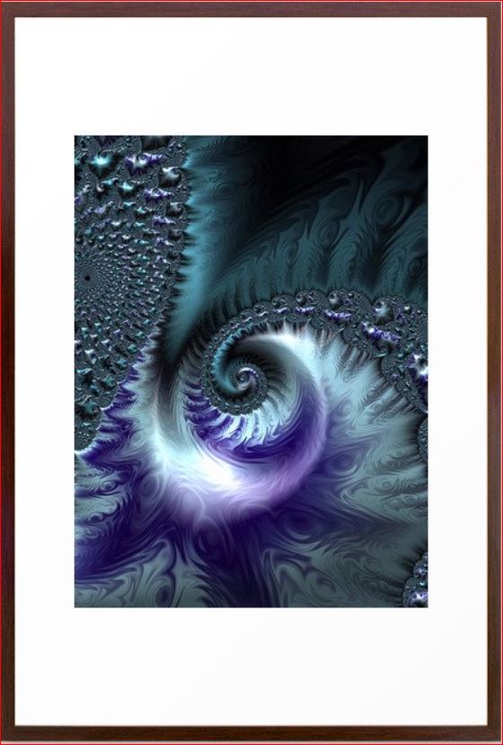
This design incorporates some of my original fractal art in a collection called “The Sea”, which reminded me of white caps on the ocean and also uses variety of blue shades.


The Sea fractal art by Northern Lights Home Staging and Design
The Sea

The Sea #2 fractal art by Northern Lights Home Staging and Design
The Sea #2

The Sea #3 fractal art by Northern Lights Home Staging and Design
The Sea #3

See More of My Blue Energy Art

See a collection of my blue energy art which could work beautifully together in creating your own blue monchromatic color scheme.


Mary Ann Benoit Energy Art on Fine Art America

Benefits of A Monochromatic Color Scheme

  • A monochromatic color scheme offers several benefits, including:
    1. Cohesiveness: By using variations of a single hue, the design inherently feels unified and harmonious.
    2. Visual Simplicity: Monochromatic designs reduce visual clutter, making spaces feel more organized and easier on the eyes.
    3. Flexibility: With one dominant color, it’s easier to mix and match patterns, textures, and shades without overwhelming the space.
    4. Depth and Dimension: By using tints, tones, and shades of a single color, you can create depth and dimension in a space without introducing multiple colors.
    5. Creates Mood: Depending on the color chosen, monochromatic schemes can evoke specific moods – blues for tranquility, reds for warmth, greens for rejuvenation, and so on.
    6. Easier Color Coordination: Choosing decor, furnishings, and finishes become simpler when you’re working within a single color spectrum.
    7. Timelessness: Monochromatic rooms often have a timeless quality and can stay relevant despite changing design trends.
    8. Highlights Architectural Features: In a monochromatic setting, architectural features can stand out more as they aren’t competing with varied colors.
    9. Enhanced Spatial Perception: In some cases, using a monochromatic scheme can make spaces seem larger or cozier, depending on the hue and its intensity.
    10. Focus on Texture and Form: With color variation minimized, there’s a greater focus on other design elements like texture, form, and material, allowing for richer tactile experiences.

    Using a monochromatic scheme can be a strategic design choice to bring tranquility, unity, and a unique aesthetic appeal to any space.

Celebrate your favorite color- go monochromatic!
Edesign by Northern Lights Home Staging and Desigo

Celebrate Your Favorite Color

Imagine entering a room where every hue resonates with your spirit, instilling a profound sense of joy and tranquility. A sanctuary where you rejuvenate and spark inspiration. When your space mirrors your essence, harmony effortlessly follows.

Why not infuse the vibrant colors of summer into your dwelling? Or perhaps the palette of your cherished season?

Elevate your space with an Aligned Design Consultation today.


A transformational design experience that aligns Art, Science and Energy to Make Magic Happen in your Home and Life. Includes Interior Design, Color and Energy alignment advice to create a space perfectly aligned with you. We'll use Energy Art, personalized to reflect your true self, as the foundation of your space's transformation.

What is Your Global Design Style? Take the Quiz


What's Your Global Interior Design Style? Take the Quiz. Northern Lights Home Staging and Design

Why Work with Northern Lights Home Staging and Design

Aligned Design©– All Rights Reserved.

Terms of Service  |  Privacy Policy  |  Disclaimer |  Brochure

Prices are subject to change without notice.

Call 907-362-0065 today
Pin These

Celebrate your favorite color- go monochromatic! Edesign by NOrthern Lights Home Staging and Design
Celebrate your favorite color- go monochromatic!


Create a Harmonious Color Scheme – Go Analogous

People often struggle with creating a great color scheme.  Often, we start the conversation by talking about the limitations, or the box of colors you need to play with based on your fixed finishes.

In my last article, Celebrate Your Favorite Color- Go Monochromatic, we talked about how you could take your favorite color and celebrate it in all it’s glory with a monochromatic color scheme. Simple and easy!

What if you would like a little more color variety,  but still want something that is simple and easy to create?  Go analogous!

Analogous color schemes are based on three hues that are next to each other on the color wheel. They are friendly neighbors, they like each other and  play well together:)

Analogous colors are harmonious and often found in nature.


peppers-analogous colors
Example of an analogous color scheme found in nature.

Why does it work? They go well together because one of the three colors is usually a combination of the other two as with the red, yellow and orange peppers above.

Analogous schemes offer more color variety than monochromatic schemes while still retaining that harmonious and often serene quality, although it can also be more dramatic too based on the hues you use. It is also a simple scheme to create by using your color wheel and picking three adjacent colors that you like.    

Which three adjacent colors are your favorites?


MY favorite color training course, Camp Chroma.

For example, in my last article, I created a monochromatic design using blues and blue/purples around the range of 250-270 on the color wheel.


Celebrate your favorite color- go monochromatic! Edesign by NOrthern Lights Home Staging and Design
Monochromatic Blue color scheme. Edesign by Northern Lights Home Staging and Design.

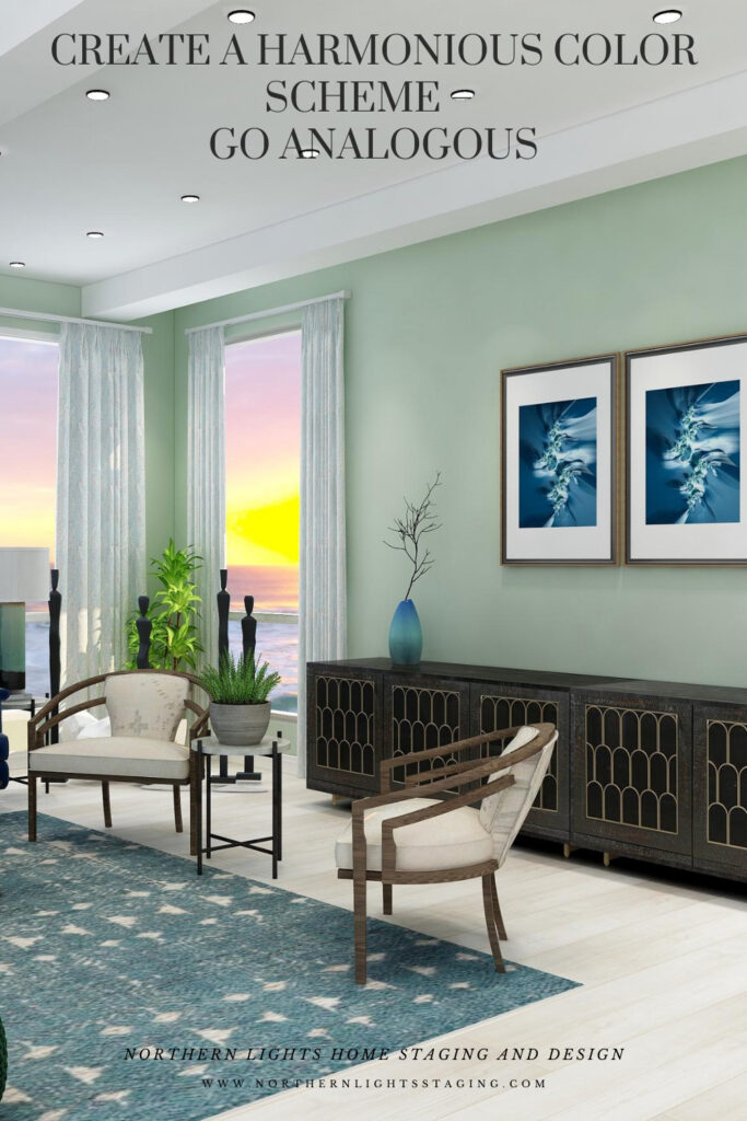
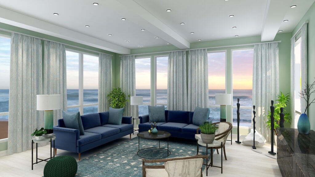
If I wanted to take this monochromatic design, and create a more analogous scheme, I could go clockwise around the color wheel and add the neighbors of blue in including purple and red-purple.  Or, I could go counter-clockwise  and add blue-green and green. 

I could also pick neighbors on either side and add purple and blue green. Let’s play.

Analogous Color Scheme #1

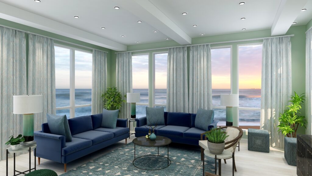
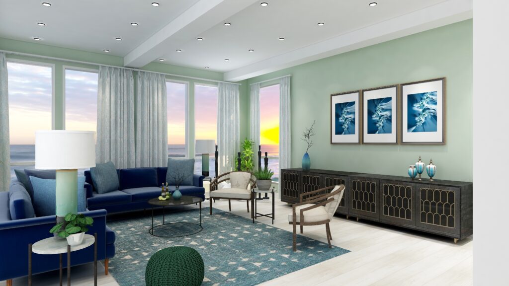
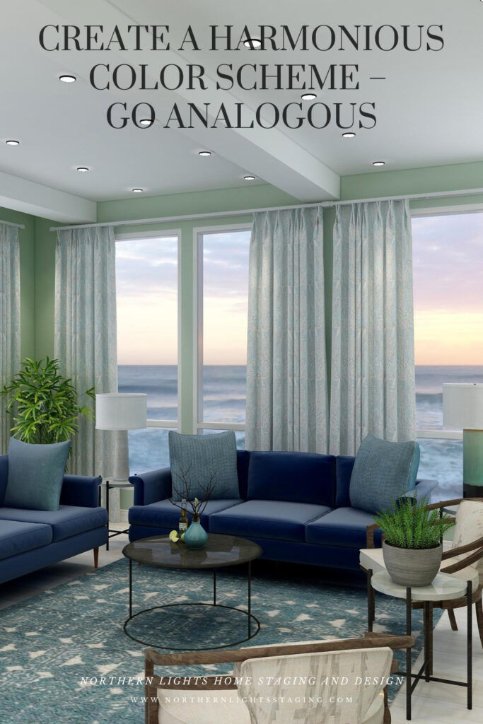
This design starts with our base blue as in the sofas and moves counter-clockwise along the color wheel to include blue greens and greens. I set the tone for this design with a new rug in blue green and then changed the paint color, lamps, side chairs and some of the accessories. I maintained the sofas and art as the anchor of the main blue color I wanted to harmonize with.

This design still maintains a calm, serene feeling similar to the original monochromatic scheme, but feels a little richer and warmer with the greens and blue greens.

Analogous color scheme. Edesign by Northern Lights Home Staging and Design.
Analogous color scheme and Edesign by Northern Lights Home Staging and Design
Analogous color scheme. Edesign by Northern Lights Home Staging and Design.
Analogous color scheme and Edesign by Northern Lights Home Staging and Design

Fractal Art

This design, as with the monochromatic design, incorporates some of my original fractal art in a collection called “The Sea”, which reminded me of white caps on the ocean and also uses variety of blue shades.


The Sea fractal art by Northern Lights Home Staging and Design
The Sea

The Sea #2 fractal art by Northern Lights Home Staging and Design
The Sea #2

The Sea #3 fractal art by Northern Lights Home Staging and Design
The Sea #3

Analogous Color Scheme #2

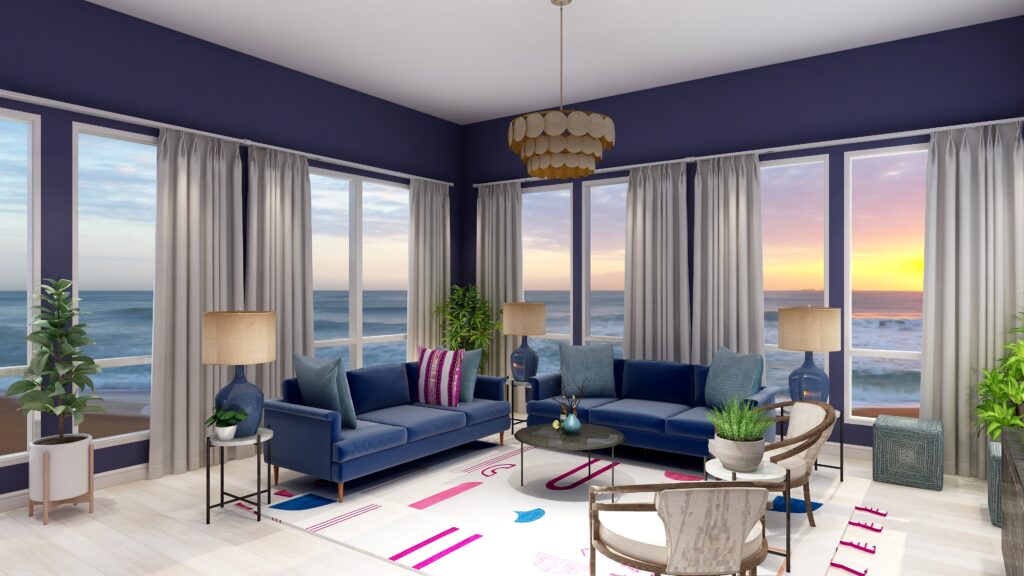
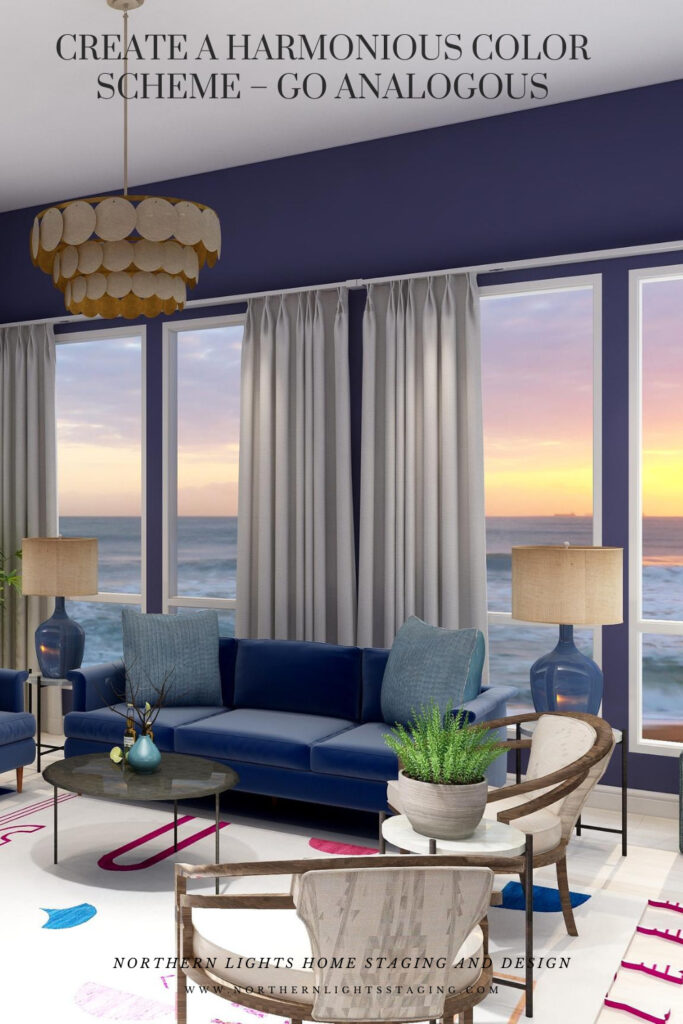
In this case, I again maintained the blue sofas as the base color from the previous design and went clockwise around the color wheel to include purple and red/purple.

I found a nice rug that contained the 3 main colors I wanted to work with to tie everything together. Then I switched the paint color, lamps, one accent pillow and some of the art to bring in some of the other colors.

This design is a little more dramatic due to the deep, rich moody wall color and the high contrast of colors against the white background of the rug. I still think it looks calm and relaxing too.


Analogous Color Scheme 2. Northern Lights Home Staging and Design
Analogous Color Scheme #2. Edesign by Northern Lights Home Staging and Design

Fractal Art

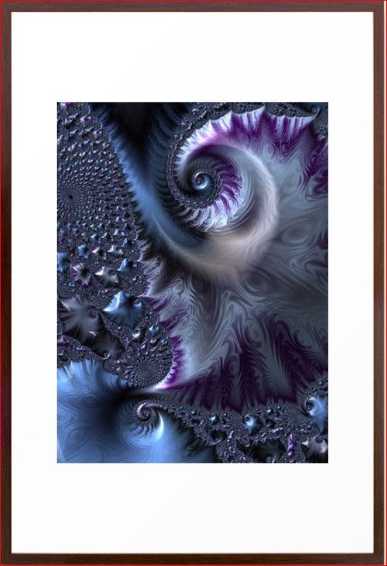
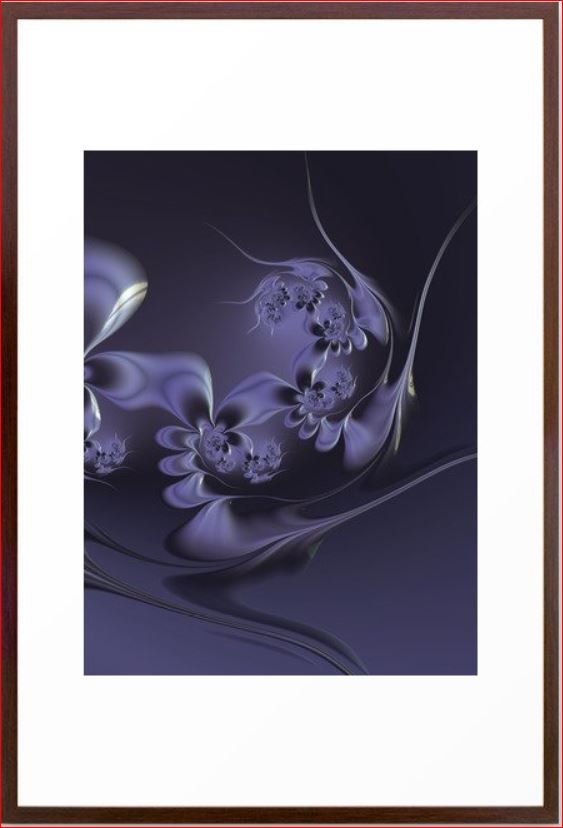
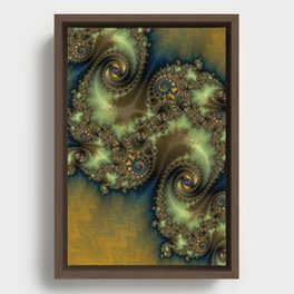
Here is some fractal art I designed that could be used in this design. My Forest Floor designs were inspired by colors in the boreal forest here in Alaska which have a lot of water in them (streams, ponds, rivers, lakes), thus the blues.  The purples represent many of our purple wildflowers. Mystery is a mystery…..use your imagination of what it means to you.


Forest Floor #3 Fractal Art.
Forest Floor #3

Mystery Fractal Art
Mystery Fractal Art

Forest Floor #4 Fractal Art.
Forest Floor #4

Benefits of an Analogous Color Scheme

Analogous color schemes use colors that are adjacent to each other on the color wheel. These schemes offer a harmonious and visually pleasing palette. Here are the benefits of using an analogous color scheme:


  • Harmony and Cohesiveness: Analogous colors have a natural harmony because they share common color components. This results in a unified and cohesive look that’s easy on the eyes.

  • Subtle Contrasts: While the colors in an analogous scheme are similar, there are still subtle contrasts that can be used to highlight or differentiate design elements.

  • Versatility: Analogous colors can be adapted to both vibrant and muted tones, offering flexibility in setting the mood or theme of a design.

  • Richness and Depth: Using several shades and tints of a color range adds richness and depth to designs.

  • Natural and Comforting: Analogous color schemes often mimic how colors appear in nature, making them inherently familiar and comforting to the human eye.

  • Easy Color Matching: It’s easier to match colors within an analogous palette because they share similar undertones, reducing the risk of clashing hues.

  • Reduced Visual Tension: Analogous colors create a more relaxed visual experience because there’s a lack of high contrast between the colors.

  • Flexibility in Highlighting: One can easily highlight an element by choosing a color from either end of the analogous range, making it slightly more vibrant or darker than the surrounding hues.

  • Aesthetic Appeal: This type of color scheme tends to be naturally pleasing and aesthetically appealing because of its harmonious nature. An analogous color scheme can look richer and add more color diversity and interest than a monochromatic color scheme.

  • Enhanced Mood Setting: Due to their close relation, analogous colors can be effectively used to evoke specific moods or feelings, like warmth (reds, oranges, yellows) or calmness (blues, greens).  These are really nice for living rooms, dining rooms and bedrooms. Analogous color schemes can also be more dramatic based on the hues you select, placement of colors and how saturated they are.

  •  

While analogous color schemes offer many advantages, it’s essential to ensure adequate contrast within designs to avoid them becoming monotonous or washed out. Using a neutral color or even a complementary color in small amounts can help add interest and break up the scheme.

Celebrate Your Favorite Colors

Imagine stepping into your space where every hue resonates with your spirit. It’s not just a room; it’s a reflection of you – a haven of happiness and tranquility. In a world where everything aligns, your surroundings uplift and rejuvenate you. When your home mirrors your essence, harmony is effortless.

Purchase an Aligned Design  or Color Consultation today.


A transformational design experience that aligns Art, Science and Energy to Make Magic Happen in your Home and Life. Includes Interior Design, Color and Energy alignment advice to create a space perfectly aligned with you. We'll use Energy Art, personalized to reflect your true self, as the foundation of your space's transformation.


Not Your Average Color Consultation

What is Your Global Design Style? Take the Quiz


What's Your Global Interior Design Style? Take the Quiz. Northern Lights Home Staging and Design

Aligned Design- All Rights Reserved.

Terms of Service  |  Privacy Policy  |  Disclaimer |  Brochure

Prices are subject to change without notice.

Call 907-362-0065 today
Pin These

Create a Harmonious Color Scheme- Go Analogous


Saturday Night Live Art Shows-Aligned Energy Art- “Release”

Welcome to Saturday Night Live Art Shows ! I am Mary Ann Benoit and am with you tonight from Seward Alaska! So excited to be with you tonight to share my new idea, called Aligned Energy Art and three fractal art pieces I designed to introduce it.

Thanks to Saturday Night Live Art Shows creator, artist Brooke Harker and her co-hosts Joan Marie of Joan Marie ArtSheryl Benjy, and Nichole McDaniel for making this possible.

Be sure to check out all the other artists from around the world,   having art shows in their Facebook and social media feeds at 6-9 pm in their time zones. Follow Saturday Night Live Art Shows on Facebook by searching #snlartshows.


Introducing “Release” Aligned Energy Art

My latest fractal art, named “Release” was inspired by the idea of releasing all the things in our lives that do not serve us and make us feel heavy. One of my teachers, Jim Fortin, often repeats this quote from his mentor, DX, that “when you think too much, you make yourself heavy, and when you are heavy, you can not fly”. 

What does that mean? We all have  things in our lives that make us feel heavy, uncomfortable, angry, resentful, and other ways that do not promote well-being.

They take our time and energy and stress us out. It might be things, like clutter, or things we do, or over-do that we really don’t enjoy or do to please others.

When was the last time you took an inventory of those things to see how many were really adding anything important or meaningful to your life?

https://northernlightsstaging.com/wp-content/uploads/2021/11/Copy-of-release_video.mp4

I decided many months ago that I wanted to release things that were taking up too much of my time and causing me to feel stressed and overwhelmed. “Release” became my new motto, and favorite word.

I noticed, the more I released, the better I felt. Thinking about the word “Release” daily, helped me improve my well-being.

I was thinking about the concept of releasing things when I created this art.

As I described in my previous Saturday Night Art Show, creating fractal art, which is digital art, is like traveling through a kaleidoscope until you find the perfect spot to stop and then you can adjust any element you want.

The place I chose looks like a landscape filled with mountains and rivers from above, releasing the energy of the water and soil down to the ocean where you see it expanding out from there.

It has the colors of fall, and the energy of the changing of the seasons, when the trees release their leaves and transform themselves to be ready for winter.

It has the colors of nature and the earth, greens and browns, blues, yellow and orange. 


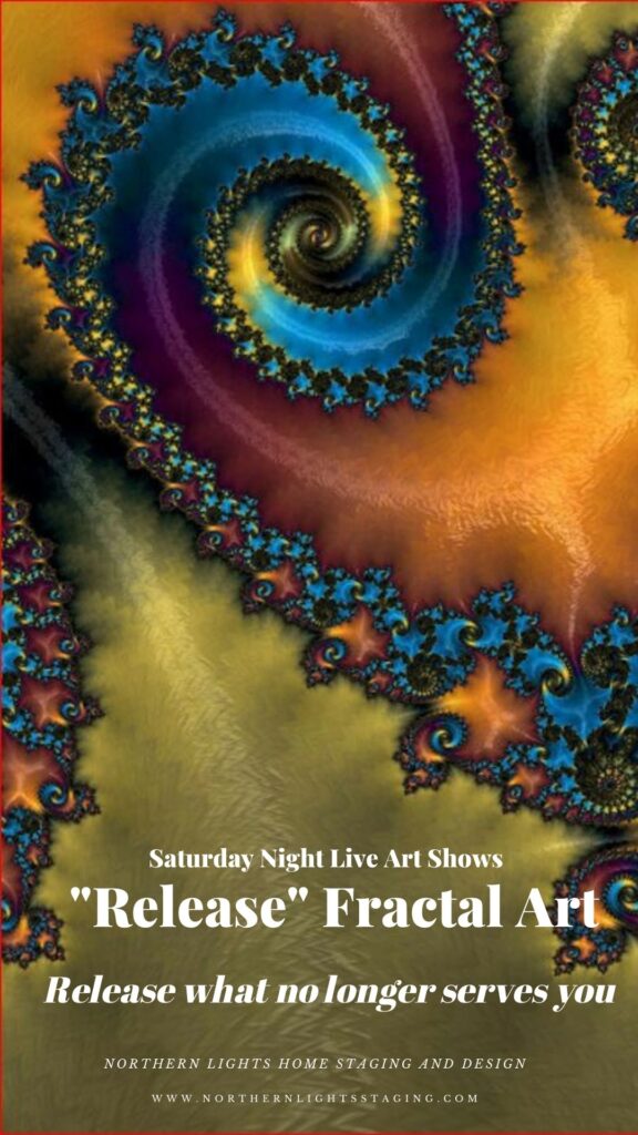
“Release” fractal art by Mary Ann Benoit of Northern Lights Home Staging and Design

The greens and colors of nature add a feeling of calmness and well-being, as if sitting in a beautiful forest. This is the feeling I want to have as a result of releasing what no longer serves me.

As I usually do, I created 2 more pieces to go with it, so you can see the movement between pieces and use three together over a sofa t create a focal point in a room.


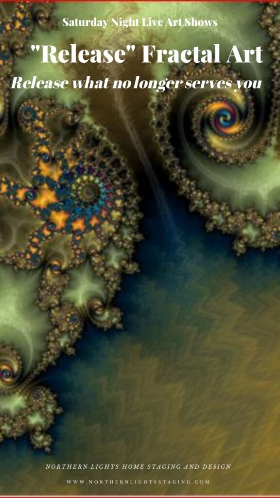
“Release 2” fractal art by Mary Ann Benoit of Northern Lights Home Staging and Design

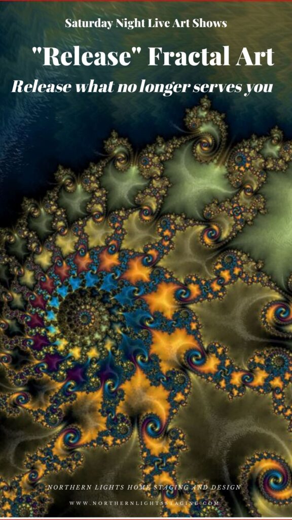
“Release 3” fractal art by Mary Ann Benoit of Northern Lights Home Staging and Design

How can you use Aligned Energy Art in your space?

If the message of “Release”, or future concepts I plan to create resonate with you, then adding art that is meaningful as well as beautiful is a great way to create your perfect space and remind yourself of what is important in your life each day when you see it.

Art like “Release” can be added to your living room, bedroom, meditation or work out area or wherever your intuition guides you to put it.

Because this art is digital, it can also be put on a variety of home decor products such as pillows, bedding, serving trays, coffee mugs, notebooks and more. So you could think about “Release” as you sip your morning coffee out of a “Release” coffee mug while writing things you want to release your “Release” journal for example, drinking out of your travel cup on the way to work or doing yoga on a “Release” mat.

 Aligned Energy Art  is another layer of meaning beyond the visual beauty in creating your perfect space that is  aligned with who you want to be.

An Example

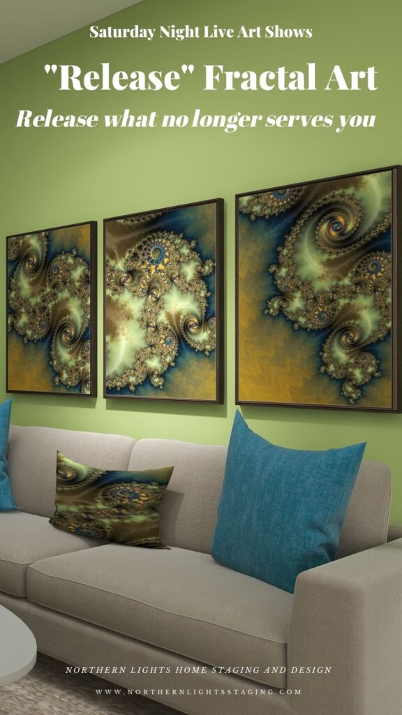
I created this Edesign, or virtual design as an example of how you could created a space using this art and expressing the energy of “Release” in your space. Note the “Release” fractal art on the framed canvases on the wall, the serving tray on the coffee table, the pillow on one of the chairs and the place settings on the table.


Your selection of art determines the energy you want to surround yourself with.

How do you want to feel?

What is Fractal Art?

Fractal art is digital art I create on my computer. I love creating fractal art because it allows me to work with brilliant colors, interesting textures, and incredible detail. Learn more about how it is created in my last Saturday Night Live Art Show, ” A Passion for Purple” where I show some video of the process. See examples at my store on Society 6.


https://youtu.be/Ha0e7-NUpE4?si=bN1ObYbHebxXW-Y8

Check out my Fractal/ Energy Art Studios

Art Prints

Energy Art home decor and clothing by Mary Ann Benoit on Vida.


Northern Lights Home Staging and Design on Society 6


What is Your Global Design Style? Take the Quiz
Edesign and fractal art home decor by Northern Lights Home Staging and Design

Are You Ready to Create Your Perfect Space with Art?

Are you ready to create your perfect space with amazing art?  Let’s tell your unique story and find the alignment of art, science, and energy that makes you happy. Try my Aligned Design consultation and let’s get started.


A transformational design experience that aligns Art, Science and Energy to Make Magic Happen in your Home and Life. Includes Interior Design, Color and Energy alignment advice to create a space perfectly aligned with you. We'll use Energy Art, personalized to reflect your true self, as the foundation of your space's transformation.

Why Work with Northern Lights Home Staging and Design

Aligned Design©– All Rights Reserved.

Terms of Service  |  Privacy Policy  |  Disclaimer |  Brochure

Prices are subject to change without notice.

Call 907-362-0065 today
Pin These

Saturday Night Live Art Shows- "Release" Fractal Art by Mary Ann Benoit of Northern Lights Home Staging and Design


Opposite Colors Attract – Go Complimentary

Crafting the perfect color palette can be a daunting task for many. Often, the starting point revolves around fixed finishes and certain constraints. In my recent blog posts, we’ve delved into constructing color schemes from a favorite hue, like blue. We’ve explored monochromatic and analogous palettes, and today, we’re diving into complementary color schemes.


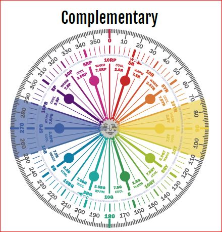
Complementary colors are a pairing of hues that sit opposite each other on the color wheel. When juxtaposed, they amplify each other’s vibrancy and intensity. The beauty of complementary colors lies in their mutual ability to enhance one another’s brilliance.

blue and yellow- complimentary colors
Blue and Yellow glass from Creative Commons CC0.

Complementary color schemes, offer several benefits when used in design:

  1. Visual Contrast: The stark contrast between complementary colors makes each hue stand out distinctly, creating an eye-catching and vibrant look.

  2. Balanced Visual Stimulation: Complementary colors provide a sense of balance; one color might be warm (like red) while its complementary color is cool (like green).

  3. Enhanced Vibrancy: When placed next to each other, complementary colors can make each other appear brighter and more vivid.

  4. Versatility: Complementary color schemes can be adapted to fit various moods and styles. For a bold and energetic look, you can use the colors in their full saturation. For a more subdued and harmonious look, you can use toned-down versions of the colors.

  5. Focus and Attention: Because of their contrast, complementary colors can be used to draw attention to specific elements in a design or space.

  6. Harmony: Even though they’re opposites on the color wheel, complementary colors inherently work well together and create a harmonious design.

  7. Flexibility in Decor: A complementary color scheme allows for flexibility. For instance, if you have a room with predominantly blue decor, introducing some orange accents (like pillows, art, or rugs) can instantly invigorate the space.

  8. Depth and Dimension: In art, especially painting, complementary colors can be used to create depth, with one color serving as a shadow or highlight against its opposite.

  9. Enhancement of Features: Complementary colors can be used to make features stand out. For example, putting orange flowers in a blue vase draws attention to the arrangement and makes both colors pop.


The key to a successful complementary color scheme is balance. Use in moderation and pair with neutral tones to provide a visual rest.

Complementary colors can create interesting optical illusions. For example, if you stare at a square of color for thirty seconds to a minute, and then look at a white paper or wall, you will briefly see an afterimage of the square in its complementary color. Try it with this blue square and see if you see an after image of yellow.

blue square

Why does it work? Leonardo da Vinci observed that the finest color harmonies were those between colors exactly opposed. Maybe that is where the saying opposites attract came from?

So, let’s create a complementary color scheme with the blue we have been working with in several other articles, as you  see the  sofas. See these other color schemes see my articles Celebrate Your Favorite Color- Go Monochromatic and Create a Harmonious Color Scheme- Go Analogous.


Celebrate your favorite color- go monochromatic! Edesign by NOrthern Lights Home Staging and Design
Monochromatic Color Scheme

Analogous Color Scheme

It’s opposite or compliment on the color wheel is yellow, which ranges from Yellow/red to Green/Yellow and can have varying degrees of saturation or chroma, and lightness. In other words, there are lots of yellows we can work with:)


complimentary colors- Camp Chroma
Complimentary Colors- Created by Camp Chroma- The Best Color Training Ever.

The Design

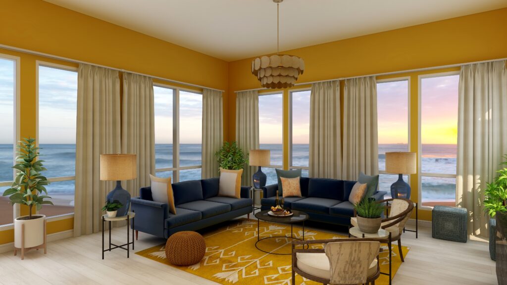
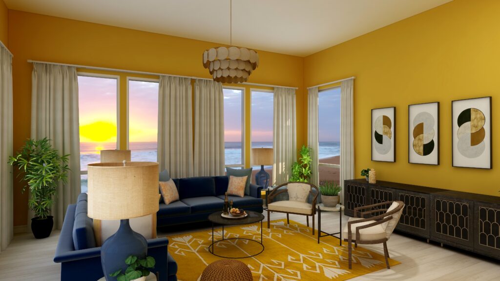
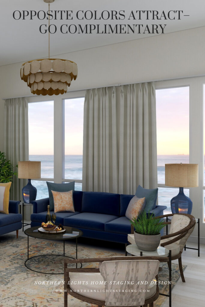
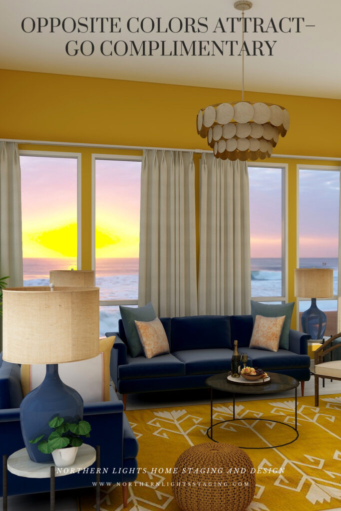
Here are examples of two living rooms I created using a blue and yellow complimentary color scheme. The first is bright and dramatic. The second is more relaxed and neutral.

Complimentary Color Scheme Edesign by Northern Lights Home Staging and Design
Complimentary blue and yellow Living Room Edesign by Northern Lights Home Staging and Design.
Complimentary Color Scheme Edesign by Northern Lights Home Staging and Design
Complimentary blue and yellow Living Room Edesign by Northern Lights Home Staging and Design.

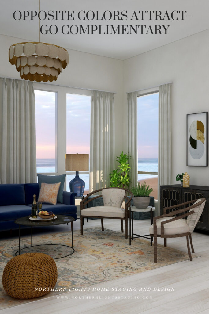
Complimentary color schemes don’t have to be bright and colorful. They can use darker, less saturated or more muted tones of opposite colors for a more understated look. The design below uses an area rug with muted yellows and blues, and wallpaper with minimal yellow. Otherwise everything is the same.

Complimentary Color Scheme Edesign by Northern Lights Home Staging and Design
Complimentary blue and yellow Living Room Edesign by Northern Lights Home Staging and Design.
Complimentary Color Scheme Edesign by Northern Lights Home Staging and Design
Complimentary blue and yellow Living Room Edesign by Northern Lights Home Staging and Design.

Benefits of A Complimentary Color Scheme

Navigating the world of complementary color schemes is easy and straightforward. Begin by pinpointing your favorite hue on the color wheel, then locate its direct opposite. This partnership is where the magic happens.


Complementary colors inherently possess a dynamic tension, making them ideal for spaces meant for lively conversations and gatherings, such as living rooms and dining areas.


However, this boldness can be tempered using muted or desaturated versions of these hues. Then you can craft a serene and sophisticated palette, perfect for spaces meant for relaxation and introspection.


Whether you seek vibrancy or tranquility, complementary color schemes offer versatility to match your vision.

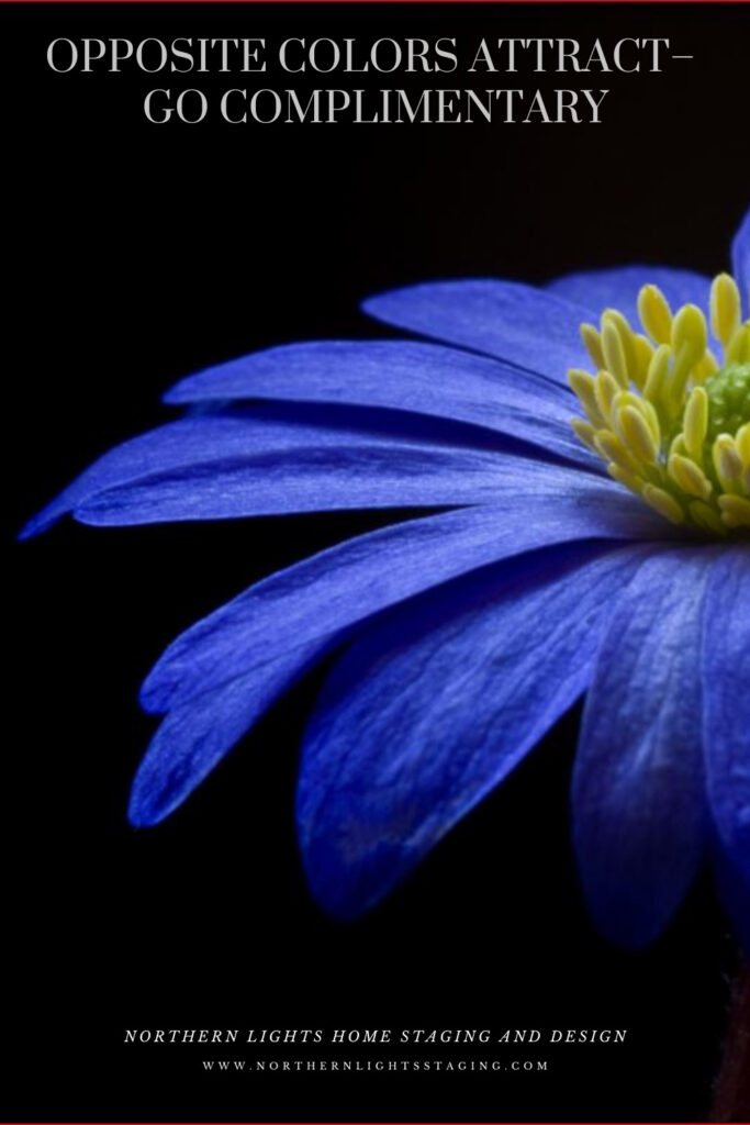
complimentary color scheme
Purple flower from Pexels.com

Create Beauty with Color in Your Space


A transformational design experience that aligns Art, Science and Energy to Make Magic Happen in your Home and Life. Includes Interior Design, Color and Energy alignment advice to create a space perfectly aligned with you. We'll use Energy Art, personalized to reflect your true self, as the foundation of your space's transformation.


Not Your Average Color Consultation

What is Your Global Design Style? Take the Quiz


What's Your Global Interior Design Style? Take the Quiz. Northern Lights Home Staging and Design

Aligned Design- All Rights Reserved.

Terms of Service  |  Privacy Policy  |  Disclaimer |  Brochure

Prices are subject to change without notice.

Call 907-362-0065 today

Why Work with Northern Lights Home Staging and Design

Download my Brochure

Interior Design, Color and Home Staging Services. Brochure of Northern Lights Home Staging and Design


Pin These

Opposite Colors Attract-Go Complimentary

Click on the picture to find out more about the best training class on color available, the Four Pillars of Color!.


Birds of a Feather- What Birds Can Teach Us About Designing the Perfect Room.

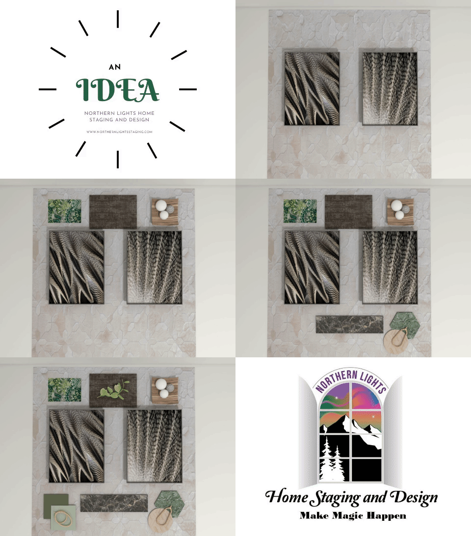
Previously, I showed you how flat lays give a bird’s eye view of a lot of magic possibilities about to unfold before you.

A flat lay creates endless possibilities for creating a perfect space.

I showed you three flat lays inspired by bird feathers and asked what room you visualized each could become.

I created some magic with the first design and wanted to share that possibility with you.

A Flat Lay is a Bird’s Eye View of a lot of Magic Possibilities About to Unfold Before You
A flat lay is an idea filled with possibilities.

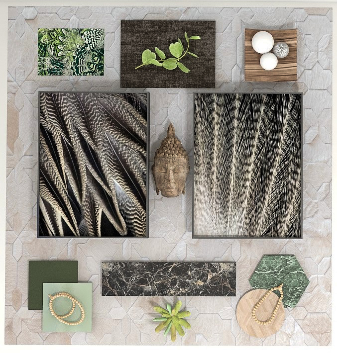
This flat lay and design was inspired by the beauty of Pintail duck and eagle feathers.  Birds provide endless inspiration for creating beautiful designs with the intricate patterns,  colors, and textures of their feathers! Who else but Mother Nature could come up with such great designs.

This flat lay showed initial ideas for flooring, tile, carpeting, fabrics, and more that I thought looked beautiful and created a feeling or mood for a room. I wanted the room to feel peaceful, earthy, spiritual and a little exotic, as if you were relaxing on the forest floor in an old-growth forest where it was totally quiet except for bird calls.

A Flatlay is a Bird’s Eye View of a lot of Magic Possibilities About to Unfold Before You
Flat lay and Edesign by Northern Lights Home Staging and Design

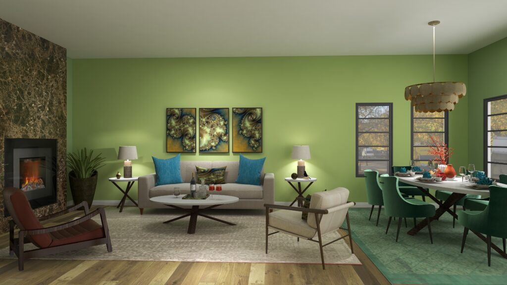
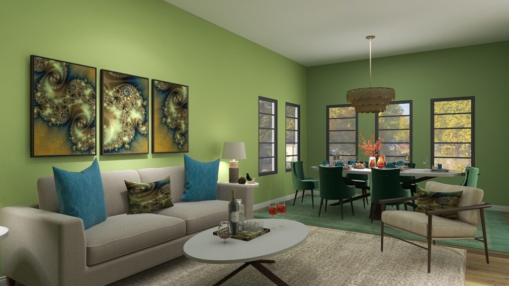
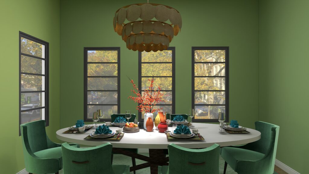
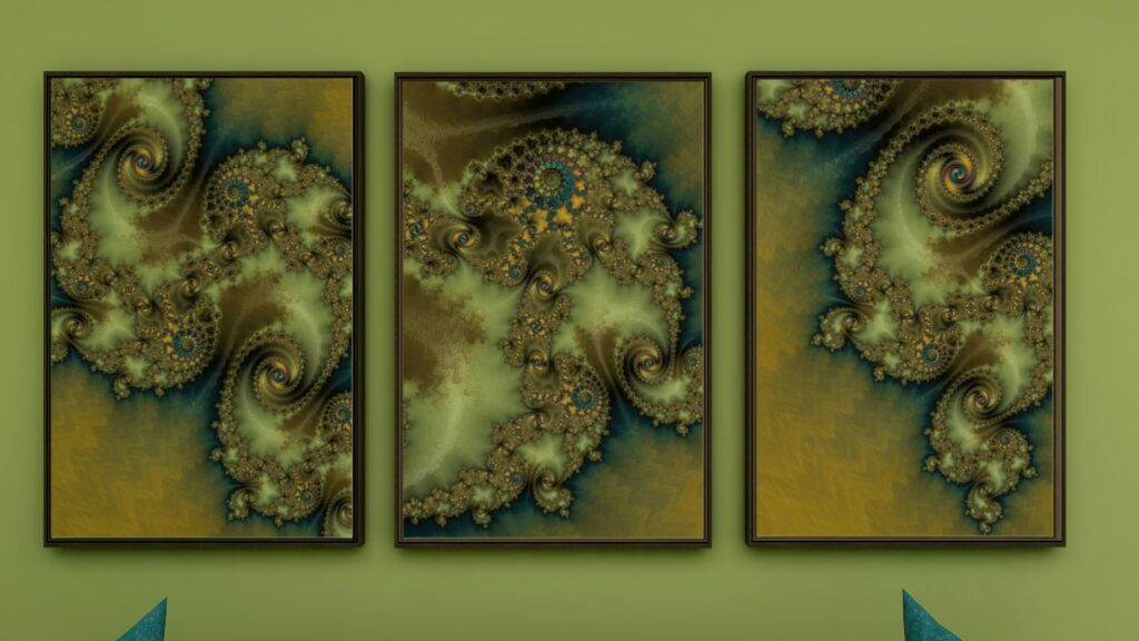
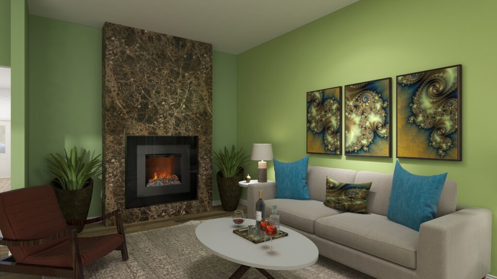
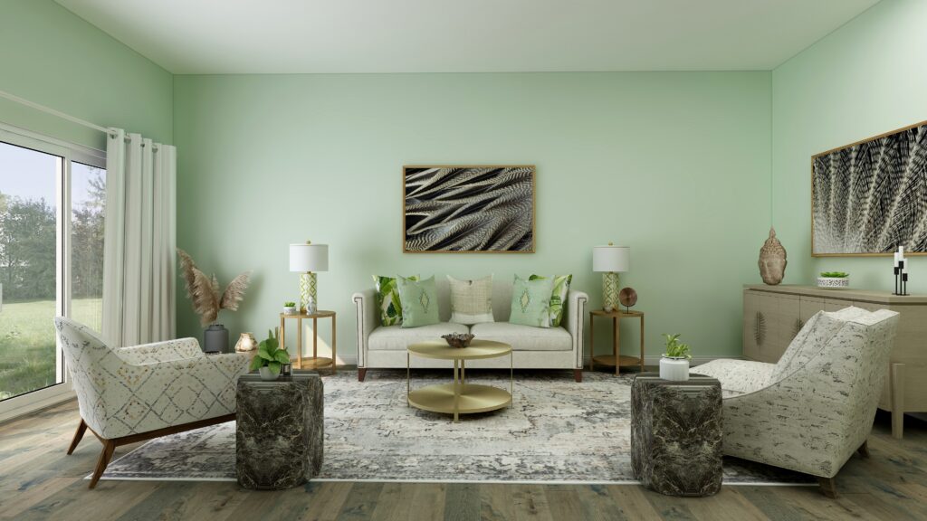
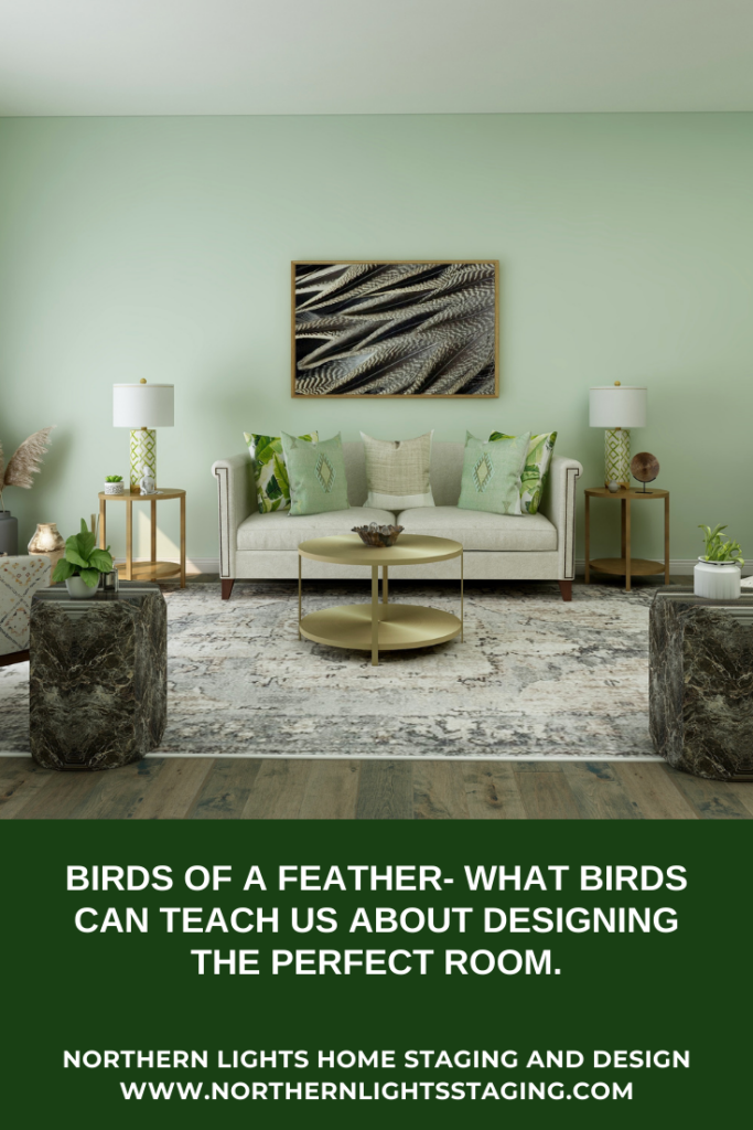
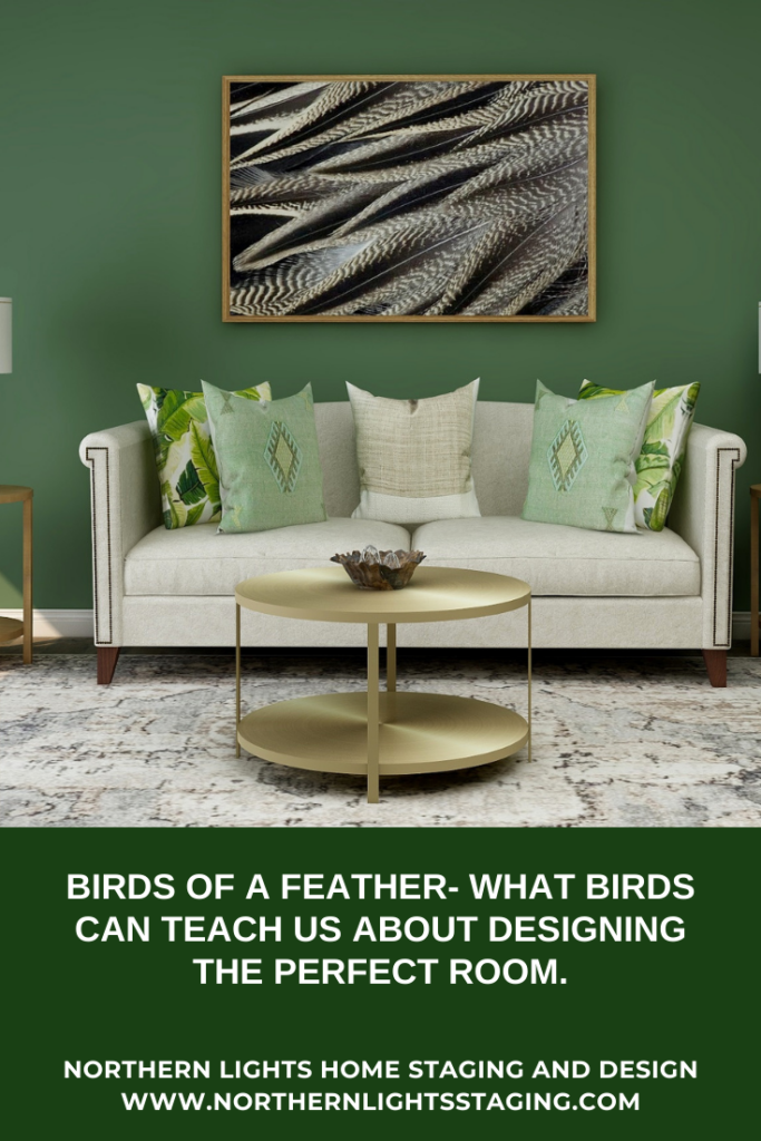
I decided to create a living room with the idea. I tried using the two shades of green for paint colors to see how it would change the look and feel of the room. I think the darker green evokes more of a feeling of the forest. Which do you prefer?

Here is the final design. Does this look like any of the possibilities you imagined from the flat lay?


Birds of a Feather- What Birds Can Teach Us About Designing the Perfect Room
Edesign by Northern Lights Home Staging and Design

Are You Ready to Create Your Perfect Space?

Are you ready to create your perfect space? I assume you are since you are reading my blog post. Let’s tell your unique story and find the alignment of art, science, and energy that makes you happy.  Let me help you take that trip to your perfect space in a Ferrari instead of a stagecoach. Try my Aligned Design consultation and let’s get started.


A transformational design experience that aligns Art, Science and Energy to Make Magic Happen in your Home and Life. Includes Interior Design, Color and Energy alignment advice to create a space perfectly aligned with you. We'll use Energy Art, personalized to reflect your true self, as the foundation of your space's transformation.


What's Your Global Design Style? Take the Quiz

Check out My Energy Art Studios


Mary Ann Benoit Energy Art on Pixels.com


Northern Lights Home Staging and Design on Society 6


Energy Art home decor and clothing by Mary Ann Benoit on Vida.

Why Work with Northern Lights Home Staging and Design

Aligned Design- All Rights Reserved.

Terms of Service  |  Privacy Policy  |  Disclaimer |  Brochure

Prices are subject to change without notice.

Call 907-362-0065 today
Pin These


Birds of a Feather- What Birds Can Teach Us About Designing the Perfect Room


Birds of a Feather- What Birds Can Teach Us About Designing the Perfect Room


How can I work with an Interior Designer on my budget?

How can I work with an Interior Designer on my budget?

Many perceive hiring an Interior Designer as a lavish expenditure during home renovation or updates. Yet, partnering with an expert can prevent costly errors, ensuring your investment aligns with your vision.


However, remodeling isn’t cheap, and budget constraints are real. Seeking professional advice that’s budget-friendly? Enter Edesign!


Edesign is the future-forward approach to Interior Design – completely online. It doesn’t matter if your preferred designer is local or states away; with Edesign, geographical boundaries blur.


It’s the answer to achieving stylish interiors swiftly, affordably, and at your convenience.

Solar Plexus Chakra
Edesign and custom energy art by Mary Ann Benoit of Northern Lights Home Staging and Design.

Edesign accelerates the design process and is budget-friendly primarily because it taps into retail sources instead of custom designs. You receive a curated shopping list and have the autonomy to decide what to buy and when.

Additionally, by taking on roles typically handled by a designer, like measuring and overseeing installations, you save both time and money. You also have the reins when it comes to hiring and managing contractors for any revamps.

In essence, Edesign is a synergized effort between the designer and you. With discussions over phone, email, or video calls, it fits seamlessly into your schedule, offering both convenience and control.

Becoming on the pillows.
Edesign and custom energy art by Mary Ann Benoit of Northern Lights Home Staging and Design.

Is an Edesigner right for you? 

Considering Edesign? It might be a good fit if you:

  • Seek affordable design solutions and are open to hands-on involvement.
  • Enjoy a DIY approach and collaborating in the design process.
  • Can measure and photograph your space with guidance.
  • Are adept at sharing your preferences through online images and product links.
  • Need a swift design plan and can help expedite the process.
  • Are okay with managing online purchases, including potential returns.
  • Can independently hire and oversee any required tradespeople.
  • Prefer to personally inspect local items before purchasing them. While the designer will recommend reputable brands and sources, it’s beneficial if you can review items firsthand
Edesign by Northern Lights Home Staging and Design
Edesign and custom energy art by Mary Ann Benoit of Northern Lights Home Staging and Design.

Consider hiring a local designer if:

  • You value face-to-face consultations and communication.
  • You want the designer to handle measurements and photography.
  • You like to personally review material samples, like fabric or tile.
  • Your project requires detailed construction plans.
  • You’re interested in custom-made furniture or cabinetry.
  • Handling online orders and potential returns isn’t your forte.
  • You desire simultaneous delivery and setup of items.
  • You prefer the designer oversees installation.
Edesign and custom energy art by Mary Ann Benoit of Northern Lights Home Staging and Design.

Remember, selecting Edesign with an Interior Designer doesn’t mean compromising quality for cost; it’s about smartly distributing tasks to achieve affordability.

Maximize Your Design Experience

Many designers offer both traditional and Edesign. If budget is a concern, ask your local designer if they provide Edesign options.

Northern Lights Home Staging and Design caters to both in-person and online needs, including Interior Design, Color Consulting, and Vacation Rental Design. I also create custom energy art for your design.

I use my exclusive Aligned Design system for both in person and online projects

A transformational design experience that aligns Art, Science and Energy to Make Magic Happen in your Home and Life. Includes Interior Design, Color and Energy alignment advice to create a space perfectly aligned with you. We'll use Energy Art, personalized to reflect your true self, as the foundation of your space's transformation.
Why Work with Northern Lights Home Staging and Design

What is Your Global Design Style? Take the Quiz


Attract Wealth with Interior Design: The Energy Art Quiz"- Northern Lights Home Staging and Design.

Aligned Design- All Rights Reserved.

Terms of Service  |  Privacy Policy  |  Disclaimer |  Brochure

Prices are subject to change without notice.

Call 907-362-0065 today


I Learned to Solve All My Interior Design Problems by Dancing-Distractions Ruin Everything

Essential Elements for a Beautiful Stage or Design.

Recently I took a dance class called From Practice to Professional Presentation with professional dancer and instructor Helia Bandeh.

This class discussed essential elements to create a beautiful stage or background to highlight your dance performance on a stage or video. She discussed decor, lighting, and costumes.

So many things related to creating your perfect space with Interior Design! This article focuses on decor.

Some critical factors related to set decoration included:

      • The dancer is part of the stage environment.  There needs to be a visual balance between the dancer and the background. Consider how the dancer looks compared to the background based on the colors she is wearing, how large or small she appears compared to the background, or how interesting she might be in context. For example, if you are dancing in front of the Taj Mahal, will people be looking at you or the building?
      • Eliminate visual disparity between the dance and the background. For example, don’t perform a dance about a love story in a Catholic Church with the cross behind the dancer. A background in nature would be more appropriate.
      • Interactive elements in the decor add dimension to the performance (such as a chair or flowers). 
      • Removing distracting elements is more important than adding supporting elements. If you are doing a Persian dance on a stage filled with chords, speakers, signs, and more, adding some Persian decorations only makes it worse, not better. It is essential to neutralize the stage and removing unneeded things first, then add decoration if it highlights the dance. Otherwise, the audience looks at everything, not just the dancer, and in essence, sees nothing but distractions.


I Learned to Solve All My Interior Design Problems by Dancing-Distractions Ruin Everything
Simorgh performing an Azeri Drum Dance at the AlAska Shriners in Anchorage.

For example, above, we are performing an Azeri Drum Dance. The room is brightly lit. The stage decor is permanently set up with a design specific to the Alaska Shriners. The background also has flags and other decorative items unrelated to the dance we are doing. The background colors do not go with our costumes and the lights do not highlight the dancers.

While the stage itself is pretty, there are a lot of distracting elements for the audience to look at that have nothing to do with, and do not enhance the dance performance.

By contrast, below I am performing a Qashqai scarf dance on a beautiful stage that perfectly shows off my dance, costume, and the scarves with it’s simplicity, colors and lighting.


I Learned to Solve All My Interior Design Problems by Dancing-Distractions Ruin Everything
Me performing a Qashqai Scarf Dance in Anchorage Alaska on a beautiful stage, perfectly set up to highlight the dancers.

How Does This Relate to Interior Design?

All these things relate, but in particular, this is key to creating a beautiful room.

  • Removing distracting elements is more important than adding supporting elements.

The more time goes by,  I realize the connections between all things artistic. The same principles apply to making the magic happen in Interior Design or any other art form. You just need to open your eyes, listen, and feel it to notice.

It always seems to come back to the alignment between art (creativity), science (color), and energy (connection) that makes the magic happen. I use this alignment to create both beautiful dance pieces and interiors.


Creating a Magical Stage

Let’s look at the three elements in stage design that help create a beautiful performance and see how they relate to that room you are designing.

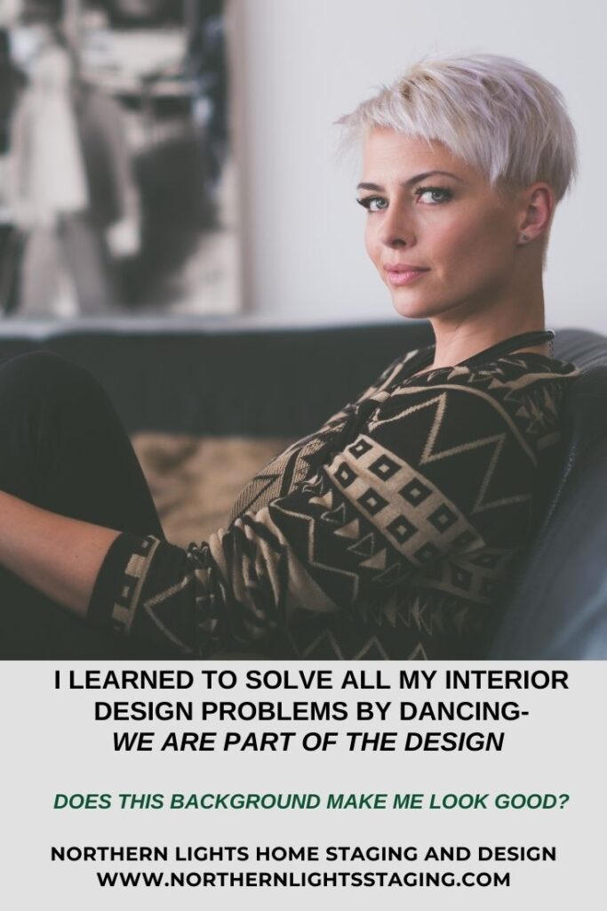
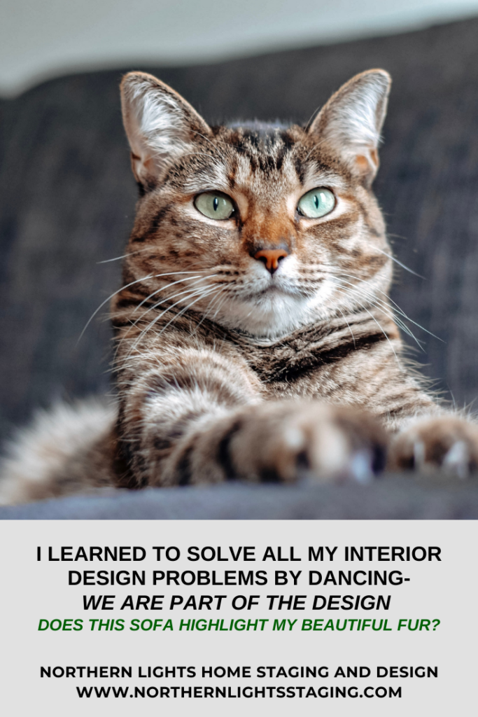
We are Part of the Design

We are part of the design of our rooms and need to consider how we look and feel within them.


 For example, if navy blue makes me look old when I wear it, but I look beautiful in turquoise, I will not design my living room with navy blue because I will not look good surrounded by that color. And if I don’t look good, I will not feel good in the room.


Think about how you will look and feel in the room. After all, when you are in it, you will be the star of that show.


I Learned to Solve All My Interior Design Problems by Dancing-Distractions Ruin Everything
We are part of the design. Does it make you look good? Photo by Jens Lidner on Unsplash.

I Learned to Solve All My Interior Design Problems by Dancing-Distractions Ruin Everything
We are part of the design. Does it make you look good? Photo by TheWonderAlice on Unsplash.

Eliminate Visual Disparity

Eliminating visual disparity is important. What is your personality and story? Are you being true to it and does it fit with the architecture of the building?

For example, are you a maximalist that loves to be surrounded by lots of things and color, creating that style in an ultra-modern space?

Or, are you trying to create an ultra-modern look in an ornate Victorian living room? The contrast might be interesting, but can you live with that visual disparity every day?

Some may call this eclectic, but even eclectic styles need a balance with one primary style.

There needs to be a connection between the architecture, style, and story you are portraying. Otherwise, it will always be distracting to the viewer.

Interacting with Your Design Elements

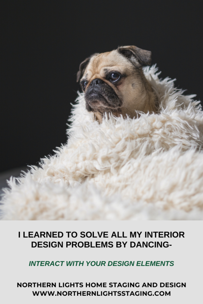
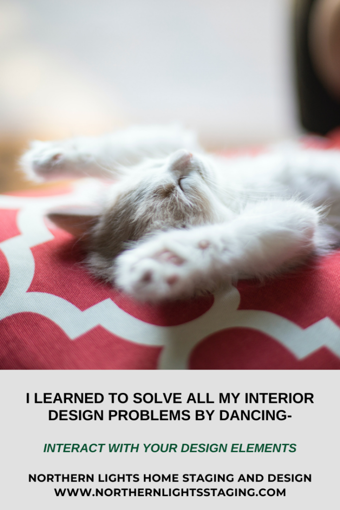
In design, we interact with almost all the elements in our spaces. It is critical to make sure elements such as furniture and decor are comfortable, support how we live, are beautiful to us, and there is not too much of it!

Do you enjoy interacting with everything, and like the touch, feel, smell, and comfort of your decor items?

I Learned to Solve All My Interior Design Problems by Dancing-Distractions Ruin Everything
Do you enjoy the touch, feel, smell, and comfort of your decor items? Photo by Matthew Henry on Unsplash.

I Learned to Solve All My Interior Design Problems by Dancing-Distractions Ruin Everything
Do you enjoy the touch, feel, smell, and comfort of your decor items? Photo by Johnathon Fink on Unsplash.

I Learned to Solve All My Interior Design Problems by Dancing-Distractions Ruin Everything
Do you enjoy the touch, feel, smell, and comfort of your decor items? Photo by Gemma Evans on Unsplash.

Removing Distractions is More Important than Adding Supporting Details

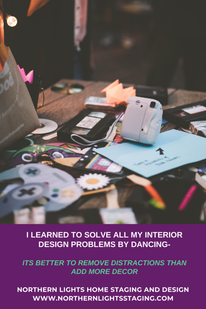
Removing distracting elements is more important than adding supporting details, which will make or break a room.

If you have a room filled with clutter and distracting things, no amount of adding more of your favorite decorative elements such as art or pillows or knick-nacks will fix the problem.

The most important thing is to neutralize the “stage” and eliminate all the unnecessary elements first. Then begin adding layers until you have created the effect you want. Otherwise, you and everyone else using the room will only see the distraction

I Learned to Solve All My Interior Design Problems by Dancing-Distractions Ruin Everything
Its better to remove distractions than add more decor when creating a beautiful room. Photo by Ayla Verschueren on Unsplash.

Neutralize First

The first step in creating a beautiful stage or a room is to neutralize it first by removing distractions. Once that is done, then you can add meaningful decor items to create the perfect background for your performance or your perfect space.

A problem I often see, is when people have too many distractions in their room, usually in the form of clutter.  The room may also have too much decor or furniture. They think that adding beautiful decor items will fix the problem, and create the look they want. 

It does not work.

The key is remove the distractions first, then add decor to get the look you want.

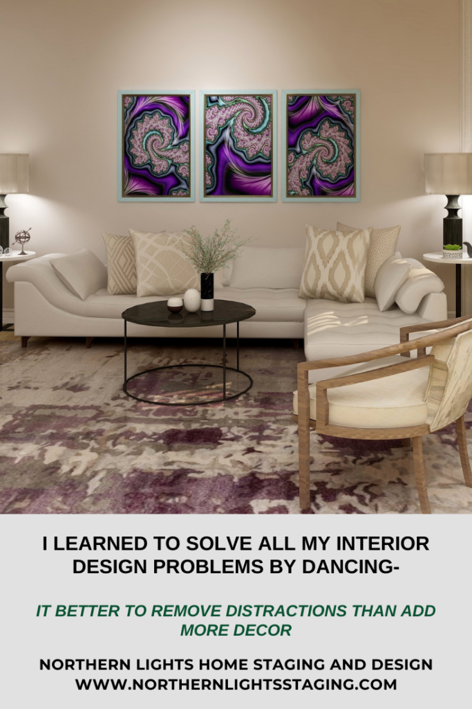
In the example below the focal point of the room is the art. To make it stand out as much as possible, the rest of the room was designed with neutral colors.

In a similar way, a neutral background on a stage could highlight a dancer in a purple dress and her beautiful movements without distractions. 


I Learned to Solve All My Interior Design Problems by Dancing-Distractions Ruin Everything
Edesign and “A Passion for Purple” fractal art by Northern Lights Home Staging and Design.

This design highlights my fractal art, “A Passion for Purple” which you can purchase at my studio on Society 6.

Before you start decorating, take everything out of the room you really don’t need, neutralize things as much as possible and then add on your layers.


I Learned to Solve All My Interior Design Problems by Dancing-Distractions Ruin Everything
Its better to remove distractions than add more decor when creating a beautiful room. Photo by Samantha Gades on Unsplash.

Learn More

To learn more, see some other articles in this series:

I Learned to All my Interior Design Problems by Playing Music.

I Learned to Solve All My Interior Design Problems by Dancing and Playing Music- Every Part Must Play Its Part.

I Learned to Solve All My Interior Design Problems by Dancing and Playing Music- We all Hear Music Differently.

I Learned to Solve All My Interior Design Problems by Dancing and Playing Music- Precision is Beautiful.

You might also enjoy my series on lessons I learned about Interior Design from dancing:

I Learned To Solve All My Interior Design Problems by Dancing: The Magic of Transitions.

I Learned To Solve All My Interior Design Problems by Dancing : Surprise Me.

I Learned To Solve All My Interior Design Problems by Dancing and Learning to Tell a Great Story.

I Learned To Solve All My Interior Design Problems by Dancing- Bring on the Bling.

I Learned to Solve all My Interior Design Problems by Dancing- There Can Only Be One Star.

I Learned to Solve all My Interior Design Problems by Dancing- Be Brave.

I Learned to Solve all My Interior Design Problems by Dancing- Create Drama with Shapes.

I Learned to Solve all My Interior Design Problems by Dancing- Create Drama with a Focal Point.

I Learned to Solve all My Interior Design Problems by Dancing.

Are You Ready to Create Your Masterpiece?

Now that you know some of the elements that work together to create your perfect space, are you ready to take action to make it happen in your home? If you knew absolutely for certain that creating a perfect space would create a better life for you, you would do it, wouldn’t you?

Let’s tell your unique story and find the alignment of art, science, and energy that makes you happy.  Let me help you take that trip to your perfect space in a Ferrari instead of a stagecoach. Try my Aligned Design consultation and let’s get started.


A transformational design experience that aligns Art, Science and Energy to Make Magic Happen in your Home and Life. Includes Interior Design, Color and Energy alignment advice to create a space perfectly aligned with you. We'll use Energy Art, personalized to reflect your true self, as the foundation of your space's transformation.

Curious about your Interior Design style? Take the quiz and find out.


What's Your Global Design Style? Take the Quiz

Why Work with Northern Lights Home Staging and Design

Attract Wealth with Interior Design: The Energy Art Quiz"- Northern Lights Home Staging and Design.

Why Work with Northern Lights Home Staging and Design

Terms of Service  |  Privacy Policy  |  Disclaimer

Prices subject to change without notice.

This page contains affiliate links.

Call 907-362-0065 today

 info@northernlightsstaging.com


How a Silly Facebook Quiz Changed My Life

Here is the crazy story of how I started Northern Lights Home Staging and Design.

You never know when inspiration will hit. The question is, will you take action and do something about it?

Mary Ann Benoit of Northern Lights Home Staging and Design. Mary Ann is an Interior Designer, Color Strategist and fractal artist.

My  inspiration came in a surprising way, from one of those silly “Facebook” quizzes. You know, one of those games that tell you who you were in a past life or what your handwriting says about you etc. One day I played “What is your true profession”. The answer was “Designer”. Whoa! This made me take a step back and think.

I had been working as a wildlife biologist for 25 years at the time, but back in 1980 had gone to school and gotten a B.A. in Interior Design. It was a passion I always had, but after getting my degree decided to pursue traveling and other interests. Life got in the way and I never did alot with it besides a few jobs, designing my own homes or helping friends.

Later, I pursued another degree in wildlife biology because I love animals and the outdoors, and took another path. Although I enjoyed it, I missed being involved in creative work. Working for the government did not encourage or inspire much creative thinking!

Over time, creative pursuits such as dance, music and art took on more importance in my life. Thoughts of starting another business (I already had a Bed and Breakfast) were in the back of my mind without a real idea of what it would be, just that I wanted something that would bring more fulfillment to my life.

When I got “Designer” as the answer to my true profession, I thought about that path not taken and wondered how my life would have turned out if I had chosen that path years ago. I do not know if it would have been the wiser choice, or if everything I had done was just preparing me for that path now, but something about that quiz totally spurred me to action! Why not now?

And so my business, Northern Lights Home Staging and Design was born on 11-20-2015.

And while I still worked as a wildlife biologist until December 2018 when I retired,  and continued to operate my B&B, I was thrilled to have this new adventure in my life and so glad I took action!!

My business started off focused on home staging, and evolved into adding Interior Design. With  my experience running a Bed and Breakfast, I added  vacation rental design and staging. I became more fascinated with color, and became a certified color strategist and added color consultations. That evolved into learning Edesign and adding online home staging, Interior design and color consulting.

On my first day of retirement from being a wildlife biologist on January 1, 2019,  I discovered fractal art and started creating my own art. Soon I created stores for my art and home decor on Society 6, and Pixels.com. Both stores include art a wide variety art and home decor products.


Mary Ann Benoit Energy Art on Pixels.com


Northern Lights Home Staging and Design on Society 6

That evolved into creating wearable art on Le Galeriste.  


Wearable energy art and home decor by Mary Ann Benoit on Le Galeriste


In each case, inspiration hit, I took action and I am amazed now at all twists and turns, new adventures in creativity and life that have evolved in less than 5 years from an idea inspired by a simple Facebook quiz.


Sometimes you just never know where your path will lead.

What inspires you and have you taken action?


Whether it is to start a new business, change your existing business, start a new path or hobby… I hope inspiration finds you and you jump in with both feet


Pin this

How a Silly Facebook Quiz Changed My Life- The story of how Northern Lights Home Staging and Design was born.


What is Your Global Interior Design Style? Take the Quiz.


Attract Wealth with Interior Design: The Energy Art Quiz"- Northern Lights Home Staging and Design.

Why Work with Northern Lights Home Staging and Design


Aligned Design- All Rights Reserved.

Terms of Service  |  Privacy Policy  |  Disclaimer |  Brochure

Prices are subject to change without notice.

Call 907-362-0065 today


Eco-Friendly Interior Design- Why it Matters

Where do you spend most of your time? 


Indoors, both at home and at work. All the things in our indoor environments can affect our health. While we probably don’t have much say about our work environments, we can totally control what is in our homes, and we can use those things to make our homes both beautiful and healthy at the same time!


 Furniture, rugs, upholstery, flooring cabinets and paint all affect our indoor air quality. Some of the chemicals used to keep us safe, such as flame retardants in synthetic fabrics and rugs can also be hard on our health. Chemicals in some carpeting and flooring off-gas into the air. Adhesives used in furniture, especially particle board, contain formaldehyde that emit harmful substances into the air.

Ways to Create a Healthy Interior Space

How can you reduce or eliminate the negative effects of common products that can affect our health and still have a beautiful home?


 • Buy higher quality furniture that uses wood joinery and fewer adhesives.

 • Get rugs made of natural materials such as wool, cotton, silk or jute. 

• Paint with brands that use fewer chemicals (low VOCs). VOCs are compounds that evaporate into the air and smell bad and are bad for indoor air quality. Benjamin Moore makes a low VOC paint in their Natura collection in all their fabulous colors with reduced levels of allergens and irritants.

 • Purchase furniture with upholstery that does not use fire retardant chemicals. 

• Purchase furniture that uses foam made of natural materials such as latex. 

• Go for furniture and décor items made of wood or metal and avoid plastics.

 • Look for pillows, mattresses, upholstery and beddings made from wool-stuffed materials rather than synthetics. 

• Consider flooring made from natural materials such as stone or wood and avoid vinyl.

 • Give your space plenty of natural light and fresh air.

 • Add plants to add beauty and filter your air.

 • Use natural cleaning products. 

• Use natural materials and objects from nature as decoration.

 • Use rammed earth or adobe for walls instead of plaster or cement.

 • Use rubber walkways made from recycled rubber outdoors rather than concrete


Radical Change Energy Art
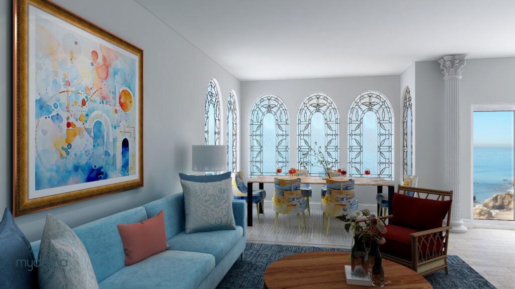
Modern Global Style Edesign and eco-friendly art by Northern Lights Home Staging and Design

How Your Choices Help the Planet

Besides actions you take to improve the air quality directly in your home, consider how your choices affect the health the planet too! 


• Buy high quality, long lasting furniture rather than cheap low-quality stuff that will end up in landfills or on the street as “free stuff” in a few years. Many cities are being overwhelmed with furniture no-one wants.

 • Find local products so that the shipping doesn’t contribute to emissions in the environment.

 • Use energy efficient lighting.

 • Use vintage items.

 • Use products made of recycled materials such as glass tiles or paper wallpaper. You can use glass in your countertops, tiles, lamps and accessories and paper for beautiful wall coverings. Even some polyester can be recycled. If you must use polyester, use rPET which can be spun into yarn and dyed without toxic properties. 

• Use renewable or sustainable materials such as bamboo, cork, teak, hemp, palm, soy fabric or cotton. Bamboo is used in fabrics, flooring and window treatments. Cork is used in textiles, floor and wall coverings. Teak is used in furniture and decking. Hemp is used in furniture upholstery, bedding, curtains and paper products. Soy fabric is soft and silky. Palm is used in some baskets. Organic cotton can be used for upholstery fabric, bedding, pillows and more. 

• Use sustainable metals that can be recycled such as copper, aluminum and steel. 

• Use solar energy for your home.


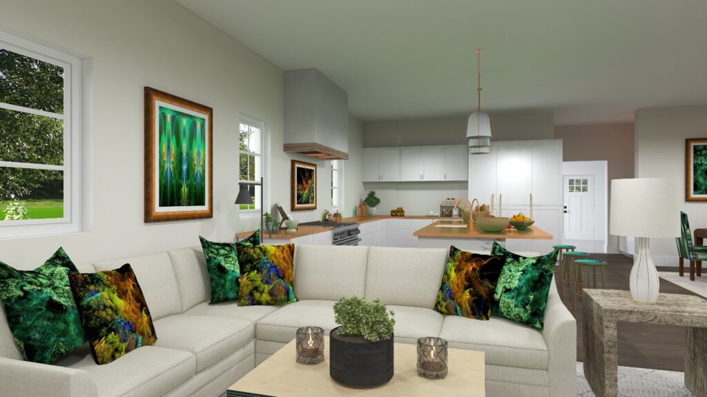
Open Space Living with Energy Art Connects You to the Nature
Modern Global Style Edesign and eco-friendly art by Northern Lights Home Staging and Design

Get the Look- Eco-Friendly Design.

So, what does eco-friendly design look like? 

It can really reflect any style that you want. Most of the eco-friendly furniture produced is in a more modern style with fabrics in a wide range of colors and uses beautiful natural wood and bamboo. 

Ethnic rugs, pillows and decorative accessories are often made of natural materials and can create a global style or Bohemian look.

 Whether you are starting fresh with a new home or redoing a whole room, consider making it eco-friendly. Or add eco-friendly elements as you update your look over time. 


Modern Global Style Edesign and eco-friendly art by Northern Lights Home Staging and Design

Eco-Friendly Furniture and Decor

It is easy to find beautiful sustainable products for your home décor. Sometimes these products may cost a little bit more, but it is worth it!


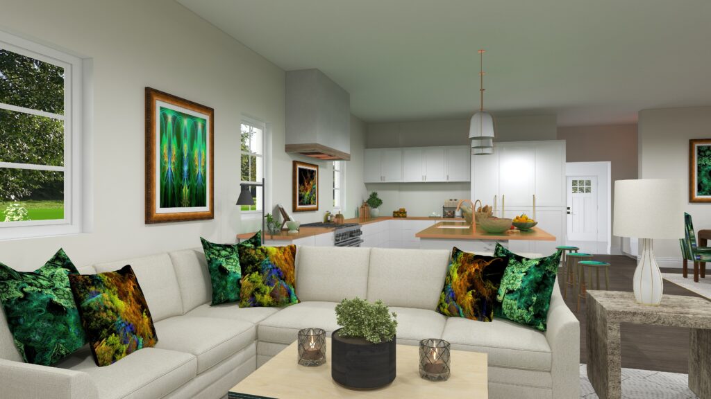
Analogous color scheme. Edesign by Northern Lights Home Staging and Design.
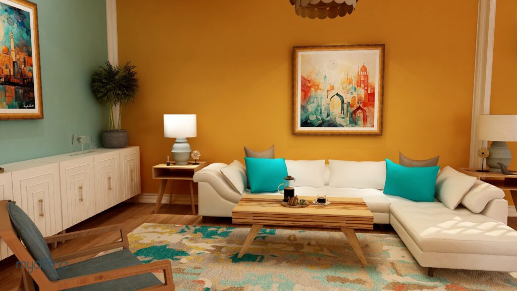
Modern Global Style Edesign by Northern Lights Home Staging and Design

Ready to Create a Beautiful Eco-Friendly Space?

My approach to interior design, termed “Aligned Design,” revolves around three pillars: art, science, and energy. The sweet spot is where they intersect.

Color is central to the science of this design. As a certified color strategist, I harness the science of color to bring unique vibrancy to spaces.

Begin with the Aligned Design blueprint, blending art, science, and your home’s energy. By fusing creativity with color and connection, we can craft your ideal space together.


A transformational design experience that aligns Art, Science and Energy to Make Magic Happen in your Home and Life. Includes Interior Design, Color and Energy alignment advice to create a space perfectly aligned with you. We'll use Energy Art, personalized to reflect your true self, as the foundation of your space's transformation.


Attract Wealth with Interior Design: The Energy Art Quiz"- Northern Lights Home Staging and Design.

Learn more about Global style design in my article, Tell Your Story with Global Style Interior Design.  Curious about what Global Style might be right for you? Take the quiz below. Ready to try to get the look in your own home? Try one of my Edesign packages.

What is Your Global Design Style? Take the Quiz

Call 907-362-0065 today
 info@northernlightsstaging.com

Download my Brochure
Why work with Northern Lights Home Staging and Design
Interior Design, Color and Home Staging Services. Brochure of Northern Lights Home Staging and Design

Terms of Service  |  Privacy Policy  |  Disclaimer

Prices subject to change without notice.